Most guides on colors to pair with terracotta floor tiles get it wrong—they give you the same tired suggestions from a decade ago. Here’s what actually works for the way we live now. We spent serious time filtering through hundreds of real homes to find the most inspiring and achievable looks. Inside, you’ll find 32 curated ideas that prove how versatile this timeless material can be, covering everything from earthy modern to cozy traditional styles. These aren’t just random photos; they’re real-life examples of how to create a space that feels both current and full of character. Forget the outdated rules. For 2026, we’re seeing a huge move towards personalized, layered homes that feel collected over time, and terracotta is the perfect foundation. 📌 Save this to Pinterest for later—you’ll want to revisit these ideas.
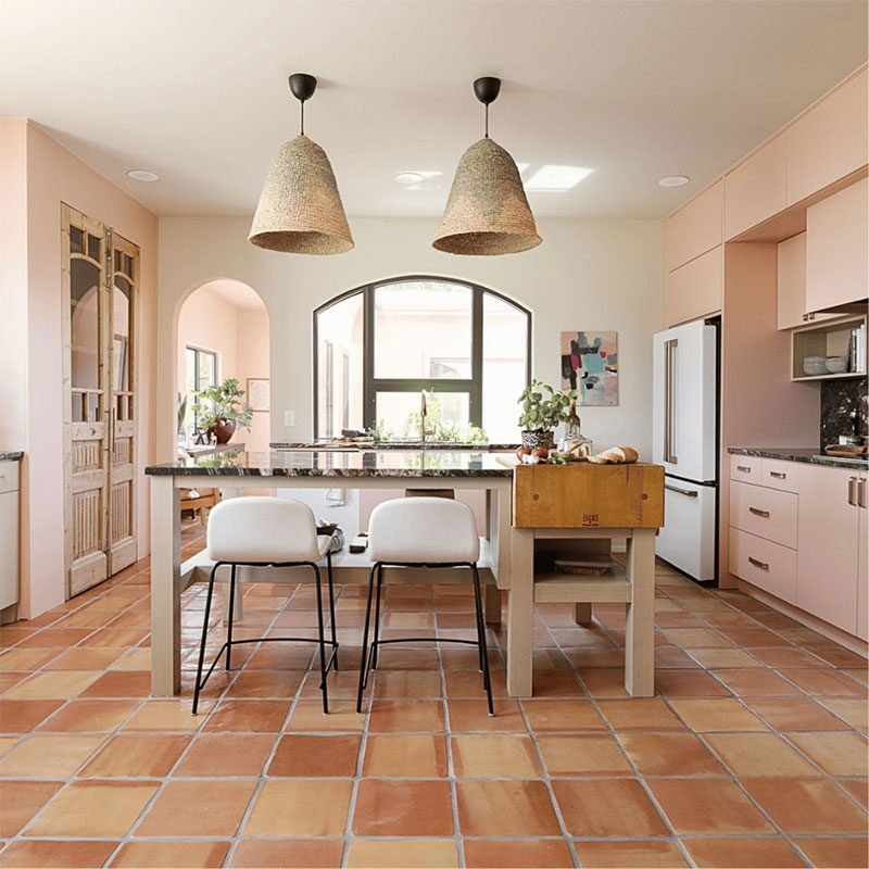
1. Pair Pale Pink Cabinetry With Warm Terracotta Floors
What makes this kitchen so special is the daring yet delightful pairing of earthy terracotta with soft, pale pink. The warmth of the floor tiles is echoed in the handmade quality of the woven pendant lights, while the pink cabinets feel modern and fresh, not saccharine. The dark stone countertop and black window frame act as grounding elements, providing a sophisticated contrast that keeps the look from feeling too whimsical. It’s a masterclass in balancing warm and cool, rustic and contemporary.
⭐ The One Thing
Recreating this chic kitchen look is more achievable than you might think. Here’s a rough estimate to get you started on your own pale pink and terracotta dream space.
- Main Furniture (Island, Stools): $2,500 – $6,000
- Lighting (Pendant Lights): $400 – $1,200
- Custom Cabinetry (Painted): $8,000 – $20,000+
- Decor/Accessories: $300 – $800
- Floor & Wall Finishes (Tiles, Paint): $3,000 – $7,000
- TOTAL: $14,200 – $35,000+
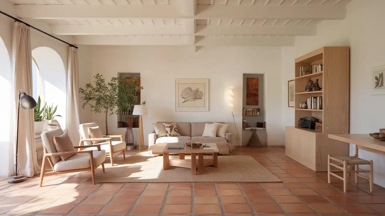
2. Create a Serene Vibe with Neutrals and Light Wood
This room’s formula is all about subtle, warm layers. Think of it as 60% neutral base (the cream walls, white ceiling, and beige upholstery), 30% natural texture (the terracotta floor and light wood furniture), and 10% soft accents (the jute-like rug). This high-neutrals ratio ensures the space feels bright and airy, preventing the terracotta from overpowering the room. You can easily swap the accent. For example, change the light wood to a darker walnut for a more dramatic, high-contrast feel while keeping the same core formula.
💸 Get This Look For Less
When working with a strong floor color like terracotta, keep the other large surfaces relatively simple. Notice how the walls are a soft, uniform cream and the ceiling is white? This creates a quiet visual backdrop that lets the floor be the star. A common mistake is to add a busy wallpaper or a competing bold color on the walls, which can quickly make the room feel chaotic. Let your beautiful floors do the talking and support them with calm, neutral partners.
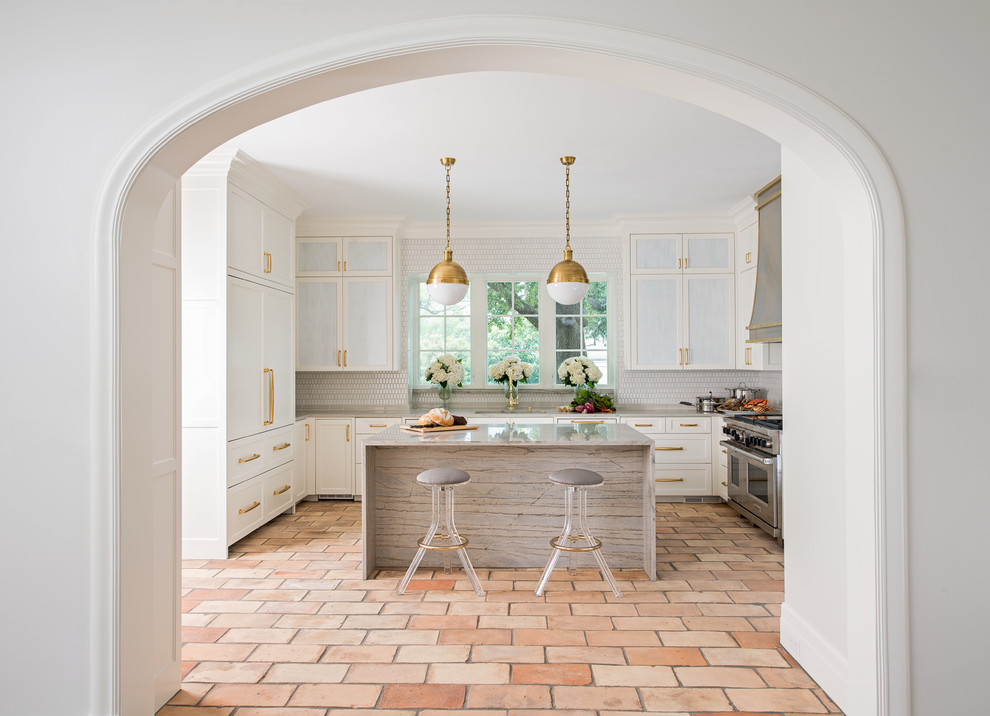
3. Go Classic with White Cabinets and Polished Brass
The single most important element in this kitchen is the brass hardware. Without it, the space would still be lovely, but it would lack that crucial layer of warmth and elegance. The brass pulls and pendant lights bridge the gap between the cool white of the cabinetry and the earthy warmth of the terracotta floors. They catch the light and add a touch of vintage character that elevates the entire design from simply “nice” to truly memorable and sophisticated.
🎯 What Makes It Work
Brass hardware is beautiful, but it requires a bit of know-how. Unlacquered brass will develop a natural patina over time, which can be a desirable, lived-in look. If you prefer a perpetual shine, you’ll need to polish it with a dedicated brass cleaner every few months. For a lower-maintenance option, choose lacquered brass, which has a protective coating. Be mindful that cheaper brass-plated hardware can chip or wear over time, revealing the base metal underneath, so it’s worth investing in solid or high-quality plated pieces.
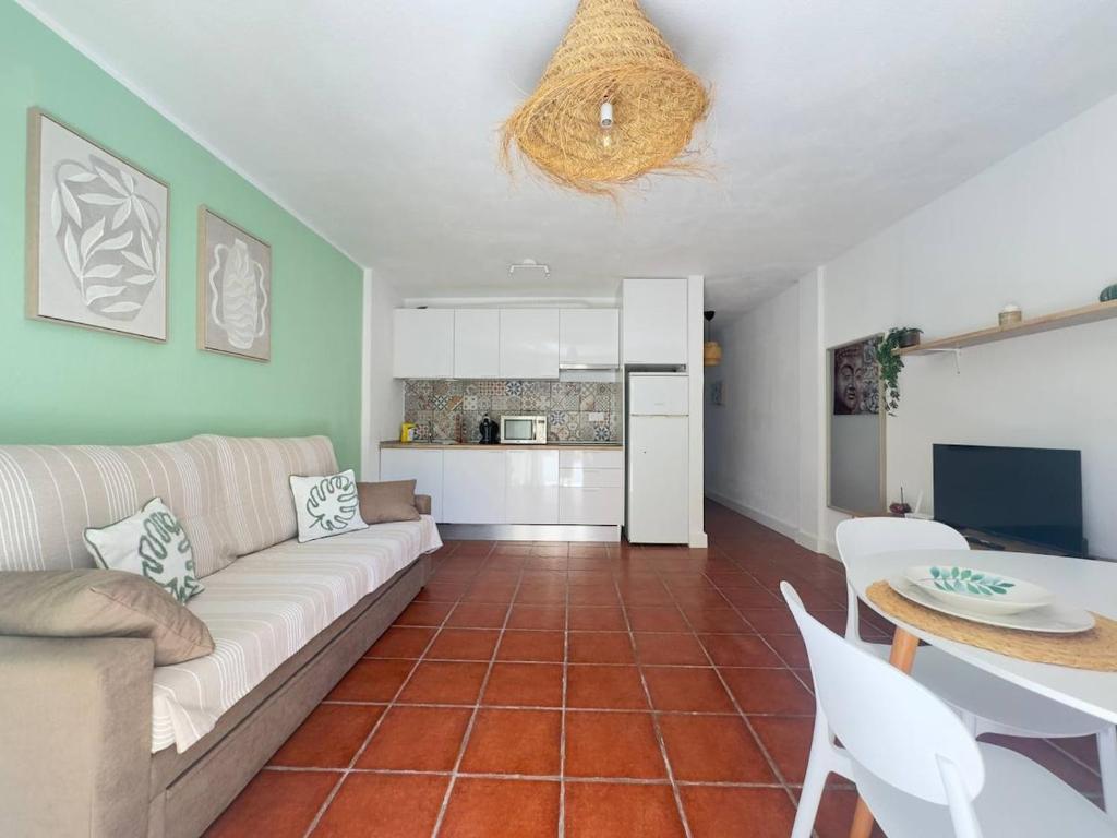
4. Add a Pop of Sage Green in a Compact Space
This idea is perfect for smaller, open-plan spaces, from a studio apartment to a guest suite kitchenette. The concept works well in rooms starting at around 150 square feet. The key is using the sage green as an accent wall rather than painting the entire room, which defines the zone without enclosing it. The compact white kitchenette keeps the area feeling bright and functional, preventing the green from overwhelming the space. The similar palette in Idea #7 shows how this color combo can be scaled up for a larger, more traditional kitchen.
💰 Budget Breakdown
You don’t need a custom build-out to get this look. Start with an IKEA KNOXHULT or SUNNERSTA kitchen unit for a clean, white base ($150 – $400). A gallon of quality sage green paint (like Behr’s ‘Dried Thyme’) is about $50. Find a fun, peel-and-stick patterned backsplash on Amazon or Wayfair for under $100. For lighting, a large woven pendant from World Market or Target can be found for $70-$150. The whole vibe can be achieved for well under $1,000 if you’re savvy.
5. Design a Cozy Mediterranean Dining Nook
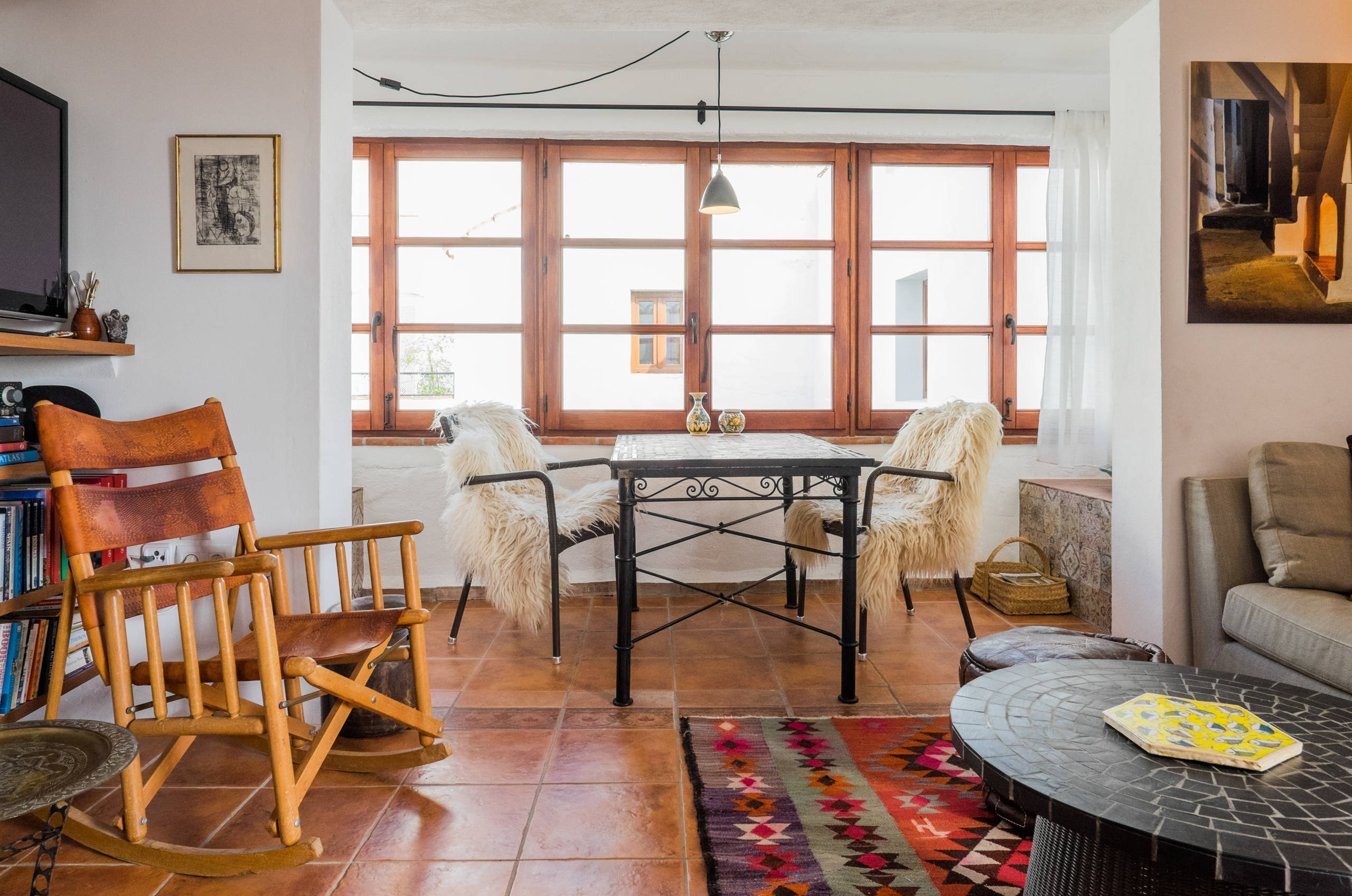
This space feels so inviting because it masterfully mixes textures. The roughness of the textured white walls contrasts beautifully with the smooth terracotta tiles. The hard, industrial feel of the black iron dining table is softened by the plush, shaggy faux fur chair covers. Finally, the colorful patterned rug adds a layer of softness and visual interest underfoot. This play on texture—hard and soft, rough and smooth—is what gives the room its cozy, collected, and deeply personal character.
🔧 How-To Brief
Those wonderful, fluffy chair covers look incredibly inviting, but let’s be honest: they are not the most practical choice for a primary dining area, especially with kids or a love for red wine. They are prone to staining and will require regular cleaning (or replacement) to keep them looking fresh. This setup is perfect for a low-traffic breakfast nook or a secondary dining spot, but for everyday meals, consider a more durable, wipeable material for your chair cushions or covers.
6. Soften the Room with Sage Green and Blush Pink
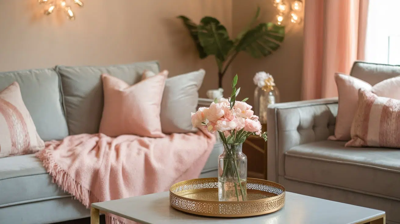
The combination of sage green and blush pink has been a designer favorite for a few years, and it shows no signs of slowing down. It’s the perfect evolution of the Millennial Pink trend, maturing into something more sophisticated and grounded. This palette is popular right now because it feels both calming (from the green) and warm (from the pink), hitting the perfect note for creating a sanctuary at home. Paired with a terracotta floor, it would lean into a very earthy, botanical, and slightly bohemian vibe that’s all over Pinterest.
📐 Style Math
To make this palette work with terracotta floors, think of it as a gentle color story. Use this formula: 50% Sage Green (sofa, a large piece), 30% Warm Neutrals (walls, rug), 15% Blush Pink (pillows, throws, art), and 5% Metallic (gold or brass accents). The key is that the sage is the dominant color, while the blush is just a supporting accent. Too much pink can make the combo feel juvenile, but this ratio keeps it feeling elegant and grown-up.
7. Paint Upper Walls Sage Green in a Traditional Kitchen
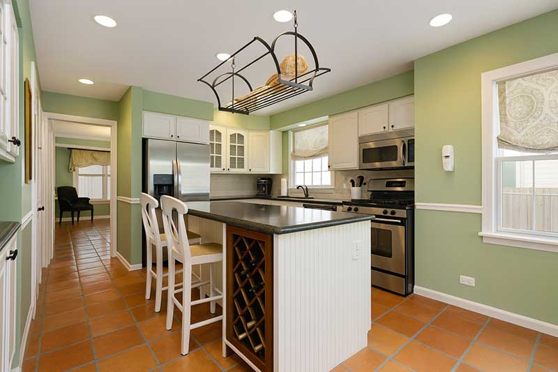
This kitchen strikes a perfect balance between color and neutrality. By painting only the upper portion of the walls sage green, the room gets a dose of personality without feeling overwhelmed. The white shaker cabinets and chair rail molding keep the lower half of the room bright and anchored, reflecting light and making the space feel clean. The terracotta floor then adds a layer of rustic warmth that prevents the green and white from feeling too cool or clinical. It’s a classic, can’t-go-wrong combination for a reason.
✅ Before You Start
Want to add that classic chair rail? It’s a straightforward weekend project. Here’s a quick guide:
- Measure and Mark: Decide on a height (typically 32-36 inches from the floor) and use a level to draw a straight line around the room.
- Cut Molding: Use a miter saw to cut your chair rail pieces. You’ll need 45-degree cuts for inside and outside corners.
- Attach to Wall: Apply construction adhesive to the back of the molding and press it onto the wall. Secure it further by nailing into wall studs.
- Finish: Caulk the top and bottom edges and fill any nail holes. Once dry, sand lightly and paint it to match your trim.
Estimated time: 4-6 hours. Cost: $100-$300.
8. Create Drama with a Terracotta Accent Wall and Teal Chairs
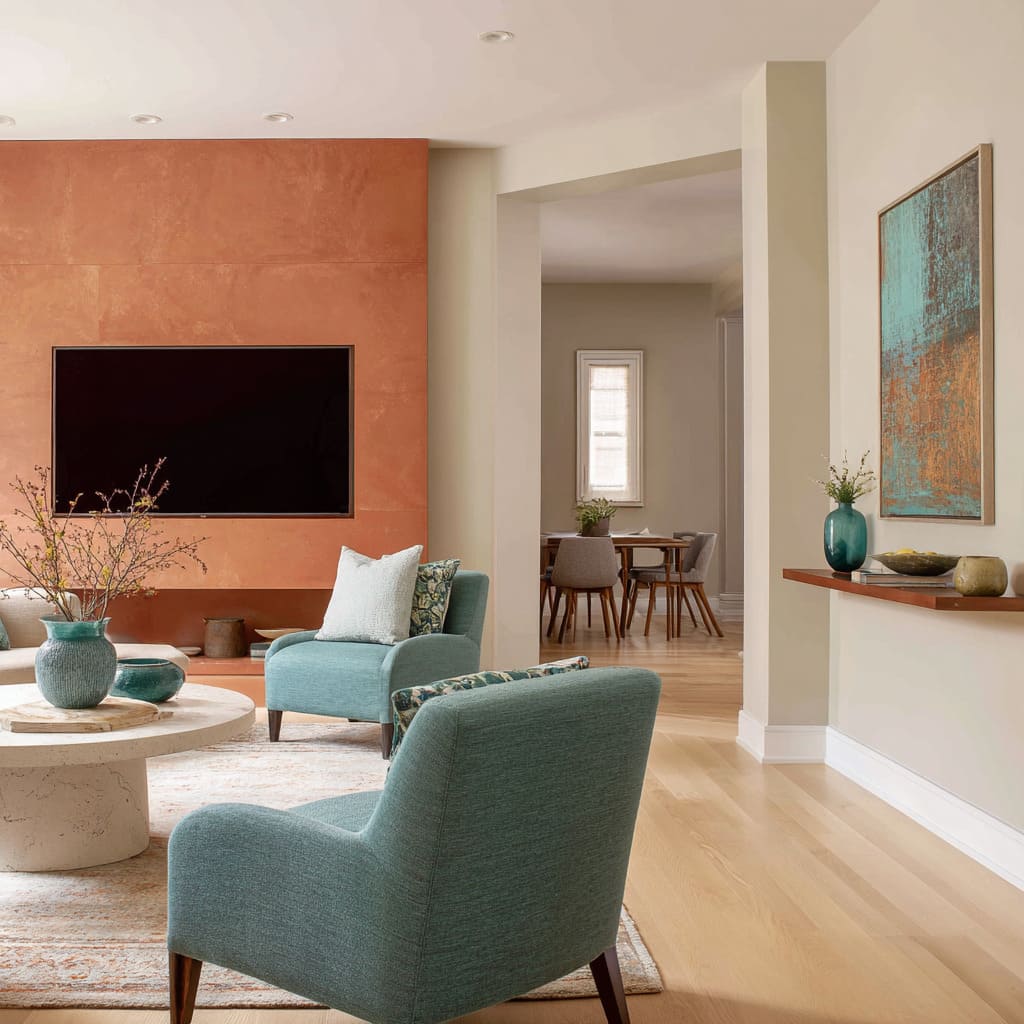
The magic of this room lies in the color relationship between the terracotta accent wall and the teal armchairs. Teal (a blue-green) sits opposite red-orange on the color wheel, making them complementary colors. This natural opposition creates a vibrant, energetic tension that is instantly captivating. If you were to swap the teal chairs for something neutral, the terracotta wall would still be warm and inviting, but it would lose that dynamic, designer-curated punch.
📏 Scale Guide
When using a bold, complementary color scheme like this, it’s crucial to give the eye a place to rest. Notice the large expanses of neutral tones: the light cream on the coffee table, the light wood flooring, and the soft, patterned rug. These elements act as a buffer, making up at least 50% of the visual space. Without them, the high contrast between the terracotta and teal could feel overwhelming and exhausting. Always balance bold color with ample neutrals.
9. Combine Sage Cabinets and Terracotta Pendant Lights
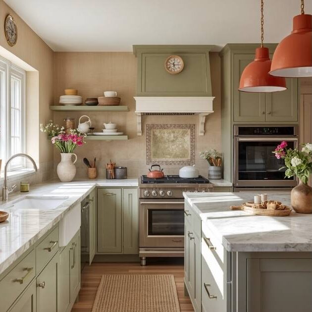
This kitchen works because it commits to an earthy, natural palette but executes it in a clean, transitional style. The sage green of the shaker cabinets is a soft, muted color that feels calming. The terracotta pendants introduce a pop of warm, rustic color, but their simple, modern shape keeps them from feeling dated. The white marble countertops and light beige textured walls provide a bright, neutral canvas that ties it all together, proving you can have color and still create a light and airy space.
💡 Designer Tip
Textured or specialty wall finishes, like the limewash or plaster effect seen here, are stunning but have practical considerations. They are more difficult and expensive to patch or touch up than standard paint. They can also be porous, making them susceptible to stains, which is a real concern behind a sink or stove. If you love the look but worry about maintenance, consider using it on walls away from the main “splash zones” and using a more durable, wipeable finish like tile or a satin paint near work areas.
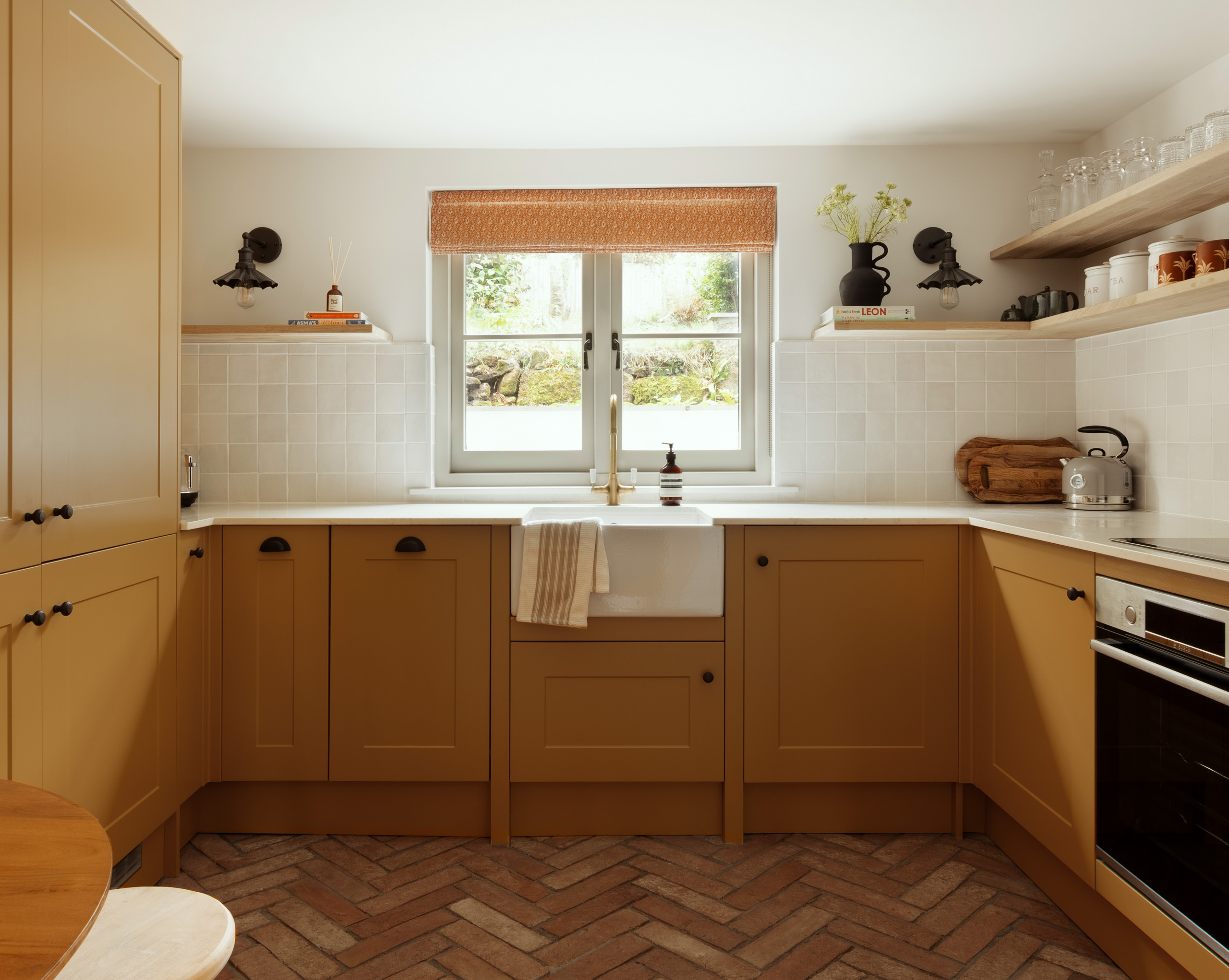
10. Go Bold With Mustard Yellow Cabinets and a Herringbone Floor
This is a high-commitment look, so make sure you’re all in before you start. Here’s a quick checklist:
🔥 Trending Context
- Get Samples: Mustard yellow can vary wildly. Order large paint swatches and look at them in your kitchen’s natural light throughout the day.
- Check Your Light: This color thrives in bright, well-lit spaces. In a dark kitchen, it might feel a bit gloomy or dingy.
- Consider Your Home’s Style: Does this warm, earthy, slightly retro vibe complement the rest of your home, or will it feel disconnected?
- Hardware Matters: The black hardware here provides a modern, graphic contrast. Brass would lean more vintage. Decide on your hardware before you paint.
11. Use Sky Blue and Terracotta in an Arched Window Nook
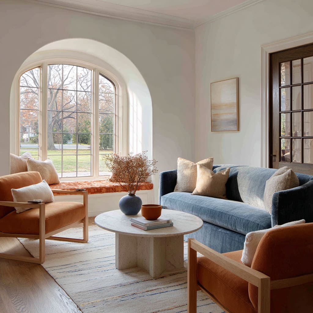
This living room feels incredibly balanced and serene because it leverages the power of natural color pairings. The soft sky blue of the sofa mimics the color of the sky, while the earthy terracotta of the armchairs and window cushion grounds the space, reminiscent of warm earth. This subconscious connection to the natural world—earth and sky—makes the room feel inherently calming and right. The light grey walls and oatmeal rug provide a quiet, neutral backdrop that allows these two primary colors to shine without competing.
⚠️ Real Talk
An arched window is a stunning architectural feature; don’t hide it behind heavy drapery. A simple, upholstered window seat cushion like the one shown here is the perfect way to highlight the shape and create a cozy reading nook. Measure the depth and curve carefully, and have a cushion custom-made with high-density foam (at least 3-4 inches thick for comfort). Use a durable, sun-resistant fabric to prevent fading over time. This not only adds seating but turns a feature into a destination.
12. Layer Earth Tones with Peach, Gray, and Olive
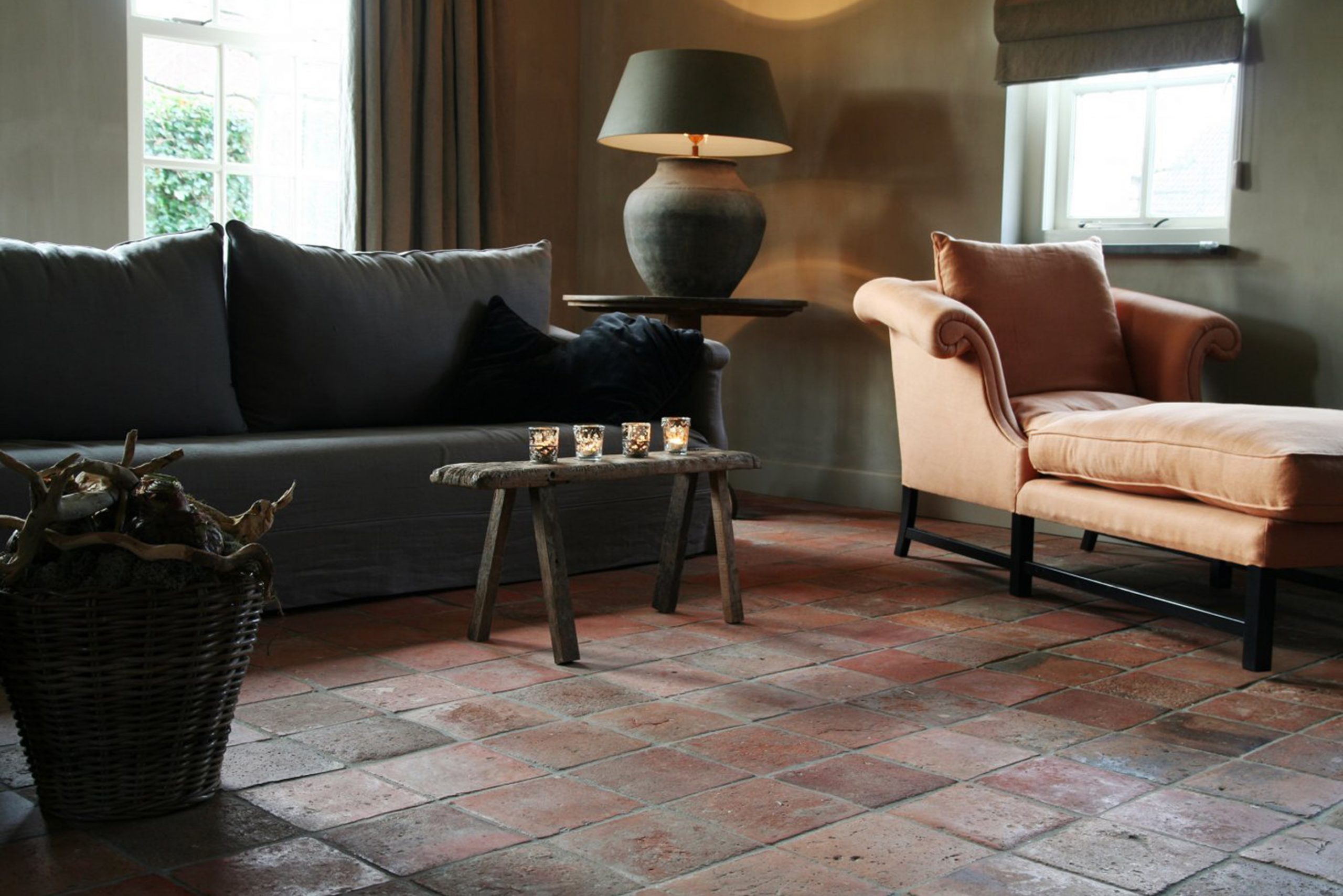
This room’s visual formula is a sophisticated blend of muted earth tones. It’s roughly 40% terracotta/rust from the aged floor tiles, 30% muted olive-brown on the walls, 20% dark gray on the main sofa, and a final 10% pop of soft peach in the chaise lounge. This creates a deeply cozy and tranquil atmosphere. The key is that none of the colors are loud or primary; they are all complex, ‘in-between’ shades that harmonize beautifully. You could swap the peach chaise for a deep teal or mustard for a different but equally rich vibe.
🧹 Maintenance Reality
This kind of moody, layered palette works best in a room with generous natural light, ideally from large windows as seen here. In a small, dark room, the olive-brown walls and dark gray sofa could feel heavy and oppressive. A minimum room size of about 200 sq ft with ceilings of at least 8.5 feet is recommended to allow the colors to breathe. In smaller spaces, consider using this palette with lighter walls, as shown in Idea #2, to maintain a sense of openness.
13. Consider a Moody Contrast with Dark Patterned Tile
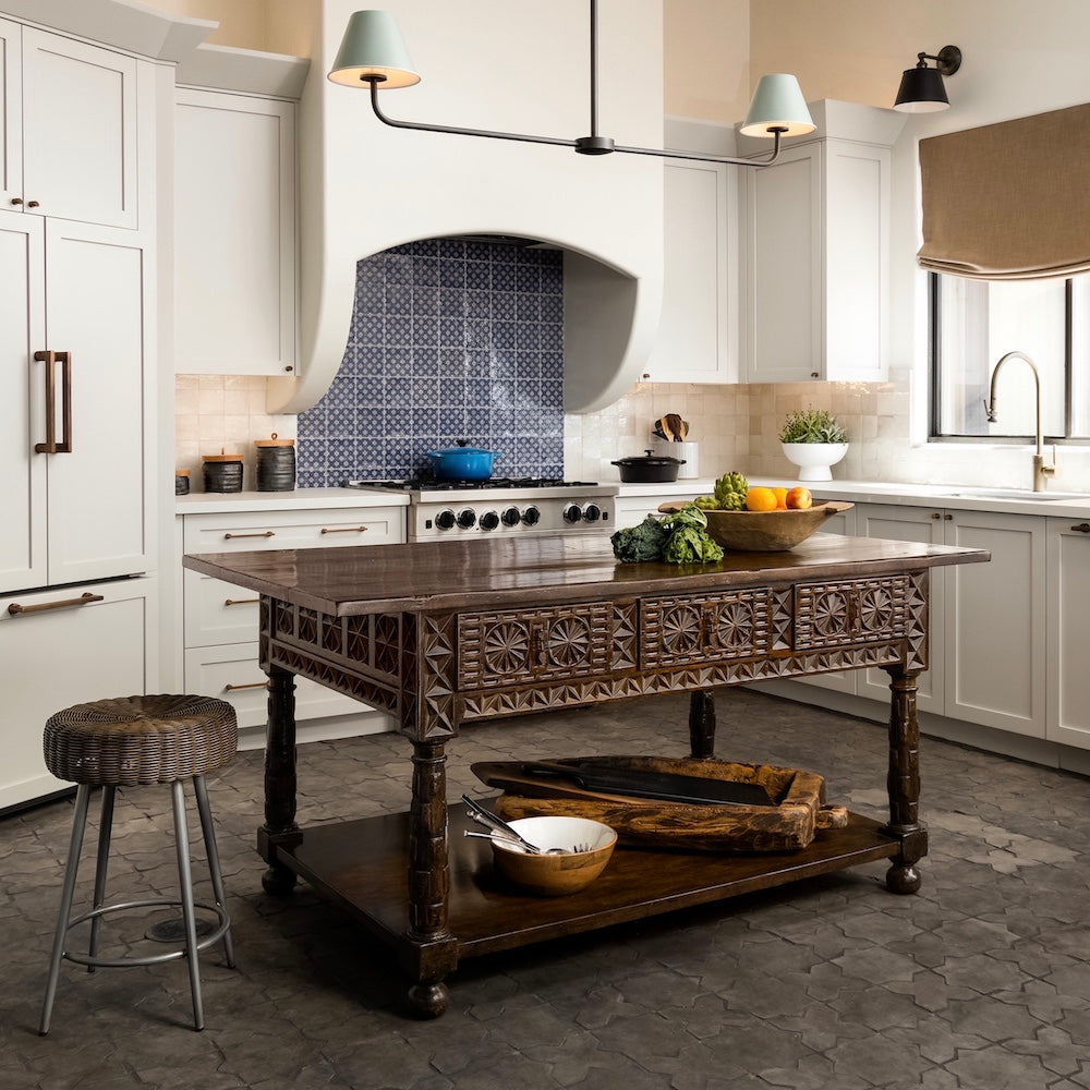
While not terracotta, this kitchen offers a valuable lesson in pairing a bold floor with classic elements. The dark, patterned floor tiles create a strong, rustic foundation, much like terracotta does. The design works because everything else is kept simple and bright. Crisp white shaker cabinets and a matching range hood provide a clean, vertical canvas, while the carved dark wood island adds a touch of warmth and craftsmanship that connects back to the floor’s rustic feel. The pop of blue and white in the backsplash tile adds a delicate, almost painterly detail.
⭐ The One Thing
The carved dark wood island is the undeniable heart of this kitchen. It’s the piece that bridges the gap between the dark floor and the bright white cabinets. Without it, the contrast between floor and cabinetry might feel too stark. The island introduces a necessary mid-tone, adds texture and a sense of history, and physically anchors the entire space. It proves that a single, statement piece of furniture can be the key to a harmonious design.
14. Mix Modern Copper Panels with Concrete Finishes
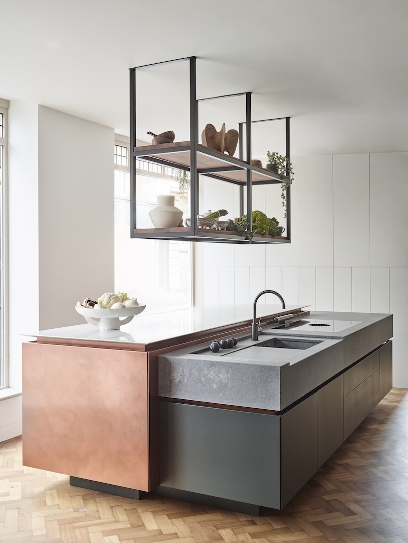
Copper is a stunning material, but it’s a ‘living finish.’ Unsealed copper, like that likely used on these panels, will react to its environment, developing a unique patina of darker browns and even blues or greens over time. Many designers cherish this evolving character. However, if you want to maintain the bright, polished look, it will require regular polishing with a specialized copper cleaner. Also, be mindful that acidic foods or cleaners can etch the surface, so immediate cleanup is key. It’s a high-style, high-maintenance choice.
💸 Get This Look For Less
The use of mixed materials, especially in the kitchen, is a major trend driven by a desire for more personalized and less ‘cookie-cutter’ spaces. Combining industrial concrete, luxe copper, and natural wood, as seen here, creates incredible visual and tactile interest. This look speaks to a broader shift away from monolithic, single-finish kitchens towards more dynamic, layered designs that feel collected and curated, telling a richer story about the homeowner’s style and personality.
15. Keep It Classic with Green Walls and Fired Terracotta
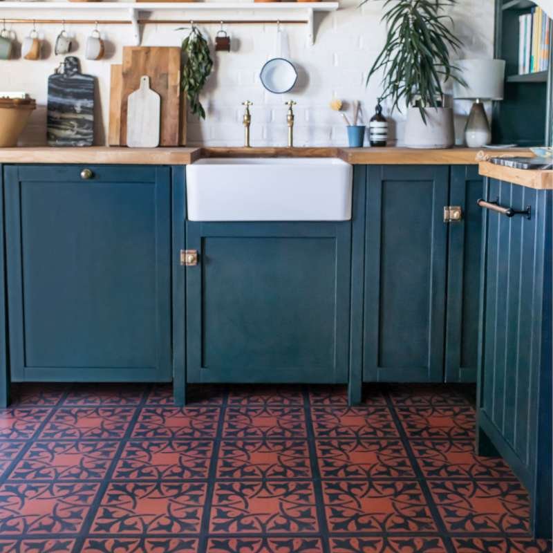
The combination of green and terracotta is a timeless pairing rooted in nature. Think of a terracotta pot holding a lush green plant—it just works. The earthy red-orange of the floor tiles provides a warm, grounding base, while the green on the walls adds a sense of vitality and freshness. This natural harmony makes the space feel balanced and welcoming. It’s a classic for a reason and a surefire way to create a room that feels both comfortable and effortlessly stylish, as seen in different applications in Idea #4 and Idea #7.
🎯 What Makes It Work
When pairing green paint with terracotta floors, pay close attention to the undertones. A sage green, olive green, or a ‘muddy’ forest green with warm, yellow undertones will harmonize beautifully with the warmth of the tiles. Avoid greens with strong, cool blue undertones, which can clash with the floor’s orange notes and make the room feel disjointed. Always test a large paint swatch next to your actual floor tiles before committing.
16. Embrace Rustic Charm with Light Wood and Yellow Walls
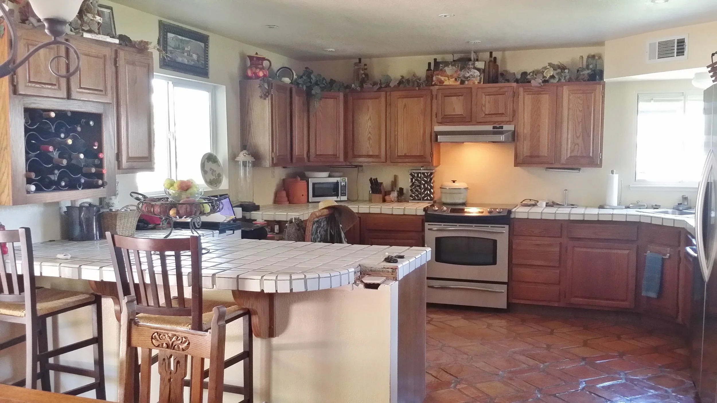
You can achieve this warm, rustic kitchen vibe on a surprisingly small budget. Search Facebook Marketplace or thrift stores for solid light wood cabinets; a dated 90s set can be transformed with a good sanding and a clear matte finish. For the countertops, instead of custom tile, look for large-format white porcelain tiles from a big box store like Home Depot, which can give a similar look for a fraction of the price. A gallon of soft yellow paint is an inexpensive way to bring in that sunny warmth. This entire aesthetic is about charm, not perfection, making it very DIY-friendly.
💰 Budget Breakdown
White tile countertops with matching grout can be a maintenance challenge. The grout lines are porous and notoriously prone to staining from things like coffee, wine, and tomato sauce. You’ll need to be diligent about sealing the grout regularly (at least once a year) and cleaning up spills immediately. While the look is charming and budget-friendly, be prepared for the extra elbow grease required to keep it looking clean compared to a solid surface countertop.
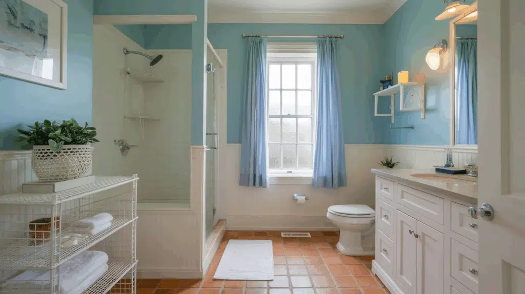
17. Pair Sky Blue Walls and White Wainscoting with Terracotta
This bathroom’s success lies in its balanced color formula. It’s approximately 50% White (wainscoting, vanity, fixtures), 30% Sky Blue (upper walls, curtains), and 20% Terracotta (floor). The high percentage of white keeps the room feeling bright, clean, and spacious. The sky blue adds a dose of cheerful, calming color, while the terracotta floor provides a necessary punch of earthy warmth, preventing the blue and white from feeling cold or sterile. This ratio is a recipe for a perfectly balanced, traditional bathroom.
🔧 How-To Brief
Installing wainscoting is a powerful way to add architectural character. Here’s the short version:
- Plan Your Layout: Decide on the height and style. Measure your walls and plan where your panels and stiles (vertical boards) will go.
- Install Bottom Rail: Attach the bottom horizontal board to the wall, making sure it’s perfectly level.
- Add Stiles: Cut and attach your vertical stiles at regular intervals using construction adhesive and nails.
- Attach Top Rail: Install the top horizontal board and the decorative cap or chair rail.
- Finish: Caulk all seams, fill nail holes, and paint.
This project elevates a room for a few hundred dollars in materials.
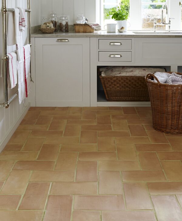
18. Use Light Grey Cabinetry and a Herringbone Terracotta Floor
This look is a study in sophisticated neutrals. The light grey of the shaker cabinets provides a soft, modern coolness that beautifully contrasts with the rustic warmth of the terracotta floor. The herringbone pattern of the tiles adds a layer of texture and movement, keeping the space from feeling static. The polished chrome hardware acts as a crisp, contemporary accent, bridging the gap between the cool grey and warm terracotta. It’s a combination that feels both current and timeless.
📐 Style Math
A heated towel rail is a touch of everyday luxury, but it does come with its own set of considerations. Electric models will add a small but noticeable amount to your monthly electricity bill, while hydronic models (connected to your plumbing) have a higher upfront installation cost. Both types need to be wiped down regularly to prevent dust buildup and water spots, especially with a polished chrome finish like this one. Make sure it’s installed by a qualified professional to ensure safety and proper function.
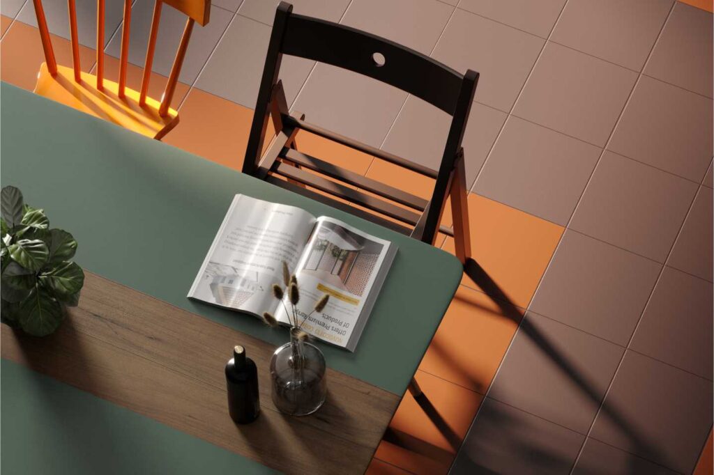
19. Try Modern Terrazzo Tiles in a Terracotta Colorway
While not a traditional terracotta tile, this terrazzo look is absolutely part of the same family and speaks to a major 2026 trend: materials that are both playful and sophisticated. Terrazzo has made a huge comeback, and this version, with its mix of warm terracotta, muted grey, and other earthy flecks, is a modern interpretation of a classic. It allows you to get that terracotta warmth but with a more graphic, contemporary edge that feels very fresh and forward-thinking.
✅ Before You Start
The element that truly makes this space sing is the unexpected pop of dark green on the table. It’s a bold, confident choice that provides a cool, dramatic counterpoint to the warm floor tiles. The orange chair and dark wood chair are lovely, but the green table is the anchor. It shows a willingness to play with color and creates a focal point that is both surprising and perfectly complementary to the earthy tones in the terrazzo floor.
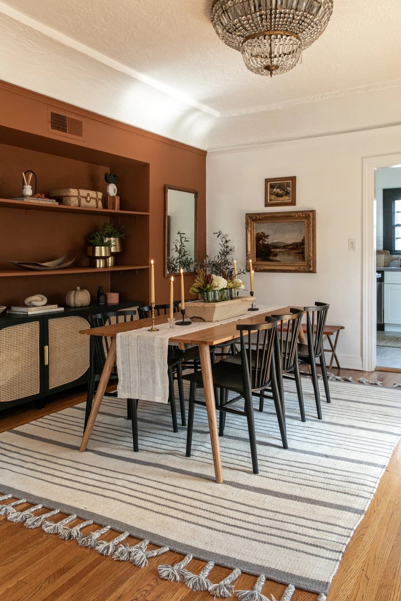
20. Anchor a Dining Room with Deep Terracotta Built-Ins
This dining room feels so cohesive because it uses color to create a strong architectural anchor. The deep terracotta built-in shelving unit isn’t just storage; it functions as a massive, textured piece of art. It establishes the room’s warm, earthy palette, which is then echoed in more subtle ways throughout the space, like in the warmer tones of the wood dining table and floor. The black chairs and striped rug provide a necessary graphic contrast that keeps the room feeling modern and crisp rather than muddy.
📏 Scale Guide
When painting a large built-in or a feature wall a deep, saturated color like this terracotta, always use a matte or eggshell finish. A higher gloss finish would reflect too much light, creating distracting hotspots and highlighting any imperfections in the surface. A matte finish, on the other hand, absorbs light, giving the color a rich, velvety depth that feels much more sophisticated and allows the objects on the shelves to stand out.
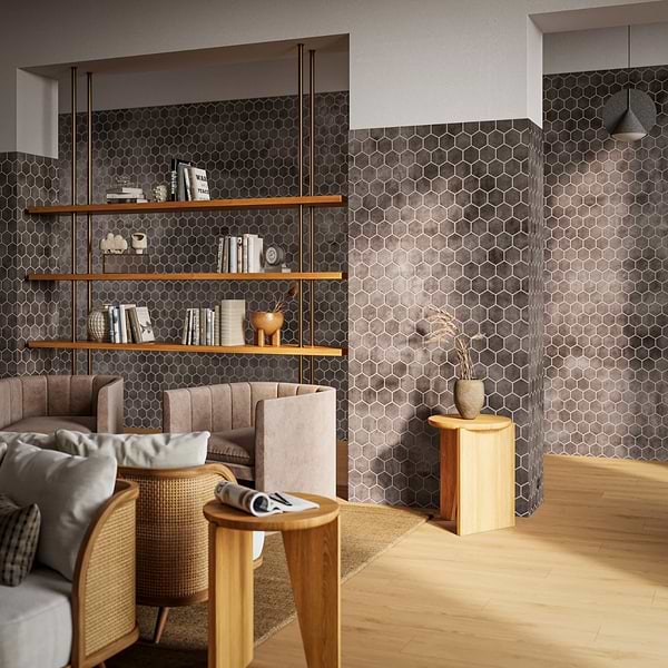
21. Create a Sophisticated Study with Dark Hexagonal Tiles
This moody and sophisticated look, with its dark hexagonal wall tiles, is best suited for a space that doesn’t need to feel vast and airy. It’s perfect for a den, a home office, or a cozy reading corner, ideally in a room that’s at least 120 square feet. The dark tiles create a sense of enclosure and focus, which can be great for a work area. Pairing it with light wood floors and shelving, as shown here, is critical to prevent the room from feeling like a cave, adding warmth and reflecting some light.
💡 Designer Tip
A wall of dark, heavily textured tiles like this can make a room feel significantly smaller and darker. It’s a bold choice that requires a commitment and, importantly, good lighting. You will need a combination of ambient light (from a ceiling fixture), task light (like a reading lamp by the chairs), and accent light (to highlight the shelves or art) to make the space functional and keep the dark walls from feeling gloomy, especially in the evening.
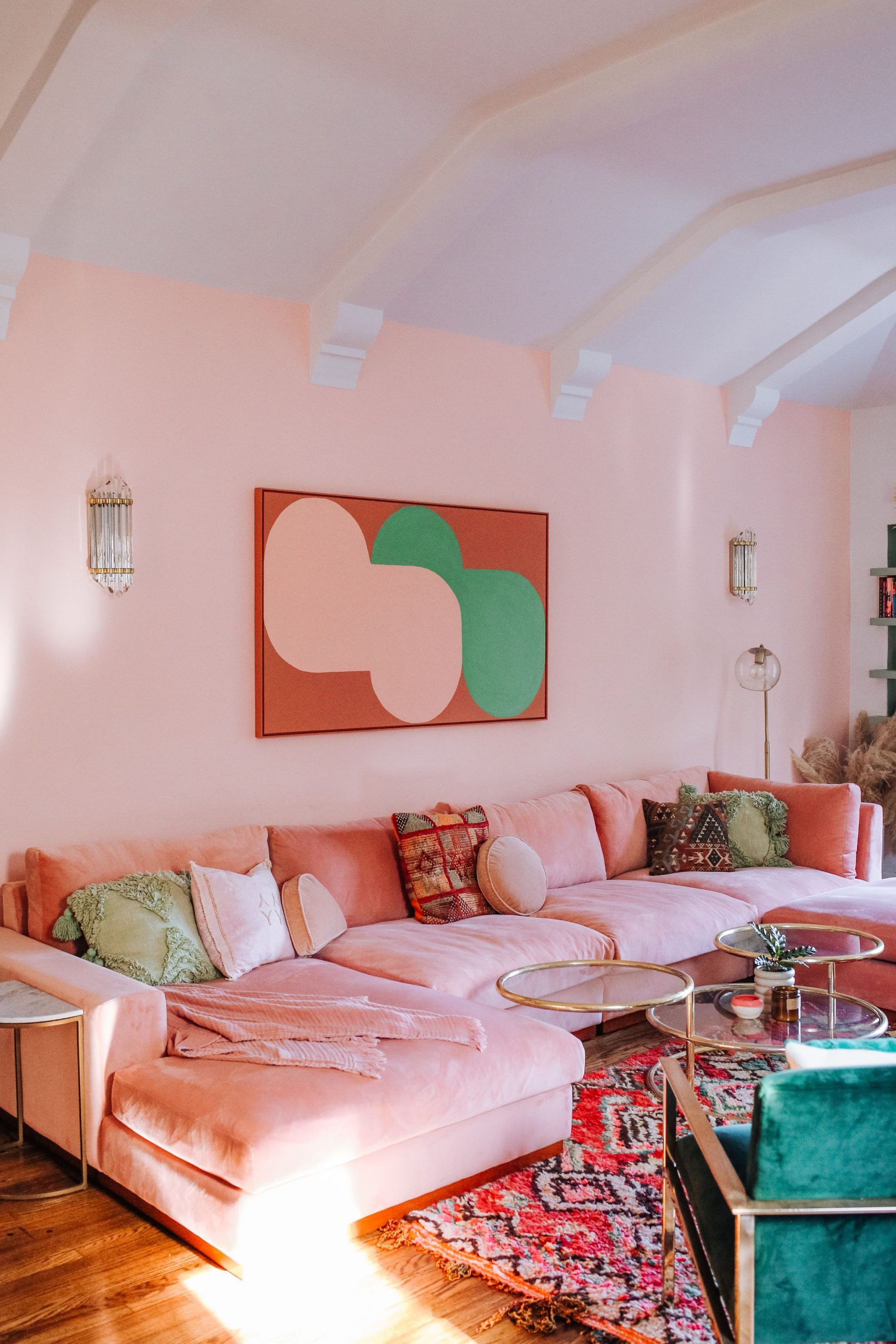
22. Pair Blush Pink Walls with a Matching Sectional
This room succeeds by committing fully to a monochromatic base and then punching it up with a strong accent color. The blush pink on the walls and the large sectional creates a soft, immersive color cocoon. It’s a bold move that works because the color is gentle, not jarring. The magic happens with the introduction of fern green through the accent chair, pillows, and art. Green is a natural complement to pink and red tones, creating a vibrant combination that feels intentional and chic. Gold accents add the final touch of warmth and sophistication.
🔥 Trending Context
Love this look but not ready to splurge on a pink sectional? Get the vibe for less. A neutral beige or cream sofa from IKEA or Wayfair is a versatile base. Spend your money on the elements that are easier to change: a gallon of blush pink paint for the walls ($50), a vibrant green accent chair from a store like Target or World Market ($200-$400), and a large piece of abstract art from Society6 or a local artist. You get the same playful, chic energy without the high-stakes furniture commitment.
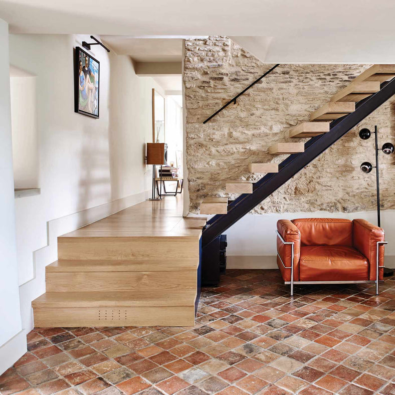
23. Mix Rustic Terracotta Tiles with a Modern Staircase
The most compelling aspect of this space is the tension between the old and the new. The rustic, uneven terracotta floor tiles and the raw stone wall speak to history, texture, and handcrafted quality. Juxtaposed against this is the clean, sharp geometry of the black metal and light wood staircase. This contrast is everything. It’s what makes the space feel dynamic and curated, rather than like a historical reenactment. It’s the confident mix of styles that creates a truly unique and memorable interior.
⚠️ Real Talk
A staircase renovation is a major undertaking. Before you start blending rustic and modern, consider this:
- Check Building Codes: Stair dimensions, riser height, tread depth, and railing requirements are strictly regulated for safety. Ensure your design is compliant.
- Structural Integrity: Consult a structural engineer, especially if you plan to alter the staircase’s support or have an open design with a stone wall.
- Material Transitions: How will the terracotta floor meet the bottom step? How will the metal frame attach to the existing structure? Plan these details meticulously to avoid awkward visual breaks.
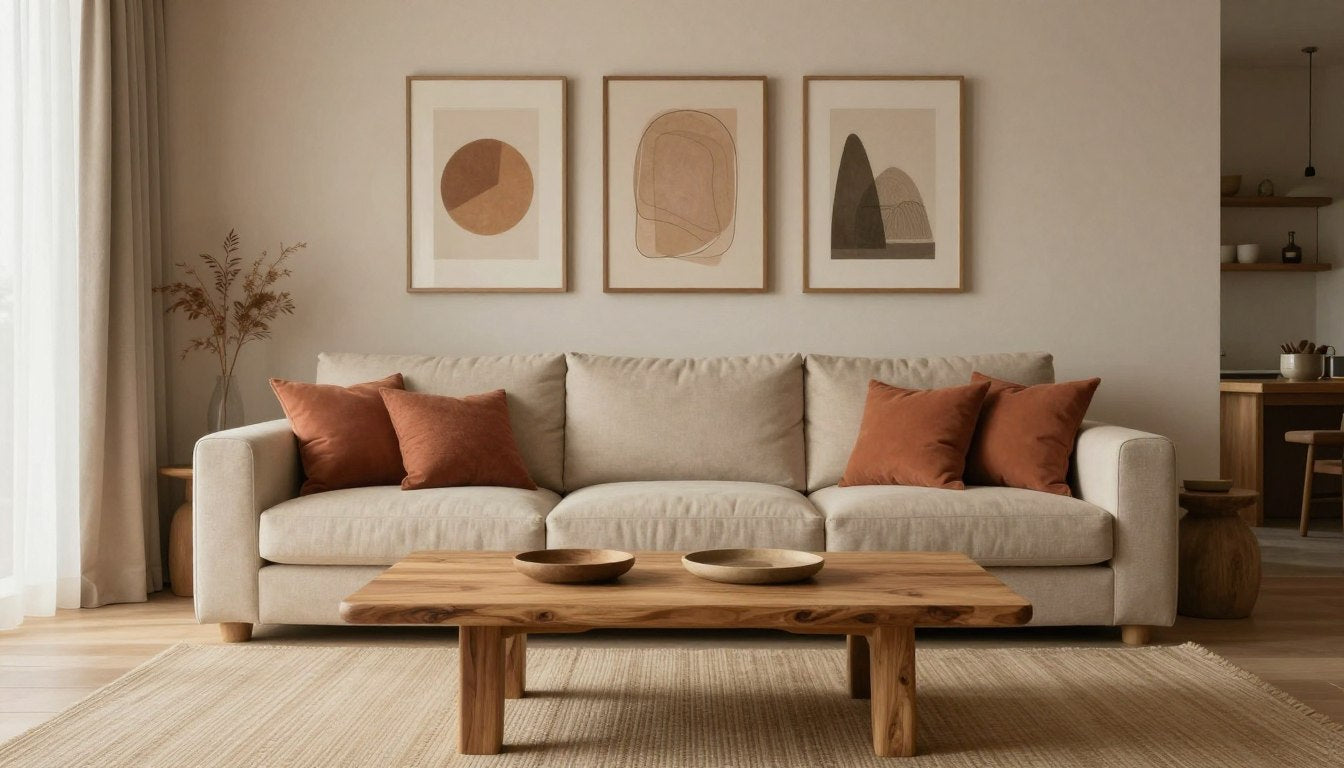
24. Warm Up a Beige Sofa with Terracotta Pillows
This is one of the easiest and most effective ways to introduce terracotta into a neutral space. The key to making it look intentional and not random is volume and variation. Don’t just toss one or two sad pillows on the sofa. Use at least four to six pillows, mixing different textures and shades. Combine a solid linen terracotta pillow with a patterned one, or a smooth cotton with a chunky knit. This layering of tone and texture is what gives the arrangement a rich, designer look.
🧹 Maintenance Reality
This is the perfect budget-friendly update. A neutral beige sofa is a smart, versatile investment. You can completely change the feel of your room seasonally just by swapping out the pillows and a throw. Stores like H&M Home, Zara Home, and even Amazon offer stylish terracotta-toned pillow covers for $10-$30 each. You can get this entire layered, warm look for under $100 and completely transform your living room in an afternoon. It proves that you don’t need a huge budget to make a big impact.
25. Use Soft Blue-Grey Walls to Cool Down Terracotta
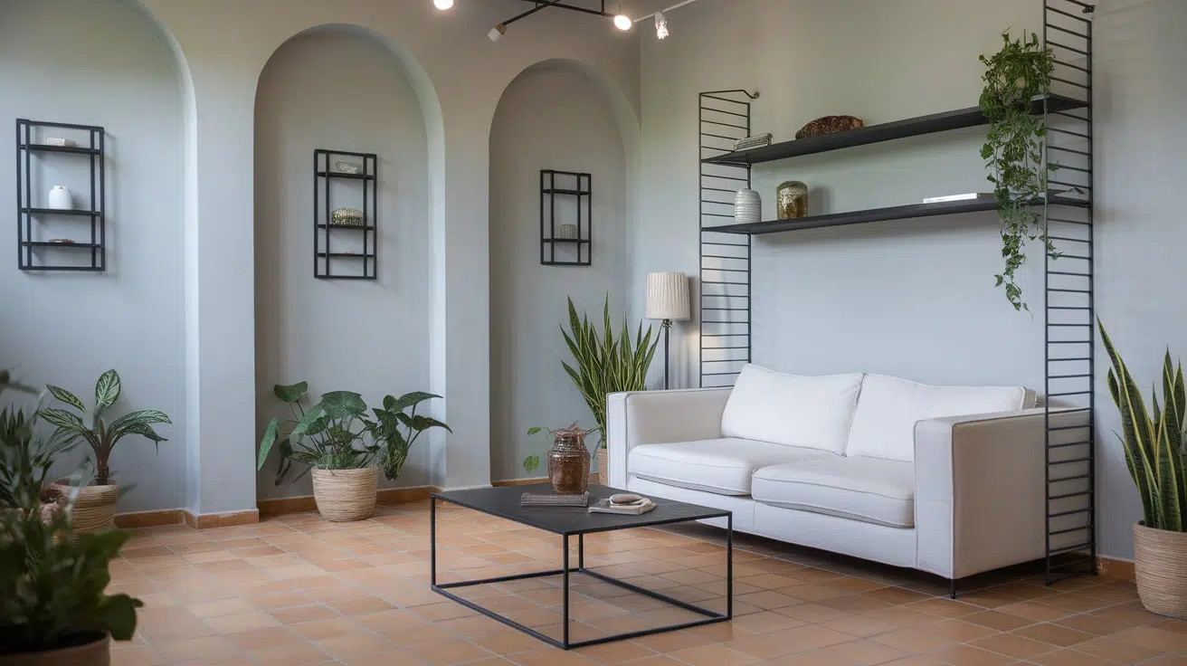
This color combination is a brilliant exercise in temperature balance. The warm, earthy terracotta floor provides a grounding energy, while the soft, light blue-grey on the walls offers a cool, airy counterbalance. This pairing prevents the terracotta from making the room feel too hot or heavy, and it stops the blue from feeling chilly or stark. The white sofa and black accents act as crisp, neutral punctuation marks within this beautifully balanced color story. The addition of green plants further enhances the natural, calming feel.
⭐ The One Thing
The architectural details here are key. The arched alcoves work beautifully with this color palette, adding a soft, organic shape that echoes the relaxed vibe. This idea is fantastic for rooms with interesting architectural features to highlight. It works well in spaces of any size, from a small 100 sq ft den to a large 400 sq ft living room. If you don’t have built-in arches, you can mimic the effect with an arched bookcase or a large, arched mirror to get a similar feel.
26. Add a Terracotta-Toned Rug to a Sage Green Kitchen
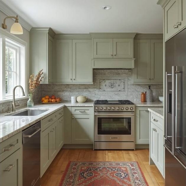
If you have existing wood or neutral floors but crave that terracotta warmth, a rug is your best friend. The trick is to choose a rug where terracotta is a dominant color, but not the only color. Look for a patterned rug, like the one shown here, that incorporates the terracotta red along with other complementary shades like creams, beiges, or even blues. This makes the rug feel like a deliberate bridge between the floor and your cabinetry, tying the whole room together.
💸 Get This Look For Less
The terracotta-toned rug is the single element that makes this kitchen feel special. Without it, the space would be a perfectly lovely but fairly standard sage green and white kitchen. The rug introduces a critical dose of warmth and pattern, grounding the room and giving it a cozy, lived-in personality. It’s the piece that demonstrates a confident and thoughtful approach to color, elevating the design from predictable to truly inspired. Refer back to Idea #9 to see how terracotta can be used as a smaller accent.
27. Combine Sage Green Cabinets, White Brick, and Wood
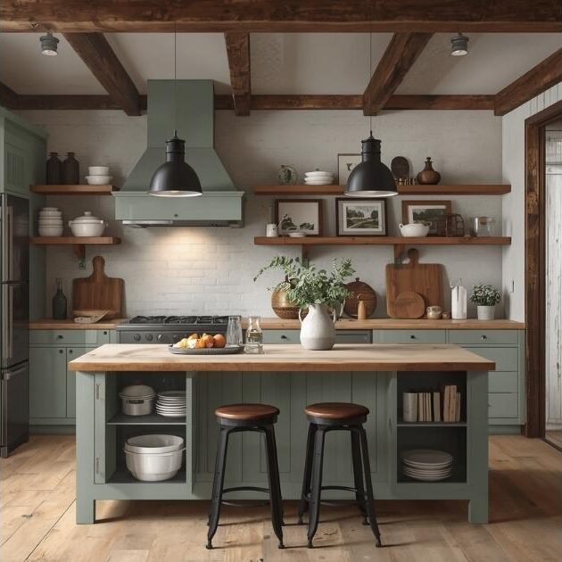
This kitchen is a masterclass in rustic texture. The design works by layering three distinct natural materials. The painted sage green cabinets provide soft, matte color. The exposed wood—on the countertops, shelves, and ceiling beams—introduces organic warmth and grain. Finally, the white painted brick backsplash adds a rough, tactile quality that contrasts with the smoothness of the other surfaces. It’s this rich textural interplay that makes the room feel so grounded, cozy, and full of character.
🎯 What Makes It Work
Natural wood countertops are beautiful, but they are not for the faint of heart in a working kitchen. They must be sealed properly and regularly (with food-safe oil or varnish) to protect them from water damage, staining, and bacteria. Standing water is the enemy and must be wiped up immediately. They will also inevitably get scratches and dings, which can be seen as either charming patina or frustrating imperfections, depending on your personality. A less demanding alternative for a similar look would be a high-quality wood-effect laminate.
28. Define a Space with Patterned Terracotta Floor Tiles
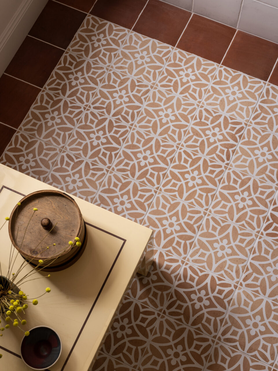
The undeniable showstopper here is the patterned terracotta floor. The intricate white floral-geometric design creates a captivating visual that is both rustic and elegant. It functions like a built-in rug, adding personality and detail without adding clutter. The solid, darker terracotta border is a clever touch that neatly frames the space, giving it a finished, custom look. The rest of the decor can remain simple because the floor does all the talking.
💰 Budget Breakdown
When using a heavily patterned floor, pull your wall and furniture colors directly from the pattern itself. Notice how the light yellow-cream color of the table echoes the lighter tones in the tile pattern, while the dark wood of the decor box picks up on the darker terracotta border. This creates an instant, no-fail color harmony. Don’t introduce a new, competing color; let the floor be your guide for a cohesive and polished look.
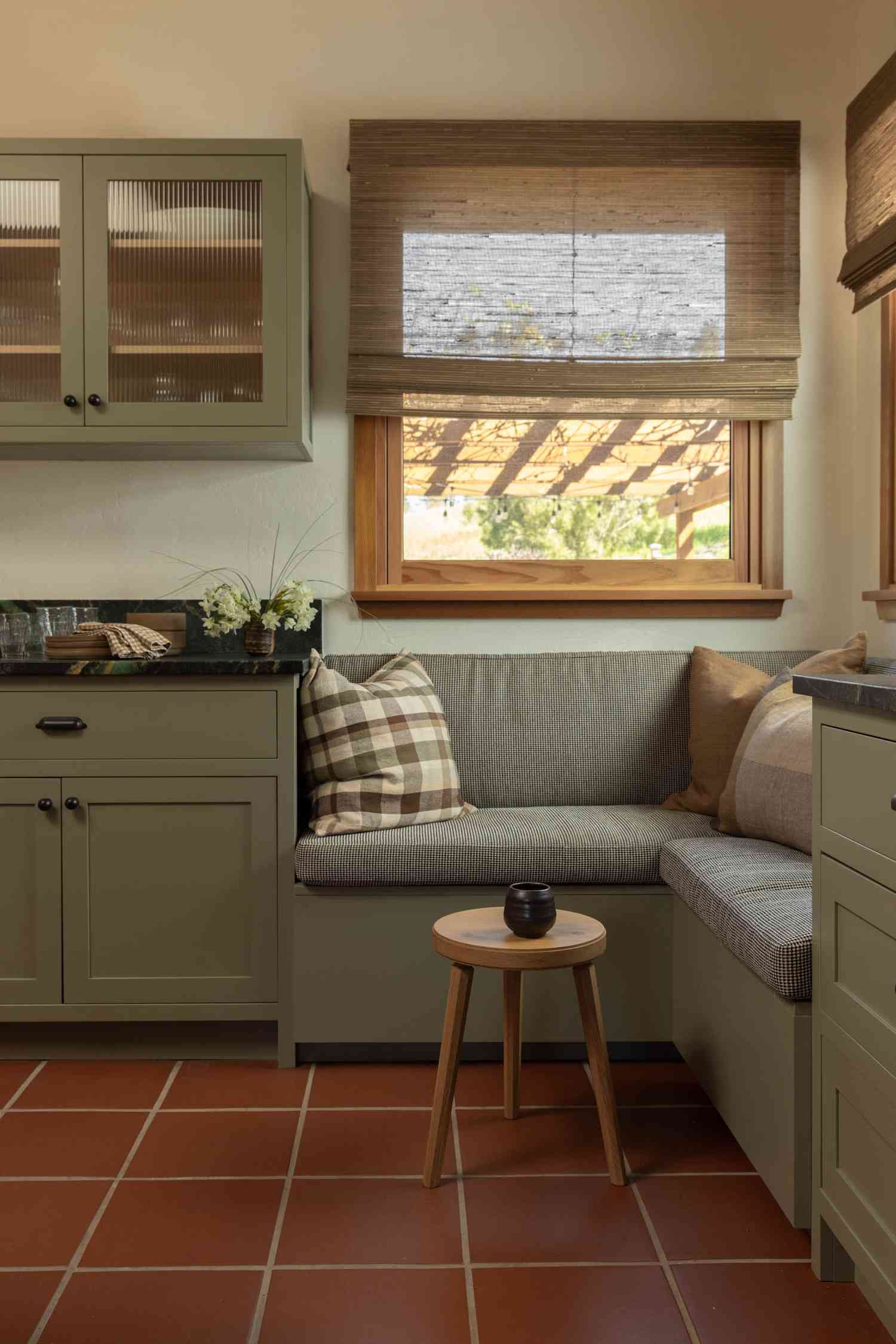
29. Create a Cozy Nook with Olive Green and Terracotta
This cozy corner follows a simple, earthy formula: 50% Olive Green (cabinetry), 40% Terracotta (floor), and 10% Natural Neutrals (wood tones, woven shades, cream pillows). The deep, calming olive green is the star, providing a sense of enclosure and comfort. The terracotta floor adds a foundational warmth that keeps the green from feeling too dark. The small touches of wood and cream are essential for adding texture and a bit of brightness. This is a perfect palette for creating an intimate, welcoming space.
🔧 How-To Brief
A built-in bench is a fantastic space-saver, but comfort is key to making it a place people actually want to sit. A bare wooden bench is fine for a few minutes, but for lingering over coffee, you need proper cushioning. Invest in a seat cushion that is at least 3 inches thick, made from high-density foam. Don’t skimp on back pillows, either. A mix of shapes and sizes makes the nook more comfortable and adds to the cozy, layered look.
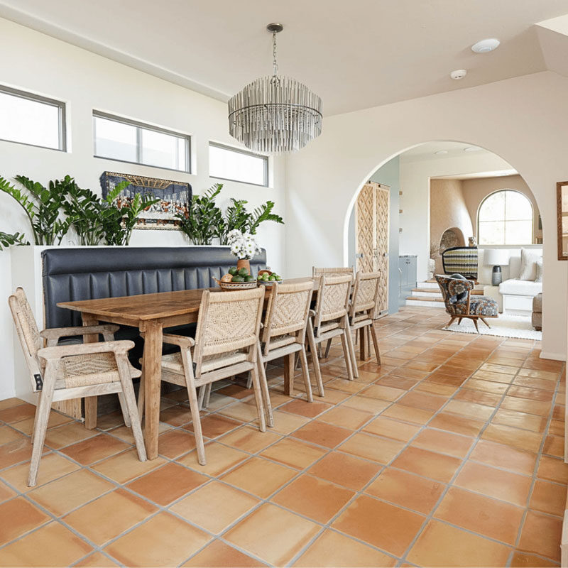
30. Contrast a Dark Bench with White Walls and Terracotta Floors
This dining area is successful because of its strong use of contrast. The bright white walls and light terracotta floor create an airy, luminous base. Against this, the dark, tufted built-in bench provides a dramatic, grounding anchor. This high contrast between light and dark creates a dynamic visual tension that is very sophisticated. The natural light wood of the table and woven chairs act as a crucial mid-tone, bridging the gap between the white and black and adding necessary warmth.
📐 Style Math
When you have a strong focal point like this dark built-in bench, you don’t need much else to make a statement. Keep the surrounding elements relatively simple. The choice of a simple, light wood table and classic woven chairs is intentional. It allows the bench to be the hero piece without competing for attention. If the table and chairs were also dark or overly ornate, the space would feel heavy and cluttered. Let your statement piece shine by supporting it with quieter partners.
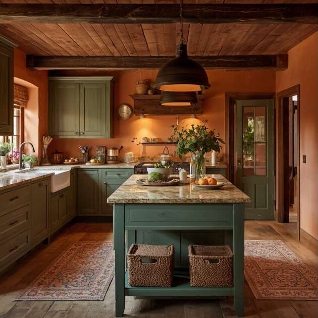
31. Wrap a Room in Warmth with Terracotta Walls and a Wood Ceiling
This is a full-immersion approach to warmth and works best in a kitchen or dining space that you want to feel exceptionally cozy and rustic. Because you’re using warm, and often dark, colors on multiple large surfaces (walls, ceiling), this look requires a room with high ceilings (9 feet or more) and good natural light to avoid feeling cramped. It’s perfect for a farmhouse, a cabin, or any home where you want to create a rustic, lodge-like atmosphere. A smaller room could achieve a similar feel by using terracotta on just one wall, like in Idea #8.
✅ Before You Start
A look this bold and specific can affect resale value. While it’s stunningly cozy and unique, a buyer with more minimalist or modern tastes might be intimidated by the amount of fixed rustic elements like the wood plank ceiling and terracotta walls. If you plan to sell in the next few years, you might consider achieving a similar vibe with elements that are easier to change, like paint (on the walls) and rugs, rather than committing to permanent ceiling and wall treatments.
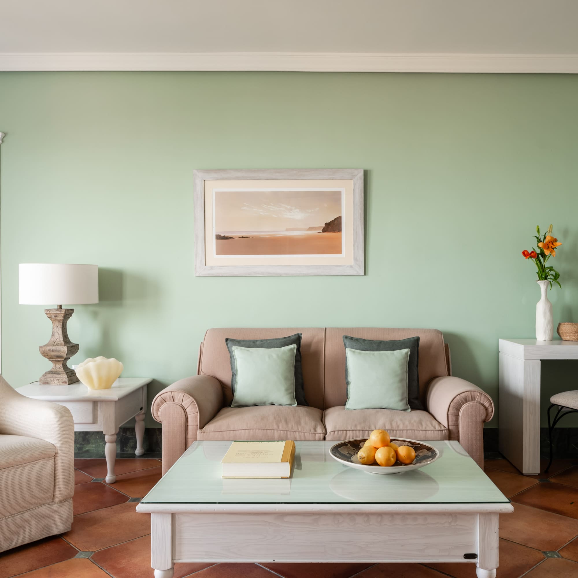
32. Choose Sandy Green Walls and Light Wood Furniture
This living room feels so calm and cohesive because it sticks to a narrow, nature-inspired palette. The sandy green of the walls is a soft, muted color that evokes a sense of tranquility. The terracotta floor provides an earthy base. The key is the light-washed wood finish on all the furniture, which harmonizes everything and keeps the room feeling light and airy. Even the pillows are in muted shades of green and grey. By avoiding any loud or contrasting colors, the room maintains a serene, rustic, and unified atmosphere.
📏 Scale Guide
This light, rustic look is very attainable without a huge investment. The focus is on finishes and colors rather than expensive, high-end pieces.
- Main Furniture (Sofa & Armchair): $1,500 – $4,000
- Wood Furniture (Coffee & Side Tables): $400 – $1,000
- Textiles (Rug, Pillows): $300 – $700
- Paint & Floor Accents: $200 – $500
- TOTAL: $2,400 – $6,200
- Budget alternative: Find secondhand wood furniture and give it a light sanding or a wash of diluted white paint. Shop for sofas at discount retailers and focus on bringing in the color with affordable pillows and paint. The look can be achieved for under $1,500.
Your Terracotta Color Story Starts Here
Armed with these 32 ideas, you can see just how versatile and beautiful terracotta floors can be. Whether you’re drawn to the warmth of pinks and mustards or the calm of blues and greens, there’s a palette waiting for you. Don’t be afraid to experiment with color to create a space that feels uniquely you. Ready to pick your palette? Pin your favorite looks from this article to your board and start telling your own color story.