You know that feeling? You’ve pinned a hundred colorful living rooms, but when you look at your own space, you can’t figure out how to make that magic happen. It’s a common roadblock! After filtering through countless options from IKEA, Target, and even Facebook Marketplace, we narrowed it down to 32 ideas that actually deliver. In this guide, you’ll find 32 curated ideas covering vibrant, eclectic, and modern bohemian styles. These are the looks that are defining 2026, driven by a desire for more personal, joyful spaces that truly feel like home. And stay until the end — we break down the most common mistakes that can ruin these looks. 📌 Save this to Pinterest for later — you’ll want to revisit these ideas.
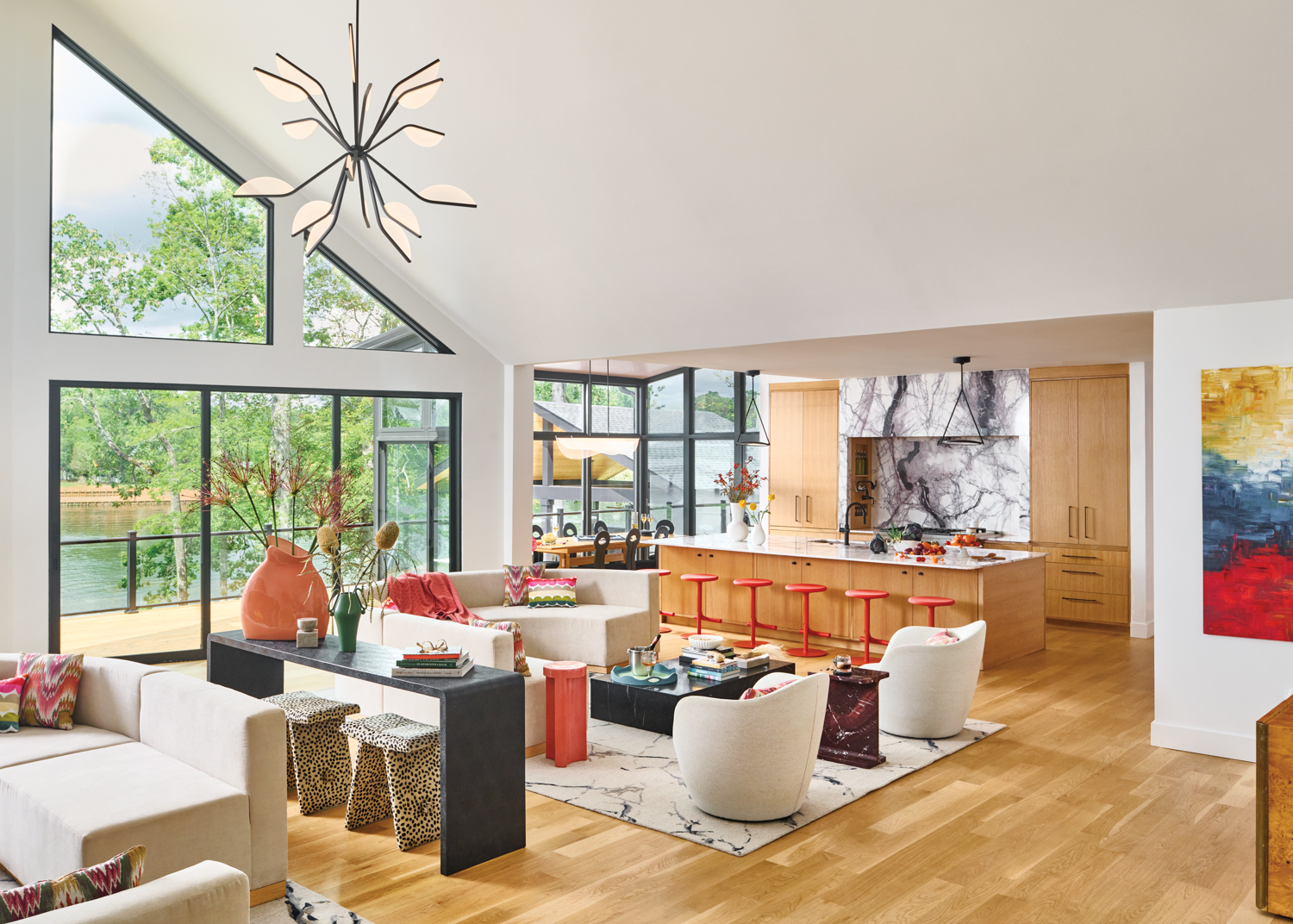
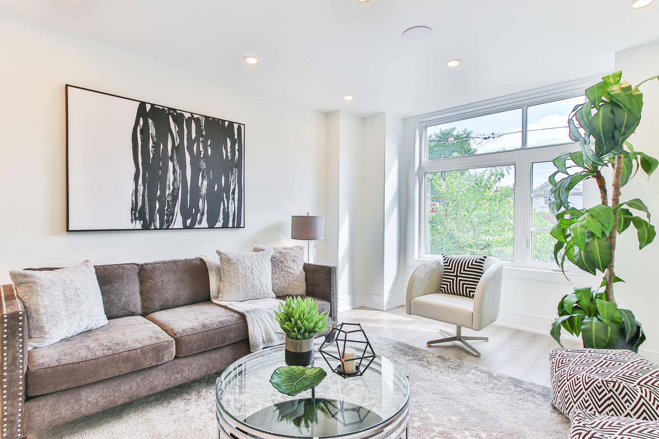
1. Open-Concept Living with Red-Orange Accents
This space nails the “neutral-with-a-pop” concept perfectly. The foundation of off-white seating, a light rug, and white vaulted ceilings creates a massive, airy canvas. This allows the hits of bold red and coral in the artwork and stools to feel intentional and powerful, not overwhelming. The success here also comes from repetition; the same fiery hue appears in multiple spots, guiding your eye through the large, open room and tying the living, dining, and kitchen areas together seamlessly.
📐 Style Math
An open-concept layout like this thrives with high ceilings—aim for at least 10 feet, though the vaulted ceiling here is closer to 16-20 feet at its peak. This idea is best suited for a larger footprint, typically 300 sq. ft. or more for the main living area, to prevent the sectional sofas from visually crowding the space. The large, black-framed windows are key; without that much natural light, the neutrals could fall flat and the colorful accents might not pop as brilliantly.
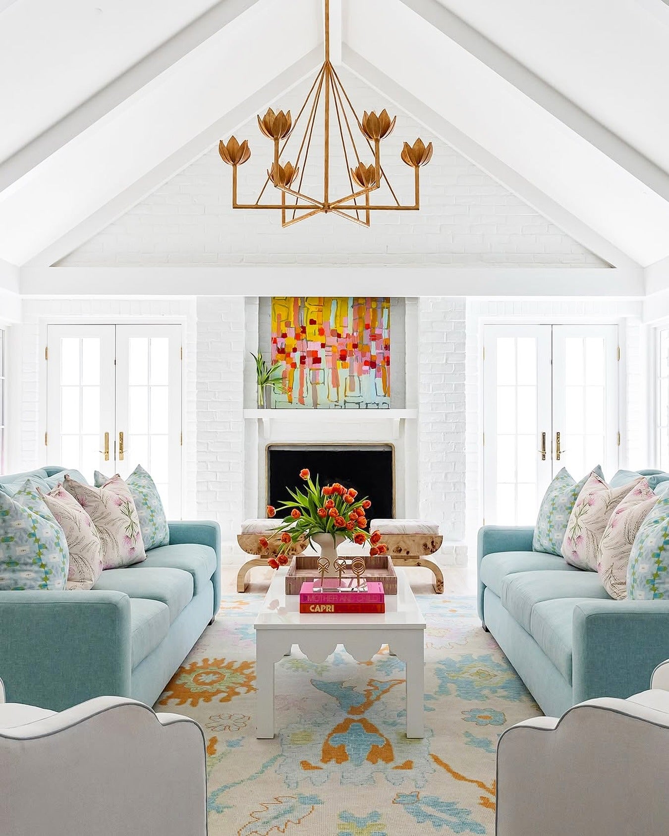
2. Symmetrical Layout with Twin Light Blue Sofas
When using a symmetrical layout with two facing sofas, the distance between them is critical. Aim for 48 to 60 inches between the sofas to create an intimate conversation area that doesn’t feel cramped. This leaves just enough room for a substantial coffee table without disrupting the walkway. Also, ensure your area rug is large enough that the front legs of both sofas can rest on it, which unifies the entire grouping.
💡 Designer Tip
that makes this room sing is the bold, abstract painting above the fireplace. Remove it, and the room is still pleasant, but it loses its soul. The artwork injects a dose of vibrant, chaotic energy that beautifully contrasts with the structured, symmetrical furniture layout. It provides all the accent colors—pink, orange, green—that are then sprinkled around the room in the pillows and decor, making the whole design feel cohesive and deliberate.
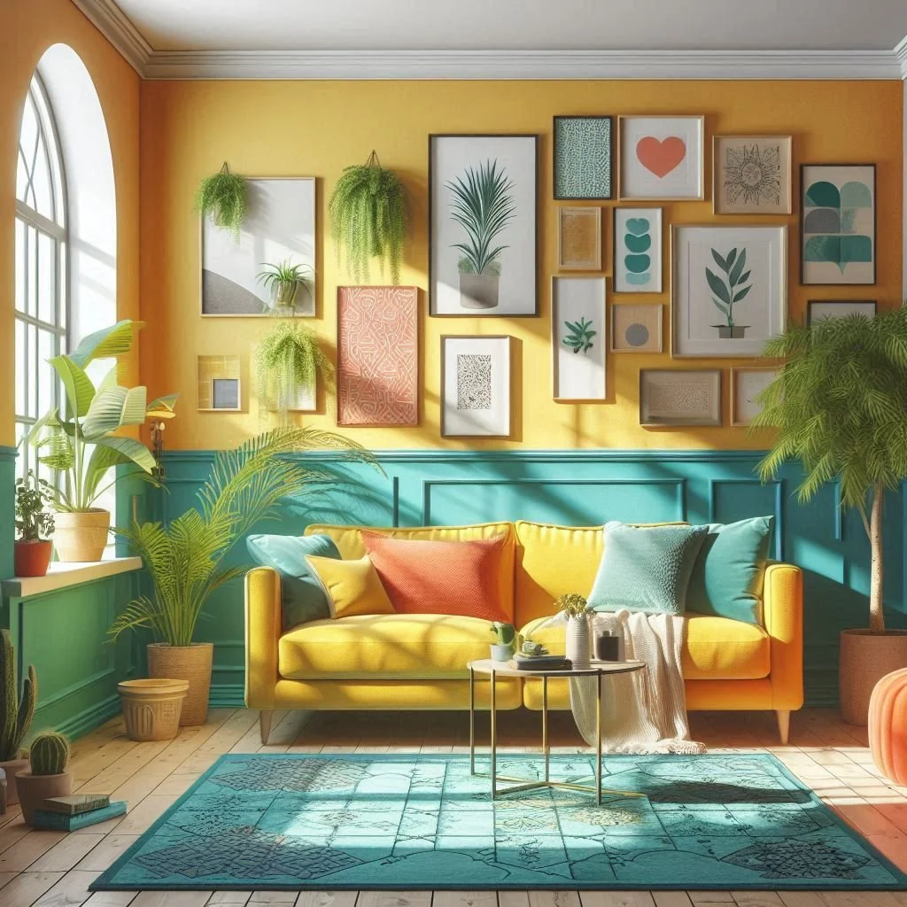
3. Vibrant Reading Nook with a Teal and Yellow Palette
This look is a masterclass in fearless color pairing. The formula is roughly: 50% bold wall color (the sunny yellow), 30% strong accent color (the deep teal wainscoting and rug), and 20% neutral/natural tones (the white archway and wood frames) to keep it grounded. The key is that the yellow and teal are equally saturated. If you were to swap colors, maintain that intensity balance. Imagine a deep magenta with a forest green, or a burnt orange with a navy blue—the same vibrant energy would remain.
📏 Scale Guide
A gallery wall of this scale is a serious commitment. It can easily look cluttered if not curated with care. You’ll need to collect frames of various sizes and finishes, and the art itself should have a loose theme (like the botanical and abstract prints here) to feel cohesive. Be prepared for a lot of measuring and layout planning *before* a single nail goes in the wall. This isn’t a weekend project you can just wing; it requires a good eye and a bit of patience to get right.
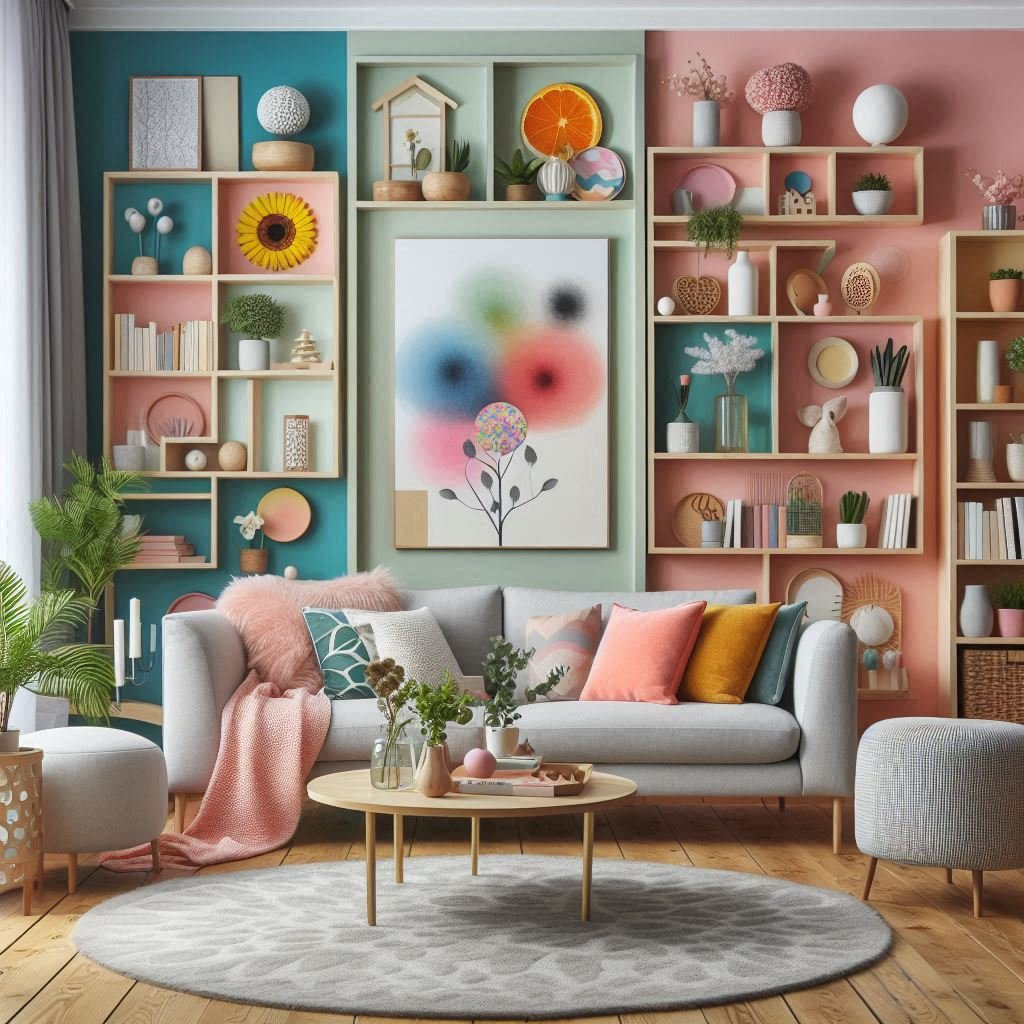
4. Pastel Color-Blocking with Integrated Shelving
The genius of this design is how the integrated shelving breaks up the pastel color-blocking. Instead of just having large, flat areas of pink and teal, the wooden grid adds structure, warmth, and a place for the eye to rest. This is a clever use of negative space. Furthermore, the abstract floral art isn’t just decor; it’s a roadmap for the room’s palette, containing all the pinks, greens, and blues used on the walls, making the entire concept feel harmonious.
🔥 Trending Context
Before you commit to a color-blocked wall with built-ins, consider these points:
- Wall Condition: Is your wall perfectly smooth? This technique highlights every imperfection. Patch and sand thoroughly first.
- Light Source: How does light hit this wall during the day? Test your pastel paint samples at different times to ensure they don’t wash out or look muddy.
- Shelf Depth: Plan the depth of your shelves based on what you want to display. Deeper shelves (10-12 inches) are more practical but visually heavier than shallower ones (6-8 inches).
- Commitment Level: This is a high-commitment look. Are you certain you’ll love these colors for a few years? It’s not as simple as a single-color repaint.
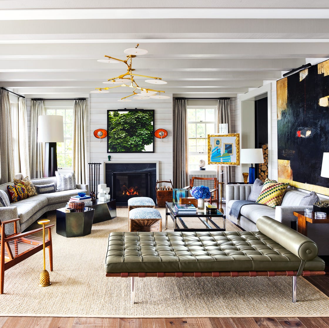
5. Playful Living Room with a Geometric Rug
This room is all about the geometric area rug. It’s the undeniable hero piece that dictates the entire vibe. Every other element—the light grey sofa, the simple mid-century furniture, the pastel accents—is chosen to support it. If you swapped this rug for a plain jute one, the room would instantly feel 90% less energetic and playful. It’s the foundation of the color palette and the source of the room’s youthful, graphic personality. Compare this with the more muted pastels in Idea #4 to see how a rug can change everything.
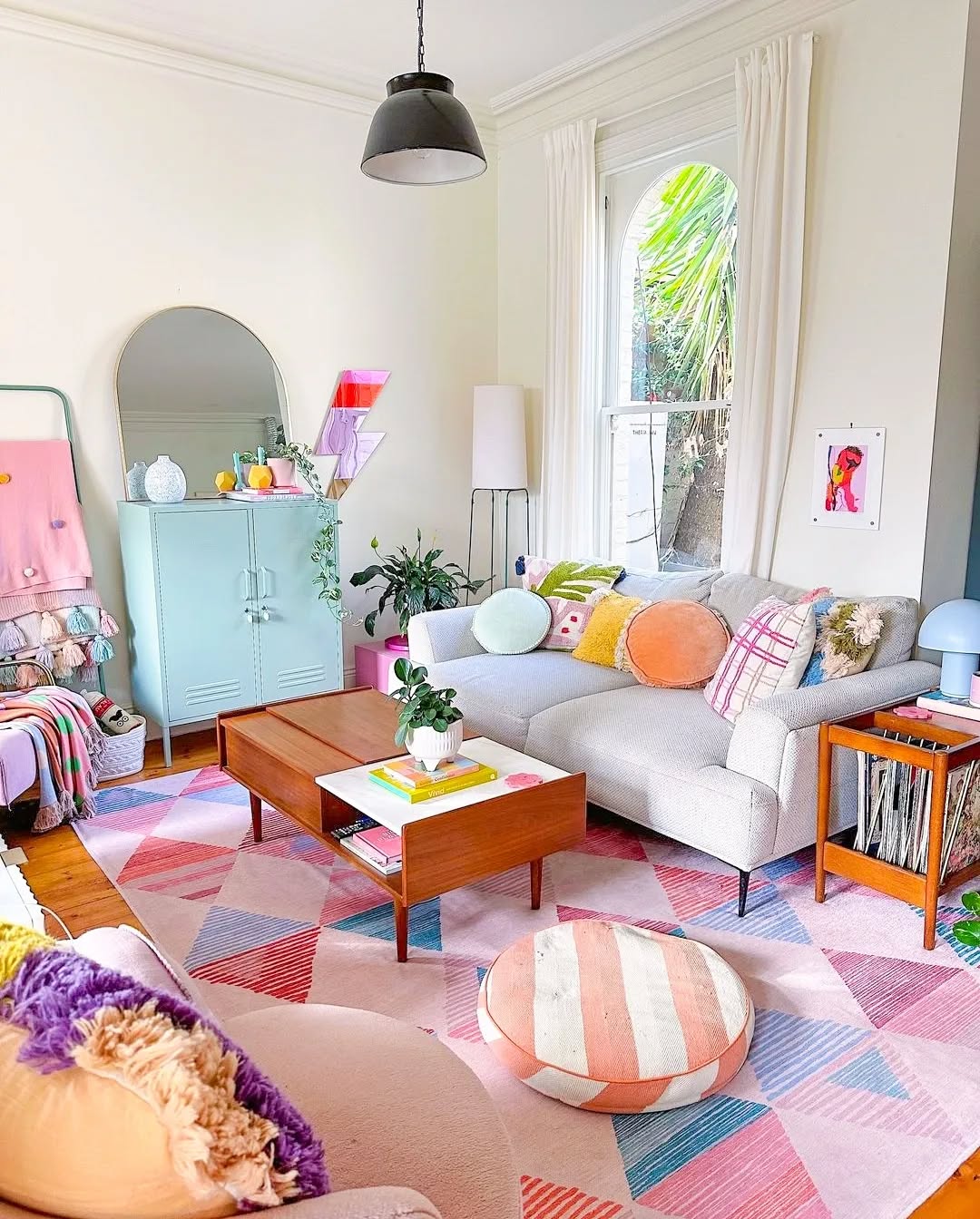
🎯 What Makes It Work
You can absolutely get this look for less. The key is finding that statement rug. Look for bold, graphic rugs at places like IKEA or Target for under $300. Pair it with a simple, affordable sofa like IKEA’s SÖDERHAMN or a find from Facebook Marketplace ($200-$500). The mid-century modern coffee and side tables are classic thrift store finds. A can of pastel blue paint on a simple metal cabinet from Walmart or a thrift store replicates the storage piece perfectly. The playful vibe comes from styling, not the price tag.
6. Beige Sofa with Pink, Green, and Gold Accents
When using multiple, highly saturated accent pillows on a neutral sofa, the key to a polished look is symmetry and repetition. Notice how the arrangement isn’t random. There’s a clear pattern of color and shape. To replicate this, buy pillows in pairs and arrange them symmetrically. For an odd number, place the most unique pillow (like the center lime green one here) in the middle. This prevents the sofa from looking like a chaotic jumble of clearance-bin finds.
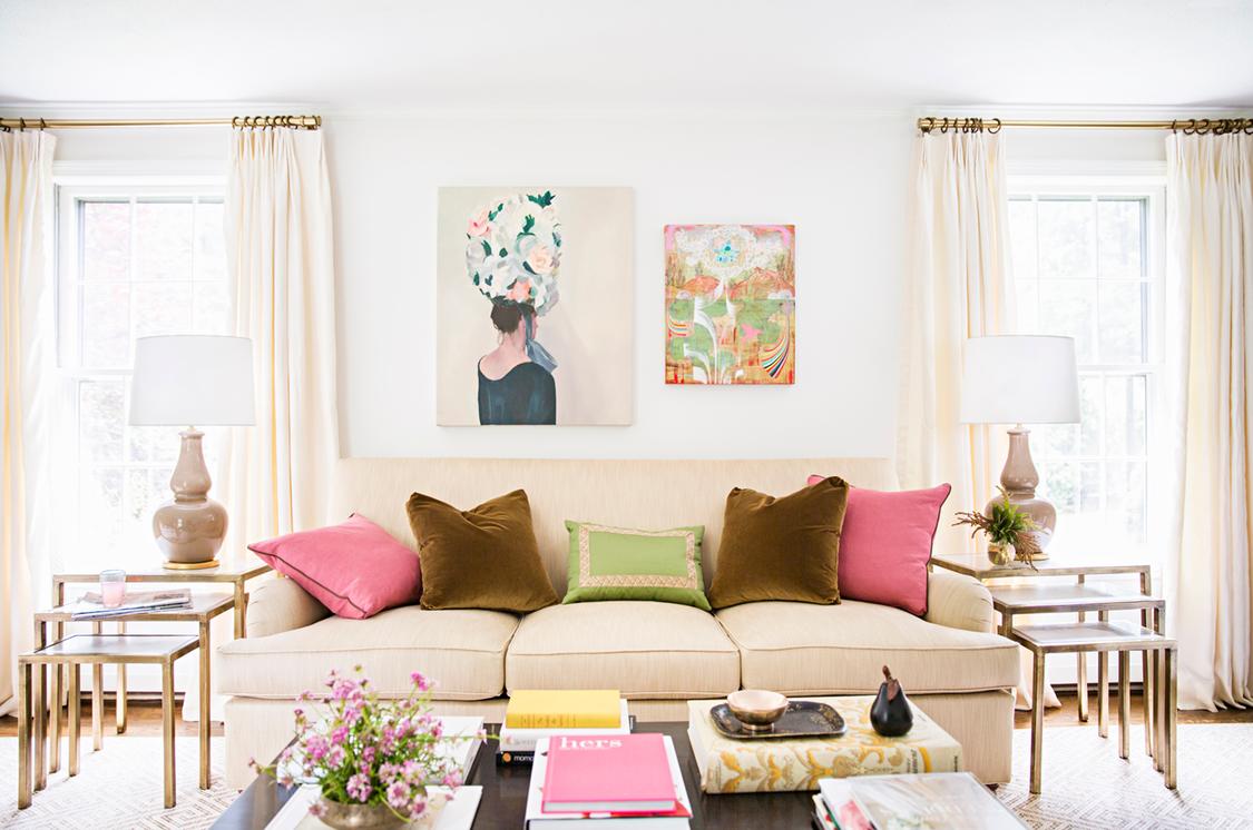
💸 Get This Look For Less
What makes this work is the confident use of contrast. The hot pink and lime green are vibrant, almost neon, against the calm, light beige sofa. It’s an unexpected color combination that feels fresh and modern. The warmth is brought in through the repeated use of gold in the nesting tables, curtain rods, and even the subtle tones of the artwork. This metallic element acts as a bridge, tying the cool neutrals and hot accents together into a cohesive, glamorous look.
7. Bohemian Eclectic with a Teal Velvet Sofa
A velvet sofa, especially a tufted one like this, is a commitment. The tufting creates crevices that are magnets for dust, crumbs, and pet hair. You’ll need to vacuum it regularly with an upholstery attachment. While beautiful, velvet can also be prone to ‘bruising’ or marking where the pile gets crushed. For a similar look with less stress, consider a performance velvet or a flat-weave fabric in the same rich teal color. The vibrant patterned rug is more forgiving, as its busy design is excellent at hiding minor stains.
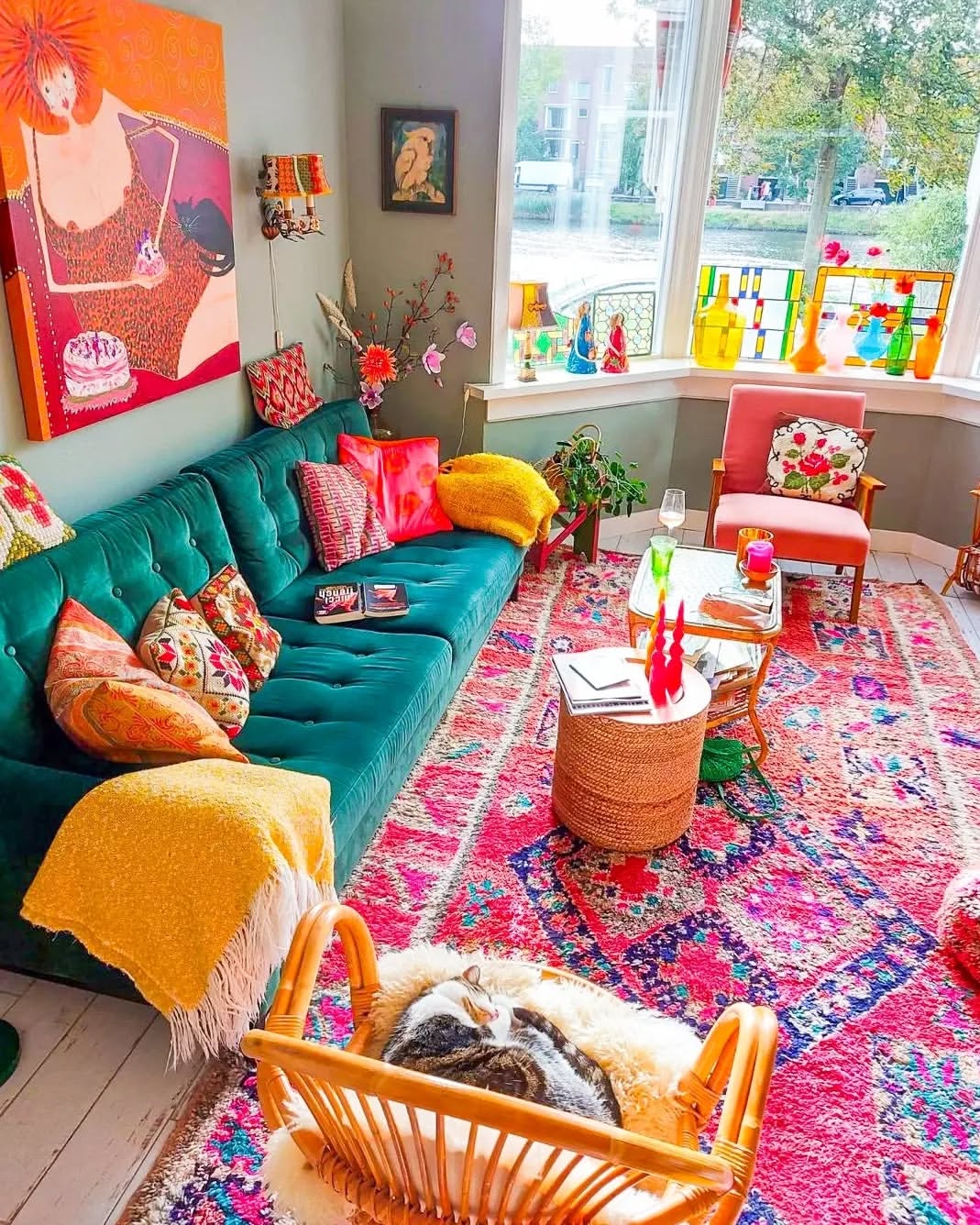
🧹 Maintenance Reality
The “bohemian eclectic” or “maximalist” vibe has been trending on Pinterest for a while, and it shows no signs of slowing down. It’s a direct reaction against years of stark minimalism. People are craving spaces that feel personal, collected, and joyful. This look, with its mix of colors, textures, and personal objects (like the glass in the bay window), tells a story. It says, “I love color, I collect things, and I’m not afraid to show it.” It’s a design style that celebrates individuality over perfection.
8. Modern Room with Dynamic Purple and Blue Lighting
You can recreate this ambient lighting effect with smart LED light strips. It’s a surprisingly straightforward DIY project.
- Time Estimate: 1-2 hours
- Cost: $50 – $150
- Step 1: Purchase a quality smart LED strip kit (like Philips Hue or Govee) that allows for color changes via an app.
- Step 2: Plan your placement. Tucking the strips behind a bookshelf, under a sofa, or along the top of a wall will create a diffused glow.
- Step 3: Clean the surface where you’ll stick the lights. Most strips have a self-adhesive backing.
- Step 4: Apply the strips, configure them with the app, and start experimenting with color combinations like the purple and blue seen here!
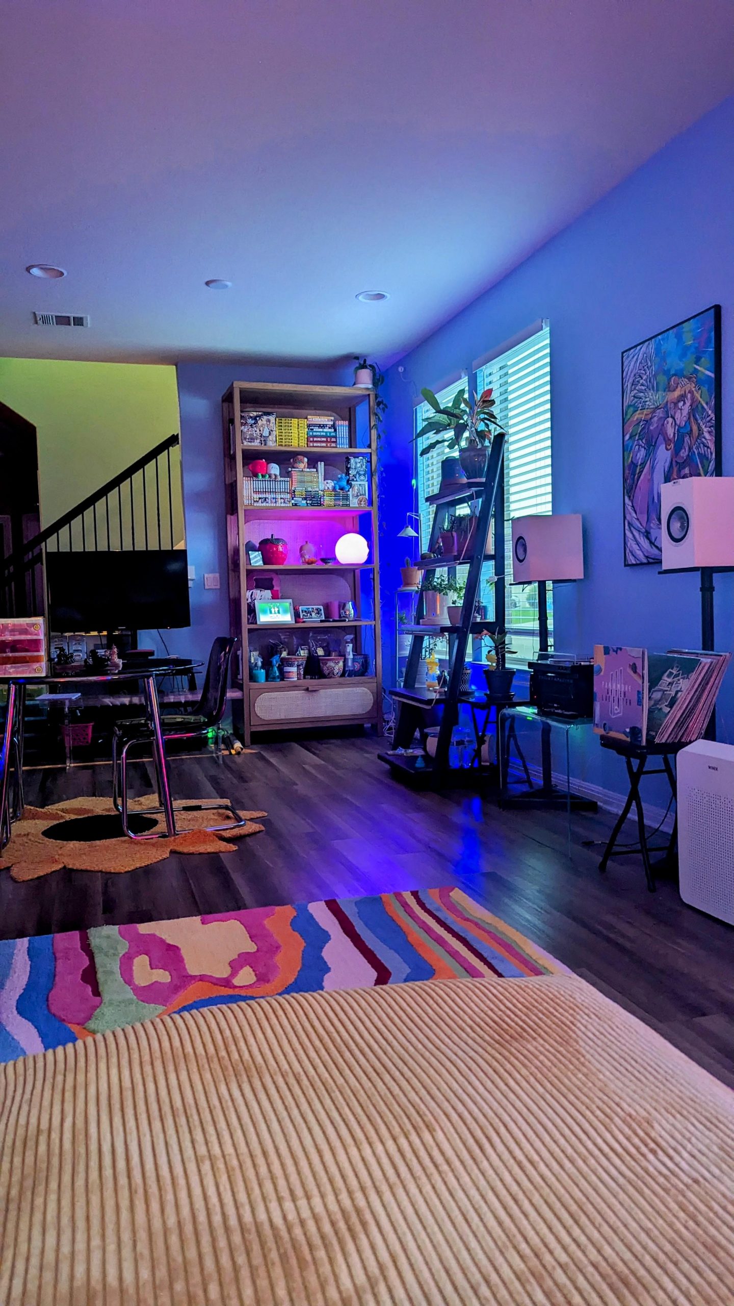
⚠️ Real Talk
While this lighting looks incredibly cool, be aware that it can dramatically alter the appearance of your decor. The blue wall paint here is the perfect canvas because it harmonizes with the lighting. However, if you have warm-toned walls (like beige or cream) or furniture, this cool-toned light wash can make them look muddy and unflattering. This effect is best reserved for rooms with a cool or neutral base palette. It’s a fantastic party trick, but maybe not the lighting you want for a quiet evening reading a book.
9. Playful Modular Sofa in Red, Pink, and Orange
The single element holding this entire room together is bravery. Specifically, the bravery to commit to a multi-colored modular sofa. It’s an unconventional choice that becomes the undeniable centerpiece and dictates every other decision. If this were a simple grey sectional, the room would be pleasant but forgettable. The sofa *is* the design. The sculptural armchair and abstract art are fantastic supporting characters, but the sofa is the star of the show.
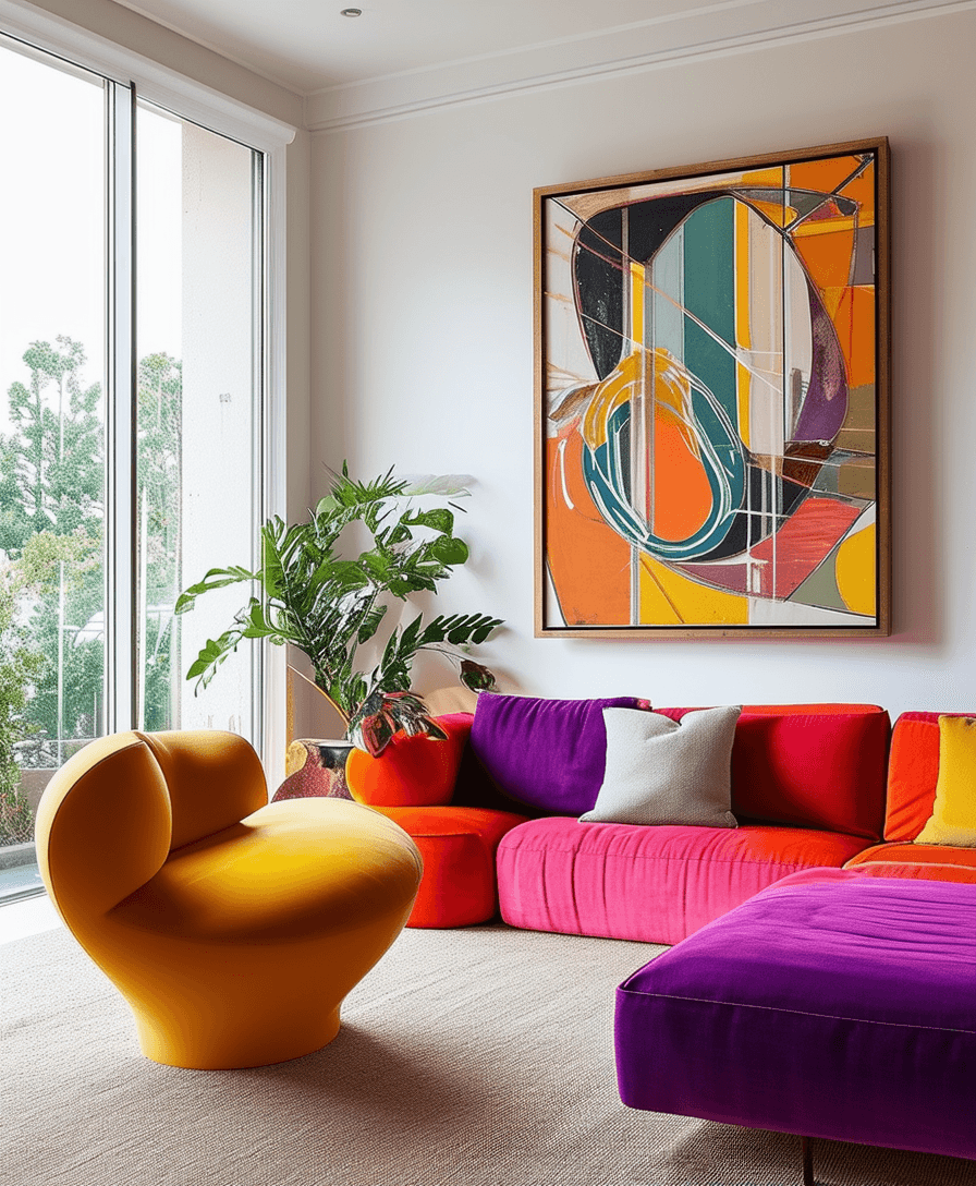
💰 Budget Breakdown
This look operates on a high-energy analogous color scheme formula. It’s about 80% warm adjacent colors (red, pink, orange), 15% a cool contrasting accent (the purple cushion), and 5% a wild card (the mustard yellow chair). The key is the saturation—every color is cranked up to its most joyful potential. You could swap the base palette to blues and greens, with a pop of orange and a pink chair, and the energetic, playful formula would still hold true.
10. Bold Eclectic Look with a Magenta Sofa
This room is a lesson in confident clashing. A magenta velvet sofa, a leopard print armchair, and a teal and orange rug shouldn’t work together in theory, but they do. Why? Because each piece is unapologetically bold. The design succeeds by going all-in instead of being timid. The crisp white walls provide a clean backdrop that prevents the riot of color and pattern from becoming claustrophobic. The simple glass coffee table adds function without introducing another competing visual element.
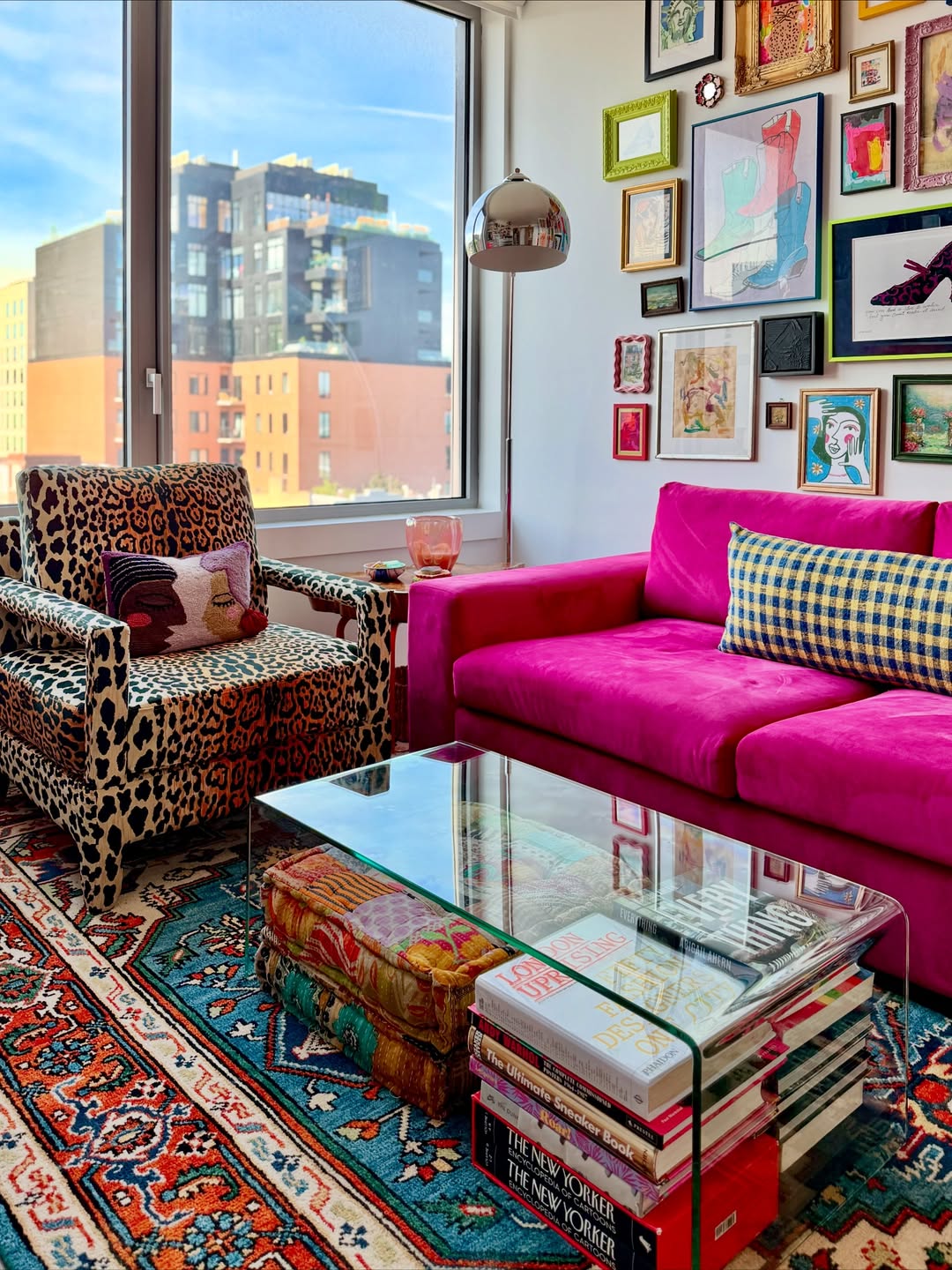
🔧 How-To Brief
A magenta velvet sofa can be a splurge. To get this high-energy eclectic look on a budget, focus on the layers. Start with a more affordable sofa in a neutral color from a store like Target. Then, go wild with accessories. Find a bold leopard print throw blanket instead of a whole chair. Scour thrift stores and Facebook Marketplace for a collection of mismatched frames to create your own gallery wall for under $50. A vibrant, patterned rug from IKEA can provide the color anchor for a fraction of the cost of a vintage one.
11. Calm and Neutral Space with Natural Wood Tones
This serene, nature-inspired look is part of the larger “Japandi” trend—a hybrid of Japanese minimalism and Scandinavian function. It’s gaining traction because it offers a calming retreat from a chaotic world. The emphasis is on natural materials (wood, woven fibers, linen), a muted color palette, and uncluttered surfaces. It’s about finding beauty in simplicity and craftsmanship, which feels grounding and authentic in 2026. This is the perfect backdrop for a quiet, mindful life. Compare the tranquility here to the vibrant energy of Idea #27.
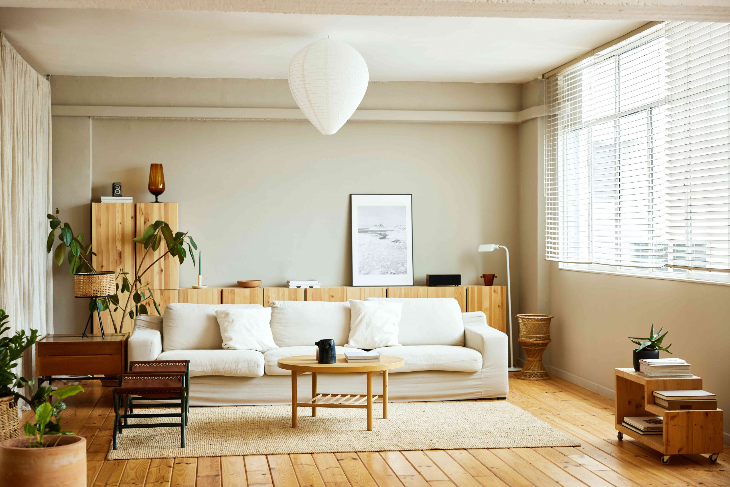
⭐ The One Thing
An all-white or off-white sofa is undeniably chic, but it requires care. A slipcover, like the one here, is your best friend. Choose a machine-washable one and be prepared to launder it every couple of months (or more, if you have pets or kids). The light wood floors and furniture are relatively low-maintenance, but beware of placing potted plants directly on them without a waterproof saucer, as water rings are the enemy of beautiful wood.
12. Beige Corduroy Sectional with a Bright Orange Table
The hero of this room is unquestionably the orange acrylic coffee table. It provides a jolt of pure, unapologetic color that electrifies the otherwise soft and neutral foundation of the beige corduroy sofa and pink floor. Its translucent, glossy finish contrasts beautifully with the plush, matte texture of the sofa. Without this specific piece, the room would lose its focal point and its playful, modern edge. It’s a perfect example of how one daring choice can define a whole space.
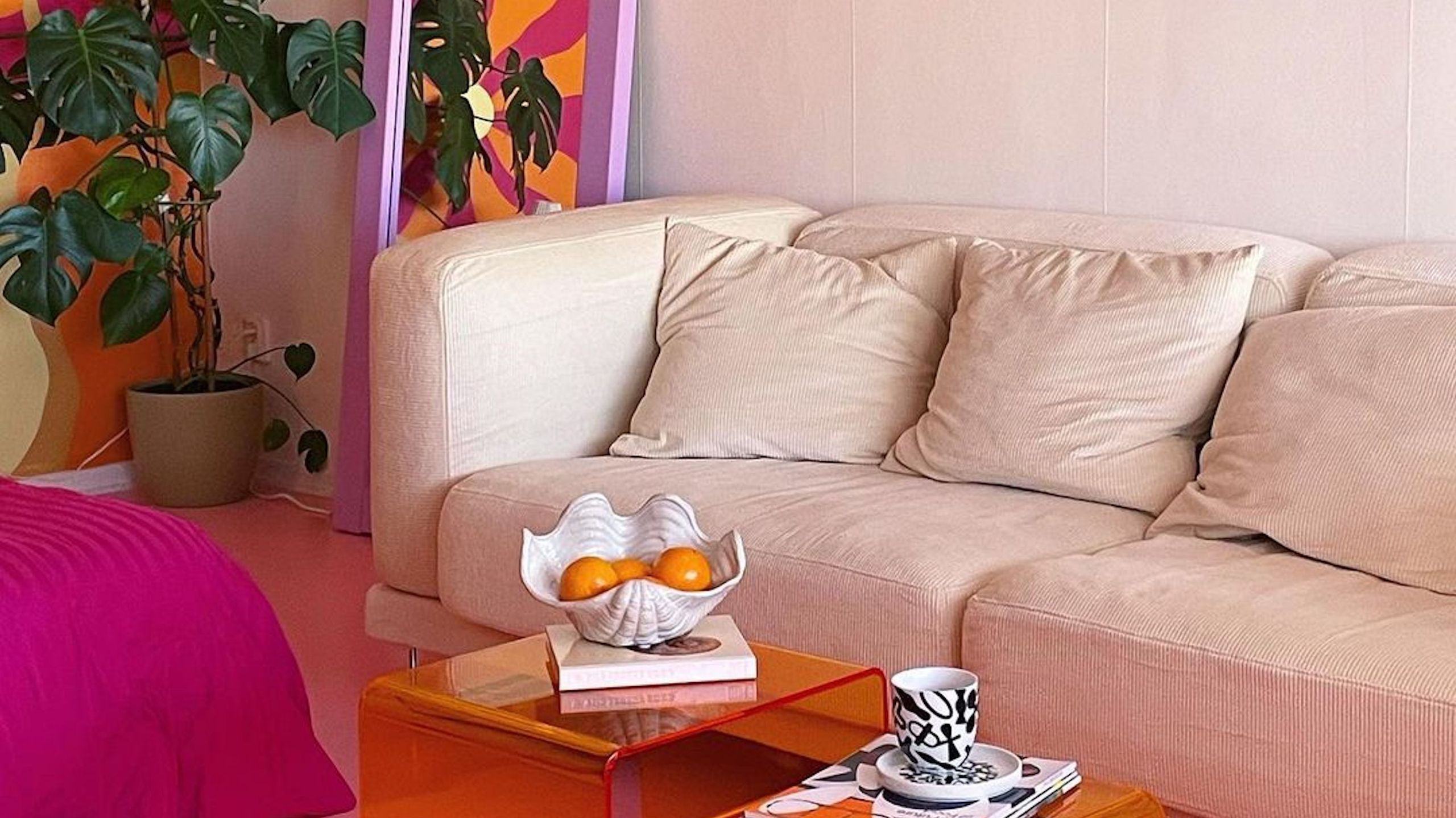
✅ Before You Start
A corduroy sofa is incredibly cozy, but the fabric’s signature ridges (or “wales”) can be a trap for dust and crumbs. Regular vacuuming with an upholstery tool is a must. Also, be mindful of spills; the texture can make it tricky to clean spots evenly. The glossy acrylic coffee table is another piece that looks amazing but shows every single fingerprint and speck of dust. If you’re a stickler for pristine surfaces, you might find yourself constantly wiping it down.
13. Lived-In Room with a Blue and White Patterned Rug
Here’s the formula for this cozy, collected look: 50% neutral base (the light beige walls and fireplace), 30% dominant color (the royal blue in the rug), 15% warm texture (the light brown leather sofa and wood tones), and 5% quirky extras (the assorted mantel decor and plants). The rug is doing the heavy lifting for the color story, allowing the rest of the pieces to be a mix of styles and materials unified by that wonderful blue.
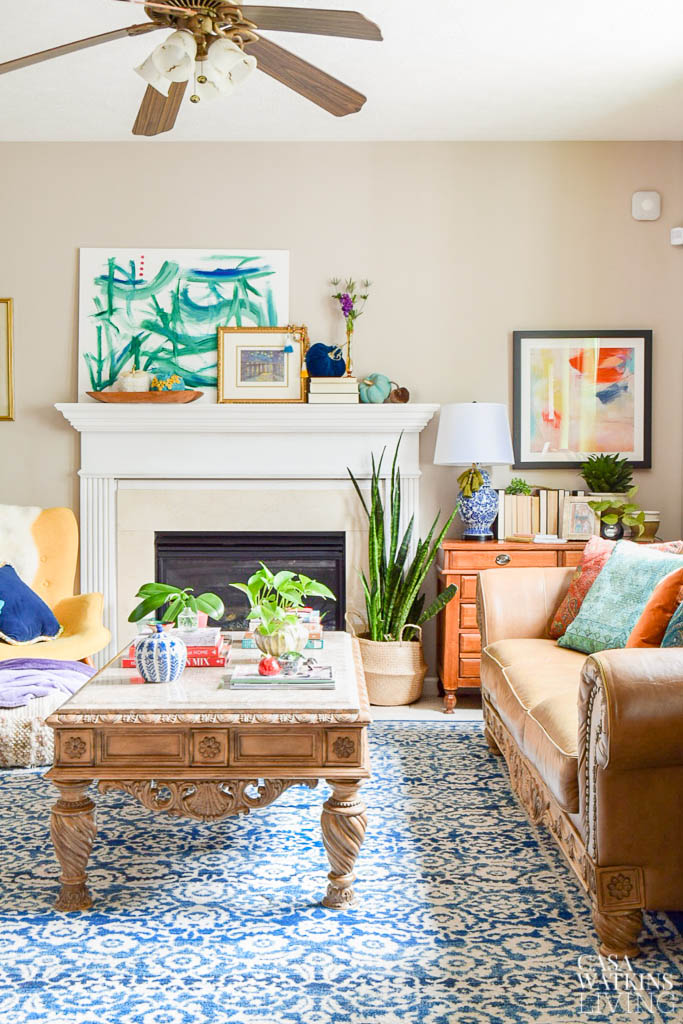
📐 Style Math
Don’t be afraid to mix wood tones, as long as you have a connecting thread. In this room, the carved coffee table, the frame on the large abstract piece, and other small wooden objects all live in the same warm, medium-brown family. The key is to keep the undertones consistent. If you have a warm oak floor, stick with other warm woods like walnut or teak, rather than introducing a cool, ashy grey wood that would clash.
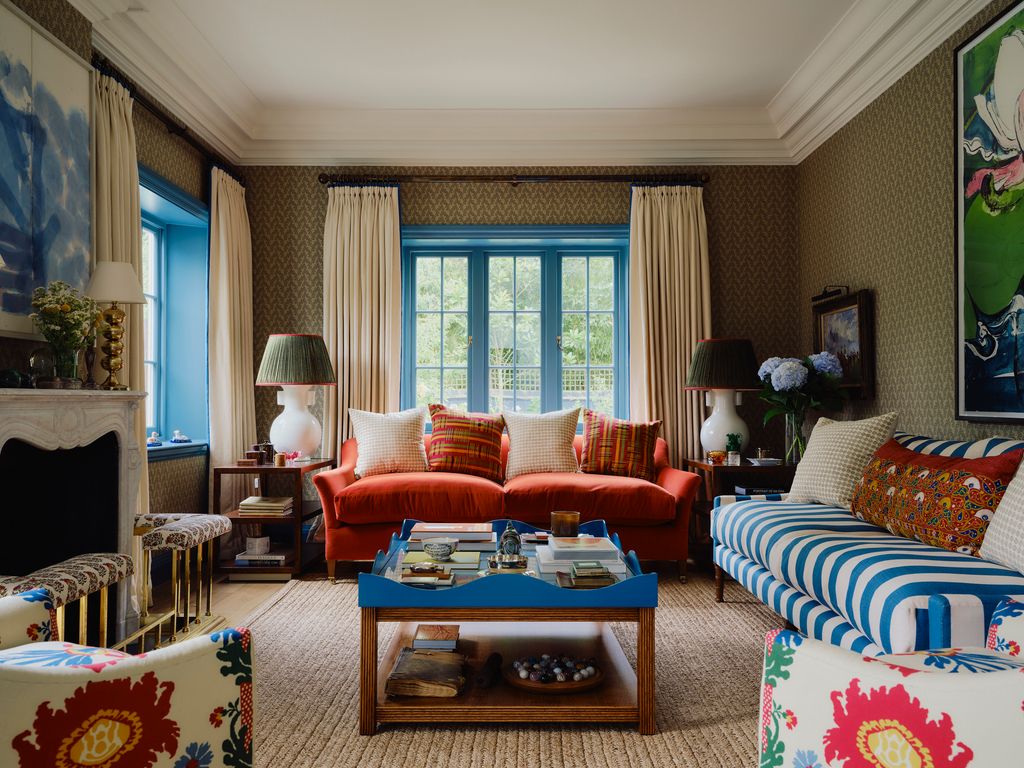
14. Maximalist Pink Living Room with Striped and Floral Patterns
This room joyfully breaks the old rule of “don’t mix patterns.” It works because the patterns vary in scale. You have the tight, uniform stripe on the sofa, the large, organic floral on the armchair, the geometric circles on the rug, and the small, repeating motif on the fireplace. By mixing large-, medium-, and small-scale patterns, you create a dynamic visual hierarchy instead of a chaotic mess. The consistent color palette of pink, blue, and yellow also acts as the glue that holds it all together.
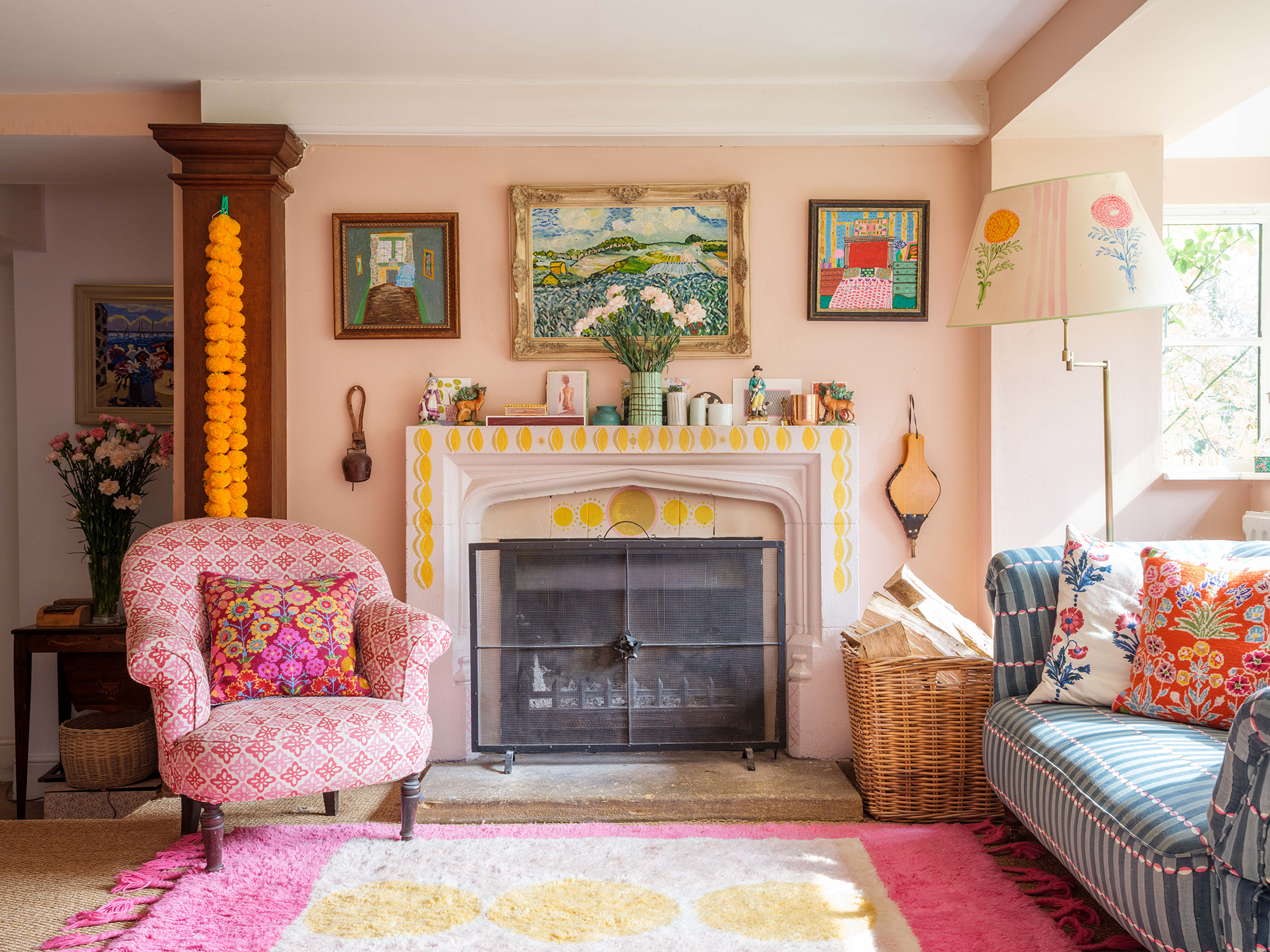
💡 Designer Tip
This is a true maximalist space, and it’s not for the faint of heart or the compulsively tidy. A room this full of color, pattern, and objects can feel visually “loud” and requires a personality that thrives in creative chaos. It can also be challenging to add anything new without disrupting the carefully curated balance. If you crave visual serenity and clear surfaces, this style will likely feel more stressful than inspiring for you to live in day-to-day.
15. Airy Blue Room with a Bold Coral Sofa
The single element that makes this room truly special is the color of the walls and built-ins. Painting everything—walls, shelves, trim—in the same light, airy blue creates an immersive color experience. It’s a bold choice that goes beyond a simple accent wall. This technique makes the room feel larger and more cohesive, turning the architecture itself into a design feature. It provides a serene, unified backdrop that allows the coral sofa to pop dramatically. Compare this to the split-color approach in Idea #3.
📏 Scale Guide
When you have built-in shelves, styling them is an art. To avoid clutter, use the “checkerboard” method. In one shelf opening, place a stack of books horizontally. In the one next to it, place a single, sculptural vase. In the one below that, use a few smaller, grouped objects. By alternating between dense and sparse arrangements and varying the height and shape of objects, you create a balanced, visually interesting display that looks curated, not chaotic.
16. Sun-Filled Room with Blue Velvet Curtains
The success of this space lies in the brilliant mix of textures. You have the soft, machine-washable cotton slipcovers on the sofas, the plush, light-absorbing velvet of the curtains, the smooth, dark wood of the coffee table, and the natural fibers of the rug. This textural variety adds depth and interest to a relatively simple color palette. The contrast between the casual, relaxed sofas and the slightly more formal, luxurious velvet curtains creates a feeling of approachable elegance.
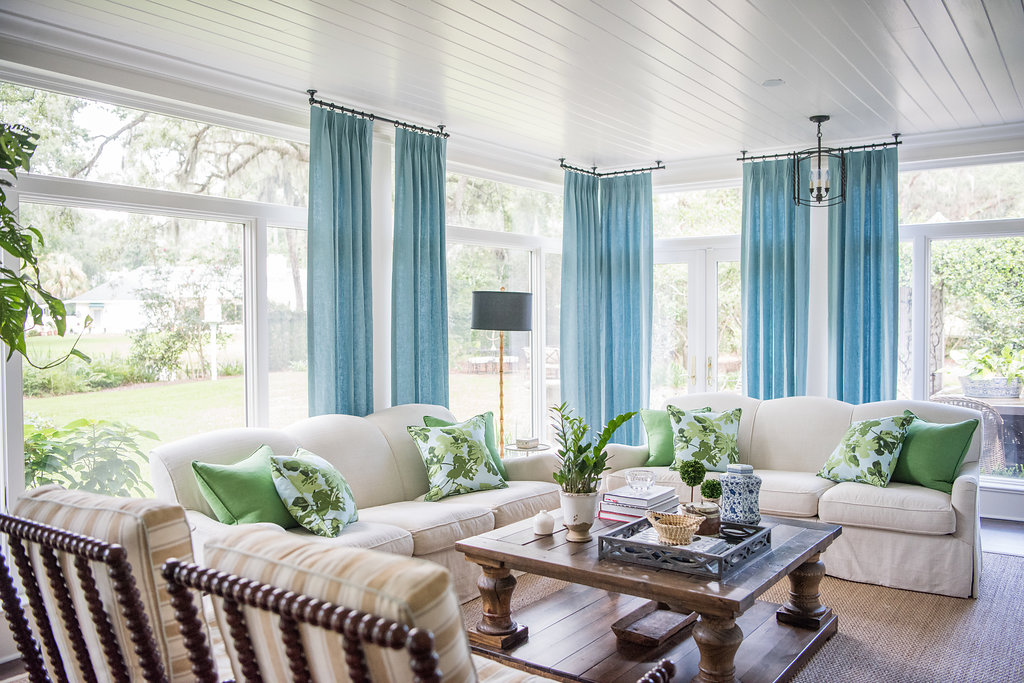
🔥 Trending Context
This look is tailor-made for a sunroom or a living room with a large bank of windows. The design relies on an abundance of natural light to keep the white sofas from feeling flat and to make the blue velvet curtains glow. Minimum ceiling height should be 8 feet, but 9 feet or more is ideal to handle the length of the curtains properly. The room’s footprint should be generous enough to accommodate two full-size sofas without feeling cramped, at least 250 sq. ft.
17. Teal Built-In Shelving with Warm Orange Accents
This room’s inviting feel comes from a classic complementary color scheme, executed perfectly. The formula is approximately 60% dominant cool color (the teal built-ins), 30% neutral foundation (the beige rug, chairs, and cabinet fronts), and 10% high-impact accent color (the warm orange pillows and decor). Teal and orange sit opposite each other on the color wheel, so they create a natural, high-energy pairing. The neutrals provide a crucial buffer zone, preventing the two bold colors from visually vibrating against each other.
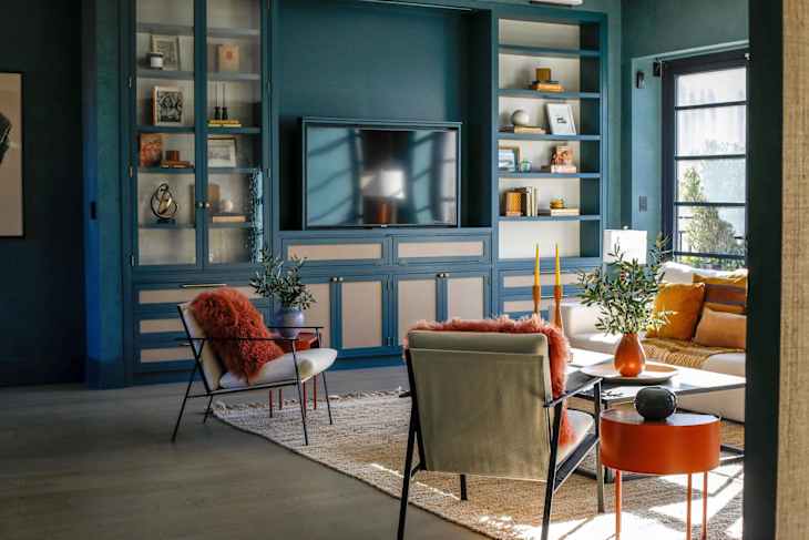
🎯 What Makes It Work
A floor-to-ceiling built-in unit is a fantastic feature, but it can be a double-edged sword. It provides immense storage and a strong focal point, but it also locks you into a specific layout and color. Repainting a unit this large is a significant project. If you’re not ready for that level of commitment, you could achieve a similar feel by painting a single wall teal and placing freestanding bookcases against it.
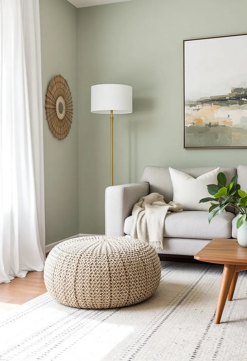
18. Sage Green and Rattan with Global Textiles
This cozy corner works because it expertly layers natural textures. The smooth, painted sage walls provide a calm backdrop for the woven texture of the rattan armchair and the bamboo blinds. The softness of the patterned pillows and the rich grain of the leather ottoman add even more tactile variety. This rich mix of materials makes the space feel collected and personal. The brass floor lamp adds a touch of metallic warmth, keeping the look from feeling too rustic.
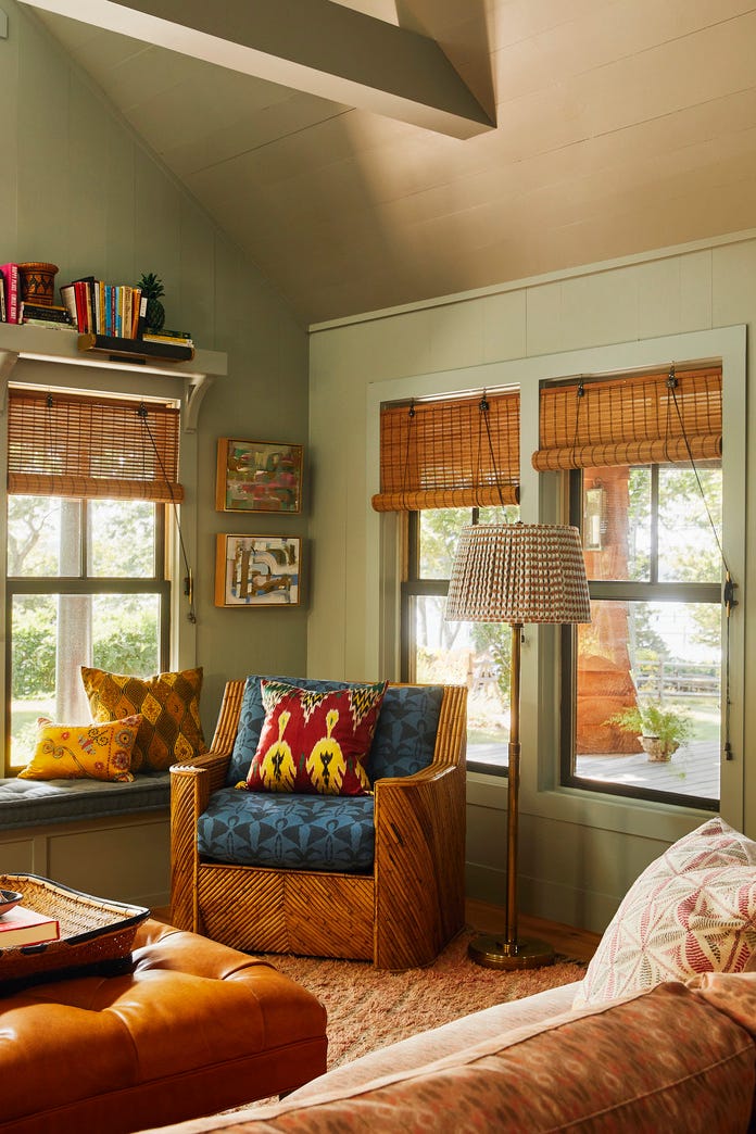
💸 Get This Look For Less
Rattan furniture is beautiful and lightweight, but it can dry out and become brittle over time, especially in a dry climate or near a heat source. To keep it in good shape, wipe it down with a damp cloth every few months and occasionally apply a bit of lemon oil or furniture polish. The bamboo blinds can be dusted with a feather duster or the brush attachment of a vacuum. While generally durable, both materials can be prone to snagging delicate fabrics.
19. Monochromatic Olive Green with a Corduroy Sectional
Recreating this earthy, textured look involves layering tones and materials. Here’s a possible breakdown:
- Wall Treatment: Board and batten materials + olive paint: $300 – $700
- Main Furniture: Large corduroy sectional sofa: $2,500 – $6,000
- Key Accent: Light wood oval coffee table: $400 – $1,200
- Textiles: Chunky knit area rug: $500 – $1,500
- Decor & Lighting: Artwork and sconce: $200 – $600
- TOTAL: $3,900 – $10,000
- Budget alternative: Find a used sectional on Facebook Marketplace, paint the walls a flat olive, and search for a light wood coffee table at Target or IKEA for a similar vibe at around 50% less cost.
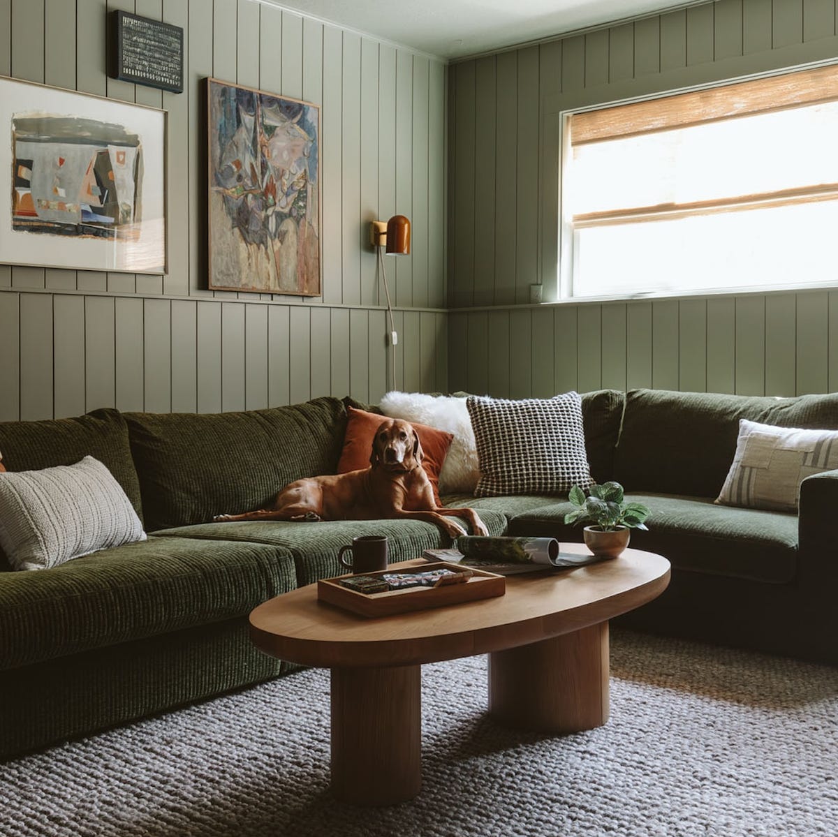
🧹 Maintenance Reality
Texture is the one thing that makes this monochromatic room so successful. Imagine this space if the walls were flat and the sofa was a simple cotton weave. It would fall completely flat. The deep ridges of the corduroy sectional, the prominent lines of the board-and-batten walls, the thick loops of the chunky knit rug, and the smooth grain of the wood table create a rich tactile landscape. It proves that a room doesn’t need a wide-ranging color palette to be deeply interesting. For a different take on earthy tones, check out Idea #25.
20. Dramatic Living Room with Black Walls and a Cream Sofa
When using dark, moody wall paint like the charcoal black here, lighting is everything. Don’t rely on a single overhead fixture. You need to layer your lighting. This room does it perfectly: a main ambient light source (not pictured), accent lighting on the artwork, and task lighting from a table lamp. This creates pockets of light and shadow, which adds drama and prevents the dark color from feeling oppressive. A dimmer switch is your best friend in a room like this.
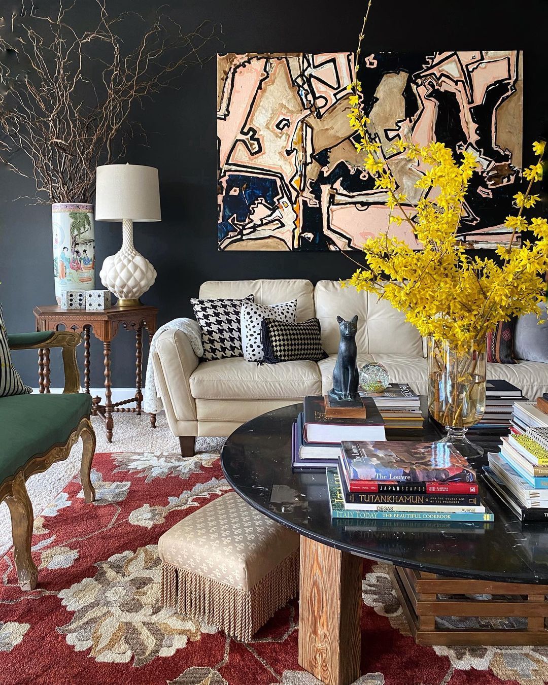
⚠️ Real Talk
The magic of this space comes from extreme contrast and intentional balance. The creamy white leather of the sofa appears extra bright and luxurious against the matte black wall. The vibrant pops of red from the rug and yellow from the forsythia branches cut through the darkness, adding life and energy. The large abstract artwork is the piece that ties it all together—it contains the black, the cream, and a hint of pink, creating a color palette roadmap for the entire room.
21. Artistic Space with a Curved Grey Sofa and Olive Daybed
that elevates this room from simply eclectic to truly artistic is the sculptural lighting. The gold chandelier with its disc-like shades and the playful orange circular sconces are functional art pieces. They add a layer of modern, graphic interest that contrasts beautifully with the more traditional architectural elements like the fireplace and shiplap. Without these specific fixtures, the room would lose a significant amount of its unique, curated personality.
💰 Budget Breakdown
This look, with its mix of large furniture pieces like a curved sofa and a separate daybed, requires a generous amount of floor space. An ideal room would be at least 18×20 feet (360 sq. ft.) to allow for comfortable traffic flow around the distinct seating zones. The high ceilings are also a major plus, giving the statement chandelier room to breathe. In a smaller room, you would need to scale down, perhaps choosing between the sofa or the daybed, but not both.
22. Modern Eclectic Room with Mustard and Burgundy Tones
This room’s formula is about pairing unexpected shapes and colors. It’s roughly 40% unconventional sofa (the curved mustard yellow one), 30% statement color anchor (the deep red leather ottoman), 20% pattern (the checkered sofa), and 10% calm neutrals (the beige armchair and sheer curtains). The key is the confidence in each piece. The curved sofa demands attention, and the oversized ottoman is bold enough to meet its energy. No single item is timid.
🔧 How-To Brief
A round ottoman as a coffee table is a great way to add softness and a pop of color to a room, and it’s great for safety in homes with small children. However, the surface is inherently unstable. You’ll absolutely need a large, flat tray to hold drinks, vases, or anything prone to tipping. Also, a leather ottoman like this can be susceptible to scratches from keys, pet claws, or even jean rivets, so it requires a bit more mindfulness than a standard wooden coffee table.
23. Cozy Reading Corner in Terracotta and Mustard
This look feels so warm and immersive because it fully commits to an earthy, analogous color palette. The deep terracotta on the walls and the rich mustard of the armchair are neighbors on the color wheel, creating a naturally harmonious and enveloping feel. The dark wood of the bookshelf adds depth and a sense of history, while the large, white paper lantern and sheer curtains provide a soft, diffused light that prevents the warm colors from feeling heavy. The abundance of green from the plants adds a vital, fresh contrast.
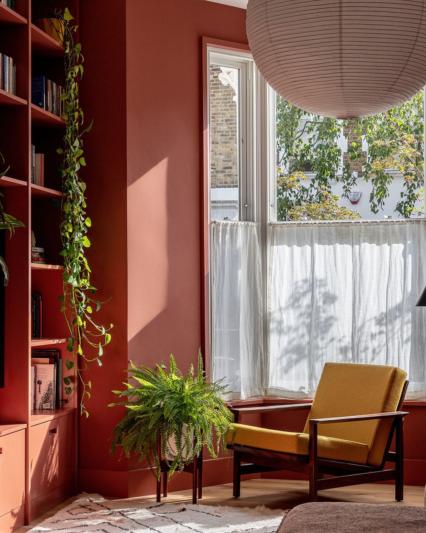
⭐ The One Thing
You can create this cozy corner on a much smaller budget. The key is the wall color— a gallon of terracotta paint is an affordable starting point ($40-$70). Look for a comfortable mustard-colored armchair from a budget-friendly store like Target or find a used one and have it reupholstered. Instead of built-ins, use a simple, dark-wood bookshelf from IKEA like the BILLY. Fill it with thrifted books and inexpensive houseplants. The iconic paper lantern look can be found at IKEA for under $30.
24. Modern Industrial Living Room with a Pop of Yellow
The concrete-look accent wall with the oversized clock decal is the one thing that gives this room its unique character. It’s a bold, industrial-inspired choice that prevents the grey-and-yellow color scheme from feeling too generic. It adds texture, a strong focal point, and a touch of urban grit that contrasts beautifully with the plush yellow velvet of the armchairs. Remove that wall treatment, and you’re left with a nice but much more conventional living room.
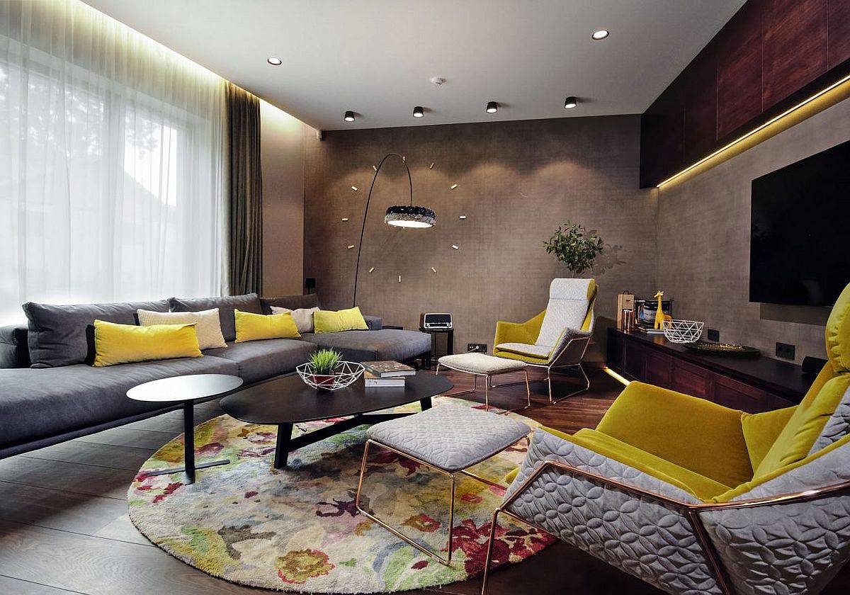
✅ Before You Start
A large sectional sofa is amazing for lounging, but it can be a real space-eater. Make sure you measure your room carefully before buying. You need to leave at least 30-36 inches of clearance for major walkways. Also, be honest about your lifestyle. If you entertain a lot, a sectional can sometimes feel less social than a traditional sofa and armchair setup, as everyone is lined up in a row. It’s fantastic for family movie nights, though!
25. Inviting Mid-Century Room with Orange and Olive
This space feels so cohesive because it leans into a classic mid-century modern palette. The combination of rust orange, olive green, and warm wood tones is iconic for a reason—it’s earthy, inviting, and sophisticated. The design works by balancing the solids: the solid orange sofa is flanked by two solid olive armchairs. The pattern is saved for the rug, which contains all the colors of the room and ties everything together. The brass sputnik chandelier is the perfect finishing touch, adding a bit of retro glamour. This is a more vibrant version of the earthy look in Idea #19.
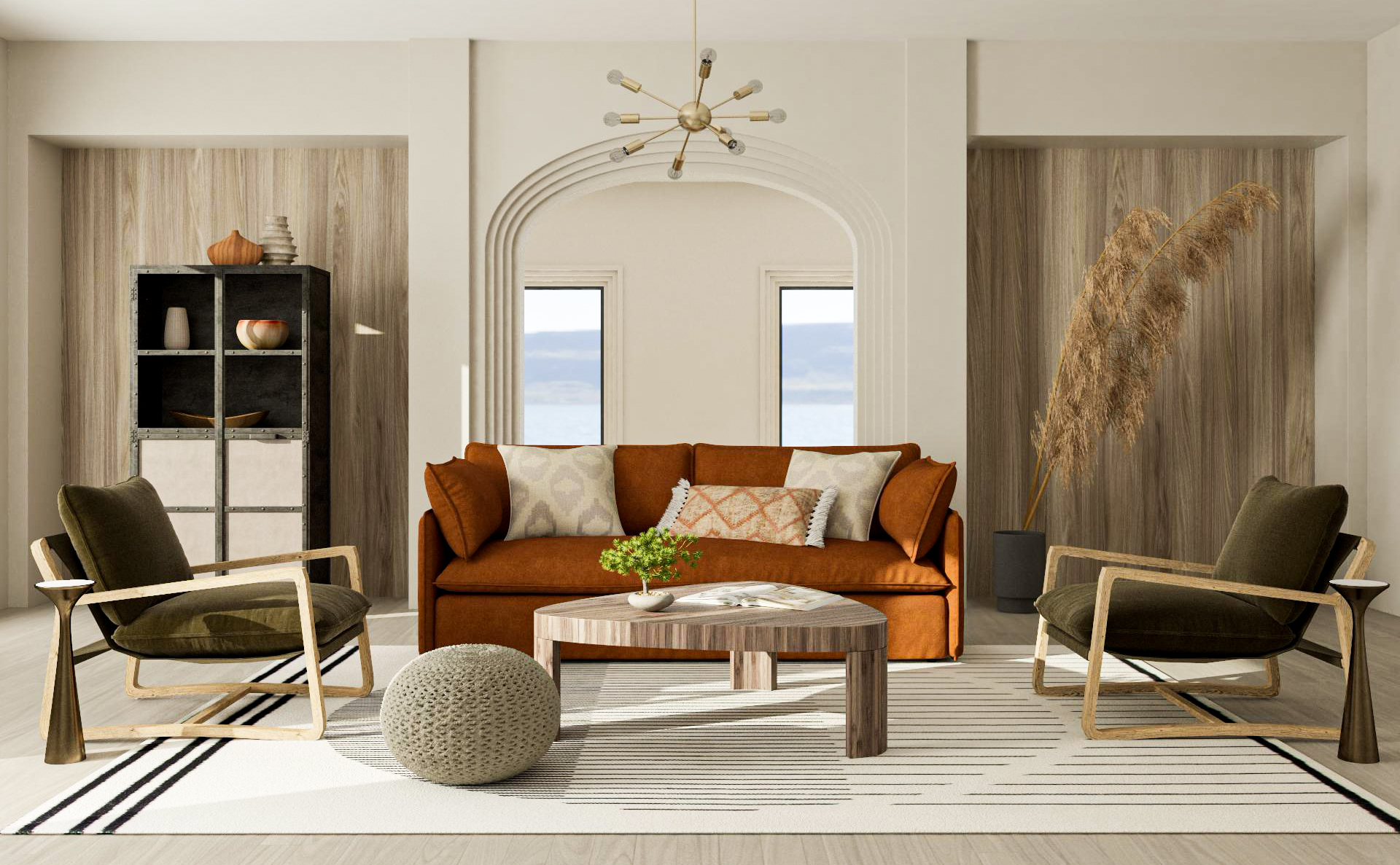
📐 Style Math
When using multiple distinct furniture pieces like this, pay close attention to the leg style and height. Notice how the tapered wooden legs of the armchairs, the triangular legs of the coffee table, and the simple legs of the sofa are all similar in their delicate scale and warm wood finish. This subtle repetition creates a sense of rhythm and harmony, making the different pieces feel like they belong together.
26. Vibrant and Pattern-Filled Eclectic Living Room
This room’s daring formula is all about addition: 30% bold color (orange sofa, blue table), 30% large-scale pattern (floral chairs, striped chaise), 20% small-scale pattern (wallpaper), and 20% unexpected choices (the blue window frames). There are almost no “neutral” resting spots. This maximalist approach works by keeping the colors—orange and blue—as recurring themes throughout the various patterns and solids, which provides a thread of consistency in the visual chaos.
💡 Designer Tip
Living in a room this visually rich requires a specific personality. It’s a feast for the eyes, but it can also be overstimulating for some. There is very little visual “quiet.” If you are someone who is easily distracted or prefers a calm, serene environment to relax, a maximalist room like this might feel more chaotic than cozy over time. It’s a bold statement, so be sure it’s a statement you want to live with every day.
27. Warm Modern Rustic with Cognac Leather and Sherpa
The magic here is in the masterful blend of rugged and soft textures. The rich, smooth cognac leather speaks to a classic, slightly masculine vibe, while the creamy, bumpy sherpa upholstery is all about soft, cozy comfort. This contrast is echoed in the dark, moody shiplap of the fireplace against the light wood floors and the woven textures of the blinds and pendant light against the sleek lines of the furniture. This play of opposites creates a dynamic yet balanced space that feels both modern and timeless.
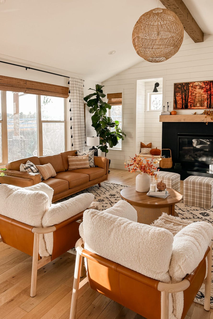
📏 Scale Guide
this room could not afford to lose is the cognac leather. It is the heart of the design. The specific warm, reddish-brown hue of the leather is the primary color driver and sets the inviting, slightly rustic tone. If you were to swap the leather seating for grey fabric, the entire mood would shift from warm and earthy to cool and contemporary. The leather provides a sense of history and durability that anchors the whole look.
28. Cozy Den with a Blue Fireplace and Wood Paneling
Painting a brick fireplace is a high-impact DIY that can completely transform a room. Here’s a quick guide:
- Time: 1 weekend
- Cost: $100-$200
- Step 1: Clean the brick thoroughly with a wire brush and a TSP solution to remove all soot and dust. Let it dry completely for 24 hours.
- Step 2: Repair any cracked mortar.
- Step 3: Apply a coat of primer specifically designed for masonry/brick. This is crucial for adhesion and to prevent soot from bleeding through.
- Step 4: Apply 2-3 coats of a high-quality, heat-resistant interior latex paint in your chosen color (like this bold blue!). Use a combination of a roller for the flat surfaces and a brush to get into the mortar lines.
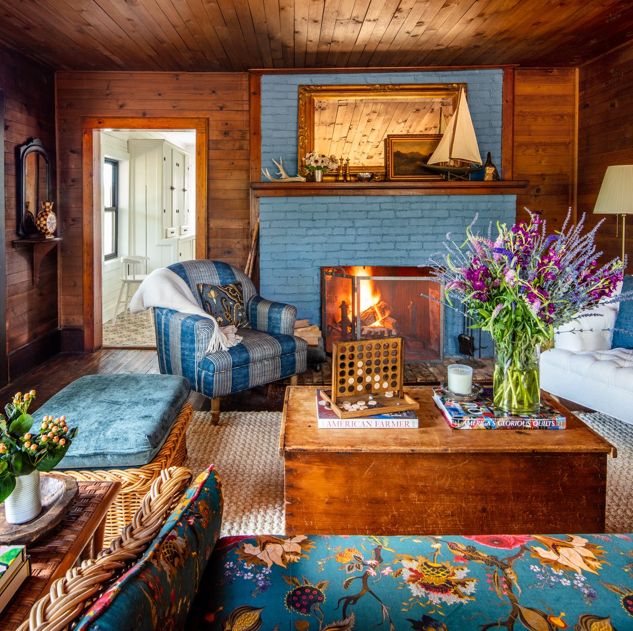
🔥 Trending Context
Wood paneling can sometimes be found for free or cheap from people renovating older homes. Keep an eye on Facebook Marketplace or local salvage yards. If you can’t find original paneling, you can get a similar cozy vibe with a wood-look wallpaper. For the furniture, focus on finding pieces with good “bones” at thrift stores. A floral sofa or striped armchair might look dated at first, but if the shape is classic, it can be a star in an eclectic room like this. The key is to embrace the mix-and-match aesthetic.
29. Serene and Modern Room with a Brown Velvet Sofa
When working with a largely neutral palette, introducing a variety of textures is non-negotiable. This room does it beautifully: the plush velvet of the sofa, the chunky knit of the throw blanket, the nubby texture of the pillows, the smoothness of the glass coffee table, and the quilted fabric of the swivel chair. This textural conversation is what keeps a neutral room from being boring. Aim for at least four different textures in your space.
🎯 What Makes It Work
This room achieves its serene mood through a very tight and disciplined color palette. The core colors are brown, grey, black, and white. This monochromatic base creates a calm, cohesive foundation. The key to keeping it from feeling sterile is the single, strategic injection of life: the tall green plant. The vibrant green acts as the only true color in the room, making it a powerful and refreshing focal point that connects the indoor space to nature.
30. Cozy Deep Red Library with a Green Velvet Sofa
This look is a beautiful example of a split-complementary color scheme. The formula is: 60% dominant color (the deep red walls), 30% key contrasting color (the olive green sofa), and 10% neutral accents (the cream, white, and wood tones). Red and green are opposites, creating a classic, high-contrast look that feels both daring and traditional. The beige and white act as a buffer, giving the eye a place to rest and keeping the strong colors from overwhelming the space.
💸 Get This Look For Less
Thinking of painting a room a deep, saturated color like this red? Here’s a checklist:
- Lighting Check: Do you have enough natural and artificial light? Dark colors absorb light and can make a room feel like a cave without proper illumination. This room has a large window and likely other light sources.
- Test, Test, Test: Paint a large sample board (at least 2×2 feet) and move it around the room at different times of day. Reds, in particular, can change dramatically in different light.
- Primer is Key: You will absolutely need a tinted grey or pink primer. Putting red paint directly on a white wall will require many, many coats.
- Mood Check: Are you sure you want this much energy? Deep red is a powerful, stimulating color. It’s great for a social space, but might be too intense for a bedroom. If you’re finding this too bold, check out the mistakes section below on how too much color can go wrong.
31. Eclectic Sitting Room with a Floral Armchair
that makes this room feel special is the fearless mix of “old” and “new.” You have the traditional, almost antique silhouette of the floral armchair and the skirted sofa, paired with a modern, geometric-shade lamp and a graphic sunburst wall sculpture. This tension between eras is what creates a collected, personal, and deeply interesting space. It suggests a home that has evolved over time rather than being decorated all at once from a single catalog.
🧹 Maintenance Reality
Don’t underestimate the power of curtains to complete a room. The antique gold striped curtains here are doing a lot of work. They draw the eye upward, making the ceilings feel taller. They also introduce a vertical pattern that contrasts with the organic floral of the chair, and their color perfectly complements the dark olive green walls. When choosing curtains, consider them an opportunity to add color, pattern, and texture—not just a functional window covering.
32. Bright Natural Living Room with Exposed Brick
This room feels so calm and inviting because it layers various neutral textures over a bright white base. The roughness of the whitewashed brick, the smooth grain of the natural wood shelves, the softness of the sofa fabric, the nubby feel of the rug, and the glint of the gold mirror all work together to create a rich sensory experience. This proves that you don’t need bold color to create a space with depth and personality. It’s a more subtle, textural approach to design, similar to the vibe in Idea #11.
⚠️ Real Talk
Achieving this natural, cozy look is very budget-friendly. The foundation is a simple, neutral sectional—look for affordable options at stores like IKEA or find a deal on a used one. Floating wood shelves are a simple DIY project or can be purchased inexpensively. For the brick, if you don’t have it naturally, you can get the look with faux brick paneling from a hardware store and give it a whitewash finish yourself. Decorate the shelves with thrifted vases, affordable prints, and books you already own.
Your Colorful Chapter Awaits
See? Adding color to your living room doesn’t have to be intimidating. Whether you go for a single pop of color or a full-on maximalist explosion, the goal is to create a space that brings you joy. Pick an idea that speaks to you, start small, and have fun with it.
Ready to start your own color story? Head over to Pinterest and create a board for your favorite looks from this article!
Photo credits: Hommés Studio, Casa Watkins Living, Decoist, Apartment Therapy, Good Housekeeping, House Beautiful, Livingetc, Reddit, Trendir, Homes and Gardens, Country Living Magazine, DecorMatters, The Spruce, House & Garden, TheCoolist, Real Homes, Lord Decor, LUXE Interiors + Design, | Lavin Label, DreamBundles, Style Me Pretty / Web
Photo credits: Hommés Studio, Casa Watkins Living, Decoist, Apartment Therapy, Good Housekeeping, House Beautiful, Livingetc, Reddit, Trendir, Homes and Gardens, Country Living Magazine, DecorMatters, The Spruce, House & Garden, TheCoolist, Real Homes, Lord Decor, LUXE Interiors + Design, | Lavin Label, DreamBundles, Style Me Pretty / Web