Is there anything more universally comforting than a beige comforter? It’s the perfect neutral canvas. But finding the right sheet colors to pair with it can feel surprisingly tricky—one wrong move and “serene sanctuary” becomes “boring box.” After filtering through hundreds of options from places like West Elm, Crate & Barrel, and Target, we narrowed it down to the absolute best combinations that work for real homes. We’re covering everything from calm and serene monochrome, earthy natural tones, and bold colorful accents.
Beige is the unofficial color of “cozy” for 2026, anchoring the move towards creating deeply personal, tranquil spaces that feel like a true escape. We found 28 distinct ideas to prove just how versatile this humble neutral can be. And stay until the end — we break down the most common mistakes that can ruin these looks. 📌 Save this to Pinterest for later — you’ll want to revisit these ideas.
1. Layer Your Bed with Serene Beige and Cream Textures
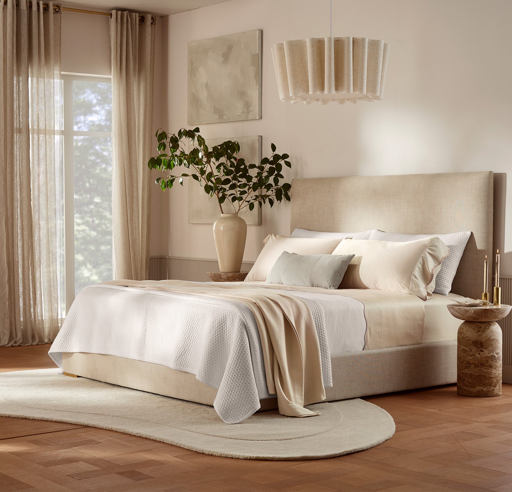
What makes this monochromatic setup sing is the masterful use of texture. When you stick to a tight color palette like beige and cream, texture does the heavy lifting to create visual interest and prevent the look from falling flat. Here, the combination of a smooth upholstered headboard, a quilted coverlet, and silky, sheer curtains creates a rich sensory experience. Each material reflects light differently, adding depth and a feeling of quiet luxury. It’s a lesson in how to do neutrals with intention and sophistication.
💡 Designer Tip
To recreate this layered look, always work from your thinnest to your thickest fabric. Start with your smoothest, highest thread-count sheets directly against the skin. Next, add a mid-weight layer like a linen duvet or a cotton quilt. Finally, top it with your chunkiest, most textural piece, which could be a heavy knit throw or a fluffy comforter. This progression ensures maximum comfort and visual depth without feeling bulky or disorganized. It’s a foolproof formula for a bed that looks as good as it feels.
2. Mix Warm Wood and a Textured Duvet for Modern Calm
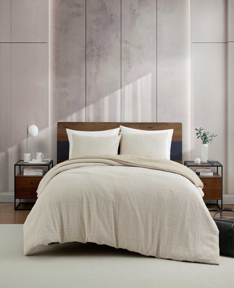
This look follows a simple but effective formula: 50% soft, textured neutrals (the beige duvet and white sheets), 30% warm, natural materials (the wood headboard), and 20% dark, grounding accents (the headboard detail and nightstands). This ratio ensures the room feels balanced—the lightness of the bedding keeps it airy, the wood adds warmth, and the dark elements provide a touch of modern contrast and definition. You can easily adapt this, swapping the dark blue for a deep forest green or a rich charcoal gray while keeping the core proportions.
✅ Before You Start
A word of caution about dark, two-toned headboards: they can visually dominate a smaller room. While the deep blue here acts as a sophisticated anchor, it requires some breathing room to look its best. In a room with less than 120 square feet or ceilings under 8 feet, a headboard this bold might feel heavy and shrink the space. Ensure you have plenty of natural light and light-colored walls, like the soft gray-pink paneling here, to balance the visual weight and maintain a serene, open feel.
3. Coordinate with Neutral Stripes on Bedding and Curtains
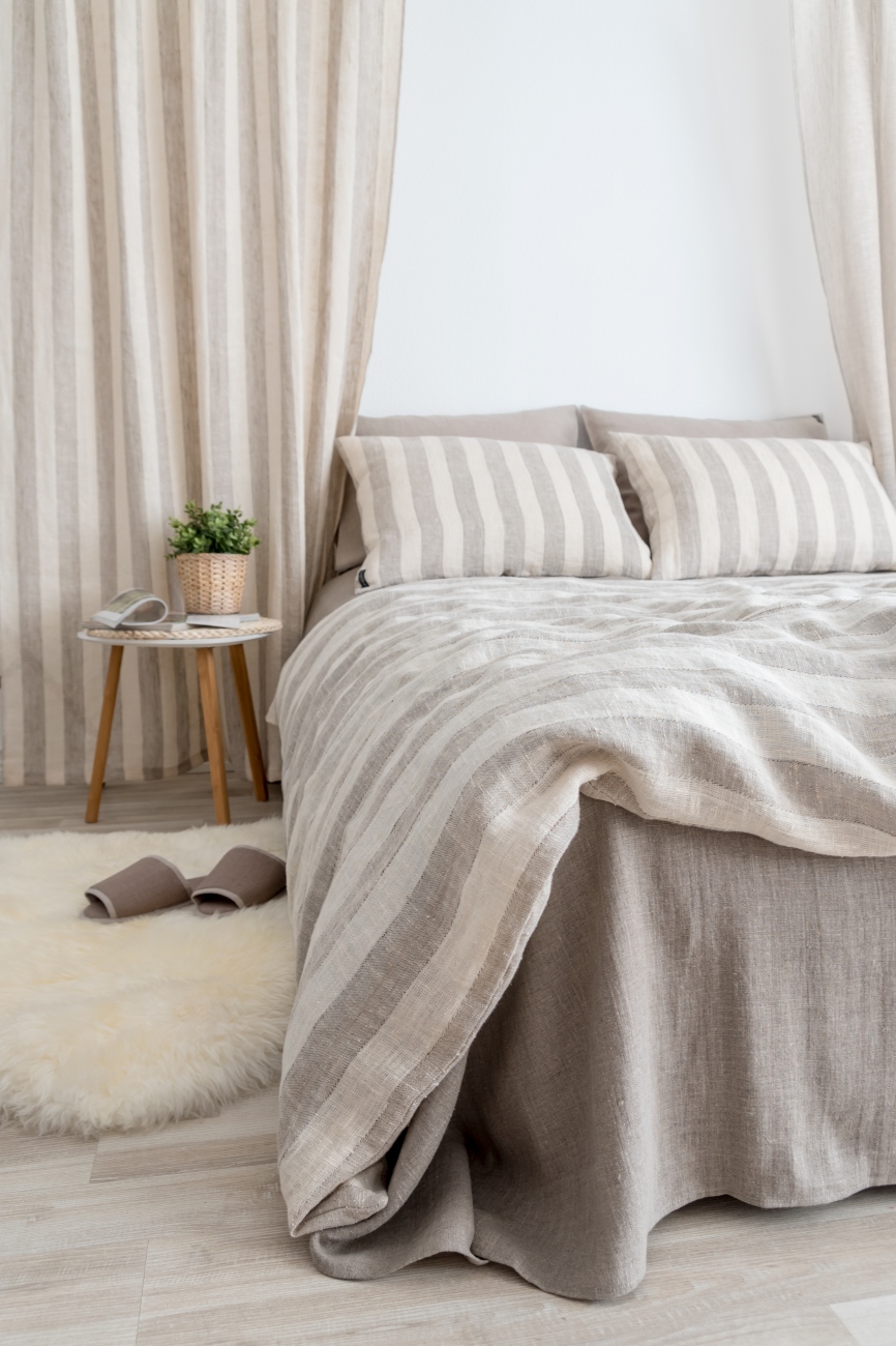
The single element that elevates this bedroom from simply nice to truly designed is the repetition of the stripe pattern. By using the same greige and white striped linen for both the duvet cover and the curtains, the look feels cohesive and incredibly intentional. It frames the bed as the undeniable focal point of the room. Removing the matching curtains would leave you with a perfectly pleasant bed, but with them, you have a complete design statement that feels custom-made and thoughtfully curated. For a different take on a natural palette, see Idea #27.
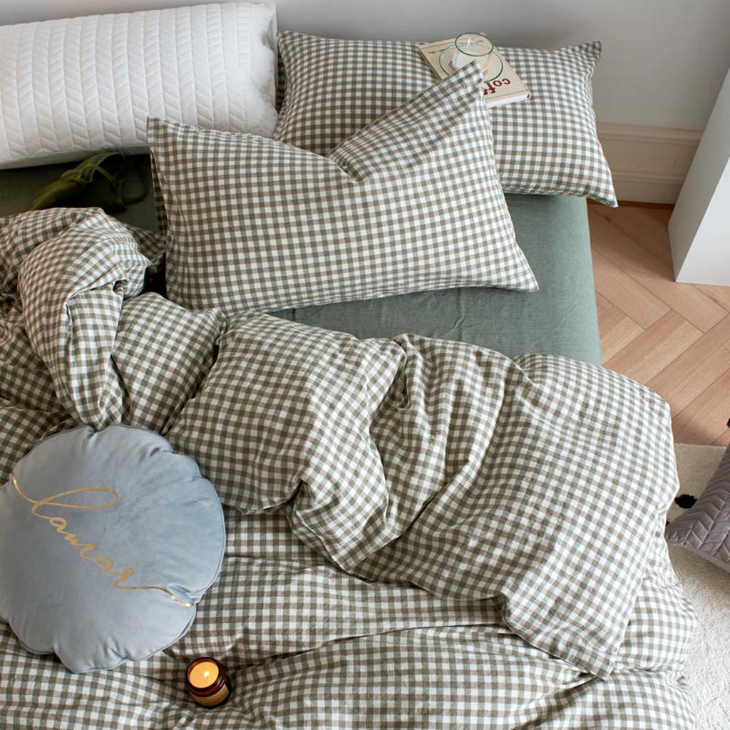
4. Go Bold with Olive Green Gingham and Solid Sheets
This combination is so successful because it pairs a classic, almost nostalgic pattern (gingham) with a sophisticated, modern color (olive green). This blend of old and new creates a look that feels both cozy and current. The solid olive sheets ground the pattern, preventing it from feeling too busy, while the white quilted pillow provides a crisp point of contrast. It’s a perfect example of how to use a bold pattern in a way that feels inviting and stylish, not overwhelming.
⭐ The One Thing
When working with a distinct pattern like gingham, the scale is everything. For bed linens, aim for a check that is between 1.5 and 3 inches square. Anything smaller can look fussy and read as a solid color from a distance, losing its charming effect. Anything larger can feel a bit juvenile or overly rustic. This medium scale strikes the perfect balance, ensuring the pattern is clearly visible and adds personality without overpowering the entire room.
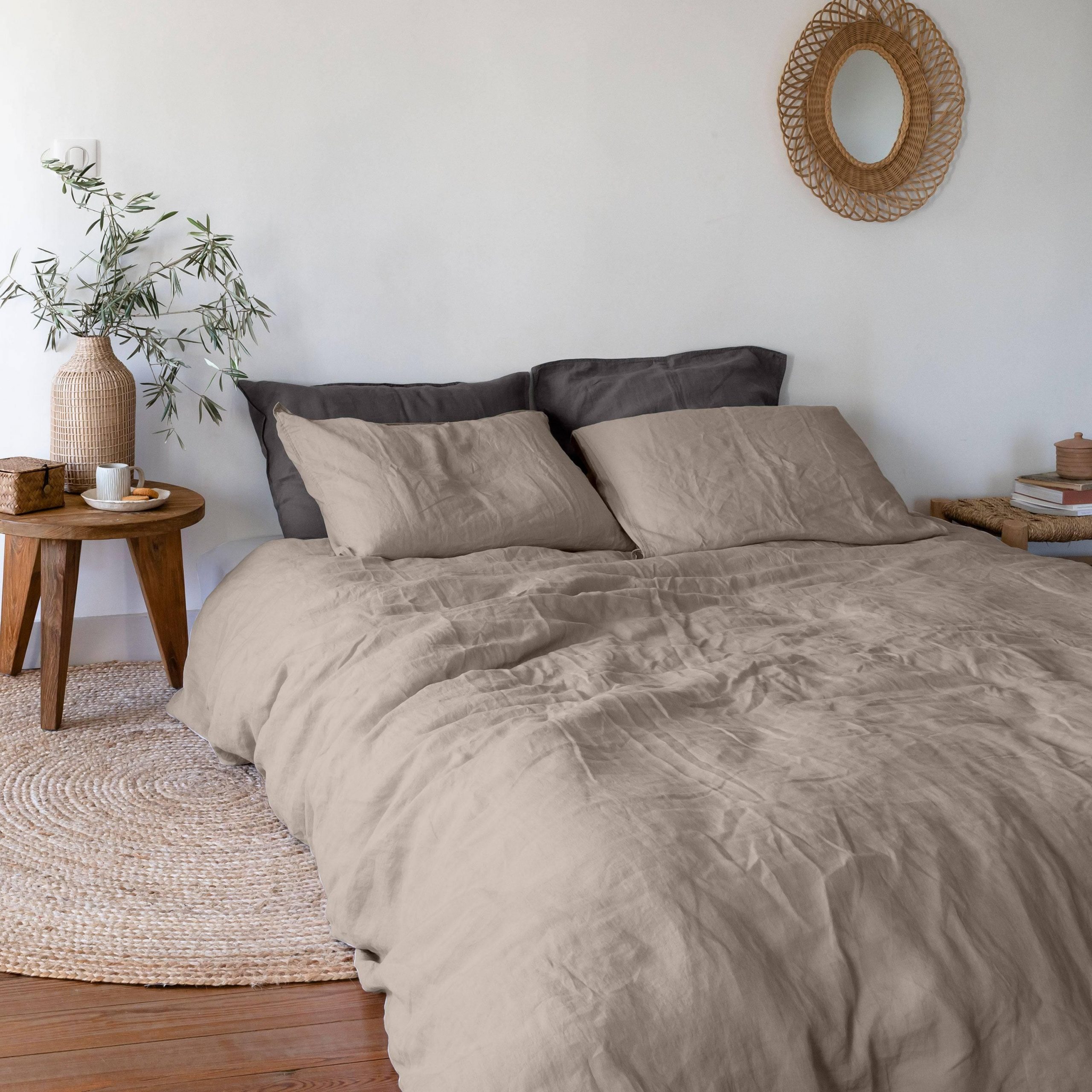
5. Use Charcoal and Olive for an Earthy, Minimalist Vibe
The single most impactful element here is the block of charcoal grey pillows. Against the light beige comforter and white walls, they create a focal point with a strong, organic contrast. Without them, the bed would be a simple, pleasant sea of neutrals. With them, the entire setup gains depth, mood, and a touch of drama. They prove that you don’t need a ton of color or clutter to make a statement; a single, well-chosen dark accent can define the entire feel of the room.
🔥 Trending Context
This minimalist, earthy aesthetic works exceptionally well in rooms of almost any size, but it truly shines in spaces from 120 to 200 square feet. The limited color palette and focus on natural textures (wood, jute, woven mirror) create a sense of calm that doesn’t overwhelm a smaller room. For larger rooms, you’d want to add another grounding element, like a larger area rug or a dark accent chair, to ensure the space still feels anchored and cohesive.
6. Add a Fresh Pop of Yellow with Floral Accents
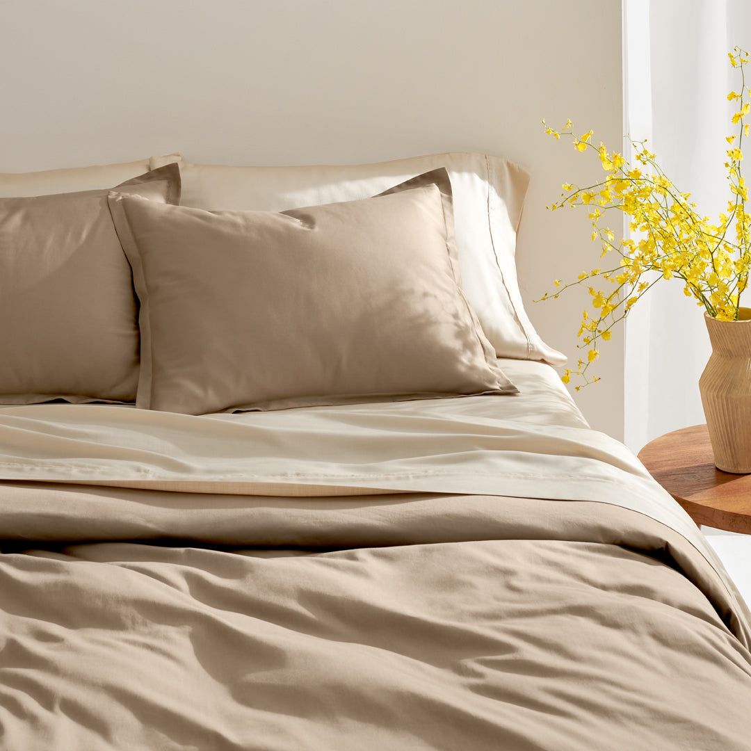
This look is a masterclass in subtlety. The foundation of a beige comforter and cream sheets is beautifully simple, creating a warm, neutral canvas. What makes it special is the single, vibrant pop of yellow from the fresh flowers. This small dose of saturated color instantly energizes the serene palette without overwhelming it. The ribbed texture of the vase and the rustic wood of the side table add just enough tactile interest to keep the minimalist setup from feeling sterile. It’s proof that sometimes the smallest accent makes the biggest difference.
💸 Get This Look For Less
While fresh flowers are a beautiful addition, they require consistent care and replacement, which can add up in cost and effort. For a lower-maintenance alternative that gives a similar effect, consider high-quality faux florals. Brands like Afloral or Pottery Barn offer incredibly realistic-looking stems that provide that same pop of color without the weekly refresh. Alternatively, you could introduce yellow through a small accent pillow or a piece of art above the nightstand for a permanent, no-fuss solution.
7. Choose Beige Chinoiserie Sheets for an Intricate, Eclectic Look
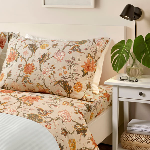
Chinoiserie and detailed botanical prints are experiencing a huge resurgence, driven by the “grandmillennial” trend that blends traditional design elements with a fresh, modern sensibility. These sheets are a perfect example. The intricate floral and bird motifs feel classic and storied, while the beige-and-white base keeps them from feeling dated or stuffy. It’s a way to engage with historical patterns that feels personal and curated, moving away from minimalist norms to embrace pattern and personality on the bed.
🔧 How-To Brief
When using a detailed, multi-colored pattern on your sheets like this chinoiserie print, pull your accent colors directly from the pattern itself for a cohesive look. Notice how the orange-red, mustard, and olive green within the print could inspire throw pillows, a piece of art, or a vase. For the comforter, always opt for a solid color that matches the background of the sheet pattern—in this case, white or a matching beige. This allows the intricate sheet pattern to be the star without creating visual chaos.
8. Embrace Freshness with a Floral and Botanical Print Duvet
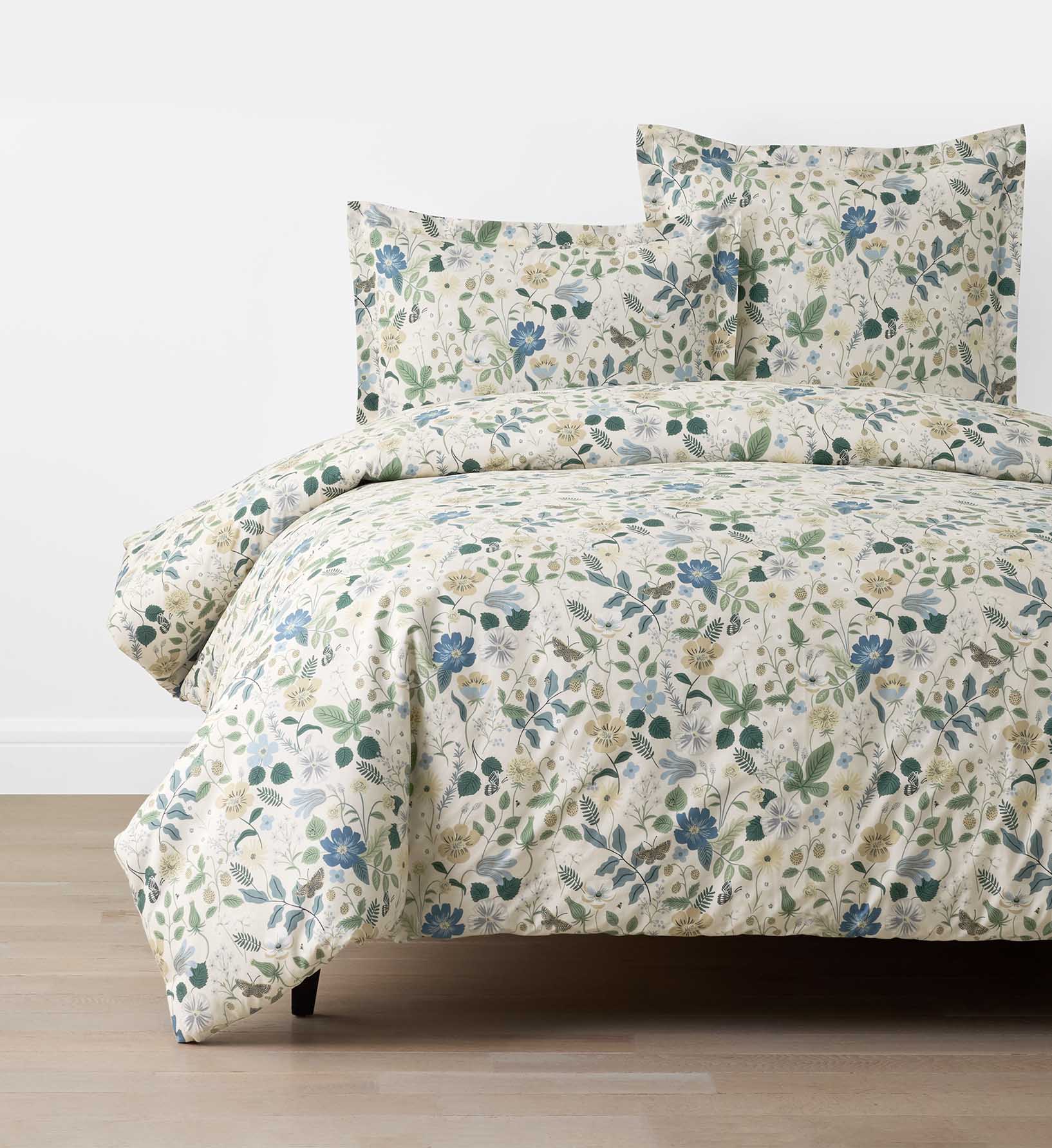
This design works because of its expert balance of color and density. The floral pattern is busy, filled with leaves, flowers, and butterflies, but the colors are beautifully harmonious—soft blues, gentle greens, and muted yellows. No single color screams for attention, allowing the overall botanical effect to feel lush and refreshing rather than chaotic. The light cream background provides a soft, airy canvas that keeps the dense pattern from feeling heavy, resulting in a look that is cheerful and feminine but also surprisingly calm.
🧹 Maintenance Reality
A dense floral print like this can be a strong commitment. While it looks beautiful and fresh, it may not be the most versatile choice if you enjoy changing your bedroom’s look frequently. A pattern this specific dictates the room’s color scheme and overall vibe quite strongly. Before you commit, be sure you love the entire color palette within the print, as you’ll be decorating around those blues, greens, and yellows for the foreseeable future to maintain a cohesive look.
9. Get Cozy with a Patchwork Floral Quilt
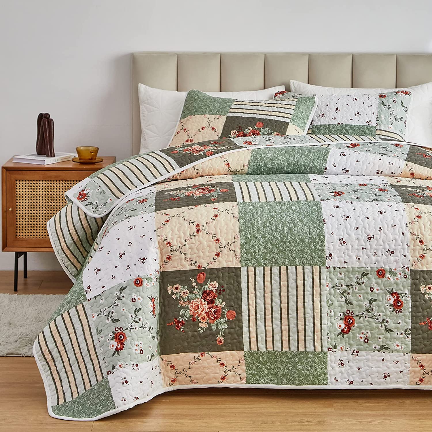
The patchwork quilt is, without a doubt, the element that gives this room its soul. It’s a piece that tells a story, evoking feelings of comfort, tradition, and home. The mix of sage green, beige, and white squares, with their varied floral and striped patterns, adds a layer of history and handcrafted charm that a simple duvet cover never could. Paired with a modern upholstered headboard and crisp white shams, the quilt bridges the gap between contemporary and traditional design, creating a look that’s both stylish and deeply comforting.
⚠️ Real Talk
Before you commit to a patchwork quilt, make sure it complements your existing elements. Here’s a quick checklist:
- Check Your Headboard: Does your headboard have a simple shape and solid color? A busy headboard will fight with a patchwork pattern.
- Assess Your Wall Color: Ensure your walls are a neutral shade pulled from the quilt, like the soft white or beige seen here. A colored wall could make the look too chaotic.
- Consider Your Sheets: You’ll absolutely need solid-colored sheets, preferably in white or cream, to give the eye a place to rest.
10. Try a Coastal Vibe with Blue Stripes and Beige Gingham
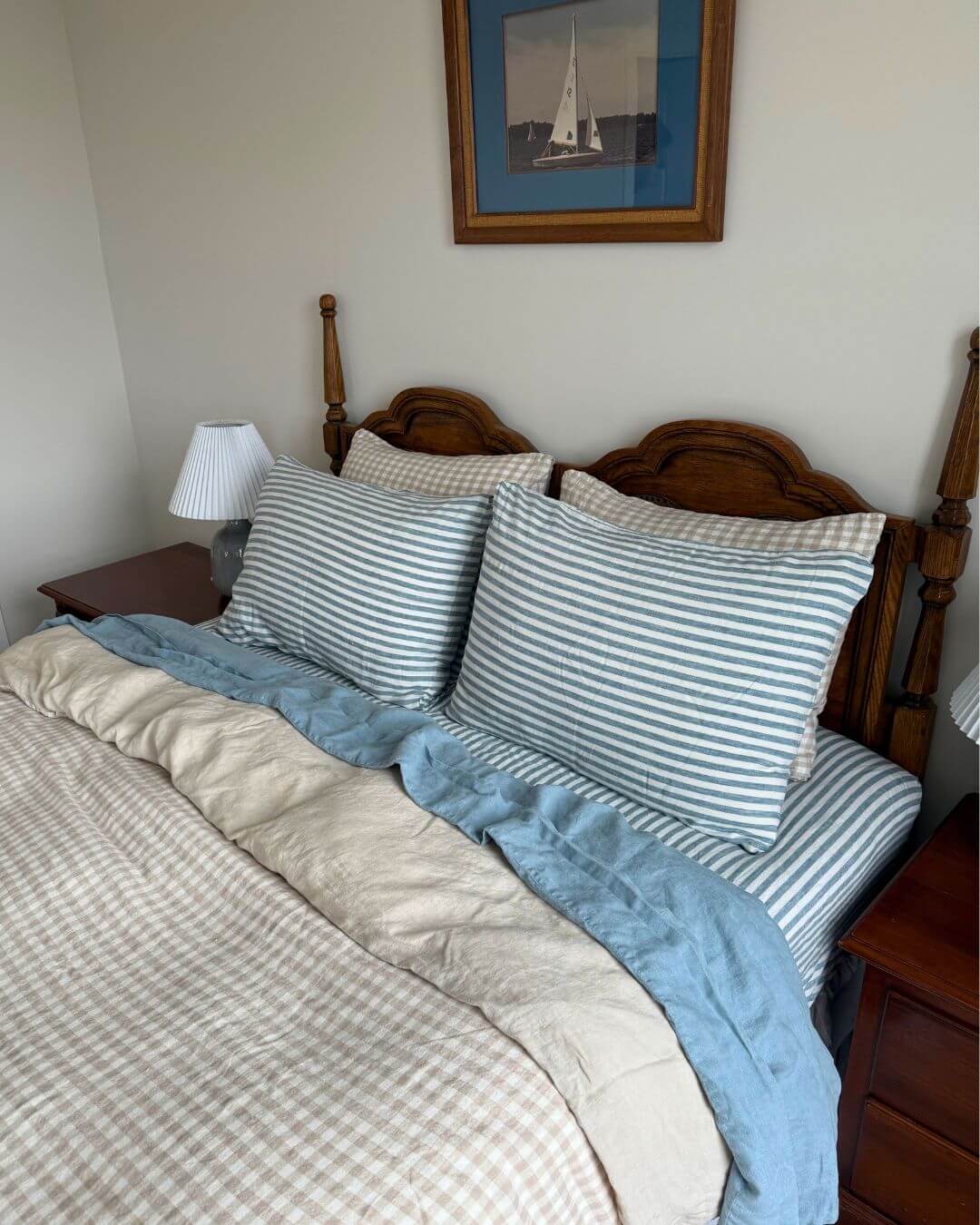
The formula for this charming coastal look is all about layering complementary patterns and colors. It breaks down to roughly 40% calm beige (gingham duvet, solid sheets), 30% crisp white (in the stripes and background), 20% natural wood (the bed frame), and 10% classic blue (stripes and flat sheet). This balance feels relaxed and inviting. The key is that the patterns (gingham and stripe) are timeless classics, so mixing them feels intentional and preppy, not chaotic. Compare this blue and beige look with the one in Idea #24.
💰 Budget Breakdown
The secret to successfully mixing patterns, like the stripes and gingham seen here, is to vary their scale. The pillow stripes are relatively bold and wide, while the gingham checks on the duvet are smaller and more subtle. This difference in scale allows each pattern to have its own identity without competing for attention. As a general rule, pair one large-scale pattern with one small-scale pattern for a harmonious result.
11. Create a Warm, Earthy Mood with Terracotta Bedding
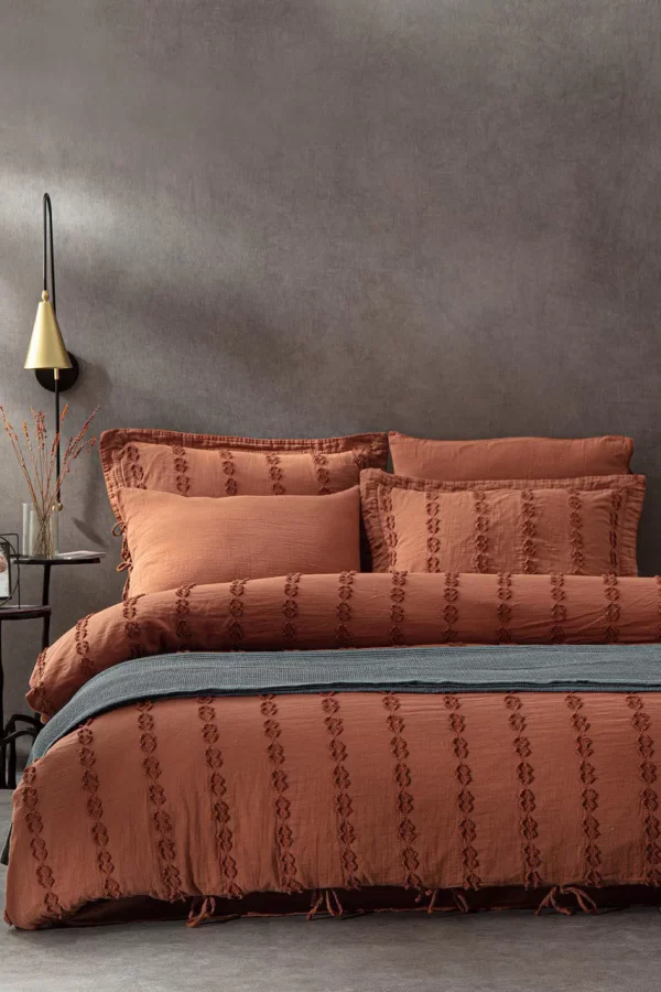
This bedroom feels so inviting because it fully embraces a warm, analogous color scheme. The rich terracotta of the bedding is a deep, earthy orange. It pairs beautifully with the dark charcoal gray wall, which has a subtle warmth to it, and the grey-blue throw. These colors sit near each other on the color wheel, creating a naturally harmonious and cohesive environment. The texture in the bedding and on the wall adds another layer of coziness, making you want to curl up and stay awhile.
📐 Style Math
Get the perfectly imperfect ‘draped throw’ look in 4 easy steps. It’s the key to making a bed feel styled, not just made. (Estimated time: 2 minutes)
- Fold your throw blanket lengthwise into thirds. This creates clean lines but keeps some volume.
- Lay the folded throw across the foot of the bed, about one-quarter of the way up from the bottom.
- Grab the center of the throw with one hand and gently pull it towards the foot of the bed, creating a soft, draped curve.
- Adjust the sides, tucking and arranging them so they fall casually. Don’t aim for perfect symmetry!
12. Go Minimalist with Warm Rust Linen and Pampas Grass
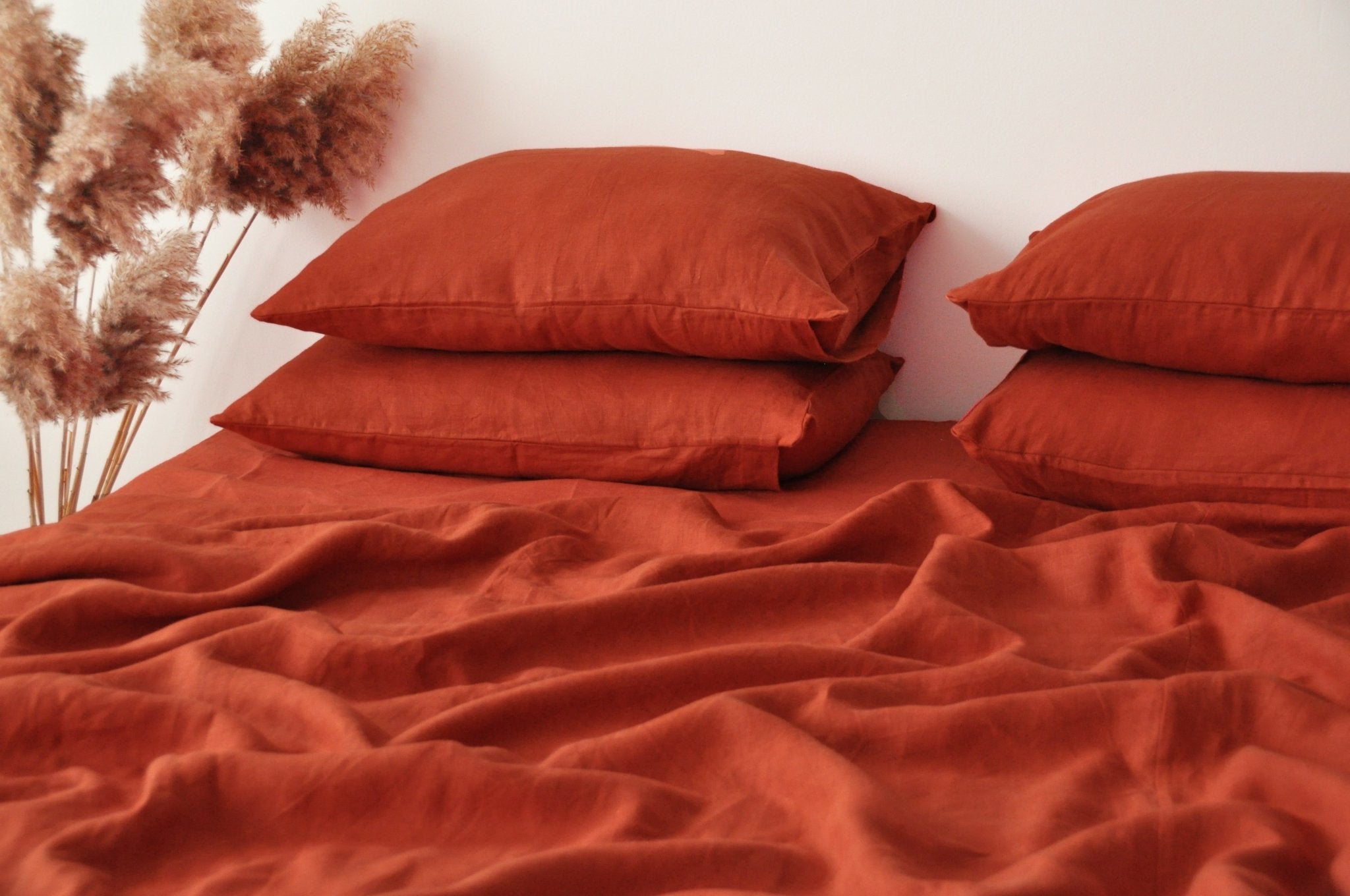
The single element that defines this entire image is the color: rust. By committing to a single, bold, earthy hue for all the bedding—sheets and pillowcases—the look achieves a powerful, minimalist impact. There are no competing patterns or distracting accent colors. It’s a confident statement that warmth and minimalism can co-exist beautifully. The addition of the pampas grass is the perfect finishing touch, echoing the bedding’s earthy texture and natural vibe without stealing the spotlight.
📏 Scale Guide
Linen bedding is beautiful, breathable, and gets softer with every wash, but it comes with a specific aesthetic: it wrinkles. If you are someone who desires a crisp, perfectly smooth bed, linen is not for you. The beauty of linen lies in its relaxed, slightly rumpled texture. To care for it, wash on a cool, gentle cycle and tumble dry on low, removing it while still slightly damp to minimize severe wrinkling. Or, you can lean into the look and embrace the natural texture as part of its charm.
13. Pair a Deep Emerald Comforter with Crisp White Sheets
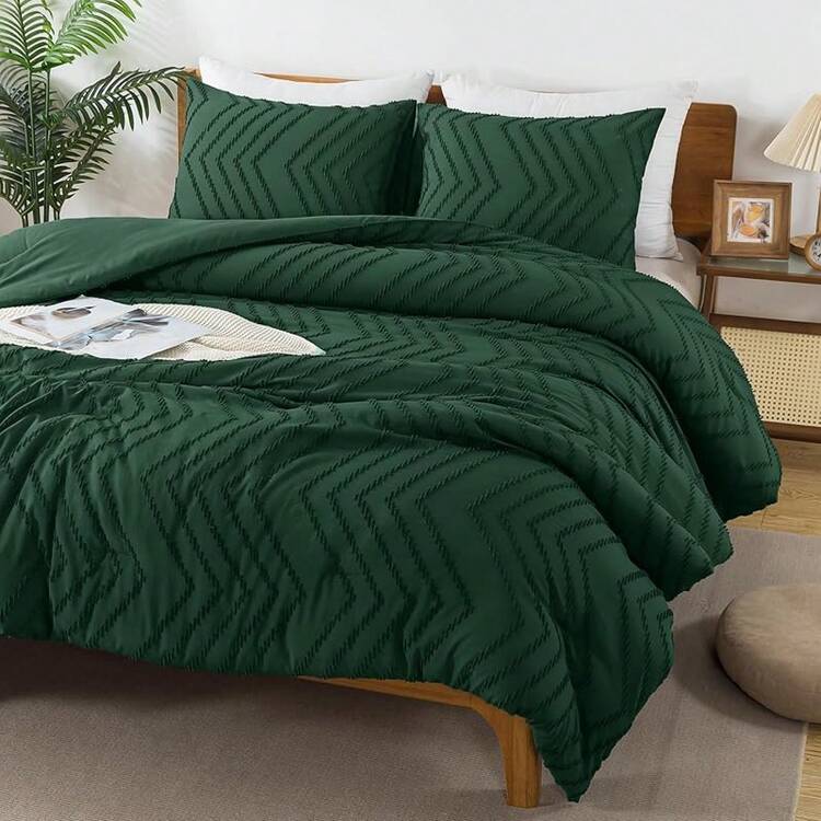
This combination is striking due to its high-contrast color pairing and rich texture. The deep, jewel-toned emerald green is inherently luxurious and calming, while the crisp white sheets peeking out from underneath provide a sharp, clean break that makes the green appear even richer. The chevron texture of the comforter adds another layer of sophistication, creating subtle shadows and highlights that give the solid color dimension. It’s a pairing that feels both bold and incredibly elegant. For a lighter take on this texture, see Idea #14.
💡 Designer Tip
You can capture this rich, high-contrast look for a fraction of the cost. While a high-end textured comforter set can run you $250+, you can find similar styles at stores like Target or Walmart for under $100. The key is to look for a comforter with a subtle, stitched texture like chevron or dots. Pair it with a basic, affordable set of crisp white cotton percale sheets—you can find great ones for around $40-$60. The magic is in the color combination, not the price tag.
14. Soften the Mood with a Lavender Textured Duvet
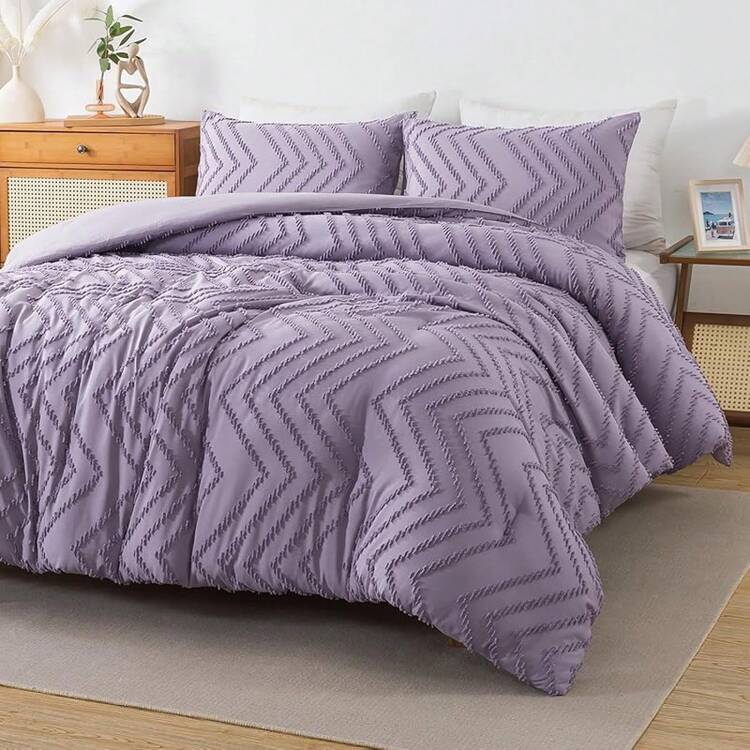
This room’s serene ambiance comes from a carefully balanced style formula: 60% soft texture (the lavender chevron duvet, the gray rug), 30% natural warmth (the light wood furniture and floors), and 10% crisp accents (the white vase and hints of green foliage). This recipe ensures the space feels soft and inviting without becoming overly sweet, thanks to the grounding presence of the wood tones. You could easily swap the lavender for a soft sage green or a pale dusty blue and achieve the same calm, modern effect.
✅ Before You Start
Light-colored, textured bedding like this beautiful lavender set looks amazing, but it can be a magnet for life’s little messes. Spills, pet hair, and even stray makeup can be more visible on a light, solid-colored surface. The texture, while beautiful, can also make spot-cleaning a bit trickier than on a smooth surface. If you have pets or small children, consider a slightly darker colorway or be prepared for more frequent laundering to keep it looking fresh and clean.
15. Layer a Beige Comforter with Muted Pastels
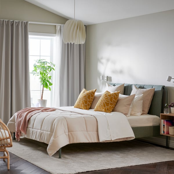
This look is a masterclass in using a neutral base to unite a diverse color palette. The beige comforter and off-white sheets act as a quiet, calming foundation. This allows the more colorful elements—the blue-green headboard, mustard yellow patterns, and soft pink pillows—to coexist without clashing. They feel like a curated collection of favorites against a serene backdrop. It’s a strategy that feels personal and playful, yet still cohesive and restful. For a different take on colorful accents, compare with Idea #20.
🎯 What Makes It Work
When mixing multiple accent colors on a bed, the key to a sophisticated look is to use each color at least twice, but in different textures or patterns. For example, the pink appears in a solid pillowcase and could be echoed in a small detail in the art. The yellow is in a patterned pillow and could be repeated in a vase or a book cover on the nightstand. This repetition makes the color choices feel intentional rather than random, tying the whole look together seamlessly.
16. Embrace Calm with a Fully Monochromatic Beige Bed
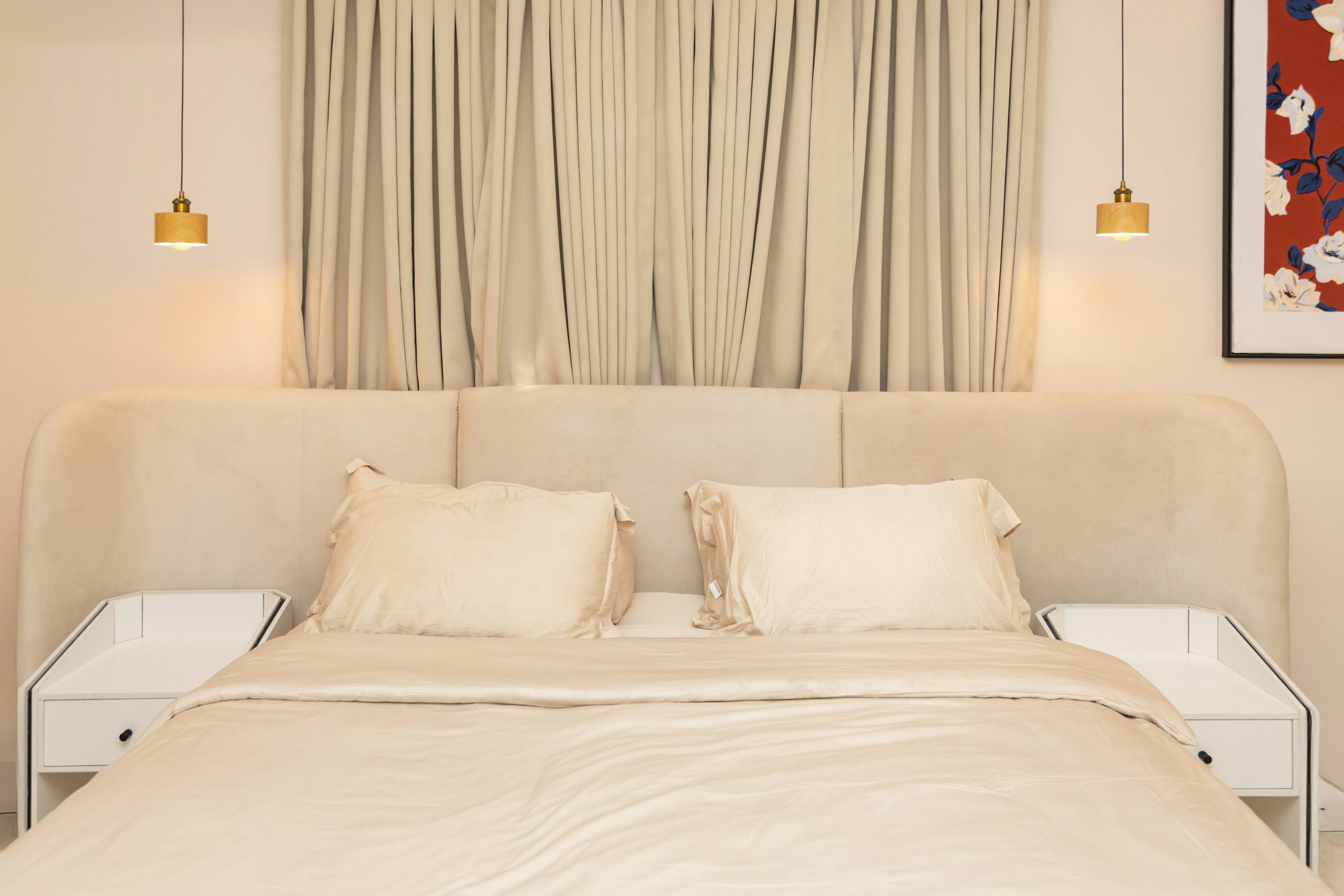
The single element that makes this room feel so incredibly serene and luxurious is the commitment to a single color: beige. From the rounded upholstered headboard to the comforter, sheets, and pleated curtains, every major textile is a coordinated shade of light beige. This full-on monochromatic approach eliminates visual clutter and creates an enveloping, cocoon-like atmosphere. The variation in textures—the soft headboard, the smooth sheets, the pleated curtains—is what gives it depth and keeps it from being boring. But it is the fearless, all-in application of beige that creates the statement. This is a great example of how to do monochrome correctly, unlike the mistake shown in Mistake #1.
⭐ The One Thing
A monochromatic scheme like this is perfect for small to medium-sized bedrooms (100-180 sq ft). The single color helps to expand the space visually, as there are no hard contrasts to break up the lines of the room. The eye flows uninterrupted from the walls to the curtains to the bed, creating a sense of spaciousness and calm. In a very large room, you might need to introduce a darker accent color in the furniture or decor to avoid the space feeling washed out.
17. Add a Touch of Elegance with Gold-Trimmed White Bedding
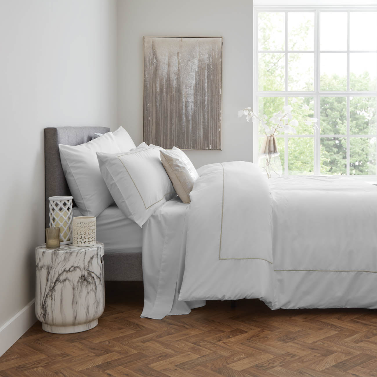
The success of this design lies in its incredible restraint. The bedding is 99% simple, crisp white. That tiny 1%—the thin line of gold embroidery—is what elevates the entire look from basic to bespoke. It’s a whisper of luxury, not a shout. This subtle metallic detail catches the light and echoes the gold tones in the nearby abstract art and the veining of the marble side table. It’s proof that the most impactful details are often the smallest and most thoughtfully chosen.
🔥 Trending Context
You don’t need to splurge on designer hotel collection bedding to get this elegant look. Many retailers now offer affordable versions of this classic style. Look at Target’s Casaluna line or even Amazon for white duvet sets with simple embroidered borders. You can often find a set for under $80. The key is to look for a single, thin line of embroidery in a metallic or contrast color. Pair it with simple white sheets, and you’ve captured that five-star hotel feeling on a real-world budget.
18. Create a Rustic Cottage Feel with Ruffled Bedding and a Distressed Chair
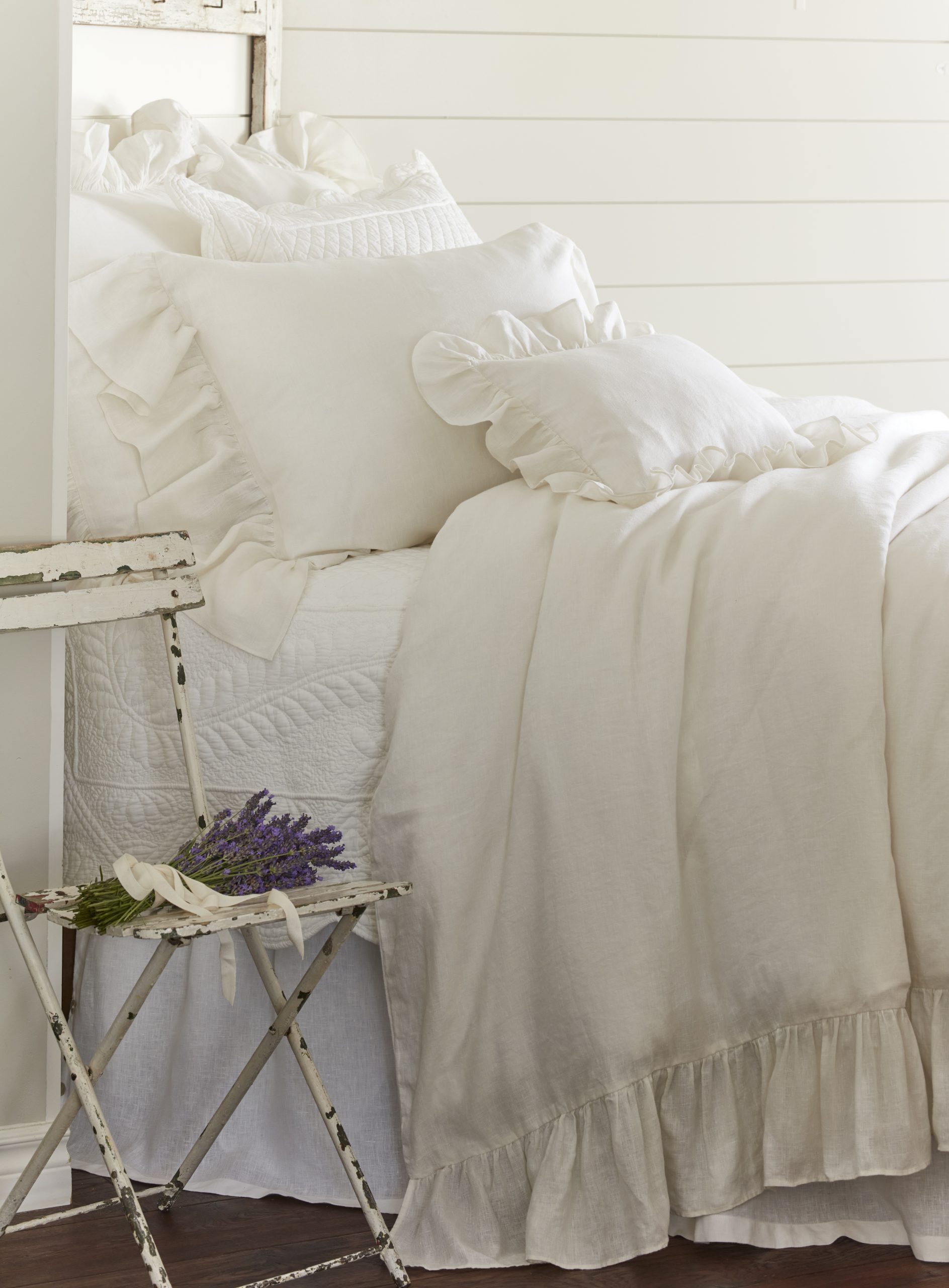
The single item that crystallizes the romantic, rustic-cottage vibe of this space is the distressed white folding chair. It’s an unexpected and deeply charming replacement for a traditional nightstand. Its peeling paint and simple form suggest a story and a sense of history, perfectly complementing the soft, feminine ruffles of the bedding. Placing the small bouquet of lavender on it is the final, perfect touch, turning a simple piece of furniture into a poetic vignette. Without the chair, it’s just a pretty bed; with it, it’s a whole mood.
💸 Get This Look For Less
This look is undeniably romantic, but let’s be honest: a vintage folding chair is not the most practical nightstand. It offers very little surface area (no room for a lamp, book, and glass of water) and no storage. This setup is ideal for a guest room where storage needs are minimal, or for someone who values aesthetics far more than bedside functionality. If you need your nightstand to be a workhorse, you might admire this look but opt for a small table with a drawer instead.
19. Play with Light and Shadow Against a Floral Accent Wall
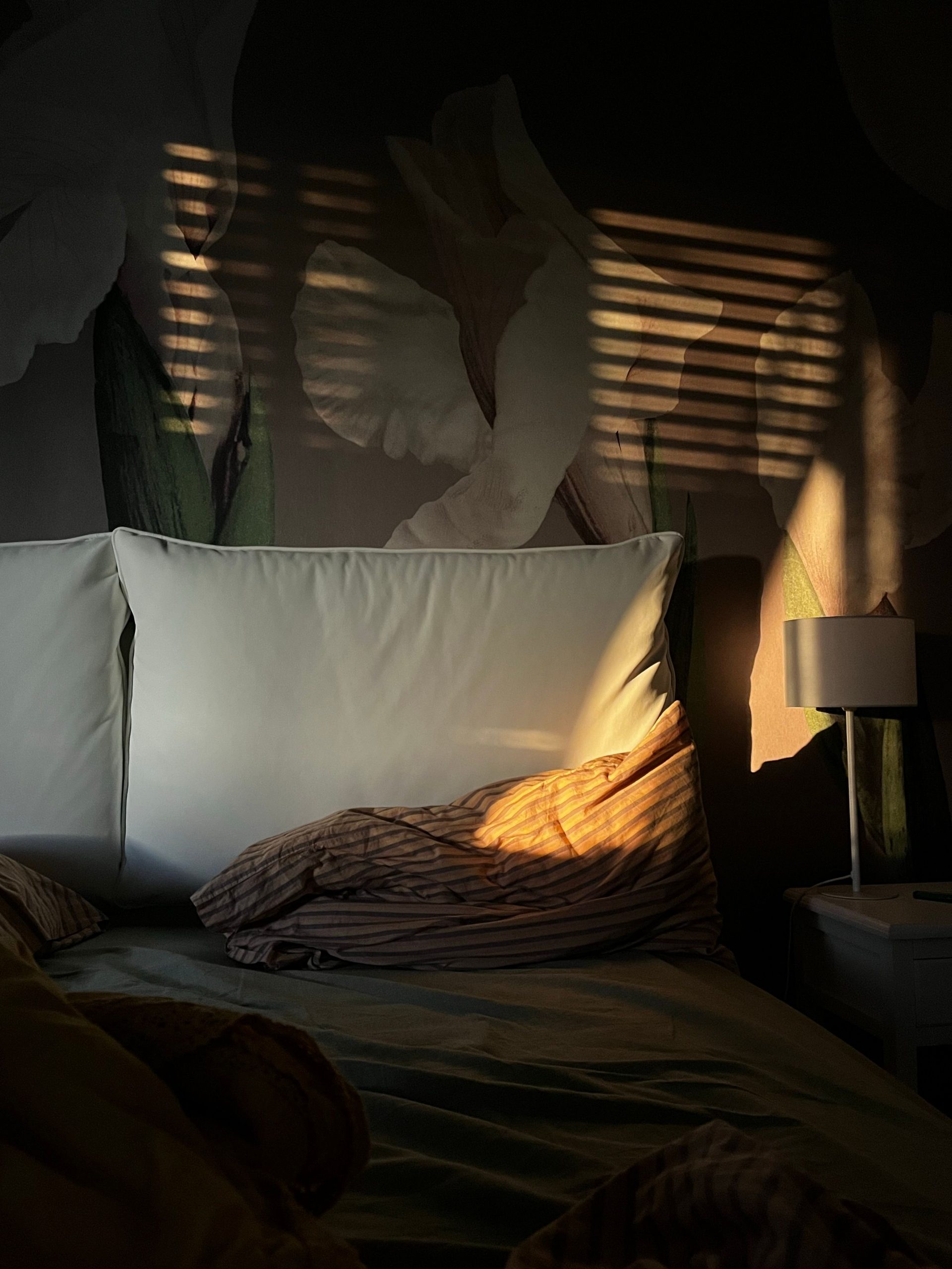
What makes this scene so captivating is the interplay between the permanent design elements and the fleeting natural light. The strong, diagonal stripes of sunlight cutting across the room add a layer of texture and drama that no lamp could replicate. They highlight the texture of the white pillows and the green sheets, while creating a dynamic pattern on the floral wall mural. It’s a perfect reminder that a room’s design isn’t just about the objects within it; it’s also about how the space interacts with light throughout the day.
🔧 How-To Brief
If you have a wall that gets dramatic, direct sunlight like this, lean into it. Instead of trying to block it out, treat the light as a design element. Choose wall treatments and bedding with subtle textures that will be highlighted by the sun. A matte-finish floral mural, like the one here, a limewash wall, or even subtly textured wallpaper will come alive when the light hits it. Avoid high-gloss finishes in these areas, as they can create harsh, unpleasant glare instead of a warm glow.
20. Pair a Beige Comforter with Dark Teal and Blush Accents
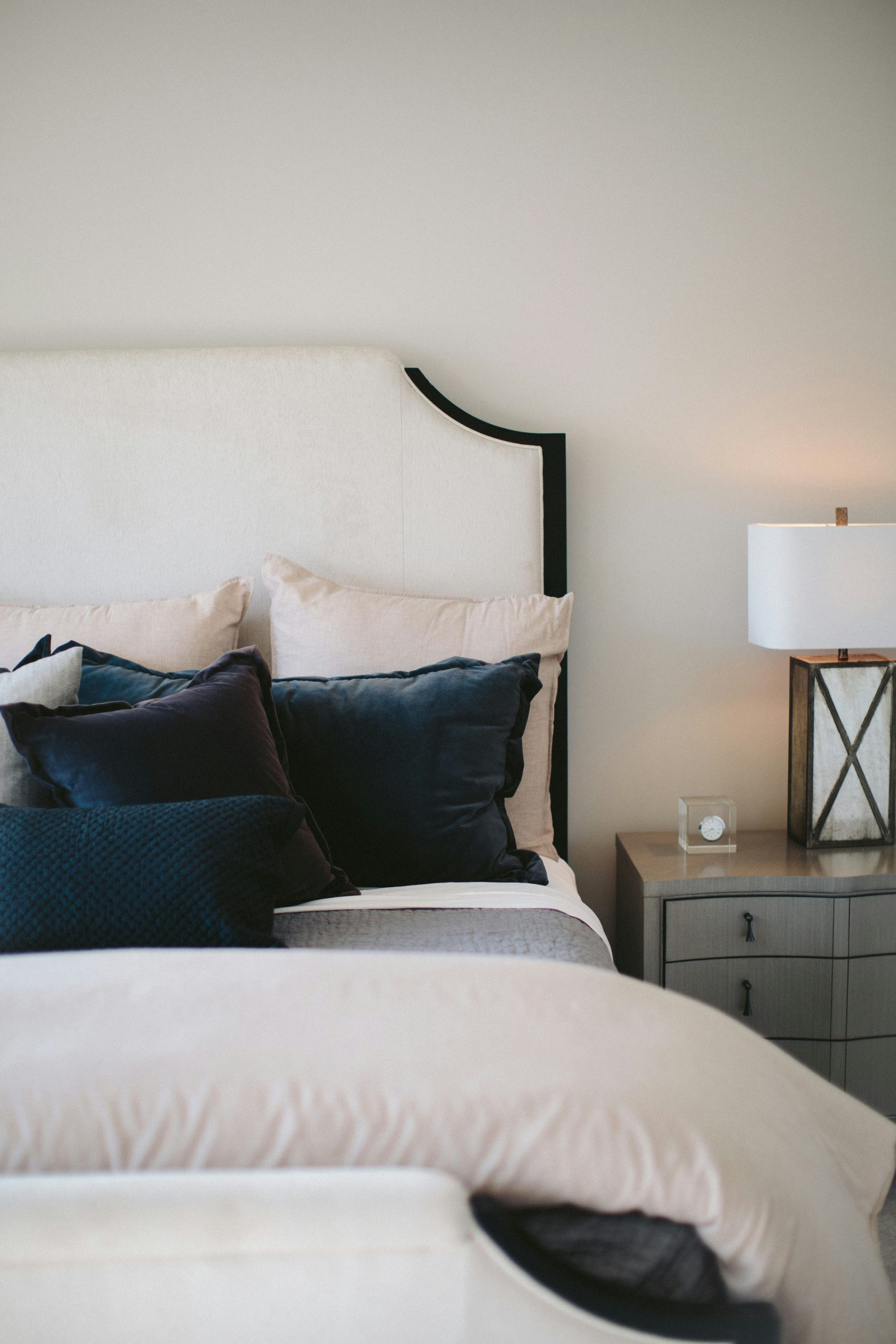
This inviting palette demonstrates a perfect balance of colors. The style math is simple: 60% warm neutral (the beige comforter and headboard), 30% a rich, cool jewel tone (the dark teal pillows and accents), and 10% a soft, warm pastel (the blush pink sheets). This formula works because the beige provides a quiet backdrop, the teal adds depth and sophistication, and the blush introduces a touch of softness and warmth, preventing the teal from feeling too cold. It’s a chic, modern, and surprisingly soothing combination.
🧹 Maintenance Reality
Before you invest in this sophisticated color palette, run through this quick checklist to ensure it will work in your space:
- Assess Your Light: Dark teal needs good natural or layered artificial light to keep from looking gloomy. This palette is best for a room with at least one large window.
- Check Your Wall Color: This combo sings against a light, neutral wall (white, cream, or a very light gray). A dark wall would be overwhelming.
- Consider Your Furniture: The dark wood and grayish tones of the furniture here ground the look. Ensure your existing pieces have a similar neutral or dark finish.
21. Achieve Modern Elegance with Monochromatic Beige and Gold
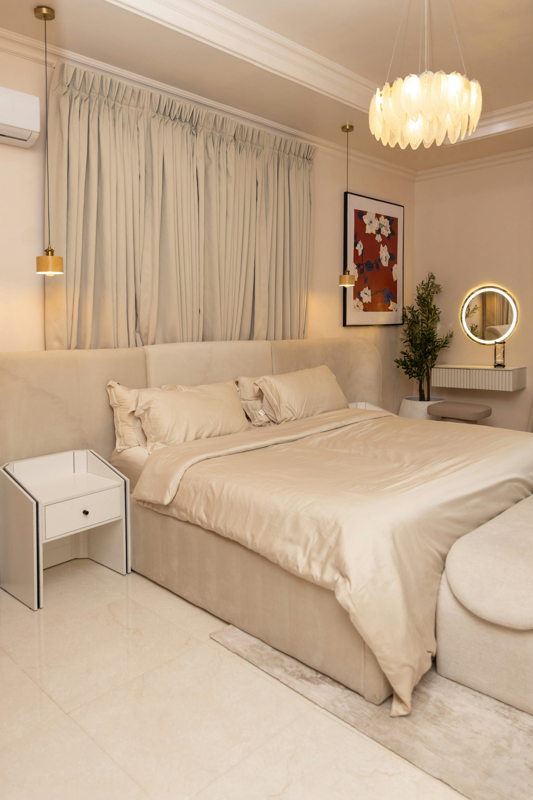
This room radiates elegance because it combines a soft, monochromatic beige palette with clean, modern lines and a hint of glamour. The lustrous finish on the duvet cover adds a subtle sheen that reflects light, making the beige feel rich and dynamic. The sharp, geometric form of the white nightstand and the perfect circle of the illuminated mirror provide a crisp, contemporary counterpoint to the soft curves of the upholstered bed. The touches of gold and the pops of color in the art are the final layer, adding personality and a hint of warmth.
⚠️ Real Talk
This grand, high-headboard style is best suited for rooms with generous proportions and higher ceilings. A headboard of this height needs a ceiling of at least 9 feet to avoid feeling cramped. The ideal room size would be 150 square feet or larger. In a smaller space, the bed would overwhelm the room. The full-height matching curtains also work to draw the eye upward, accentuating the ceiling height, a trick that is most effective when you have the vertical space to begin with.
22. Brighten Your Space with a Natural Wood Bed and Neutral Textiles
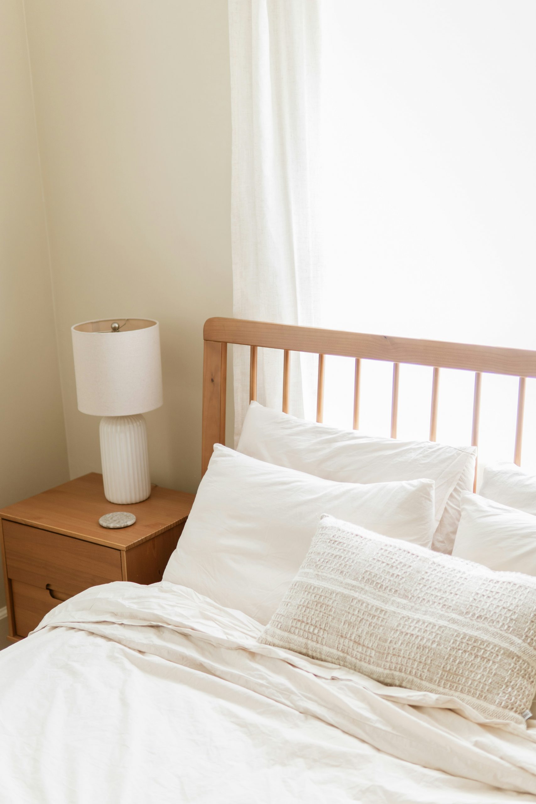
The single element that defines this bright and airy space is the slatted wooden headboard. It’s the perfect centerpiece for a room focused on natural materials and serene vibes. The light wood tone brings warmth and organic texture, while the slatted design keeps it from feeling like a heavy, solid block. It provides structure and interest without sacrificing the room’s light, breezy feel. Every other choice—the creamy white bedding, the ceramic lamp, the sheer curtains—is a quiet complement to the headboard’s starring role.
💰 Budget Breakdown
To keep a bedroom with lots of light wood and white from feeling sterile, layering different shades of neutral is key. Notice the mix here: crisp white sheets, off-white pillows, and a textured beige-and-white throw pillow. These subtle variations in the neutral family add warmth and depth. Never underestimate the power of layering whites and creams together. It’s a simple trick that adds instant sophistication and prevents a minimalist palette from feeling one-dimensional.
23. Mix a Beige, Blue, and White Checkered Duvet with Gray Sheets
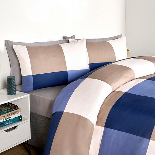
This combination works beautifully because the gray sheets act as a neutral bridge between the colors in the checkered duvet. The gray is a cool neutral that speaks to the blue tones in the pattern, while its softness also complements the beige. Choosing gray sheets instead of white was a smart move; white could have created too stark a contrast, while the gray provides a softer, more integrated look. It makes the bed feel calm and cohesive, despite the bold, multi-colored pattern on top.
📐 Style Math
A large-scale checkered or plaid pattern like this has a strong visual presence. While it creates a cozy and inviting bed, be aware that it can make a very small room feel a bit busier. This type of bedding is best suited for rooms where the bed is the clear focal point and other patterns are kept to a minimum. If you have patterned curtains, a busy rug, and a lot of art on the walls, adding a bold checkered duvet might create a feeling of visual clutter.
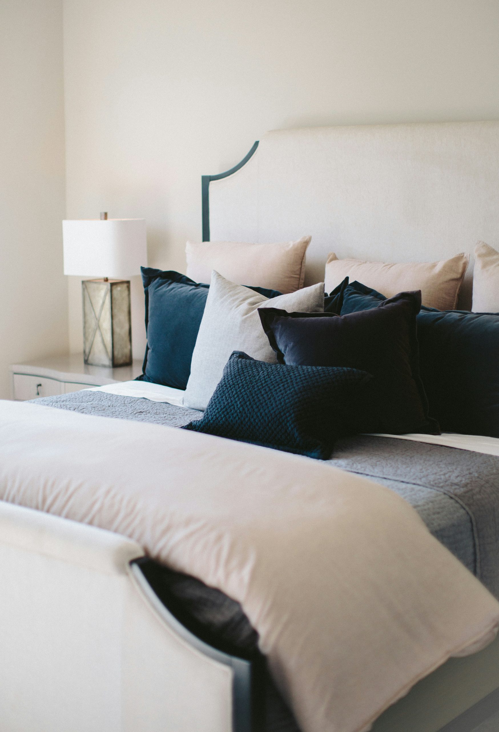
24. Layer a Beige Comforter with Blue, Gray, and Pink Pillows
This bed is a perfect equation for a serene yet interesting look: a 50% neutral base (beige comforter and headboard), 30% cool tones (light gray blanket, blue pillows), and 20% warm accents (dark teal trim, pale pink pillows). The beige base ensures it’s calming, the cool tones add a modern, airy feel, and the small touches of warmth provide balance and personality. This formula is endlessly adaptable—swap the pink for mustard yellow or the gray for a soft sage green to suit your taste.
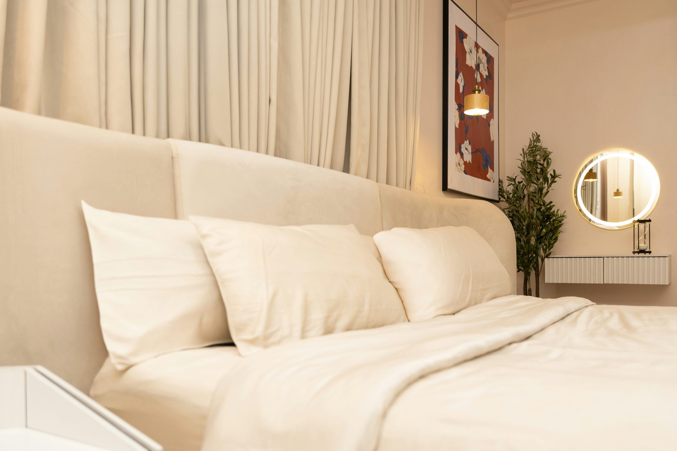
25. Style a Soft Beige Bedroom with Patterned Art and an Illuminated Mirror
This room feels so successfully soft and inviting because it layers multiple light sources to create a warm, ambient glow. Instead of relying on a single overhead fixture, it uses a small hanging pendant, a backlit circular mirror, and likely hidden lamps. This layered lighting eliminates harsh shadows and allows the monochromatic beige palette to feel rich and dynamic. The textures of the upholstered headboard and curtains catch the soft light beautifully, contributing to the overall serene and sophisticated atmosphere.
💡 Designer Tip
To get this curated, high-end look, here’s a potential cost breakdown:
- Upholstered Bed & Headboard: $800 – $2,000
- Beige Comforter & Sheet Set: $150 – $400
- Lighting (Pendant & Mirror): $300 – $750
- Decor (Artwork, Plant, Console): $250 – $600
- TOTAL: $1,500 – $3,750
Budget alternative: Find a similar upholstered headboard on Facebook Marketplace, DIY a backlit mirror using LED strips, and shop for art prints on Etsy to get the vibe for 40-50% less.
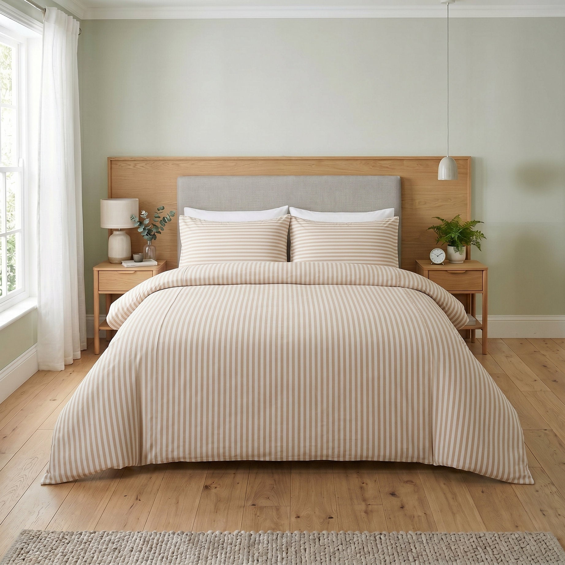
26. Use Beige and White Stripes against Muted Green Walls
The genius of this design is the pairing of the earthy, muted green walls with the clean, graphic beige and white stripes. The green provides a soft, natural backdrop that is calming and organic, while the stripes on the bedding introduce a crisp, tailored element. The light wood furniture acts as a bridge between the two, its natural warmth tying the green and beige together. It’s a combination that feels both relaxing and stylishly put-together, hitting a sweet spot between natural modern and classic design.
✅ Before You Start
This color and material combination is incredibly versatile and works well in bedrooms of most sizes, from a compact 100 sq. ft. to a more spacious 250 sq. ft. The pale green walls recede, making the room feel larger, while the light wood and white accents keep the atmosphere bright and airy. The vertical stripes on the comforter can also create an illusion of height, making it a clever choice for rooms with standard 8-foot ceilings.
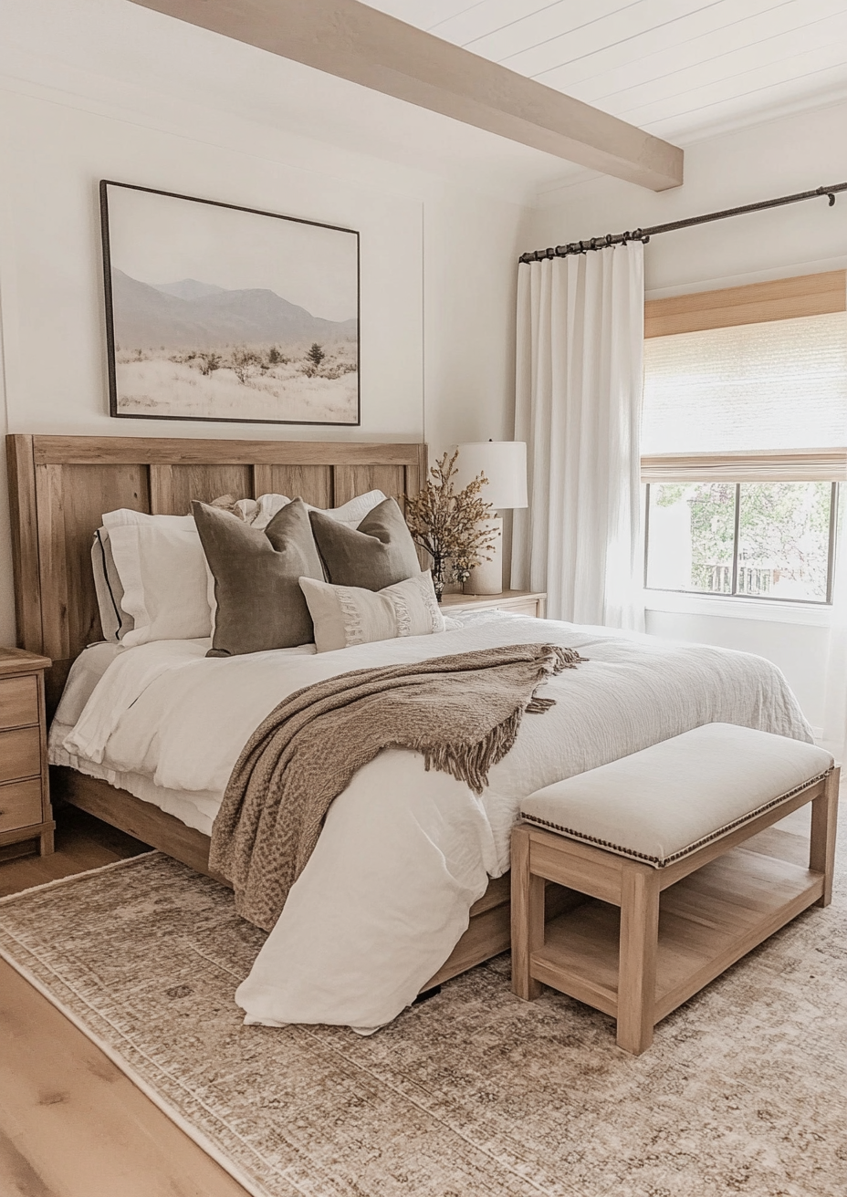
27. Layer White and Beige Bedding with Warm Wood and Olive Accents
that truly anchors this earthy, natural bedroom is the large landscape artwork above the bed. While the layers of white, beige, and olive green are beautiful, the artwork provides the narrative for the entire space. Its muted, panoramic scene sets the tranquil, nature-inspired tone. The colors within the art are reflected in the bedding choices, making the whole room feel like a cohesive extension of that peaceful view. Without it, the bed is just a nice collection of textiles; with it, it’s a complete story.
🎯 What Makes It Work
Recreating this layered, textured bed is simple. Here’s a quick guide:
- Start with your base: crisp white sheets and a simple white comforter. This creates a bright canvas.
- Fold the comforter back about a third of the way down the bed to show off the sheets.
- Layer your sleeping pillows first, then place your accent pillows in front. Here, two olive green pillows and one embroidered beige pillow create a focal point.
- Drape a textured throw blanket (like the medium brown one here) casually across the foot of the bed for a final touch of color and texture.
28. Combine Neutral Stripes with a Light Wood Frame
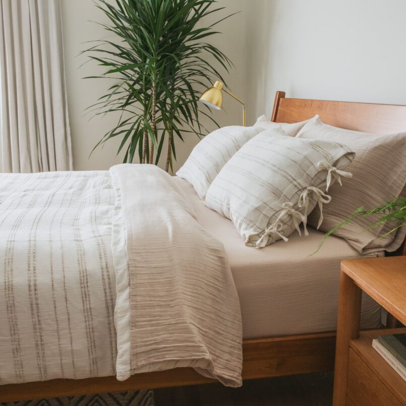
This look is a prime example of how to do neutral-on-neutral with personality. The key is the subtle but distinct variation in the neutrals. You have the warm brown of the wood bed frame, the slightly cooler light beige of the sheets, and the white-and-brown stripes of the duvet. These elements are all in the same family, but different enough in tone and pattern to create depth. The brass lamp and green plant add just enough warmth and life to complete the serene, natural picture. It’s a similar concept to Idea #3, but with a bolder stripe.
⭐ The One Thing
Achieving this calm, natural aesthetic doesn’t require a hefty investment. The core components are a simple wood-framed bed and striped bedding, both of which can be found at budget-friendly price points. Check IKEA for their classic wood bed frames like the NEIDEN or TARVA, often under $150. For the striped duvet cover, browse places like H&M Home or Quince, where you can find stylish options for $70-$100. A thrifted brass lamp and a simple snake plant will complete the look for well under $400 total.
Your Perfect Bed Palette is Waiting
Now that you’ve seen how incredibly versatile a simple beige comforter can be, the only thing left is to pick a direction and make it your own. Whether you’re drawn to the quiet calm of layered neutrals, the fresh energy of a colorful pattern, or the deep mood of a jewel tone, the perfect combination is ready for you to try. Don’t forget to save your favorites to Pinterest to start building the bedroom you’ve been dreaming of!