Blue And Green Living Room Ideas 2026: 46 Modern Color Schemes For Your Home
Blue and green living rooms are having a major moment in 2026, and it’s easy to see why. This natural color pairing brings a sense of calm and balance that feels both timeless and refreshingly modern. Whether you’re drawn to deep navy and emerald tones or soft sky blues with sage accents, this combination works beautifully across styles—from coastal retreats to moody, layered interiors. Americans searching Pinterest for living room inspiration are discovering that blue and green aren’t just compatible—they’re transformative. In this article, we’ll explore distinct ways to bring this dynamic duo into your space, with ideas that span every aesthetic and budget.
1. Navy and Emerald Jewel Tone Sanctuary
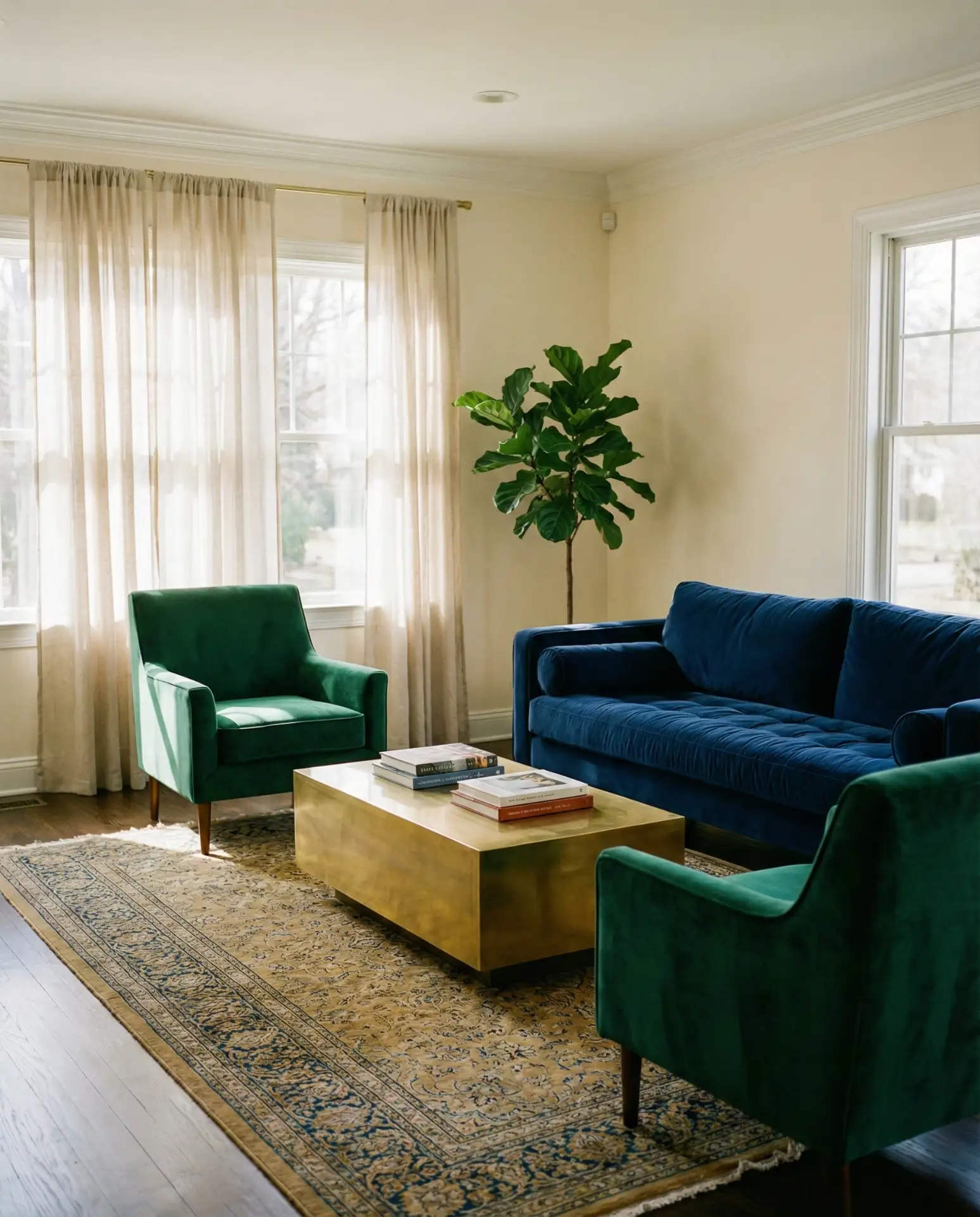
A navy sofa paired with emerald velvet accent chairs creates an instantly luxurious foundation that feels both modern and classic. This color scheme works particularly well in living rooms with high ceilings or abundant natural light, where the depth of both hues can be fully appreciated. Layer in brass hardware and a Persian-style rug with gold accents, and you’ve got a space that commands attention without feeling overwrought. The key is balance—let one color dominate while the other punctuates.
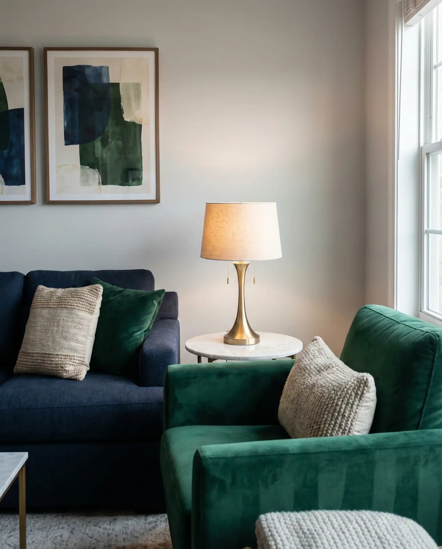
This approach works best in formal living rooms or spaces where you entertain regularly. The jewel-tone palette naturally elevates the room’s formality, making it ideal for brownstones, historic homes, or newer builds aiming for sophistication. If you’re working with a smaller budget, start with one statement piece—either the sofa or the chairs—and build around it with less expensive textiles and accessories that echo the color story.
2. Coastal Light Blue with Sage Accents
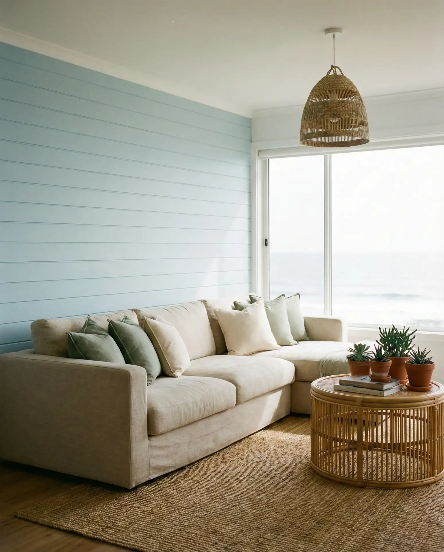
Soft light blue walls paired with sage green furnishings evoke the easy breezes of a coastal retreat, even if you’re hundreds of miles from the ocean. This palette feels particularly at home in beach towns from California to the Carolinas, but it translates beautifully to suburban and urban spaces craving serenity. Think linen slipcovers, whitewashed wood coffee tables, and plenty of texture through woven baskets and jute rugs. The overall effect is airy, unfussy, and deeply restful.
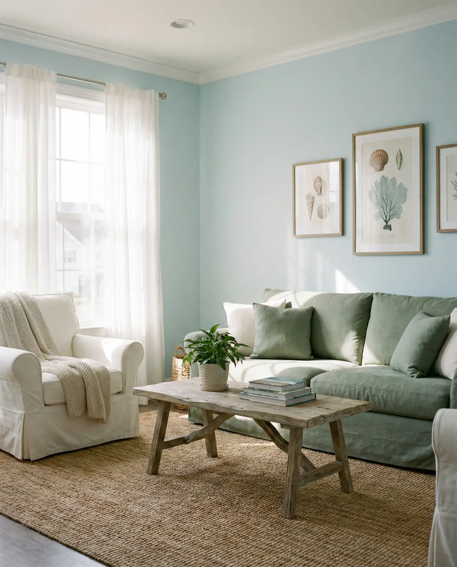
A common mistake here is going too matchy-matchy with blues and greens in the same saturation. Instead, vary the intensity—pale blue on the walls, medium sage on upholstery, and deeper teal in artwork or pillows. This layering prevents the room from feeling flat or one-dimensional. Also, resist the urge to add too many nautical clichés; let the colors do the coastal work without anchors and rope details.
3. Moody Teal and Forest Green Library Vibes
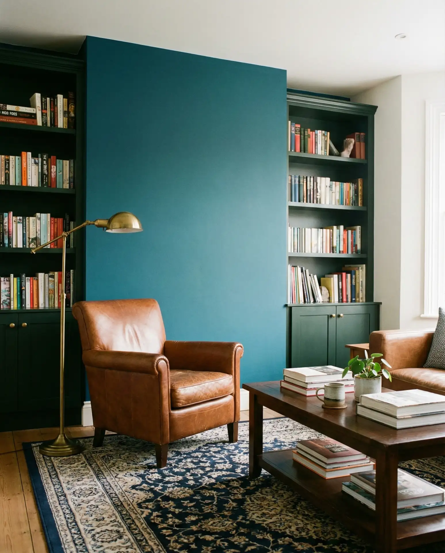
For those drawn to moody and dark interiors, a teal accent wall combined with forest green built-ins creates an enveloping, library-like atmosphere that’s equal parts sophisticated and comforting. This aesthetic thrives in spaces with plenty of artificial lighting—think sconces, table lamps, and overhead fixtures that can compensate for the deeper tones. Add leather furniture and dark wood shelving, and you’ve created a living room that feels like a private club.
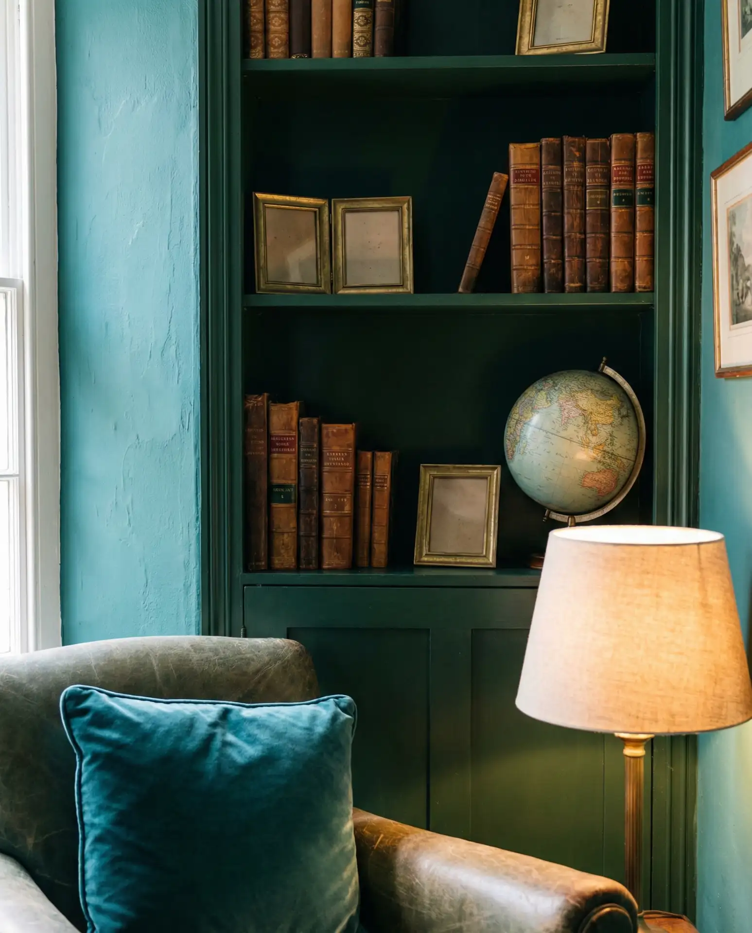
My neighbor recently painted her entire living room in this scheme and was initially worried it would feel too dark. Three months later, she says it’s the room she spends the most time in—cozy without being claustrophobic, dramatic without being overwhelming. The secret was adding enough warm metallics and layered lighting to keep the space from feeling cave-like.
4. Farmhouse Blue with Olive Green Textiles
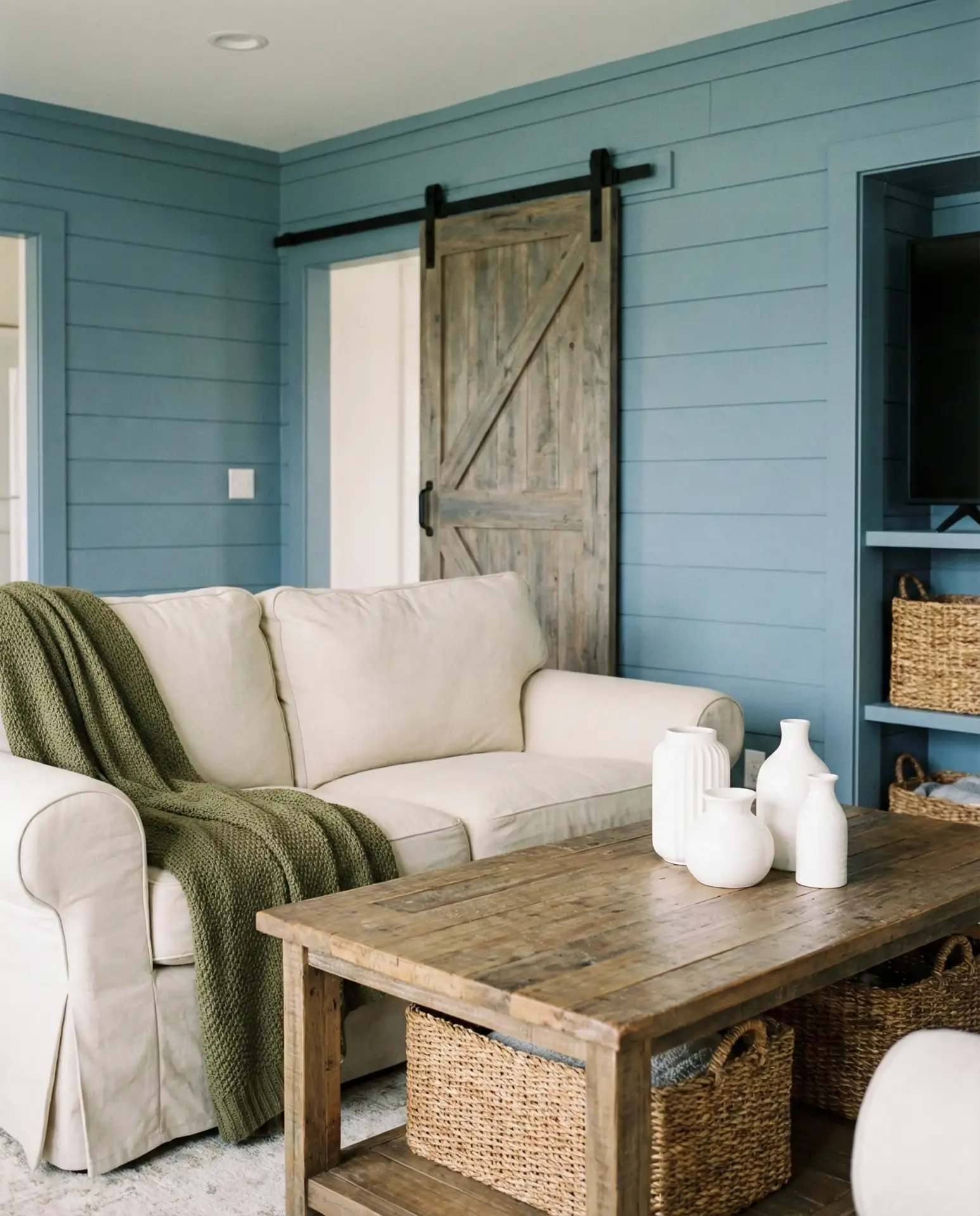
The farmhouse trend gets a fresh update when you swap out the typical all-white palette for muted blue walls and olive green soft goods. This combination feels rooted in countryside tradition but with enough color to avoid feeling generic. Think slipcovered sofas in cream, vintage olive green quilts draped over chair backs, and reclaimed wood coffee tables that ground the lighter tones. It’s cozy, collected, and endlessly livable.
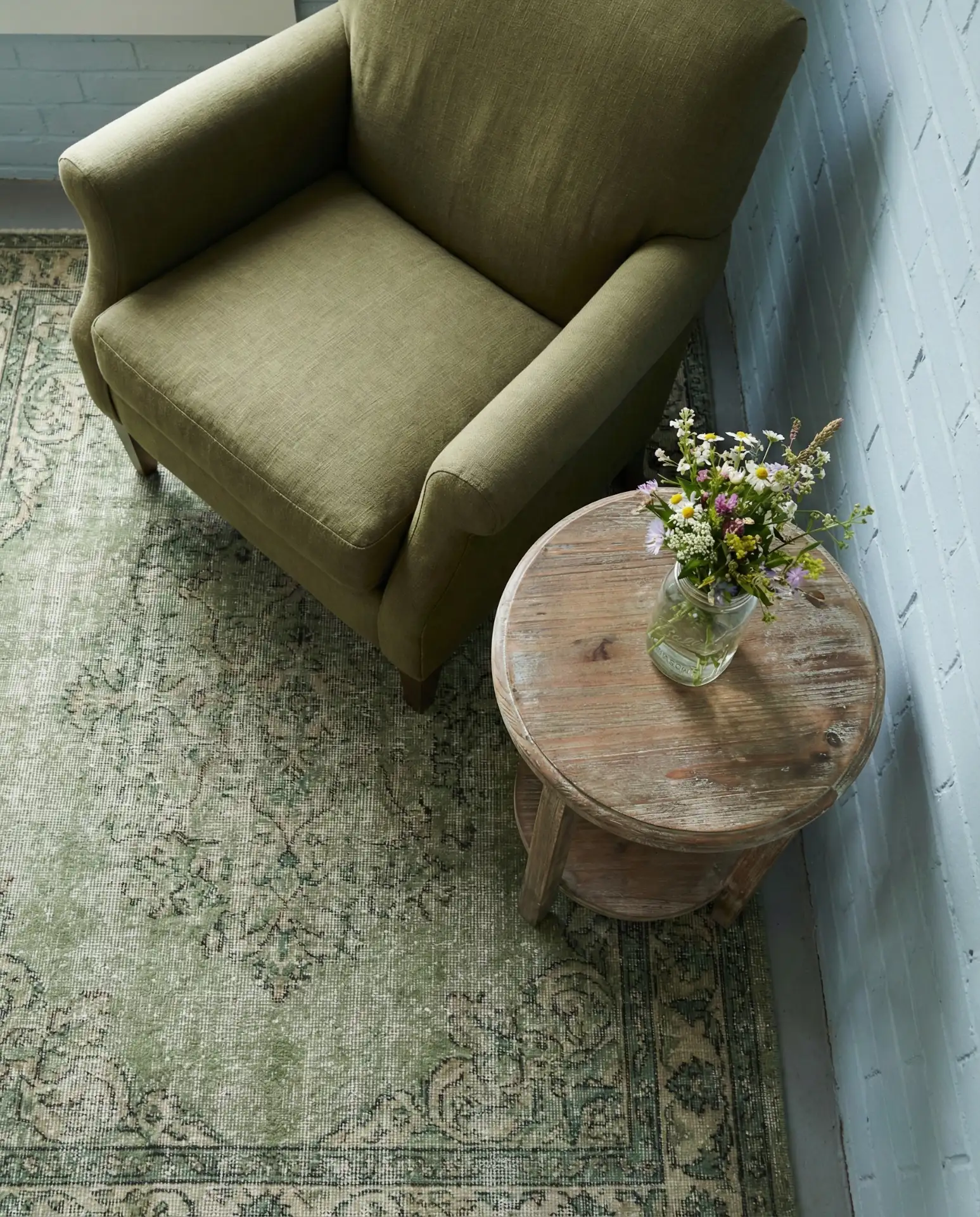
This style works best in ranch homes, converted barns, or any space with rustic architectural details like exposed beams or wide-plank floors. Urban apartments can pull it off too, especially if you lean into vintage finds and antique markets for accessories. Budget-wise, farmhouse style can be quite forgiving—many of the best pieces are secondhand discoveries or DIY projects that add character without breaking the bank.
5. Royal Blue Velvet with Mint Green Accents
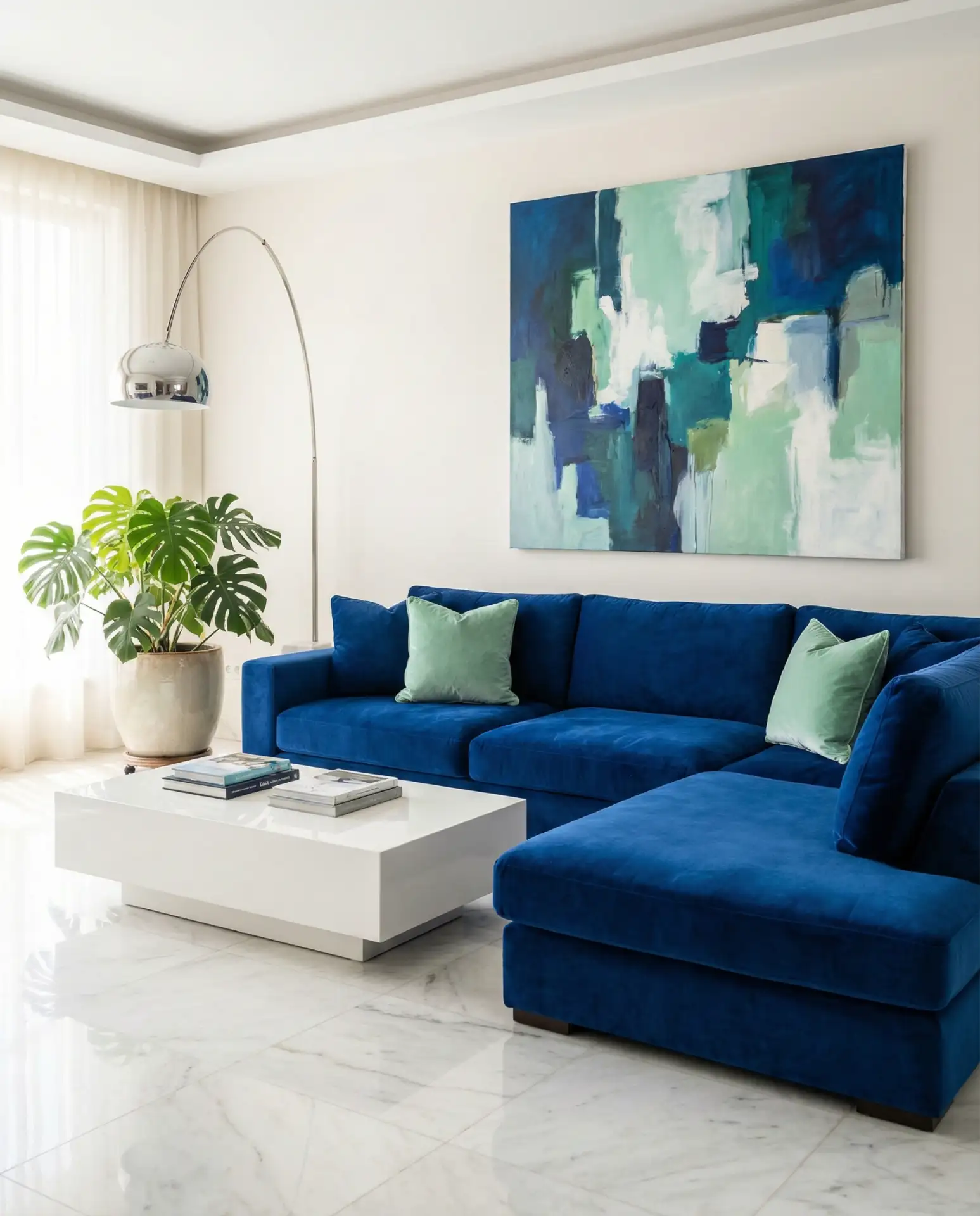
A royal blue velvet sectional serves as a bold anchor that demands supporting players with equal personality. Enter mint green—a shade that might seem risky at first but actually plays beautifully against deeper blues. Add in white lacquered side tables and abstract art featuring both colors, and suddenly you have a living room that feels curated and confident. This is maximalism done with restraint, where every piece has visual weight but nothing competes.
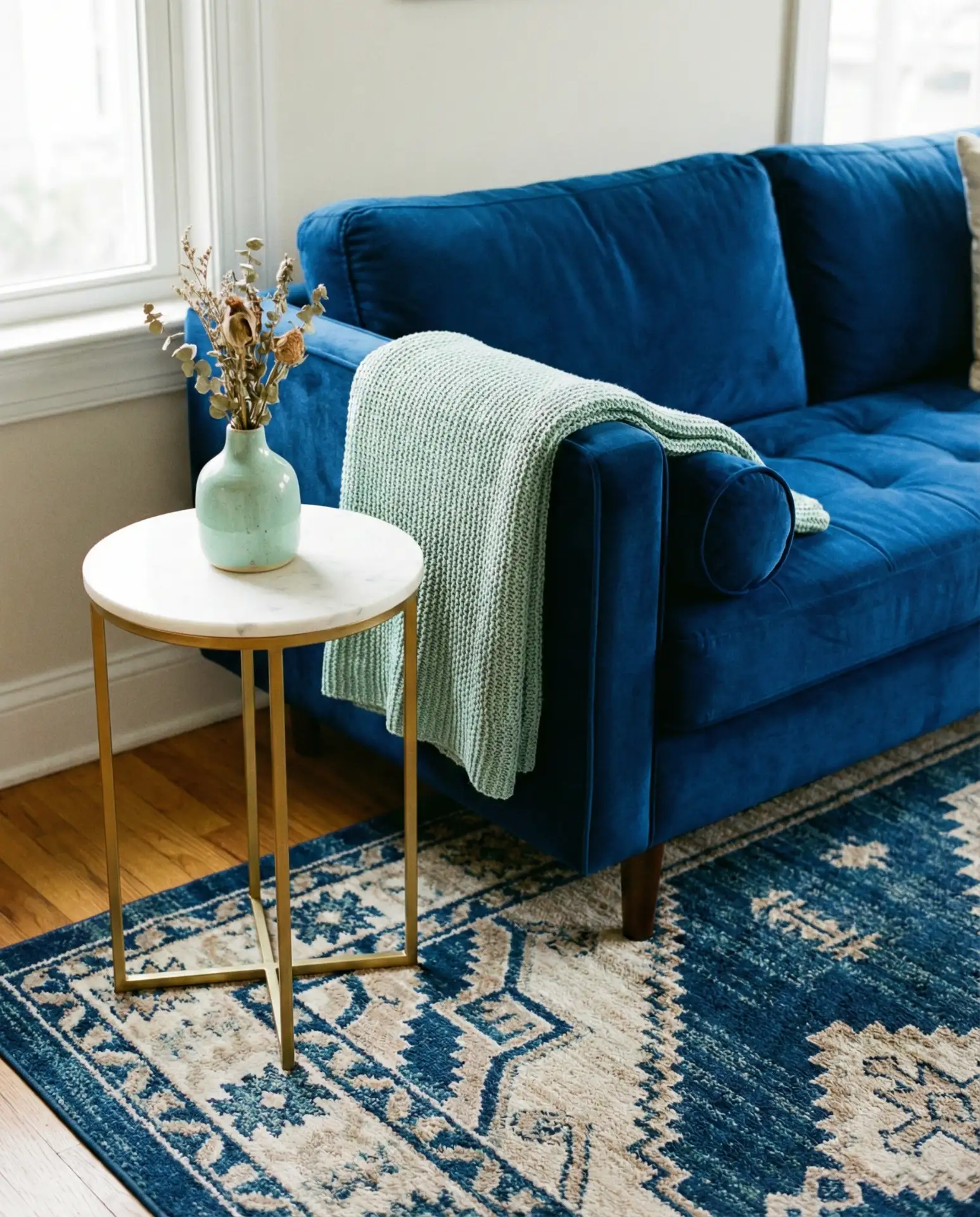
Regional context matters here—this palette feels particularly at home in modern lofts in cities like Miami, Austin, or Brooklyn, where bold color choices are celebrated. In more conservative markets, you might want to ease into it by starting with mint green as an accent color in pillows or artwork before committing to larger pieces. The velvet sectional itself is an investment, so choose quality that will last through trend cycles.
6. Pale Aqua Walls with Eucalyptus Green Furniture
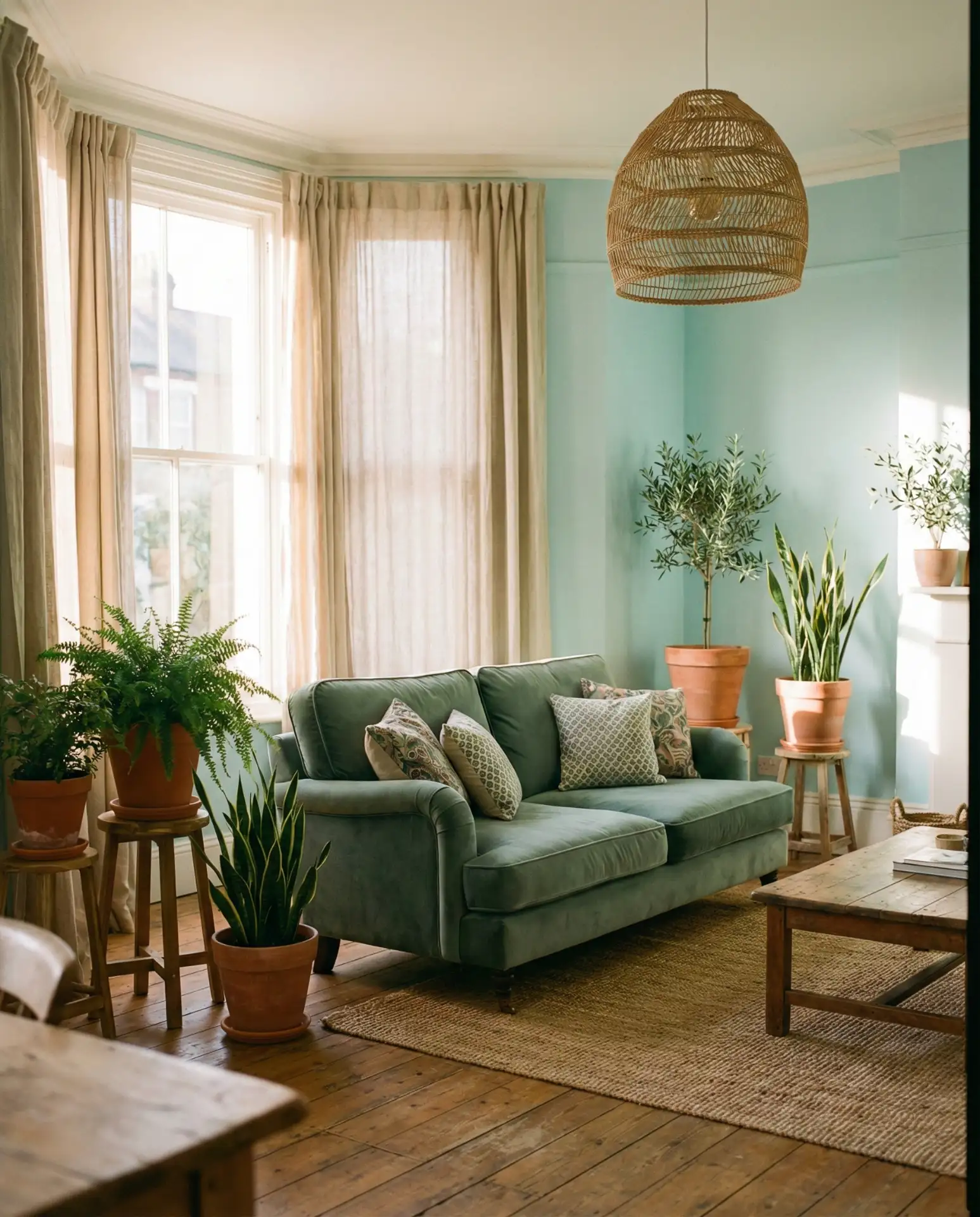
Pale aqua creates a barely-there backdrop that allows eucalyptus green furniture to take center stage without overwhelming the senses. This is a masterclass in subtlety—the kind of color scheme that photographs beautifully but also lives quietly and peacefully in daily life. Layer in plenty of natural materials like rattan, linen, and unfinished wood to keep the palette from feeling too precious. The result is sophisticated yet approachable.
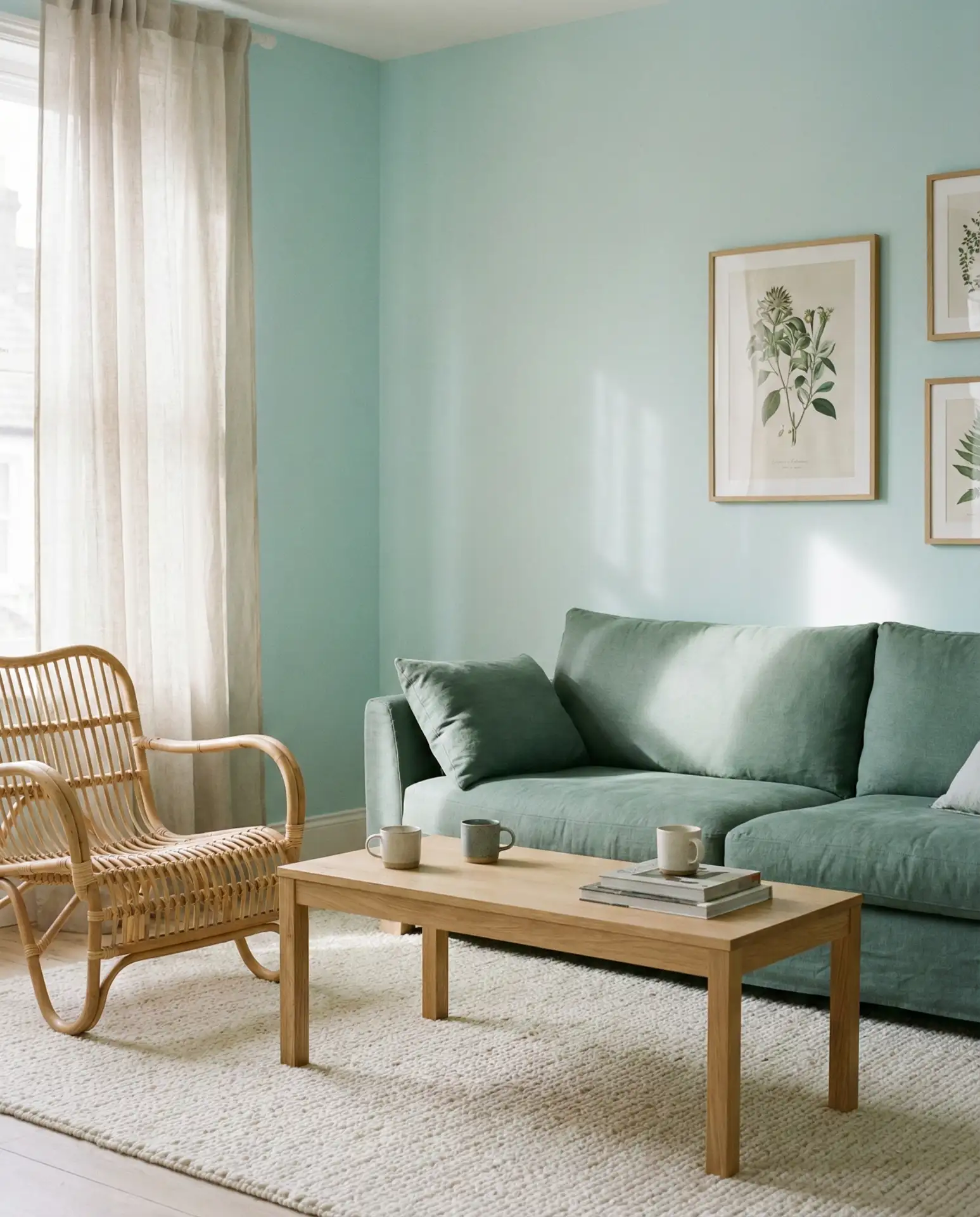
One practical insight: pale aqua can read differently depending on your lighting. Test paint samples on multiple walls and observe them at different times of day—morning light may bring out more green, while evening light emphasizes the blue. Once you’ve committed, the payoff is enormous. This palette works in everything from condos to cottages, adapting easily to existing architectural styles without demanding major renovations.
7. Navy Paneling with Chartreuse Accents
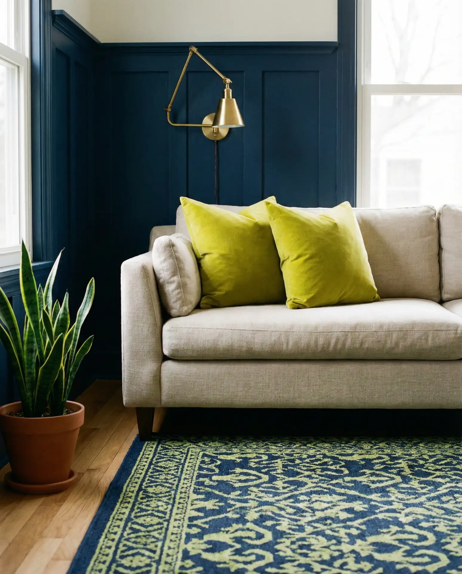
Installing navy vertical paneling creates instant architectural interest, and chartreuse accents provide the unexpected pop that keeps the room from feeling too traditional. This combination walks the line between classic and contemporary—the paneling nods to heritage design while the bright yellow-green brings energy that’s thoroughly modern. Think chartreuse velvet pillows, a sculptural side chair, or even a bold area rug that bridges both tones.
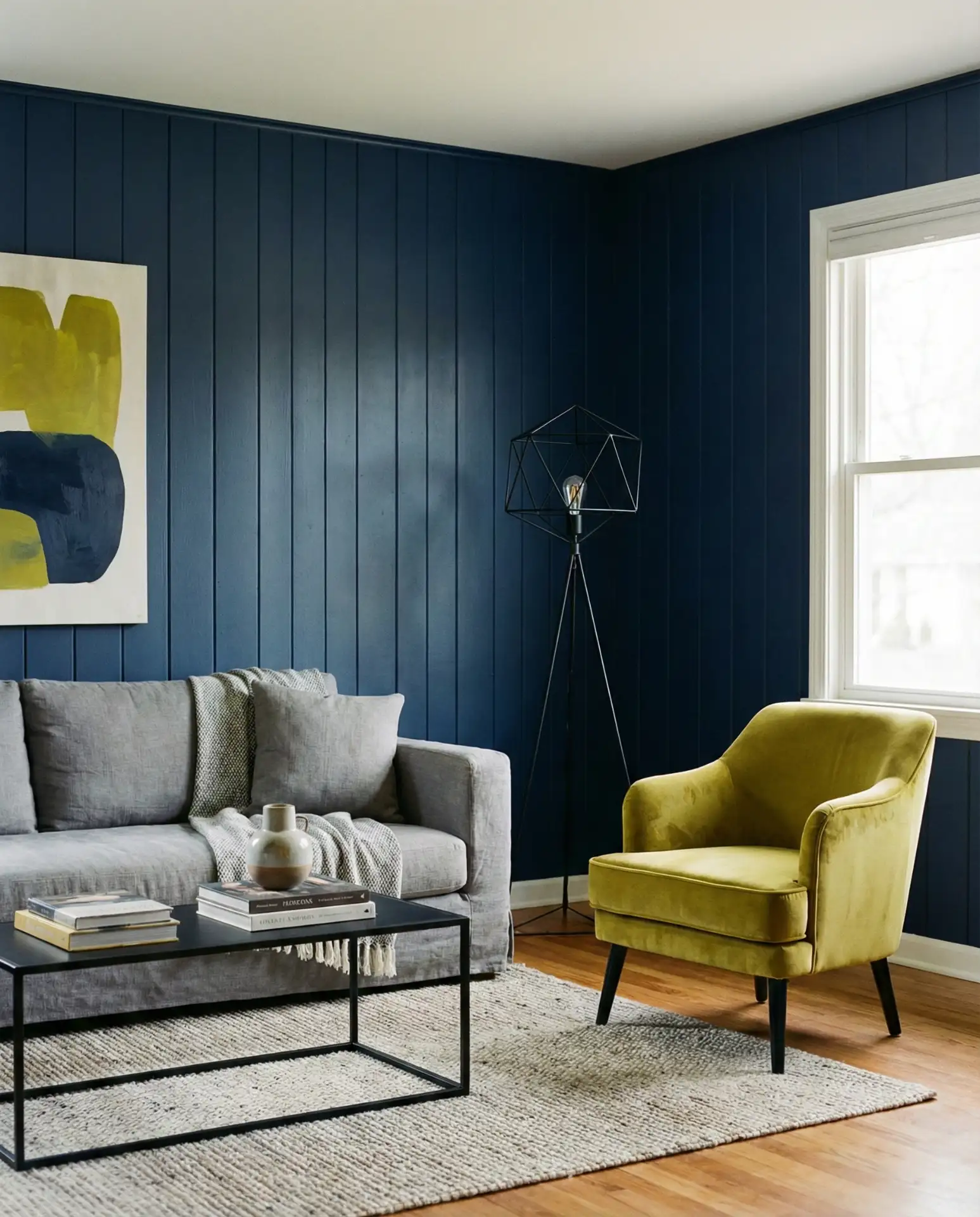
From an expert perspective, this scheme requires confidence but rewards it generously. The key is proportion—let navy dominate the space through the paneling, then use chartreuse sparingly for maximum impact. Too much of the bright green can overwhelm; just enough makes the whole room sing. This approach particularly shines in living rooms with good natural light, where the chartreuse can truly glow against the deep navy backdrop.
8. Turquoise Sofa with Sage Green Walls
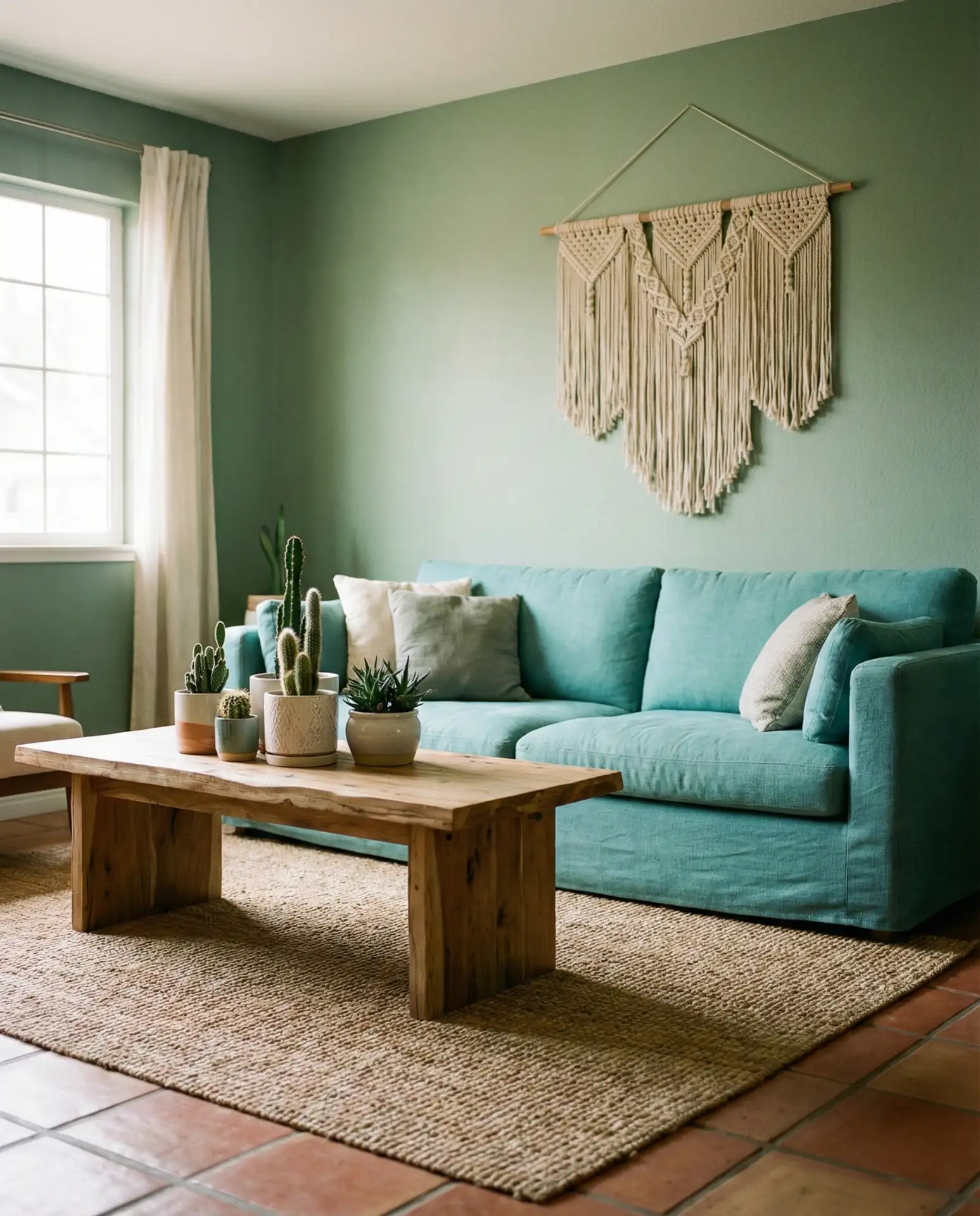
Flipping the typical formula, a vibrant turquoise sofa against sage green walls creates a playful inversion that feels both grounded and energetic. This color scheme has a distinctly Southwestern feel, making it ideal for homes in Arizona, New Mexico, or Southern California, though it translates well to any space seeking warmth and personality. Layer in terracotta planters, woven textiles, and natural wood tones to complete the look.
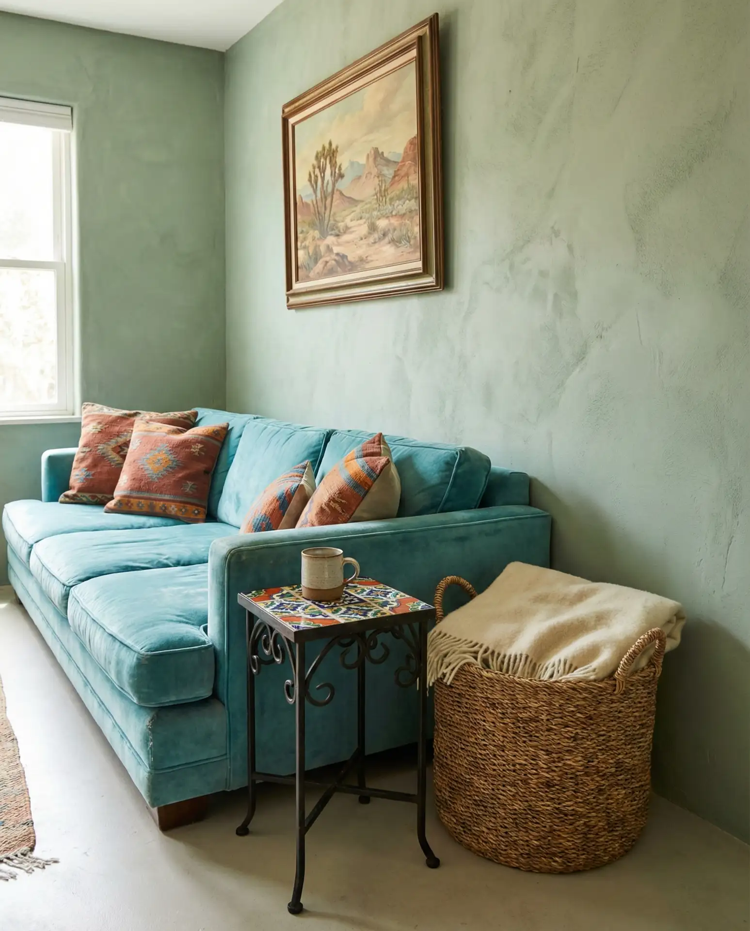
Real homeowners who’ve tried this combination often report that it’s more versatile than expected. The turquoise reads as a neutral against the sage, allowing you to rotate accent colors seasonally—burnt orange in fall, coral in summer—without repainting or buying new furniture. It’s a smart foundation for people who like to refresh their decor without starting from scratch each time.
9. Sky Blue Ceiling with Olive Upholstery
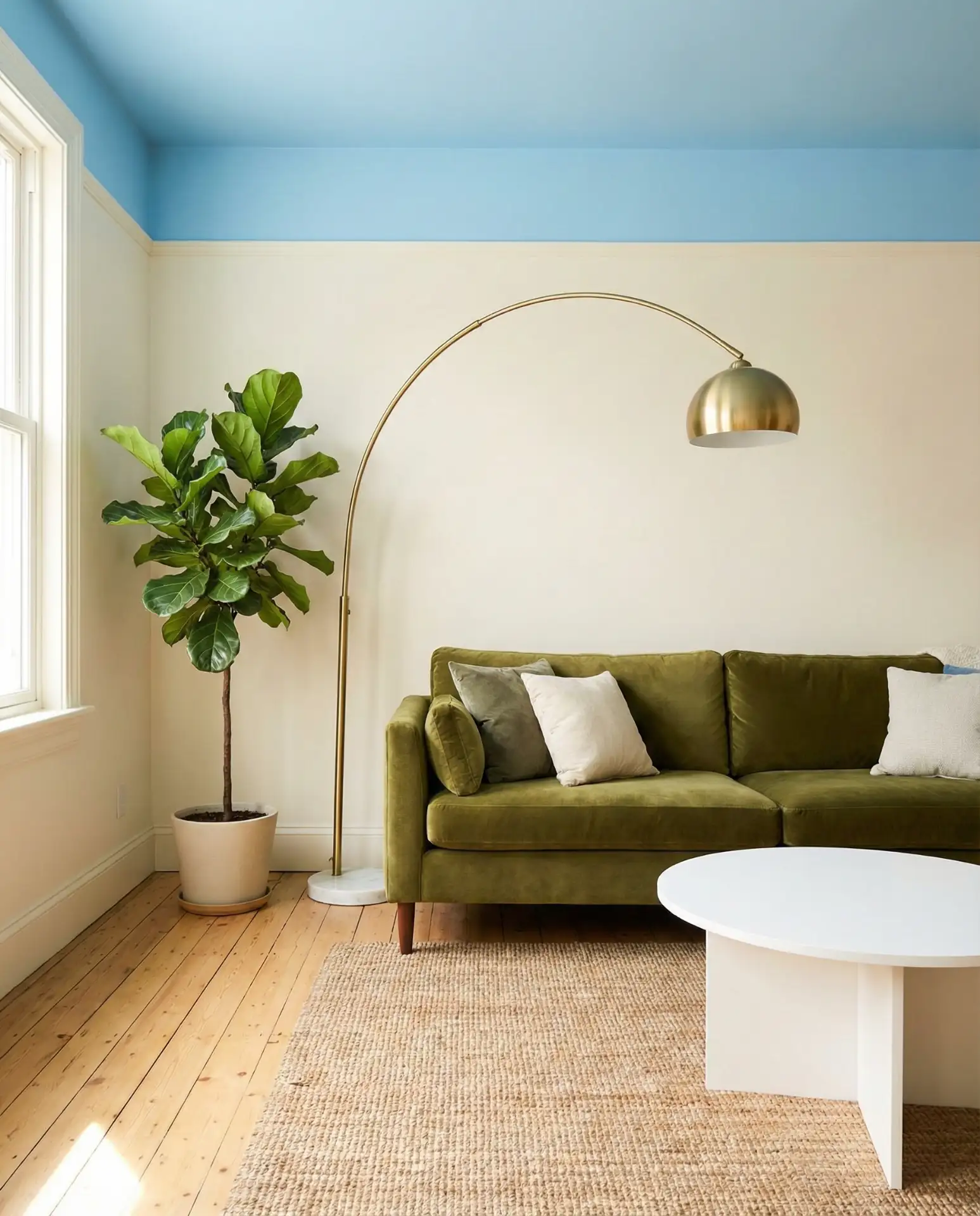
Painting the ceiling sky blue is a designer trick that adds dimension to any room, and when paired with olive green upholstered furniture, it creates a modern take on nature-inspired interiors. The eye is drawn upward, making even modest ceiling heights feel more expansive, while the grounded olive tones anchor the space below. Combine with plenty of greenery—real plants in varying heights—to blur the lines between indoors and out.
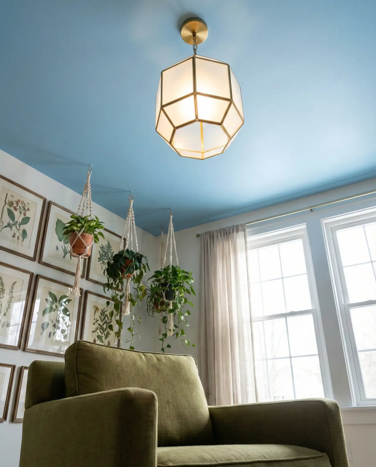
This works best in living rooms with good natural light, particularly those with southern exposure. The blue ceiling reflects light beautifully throughout the day, creating an ever-changing ambiance. In terms of budget, ceiling paint is relatively inexpensive compared to other design interventions, making this a high-impact, low-cost way to transform your space. Just make sure to prep properly—ceilings show imperfections more than walls.
10. Denim Blue Sectional with Jade Green Accessories
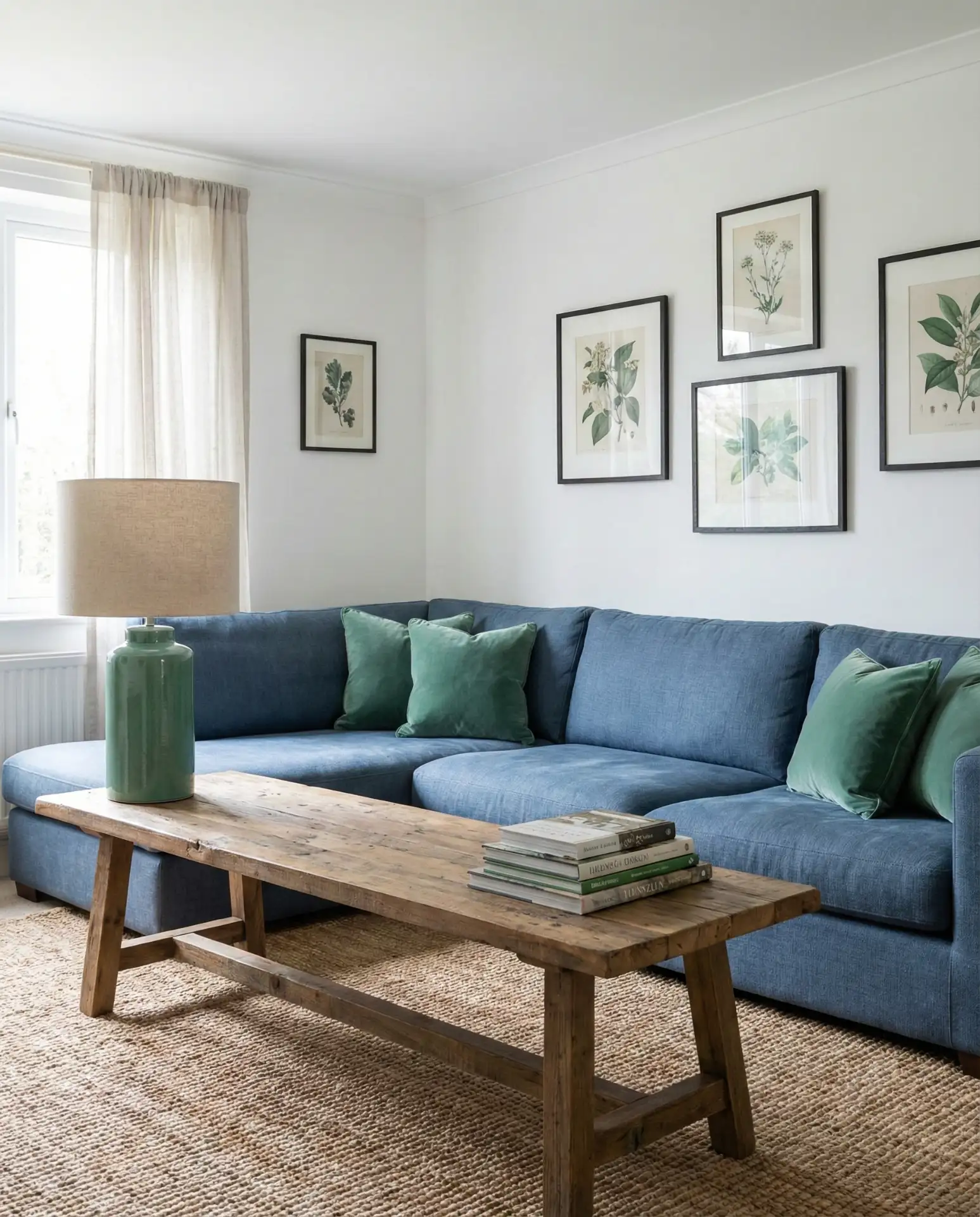
A denim blue sectional has that lived-in quality that makes it perfect for family living rooms, while jade green accessories add just enough polish to elevate the everyday. This aesthetic strikes that difficult balance between comfortable and composed, making it ideal for households with kids, pets, or both. Choose jade green through ceramics, artwork, and textiles rather than large furniture pieces—it’s easier to swap out as tastes evolve.
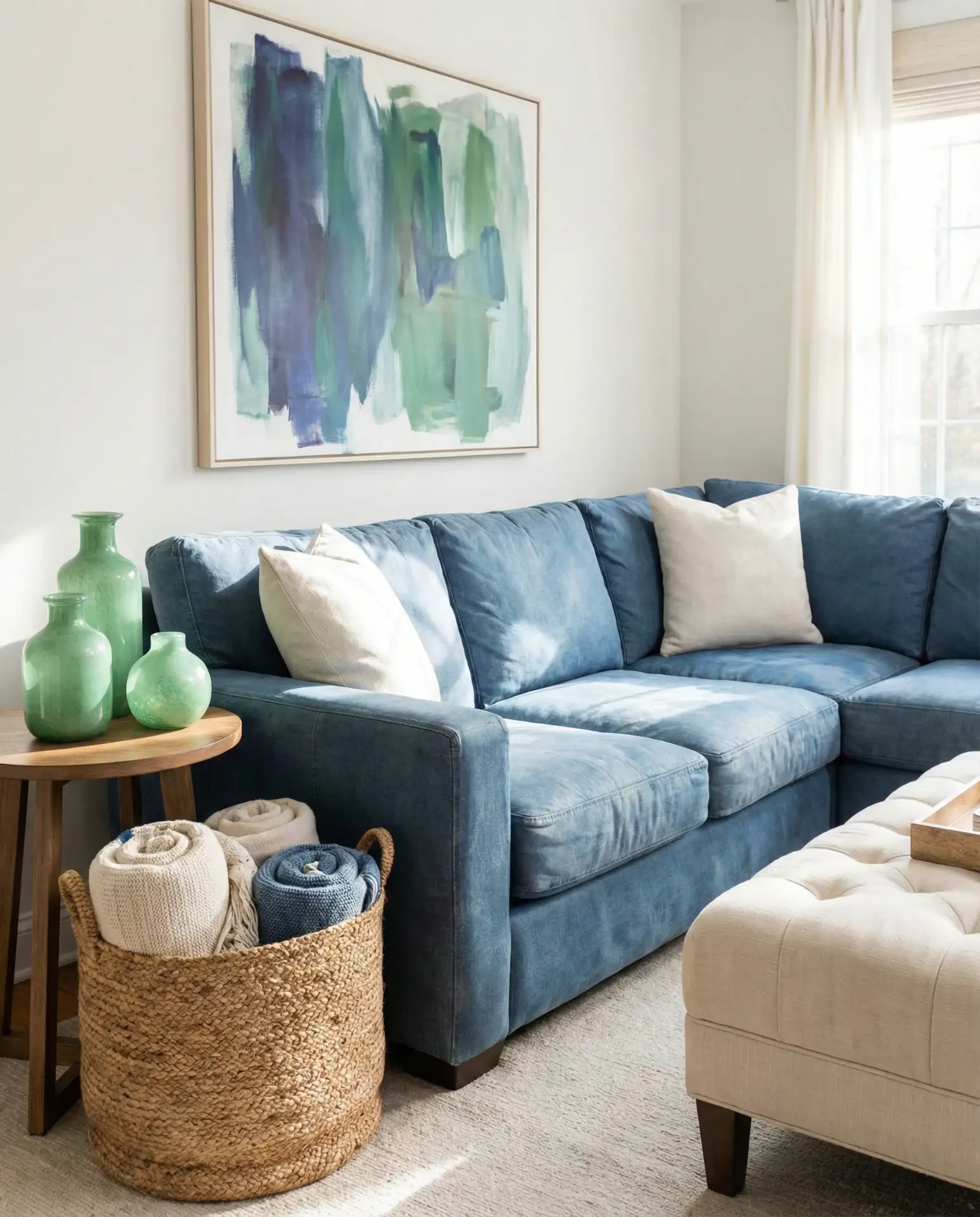
A common mistake is choosing too many different shades of blue or green in an attempt to add variety. Instead, commit to your specific tones—true denim blue and clear jade—then bring in contrast through neutrals like cream, tan, and natural wood. This restraint actually creates more visual interest than a rainbow of similar hues competing for attention.
11. Teal Built-Ins with Seafoam Seating
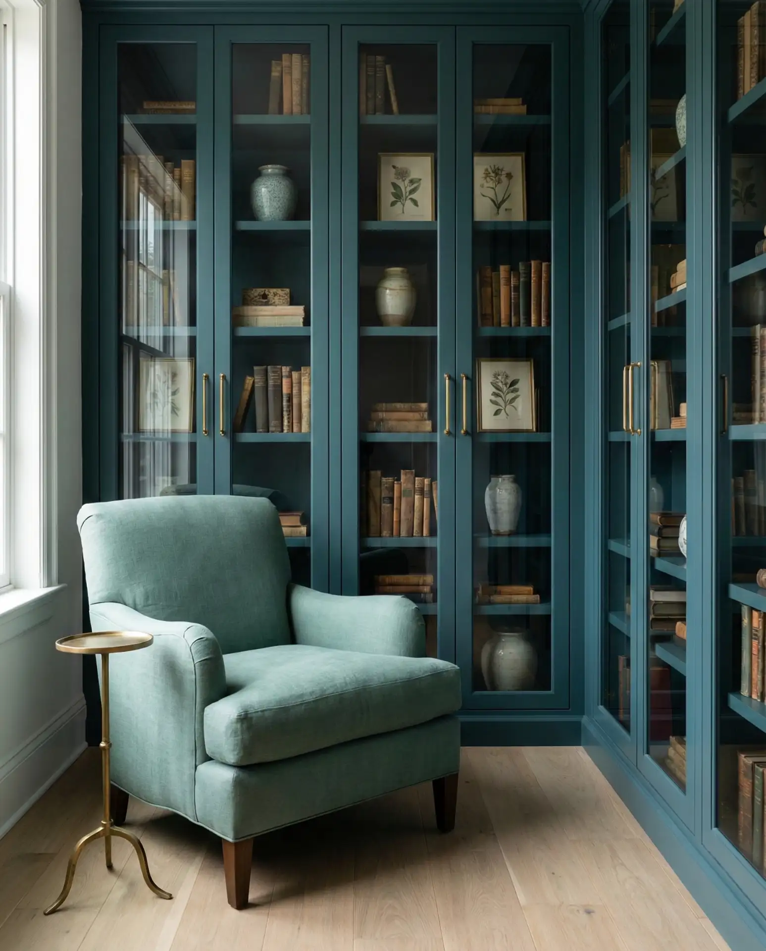
Teal built-in cabinetry provides both storage and dramatic color impact, while seafoam green seating keeps the palette feeling light and breathable. This combination offers the best of both worlds—the structure and sophistication of darker tones with the airiness of pastels. It’s particularly effective in coastal settings but translates beautifully to any space that wants to feel serene yet intentional. Consider glass-front cabinets to break up solid teal expanses.
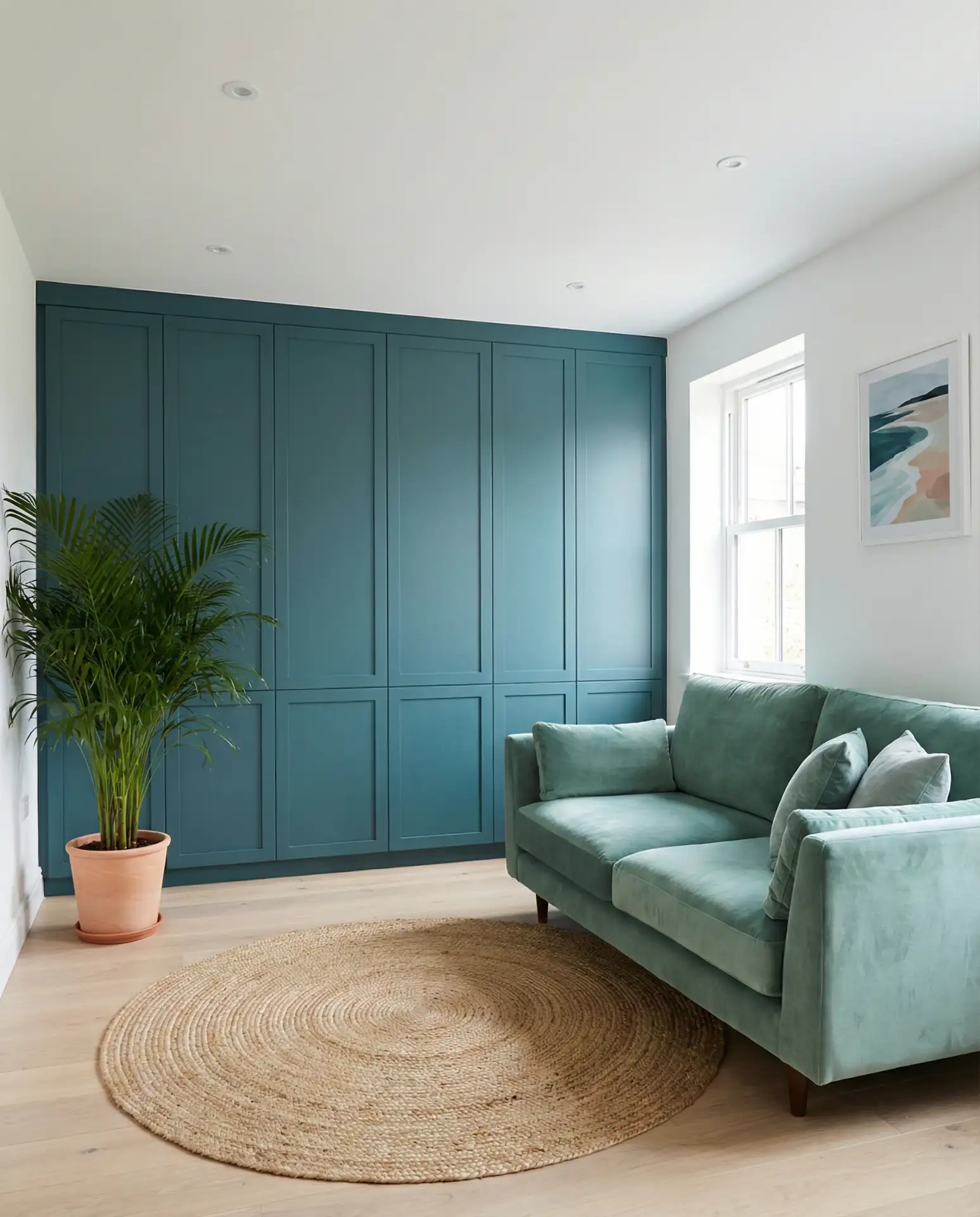
Built-ins are an investment, typically ranging from moderate to high depending on whether you go custom or semi-custom. However, they add both storage and property value, making them one of the smarter expenditures in home design. If full built-ins aren’t in the budget, consider painting an existing bookshelf or cabinet teal—you’d be surprised how much impact a single painted piece can have when thoughtfully placed.
12. Periwinkle Accent Wall with Hunter Green Sofa
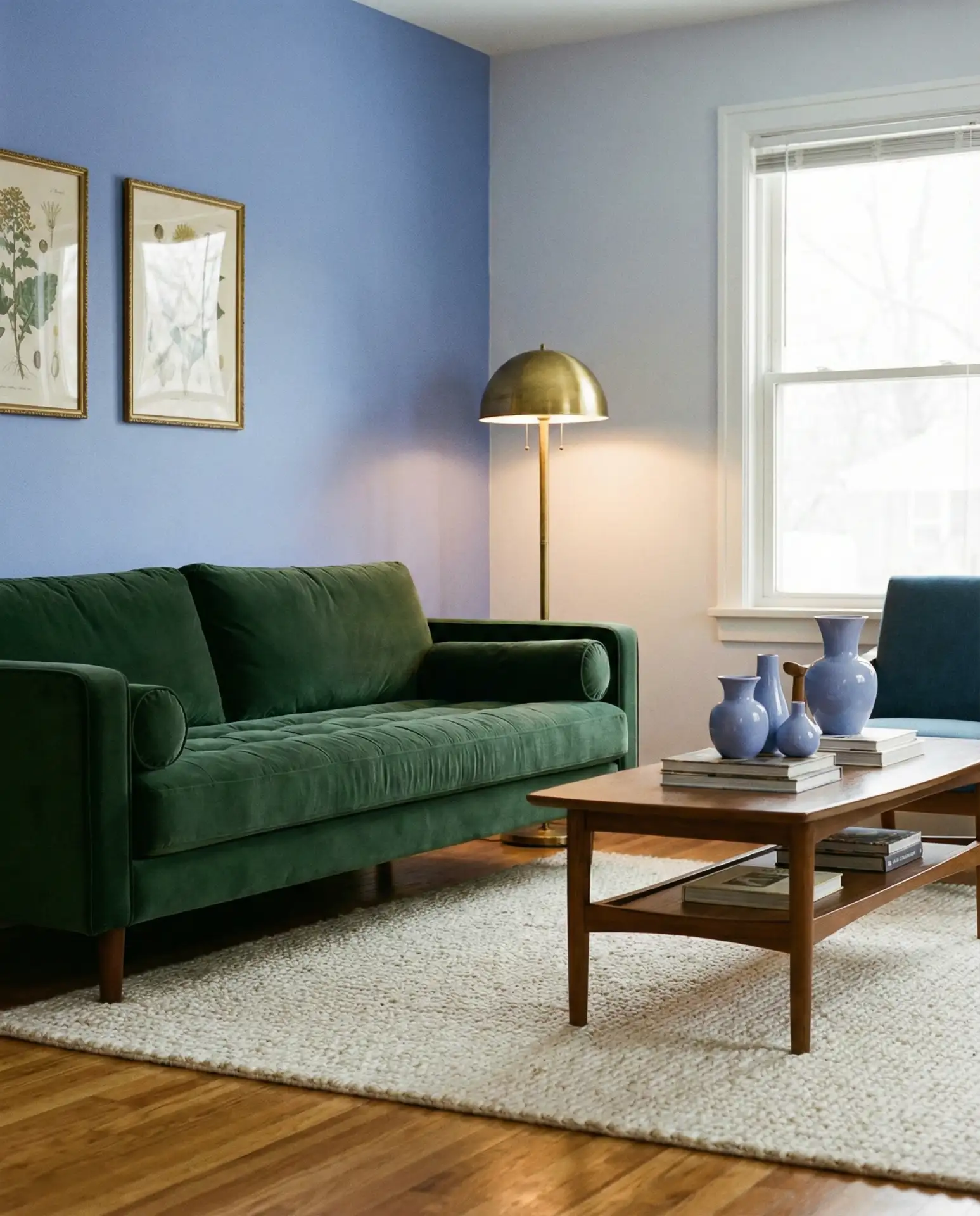
Periwinkle brings a soft, dreamy quality that contrasts beautifully with the richness of a hunter green sofa, creating a color scheme that feels both nostalgic and current. This pairing works particularly well in living rooms with vintage or transitional furniture, where the slightly retro feel of periwinkle complements older wood tones and traditional silhouettes. Add brass or copper accents to warm up the cooler tones and prevent the space from feeling too icy.
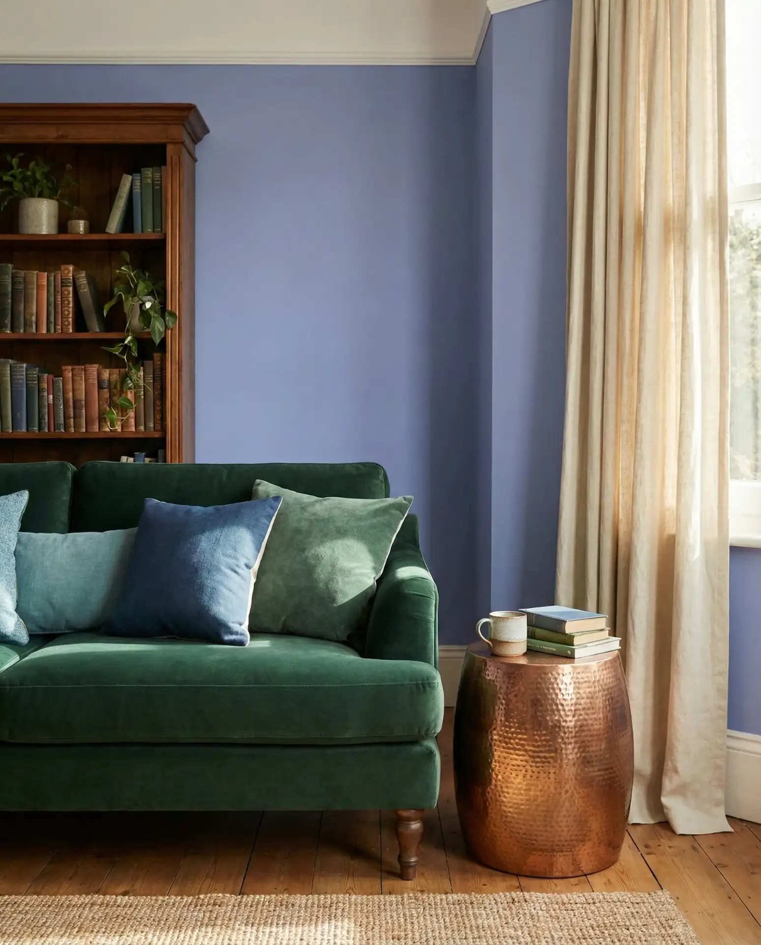
From a practical standpoint, periwinkle paint is remarkably forgiving—it hides minor wall imperfections better than stark white while still feeling light and open. The hunter green sofa, meanwhile, is incredibly practical for high-traffic homes since darker upholstery shows far less wear than lighter alternatives. Together, they create a living room that’s both beautiful and low-maintenance, a combination every busy household can appreciate.
13. Cerulean Blue Drapes with Moss Green Armchairs
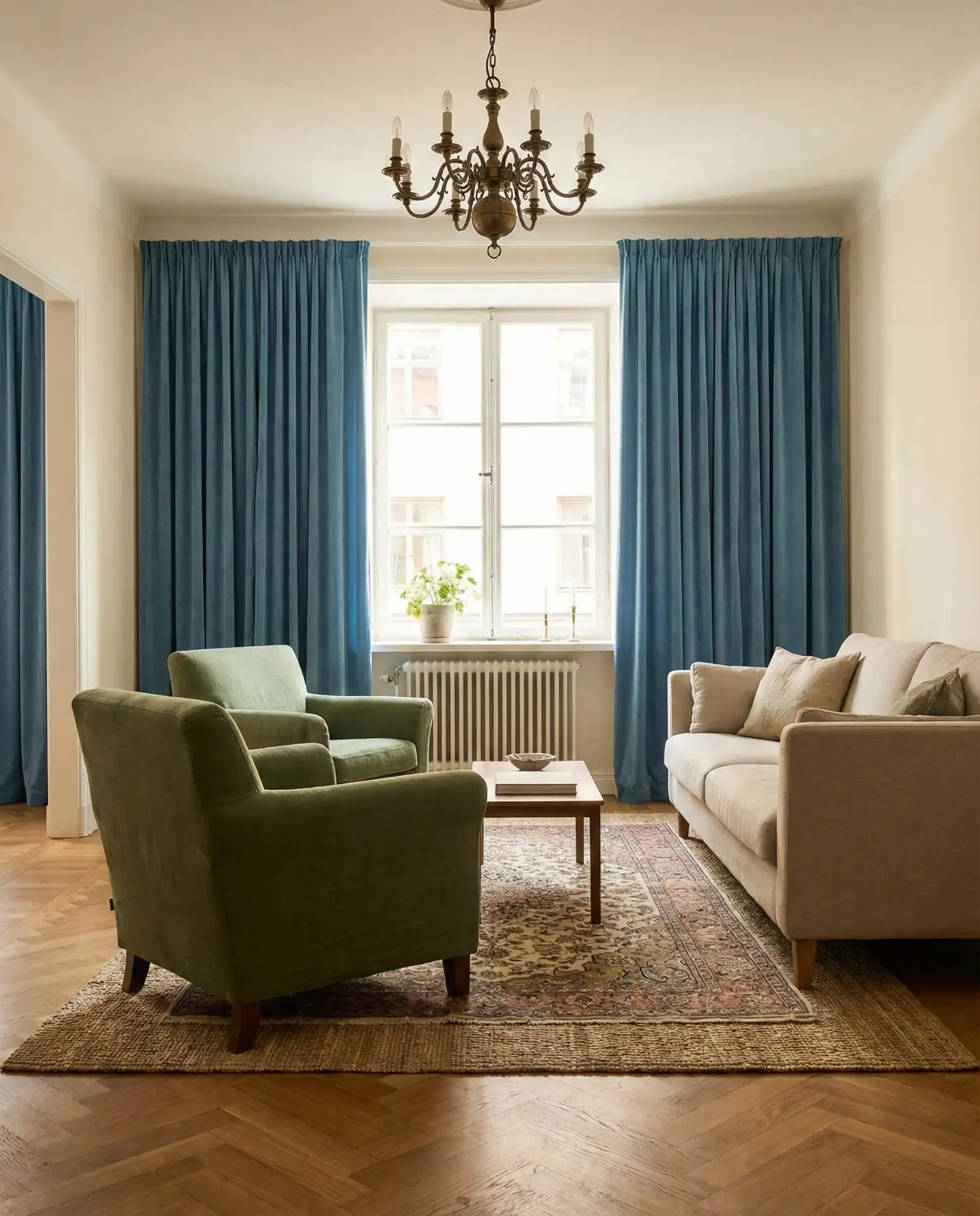
Cerulean blue drapes introduce color at eye level and above, creating vertical interest that draws the gaze upward and makes ceilings feel taller. Paired with moss green armchairs, this creates a layered, collected look that suggests the room came together over time rather than in a single shopping trip. This approach to decor feels sophisticated and personal, especially when you mix in vintage finds or inherited pieces that add character.
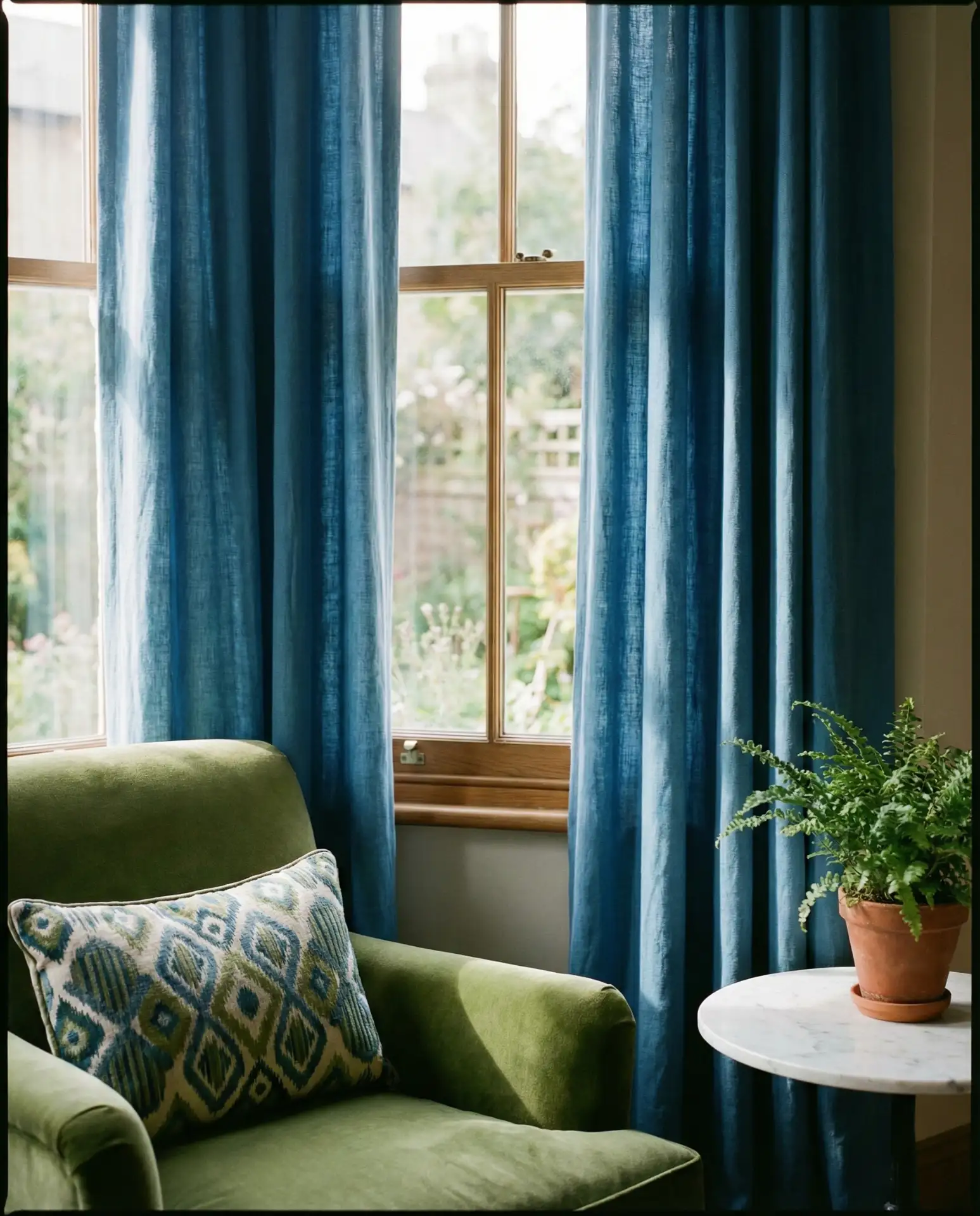
This color story works best in living rooms with large windows where the drapes can be a focal point. In smaller spaces or rooms with limited windows, consider using the cerulean blue in smaller doses—perhaps as throw pillows or artwork—while letting the moss green armchairs carry more visual weight. The goal is balance, not competition between the two colors.
14. Powder Blue Walls with Emerald Velvet Ottoman
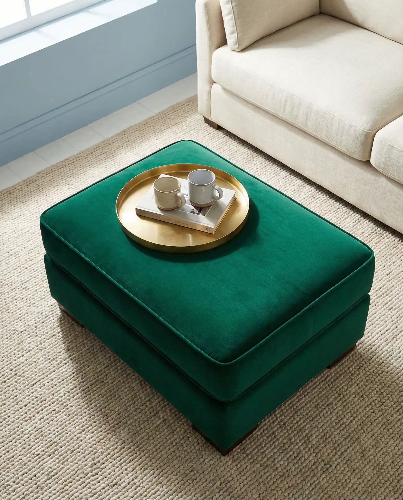
Powder blue walls create a serene envelope that makes any space feel larger and calmer, while an emerald velvet ottoman provides a jewel-like punctuation point that prevents the room from feeling too washed out. This is a particularly smart color scheme for small living rooms where you want color without overwhelm. The ottoman serves double duty as both seating and a coffee table, making it as practical as it is beautiful.
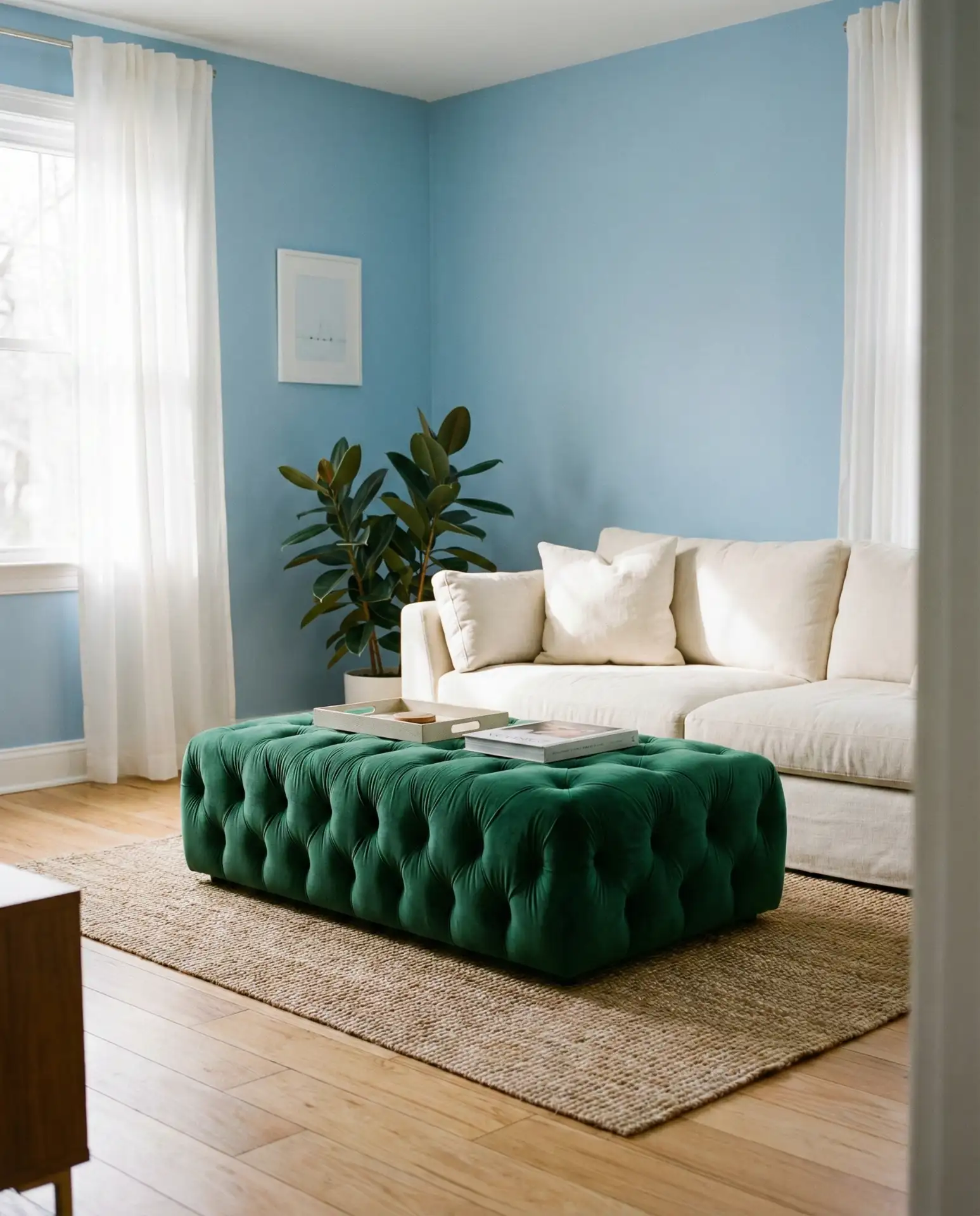
In terms of American lifestyle, this setup works beautifully in condos and apartments where square footage is limited but style aspirations are high. The powder blue expands the space visually, while the emerald ottoman adds personality without taking up precious real estate. Many city dwellers find this approach gives them the color they crave without sacrificing the open, airy feel that makes small spaces livable.
15. Steel Blue Sofa with Lime Green Throw Pillows
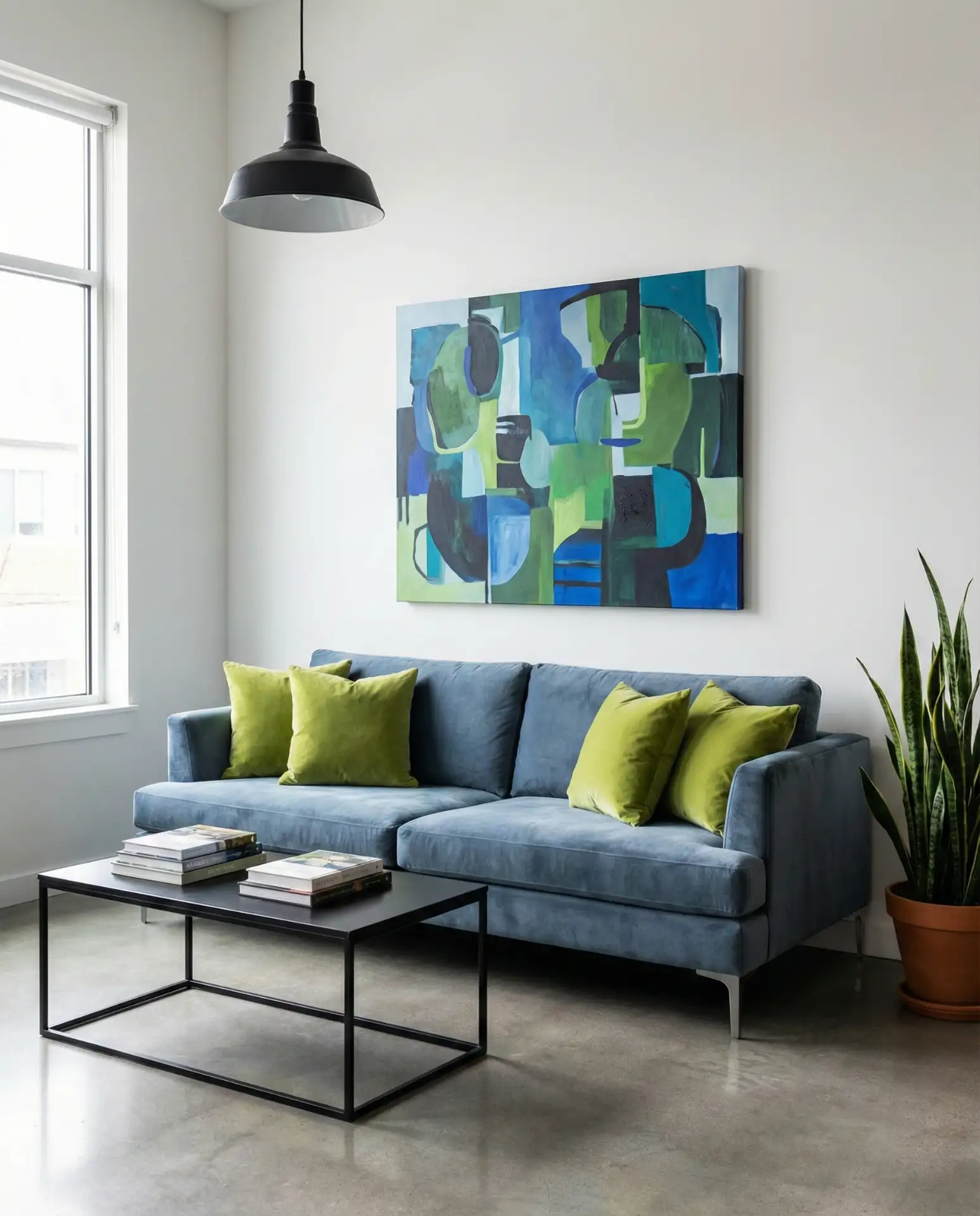
A steel blue sofa offers a cool, modern foundation that pairs unexpectedly well with lime green throw pillows—a combination that feels fresh and energetic without tipping into juvenile territory. The key is keeping the lime green limited to accents; too much and the room loses sophistication. This color scheme works particularly well in contemporary or industrial spaces where clean lines and bold choices are celebrated.
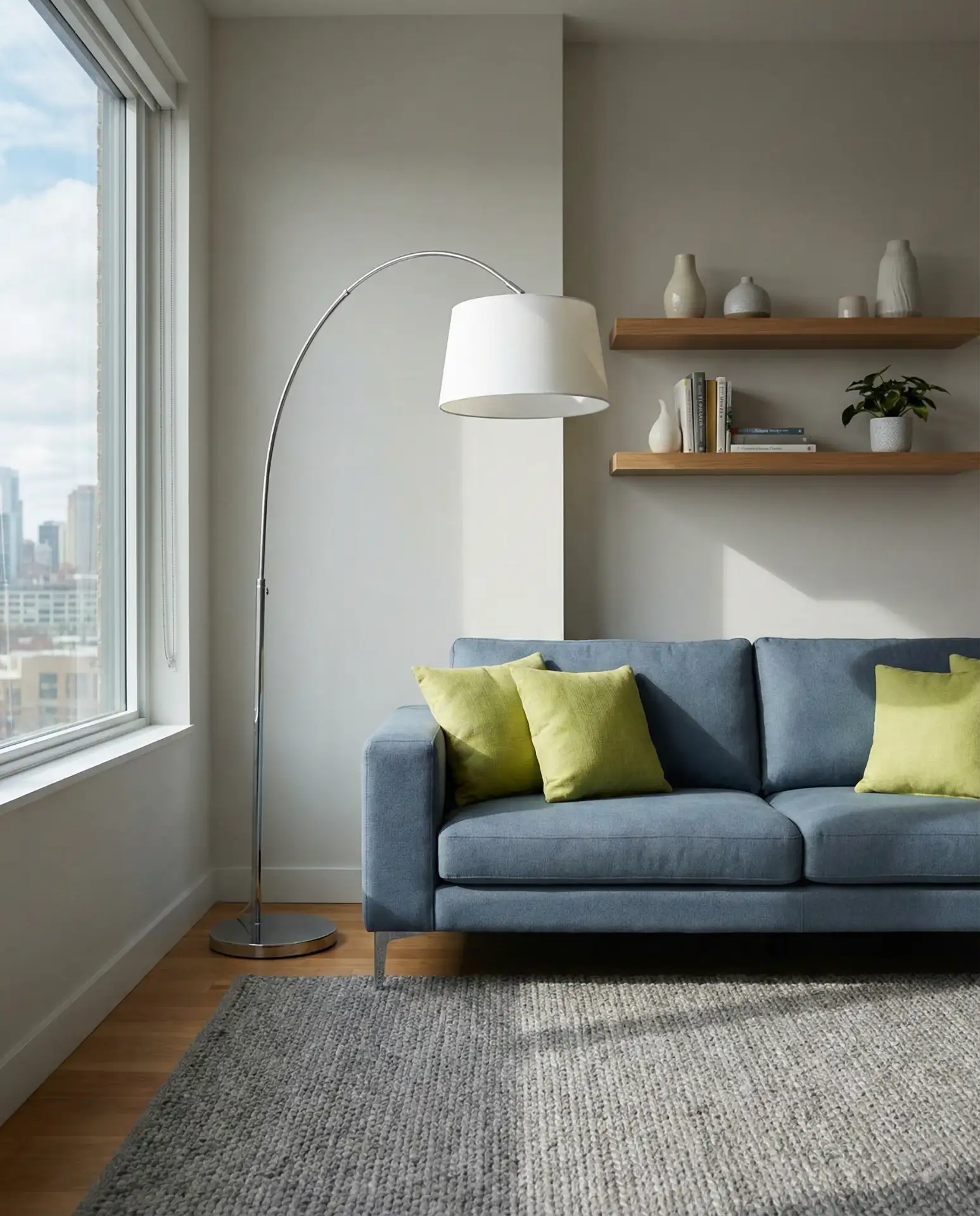
One expert tip: when working with this much color contrast, keep your other finishes neutral and streamlined. Stick to black, white, and natural wood tones for everything else—coffee tables, media consoles, and lighting fixtures. This restraint allows the blue-green combination to shine without visual competition. It’s a lesson in letting your hero pieces have the spotlight they deserve.
16. Dusty Blue Walls with Kelly Green Artwork
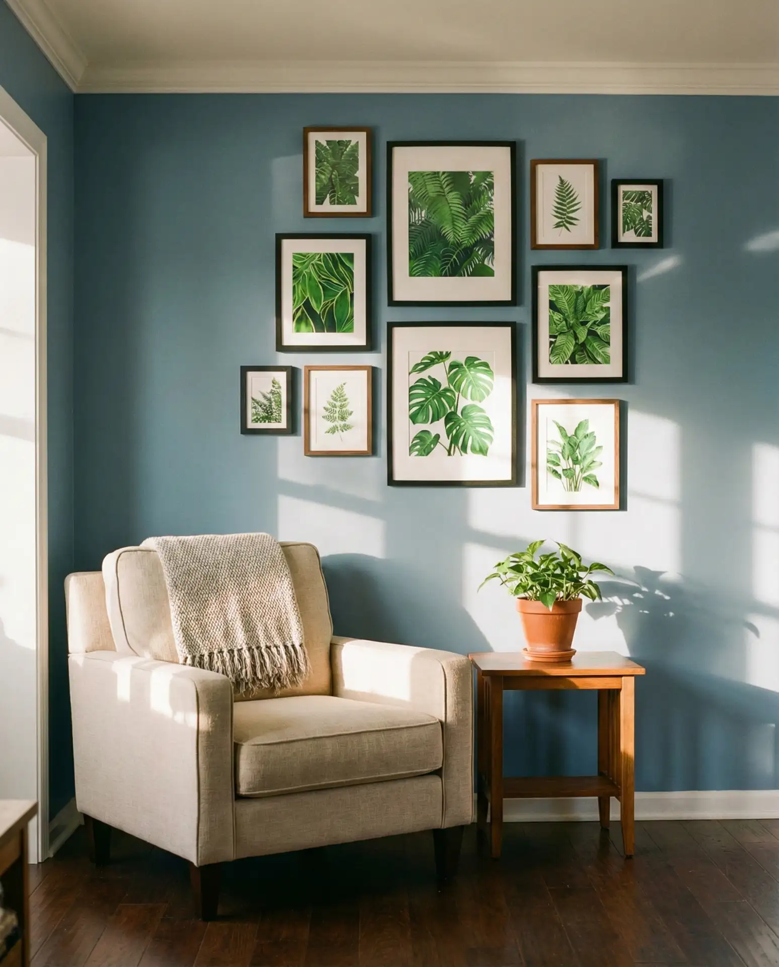
Dusty blue walls have become an interior design staple for good reason—they’re flattering to almost every skin tone and furniture style, creating a versatile backdrop for bolder choices. Kelly green artwork provides vibrant contrast without requiring major furniture investments, making this an accessible entry point into the blue-green trend. Rotate your art seasonally, and you can shift the room’s entire energy with minimal effort and expense.
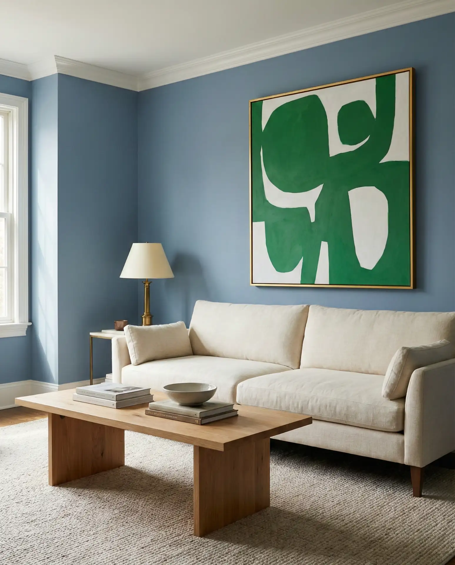
Real homeowner behavior shows that people are far more likely to change artwork than paint colors or furniture, making this approach particularly sustainable. You can completely refresh the room’s mood by swapping out green artwork for coral or mustard when you’re ready for something new, without touching the dusty blue walls that serve as a timeless foundation. It’s design flexibility built into the bones of the room.
17. Cobalt Accent Pieces with Seafoam Sectional
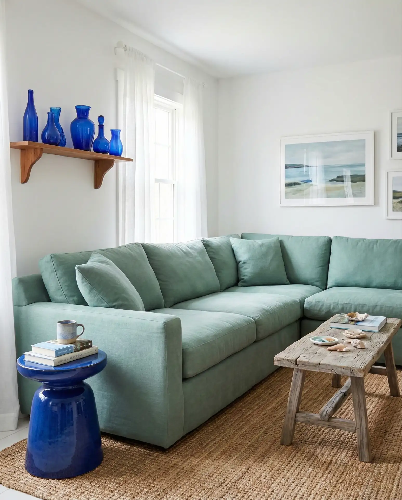
Inverting the typical dark-furniture, light-accents formula, a seafoam sectional anchors the room in softness while cobalt accent pieces—vases, picture frames, side tables—provide strategic pops of saturated color. This light and airy approach feels particularly coastal, though it works just as well in urban settings where residents crave calm amidst the chaos. The seafoam reads as almost neutral, allowing you to play with cobalt intensity.
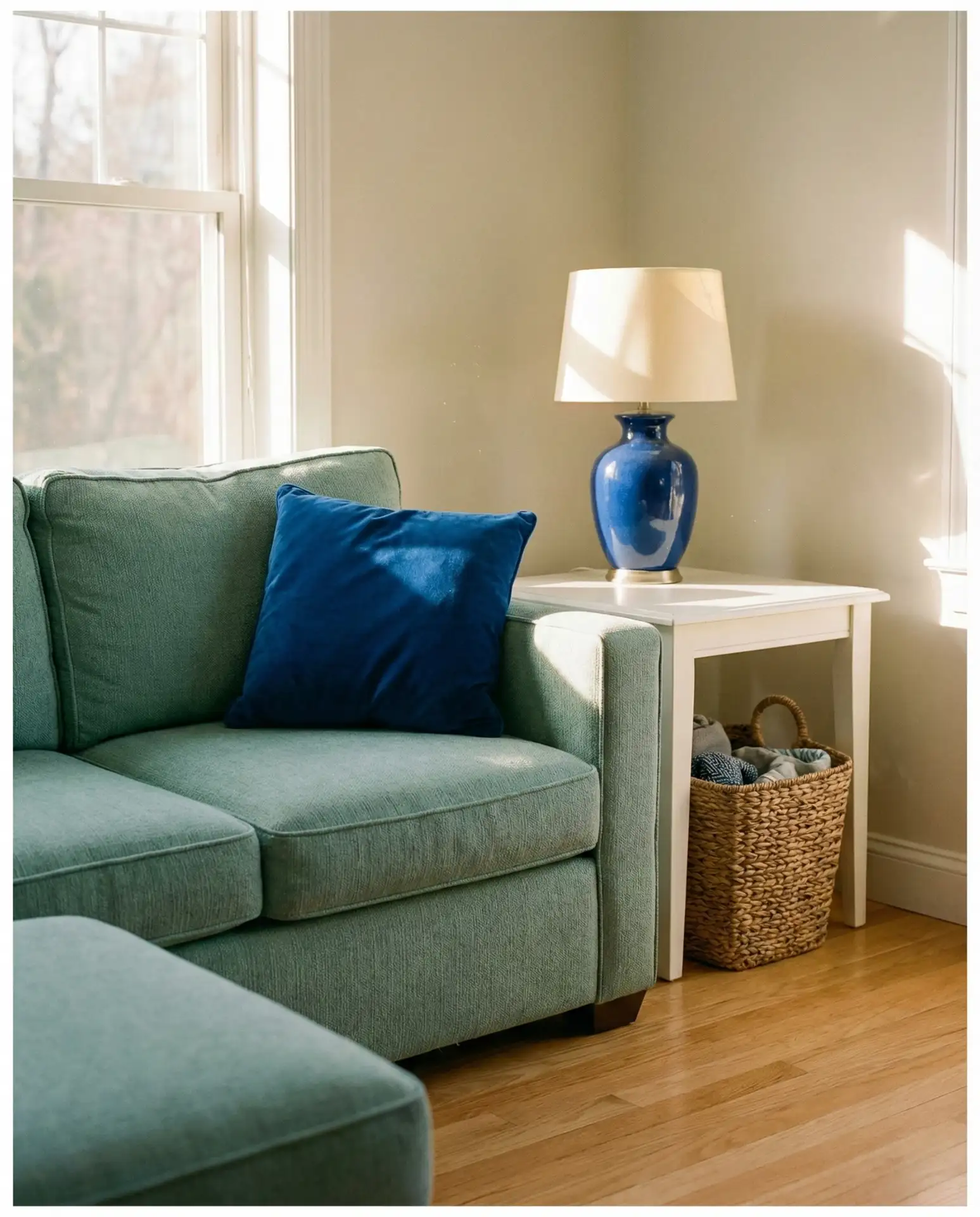
This palette works best in rooms with abundant natural light, where the seafoam can show its true color rather than reading as gray or washed out. South-facing and west-facing rooms are ideal. In darker spaces, you might want to flip the proportions—more cobalt, less seafoam—to prevent the room from feeling dingy. Understanding your room’s light quality before committing to this scheme will save you from costly do-overs.
18. Navy Shiplap with Mint Green Furniture
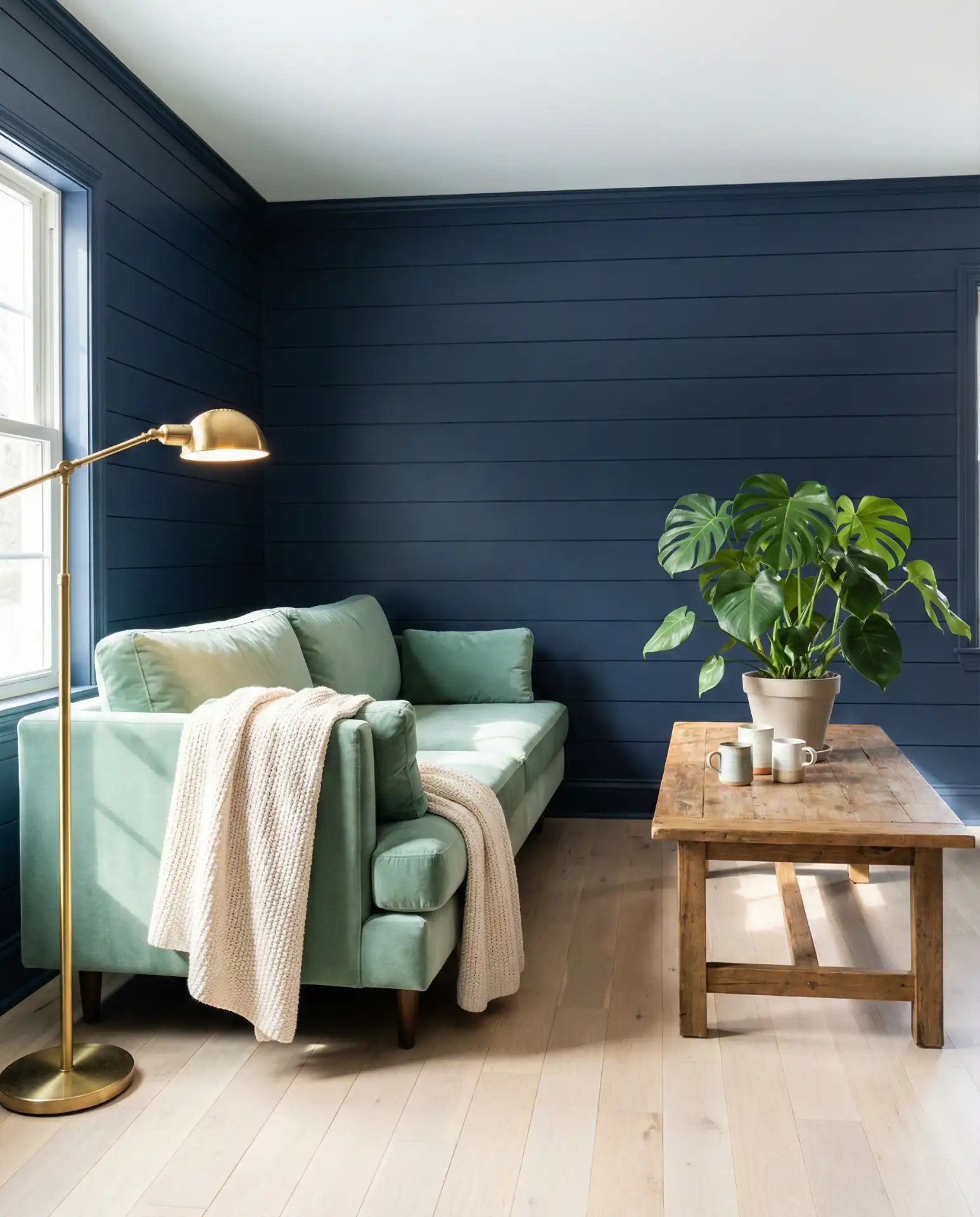
Navy shiplap provides that coveted architectural texture while offering a dramatic backdrop for lighter furniture choices. Mint green seating and tables pop against the dark walls, creating a playful contrast that works in both modern and farmhouse contexts. The shiplap installation itself adds dimension that flat-painted walls can’t match, making this worth the extra effort if you’re committed to transforming your space.
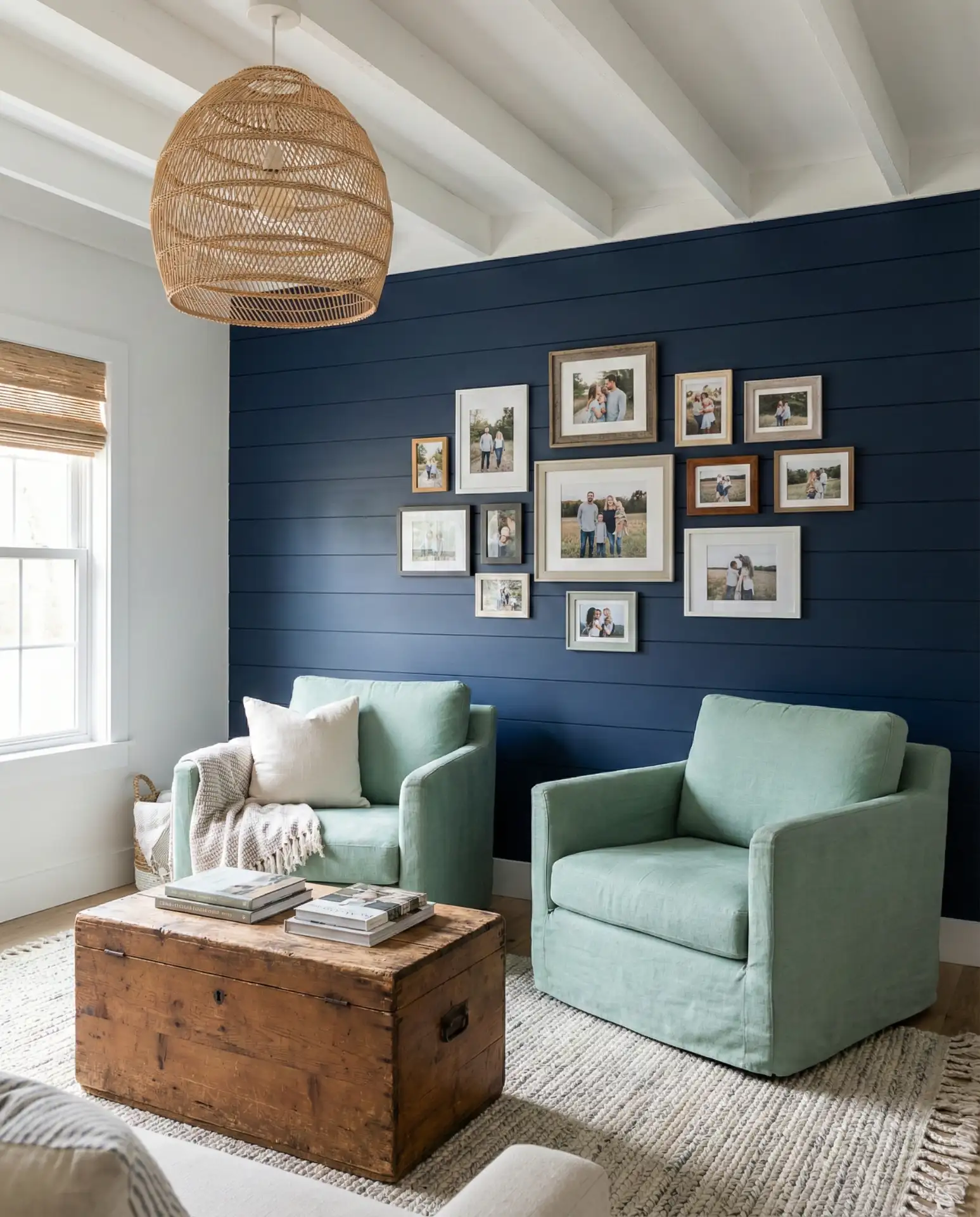
Budget considerations: shiplap installation ranges from DIY-friendly (if you’re handy) to requiring professional help, but it’s generally more affordable than custom millwork or built-ins. The mint green furniture can be sourced at various price points—vintage stores often have great mid-century pieces in this color family, or you can go new with retailers offering performance fabrics ideal for family use. Either way, the investment pays off in visual impact.
19. Azure Blue Rug with Fern Green Side Tables
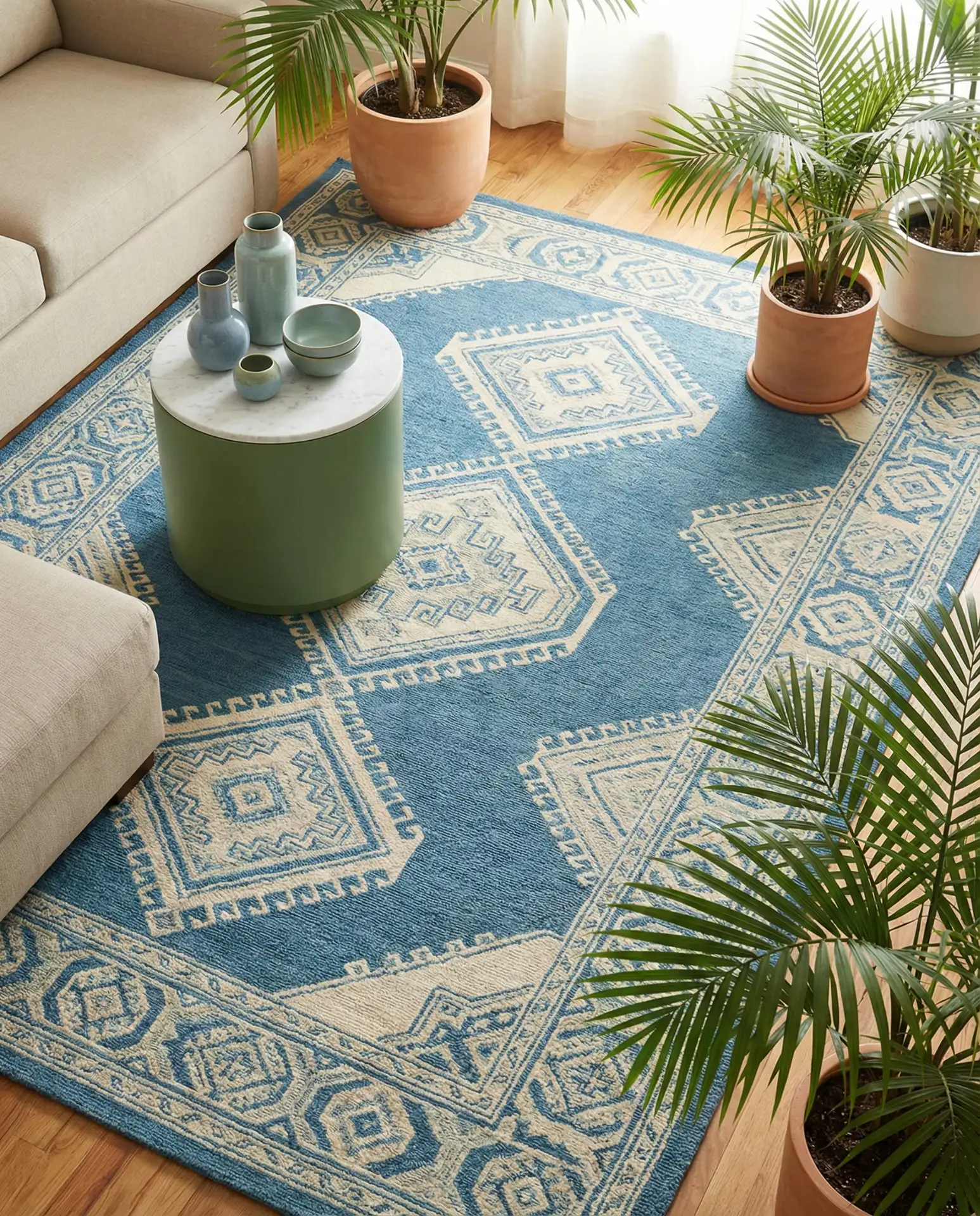
An azure blue rug grounds the entire room and provides the perfect foundation for fern green side tables to play off of. This approach starts from the floor up, which is sometimes easier than committing to wall color or large furniture pieces. The color scheme feels organic and nature-inspired without being literal about it—no leaf patterns or botanical prints necessary when the colors themselves do the work.
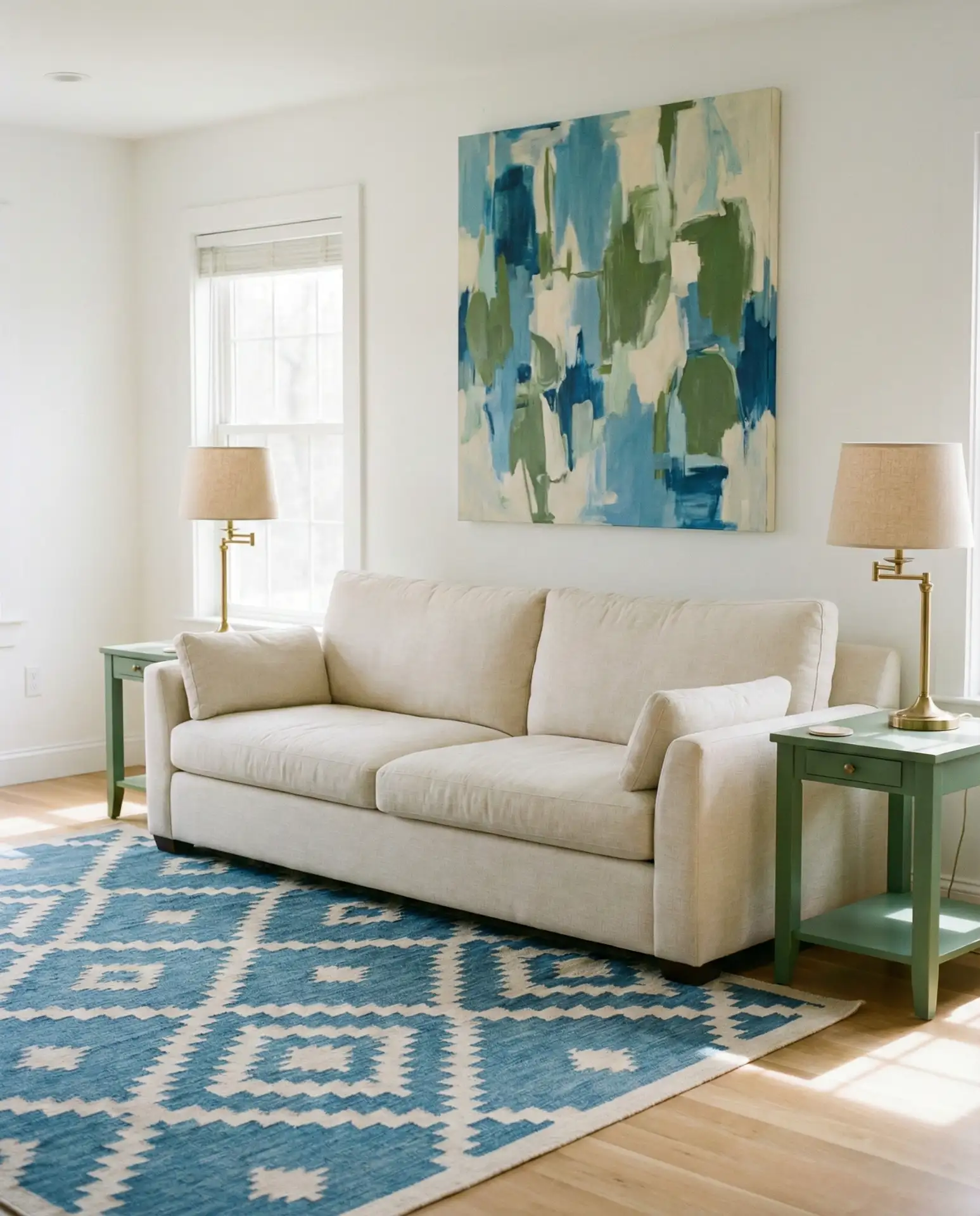
Side tables are one of the easiest pieces to DIY or paint yourself, making fern green side tables an accessible project for budget-conscious decorators. Pick up inexpensive wooden tables at thrift stores, give them a few coats of quality paint in your chosen green, and you’ve got custom pieces at a fraction of retail cost. The azure rug is worth investing in since it gets heavy use—choose durable materials like wool or performance synthetics that can handle foot traffic.
20. Prussian Blue Walls with Pistachio Green Accents
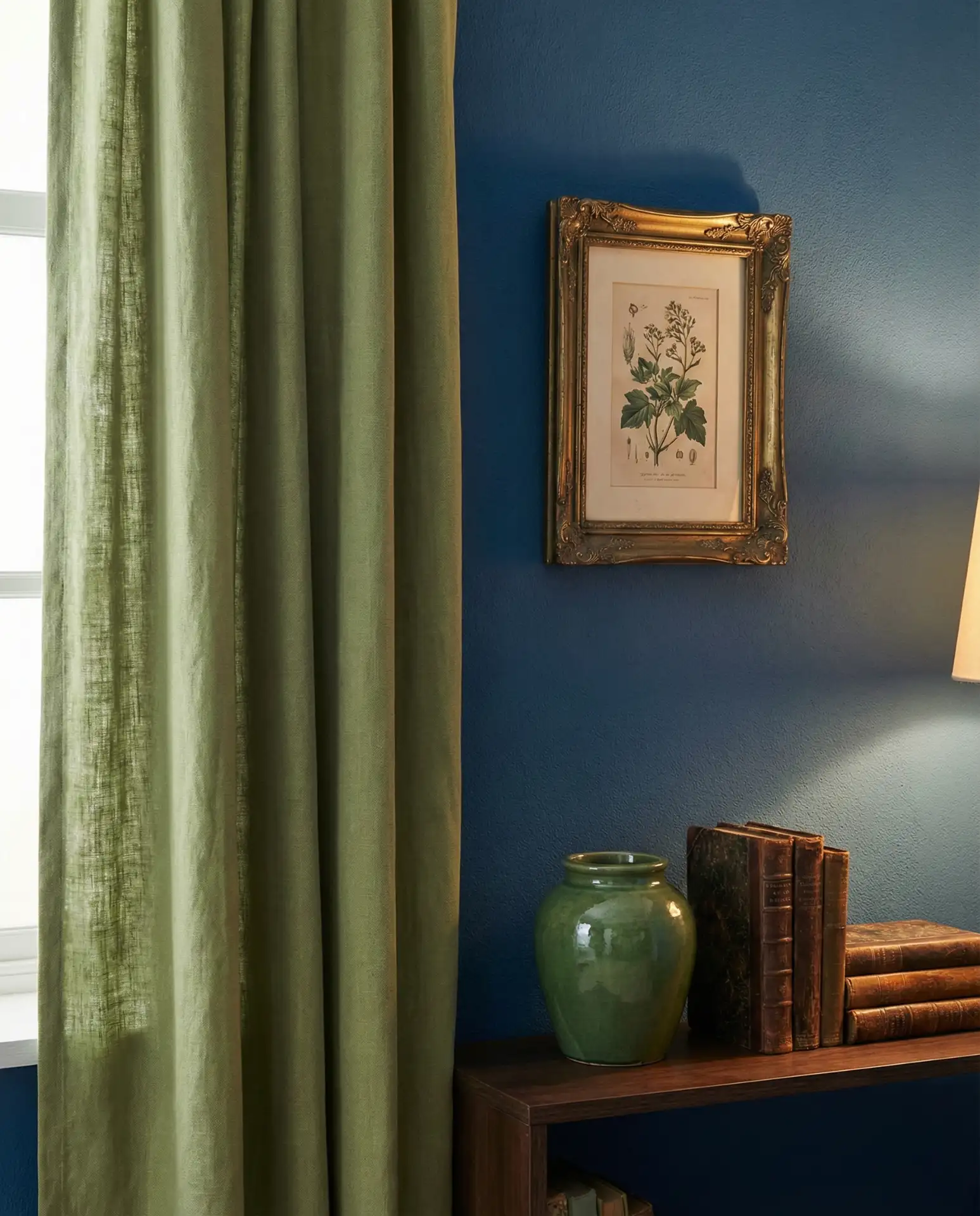
Prussian blue walls create an enveloping, intimate atmosphere that reads as both moody and refined, while pistachio green accents provide unexpected lightness that keeps the space from feeling oppressive. This is sophisticated color theory in action—the warm undertones in pistachio play beautifully against the cooler Prussian blue. Add in plenty of warm woods and brass fixtures, and you’ve got a living room that feels like a jewel box.
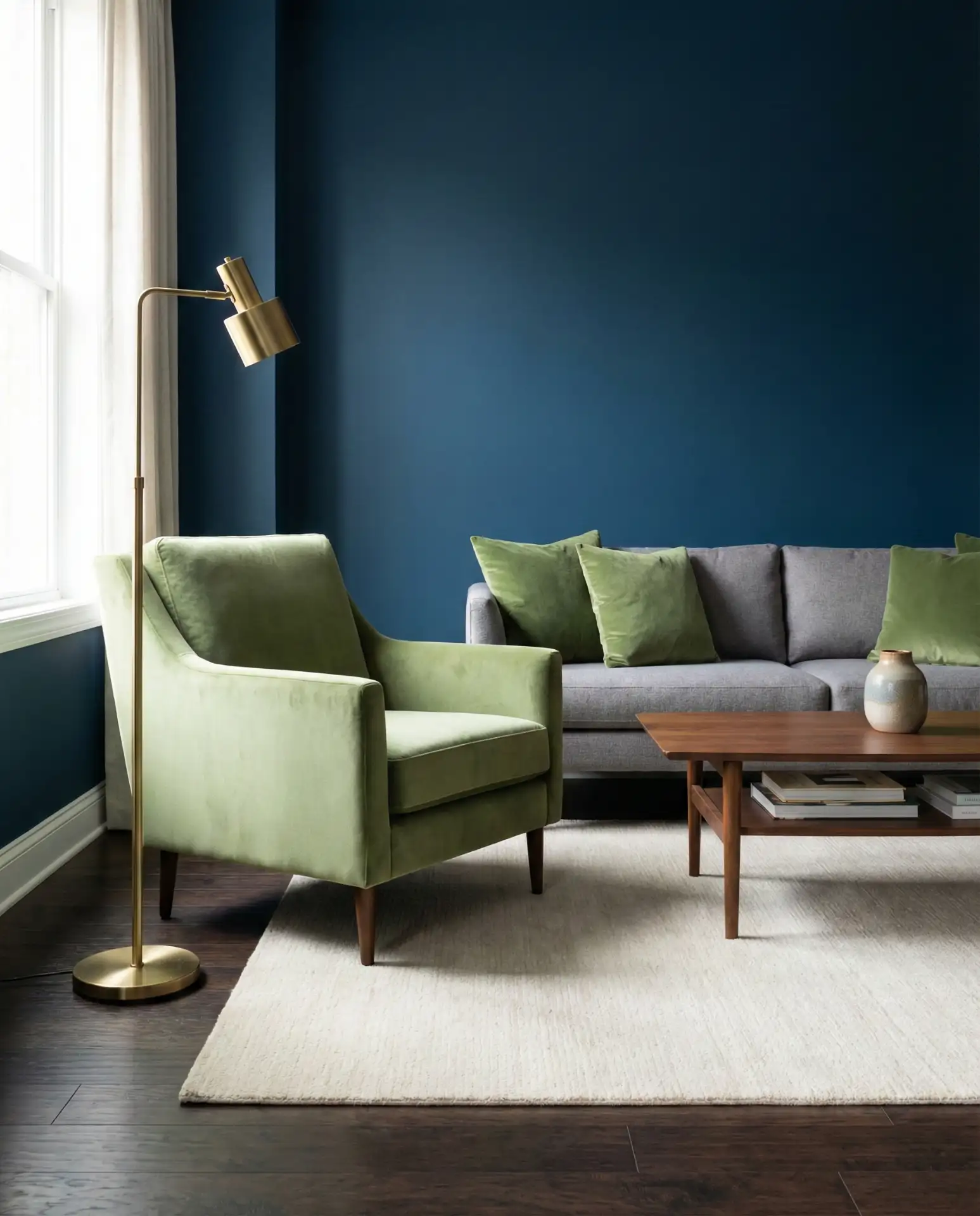
This color story thrives in rooms with excellent artificial lighting since the Prussian blue absorbs natural light. Plan for multiple light sources at different heights—table lamps, floor lamps, sconces, and overhead fixtures—all on dimmers for maximum flexibility. The pistachio accents will glow beautifully in warm LED light, creating ambiance that changes throughout the day and evening.
21. Baby Blue Sofa with Moss Green Throw Blankets
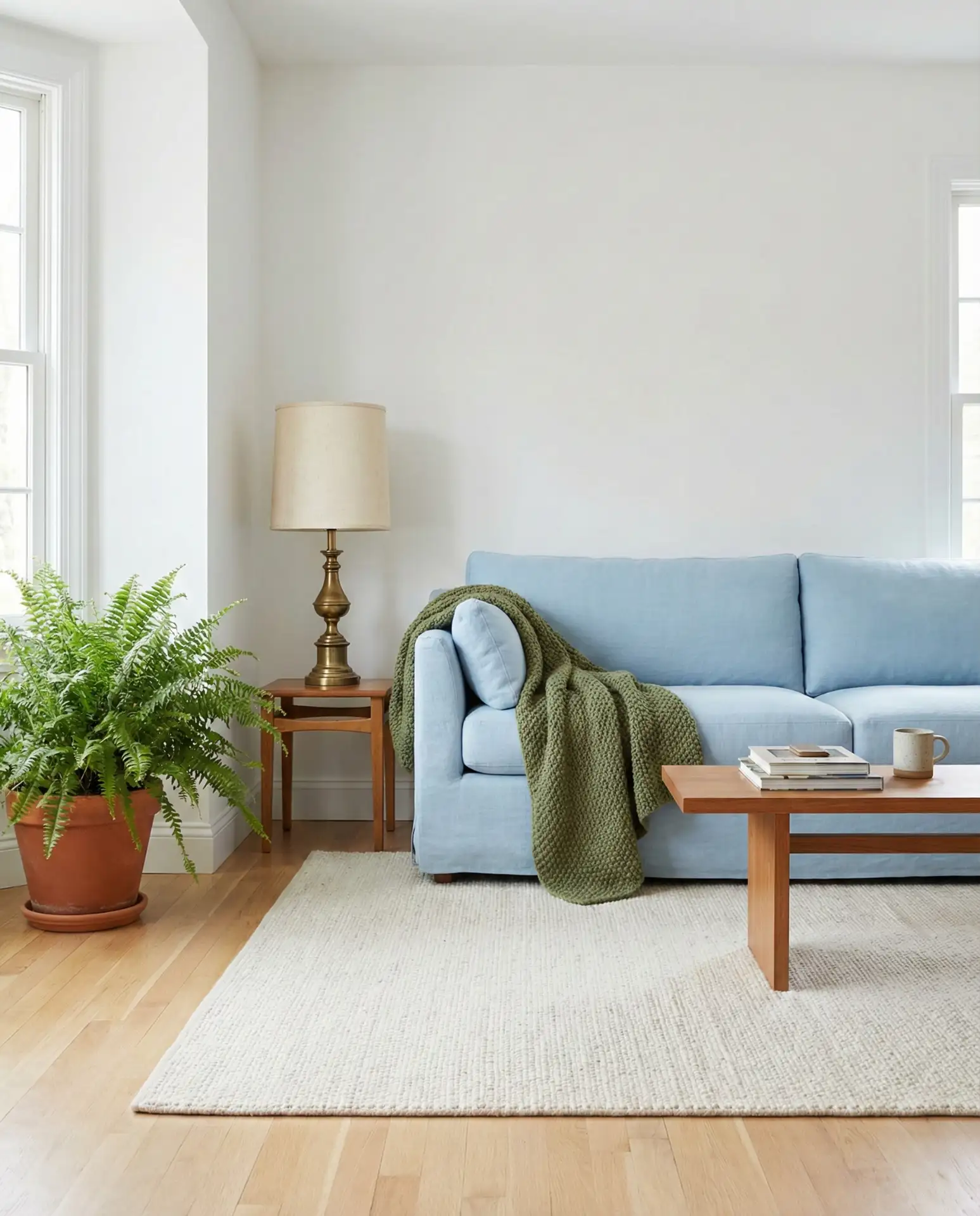
A baby blue sofa brings an unexpected softness to living spaces, creating an instant focal point that’s both calming and cheerful. Moss green throw blankets add earthy contrast without competing for attention, making this a harmonious color scheme that’s easy on the eyes. This combination particularly shines in spaces with lots of white or neutral backgrounds, where the soft colors can really stand out and be appreciated.
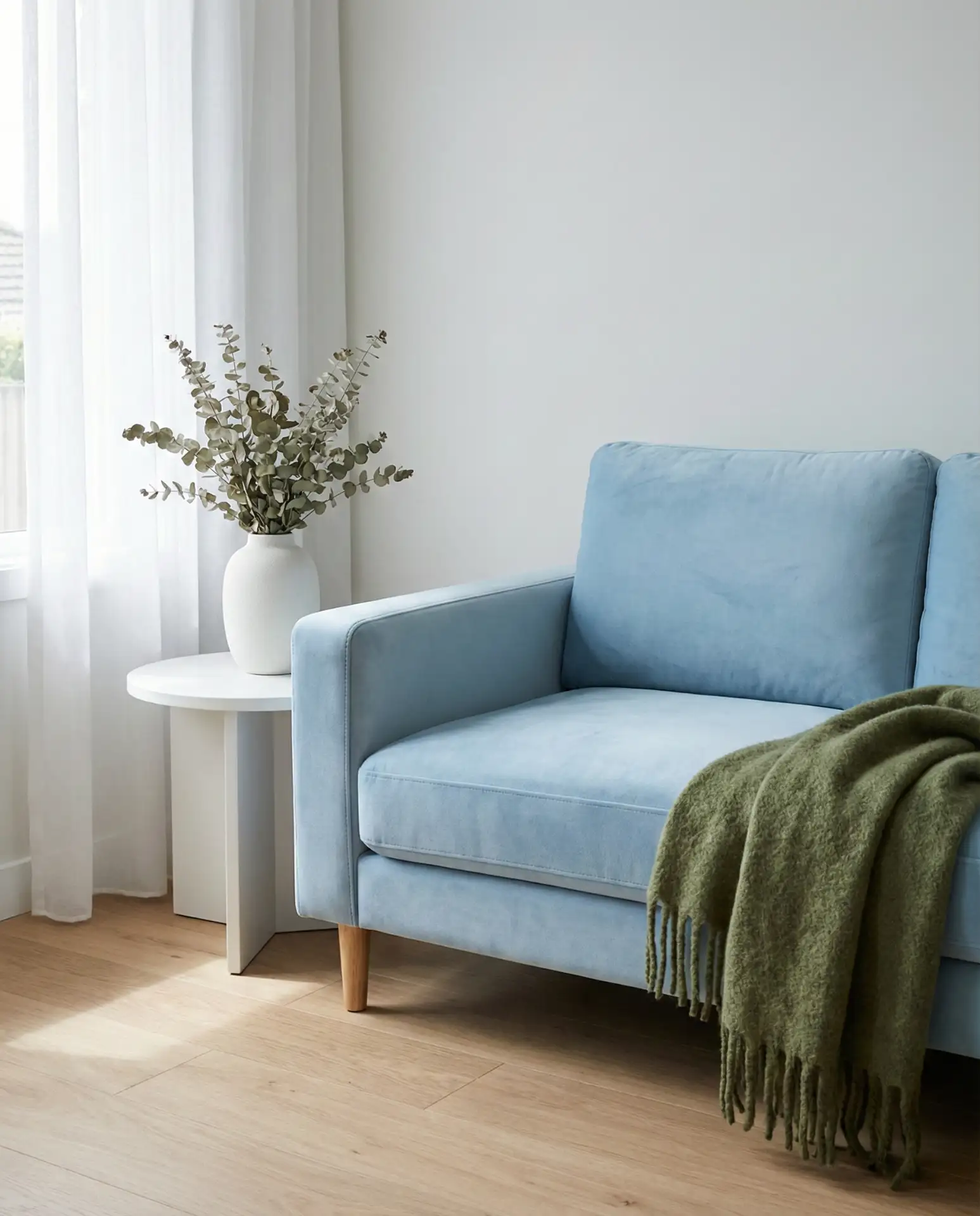
An anecdote from a designer friend: she recently specified a baby blue sofa for a client who was nervous about color, and it’s become the client’s favorite piece in their home. The key was quality—investing in a well-made sofa in an unconventional color means it needs to last because replacing it is a bigger deal than swapping out a beige one. Choose performance fabrics if you have kids or pets, and your blue sofa can be both beautiful and practical.
22. Indigo Curtains with Celadon Green Furniture
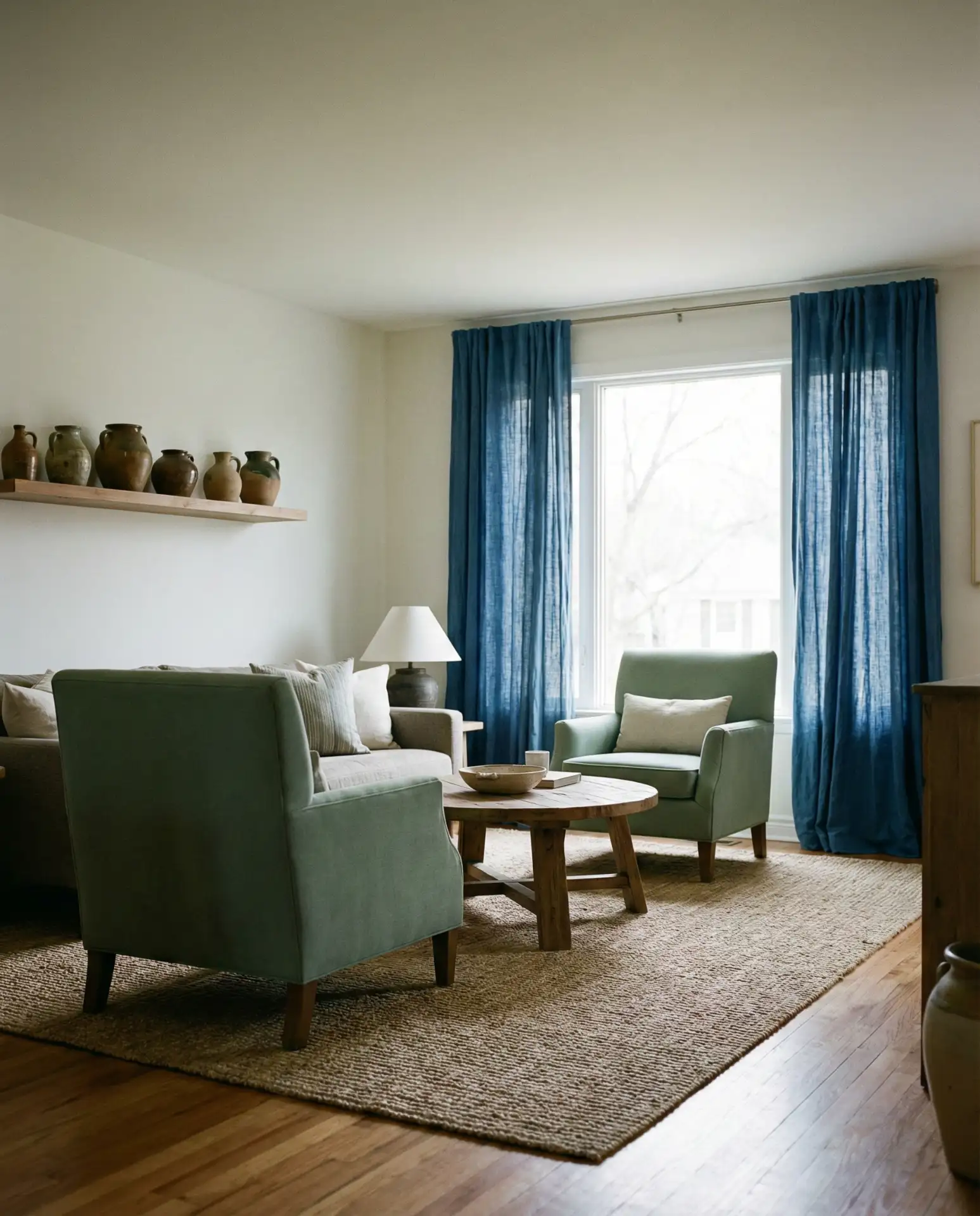
Indigo curtains frame your windows with rich, saturated color, while celadon green furniture brings a pale, ethereal quality that feels both ancient and contemporary. This color scheme has Asian-inspired sensibilities—celadon is, after all, the color of precious pottery—but translates beautifully to American interiors seeking tranquility and refinement. The contrast between deep and pale creates visual interest without busyness.
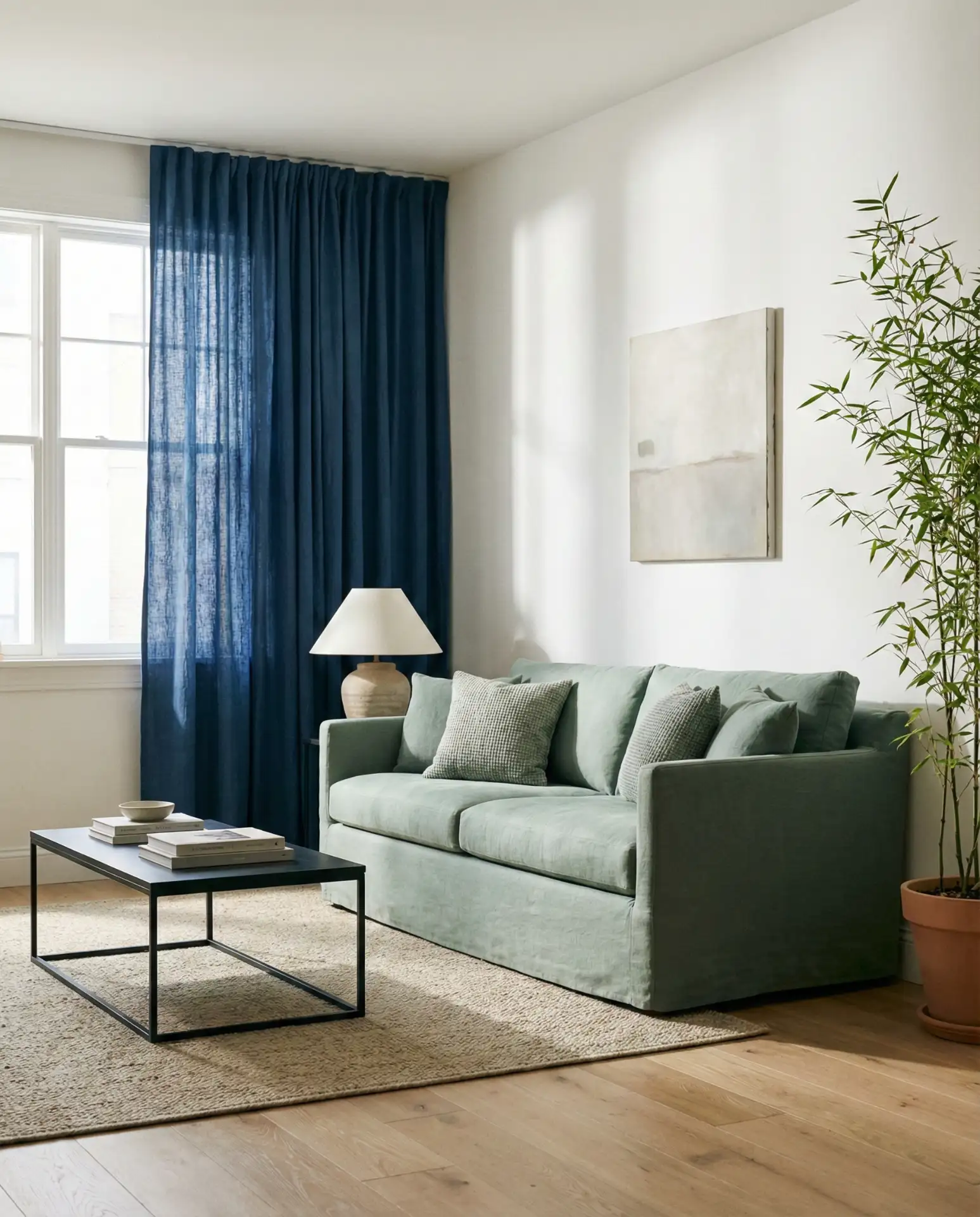
This works best in living rooms where you want a meditative quality—perfect for people who use their living room for yoga, reading, or quiet evenings rather than high-energy entertaining. The indigo curtains help with light control, creating that cozy den-like feeling when drawn, while the celadon furniture keeps things from feeling too dark when they’re open. It’s thoughtful design that adapts to your needs throughout the day.
23. Wedgwood Blue Walls with Spring Green Plants
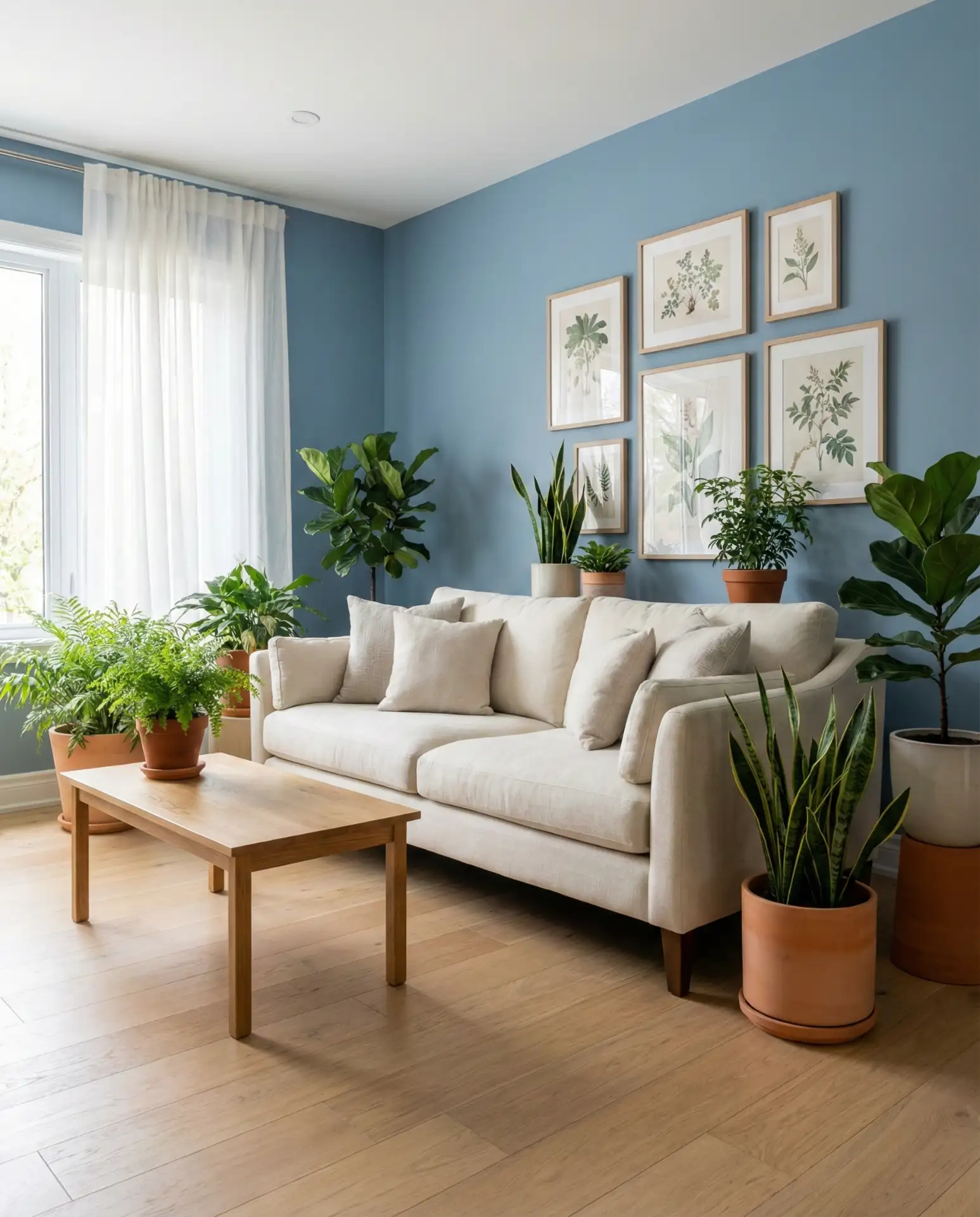
Wedgwood blue walls—that perfect grayish-blue that’s been beloved for centuries—create a sophisticated envelope for spring green plants to truly shine. Rather than relying on furniture for the green element, this approach uses living plants as the color accent, bringing vitality and air-purifying benefits along with beauty. It’s a modern way to incorporate the blue-green trend while keeping your furniture investment flexible and neutral.
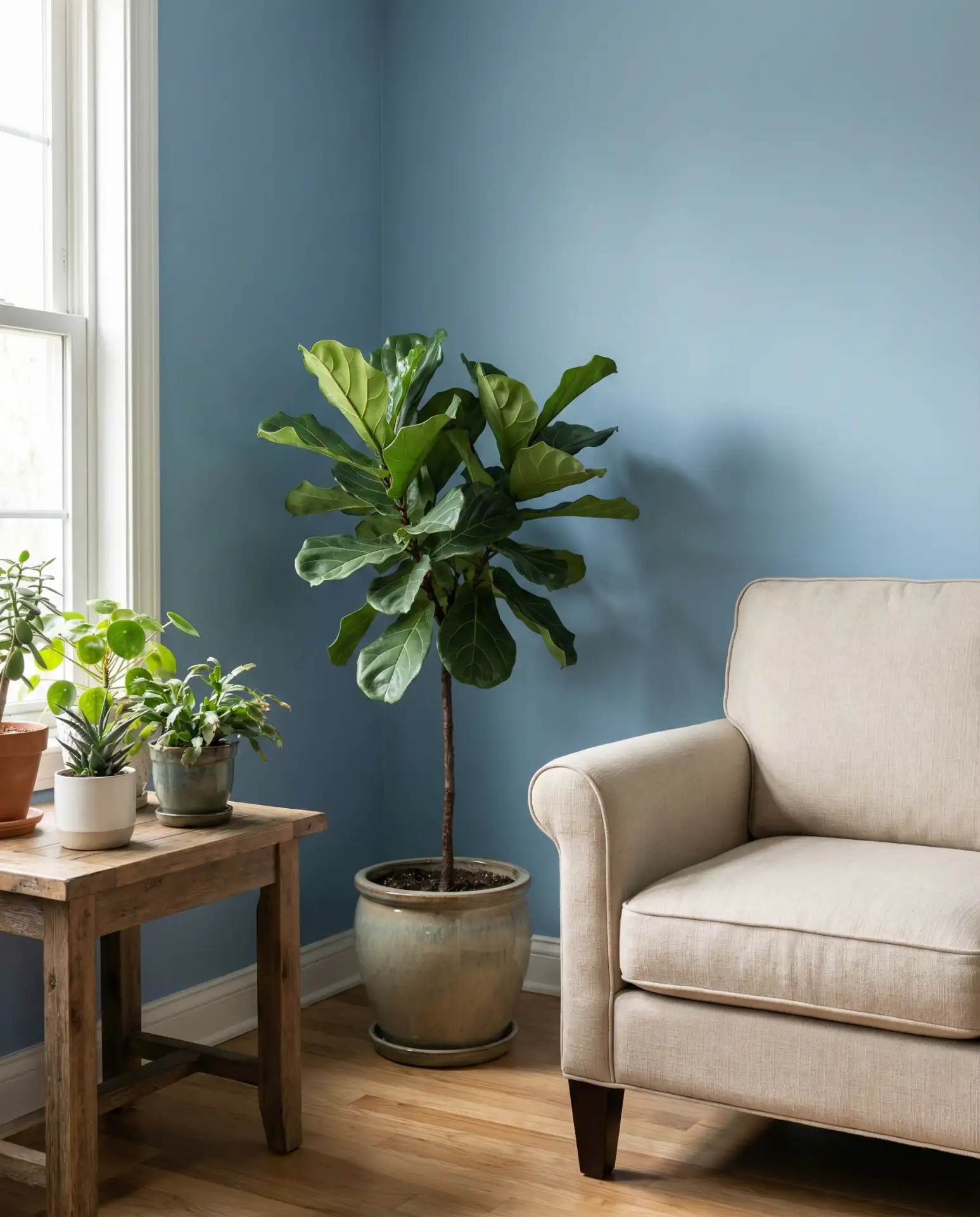
From a practical standpoint, this approach requires you to actually care for plants, which not everyone wants to commit to. If you’re not confident in your green thumb, consider low-maintenance varieties like pothos, snake plants, or ZZ plants that thrive on neglect. The Wedgwood blue background makes even simple plants look intentional and designed, so you don’t need exotic species to achieve the look. It’s proof that sometimes the simplest solutions are the most effective.
Conclusion
Whether you’re drawn to moody depths or coastal lightness, the blue and green living room trend offers endless possibilities for creating a space that feels uniquely yours. These 23 ideas demonstrate that this classic color pairing works across budgets, styles, and regions—from farmhouse charm to sleek modern sophistication. The key is choosing the specific shades and proportions that speak to your lifestyle and existing architecture. Don’t be afraid to test samples, move slowly, and trust your instincts. We’d love to hear which combination resonates with you most—drop a comment below and share your blue and green living room plans or photos!
