Fall vignette decor is having a major moment on Pinterest right now — and we know exactly why. After filtering through hundreds of options across Target, IKEA, and Facebook Marketplace, we narrowed it down to the ideas that actually deliver. We’re covering looks from rustic and cozy to moody and traditional, with options at every price point—from $50 DIY setups to $1,500 designer looks. In this guide, you’ll find 29 curated ideas for your living room, kitchen, and beyond. In 2026, the move towards creating personal, comforting sanctuaries at home is stronger than ever, and a well-styled vignette is the perfect way to tell your own seasonal story. Go ahead and save this — you’re going to want to reference it.
1. A Breath of Fresh Air: Pale Teal and White Hutch
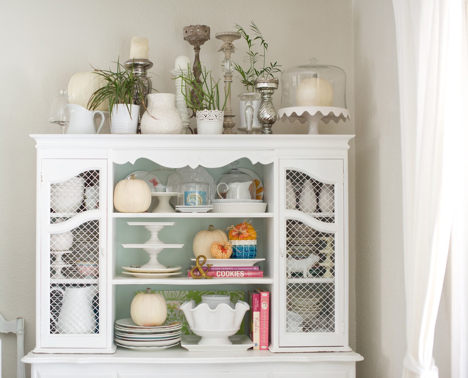
This look is so refreshing because it defies the typical warm, earthy fall palette. The success lies in the clever use of color temperature contrast. The pale, cool teal on the shelving interior makes the warm, creamy whites of the pumpkins and ceramics pop without shouting. It feels like a crisp autumn morning. Furthermore, the mix of materials—smooth ceramic, reflective glass, woven mesh, and soft greenery—creates a rich tactile experience that keeps the eye moving and engaged, preventing the monochrome elements from feeling flat.
📐 Style Math
You can absolutely achieve this serene fall look without a built-in hutch. Start by sourcing a secondhand bookcase from Facebook Marketplace or a thrift store for under $75. A couple of coats of white chalk paint will give it that soft, matte finish. For the backing, get a thin piece of plywood cut to size at a hardware store and paint it your desired shade of pale teal or even a soft gray. Then, stock up on affordable white ceramic pitchers, bowls, and pumpkins from Target or Walmart. The whole project can come in under $200 if you shop smart.
2. Classic Charm with a Pop of Fall Floral
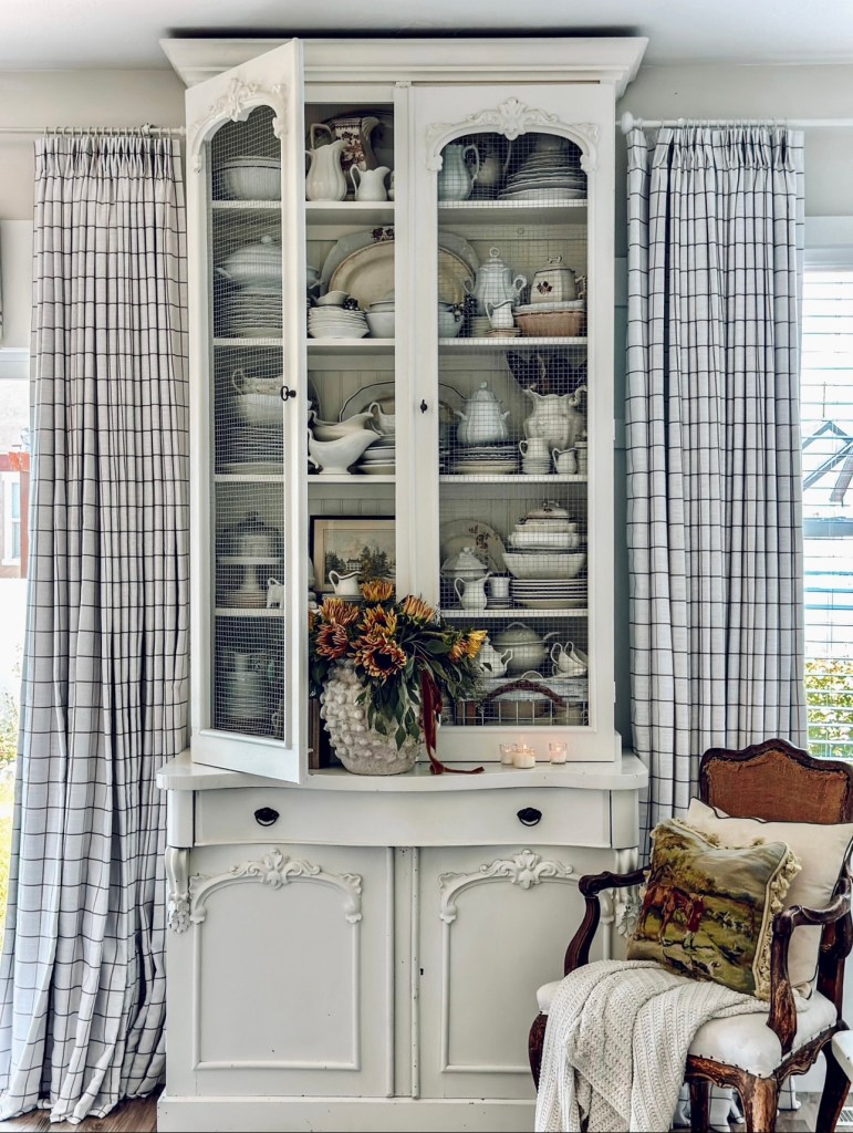
When styling a hutch with mesh or glass doors, remember the 70/30 rule for space. Keep at least 30% of the visible shelf space empty. This “negative space” is crucial for preventing a cluttered look and allowing each object to be seen and appreciated. It gives the collection room to breathe and makes the whole arrangement feel more curated and intentional. If your shelves are packed from edge to edge, the individual beauty of your pieces gets lost in the noise. Pull a few things out and see how the entire display suddenly feels more high-end.
💡 Designer Tip
The single element holding this entire vignette together is the oversized floral arrangement. Without it, you’d have a lovely but standard display of white china. That burst of deep orange and yellow is the anchor point, injecting life and seasonal warmth into the otherwise neutral scene. It’s the gesture that says “autumn” loud and clear. It proves that sometimes, one bold, beautiful statement piece is more effective than a dozen smaller themed decorations. It draws the eye and gives the whole corner a clear purpose.
3. Abundant Harvest Dining Table Centerpiece
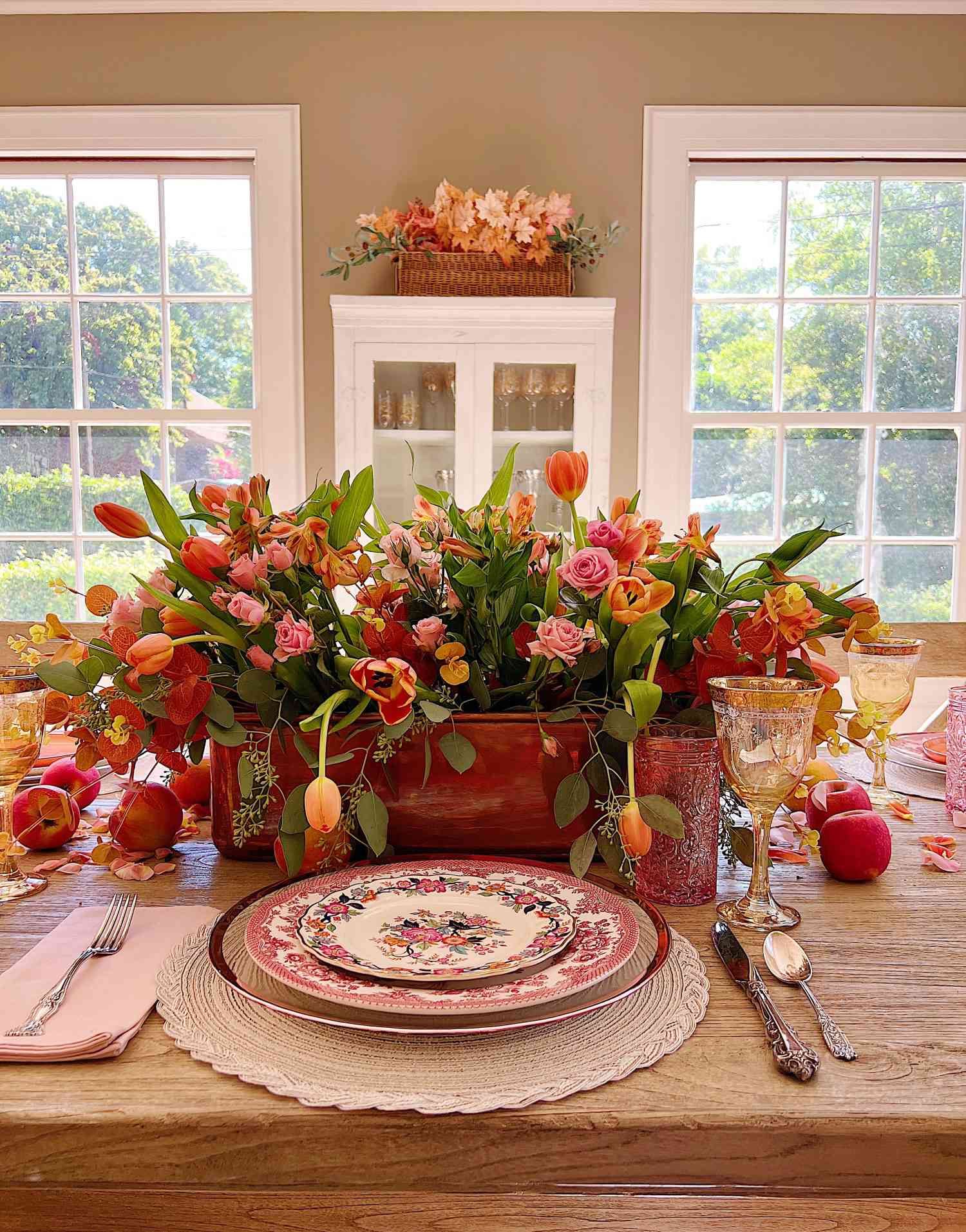
Recreating this lush, festive tablescape is an investment in beautiful entertaining. The cost is primarily in the quality of the florals and the dinnerware.
📏 Scale Guide
- Main Centerpiece (Florals & Wooden Box): $150 – $300
- Dinnerware (Plates, Glassware, Silverware for 6): $400 – $800
- Decor (Fresh Fruit, Extra Leaves): $20 – $40
- TOTAL: $570 – $1,140
Budget alternative: Use a mix of high-quality faux florals and less expensive fresh greenery. Source ornate plates and glassware from thrift stores and create a mismatched, collected look for a fraction of the price. The total could be brought down to $250 – $450.
The visual recipe here is all about warmth and layering. Think of it as 60% traditional elements, 30% natural abundance, and 10% polished shine. The traditional base comes from the ornate glassware and floral-patterned plates. The natural abundance is brought in by the overflowing wooden centerpiece box and the scattered fresh pomegranates and apples. Finally, the polished silverware provides that 10% of shine that elevates the whole look and keeps it from feeling too rustic. You could swap the fruit for gourds or the roses for dahlias, and the formula would still work perfectly.
4. Kitchen Island Glow-Up with Dahlias and Taper Candles
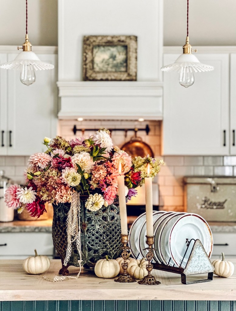
Let’s be honest: while breathtakingly beautiful, this is a high-maintenance vignette. Fresh dahlias of this quality can be expensive and will only last a few days. You’ll need to change the water daily and be prepared to replace the entire bouquet weekly to keep it looking fresh. Also, lit taper candles on a high-traffic surface like a kitchen island require constant supervision. This is a “company is coming over” setup, not a “leave it up all week” kind of display, especially if you have curious kids or pets. It’s stunning for an evening, but not practical for everyday life.
⚠️ Real Talk
Want to create that perfect candle and pumpkin cluster? Here’s a mini-guide.
- Time Estimate: 10 minutes
- Cost: $20 – $50
- Step 1: Start with your tallest elements. Place your two antique brass taper candle holders slightly off-center.
- Step 2: Anchor the display with your stack of white plates in their metal rack, placing it to one side.
- Step 3: Arrange your small white pumpkins in a gentle arc around the base of the candles and plates, creating a visual connection.
- Step 4: Place your largest element, the floral planter, behind the grouping to act as a backdrop. This creates depth and a clear focal point.
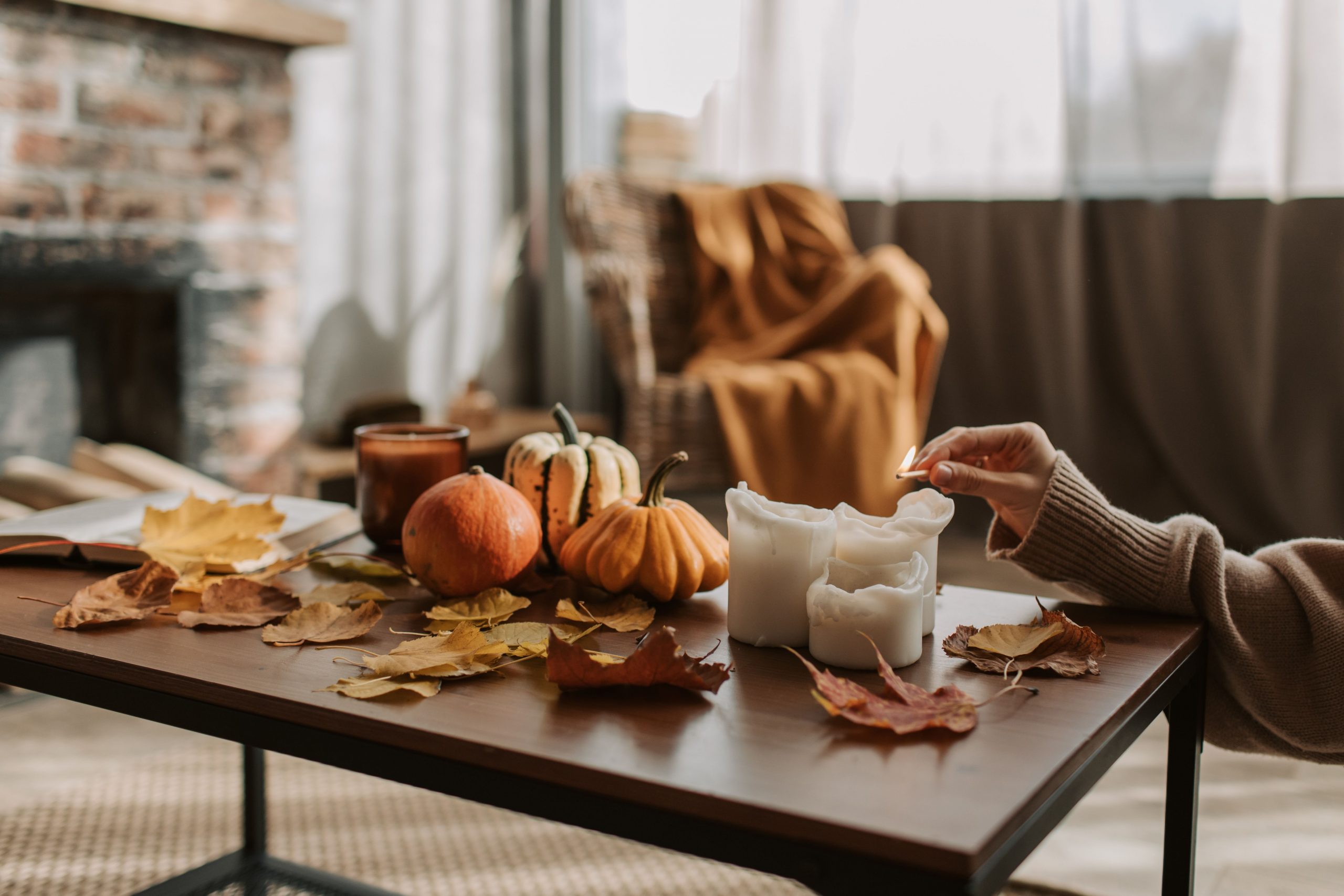
5. The Simple Warmth of Pumpkins and Candlelight
that makes this image so captivating is the human element. The hand reaching in to light the candle transforms a static arrangement into a moment in time. It’s not just a collection of objects; it’s an action, an invitation to coziness. Removing the hand would leave you with a perfectly nice, but generic, fall display. That simple gesture tells a story of someone settling in for a quiet, warm evening, which is a feeling we all crave during the autumn months. It makes the entire scene feel alive and relatable.
🔥 Trending Context
This type of imagery is incredibly popular right now because it taps into the “main character” trend we see all over social media. It’s not just about showing off your decor; it’s about showing yourself *living* within that decorated space. The focus on actions—lighting a candle, holding a warm mug, draping a blanket—creates a narrative and a mood that feels much more authentic and aspirational than a sterile, empty room. It sells a feeling, not just a product, which is why it resonates so deeply in 2026.
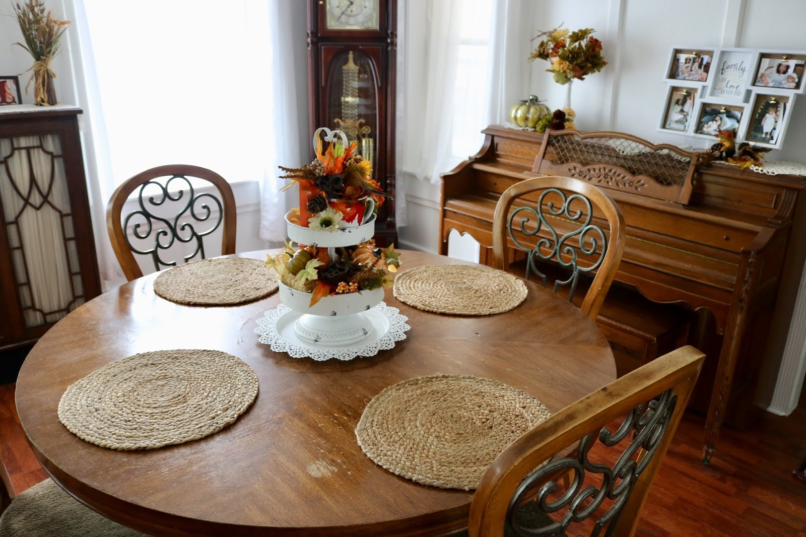
6. Traditional Dining Room with a Tiered Fall Stand
This idea is perfect for a dining room with a round table between 48 and 60 inches in diameter. A tiered stand works beautifully here because it draws the eye upward, adding height without taking up too much horizontal surface area. This leaves plenty of room for individual place settings without the centerpiece feeling crowded. This approach would be less successful on a long, narrow rectangular table, where a low, linear arrangement would be more appropriate. For a smaller, 36-inch bistro table, a tiered stand like this would be overwhelming; opt for the simpler look in Idea #12 instead.
⭐ The One Thing
What makes this work is the principle of repetition and rhythm. The roundness of the table is echoed in the round woven placemats and the circular tiers of the centerpiece stand. This repetition of shapes creates a sense of harmony and cohesion. The warm wood tones of the table, chairs, clock, and piano are also repeated throughout the space, wrapping the room in a consistent, cozy palette. The white centerpiece acts as a bright focal point, preventing the wood tones from feeling too heavy.
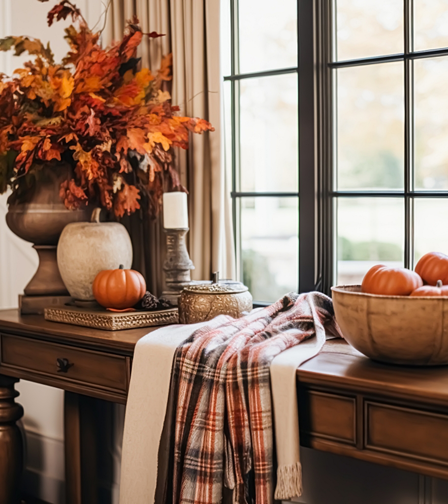
7. Layered and Cozy Autumn Console Table
The secret to a professionally styled console table is layering in unexpected ways. Most people just place items *on* the table. Notice how the plaid throw blanket is draped *over* the table itself, breaking up the hard lines of the dark wood and adding a soft, textural element that spills toward the floor. This technique adds depth, color, and a casual, lived-in feel that is much more interesting than a standard table runner. It’s a bold move that makes the entire vignette feel more dynamic and inviting.
🎯 What Makes It Work
While stunning, a large arrangement of faux foliage like this is a major dust magnet. To keep it looking fresh and not sad, you’ll need to give it a thorough cleaning at least twice a season. The easiest method is to take it outside and use a hairdryer on a cool, low setting to blow the dust off. For more stubborn grime, you can wipe individual leaves with a damp microfiber cloth. Storing it after the season is also a challenge; you’ll need a large box to avoid crushing the branches and losing the carefully arranged shape.
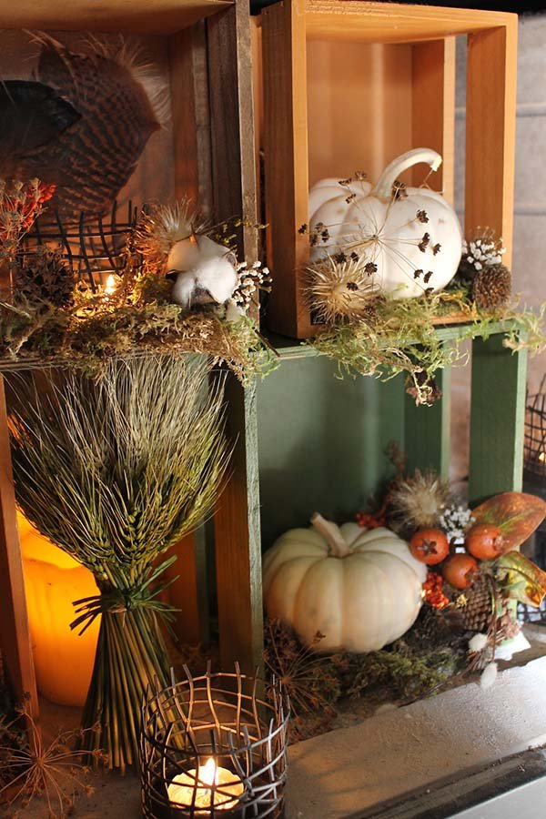
8. Rustic Charm with Stacked Crates and White Pumpkins
Love the look of painted, rustic crates? It’s an easy DIY project.
💸 Get This Look For Less
- Time Estimate: 1 hour (plus drying time)
- Cost: $15 – $30
- Step 1: Source inexpensive wooden crates from a craft store or garden center.
- Step 2: Lightly sand any rough edges, but don’t aim for perfection. A little roughness adds to the charm.
- Step 3: Apply a single coat of chalk paint in your desired color (like this forest green). Don’t worry about full, even coverage.
- Step 4: Once dry, use a medium-grit sandpaper to distress the edges and corners, revealing some of the natural wood underneath.
- Step 5: Wipe away the dust, and you’re ready to style!
This vignette’s formula is simple: 50% rustic structure, 30% natural textures, and 20% soft white. The stacked wooden crates provide the strong, rustic framework for the entire display. The varied natural textures—dried wheat, fluffy cotton, sharp thistles, and delicate feathers—make up the next layer, adding complexity and interest. Finally, the soft white of the pumpkins and candles provides a clean, bright contrast that keeps the arrangement from feeling too dark or busy. It’s a balanced composition that feels both curated and completely natural.
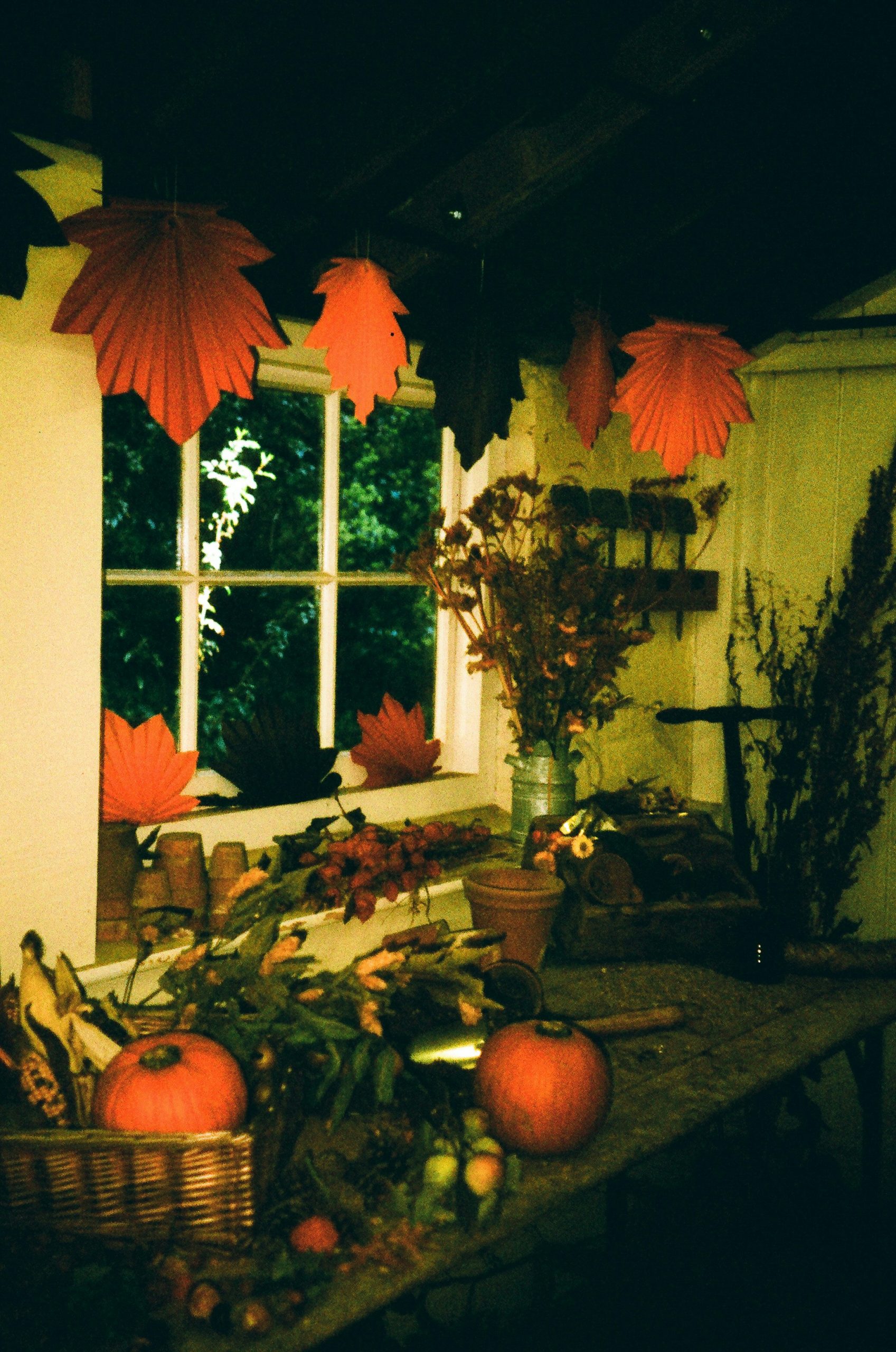
9. Whimsical Autumn with Hanging Paper Leaves
This look is a fantastic example of how to make a huge impact with a tiny budget. The hanging paper leaves are the star of the show, and they cost pennies to make. All you need is some colored construction paper or cardstock (in shades of orange, red, and yellow), scissors, and some clear fishing line. You can trace real leaves or find a template online. By hanging them at different heights, you create a sense of movement and magic. Paired with a few real pumpkins and some foraged dried foliage from your yard, you can create an immersive fall experience for under $25.
💰 Budget Breakdown
A quick reality check on those charming paper leaves: they are delicate! If that window is a high-traffic area or one you open and close often, they will get tangled, torn, or knocked down in a hurry. This is a great idea for a less-used corner or a window that stays closed for the season. Also, be mindful of your heat sources. Keep paper decorations a safe distance from radiators, lamps, and especially candles to avoid any fire hazards. Safety first, then style!
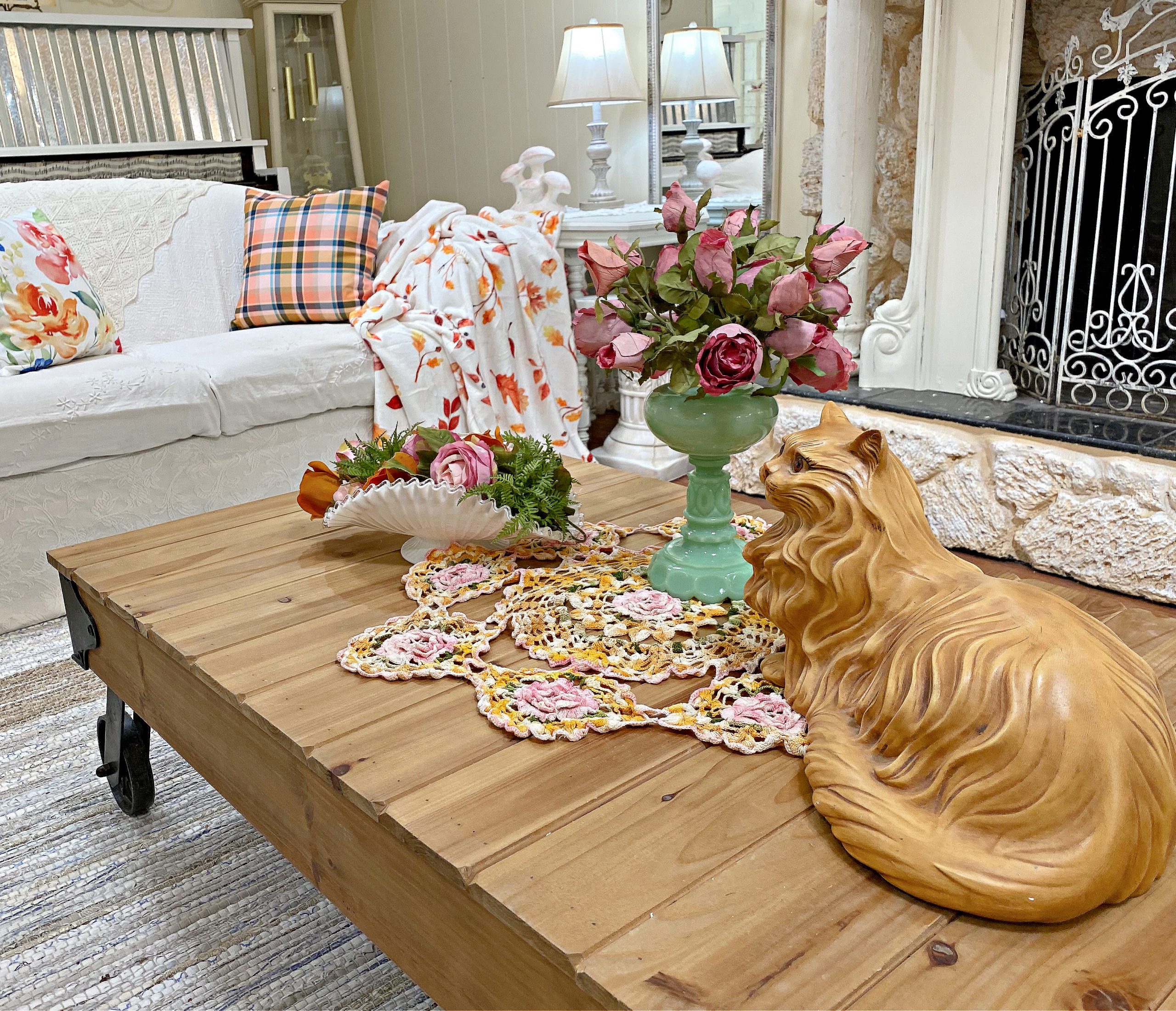
10. Charming Living Room with a Floral and Feline Touch
Take away the large carved cat statue, and what do you have? A pretty, but somewhat generic, floral and plaid living room. That cat is the single element that injects a huge dose of personality and quirkiness into the space. It’s unexpected, charming, and tells you something about the person who lives here. It breaks the “fall decor” mold and makes the vignette feel like a personal collection rather than a staged catalog photo. It proves that your decor doesn’t have to be 100% on-theme to be effective. Sometimes a beloved, slightly odd object is what makes a space truly yours.
🔧 How-To Brief
This vignette works so well because of its masterful mix of patterns and textures. You have the rough, linear texture of the wooden slat coffee table, the soft fluff of the plaid pillows, the delicate intricacy of the crochet runner, and the smooth ceramic of the vases. The patterns—plaid, floral, and leaf-print—are all different, but they are unified by a shared color palette of orange, pink, and green. This creates a look that is visually rich and layered, but not chaotic. It feels collected and cozy, not cluttered.
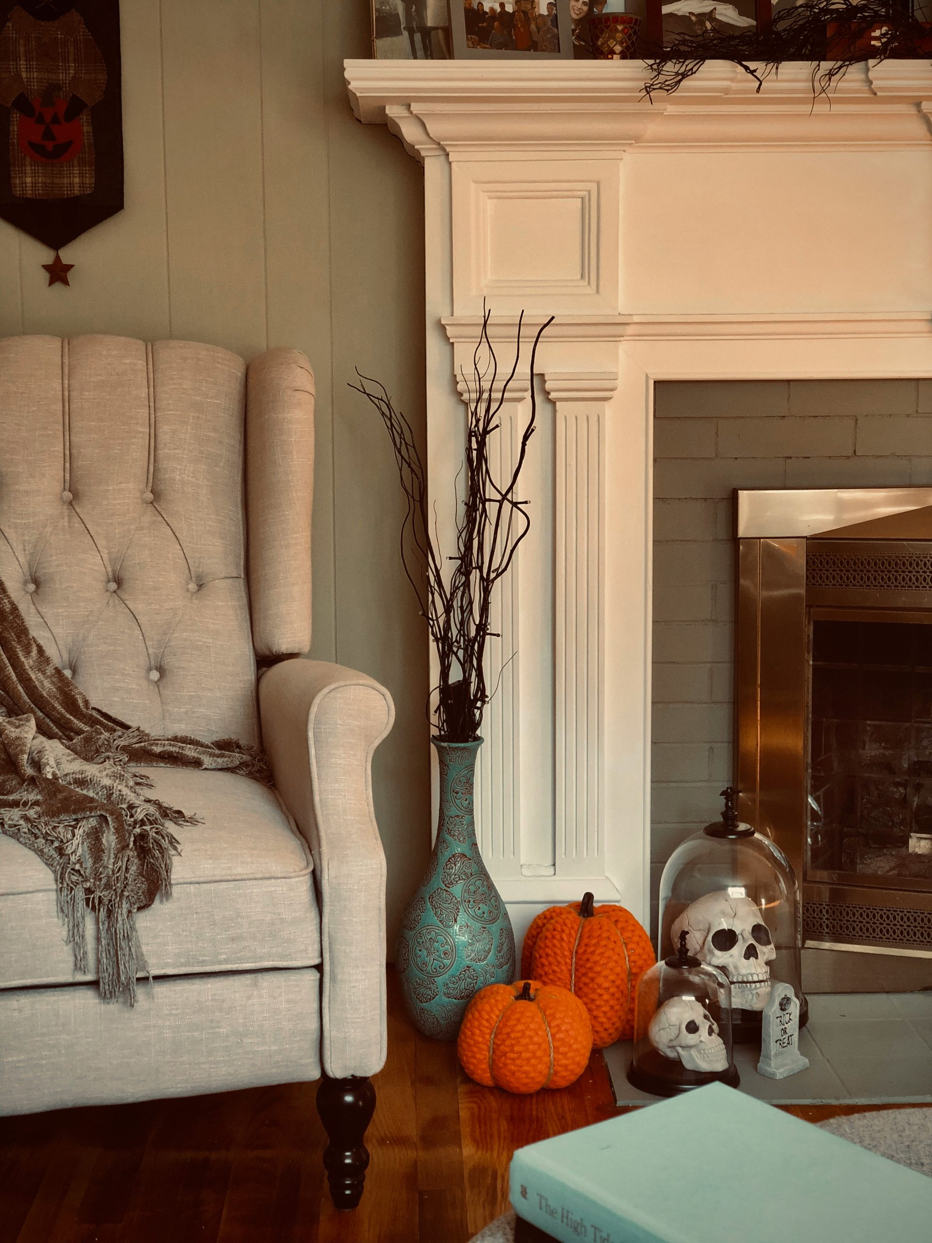
11. Spooky and Chic: A Halloween Fireplace Nook
This is a brilliant solution for a small, awkward corner, particularly one next to a fireplace that might otherwise go unused. The arrangement works best in a space that is at least 3 feet wide, allowing enough room for the armchair to not feel crammed against the wall. The key is the verticality of the branches in the teal vase, which draws the eye upward and makes the small corner feel more significant. A vignette like this doesn’t need a lot of square footage, but it does need a “moment” to anchor it, like the fireplace hearth here.
🧹 Maintenance Reality
Want to make spooky decor feel chic? It’s all about restraint and quality materials. Instead of plastic skeletons, this display uses skulls under elegant glass cloches, instantly elevating them from kitsch to curiosity. The color palette is also key. The decor is limited to a sophisticated mix of orange, teal, cream, and black. By avoiding a rainbow of Halloween colors and focusing on just two or three, the look feels intentional and high-end. The cozy, high-quality armchair and throw also ground the spooky elements in a comfortable, stylish reality.
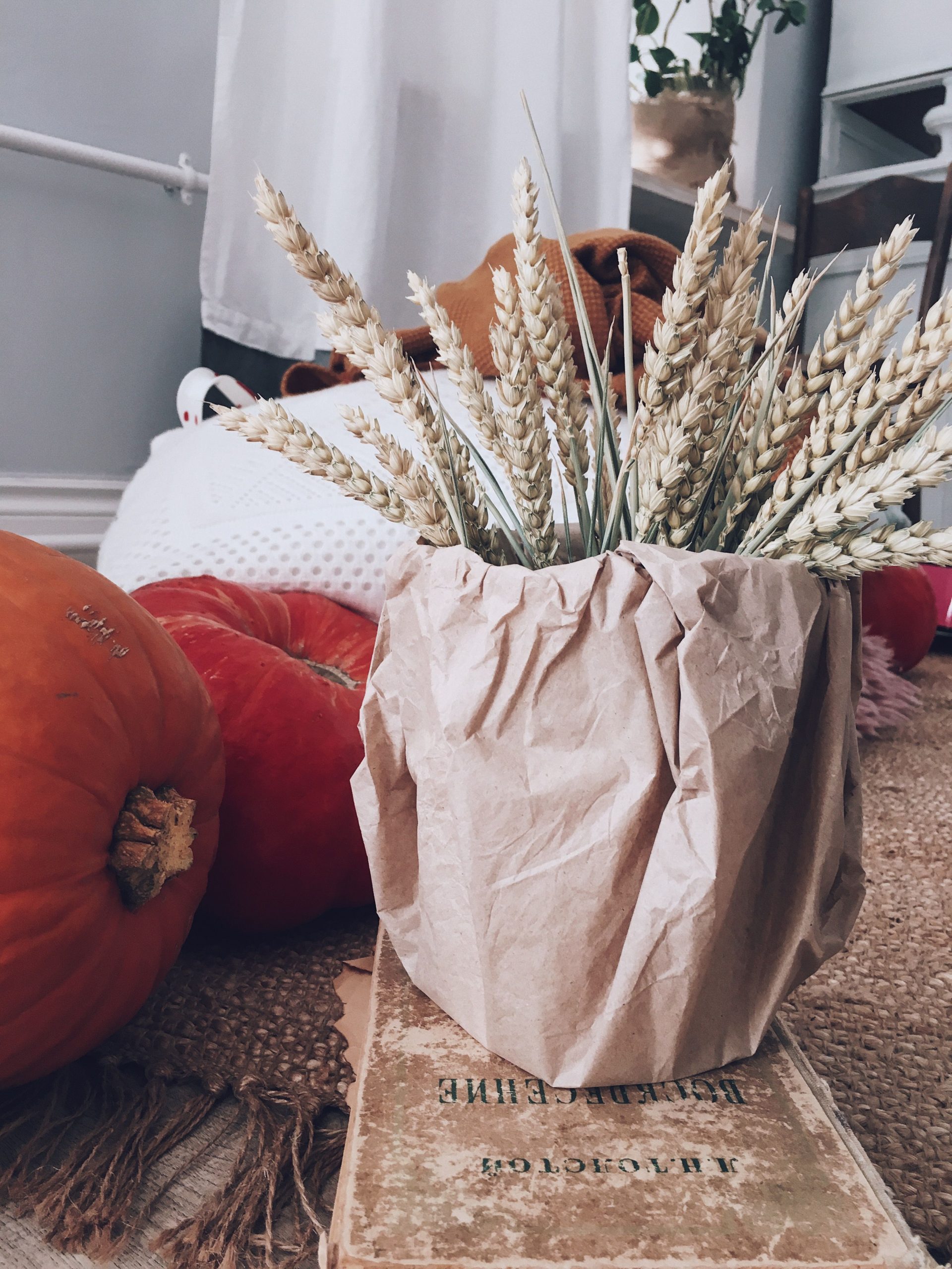
12. The Beauty of Simplicity: Wheat and Pumpkins on Jute
This entire look can be created for less than $15, proving that impactful fall decor does not need to be expensive. A bundle of dried wheat from a craft store costs a few dollars. The pumpkins can be from the grocery store. The vintage book can be found at any thrift store for a dollar or two (look for ones with aged, yellowed paper). And the brown paper bag? That’s probably already in your kitchen. It’s a celebration of simple, humble materials. This is a great alternative to the grand floral arrangements seen in looks like Idea #3, offering a quiet, rustic charm.
✅ Before You Start
This vignette perfectly captures the “Humble Harvest” trend. In a world of over-the-top, perfectly curated everything, there’s a growing appreciation for the beauty of simple, natural, and even slightly imperfect materials. The crumpled paper bag, the faded book, the rough texture of the jute—these elements feel authentic and grounding. It’s a move away from mass-produced plastic decor and towards things that have a story and a tactile quality. It feels honest, cozy, and deeply connected to the actual season of harvest.
13. Clean and Simple: Fall Gourds on a White Dresser
Here’s a minimalist fall decor formula: 80% neutral foundation + 20% natural color. The white dresser and light gray wall create a clean, expansive neutral canvas. The vignette itself—the wooden tray and the colorful gourds—makes up just 20% of the visual information. This high-contrast ratio is what makes the display pop. It feels intentional and uncluttered. You could swap the gourds for mini pumpkins, apples, or even a small floral arrangement, and as long as you maintain that 80/20 balance, the clean, modern feel will remain.
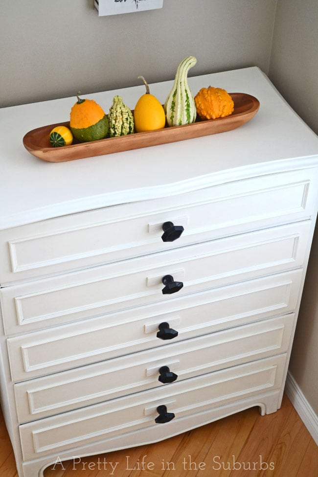
📐 Style Math
that makes this idea work so well is the long, shallow wooden tray. Without it, the gourds would just be a loose pile on a dresser, looking a bit random and messy. The tray acts as a frame, corralling the small items into a single, cohesive unit. It gives them purpose and presence. It also adds a necessary layer of warm, natural texture against the smooth, painted surface of the dresser, providing crucial visual contrast. It’s a simple tool that turns clutter into a curated collection.
14. A Classic Pumpkin Centerpiece with a Warm Glow
This centerpiece works because of its strong sense of symmetry and hierarchy. The large, mottled pumpkin is the undeniable star of the show, placed centrally and elevated on a dark green plate. It creates a clear focal point. The two pillar candles act as stately guards, flanking the pumpkin and creating a balanced, symmetrical frame. The smaller gourds, leaves, and pinecones are then scattered around the base, filling in the gaps and adding texture without competing for attention. This clear hierarchy makes the arrangement feel organized and visually satisfying.
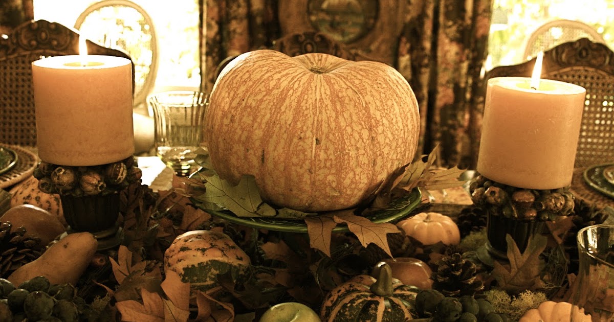
💡 Designer Tip
Let’s have some real talk about using real, lit pillar candles in a centerpiece full of dry leaves and other flammable materials. It’s beautiful, but it’s a fire hazard waiting to happen. Never leave this arrangement unattended. A guest could easily knock a candle over, or a leaf could curl into the flame. For a worry-free version that’s just as magical, invest in a set of high-quality flameless LED pillar candles. They provide the same warm flicker and glow without any of the risk, so you can actually relax and enjoy your dinner party.
15. Elegant Mantel Styling with Art and Orchids
A common mistake when styling a mantel is putting one large piece of art in the center. Notice how using two smaller, vertically-oriented paintings creates a more dynamic and sophisticated look. The key is to hang them low, just an inch or two above the mantel surface. This visually connects the artwork to the objects on the mantel, making it all feel like one cohesive unit. If you hang them too high, they will look like they are floating away from the rest of your display.
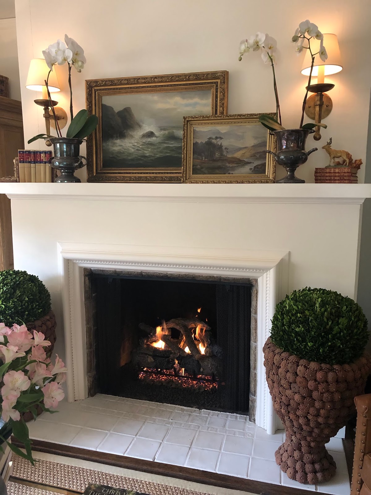
📏 Scale Guide
This grand, symmetrical look is best suited for a large fireplace with a substantial mantel in a room with ceilings that are at least 9 feet high. The large pinecone planters and tall orchids require vertical space to feel balanced, not cramped. On a smaller fireplace or in a room with standard 8-foot ceilings, this exact arrangement would feel overwhelming and out of scale. For a more compact space, consider the console table styling of Idea #7, which offers a cozier, more adaptable approach to fall decor.
16. A Collected Hallway with a Pop of Patterned Wallpaper
The single most impactful element in this space is the sliver of patterned wallpaper visible through the doorway. Without it, you have a perfectly nice, traditional hallway vignette. With it, you have a space filled with intrigue, depth, and personality. It creates a “peek-a-boo” effect that makes you curious about the next room. It also serves as the inspiration for the color palette, with its red tones being picked up by the lamp base. It’s a brilliant way to add pattern and color without committing to wallpapering the entire hallway.
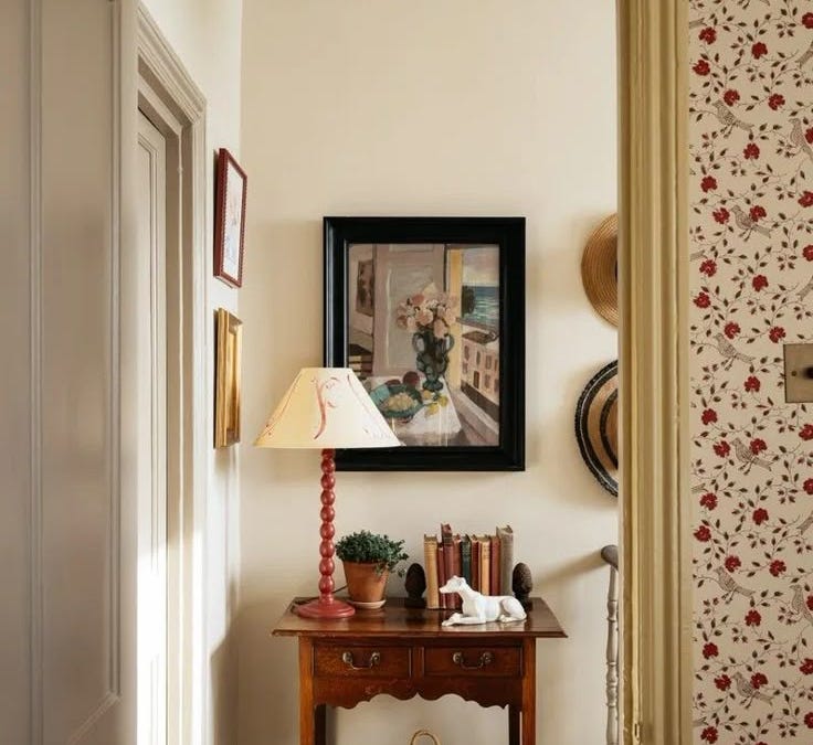
⚠️ Real Talk
This vignette feels so authentic and “lived-in” because it avoids being overly symmetrical or staged. The lamp is placed off-center, balanced by the visual weight of the books and plant on the other side. The artwork isn’t perfectly centered over the table; it’s hung in relation to the lamp. This type of asymmetrical balance is harder to achieve but results in a much more natural and dynamic composition. It looks like someone curated these objects over time, not like they bought them all at once to fill a space.
17. Farmhouse Welcome with a ‘Hello Fall’ Tin
The “Hello Fall” decorative tin is a charming focal point, but you don’t need to buy a pre-made one. Get the same look for less by finding a vintage-style milk jug or watering can from a thrift store or IKEA for under $20. Then, use a stencil or a Cricut machine to add your own “Hello Fall” message with white acrylic paint. Fill it with inexpensive faux leaves from a craft store, and you have a personalized, high-impact piece for a fraction of the retail cost. The large wooden bowl of pinecones can be a freebie if you have pine trees in your neighborhood!
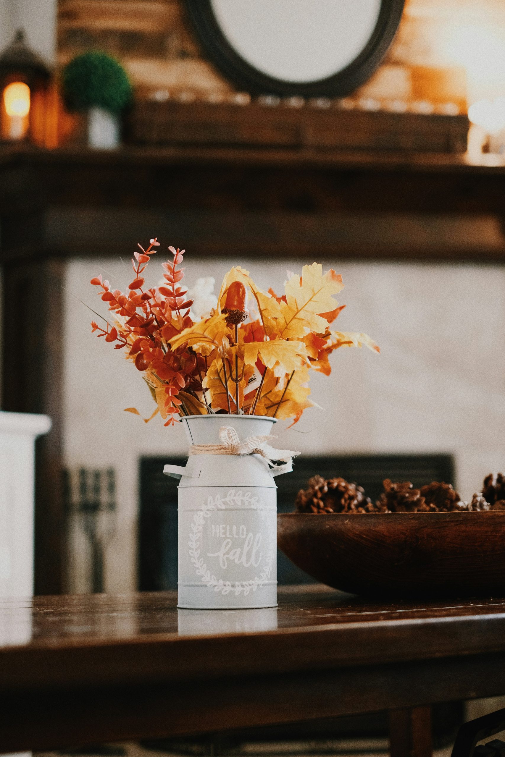
🔥 Trending Context
A word of caution about decor with text: it can quickly feel dated or cheesy. The “Live, Laugh, Love” effect is real. This “Hello Fall” sign works because it’s seasonal and the typography is simple and clean. To keep it from feeling generic, make sure the object it’s on has some character, like this rustic tin. And please, limit yourself to one piece of text-based decor per room. When you have signs telling you to “Gather,” “Be Grateful,” and “Enjoy Fall” all in one space, it loses its charm and starts to feel like a command center.
18. Cozy Rainy Day Window with House-Shaped Candles
This image is the visual embodiment of the “Cozy Core” or “Hygge” aesthetic that continues to dominate social media feeds every autumn. The trend emphasizes creating a feeling of contentment, warmth, and well-being through your surroundings. It’s not about grand gestures, but small, tangible comforts: the flicker of a candle, the softness of a knit blanket, the beauty of a simple leaf. The rain-streaked window is key—coziness is always amplified by a contrast with gloomy weather outside. This is the feeling everyone is trying to capture and share in the fall of 2026.
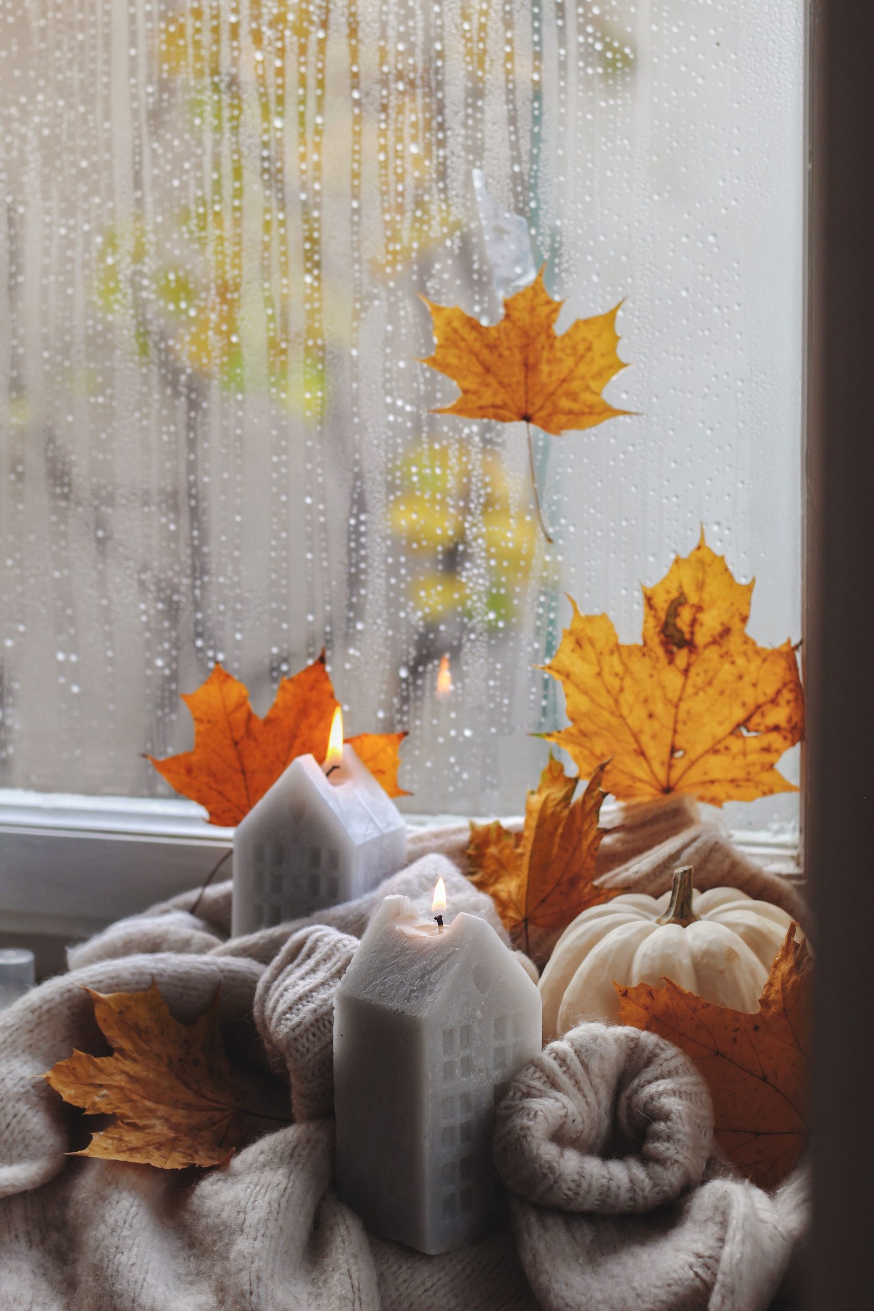
⭐ The One Thing
that elevates this from a simple fall display to something truly special is the house-shaped candles. They are brilliant. They tap into the deep, primal feeling of “home” as a sanctuary, a place of warmth and safety. Seeing them lit, glowing from within, while the rain comes down outside, is a powerful visual metaphor. Swapping them for regular pillar candles would still be cozy, but it would lose that specific, heartfelt symbolism that makes this image so resonant.
19. A Miniature World of Warmth and Rustic Textures
The formula for this cozy glow is 40% warm light, 40% natural texture, and 20% clean white. The candlelight, reflected on the tabletop, creates an ambient glow that is the dominant feature. This is balanced by an equal measure of rough, natural textures from the pinecones and nuts. Finally, the clean white of the decorative house and candle holder provides a crisp point of contrast, preventing the scene from becoming a monotonous sea of brown and orange. It’s a focal point that brightens the entire composition.
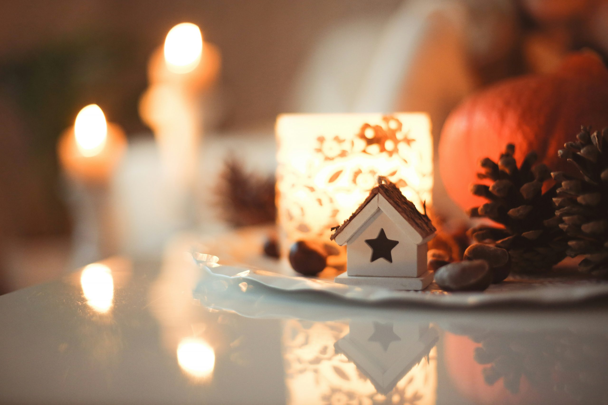
🎯 What Makes It Work
What makes this tiny scene so effective is the smart use of reflection. Placing the objects on a polished, reflective surface doubles the impact of the candlelight, creating a pool of light that seems to emanate from within the vignette itself. This simple trick amplifies the warmth and coziness exponentially. It also adds a touch of sophistication and magic, making the display feel more dynamic than if it were set on a matte or fabric surface. It’s a small detail with a huge payoff.
20. An Autumn Reading Nook with Coffee and Twinkle Lights
The secret to magical, non-tacky twinkle lights is using a strand with a thin, flexible wire (often copper or silver) rather than the thick green plastic kind. This allows you to weave them subtly into your decor. Another key is to choose lights labeled “warm white.” The slightly yellow-toned glow mimics candlelight and feels cozy, while “cool white” or “daylight” LEDs can feel sterile and harsh. Lastly, always use them as an accent, blurred in the background or tucked behind objects, rather than the main feature. They should create atmosphere, not be the star of the show.
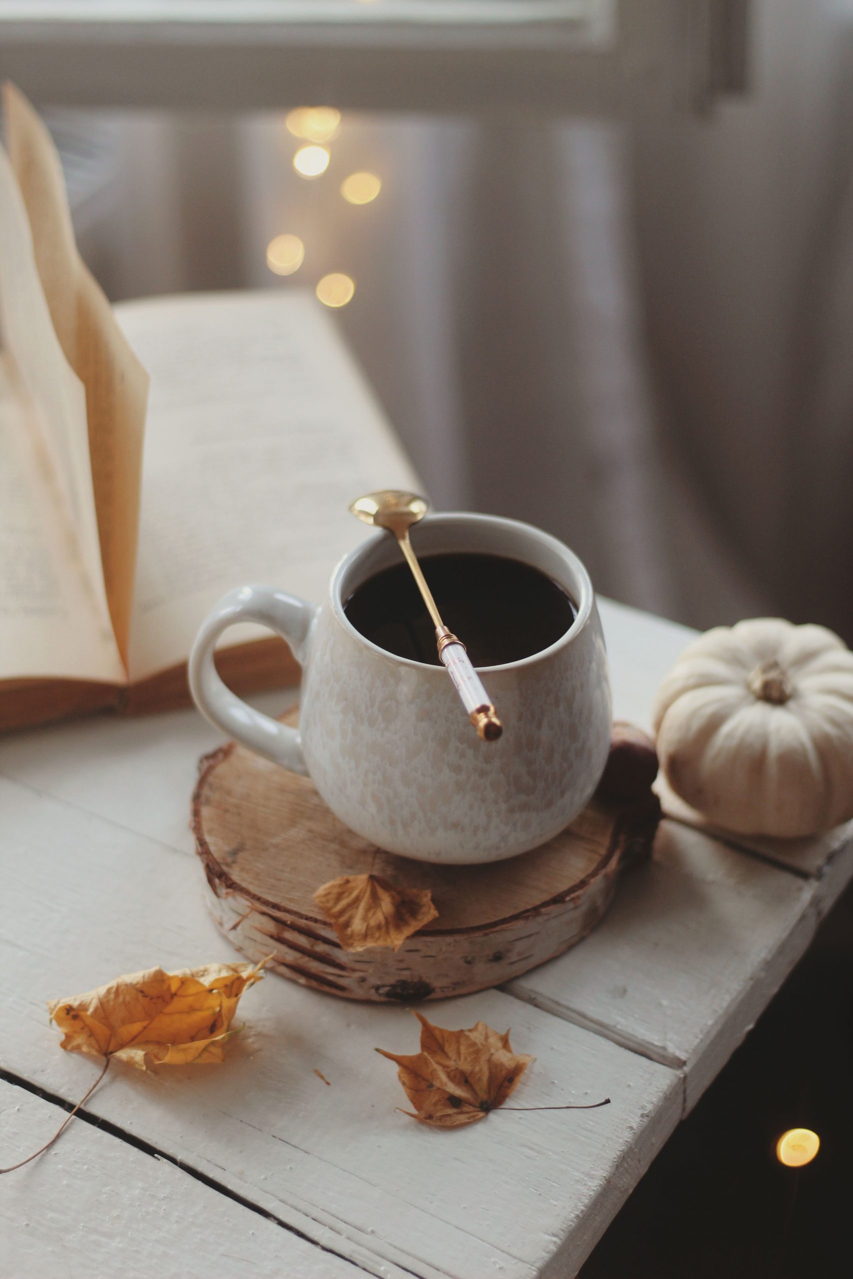
💸 Get This Look For Less
You don’t need a fancy setup to create this cozy reading vibe. The mug can be from Target, the spoon from a thrift store, and the coaster from a craft store wood-slice section. The distressed wood surface? That could be an old cutting board, a serving tray, or even a piece of scrap wood you’ve painted and sanded. The “book” can be your current read or a pretty one from a secondhand shop. Scatter some real leaves you’ve pressed and a strand of battery-operated fairy lights ($5-10 online), and you have the perfect cozy shot for less than $25.
21. Farmhouse Dining Table with Lantern and Plaid
This farmhouse vignette is perfectly scaled for a round kitchen or dining table that seats four, typically 42 to 48 inches in diameter. The central arrangement is contained and doesn’t spill into the individual place settings, which is key for a functional dining table. The lantern provides some height, but its glass construction keeps it from feeling too heavy or blocking sightlines across the table. For a larger, six-person table, you might need to add a couple more elements, like small potted mums, to give the centerpiece enough presence.
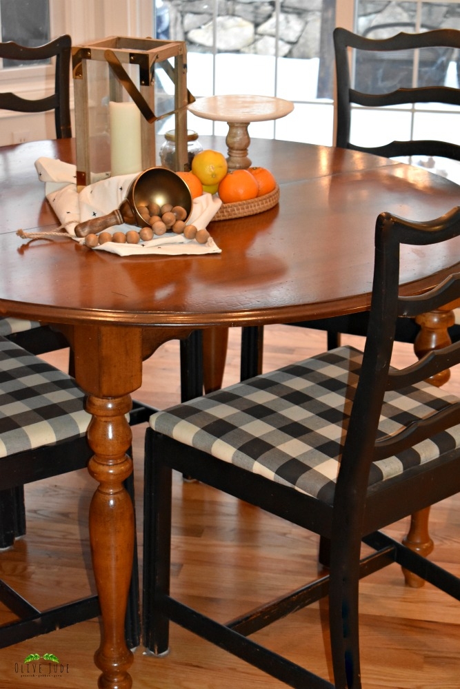
💰 Budget Breakdown
While the wooden lantern is a classic farmhouse element, be honest with yourself about whether you will actually use it. If you put a real candle inside, you have to supervise it and clean up wax drips. If you use an LED candle, you have to remember to turn it on and off or deal with batteries. Often, these lanterns just end up as empty glass boxes collecting dust. If you love the look, go for it! But if you suspect it will become a clutter-catcher, maybe opt for a simpler centerpiece, like the pitcher of grasses in Idea #25.
22. A Rustic Porch Welcome with a Colorful Rug and Mums
This porch display works because it expertly balances rustic textures with pops of vibrant color. The distressed wood of the bench and floorboards provides a weathered, neutral base. Then, the scene is strategically layered with color: the bright orange of the pumpkins and mums, and the surprising jolt of dark blue and cream from the patterned rug. The rug is the key—it grounds the space, defines the vignette area, and introduces a complementary color that makes the traditional orange tones feel fresh and modern. It’s an unexpected choice that pays off beautifully.
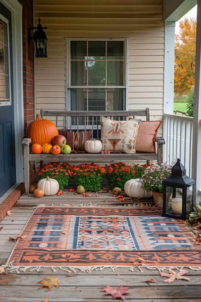
🔧 How-To Brief
Potted mums are the quintessential fall plant, but they require consistent care to look this good. They are thirsty plants and need to be watered thoroughly every day, especially if your porch gets direct sun. To maximize their bloom time, you also need to “deadhead” them regularly, which means pinching or cutting off the spent, wilted flowers. If you neglect them for even a couple of days, they can quickly become a sad, crispy mess. They offer a huge visual reward, but they are not a “set it and forget it” plant.
23. Moody and Elegant Dining with a Pop of Yellow
The formula for this dramatic look is 60% dark and moody + 30% bright accent + 10% metallic warmth. The dark, painted wainscoting and landscape mural create a sophisticated, enveloping backdrop. The single, vibrant pop of yellow from the artificial leaves provides a powerful, intentional contrast that brings the whole scene to life. Finally, the brass candlesticks add that crucial 10% of metallic shine and warmth, reflecting the light and adding a touch of glamour. It’s a confident and beautifully balanced composition.
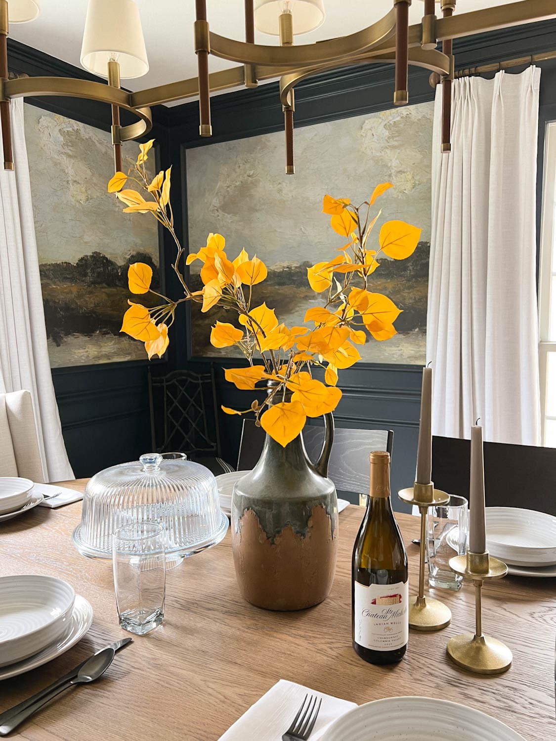
🧹 Maintenance Reality
Using high-quality artificial stems is the key to a successful fall floral display that lasts all season. When shopping for them, look for variation in color—real leaves aren’t a single, flat shade of yellow. The best ones have subtle hints of green, orange, or brown. Also, check for textured veins and imperfect shapes. After you buy them, take a few minutes to bend and shape the plastic stems and branches to create a more natural, less rigid silhouette. Don’t just stick them in the vase straight out of the bag!
24. A Classic Front Porch Overflowing with Mums
You can get this abundant, classic fall porch look on a tighter budget. Instead of buying several large, pre-potted mum plants, buy smaller, less expensive ones from a grocery store or garden center. Then, “pot them up” into larger, more impressive planters you already own or find at a thrift store. You can place bricks or empty plastic bottles in the bottom of the large planter so you don’t have to fill the whole thing with expensive potting soil. For pumpkins, visit a local farm or pumpkin patch in late October when prices often drop, and mix in a few inexpensive gourds.
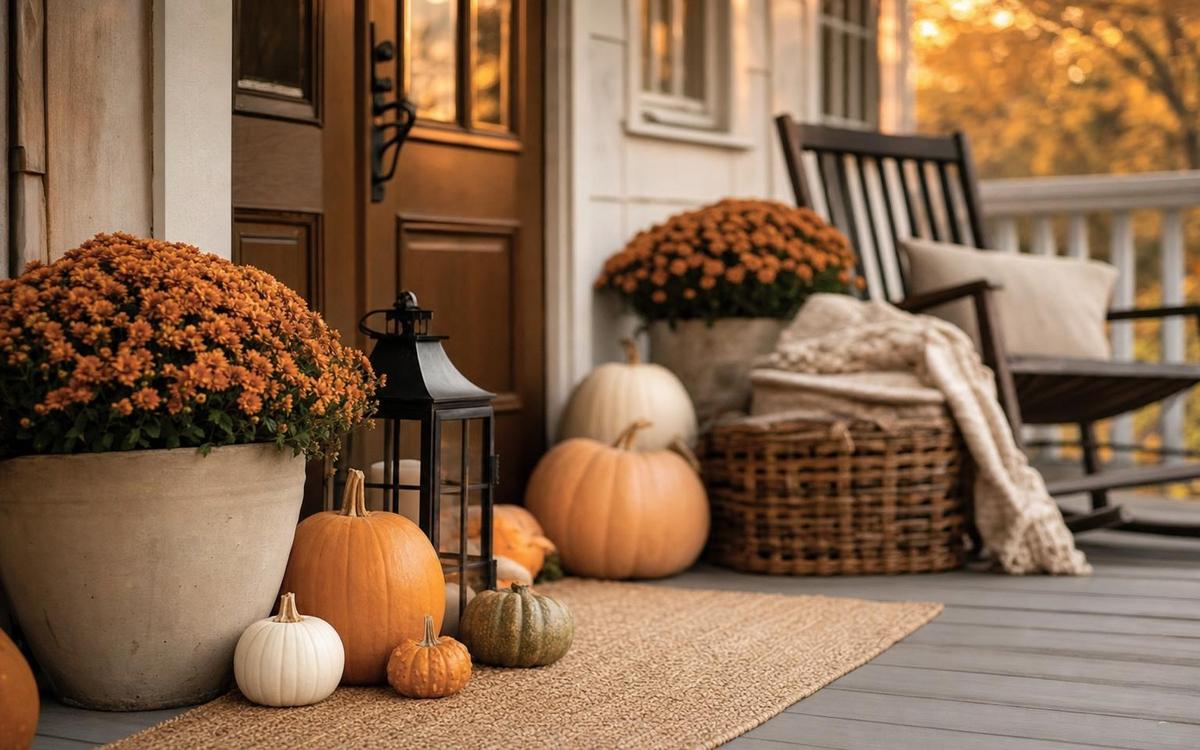
✅ Before You Start
that makes this porch so successful is the sheer abundance. This isn’t a timid display with one pumpkin and one pot of mums. This is a joyful, confident explosion of fall. By grouping multiple pots of the same vibrant orange mums and piling on pumpkins of various sizes, the homeowner has created a massive visual impact. It’s a lesson in “more is more.” Sometimes, the best design choice is to commit fully and go big. The generosity of the display is what makes it feel so welcoming and festive.
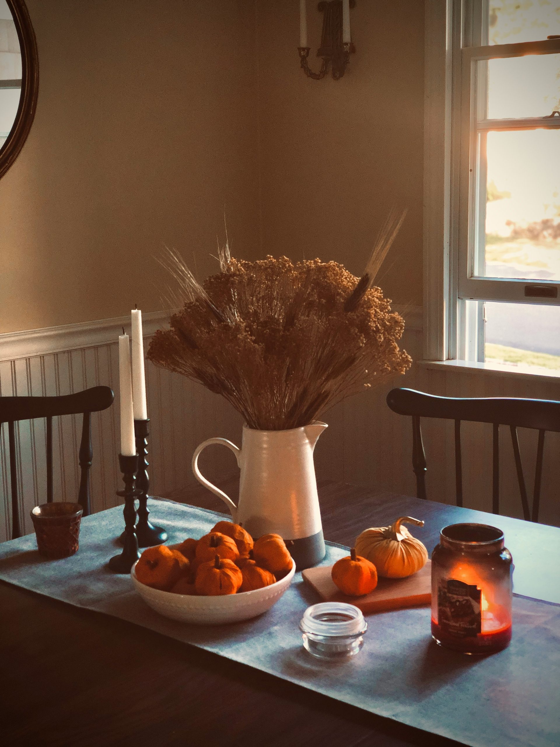
25. Harvest-Inspired Dining with a Pitcher of Dried Grasses
This vignette feels so warm and inviting due to its masterful use of lighting and texture. The natural light from the window provides a soft, atmospheric glow, which is then enhanced by the focused, intimate light from the candles. This layering of light sources creates depth and mood. Texturally, the scene is a symphony of contrasts: the smooth white ceramic of the pitcher, the rough and feathery dried grasses, the smooth wax of the candles, the nubby fabric of the table runner, and the warm grain of the wooden furniture. This rich mix is a feast for the eyes.
📐 Style Math
Before you commit to a centerpiece for your dining table, run through this quick checklist:
- Height Check: Can you see the person sitting across from you? Place the centerpiece on the table and sit down. If it blocks your view, it’s too tall for conversation.
- Footprint Check: Is there enough room for plates, glasses, and serving dishes? A beautiful centerpiece is useless if it makes the table non-functional. Compare it to the more compact style of Idea #12.
- Scent Check: If using scented candles or real foliage, is the smell overpowering? Strong scents can interfere with the aroma and taste of food.
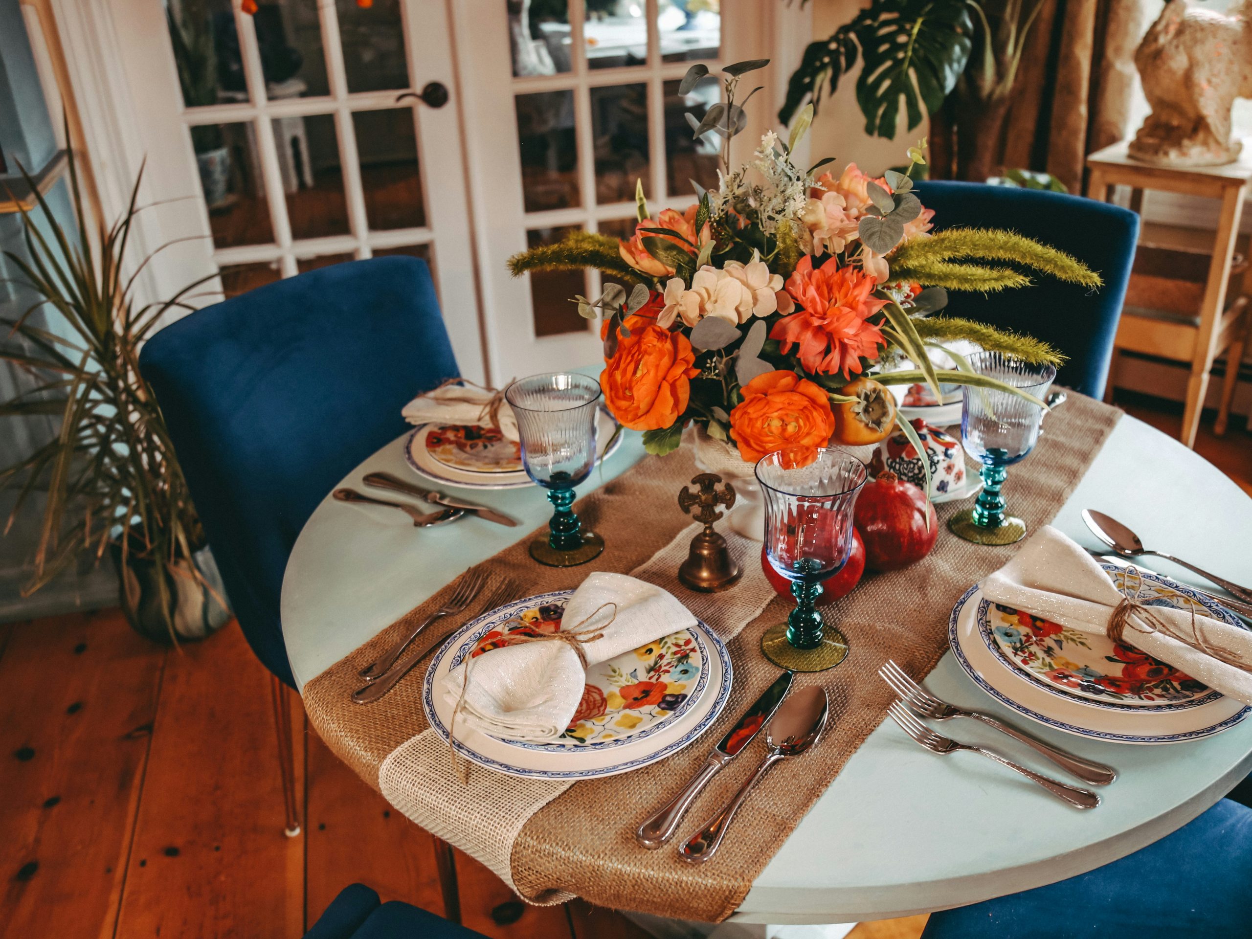
26. Vibrant Fall Table with Blue Velvet and Pomegranates
The secret weapon in this tablescape is the use of a complementary color scheme. The deep orange of the flowers and persimmons is directly opposite the rich blue of the velvet chairs on the color wheel. This high-contrast pairing creates a visual vibration that makes both colors appear more intense and vibrant. It’s a bold, confident choice that moves beyond the typical monochrome fall palette. To keep it from being jarring, the designer used softer versions of these colors—like the light blue tabletop and pinkish florals—to bridge the gap.
💡 Designer Tip
A burlap table runner looks wonderfully rustic, but it can be a nightmare to clean. It sheds fibers everywhere, and if someone spills wine or gravy on it, you can’t just toss it in the wash. Spot cleaning is your only option, and it can leave a mark. Also, the open weave means that crumbs and spills can fall right through to the table underneath. It’s a great choice for texture, but if you’re planning a messy meal with kids (or clumsy adults), a washable cotton or linen runner might be a more practical choice.
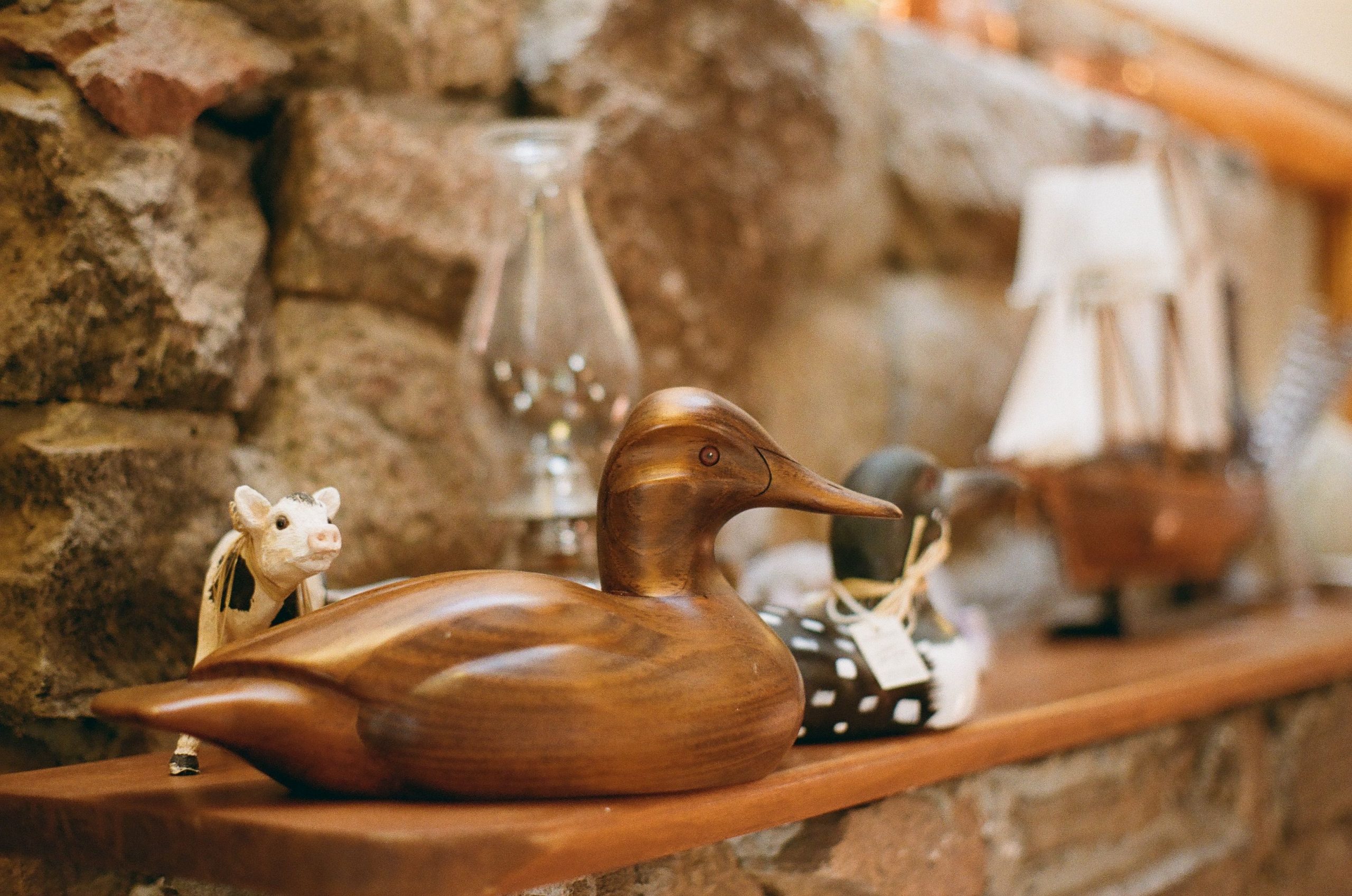
27. Rustic Mantel with Carved Wood Ducks and Stone
The single most important element here is the collection of carved wooden ducks. They are the heart of the vignette. They suggest a story, a hobby, a personal connection to nature or craftsmanship. Without them, the mantel would just be a display of generic decorative objects. The ducks transform it into a personal statement. They give the space a sense of history and a lived-in, collected-over-time feeling that is impossible to buy off a shelf. They prove that the most meaningful decor is often something that has personal significance.
📏 Scale Guide
This rustic look works because of the harmonious relationship between the materials. The warm, smooth wood of the mantelpiece and the ducks is a perfect complement to the cool, rough texture of the grey stone fireplace. This pairing of opposite textures and temperatures creates a balanced and visually interesting foundation. The other small items—the white porcelain cow, the glass lamp—are kept simple, allowing the primary conversation between wood and stone to take center stage. The result is a calm, grounded, and authentic space.
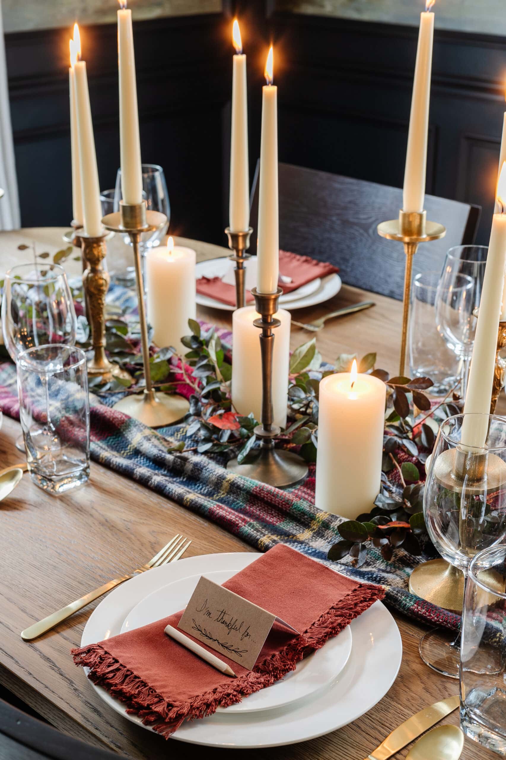
28. Glowing Tablescape with a Plaid Runner and Brass Candlesticks
The visual equation for this inviting tablescape is 50% warm base + 30% ambient light + 20% natural color. The warm base is established by the oak table and the plaid runner. The ambient light is the hero, with the numerous lit candles and their brass holders providing a magical glow that makes up a huge part of the mood. The final 20% comes from the pops of natural color in the green and red garland and the rust-colored napkins. This formula prioritizes mood and light over excessive objects. For a simpler take, see Idea #25.
⚠️ Real Talk
To get that effortlessly chic, layered look with your napkins and flatware, follow this simple sequence. First, place your dinner plate. Next, fold your fringed napkin loosely and place it in the center of the plate. Finally, lay your gold-toned flatware on top of the napkin. This creates a more casual, modern feel than placing the flatware on either side of the plate. It says “come and eat” rather than “don’t touch the display.” The little bit of fringe peeking out adds that perfect touch of texture.
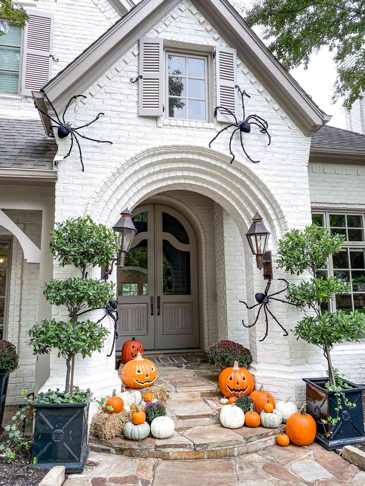
29. Spooky and Grand: A Halloween Entry with Spiders
This high-impact Halloween decor works because it matches the grand scale of the home’s entrance. The large black spiders are proportional to the expansive white brick wall, and the multiple hay bales and pumpkins are substantial enough to not look dwarfed by the tall, arched doorway. If you have a smaller, standard-sized front door, trying to replicate this exactly would look crowded. Instead, use one or two smaller spiders and a more contained cluster of pumpkins on your steps. The key is to match the scale of your decor to the scale of your architecture. Compare this with the more modest porch in Idea #24.
🔥 Trending Context
Those big black metal spiders look fantastic, but how do you attach them to a brick wall without causing permanent damage? Most homeowners use temporary solutions like heavy-duty outdoor mounting tape or brick clips that grip onto the edges of the bricks without drilling. Be sure to use a product that can be removed cleanly. Also, consider the weight. If the spiders are heavy, you may need to use more than one anchor point to distribute the load and prevent them from taking a nosedive in a strong autumn wind.
Your Autumn Story Starts at Home
You don’t need to be a professional designer to create a home that feels personal and alive with the season. These ideas are just a starting point for telling your own story. Now, go gather some branches, light a candle, and have fun with it. Don’t forget to save your favorites to your Pinterest board to keep the inspiration flowing!