You know that feeling when you finally find the two-color wall combination that looks exactly right for your space, but you have no idea how to pull it off? It feels like everyone on Pinterest has a perfectly painted bedroom, and you’re still staring at swatches. We get it. After filtering through hundreds of options across high-end designers and mainstream brands like Target and IKEA, we narrowed it down to 27 ideas that actually deliver. In this guide, you’ll find 27 curated two-color combinations for your bedroom walls, covering modern, earthy, and even maximalist styles. These are real-world looks for 2026, driven by a desire for personalized, cozy spaces that feel both intentional and livable. And stay until the end — we break down the most common mistakes that can ruin these looks. 📌 Save this to Pinterest for later — you’ll want to revisit these ideas.
1. Deep Green Walls with Warm Wood Tones
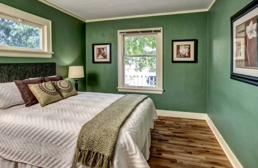
This look is all about creating a cozy, earthy sanctuary. The deep, moody green on the walls provides a sense of calm and sophistication. It works because it balances an intense color with classic, natural materials. The white trim and ceiling act like a frame, preventing the dark green from feeling overwhelming and adding a crisp, architectural detail. The warm oak tones of the flooring and the textured, dark headboard ground the space, while the lighter bedding provides a necessary point of visual relief, keeping the room from feeling too heavy.
📐 Style Math
To recreate this specific look, here’s a possible cost breakdown. Remember, prices can vary wildly based on brand and location, but this gives you a solid starting point.
- Paint & Supplies: $150 – $300 (for high-quality, textured paint)
- Furniture (Bed, Nightstands): $1,500 – $4,000
- Lighting & Decor: $400 – $900
- Textiles (Bedding, Throw, Rug): $500 – $1,200
- TOTAL: $2,550 – $6,400
- Budget Alternative: Recreate for under $1,200 using a similar paint color from a budget brand, thrifted furniture, and affordable bedding from stores like Target or HomeGoods.
2. Split Green and Off-White Walls with Velvet Pillows
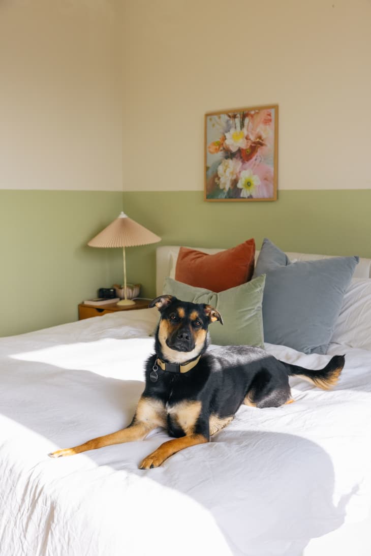
When doing a two-tone wall, the height of your dividing line is everything. For a standard 8-foot ceiling, placing the line at the 32-inch mark (from the floor) is a classic choice that aligns with traditional chair rails. However, to make the room feel taller, try moving the line up to 40-48 inches. This draws the eye upward and gives the illusion of more height. Always use a high-quality painter’s tape (like FrogTape) and pull it off while the top coat is still slightly damp for the crispest possible line.
💡 Designer Tip
The visual success of this room is a simple but effective formula: 50% calm color block + 40% soft neutrals + 10% texture. The lower green and upper off-white walls create a serene, balanced foundation. The white headboard and bedding contribute to the neutral, airy feel. The final 10% comes from those crucial velvet pillows in muted orange, green, and blue, which inject just enough personality and tactile interest to keep the room from feeling flat. You could easily swap the green for a soft navy and the velvet for a chunky knit to get a different but equally balanced vibe.
3. Crisp White Walls with Soft Green Trim
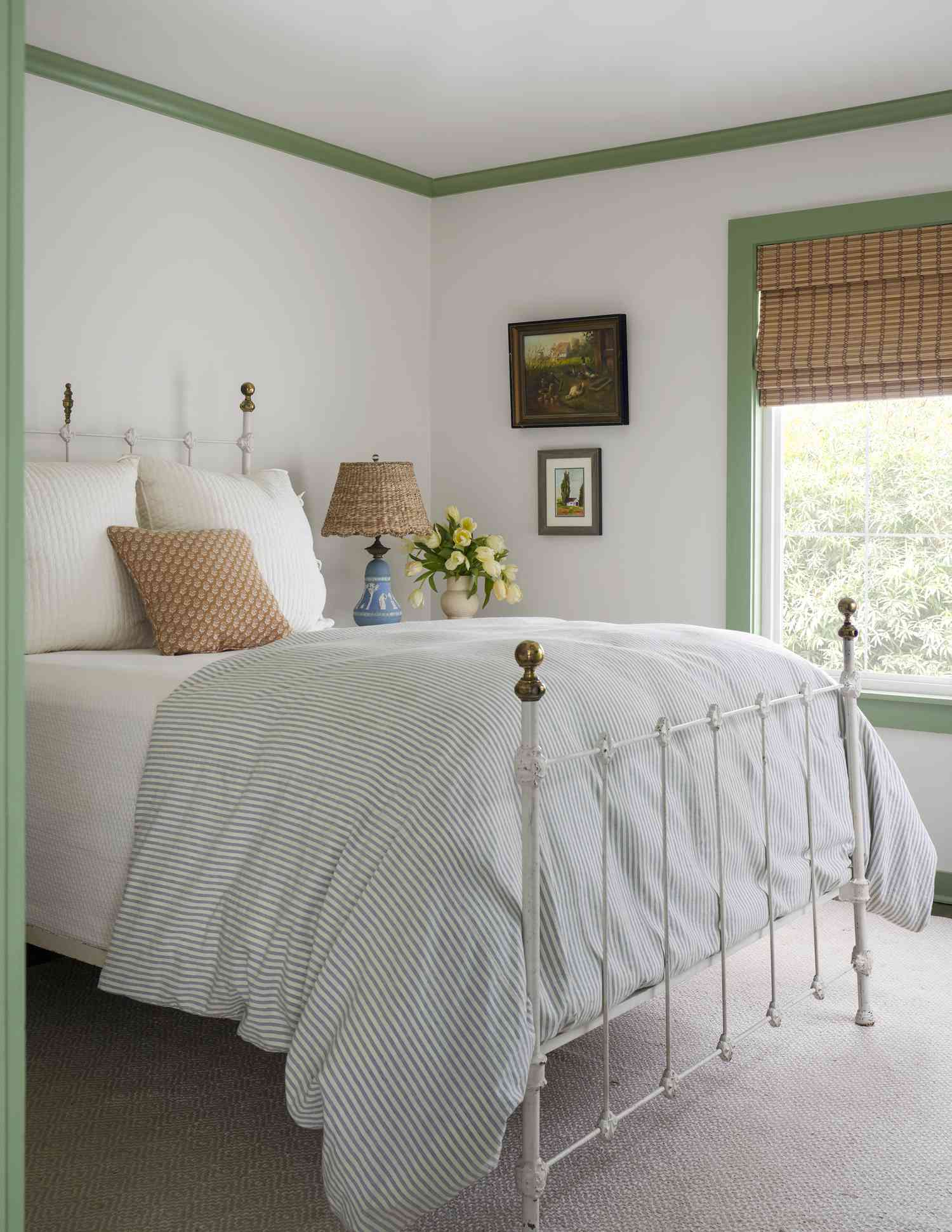
The single element that makes this room sing is the painted trim. Without the soft green on the crown molding and window casings, this would be a pleasant but fairly standard bedroom. By using color on the architectural details instead of the walls, the entire space feels custom and thoughtfully designed. It’s a reverse accent wall—drawing attention to the room’s good bones rather than a single flat plane. This technique adds character without sacrificing the light, airy feeling of white walls, making it perfect for smaller rooms.
📏 Scale Guide
You don’t need a huge budget to achieve this charming, custom look. The key is in the paint, not pricey furniture. Get the vibe for under $500 by focusing on the details. A gallon of quality paint for the trim will run you $50-$80. Find a vintage metal bed frame on Facebook Marketplace or at a thrift store for under $150. For bedding, look to IKEA or Target for simple white linens and a classic striped duvet, which you can often find for around $100-$150. A woven lamp from Walmart or a flea market completes the look for another $40.
4. Fuchsia Walls with a Bold Floral Ceiling
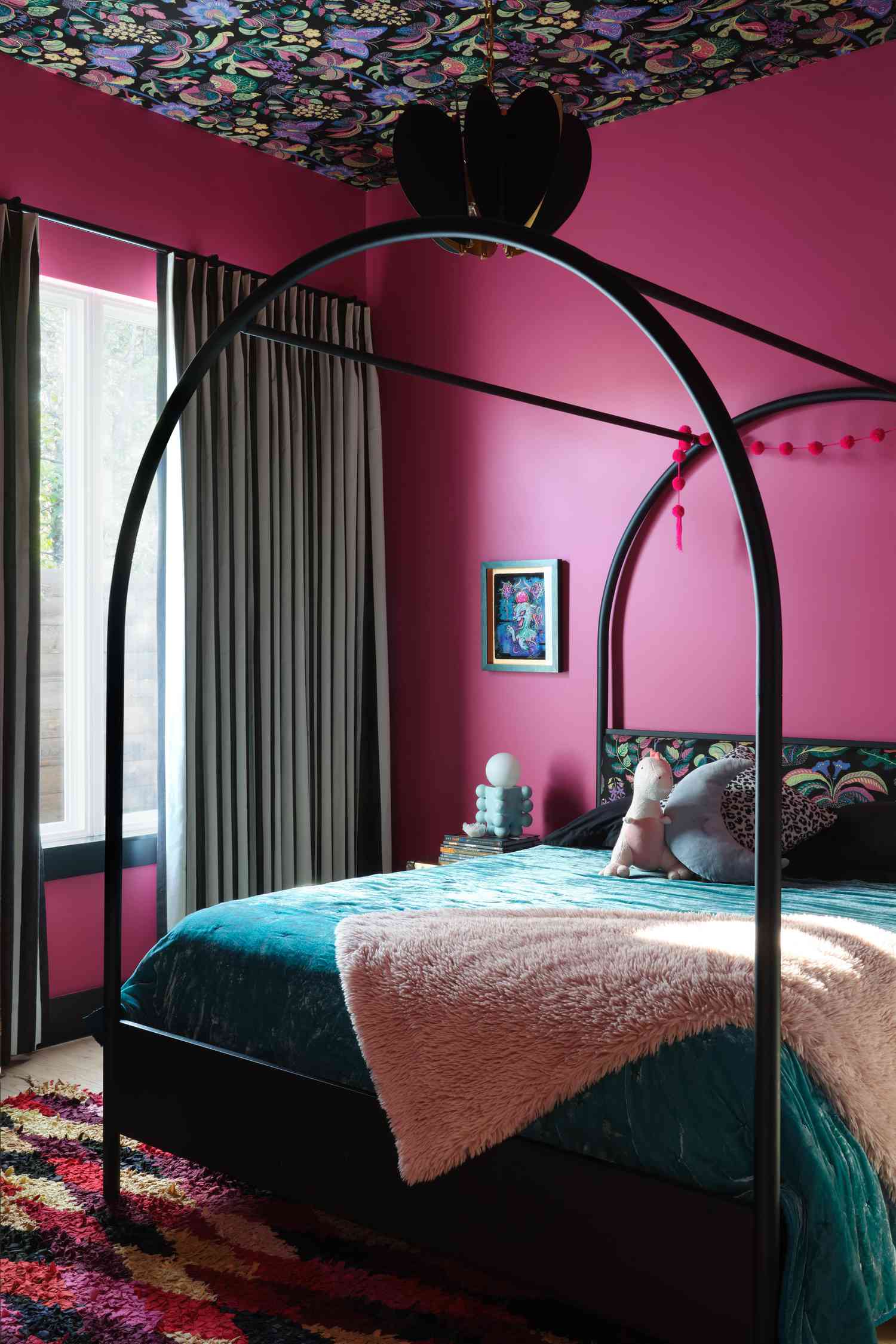
Okay, let’s be honest. This is a commitment. A fuchsia and black bedroom isn’t for the faint of heart, and its success hinges entirely on your room’s lighting. In a space with small windows or poor natural light, this much saturated color can quickly go from bold and glamorous to dark and cavelike. Before you even think about buying paint, spend a full day observing how the light moves across the room. A maximalist look like this requires confidence and, preferably, tall ceilings and large windows to feel energizing rather than claustrophobic.
⚠️ Real Talk
Maximalism is continuing its glorious reign into 2026, and this room is a perfect example of why. After years of minimalist white and grey boxes, there’s a collective craving for personality, story, and joy in our homes. This isn’t about following a specific rulebook; it’s about using color and pattern to express individuality. The rise of “dopamine decor” on Pinterest and TikTok shows a clear shift towards creating spaces that make us feel happy and energized. This fuchsia and teal combination, while bold, is a direct reflection of that joyful, more-is-more cultural mood.
5. Fuchsia Ceiling with Patterned White Walls
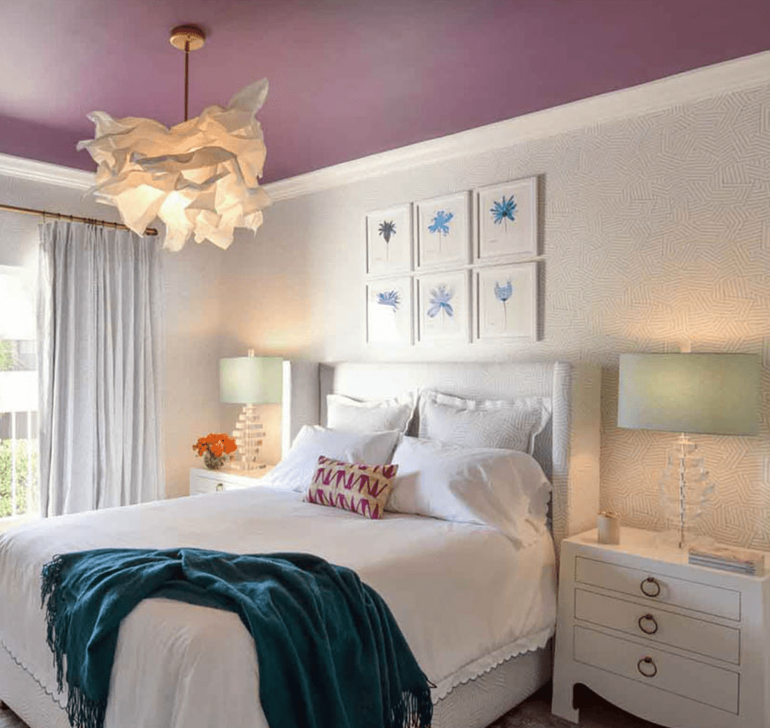
This design cleverly inverts the traditional accent wall. By painting the ceiling a shocking fuchsia, it draws the eye upward and makes the room feel surprisingly grand. This works for two reasons: First, the boldly colored ceiling is balanced by neutral, subtly patterned walls and white furniture, so it doesn’t overwhelm the space. Second, the repetition of color—the teal throw on the bed echoing the blue tones in the artwork—creates a cohesive visual thread that ties the whole room together. It feels intentional, not random.
💰 Budget Breakdown
This idea is brilliant for rooms that are architecturally a bit boring. It works best in a room with at least an 8-foot ceiling; anything lower might feel a bit compressed by the strong color overhead. A minimum room size of 10×12 feet is ideal, as it gives the fuchsia enough space to breathe. In a smaller room, you risk the ceiling color feeling oppressive. If you have a smaller space but love this concept, consider the green and white split-wall from Idea #2, which creates interest without focusing all the attention upward.
6. Beige Paneled Walls with Earthy Accents
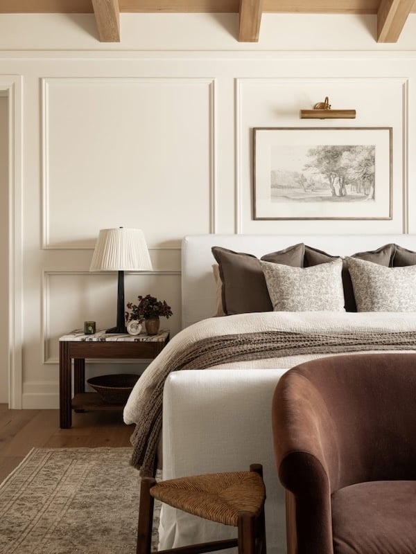
While paneled walls add incredible texture and a high-end feel, they are absolute dust magnets. The grooves and ledges of the paneling will require more frequent and detailed cleaning than a simple flat wall. Plan to run a microfiber duster or a brush attachment on your vacuum over the paneling every two weeks to keep it looking fresh. The creamy beige color is forgiving with fingerprints, but any scuffs on the raised portions of the paneling will be more noticeable, so keep some touch-up paint handy for quick fixes.
🔥 Trending Context
To keep a neutral, paneled room like this from feeling boring, texture is non-negotiable. But don’t just throw in a knit blanket. Think in layers and materials. The designer here masterfully mixed the vertical lines of the wall paneling with the plush velvet of the accent chair, the chunky weave of the throw, the smooth coolness of the marble-topped nightstand, and the ruggedness of the exposed wood beams. When you have a monochromatic palette, aim for at least four distinct textures to create visual depth and a truly luxurious feel.
7. White Vertical Paneling with a Light Gray Upper Wall
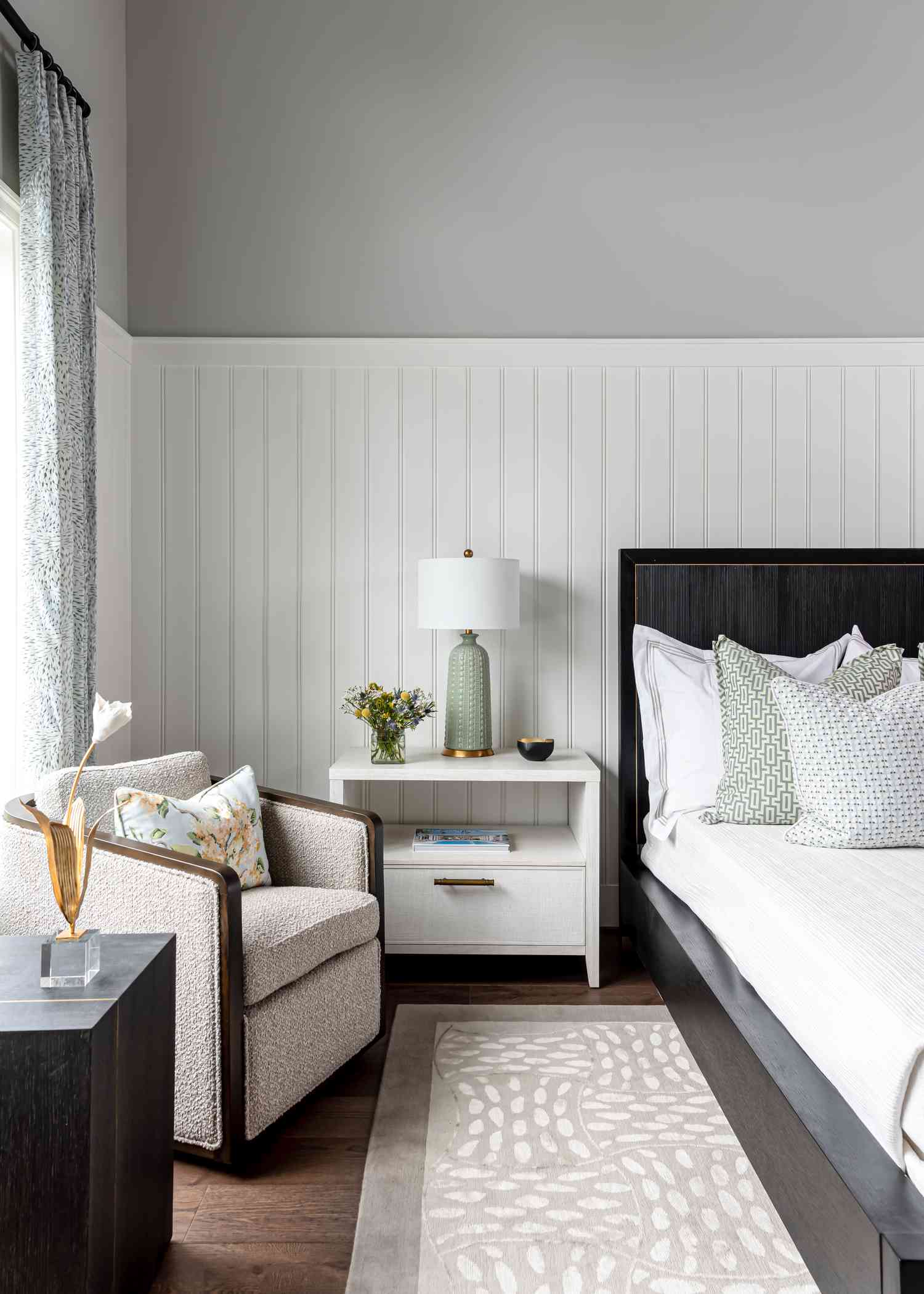
This room’s serene and modern feel comes from a balanced equation: 60% structured neutral + 30% soft color + 10% dark contrast. The white vertical paneling and light grey upper wall form the structured, neutral base that makes up the majority of the visual space. The soft color is introduced through the light green lamp and the subtle tones in the rug. The dark wood of the bed frame and armchair provides that essential 10% of contrast, grounding the entire composition and preventing it from feeling washed out. This is a very different use of paneling than the full-wall texture in Idea #6.
🎯 What Makes It Work
The single most important element here is the white vertical paneling on the lower half of the wall. It’s the architectural backbone of the entire design. Without it, you’d simply have light gray walls, and the room would lose all of its crisp, custom-built character. The paneling adds texture, visual interest, and a sense of structure that elevates the simple color palette from basic to sophisticated. It proves that how you apply color is just as important as the color itself.
8. Split Wall with Deep Brown Base and Pale Blue Top
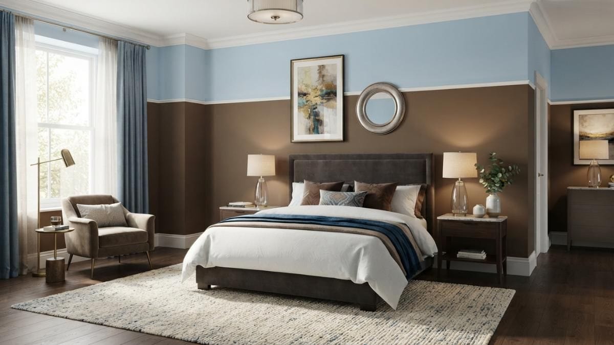
A word of caution with a dark, low-painted wall like this: it can visually shorten the room if not handled carefully. This look is most successful in spaces with high ceilings (9 feet or more). In a room with standard 8-foot ceilings, painting the bottom half such a deep brown could create a heavy, sinking feeling. If your ceilings are on the lower side, consider either lowering the split line to about one-third of the way up the wall or choosing a slightly less saturated shade of brown to maintain a sense of openness.
🧹 Maintenance Reality
This combination works so beautifully because it plays with visual weight and expectation. The deep brown on the bottom grounds the space with a rich, earthy feel, almost like solid wood wainscoting. The pale blue on top then opens the room up, mimicking the sky and creating a sense of airy lightness. The thin white molding between them is crucial; it acts as a clean, crisp horizon line that makes the transition intentional and sharp, not just like you ran out of one color of paint. The balance is what makes it feel both cozy and spacious at the same time.
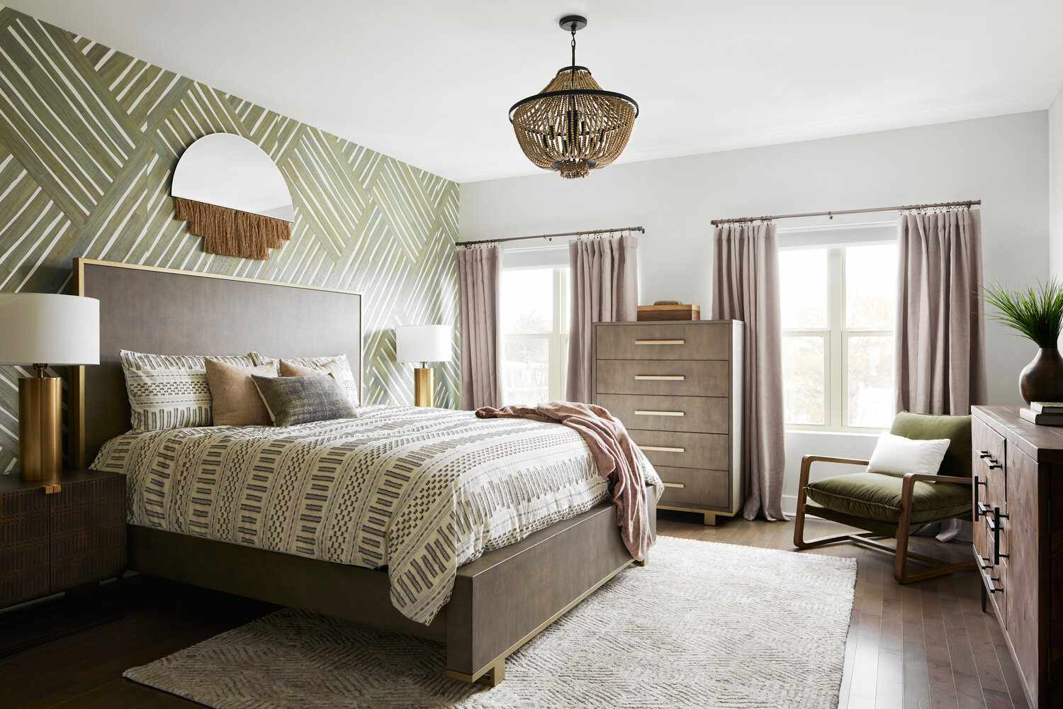
9. Modern Bedroom with a Green Geometric Accent Wall
When you have a bold, large-scale pattern on an accent wall, let it be the star. The key to keeping it chic and not chaotic is to pull colors for the rest of the room *directly from the pattern itself*. The designer here picked up the olive green for the armchair and the off-white for the curtains right from the wallpaper. This creates a cohesive, intentional look. For your furniture, stick to simple, clean lines and solid colors, like the dark wood bed frame, which acts as a grounding element against the busy pattern.
⭐ The One Thing
An accent wall with a large-scale geometric pattern needs room to make an impact. This idea is perfect for a primary bedroom, specifically one that is at least 12×14 feet. This size allows the pattern to be appreciated from a distance and not feel like it’s closing in on you. The wall where the headboard sits is almost always the best candidate for this treatment. Ensure the wall is a solid plane, uninterrupted by windows or doors, for the pattern to have maximum effect. A ceiling height of 8 feet is fine, but 9+ feet will really let it shine.
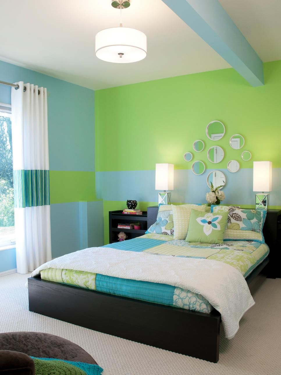
10. Split Walls in Lime Green and Sky Blue
Love this vibrant, youthful energy but not the potential price tag of a full room makeover? You can channel this look for less than $200. The magic is in the paint and the bedding. A quart of lime green and a quart of sky blue paint will cost around $50-$60 total. Instead of buying a whole new bed, focus on a patchwork or color-block duvet cover from a store like Society6 or Urban Outfitters, which can often be found on sale for under $100. A set of simple round mirrors from Target or Amazon will only set you back another $30-$40.
🔧 How-To Brief
This color combination is pure, unapologetic fun, but it’s not a restful one. Bright, high-saturation colors like lime green and sky blue are stimulating, which can be great for a kid’s room or a guest room, but might interfere with sleep if you’re sensitive to your environment. If you love the colors but need a more serene space, consider using them as smaller accents instead. Or, if you’re committed to the walls, make sure to read our guide to paint finish mistakes at the end of the article. A too-shiny finish on these colors could be a real headache. See common mistakes for more.
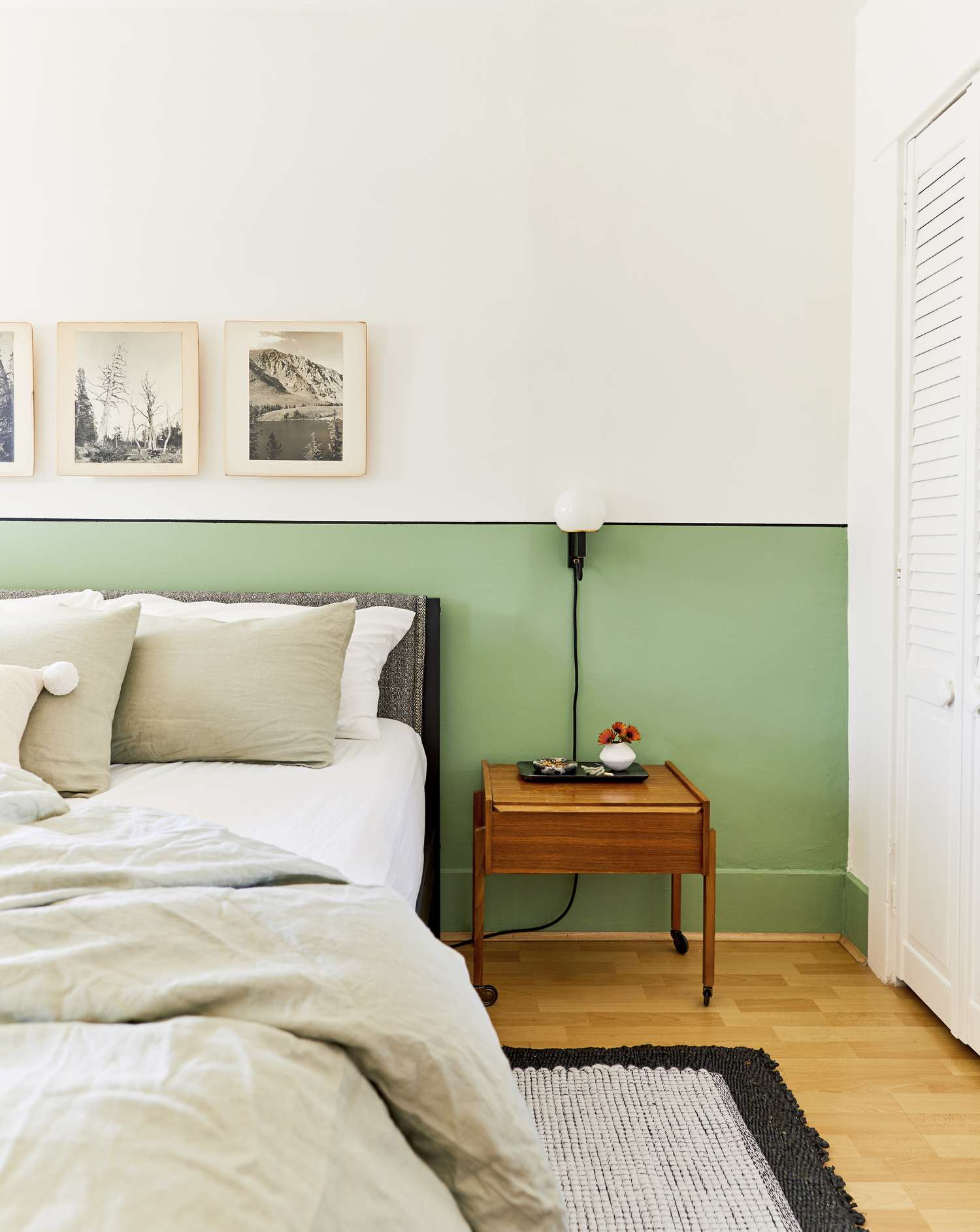
11. Sage Green and White Two-Tone Wall with a Black Dividing Line
The thin black line is what elevates this from a simple two-tone wall to a sharp, graphic statement. Here’s how to get it perfectly crisp.
💸 Get This Look For Less
- Time Estimate: 1-2 hours (plus paint drying time)
- Material Cost: ~$30 (Tape, 1/4″ artist’s brush, small sample pot of black paint)
- Paint your two main wall colors (sage and white) and let them dry completely for at least 24 hours.
- Use a level and a pencil to lightly mark your dividing line. Use high-quality painter’s tape to tape off the top and bottom edges of your intended black line, creating a thin channel.
- Press the tape down firmly. Then, paint over the edge of the tape with your BASE color (the sage or white) to seal it. This prevents the black from bleeding. Let it dry.
- Using a small, steady brush, paint your black line between the tape. Remove the tape while the black paint is still slightly wet, pulling it away at a 45-degree angle for the cleanest edge.
It’s all about that thin black line. Seriously. Take it away, and you have a lovely, soft, green-and-white bedroom. It’s pleasant, but not memorable. That single, sharp, black horizontal line introduces a modern, almost architectural element. It adds a touch of graphic severity that contrasts beautifully with the soft sage and natural wood tones. It’s the design equivalent of adding a period to the end of a sentence—it provides structure and confidence. For a softer but equally interesting effect, check out the color-on-trim look in Idea #3.
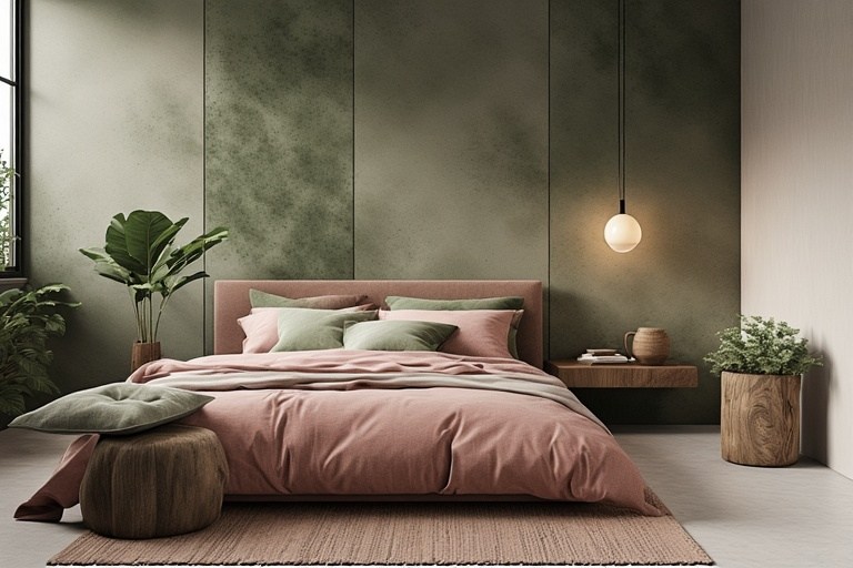
12. Textured Sage Panels with a Dusty Rose Bed
The formula here is sophisticated and soothing: 50% textured monochrome + 40% dusty complimentary + 10% natural warmth. The paneled sage green wall provides a textural, monochromatic base that is calming and complex. The dusty rose bed frame and bedding offer a direct, soft contrast—green and red are opposites on the color wheel, so this muted pairing feels both natural and deliberate. The final 10% comes from the light wood floating nightstand and floors, which inject just enough warmth to keep the cool tones from feeling chilly.
✅ Before You Start
This palette feels so cohesive because it relies on colors that are desaturated, meaning they have a bit of grey mixed in. The sage isn’t a bright, leafy green, and the rose isn’t a bubblegum pink. This shared muted quality allows them to harmonize beautifully without competing for attention. The textural variety, from the ribbed wall panels to the soft upholstery of the bed and the smooth wood of the nightstand, adds another layer of interest that makes the simple color scheme feel rich and dynamic.
13. Cloud Wallpaper Accent Wall with a Red Velvet Headboard
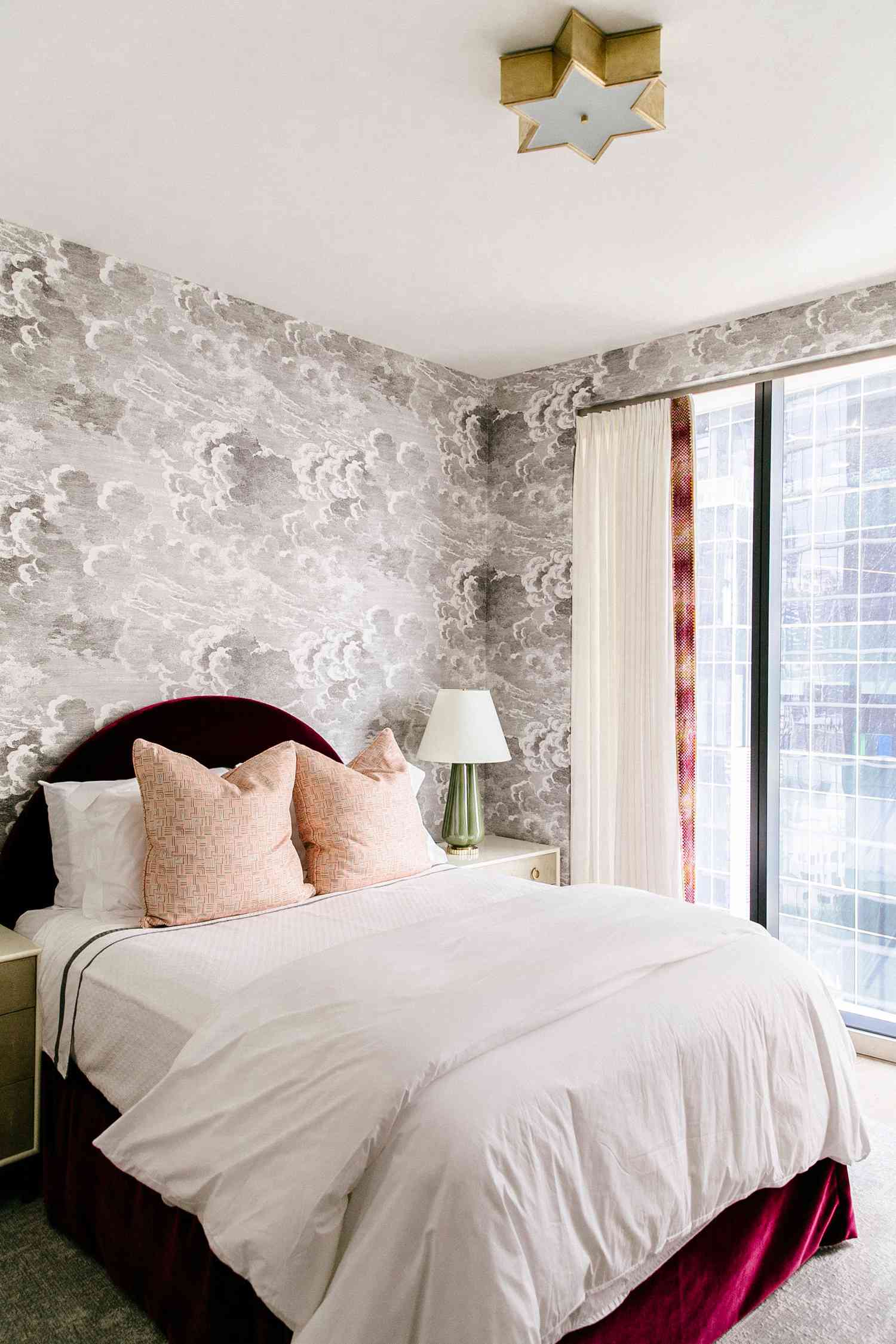
This look is a beautiful example of the “romantic academia” trend we’re seeing bubble up. It blends the drama and intellectual heft of dark academia with a softer, more ethereal touch. The cloud wallpaper evokes classical art and mythology, while the deep red velvet and gold starburst light fixture add a layer of opulence and theatricality. It’s a move away from stark minimalism towards creating spaces that feel layered, personal, and full of narrative. It’s about building a room that feels like a backdrop for a story.
📐 Style Math
The make-or-break element in this entire room is the deep red velvet headboard. While the cloud wallpaper is a stunning feature, it’s the headboard that provides the crucial anchor and point of rich, saturated contrast. Without its luxurious texture and bold color, the grey-and-white cloud pattern could feel cold or washed out. The red velvet injects warmth, drama, and a necessary tactile element that makes the whole design feel grounded and impossibly chic. It’s the heart of the room.
14. Modern Two-Tone Walls with a Dark Lower Half
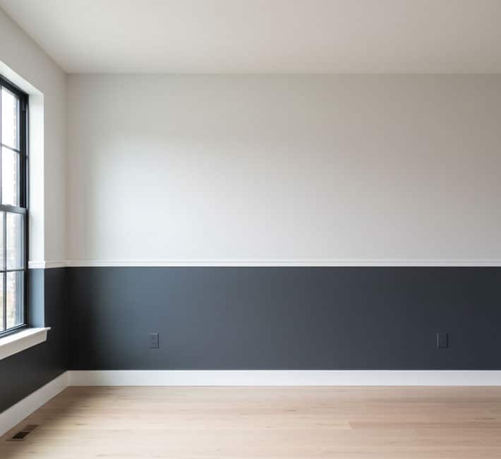
For a two-tone wall like this, the finish of your paint is just as important as the color. Always use a matte or eggshell finish for a modern, sophisticated look. A higher gloss paint will reflect light in a way that highlights every tiny imperfection on your wall, which can look cheap and distracting. The dark charcoal color on the bottom should especially be matte to absorb light and create a sense of depth. The white chair rail molding, however, can be satin or semi-gloss to provide a subtle contrast in sheen and make it easier to wipe clean. This is a sharper take on the half-wall look than Idea #18.
💡 Designer Tip
This is one of the most versatile two-color combinations and it works in almost any room size, from a small 9×9 foot office to a large 15×20 foot living space. The key is in the proportions. In a room with standard 8-foot ceilings, placing the chair rail at 32-36 inches from the floor is a safe bet. In a room with taller, 10-foot ceilings, you can be more dramatic and bring the dark color up to 48 or even 60 inches to create a cozier, more grounded feeling without sacrificing the sense of height provided by the off-white upper wall.
15. Deep Teal and White Half-Wall with an Ocher Velvet Sofa
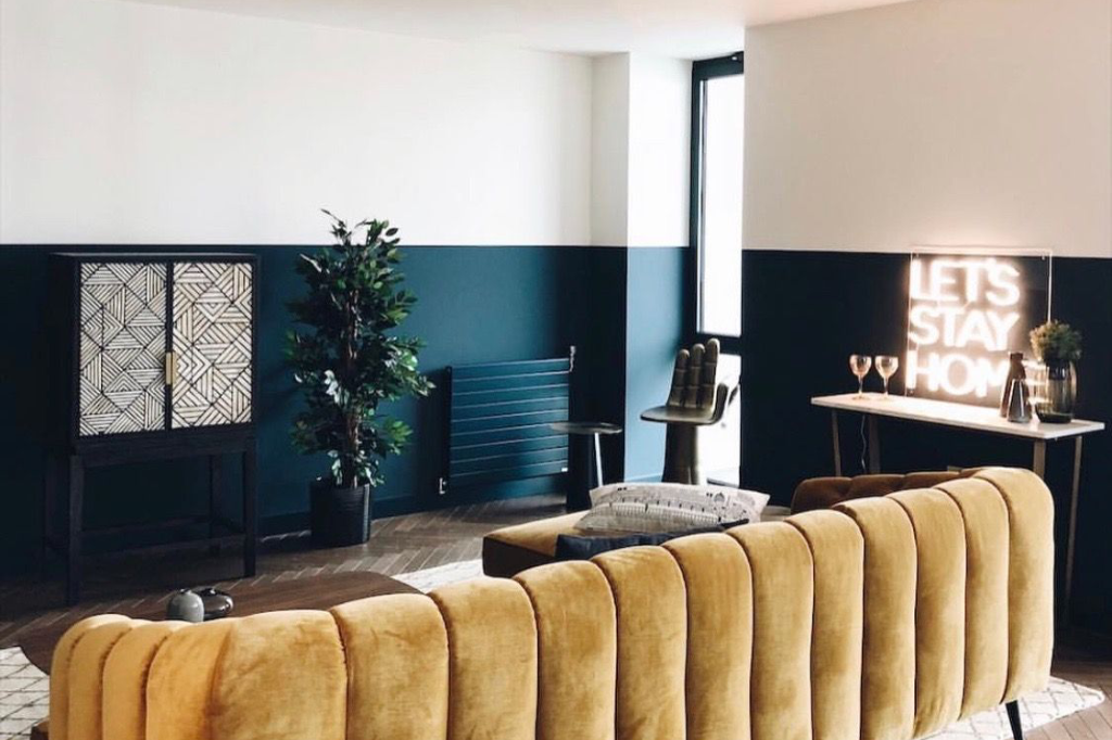
This room is a masterclass in using complementary colors. The deep teal/blue on the lower walls and the rich ocher/yellow of the sofa sit opposite each other on the color wheel. This creates a powerful, high-contrast visual that is inherently dynamic and exciting. The reason it doesn’t feel chaotic is that the top half of the wall is a clean, gallery-white, which gives the eye a place to rest. This neutral zone calms the composition down and allows the bold color pairing to shine without overwhelming the senses.
📏 Scale Guide
An eclectic look like this requires a confident hand. The danger here is that it can easily tip over from ‘curated and cool’ to ‘random and messy.’ Every piece needs to have a strong personality, but they also need to talk to each other. The gold of the hand-shaped chair echoes the ocher of the sofa; the dark wood tones of the cabinet provide a grounding neutral. If you’re not careful about creating these small connections through color and material, you could end up with a room that just feels like a collection of disconnected, ‘weird’ furniture.
16. Deep Red Accent Wall with Cream and White Elements
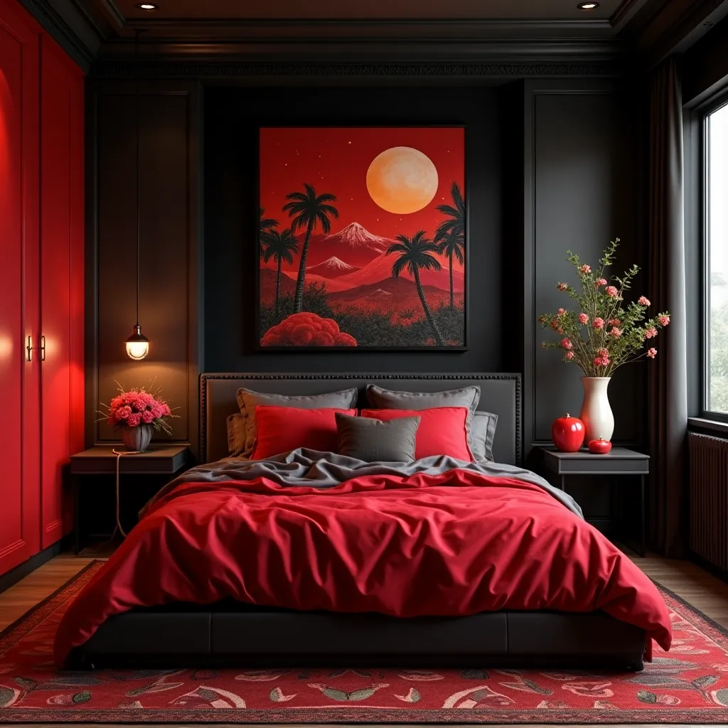
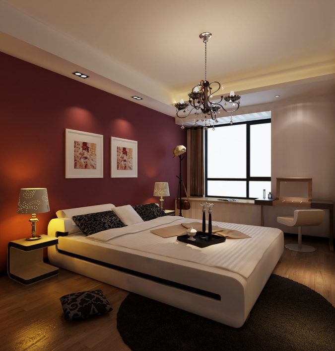
that makes this bedroom feel modern and not dated is the choice of white. By pairing the deep red accent wall with a bright, clean white platform bed and crisp off-white on the adjacent wall, the look stays fresh and high-contrast. If the designer had used cream or beige bedding and wall colors, the red could have easily felt heavy and reminiscent of a 1990s Tuscan-style dining room. The stark white is the key to making this moody color feel current and chic.
⚠️ Real Talk
When using a powerful, saturated color like this deep red, don’t stop at the accent wall. To make it feel integrated and intentional, you need to repeat that color in at least two other places in the room. They don’t have to be big statements. It could be a throw pillow, a book spine on the nightstand, or a small detail in a piece of artwork. This repetition creates a visual rhythm that guides the eye through the space and makes the bold choice feel purposeful, not like an afterthought.
17. White and Royal Blue Painted Brick Walls
Painted brick looks incredible, but be prepared for the upkeep. First, brick is porous. Once you paint it, you’re pretty much committed, as stripping paint from brick is a difficult and expensive process. Second, dust loves to settle on the rough texture of the brick and in the mortar lines, so it will require more frequent cleaning than a smooth wall. A semi-gloss or satin paint finish is a good choice here, as it will be easier to wipe down than a matte finish. Be ready for occasional touch-ups, as paint on brick can chip or flake over time, especially in high-traffic areas.
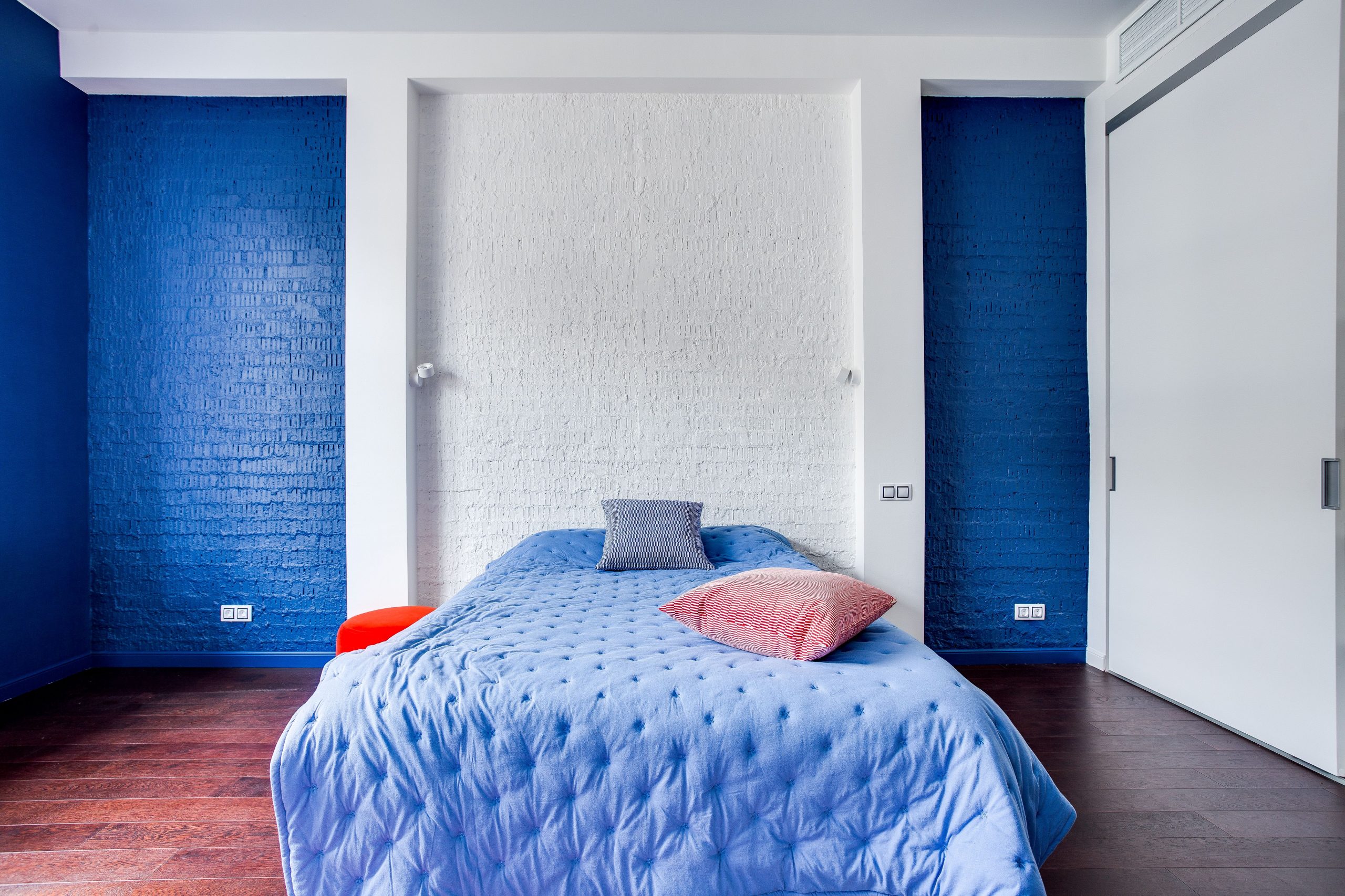
💰 Budget Breakdown
Want this bold, graphic look without an actual brick wall? You can get a remarkably similar effect using faux brick paneling from a home improvement store and a couple of cans of paint. A 4’x8′ panel costs around $40-$60. Paint your main wall white, then attach a panel painted royal blue. For an even cheaper route, look for ‘paintable brick’ wallpaper. It provides the texture and pattern for under $100 for a whole wall. Pair it with a simple light blue quilt from a store like Target and a single red accent pillow to capture the essence of this high-contrast style on a serious budget.
18. Black and White Half-Painted Wall with Blue Accents
This room’s chic, artistic vibe is built on a clear formula: 80% high-contrast monochrome + 20% artistic accent color. The black and white half-painted walls, black headboard, and white bedding create a powerful graphic foundation that is timeless and bold. All the personality then comes from that final 20%—the vibrant blue in the pillows and, most importantly, the artwork. By concentrating the color in just a few key places, it has maximum impact. You could swap the blue for emerald green or a deep magenta to change the mood entirely while keeping the same successful ratio.
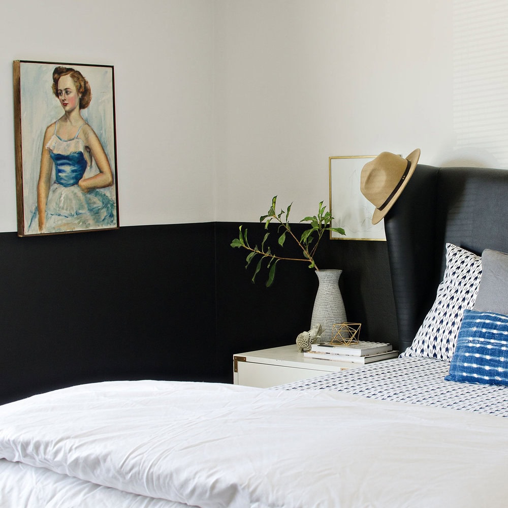
🔥 Trending Context
The half-painted wall is a classic for a reason: it’s a brilliant optical illusion. Placing the dark color on the bottom half of the wall grounds the space, while the white upper half draws the eye upward, creating a sense of height and airiness. It gives you the drama of black without the risk of making the entire room feel like a cave. The sharp, crisp line between the two colors is key; it feels intentional and graphic, turning a simple paint job into a strong architectural feature. It’s a much sharper look than the softer split in Idea #14.
19. Deep Green Walls with Gold Accents and a White Stripe
When incorporating metallic accents like the gold mirrors and pillows here, the key is to vary the texture and finish. Notice how the mirrors have an ornate, slightly aged gold finish, while the velvet pillow has a soft, shimmery sheen. This mix of finishes—some matte, some shiny, some textured—is what makes the metallics feel sophisticated and layered, not flat and one-dimensional. Sticking to just one type of shiny gold can quickly look dated. Aim for at least two different gold tones or textures for a richer, more curated feel.
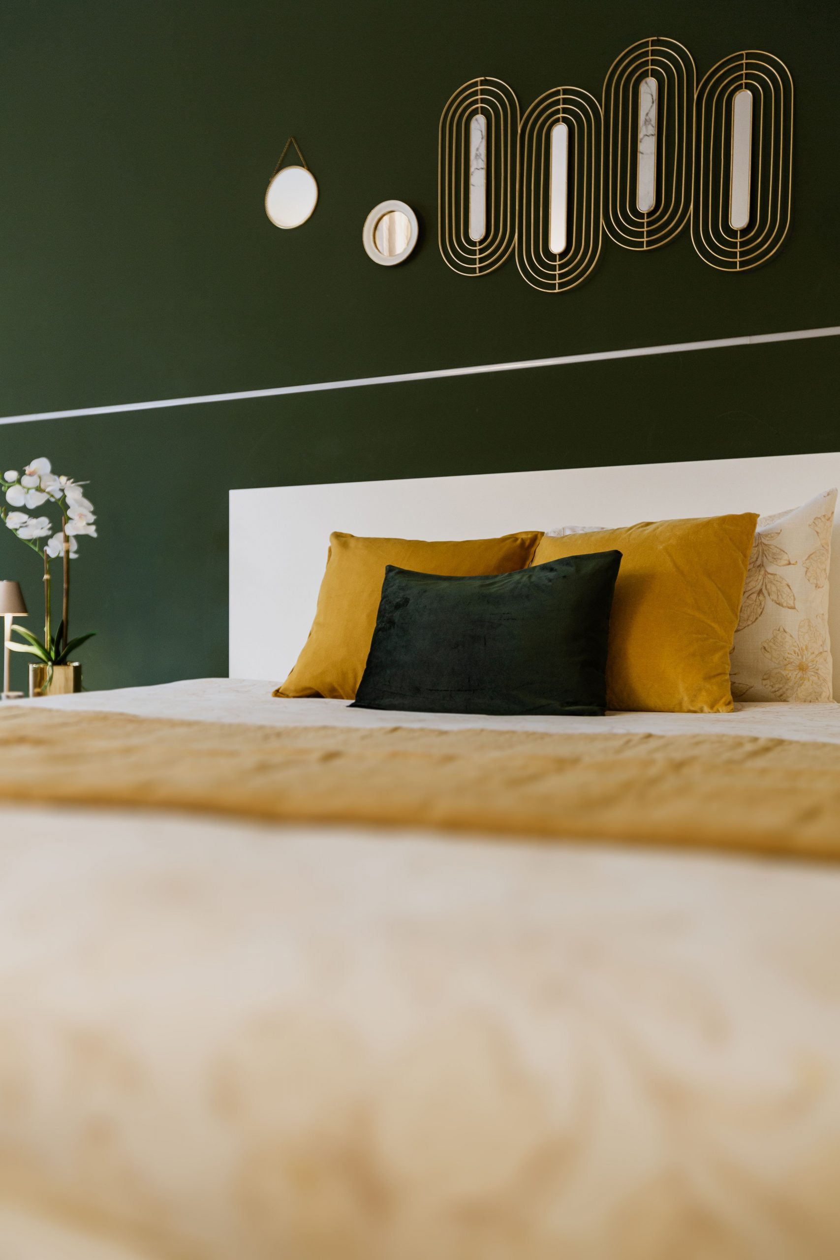
🎯 What Makes It Work
The single element holding this luxurious design together is the simple, thin white horizontal stripe. It seems minor, but its role is huge. It acts as a visual break in the deep green, preventing the color from feeling too monolithic. More importantly, it perfectly aligns with the top of the white headboard, creating a seamless, custom look that visually connects the furniture to the walls. Without that stripe, the headboard would feel like it was just placed against a green wall; with it, the whole composition feels integrated and thoughtfully designed.
20. Elegant Gray Bedroom with Burgundy and Teal Accents
This is a perfect example of a design principle called ‘The 60-30-10 Rule’ in action. The light gray paneled walls make up about 60% of the room’s color, creating a serene and neutral backdrop. The rich burgundy of the velvet bench serves as the secondary color, taking up about 30% of the visual space (when combined with other small touches). That final, thrilling 10% is the pop of teal in the bolster pillows. This formula ensures a balanced color palette where the accent colors feel intentional and impactful, not random or overwhelming.
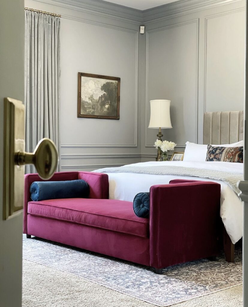
🧹 Maintenance Reality
You can capture this same elegant, color-pop aesthetic for a fraction of the cost. The key is the bench and pillows. Find a basic upholstered bench from Wayfair, Target, or even a thrift store for under $150. Then, buy a few yards of burgundy velvet fabric (around $20-$30/yard) and use a staple gun to reupholster it yourself—it’s a surprisingly simple DIY. A pair of teal velvet pillow covers from Amazon or H&M Home will only run you about $25. The light gray wall paint is inexpensive, instantly giving you that luxe-for-less vibe.
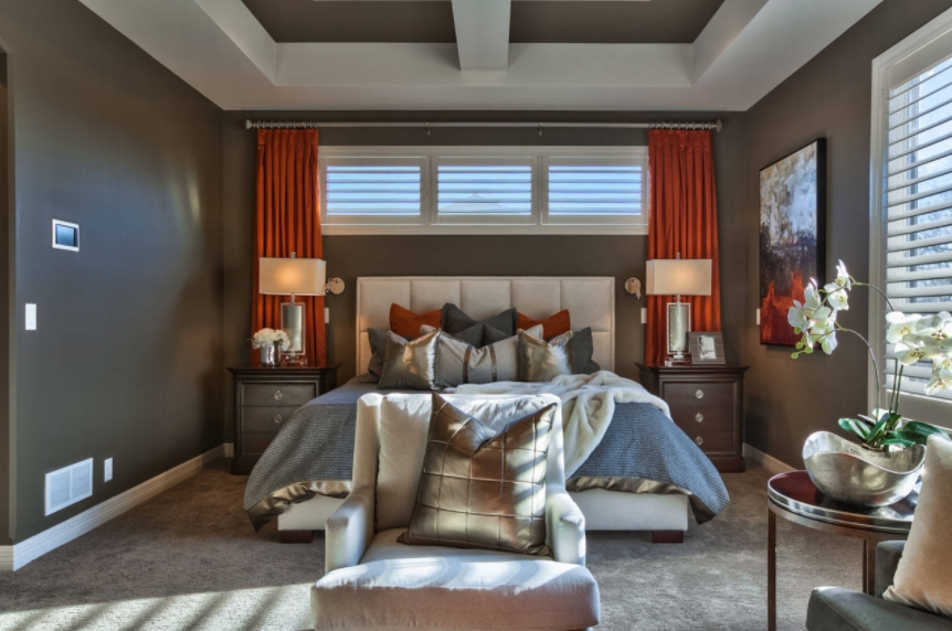
21. Deep Gray Walls with Vibrant Orange Curtains
This dramatic, high-contrast look is best suited for a primary bedroom with generous proportions. A room size of at least 14×16 feet is ideal to allow the deep gray walls to feel enveloping and luxurious, rather than cramped. Most importantly, this idea demands a high ceiling—9 feet minimum, but 10+ feet is even better. The white tray ceiling is doing a lot of work here to bounce light and prevent the dark walls from feeling oppressive. In a room with low ceilings, this much dark paint could feel like the ceiling is closing in on you.
⭐ The One Thing
Let’s talk about those orange curtains. While they are undeniably stunning, using such a bright, energetic color in the bedroom can be tricky. Orange is a stimulating color that can evoke feelings of excitement and activity—not always what you want when you’re trying to wind down. If you’re a sensitive sleeper, this might not be the best choice for you. If you love the color pairing, consider using the orange in smaller doses, like throw pillows or a piece of art, rather than framing the main source of morning light with it.
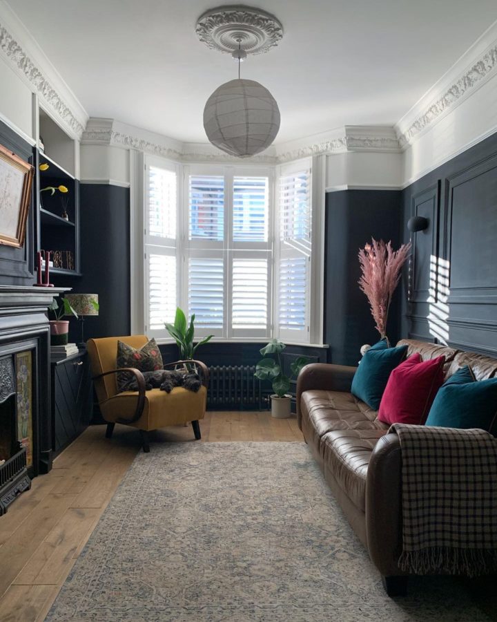
22. Dark Blue Paneling with White Upper Walls
This paneled look is gorgeous, but it’s a commitment. Before you start, run through this quick checklist to make sure it’s the right move for your space.
🔧 How-To Brief
- Measure Your Ceiling Height: This look needs at least 8-foot ceilings to avoid feeling squat. If your ceilings are lower, consider a lighter blue or a shorter paneling height.
- Assess Your Light: Does the room get good natural light? A dark navy needs light to look rich and not gloomy. Check the color in the morning, afternoon, and evening.
- Check Your Baseboards: You’ll need to work with your existing baseboards. Are they thick enough to look proportional with the paneling, or will they need to be replaced?
- Confirm Your Budget: Wood paneling, plus the cost of paint and potentially labor, can add up. Price out your materials before you begin. For a more budget take, see Idea #27.
This classic combination of navy blue and crisp white works because it leans on centuries of design precedent. It feels traditional and timeless. The dark blue paneled lower walls provide a sense of stability and architectural heft, grounding the room. The white upper walls and ceiling create an open, airy feeling, preventing the dark blue from overwhelming the space. The contrast is what makes it so visually satisfying—it’s the perfect balance of cozy and spacious, formal and relaxed.
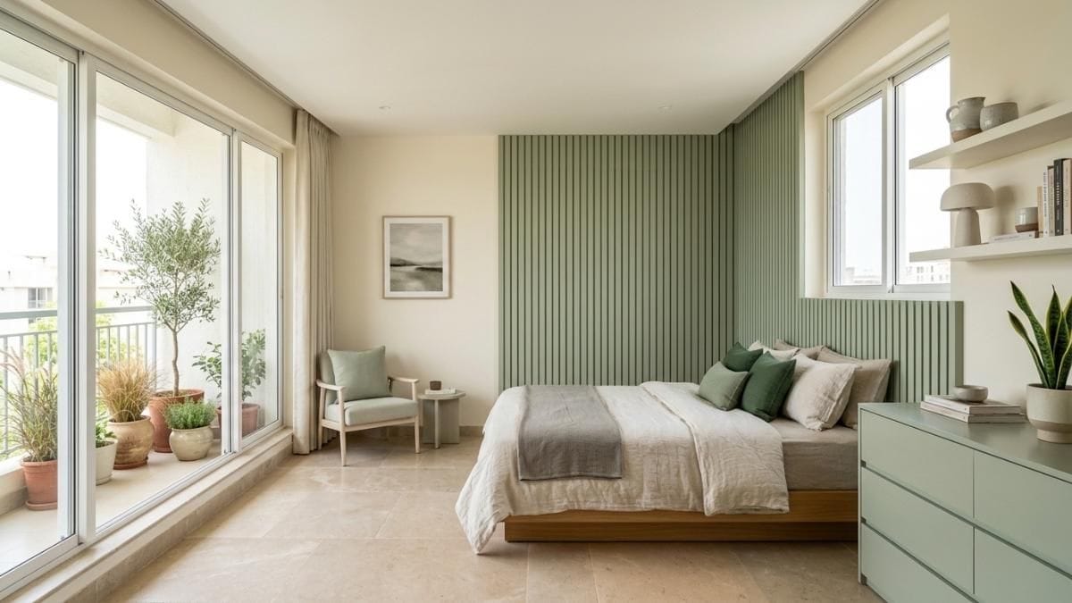
23. Serene Bedroom with Sage Green and Cream Walls
This room’s incredible serenity comes from a simple but powerful recipe: 70% soft, warm neutrals + 30% natural color and texture. The light cream walls, beige floor tiles, and low wooden bed create a calm, warm, and inviting base that fills the majority of the space. The visual interest comes from the remaining 30%, which is concentrated in the sage green fluted wall panels and the living plants. This strategic use of color and texture as a focal point, rather than spreading it throughout the room, is what gives it such a peaceful, spa-like quality. Compare this to the bolder green in Idea #1.
💸 Get This Look For Less
When creating an accent wall with fluted or vertical paneling, run the panels all the way from the floor to the ceiling. Stopping short, or framing it with molding on the top and bottom, can make it look like a DIY project gone wrong. Extending the panels the full height of the wall creates a seamless, high-end look that draws the eye upward and makes the ceiling feel taller. It turns the wall from a simple decorative element into a strong, integrated architectural feature of the room.
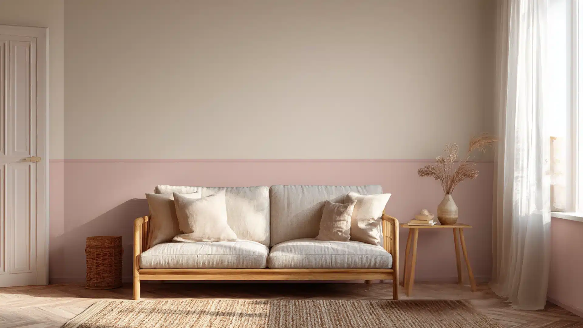
24. Minimalist Room with a Beige and Pink Two-Tone Wall
The single most important detail in this calming space is the paint itself—specifically, the choice of a muted, dusty pink and a warm, creamy beige. These aren’t just any pink and beige. They are desaturated, earthy versions of the colors. If the pink were brighter or the beige cooler, the room would lose its sophisticated, serene atmosphere and could easily veer into nursery territory. The success of this minimalist look hinges entirely on the subtlety and warmth of the chosen paint tones, proving that sometimes the quietest colors make the biggest statement.
✅ Before You Start
This look is beautifully minimal and incredibly budget-friendly to replicate. The star of the show is the paint job, which only requires two sample pots or quarts of paint (under $75). The sofa has clean lines that are easy to mimic with an affordable IKEA piece like the BALKARP or a similar model from Wayfair, often under $300. The rug is a simple natural woven jute or sisal, which are widely available from stores like Rugs USA or even Target for under $150 for a good size. The rest is styling: sheer white curtains and a few pieces of dried pampas grass from a craft store.
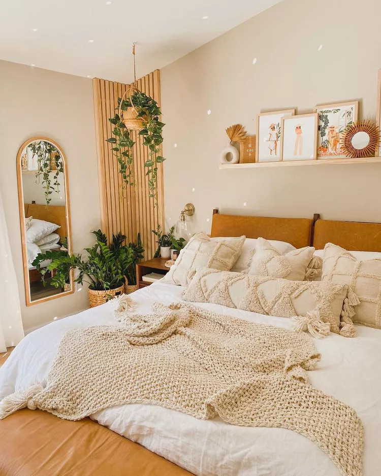
25. Warm Beige Walls with a Light Wood Slat Accent
This design is a masterclass in layering neutrals. It works because it avoids being boring by focusing on texture instead of color. You have the smooth, matte finish of the beige walls, the linear, organic texture of the wood slat panel, the soft warmth of the tan leather headboard, the chunky weave of the knit blanket, and the varied textures of the many off-white pillows. The eye stays engaged by moving between these different surfaces. The addition of live plants provides a necessary touch of organic shape and color, breathing life into the neutral palette.
📐 Style Math
A wood slat wall is a stunning feature, but just like the paneled walls in other ideas, those little grooves are prime real estate for dust. Plan for a weekly dusting with a microfiber cloth or the brush attachment of your vacuum to keep it looking clean. Be mindful of humidity as well; if you live in a very humid climate, ensure the wood is properly sealed to prevent warping over time. For the tan leather headboard, a simple wipe-down with a leather conditioner every 6-12 months will keep it from drying out and cracking.
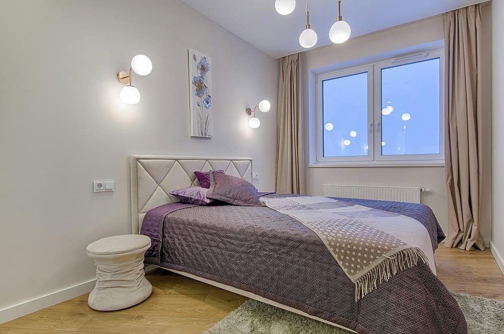
26. Neutral Bedroom with Deep Purple and Lavender Bedding
The key to making purple feel sophisticated and not juvenile is to use a range of tones. The designer here didn’t just use one shade of purple; they layered deep, royal purple with a softer lavender. This technique, called tonal layering, creates depth and complexity. When pairing it with a neutral wall, choose a warm beige or greige (a mix of grey and beige) like the one shown. A stark, cool grey wall could make the purple feel cold, while the warmth in the beige walls complements the richness of the purple tones.
💡 Designer Tip
This room follows a simple but effective formula for adding color to a neutral space: 80% calm neutral + 20% tonal color. The light neutral walls, warm wood floor, beige curtains, and upholstered headboard create a soothing, neutral envelope that makes up about 80% of the room. The personality and focus come from the 20% of color, strategically placed on the bed. By using several shades of purple, the color story feels intentional and rich. The small gold accents on the sconces act as a final, jewelry-like touch.
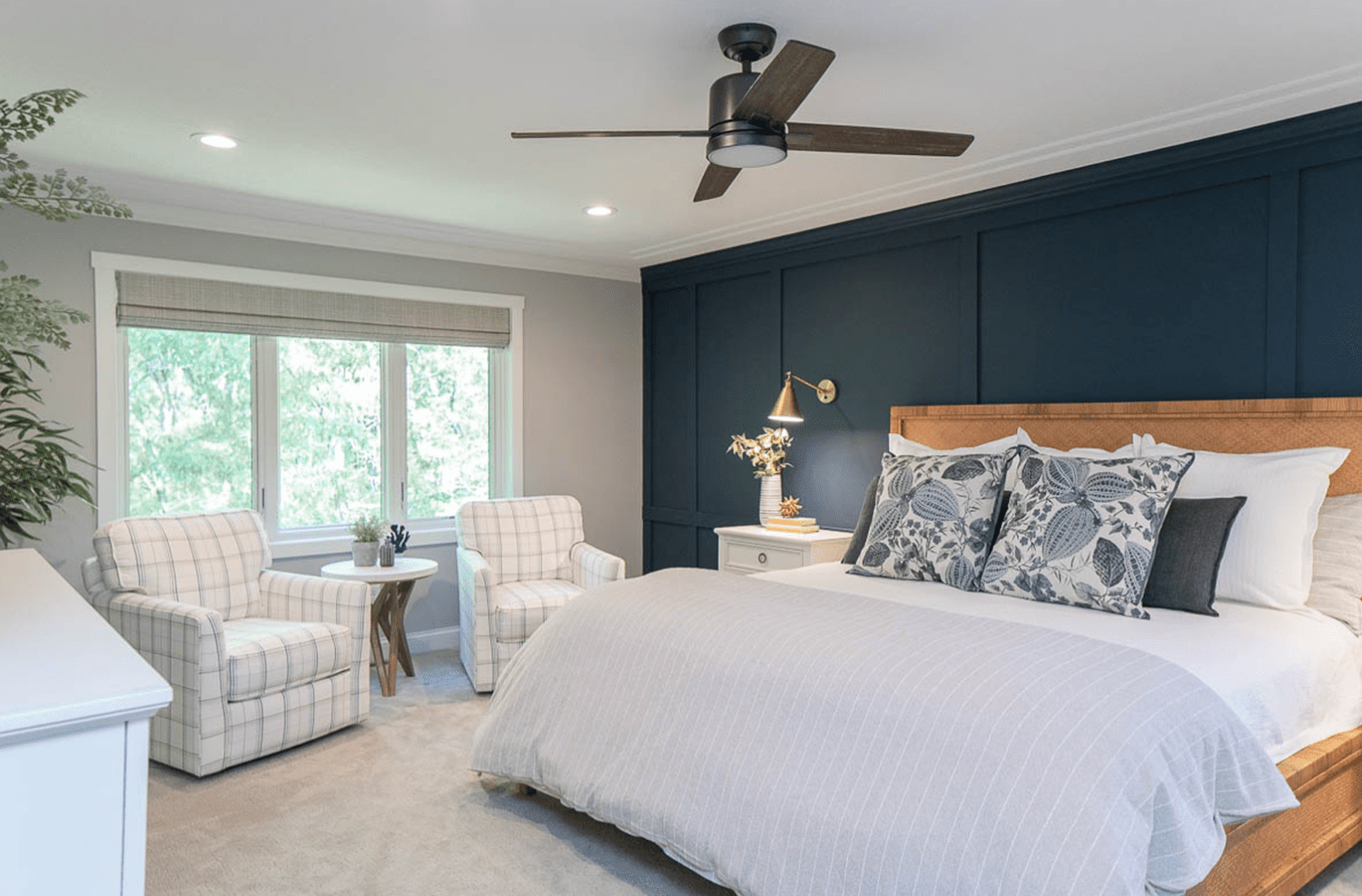
27. Navy Blue Board and Batten Wall with Light Coastal Accents
Board and batten is a classic look that adds instant architectural character. Here’s a simplified guide to creating this accent wall.
📏 Scale Guide
- Time Estimate: 1-2 weekends
- Material Cost: $150 – $400 (MDF boards, paint, nails, caulk)
- First, paint your entire wall the final navy blue color. It’s much easier than painting around the boards later.
- Plan your layout. Measure your wall and decide on the spacing for your vertical battens (typically 12-20 inches apart).
- Cut your 1×3 or 1×4 MDF boards to size. Install the top horizontal board first, then the baseboard (or use your existing one), and then fill in the vertical battens using a nail gun and construction adhesive.
- Caulk all the seams where the boards meet the wall and each other. This is the crucial step for a professional finish!
- Once the caulk is dry, paint the battens with two coats of the same navy blue paint.
The single element that makes this room feel both sophisticated and relaxed is the woven wood headboard. Against the dark, formal navy board and batten wall, a solid upholstered or dark wood headboard might have felt too heavy or traditional. The light-colored, natural texture of the woven headboard provides a crucial point of contrast and a touch of coastal, breezy energy. It’s the perfect counterpoint to the wall’s structure, preventing the room from taking itself too seriously. It’s a more casual take on the navy paneling seen in Idea #22.
Your Perfect Bedroom Palette is Waiting
Choosing a two-color combination for your walls is about more than just paint; it’s about setting the mood for the most personal room in your house. Whether you’re drawn to a calming sage green or a bold fuchsia, the right pairing can transform your space. Don’t be afraid to experiment with swatches and find the combination that truly feels like you. Ready for more inspiration? Head over to Pinterest and start creating a board for your dream bedroom—you might be surprised by what you discover.