Pink room decor is trending for 2026, but not the baby-nursery pink you might be imagining. From dusty roses to bashful shell-pinks, pink living rooms and fuchsia accent walls are finding their way across the country in ways that suggest a new trajectory that is fresh, sophisticated, and deeply personal. Pinterest searches for pink interiors have soared as others, too, realize that this color works with so many different styles—whether your taste is vintage charm, modern minimalism, or maximalist drama. In this guide, you will see inspiring ways that pink can be used in bedrooms, living rooms, and beyond, with tips on how to pull off the hue in your own space.
1. Blush and Gold Bedroom Sanctuary
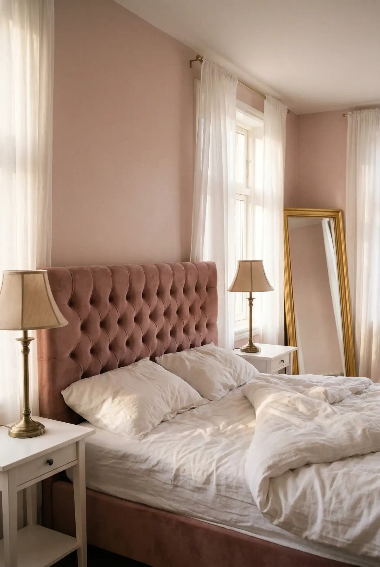
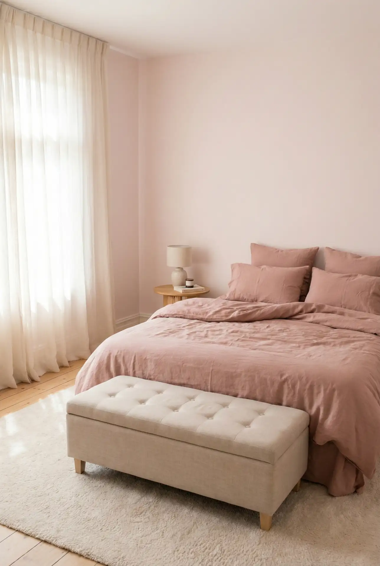
A blush bedroom paired with gold and brass accents creates a serene yet elegant retreat. This combination works beautifully in master bedrooms where you want a calming atmosphere without sacrificing style. Soft blush walls provide the perfect backdrop for metallic fixtures, velvet throw pillows, and framed mirrors that catch the light. The warmth of gold balances pink’s coolness, making the space feel inviting rather than overly sweet. 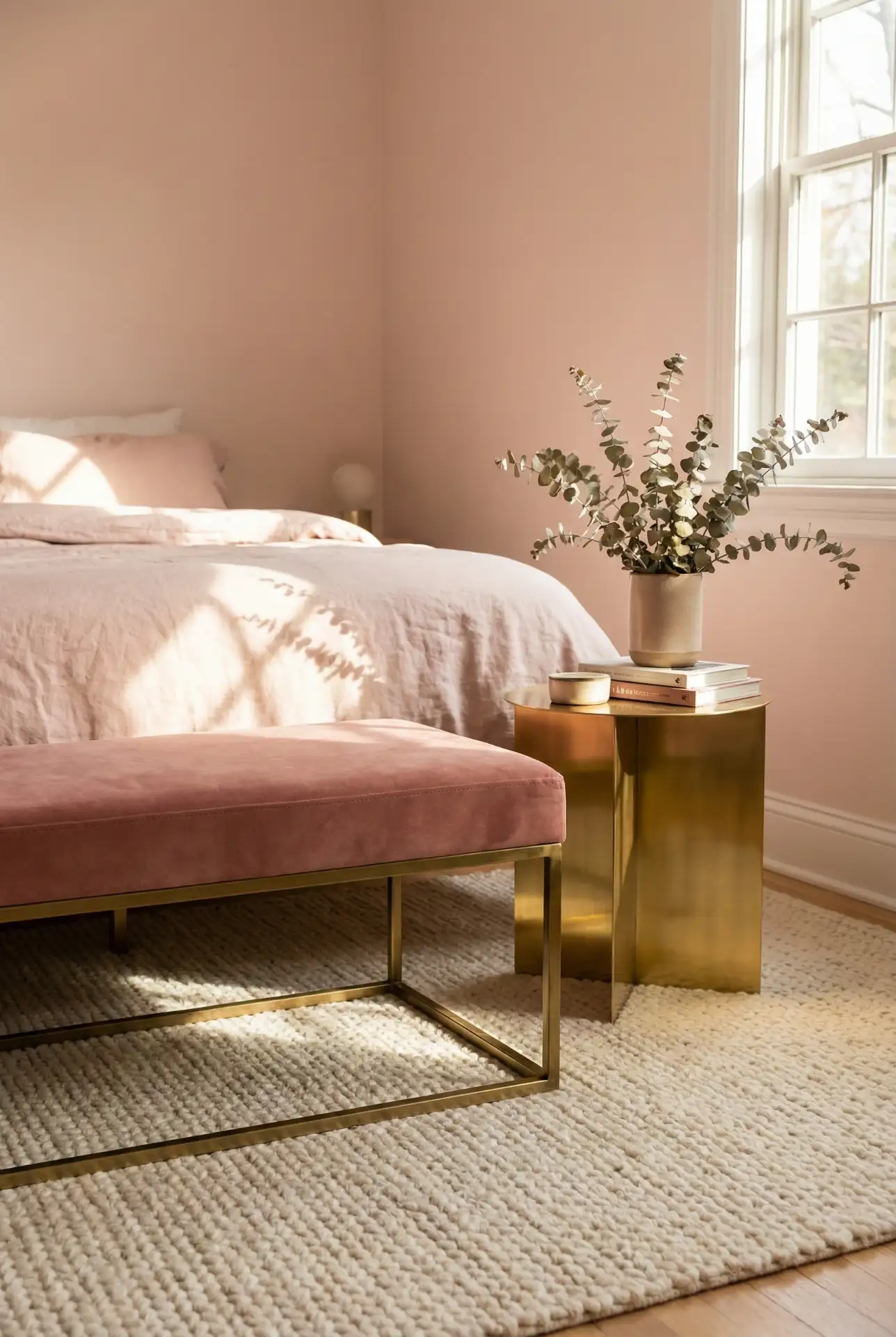
This palette is at its best in light-filled rooms, where the rose blush note can move all day from peachy morning shades to cooler evening tones. In warmer climates like Texas, Arizona, or Florida, many homeowners report that blush keeps a bedroom feeling open and airy without the clinical air of pure white. Budget-wise, you can easily create this look on the cheap by painting walls yourself and incorporating some gold accents with thrifted lamps or DIY spray-painted frames.
2. Dark Moody Pink Living Room
Dark pink may not be the first color that comes to mind when you think of cozy, but it is one of the biggest paint trends for 2020. Think deep mauve, raspberry, or wine-toned walls that foster an intimate, jewel-box feel. You can especially succeed with this method in living rooms or home libraries where you want to turn up the drama and coziness, respectively. Combine dark pink with charcoal furniture, black window frames, and brass or copper details for a more grown-up take that doesn’t conform to the classic interpretations of pink. 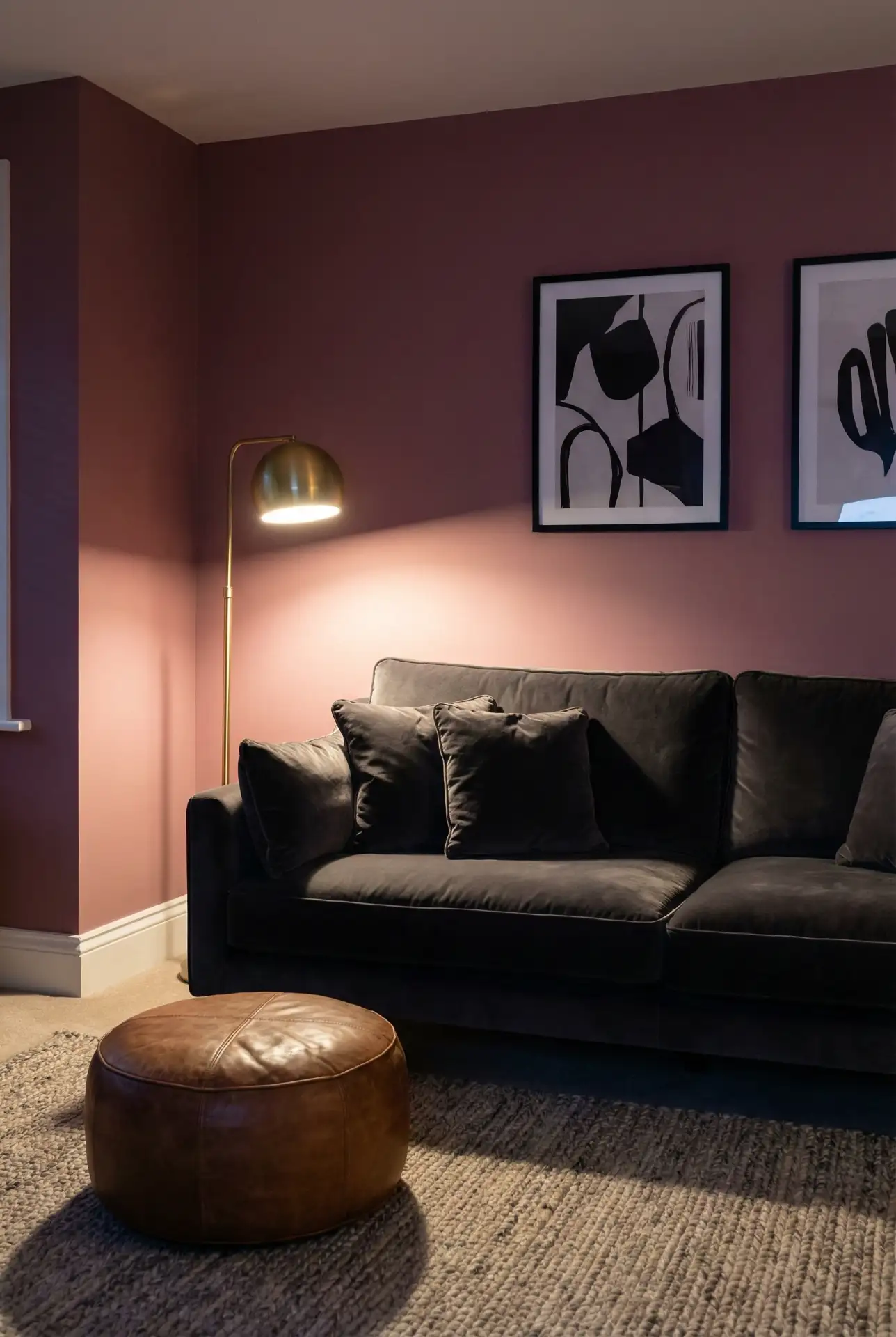
A typical error would be to paint all four walls of a small space dark pink, as it can feel claustrophobic. Instead, consider a single accent wall or even a ceiling painted for surprise effect. Dark pink is often recommended by the pros to be tested in north-facing rooms, where cooler light will turn this tint even richer. This look plays well with vintage Persian rugs and old wood furniture for a collected, layered feel.
3. Light Pink Kids Bedroom with Playful Touches
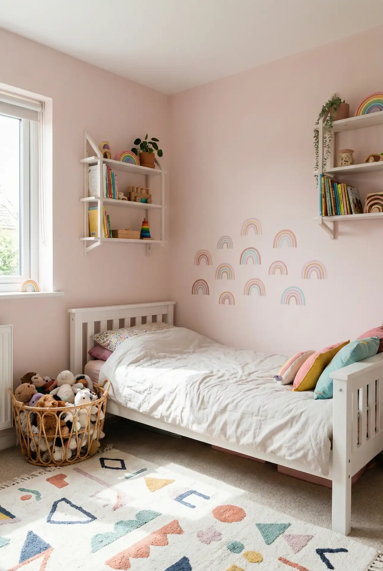
Light pink continues to be a popular hue in kids’ bedroom ideas, but this year all those “cute” animal paintings are making way for interiors that children can grow into. A soft pink base allows you to swap out posters, bedding, and accessories without having to repaint. This shade is gender neutral and goes well with organic wood furniture and woven baskets, as well as some pops of funkier colors like yellow or teal to keep it fun without looking juvenile. 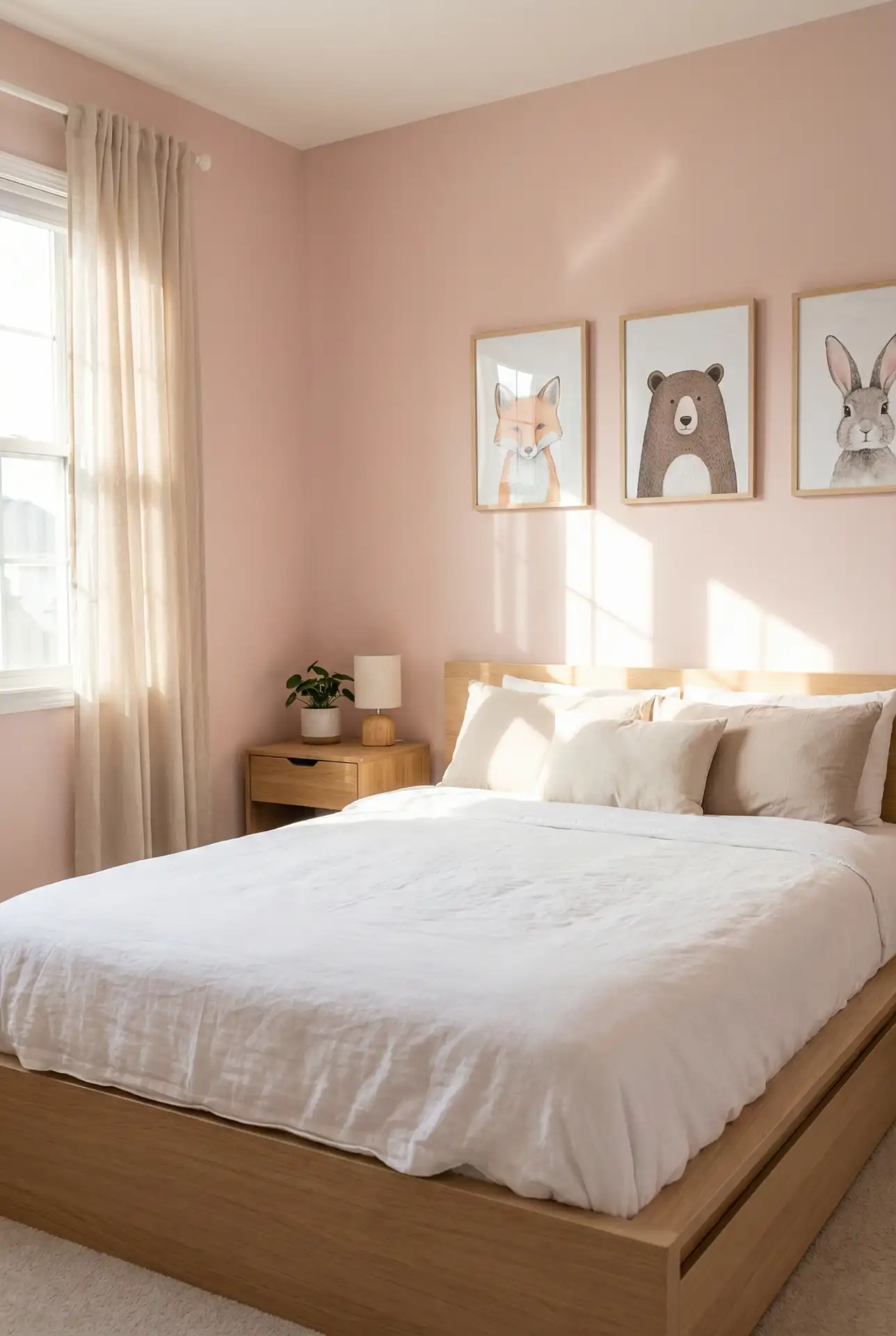
In practice, many American families find that light pink works better than brighter colors for helping kids wind down at bedtime. Parents in suburban areas often pair pink walls with blackout curtains in complementary shades to support healthy sleep routines. A small investment in quality neutral furniture means you won’t need to replace pieces as your child’s tastes evolve.
4. Dusty Rose and Terracotta Dining Space
Dusty pink paired with warm terracotta creates an earthy, welcoming dining area that feels both modern and timeless. This combination draws inspiration from Southwestern and Mediterranean aesthetics, making it especially popular in states like New Mexico, California, and Arizona. The muted pink softens terracotta’s intensity, while the clay tones ground pink’s sweetness. Add in natural wood tables, linen napkins, and ceramic dishware for a space that begs for long dinner parties. 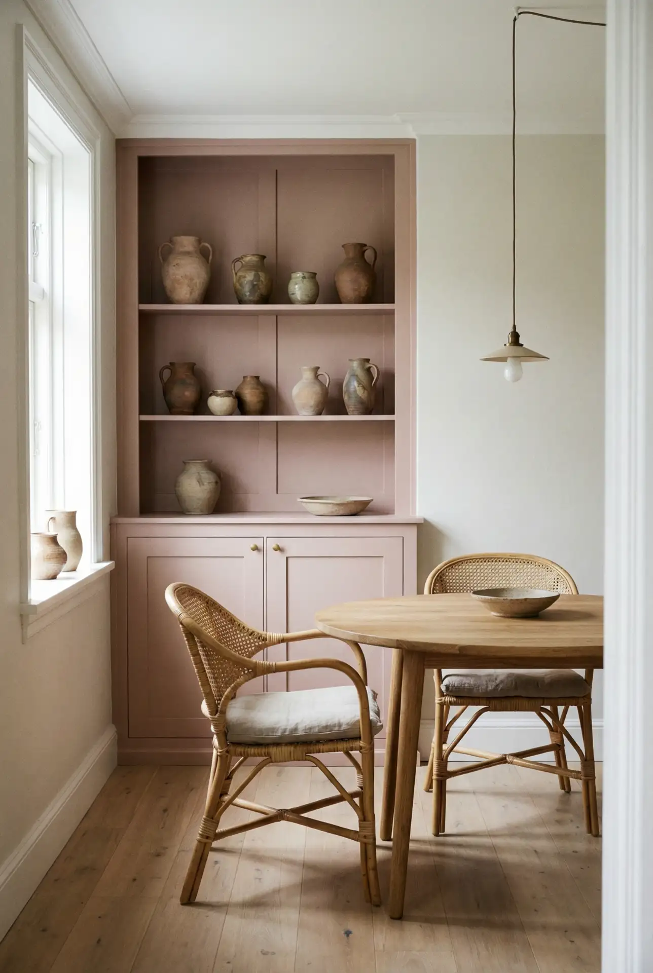
\n This schematic shines in rooms loaded with natural materials—hello exposed brick, concrete floors, or wooden beams. For one Austin homeowner, painting her dining room dusty rose turned it from a pass-through room into the heart of her home, where people naturally gather. The pairing is earthy and organic, not at all fussy.
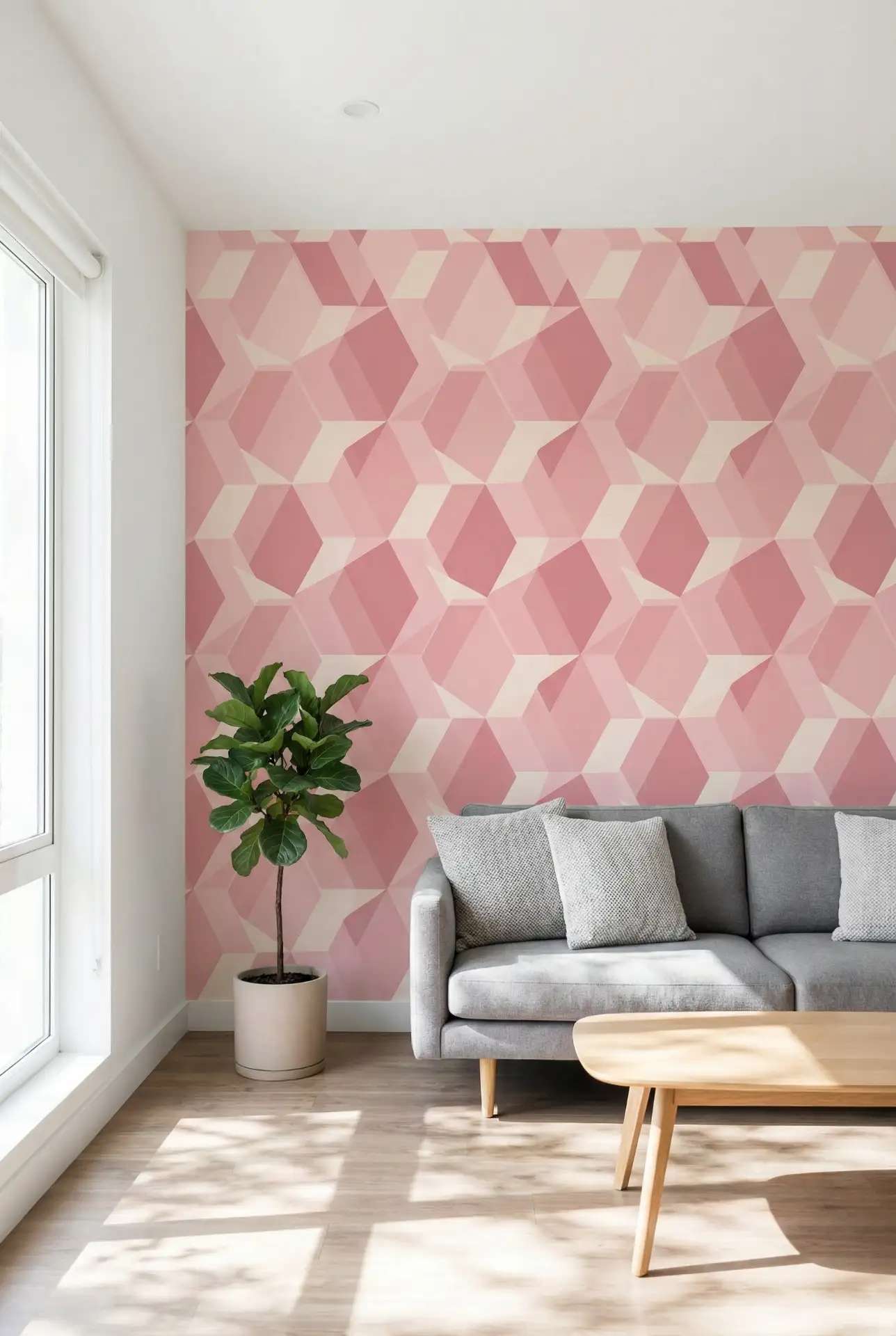
5. Hot Pink Accent Wall in Modern Office
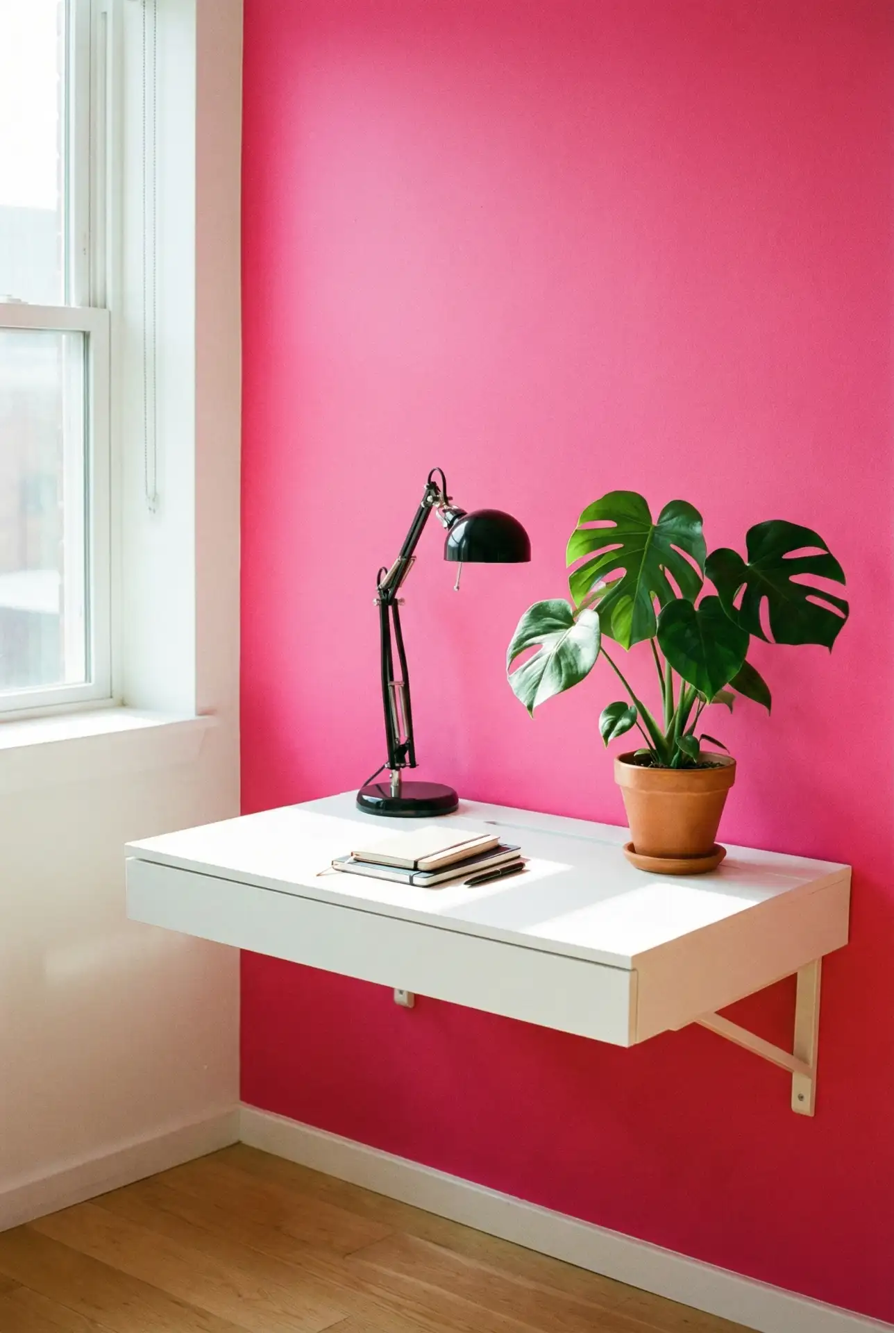
A hot pink accent wall brings energy and creativity to home offices, breaking up the monotony of neutral workspaces. This bold choice works particularly well behind a desk or as a Zoom backdrop, adding personality without overwhelming the room. Pair it with crisp white furniture, black accents, and plenty of greenery to keep the space feeling professional yet inspired. The vibrancy of hot pink can actually boost focus and motivation when used strategically. 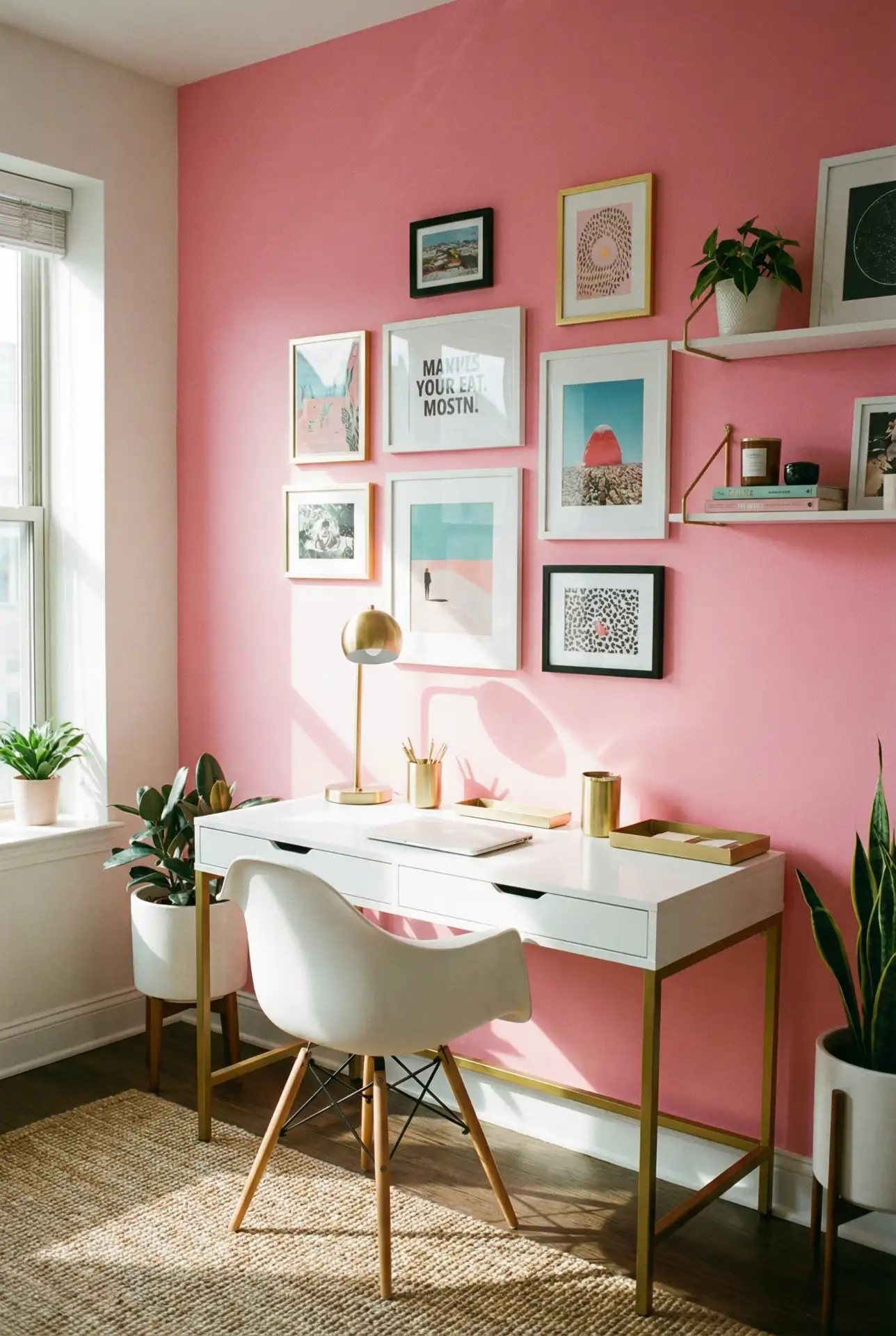
Actual homeowner behavior indicates that people who choose a hot pink office are more likely to be freelancers, creatives and remote workers who want their space to reflect some aspect of themselves. Best in: Rooms full of natural light that can withstand the impact, making the intensity not become oppressive. In darker rooms, you might try hot pink on the lower half of a wall to make a strong impression without smothering the room.
6. Green and Pink Botanical Bedroom
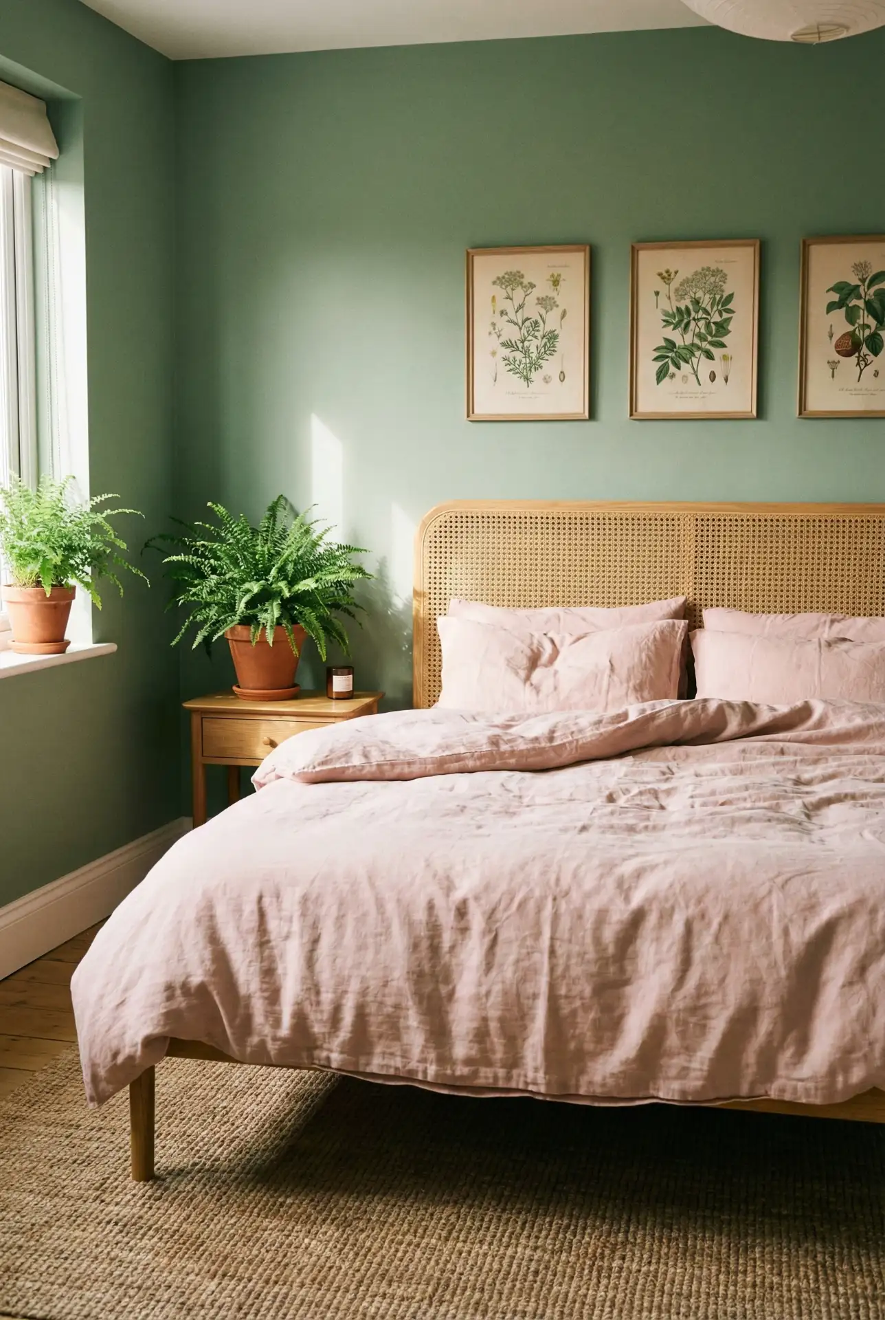
This green and pink color scheme is pretty but also feels alive and rejuvenating—like a garden. This combination plays into trends in biophilic design, which is about bringing the outside in, not simply through plants but also color. The soft sage wall with blush bedding, or the other way around, is better balanced—neither color is dominant. Throw in some botanical prints, woven rugs, and wood furniture for an organic vibe. It’s a combo that works all year long but feels particularly great in spring and summer. 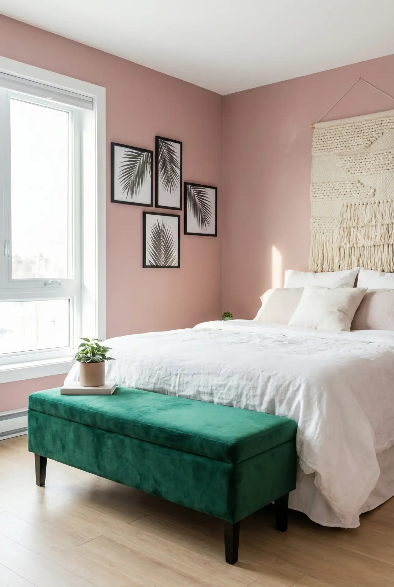
Thrift-store plants and paint are where budget-minded decorators can begin before you start adding new furniture to replicate this look. Many homeowners tell us that they are in a great mood and sleep really well with this color combination, which may be because it feels like an outdoor environment.” The secret is to pick muted versions of each color versus bright, competing ones.
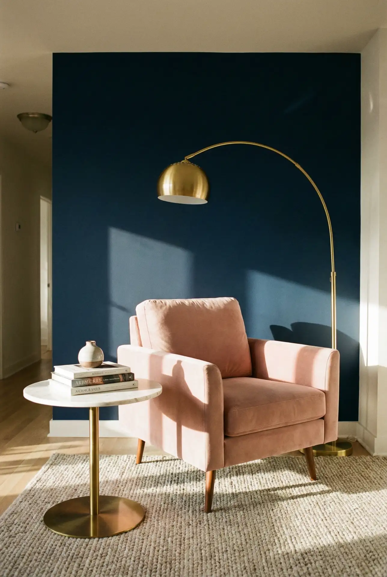
7. Navy and Blush Contrast Living Room
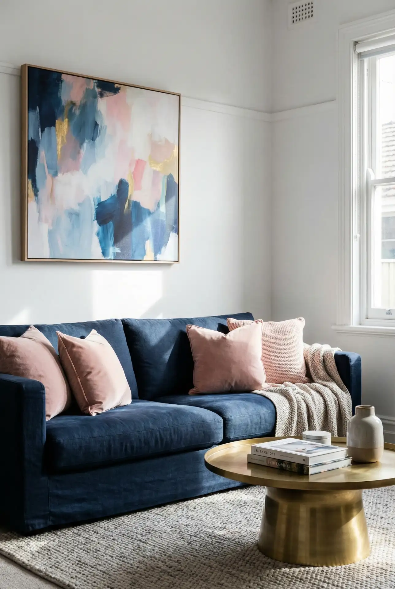
Navy and blush create striking visual contrast in living rooms, with navy providing depth and sophistication while blush adds warmth and softness. This combination feels both classic and contemporary, working equally well in traditional homes and modern apartments. Use navy for larger furniture pieces like sofas or built-in shelving, and introduce blush through pillows, throws, artwork, and smaller accent pieces. The result is a balanced space that feels pulled together without being matchy. 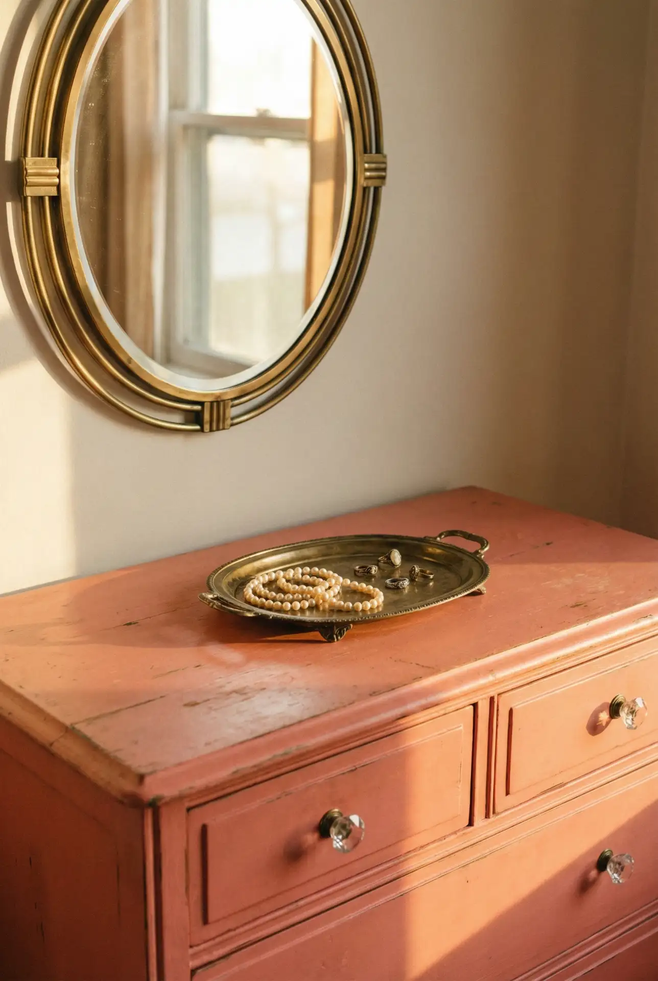
This palette works best in rooms with good architectural details or high ceilings, where the navy won’t feel too heavy. Coastal homeowners from Maine to Oregon appreciate how this combination nods to nautical themes without feeling cliché. Expert designers suggest using a 60-30-10 ratio: 60% neutral (walls, large furniture), 30% navy, and 10% blush for balanced impact.
8. Vintage Pink Vanity Corner
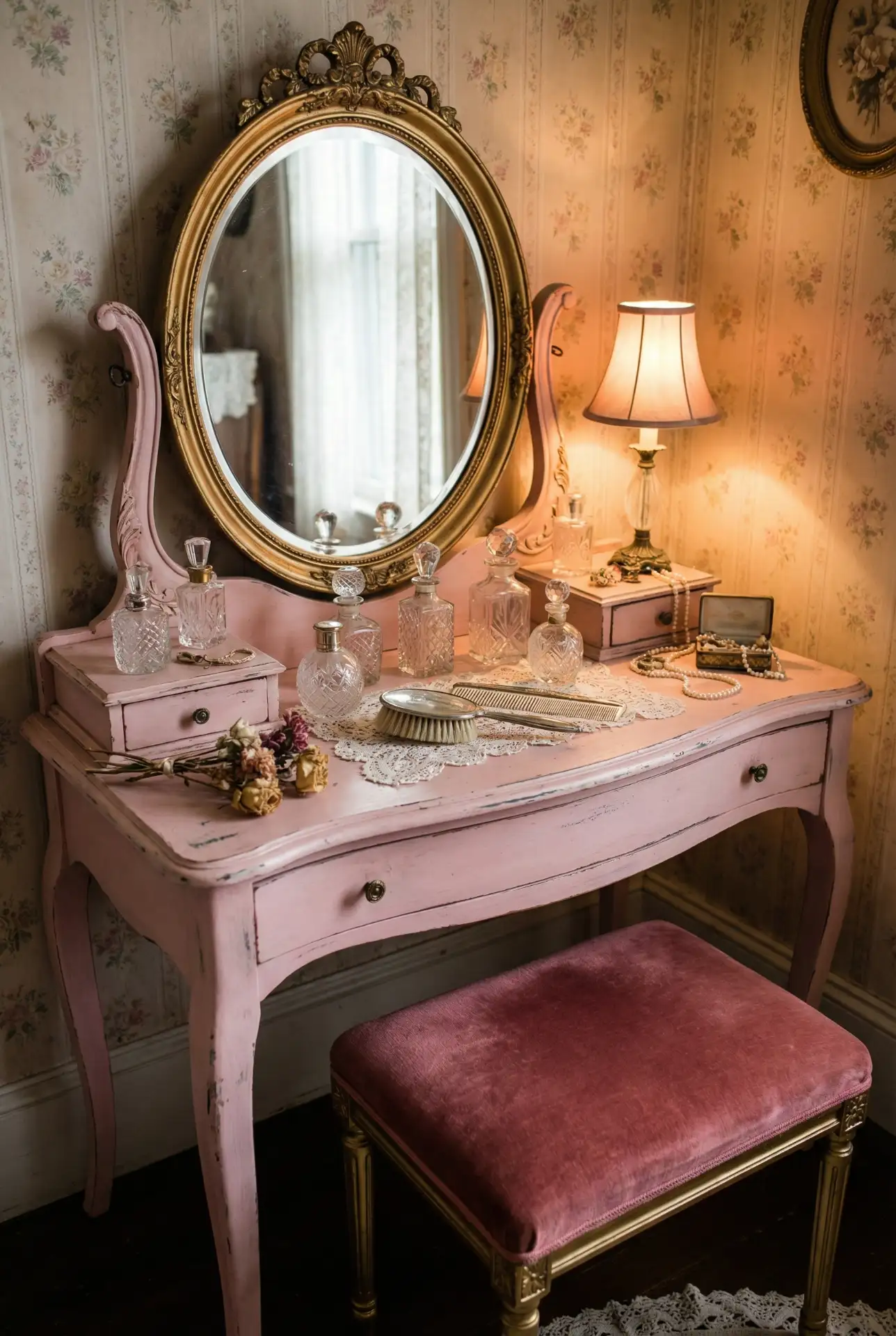
The temptation is there to mix the zillions of vintage eras all in one room, but that’s not a particularly attractive look and ends up seeming more jumbled than curated. Choose a period—Art Deco, mid-century, or Victorian—and stick with it for cohesion. For many Americans, it turns out, that vintage pink furniture retains value better than a new fast-furniture piece—making this blush-hued an investment for your home that looks good too.
9. Simple Minimalist Pink Bedroom
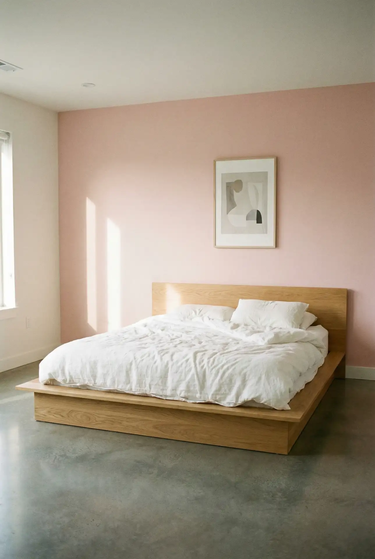
It goes without saying that the less in this calm-ideas bedroom décor style suits us just fine. One soft pink wall, white sheets, and the right amount of sparse furniture ensure the room doesn’t feel overly cluttered. In smaller bedrooms, this approach is magic: Being too sexy with color or pattern can kick up a claustrophobic atmosphere. The trick is restraint—the pink should stand out on its own, not compete with busy decor or multiple accent colors. 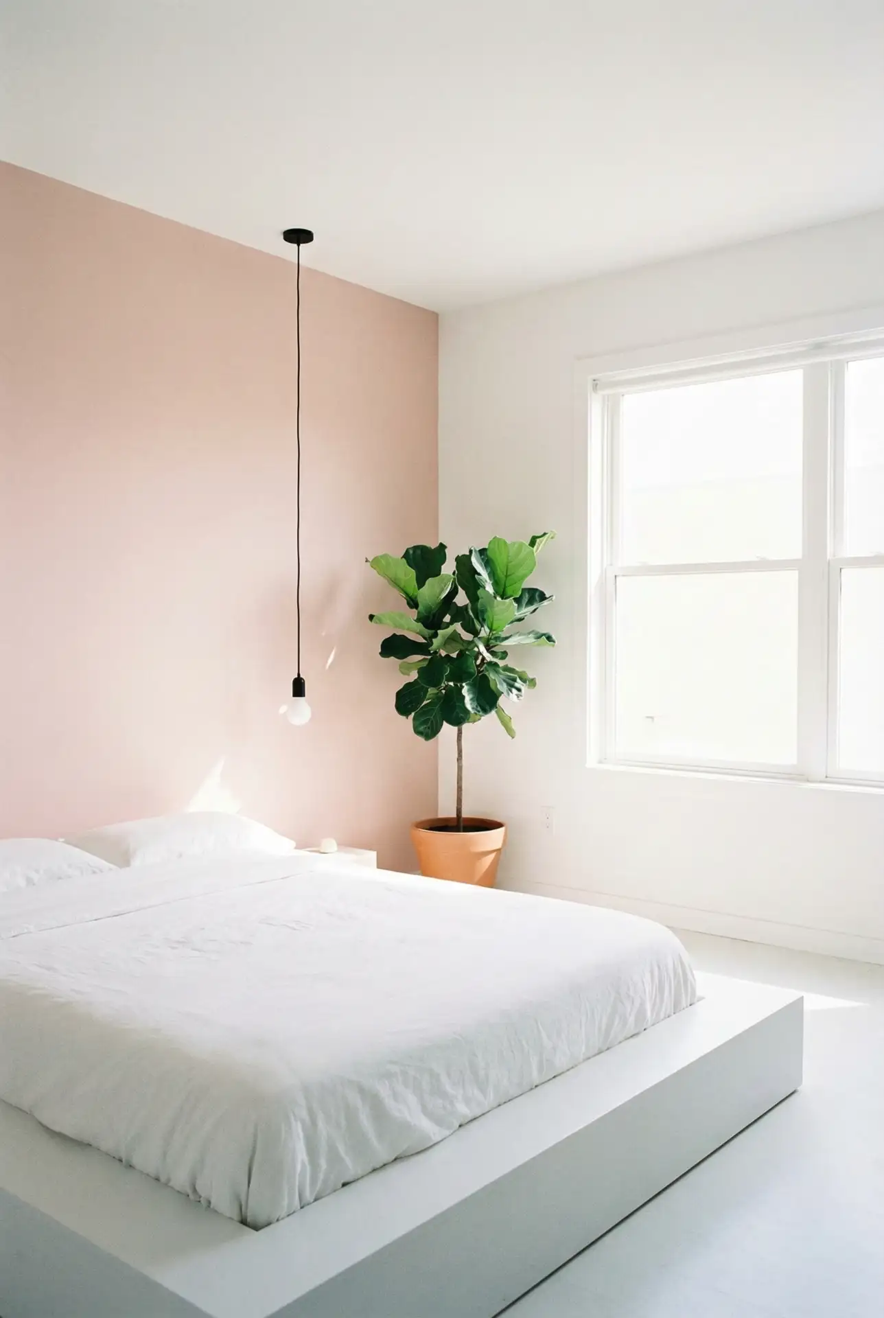
This technique is ideal for city apartments or contemporary homes in which clean lines are already part of the architecture. Actual homeowners discover that the minimalist pink bedroom is indeed conducive to sleep by minimizing visual stimulation before bed. The good thing is that this kind of decorating couldn’t be more flexible—in the few medium-to-small decorative items you do have, it’s simple to incorporate a rotating cast without upsetting the proverbial peace.
10. Blue and Pink Nursery Design
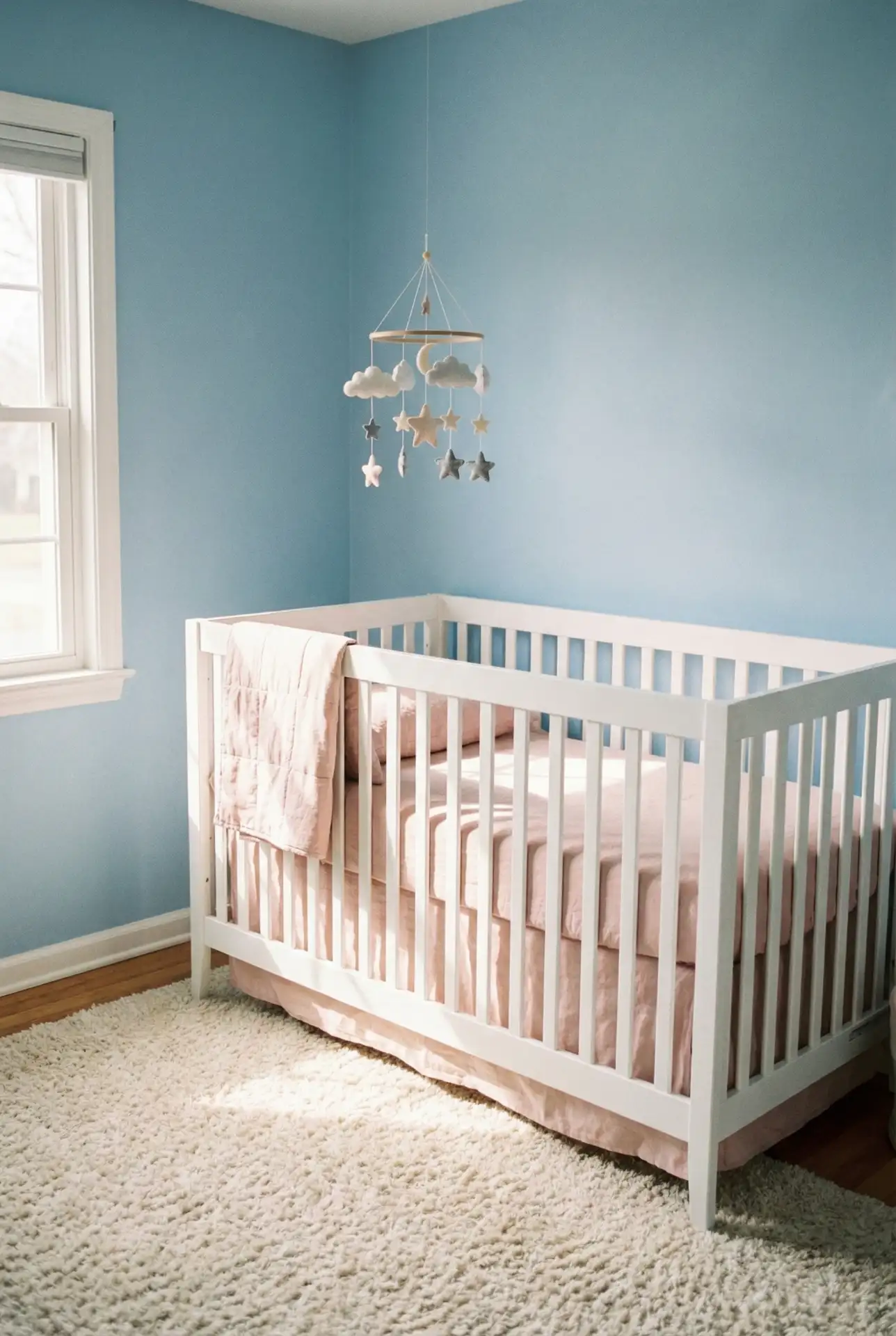
Blue and pink come together for a balanced, gender-neutral nursery that’s unique and modern. This pairing gives an end-run around the typical “boy” or “girl” color schemes and means parents can create a space both calming and fun. Powder blue walls with coral or blush accents, or the opposite, add interest while maintaining a sense of calm for its littlest inhabitants. Just add white furniture and natural wood toys for a room that grows with your child. 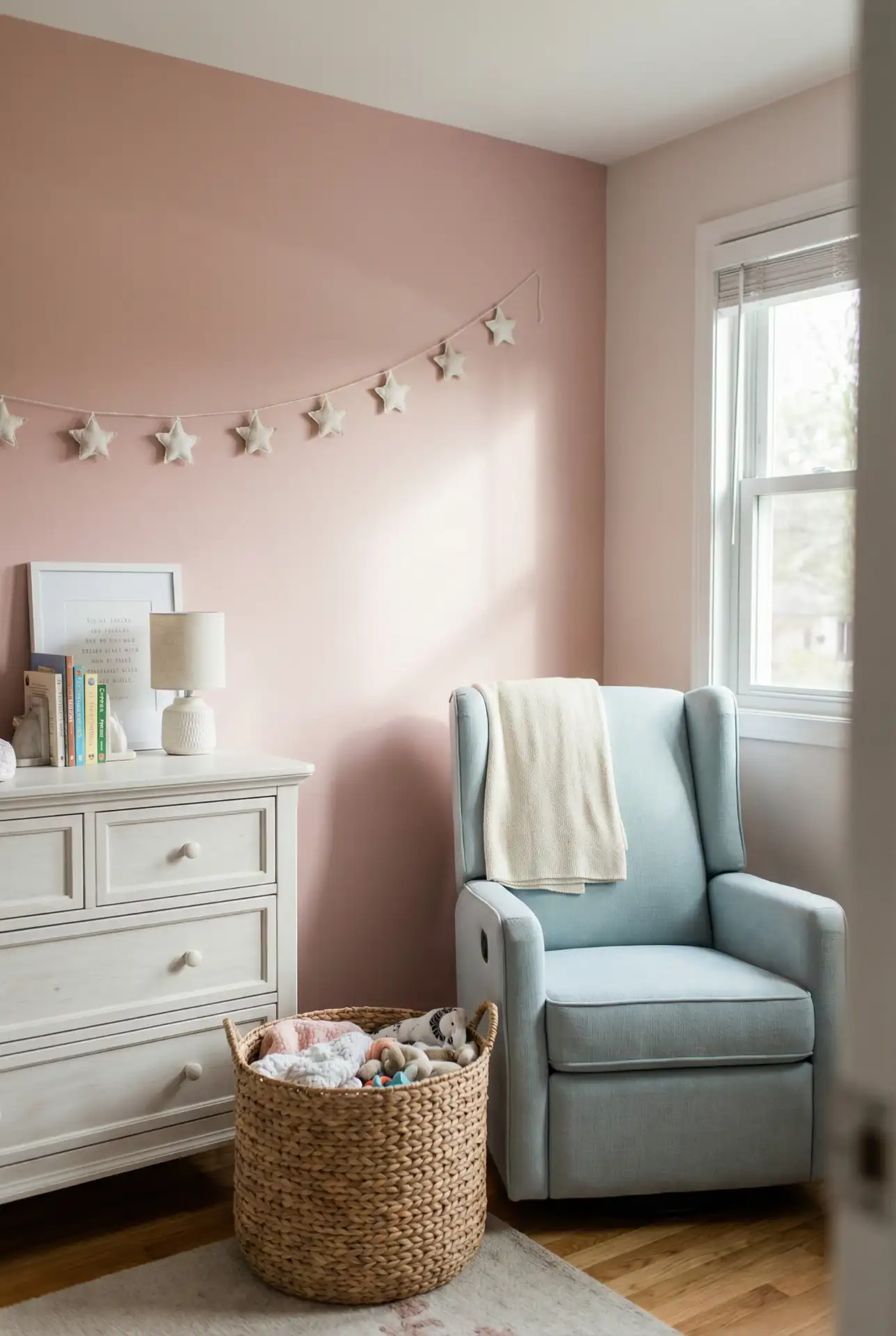
Where it works best: babies’ rooms in homes with good natural light, so the pale colors don’t look drab or dirty. Turning up on all those lists, this combo is a favorite of parents in America because it doubles as an easy transition into a toddler room with no need for a full repaint. The palette is also perfect for photos—and those moments you want to remember early in your parenting journey.
11. Purple and Pink Dreamy Teen Room
Pairing purple and pink creates a sophisticated space for teenagers who want something more grown-up than traditional kids’ decor. Lavender walls with dusty rose accents, or deep plum with hot pink details, offer versatility and personality. This combination works for ideas for girly wall designs without feeling juvenile, especially when balanced with modern furniture and mature accessories like string lights, gallery walls, or vintage mirrors. Teens appreciate having control over their space, and these colors offer flexibility. 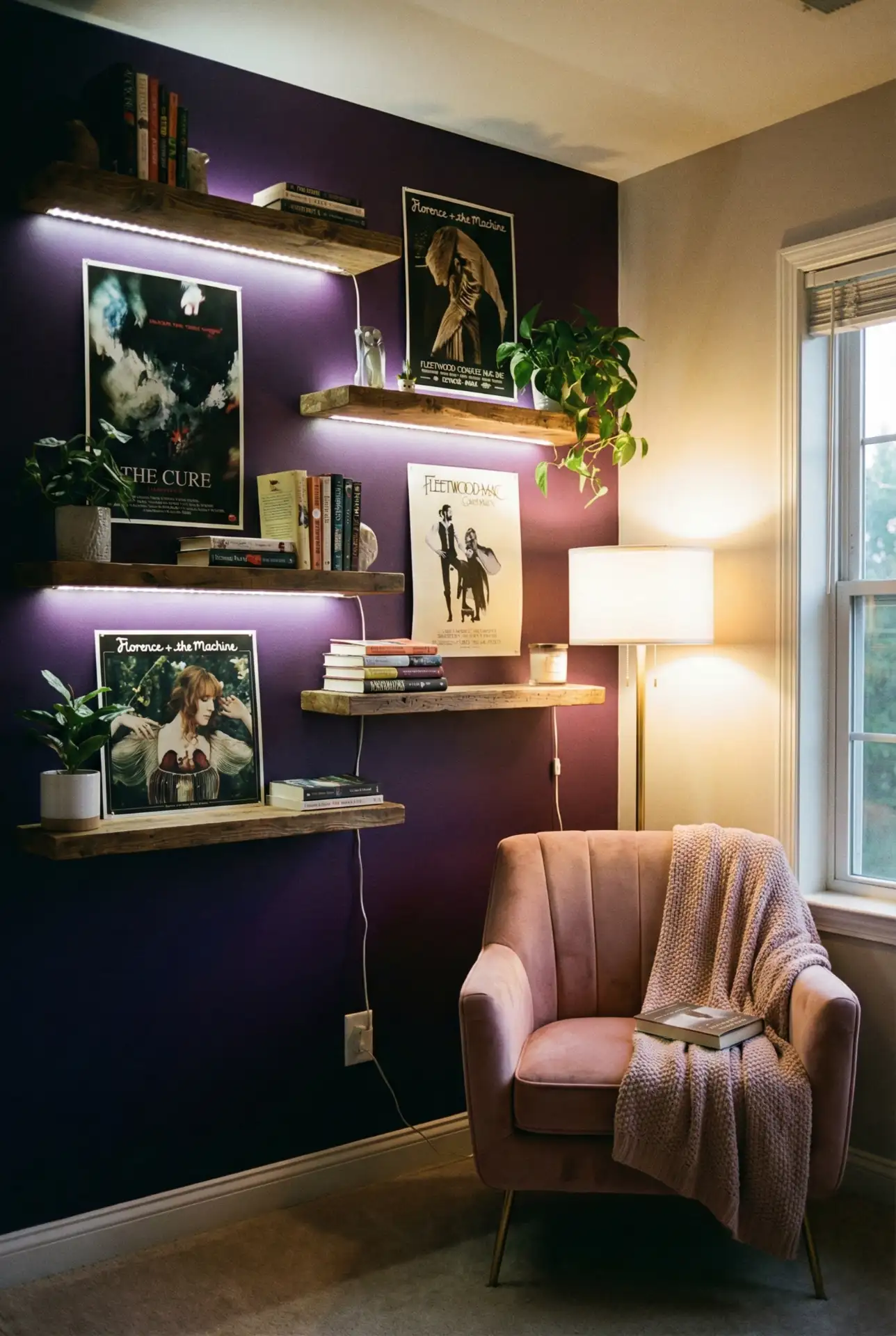
Practical tip: get your teen in on selecting the precise colors so you can be sure they’ll use and like it. Paint stores can also provide sample sizes if you would like to test how the color looks in different lights at various times of day. That investment in their input tends to pay off in the form of a room they are proud to show friends and that needs fewer future redesigns.
12. Brown and Pink Earthy Living Space
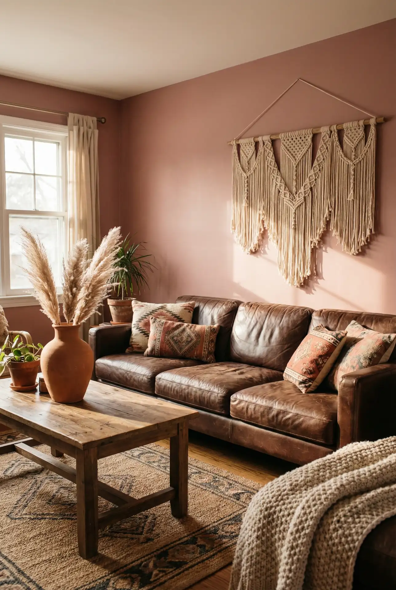
Who knew brown and pink could add such a punch to your living space! Dark chocolate or camel furniture against dusty rose walls, or with a blush reach, can make for an earthy, grounded feeling that’s simultaneously modern and classic. This palette is inspired by the return of ’70s-style interiors, but it feels new for 2026. Layered texture, including a leather sofa, wooden coffee tables, and pink velvet pillows, makes you want to sit down and stay awhile. 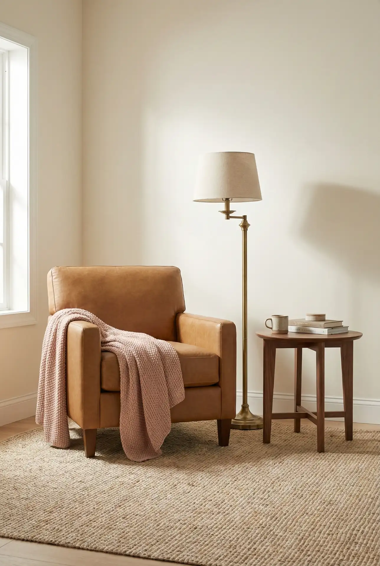
Expert-like commentary: there’s also an emerging preference of brown and pink over the overly done gray and white. The palette comes across as warmer and more welcoming, especially for open-concept homes in which living spaces need to stand apart from the kitchen. It’s also more forgiving to wear: leather gains patina, while pink hides the odd smudge better than pure white.
13. Yellow and Pink Cheerful Kitchen Accents
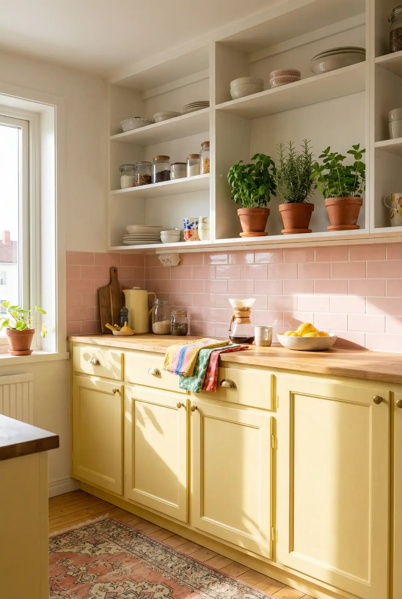
Bringing yellow and pink into the kitchen creates an energizing space perfect for morning coffee and meal prep. This sunny combination works best as accents rather than dominant colors—think pink dish towels, yellow ceramic canisters, or a pink backsplash with buttery yellow cabinets. The pairing feels retro-inspired but contemporary when executed with modern materials and clean lines. It’s especially popular in vintage or eclectic kitchen designs where personality matters more than perfection. 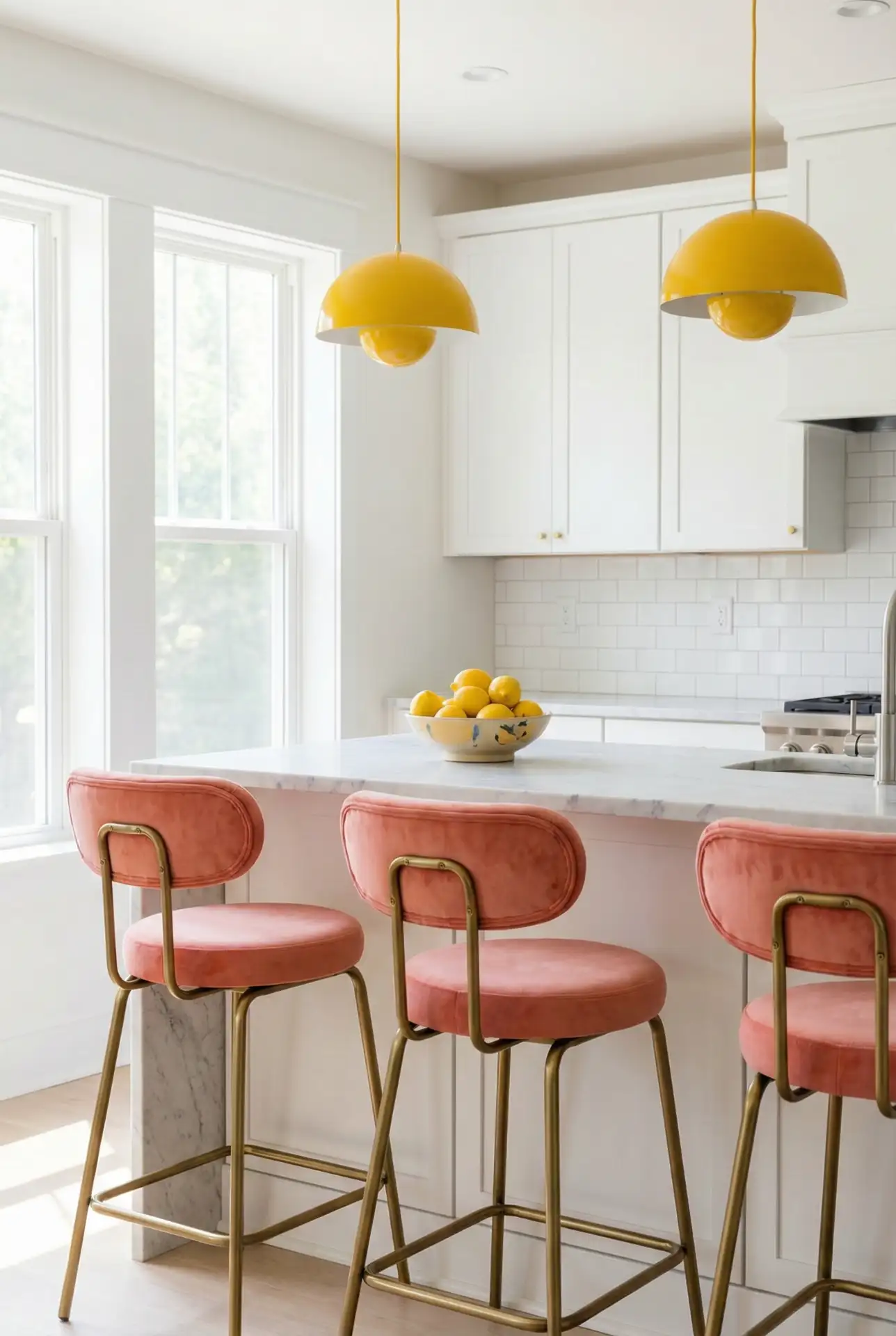
A common mistake is using these colors in equal amounts, which can feel chaotic. Instead, choose one as your primary color and the other as an accent—roughly a 70/30 distribution. Budget angle: you can introduce this palette affordably through items like dishware, textiles, and small appliances before committing to permanent fixtures like cabinets or tile.
14. Grey and Pink Sophisticated Bedroom
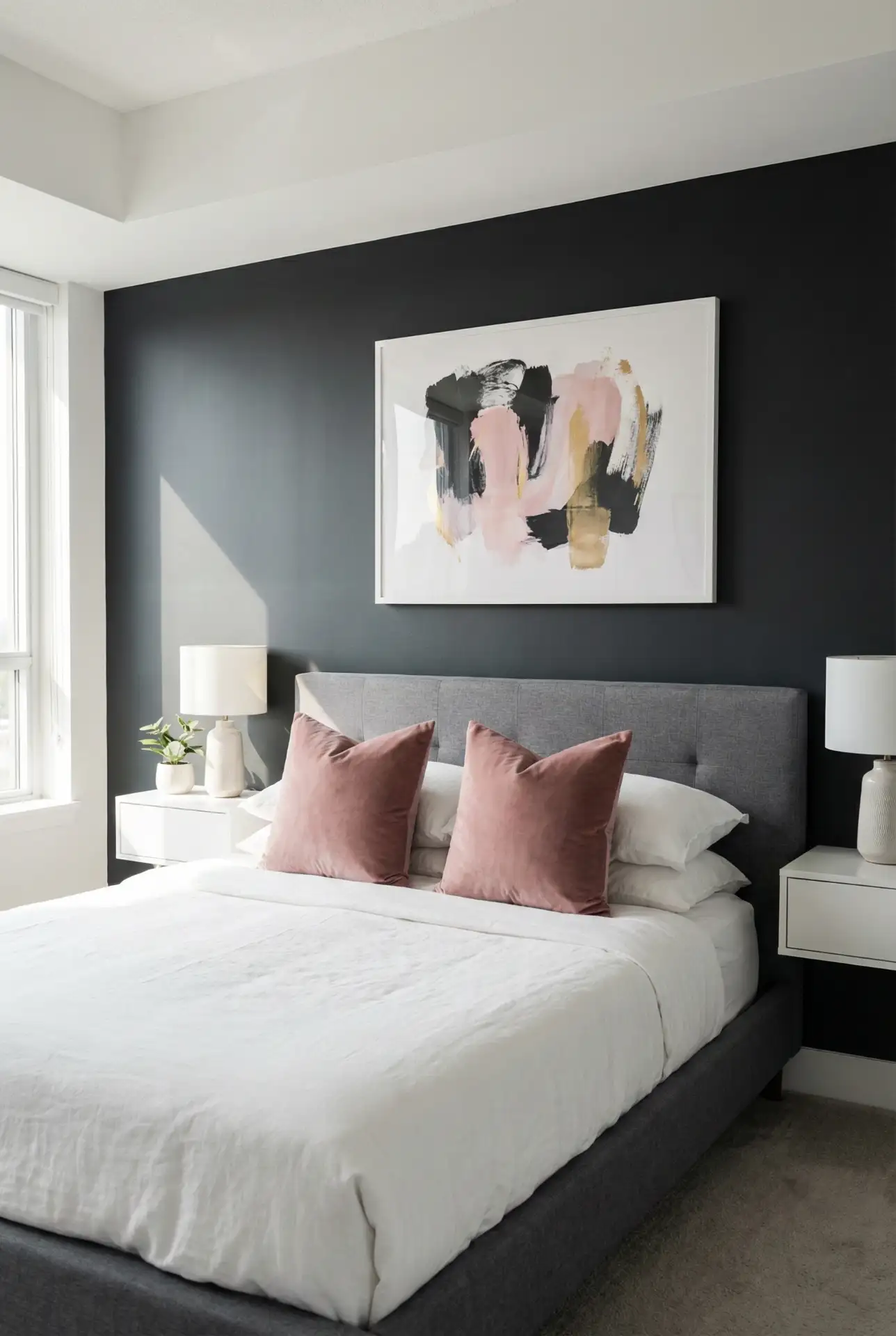
Grey and pink bedroom ideas Perfect for the decor of bedrooms in adults, creating a soft upholstered room. Walls in charcoal or dove gray offer a neutral canvas so blush or rose-colored accents don’t come on too strong. This combination transcends design styles—be it Scandinavian minimalism or contemporary glam—providing flexibility for homeowners with ever-changing tastes. Combine varied textures, such as velvet, linen, and faux fur, to give depth to the color palette. 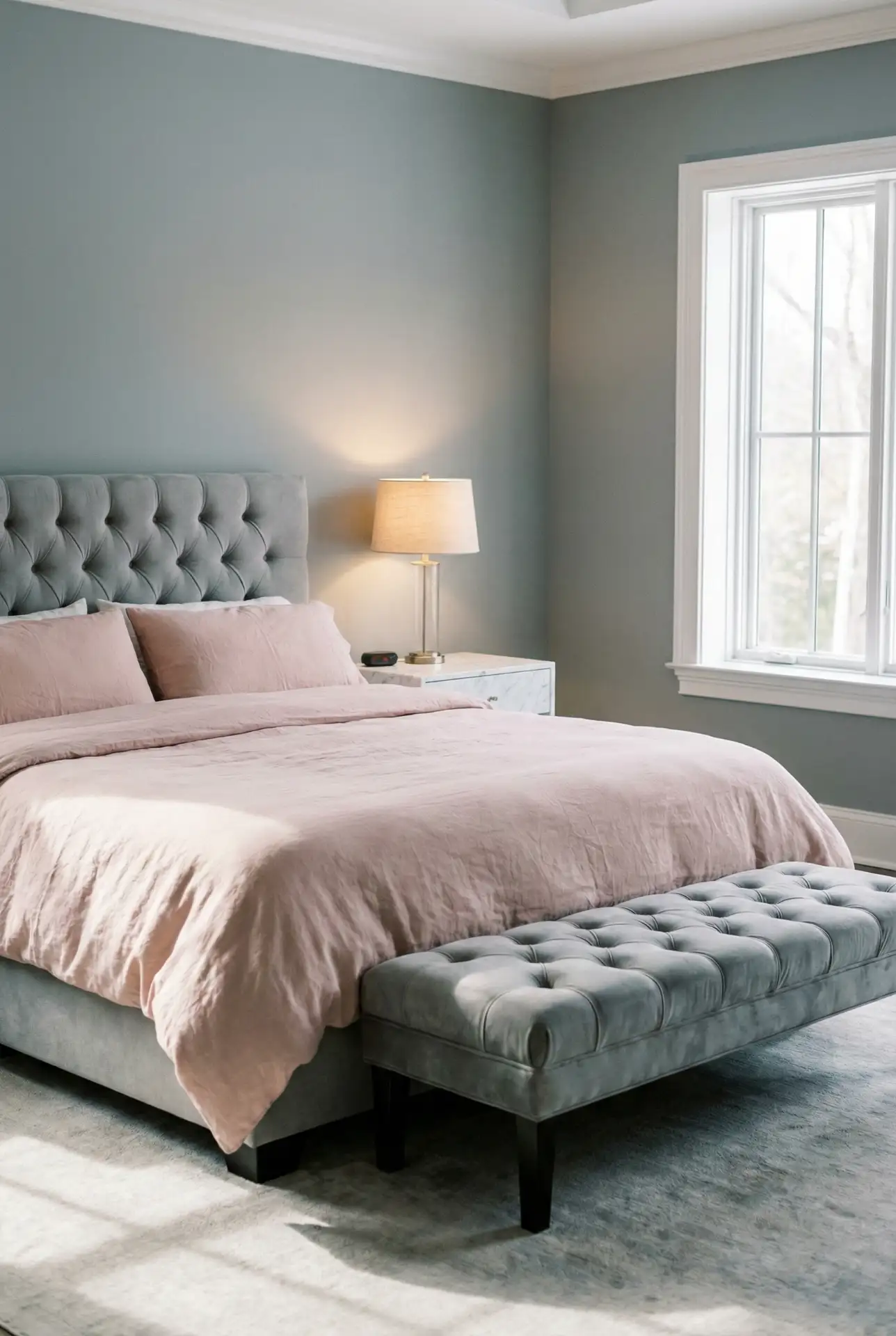
What actual homeowner behavior reveals is that people who opt for gray and pink tend to keep the bedroom a lot cleaner since it looks like it was thought through. For the Pacific Northwest and Northeast, where natural light can be scarce, this pairing illuminates spaces without sacrificing a surface coziness for the darker months. The color palette is timeless, and one does not need to constantly update.
15. Orange and Pink Sunset-Inspired Space
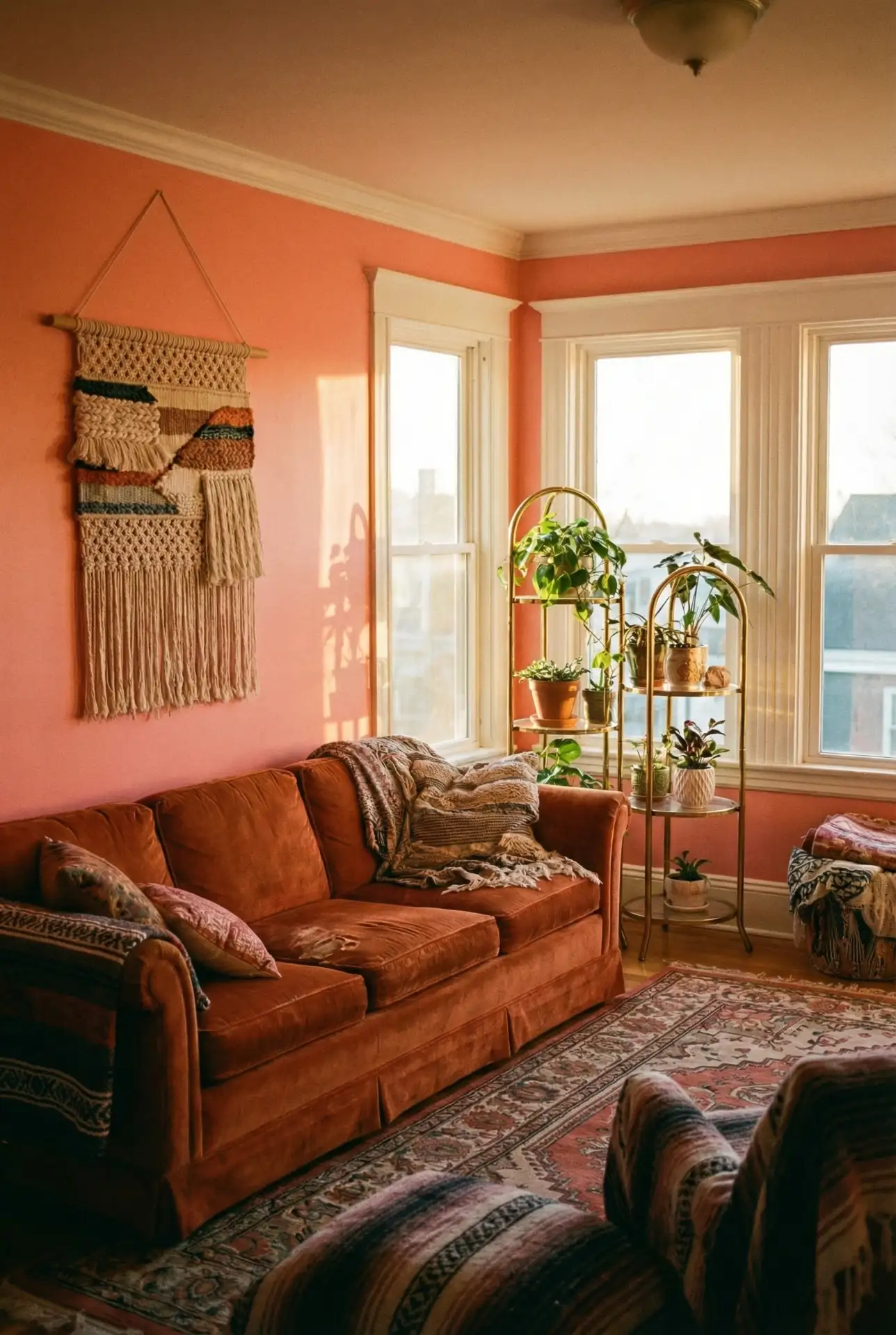
Pairing orange and pink creates vibrant, sunset-inspired interiors that feel bold and joyful. This combination works particularly well in creative spaces, playrooms, or areas where energy and optimism are welcome. Think peachy coral walls with burnt orange throw pillows or hot pink accents against terracotta backgrounds. The warmth of both colors creates an enveloping, cheerful atmosphere that’s hard to achieve with cooler tones. Balance is key—use plenty of white or cream to give the eyes a place to rest. 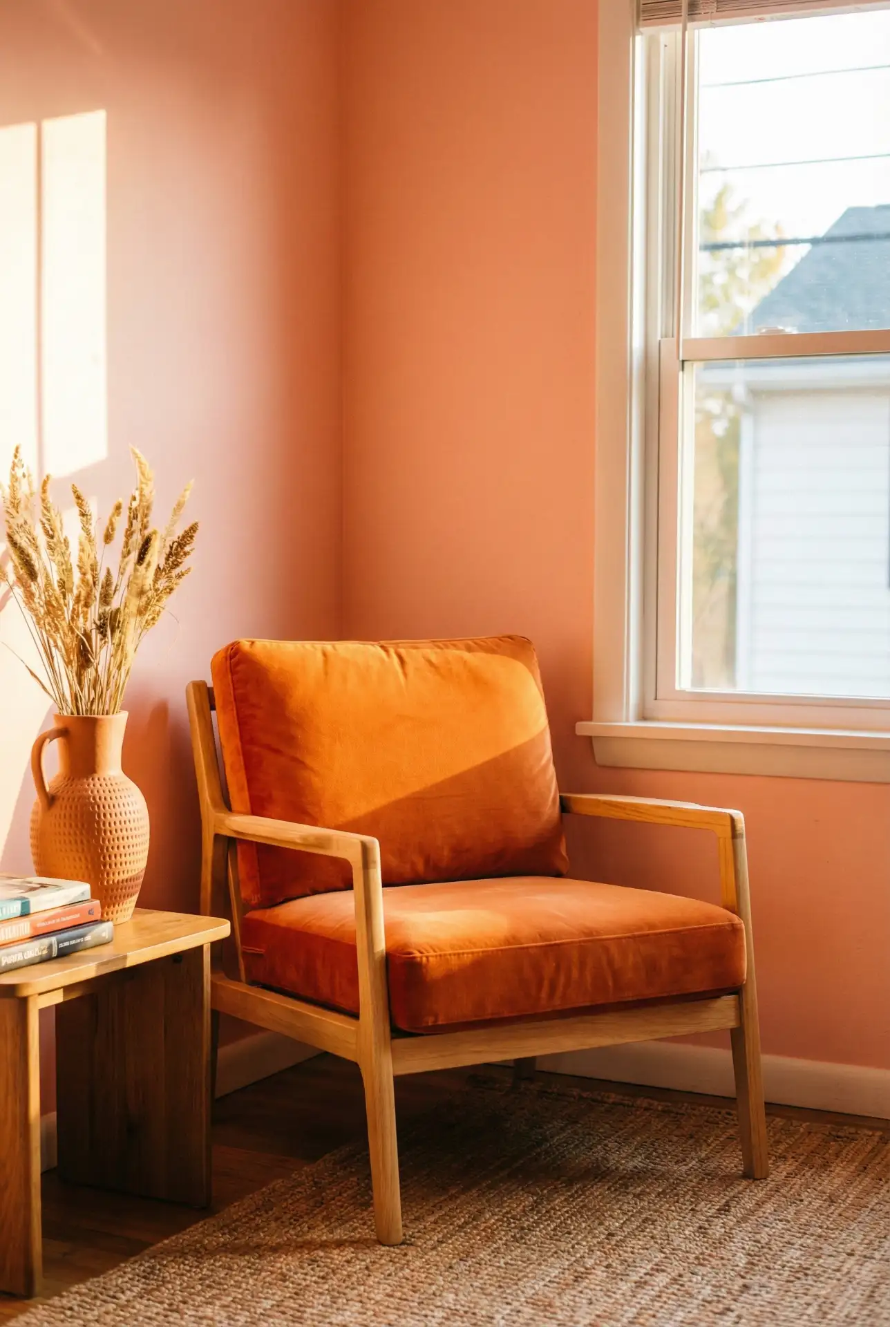
One homeowner in a San Diego apartment picked these colors to have that feeling of endless sun, even in their north-facing living room. The combination can read seasonal, which lovers of refreshing their decor with pillow covers and throws all year round will be intrigued by.
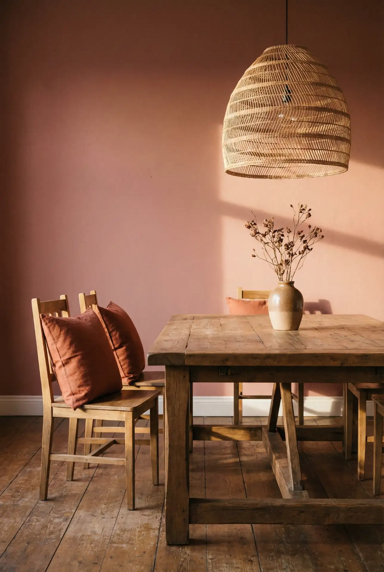
16. Red and Pink Valentine’s-Ready Dining Room
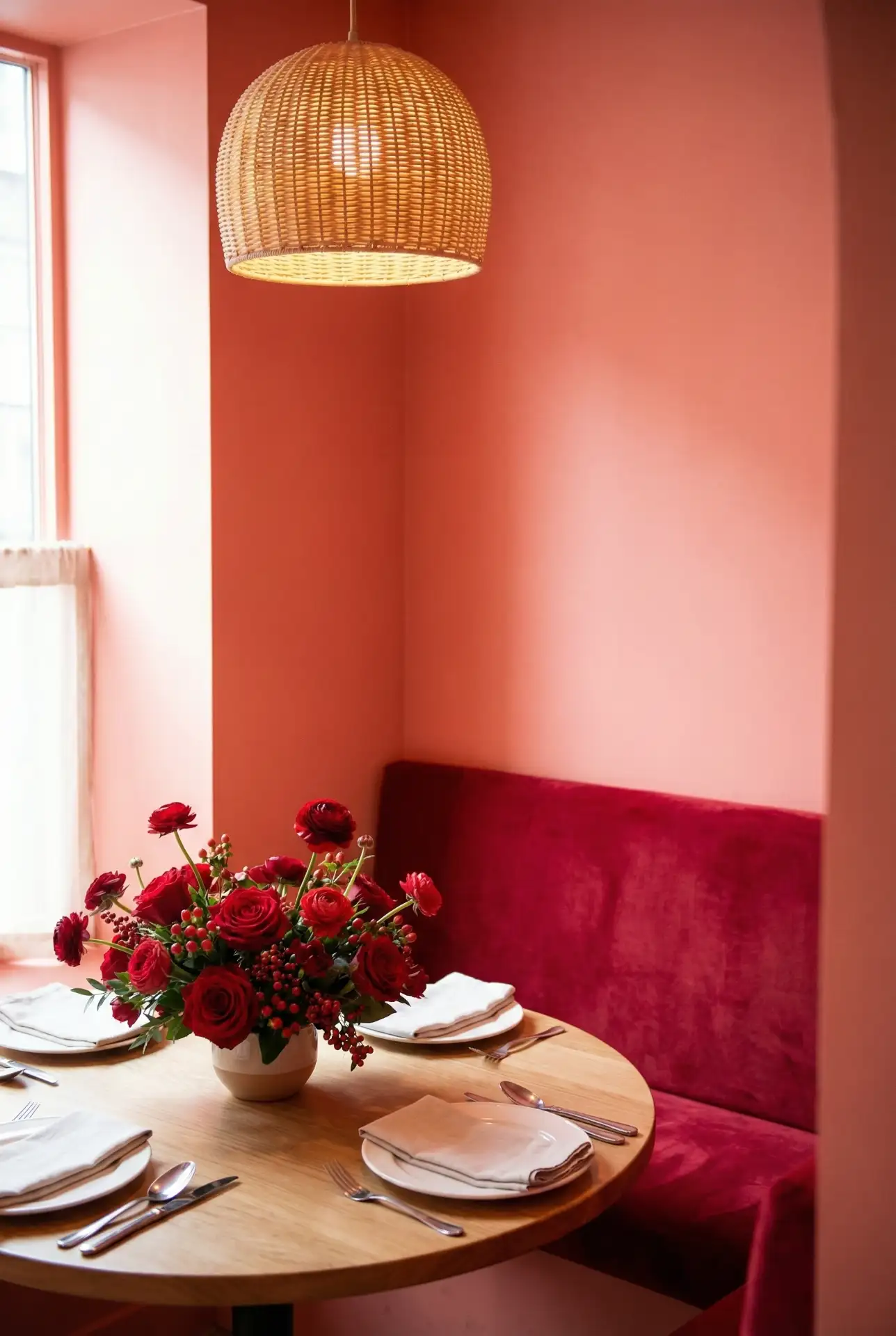
Red and pink can be daring, but when it works, you’ve got yourself a dramatic and romantic entertaining space. Forgo the air quotes with high-gloss wine-red walls against blush table linens or coral-pink walls with burgundy velvet chairs. This striking combination is particularly effective in a formal dining room or an area used predominantly for evening entertaining, as the richness of each color only deepens when dark lighting comes into play. The trick is to choose hues with similar undertones — all warm or all cool. 
Where it works best: In homes with dedicated formal dining rooms (rather than eat-in kitchens), where the loudness can be matched by closing doors between meals. This isn’t a palette for everyday breakfast nooks, but it is the right one for rooms that are to leave an impression. One Chicago homeowner said that since repainting their dining room in these tones, they are hosting a dinner party monthly instead of annually.
17. Your Dreams Pink Cloud Bedroom
Creating your dream bedroom in soft pink tones feels like sleeping in a cloud. This approach uses various shades of pink—from barely-there blush to slightly deeper rose—to create a monochromatic sanctuary that’s anything but boring. Different textures prevent the space from feeling flat: think velvet pillows, linen curtains, silk throws, and cotton bedding all in complementary pink tones. The result is a cocoon-like space that promotes rest and relaxation. 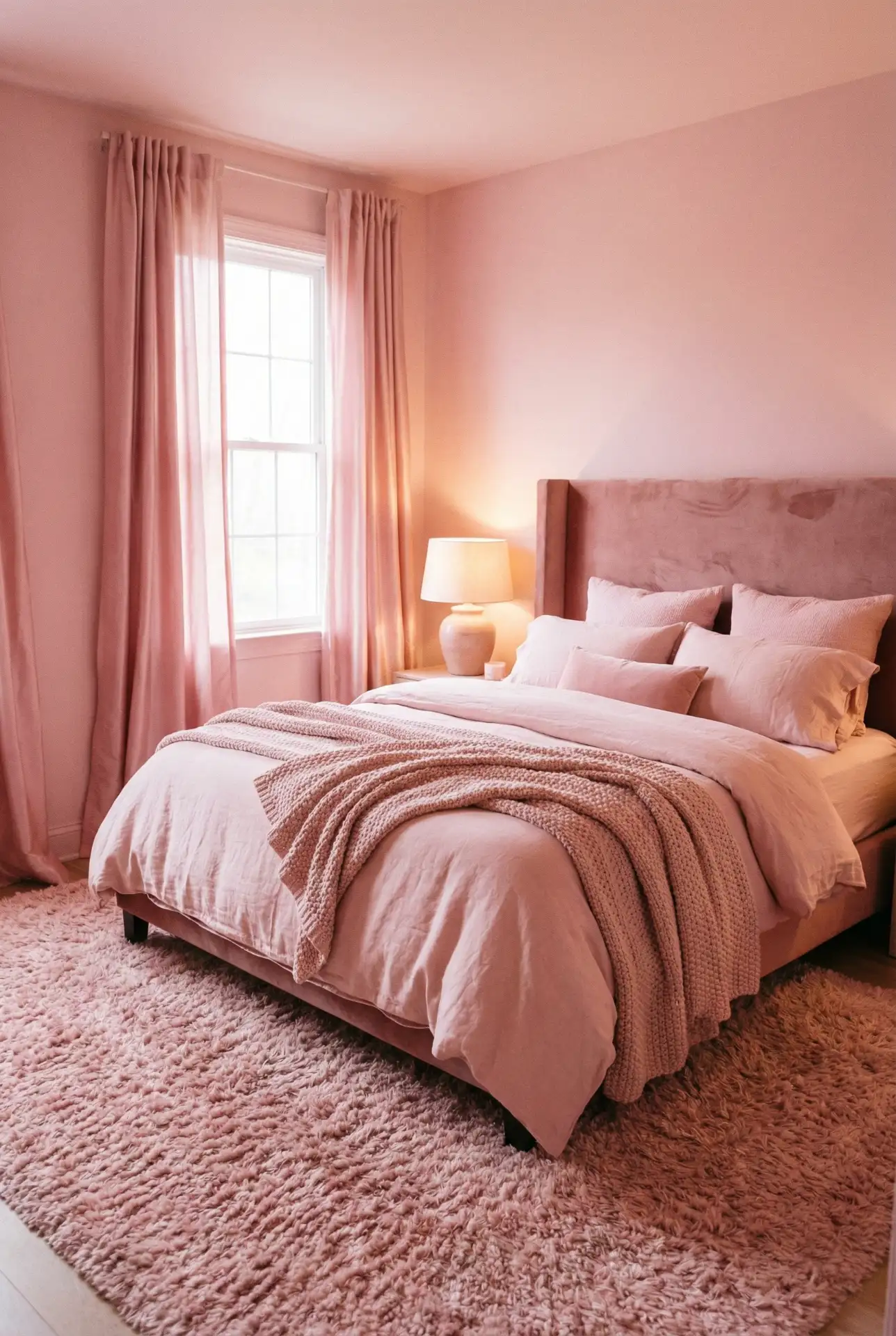
American lifestyle context: in high-stress urban areas like New York or Los Angeles, people are increasingly creating bedroom sanctuaries designed purely for rest rather than multiple functions. A monochromatic pink bedroom signals to your brain that this space is for relaxation only. The investment in quality bedding and window treatments pays off in better sleep quality and a genuine retreat from daily demands.
18. Black and Pink Edgy Contrast Bedroom
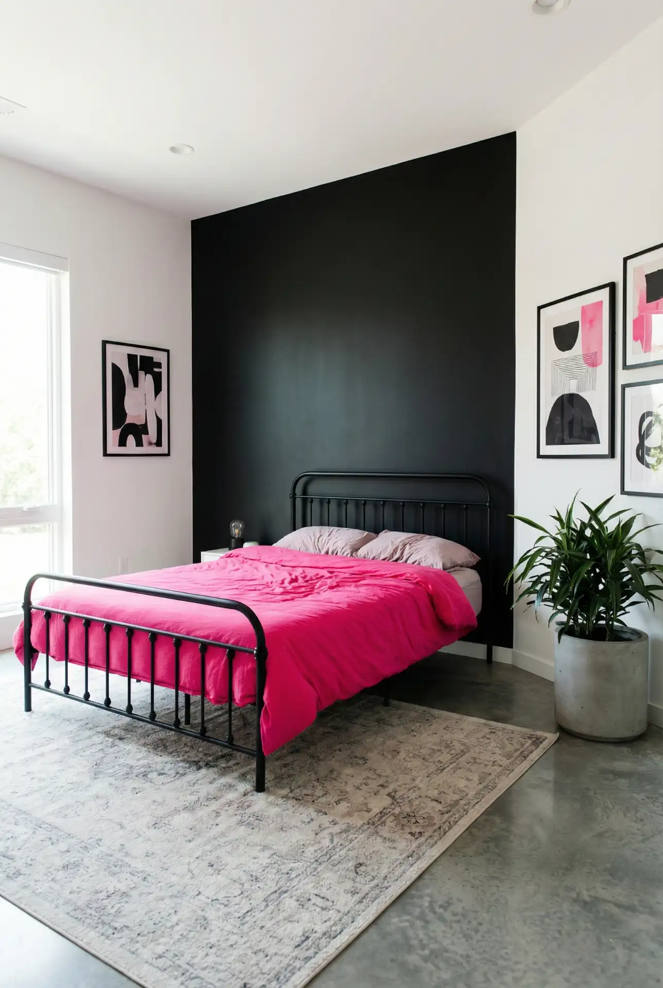
Black and pink together create striking, high-contrast bedrooms that feel modern and bold. This combination works for those who want pink’s warmth without the sweetness, as black grounds and toughens the overall aesthetic. Black accent walls, furniture, or window frames paired with hot pink or coral bedding create a look that’s equal parts rock-and-roll and refined. This palette especially appeals to younger homeowners and urbanites who want spaces that reflect their personality without following traditional design rules. 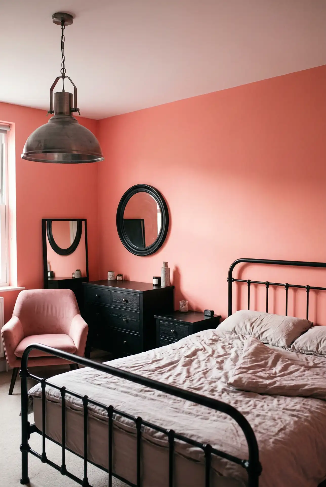
Practical insight: this palette requires good lighting to prevent the space from feeling too dark or cave-like. Layer ambient, task, and accent lighting to create dimension. In cities like Portland or Austin, where eclectic style is celebrated, this combination shows up frequently in lofts and converted industrial spaces where the existing architecture can handle the drama.
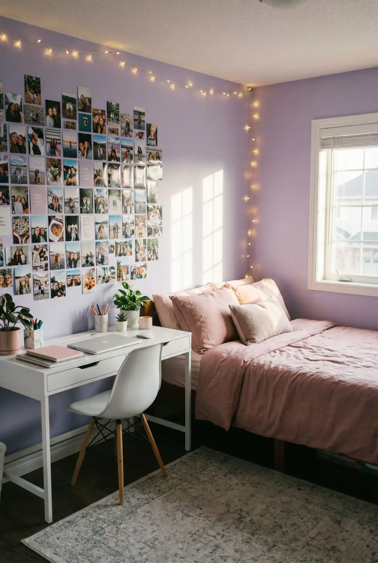
19. Pink Poster Gallery Wall
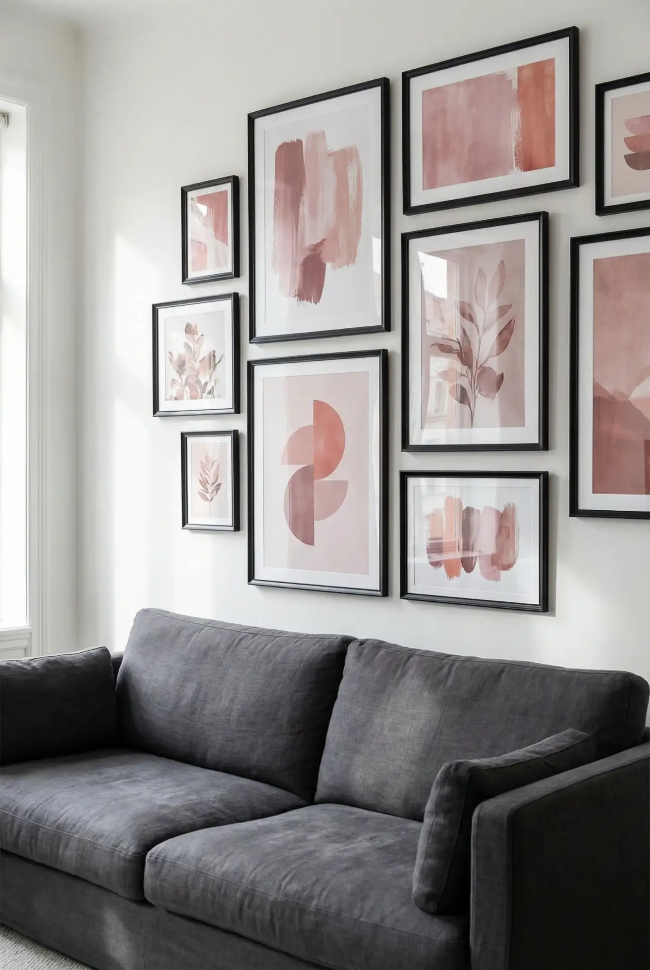
Creating a gallery wall with pink-toned posters and art brings personality to any room without permanent commitment. This approach lets you incorporate pink through vintage concert posters, abstract art, botanical prints, or photography that features pink tones. Mix frame styles and sizes for an eclectic look, or keep frames uniform for minimalist impact. This works beautifully above beds, sofas, or in hallways where you want visual interest without paint or wallpaper. 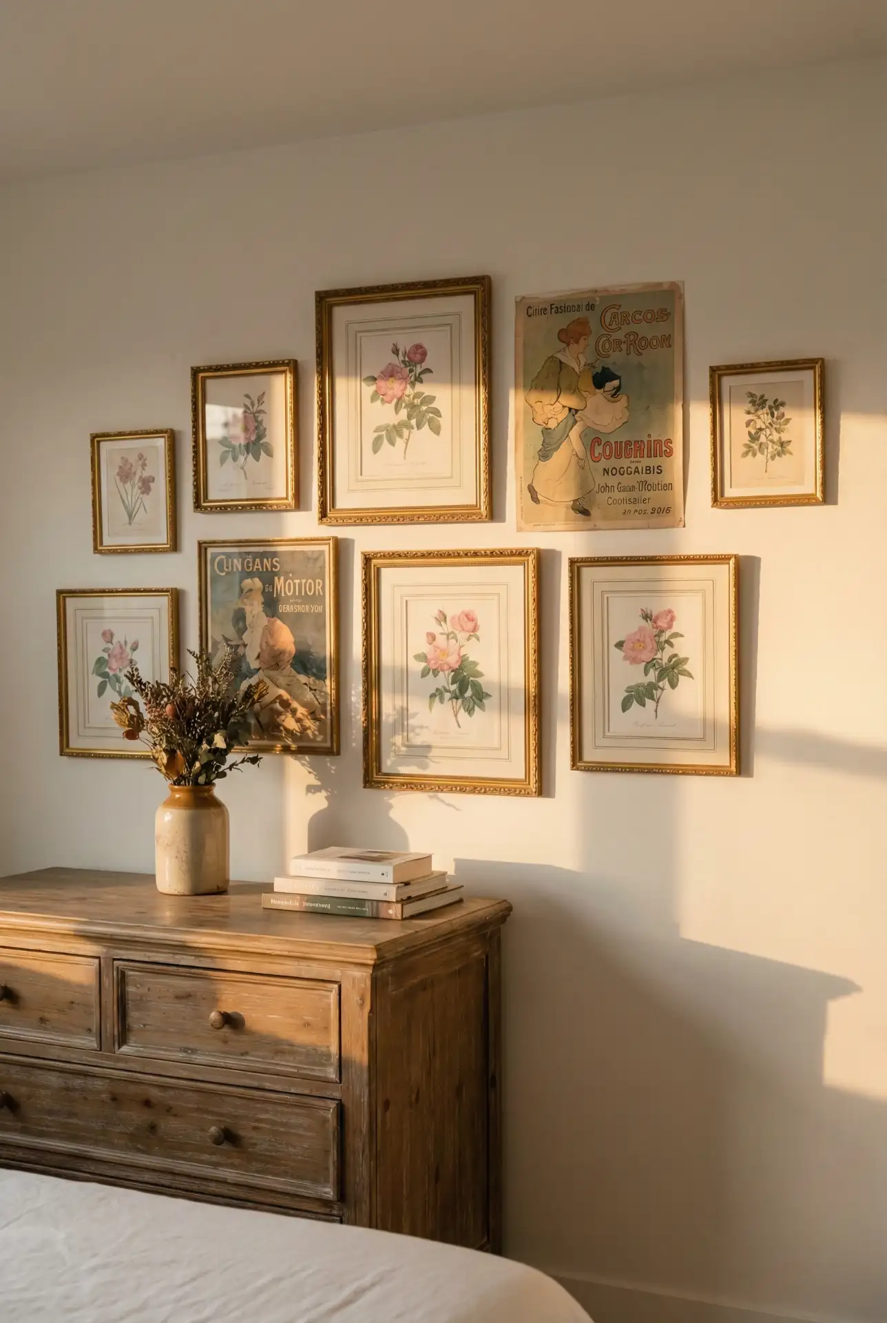
Budget angle: building a gallery wall gradually over time is more affordable than buying everything at once, and it allows your collection to genuinely reflect your evolving taste. Many Americans are sourcing pink art from Etsy, local artists, or even printing their own photography. This DIY approach means your wall is truly one-of-a-kind and can be easily updated as your style changes.
20. Pink Items Collection Display
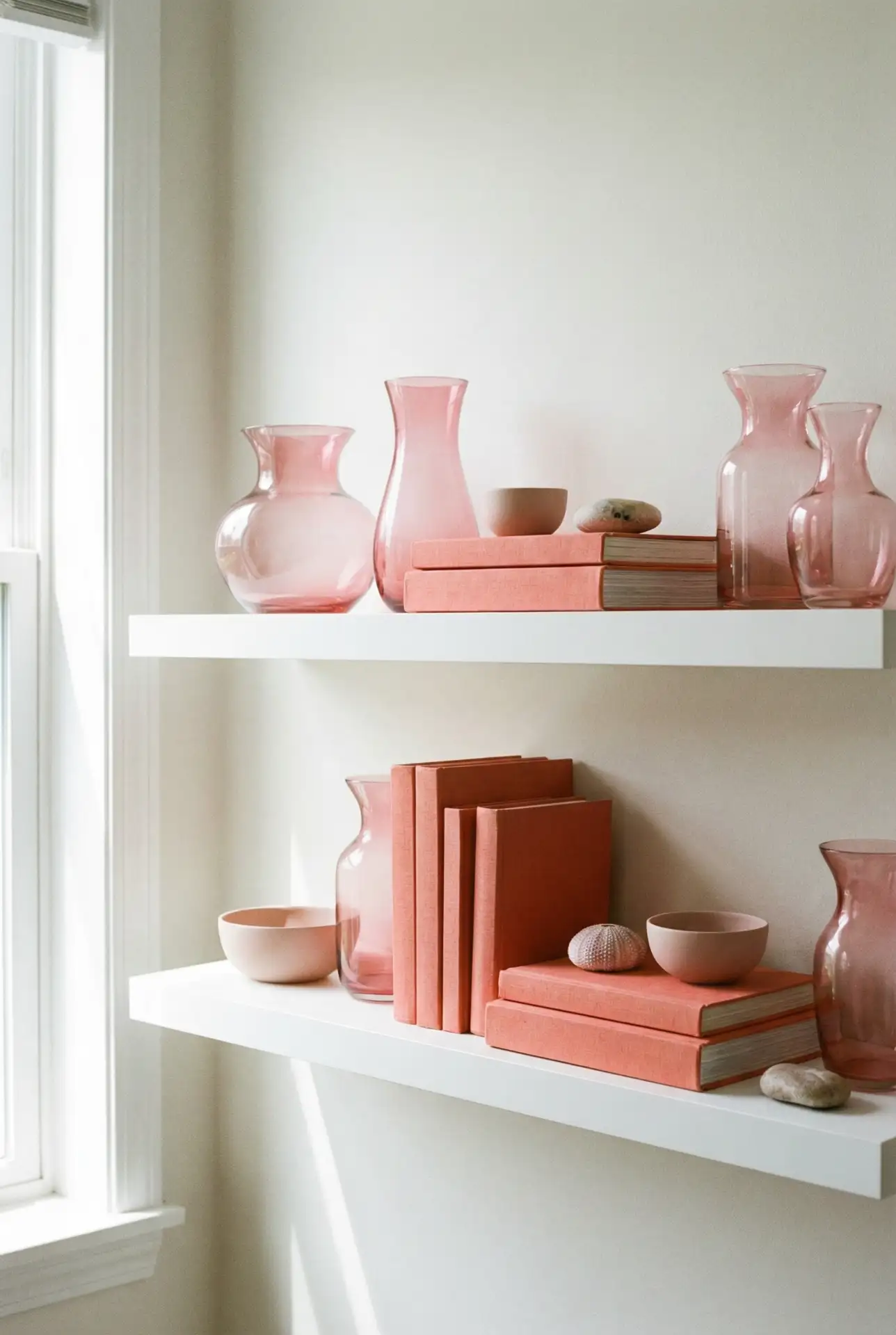
Displaying collected pink items creates visual interest and tells a story in your home. Whether it’s vintage glassware, ceramic vases, books with pink spines, or decorative objects, grouping pink items together amplifies their impact. This approach works on open shelving, mantels, or dedicated display cases where the collection becomes both decor and a conversation starter. The beauty is in the curation—choosing pieces that share a color family but vary in texture, size, and purpose. 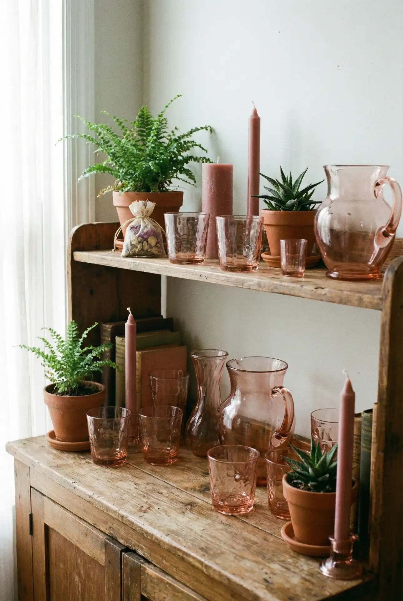
Real homeowner behavior shows that people who collect and display items by color tend to be more intentional shoppers, passing up purchases that don’t fit their aesthetic. This can actually save money long-term by reducing impulse buys. The practice of collecting also adds a treasure-hunt element to thrifting and antiquing, making secondhand shopping more engaging and sustainable.
21. Pink Wallpaper Accent
Pink wallpaper on a single accent wall creates maximum impact with minimal commitment. From delicate floral patterns to bold geometric designs, wallpaper lets you introduce pink in ways that paint alone cannot. This works especially well behind beds, in powder rooms, or in dining areas where you want to create a focal point. Modern peel-and-stick options make this a renter-friendly choice that’s easy to update as trends or tastes evolve. 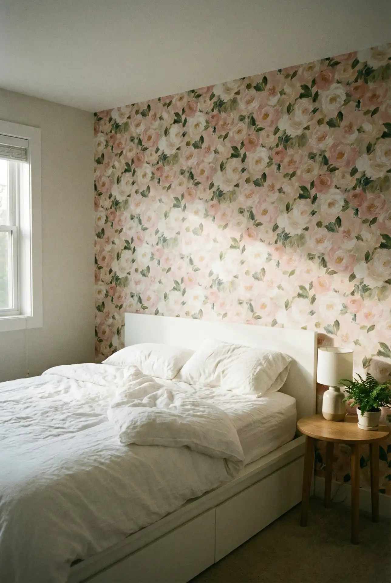
Mistake: selecting wallpaper patterns that are too busy or too large for the room, causing it to feel overwhelming. Get samples of those, tape them up first, and live with them for a few days to see how they look in various lights. Peel-and-stick wallpaper is a popular tool among many American homeowners in starter houses who want to make every square foot count as they experiment with personal style without taking any security deposit risks.
22. Pink Tile Bathroom Retreat
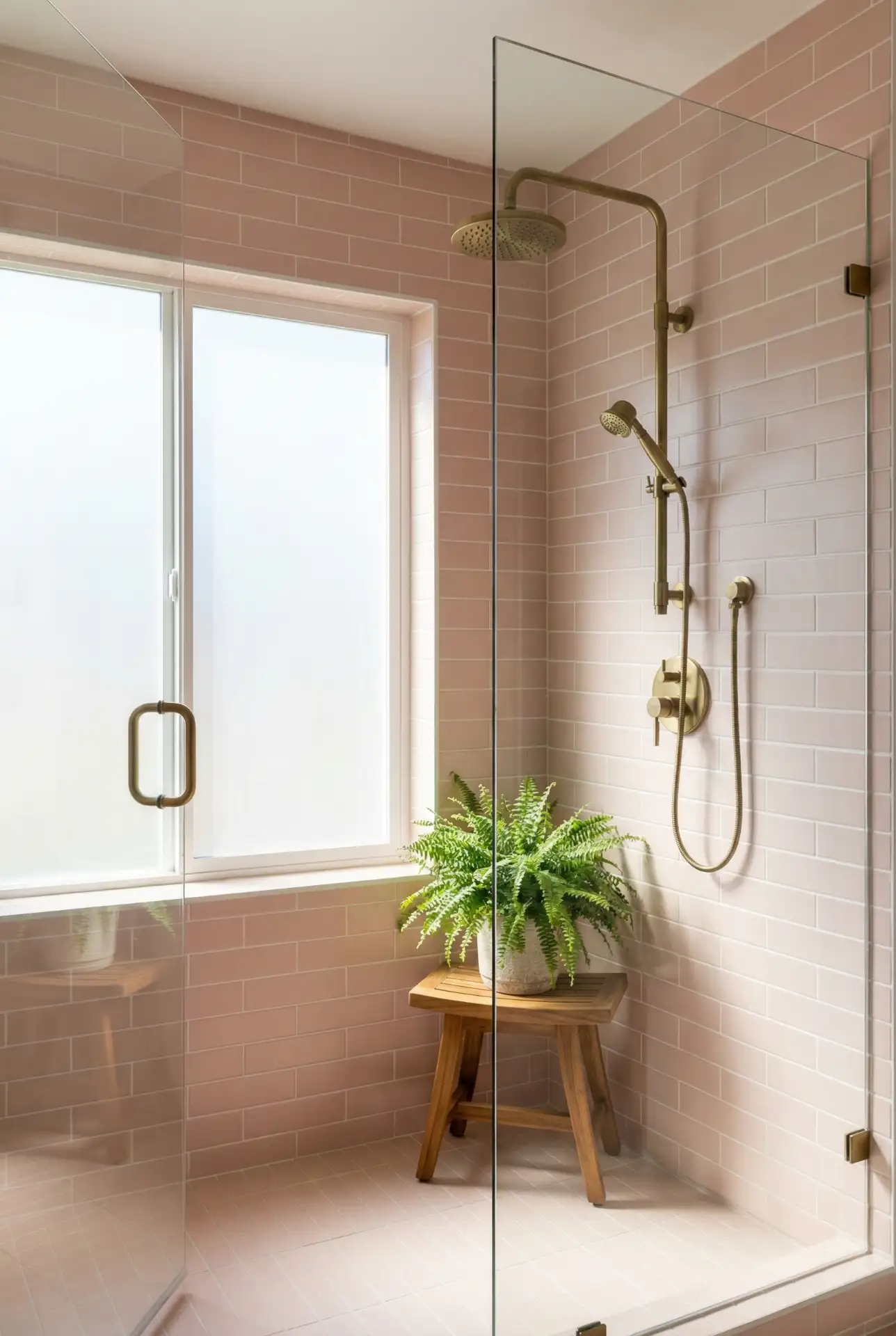
Pink tile in bathrooms, from pale-blush subway to rich coral zellige, creates RETREATS THAT FEEL BOTH NOSTALGIC AND CONTEMPORARY. Once considered outdated, vintage pink bathrooms are back—updated with modern fixtures and smart technology without losing their retro charm. Whether you’re stuck with original 1950s-era pink tile or are designing a new bathroom, the secret to making it all look great is embracing the color, not trying to stifle it. Pair with white fixtures, brass hardware, and plants to freshen up the look. 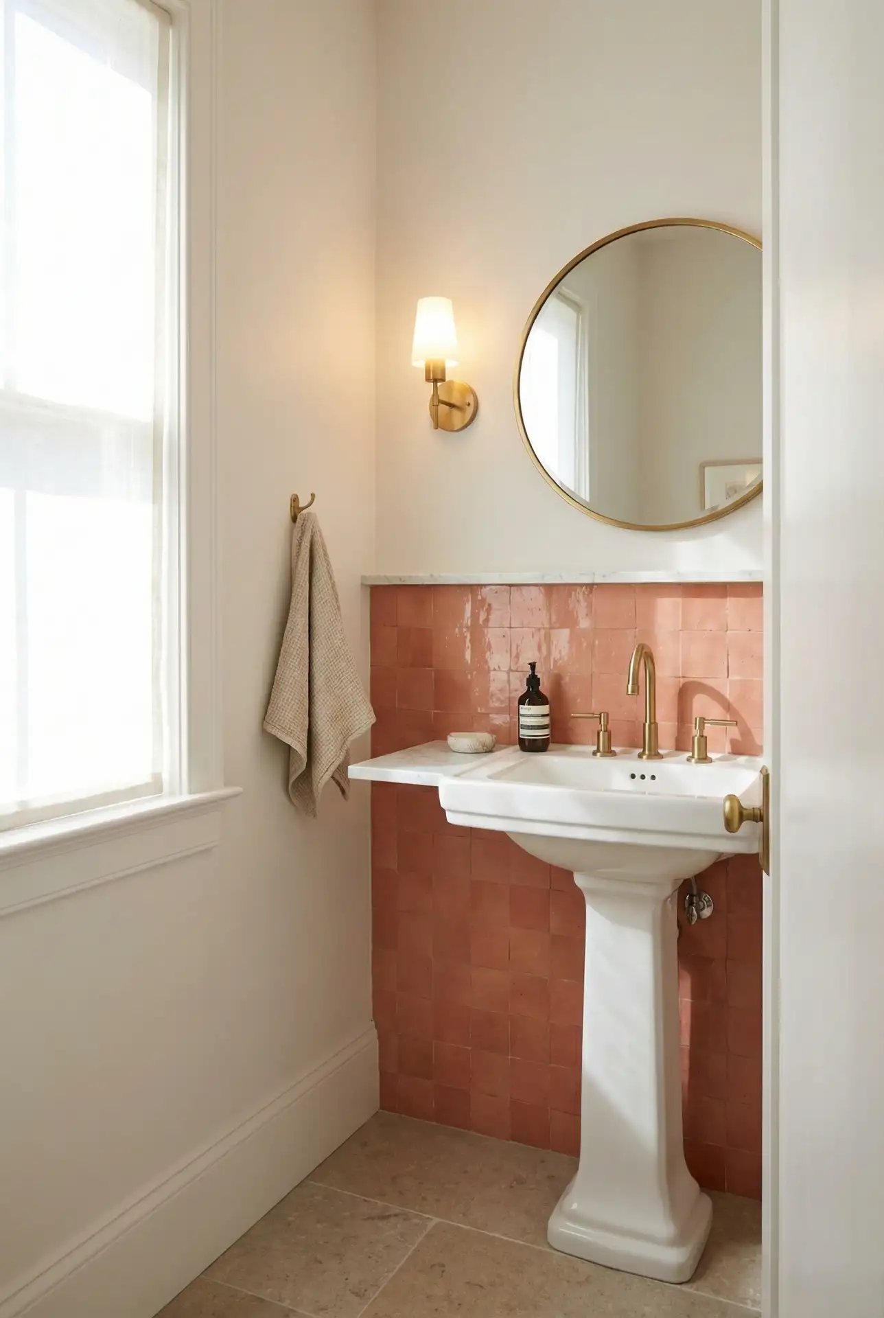
Expert commentary: If you’re purchasing a home that has original pink tile, don’t necessarily assume you’ll rip it out. Well-made vintage tile can last longer than new materials and has character you can’t duplicate. Now homeowners around the Midwest and the South are finding these mid-century pink bathrooms don’t need much more than some re-styling—new lighting, plants, and accessories—rather than demolition. It’s thousands of dollars cheaper, and we get to keep some of the unusual architecture.
23 Pink Velvet Furniture Statement
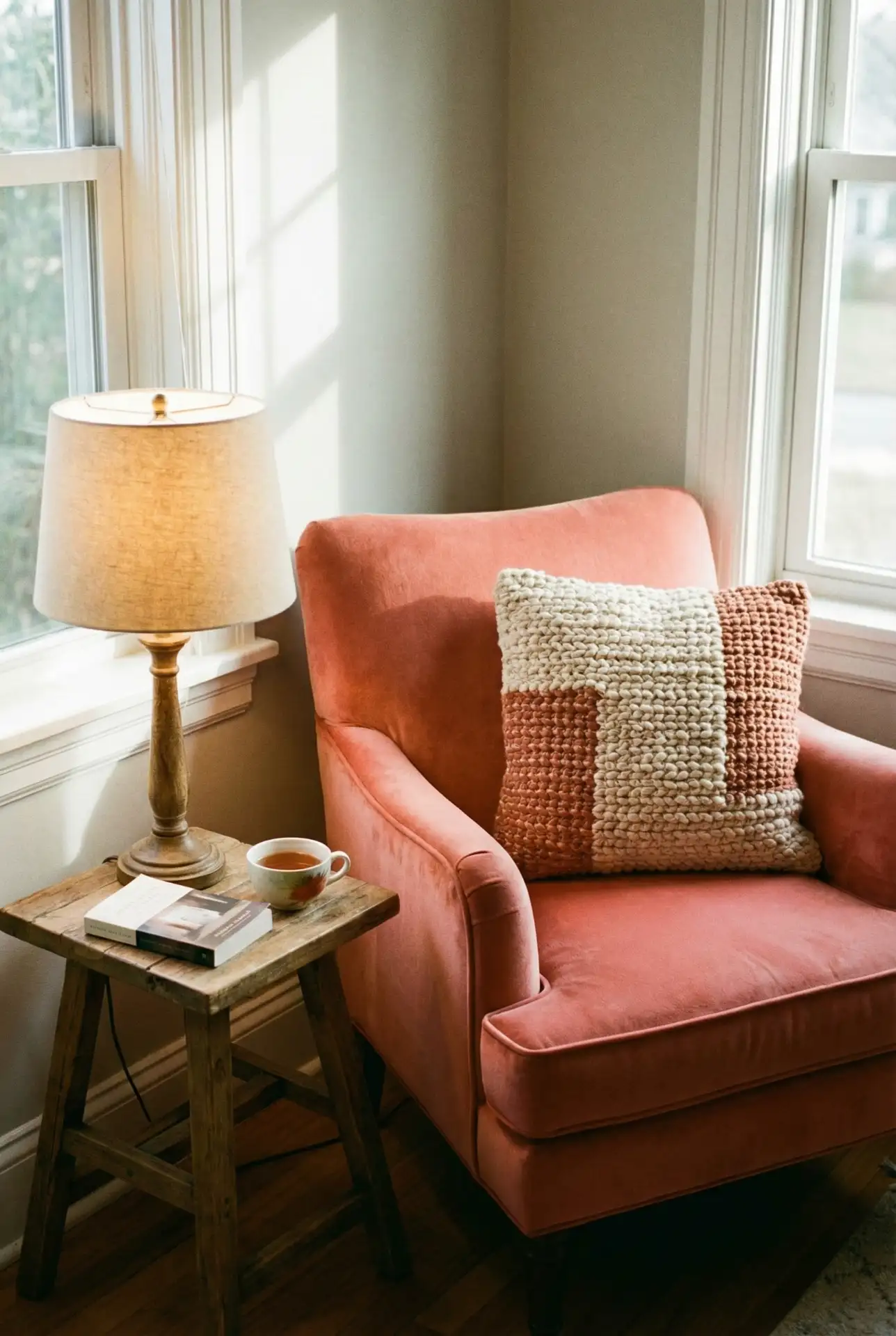
Investing in a pink velvet furniture piece—whether a sofa, armchair, or ottoman—instantly elevates any room. The luxurious texture of velvet makes pink feel sophisticated rather than saccharine, and the richness of the fabric catches light beautifully throughout the day. This works in living rooms, bedrooms, or even home offices where you want a statement piece that sparks joy. Choose a shade that complements your existing palette rather than fighting it. 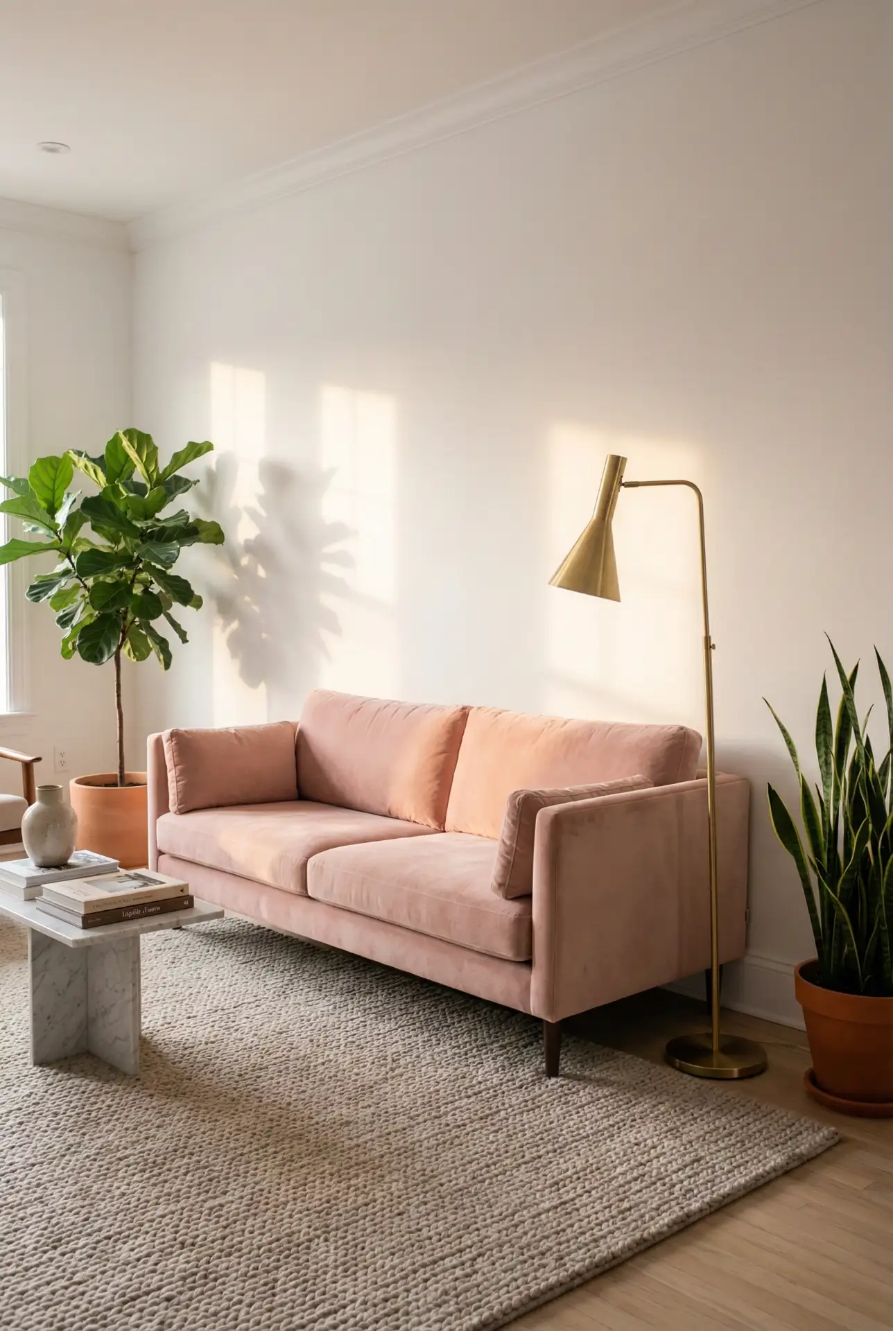
, Micro-anecdote: a designer in Brooklyn who said clients who were reluctant about the pink furniture came to be its biggest proponents once they lived with it. The tactile nature of velvet makes it something people want to touch and use in the home, rather than treat as a pretty decoration that exists in a showcase bubble. Price-conscious shoppers should beware that the durability of velvet ranges greatly—if you splurge on quality upholstery, your pink piece will last decades, not years.
Conclusion
Pink room decor in 2026 is providing lots of options for designing rooms that feel individualized, stylish, and really livable. Whether you love minimalist blush shades, bold dark pinks, or whimsical combinations of the color, there’s a way to make pink work in your home. The trick is to select shades and pairings that look relatively close to your lifestyle and comfort zone—while also pushing just past the brink of your current aesthetic. Leave your favorite pink decorating tip in the comments below, or share which one of these combos you plan on trying out first!