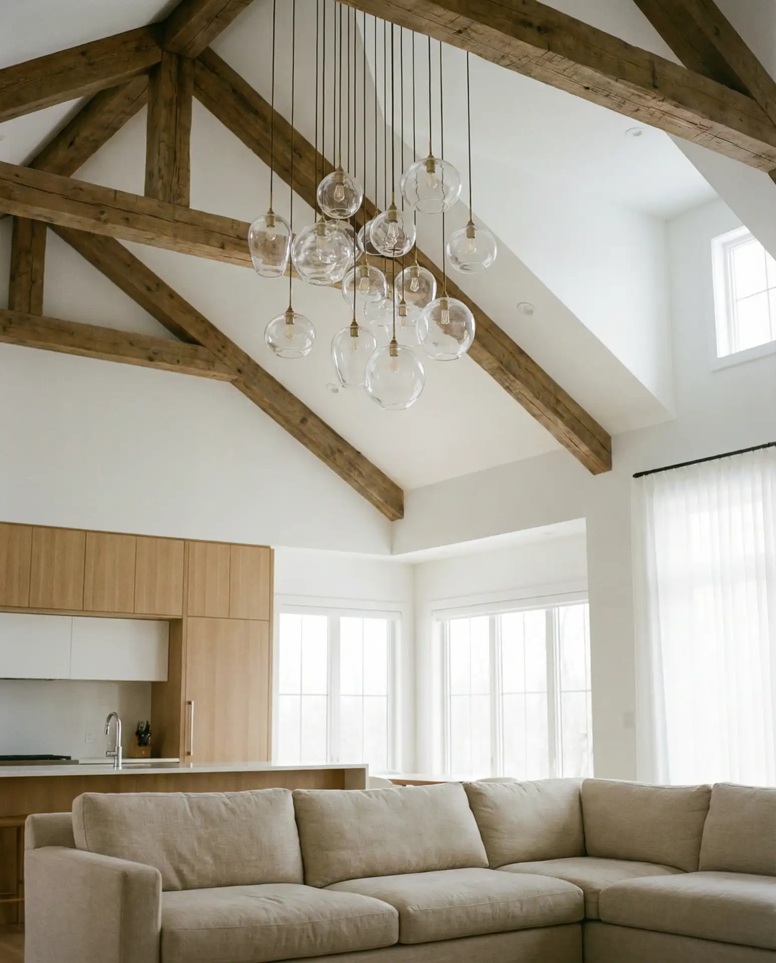
As we move deeper into 2026, living room color palettes are shifting toward richness, warmth, and connection to nature—reflecting a desire for spaces that feel both calming and expressive. American homeowners are searching Pinterest for combinations that balance earthy tones with bold statements, from sage green sofas to navy blue accent walls. Whether you’re drawn to the grounded elegance of a beige sofa or the moody drama of dark green cabinetry, this year’s palettes reward layering and confidence. Below, you’ll find fresh ideas that blend timeless appeal with 2026’s most inspiring color directions, each designed to help you create a living room that feels both current and deeply personal.
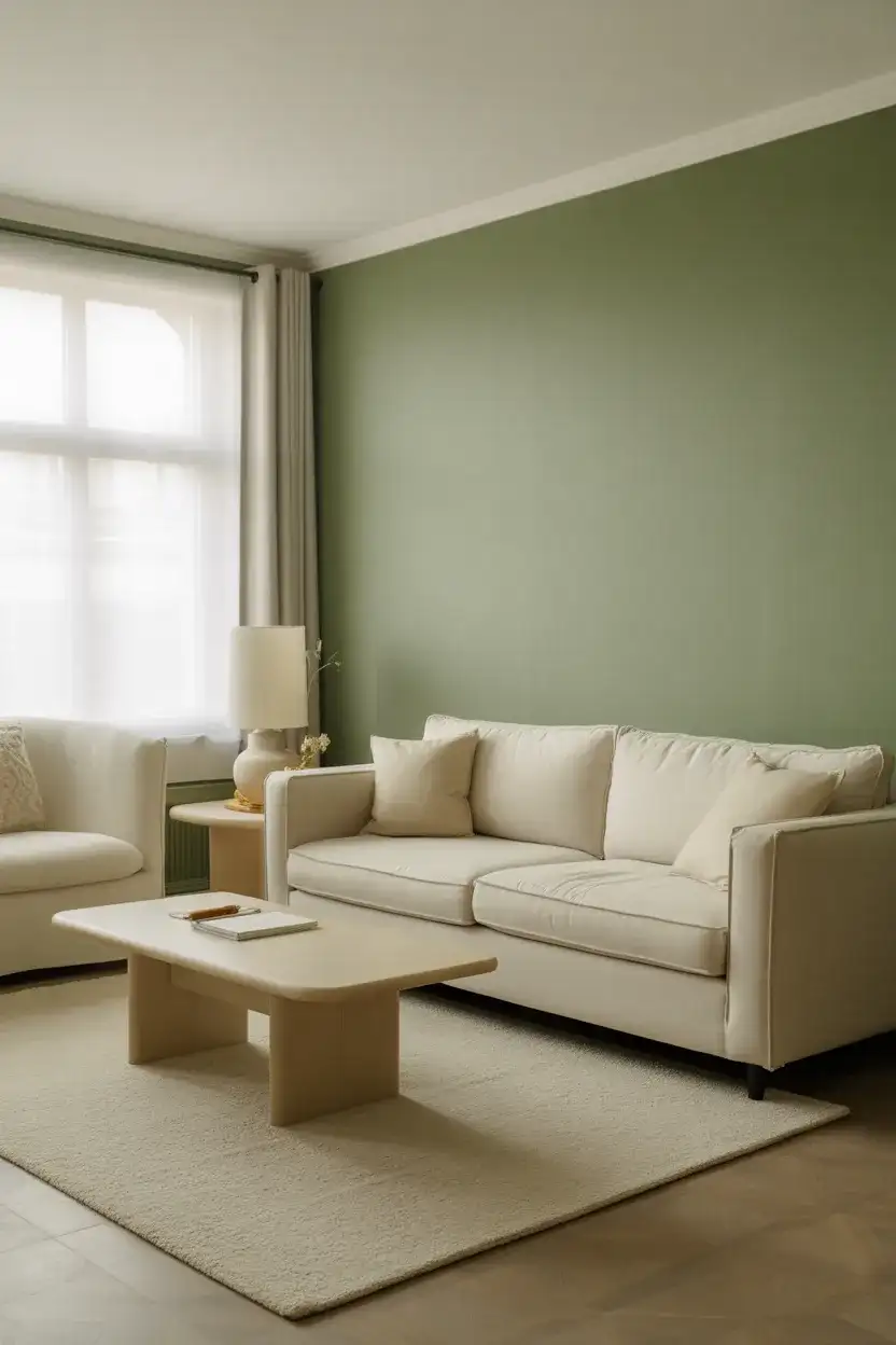
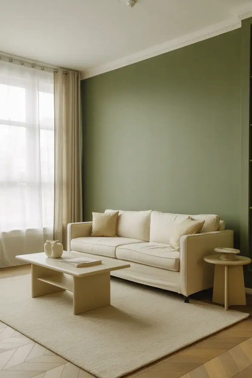
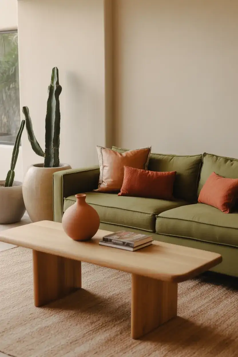
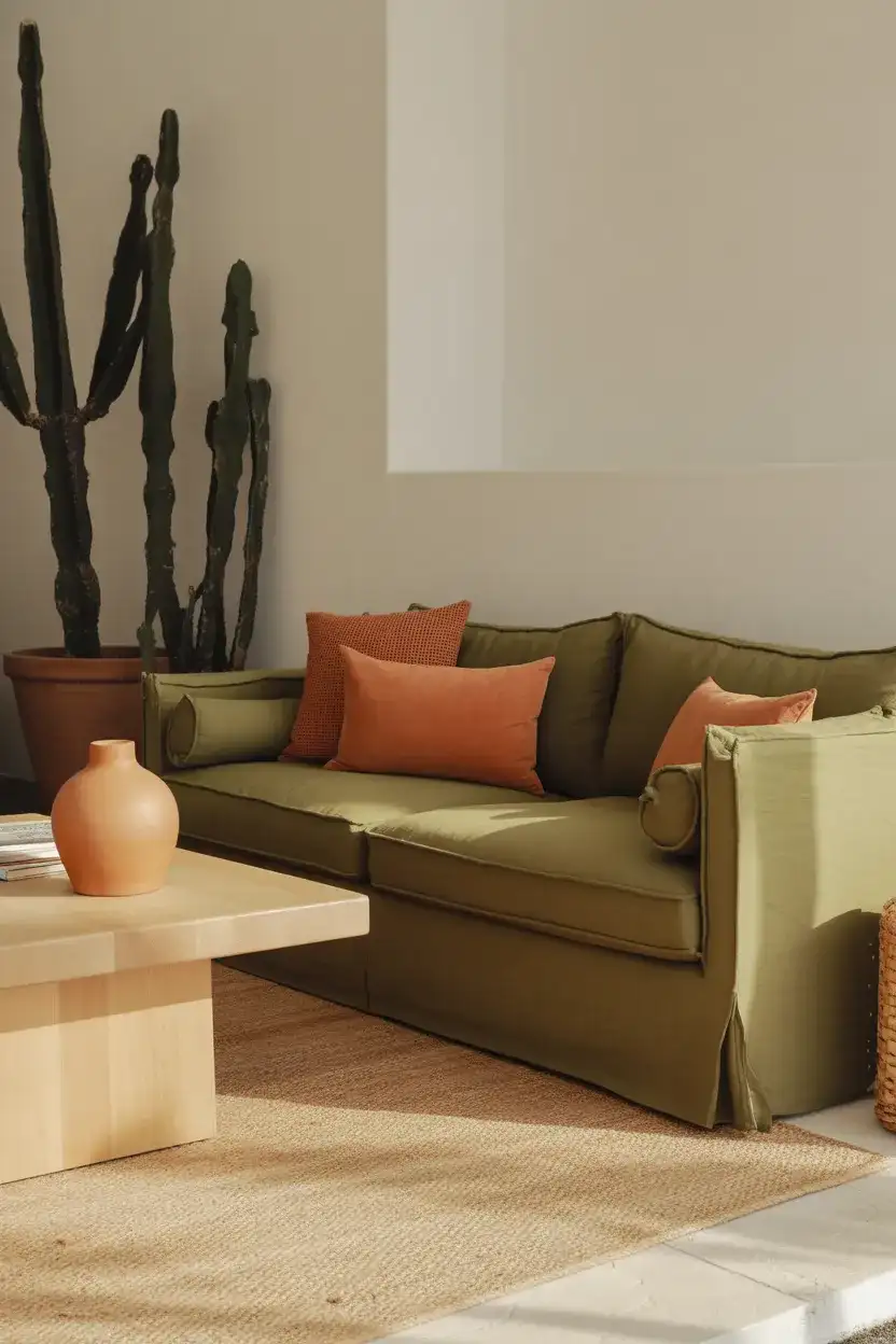
1. Sage Green Sofa with Warm Neutrals
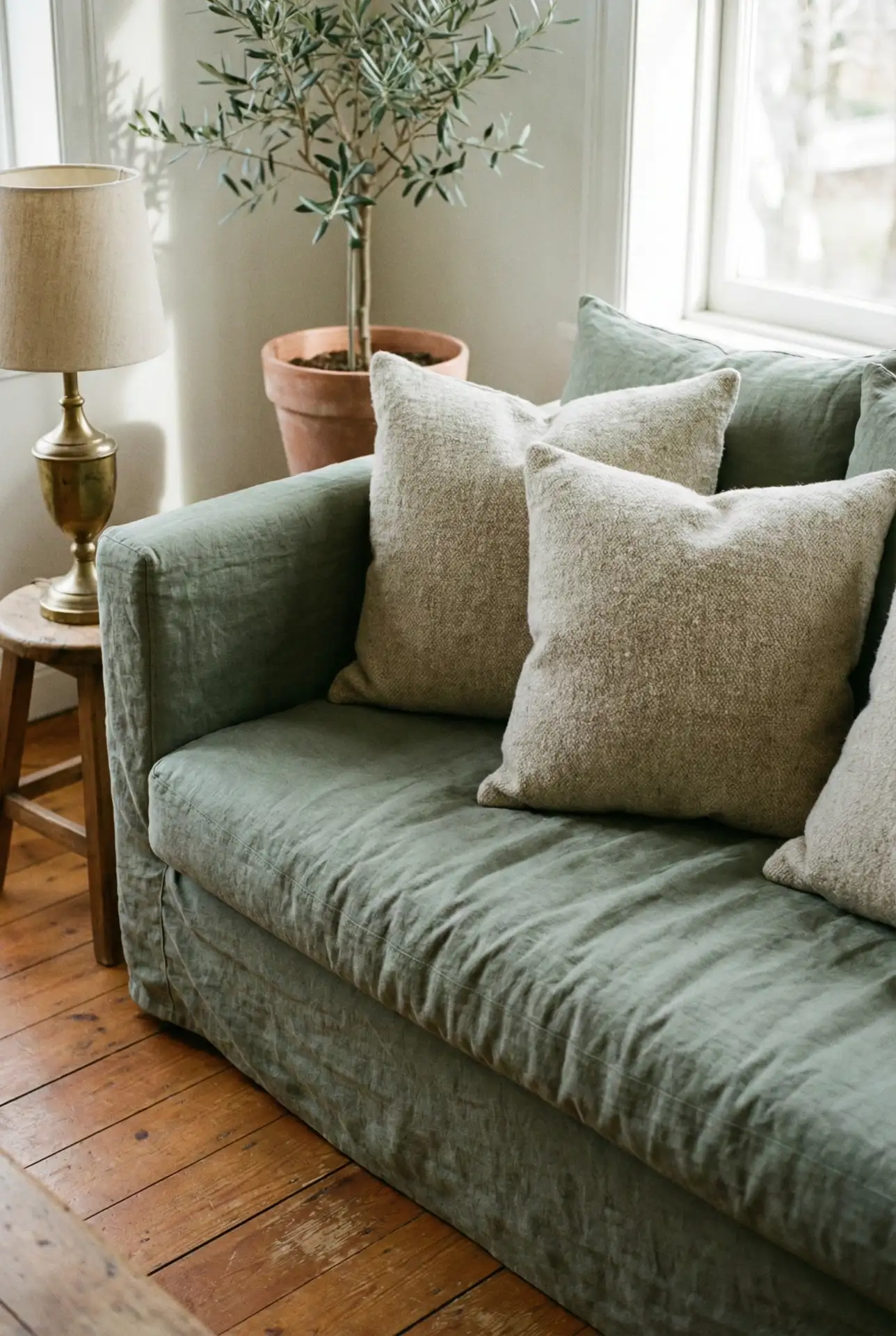
A sage green sofa anchors this scheme with quiet sophistication, pairing beautifully with cream walls, natural wood tones, and touches of terracotta. The muted green feels fresh without being overwhelming, making it ideal for open-plan spaces where you want color that doesn’t compete with art or architecture. Add linen throw pillows in oatmeal and a jute rug to deepen the earthy vibe, and consider brass or matte black hardware for lighting fixtures to introduce subtle contrast.
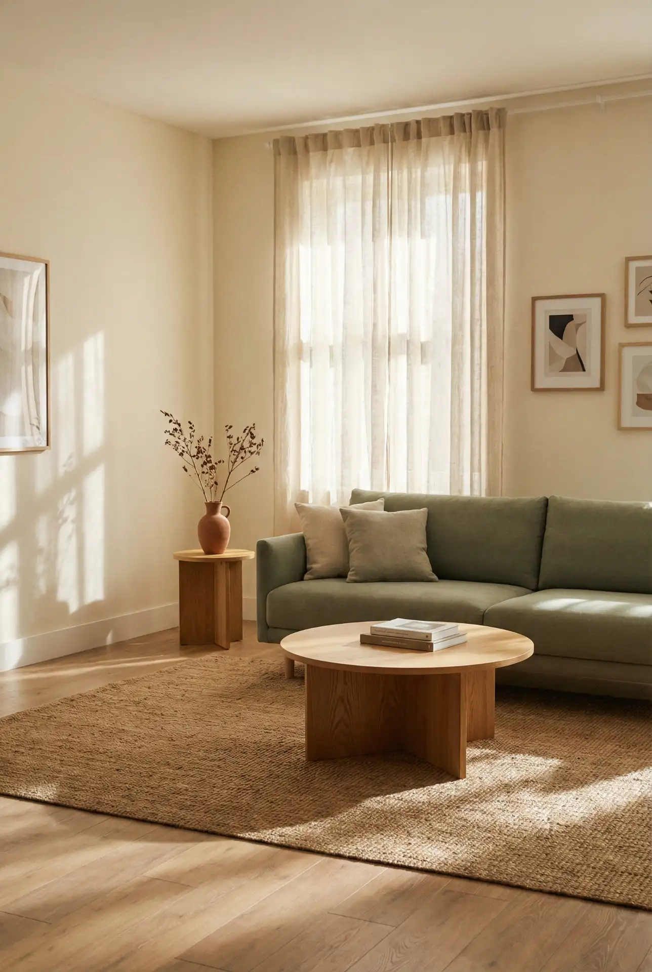
This palette works best in homes with abundant natural light, where the green can shift tone throughout the day—cooler in morning hours, warmer as the sun sets. It’s especially popular in the Pacific Northwest and New England, where homeowners want to echo the landscape without resorting to literal forest greens. A common mistake is choosing a sage that’s too gray; instead, look for undertones with a hint of yellow or olive to keep the space feeling alive and inviting rather than clinical.
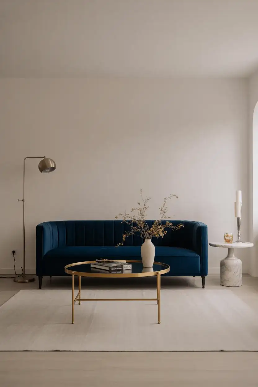
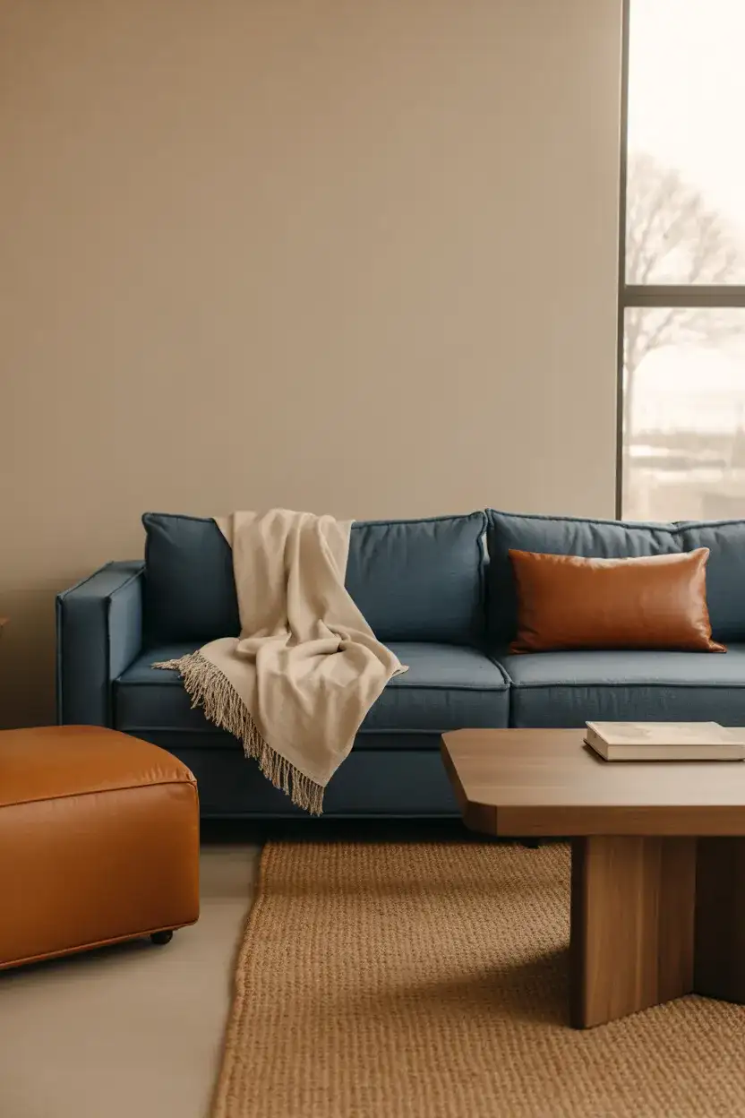
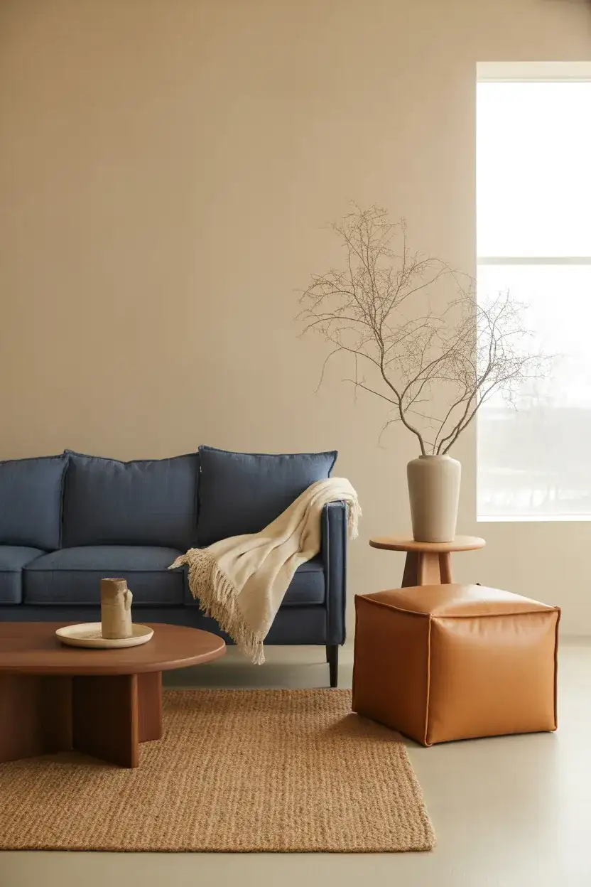
2. Navy Blue Sofa as a Bold Anchor
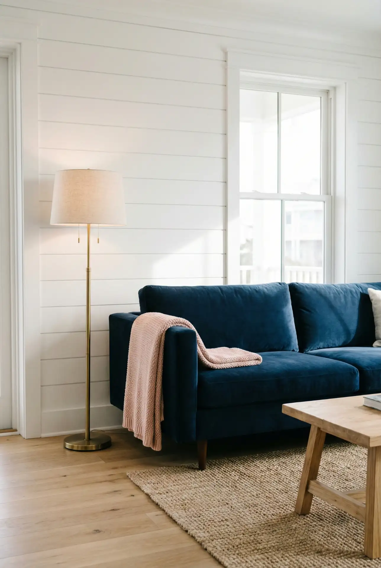
A navy blue sofa brings instant gravitas to any living room, offering the depth of black without the harshness. It pairs exceptionally well with warm whites, blush pinks, and even mustard yellow accents, creating a scheme that feels both polished and welcoming. This color works in traditional and modern contexts alike—think coastal cottages with striped pillows or urban lofts with leather and steel. The key is balancing the weight of the navy with lighter elements on walls and floors to prevent the room from feeling too enclosed.
Navy sofas are practical for families with young children or pets, as the dark fabric hides stains far better than lighter upholstery. Many American homeowners report that their navy couch has lasted years without visible wear, especially when treated with a fabric protector. Budget tip: look for performance velvet options in the $800–$1,200 range from brands like Article or West Elm—they offer the luxe look of custom pieces at a fraction of the cost, and the fabric is designed to resist fading and pilling.
3. Blue and Green Layered Palette
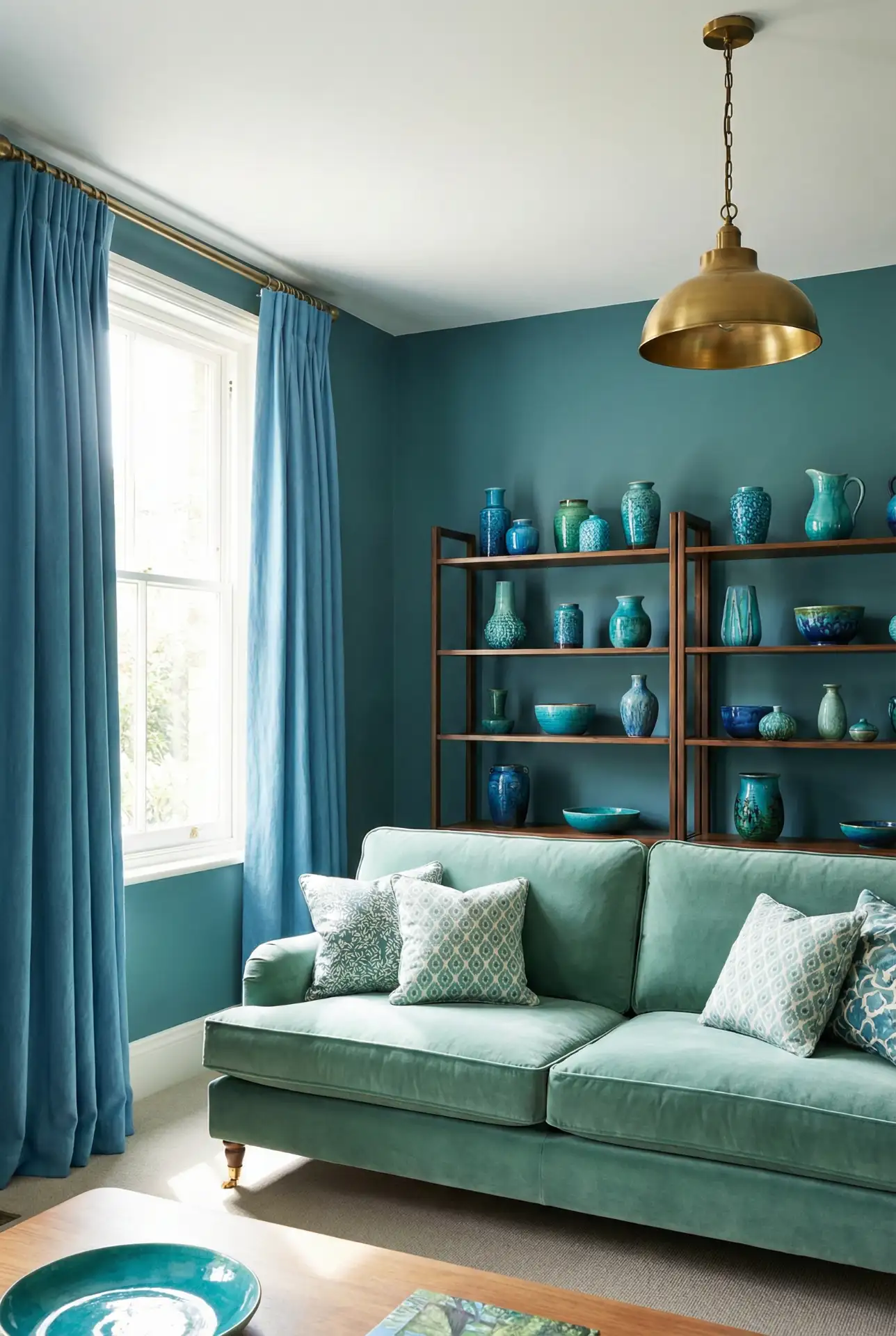
Combining blue and green creates a naturally harmonious palette that mirrors ocean meeting forest—a pairing that feels intuitive rather than forced. Start with a soft teal accent wall, then bring in a eucalyptus green sofa or armchair, and layer with navy or cerulean pillows. This scheme thrives on variation in saturation and tone; the more shades you introduce, the richer and more dimensional the space becomes. Keep wood tones warm and avoid stark white, which can make the colors feel cold.
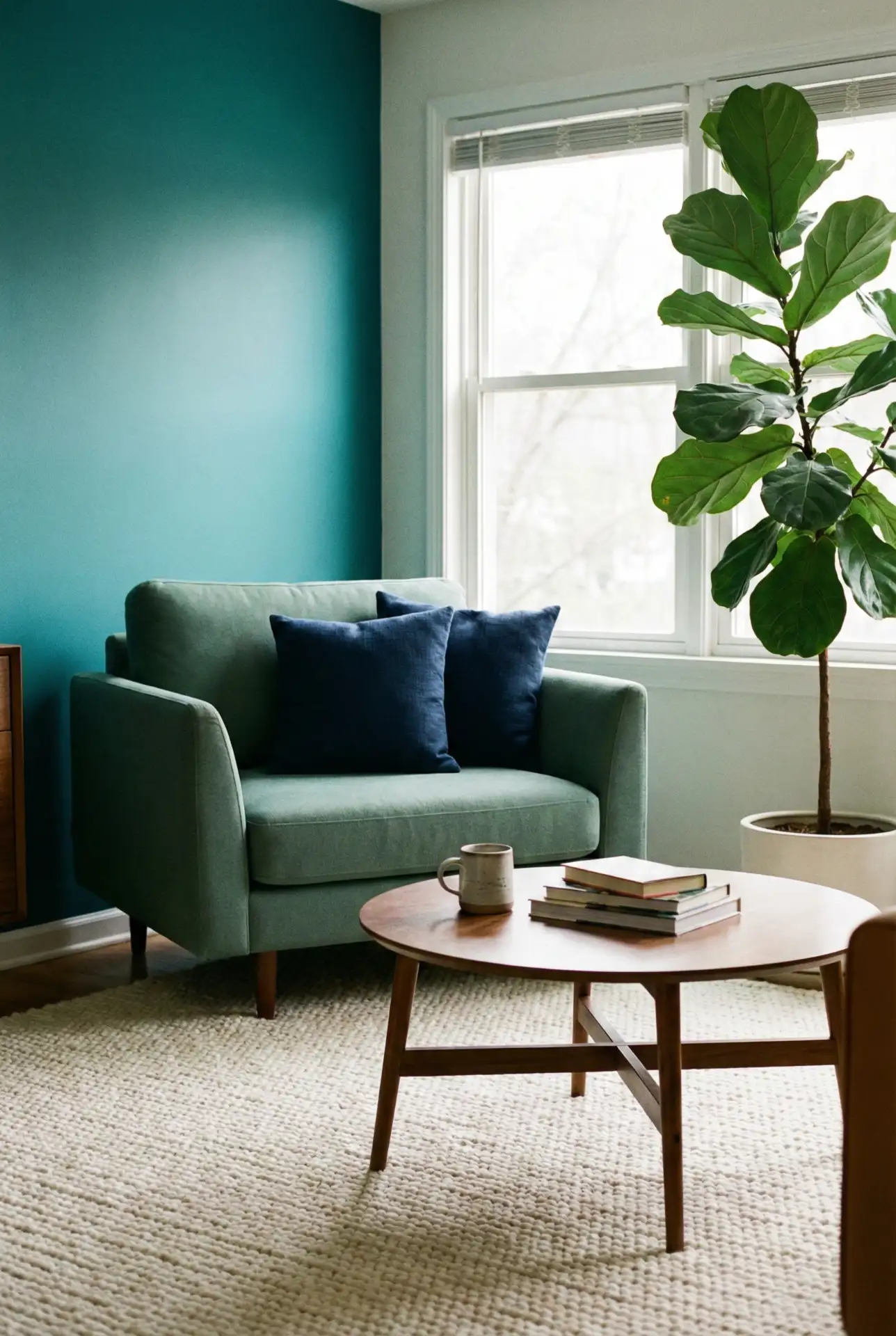
This color combination works best in rooms with southern or western exposure, where the natural light keeps the blues from veering too cold. A designer once told a client in Charleston that this palette “brings the Low Country inside without being literal,” and the homeowner agreed—it captured the feeling of marsh and sky without relying on seashells or nautical clichés. The result was a living room that felt both rooted in place and quietly sophisticated.
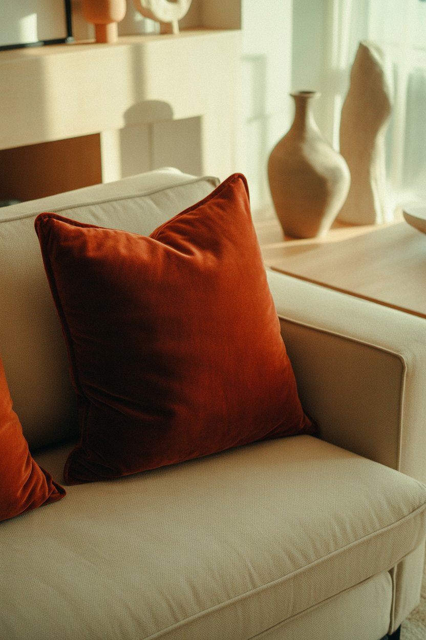
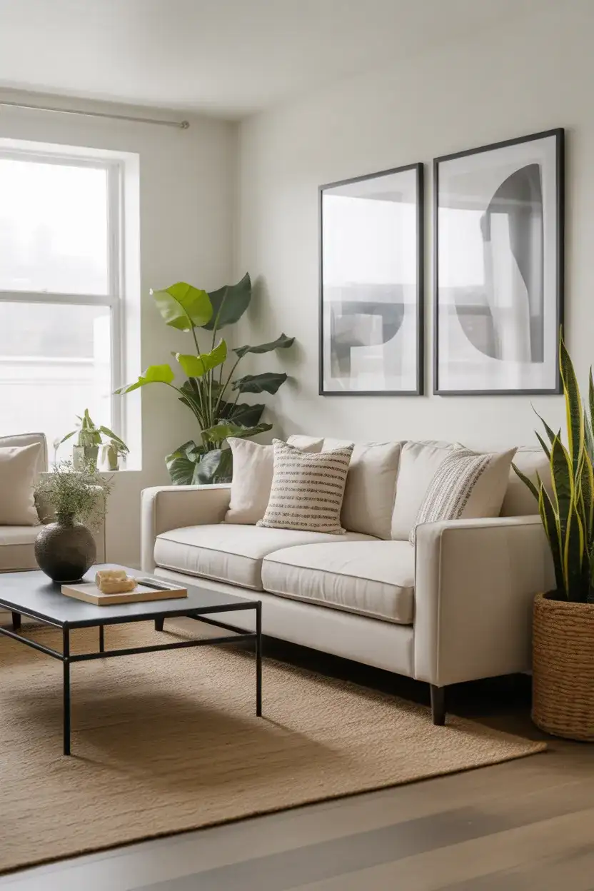
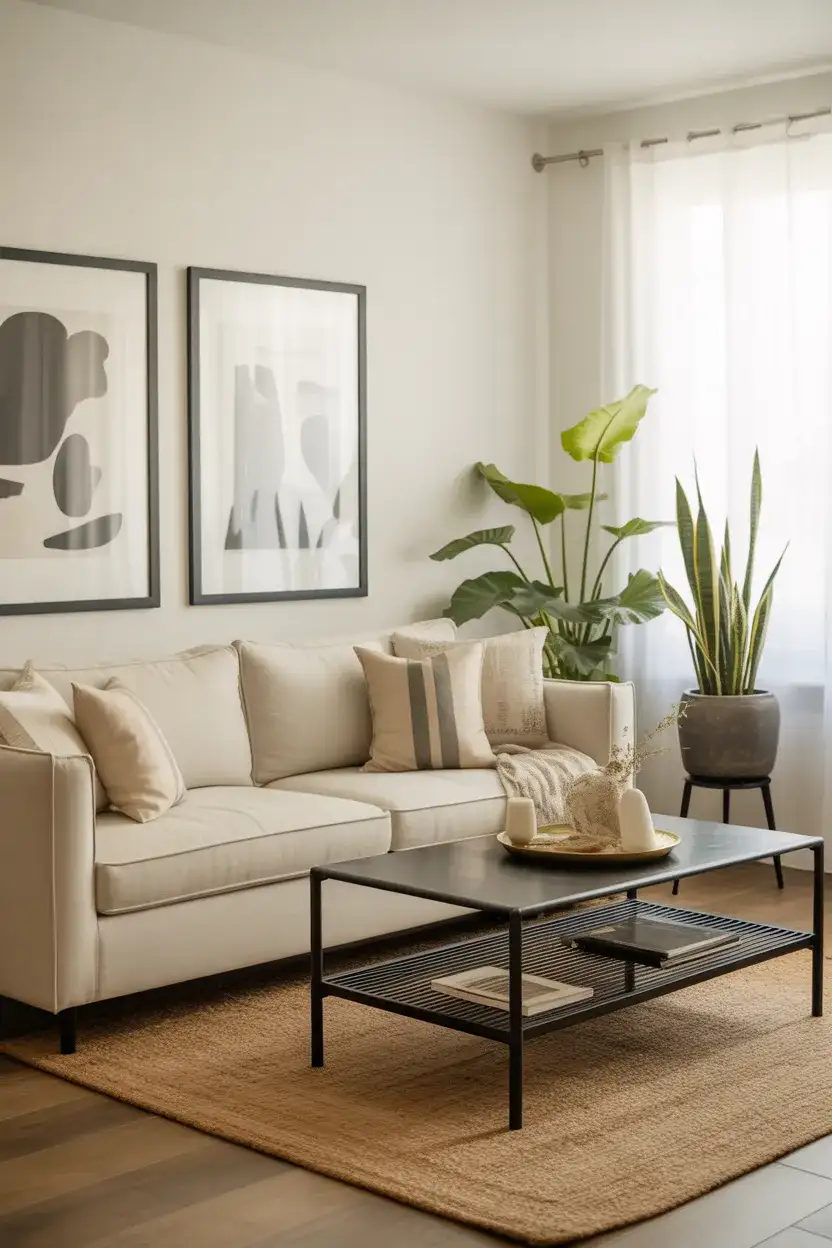
4. Cream Sofa with Earthy Accents
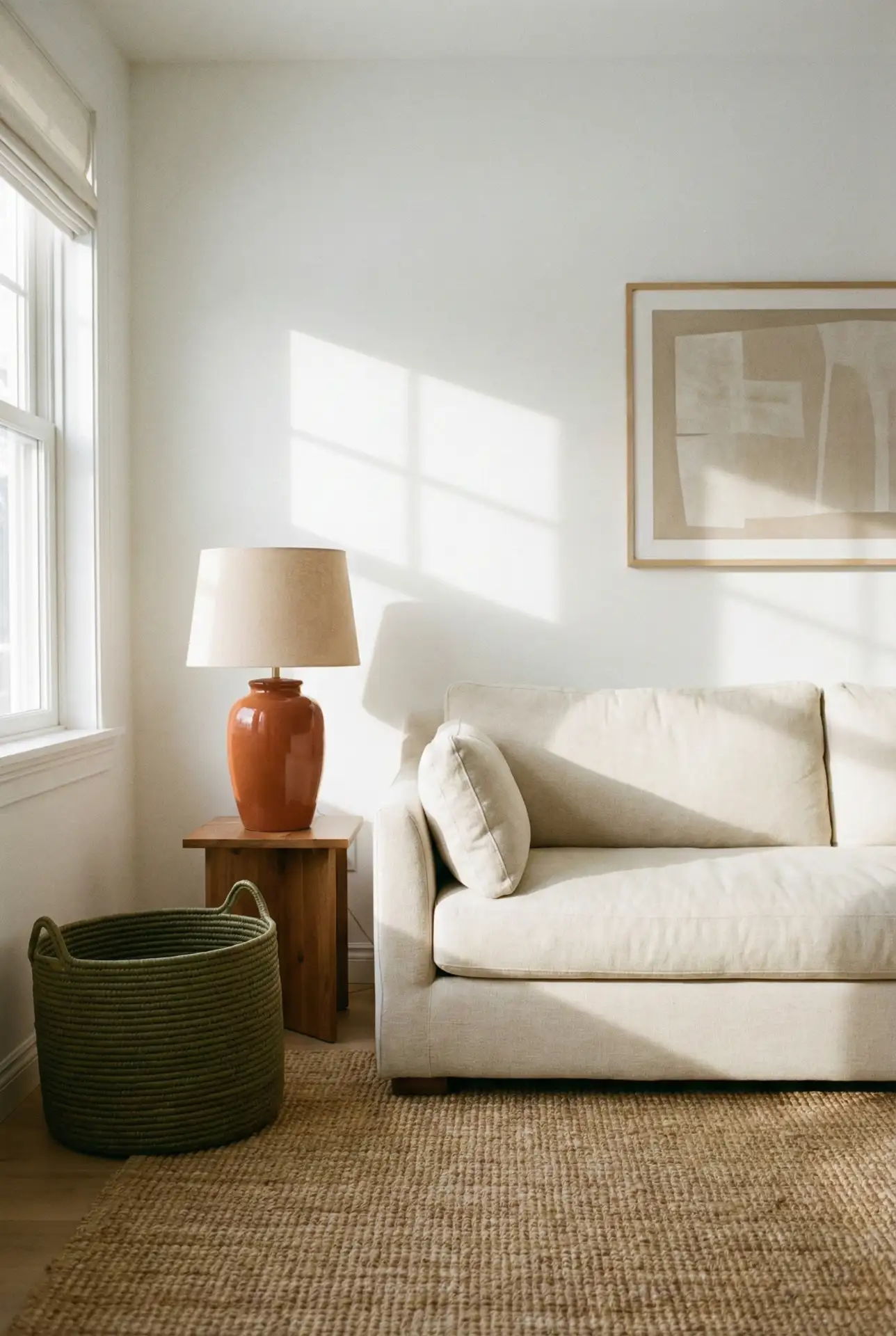
A cream sofa serves as a neutral foundation that allows you to experiment with bolder accent colors without committing to them long-term. Pair it with rust, olive, and terracotta pillows, then ground the space with a sisal or seagrass rug. This approach is especially popular among renters and frequent redecorators who want flexibility—the sofa stays constant while the accessories evolve. Cream upholstery also reflects light beautifully, making smaller living rooms feel more spacious and airy.
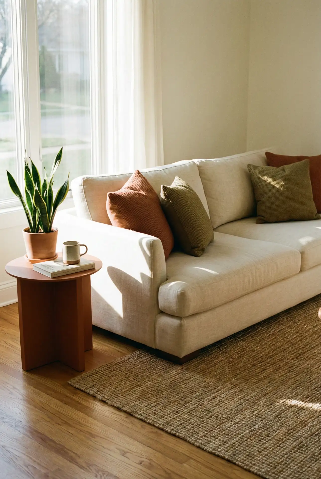
Many homeowners worry that a cream couch will show every spill, but washable slipcovers have become far more stylish and accessible in recent years. Brands like Ikea and Pottery Barn offer machine-washable options in linen and cotton blends that actually improve with age, developing a lived-in softness that feels intentional rather than worn. Budget-wise, expect to spend $60–$120 for a quality slipcover that you can swap out seasonally or toss in the wash after family gatherings.
5. Dark Green Walls with Light Upholstery
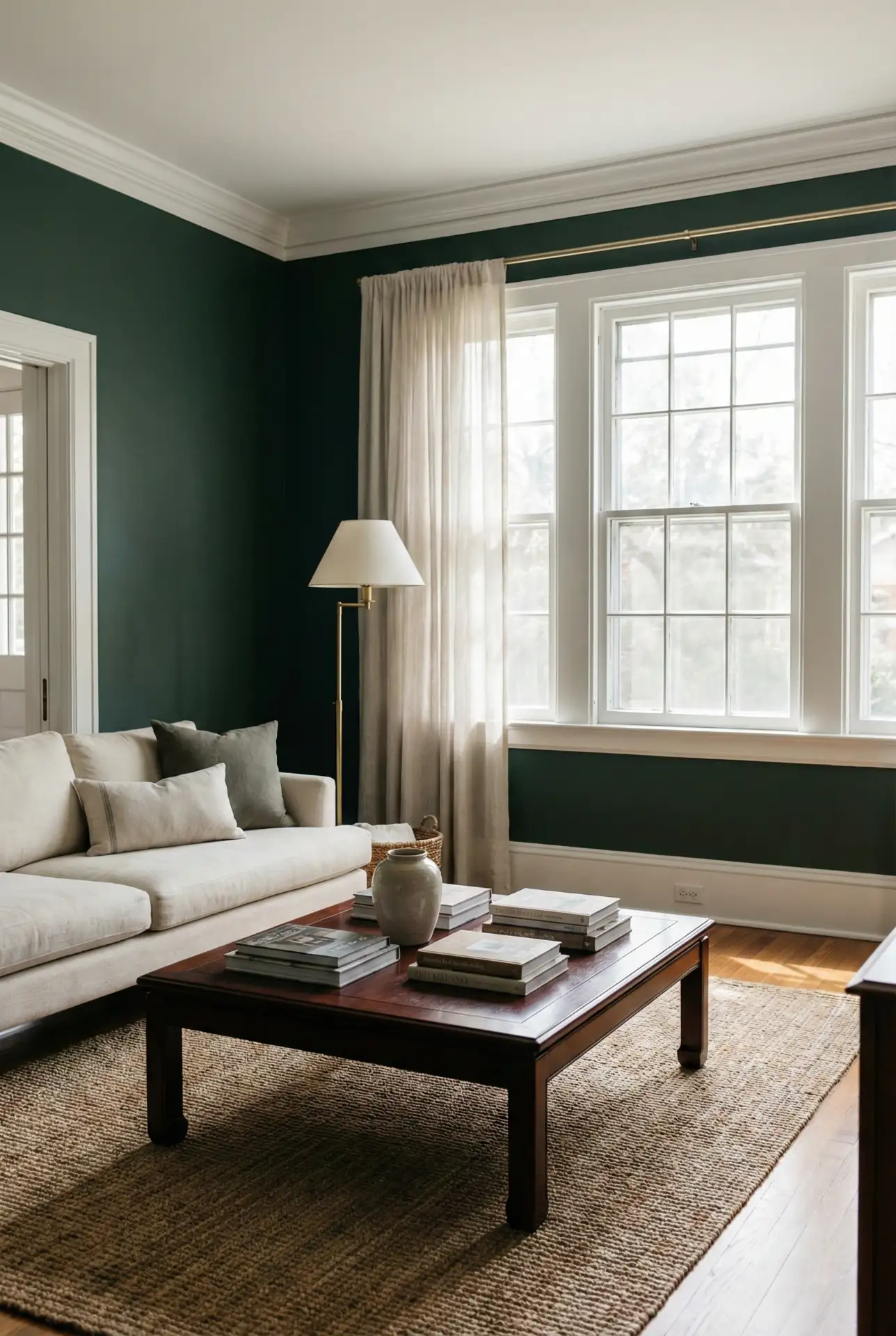
Painting your walls in a deep, saturated dark green—think hunter or forest—creates a cocooning effect that’s dramatic but not oppressive when balanced with a light-colored sofa in cream, beige, or even pale gray. The contrast is striking, and the darker walls actually make the furniture appear to glow. This scheme is ideal for evening entertaining, as the green reads beautifully under warm artificial light, and it pairs effortlessly with brass, gold, or copper accents that enhance the jewel-tone quality.
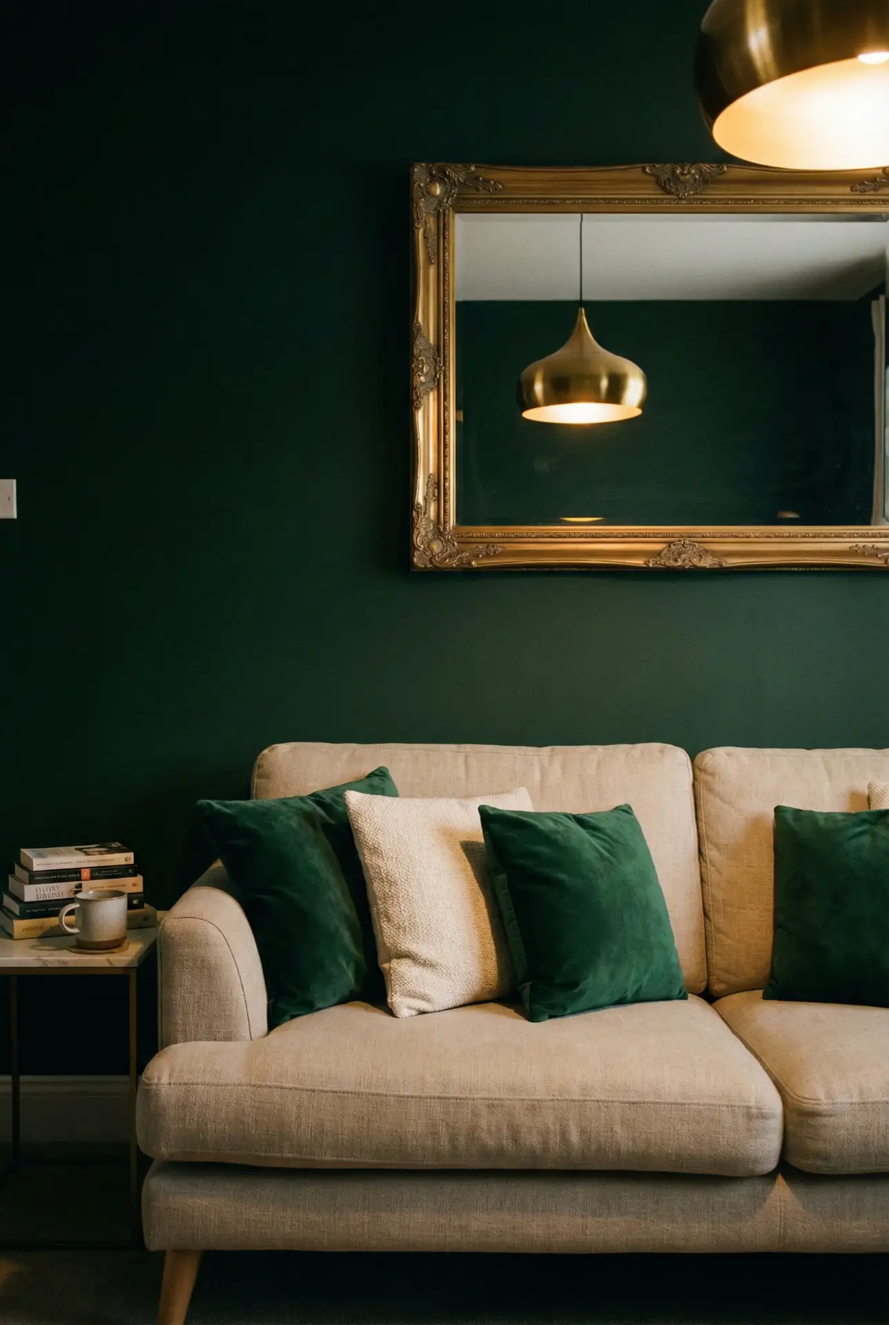
This palette works best in living rooms with high ceilings and ample square footage, where the dark walls can breathe. In smaller spaces, consider painting just one accent wall in the deep green and keeping the remaining walls neutral. Common mistake: using too many dark accessories alongside the green walls, which can make the room feel cave-like. Instead, introduce plenty of white or cream textiles, reflective surfaces, and fresh greenery to keep the space feeling balanced and alive.
6. Beige Sofa with Cool Blue Tones
A beige sofa grounds a room with understated elegance, and when you layer in light blue or powder blue accents—through pillows, throws, or even a painted side table—the combination feels fresh and coastal without leaning into nautical clichés. This palette is especially effective in homes with neutral carpeting or light wood floors, where the beige acts as a bridge between the floor and the cooler wall tones. It’s a favorite among Midwestern and Southern homeowners who want a relaxed, livable aesthetic that doesn’t sacrifice style.
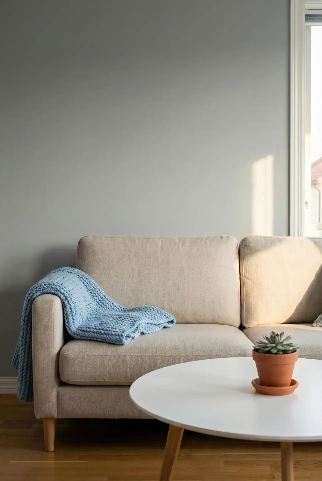
Across the Southeast, many homeowners report that this color scheme helps their living rooms feel cooler during hot, humid summers—psychologically, the blue tones provide visual relief even when the air conditioning is working overtime. It’s a practical choice for regions where the climate demands both comfort and visual calm. Budget-friendly tip: thrift stores and estate sales often have vintage blue glassware and ceramics that can be styled on shelves or mantels, adding personality without the price tag of new decor.
7. Grey Sofa with Warm Wood Accents
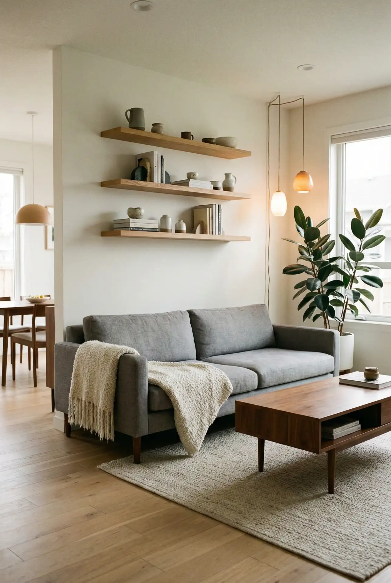
The ubiquitous grey sofa remains a staple for good reason—it’s versatile, sophisticated, and a perfect backdrop for seasonal styling. To prevent it from feeling cold or sterile, balance the gray with warm wood furniture: a walnut coffee table, oak shelving, or a teak media console. Layer in caramel leather, cream textiles, and touches of greenery to soften the palette and introduce life. This combination is especially popular in open-concept homes where the living room flows into the kitchen, as the wood tones can tie into cabinetry and island stools.
A designer in Denver once advised a client to avoid pairing a grey sofa with chrome or brushed nickel hardware, as it can make the space feel too industrial. Instead, she suggested matte black or aged brass fixtures, which introduce contrast without adding coldness. The client followed the advice and reported that the room finally felt “finished” rather than like a showroom. It’s a small shift, but one that significantly impacts the overall warmth and livability of the space.
8. Olive Green and Mustard Yellow
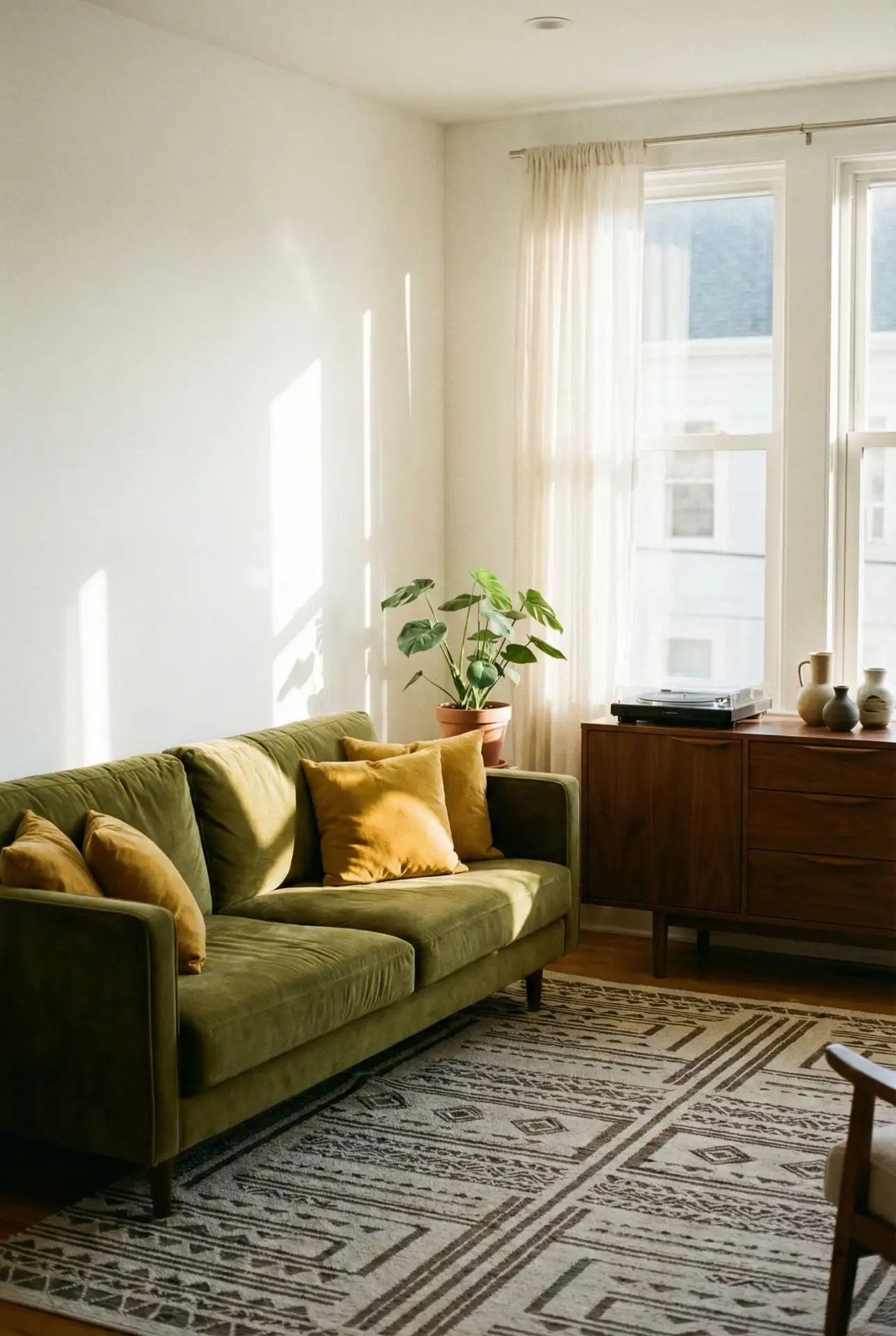
This retro-inspired pairing of olive green and blue and yellow accents feels both nostalgic and current, channeling mid-century modern vibes with a contemporary edge. An olive green sofa or armchair anchors the room, while mustard pillows, throws, or even a painted accent wall add warmth and energy. The key is to keep the proportions balanced—too much mustard can overwhelm, but used sparingly, it brings a sunny, optimistic quality that’s perfect for north-facing rooms or basements that need a brightness boost.
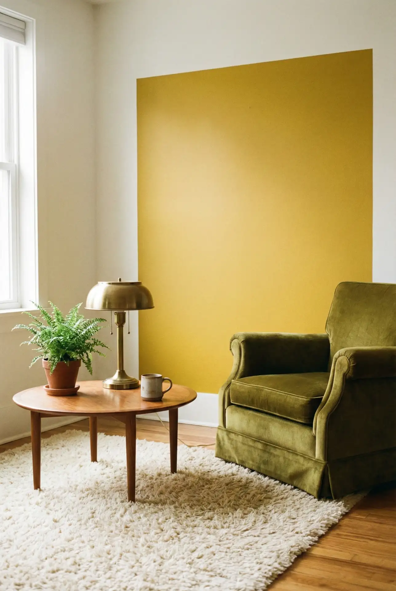
This palette works best in eclectic or bohemian-leaning homes where pattern mixing and vintage finds are celebrated. It’s less suited to minimalist or ultra-modern spaces, where the warmth of the colors can feel at odds with the sleekness of the design. If you’re drawn to this scheme but worried about commitment, start with mustard pillows and an olive throw—both are easy to swap out if your tastes shift, and they’re affordable enough that you won’t feel locked into the look for years.
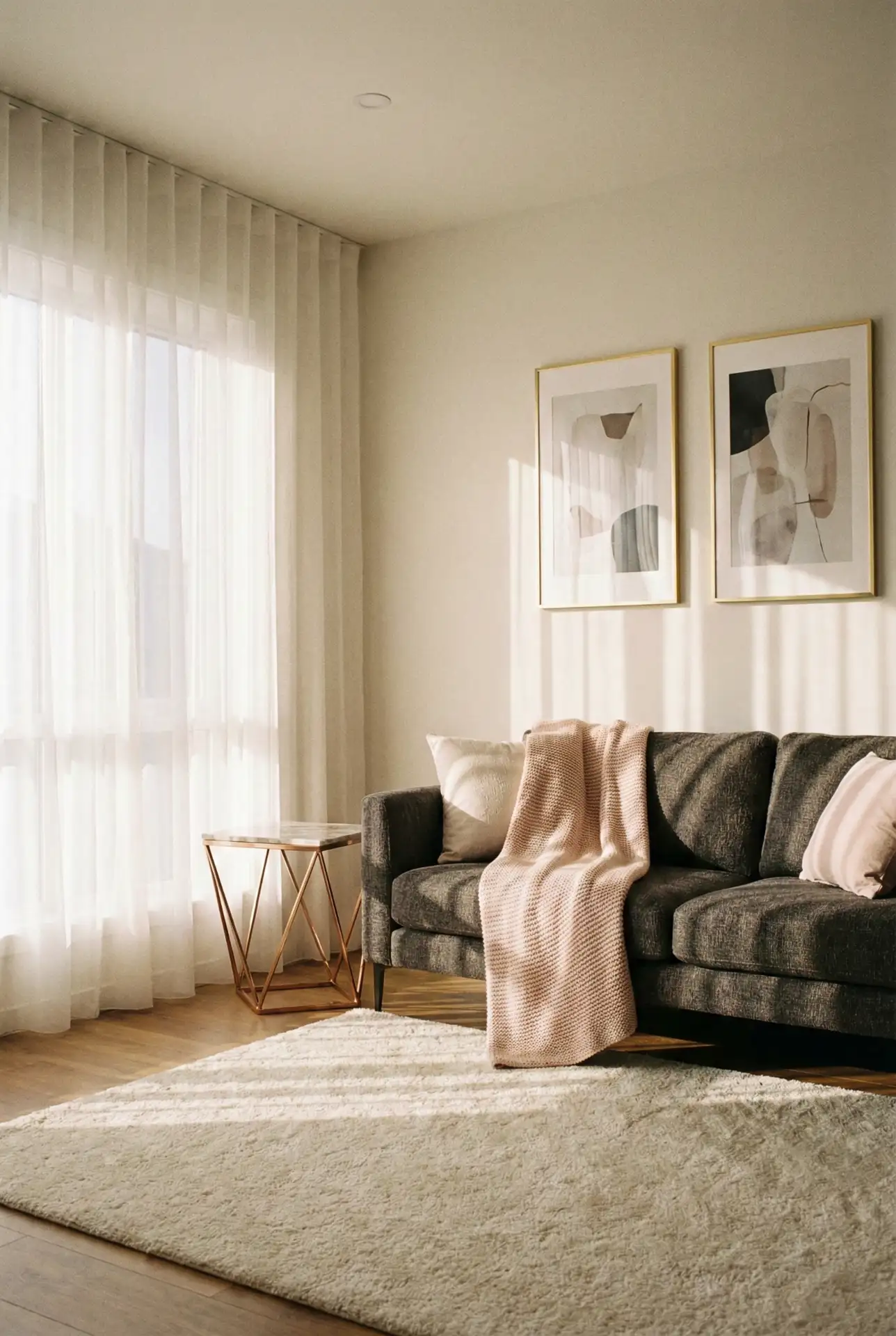
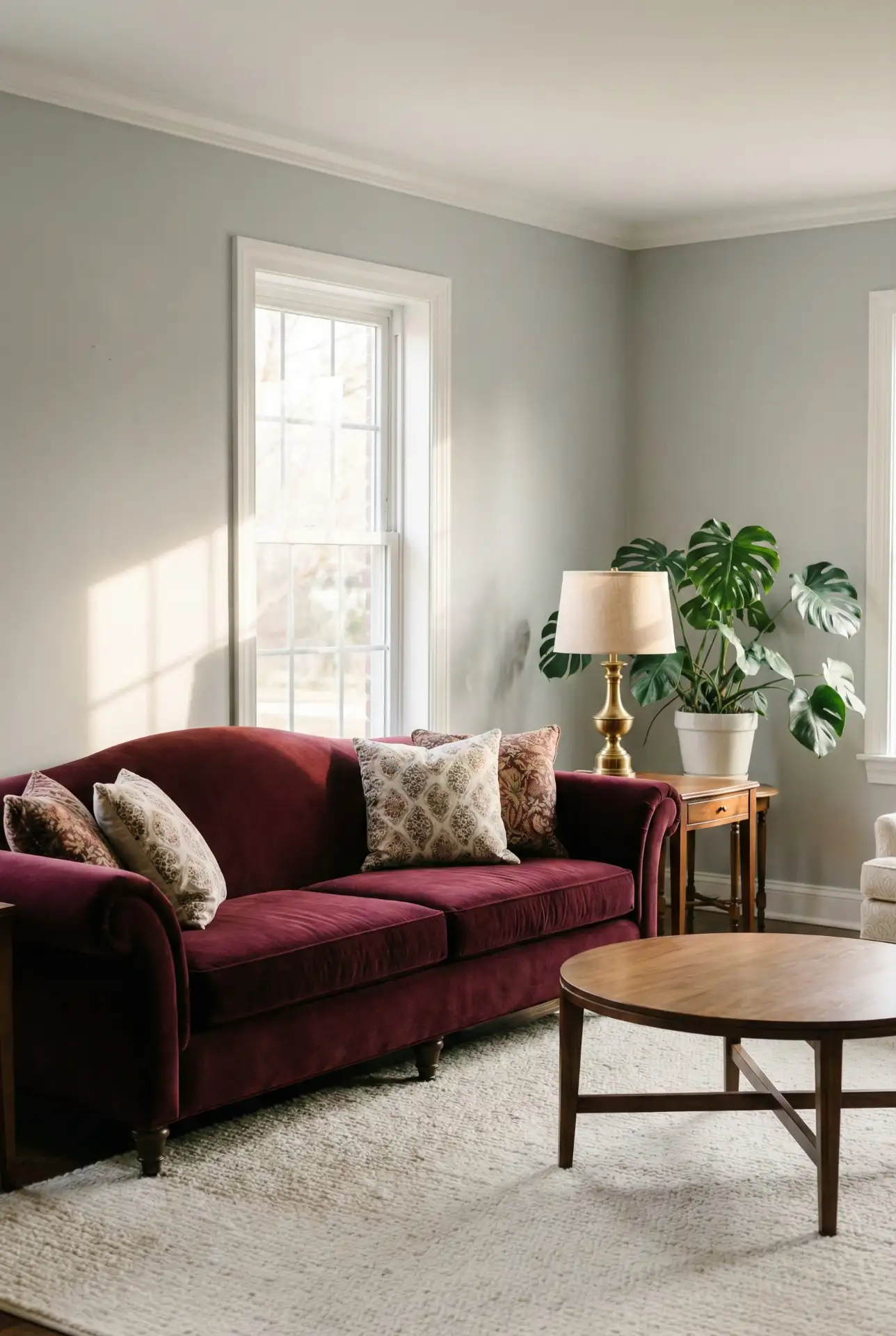
9. Charcoal Couch with Blush and Brass
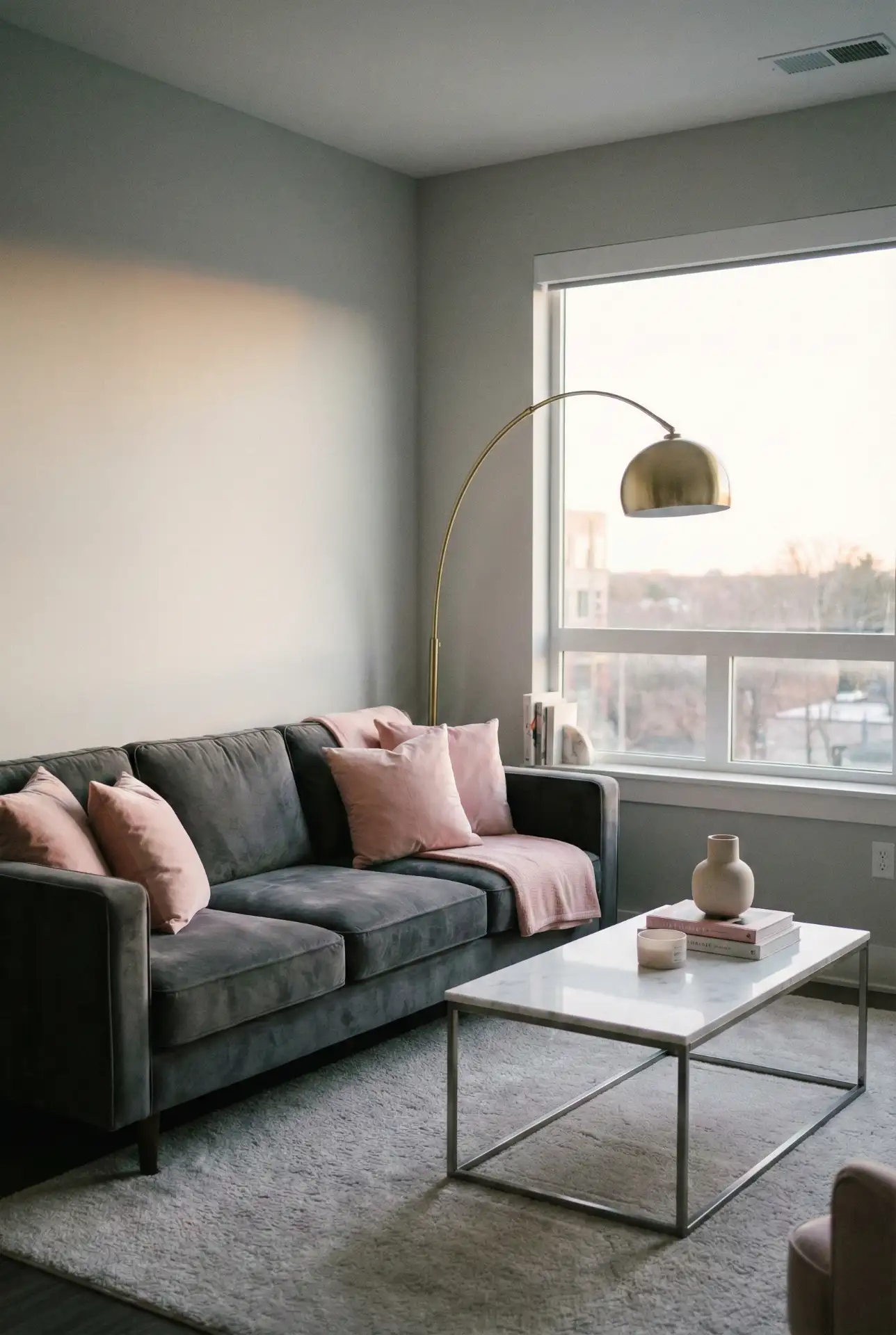
A charcoal couch delivers the drama of black with slightly more warmth, and it pairs beautifully with soft, feminine accents like blush pink pillows, rose gold hardware, or pale pink throws. Add brass or gold lighting fixtures and accessories to introduce a layer of sophistication that prevents the pink from feeling juvenile. This combination is particularly popular in urban apartments where residents want a mature, chic aesthetic that still feels welcoming and personal rather than sterile or overly masculine.
Real homeowner behavior: many people initially worry that a dark grey sofa will make their living room feel smaller, but in practice, the opposite is often true—the dark color recedes visually, allowing lighter elements like rugs, art, and walls to take center stage. One homeowner in Brooklyn reported that switching from a cream sofa to charcoal actually made her small living room feel more spacious and less cluttered, as the darker upholstery didn’t compete for attention the way the lighter fabric had.
10. Camel Couch with Black and White
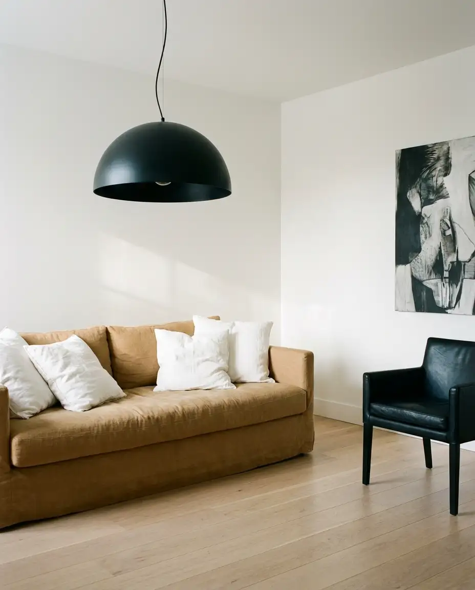
A camel couch—whether in leather or linen—brings warmth and richness to a black-and-white color scheme, softening what could otherwise feel too stark or graphic. The camel acts as a bridge between the extremes, adding a layer of comfort and lived-in elegance. Pair it with a black-framed coffee table, white walls, and black-and-white photography or line drawings for a look that’s both timeless and current. This palette is especially effective in lofts or industrial-style spaces where the architecture is already dramatic.
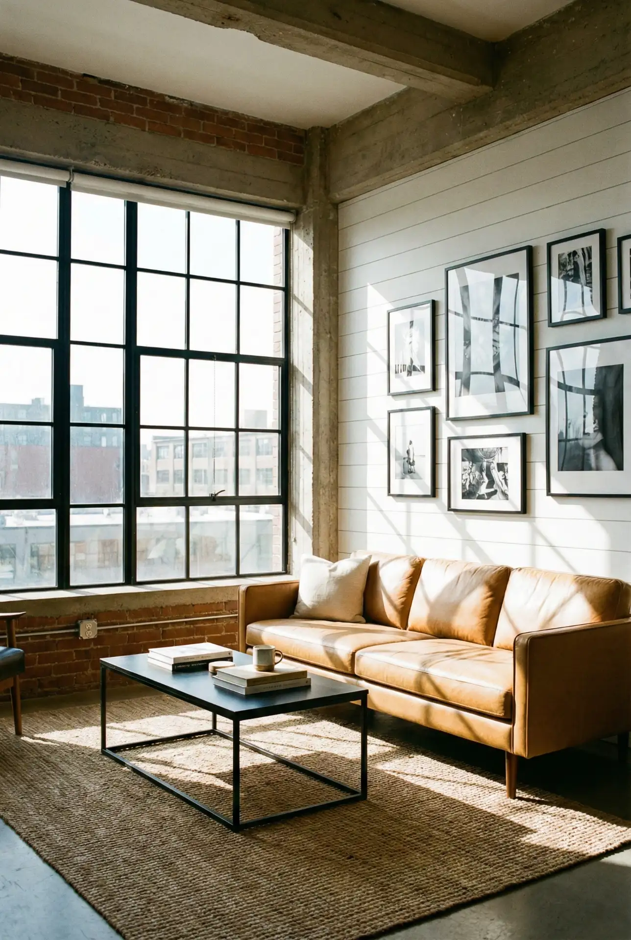
Budget angle: camel leather sofas can range from $1,500 for a basic option at CB2 to $6,000+ for top-grain Italian leather from brands like Restoration Hardware. If you’re working with a tighter budget, consider a camel linen or cotton option, which still delivers the warm, neutral tone at a fraction of the price. Linen also develops a beautiful patina over time, giving the piece character without the maintenance demands of leather.
11. Red Sofa as a Statement Piece
A red sofa—whether in a deep burgundy, vibrant scarlet, or muted terracotta—commands attention and instantly elevates a neutral room. It’s a bold choice that rewards confidence, and it pairs surprisingly well with warm grays, creams, and even soft pinks. Keep the rest of the palette subdued to let the red sofa shine, and introduce natural textures like wood, rattan, and linen to prevent the room from feeling too formal or staged. This is a particularly popular choice for homeowners who want a single statement piece that can anchor the entire design.
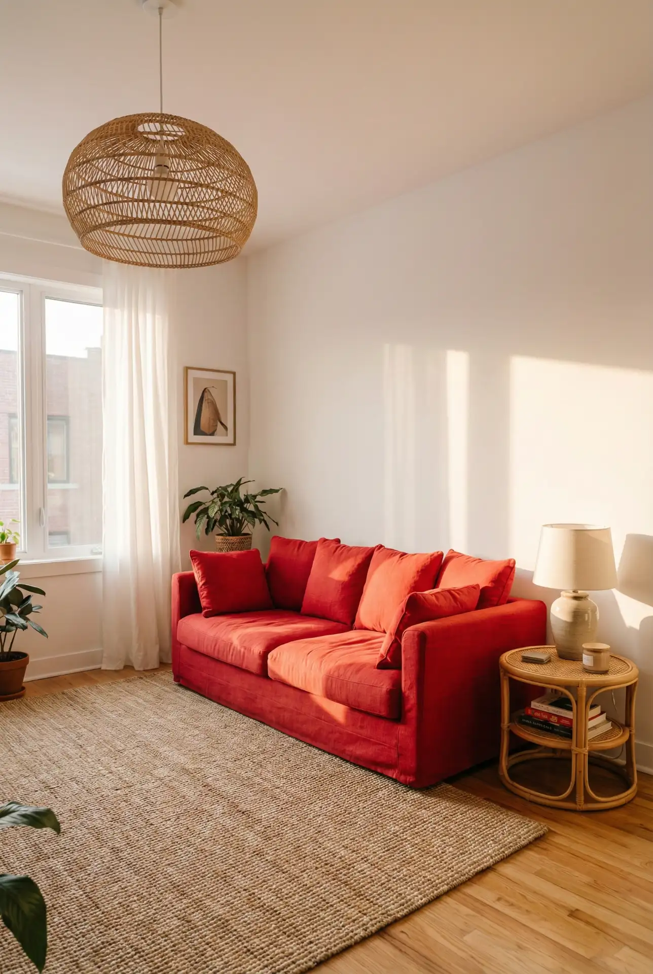
According to color psychology experts, red is energizing and social, making it an excellent choice for living rooms where you entertain frequently. However, it can be overstimulating in spaces meant for relaxation, so consider your lifestyle and how you use the room. One designer in Austin advised a client to choose a deeper, wine-toned red rather than a bright cherry, noting that the darker shade would age better and feel more sophisticated as trends shifted. The client loved the advice and reported that guests consistently complimented the sofa years later.
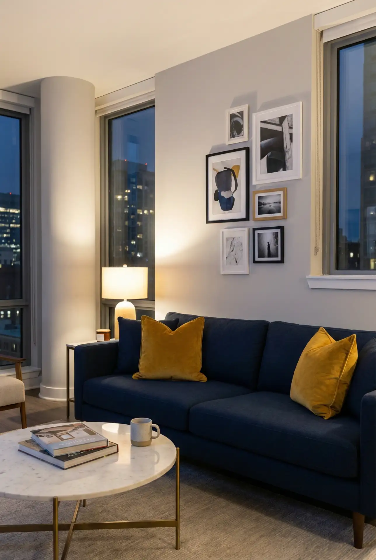
12. Navy and Mustard Contrast
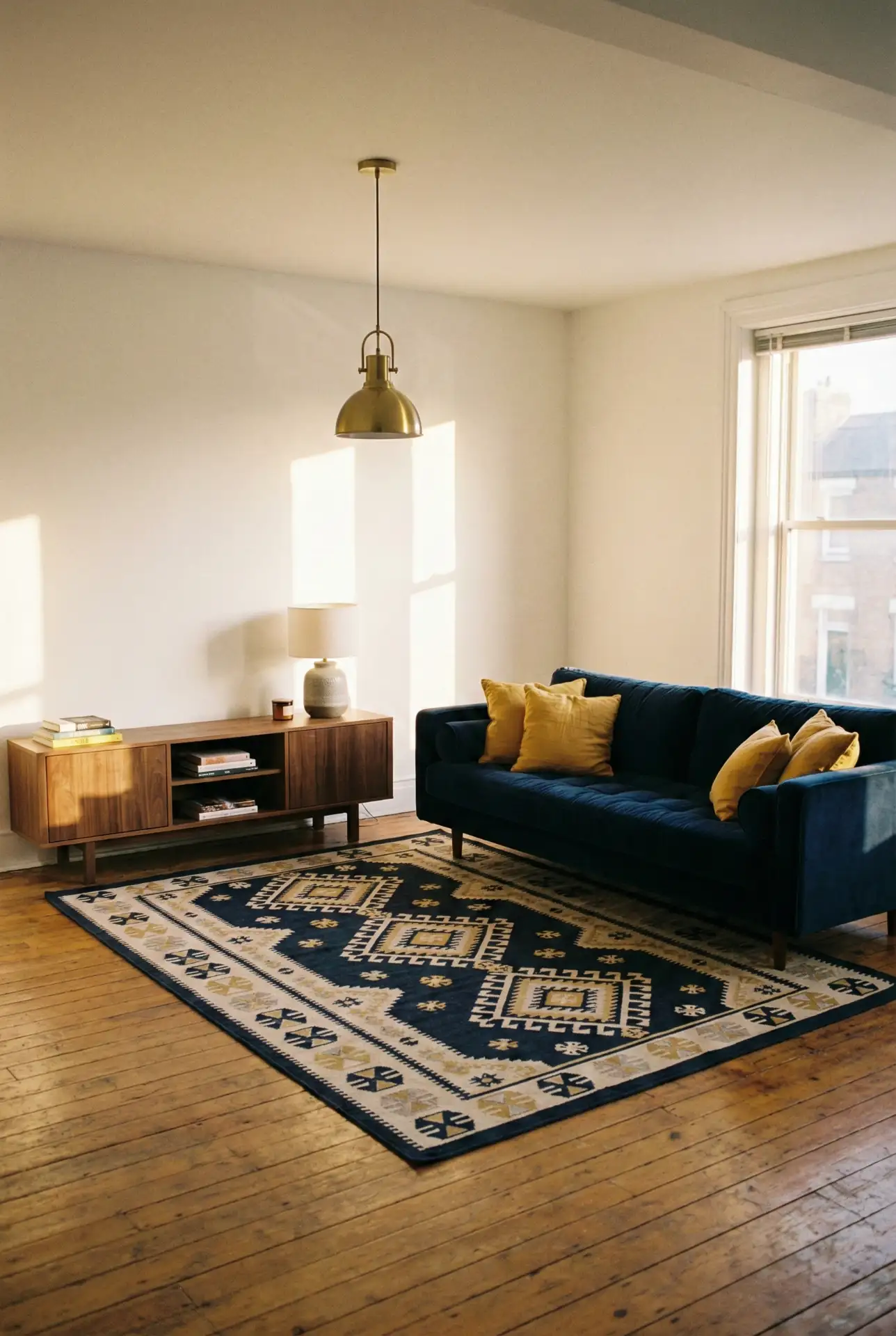
The pairing of navy blue and mustard yellow creates a high-contrast scheme that’s both energizing and grounded. A navy blue sofa serves as the anchor, while mustard appears in pillows, artwork, or even a painted bookshelf. This combination works beautifully in mid-century modern or eclectic spaces, and it’s forgiving—because both colors are rich and saturated, they don’t require perfect color matching the way pastels do. Add warm wood tones and plenty of white or cream to keep the scheme from feeling too heavy.
This palette works best in well-lit spaces where the darker navy won’t make the room feel closed in. If your living room is on the smaller side or lacks natural light, consider using the navy more sparingly—perhaps as an accent chair or throw pillows—and let the mustard take a larger role on the walls or in larger textiles. Common mistake: using equal amounts of both colors, which can feel chaotic. Aim for a 70/30 or 80/20 ratio, with one color dominant and the other as an accent.
13. Teal Walls with Neutral Furniture
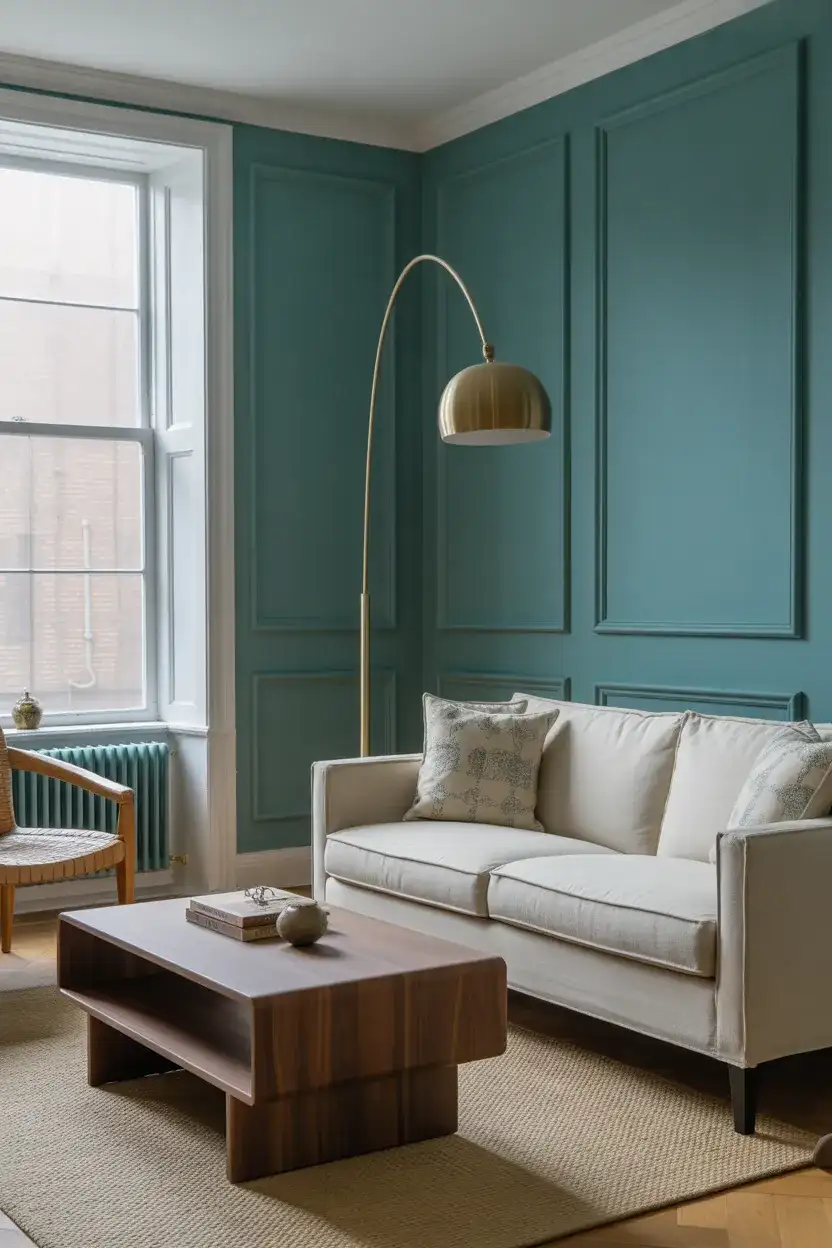
Painting your walls in a rich teal—somewhere between blue and green—creates an enveloping, jewel-box effect that’s both dramatic and calming. Pair the walls with neutral furniture in beige, cream, or light gray to let the color take center stage, and introduce natural wood tones and brass or gold accents to warm the scheme. This palette is especially popular in formal living rooms or spaces where you want to make a strong design statement, and it photographs beautifully, which is a bonus if you’re planning to list your home in the future.
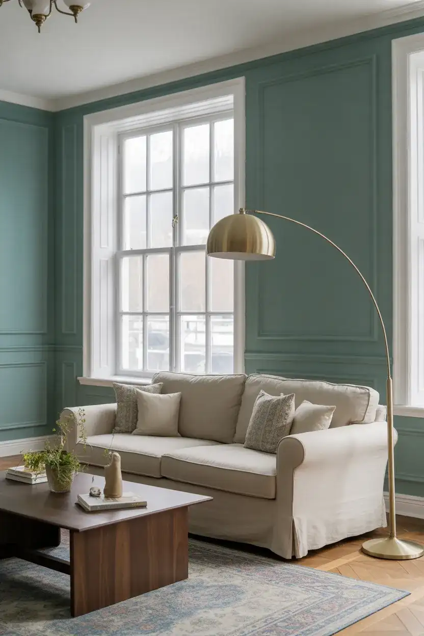
American lifestyle note: this color scheme is trending in Southern homes, particularly in Charleston and Savannah, where homeowners appreciate the nod to historic paint colors—teal and deep aqua were popular in antebellum-era interiors—while still feeling fresh and modern. It’s a way to honor regional design traditions without creating a literal period room. Many local designers recommend using a satin or eggshell finish rather than matte, as it reflects light more beautifully and adds subtle depth to the color.
14. Blue and Brown Natural Harmony
The combination of blue and brown feels inherently natural, echoing sky and earth, water and wood. Start with a soft blue—whether on the walls or in upholstery—and layer in brown through leather furniture, wooden accents, and woven textures like rattan or seagrass. This palette is incredibly forgiving and works across a range of styles, from coastal to farmhouse to contemporary. It’s also timeless, meaning you won’t feel pressured to redecorate in a few years when trends shift, and it appeals to both masculine and feminine design sensibilities.
Where it works best: this palette thrives in homes with wood floors, exposed beams, or other architectural elements that introduce natural brown tones. It’s less effective in spaces with wall-to-wall carpeting or tile floors, where the lack of wood can make the scheme feel disconnected. If you’re working with a non-wood floor, bring in plenty of wooden furniture and accessories—side tables, picture frames, trays—to create that essential visual link between the blue and brown elements.
15. Sage and Cream Softness
The pairing of sage and cream is inherently soothing, offering a low-contrast palette that’s perfect for creating a calming, spa-like atmosphere in your living room. Use sage on an accent wall or in upholstery, and layer in cream through larger furniture pieces, throws, and rugs. The result is a space that feels cohesive and serene without being boring—there’s enough variation in tone to keep the eye engaged, but nothing jarring or overstimulating. This is an ideal choice for homeowners who want a restful retreat at the end of a long day.
Practical insight: this palette is extremely forgiving when it comes to wear and tear. Both sage and cream upholstery hide light staining better than stark white, and the low-contrast scheme means that fading from sunlight is less noticeable over time. Many homeowners with pets or young children report that their sage green sofas have held up remarkably well, requiring only occasional spot cleaning rather than professional upholstery services. It’s a beautiful choice that’s also highly livable.
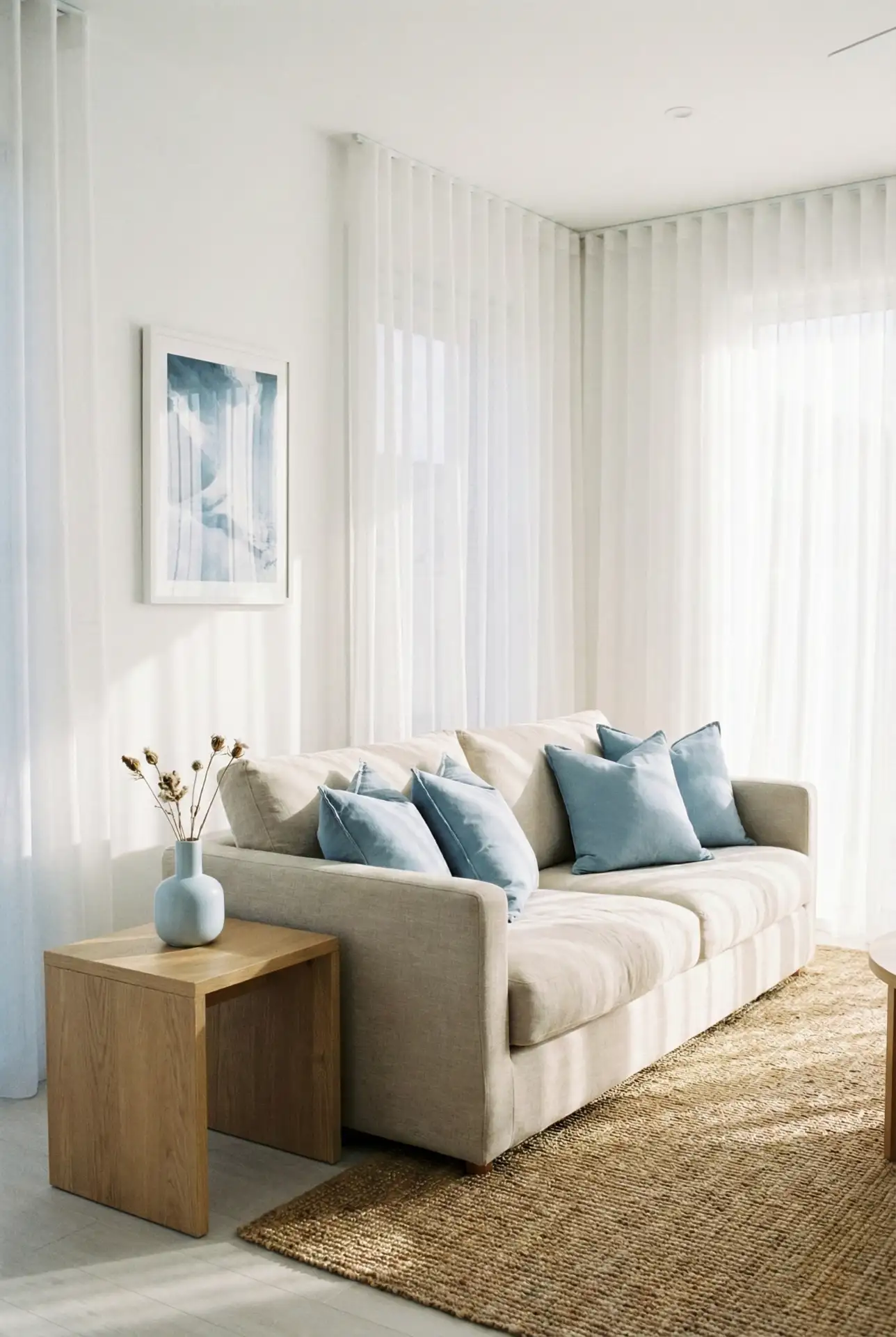
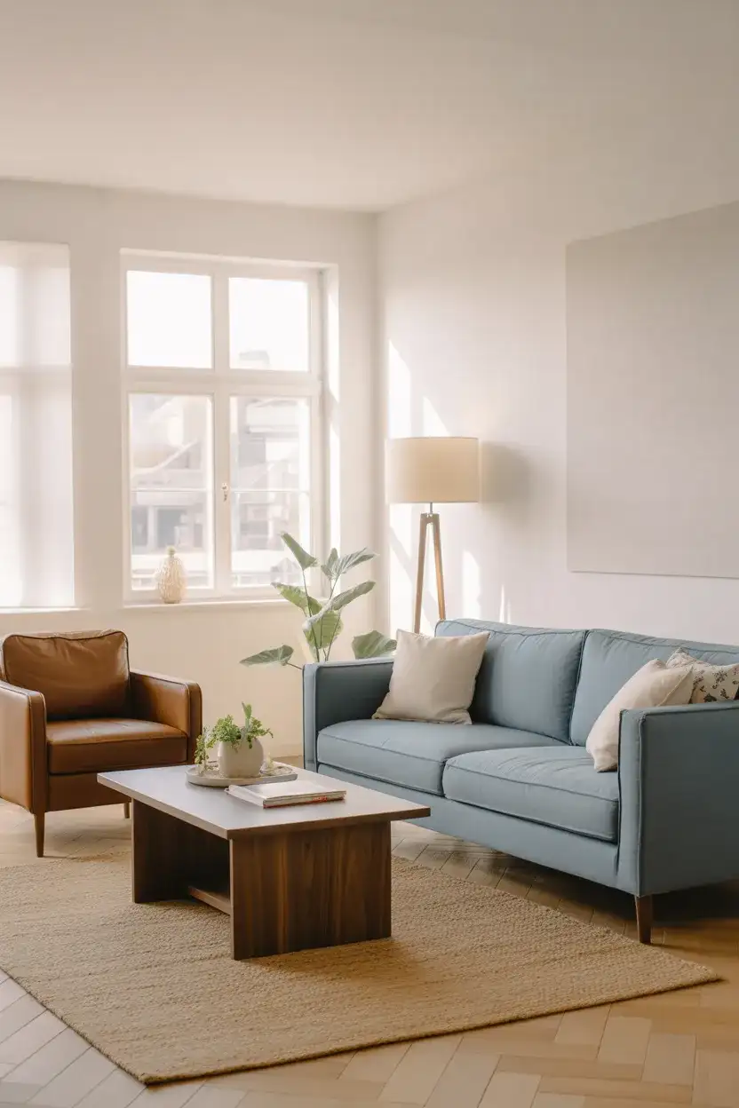
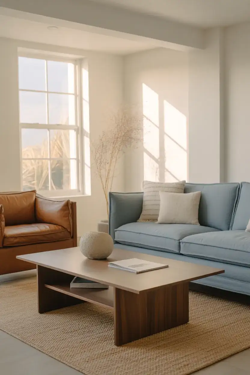
16. Light Blue and White Airiness
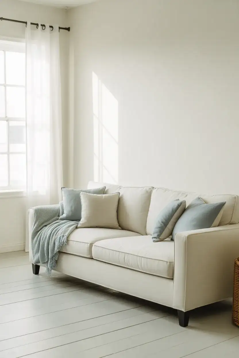
A light blue and white palette creates an airy, almost ethereal quality that’s perfect for small living rooms or spaces with limited natural light. Use white as the base—on walls, larger furniture pieces, and trim—and introduce light blue through pillows, throws, artwork, or a single accent chair. The result is a room that feels open, fresh, and calm, with a hint of color that keeps it from feeling too stark or clinical. This is a particularly popular choice in coastal areas and in homes with Scandinavian or minimalist design leanings.
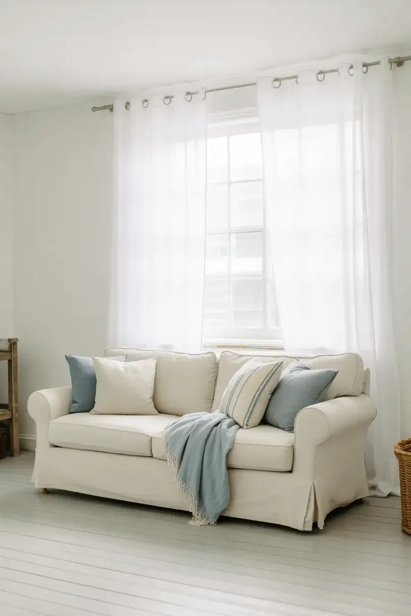
Expert-style commentary: designers often recommend this palette for clients who suffer from seasonal affective disorder or who live in regions with long, dark winters. The combination of white and light blue mimics natural daylight and clear skies, providing a psychological boost even when the weather outside is gray. One designer in Minneapolis told a client that this scheme “brings summer indoors year-round,” and the client reported feeling noticeably more energized and optimistic spending time in the space.
17. Dark Blue and Gold Glamour
A dark blue sofa or accent wall paired with gold or brass accents creates a glamorous, sophisticated look that feels both timeless and on-trend. The deep blue provides a rich backdrop that makes gold hardware, lighting fixtures, and decor accessories truly shine. Add in velvet textures, marble surfaces, and touches of cream or ivory to complete the luxe aesthetic. This palette is ideal for formal living rooms or spaces where you want to make a strong impression, and it photographs beautifully for social media or real estate listings.
Budget tip: if brass and gold accessories feel out of reach financially, look for vintage or secondhand pieces at estate sales, antique shops, or online marketplaces. Authentic brass and gold-plated items from the 1960s and 70s are often more affordable than new pieces and have far more character. A homeowner in San Francisco found a stunning brass bar cart for $75 at an estate sale and reported that it became the centerpiece of her navy blue living room, drawing compliments from every guest.
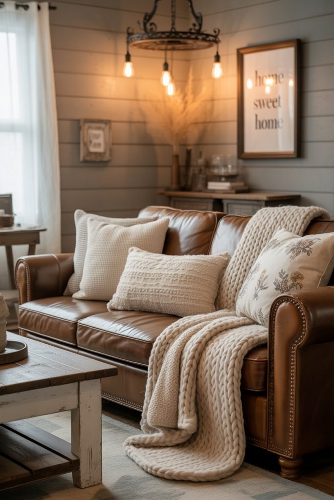
18. Ideas Cozy with Layered Textures
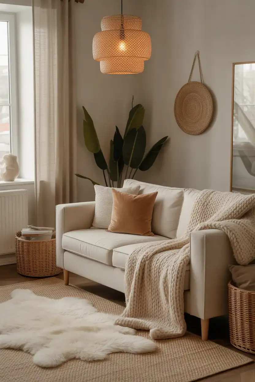
Creating cozy ideas in your living room is less about specific colors and more about layering textures and tones to build warmth and depth. Start with a neutral base—cream, beige, or soft gray—and then add layers: a chunky knit throw, velvet pillows, a sheepskin rug, linen curtains, and woven baskets. The variety of textures creates visual interest without relying on bold color contrasts, and the result is a space that invites you to curl up and stay awhile. This approach works beautifully in homes with open floor plans, where you want the living room to feel like a distinct, cocooning retreat.
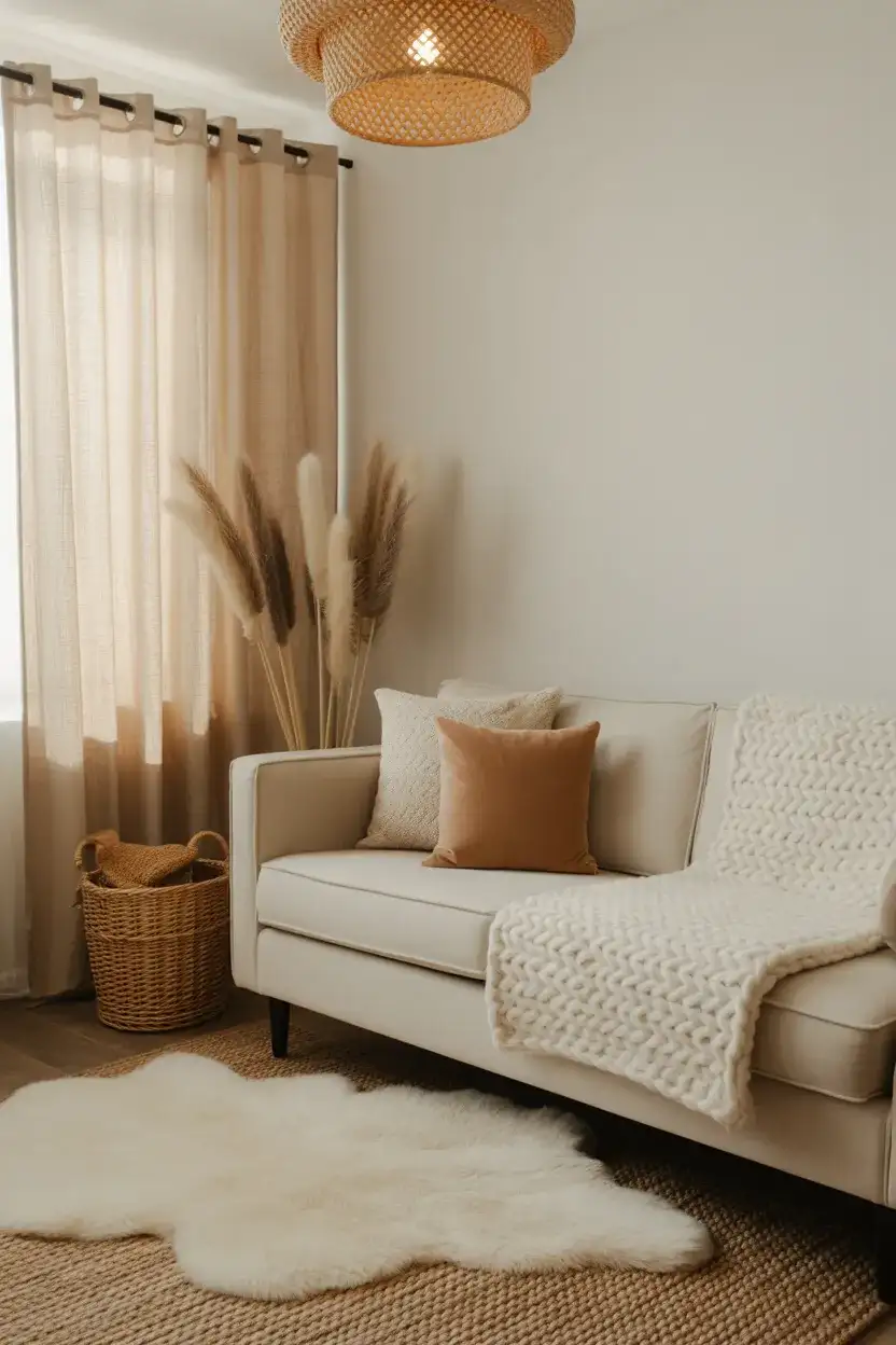
Regional context: this approach is especially popular in the Mountain West—Colorado, Montana, and Wyoming—where homeowners want spaces that feel warm and inviting during long, cold winters. The emphasis on texture rather than color allows the outdoors to remain the visual focus, with large windows framing mountain views while the interior provides a soft, comfortable counterpoint. It’s a design philosophy that respects the natural environment while prioritizing human comfort and coziness.
19. Earthy Palette with Terracotta and Olive
An earthy palette built around terracotta and olive green brings the warmth of the desert and the coolness of the forest into conversation, creating a scheme that’s both grounded and fresh. Use terracotta in pottery, pillows, or even a painted accent, and let olive appear in upholstery or textiles. Add in natural wood, rattan, and plenty of greenery to reinforce the connection to nature. This palette is ideal for homeowners who want their living room to feel organic and lived-in rather than overly styled or precious.
Common mistake: using too many pottery pieces in terracotta, which can make the room feel like a ceramics studio rather than a living space. Instead, limit terracotta pottery to two or three statement pieces—a large floor vase, a bowl on the coffee table, a planter—and introduce the color through textiles and smaller accents. This keeps the palette feeling intentional and curated rather than overly thematic or one-note. Balance is key to making this warm, earthy scheme feel sophisticated.
20. Grey Sofa with Jewel-Tone Accents
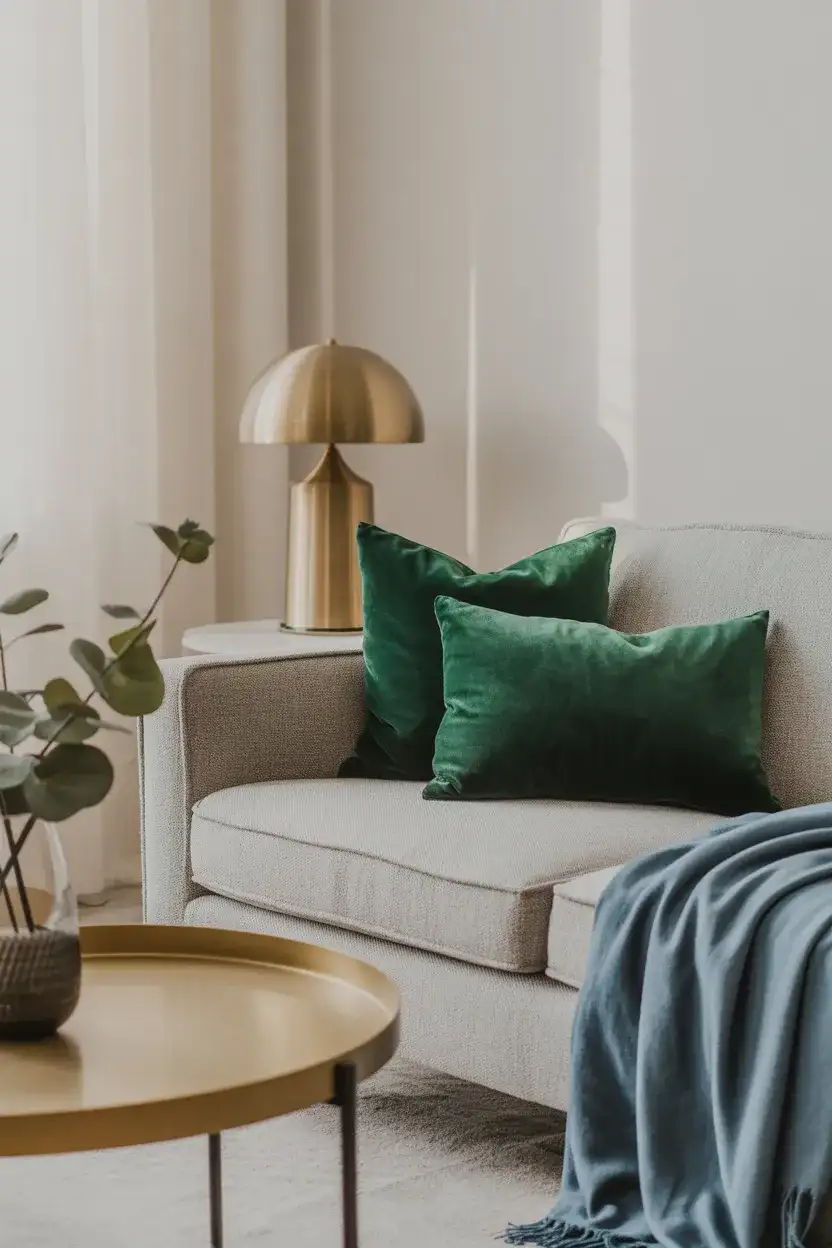
A neutral grey sofa becomes the perfect canvas for jewel-tone accents—think emerald green, sapphire blue, ruby red, or amethyst purple. These rich, saturated colors add drama and personality without overwhelming the space, and they’re easy to swap out seasonally or as your tastes evolve. Layer in metallic accents in gold or brass to enhance the luxe quality of the jewel tones, and keep walls and floors neutral to let the colors shine. This approach is popular among design enthusiasts who want flexibility and visual impact without committing to bold upholstery.
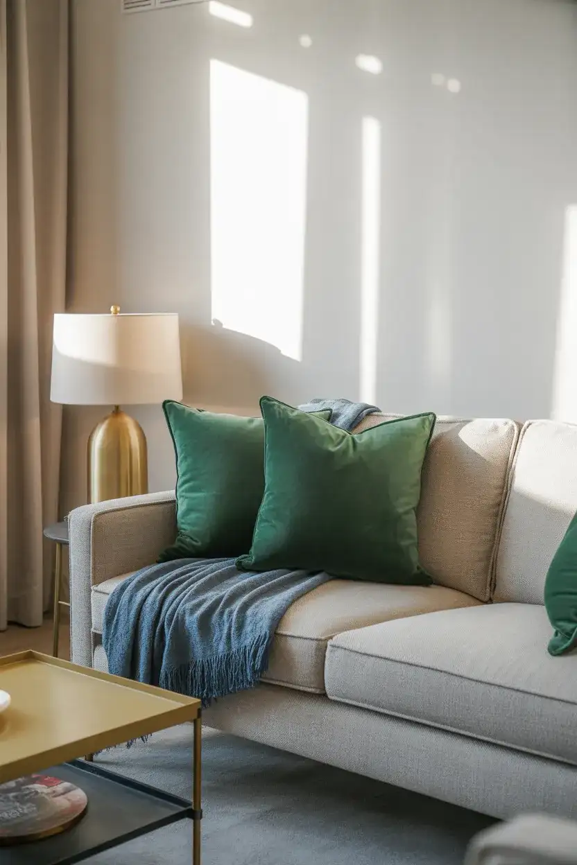
Real homeowner behavior: many people find that jewel-tone pillows are an easy, low-risk way to experiment with color. If you fall in love with emerald or sapphire, you can eventually commit to larger pieces like an accent chair or rug; if you decide it’s not for you, swapping out pillows costs far less than replacing upholstery. One homeowner in Portland started with a single emerald pillow on her dark grey sofa, loved the pop of color, and within six months had introduced emerald curtains and a velvet ottoman—a gradual evolution that felt natural rather than forced.
21. Cream Couch with Black Accents
A cream couch paired with black accents creates a high-contrast scheme that’s both graphic and sophisticated. Use black in smaller doses—picture frames, lighting fixtures, side tables, or even a single black accent chair—to ground the space and prevent the cream from feeling too soft or washed out. This combination works beautifully in modern and transitional spaces, and it’s a favorite among homeowners who appreciate clean lines and a curated, intentional aesthetic. Add in natural wood tones or greenery to soften the stark contrast and introduce warmth.
Where it works best: this palette thrives in homes with plenty of natural light and high ceilings, where the black accents won’t make the space feel cramped or dark. It’s less ideal in basement living rooms or spaces with limited windows, where the black can absorb too much light and make the room feel cave-like. If you’re working with a darker space but love this aesthetic, consider using charcoal gray instead of true black—it provides contrast without the visual weight, and it still reads as intentional and sophisticated.
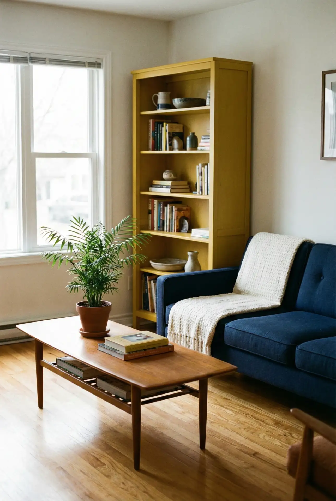
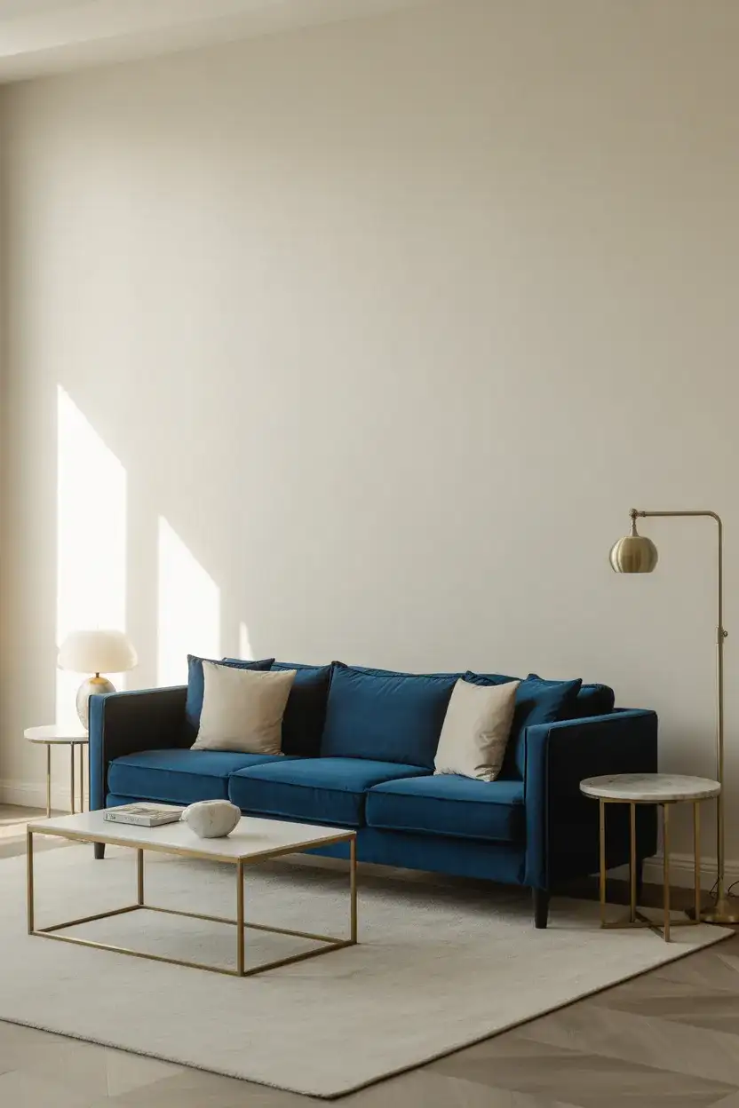
22. Navy Sofa with Warm Neutrals
A navy blue sofa paired with warm neutrals—think camel, cream, and warm beige—creates a balanced scheme that’s both polished and inviting. The navy provides depth and structure, while the warm neutrals soften the overall look and prevent it from feeling too formal or cold. This is an excellent choice for family rooms or multi-functional living spaces where you need the room to serve both everyday life and occasional entertaining. Layer in natural textures like linen, wool, and wood to add dimension and keep the palette from feeling flat.
Practical insight: this color scheme is remarkably versatile across different design styles. It works in coastal homes when paired with whitewashed wood and sisal rugs, in farmhouse spaces with reclaimed wood and vintage accessories, and in urban apartments with sleek lines and minimal decor. The key is adjusting the proportions and textures to suit your aesthetic—more linen and natural fiber for casual, more velvet and brass for formal. One homeowner in Nashville reported that she’s redecorated her living room three times over five years, always keeping her navy couch as the anchor and simply changing the accessories and accent colors to reflect her evolving taste.
Conclusion
These living room color schemes offer a range of moods and approaches, from soft and soothing to bold and dramatic, each one rooted in 2026’s movement toward warmth, authenticity, and connection to the natural world. Whether you’re refreshing a single piece of furniture or reimagining your entire space, these palettes provide a thoughtful starting point for creating a living room that feels both current and enduringly personal. We’d love to hear which scheme resonates with you—share your thoughts or your own color combinations in the comments below.