Kitchen paint colors are having a major moment in 2026, and if you’ve been scrolling Pinterest lately, you’ve probably noticed the shift. Americans are moving away from stark, cold palettes and embracing warmer, more personal spaces that reflect comfort and individuality. Whether you’re working with oak cabinets, dreaming of a cottage vibe, or drawn to moody drama, there’s a color story waiting for you. This guide walks you through fresh, inspired kitchen paint ideas that feel current, livable, and completely worth pinning.
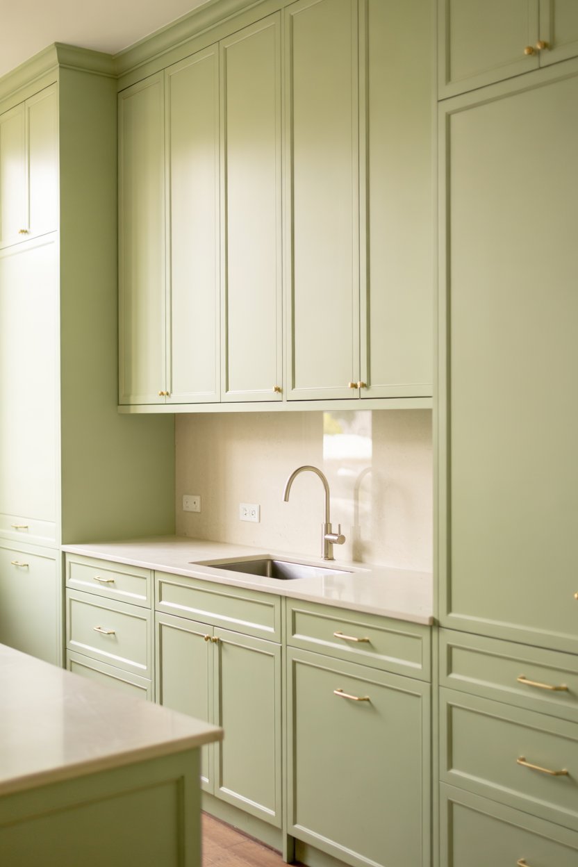
1. Soft Sage Walls with Oak Cabinets
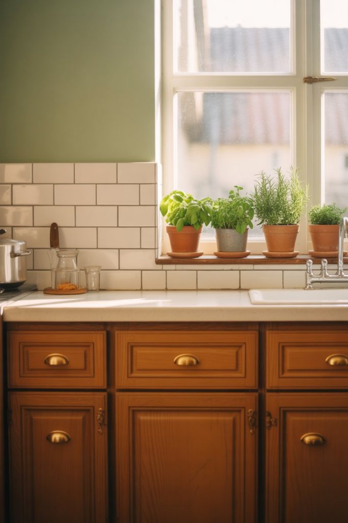
If you have oak cabinets that you’re not ready to replace, a soft sage green on the walls can completely transform the space. This color brings out the warm honey tones in the wood without fighting them, creating a farmhouse-inspired look that feels both modern and timeless. It’s especially beautiful in kitchens with natural light, where the green shifts subtly throughout the day. 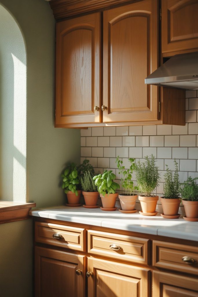
This palette works particularly well in Midwestern and Southern homes where oak cabinetry is still common. Pair it with white countertops and simple brass hardware to keep the look fresh. The sage acts as a neutral but adds just enough color to make the space feel intentional rather than dated.
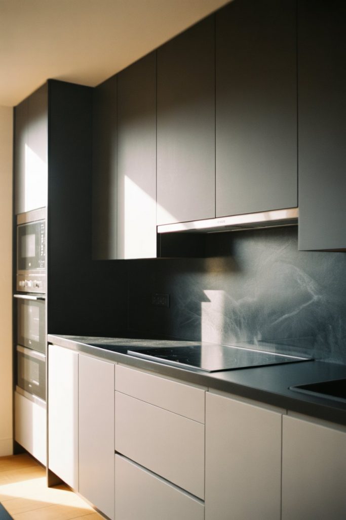
2. Charcoal Gray for Drama with White Cabinets
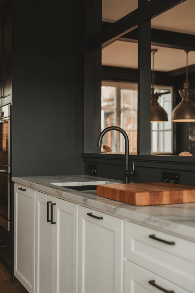
A deep charcoal or near-black wall color against white cabinets creates instant drama without feeling too heavy. This approach is popular in urban kitchens and open-concept spaces where the kitchen needs to make a statement. The contrast is bold but surprisingly versatile, especially when you bring in warm wood tones or natural textures. 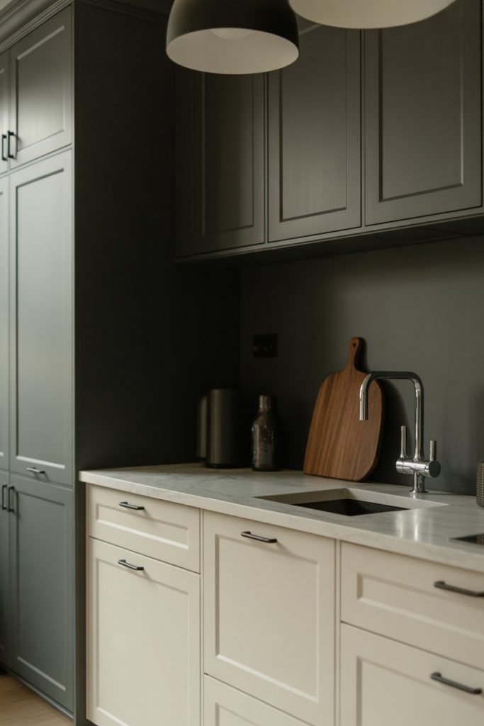
One common mistake here is choosing a gray that’s too cool or flat. Look for charcoals with a hint of warmth or brown undertone, which prevents that sterile, basement feel. Add in some greenery and warm metals to soften the edges.
3. Creamy Off-White for a Cottage Kitchen
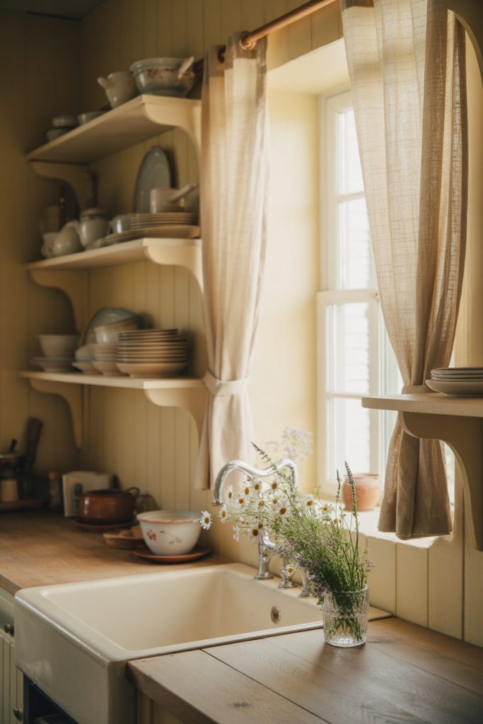
A true cottage kitchen deserves a creamy, almost-ivory wall color that feels soft and lived-in. Forget stark white—this is about warmth, texture, and a slightly worn-in charm that makes the space feel like it’s been there forever. It pairs beautifully with vintage hardware, open shelving, and farmhouse sinks. 
This color is especially forgiving in older homes with uneven walls or quirky architecture. It hides imperfections while creating a soft backdrop for colorful dishes, linens, and cookware. In the Pacific Northwest and New England, this palette feels right at home.
4. Deep Forest Green Accent Wall
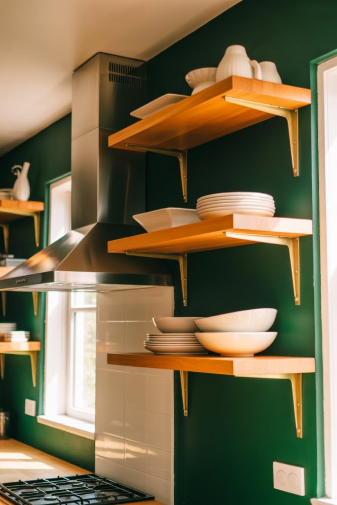
A single wall painted in a rich, deep green can anchor an entire kitchen without overwhelming it. This works especially well behind open shelving or as a backdrop for a range wall. The color adds depth and sophistication, and it’s one of those ideas that photographs beautifully—hence its popularity on Pinterest. 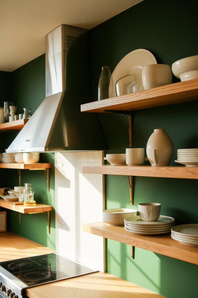
Where it works best: kitchens with good natural light and neutral cabinetry. Avoid this in small, windowless kitchens where the color can feel heavy. Pair with warm wood, white dishes, and simple styling to let the green be the hero.
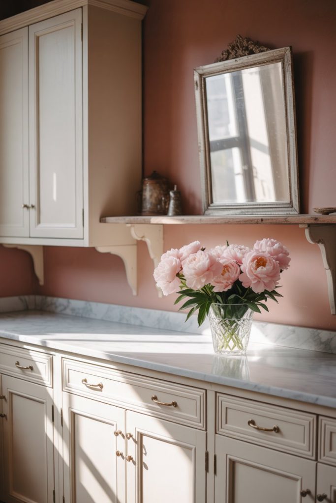
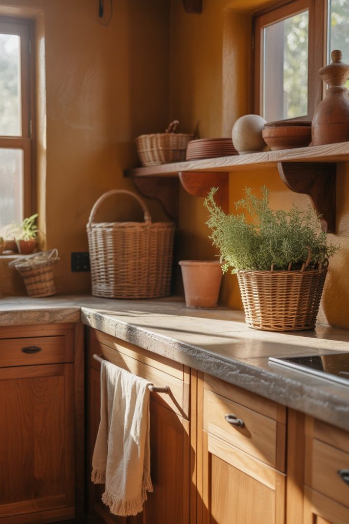
5. Warm Terracotta in a Moody Space
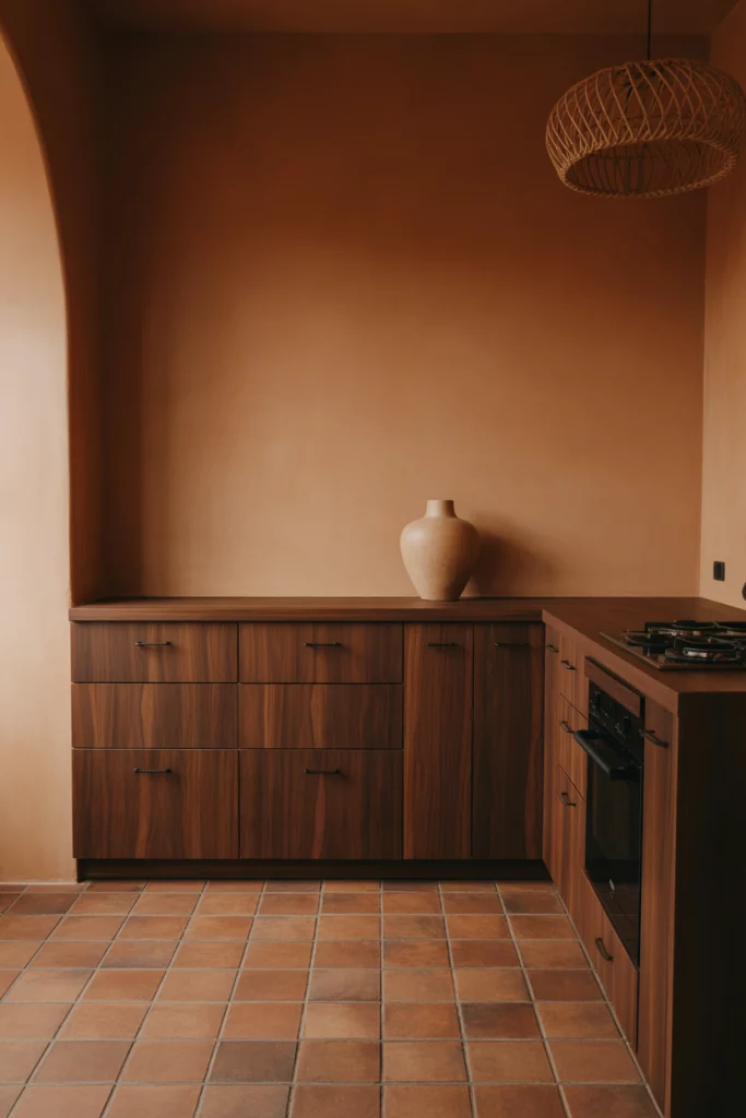
Terracotta is having a serious revival, especially in moody kitchens that lean into warmth and earthiness. This isn’t your grandmother’s Tuscan kitchen—it’s more sophisticated, more muted, and paired with modern fixtures. The color feels grounding and works beautifully with natural materials like wood, stone, and linen. 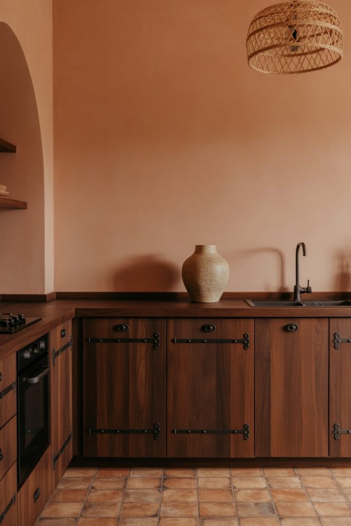
Homeowners in the Southwest and California are gravitating toward this palette, which feels connected to the landscape. It’s also budget-friendly—terracotta reads as expensive even when it’s not, and it ages beautifully. Just make sure your lighting is warm-toned to avoid any orange cast.
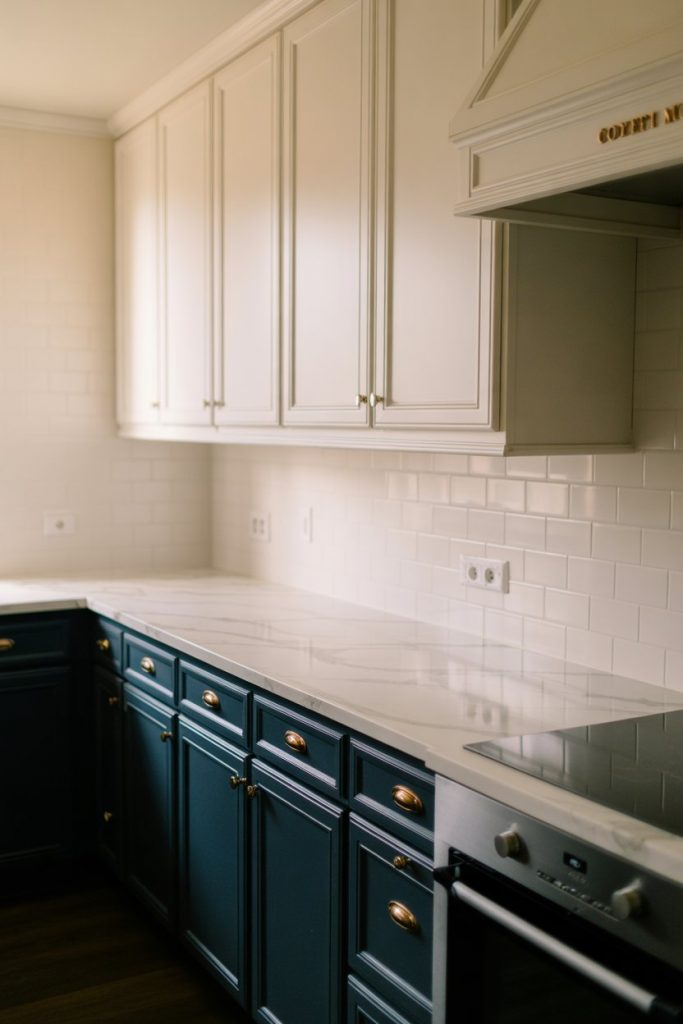
6. Classic Navy with Sherwin Williams Naval
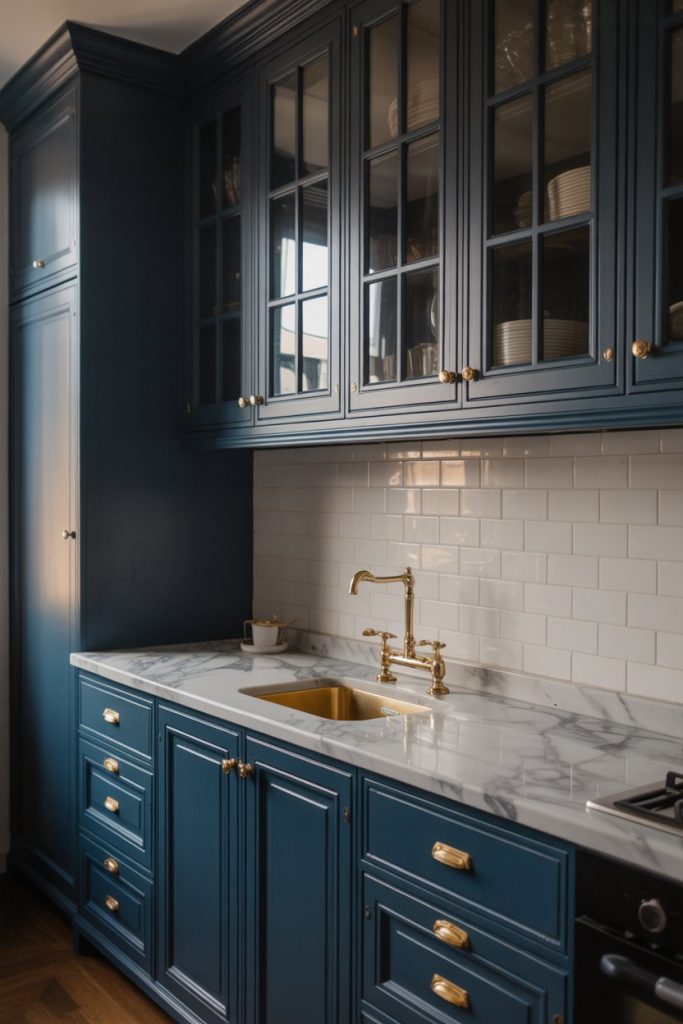
Sherwin-Williams Naval has become the go-to navy for kitchens, and for good reason. It’s deep enough to feel dramatic but not so dark that it closes in a space. Use it on walls, cabinets, or both for a cohesive, sophisticated look that works in traditional and modern homes alike. 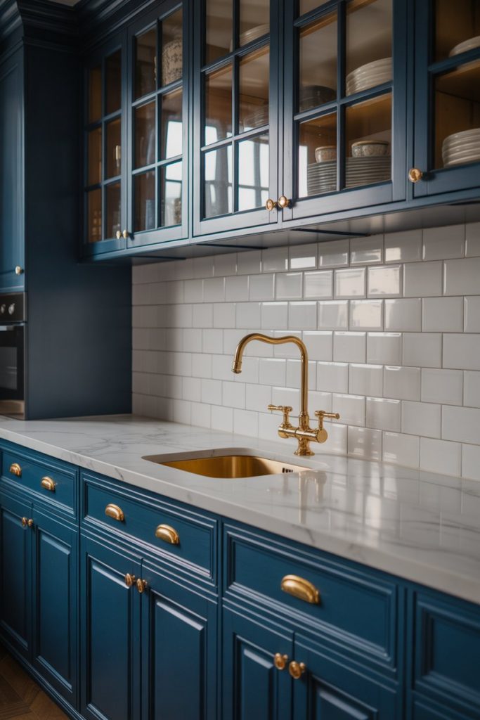
A designer once told me that Naval is the color clients never regret, and I’ve seen that play out dozens of times. It’s versatile enough to transition from living room to kitchen in an open floor plan without jarring the eye. Pair it with warm brass or natural wood for balance.
7. Pale Blue for a Coastal Kitchen
A soft, weathered blue brings instant coastal charm to any kitchen, even if you’re nowhere near the ocean. Think faded denim or a hazy sky—colors that feel calm, airy, and effortlessly casual. This palette is particularly popular in beach towns and lakefront homes, but it translates beautifully anywhere. 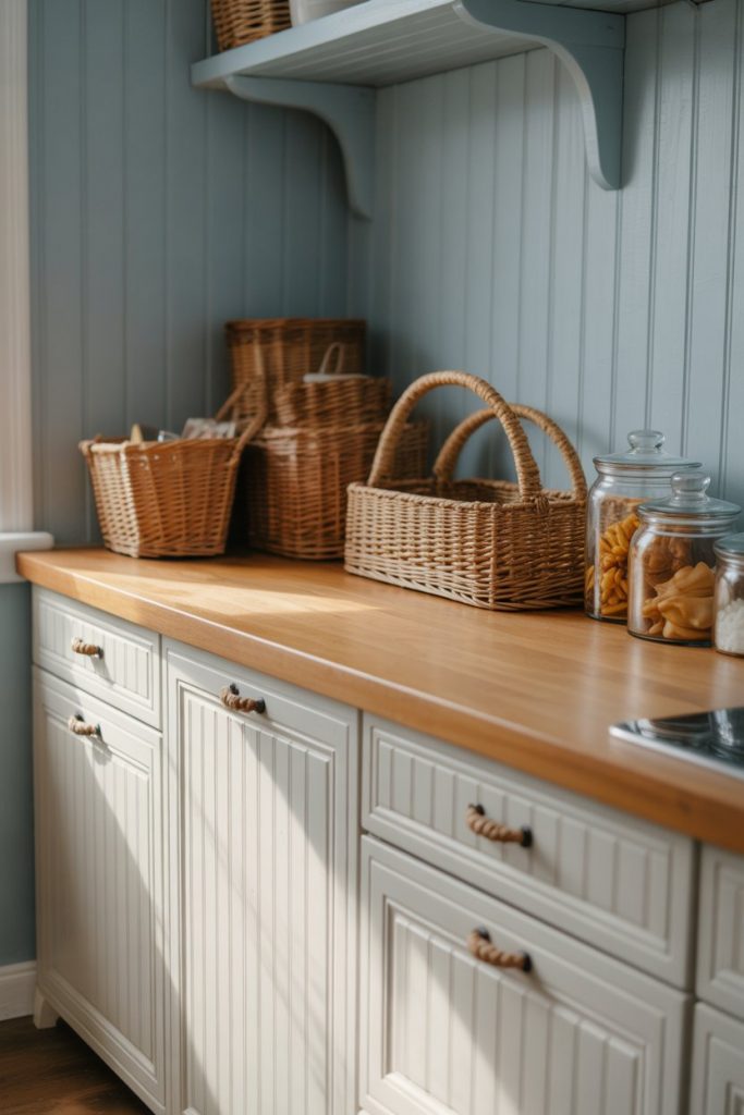
Practical insight: this color works best in kitchens with white or light wood cabinetry. Avoid pairing it with dark cabinets, which can make the blue feel muddy. Add natural textures like jute, rattan, and linen to complete the beachy vibe.
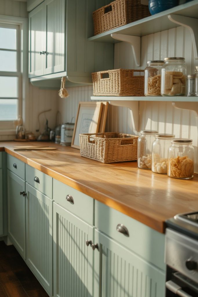
8. Warm Greige for Open-Concept Flow
Greige—that perfect blend of gray and beige—is the ultimate warm neutral for kitchens that flow into living spaces. It’s sophisticated without being boring, and it works with almost any cabinet color. In 2026, the best greiges have a slight taupe or mushroom undertone that feels current and cozy. 
This is one of the safest bets for resale, especially in suburban markets where buyers want move-in-ready neutrals. It’s also incredibly forgiving—greige hides minor wall imperfections and adapts to different lighting conditions throughout the day.
9. Soft Yellow for a Cheerful Vintage Vibe
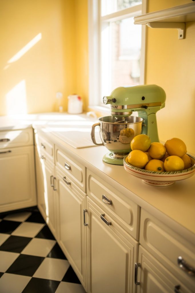
A buttery, muted yellow brings warmth and cheer without feeling childish or dated. This is the color of vintage kitchens from the 1940s and 50s, but when done right, it feels fresh and optimistic. Pair it with white trim, vintage-inspired hardware, and retro accessories for a cohesive look. 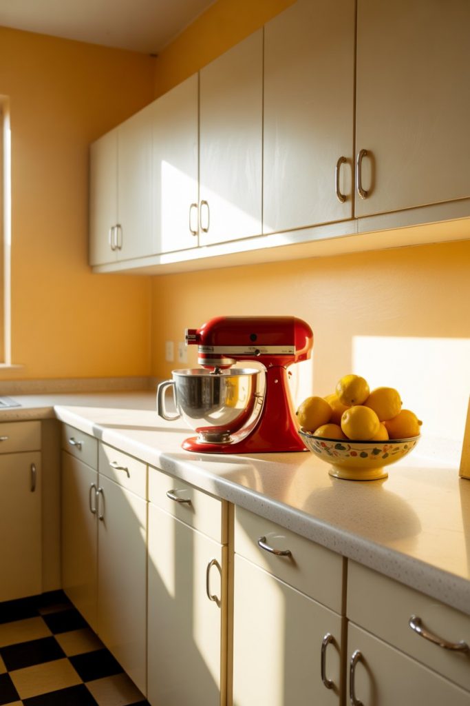
Where it works best: kitchens with plenty of natural light and simple, unfussy cabinetry. Avoid cool yellows, which can look sickly. Stick with warm, creamy tones that have a hint of peach or gold for a flattering glow.
10. Black Walls with Black Cabinets for Maximum Drama
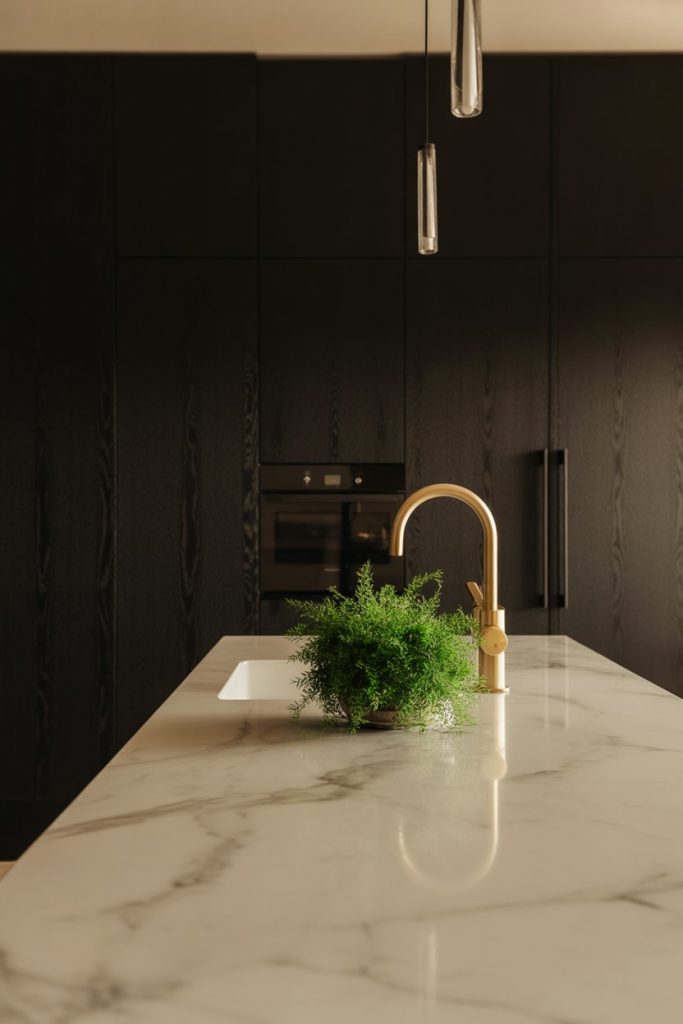
Yes, you can paint both your walls and black cabinets the same color—and yes, it can look incredible. This approach creates a cocooning, intimate space that feels more like a jewel box than a traditional kitchen. It’s bold, it’s confident, and it’s not for everyone—but if you love drama, this is your move. 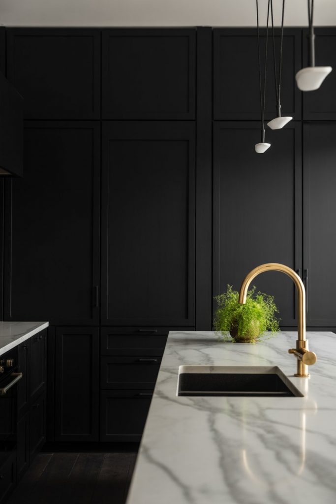
Budget angle: black paint is universally available and often cheaper than trendy colors. You’ll save money on the paint itself, but invest in good lighting—this look needs layered, warm light sources to avoid feeling like a cave.
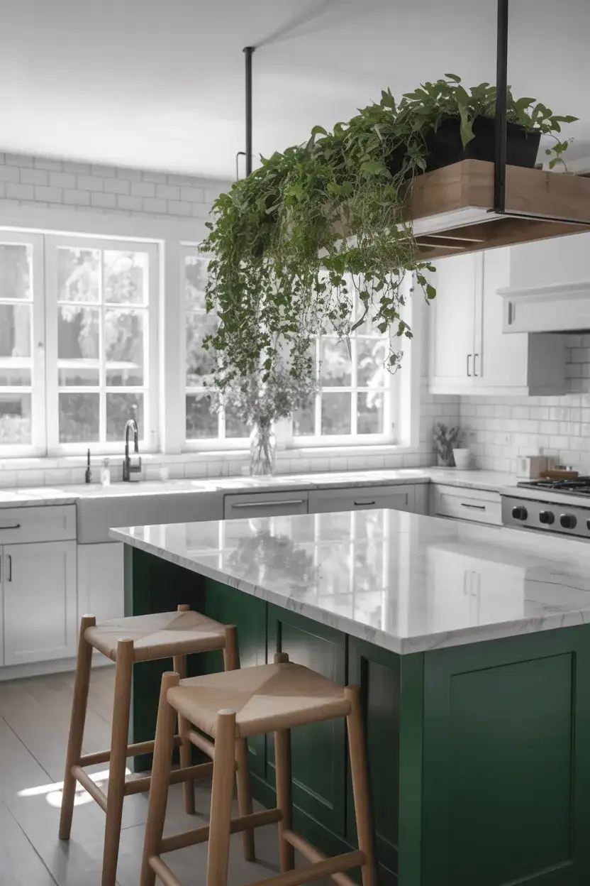
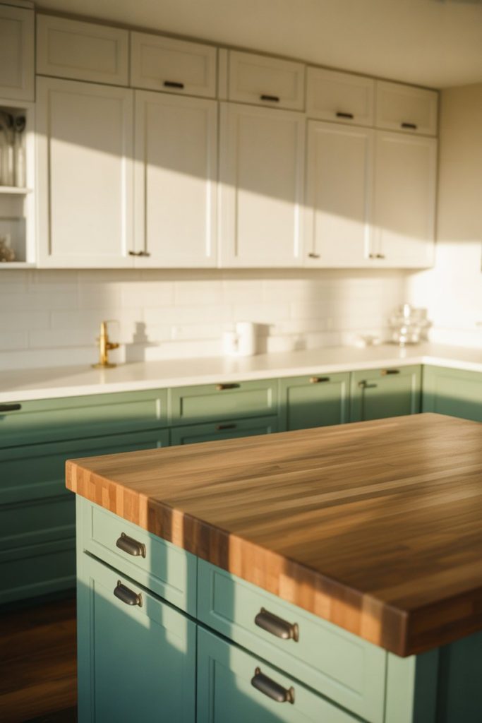
11. Sage Green Cabinets with White Walls
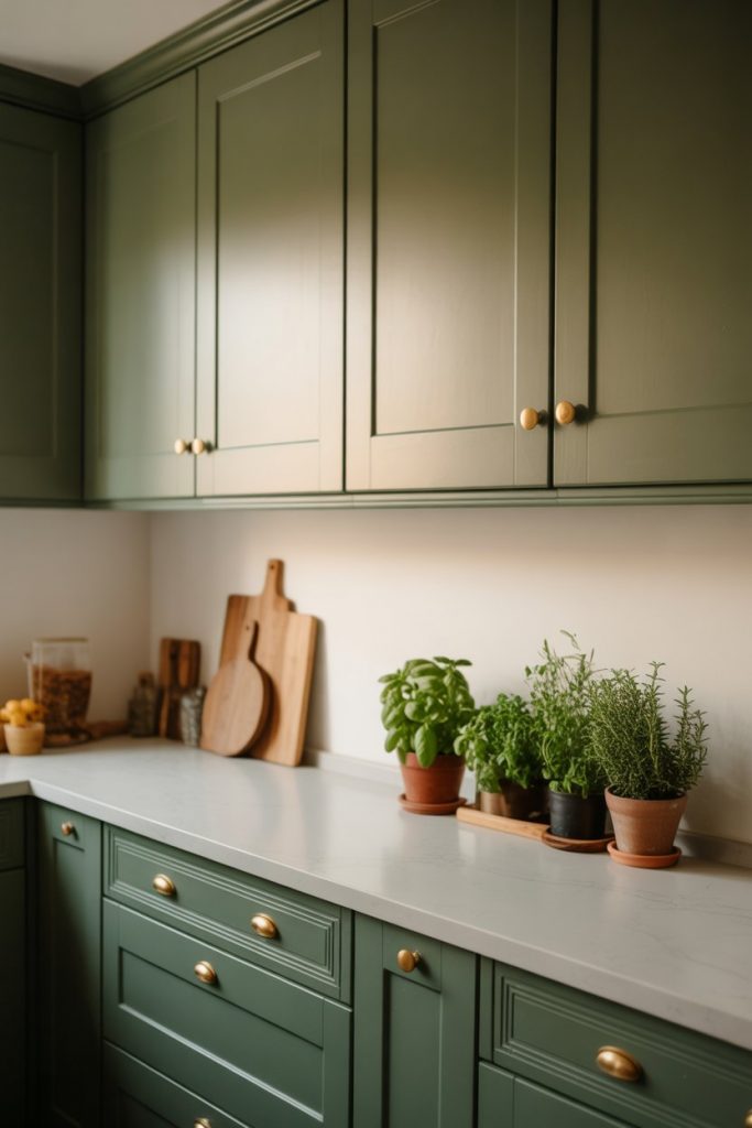
Flipping the script, sage green cabinets paired with crisp white walls create a fresh, botanical look that’s taken over Pinterest. The white keeps things bright and clean, while the sage adds personality and a connection to nature. It’s a particularly smart choice for smaller kitchens that need color but can’t afford to go too dark. 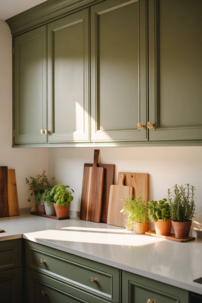
This palette is especially popular among millennial and Gen Z homeowners who want something current but not trendy. It feels timeless in a way that aqua or coral cabinets don’t. Pair with warm wood floors and simple brass hardware for a cohesive, grounded look.
12. Deep Plum for a Witchy Aesthetic
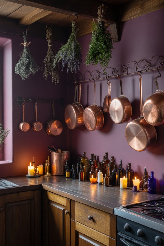
If you’re drawn to a witchy, bohemian vibe, a deep plum or aubergine wall color can set the perfect tone. This is moody without being dark and rich without being overwhelming. It pairs beautifully with brass, copper, and natural wood, and it photographs like a dream in both daylight and candlelight.
Expert-style commentary: this color works best in kitchens with high ceilings or good natural light. In smaller, darker spaces, consider using plum as an accent wall rather than all over. Layer in texture—velvet, wood, metal—to keep the space from feeling flat.
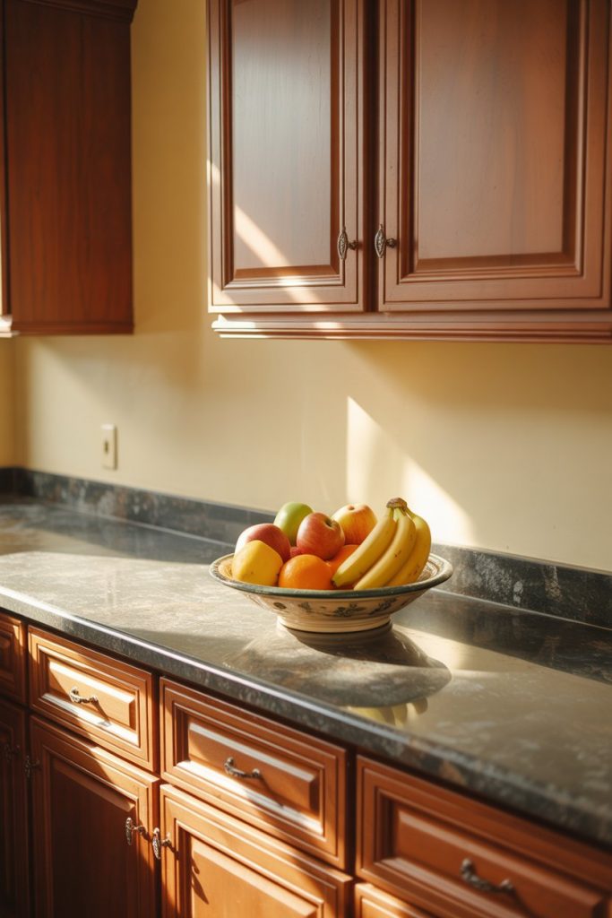
13. Warm White with Brown Cabinets
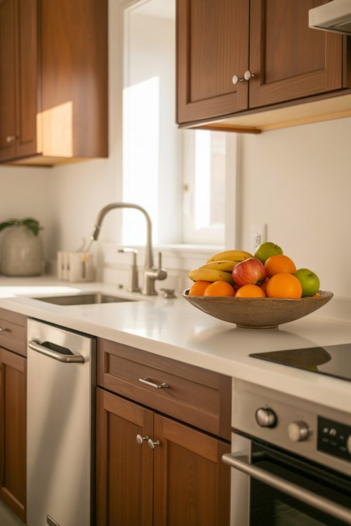
If you have brown cabinets—whether walnut, cherry, or stained oak—a warm white wall color is your best friend. It brightens the space without competing with the wood, and it creates a clean backdrop that lets the natural grain shine. This is a classic combination that never goes out of style. 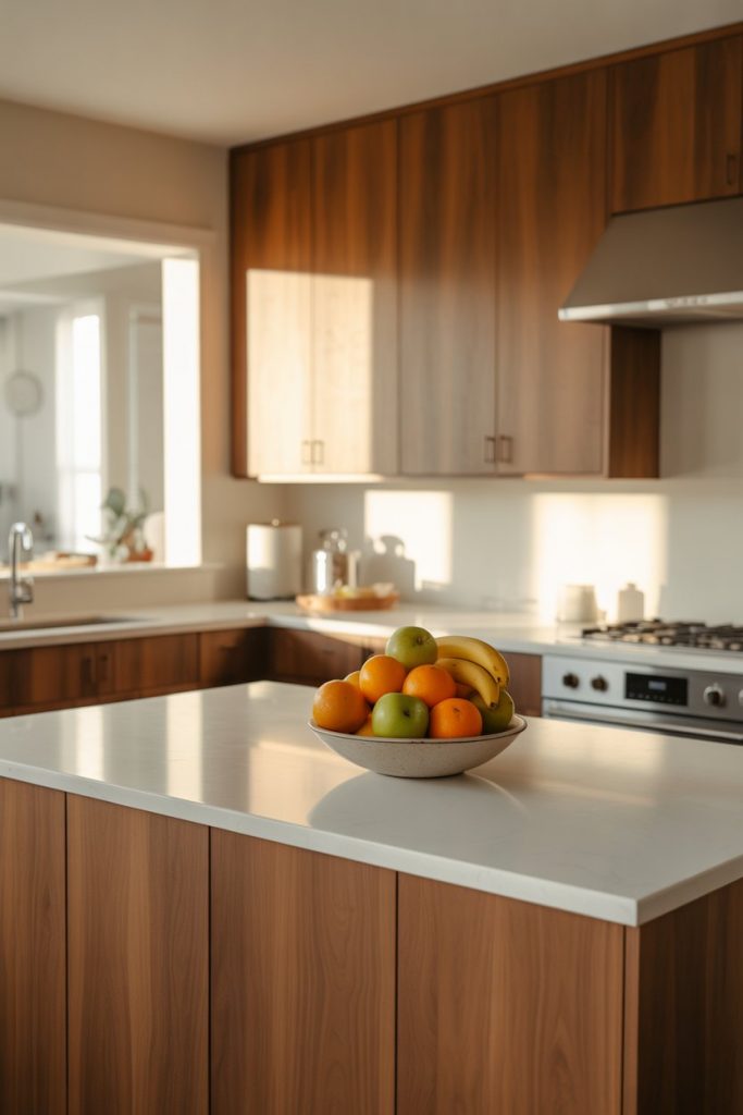
Real homeowner behavior: many people try to fight their brown cabinets with cool grays or stark whites, which just makes everything look muddy. Embrace the warmth instead—choose whites with a creamy or yellow undertone, and the whole space will feel cohesive and intentional.
14. Soft Blush in a Cottagecore Kitchen
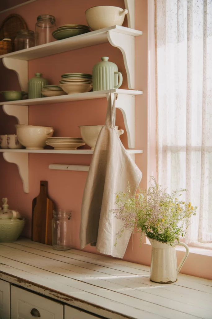
A barely-there blush pink is the epitome of cottagecore, bringing a romantic, gentle energy to the kitchen. This isn’t Pepto pink—it’s a whisper of color that feels nostalgic and sweet without being saccharine. Pair it with natural wood, vintage textiles, and plenty of plants for a dreamy, pastoral vibe. 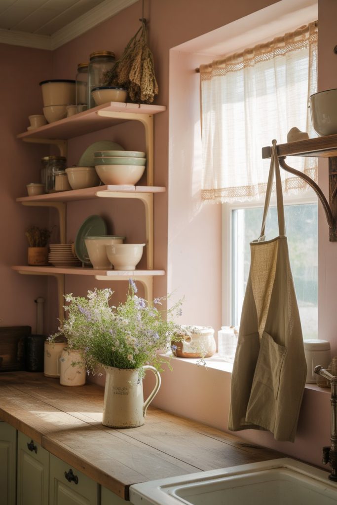
This palette is particularly popular in rural areas and among younger homeowners renovating older homes. It photographs beautifully in natural light and pairs well with vintage finds from flea markets and estate sales, making it a budget-friendly choice for the thrift-savvy decorator.
15. Warm Taupe for West-Facing Kitchens
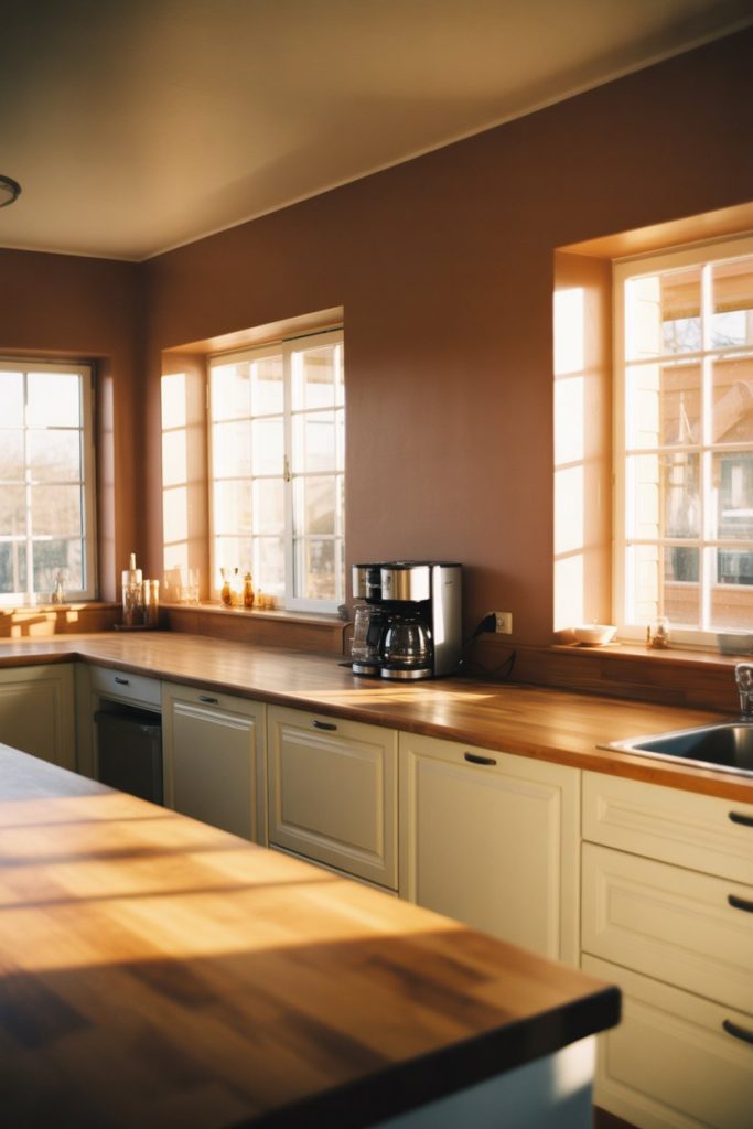
If you have a west-facing kitchen, you know the golden afternoon light can be both a blessing and a challenge. A warm taupe wall color works beautifully here, absorbing that honey-toned light without turning orange or muddy. It’s sophisticated, easy to live with, and transitions beautifully from day to night. 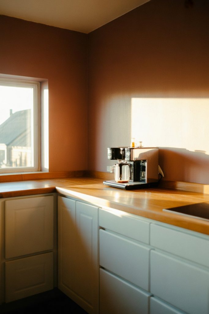
Practical insight: test your taupe at different times of day before committing. What looks perfect at 3 p.m. might look too warm or too gray in morning light. Paint large sample boards and move them around the room to see how the color shifts.
16. Benjamin Moore Hale Navy on Lower Cabinets
Benjamin Moore Hale Navy is a designer favorite for lower cabinets, especially when paired with white uppers and walls. This creates a grounded, two-tone look that feels custom and considered. The navy adds depth without overwhelming the space, and it hides everyday wear better than lighter colors. 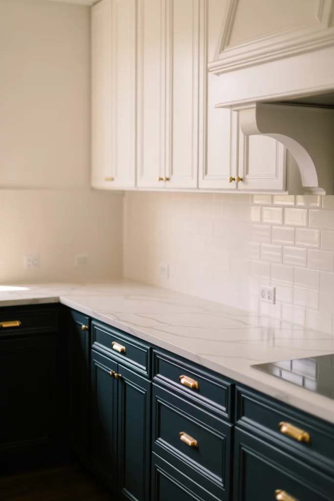
A micro-anecdote: I once watched a friend transform her builder-grade kitchen with just this paint color. The cabinets were the same, but the navy made them look custom and expensive. She spent about $150 on paint and suddenly had a kitchen worth pinning.
17. Warm Cream for Cherry Cabinets
If you have cherry cabinets, you know they can skew orange or red depending on the light. A warm cream wall color—not white, not beige—creates harmony by echoing the wood’s warm undertones. This softens the intensity of cherry without fighting it, creating a space that feels cohesive and intentional. 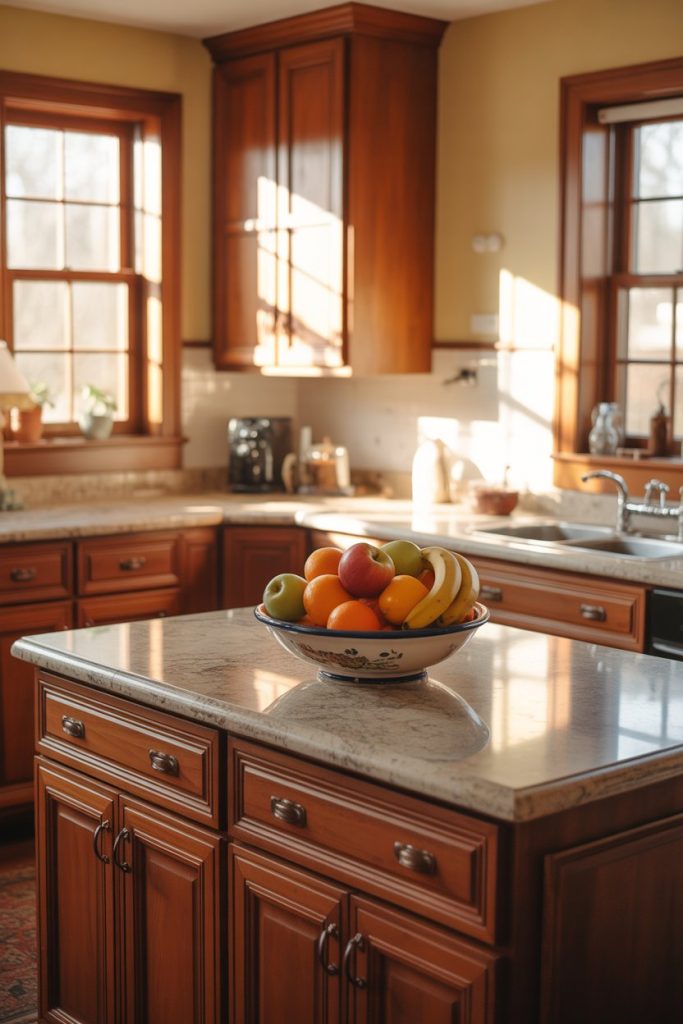
Common mistake: pairing cherry with cool grays or stark whites, which creates a jarring contrast. Stick with warm, creamy tones, and add in soft greens or blues through accessories if you want a little color variety.
18. Charcoal with White Cabinets and Black Countertops
For a truly modern look, pair charcoal walls with white cabinets and black countertops. This creates a graphic, high-contrast space that feels edited and intentional. The charcoal adds depth without competing with the black counters, and the white cabinets keep everything from feeling too dark. 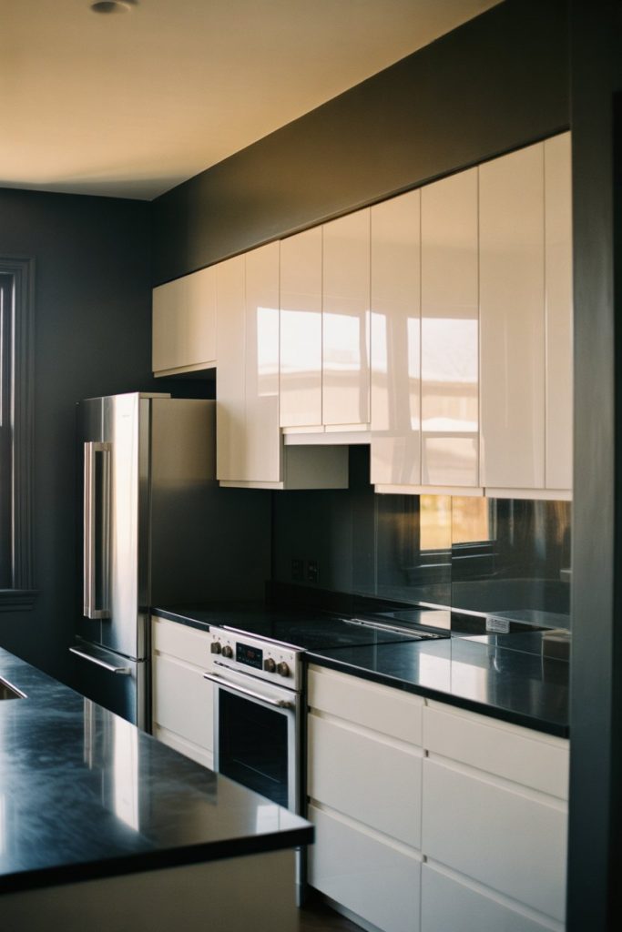
Where it works best: contemporary homes with good lighting and open floor plans. This palette needs space to breathe. Add warmth through wood floors, cutting boards, and plants to prevent it from feeling sterile.
19. Dusty Rose with Vintage Hardware
Dusty rose is making a comeback as a sophisticated neutral that leans slightly pink. It’s perfect for vintage-inspired kitchens where you want color but nothing too bold. Pair it with brass or copper hardware, marble countertops, and vintage-style appliances for a collected-over-time look. 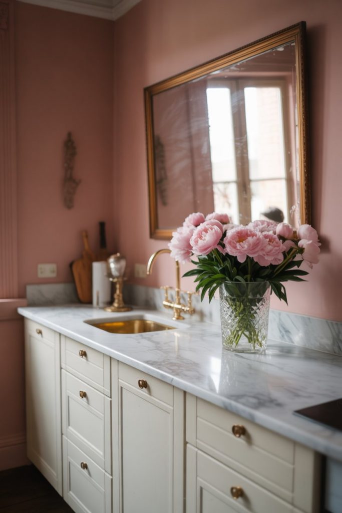
This color is particularly flattering in kitchens with warm wood floors and plenty of natural light. In the Northeast and Mid-Atlantic, it feels right at home in historic rowhouses and Victorian homes undergoing thoughtful renovations.
20. Two-Tone Color Combinations for Visual Interest
One of the smartest ideas for 2026 is using two-tone combinations—painting upper and lower cabinets different colors or using one color on walls and another as an accent. This creates visual interest and allows you to incorporate multiple trends without committing fully to either. 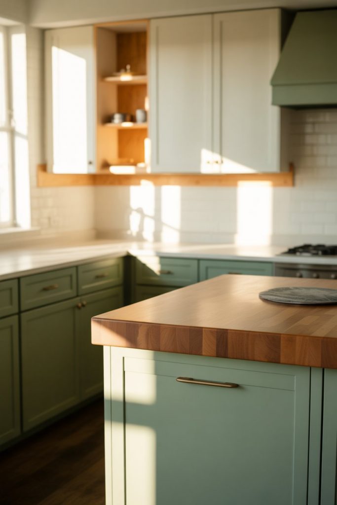
Budget angle: this approach lets you use expensive designer colors sparingly. Paint the lowers in a bold or trendy shade, keep the uppers neutral, and you’ve created a custom look without breaking the bank. It’s also easier to update later if tastes change.
21. Earthy Brown for a Grounded, Natural Kitchen
Rich, earthy browns—from cocoa to mushroom—are emerging as the sophisticated neutral of 2026. These colors feel grounded and warm, working beautifully with natural materials like wood, stone, and linen. They’re especially popular in farmhouse and transitional kitchens where warmth is the priority.
Expert-style commentary: brown is finally shedding its dated reputation and being recognized for what it is—a true neutral that works with everything. Layer in different tones and textures to keep it interesting, and don’t be afraid to go dark. In naturally lit spaces, deep browns read as luxurious rather than oppressive.
Conclusion
The kitchen paint colors trending in 2026 are all about warmth, personality, and creating spaces that feel lived-in and loved. Whether you’re drawn to moody drama, coastal calm, or vintage charm, there’s a palette here that can transform your space. Try one of these ideas, adapt it to your style, and don’t forget to share your results in the comments—we’d love to see how these colors come to life in your home.