Kitchen color is having a major moment in 2026, and it’s no surprise that American homeowners are turning to Pinterest for fresh inspiration. Whether you’re planning a full remodel or just craving a mood shift, the right palette can completely transform how your kitchen feels—from energizing morning routines to cozy evening gatherings. This year’s trending schemes blend timeless appeal with bold personality, balancing classic neutrals with unexpected pops of color. Below, you’ll find kitchen color ideas that reflect everything from vintage charm to modern minimalism, each designed to spark your creativity and help you discover the perfect look for your space.
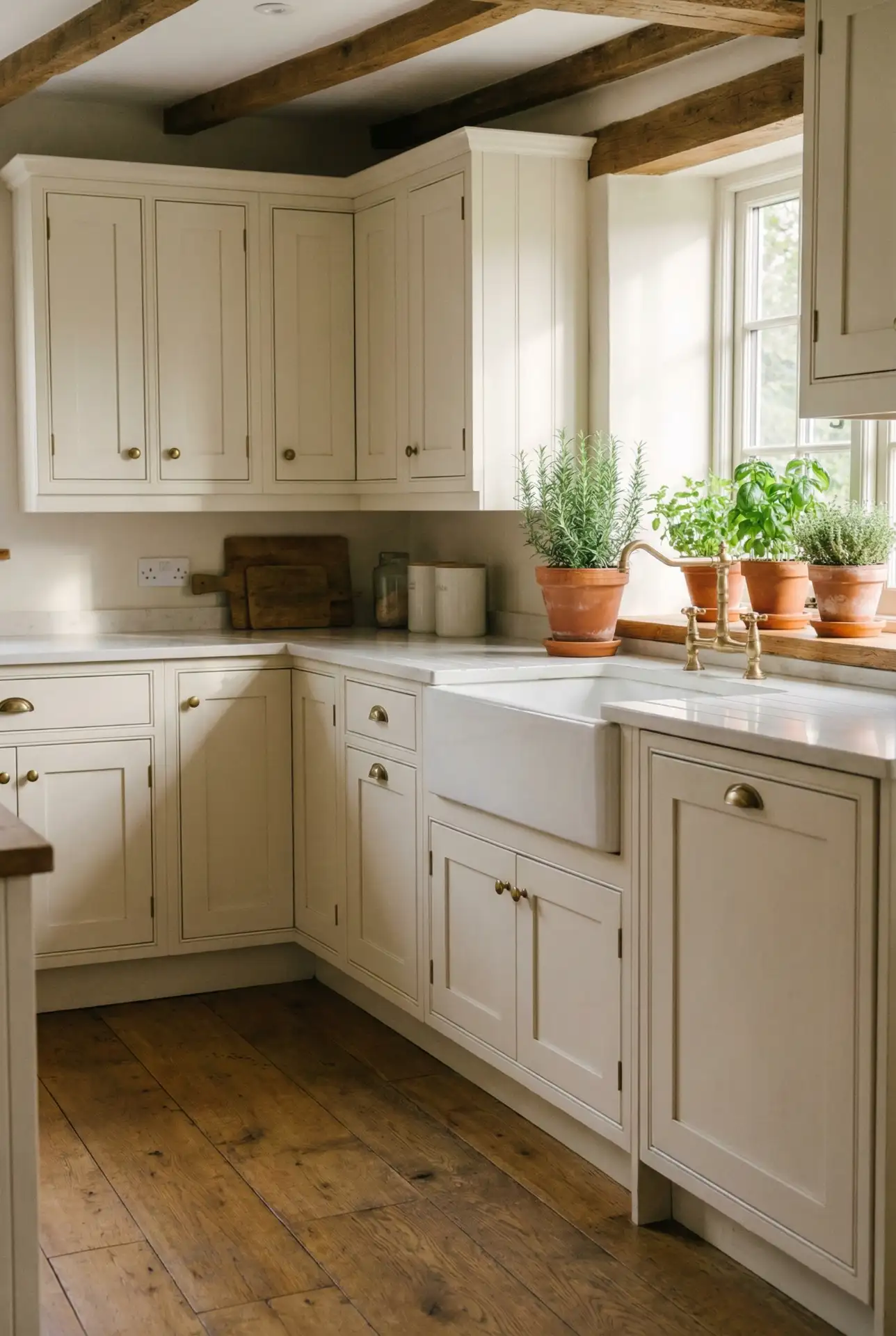
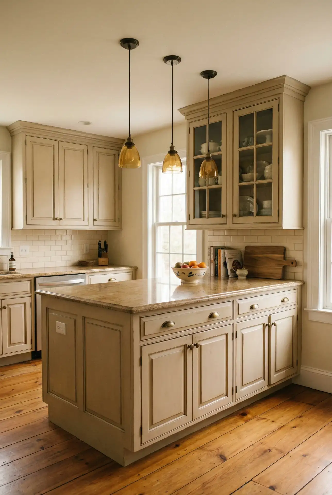
1. Warm Farmhouse White and Cream
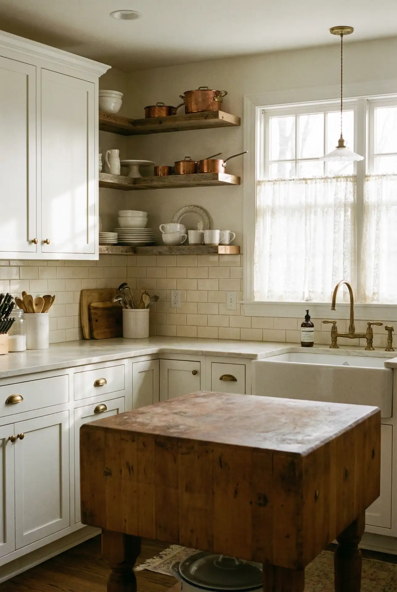
Where this works best is in homes with existing wood tones or exposed beams—the warm whites complement natural materials rather than fighting them. A client once told me she chose this scheme because it reminded her of her grandmother’s kitchen in Tennessee, where everything felt slower and more intentional. It’s a palette that invites you to linger over coffee, and it photographs beautifully for those who love sharing their spaces online.
2. Bold Emerald Green Statement
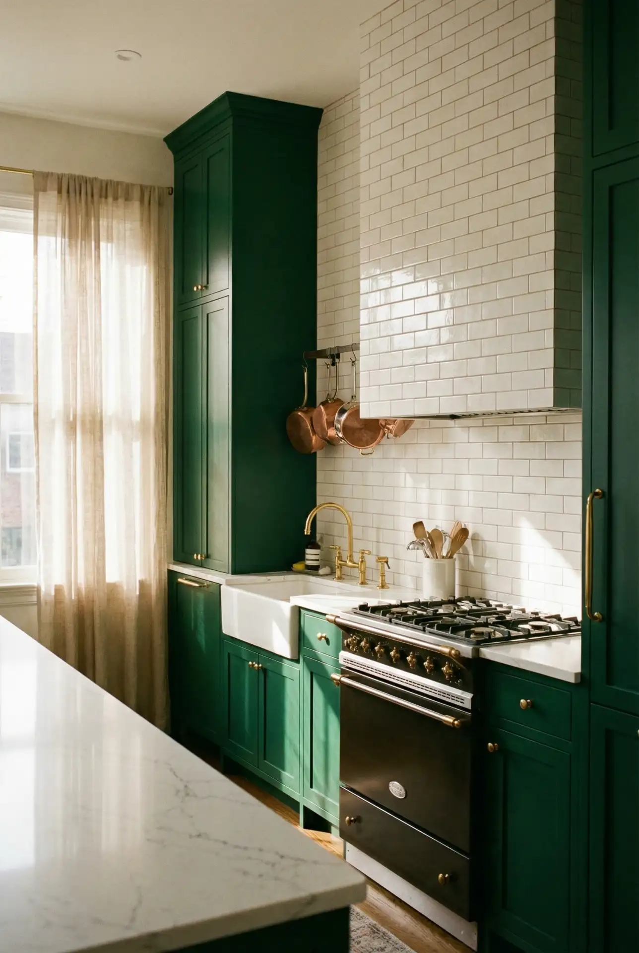
If bold is what you are after, these dark emerald green cabinets offer a luxurious, jewel-toned alternative to your standard safe neutrals. Counteract the richness from becoming too heavy by teaming it with antiqued brass or gold hardware, marble counters, and warm wood accents. This classic color has its heritage in traditional British and European design, but it’s at home in today’s American kitchens too—especially when given ample natural light and walls of white or cream. 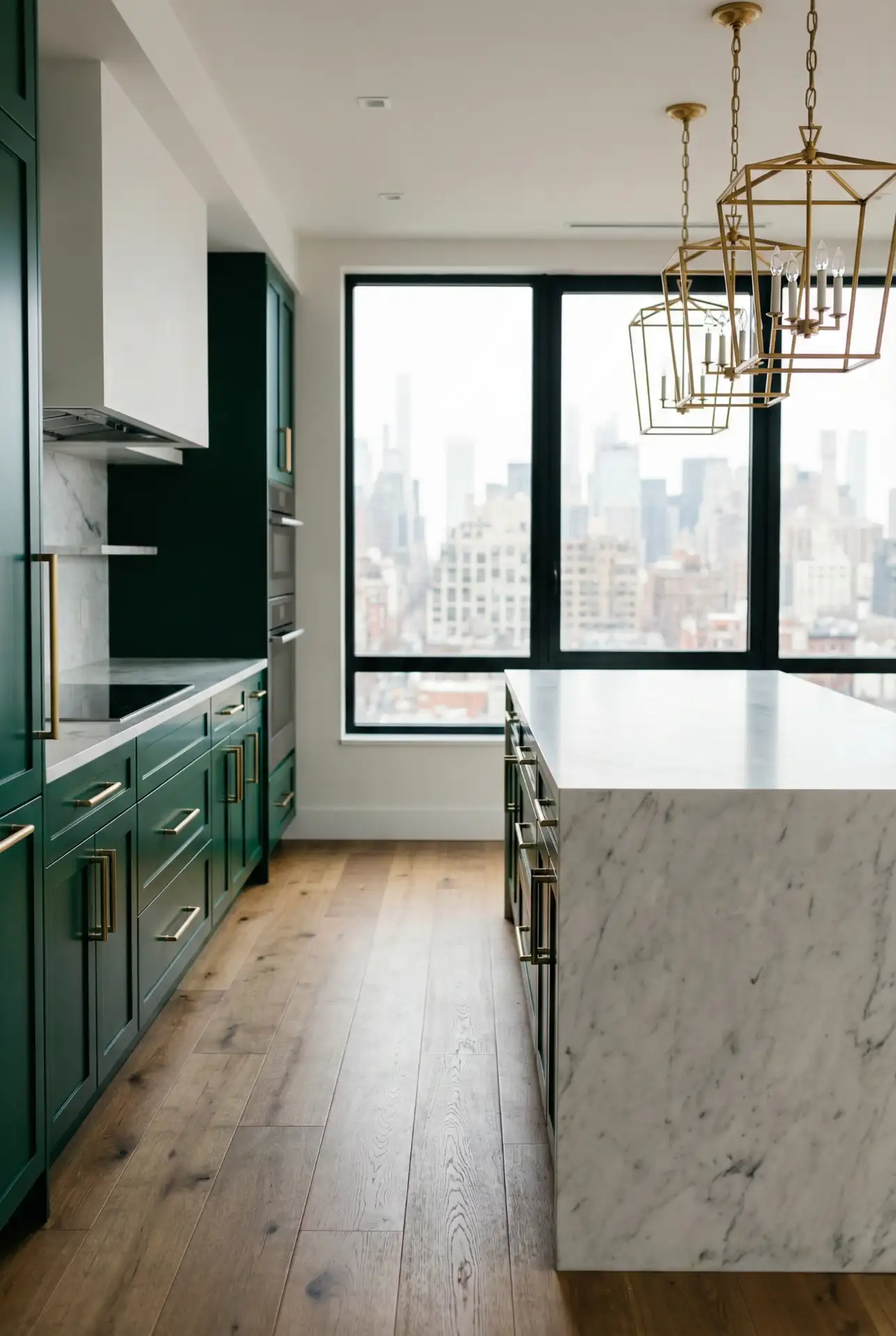
One common mistake is pairing emerald with too many other bold colors—it’s already doing the heavy lifting. Instead, let the green be the star and surround it with neutrals and natural textures. Real homeowners who’ve gone this route often say they were nervous at first, but now they can’t imagine their kitchen any other way. It’s a color that grows on you and makes every meal feel a little more special.
3. Soft Sage and Oak Harmony
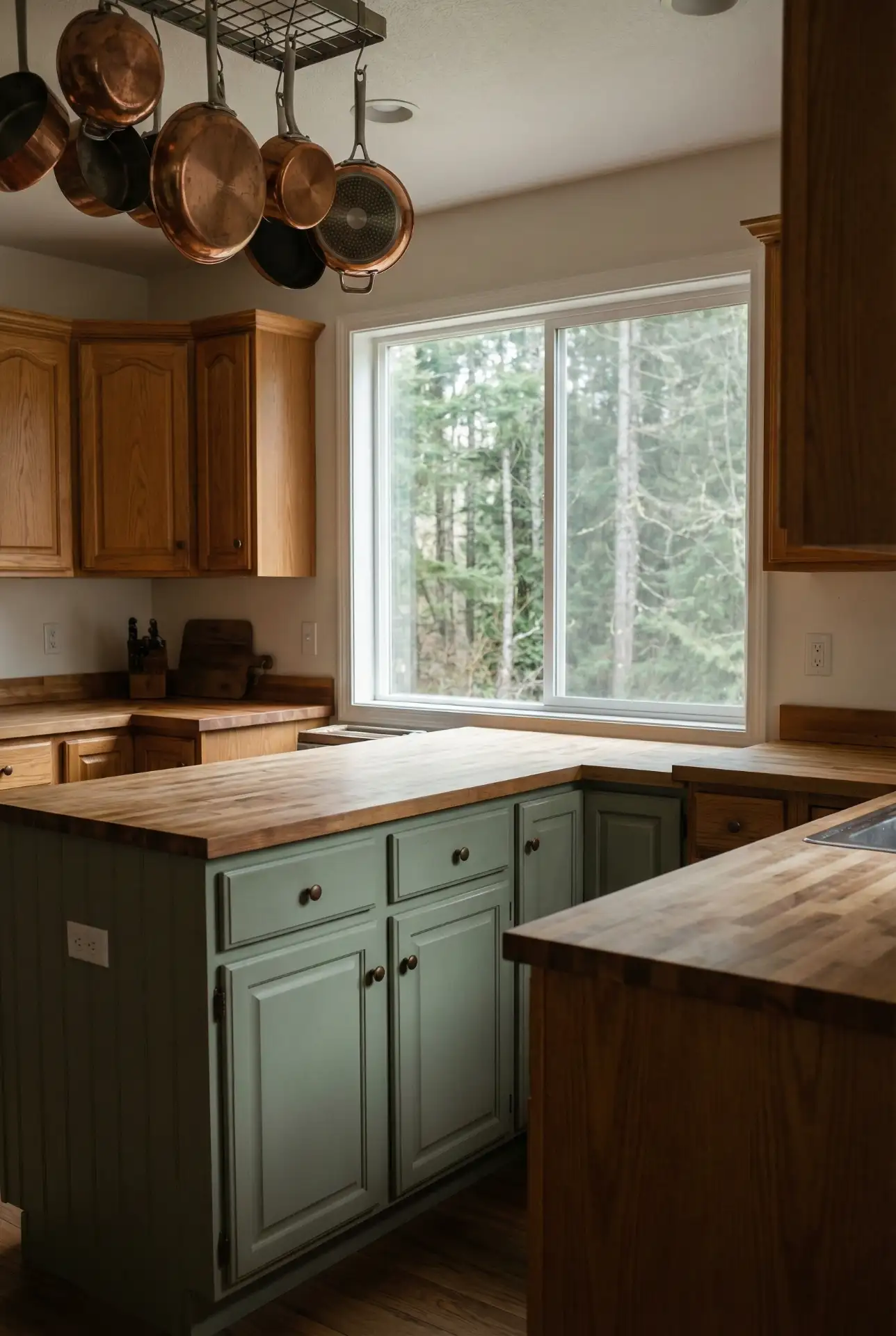
Sage green has emerged as the color of choice for those looking to create a serene, nature-based palette, beautifully complementing oak cabinets that generate warmth and wood-grain detail. This strategy is particularly popular in the Pacific Northwest and mountainous areas, where homeowners often want the inside of their homes to repeat the landscape outside. The subdued green takes the edge off sometimes-orange oak plus provides that just-right organic feel, kinda split between contemporary and classic. 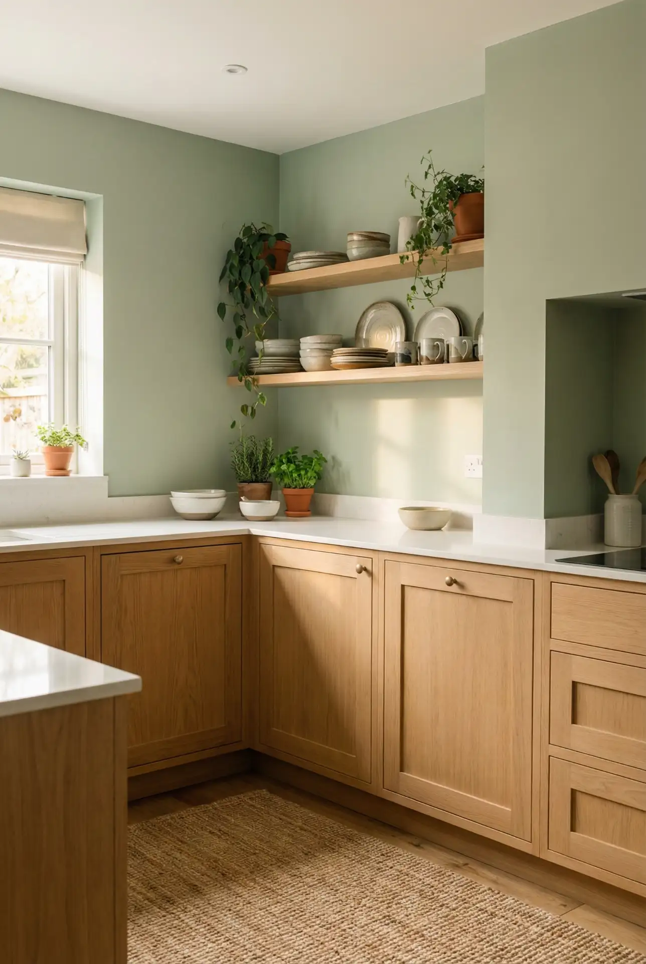
Savvy renovators can’t get enough of this trick: You can paint existing oak cabinets in sage or use sage on the wall and keep the oak cabinetry as is—either way you’ll save a small fortune over installing brand-new ones. It’s a smart way to update an old kitchen without losing the feel of solid wood. Sage also happens to be forgiving: it hides smudges and fingerprints better than stark white, and that’s important in a busy family kitchen.
4. Dramatic Black and White Contrast
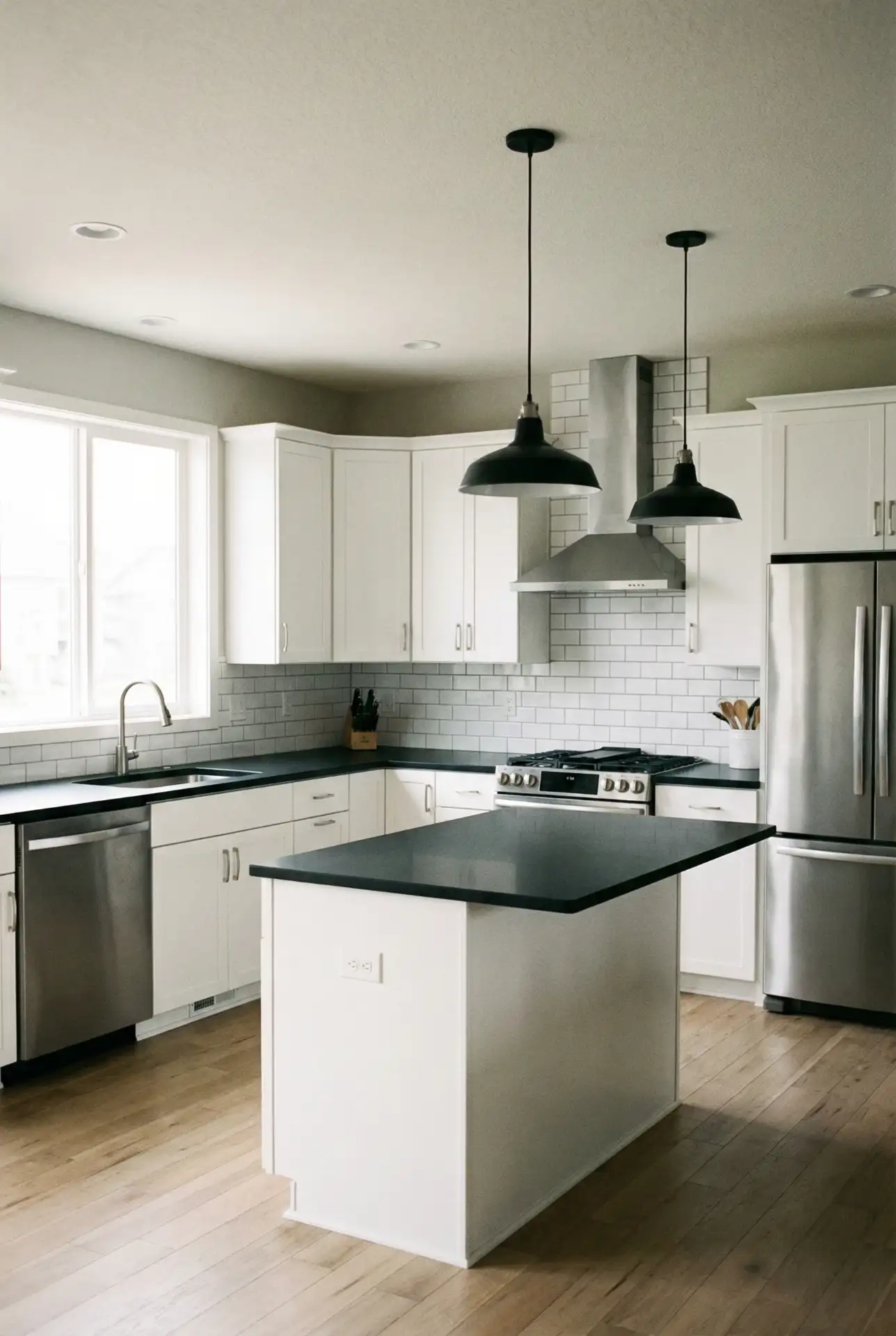
“White cabinets and a black countertop were supposed to be an awful combo, but it is actually my favorite look yet!” “High-contrast” was a signature look in the next several decades but feels especially crisp in 2026 when styled with modern hardware and not much else. And the black surface—be it granite, quartz, or soapstone—provides a grounding force against the white and visual weight so things don’t get too antiseptic. This classic pair goes with everything from tiny galley kitchens to huge open-plan spaces. 
Where this truly shines is in homes warehoused with natural light—the black countertop can read a bit heavy in an already dark space, but when that sunlight pours in, it becomes a sleek anchor instead of a vortex of darkness. I once had a decorator tell me that her clients feared black would reveal every crumb, but they soon found that honed or leathered surfaces conceal the signs of daily wear better than polished white marble ever could. It’s a “workhorse” palette that comes across as effortlessly polished.
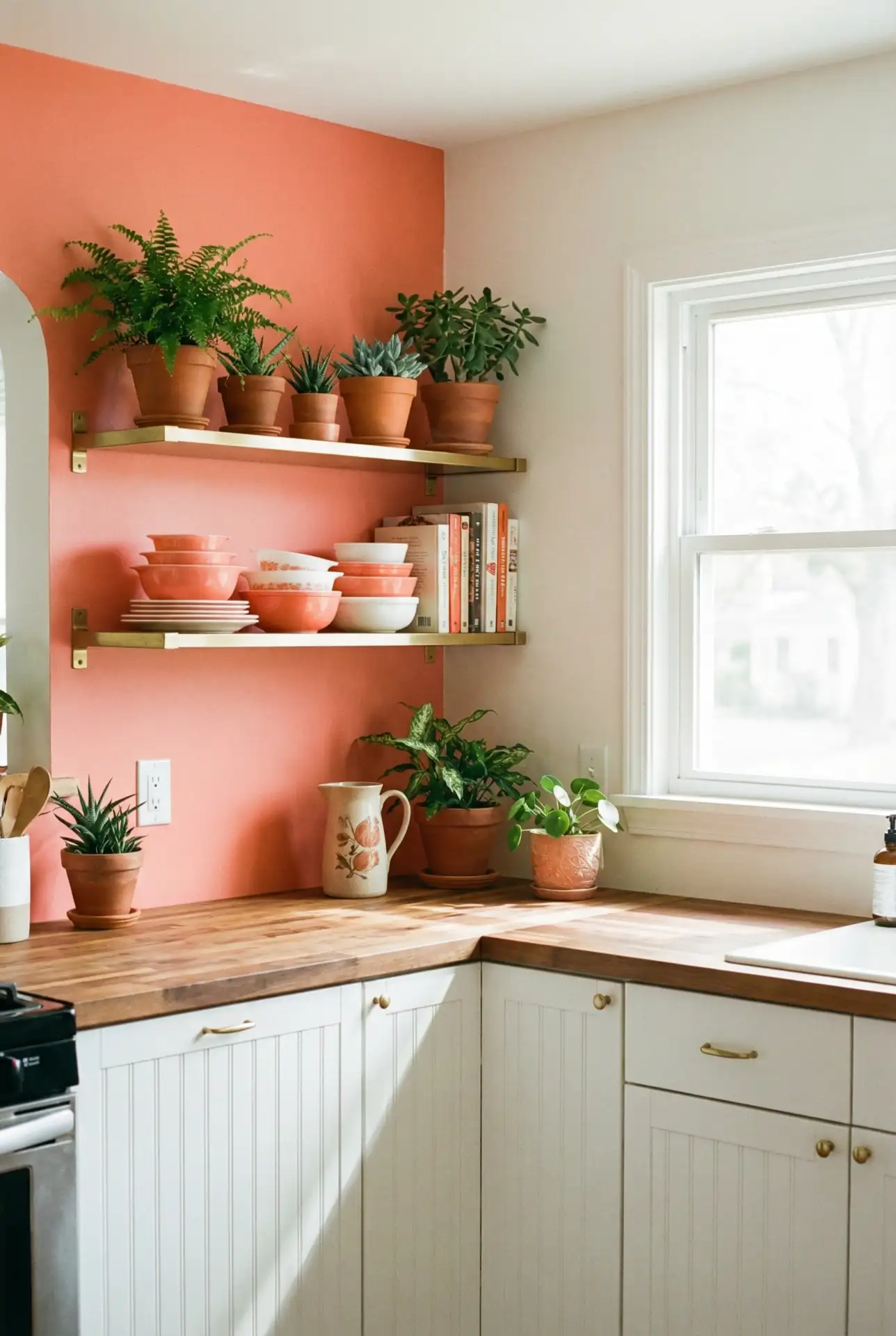
5. Warm Terracotta and Cream
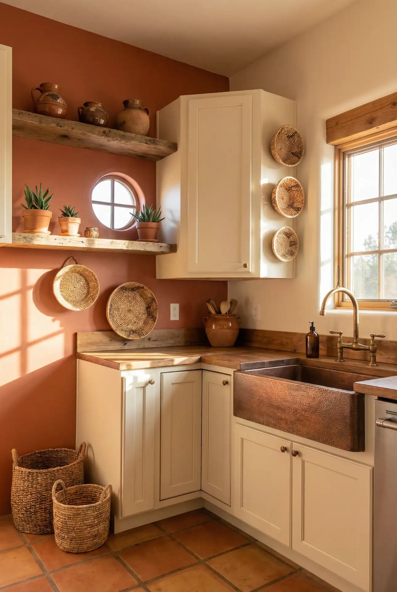
Terracotta brings an earthy, sun-baked warmth to kitchens, and when paired with cream cabinetry, it evokes a Tuscan villa or southwestern hacienda without feeling like a theme park. This palette is especially appealing in desert regions of the U.S.—Arizona, New Mexico, and Southern California—where the climate and landscape naturally complement these warm tones. Think terracotta tile backsplashes, painted accent walls, or even clay-hued dishware on open shelves. 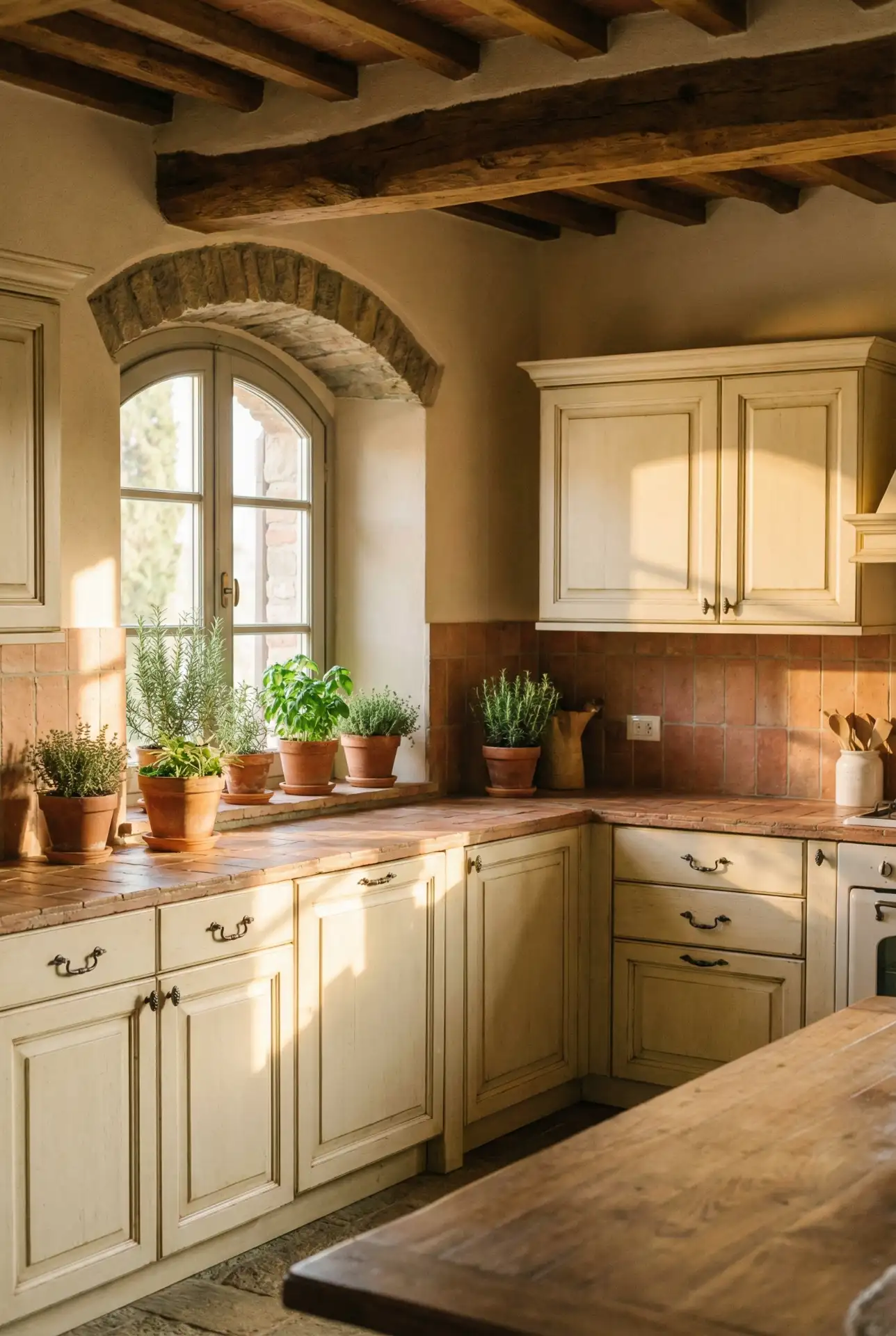
Homeowners who embrace this scheme often report that it makes their kitchen feel like the heart of the home—inviting, warm, and a little bit romantic. One couple in Scottsdale painted their kitchen walls in a soft terracotta and said it transformed the space from builder-grade bland to something that felt hand-picked and personal. It’s a color story that rewards boldness but doesn’t require a huge budget; even small terracotta accents can shift the entire mood.
6. Classic French Country Blue-Gray
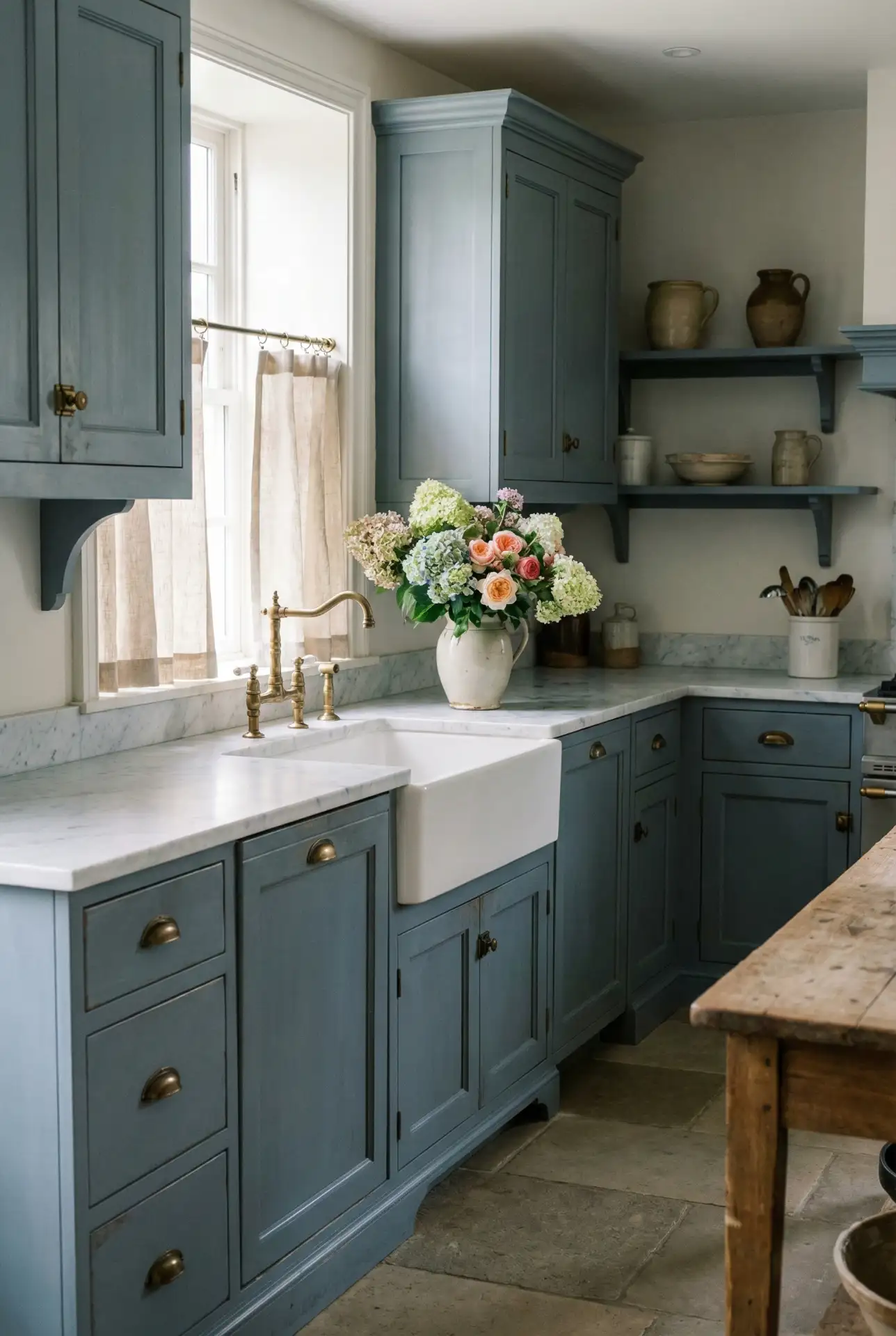
Soft blue-gray cabinetry is a hallmark of French country design, offering a muted elegance that feels both vintage and current. Pair it with white marble or butcher block countertops, delicate hardware, and open shelving to complete the look. This palette is particularly popular in New England and the Mid-Atlantic, where European-inspired aesthetics have long been favored. The color itself is incredibly versatile—it reads cool in bright light and warm in the evening, adapting to the rhythms of daily life. 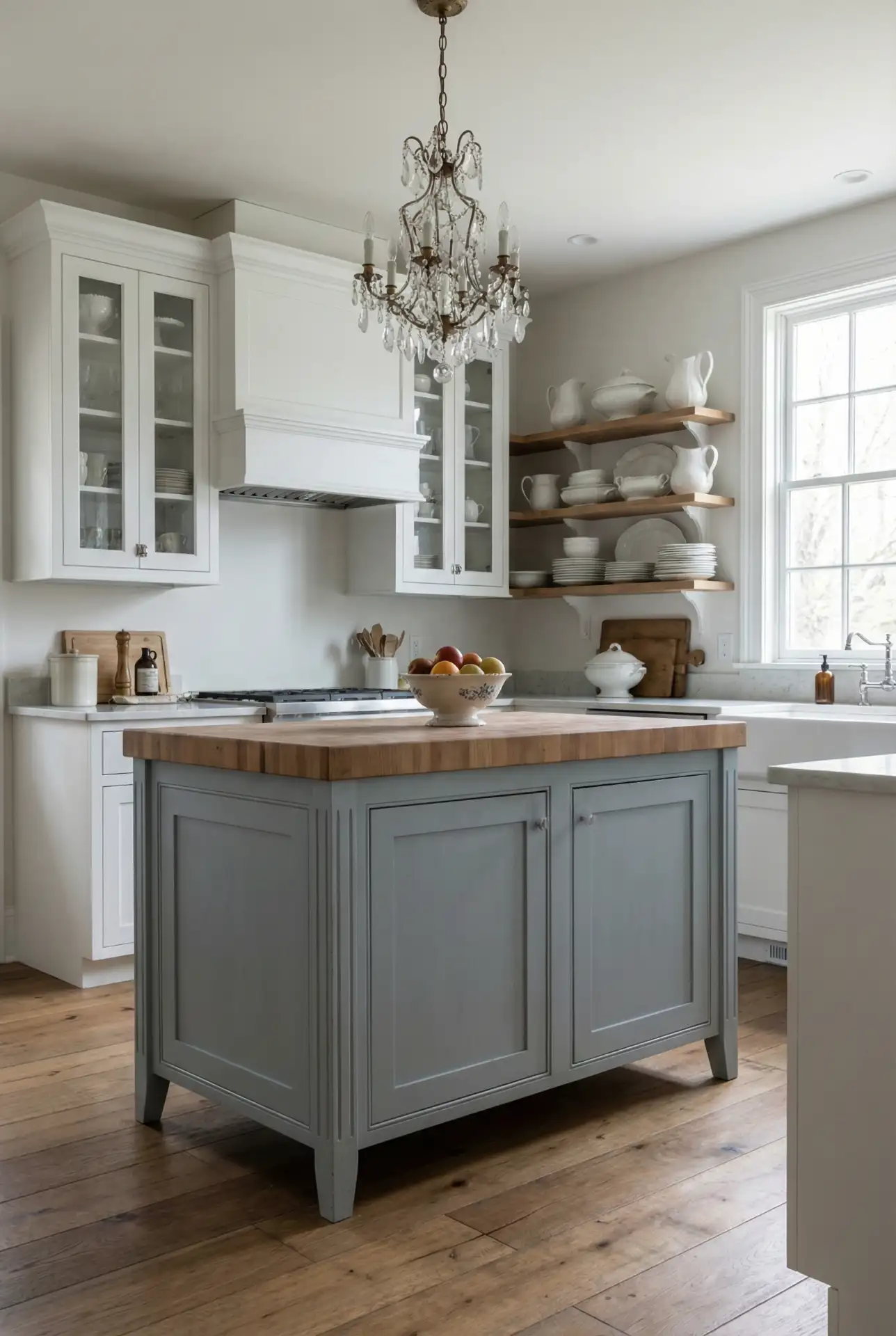
One actionable insight: wearing and fingerprints show up less in this color than pure white, but it still feels light and airy enough for anyone who loves brights. It’s a perfect pick for families that want an updated look without the hassle of maintaining unblemished white doors. One Connecticut house owner tells us her blue-gray kitchen has now lived through three kids and countless dinner parties, still looking as good as the day it was finished—proof of both its durability and its classic looks.
7. Deep Charcoal and Brass Accents
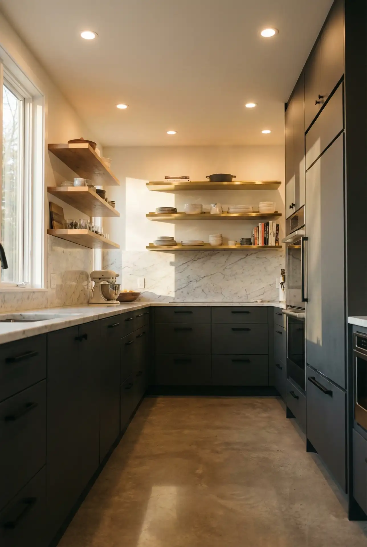
For those craving a moody, sophisticated vibe, deep charcoal cabinetry paired with warm brass hardware offers a dramatic yet refined look. This scheme works beautifully in urban lofts, modern farmhouses, and even historic homes where a touch of edge is desired. The charcoal provides a neutral base that’s far more interesting than black, while the brass adds warmth and a hint of glamour. It’s a palette that feels grown-up and considered, perfect for serious home cooks who want their kitchen to reflect their style. 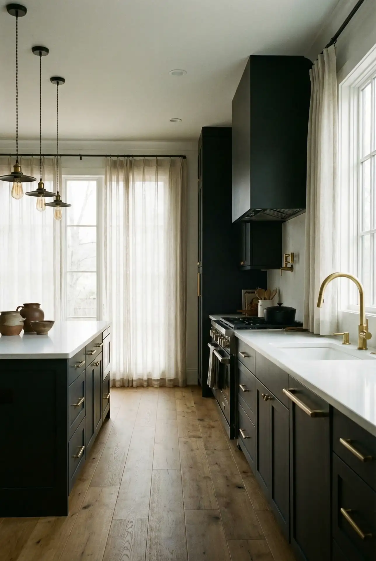
But that doesn’t mean this palette is only for large cooking spaces—note the lovely example of a small kitchen, above right. A dark color can make walls appear to recede and therefore make a room seem larger. One Brooklyn designer said that many of her clients are afraid dark cabinets will make their space feel smaller, but when done right, that is not the case. The trick is to offset the dark wood kitchen cabinetry with light flooring, lots of additional sources of light, and light metallics in the hardware, etc., to help reflect all that lovely light around.
8. Bright Red Pop with Neutral Base
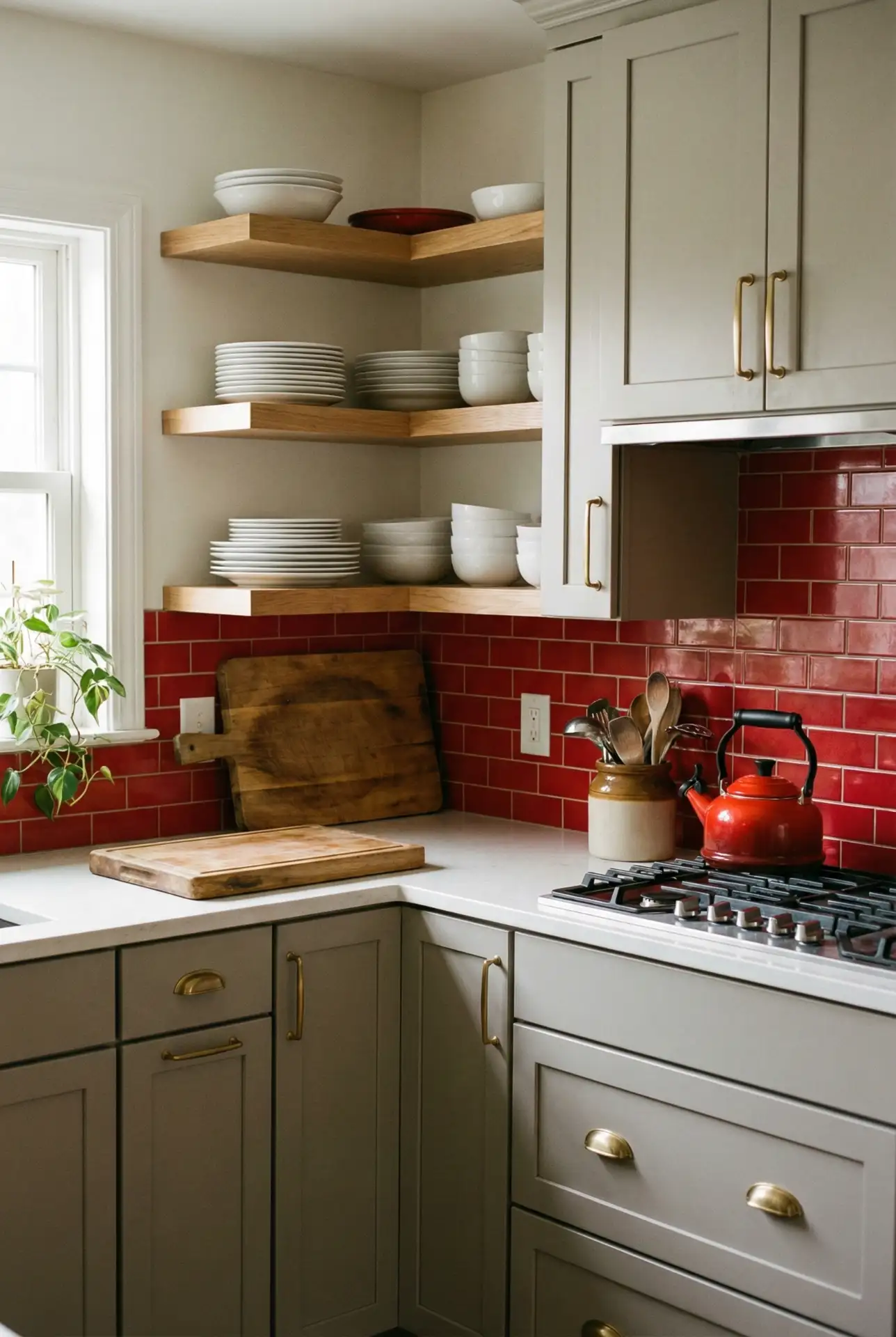
A red accent—whether it’s a single painted island, a bold backsplash, or even just red bar stools—can energize a neutral kitchen without overwhelming it. This approach is perfect for renters or cautious decorators who want personality but aren’t ready to commit to color on every surface. Red pairs surprisingly well with whites, grays, and even warm woods, and it has a retro charm that nods to mid-century diners and vintage Americana. It’s a happy color that makes the kitchen feel like a gathering place. 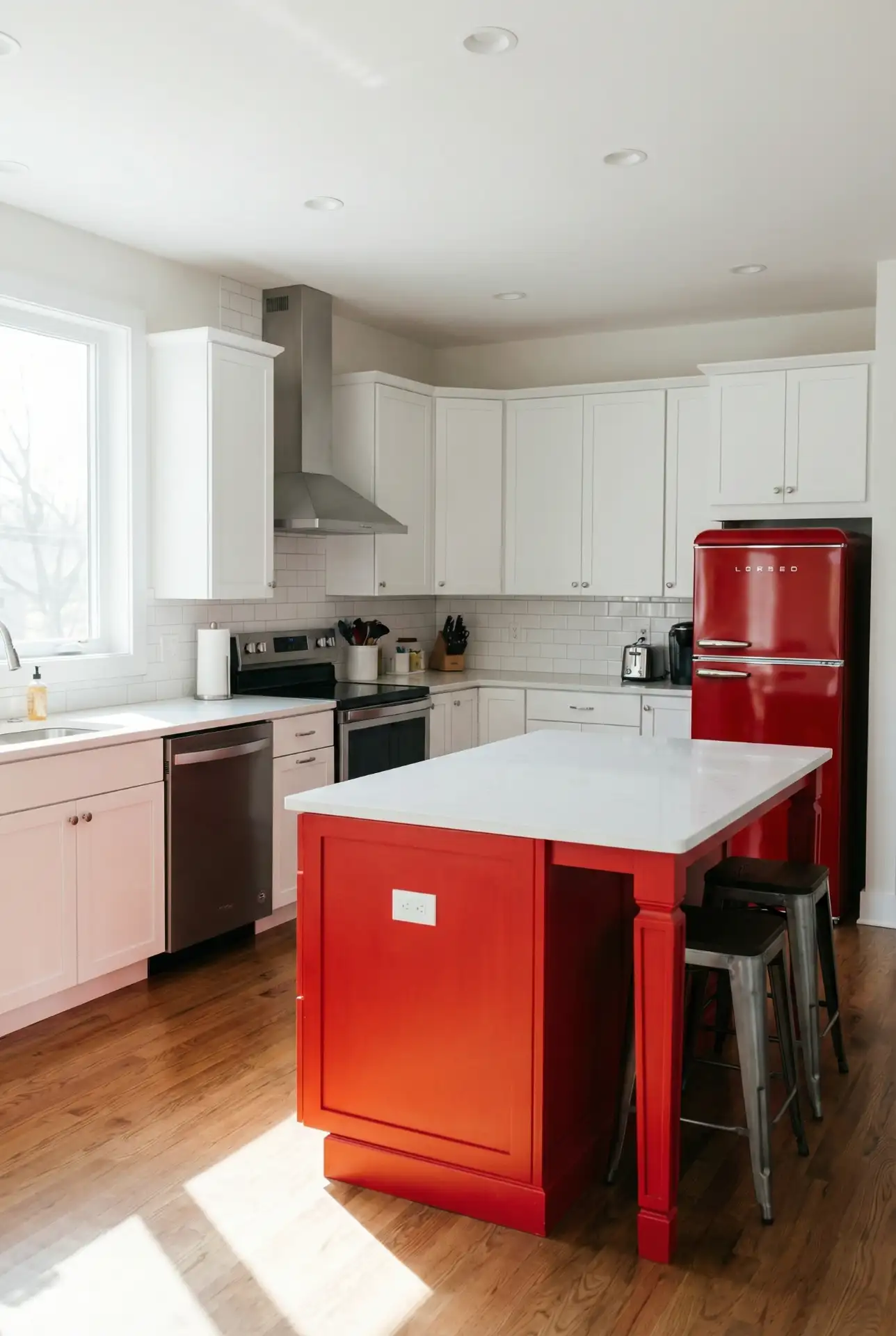
One Portland homeowner had lower cabinets painted red while keeping the uppers white—it’s one of the first things guests comment on, and it cost her less than $200 in paint and primer. Red is also deceptively versatile: you can go fire-engine bright for a fun vibe or opt for darker, more subdued crimson if moodier is the look you’re going for. Just be sure not to wear it with too many other strong colors—let the red do the heavy lifting and all else in supporting roles.
9. Creamy Yellow and White
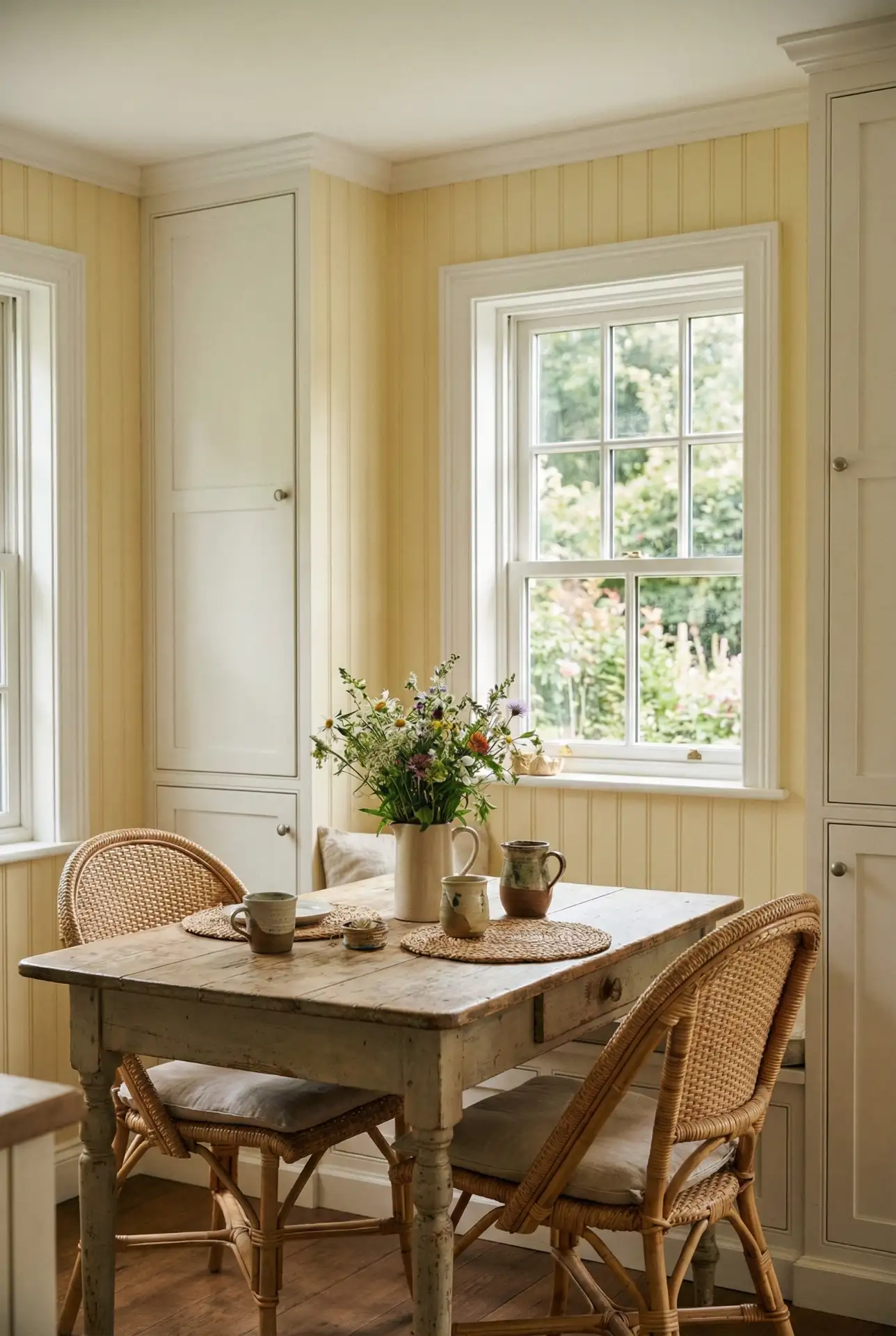
-2 A pale creamy yellow brings a little sunshine to the kitchen without being an in-your-face bright lemon. When paired with white cabinets, it can make for a lively, welcoming space that’s particularly right in breakfast nooks and farmhouse-style kitchens. This palette is a favorite in the South and Midwest, where kitchens tend to be the most active room in the house and where homeowners seek a color that will lift their spirits on even the grayest day. Think buttery yellow walls, white cabinets, and natural wood or brass accents. 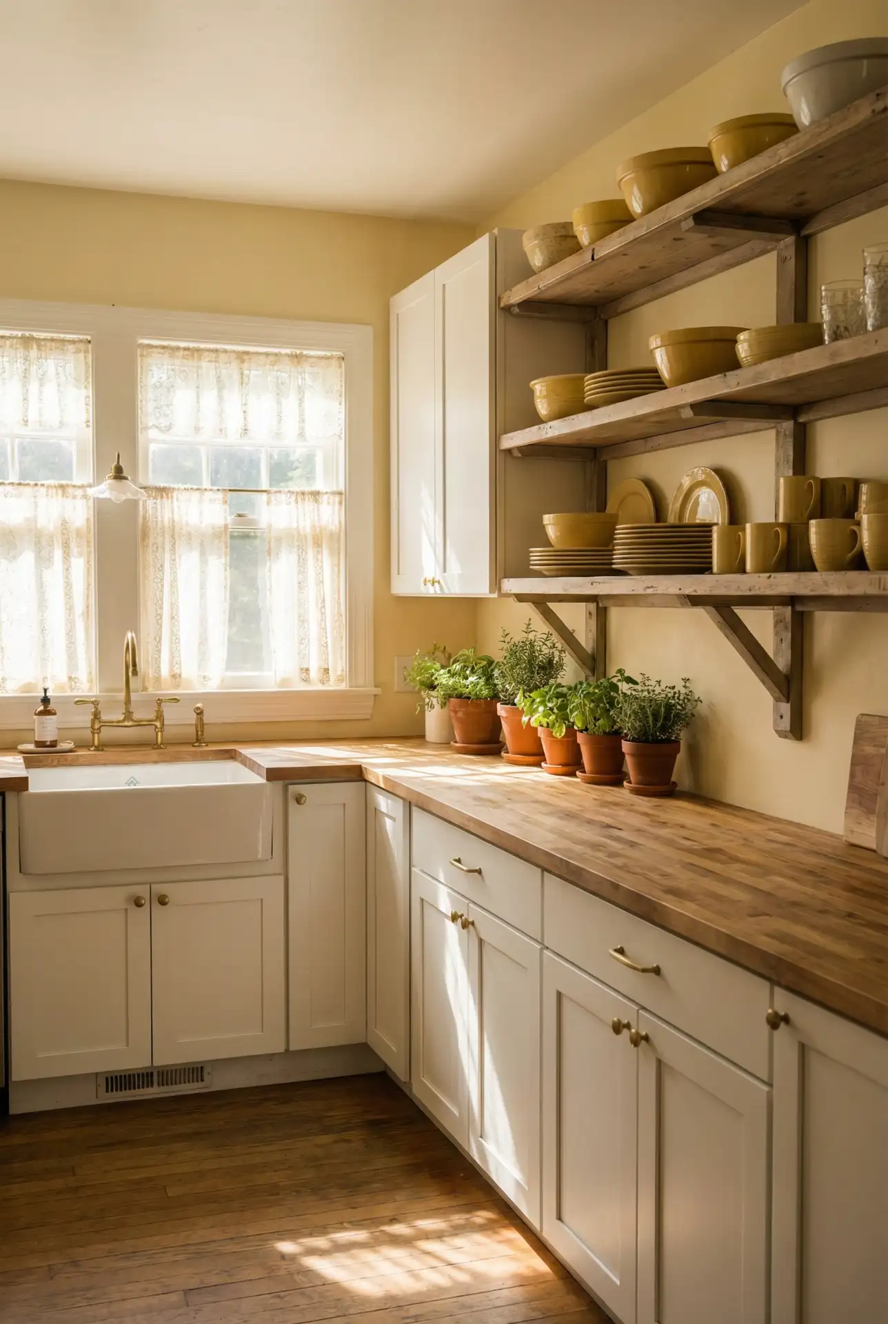
Where this works best is in north-facing kitchens that tend to feel cool and dim—yellow warms them up instantly. A common mistake is choosing a yellow that’s too saturated or too green; test samples in your actual light before committing. Real homeowners who’ve nailed this palette often mention that it makes morning coffee feel like a ritual and that guests always say the kitchen feels “happy.” It’s a color that doesn’t take itself too seriously, which is exactly the point.
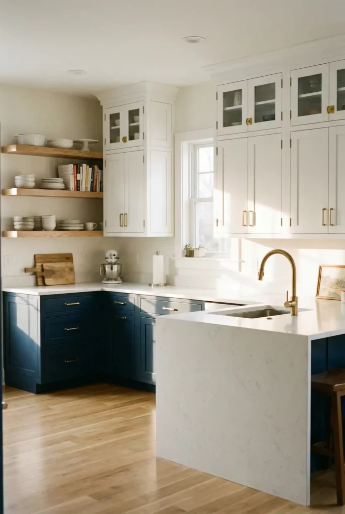
10. Navy Blue and Marble Elegance
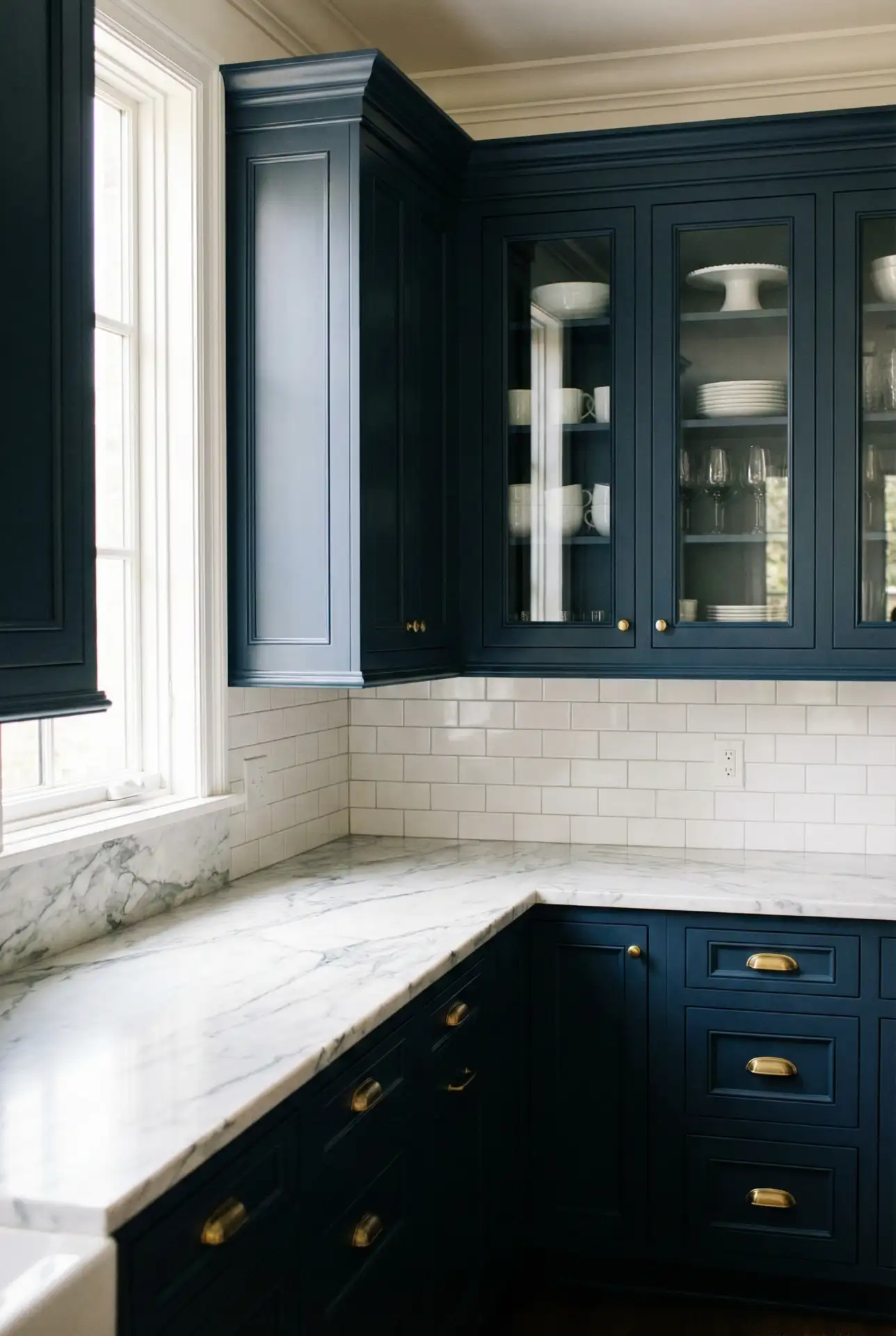
Navy blue cabinetry paired with white or gray marble countertops strikes a balance between bold and classic. This timeless combination has been favored in coastal homes from Maine to California, where the deep blue echoes the ocean while the marble keeps things refined. Navy is more approachable than black but still makes a statement, and it pairs beautifully with both warm metals like brass and cool finishes like chrome. It’s a color that reads as confident without being loud. 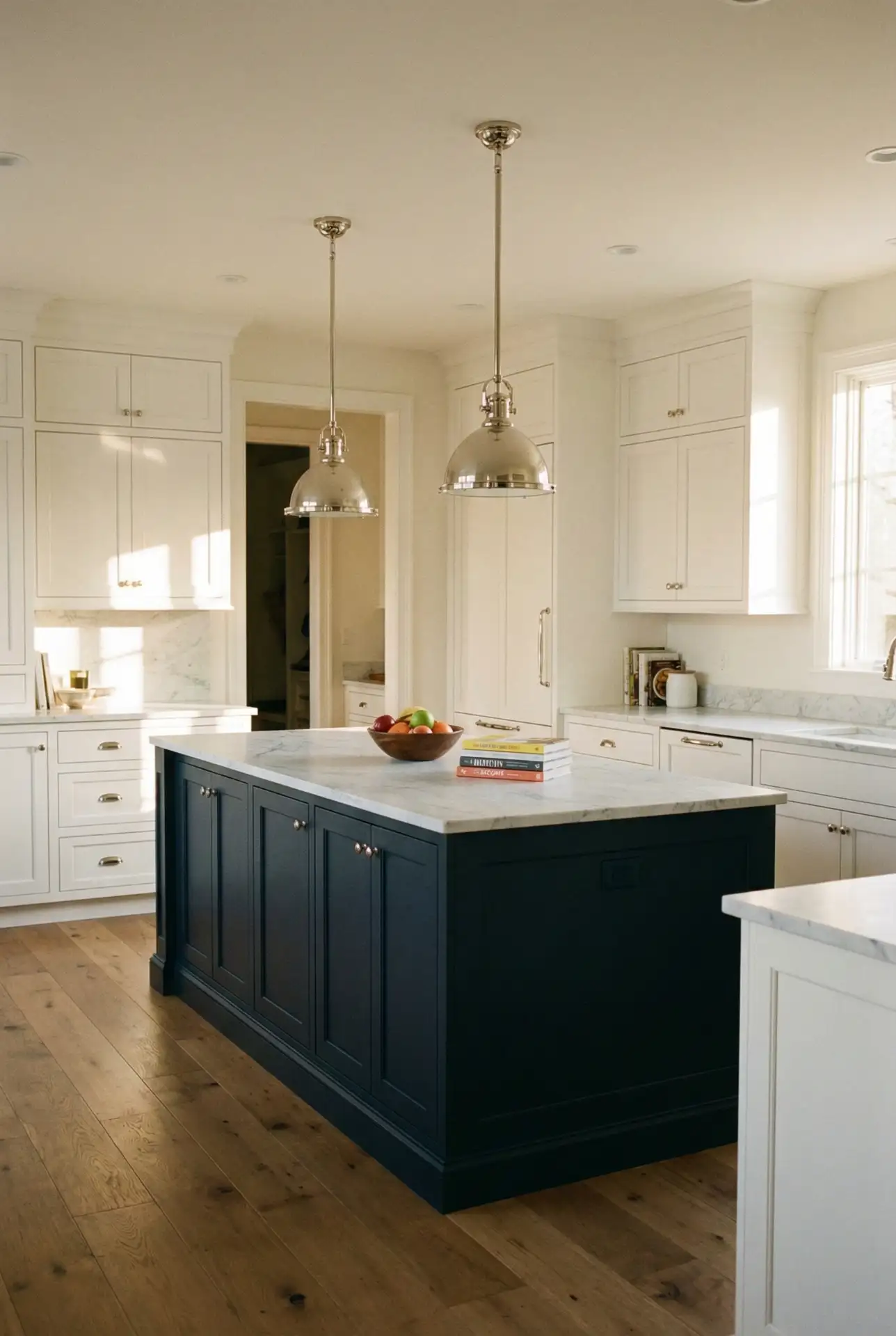
This palette is surprisingly budget-friendly if you choose quartz over natural marble—modern quartz can mimic Carrara or Calacatta at a fraction of the cost, and it’s far more durable for daily use. A homeowner in Charleston painted her existing oak cabinets navy and swapped in quartz countertops for under $5,000, transforming her dated kitchen into something that could be featured in a design magazine. Navy hides scuffs and fingerprints well, making it practical for families while still looking polished.
11. Soft Blush and Brass
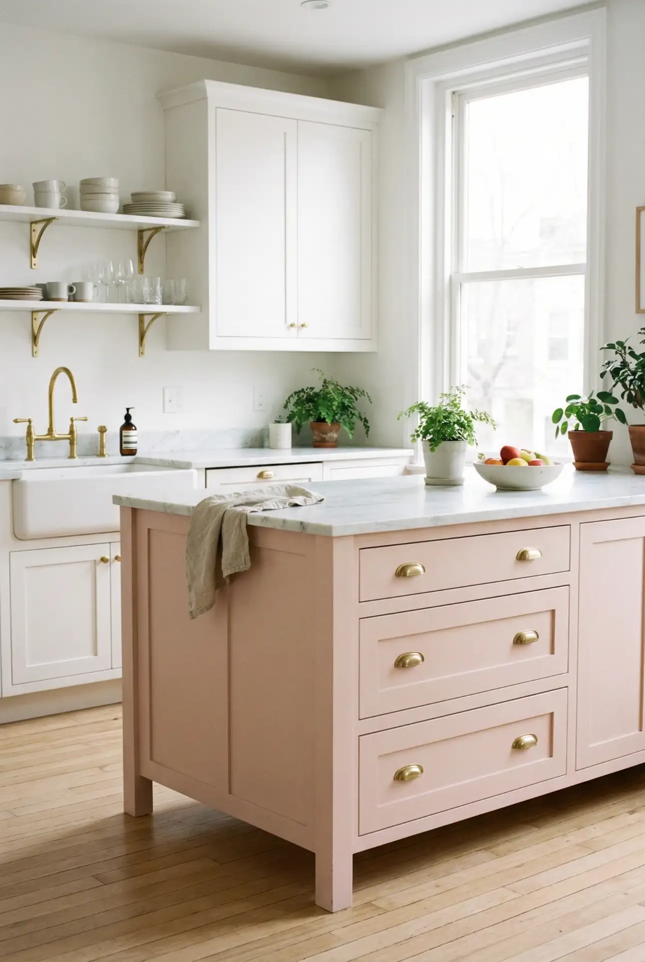
Blush pink is no longer just for bedrooms—it’s making its way into kitchens, where it injects a soft touch of femininity without looking overly precious. 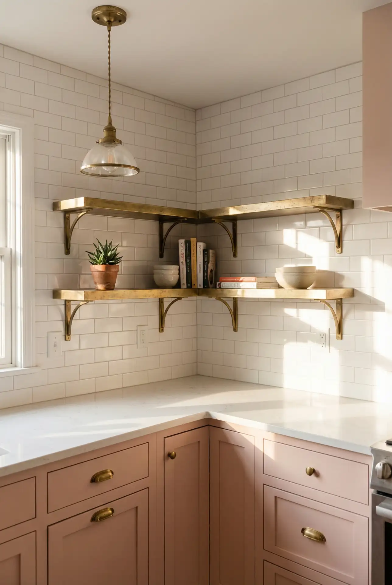
American lifestyle trends are all about customizability, and blush is a color that conveys distinctiveness—it’s not what everyone else is going for, which, of course, is the whole point. A Denver millennial couple painted their kitchen island blush on a whim—and liked it so much, they went for full cabinetry. The trick is to pick a blush with just enough gray or beige in it that keeps it from feeling too sugary—dusty rose, not bubblegum. It’s a gamble that tends to pay off gorgeously.
12. Earthy Olive Green and Wood
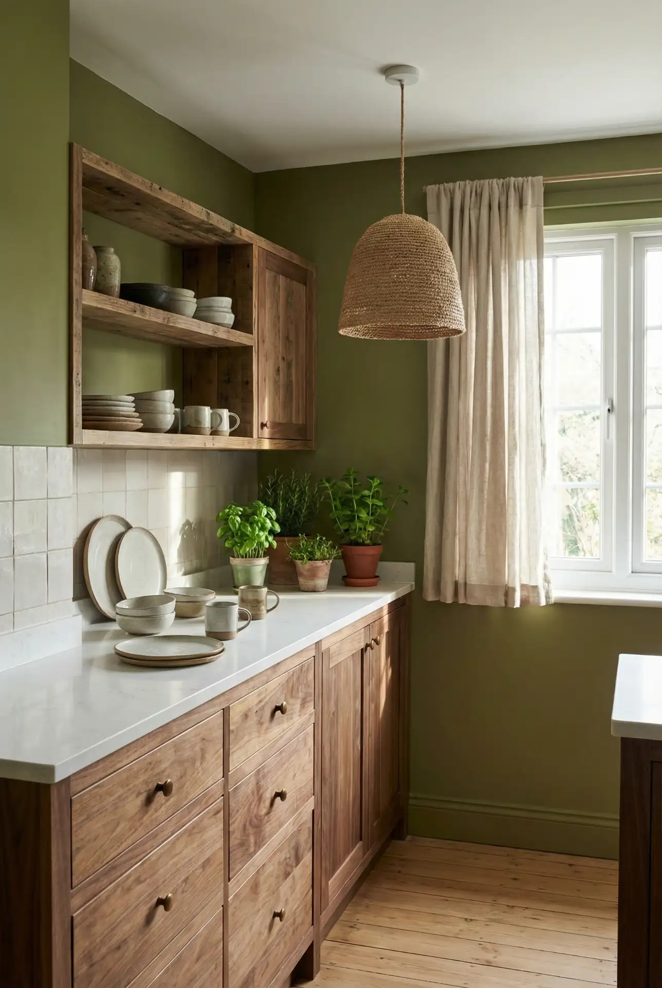
Olive Green: The color olive has long been associated with peace and quiet, but now more than ever homes should reflect a grounding sense of sanctuary. With wood cabinets (whether walnut or oak or, particularly, reclaimed pine), it makes a warm and organic palette that feels at home in both modern and traditional homes. This scheme is especially easy to pull off in the Pacific Northwest and mountain states, where you look outside your window and see tones of earthy browns & greens. Olive is muted enough to feel livable year-round but strong enough not to read as the path of least resistance. 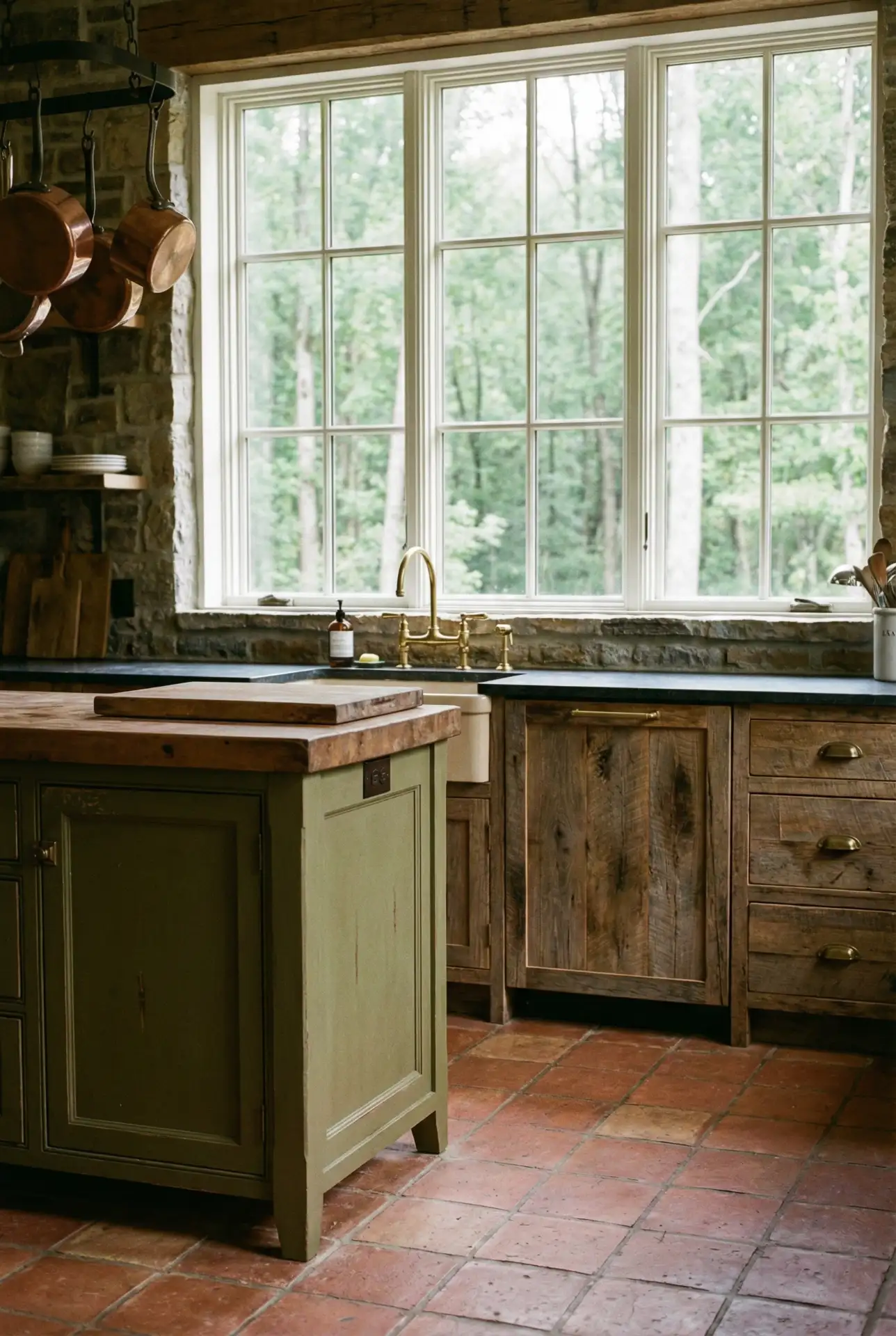
This shade is popular among green-minded homeowners since it plays so well with eco-friendly materials: bamboo, cork, and reclaimed wood. One Oregon couple painted their walls olive green and left the decade-old wooden cabinets they were about to update. The new look of the wood, they said, went from dated to intentional and saved them thousands of dollars. Olive is also a forgiving color; it doesn’t display dirt or scuffs the way lighter colors do, and that’s definitely a win in high-traffic kitchens.
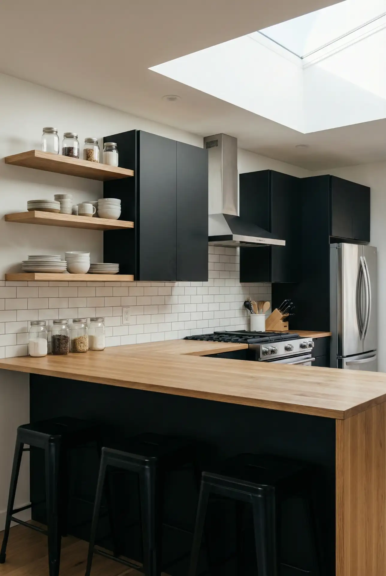
13. Crisp Gray and Stainless Steel
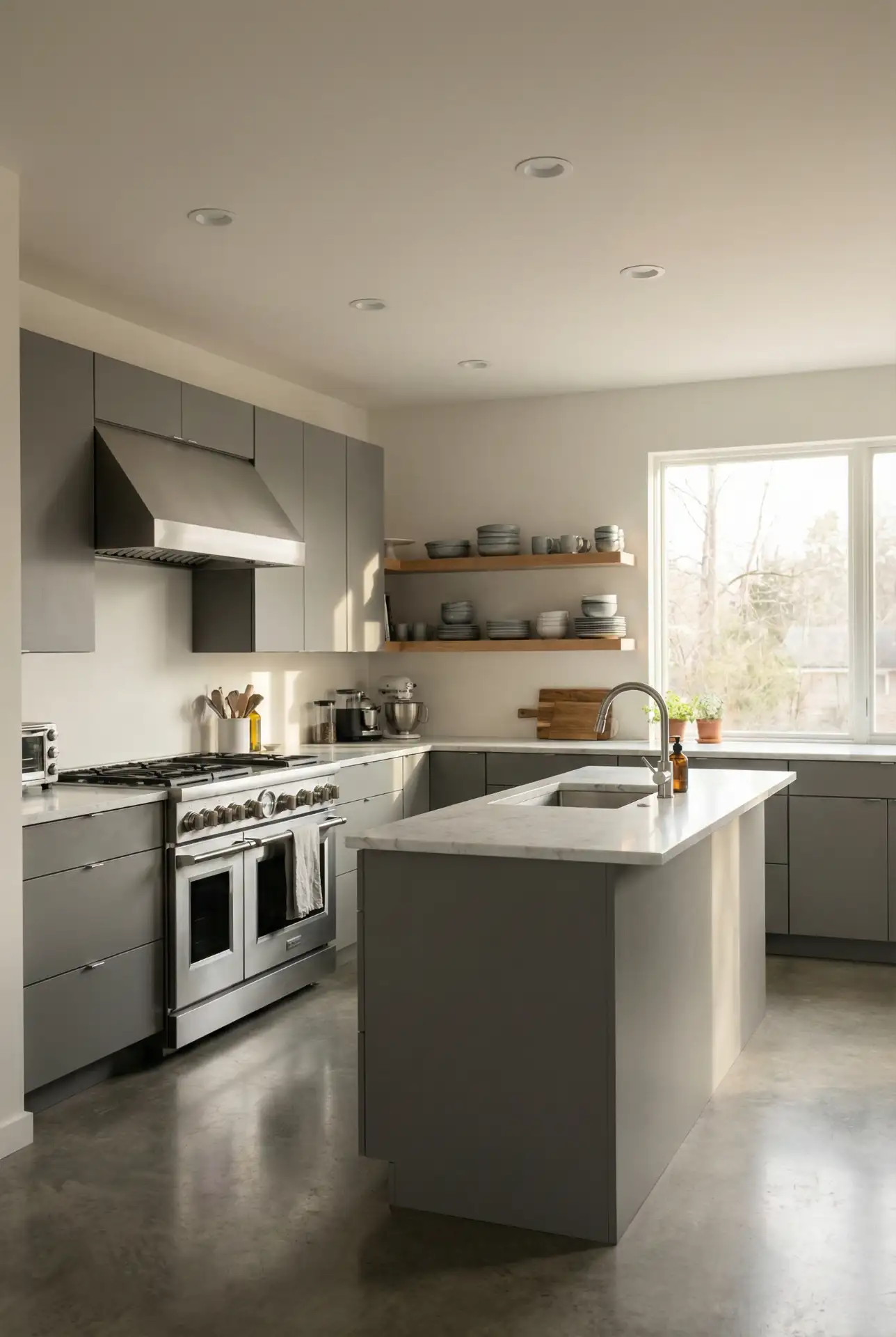
Gray cabinets in shades ranging from pale to dark gray across the room are a modern twist in this traditional kitchen, which can be more and more family-friendly with accessories and paint that let the kids be kids. This palette is widely embraced in urban condos, as well as new construction where clean lines and low fuss are prized. Gray is really a bit of a miracle—it can go warm if you want it to, depending on the undertones, or it can stay chilly and industrial. And it’s a safe bet in the resale department — something that appeals to a broad range of tastes. 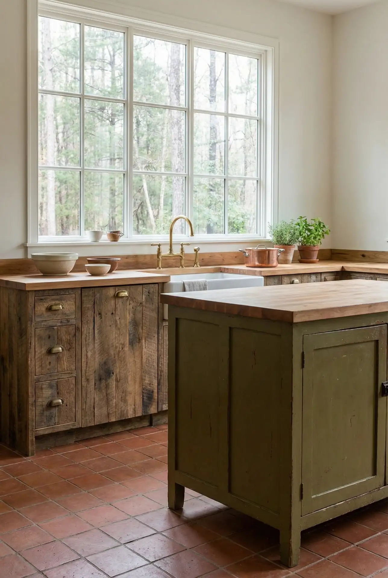
A real-world tip: Gray is a tricky color choice, and comes in hundreds of shades but most will not achieve your goal if you pick the wrong one.” / It’s no secret that gray does not look like much to us. Always test samples in your space at various times of day, and be mindful of undertones—some grays skew blue, others green or beige. A homeowner became convinced she’d found an ideal shade of gray in Chicago, only to discover that it read purple when the sun went down; she eventually settled on a warmer hue and couldn’t have been happier with the result. It’s a little extra work, but worth it to do it right.
14. Bold Teal and Brass Fixtures
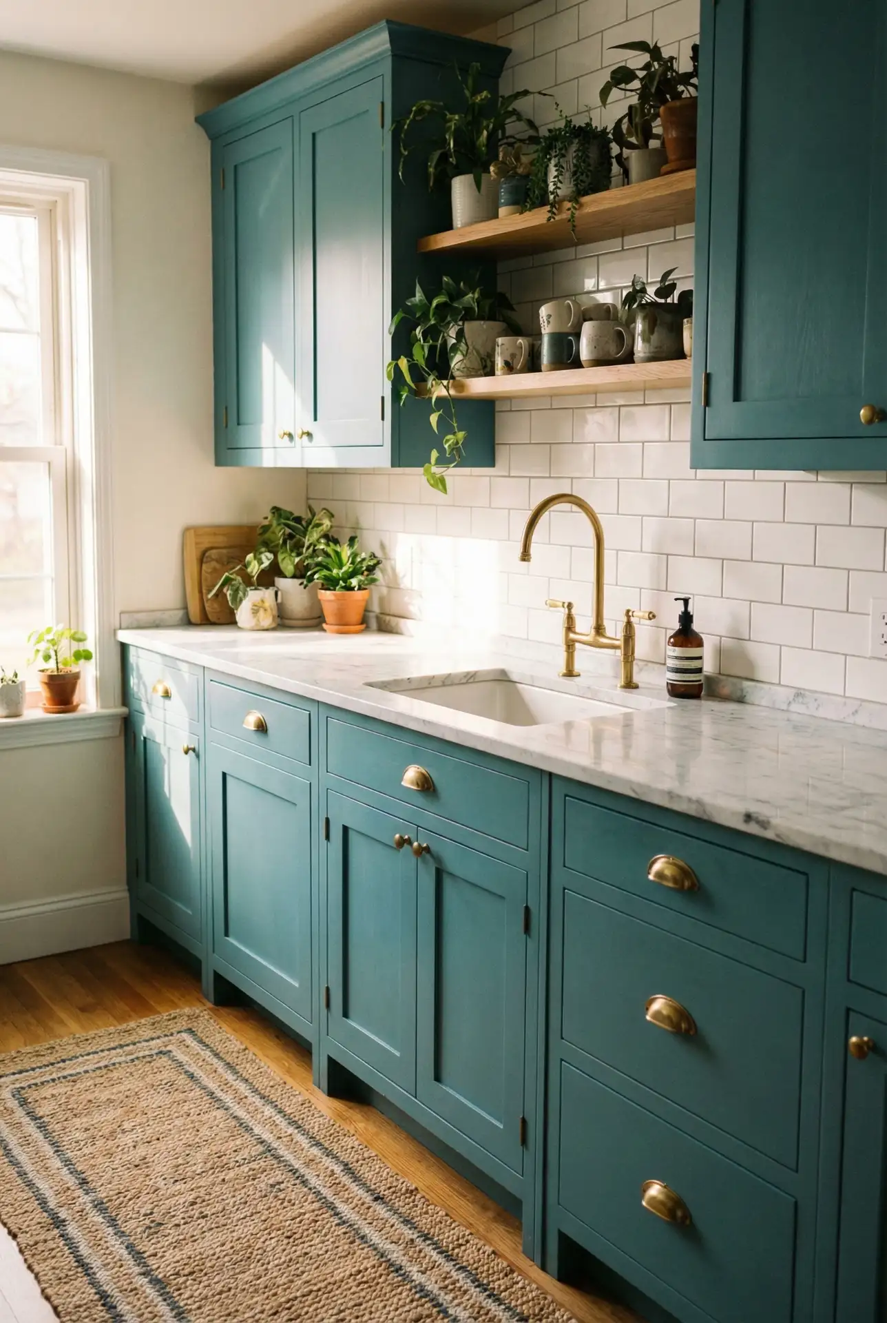
Teal Make the bold statement of a saturated hue that is cooler and fresher than emerald or navy. When its paired with warm brass fixtures and white or natural wood countertops, it creates a space that feels both lively and balanced. This palette is on the rise in eclectic and boho spaces, where quirky color pairings are favored. Teal looks particularly attractive in kitchens whose light is good enough for its cool, blue-green depths to shift and shimmer with the motion of a sunbeam. 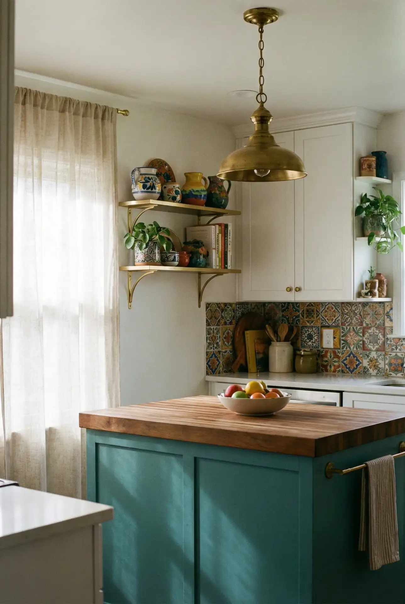
Where it’s most effective is in spaces with an existing bohemian or global vibe—teal cranks that up without competing. A renter in San Francisco painted her kitchen island, which was designed to look freestanding for the sake of flexibility, but it left her yearning for something more stylish than prefab white laminate. Painting it teal with brass hardware, she said, turned a generic space into gallery-worthy real estate. Teal is also incredibly forgiving; any small mistakes in the paint job or cabinet aging just blend right in rather than stand out, so it’s a great pick for DIYers ready to take on their first cabinet painting project.
15. Warm Beige and Tan Granite
For those working with existing tan granite countertops, warm beige cabinetry creates a harmonious, cohesive look that enhances rather than fights the natural stone. This palette is common in homes built in the 1990s and early 2000s, where tan granite was standard, and it’s seeing a resurgence as homeowners realize they don’t need to replace perfectly good countertops—they just need the right cabinet color. Beige tones with warm undertones pull out the gold and brown flecks in the granite, making everything feel intentional. 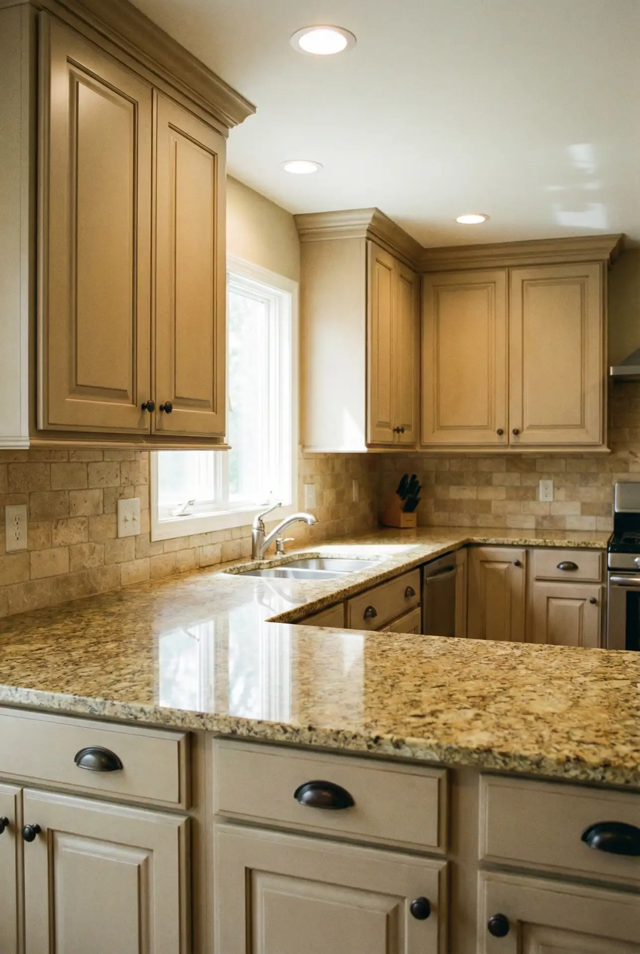
A classic blunder: using tan granite with white cabinets, which dates the stone and the whole kitchen. Beige, instead, would have a better flow and would elevate the granite to look rich, not builder-grade. A Phoenix homeowner painted her oak cabinets a sleek snow white and coated the walls in Benjamin Moore’s Manchester Tan, choosing this beige because it contrasts with flat-slab cabinet doors, avoiding “feeling like a loo.” She left the tan counters (not shown) to help tone down the modern gender-neutral scheme. It’s the power of paint: it turns perceptions inside out.
16. Soft Lavender and White
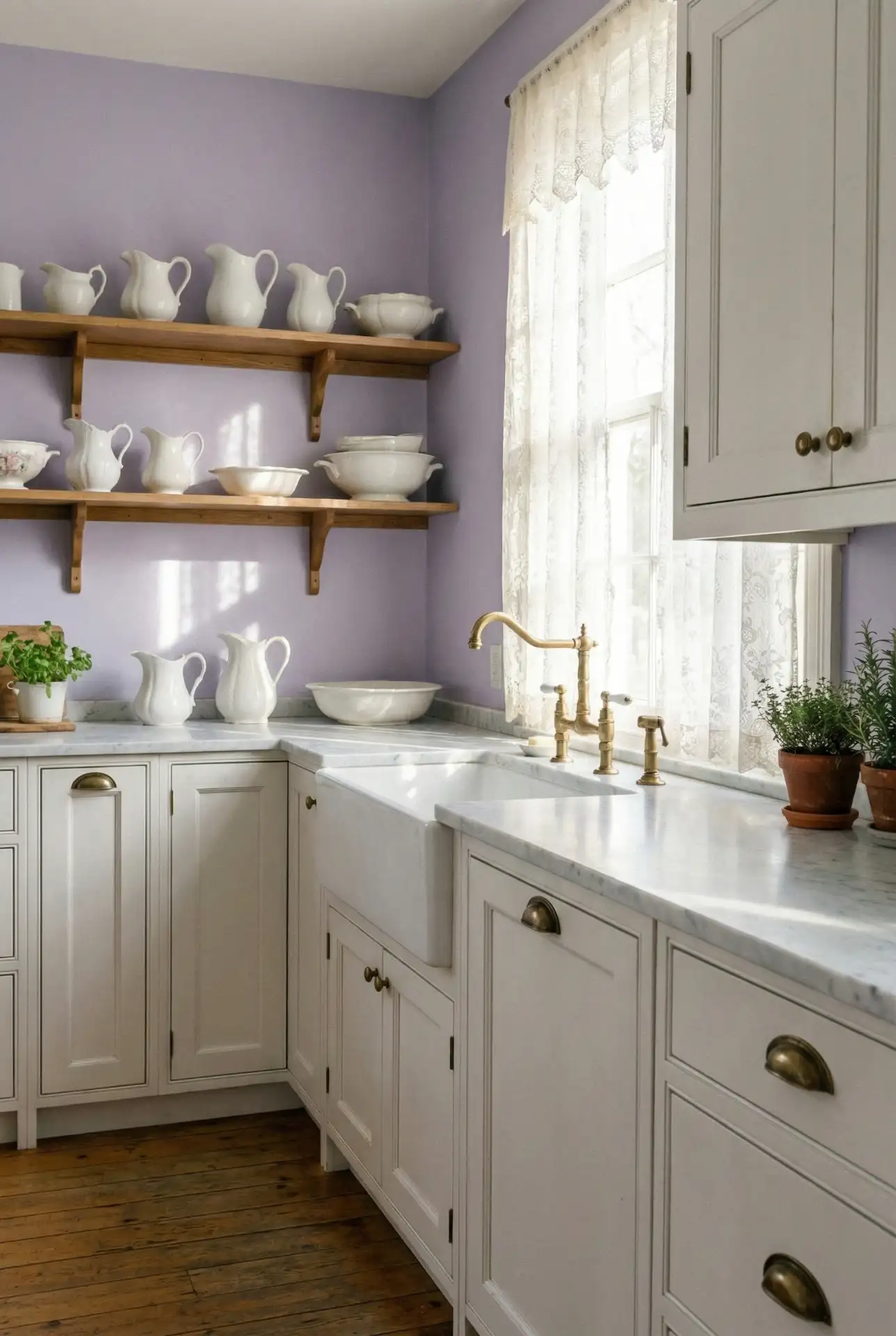
Lavender is an unexpected choice for kitchens, but when done right—think muted, dusty lavender paired with white cabinets and brass or nickel accents—it creates a dreamy, vintage-inspired space. This palette is perfect for those drawn to shabby chic or cottage aesthetics, and it’s gaining popularity in creative communities where homeowners aren’t afraid to embrace color. Lavender brings a sense of calm and whimsy, making the kitchen feel less utilitarian and more like a curated retreat. 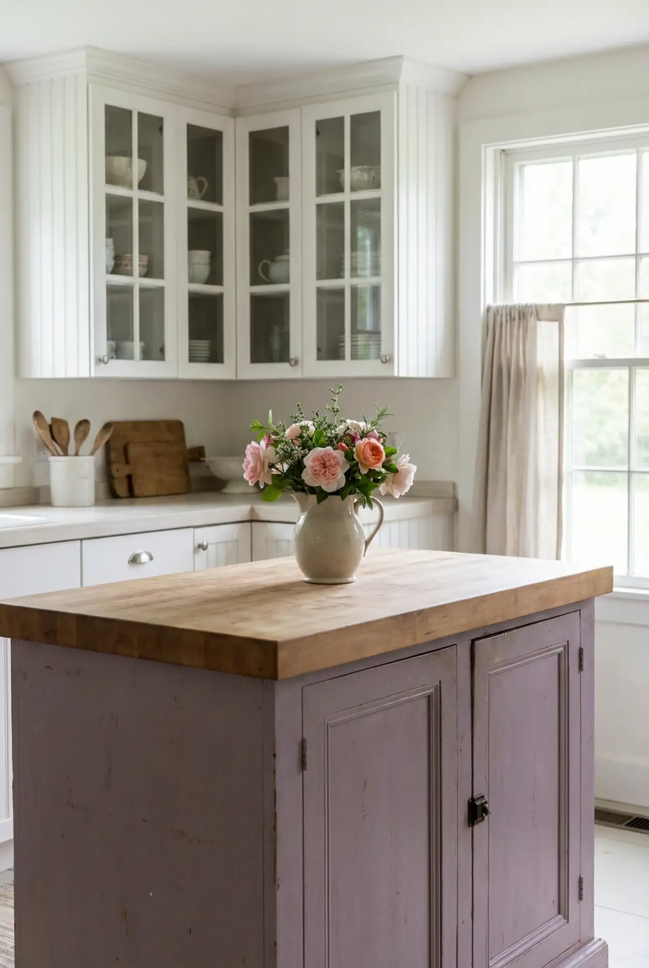
Regional context: this palette is especially beloved in the South, where pastel colors have a long tradition in home design. A homeowner in Savannah painted her kitchen walls lavender and paired them with white cabinets and vintage finds from local antique shops—she said it felt like stepping into her grandmother’s house, but updated for modern living. Lavender is also a color that shifts beautifully in changing light, looking cooler in the morning and warmer in the evening, which adds dimension to the space.
17. Deep Burgundy and Cream
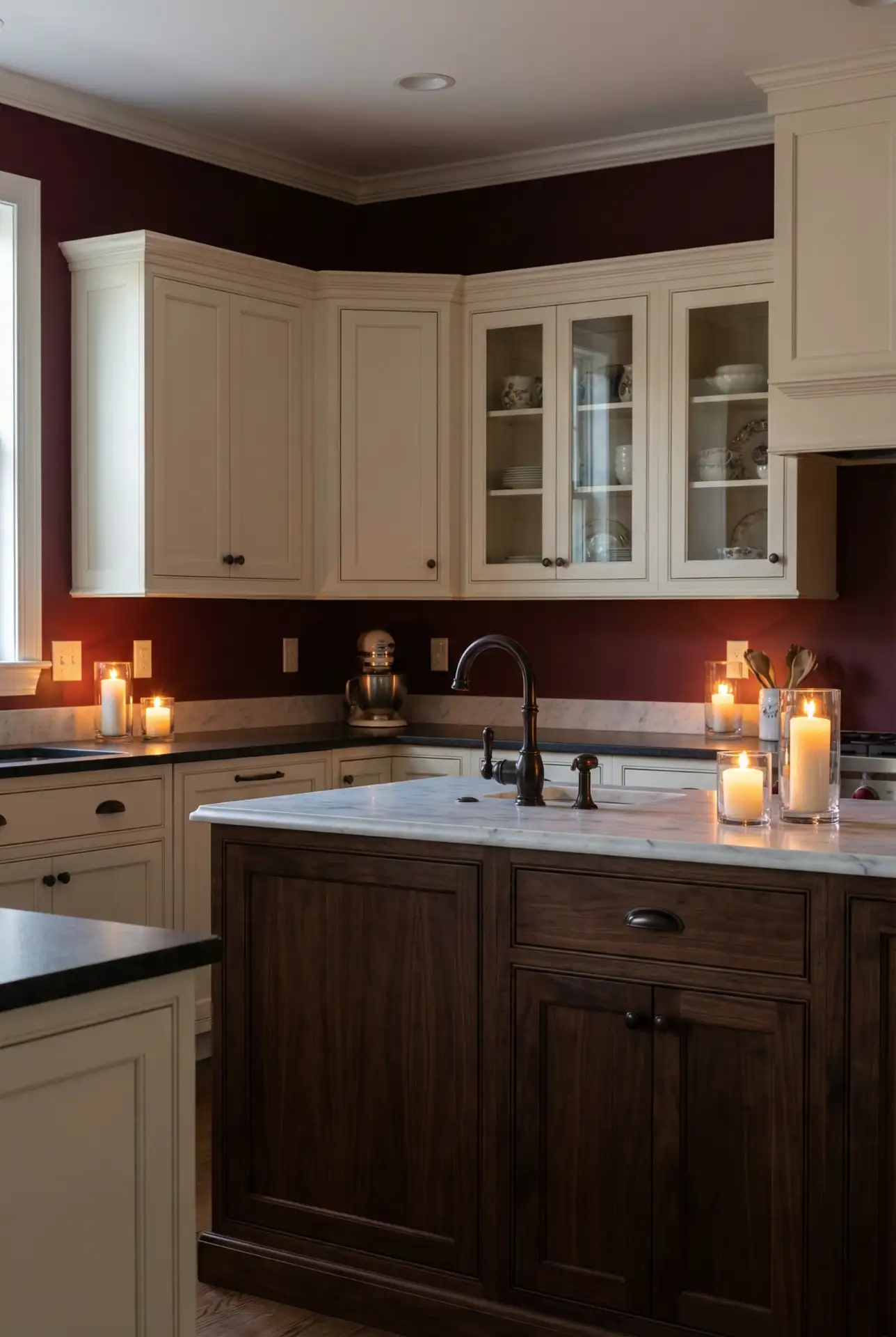
Burgundy is a deep, wine red that oozes warmth and sophistication sans the spiritedness of brighter reds. With cream kitchen cabinets or countertops, it gives a warm, almost library-esque feel to the space. This palette is excellent in historic homes, mountain cabins, or anywhere you want layers of warmth and comfort. Burgundy is particularly jaw-dropping in kitchens that have wood beams, dark floors, or other traditional architectural features that can stand up to the impact of a super rich color. 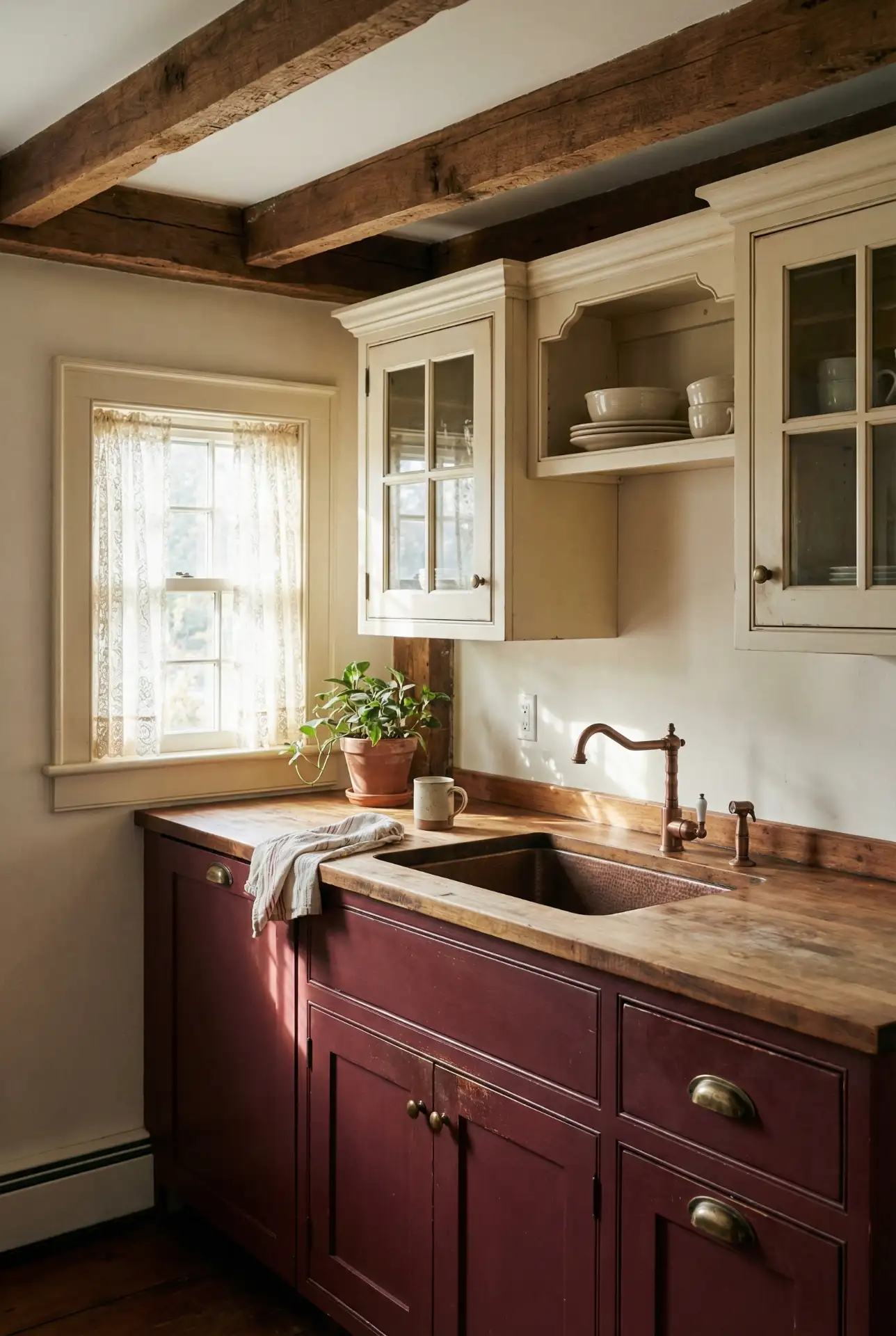
One micro anecdote: In Vermont, a friend inherited her grandmother’s farmhouse and painted the kitchen walls burgundy as an homage to the old wallpaper that had remained for decades. She added cream cabinets to go with it and said the room felt like home again almost immediately—rooted in history but fresh for her own life. Burgundy isn’t for the faint of heart, but when you take it on, there’s a richness that cannot be matched by lighter colors.
18. Black and Natural Wood Contrast
Matte black ACCENT cabinets against natural wood cabinetry or countertops make for a bold yet sophisticated statement in the kitchen that feels contemporary and cozy. This scheme is particularly appealing to open-plan homes in which the kitchen can be seen from the rest of the living room and needs some wow factor. The black anchors the space, but the wood prevents it from feeling cavernous or sterile. It’s such a versatile palette that it can complement everything from minimalist, Scandinavian-inspired spaces to industrial lofts. 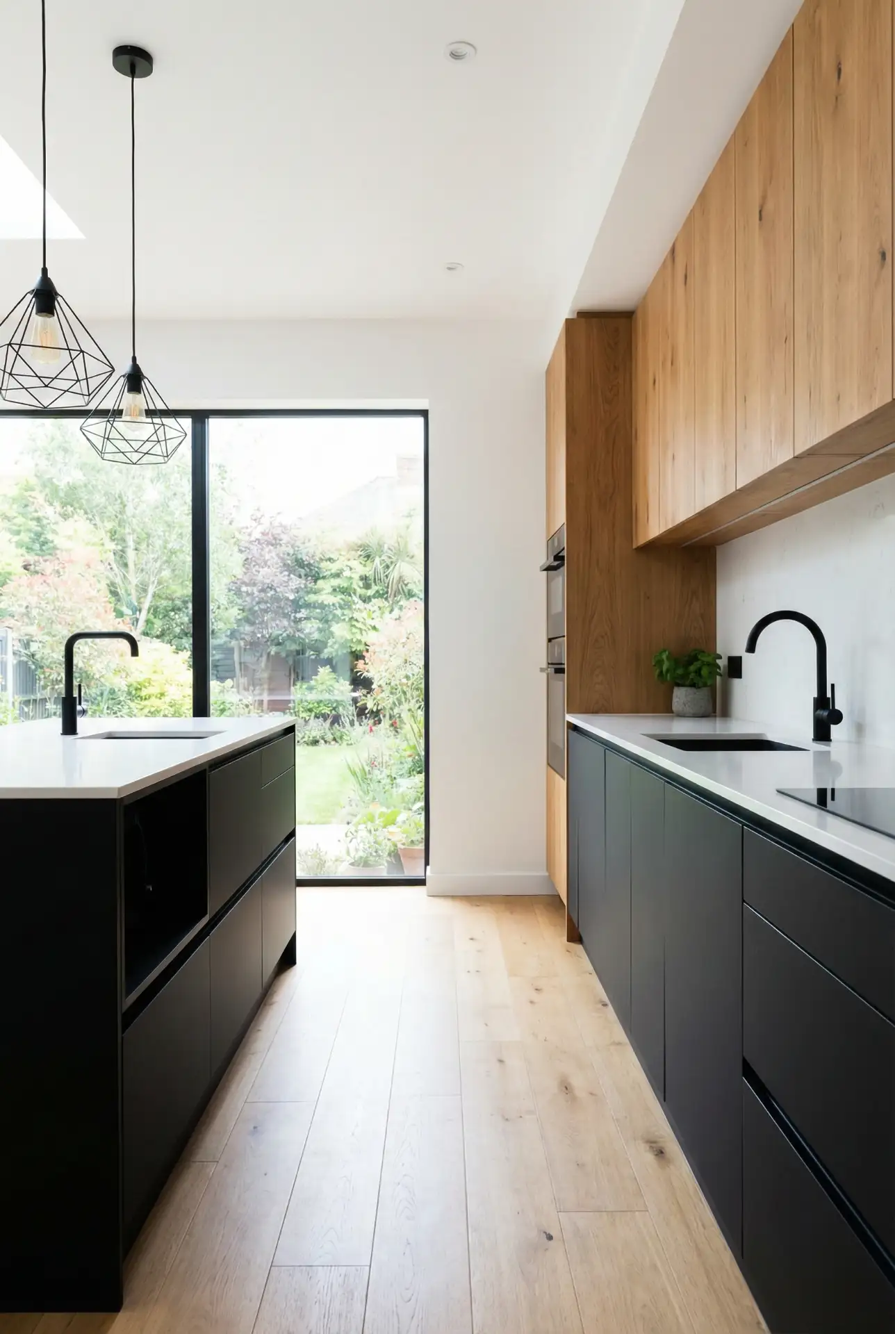
Expert commentary says this is best for when you have plenty of natural light or great artificial lighting—black can absorb light and make a dim kitchen feel like a cave. But in a light-filled room, black cabinetry can feel like a bold anchor that lets the wood tones pop. In midcentury modern renovations, says a designer based in Los Angeles who frequently employs this combination, “the contrast honors the era’s love of both sleek lines and natural materials.” It’s an evergreen combination that never goes out of style.
19. Pale Mint and Copper Accents
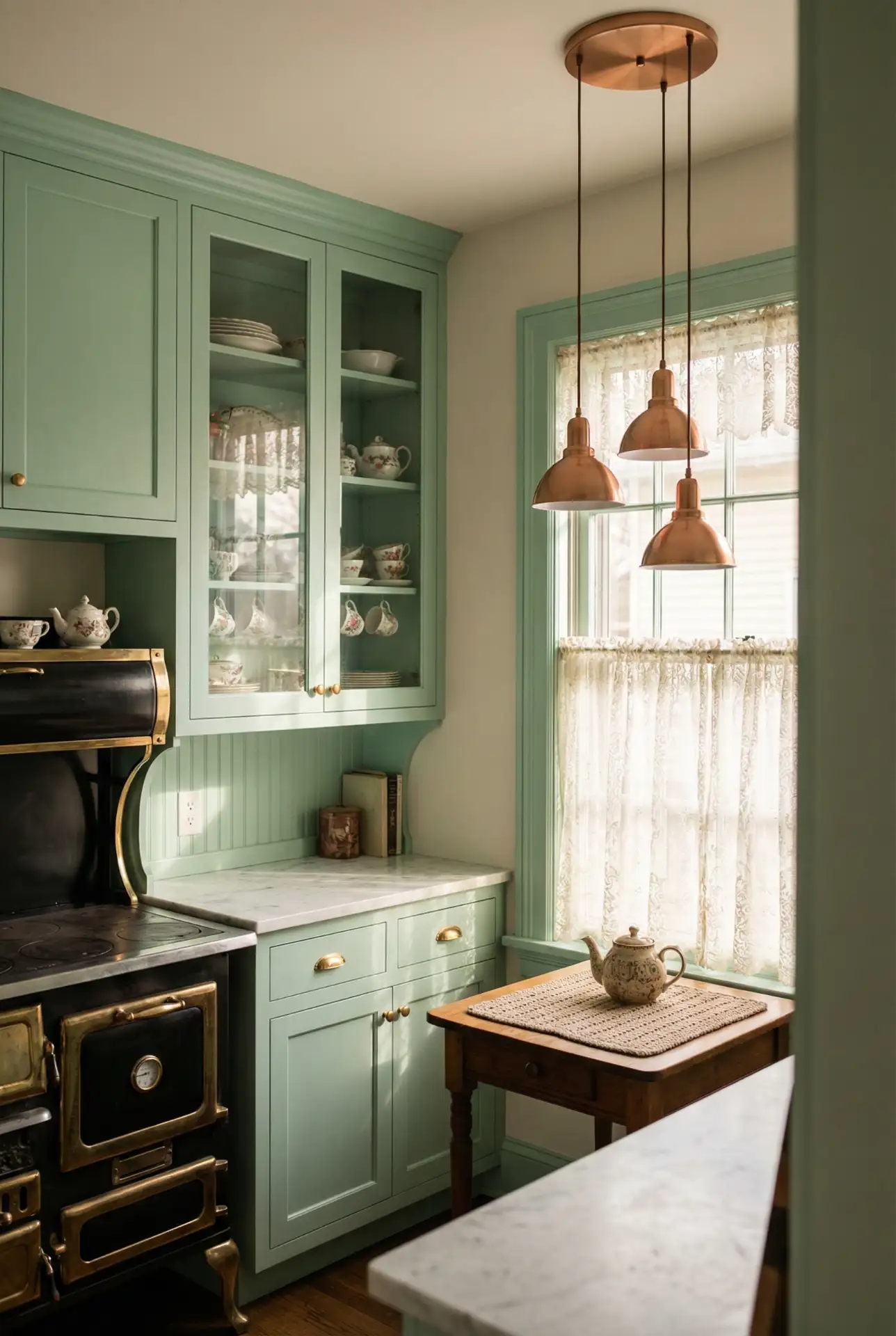
Pale mint green is a cool vintage-inspired option, conjuring up 1950s diners and old-school enamelware. When combined with copper or soft, rosy gold fixtures, it instantly sets the mood, giving off a playfully chic look that feels nostalgic but also of-the-moment. This antique-inspired style is particularly attractive in tiny kitchens or breakfast nooks, where a bit of whimsy can give the space character and cheer. Mint pairs well with white countertops, light wood, and even black pops to provide contrast. 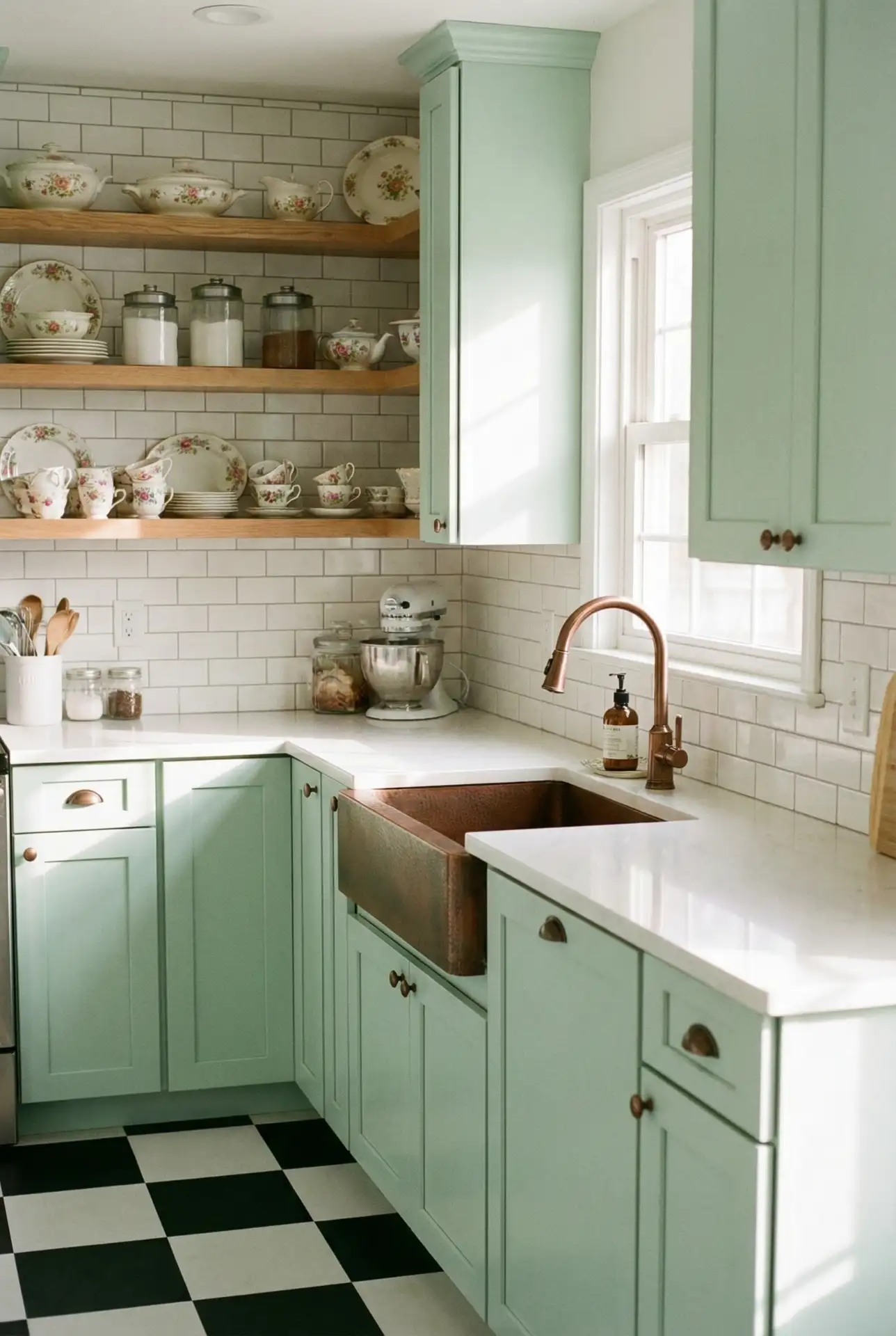
\n This is a low-cost way to add personality, and interior mint paint and copper faucets are available at many price points. The 1940s kitchen cabinets in a Minneapolis home were painted mint and had copper hardware from a salvage shop. She said she spent less than $500 in total and turned the space from dated to delightful. Unless I have something painted mint, it’s a snap to enamel, and if there are nickel spots with slight yellowing, the ones on mine can come back to life too while miraculously not denting much if at all (mine has zero dents), hiding those pesky little nothing-imperfections like only patinated vintage stone-washed anything can.
20. Warm Taupe and Stainless Appliances
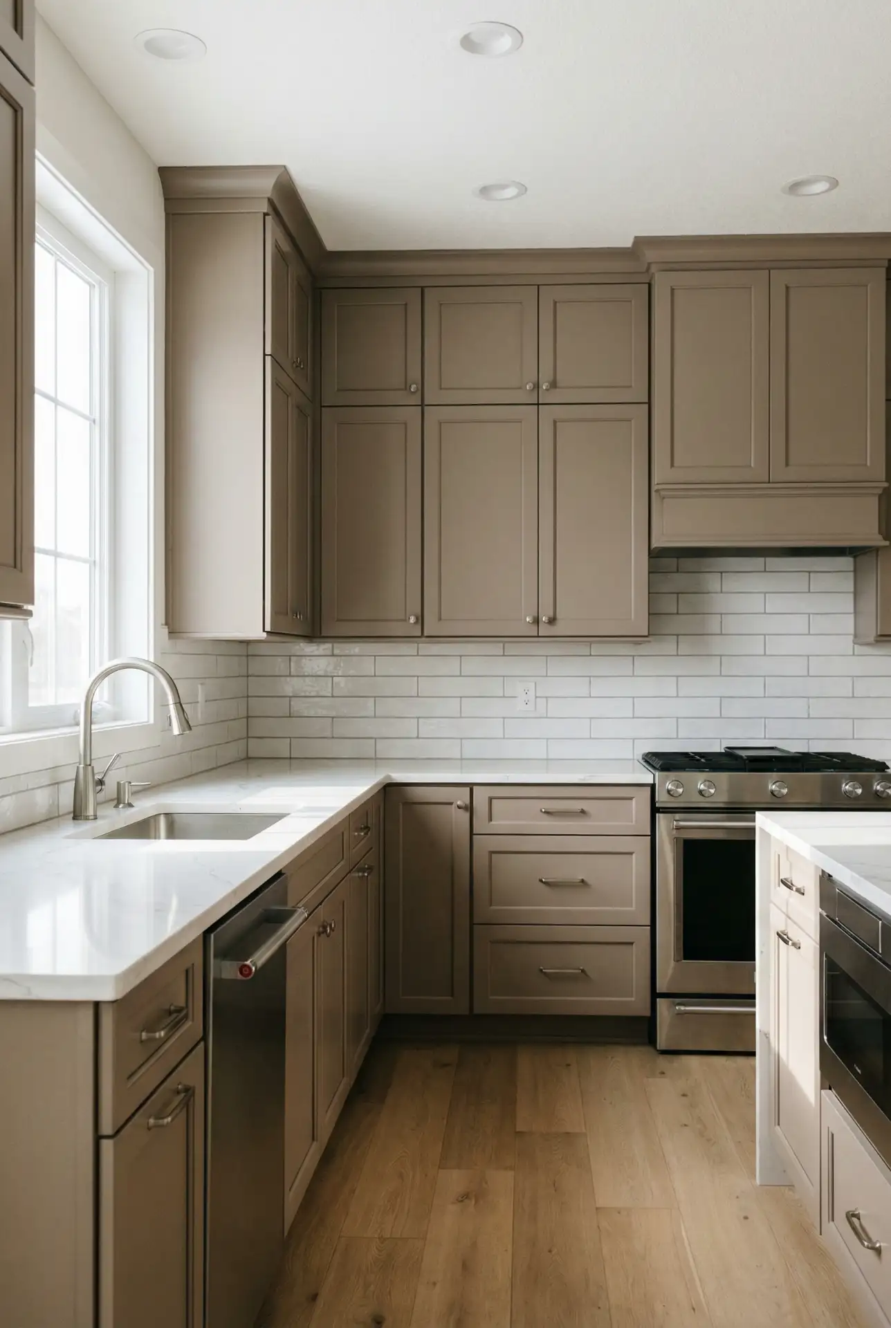
Taupe is a great choice if you’re looking for gray that has some warmth to it but doesn’t veer too far into the realm of traditional beige. When combined with stainless steel appliances and white or light countertops, it makes for a fresh, classic kitchen that suits just about any taste. It’s a particularly popular palette in the suburban homes, new construction, and “step-home” designs—think hip young professionals driving kids to soccer practice in their enormous SUVs—where homeowners want something that feels current but won’t seem dated five years down the line. It’s also a sensible pick for resale—neutral enough to jibe with any buyer’s style. 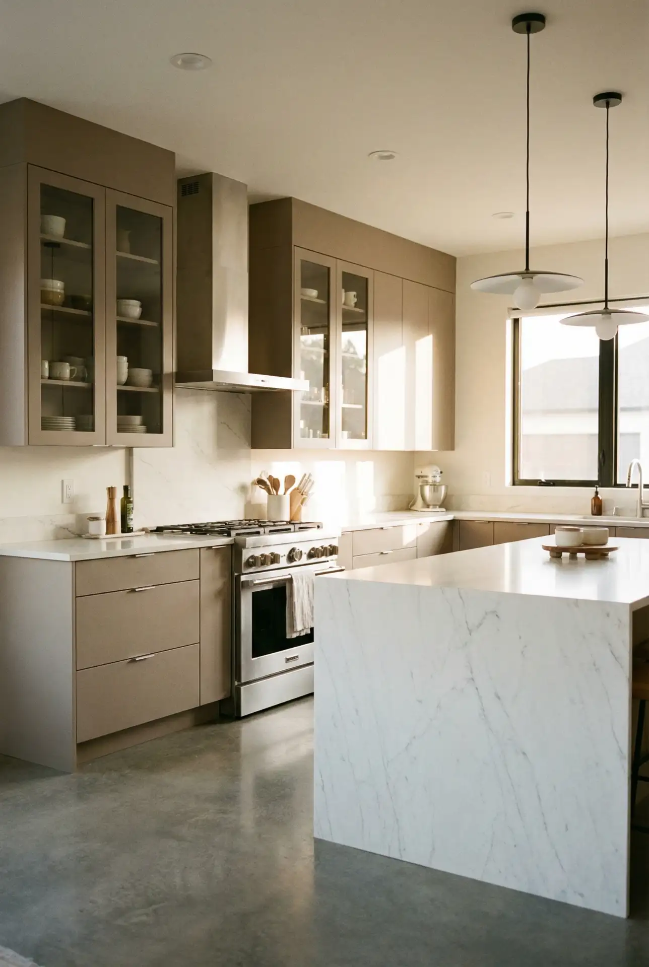
Where this works best is in homes with open floor plans, where the kitchen has to feel like part of an adjacent living area — taupe’s kind of got swagger in that it’s not so dominant but interesting enough not to disappear. The most common error is picking a taupe that’s either too cool or too warm; test samples against your floor and lighting to find one that’s just right. Dallas and Atlanta homeowners favor this palette for taking strong sunlight without going washed out or yellow.
21. Bright Coral and White
Coral is a happy, energizing color that sits between pink and orange, bringing warmth and personality without being as intense as true red. Paired with white cabinets, marble or quartz countertops, and brass or gold accents, it creates a fresh, modern palette that feels both playful and polished. This look is especially popular in coastal regions and Sunbelt states, where bright colors feel natural and uplifting. Coral works beautifully as an accent wall, island color, or even full cabinetry for the truly adventurous. 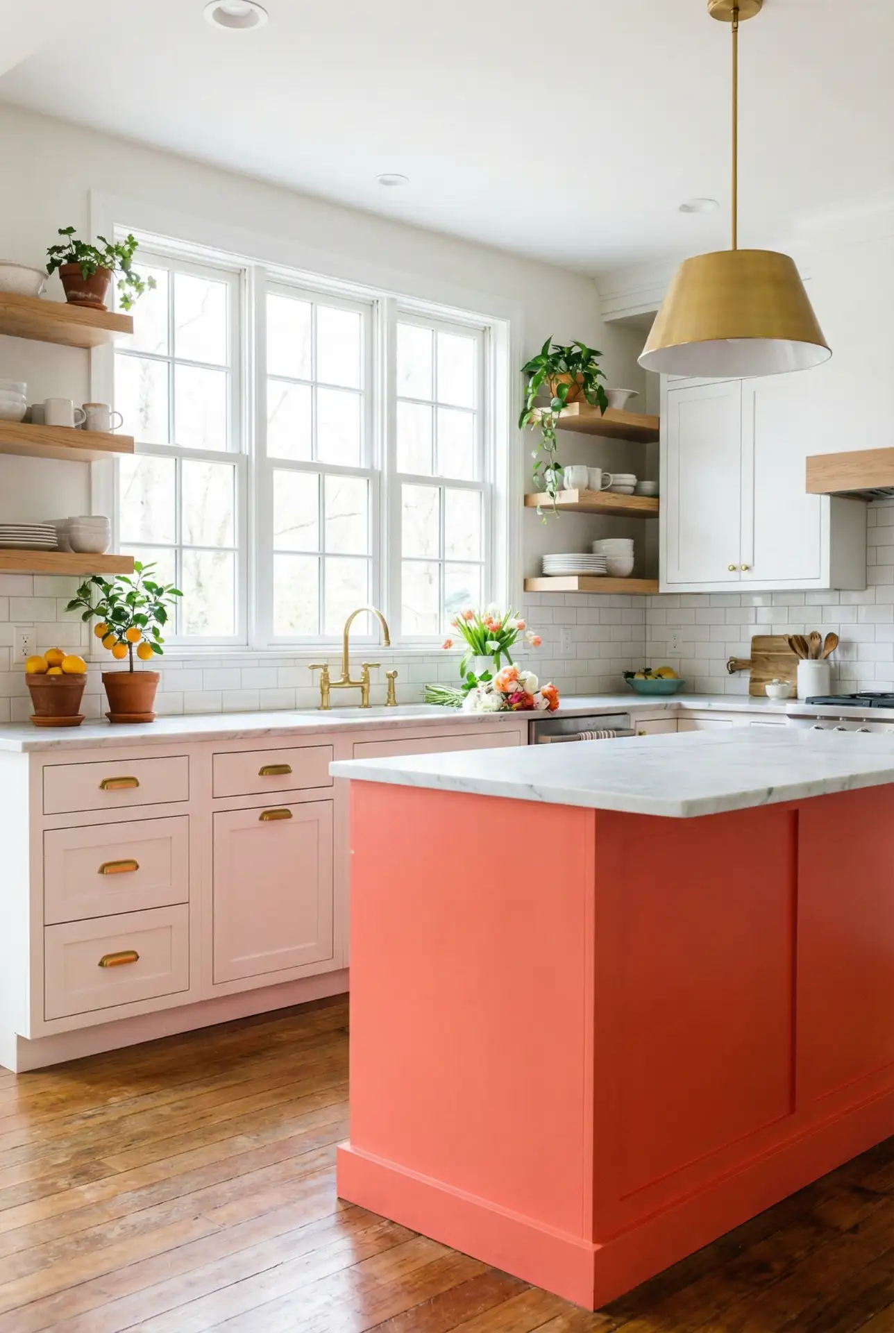
Real homeowner behavior: coral is often chosen by people who are tired of playing it safe and want a kitchen that reflects their personality. A couple in Miami painted their kitchen island coral after years of all-white everything, and they say it changed the energy of their entire home—suddenly the kitchen became the room where everyone wanted to hang out. Coral is also surprisingly versatile; it works with both warm and cool tones, making it easier to integrate into existing decor than you might think.
22. Classic Two-Tone: Navy Lower, White Upper
A two-tone kitchen featuring navy lower cabinets and white cabinets on top offers the best of both worlds—the drama of color with the airiness of white. This timeless approach has been popular in American kitchens for years and shows no signs of fading. The navy grounds the space and hides wear on lower cabinets, while the white uppers keep the room feeling open and bright. It’s a smart design move that works in both traditional and contemporary settings. 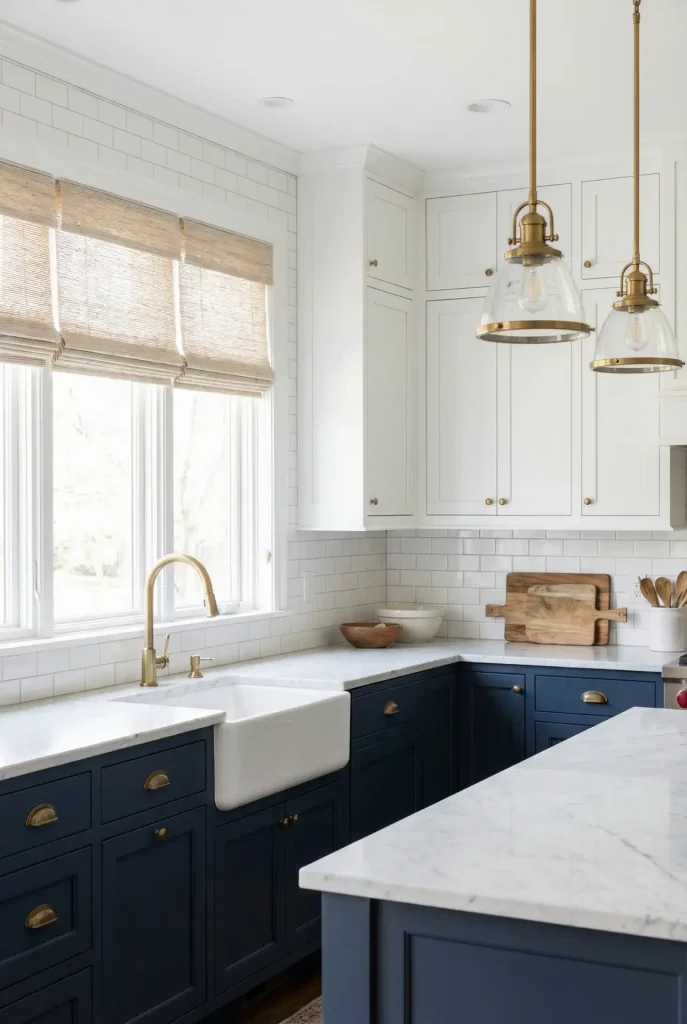
One of the big mistakes is coordinating two colors that are too close in value—there needs to be a strong contrast for the two-tone idea to work. Another hazard is mismatched hardware; ensure all pulls and knobs match between the two colors for a pulled-together appearance. For a budget renovation, a homeowner in Seattle chose this palette and says it gave her kitchen “a custom, high-end look for 1/8th the cost.” The two-toned version is also forgiving if you’re DIYing; if you screw up the navy on the lowers, the white uppers can still be pristine.
Conclusion
2026 kitchen color trends The sweat and tears of life cooking are dry, and in the dust of dried crusts we suddenly look around us to discover that cool is so hot. Whether you’re lured by the welcomingness of terracotta, the elegance of navy, or the wit and exuberance of coral, there’s a color story here that can help change your kitchen so it feels as if it belongs to you. Tell us which one you’d be courageous enough to try next! OR tell us your favorite from the list in the comments.