As we move through 2026, choosing the right exterior paint color has become more than just a design decision—it’s a reflection of how we want our homes to feel in an evolving landscape of style and sustainability. American homeowners are turning to Pinterest in record numbers, searching for fresh palettes that balance timeless appeal with contemporary edge. Whether you’re drawn to earthy neutrals, bold statement hues, or classic combinations that never fade, this year’s trending colors offer something for every architectural style. From modern minimalism to farmhouse charm, the exterior of your home is your first impression and your most visible investment. In this guide, we’ll explore inspiring exterior paint ideas that are shaping curb appeal across the country right now.
1. Warm Taupe with Crisp White Trim
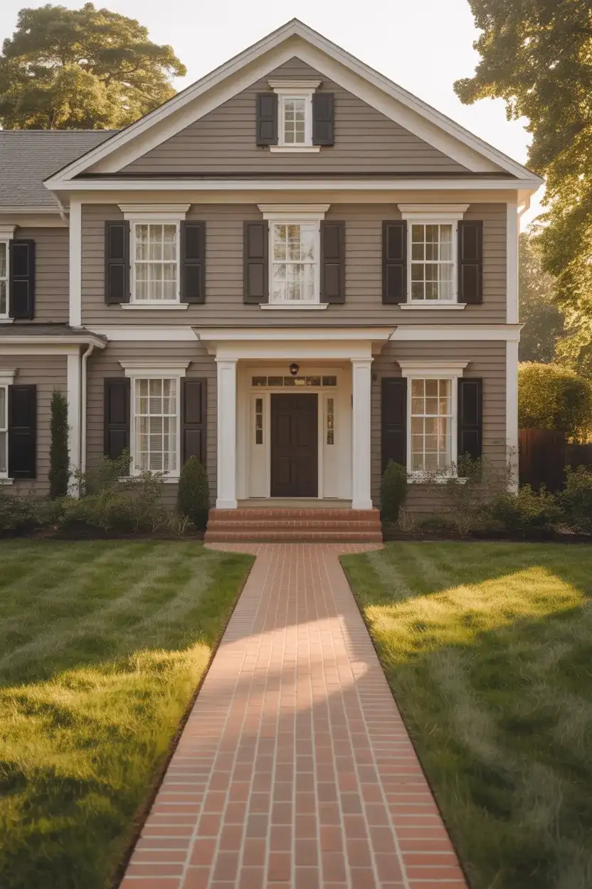
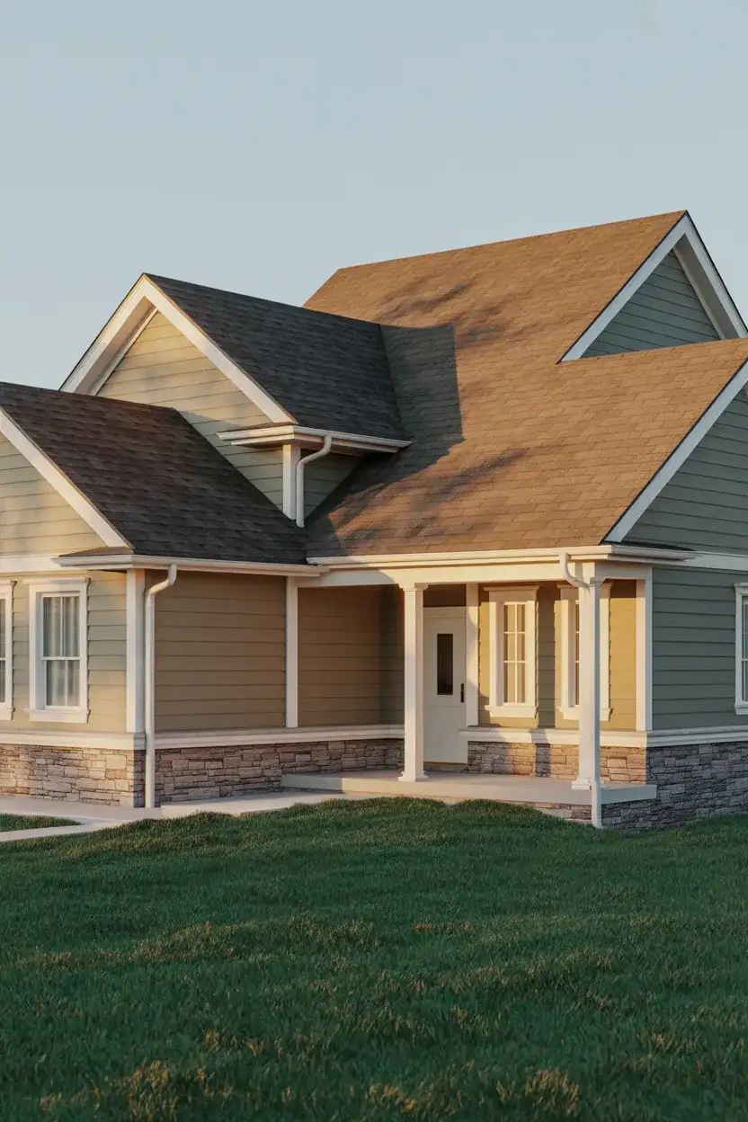
One of the most enduring choices for 2026 is a soft, warm taupe that sits beautifully between beige and gray. This versatile neutral works across architectural styles, from colonial revivals to contemporary builds, offering a sophisticated backdrop that pairs effortlessly with white trim and natural landscaping. Taupe reads as grounded and approachable without feeling too traditional, making it ideal for homeowners who want a fresh look that won’t feel dated in five years.
Taupe works exceptionally well in regions with varied seasonal light—think the Northeast and Midwest—where it adapts to both summer brightness and winter overcast skies. The color’s warm undertones prevent it from looking washed out, while its subtlety allows architectural details to shine. Pair it with oil-rubbed bronze hardware and dark roof shingles for a cohesive, pulled-together look that feels current without chasing fleeting trends.
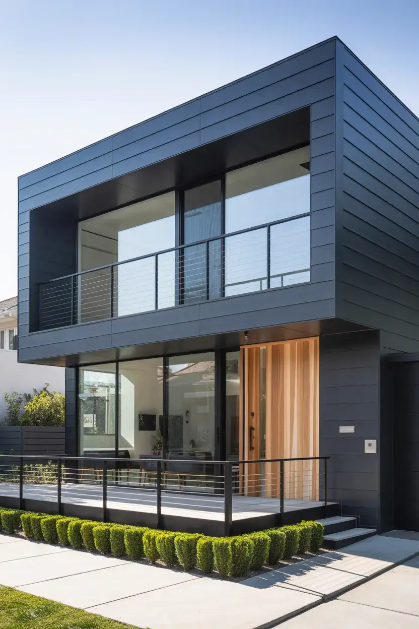
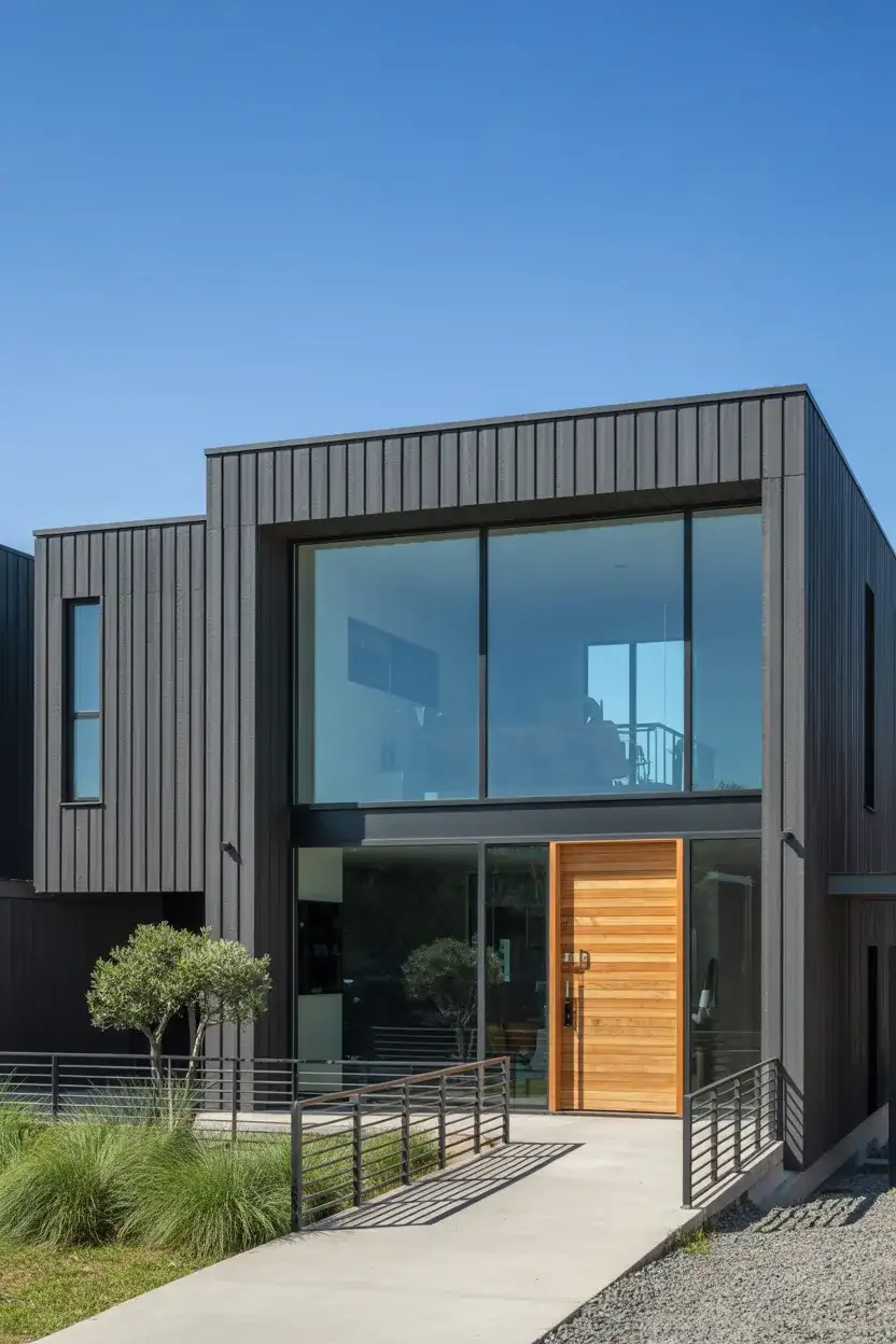
2. Deep Charcoal Gray for Modern Homes
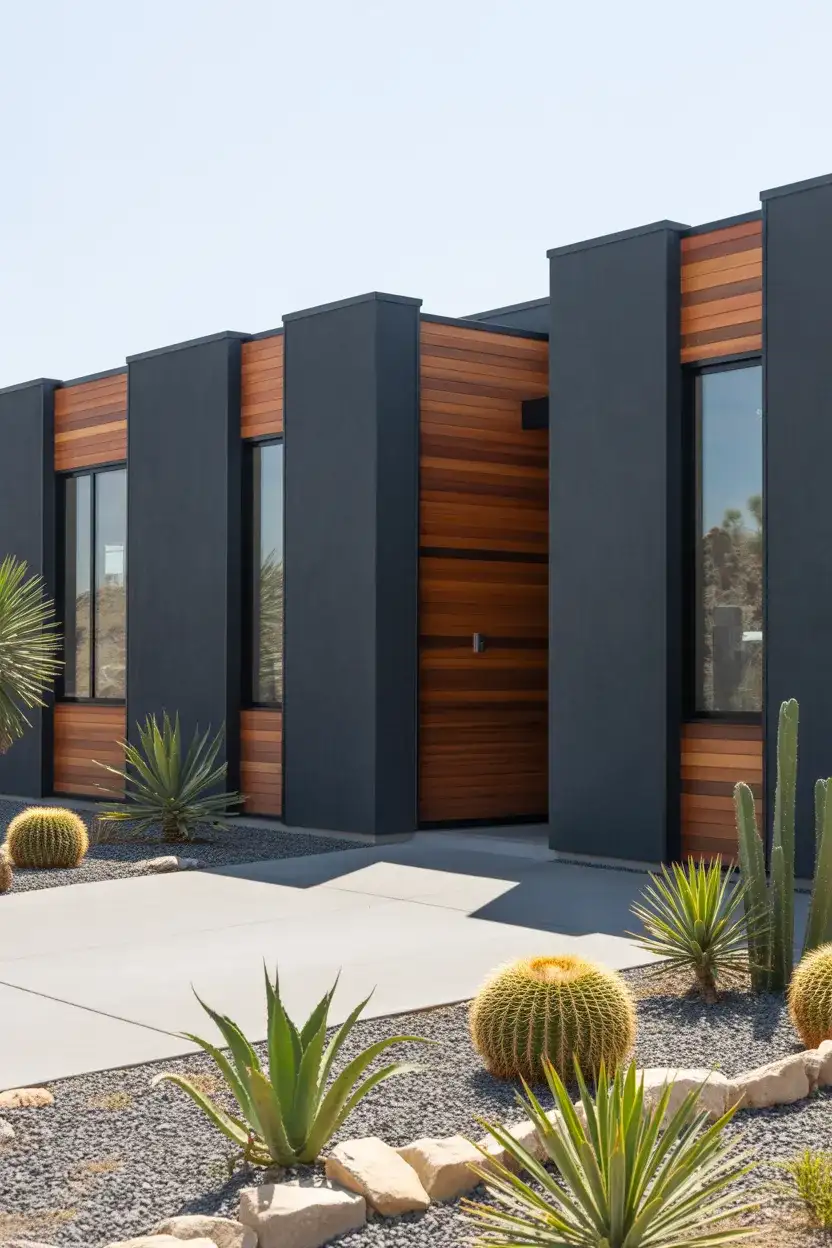
For homeowners embracing modern and contemporary mid-century modern aesthetics, a dark charcoal gray exterior has become a go-to choice. This bold, confident color creates dramatic contrast when paired with natural wood accents, large expanses of glass, and minimalist landscaping. Charcoal gray communicates sophistication and urban sensibility, making it especially popular in suburban neighborhoods where homeowners want their property to stand out with understated elegance.
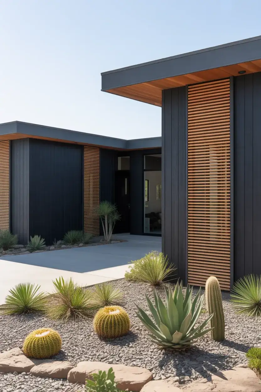
A common mistake with dark exteriors is forgetting that they absorb more heat, which can increase cooling costs in warmer climates. To avoid this, choose a high-quality paint with reflective pigments designed for energy efficiency. Also, ensure your home has enough contrasting elements—like white trim or natural wood—to prevent the exterior from feeling too heavy or monolithic.
3. Classic White Farmhouse with Black Accents
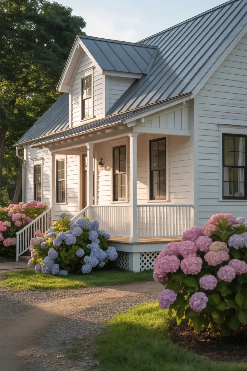
The farmhouse style remains a Pinterest powerhouse, and nothing captures its essence quite like a crisp white exterior with black doors and window frames. This high-contrast combination evokes the simplicity and charm of rural American architecture while feeling remarkably current. White reflects light beautifully, making homes appear larger and more inviting, while black accents add definition and visual weight that prevent the look from feeling too plain.
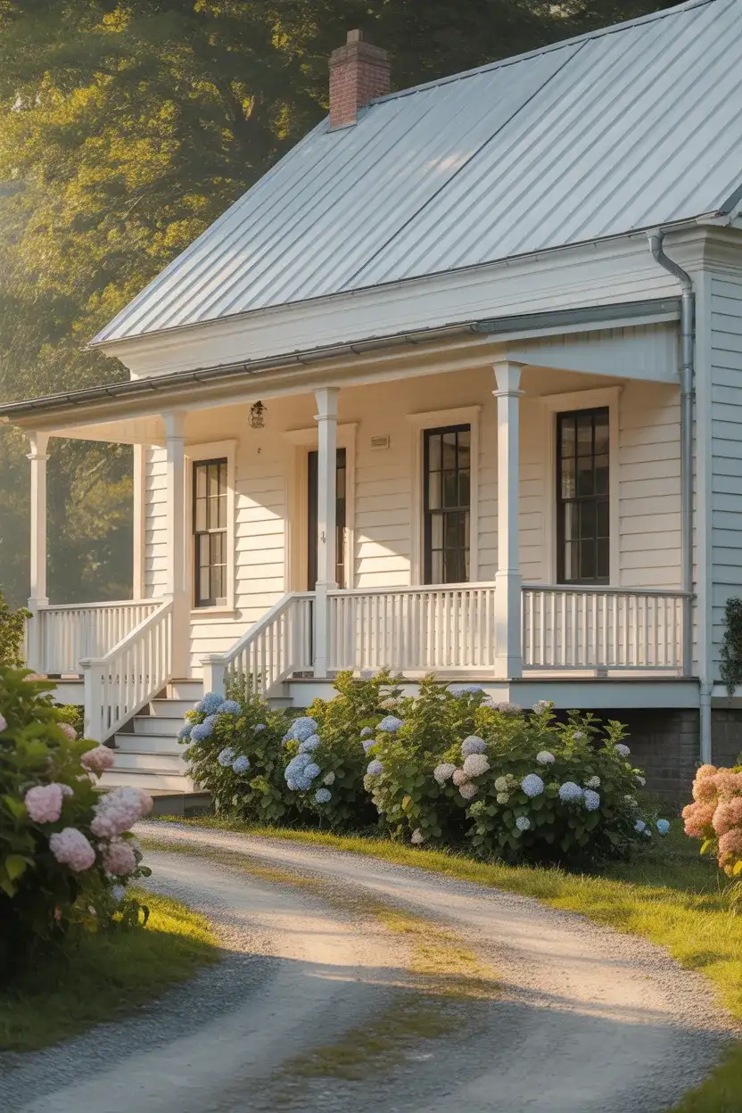
This palette thrives in rural and suburban settings across the South and Midwest, where traditional home styles dominate. The beauty of this combination is its versatility—it works equally well on a modest cottage or a sprawling estate. For added warmth, consider incorporating natural wood tones in your porch ceiling or front door to soften the starkness of pure black and white.
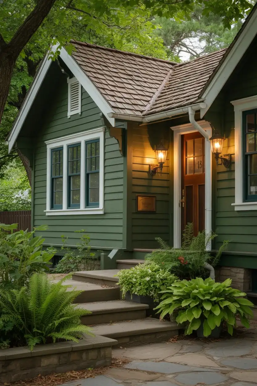
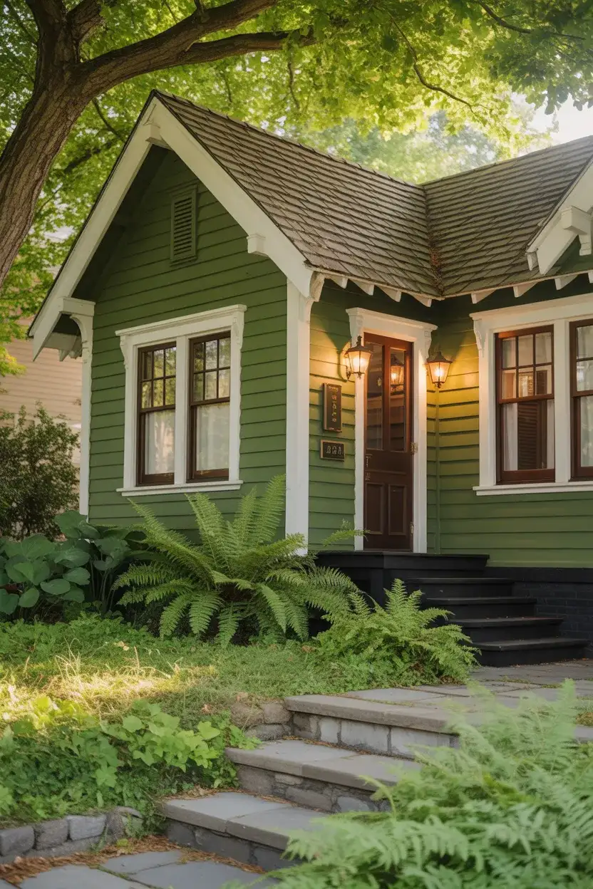
4. Sage Green with Natural Wood Details
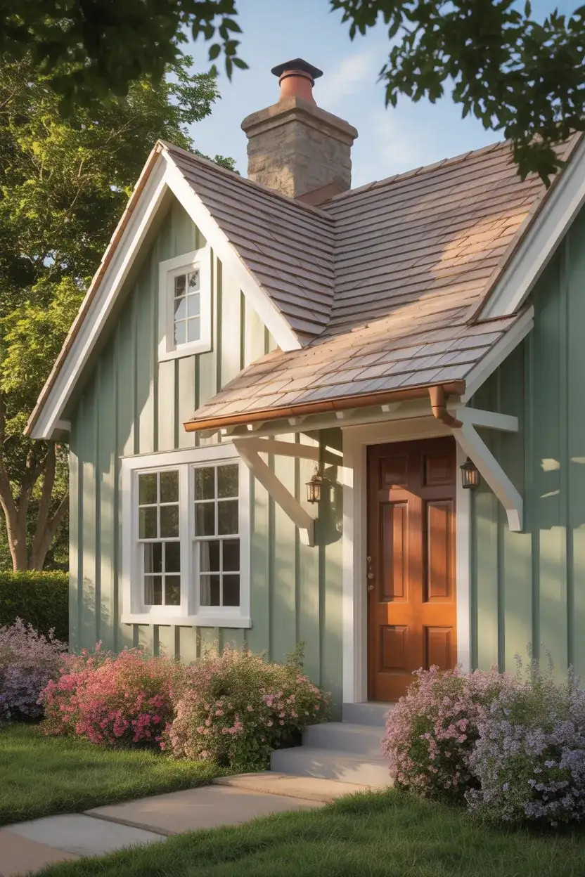
Soft, muted green tones are having a major moment in exterior design, especially for homeowners seeking a connection to nature. Sage green offers a serene, organic feel that complements wooded lots and garden-forward properties beautifully. This trending color works particularly well when combined with unstained cedar or redwood accents, creating a harmonious blend between the built environment and the landscape.
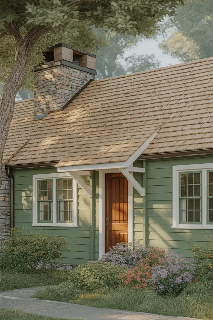
My neighbor recently painted her 1920s bungalow in a soft sage, and the transformation was remarkable—what once felt dated now looks like it belongs in a design magazine. She paired it with bronze light fixtures and a walnut-stained door, and the whole effect feels both calming and intentional. It’s a reminder that color choices can completely shift how a home sits in its environment.
5. Navy Blue with Brass Hardware
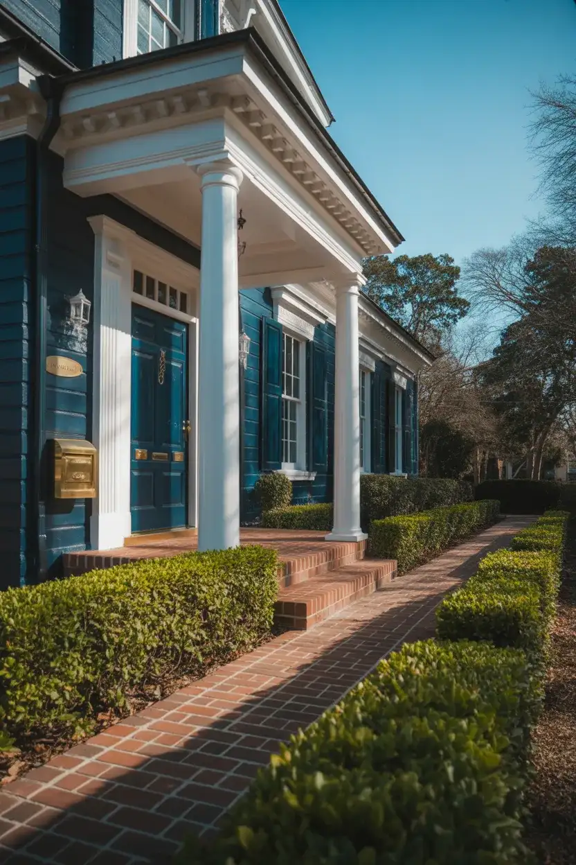
Rich, saturated blue exteriors continue to captivate homeowners who want something bolder than neutrals but not as stark as black. Navy reads as both classic and contemporary, evoking nautical charm in coastal areas while bringing unexpected sophistication to inland settings. When paired with warm brass or gold-toned hardware, this combination feels both timeless and distinctly of-the-moment.
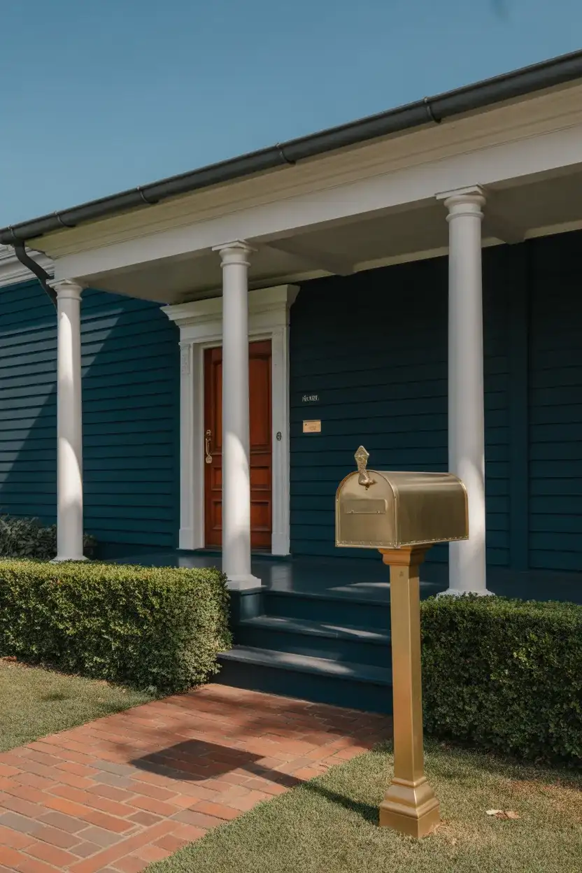
Navy works best in neighborhoods with mature trees and established landscaping, where the deep color can be softened by surrounding greenery. In the Pacific Northwest and New England, this shade thrives under cloudy skies without looking dreary. For a cohesive look, echo the navy in your front door or shutters if your siding is a different color, creating visual continuity across your home’s facade.
6. Soft Gray with White Windows and Warm Undertones
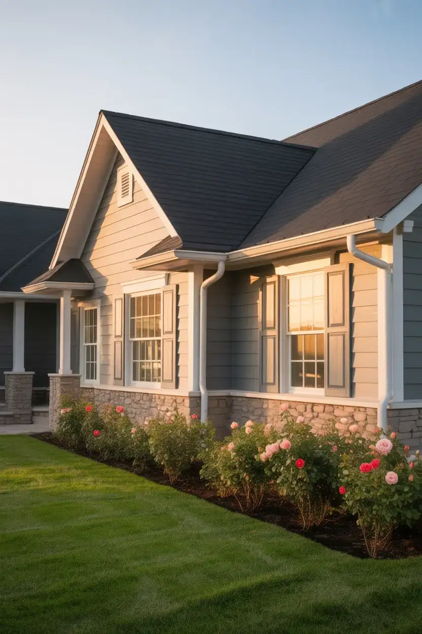
A light gray exterior with white windows remains one of the most popular choices in 2026, particularly for homeowners who want a neutral that feels fresh and modern. The key is choosing a gray with subtle warm undertones—think greige rather than cool blue-gray—to prevent the exterior from feeling cold or institutional. This palette works beautifully across architectural styles and pairs well with virtually any roof color.
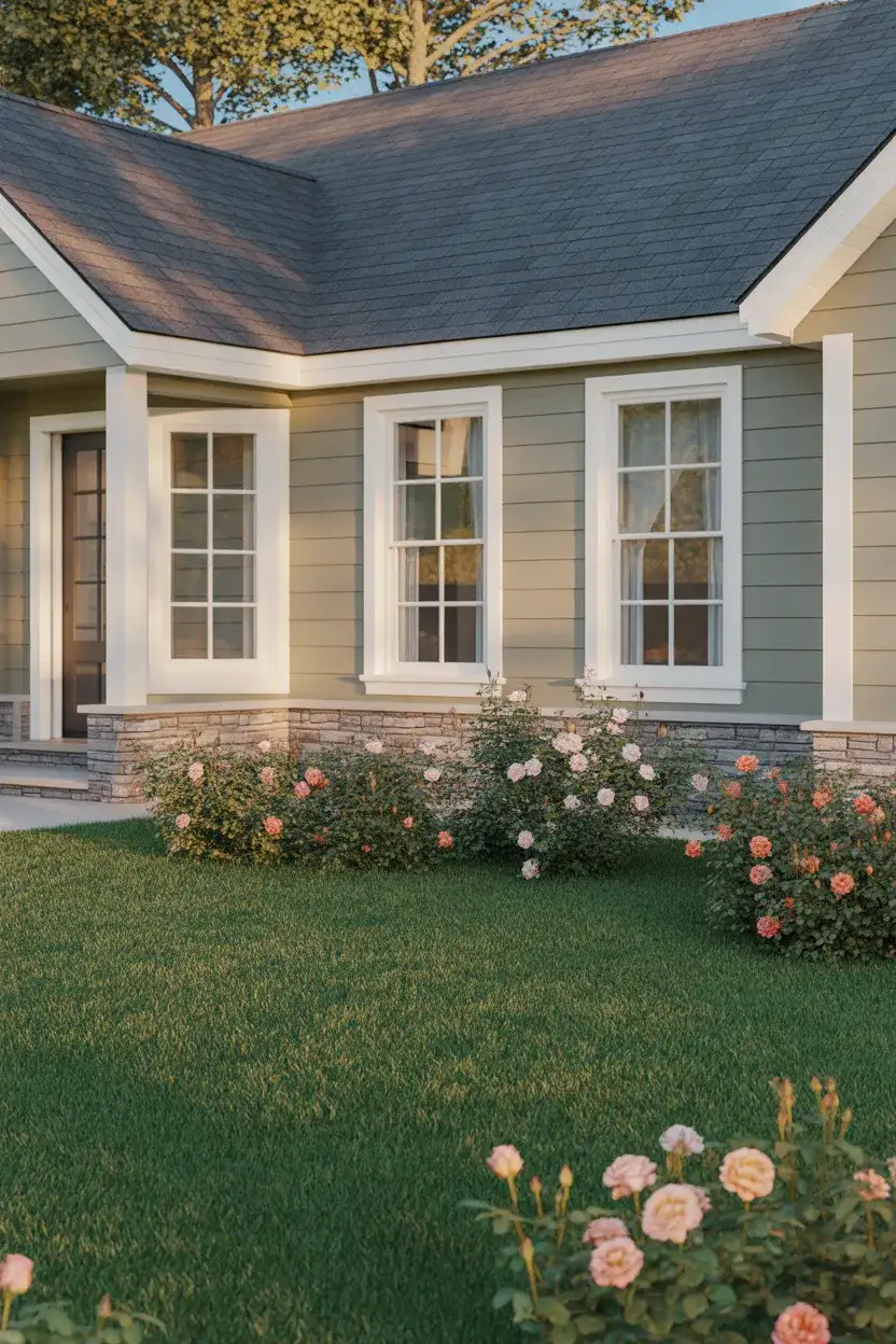
When considering budget, lighter colors like this warm gray typically require fewer coats than darker shades, which can translate to savings on both paint and labor. Expect to invest around $3,000 to $6,000 for a full exterior paint job on an average single-family home, with premium paints offering better longevity and fade resistance—a worthwhile investment for a color you’ll live with for years.
7. Earthy Terracotta with Cream Trim
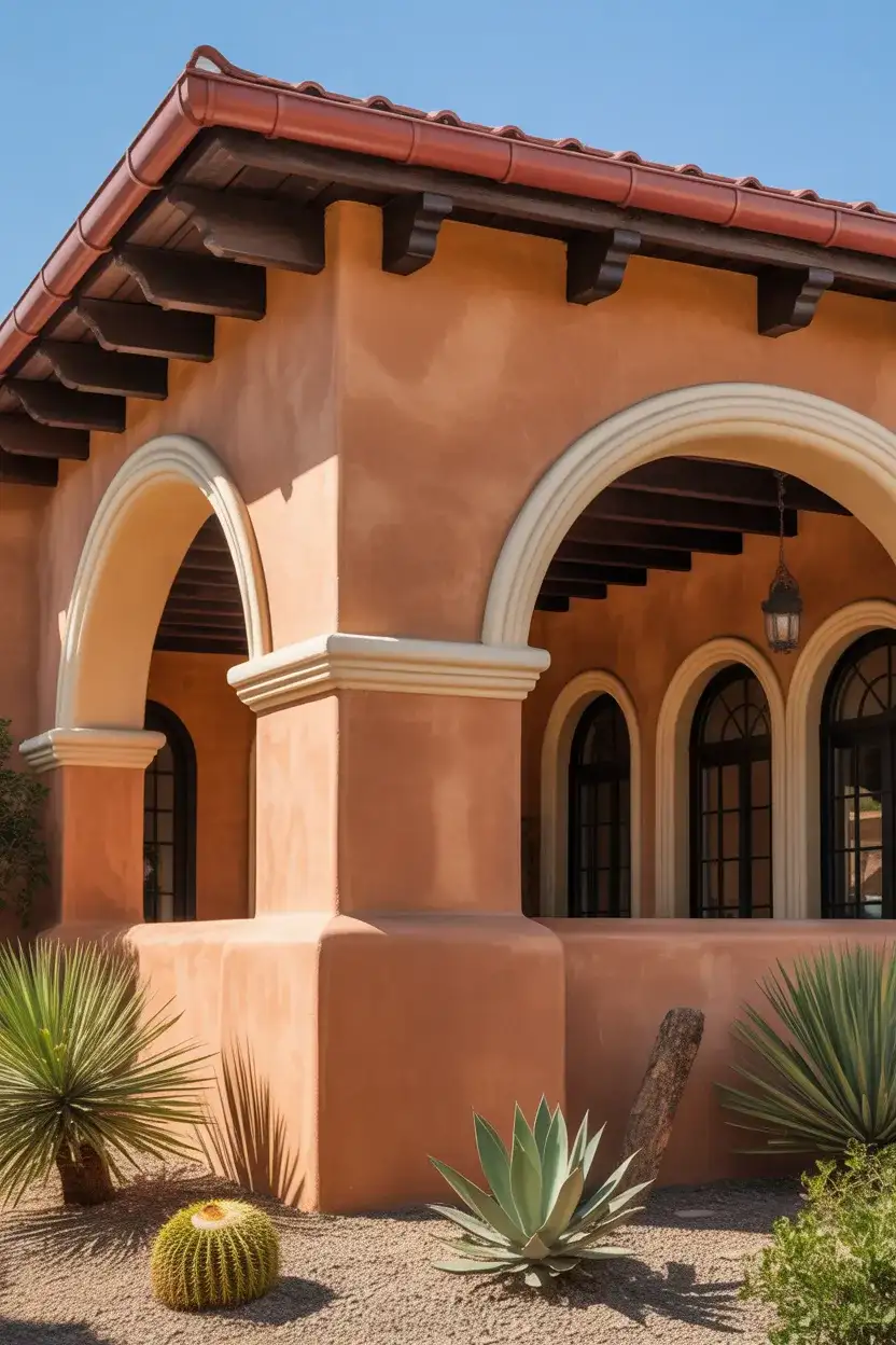
Warm, earthy tones inspired by Southwestern and Mediterranean architecture are gaining traction beyond their traditional regions. A muted terracotta or clay-toned exterior brings warmth and personality, especially when combined with cream or off-white trim. This palette feels grounded and natural, working particularly well on homes with stucco siding or those featuring terracotta roof tiles already in place.
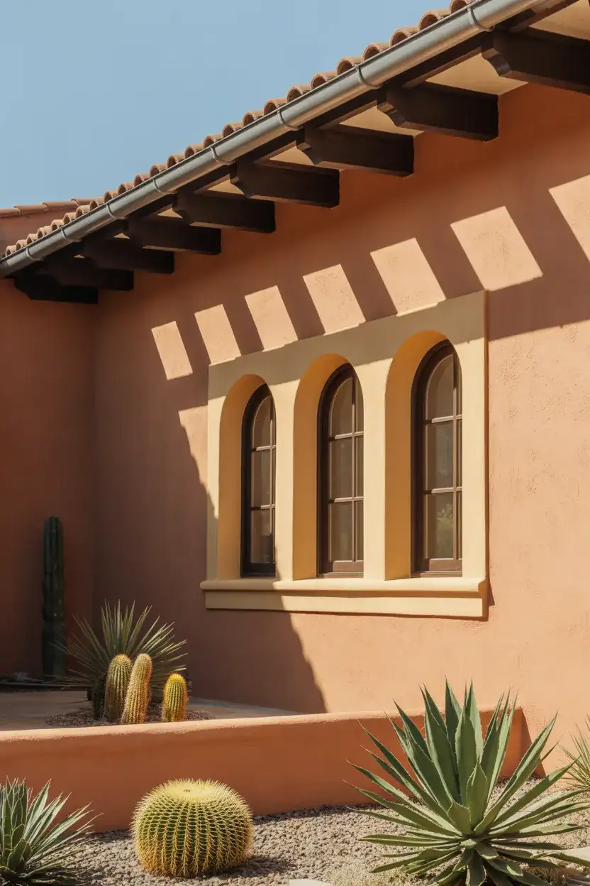
This color story thrives in sunny climates like Arizona, Southern California, and Texas, where the intense light brings out the richness of the pigments. The terracotta-cream combination creates a warm, inviting presence that feels both historical and contemporary. Consider adding wrought iron accents or dark wood doors to complete the Mediterranean-inspired look.
8. French Country Blue with Rustic Accents
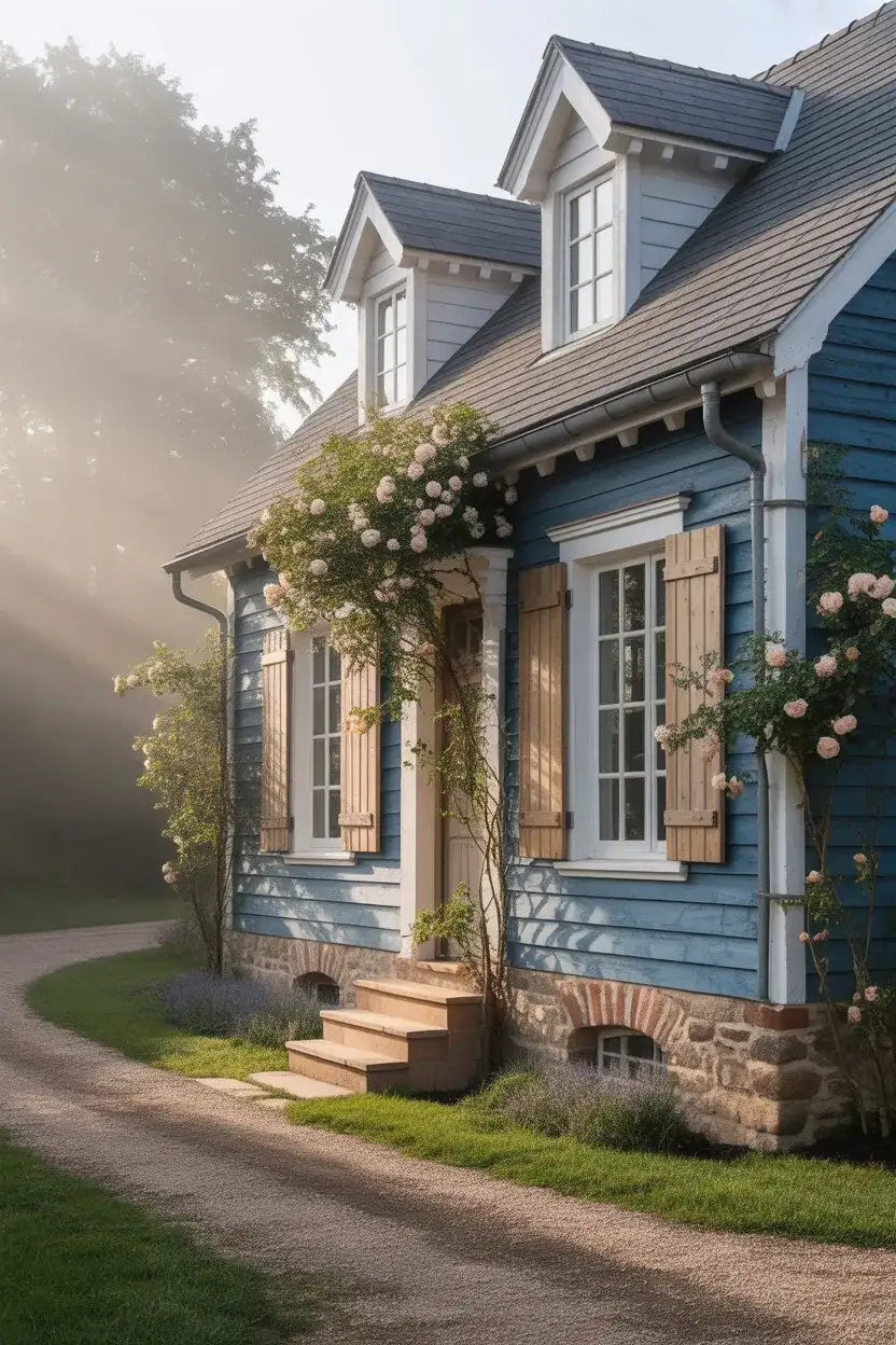
The romantic appeal of French country blue continues to inspire homeowners seeking a softer, more European-influenced aesthetic. This dusty, slightly grayed blue evokes the weathered shutters of Provence and pairs beautifully with natural stone, aged wood, and climbing vines. It’s an excellent choice for those wanting color that feels both distinctive and understated, with enough personality to stand out without overwhelming the neighborhood.
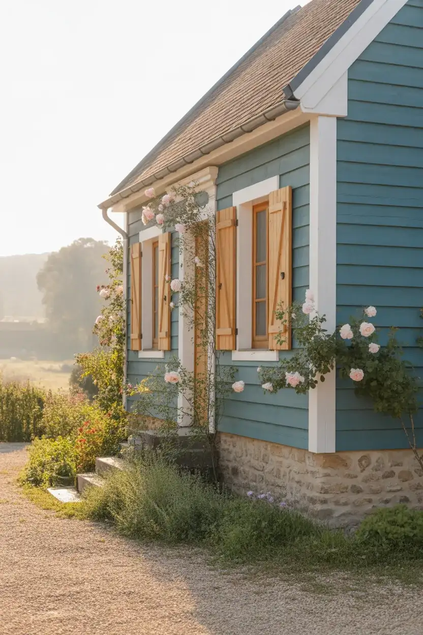
Real homeowners often hesitate with blue exteriors, worried they’ll tire of the color or that it won’t have resale appeal. The beauty of these muted, historically inspired blues is that they read as classics rather than trends. They work particularly well in rural and semi-rural settings where the home is surrounded by natural landscape, allowing the color to feel like an organic extension of sky and water rather than an imposed choice.
9. Chocolate Brown with Tan Accents
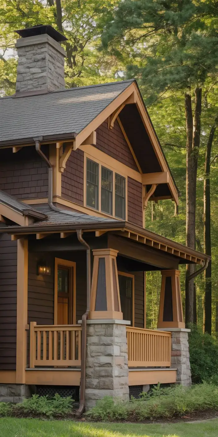
Rich brown exteriors offer a warm, grounded alternative to gray and have become increasingly popular for homes in wooded settings. A deep chocolate brown creates a striking backdrop for lighter trim and blends beautifully with natural surroundings. This color choice works especially well on homes with exposed wood elements or those situated among mature trees, where the brown helps the structure recede into the landscape.
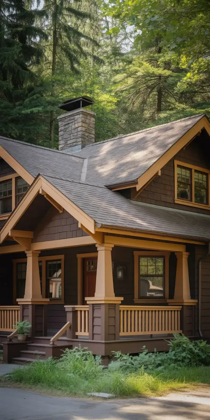
Expert designers note that brown exteriors benefit from careful attention to undertones—too red and the home can look dated, too gray and it loses warmth. The sweet spot is a brown with balanced neutral undertones that doesn’t lean too heavily in any direction. Pair with warm metallics like copper gutters or oil-rubbed bronze fixtures to enhance the organic, earthy quality of the palette.
10. Crisp White with Black Trim for Contrast
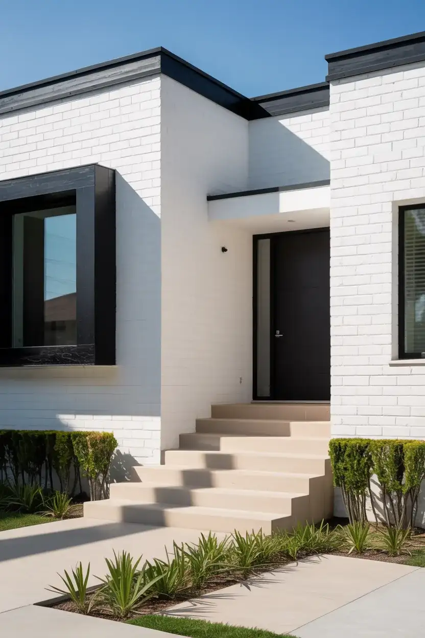
Flipping the traditional white-with-black-accents formula, some modern homeowners are opting for pure white siding with black trim around windows and doors. This bold reversal creates maximum contrast and a graphic, contemporary feel that photographs beautifully. The look is clean, architectural, and particularly effective on homes with strong geometric lines or those in urban and suburban settings where making a statement is part of the appeal.
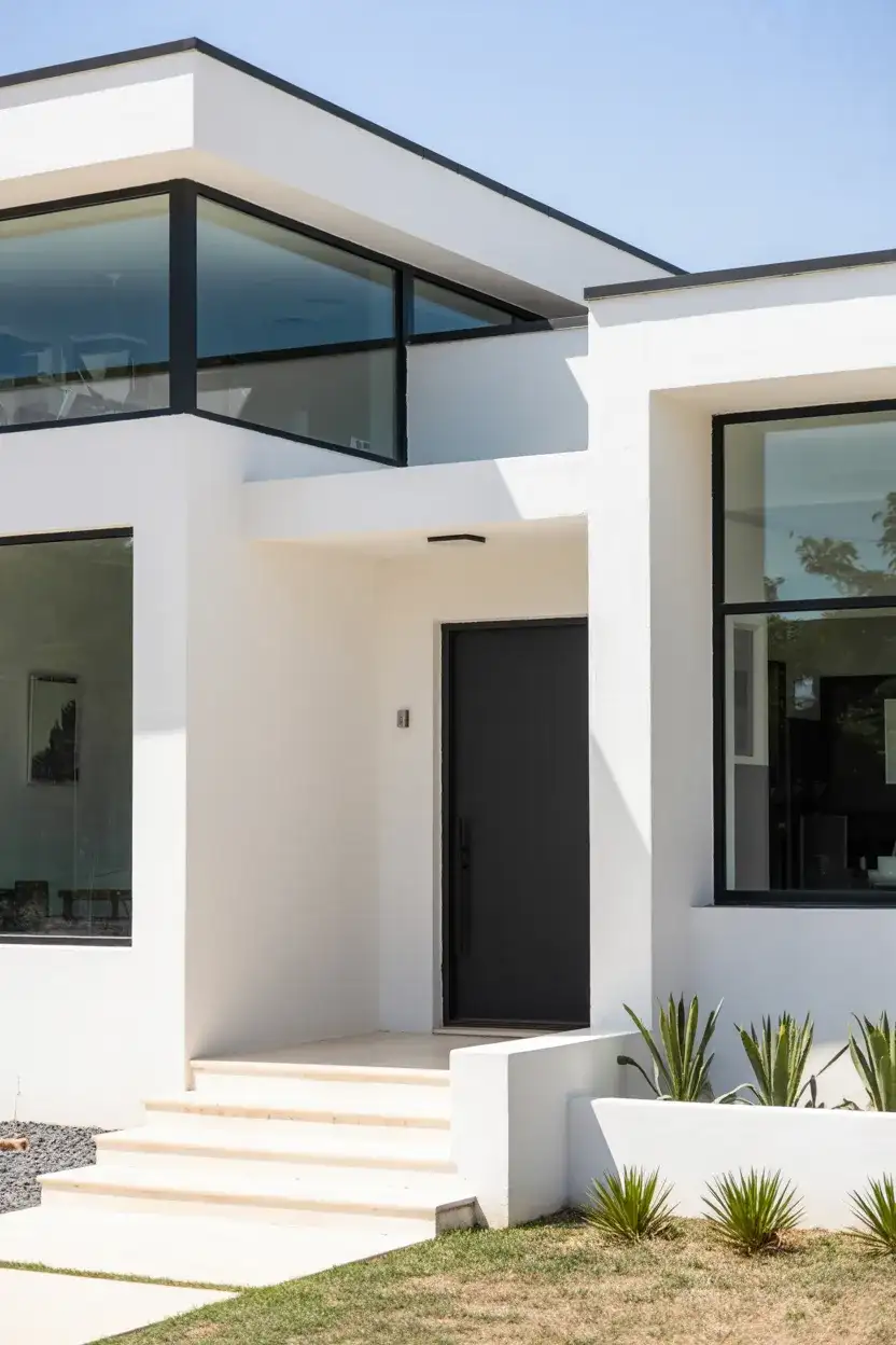
This high-contrast combination works best on newer construction or recently renovated homes where the architecture can support the graphic boldness. In neighborhoods with a mix of traditional and contemporary styles, this palette bridges the gap beautifully. Keep maintenance in mind: white shows dirt more readily than mid-tones, so plan for regular cleaning, especially near ground level where soil splashes up during rain.
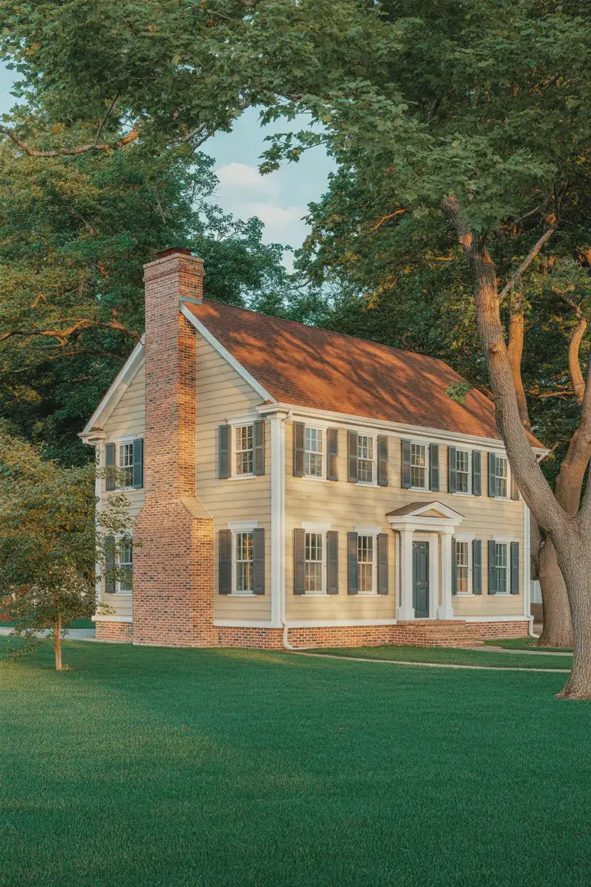
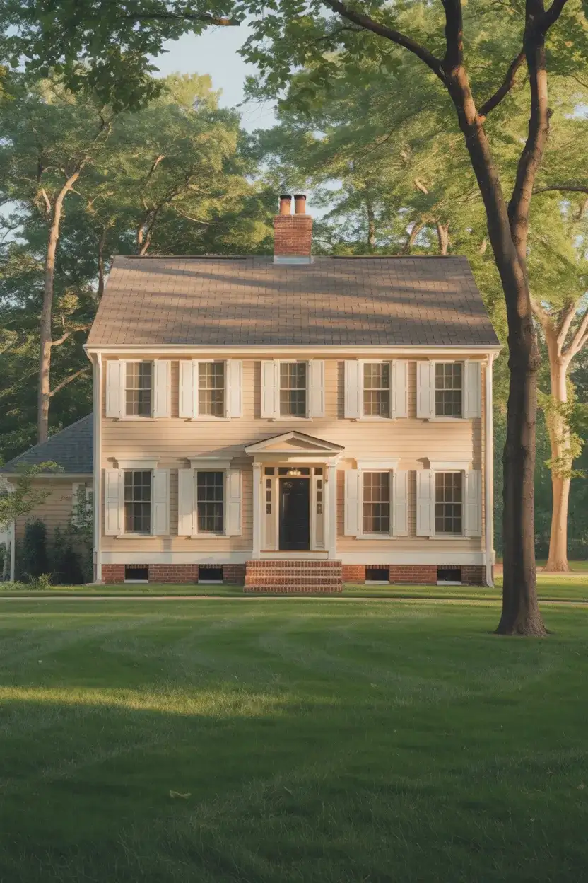
11. Soft Beige for Timeless Appeal
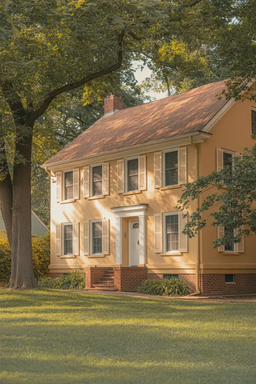
When in doubt, a soft, neutral beige remains one of the most reliable choices for exterior paint. This warm, versatile shade works across all architectural styles and complements virtually every roof color, from dark shingles to terracotta roof tiles. Beige offers the warmth of tan without feeling too yellow and provides enough contrast with white trim to create definition without drama.
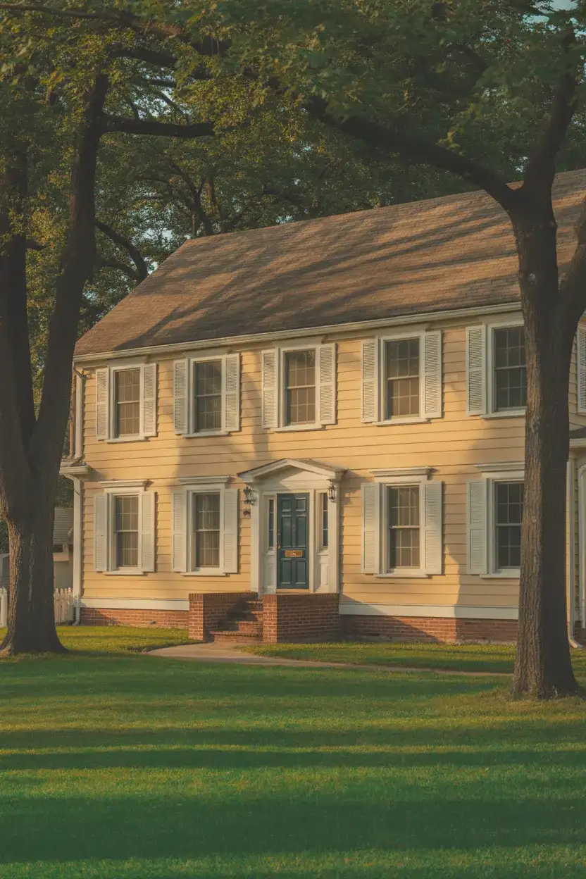
Beige exteriors have strong resale value because they appeal to the broadest range of buyers. They’re particularly popular in suburban developments where homeowners want to blend in while still maintaining an attractive appearance. The key is choosing a beige with enough saturation to avoid looking washed out—test samples on your home’s exterior at different times of day to see how the light affects the color before committing.
12. Slate Blue for Coastal Charm
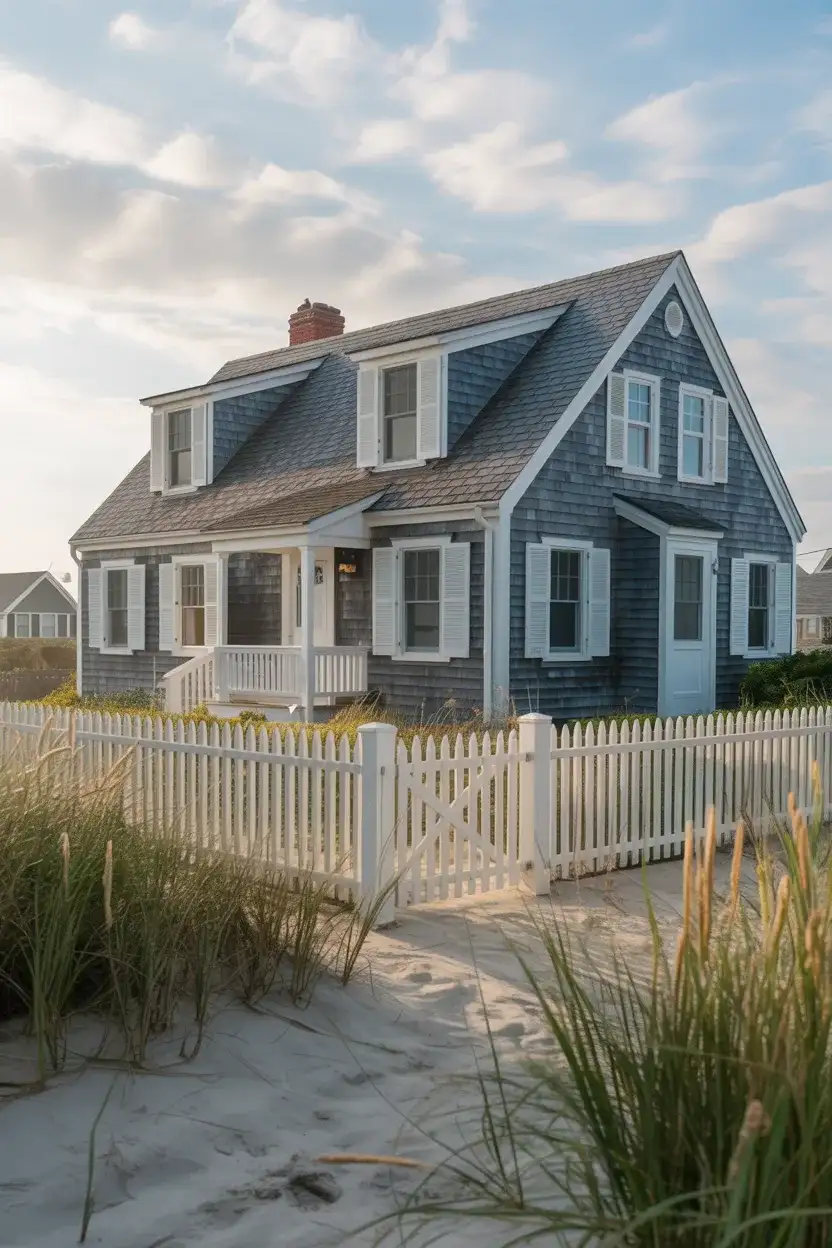
A grayed, medium-toned slate blue brings understated coastal elegance to homes in any region. This sophisticated shade falls between navy and powder blue, offering the calming associations of water and sky without feeling overly nautical or theme-driven. It’s a trending choice for homeowners who want color that feels intentional and curated, working beautifully with both traditional and contemporary mid-century modern architecture.
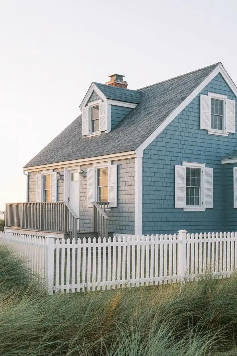
While slate blue originated in beachside communities along the Atlantic and Pacific coasts, it translates beautifully to inland settings where homeowners want to evoke a sense of relaxed, vacation-home tranquility. Pair it with white or cream trim, natural fiber textures, and plenty of green landscaping to soften the coolness of the blue and create a welcoming, lived-in feel.
13. Olive Green with Bronze Details
Deeper than sage but softer than forest, olive green strikes a perfect balance for homeowners seeking an earthy, sophisticated exterior. This versatile shade works particularly well on homes surrounded by natural landscaping, where it helps the structure blend seamlessly into its environment. Olive green is having a moment in 2026, especially when paired with warm bronze hardware and natural wood accents that enhance its organic character.
One mistake to avoid with olive green is pairing it with cool-toned metals like chrome or brushed nickel, which can create visual discord. Instead, lean into warm metallics—bronze, copper, or oil-rubbed finishes—that harmonize with the green’s earthy undertones. This creates a cohesive, intentional look that feels professionally designed rather than haphazardly assembled.
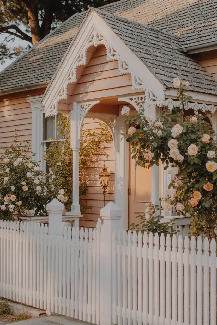
14. Soft Pink for Unexpected Romance
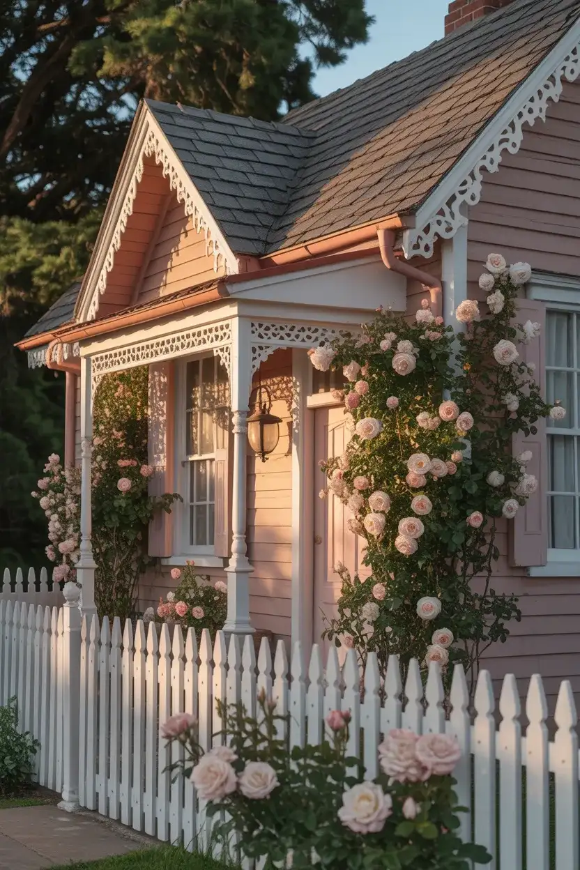
For the adventurous homeowner, a muted dusty pink exterior offers unexpected charm and individuality. This isn’t a bright or juvenile pink—think more along the lines of weathered terracotta or sun-bleached rose—that reads as sophisticated and historically grounded. While not a mainstream choice, it’s gaining traction among design-forward homeowners who want their home to make a memorable impression without veering into garish territory.

This palette works best in established neighborhoods with diverse architectural styles, where individuality is celebrated rather than frowned upon. In historic districts or communities with Victorian-era homes, a soft pink can actually feel quite period-appropriate. Balance the sweetness with darker accents—charcoal shutters, a deep green door, or bronze hardware—to ground the look and prevent it from feeling overly precious.
15. Warm Gray with Brown Roof
One of the most practical and pleasing combinations is a warm gray body with a brown roof, creating a harmonious blend of cool and warm tones. This pairing works exceptionally well when you have an existing roof in good condition that you don’t want to replace. The gray picks up the neutral quality of the brown, while the roof grounds the overall look, preventing the exterior from feeling too cool or sterile.
This combination is practical from a maintenance standpoint because both colors age gracefully and don’t show dirt as readily as stark white or very dark shades. In the Midwest and parts of the South, where brown roofs are common due to regional preferences and material availability, this pairing allows homeowners to refresh their exterior without the expense of re-roofing, making it a budget-conscious choice that doesn’t sacrifice style.
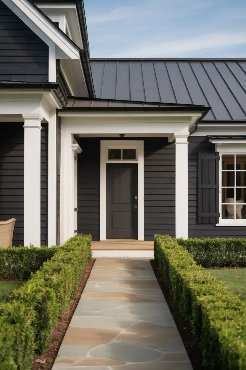
16. Charcoal with White Trim and Black Doors
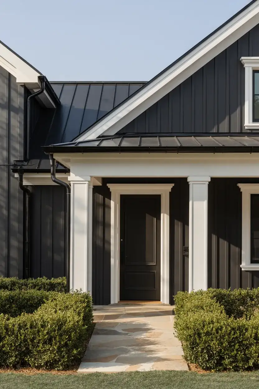
A deep charcoal body with white trim and black doors creates a sophisticated, high-contrast look that’s become synonymous with modern farmhouse and transitional styles. This combination offers the drama of dark exteriors while maintaining clarity and definition through the white trim. The black door adds an exclamation point to the design, creating a focal point that draws the eye and enhances curb appeal.
My friend’s home underwent this transformation last summer, and the before-and-after photos are stunning—what was once a forgettable beige box is now the most photographed house on the street. She mentioned that neighbors stopped by constantly during the painting process, asking for her color choices. It’s a reminder that bold decisions can pay off when executed with clean lines and quality materials.
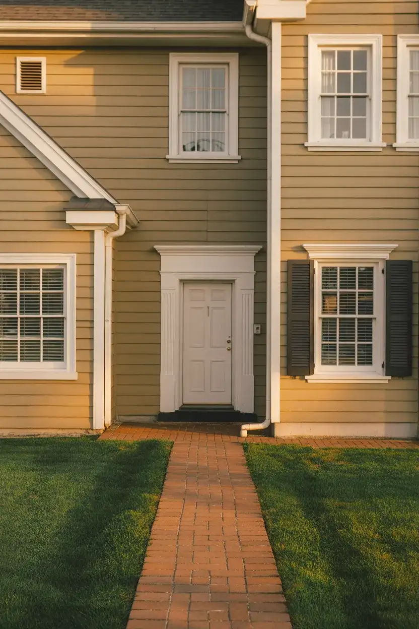
17. Cream with Green Shutters
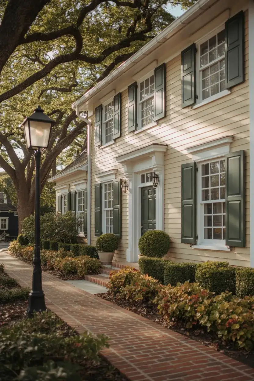
A soft cream exterior with deep green shutters evokes classic colonial and traditional styling while feeling fresh and current. This time-tested combination works beautifully on historic homes and new construction alike, offering a sophisticated alternative to stark white. The cream provides warmth without the yellow cast of some beiges, while green shutters add a pop of color that feels rooted in architectural tradition.
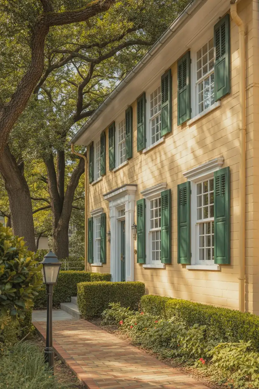
This pairing thrives in the Northeast and Mid-Atlantic states, where colonial architecture dominates and traditional color schemes are appreciated. The beauty of this combination is its versatility—you can adjust the shade of green from forest to sage depending on your home’s surroundings and personal taste. Keep the rest of your palette simple with natural wood or brass accents to let the cream-and-green relationship remain the star.
18. Desert Sand with Brick and Stone
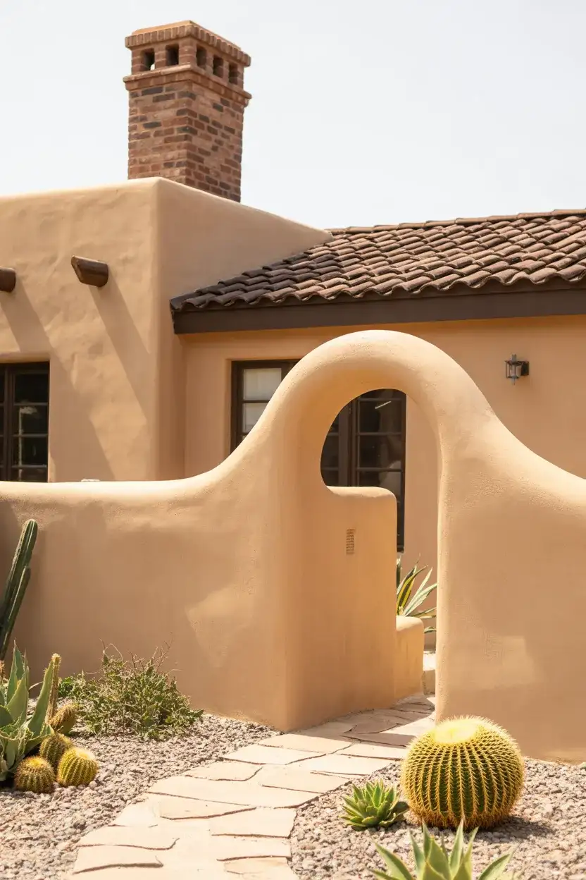
For homes with existing brown roof and red brick wall elements, a warm desert sand or sandy beige paint creates a cohesive, sun-baked aesthetic. This earthy palette harmonizes beautifully with natural stone accents and terracotta details, making it ideal for Southwestern and Mediterranean-style architecture. The key is choosing a sand tone with enough warmth to complement the red undertones in brick without clashing.
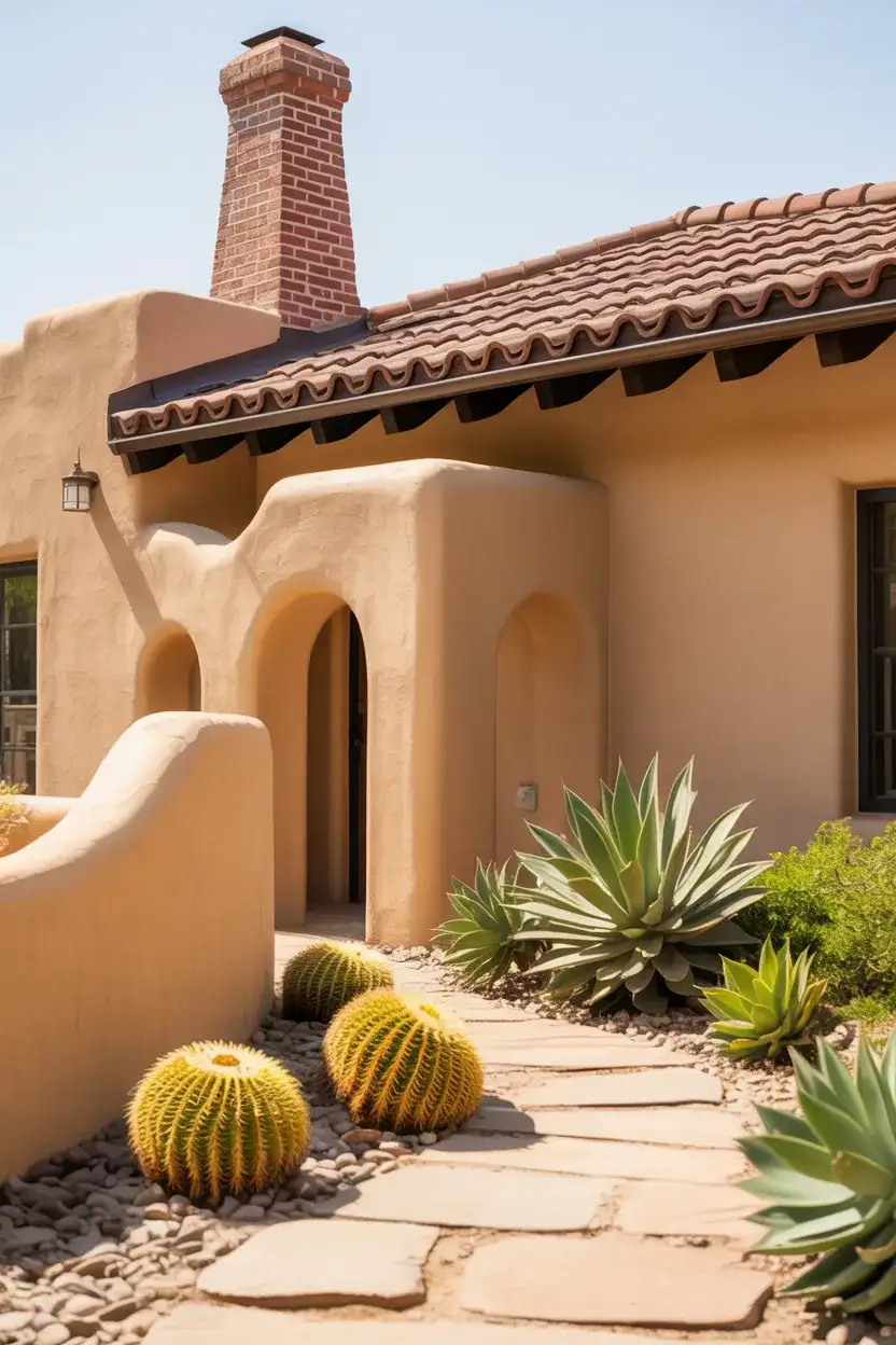
A common pitfall is choosing a sand color that’s too cool or gray-toned, which creates an awkward relationship with warm brick. Test your paint samples next to your brick and stone elements in various lighting conditions. In sunny climates like Arizona, New Mexico, and Southern California, this palette reflects light beautifully while maintaining its color integrity under intense UV exposure, making it both practical and aesthetically pleasing.
19. Soft Mint for Vintage Vibes
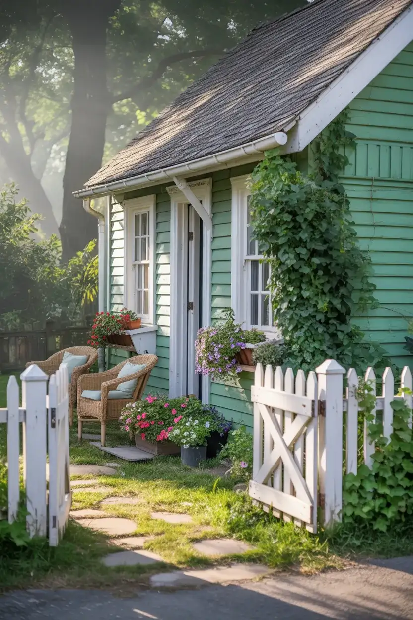
A pale, muted mint green brings nostalgic charm to cottages and bungalows, evoking the gentle pastels of 1920s and 1930s architecture. This isn’t a bright or artificial mint—think more along the lines of faded celadon or pistachio—that feels both vintage and surprisingly current. It’s the latest choice for homeowners who want to honor a home’s historical character while adding personality that stands out from the standard neutral parade.
Expert colorists recommend pairing mint with crisp white trim and darker accents—like charcoal shutters or a navy door—to prevent the look from feeling too sweet or one-note. This grounding strategy lets the mint read as intentional and sophisticated rather than costume-like. In neighborhoods with bungalows and early 20th-century homes, this shade can actually increase curb appeal by highlighting the home’s period character.
20. Black for Bold Statement
For the truly daring, a matte or semi-gloss black exterior creates unparalleled drama and sophistication. While dark colors require commitment, black has moved beyond novelty to become a legitimate choice for modern and contemporary mid-century modern homes. The key is balancing the intensity with ample natural wood, stone, or white elements to prevent the home from feeling oppressive or cave-like.
Real homeowners who choose black exteriors often report that their biggest concern—that it would be overwhelming—turned out to be unfounded. In practice, black recedes visually in many settings, especially against dark landscaping or at dusk, creating a sophisticated backdrop that lets architectural details and lighting shine. However, be prepared for higher paint costs, as black may require premium formulations to prevent fading and chalking over time.
21. Pale Yellow for Cheerful Charm
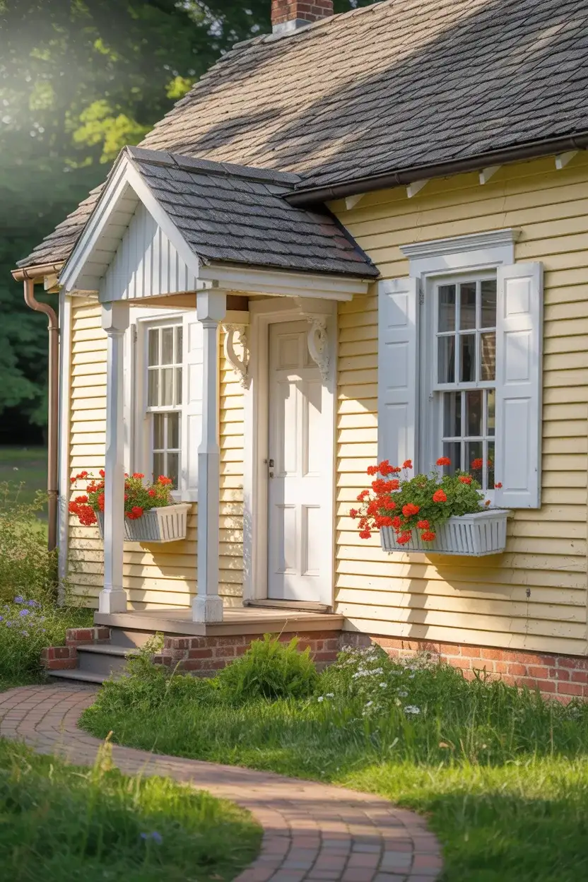
A soft, buttery yellow brings instant sunshine and warmth to any home, making it a popular choice for cottages and traditional homes in both rural and suburban settings. The key is choosing a yellow with enough subtlety—think cream with a hint of sunny warmth rather than school bus bright—that it feels sophisticated rather than loud. This shade works beautifully with white trim and adds an inviting, approachable quality that neighbors and passersby appreciate.
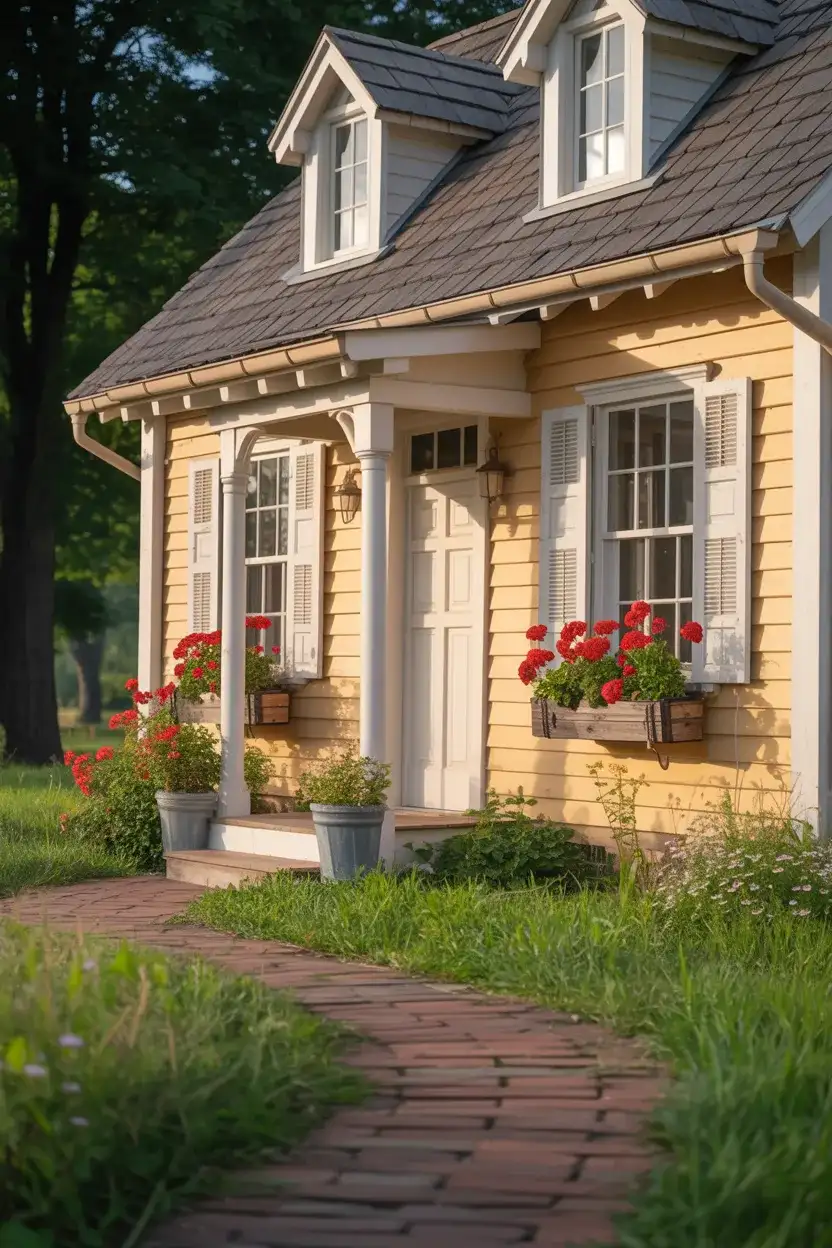
Yellow exteriors work best in regions with plenty of natural greenery—think the Pacific Northwest, New England, and the Southeast—where the surrounding landscape provides visual balance. Without enough green to anchor it, yellow can feel jarring or overly bright. Consider your home’s orientation too: a pale yellow on a north-facing facade maintains its softness, while the same color on a south-facing wall might appear washed out in intense midday sun.
22. Warm Beige with Red Brick
When working with a brown roof and red brick wall, a warm beige body color creates seamless integration between painted and masonry surfaces. This classic combination is particularly common in traditional and colonial architecture, where brick chimneys, foundations, or accent walls are already part of the home’s character. The beige acts as a neutral bridge that harmonizes the warm red tones without competing for attention.
This color strategy is particularly effective in established neighborhoods throughout the Mid-Atlantic and Southern states, where brick is a dominant architectural material. The beige-brick-brown combination reads as tasteful and traditional without being boring, appealing to a wide range of buyers if you eventually sell. It’s a safe choice that still allows for personality through door color, landscaping, and decorative accents.
23. Two-Tone Modern with Gray and White
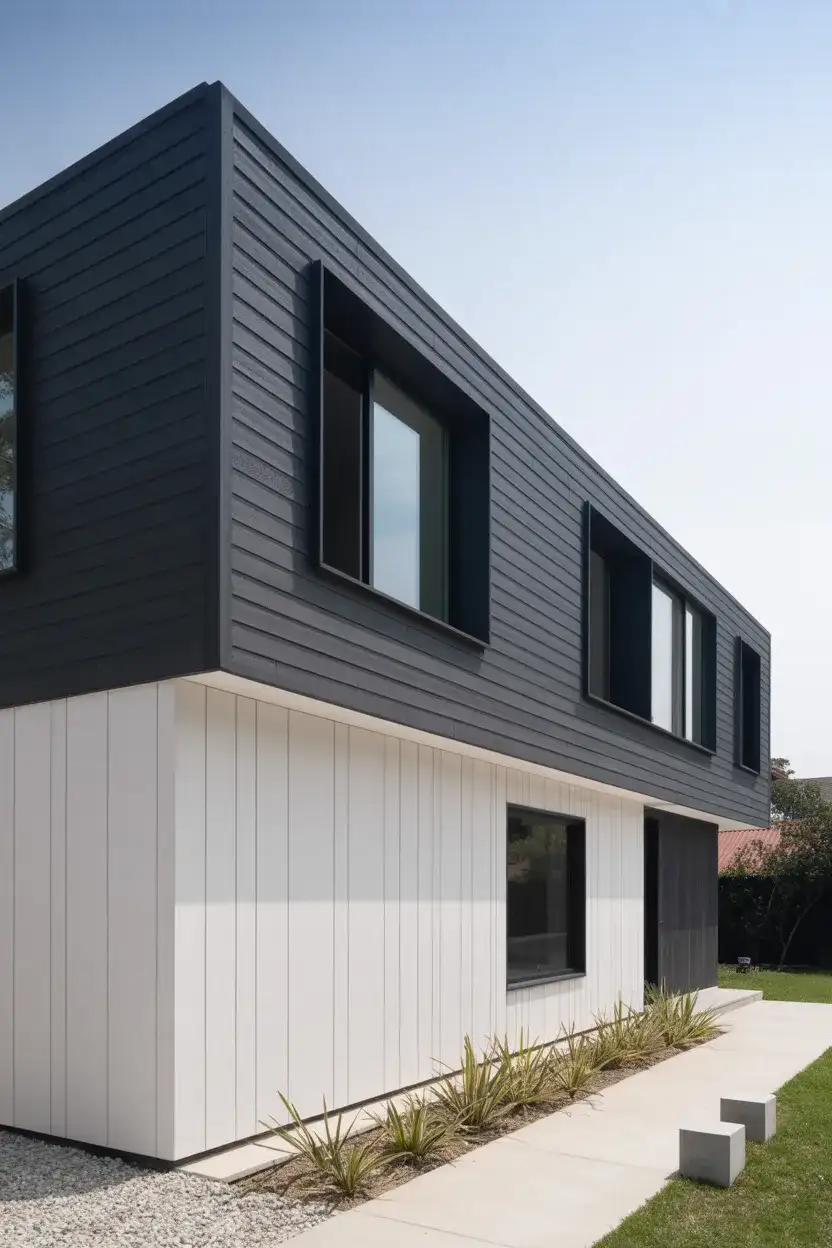
A contemporary mid-century modern approach involves using two colors—typically a medium gray and bright white—to highlight different planes and architectural elements. This technique adds depth and visual interest to flat facades, emphasizing horizontal lines, geometric shapes, and material transitions. The two-tone strategy has become increasingly popular in 2026 as homeowners seek to give their homes a custom, architect-designed feel.
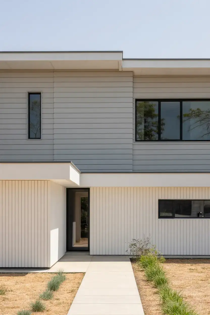
To execute this look successfully, use the lighter color on recessed areas or upper sections and the darker shade on protruding elements or lower levels. This creates shadow play that enhances the home’s three-dimensional quality. Common mistakes include choosing colors that are too similar in value, which defeats the purpose, or applying the two-tone scheme randomly without regard to the home’s architectural logic. Work with your home’s natural lines and transitions for the most polished result.
Conclusion
Choosing an exterior paint color is one of the most impactful decisions you’ll make for your home’s appearance, affecting everything from curb appeal to how your property photographs online. Whether you lean toward timeless neutrals, nature-inspired hues, or bold modern statements, the right color can transform your home’s presence in the neighborhood. Take your time testing samples in different lighting conditions, consider how your choice works with existing elements like your roof and landscaping, and don’t be afraid to express your personal style. What color combination are you considering for your home’s exterior? Share your thoughts and questions in the comments below—we’d love to hear about your design journey.