Colorful living rooms are having a major moment in 2026, and American homeowners are ready to embrace it. After years of all-white and all-gray interiors, there’s a growing hunger for spaces that feel personal, joyful, and alive. Pinterest boards are overflowing with vibrant palettes, from soft pastels to dramatic moody tones, proving that color isn’t just a trend—it’s a return to emotional design. Whether you’re working with a grey couch you already love or starting fresh with bold paint choices, this guide will walk you through inspiring ways to bring color into your living room without losing sophistication or balance.
1. Soft Pastel Refresh with White Couch Foundation
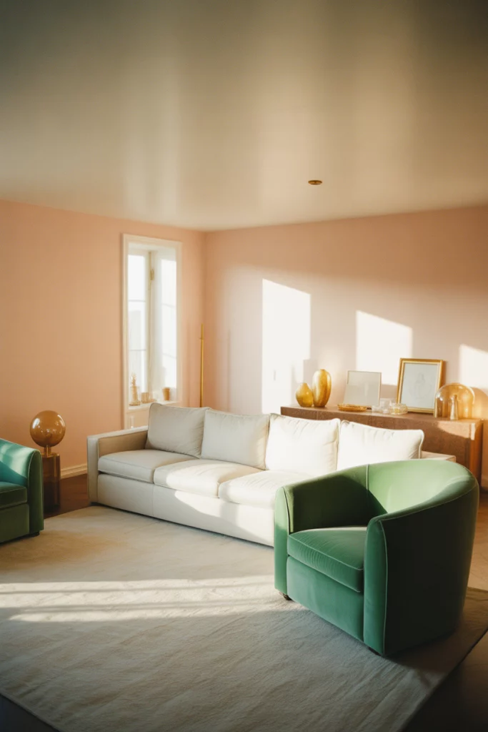
A white couch offers the perfect blank canvas for experimenting with pastel hues across your walls, textiles, and accessories. Think blush pinks, powder blues, and mint greens that create a calming, airy atmosphere without feeling juvenile. This approach works beautifully in smaller living rooms where you want to maintain a sense of openness while adding personality. Layer in textured throws, velvet pillows, and a soft rug in complementary tones to build depth without overwhelming the space. 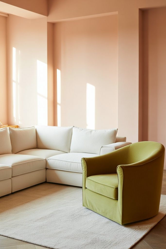
The beauty of this palette is its versatility—you can shift the mood seasonally by swapping out a few key pieces. In Southern states like Georgia and the Carolinas, homeowners love this look because it feels fresh year-round without fighting the heat. Just avoid choosing pastels that are too icy or gray-based; warm undertones keep the space from feeling sterile or cold, especially under artificial lighting in the evening.
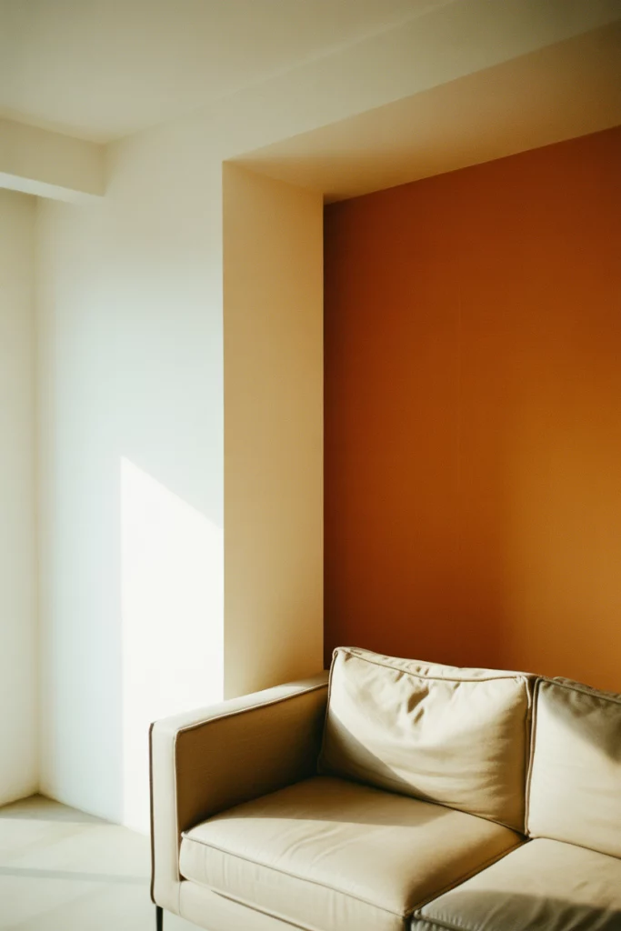
2. Bold Accent Wall Drama
An accent wall in a bold color instantly transforms a living room from safe to statement-making. Deep emerald, rich terracotta, or even a striking cobalt blue can anchor the room and give you a focal point that doesn’t require a full repaint. This strategy is especially popular in open-concept homes where you want to define the living area without adding physical barriers. Pair it with neutral furniture and let the wall do all the talking. 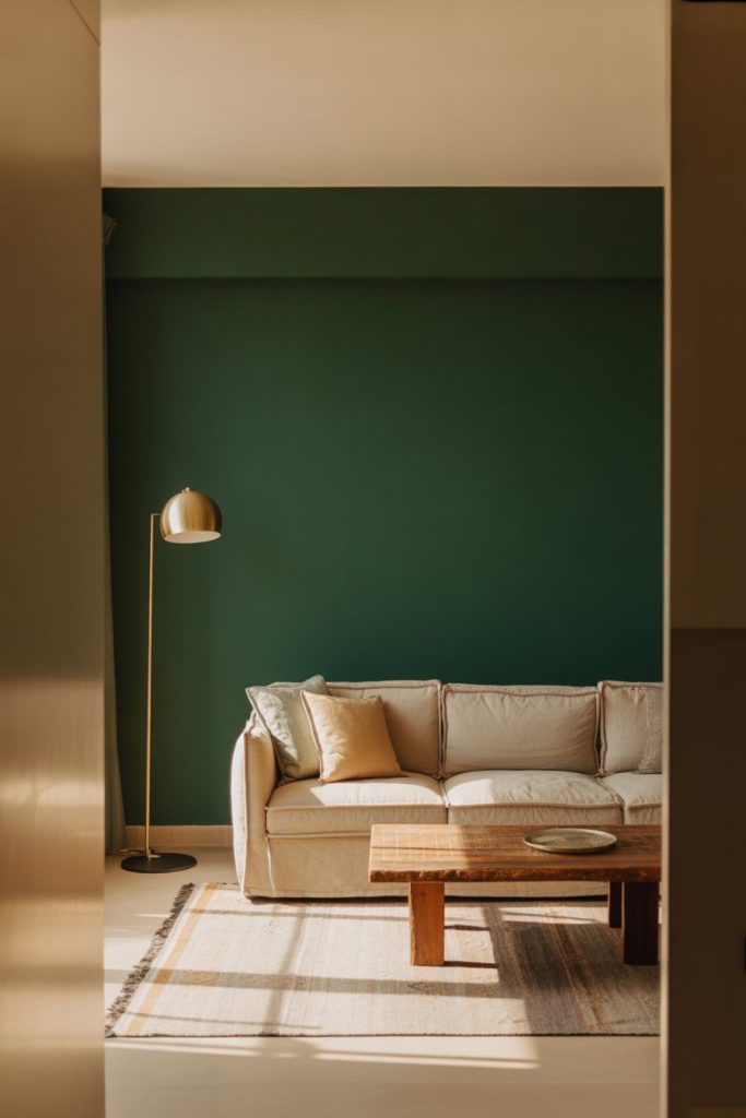
Budget-conscious decorators appreciate this approach because it delivers maximum impact with minimal investment. A single gallon of quality paint—whether from a trusted brand or a specialty line—can completely shift the energy of your space. Just make sure to sample the color in different lighting conditions first; what looks moody and sophisticated at noon might feel overly dark by evening if your room doesn’t get enough natural light.
3. Greige Paint as a Warm Neutral Base
Greige paint continues to dominate American interiors, and for good reason—it’s the perfect middle ground between gray and beige, offering warmth without skewing too traditional. This neutral backdrop allows you to introduce color through artwork, textiles, and decorative objects without committing to a bold wall color. It’s particularly effective in living rooms with mismatched furniture or eclectic collections, as it unifies everything visually. The subtle warmth prevents the space from feeling clinical or cold. 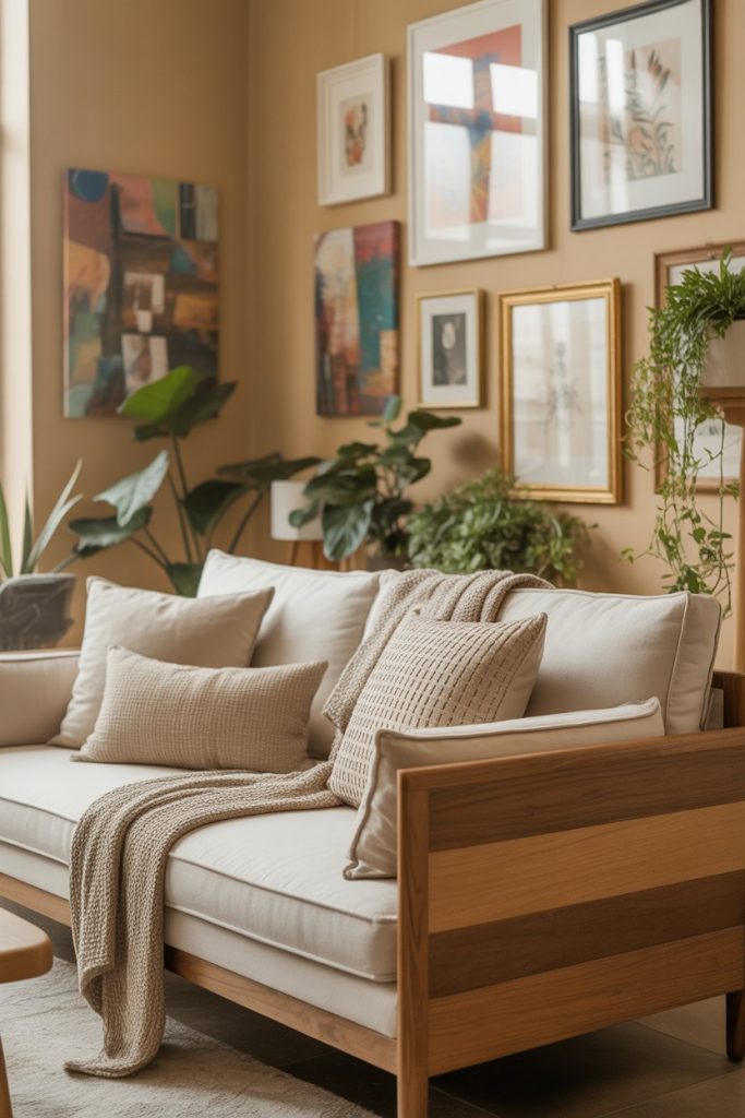
Where this works best: homes in the Pacific Northwest and Northeast, where natural light can be limited and cool-toned grays feel too stark. Greige reflects available light beautifully while maintaining coziness. It’s also forgiving with different wood tones—whether you have warm oak floors or cool walnut furniture, greige plays nicely with both, making it a practical choice for renters or anyone working with existing pieces.
4. Bright and Energetic Primary Colors
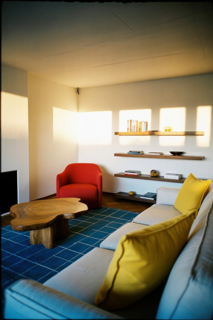
Embracing primary colors—red, blue, and yellow—might sound retro, but when done right, it feels fresh and surprisingly modern. The key is balancing saturated hues with plenty of white or neutral space to let each color breathe. Think a cherry red armchair, a cobalt blue throw, and mustard yellow pillows against white walls and natural wood. This playful approach works beautifully in homes with young families or creative professionals who want their space to feel alive and unconventional. 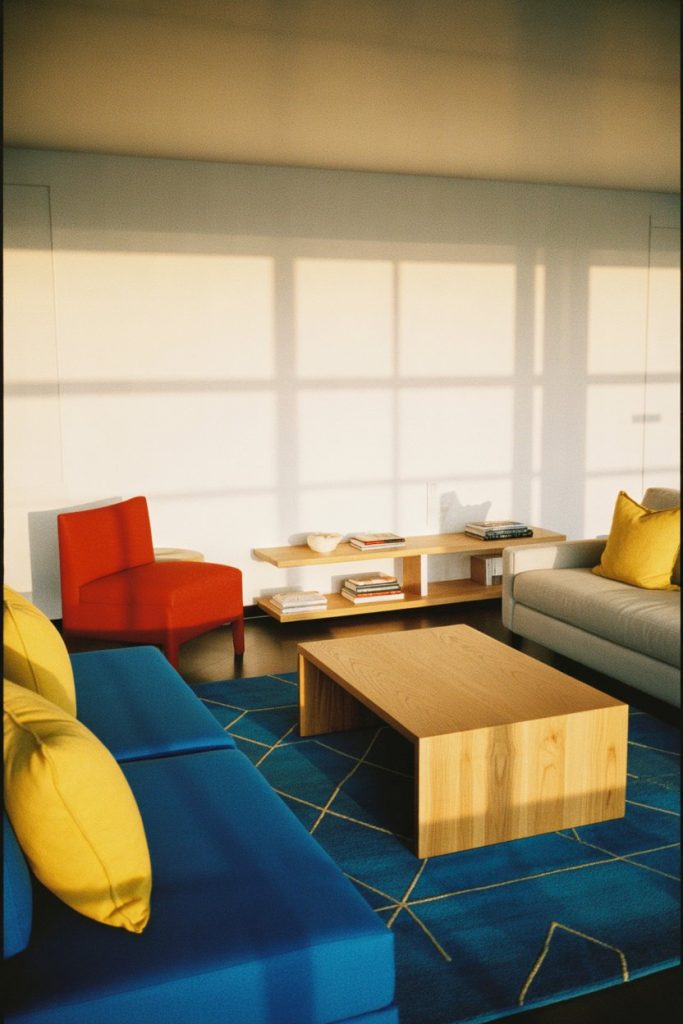
A common mistake is using all three primary colors in equal amounts, which can feel chaotic rather than intentional. Instead, choose one as your dominant color (maybe 60% of your accents), a second as supporting (30%), and the third as a small pop (10%). This creates visual hierarchy and prevents the room from looking like a preschool classroom. Real homeowners who nail this look often stick to one bold furniture piece and layer in the other colors through smaller, easily changeable items.
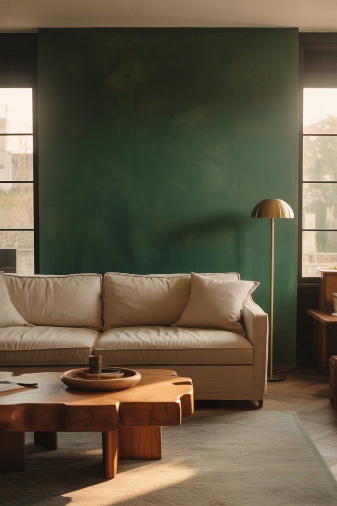
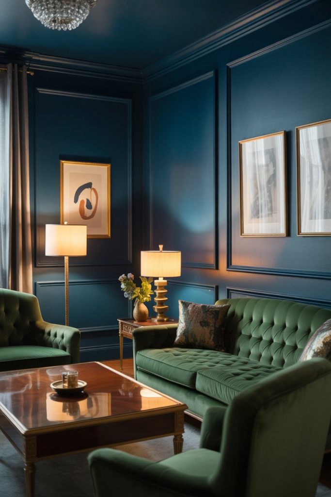
5. Moody Dark Living Room
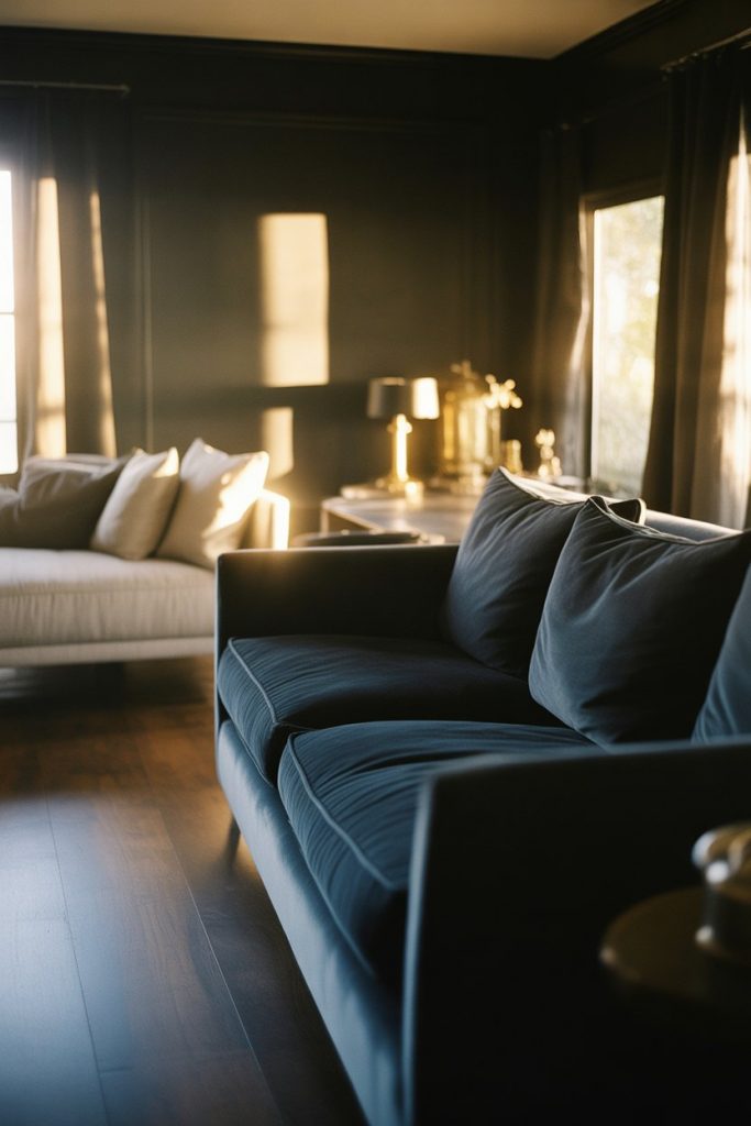
The moody dark living room trend shows no signs of slowing down, with charcoal, navy, and forest green creating cocooning, intimate spaces. This approach works especially well in larger rooms that can handle the drama without feeling cramped. When you commit to a dark palette, lighting becomes critical—layer in floor lamps, table lamps, and even LED strips to prevent the space from feeling like a cave. Metallic accents in brass or copper add warmth and reflection. 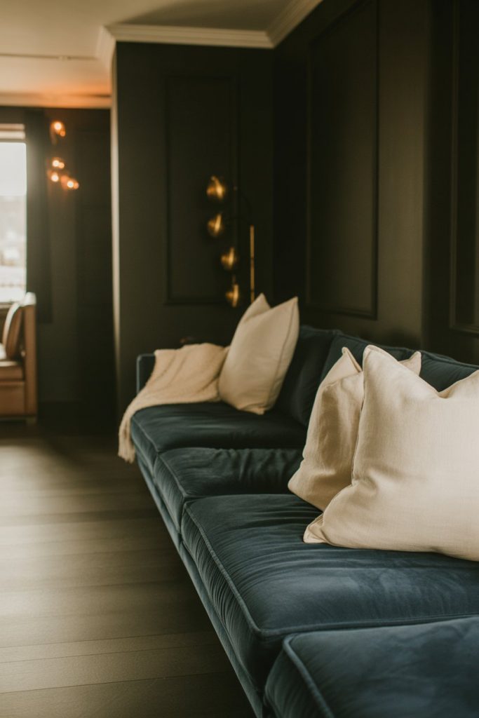
Midwestern homeowners, particularly in cities like Chicago and Minneapolis, love this look for its coziness during long winters. The dark walls actually make the space feel warmer and more inviting when snow is piling up outside. Just remember that dark colors absorb light, so if your living room is already dim or north-facing, you might want to test samples first or consider a lighter shade of your chosen color to maintain some brightness.
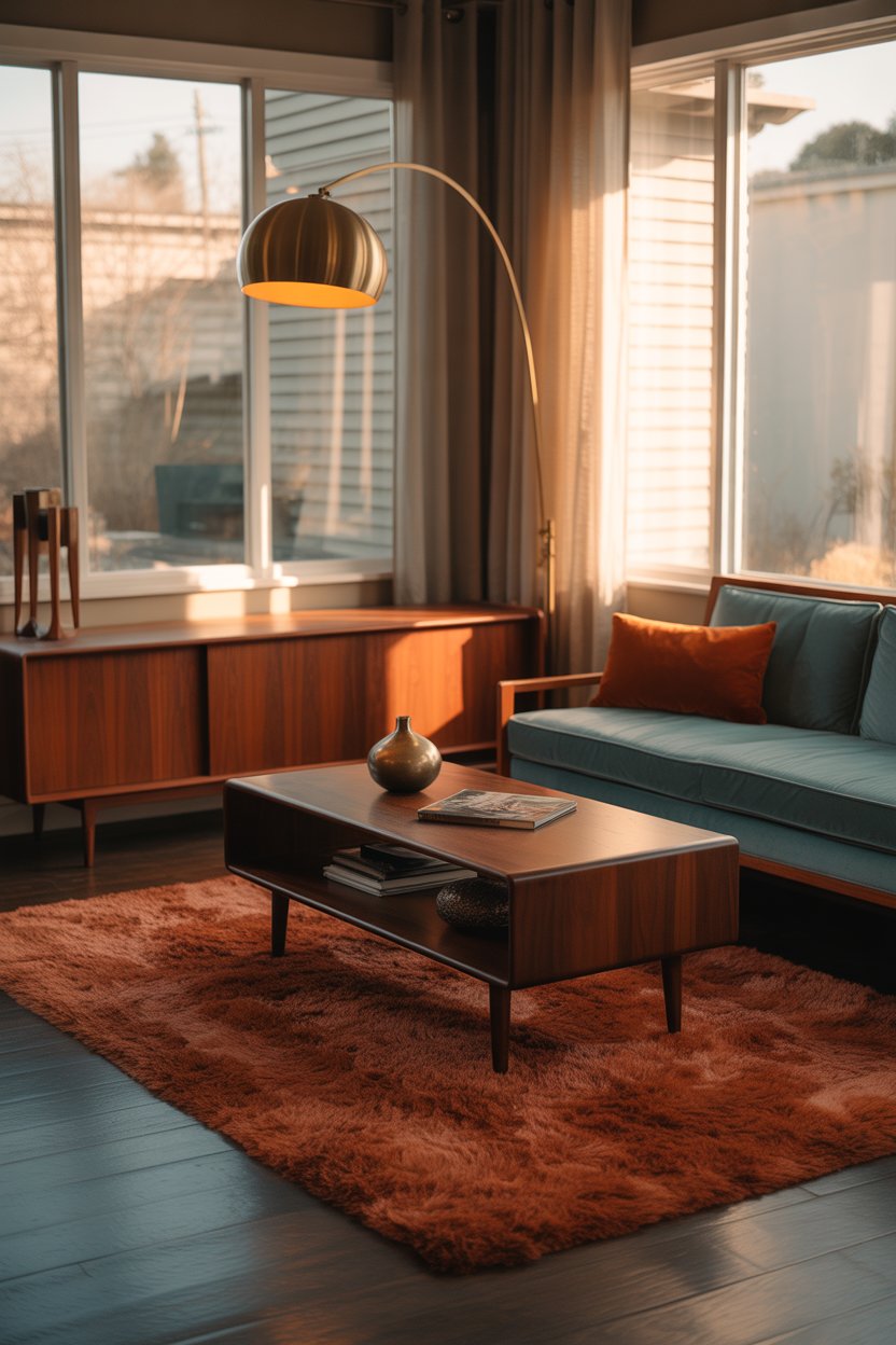
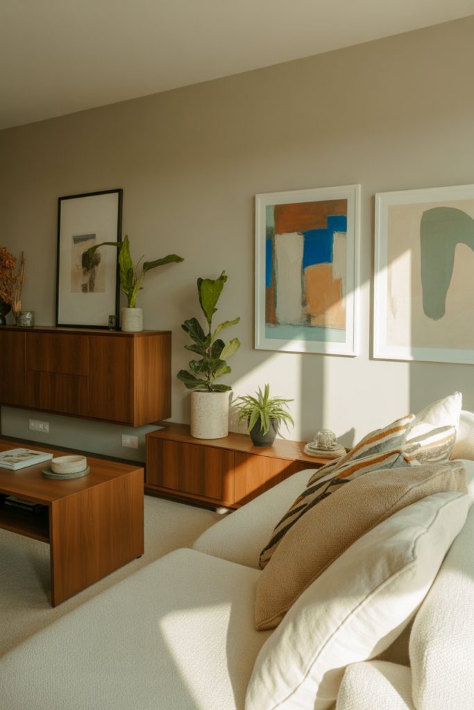
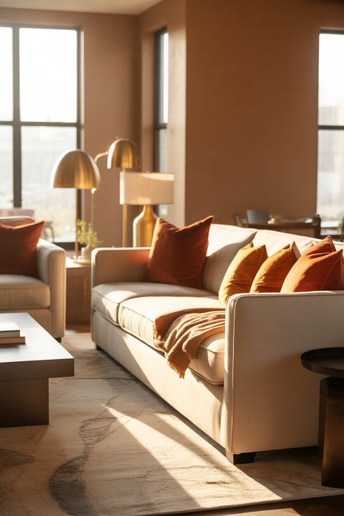
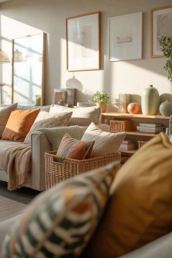
6. Warm Neutral Paint with Earth Tones
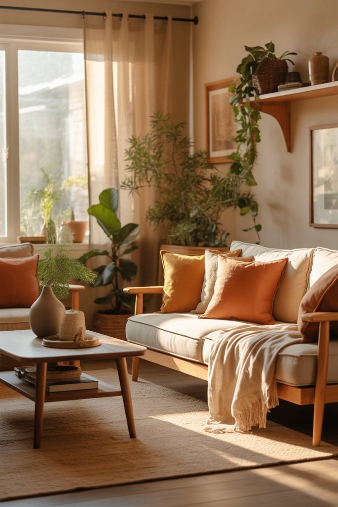
Warm neutral paint colors like honey beige, soft taupe, and creamy off-white create a welcoming foundation that pairs beautifully with earth tones throughout the room. Think terracotta, rust, olive green, and warm browns brought in through furniture, textiles, and natural materials. This palette feels inherently organic and grounding, perfect for anyone craving a connection to nature in their urban or suburban space. It’s a sophisticated alternative to stark white that still maintains brightness and airiness. 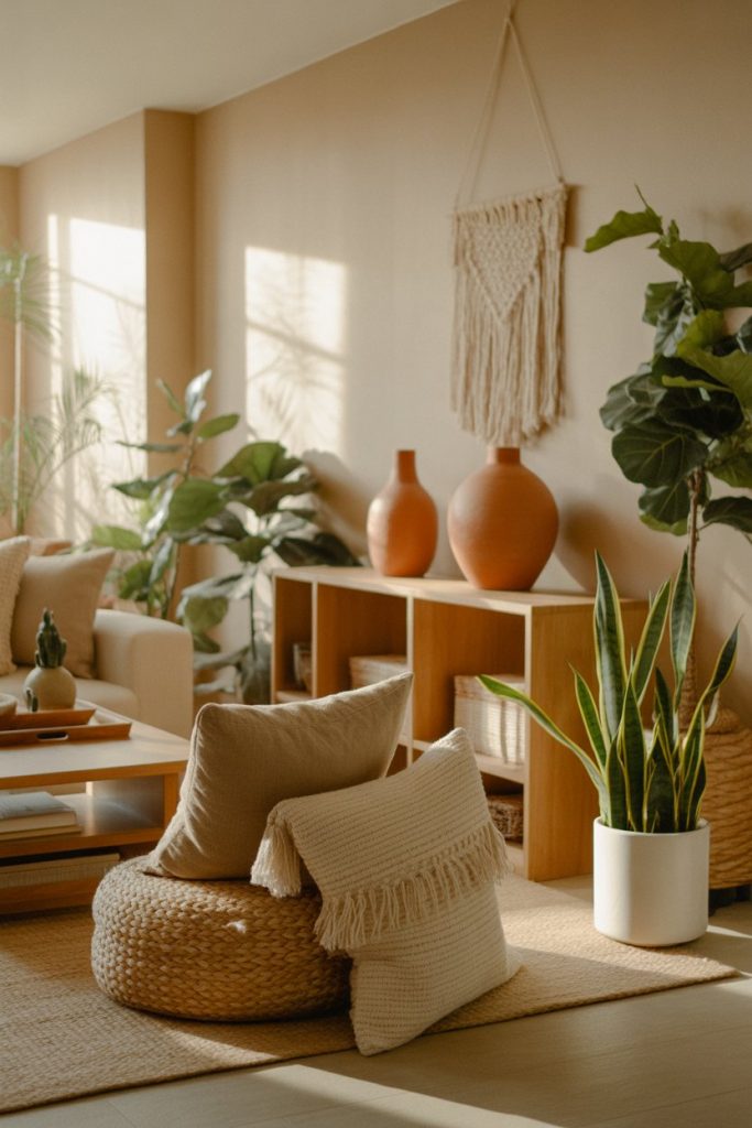
An expert-style tip: warm neutrals work beautifully in open-concept spaces because they flow seamlessly from room to room without creating harsh visual breaks. If your living room opens into a kitchen or dining area, choosing a warm neutral base allows you to introduce different accent colors in each zone while maintaining overall cohesion. This is particularly valuable in newer American construction where open floor plans dominate.
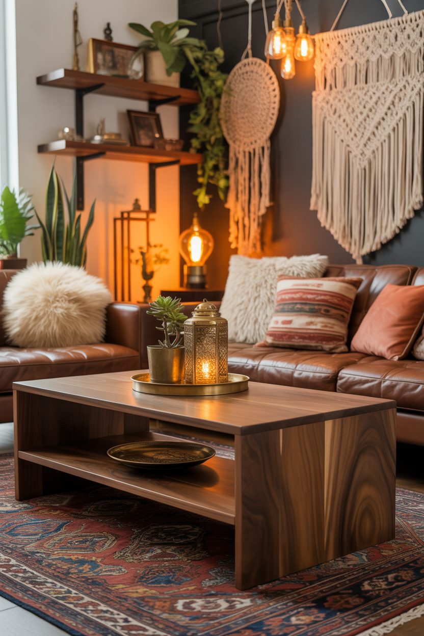
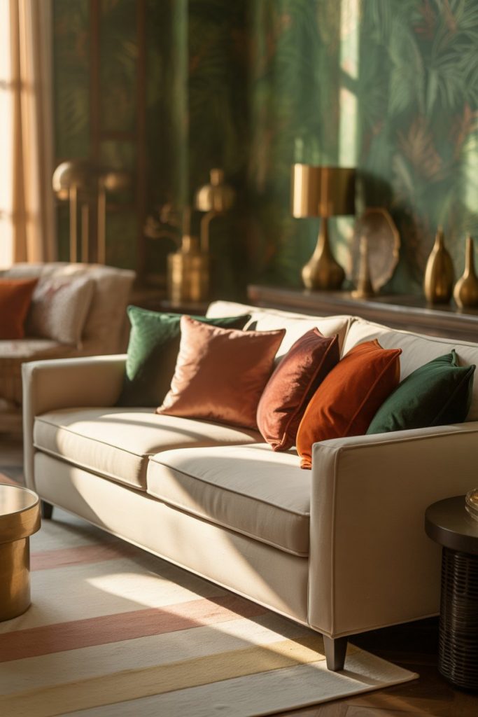
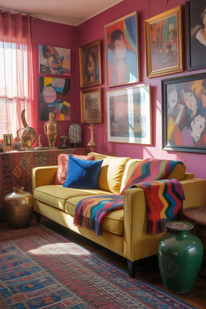
7. Boho Maximalism with Layered Color
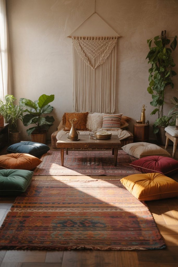
The boho aesthetic thrives on color mixing, pattern clashing, and textural abundance—think jewel tones, global textiles, and an eclectic mix of vintage and new pieces. This style gives you permission to break traditional design rules and follow your instincts. Layer a vibrant rug over natural flooring, pile on patterned pillows in clashing prints, and don’t shy away from that colorful tapestry or hand-painted vintage cabinet. The result should feel collected over time, not purchased all at once from a single store. 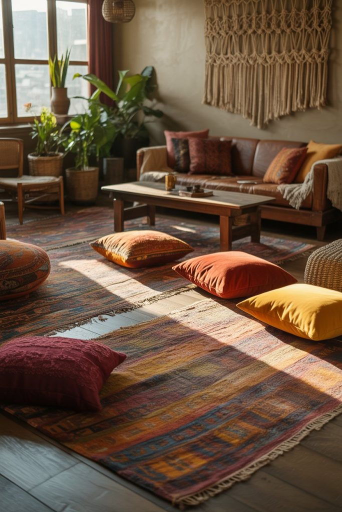
Real homeowner behavior shows that successful boho spaces evolve organically—people add pieces gradually as they travel, thrift, or inherit items from family. The mistake many make is trying to create this look all at once from a catalog, which results in a space that feels staged rather than lived-in. Start with one or two statement pieces you truly love, then build around them slowly. This approach is also kinder to your wallet and results in a more authentic, personal space.
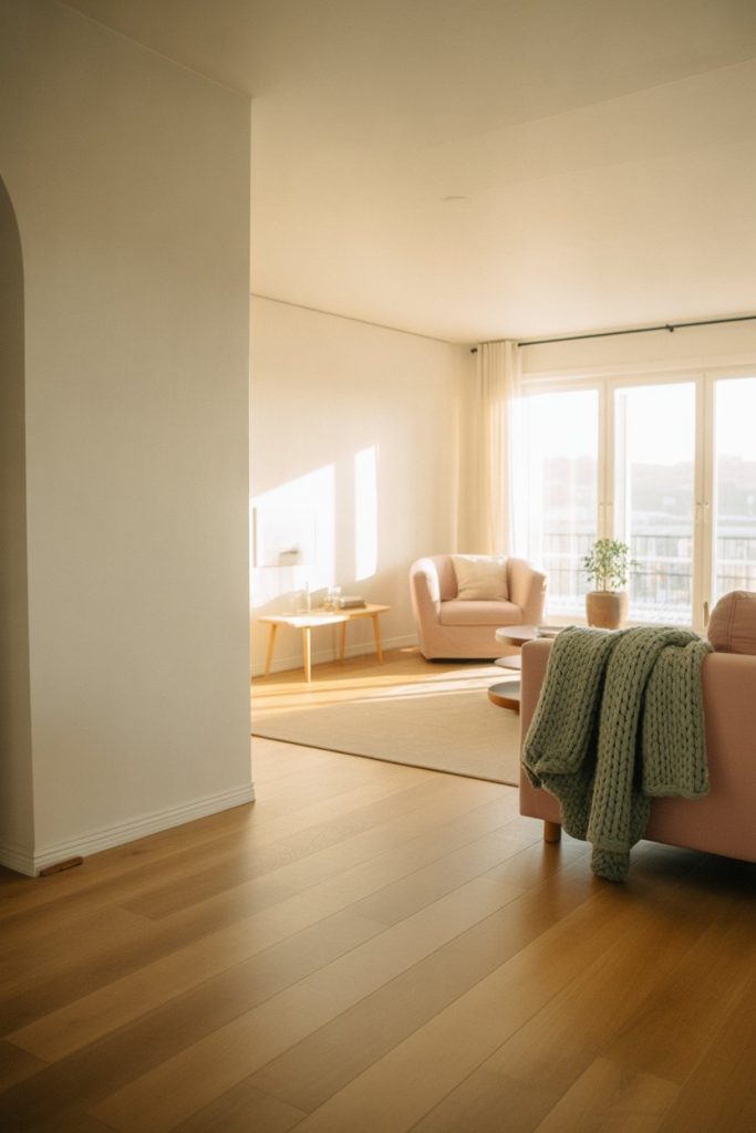
8. Grey Couch with Colorful Accessories
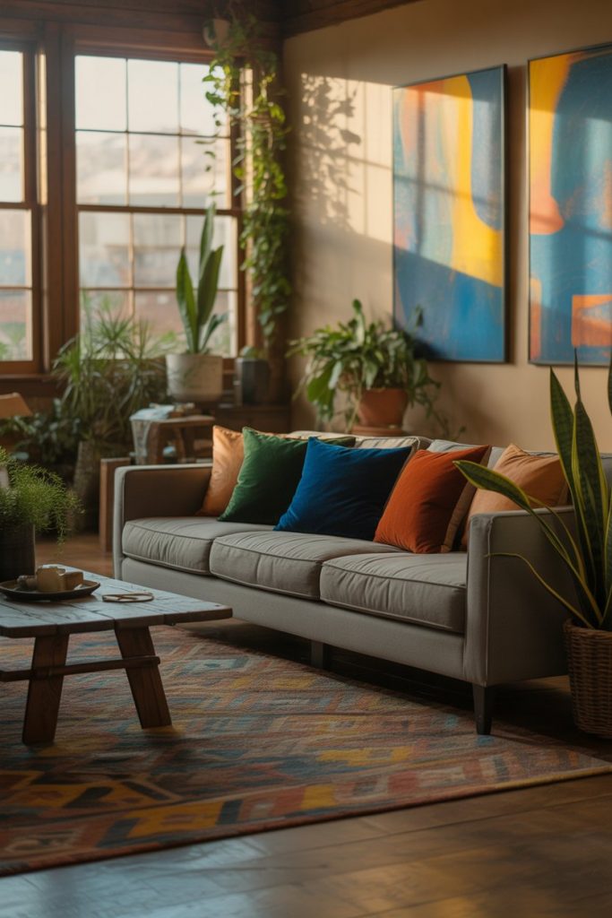
A gray couch is one of the most common furniture investments in American homes, and it’s actually a brilliant foundation for colorful living room design. The neutral tone allows you to switch up your color scheme seasonally or as your taste evolves without replacing major furniture pieces. Layer in colorful throw pillows, vibrant artwork, a patterned rug, and maybe a jewel-toned throw blanket to inject personality. This approach gives you flexibility and keeps your space feeling current without constant renovation. 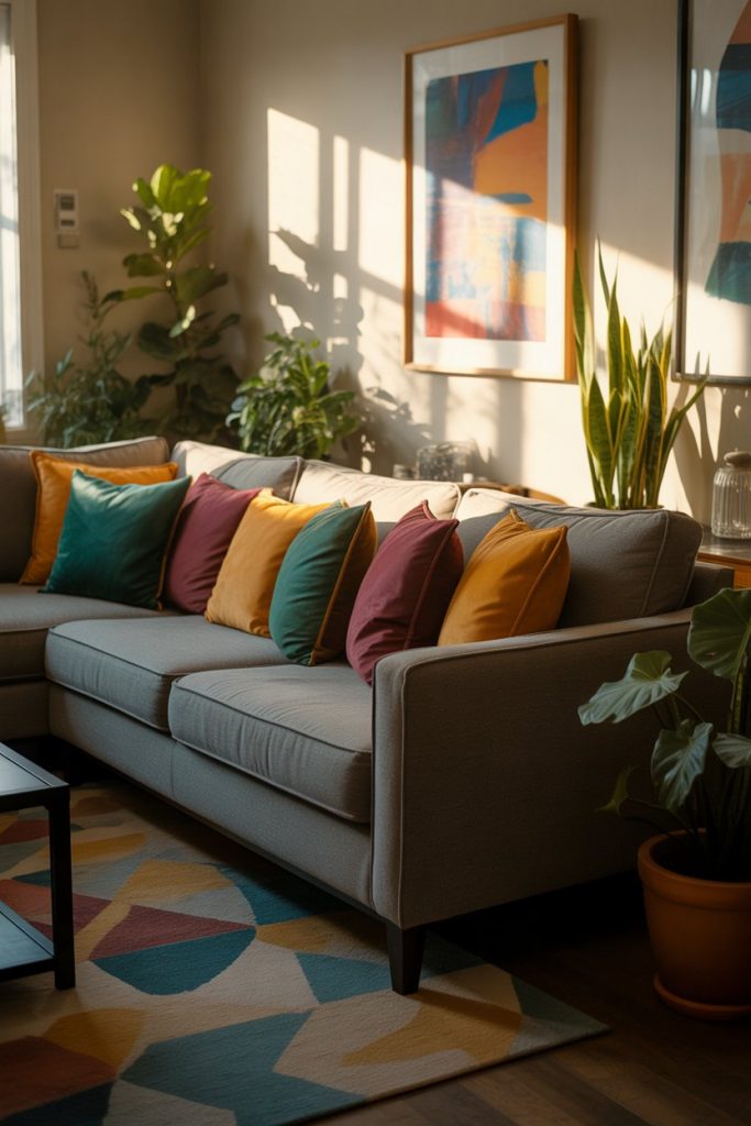
In Texas and other warm-weather states, homeowners appreciate how a grey couch doesn’t show dust and pet hair as readily as darker or lighter options, making it practical for everyday living. The trick is choosing the right shade of grey—avoid anything too cool or blue-toned unless you’re specifically going for an industrial vibe. Warmer greys with slight brown or taupe undertones work better in most lighting conditions and feel more inviting year-round.
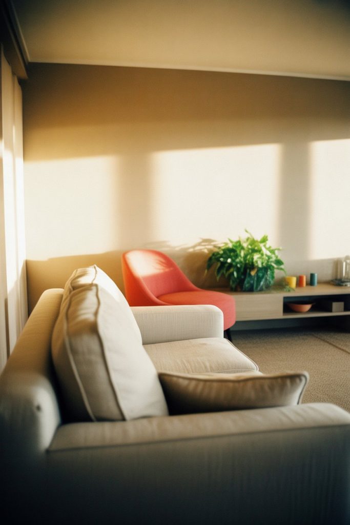
9. Minimalist Color-Blocking
The minimalist approach to color doesn’t mean no color—it means intentional, carefully chosen color used sparingly for maximum impact. Think a single accent wall in a saturated hue, one statement piece of furniture in a bold color, or a large-scale artwork that introduces just two or three colors total. The rest of the space remains clean, uncluttered, and neutral. This creates visual rest areas that make your color choices feel even more powerful and deliberate. 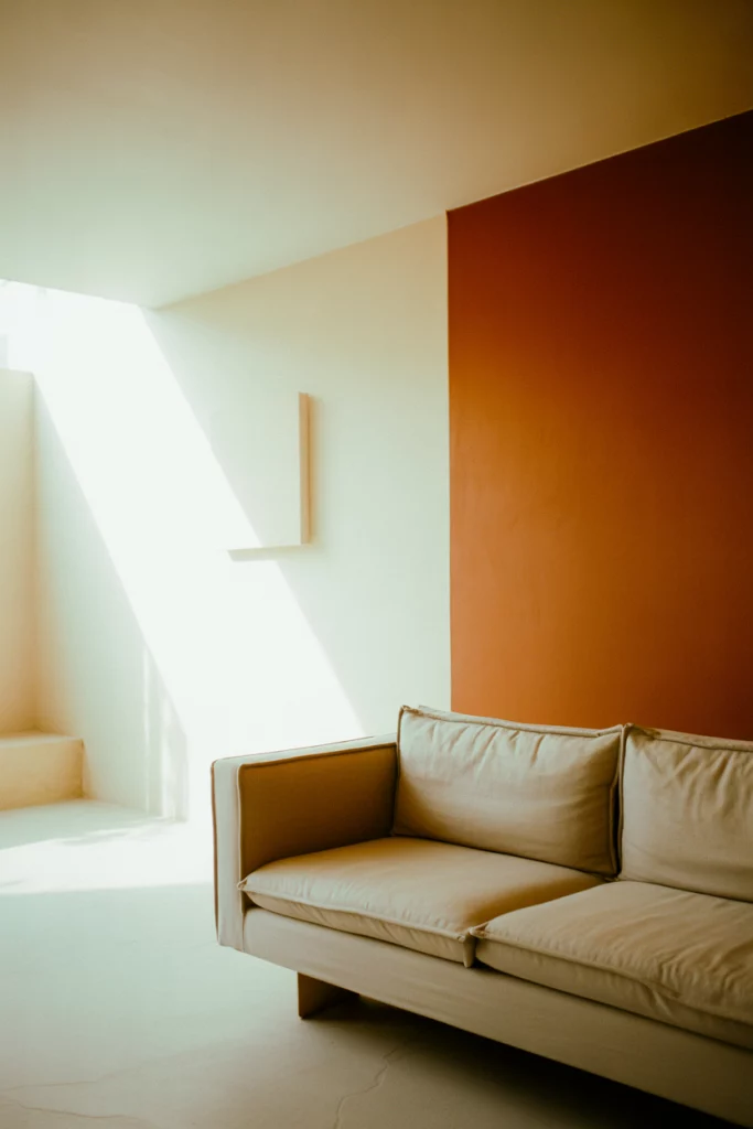
This aesthetic particularly resonates with younger homeowners in urban areas like Brooklyn, San Francisco, and Seattle, where smaller square footage demands smart editing. The practical insight here is that minimalist color-blocking actually makes spaces feel larger because your eye isn’t darting around trying to process visual clutter. Just ensure your chosen color is one you genuinely love, since it will be the star of the show with nowhere to hide.
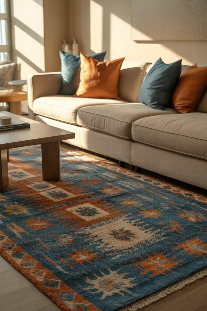
10. Beige Couch as a Versatile Anchor
A beige couch might sound boring, but it’s actually one of the most versatile foundations for colorful design. Unlike stark white, beige has warmth that makes a room feel immediately cozy. Unlike grey, it pairs beautifully with both cool and warm color palettes without clashing. You can surround it with jewel tones, pastels, or even primary colors, and it will ground everything harmoniously. Think of it as the diplomatic neutral that gets along with everyone. 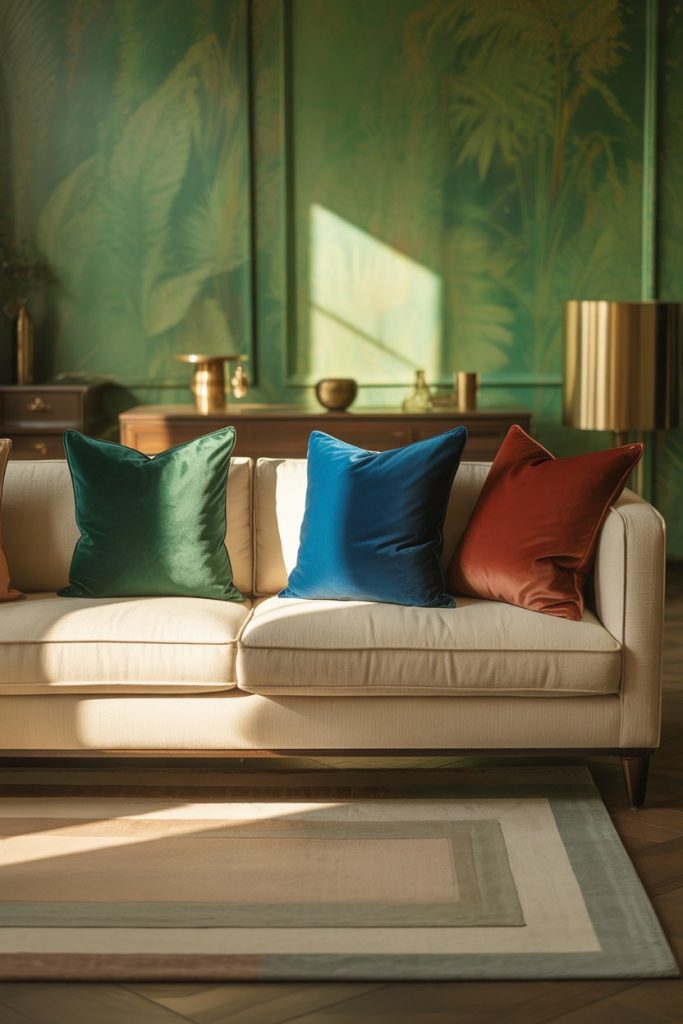
Where this works best: family homes and spaces that see a lot of use. Beige is surprisingly forgiving with spills and wear compared to pure white, and it doesn’t show every thread pull the way dark upholstery does. Many homeowners in suburban areas across the Midwest and South choose beige specifically because it ages gracefully and doesn’t require constant cleaning or stress about maintenance, freeing them up to have fun with removable color elements instead.
11. Light and Airy Scandinavian Approach
Light color palettes don’t have to be colorless—Scandinavian design proves you can have brightness and personality simultaneously. Start with soft white paint or the palest warm grey on walls, then introduce color through muted tones like dusty pink, sage green, or soft terracotta. The key is keeping everything in a similar tonal range so nothing jumps out aggressively. Natural materials like light wood, linen, and wool add texture without adding visual weight. 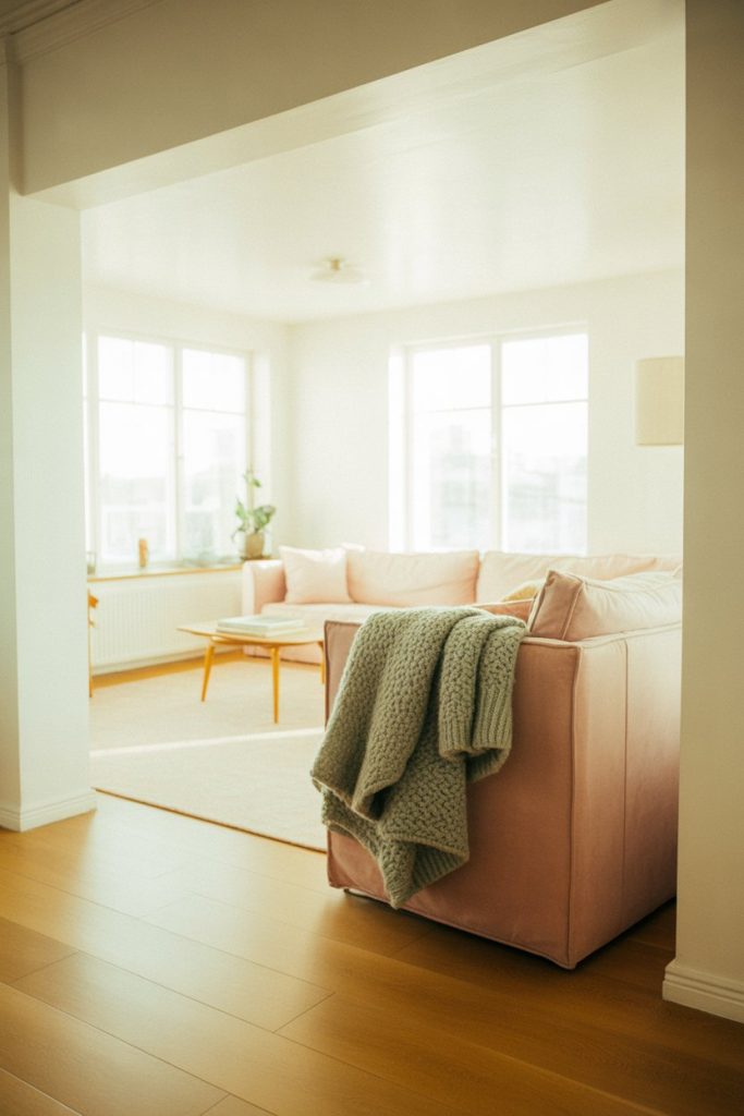
A micro anecdote: a Seattle homeowner recently shared that switching from pure white to a slightly warm off-white made her rainy-day mornings feel noticeably cozier. The subtle warmth compensated for the cool grey light coming through the windows, proving that even tiny color adjustments can have a meaningful impact on daily life and mood in climates with limited sunshine.
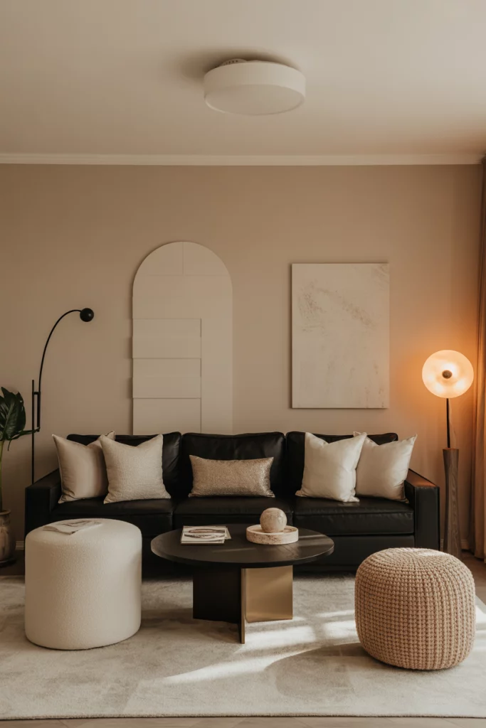
12. Black Couch Drama
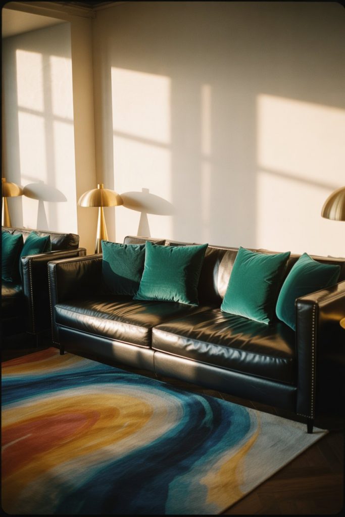
A black couch makes a powerful statement and serves as a sophisticated anchor for surprisingly colorful design. Because black has such a strong visual weight, you can actually go bolder with your color choices elsewhere without the room feeling chaotic. Think jewel-tone pillows, a vibrant patterned rug, or walls painted in rich, saturated hues. The black grounds everything and prevents the space from tipping into overwhelming territory. It’s a surprisingly versatile choice that reads modern and intentional. 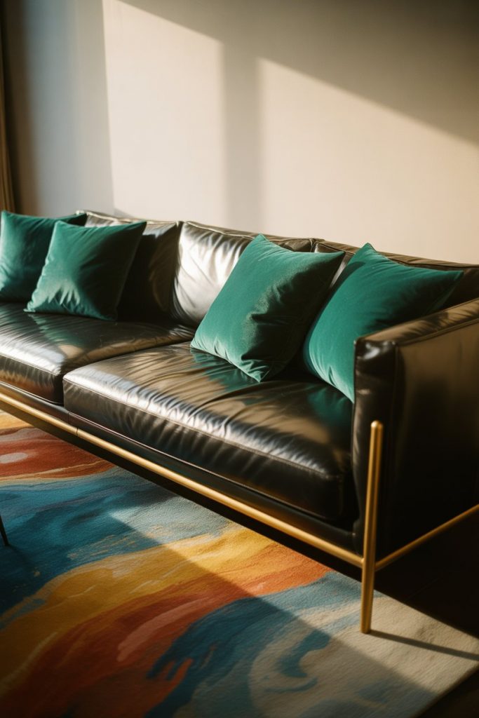
The common mistake with black furniture is surrounding it with too many other dark elements, which can make a space feel heavy or cave-like. Instead, balance it with plenty of lighter elements—white or cream walls, light wood accents, and ample lighting. This creates contrast and drama without sacrificing livability. Urban loft dwellers particularly love this look because it feels edgy and sophisticated without requiring a complete renovation of industrial spaces.
13. Toupe Sophistication
Taupe (also spelled “toupe”) is experiencing a renaissance as homeowners rediscover its warm, sophisticated qualities. This greyed-brown neutral sits perfectly between beige and grey, offering enough warmth to feel inviting while maintaining modern restraint. Use it on walls as a backdrop for colorful furniture and art, or invest in a taupe sofa and build color around it. It pairs beautifully with both warm neutral palettes and cooler tones, making it remarkably adaptable to different design directions. 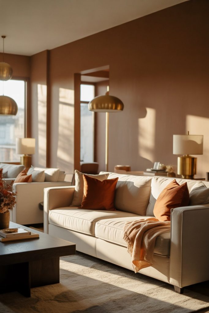
Practical insight: taupe shows significantly less dust, pet hair, and everyday wear than stark white or black, making it ideal for households with kids, pets, or high traffic. It’s particularly popular in Colorado, Arizona, and other Western states where the natural landscape inspires earth-toned interiors. The color also photographs beautifully, which matters in an era where homeowners share their spaces on social media or need good listing photos when selling.
14. Behr Paint Color Exploration
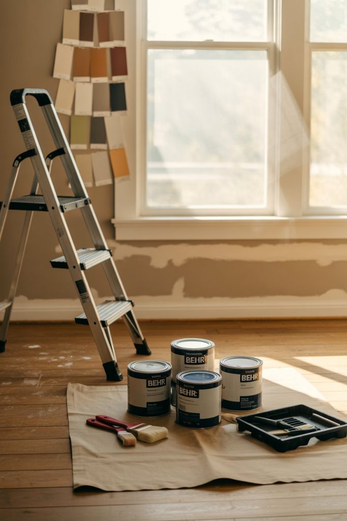
Shopping for color at paint retailers can be overwhelming, but Behr paint has become a go-to for many American homeowners thanks to its wide availability at Home Depot and extensive color range. Their curated palettes for each year make it easier to identify trending shades that work well together. Whether you’re drawn to their warm neutrals, nature-inspired greens, or bolder statement colors, the brand offers options at various price points with good coverage and durability for living room walls.
Expert-style commentary: always test paint samples in your actual space before committing to gallons. What looks perfect on a small chip in the store can read completely differently once it’s on your wall in your specific lighting. Paint a large poster board or directly on the wall in a few different areas—one that gets morning light, one that gets afternoon light, and one that’s typically in shadow. Live with it for a few days and observe how it shifts throughout the day before making your final decision.
15. Neutral with Pop Strategy
The neutral with pop approach is perfect for those who want color but feel nervous about full commitment. Keep walls, major furniture, and large textiles in safe neutral territory—think greige, beige, or soft white—then introduce one or two vibrant colors through easily changeable elements. This might be a bright yellow armchair, coral throw pillows, or a teal coffee table. The beauty is you can swap out these pops seasonally or as your taste evolves without repainting or replacing expensive pieces. 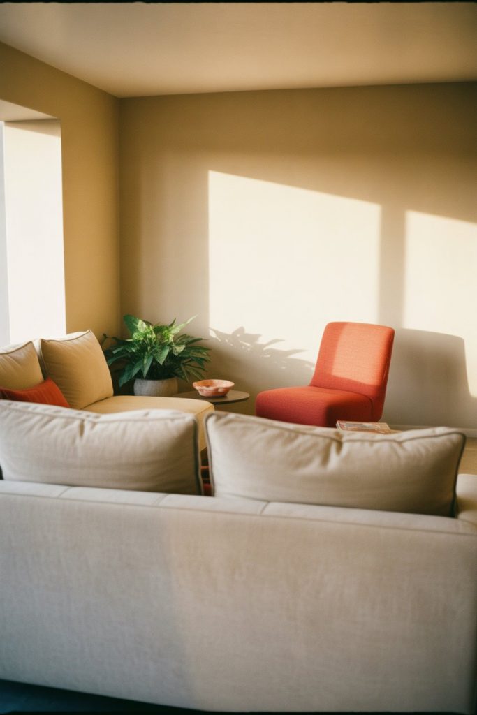
Budget angle: this approach is incredibly cost-effective because you’re only investing in a few colorful pieces rather than repainting entire rooms or replacing neutral furniture. Many homeowners start with affordable pops—maybe a $30 throw blanket or thrifted vintage chair they paint themselves—and test the water before making bigger color commitments. It’s a low-risk way to inject personality and see what colors you actually enjoy living with daily versus what just looks good in photos.
16. Caparol Color Innovation
Caparol paint may be less familiar to American consumers than big-box brands, but this German manufacturer offers exceptional quality and an impressive color range for those willing to seek it out at specialty retailers. Their eco-friendly formulations and rich pigmentation create depth that’s hard to achieve with cheaper paints. If you’re planning a colorful living room and want your walls to have true, saturated color that doesn’t fade or require multiple coats, investing in premium paint makes a noticeable difference in the final result. 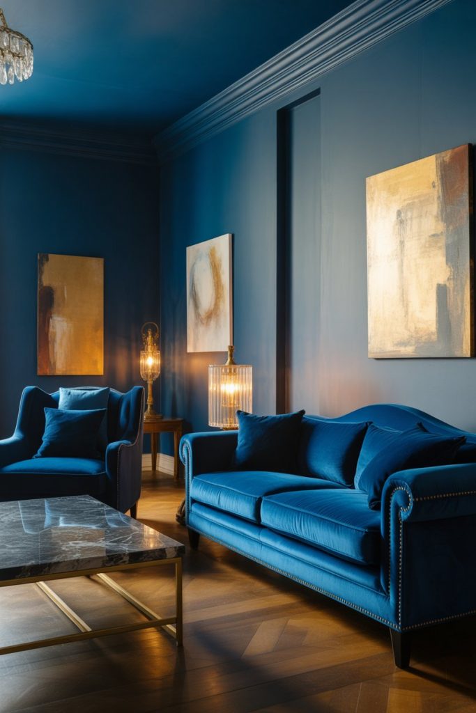
Where this works best: high-end renovations and homes where paint quality is a priority. Design-conscious homeowners in cities like Boston, Portland, and Austin increasingly seek out specialty paint brands for their superior finish and color accuracy. While you’ll pay more per gallon—sometimes double or triple the cost of basic brands—the coverage is typically better, meaning you may need fewer coats. The richer pigmentation also means colors look more sophisticated and true to their chip, without the chalky or flat finish that sometimes comes with budget paint.
17. White Paint Foundation
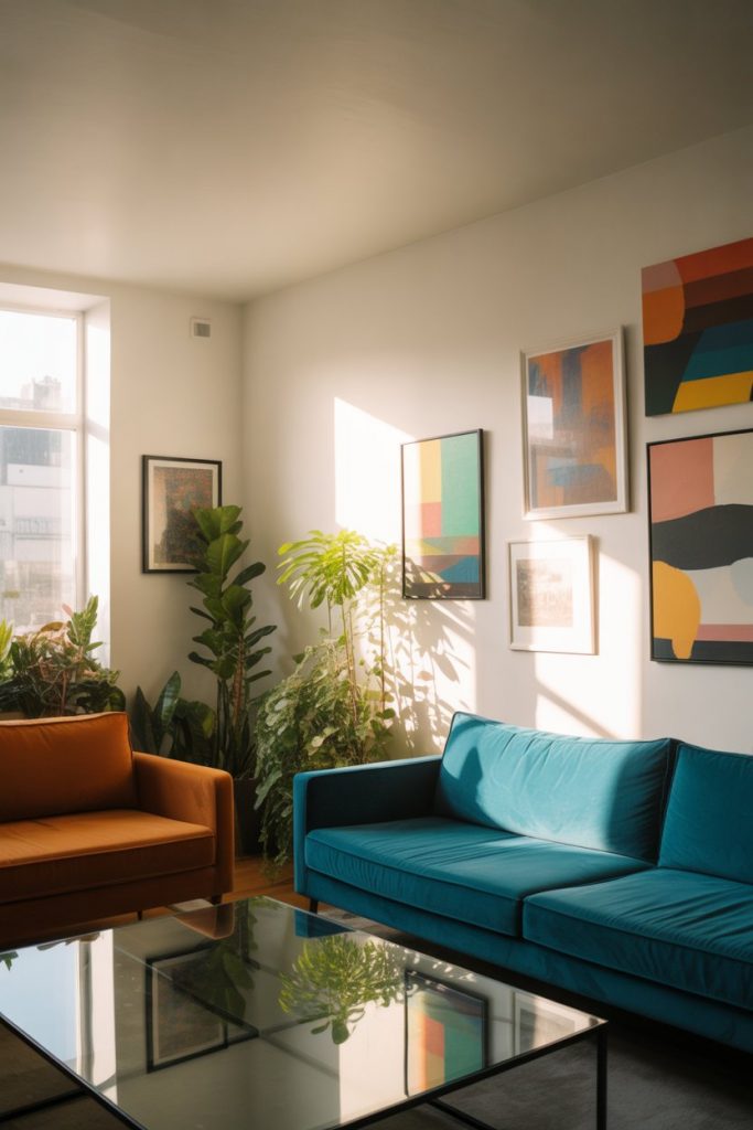
White paint on walls isn’t giving up on color—it’s creating the perfect gallery-like backdrop for colorful furniture, art, and textiles. Pure white or warm white walls make every other color in the room pop and allow you to change your color scheme dramatically without repainting. This is the professional designer trick for creating flexible, evolving spaces. The crispness of white also makes rooms feel larger and brighter, particularly valuable in apartments or homes with limited natural light. 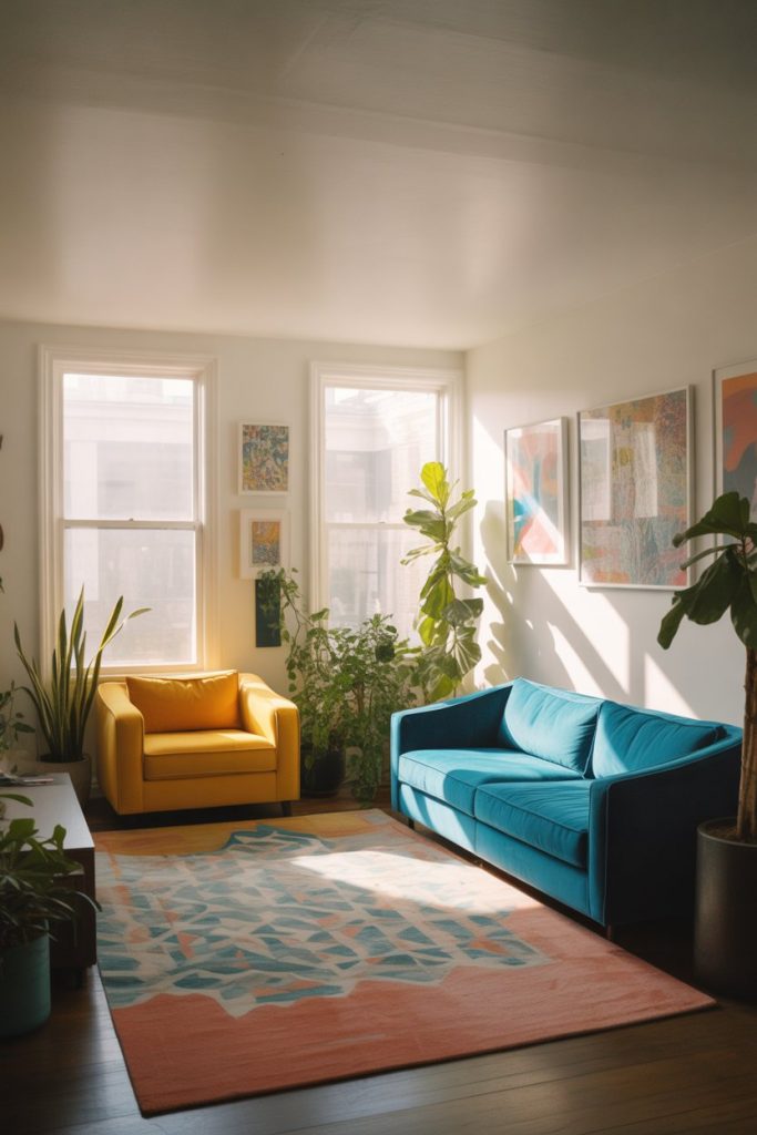
Real homeowner behavior shows that people with white walls tend to refresh their spaces more frequently because it’s so easy—just swap pillows, rotate artwork, or add a new throw blanket, and the room transforms. This is particularly appealing to renters in cities like New York, Los Angeles, and Chicago who can’t paint but still want to personalize. One common pitfall: choosing a stark, cool white in a room with warm lighting, which can make the space feel dingy by evening. Test white samples just as carefully as you would any color.
18. Rug as Color Foundation
A colorful, patterned rug can be the starting point for your entire living room palette, pulling in multiple hues that you then echo in smaller doses throughout the space. This approach takes the guesswork out of color coordination—simply pull accent colors from the rug for pillows, artwork, or a painted accent wall. It’s especially effective if you have neutral walls and furniture, as the rug becomes the primary color story. Persian, Turkish, and modern abstract rugs all work beautifully for this strategy. 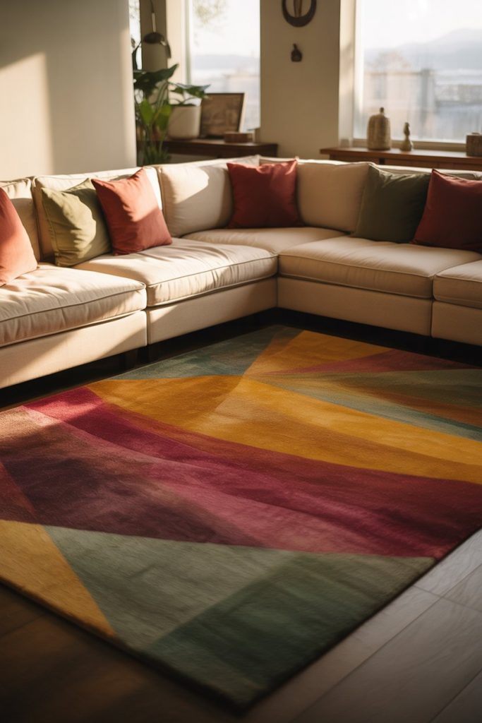
A common mistake is choosing a rug that’s too small for the space. Your rug should be large enough that at least the front legs of all major furniture pieces sit on it, creating a cohesive seating area. Too-small rugs make a room feel choppy and disconnected, no matter how beautiful the colors are. Budget-conscious shoppers often find incredible vintage rugs online or at estate sales—these have the advantage of already being broken in, with colors that have softened and mellowed to feel collected rather than brand new.
19. Earth-Toned Sanctuary
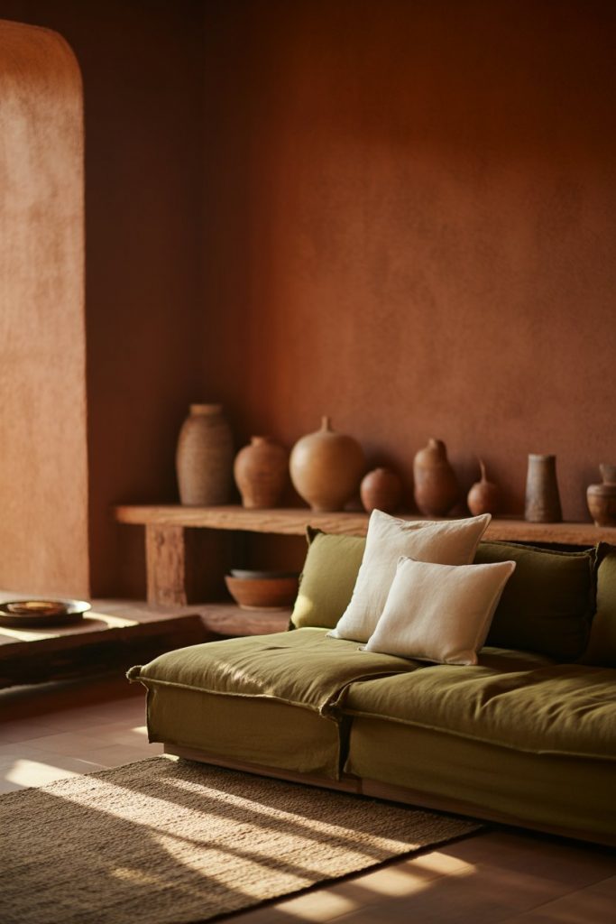
An earth-toned living room built around terracotta, rust, olive, clay, and warm browns creates a sanctuary that feels fundamentally calming and connected to nature. These colors work beautifully together because they’re literally pulled from the natural landscape. Pair them with natural materials like jute, rattan, linen, and wood for a cohesive, organic aesthetic. This palette feels particularly relevant now as more people seek grounding, nature-inspired spaces that offer respite from digital overwhelm and urban stress. 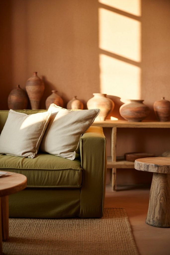
This aesthetic translates beautifully across different American regions—from desert homes in New Mexico and Arizona, where it echoes the landscape, to forested areas in Oregon and Vermont, where it brings outdoor tones inside. The colors age gracefully too, meaning small dings or fading only add character rather than looking shabby. Families with children appreciate how forgiving these tones are and how they hide the inevitable wear and tear of daily life while maintaining a sophisticated, adult aesthetic.
20. Bright Maximalist Joy
Embracing bright colors throughout an entire living room—think fuchsia, electric blue, sunny yellow, and vibrant orange—creates spaces full of personality and joy. This bold approach isn’t for everyone, but for those who lean into it, the results are energizing and deeply personal. The trick is ensuring you have a good balance across the color wheel rather than too much of one family of colors. Mix warm and cool tones, vary the saturation levels, and include some neutral breathing room so the eye has places to rest. 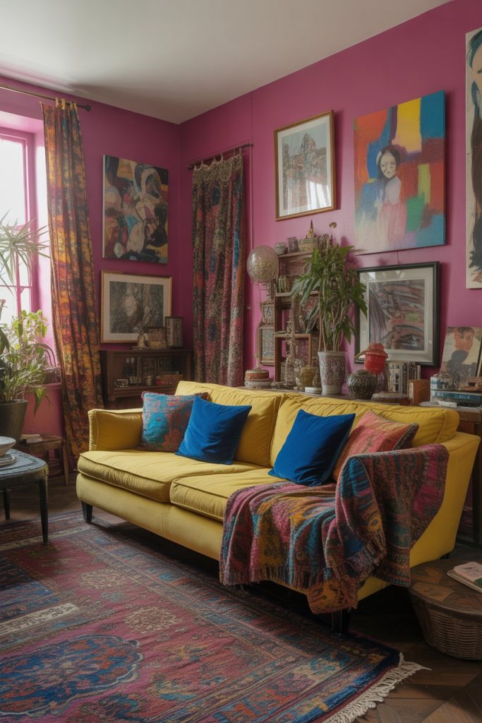
Creative professionals, artists, and free spirits gravitate toward this look because it reflects personality unapologetically. It works particularly well in sunny climates like Southern California, Florida, and Hawaii, where bright interiors feel appropriate to the climate and lifestyle. However, achieving this without chaos requires discipline—stick to a limited number of main colors (maybe four or five) and repeat them throughout the space rather than introducing every color of the rainbow. This creates cohesion despite the intensity.
21. Warm Neutral as Modern Classic
Warm neutral palettes built around honey, camel, cream, and soft tan create timeless living rooms that feel both current and enduring. These colors never truly go out of style because they’re rooted in natural materials—sand, stone, wood, linen—that humans have always found beautiful. Layer different shades and textures of warm neutrals for depth, then introduce small doses of color through art, plants, or a single statement piece. The result feels sophisticated, pulled-together, and effortlessly elegant. 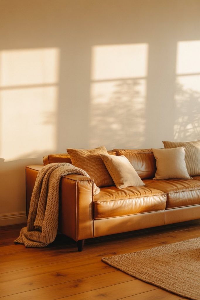
Expert-style commentary: The key to making warm neutrals feel interesting rather than bland is varying your textures significantly. Smooth leather against nubby linen, polished wood against rough jute, matte walls against glossy ceramics—these textural contrasts create visual interest even when the color palette is restrained. This approach has staying power precisely because it’s not trendy; it won’t feel dated in five years, making it a wise investment for anyone planning to stay in their home long-term or wanting to maximize resale value.
22. Seasonal Color Rotation
The smartest colorful living room strategy might be building in flexibility—starting with a neutral base (walls, major furniture) that allows you to rotate seasonal colors through textiles, pillows, artwork, and small furniture pieces. This means you can embrace rich jewel tones in fall, fresh pastels in spring, bright summery hues in warmer months, and cozy warm tones in winter. Your space stays fresh and aligned with the seasons without requiring major renovation or expense, and you never get bored. 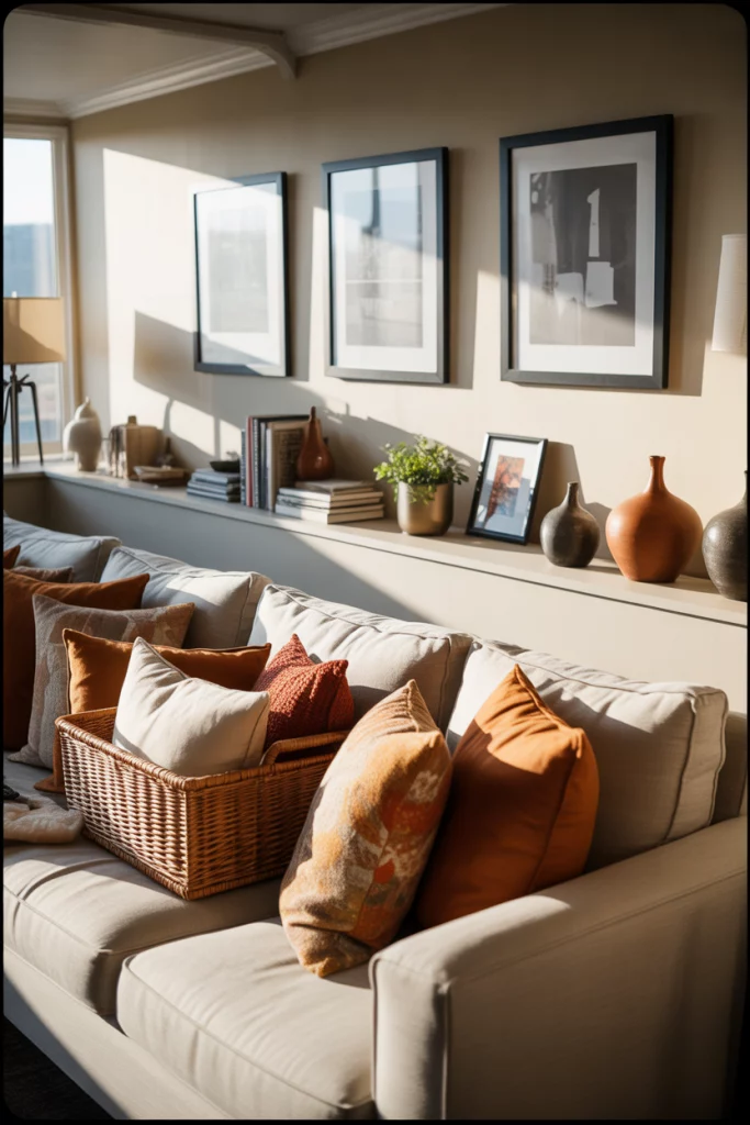
Practical insight: storage is key to making this work. Invest in under-bed boxes or ottoman storage for off-season textiles so they stay clean and accessible. Many homeowners develop a simple rotation—two sets of pillows, two throws, maybe two pieces of easily changeable art—that they swap out three or four times a year. This keeps the effort manageable while dramatically shifting the mood of the space. It’s also a smart financial approach, spreading out your decor purchases over time rather than trying to create a complete room all at once.
Conclusion
The colorful living room possibilities in 2026 are truly endless, and the best approach is one that feels authentic to your personality and lifestyle. Whether you’re drawn to moody drama, bright maximalism, or sophisticated neutrals with strategic pops, trust your instincts and start with changes you can easily adjust. Drop a comment below sharing which idea you’re most excited to try—we’d love to hear what resonates with you and see how you make these concepts your own.