Cape Cod architecture has long been a staple of American home design, blending colonial charm with practical living. In 2026, homeowners are reimagining these classic exteriors with fresh colors, modern materials, and coastal-inspired accents that honor tradition while embracing contemporary style. Whether you’re planning a full remodel or simply refreshing your curb appeal, this guide offers inspiring ideas that balance timeless elegance with today’s design trends. From bold color schemes to subtle landscaping touches, you’ll discover how to make your Cape Cod home feel both rooted in history and perfectly current.
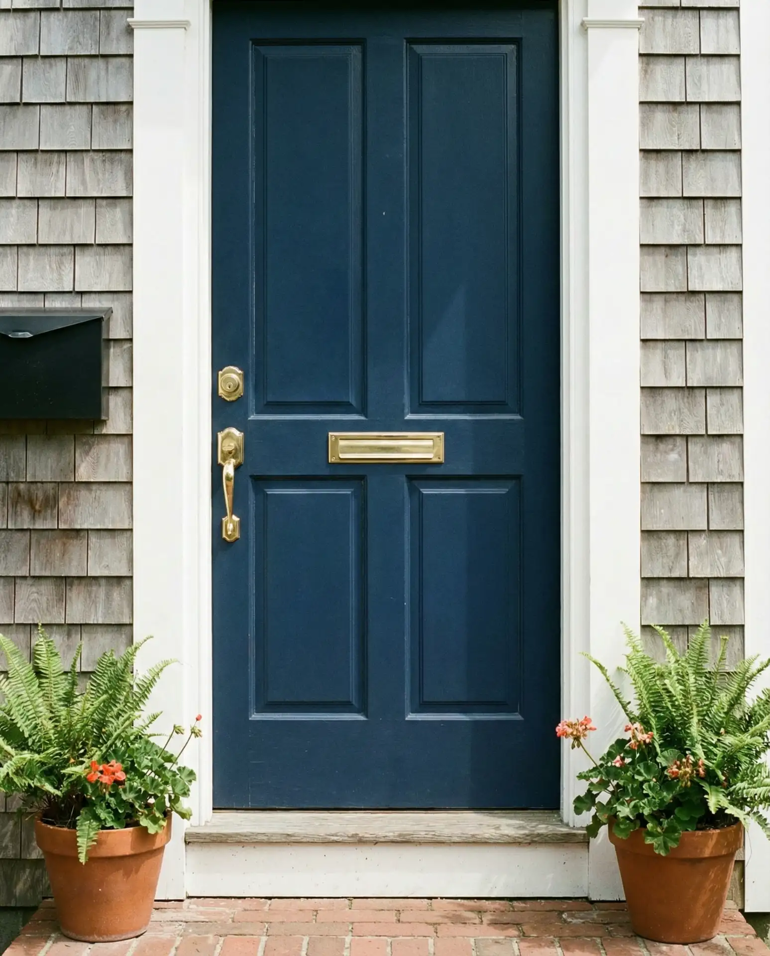
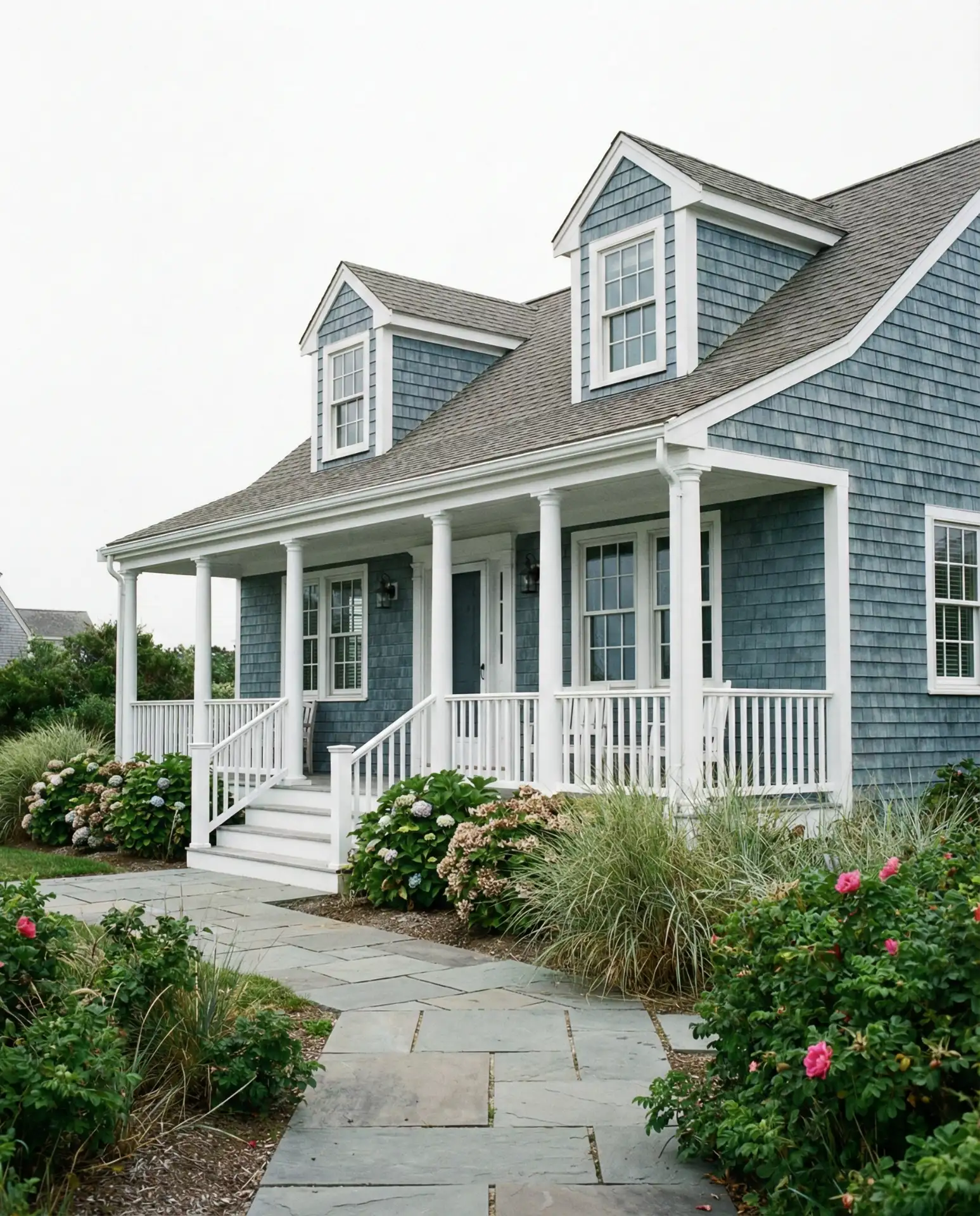
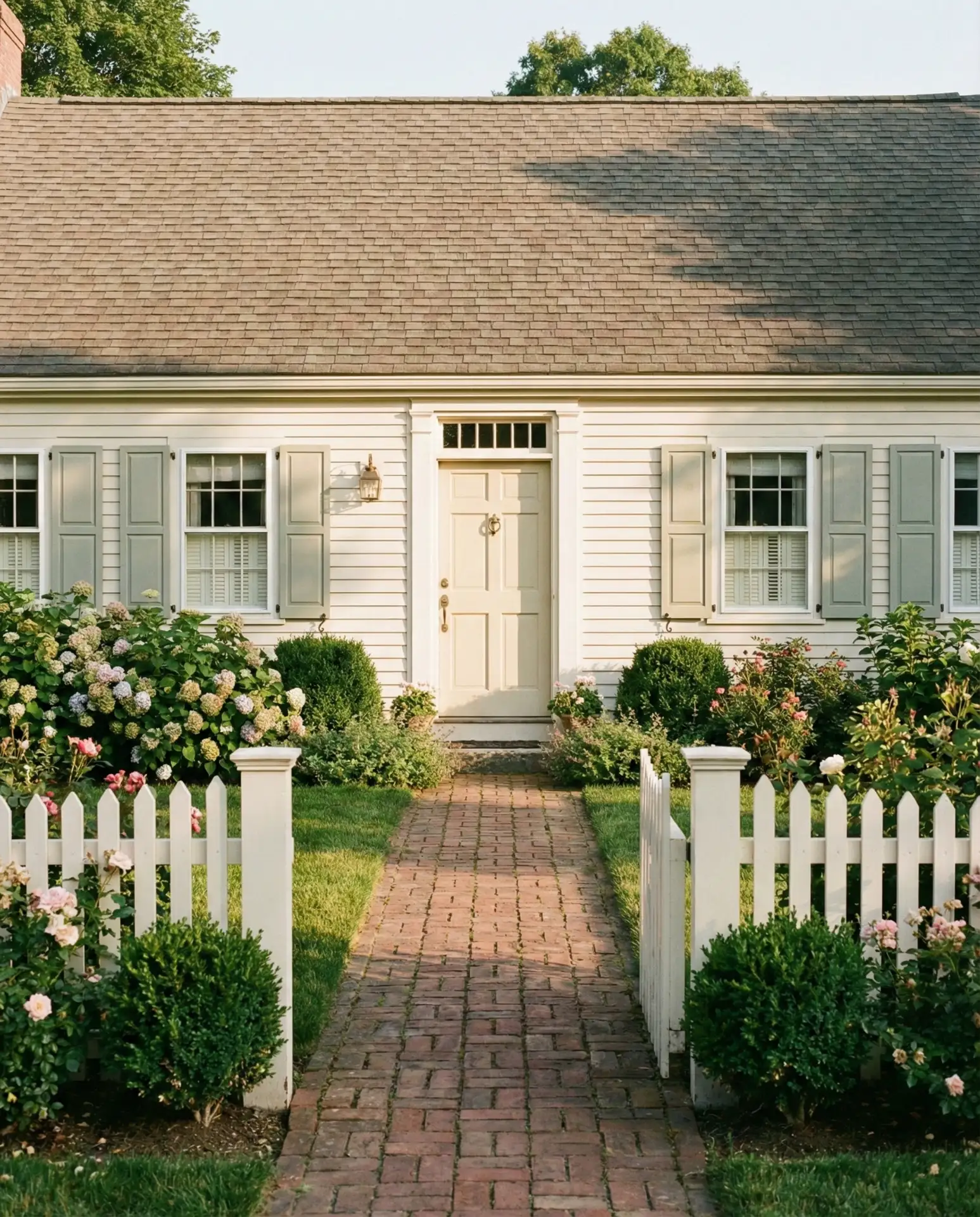
1. Classic White Shingles with Navy Shutters
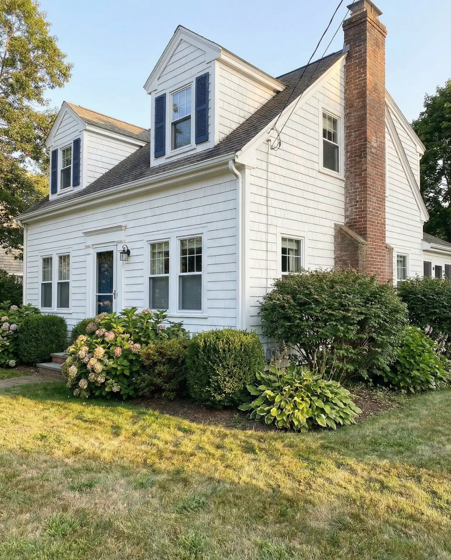
The quintessential Cape Cod look starts with crisp white cedar shingles paired with deep navy shutters. This combination captures the essence of New England coastal living, offering a clean backdrop that works beautifully in both suburban neighborhoods and beachside settings. The contrast creates instant curb appeal while maintaining the home’s traditional character, and the neutrality allows for seasonal decorating flexibility throughout the year.
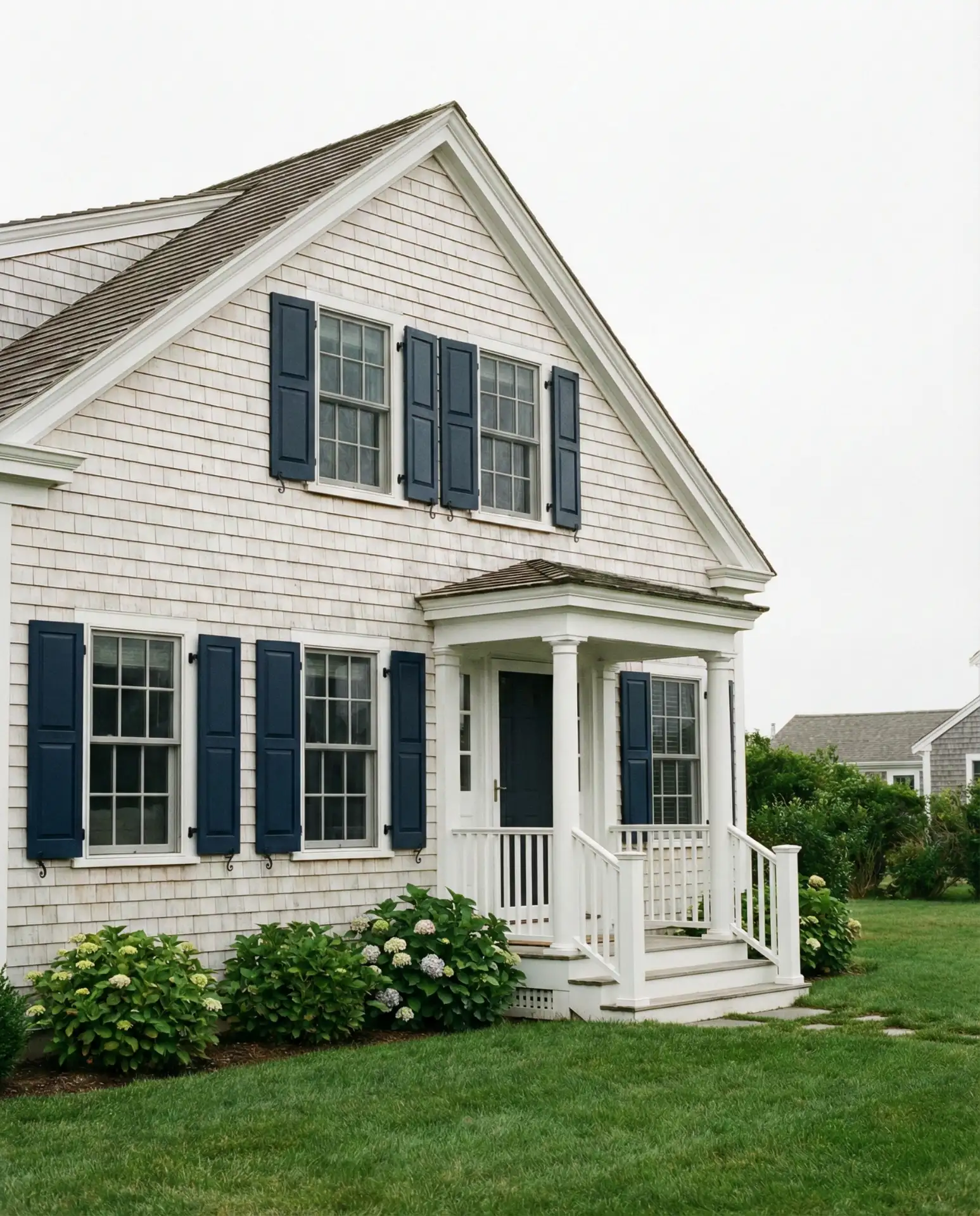
This palette works especially well in coastal regions where salt air naturally weathers materials over time. Homeowners in Massachusetts and Rhode Island report that this color scheme requires repainting every 8-10 years, making it a relatively low-maintenance choice. The navy shutters can be easily swapped for black or dark green if you want to refresh the look without a complete exterior overhaul.
2. Weathered Grey with Coastal Blue Accents
A soft grey exterior brings modern sophistication to the traditional Cape Cod form, especially when highlighted with coastal blue trim around windows and doors. This color scheme has gained popularity in 2026 as homeowners move away from stark white toward warmer, more nuanced neutrals. The grey tones mirror natural driftwood and beach stones, creating an organic connection to seaside environments.
Where it works best: This combination shines in transitional neighborhoods where historic charm meets contemporary taste. The grey base hides dirt and weathering better than pure white, which matters in high-traffic family homes. Pair it with nickel or brushed chrome hardware for a cohesive modern-traditional blend that feels intentional rather than dated.
3. Deep Green Siding with Cream Trim
Rich dark green exteriors are making a statement in 2026, offering a bold alternative to neutral palettes while still honoring colonial precedents. When paired with warm cream or off-white trim, the effect is both stately and welcoming. This color choice works particularly well on homes with substantial landscaping, as the green siding allows the structure to nestle naturally into wooded or garden-rich settings.
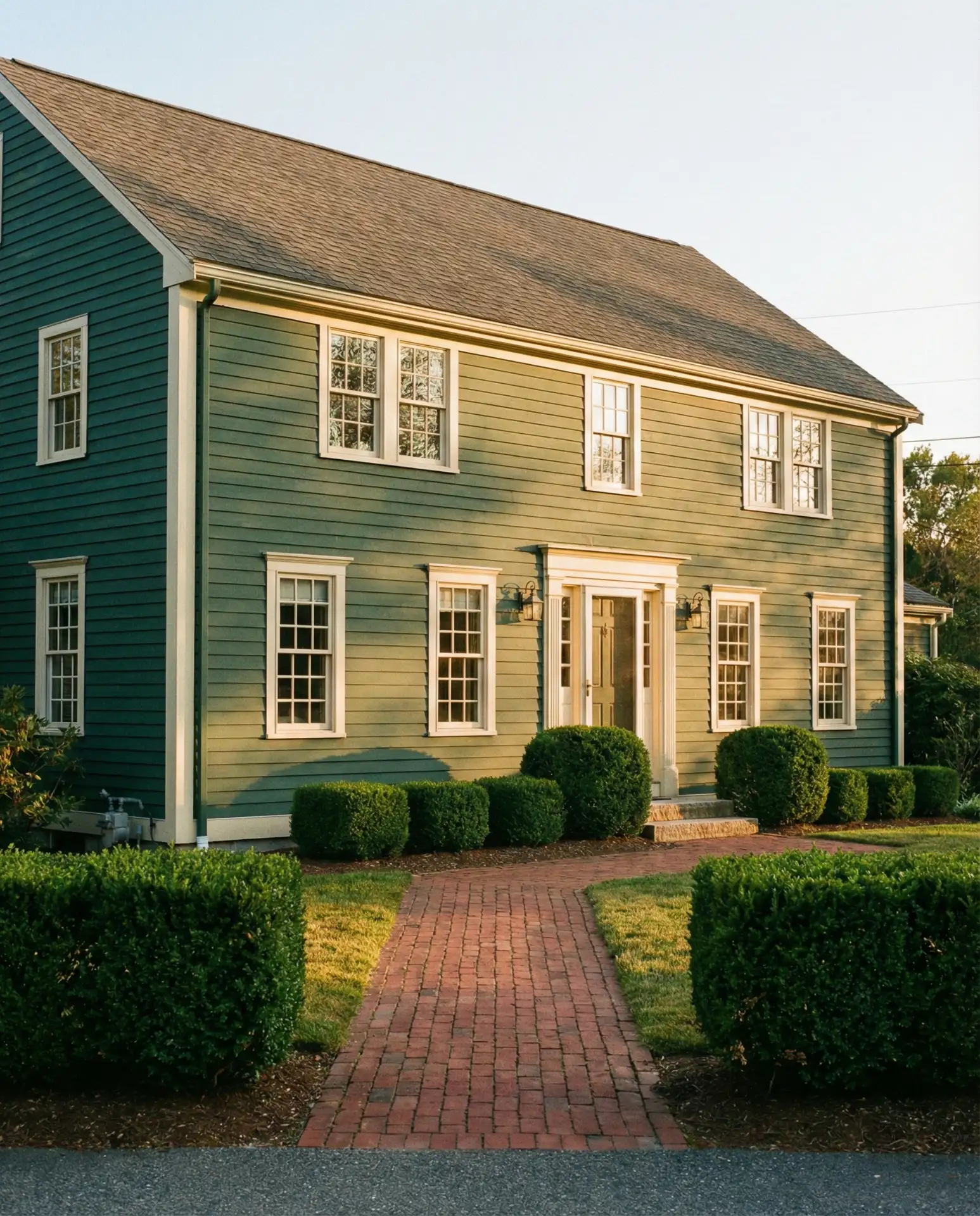
A contractor I spoke with in Vermont mentioned that dark green exteriors have increased resale interest by nearly 15% in their market, particularly among buyers seeking character homes. The key is choosing a green with grey undertones rather than blue or yellow bases, which helps the color feel grounded and timeless rather than trendy.
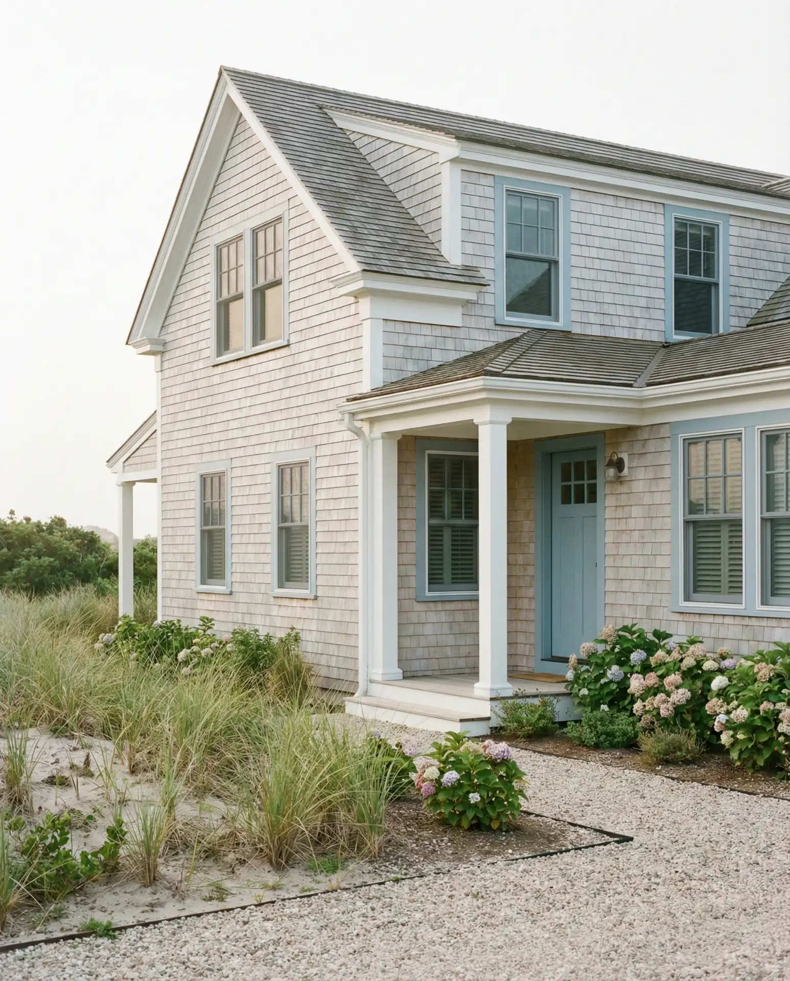
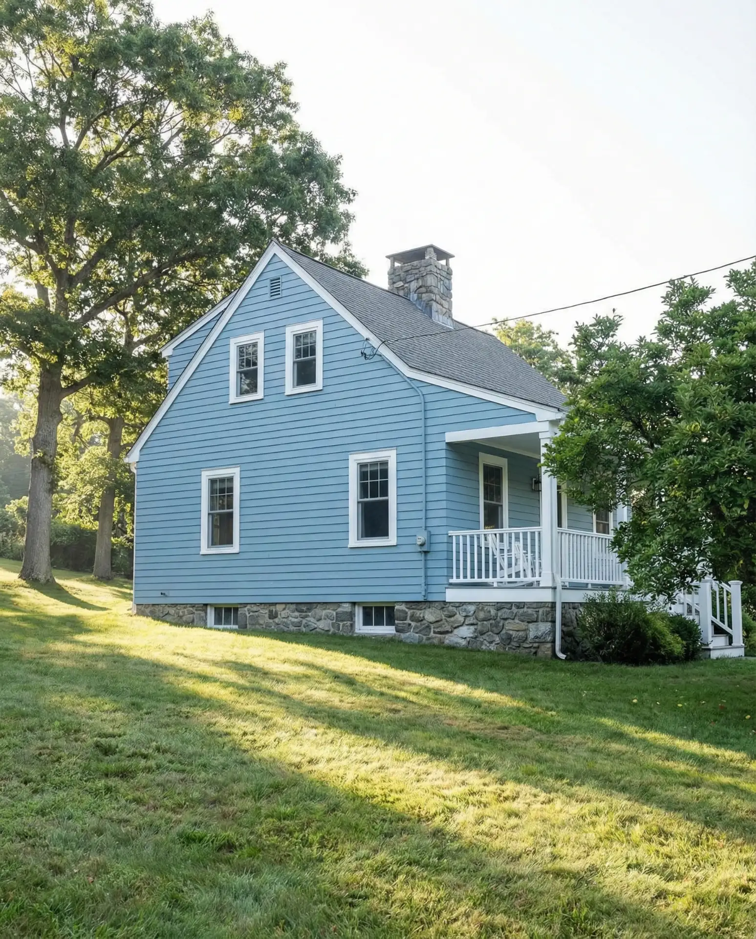
4. Light Blue Clapboard with White Details
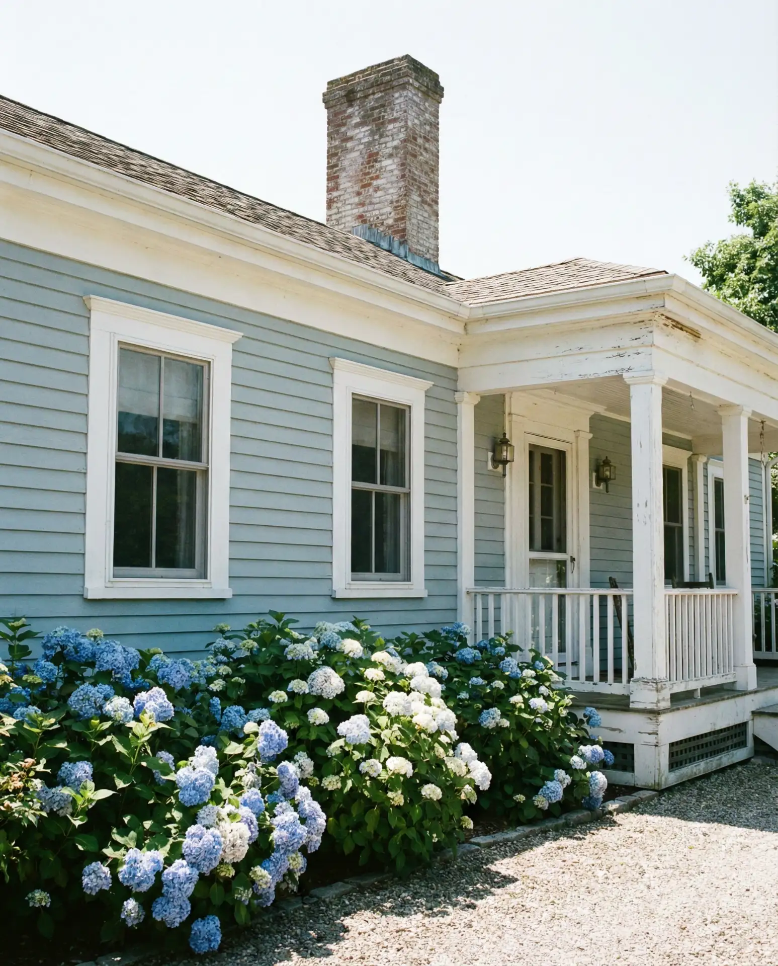
Soft light blue siding evokes seaside cottages and brings an airy, optimistic feel to Cape Cod exteriors. This shade sits comfortably between traditional and playful, making it ideal for families who want personality without veering too far from the classic aesthetic. White trim amplifies the brightness and creates crisp visual separation that highlights architectural details like corner boards and window casings.
This color performs beautifully in full sun, as the light tones reflect rather than absorb heat, potentially reducing cooling costs during summer months. Homeowners often worry that blue will feel too casual, but when executed with quality paint and maintained trim, it reads as refined and intentional. The combination also photographs exceptionally well, which matters for those documenting their home journey on social media.
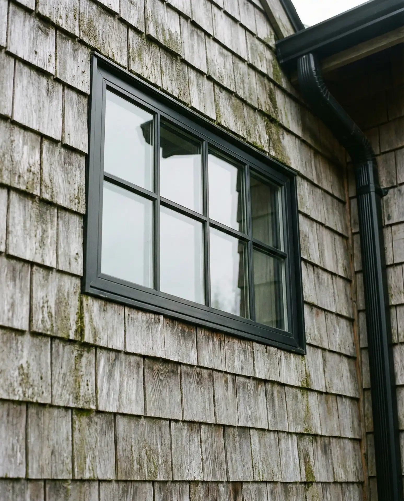
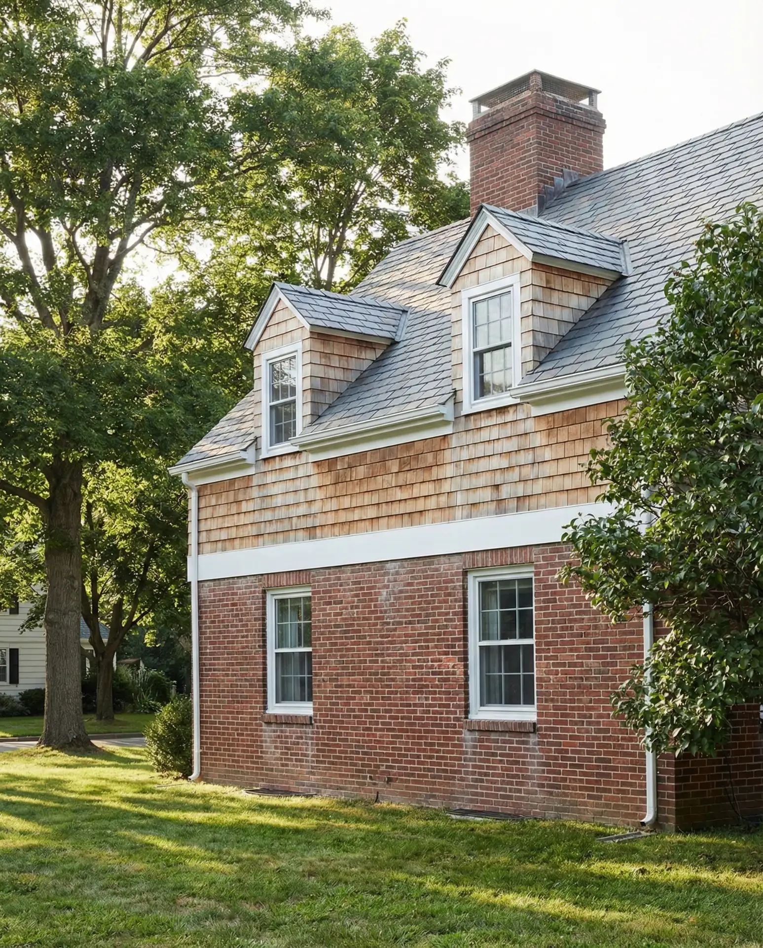
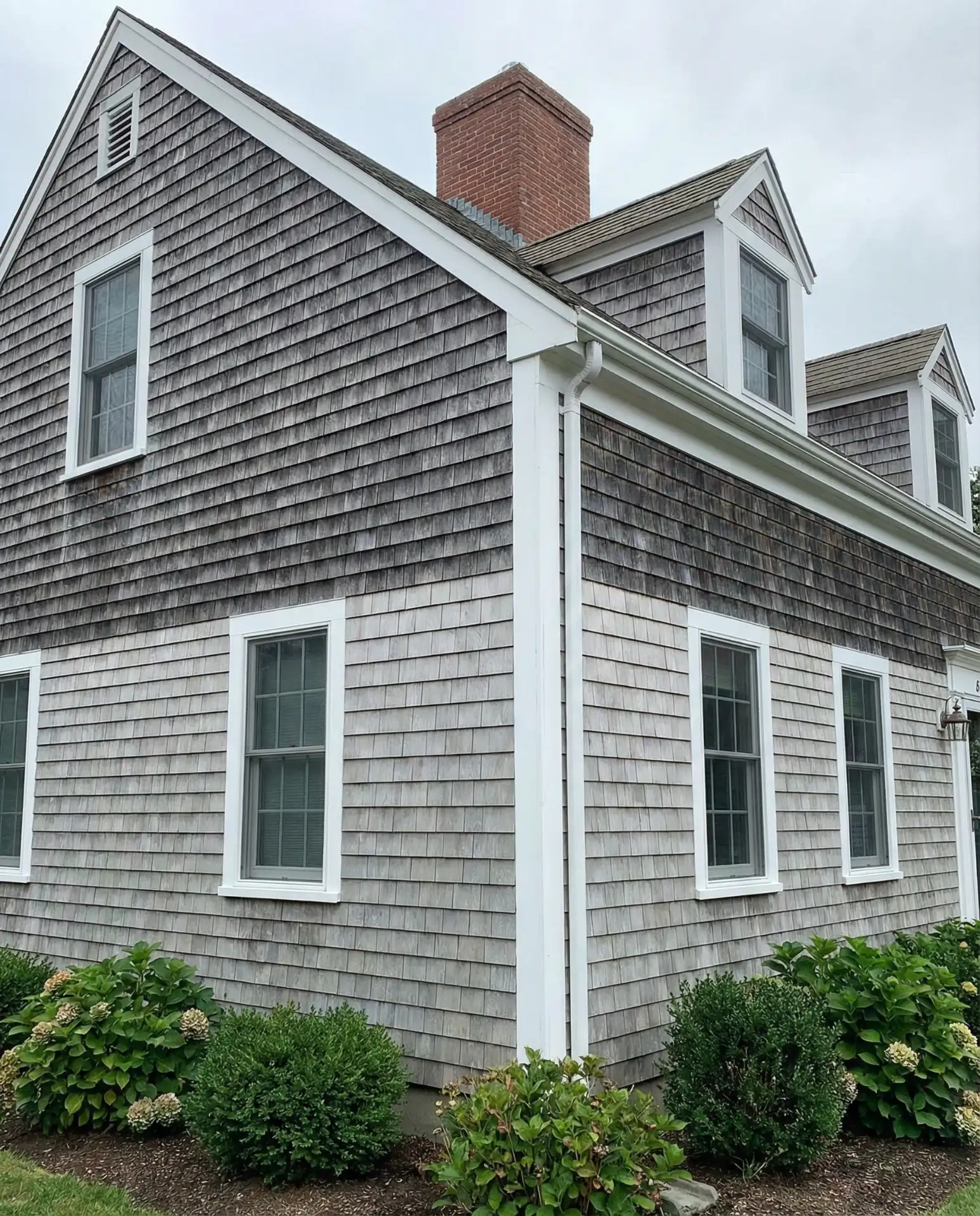
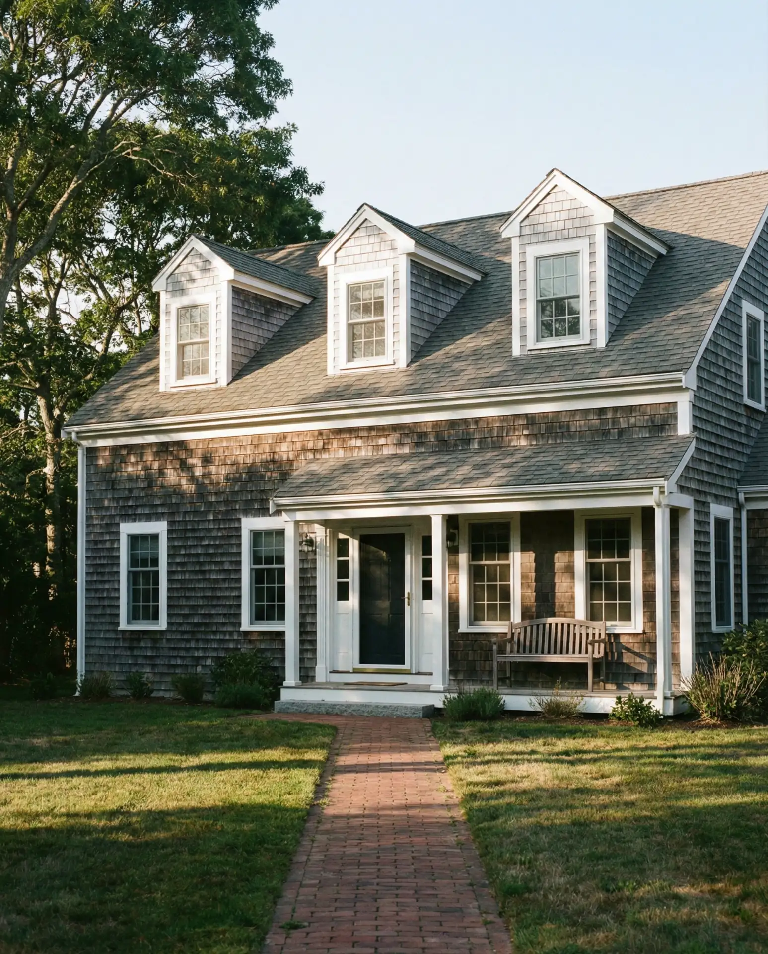
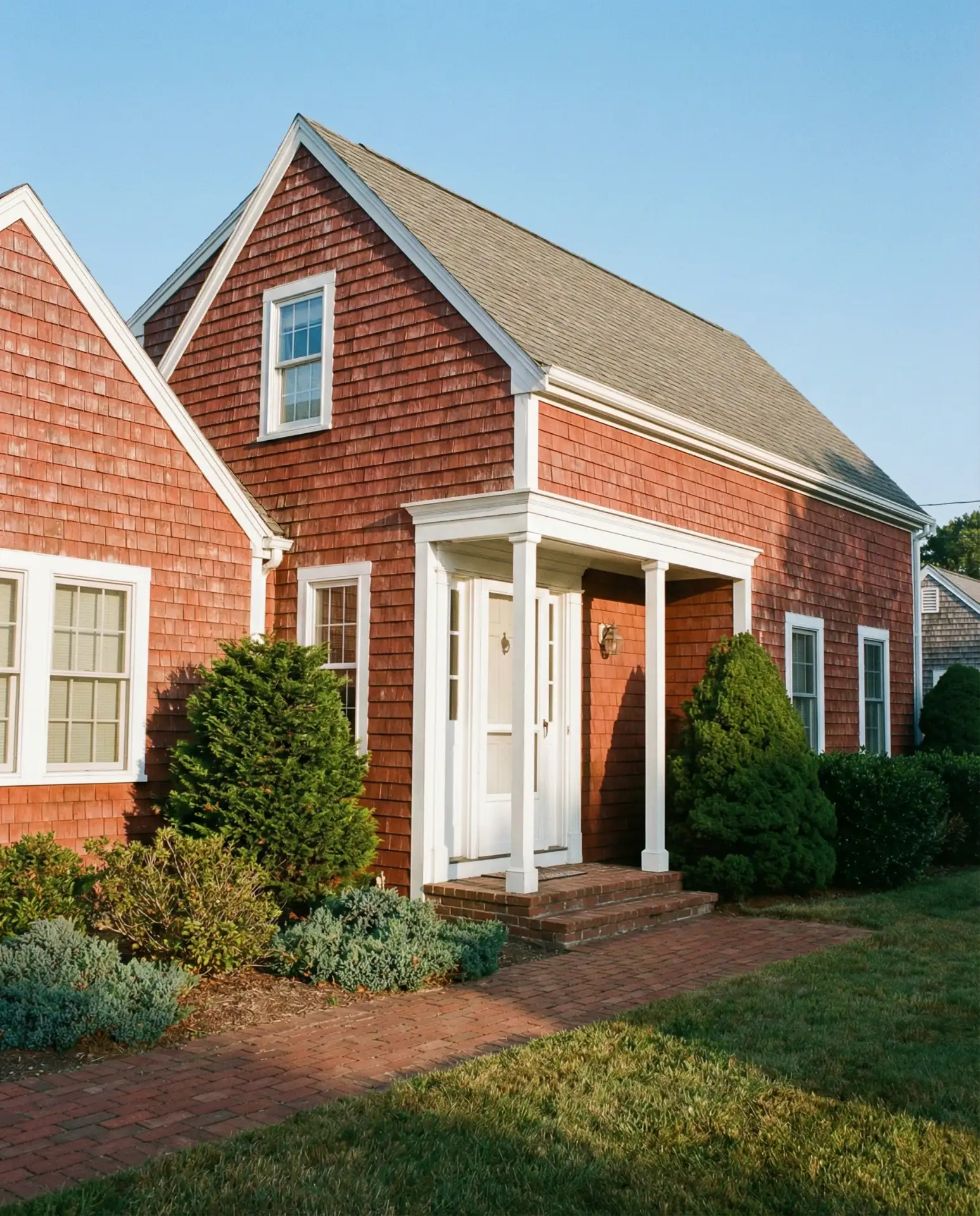
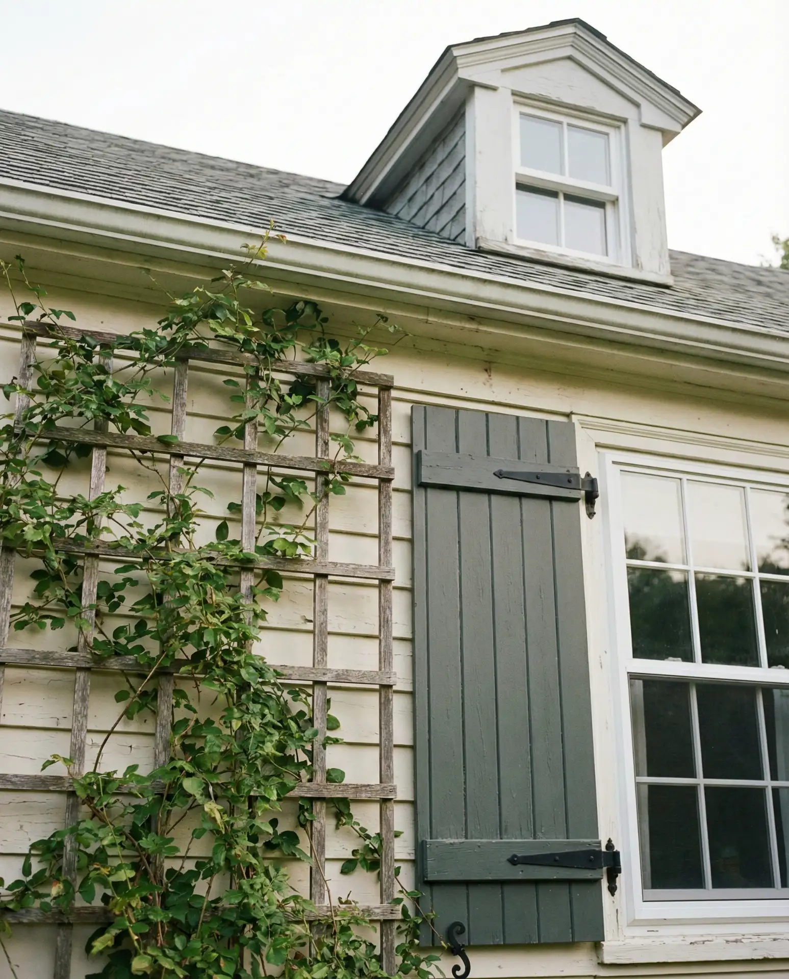
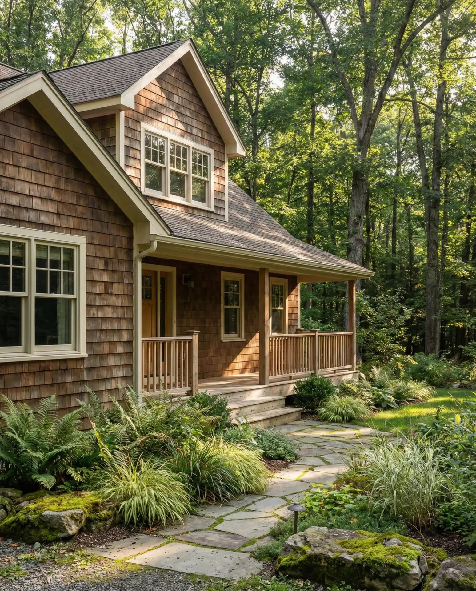
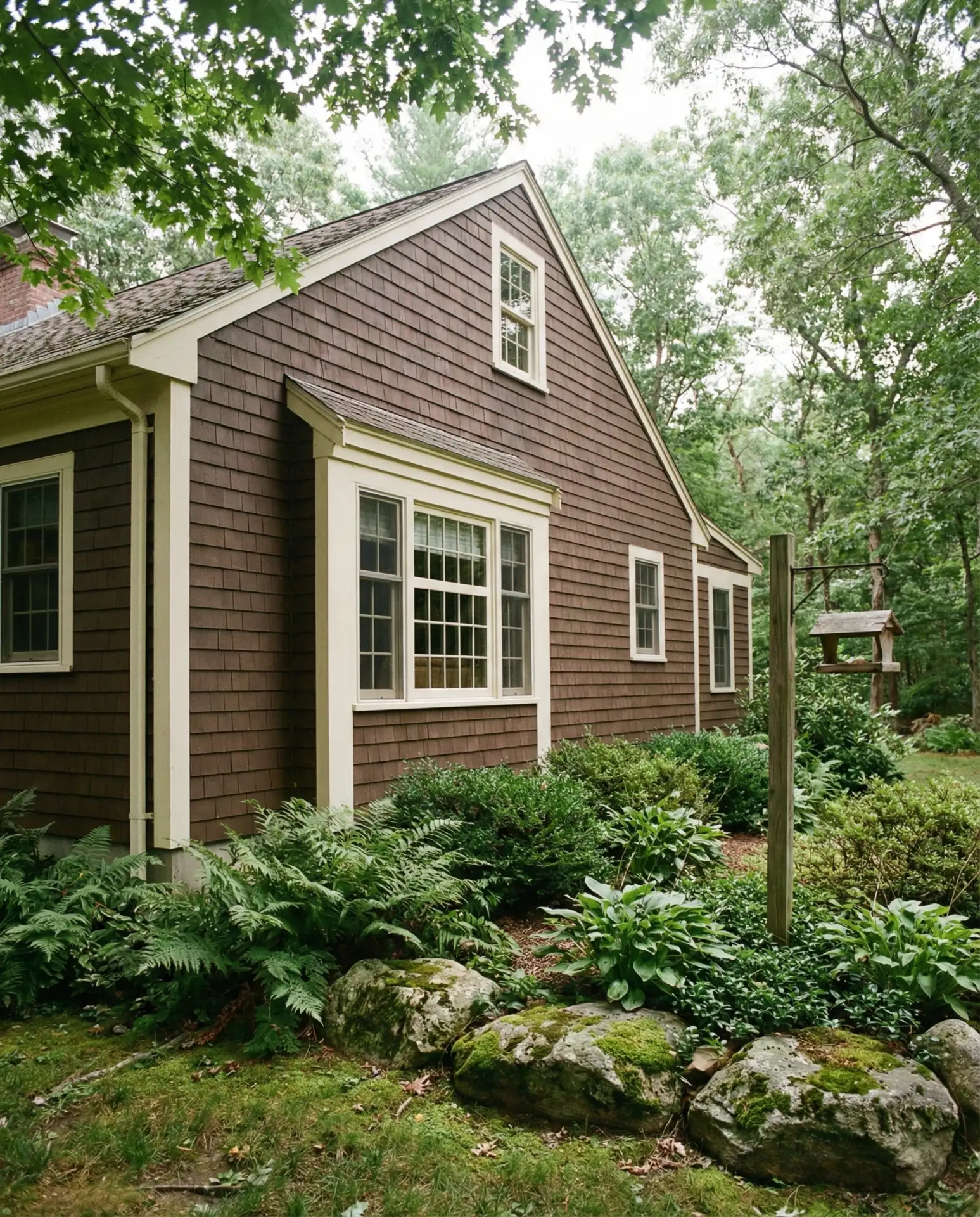
5. Natural Cedar with Black Windows
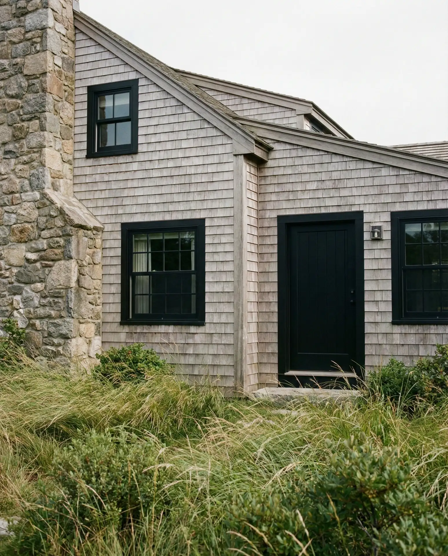
Unpainted cedar shingles develop a silvery patina over time, creating an organic, ever-changing exterior that feels connected to the landscape. Paired with black window frames and trim, this approach delivers a contemporary edge while respecting the Cape Cod’s historical roots. The contrast between warm wood tones and crisp black creates visual drama that works equally well in wooded settings and open coastal sites.
Budget considerations: Natural cedar requires no painting, but it does need occasional treatment with wood preservative to prevent rot in humid climates. Over a 20-year period, this can actually cost less than repeated paint jobs on vinyl or composite siding. The black windows, typically aluminum-clad wood, represent a higher upfront investment but offer superior durability and thermal performance compared to standard white vinyl.
6. Charcoal Grey with Bright White Accents
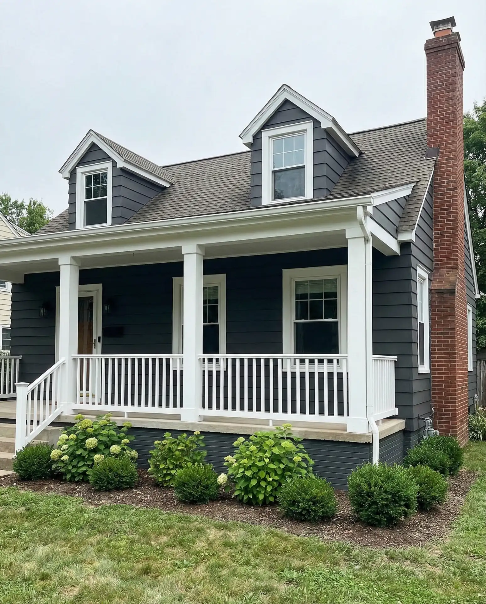
A dark charcoal exterior makes a bold statement that challenges traditional Cape Cod conventions while maintaining the form’s inherent symmetry and proportion. Crisp white trim provides essential contrast, preventing the home from feeling heavy or imposing. This modern palette appeals to homeowners who appreciate minimalist aesthetics and want their Cape to stand out in neighborhoods dominated by lighter colors.
Common mistake to avoid: Many homeowners choose a charcoal that’s too warm or brown-toned, which can read as dated rather than contemporary. Look for cool-based greys with subtle blue undertones, and test large samples on your actual siding in different light conditions before committing. The white trim should be a true, bright white rather than cream to maximize the graphic impact.
7. Soft Yellow with Green Shutters
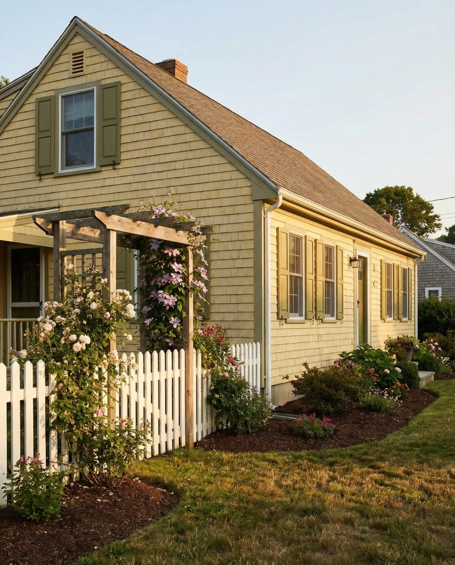
Butter yellow siding brings cheerful warmth to Cape Cod exteriors, evoking sunny days and welcoming energy. When combined with green shutters in a sage or olive tone, the palette feels garden-inspired and naturally harmonious. This combination has historical precedence in colonial paint traditions while feeling fresh and unexpected in today’s predominantly neutral streetscapes.
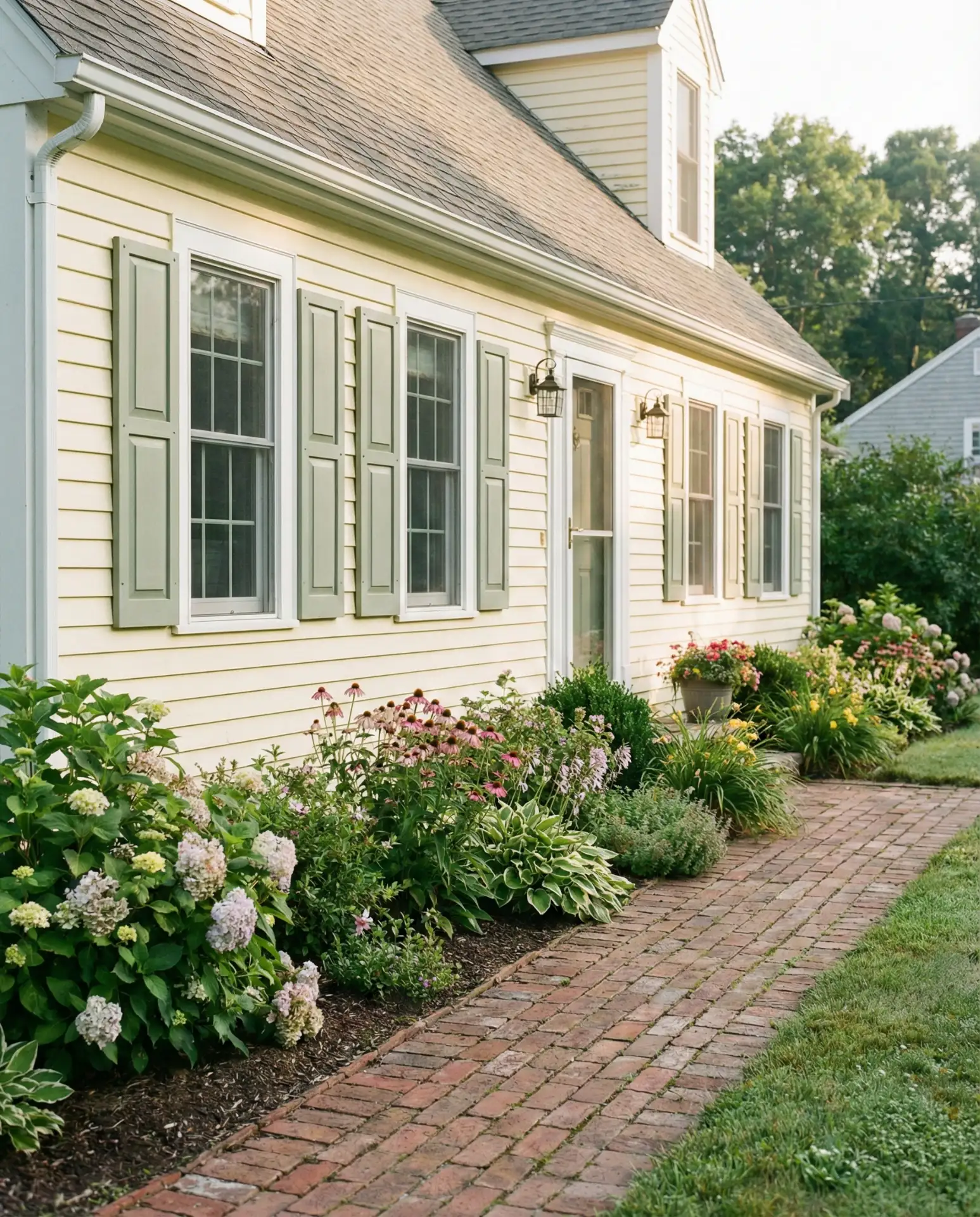
Real homeowner behavior: Families with young children particularly gravitate toward this palette, as the cheerful exterior sets a welcoming tone and photographs beautifully for family documentation. The yellow also shows less dirt and pollen than white, which matters in regions with heavy spring blooms. Consider adding window boxes with seasonal flowers to enhance the garden cottage aesthetic.
8. Brick First Floor with Shingled Second Story
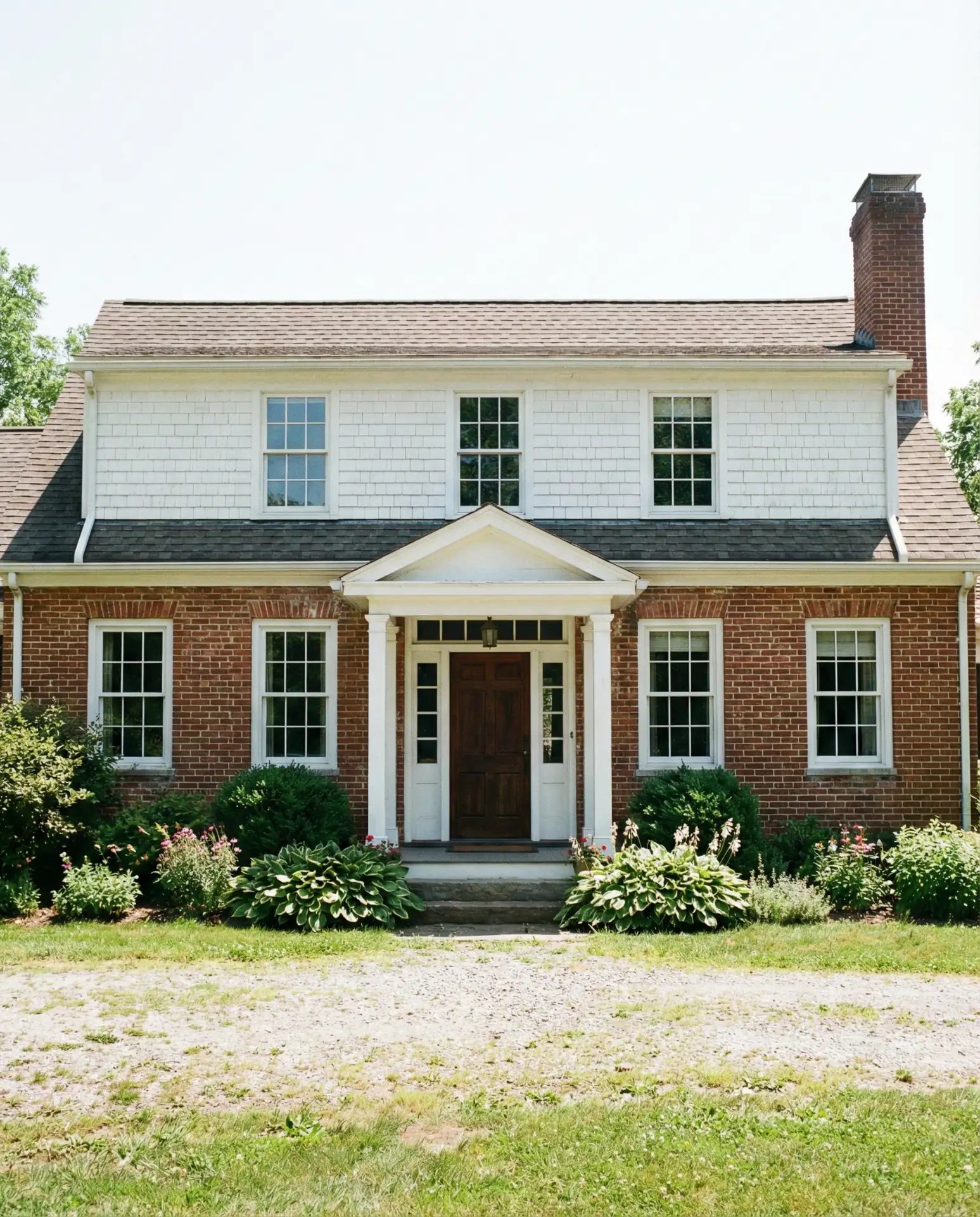
Combining brick on the ground level with traditional wood shingles above creates visual weight and permanence while maintaining the Cape Cod’s characteristic roofline. This mixed-material approach is particularly popular in large Cape Cod homes, where the added texture breaks up expansive wall planes. The brick provides durability and reduces maintenance needs at the most vulnerable height, while shingles preserve the home’s historical character.
This design strategy works best in regions with significant weather exposure, as brick offers superior protection against wind-driven rain and reduces the risk of moisture penetration. The transition line between materials should align with a logical architectural feature like a window sill line or floor level to appear intentional. Many homeowners paint the upper shingles in a color that complements the brick’s undertones.
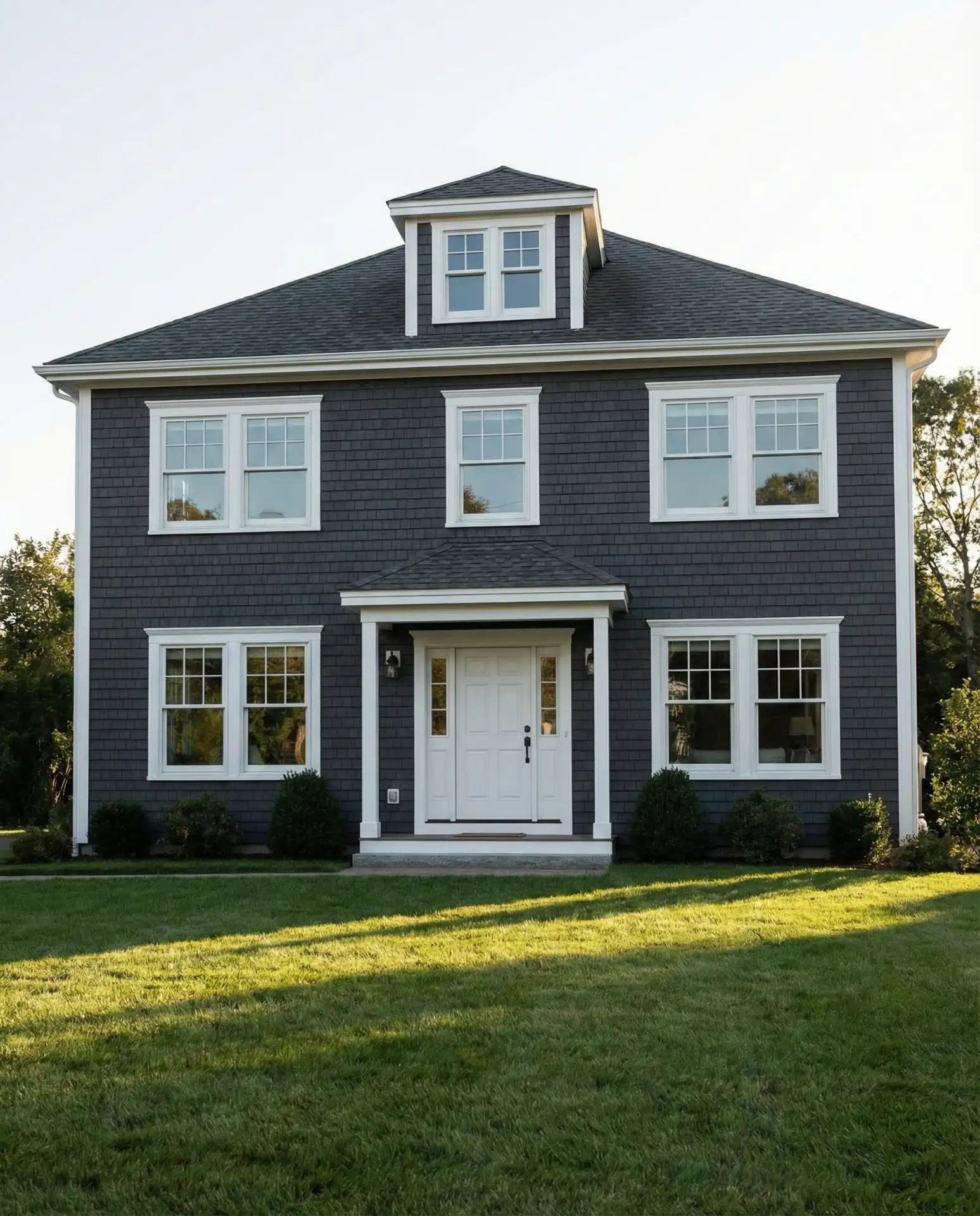
9. Pale Grey with Navy Door and Black Roof
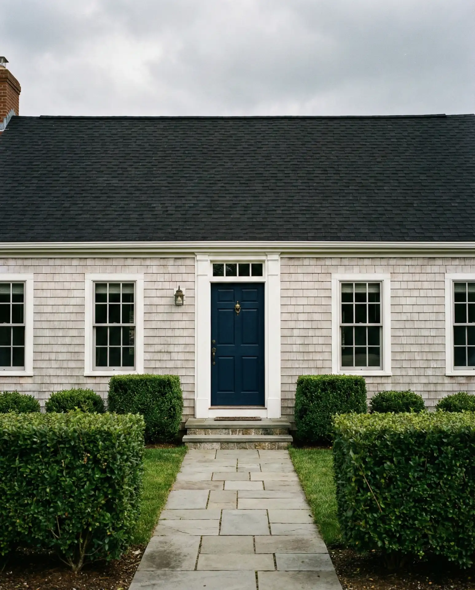
A subtle grey body color provides a sophisticated neutral backdrop that allows architectural details to shine, while a bold navy front door creates a focal point that draws the eye. The black roof grounds the composition and provides essential contrast against lighter wall tones. This restrained color palette has become increasingly popular among homeowners seeking a refined, understated presence.
Expert insight: This palette reads as timeless rather than trendy because it relies on classic neutrals with just one accent color. The navy door can be easily repainted if tastes change, while the grey siding and black roof provide a stable foundation that works with various accent choices. Add brass or bronze hardware for warmth, or stick with chrome and nickel for a cooler, more contemporary feel.
10. White with Forest Green Trim and Door
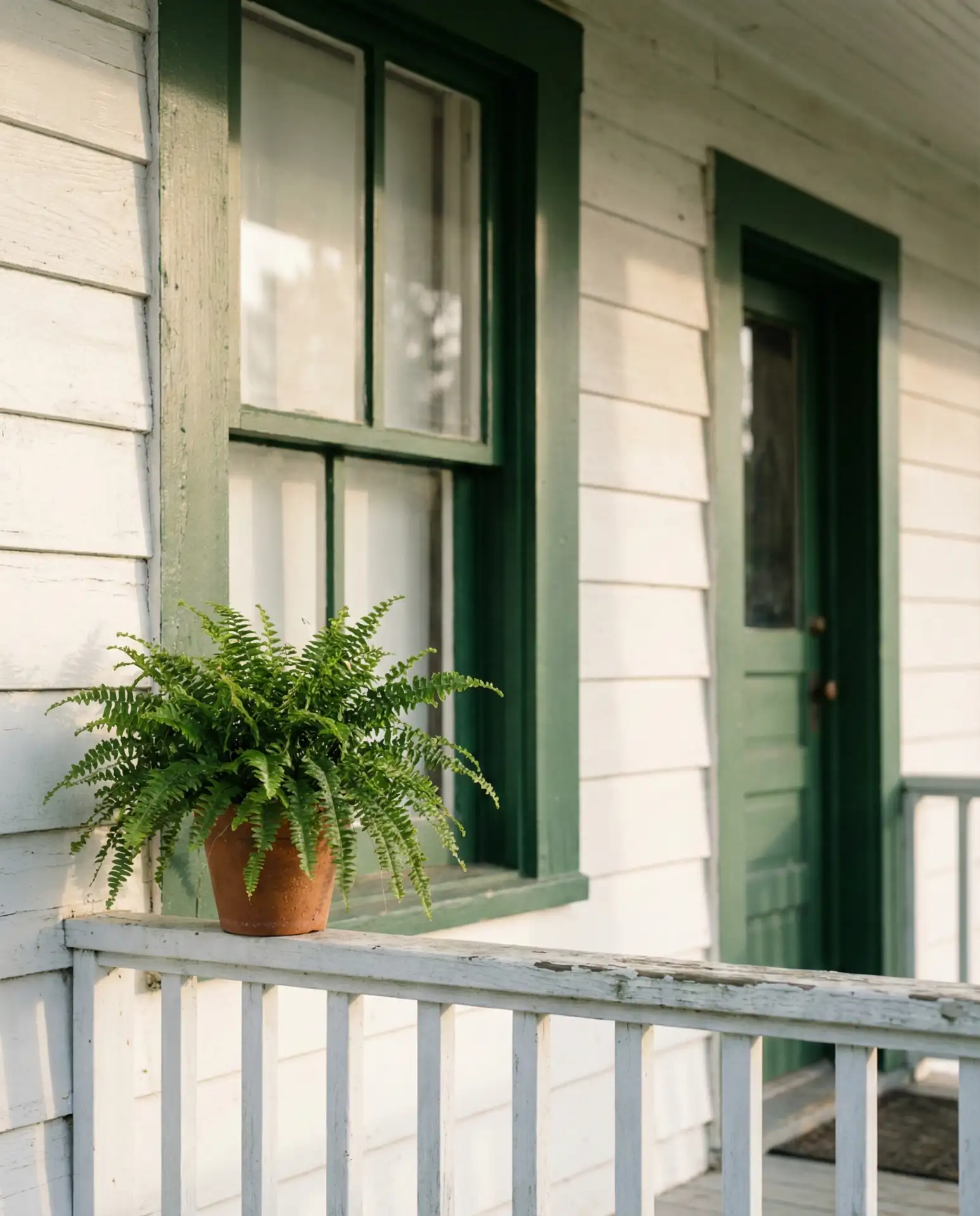
Reversing the traditional formula by applying dark green to trim and doors rather than shutters creates unexpected visual interest while maintaining classic appeal. The white body remains bright and crisp, while the green trim adds depth and frames architectural elements in a way that feels both traditional and slightly unconventional. This approach works especially well on homes with detailed millwork worth emphasizing.
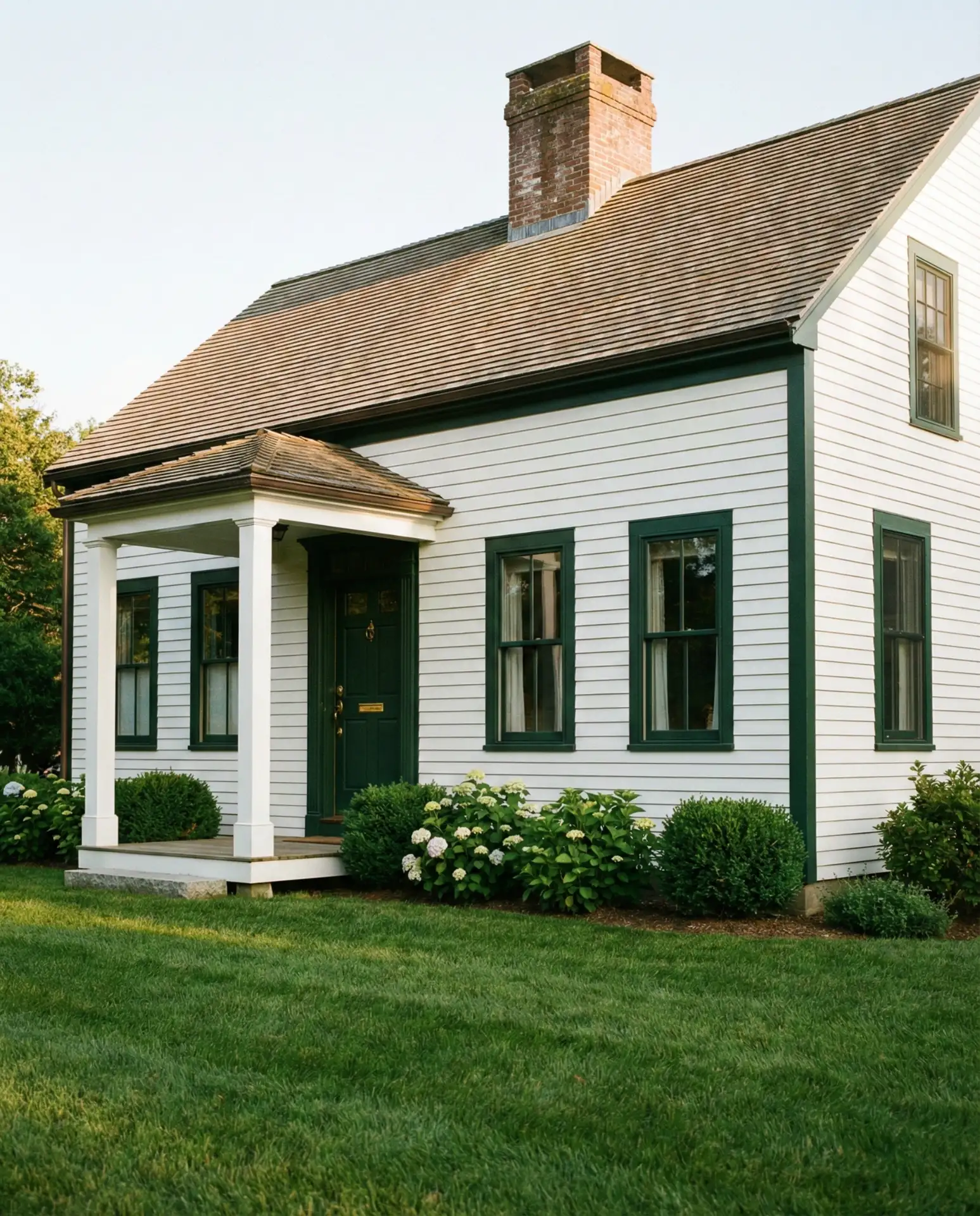
Where it works best: This color scheme particularly suits homes in heavily wooded areas, where the green trim creates a visual bridge between the structure and surrounding landscape. The white body prevents the home from disappearing into the trees, while the green anchors it to the site. Consider using the same green for garage doors to create a cohesive exterior palette.
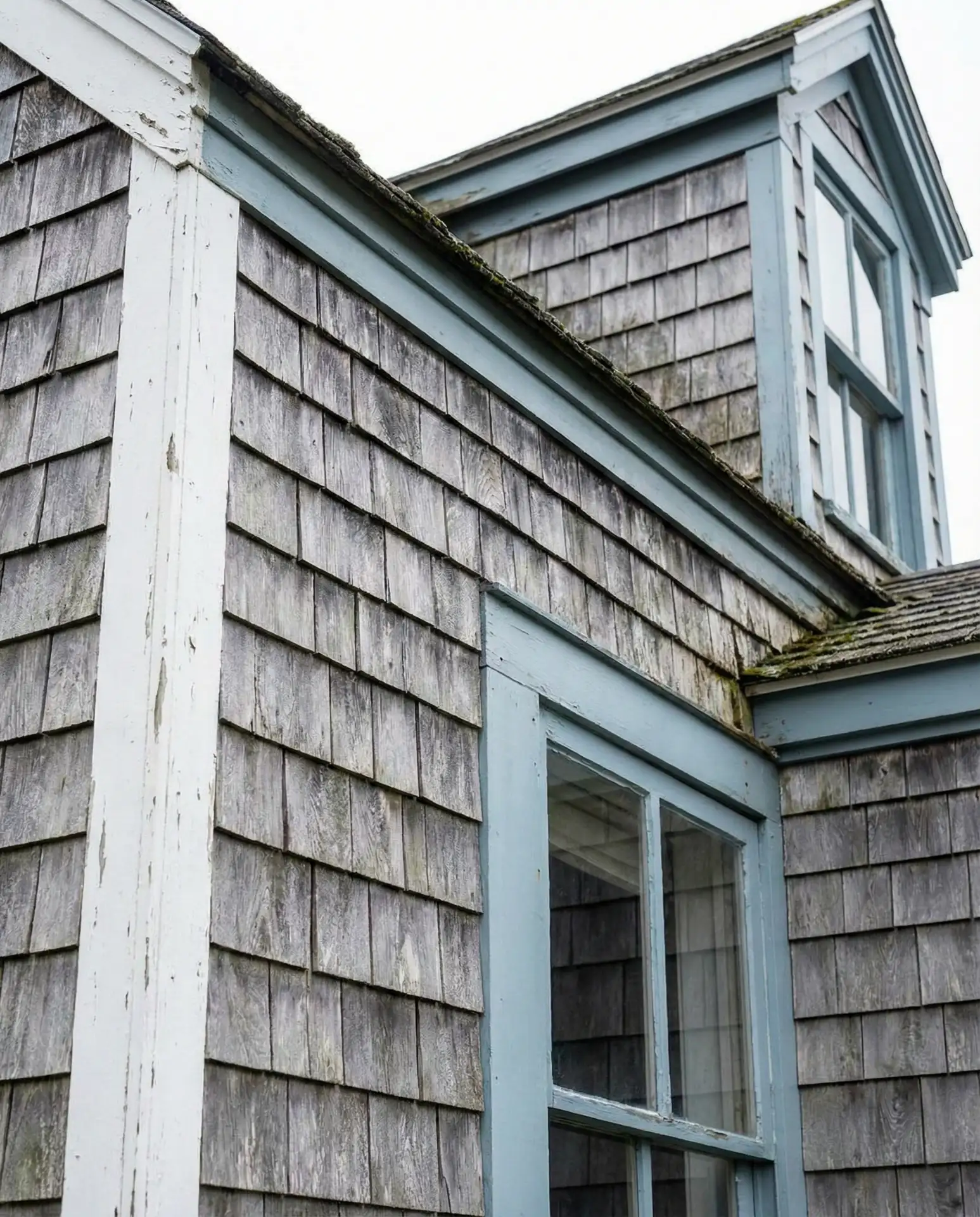
11. Coastal Blue-Grey with White Porch
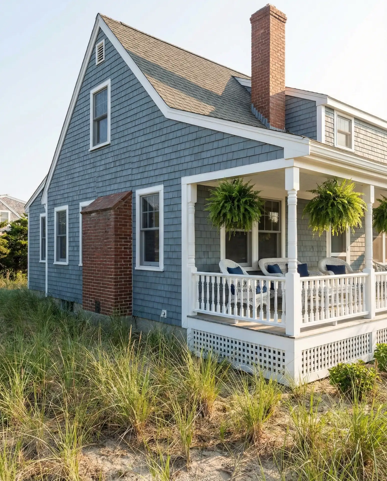
A sophisticated blue-grey that shifts between blue and grey depending on light conditions offers complexity and depth to Cape Cod exteriors. This chameleon-like quality feels inherently coastal, mimicking ocean waters and morning mist. A white-painted porch with traditional railings and columns provides bright contrast and creates an inviting transition between home and yard.
Practical insight: This color performs well in high-UV environments because quality blue-grey paints with fade-resistant pigments maintain their hue longer than pure whites or bold colors. The white porch can be easily cleaned each spring with a pressure washer, making maintenance straightforward for busy homeowners. Consider adding a porch ceiling in a lighter shade of the same blue for added dimension.
12. Taupe with Cream and Black Accents
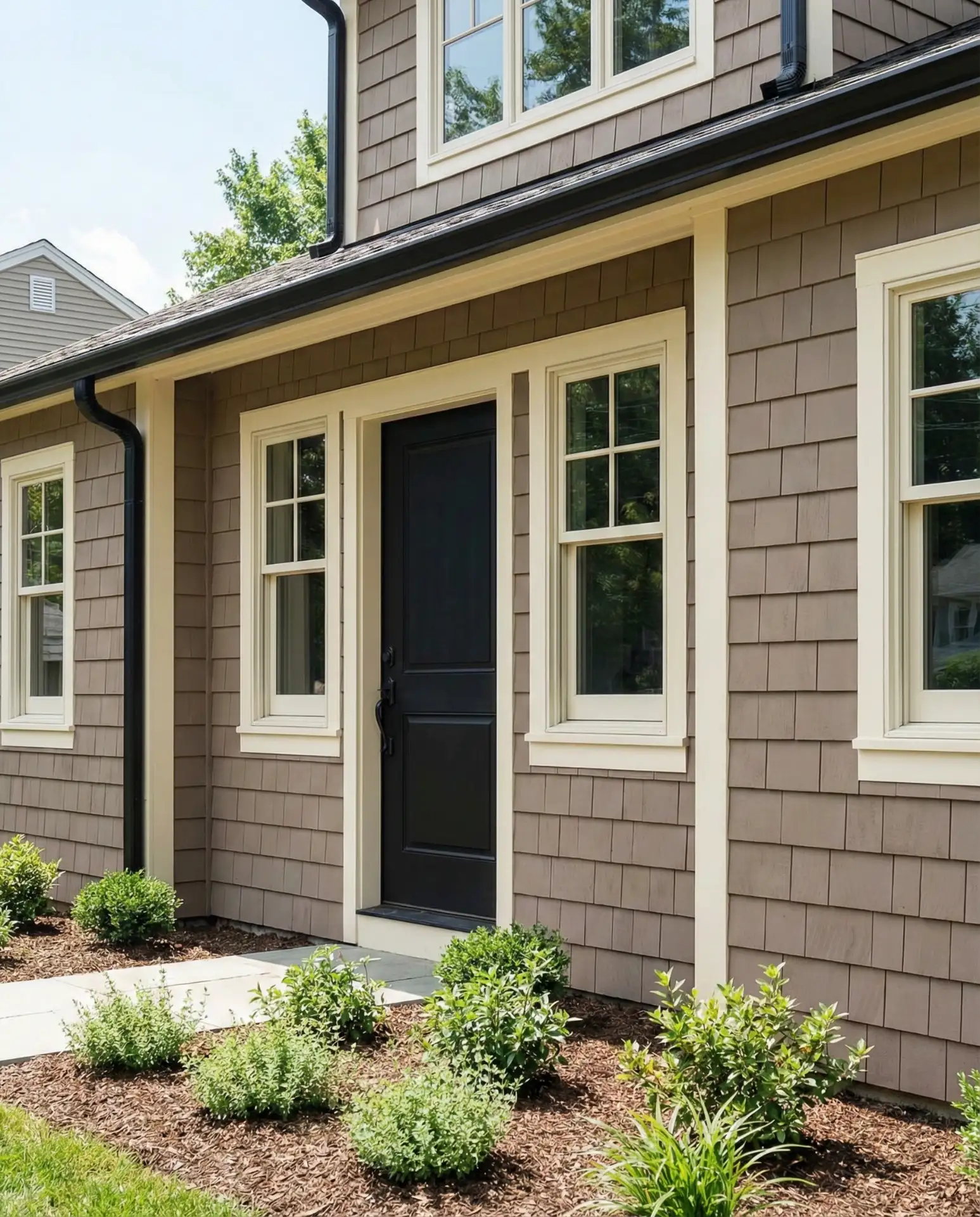
Warm taupe siding offers an earthy alternative to grey while maintaining the neutrality that makes color schemes versatile. Cream trim softens the overall composition, while black accents on doors, light fixtures, and gutters add contemporary sharpness. This three-color approach creates visual layers that give even modest Cape Cod homes a designer-calibrated appearance.

American lifestyle context: Taupe exteriors have gained traction in suburban developments where homeowners’ associations limit bold color choices, but residents still want personality. The warm neutral reads as sophisticated and coordinated without challenging conservative aesthetic standards. It also pairs beautifully with brick walkways and natural stone landscaping elements common in traditional American residential design.
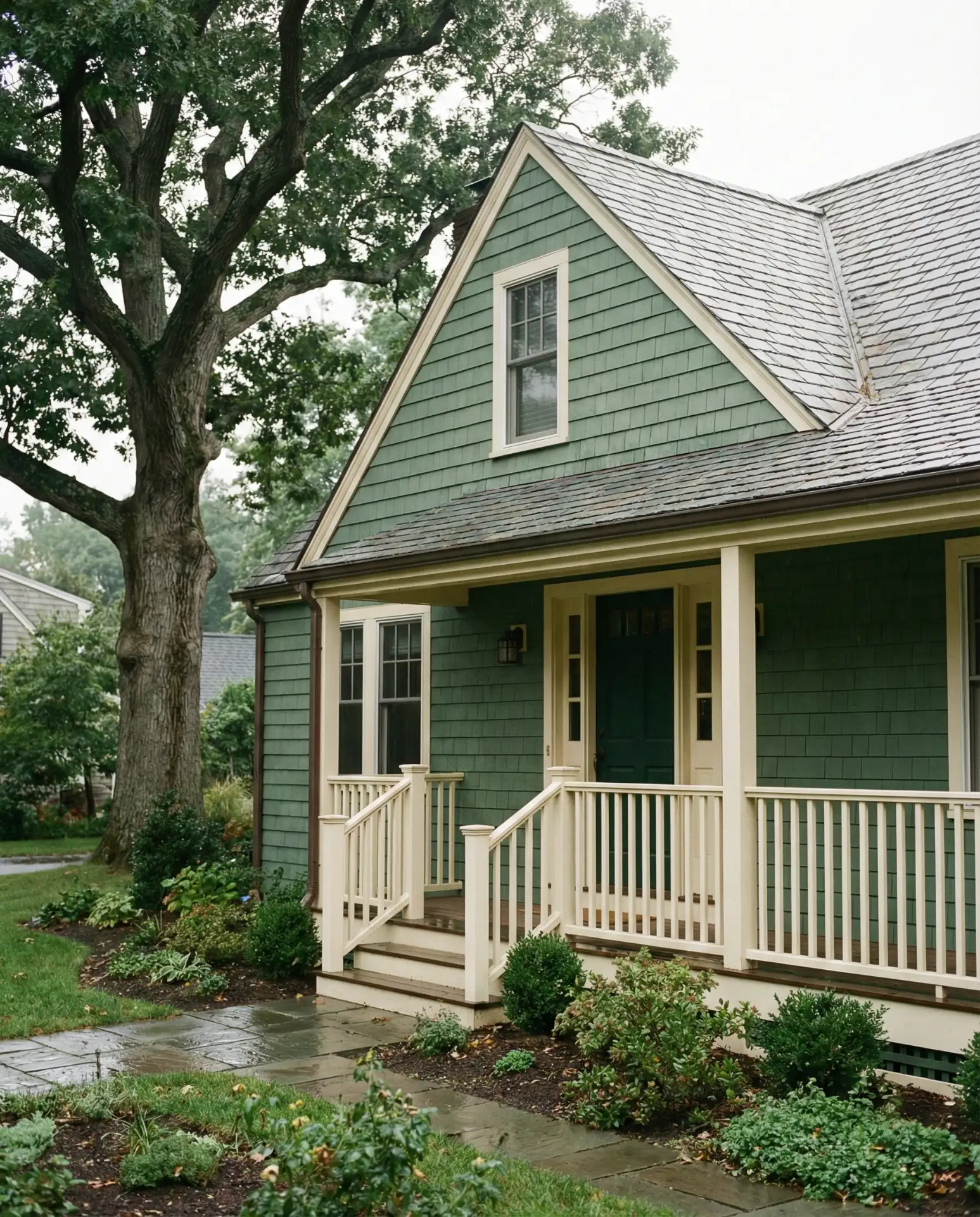
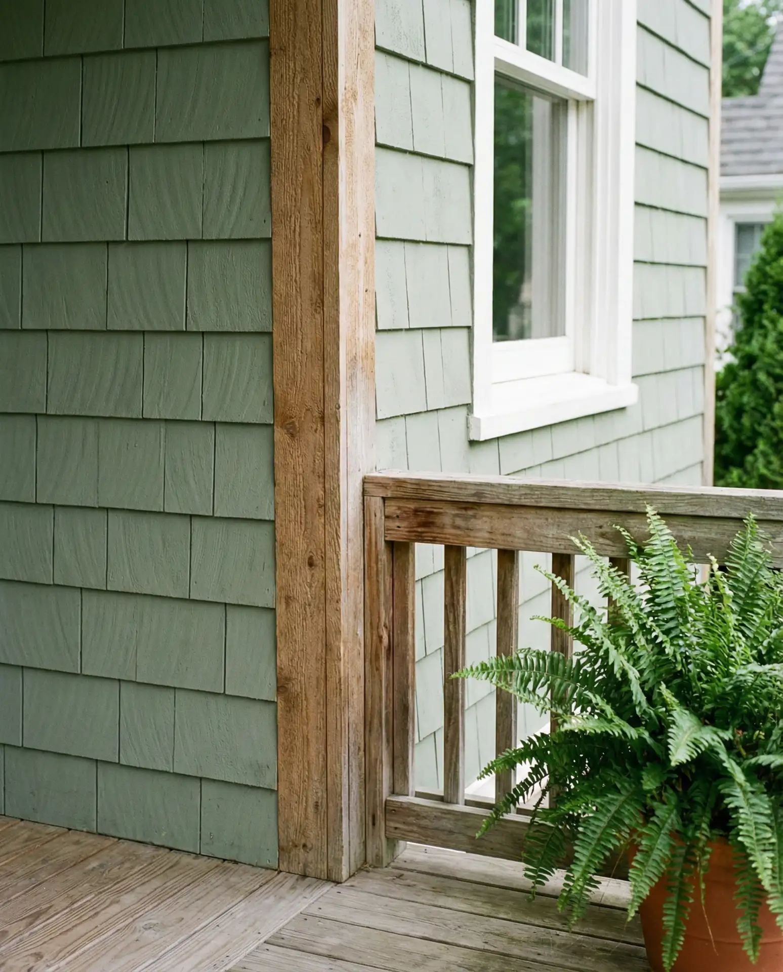
13. Sage Green with Natural Wood Accents
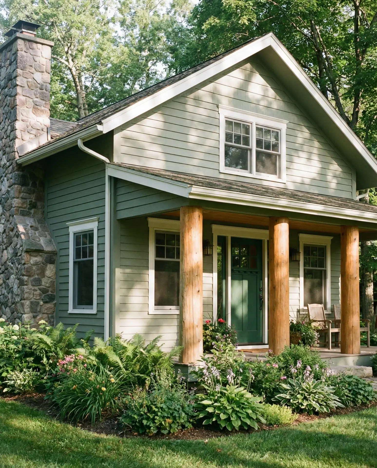
Soft sage green siding brings an organic, garden-inspired quality to Cape Cod homes, especially when paired with natural wood elements like cedar porch posts or exposed beam ends. This modern interpretation of traditional colors feels grounded and calm, appealing to homeowners seeking a connection with nature. The wood accents add warmth and texture that prevent the green from feeling flat or one-dimensional.
A landscape designer in Connecticut shared that sage green homes integrate beautifully with mature landscaping, as the color doesn’t compete with foliage but rather complements it. The natural wood accents should be treated with clear sealant to preserve their color and protect against moisture, requiring reapplication every 2-3 years depending on sun exposure and climate.
14. Two-Tone Grey with Darker Lower Level
Using a darker grey on the first floor and a lighter shade above creates visual grounding while adding architectural interest to standard Cape Cod forms. This two-tone approach is particularly effective on large homes where a single color might feel monotonous. The darker lower section also hides splash-back from rain and irrigation better than lighter tones, offering practical benefits alongside aesthetic appeal.
Common mistake to avoid: The two greys must be from the same color family with only a 2-3 shade difference, or the effect looks disjointed rather than intentional. Test both colors next to each other on your actual siding before committing, and ensure the transition line follows a logical architectural feature like a window sill line rather than cutting randomly across the wall plane.
15. Classic Red with White Trim
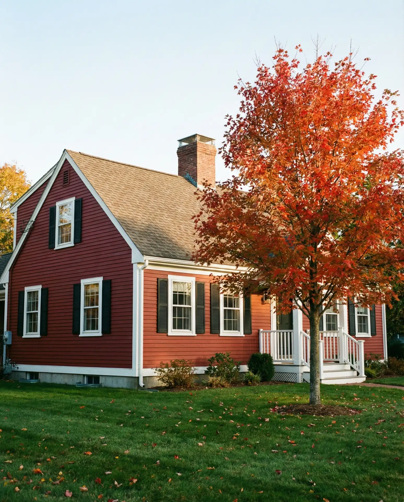
Deep barn-red siding recalls New England agricultural heritage while making a confident color statement. This bold choice works beautifully on Cape Cod homes with strong architectural bones and ample white trim to balance the intensity. The red-and-white combination has deep roots in colonial paint traditions and continues to feel both historical and spirited in contemporary neighborhoods.
Where it works best: Red exteriors particularly suit rural and semi-rural settings where the color can reference nearby barns and agricultural outbuildings. In suburban contexts, it creates a distinctive presence without appearing garish, especially when balanced with generous white trim. The color also complements autumn landscapes exceptionally well, creating stunning curb appeal during peak foliage season.
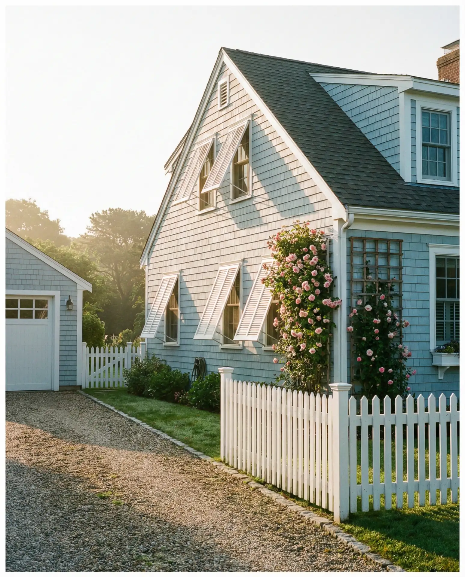
16. Soft Blue with Natural Stone Foundation
Pairing coastal blue siding with an exposed natural stone foundation creates a layered material palette that grounds the home literally and visually. The stone provides textural contrast against smooth painted surfaces while referencing classic Cape Cod construction methods. This combination works especially well on sloping lots where foundation walls are more visible and can be celebrated as a design element.
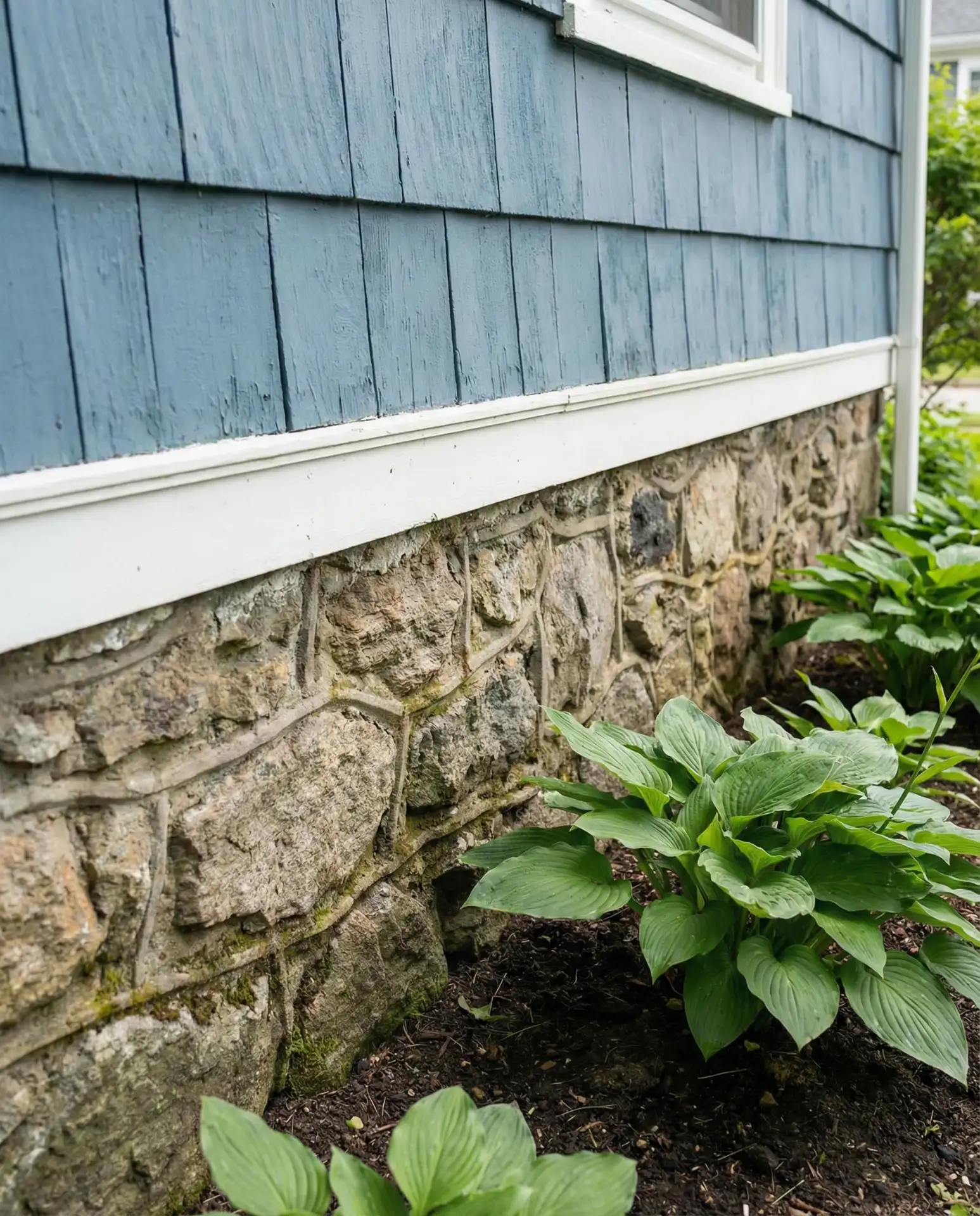
Budget perspective: Exposed stone foundations require less maintenance than painted foundation walls but do need periodic repointing of mortar joints, typically every 15-20 years depending on climate. The initial installation or restoration of a stone foundation facing represents a significant investment, but it adds substantial character and can increase property value in markets where historical authenticity is prized.
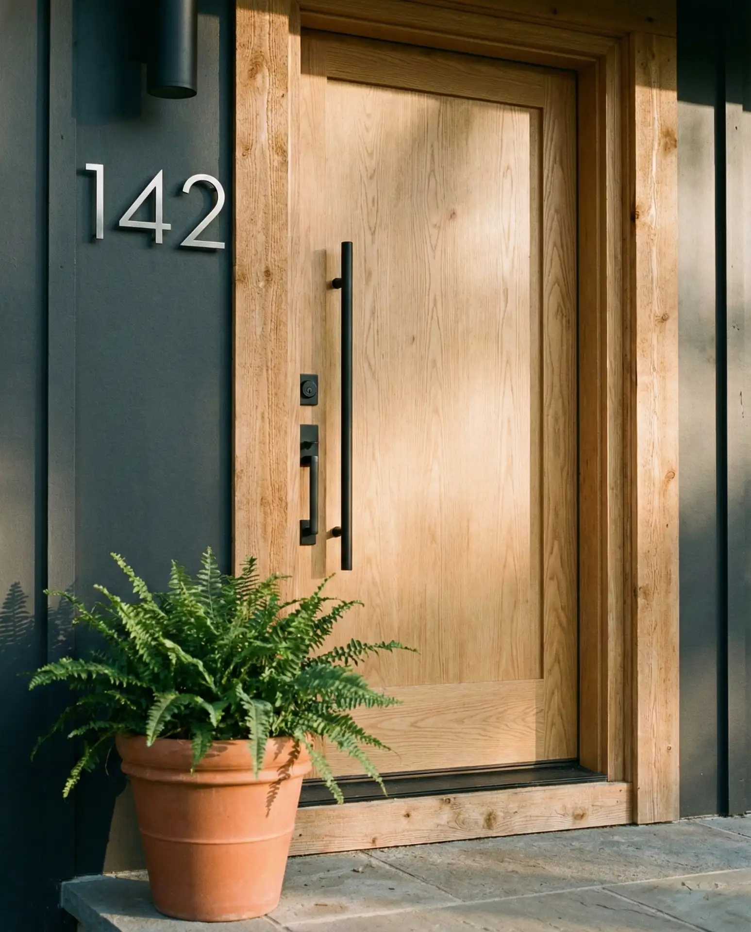
17. Charcoal with Warm Wood Door and Trim
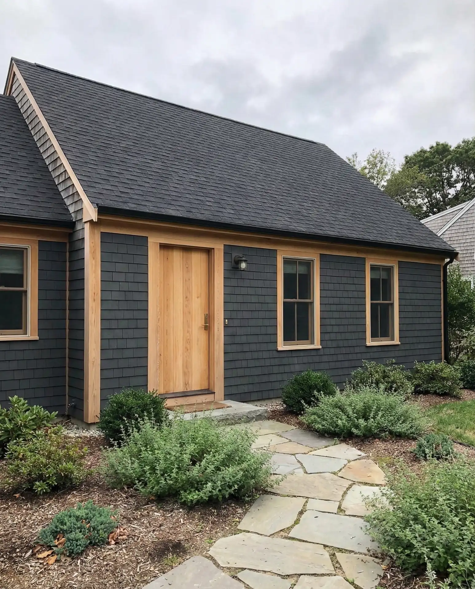
A dark charcoal exterior gains warmth and approachability when paired with natural wood doors and trim elements left unstained or finished with clear sealer. This combination balances modern sophistication with organic texture, preventing the dark siding from feeling cold or unwelcoming. The wood elements age gracefully, developing a silvery patina that complements the charcoal beautifully over time.
Real homeowner observation: Couples renovating their Cape Cods increasingly choose this palette to bridge traditional form and contemporary taste. The wood elements require annual cleaning and resealing if you want to maintain their warm tone, or you can let them weather naturally to silver-grey, which many homeowners find equally appealing and more authentic to New England’s coastal aesthetic.
18. Cream with Soft Grey-Green Shutters
Warm cream siding creates a gentle, welcoming presence that works beautifully in both sunny and shaded sites. Paired with grey-green shutters in a muted sage or eucalyptus tone, the effect is sophisticated and slightly unexpected. This subtle color palette appeals to homeowners who want their Cape Cod to feel distinctive without making a bold statement, fitting comfortably into established neighborhoods.
This color scheme reads as timeless because it relies on muted, nature-inspired tones that don’t compete with landscape elements. The cream remains bright enough to reflect light and keep the home feeling fresh, while the grey-green adds just enough color interest to prevent blandness. Consider using the same grey-green for the front door to create a cohesive, intentional palette.
19. Navy Blue with Crisp White and Brass Details
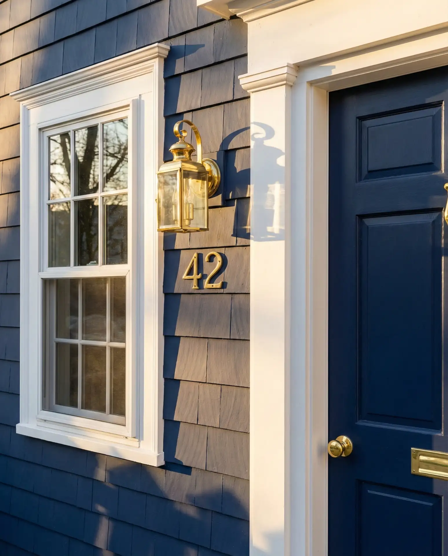
Deep navy blue siding makes a confident statement while maintaining a connection to maritime traditions and coastal color palettes. Bright white trim provides essential contrast and prevents the navy from overwhelming the facade. Brass or bronze hardware, light fixtures, and house numbers add warm metallic accents that elevate the overall composition from simple to sophisticated.
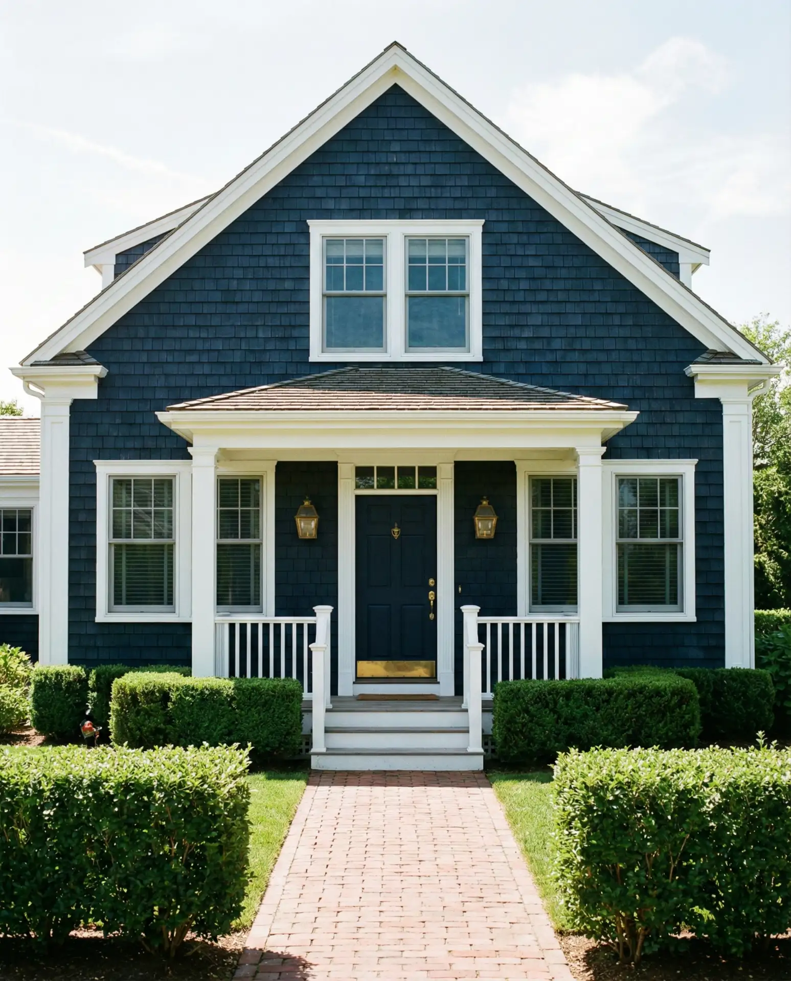
Expert commentary: Navy exteriors have proven remarkably versatile across different regional contexts, working equally well in coastal areas and inland suburbs. The key to success is choosing a navy with enough depth to read as intentional rather than washed-out, but not so dark that it appears black in low light. The brass accents should be lacquered to prevent tarnishing, especially in humid or coastal climates.
20. Weathered Brown with Natural Landscaping
Rich brown stain or paint creates an earthy, grounded exterior that allows Cape Cod homes to nestle into wooded sites naturally. This approach works particularly well when combined with native landscaping that emphasizes natural grasses, ferns, and shade-tolerant perennials. The brown palette references tree bark and forest floors, creating visual continuity between the built structure and surrounding environment.
Where it works best: This palette particularly suits heavily wooded lots where the home sits among mature trees and receives filtered rather than direct sunlight. The brown siding won’t show pollen and organic debris as readily as lighter colors, which matters in forest settings. Native landscaping reduces maintenance while supporting local ecosystems, appealing to environmentally conscious homeowners.
21. White with Black Trim and Metal Roof
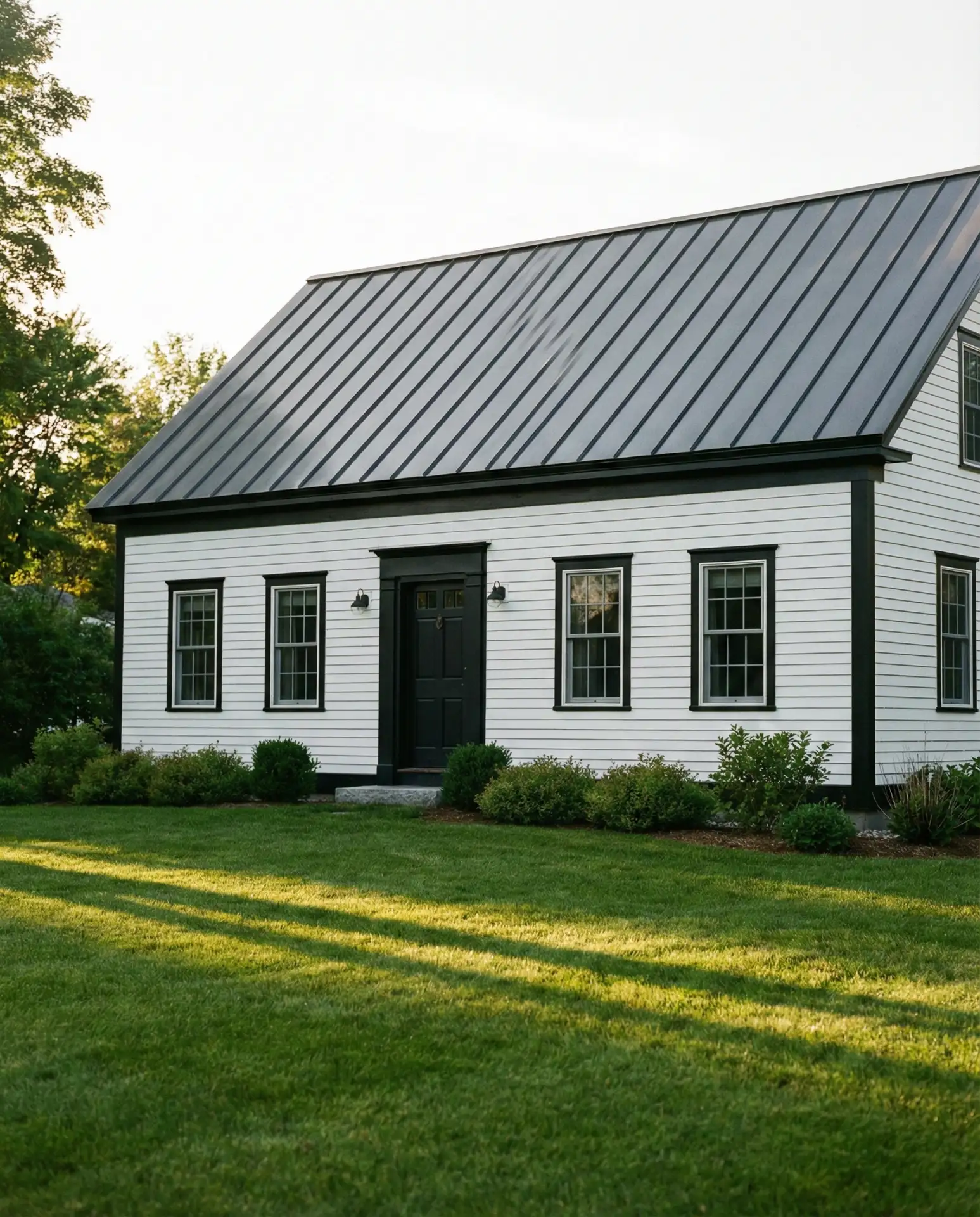
Crisp white siding paired with black trim and a standing-seam metal roof creates a graphic, high-contrast composition that feels both traditional and contemporary. The metal roof adds modern performance benefits, including superior weather resistance and longevity, while contributing to the home’s visual impact. This bold palette works especially well on Cape Cods with strong architectural lines and symmetry.
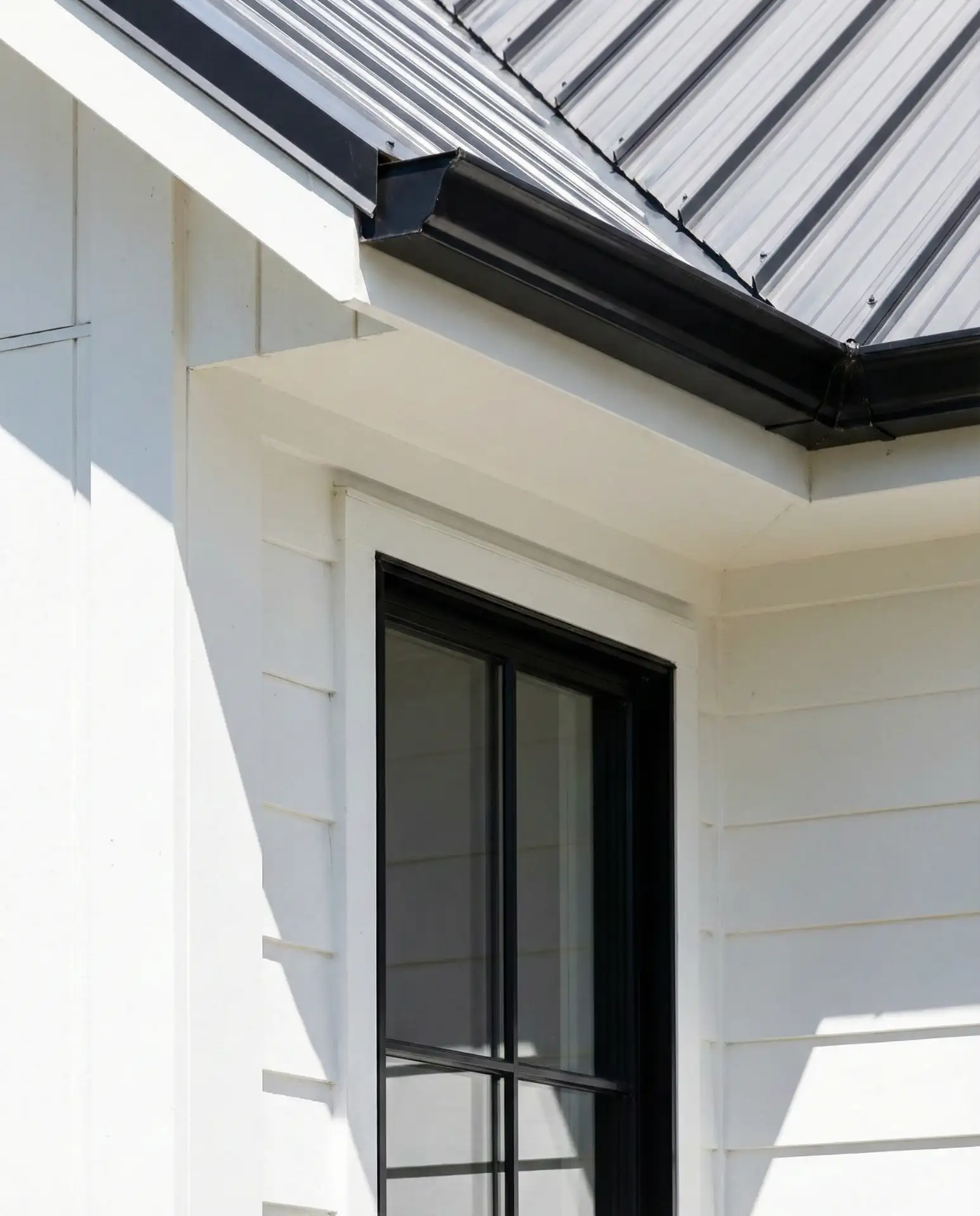
Budget consideration: Metal roofs represent a significant upfront investment, typically 2-3 times the cost of asphalt shingles, but they last 50+ years compared to 20-30 for asphalt. Over the lifecycle of the home, metal roofing often proves more economical while offering better energy efficiency and virtually no maintenance. The dramatic appearance also commands attention in neighborhoods dominated by traditional roofing materials.
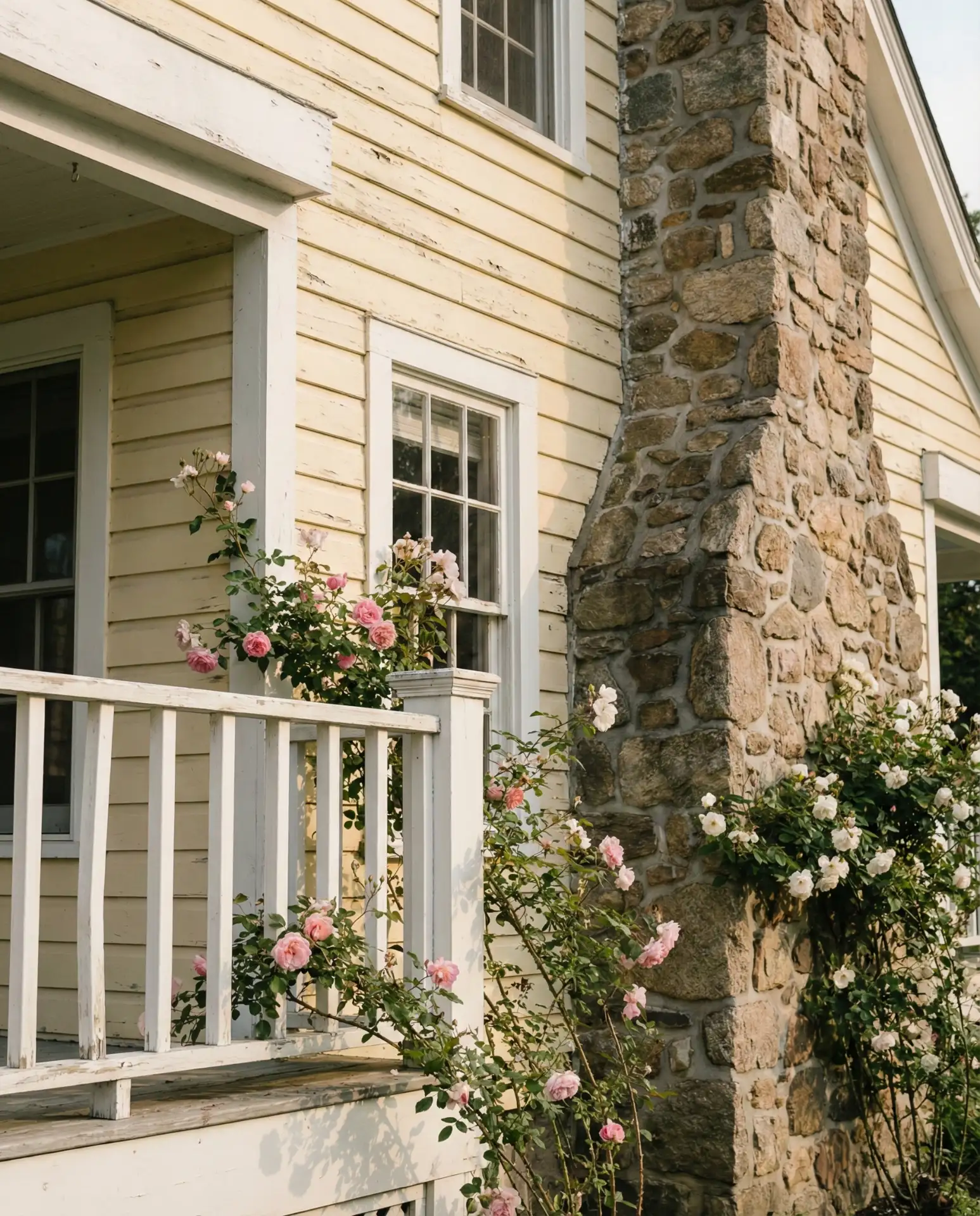
22. Pale Yellow with White and Natural Stone
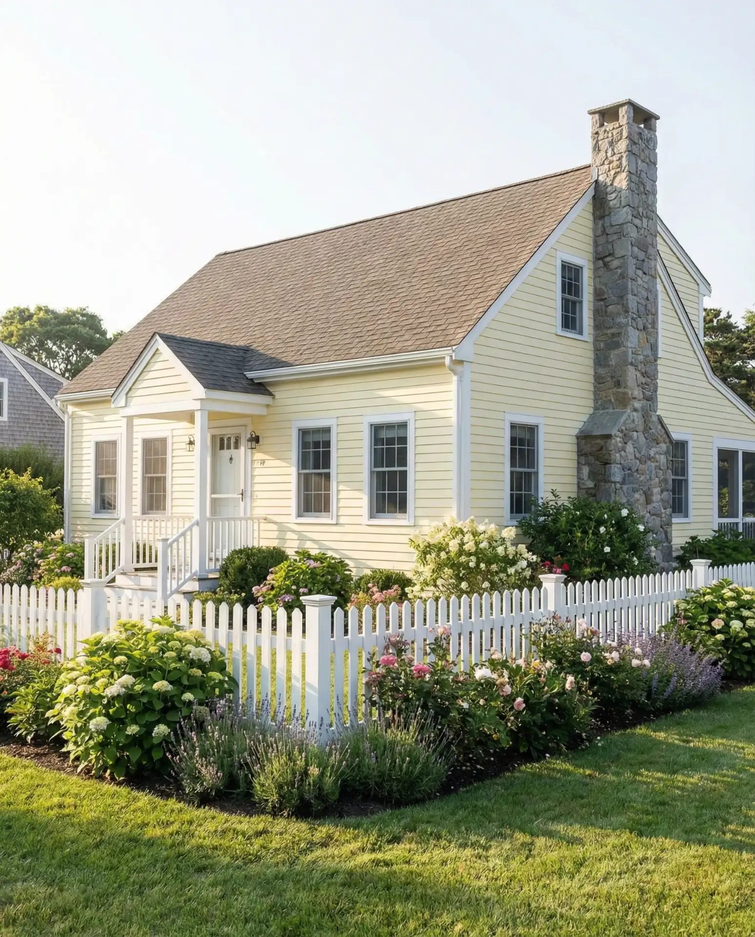
Soft butter yellow brings warmth and optimism to Cape Cod exteriors, especially when balanced with white trim and natural stone elements like chimneys or foundation walls. This combination feels sunny and welcoming without being overly bold, appealing to families who want a cheerful home that still respects traditional design principles. The stone adds texture and weight that grounds the lighter painted surfaces.
Practical insight: Pale yellow performs well in both full sun and partial shade, maintaining its cheerful appearance across different light conditions throughout the day. The color hides minor dirt and pollen better than pure white while still reading as bright and fresh. When selecting your yellow, avoid shades with strong green undertones, which can appear sickly in certain light, and lean toward buttery yellows with warm, slightly peachy bases.
Conclusion
These ideas demonstrate the remarkable versatility of Cape Cod exteriors in 2026, from bold contemporary statements to gentle nods toward tradition. Whether you’re drawn to classic coastal palettes or ready to experiment with unexpected color combinations, the key is choosing finishes that honor your home’s architectural integrity while expressing your personal style. Share your favorite combination in the comments below, or let us know which approach you’re considering for your own Cape Cod remodel.