Blue is having a serious moment in American interiors, and 2026 is turning out to be the year it fully takes over the living room. Whether you’re scrolling Pinterest at midnight looking for something moody and layered or searching for a breezy, light-filled refresh, blue offers more range than almost any other color in the spectrum. From deep, almost-black navies to the softest duck egg and sky tones, there’s a version of blue that works in a Brooklyn apartment, a Texas ranch house, or a Pacific Northwest cottage. In this roundup, we’re sharing real, liveable ideas for bringing blue into your living room—with styling tips, honest advice, and plenty of visual inspiration to get you started.
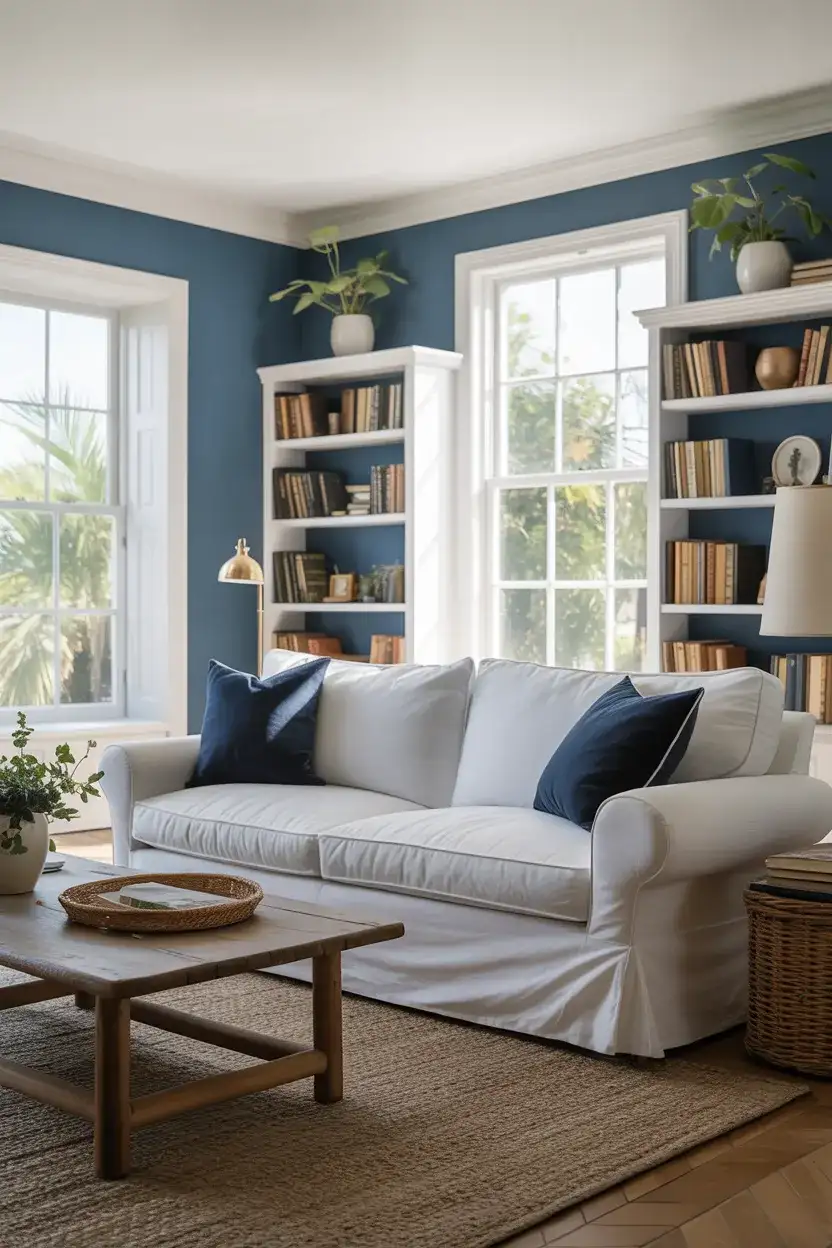
1. Dark Navy Velvet Sofa Against White Walls
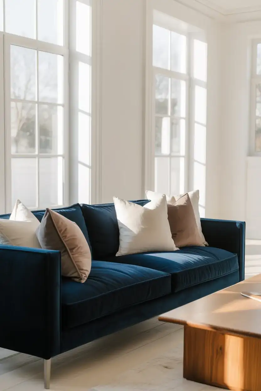
There are few moves in interior design as confident as anchoring a living room with a dark navy velvet sofa. The depth of the color reads as sophisticated without feeling cold, especially when the walls stay white and natural light can bounce freely around the room. This is a look that photographs beautifully—which is probably why it keeps circulating on Pinterest—but it also works extraordinarily well in real life. The navy acts as a grounding element, letting everything else in the room feel lighter and more intentional.
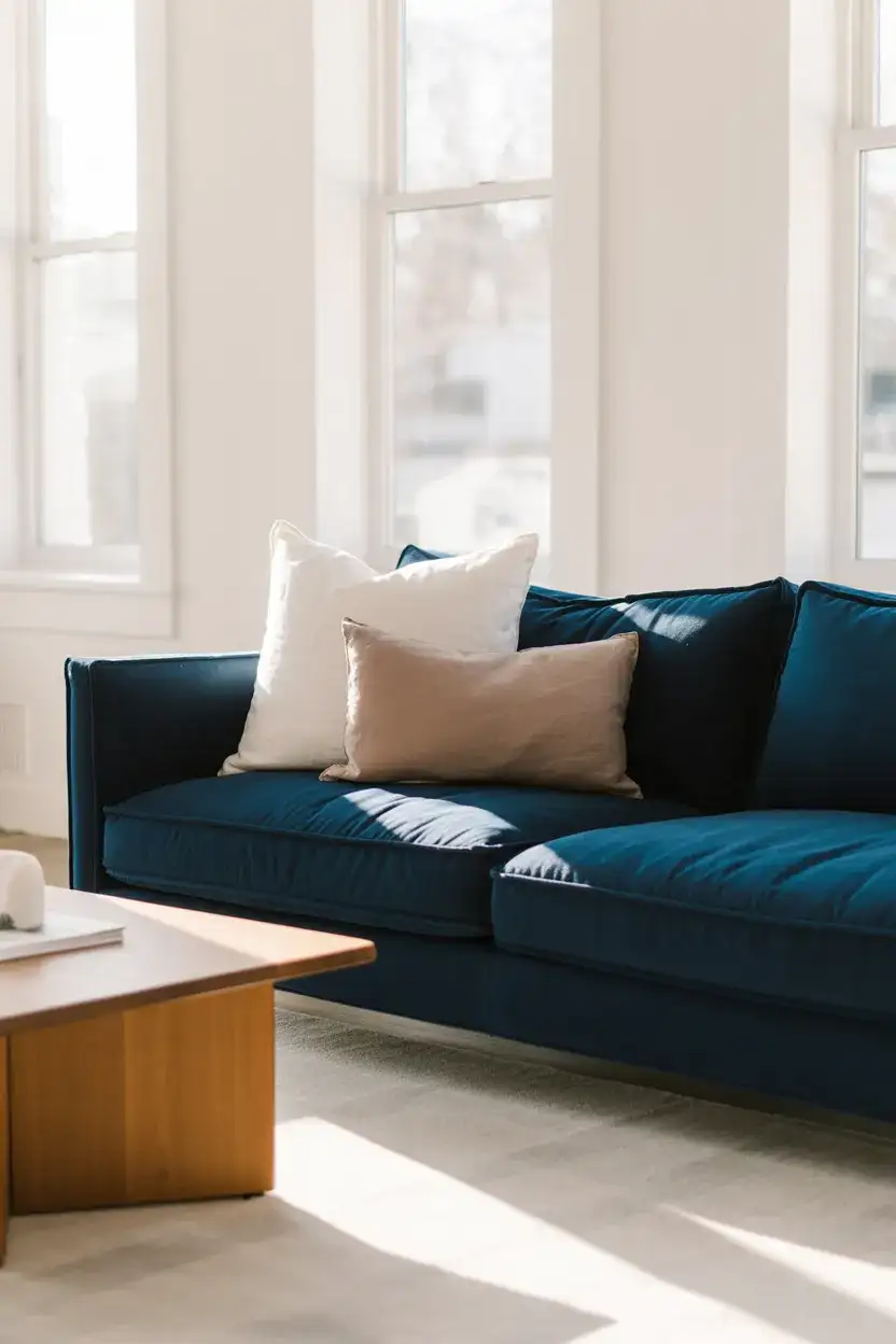
Style-wise, this pairing is surprisingly forgiving. A navy sofa works with gold, brass, or warm bronze hardware—light fixtures, picture frames, even the legs on a side table. If your space leans more casual, layer in a chunky knit throw and some mismatched linen pillows to soften the drama. The common mistake people make is going too matchy-matchy with their accessories in the same blue family. Let the sofa be the star; keep everything else grounded in naturals like oatmeal, sand, and warm white.
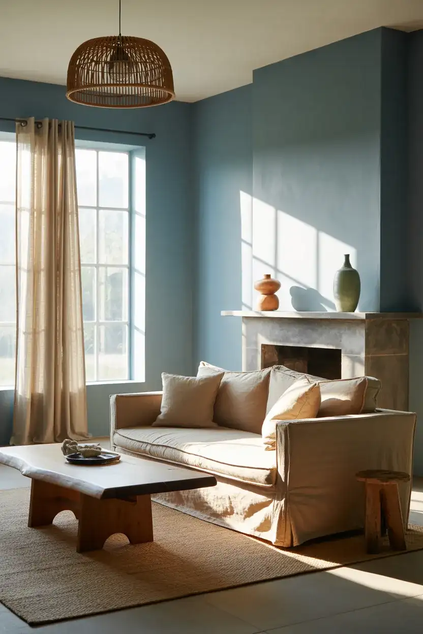
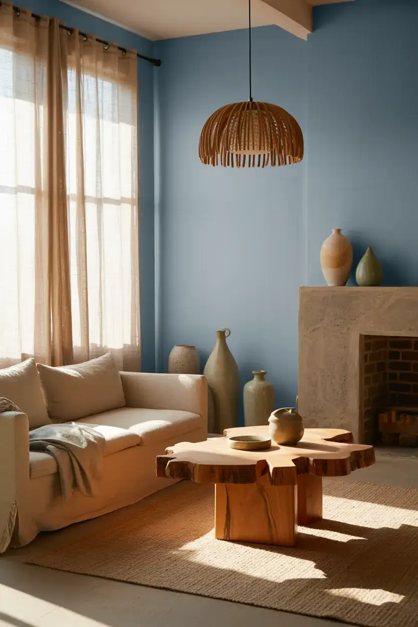
2. Light Blue Walls With Warm Wood and Linen
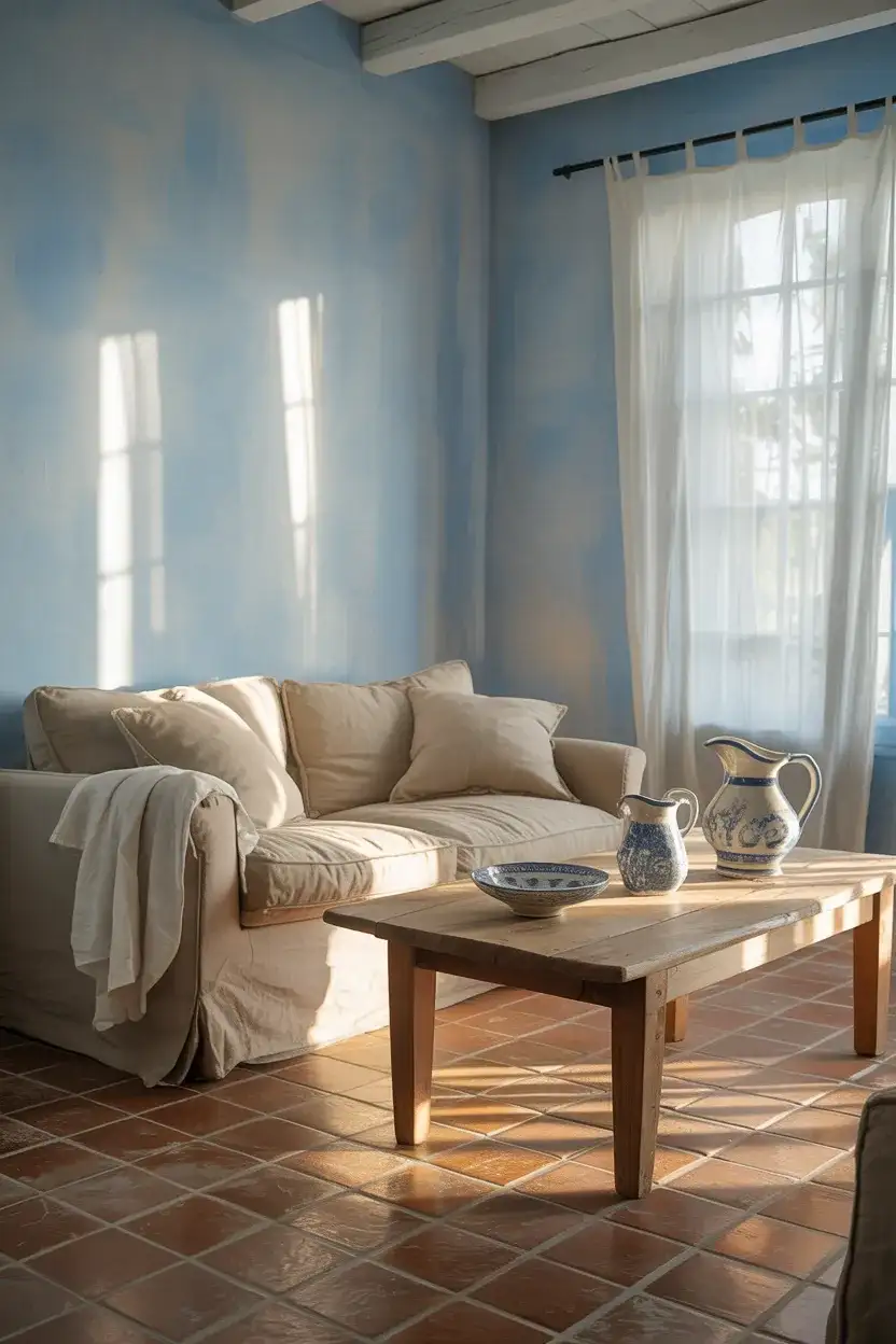
If you’ve been dreaming of a living room that feels like a long exhale, light blue walls paired with warm wood tones and relaxed linen upholstery might be the combination you’ve been searching for. This color scheme has deep roots in Scandinavian and coastal American design, and in 2026 it’s being reinterpreted in warmer, more layered ways—less “beach house,” more “thoughtfully collected home.” ” The trick is choosing a blue that reads as soft and almost neutral in natural light, leaning toward the gray-blue or muted periwinkle end of the spectrum.
This look works best in rooms that get good natural light—north-facing rooms may push the blue into a chillier territory than you’d like. For those spaces, warm the palette up further by adding more amber-toned wood pieces and swapping cool-white lighting for soft warm bulbs. A homeowner in Portland recently shared that painting her living room in a dusty blue-gray transformed it from a room she rushed through to one she actually lingered in—sometimes the right wall color is the whole story.
3. Moody Hague Blue Accent Wall
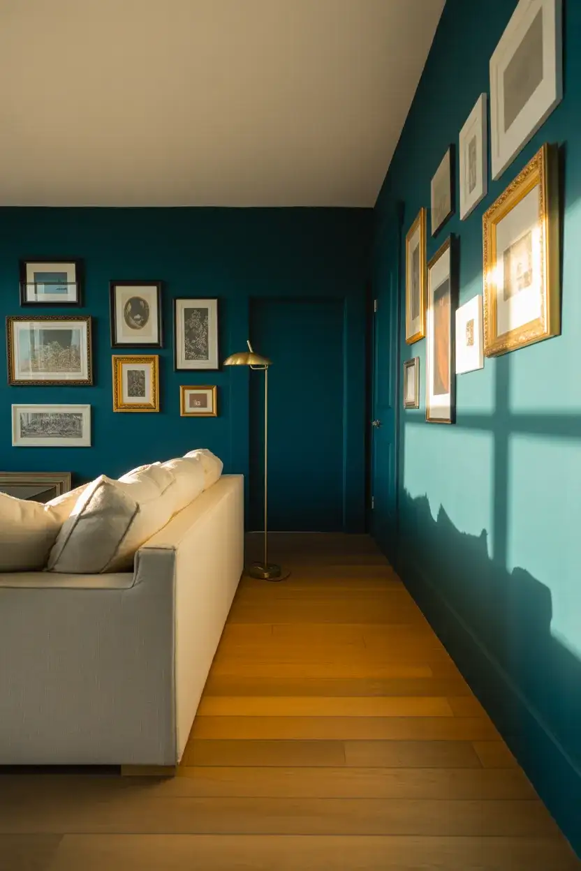
Farrow & Ball’s Hague Blue has earned legendary status in the interior design world, and for good reason—it’s one of those rare colors that manages to be simultaneously dramatic and livable. Painted on a single wall in a living room, it creates a backdrop that makes art pop, furniture look intentional, and the whole space feel like it was designed rather than assembled. It’s a deep, complex blue-green with enough darkness to feel truly moody without crossing into oppressive territory.
Where this works best is in rooms where at least one other wall stays light—white, off-white, or even a very pale warm gray. That contrast is what lets the accent wall do its job without making the space feel like a cave. Budget-wise, you don’t have to use the actual Farrow & Ball paint—many American paint brands now offer excellent deep teal-blues at a fraction of the price. Benjamin Moore’s Newburyport Blue and Sherwin-Williams’ Naval are both worth sampling before you commit.
4. Blue and Brown Earthy Living Room
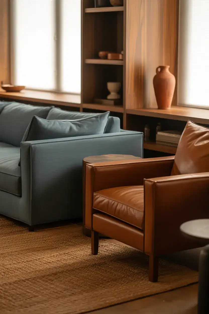
The combination of brown and blue is one of those design pairings that feels almost instinctively right—like denim and leather, or the ocean and a sandy shore. In a living room, this color duo creates a grounded, organic atmosphere that reads as warm despite the blue’s inherent coolness. Think of a slate-blue sofa against a walnut wood media unit or blue throw pillows on a cognac leather armchair. The browns anchor the space and keep the blue from feeling too airy or disconnected from the room’s physical materials.
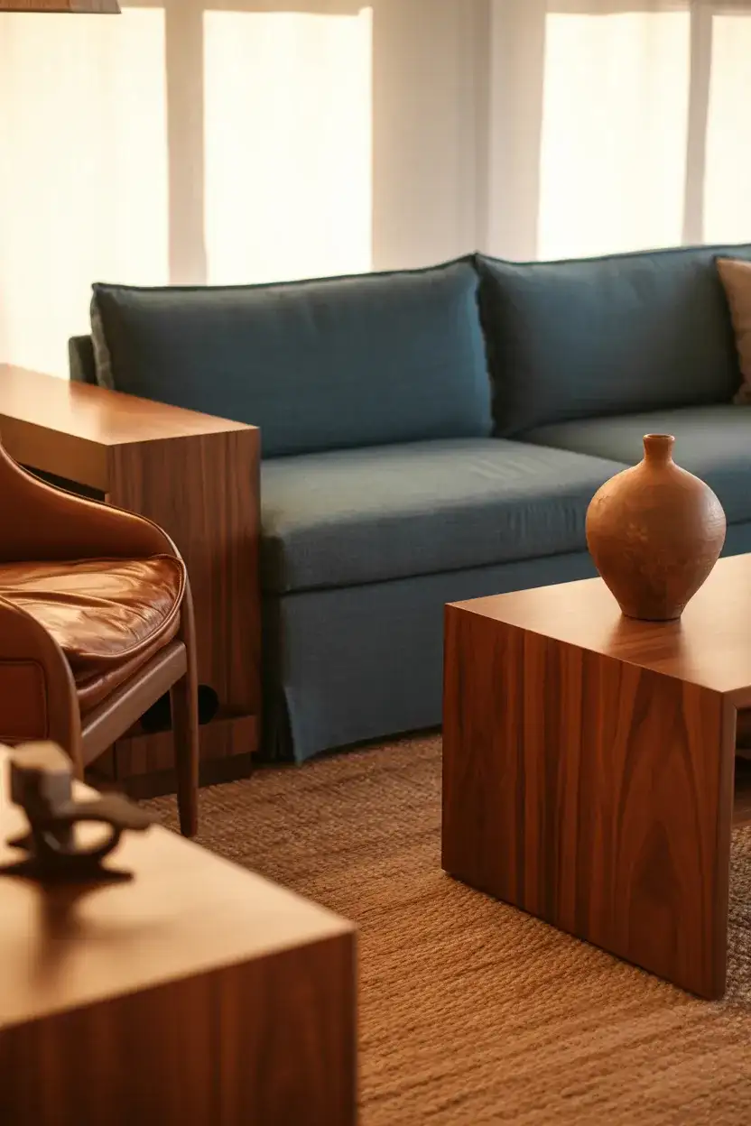
This is a particularly good approach for American homes in the South and Midwest, where warm earthy tones have a long tradition and stark minimalism can feel out of place. The combination feels collected rather than designed—which is exactly the energy a lot of homeowners are going for right now. Mix textures freely: a nubby bouclé pillow in dusty blue, a smooth walnut bowl, and a rough-woven basket—these contrasts are what give the room its life.
5. Cozy Inchyra Blue Reading Nook
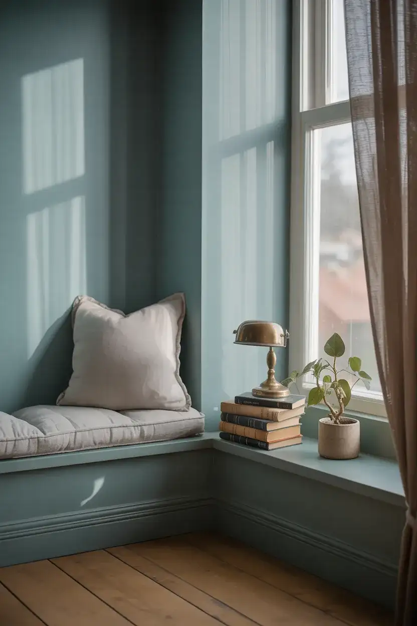
Farrow & Ball’s Inchyra Blue is quieter and more contemplative than its louder cousins in the color family—it sits somewhere between a faded denim and a soft teal-gray, and it has an almost meditative quality that makes it ideal for a reading corner or a tucked-away living room nook. Paired with natural linen, aged leather, and warm brass accents, it creates a space that feels genuinely cozy—the kind of corner you don’t want to leave on a Sunday morning. It’s the color equivalent of a really good book.
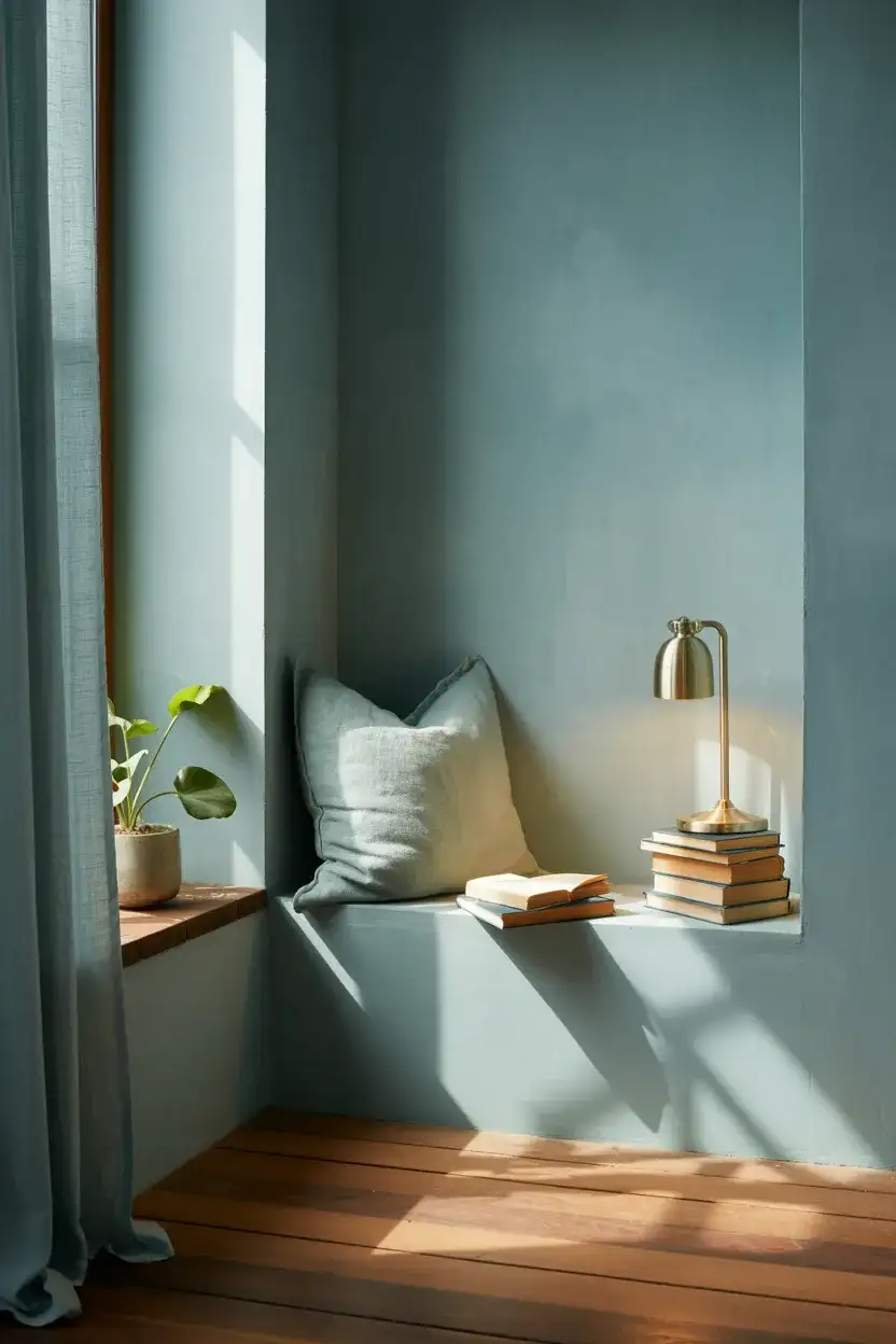
An interior designer based in Nashville described Inchyra Blue as “the color for people who want drama without commitment”—and that’s an apt description. It’s gentle enough to live with long-term but interesting enough to feel like a real design choice. For a reading nook specifically, keep the lighting warm and layered: a floor lamp, a table lamp, and maybe a candle or two. Overhead lighting alone will flatten this color; it needs warm, angled light to show its true depth.
6. Blue and Grey Modern Living Room
The grey and blue pairing is probably the most searched living room color combination on Pinterest right now, and it’s easy to see why—it’s sophisticated, timeless, and endlessly adaptable. In a modern living room context, this color scheme works particularly well when the grey leans warm (think greige or taupe-gray) rather than a cool blue-gray, which can start to feel monotone. Introduce the blue through a large sectional or a statement armchair, and let the grey do its quiet work in the walls, rug, and soft furnishings.
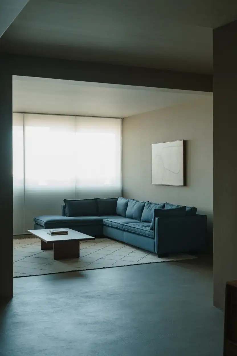
This combination is particularly practical for renters who can’t paint—a blue sofa and gray rug can transform a beige rental living room without touching the walls. When shopping for both colors, it helps to bring fabric swatches or paint chips together to check undertones in natural light before committing. The most common misstep is pairing a warm gray with a cool blue; the undertone conflict makes the room feel slightly off without anyone being able to articulate why.
7. Blue and Green Botanical Living Room
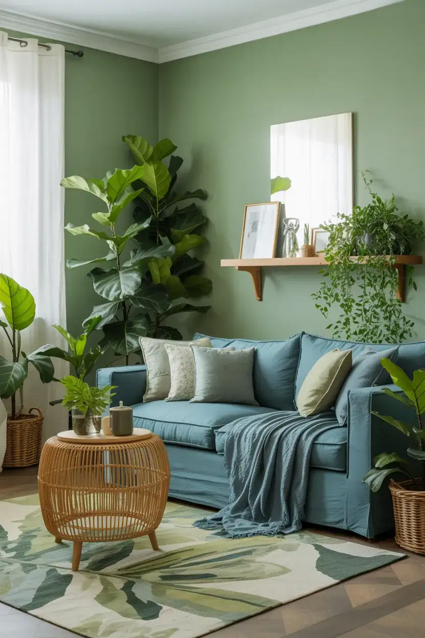
Pairing green and blue in a living room taps into something deeply soothing about the natural world—it’s the color palette of a forest meeting the sea, and it has a proven psychological effect on how calm and at ease people feel in a space. In 2026, this combination is trending in a more sophisticated, adult direction than the “jungle maximalism” of a few years ago. Think a muted sage green on the walls with a teal-blue sofa, or deep forest green velvet cushions against a coastal blue linen chair.
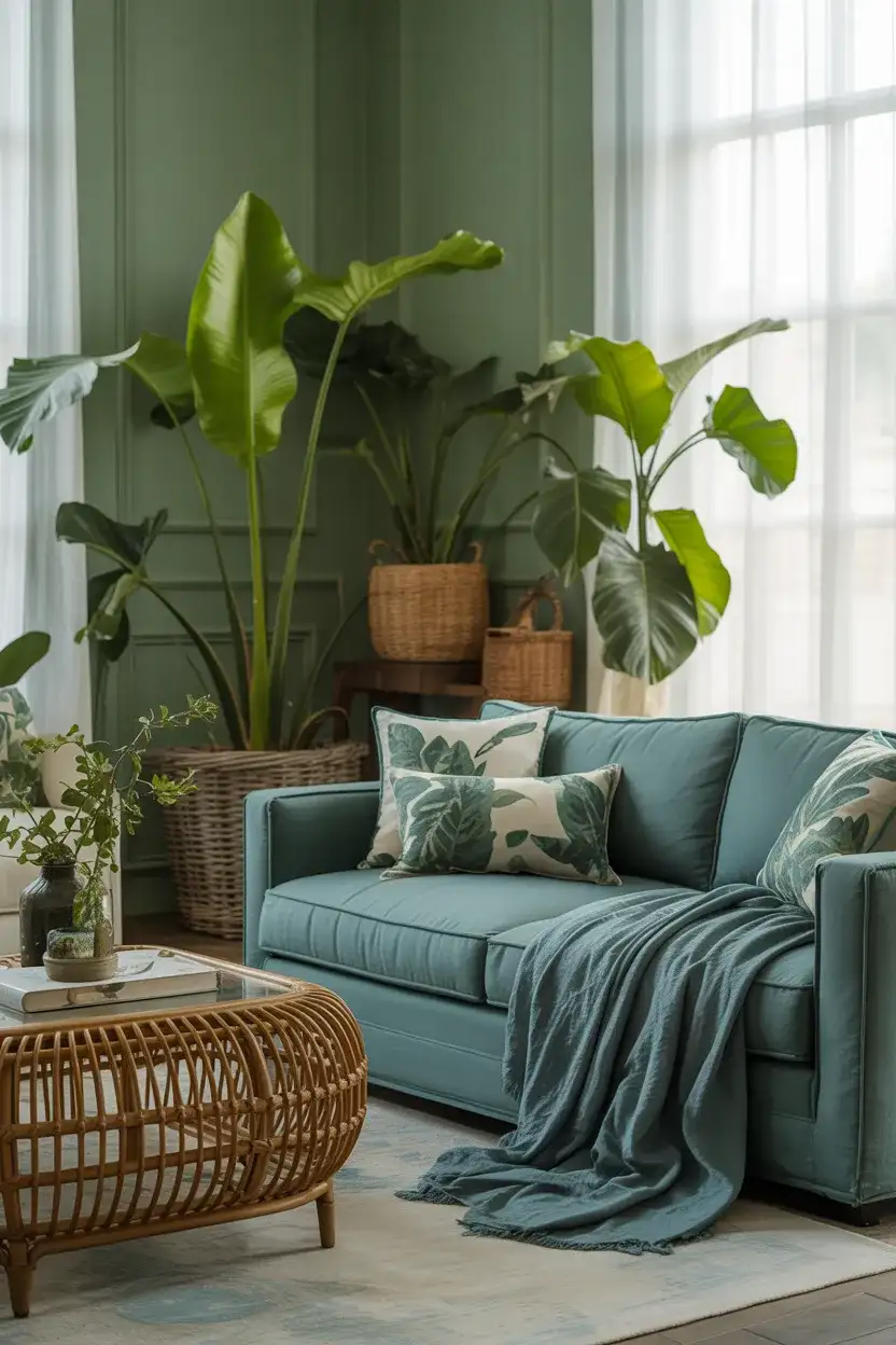
This look works beautifully in living rooms with access to outdoor views—a garden, a wooded yard, or even a balcony with greenery. The interior palette essentially continues the landscape outside, blurring the boundary between inside and out. Keep the plant selection varied in texture: something trailing, something tall and structural, and something low and sculptural. The combination of real greenery with green-and-blue textiles doubles down on the botanical mood in the most satisfying way.
8. Midnight Blue Ceiling Statement
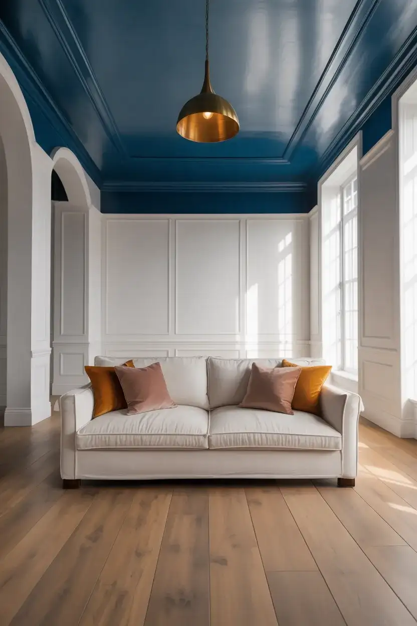
Painting a ceiling is one of those design moves that sounds terrifying until you actually do it—and a midnight blue ceiling in a living room is one of the most dramatic and rewarding examples. The effect is deeply atmospheric: the room feels like the sky just before a storm, or a velvet theater ceiling, or the inside of a very chic cocktail bar. The key is keeping everything below it grounded in lighter, warmer tones so the ceiling recedes rather than crashes down. Walls in soft white, cream, or warm plaster work best.
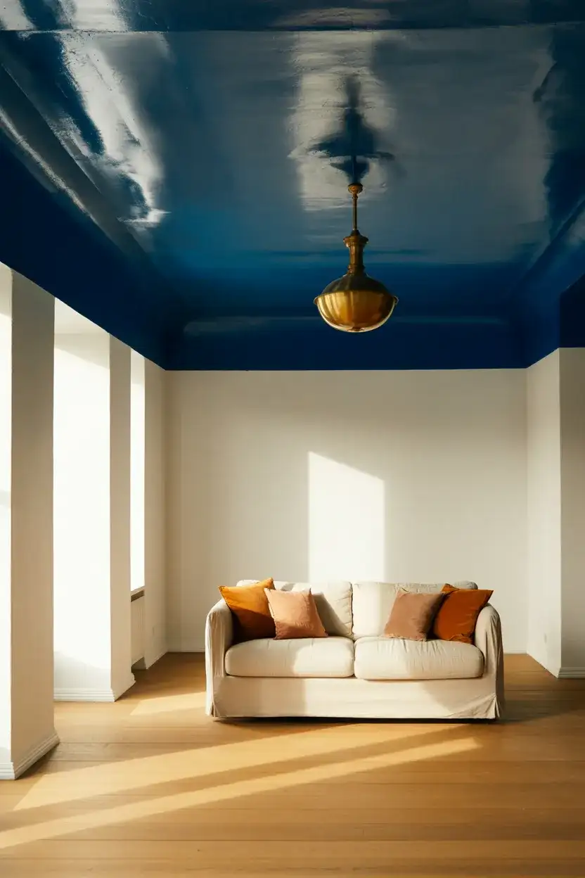
A midnight blue ceiling works exceptionally well in rooms with high or standard-height ceilings—in rooms with ceilings below nine feet, the effect can feel slightly claustrophobic, though it’s not impossible. For lower ceilings, choose a slightly lighter shade of blue and pair it with a very warm, creamy white on the walls to keep it feeling expansive. Real homeowners who’ve taken the plunge consistently report that it’s the first thing guests notice and almost always a compliment.
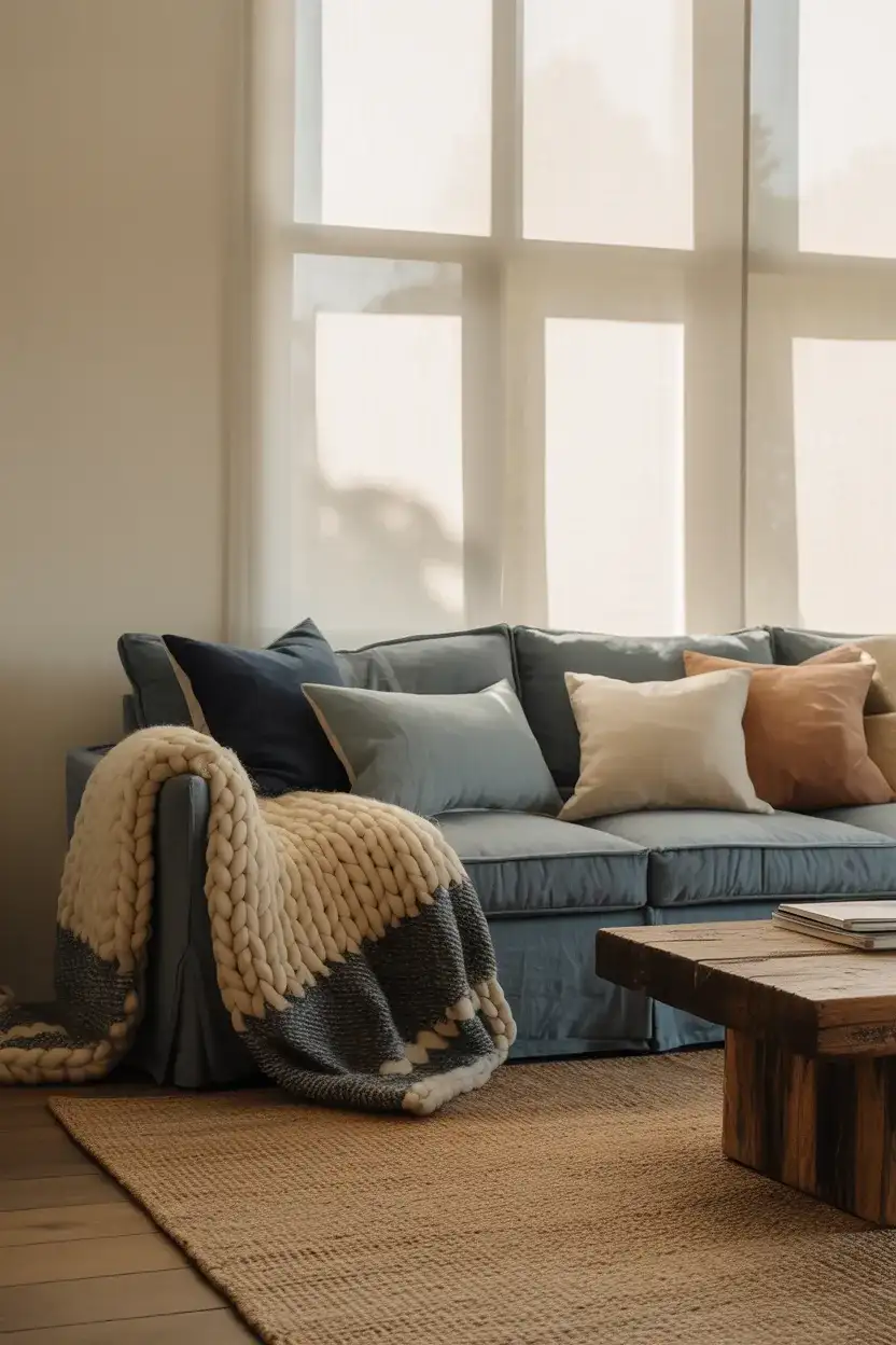
9. Dusty Blue and Beige Neutral Living Room
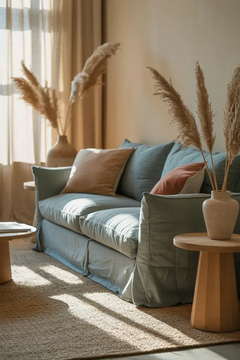
For anyone who loves blue but worries about it feeling too bold or dominating, the combination of dusty blue with beige and warm neutral tones is the answer. This palette is genuinely one of the most livable approaches to blue in a living room—the dusty quality of the blue softens it significantly, and when layered with warm beige linens, jute rugs, and honey-toned wood, it reads as almost a neutral itself. It’s sophisticated without being stark, and it photographs with a beautiful muted warmth.
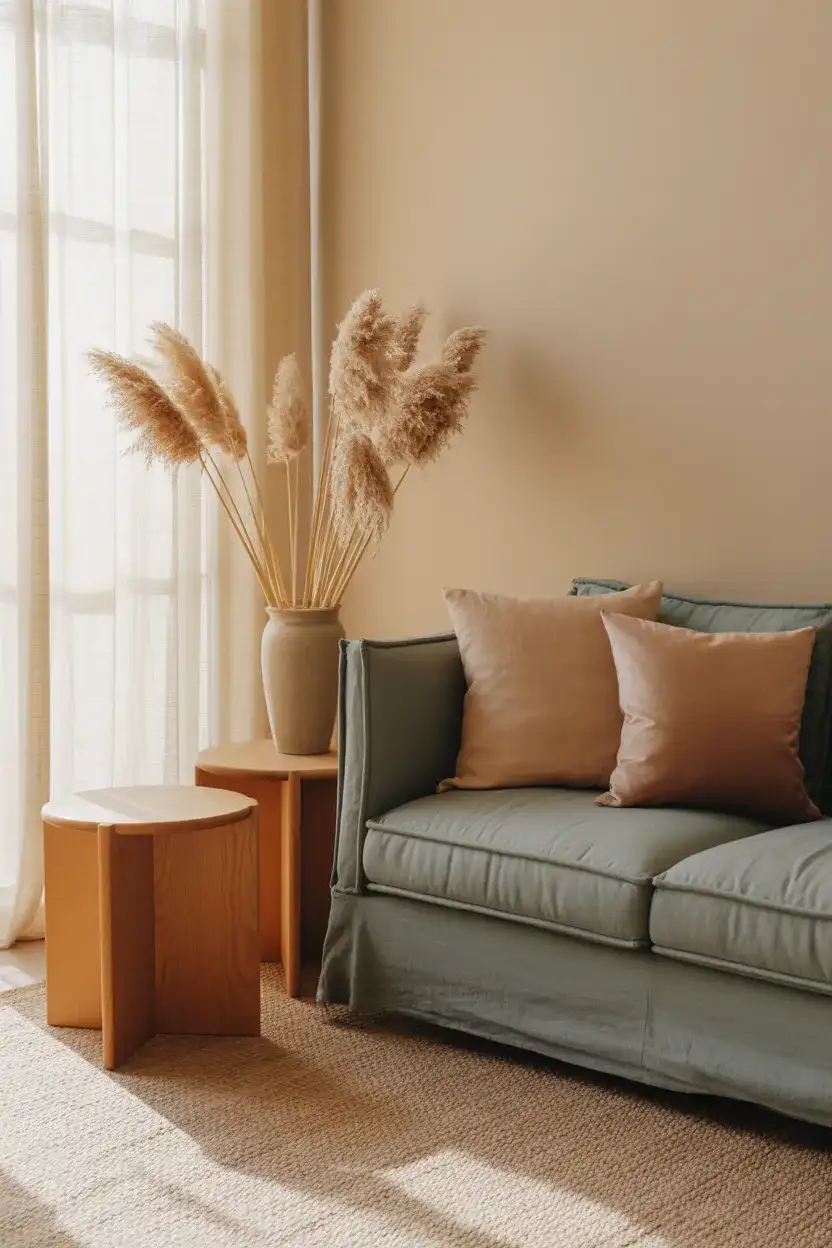
From a budget perspective, this is also one of the most accessible versions of a blue living room. Dusty blue is a common color for affordable furniture lines at stores like Article, Wayfair, and IKEA, making it easy to build this palette without a large investment. Start with a dusty blue accent chair or a pair of pillows, layer in your existing beige or warm neutral pieces, and see how the combination feels in your space before committing to larger purchases like a sofa or a rug.
10. Blue and Orange Bold Contrast Room
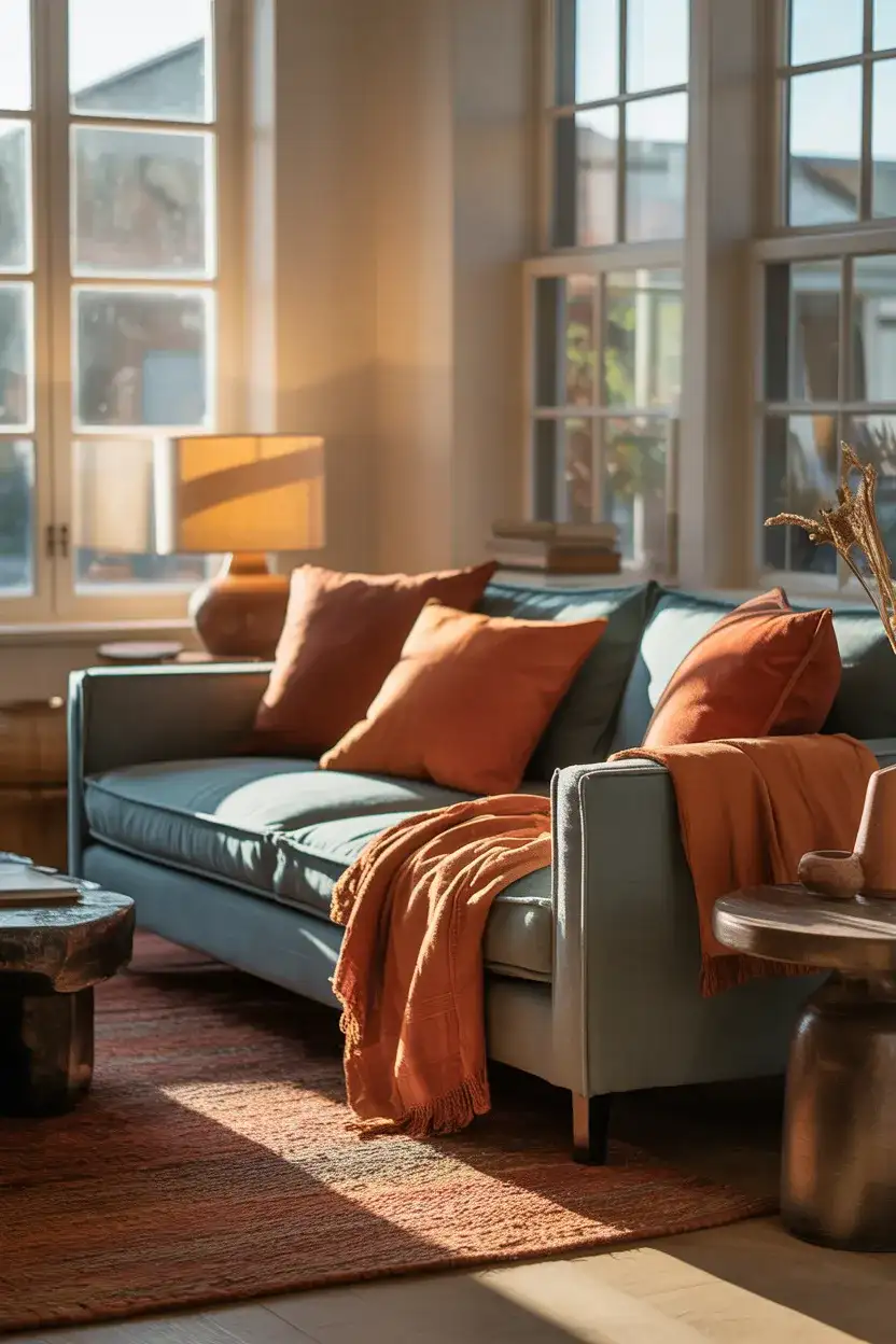
Blue and orange and its warmer earth-tone relatives—terracotta, rust, and burnt sienna—create one of the most visually exciting color pairings in interior design. They sit opposite each other on the color wheel, which means they have a natural tension that energizes a room without feeling chaotic. In a living room, this combination works beautifully when the blue is cooler and slightly muted (navy, slate, or denim blue) and the orange reads as earthy and warm rather than neon. Think a navy linen sofa with rust-toned accent cushions and a terracotta ceramic lamp.
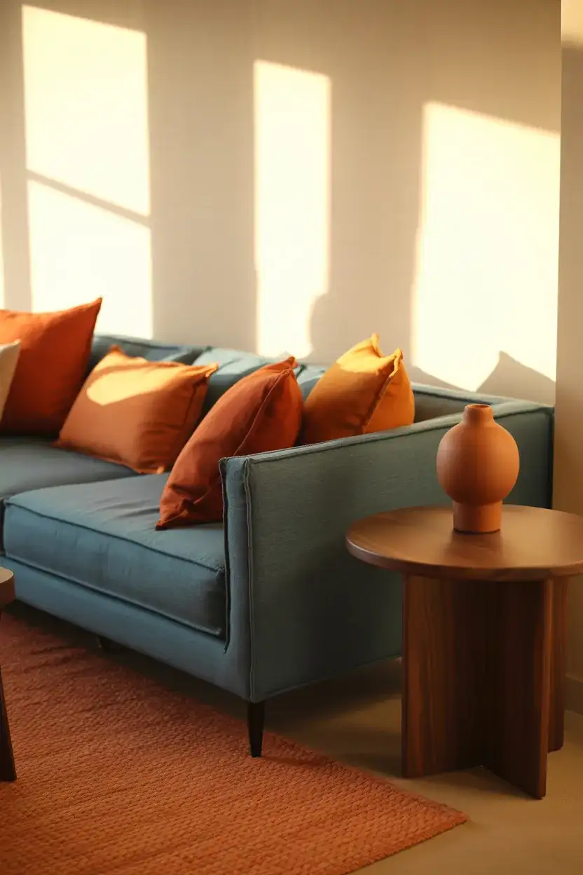
This pairing has a long tradition in Southwestern American design—think of the cobalt blue and terracotta that shows up in New Mexico and Arizona architecture and pottery. That regional reference gives the combination a sense of place and authenticity that purely trend-driven palettes sometimes lack. If you’re in the Southwest or inspired by that aesthetic, lean into the clay and adobe orange; in other parts of the country, a more muted rust or cinnamon tone will feel more universally integrated.
11. French Blue Living Room With Antique Touches
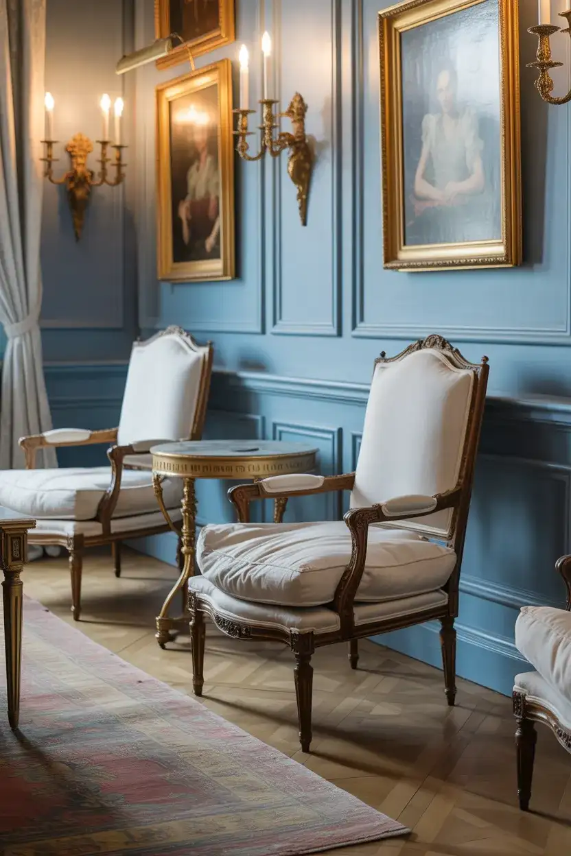
French blue—that particular shade of medium-depth blue with a slightly grayed, faded quality—has been a staple in European interiors for centuries, and it’s experiencing a well-deserved revival in American homes right now. It’s the color of vintage French toile, antique faïence pottery, and the faded shutters on Provençal farmhouses, and it carries all of that history with it into a living room setting. Paired with antique and vintage furniture, aged brass, and patinated wood, it creates a space that feels genuinely layered and collected rather than decorated.
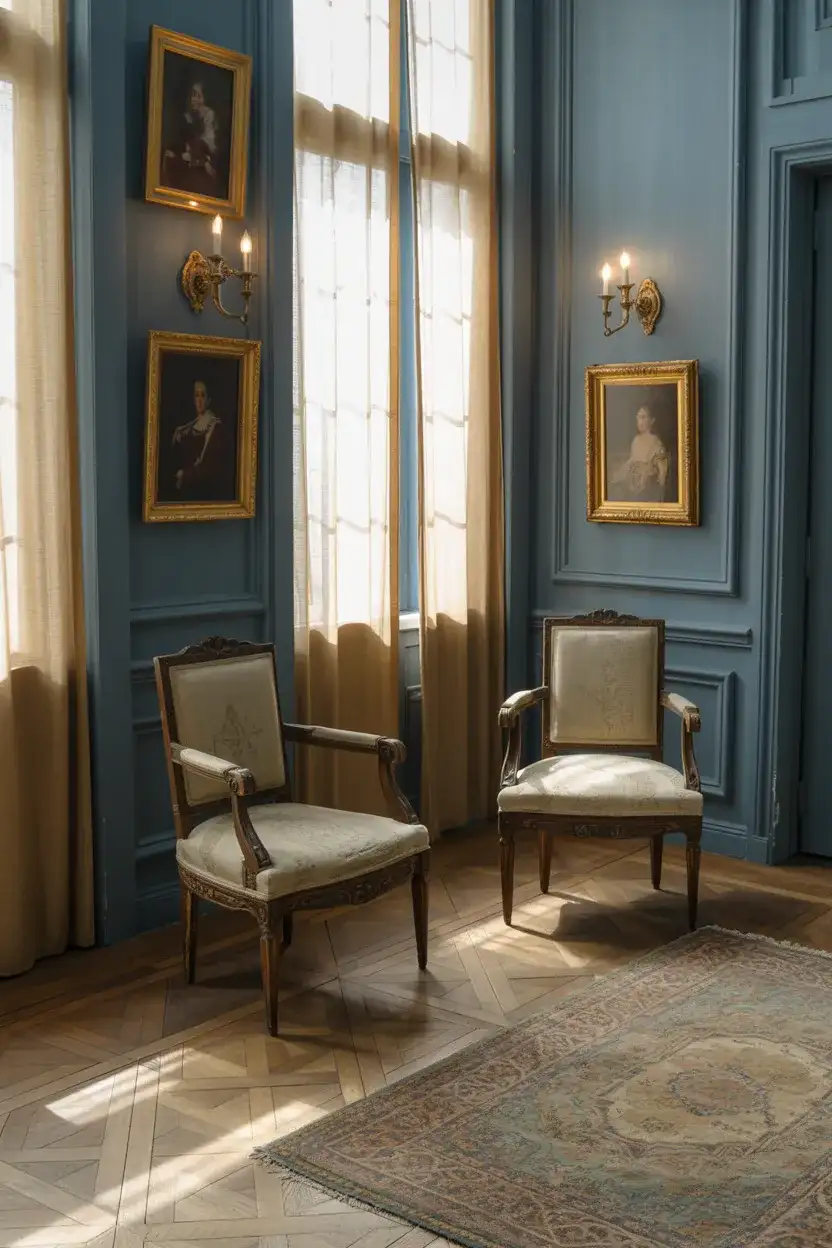
The beauty of French blue as a wall color is that it ages well—both literally (it tends to look better as it fades slightly over time) and figuratively (it doesn’t feel like a trend that you’ll regret in five years). For homeowners who want to lean into the antique angle without spending a fortune on actual antiques, vintage markets and estate sales in most American cities are still excellent sources of the kind of aged brass, worn wood, and slightly threadbare upholstery that completes this look perfectly.
12. Sky Blue and White Airy Living Room
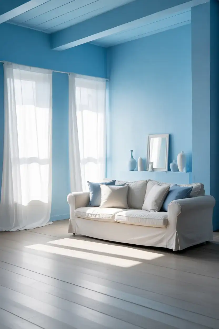
A sky blue and white living room is the interior equivalent of a clear day—it’s open, optimistic, and genuinely mood-lifting. This combination works especially well in spaces that get plenty of natural light, where the blue stays light and ethereal rather than cold. The white acts as a clean canvas that lets the blue breathe, and the overall effect is one of spaciousness even in smaller rooms. This is a particularly popular approach in coastal states—think Connecticut, the Carolinas, and California—but it translates just as well anywhere with decent light.
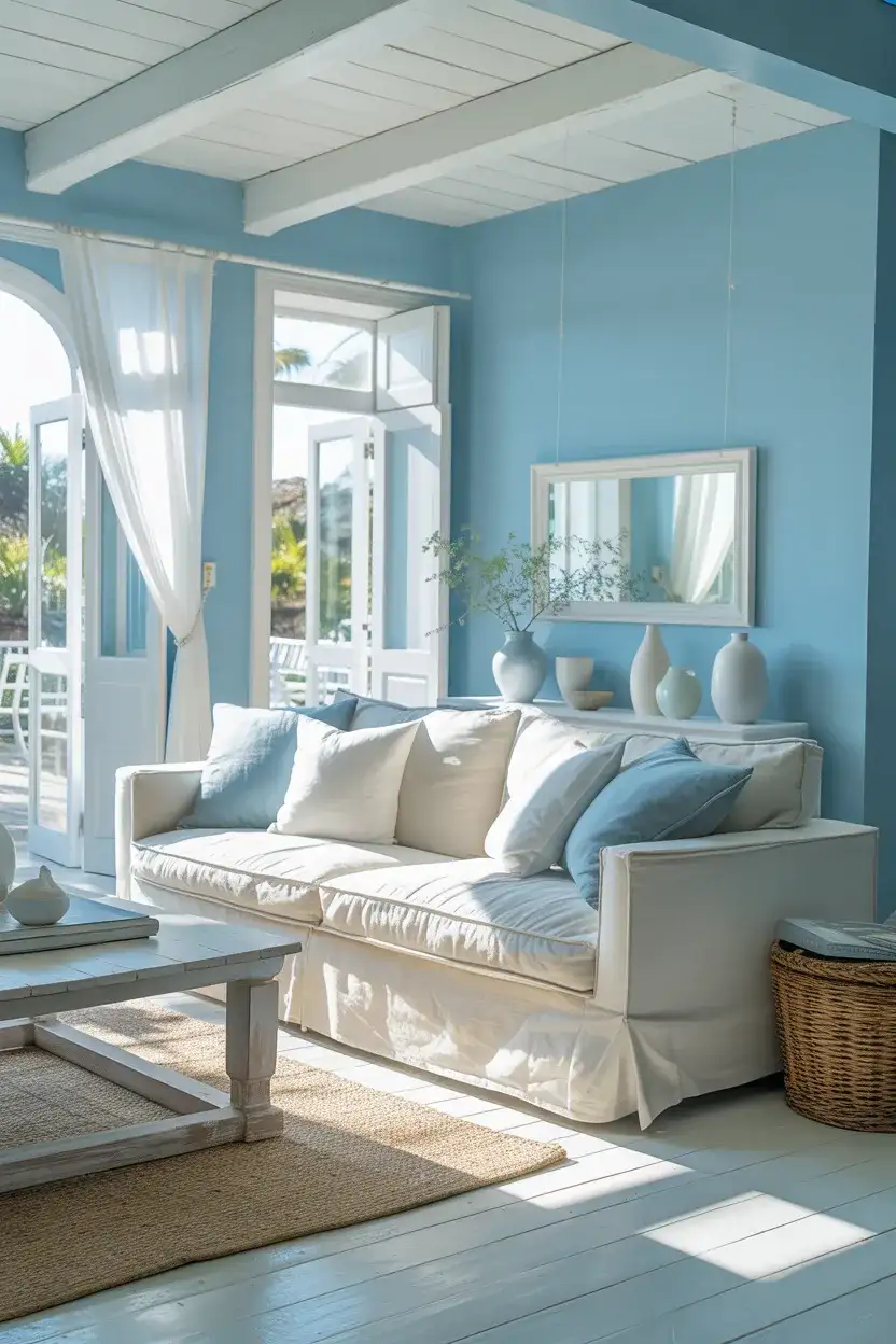
One thing worth knowing about sky blue walls: they are highly sensitive to light direction and time of day. In the morning, they can look almost lavender; at midday, they can read as very pure and clean; in the evening under artificial light, they may shift toward gray. Before committing to a full room, paint large swatches and observe them at different times of day and under your actual artificial lighting. What looks perfect in the paint store can look completely different once it’s on your walls at 9pm.
13. Duck Egg Blue With Natural Materials
There’s something almost universally beloved about duck egg blue—it’s that soft, slightly gray-green blue that reads differently in every light and somehow manages to feel both fresh and nostalgic at the same time. It pairs extraordinarily well with natural materials: raw linen, unfinished wood, stone, rattan, and aged cotton. In a living room, it creates an atmosphere that feels grown-up and gentle simultaneously. It’s the kind of color that appeals to both the minimalist and the maximalist, depending on how you style it around.
Duck egg blue has a long history in British country house interiors, but it’s crossed the Atlantic beautifully and now appears regularly in American farmhouse, cottage, and eclectic home styles. It’s particularly effective in older homes with imperfect plaster walls—the slight texture actually enhances the way the color shifts across the surface. If you want a lived-in, timeworn look, this is your color. Don’t overthink the accessories; the more relaxed and slightly mismatched, the better this palette tends to look.
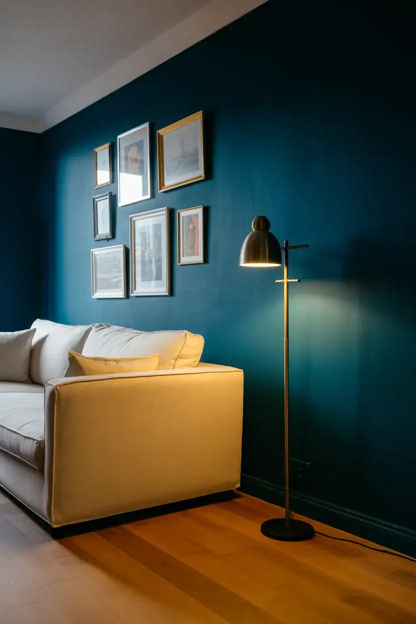
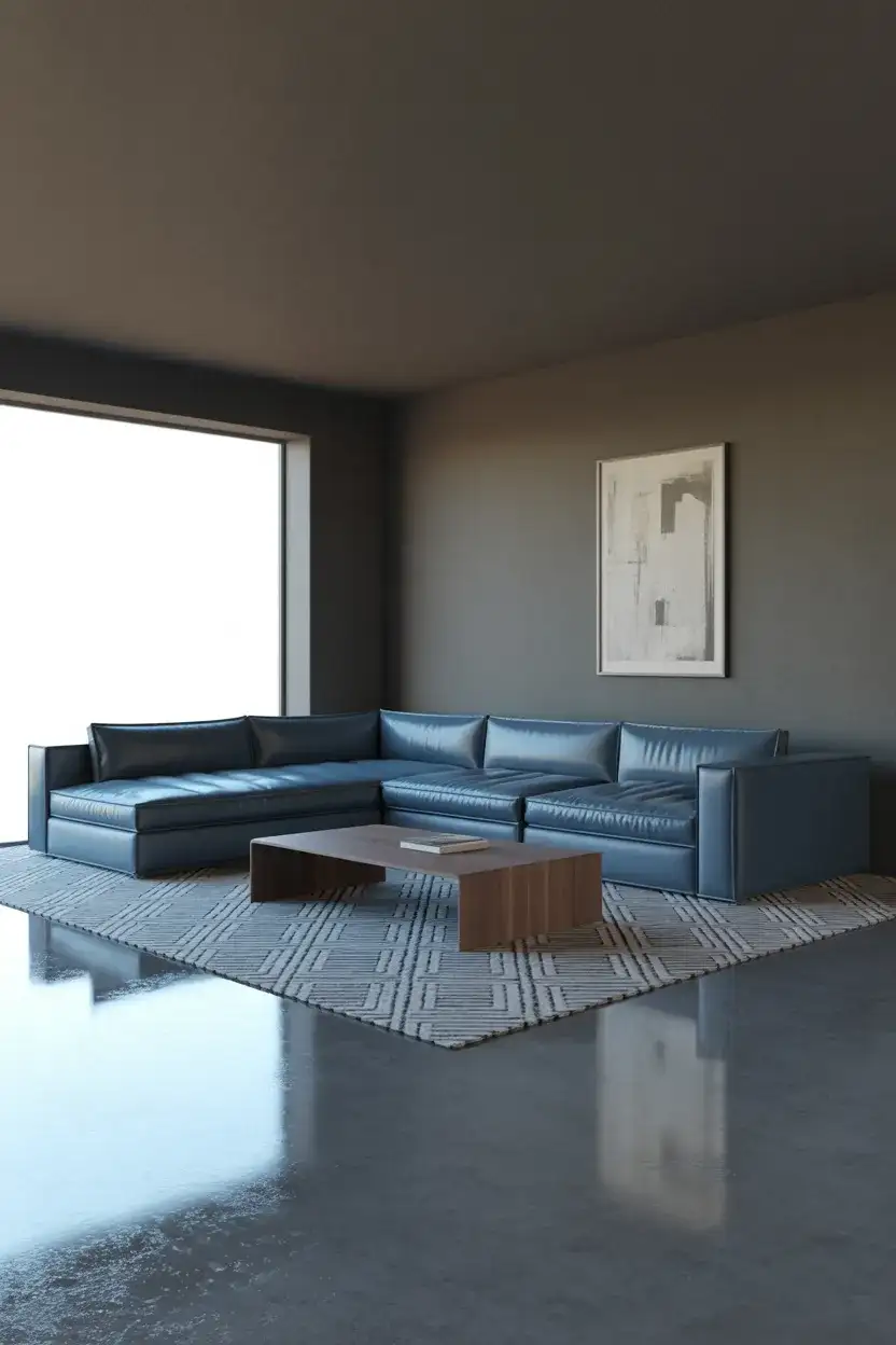
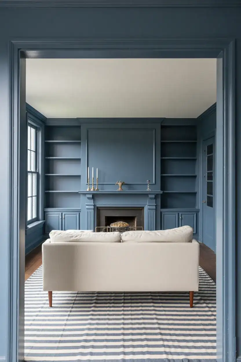
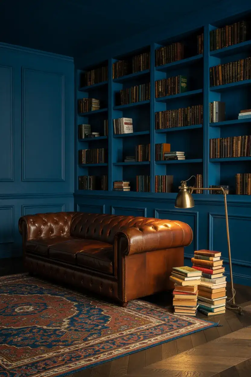
14. Navy Blue Walls Full Room Immersion
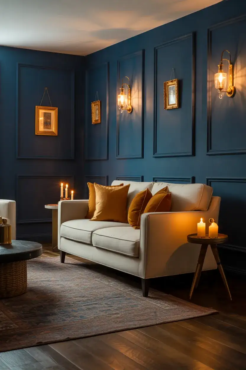
Going all in on navy walls—not just an accent wall, but all four walls—is one of the boldest moves you can make in a living room, and when it works, it is absolutely extraordinary. The trick is embracing the darkness rather than fighting it. This isn’t a room that needs to feel light and bright; it’s a room meant to feel like a jewel box, a library, a sanctuary from the outside world. Think of it like the interior equivalent of sitting inside a deep blue velvet evening sky. Decor in warm metals, rich wood, and soft amber textiles makes the navy walls glow.
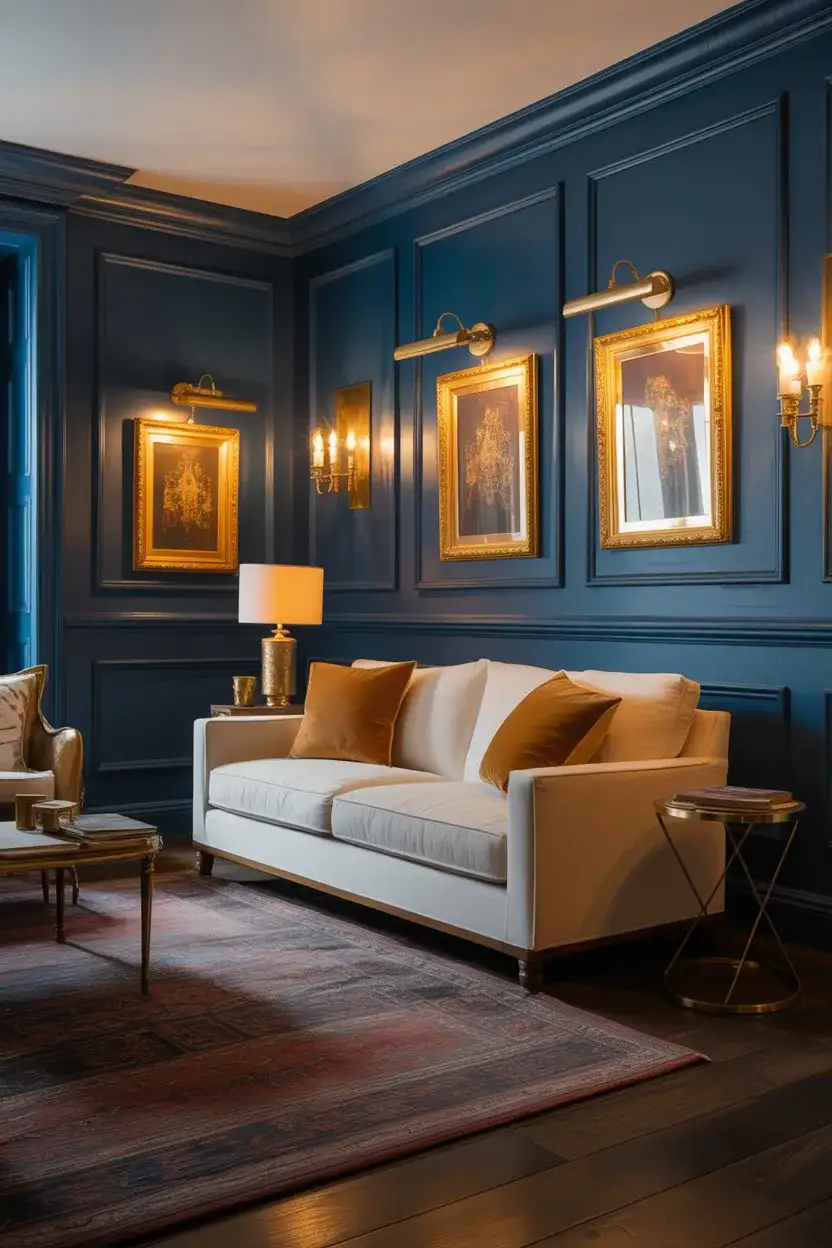
Lighting is absolutely critical in an all-navy room—perhaps more critical than in any other living room scenario. You need multiple light sources at different heights, and they should all emit warm, not cool, light. A single overhead fixture in a dark room creates flat, gloomy shadows; layered lamps and sconces create the warm drama you’re after. This look genuinely works best in the evening, which is why it’s so beloved for homes where the living room is primarily a nighttime space—a dinner party room or a drinks-and-entertaining space.
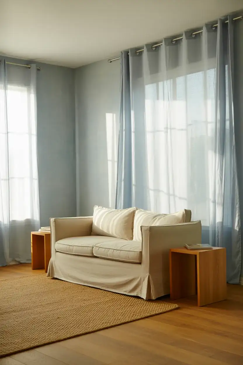
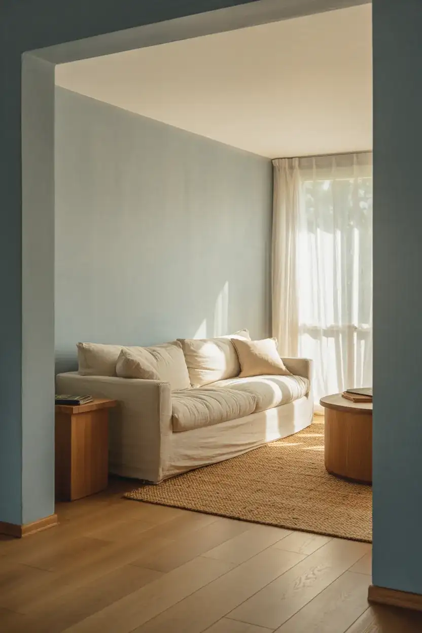
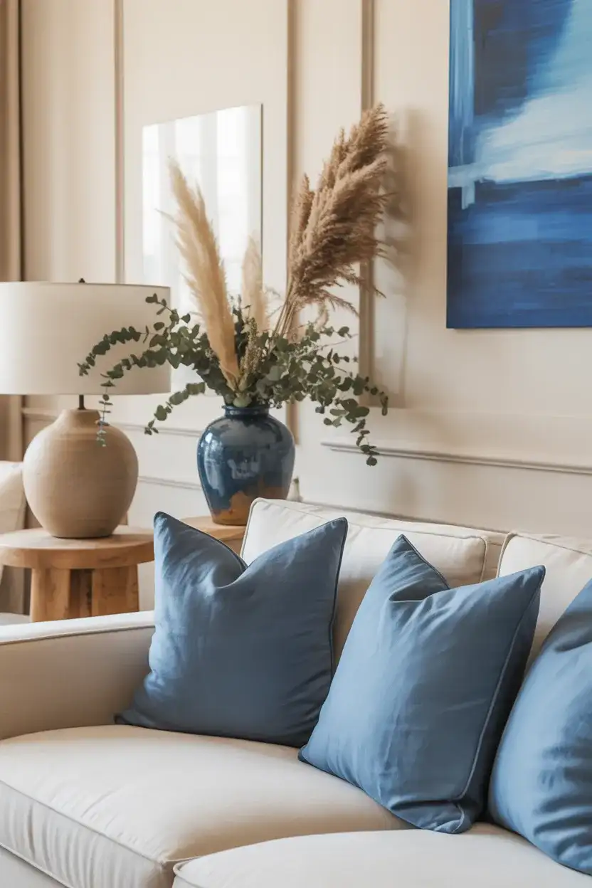
15. Neutral Blue With Layered Textiles
A neutral and blue palette—where the blue acts almost as a sophisticated neutral rather than a statement color—is one of the most wearable and long-lasting approaches to a blue living room. This works best with shades that have significant gray or greige undertones: think a slate-blue, a blue-linen, or a dusty chambray tone for the main sofa or wall color. Layer ideas in through textiles—throws, cushions, and rugs—and let the various blues and neutrals play off each other at different scales and textures throughout the room.
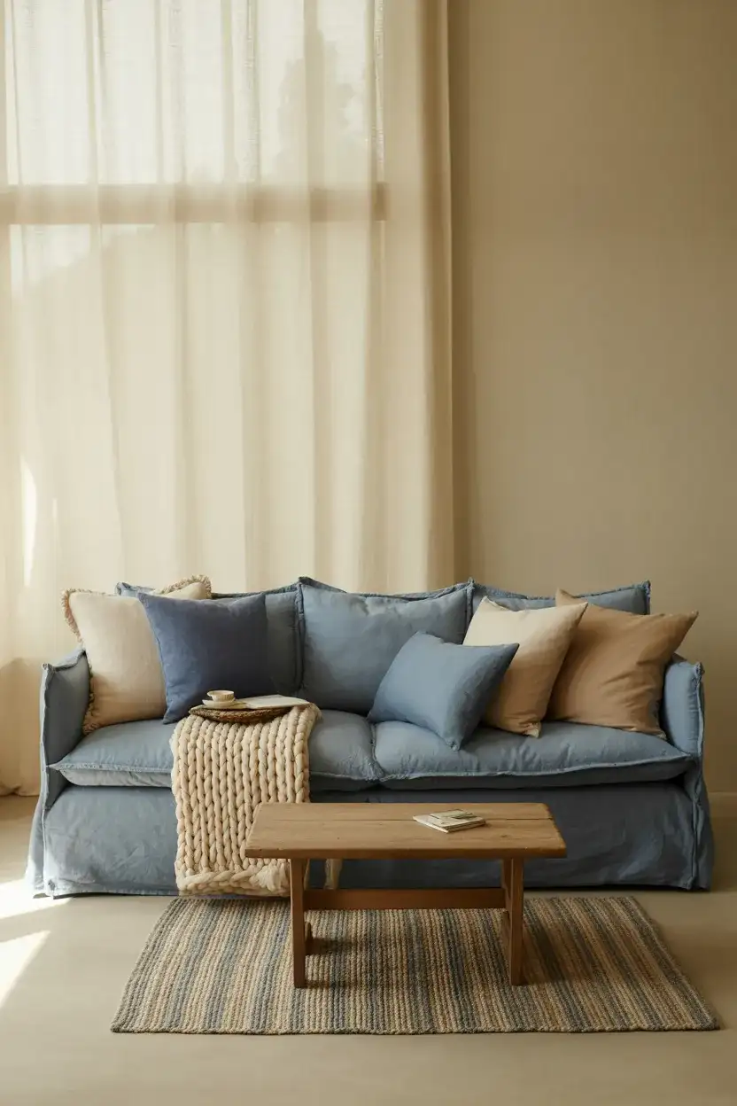
The layered textile approach is also one of the most practical for renters or homeowners who aren’t ready to commit to a blue wall or sofa. A neutral room can be transformed into a blue-focused space through cushions, throws, a blue rug, and blue ceramic accessories—all of which can be changed out relatively easily if your taste evolves. This is how many Americans approach big color decisions: incrementally, through soft furnishings first, to test the waters before the bigger commitment.
16. Pink and Blue Romantic Living Room
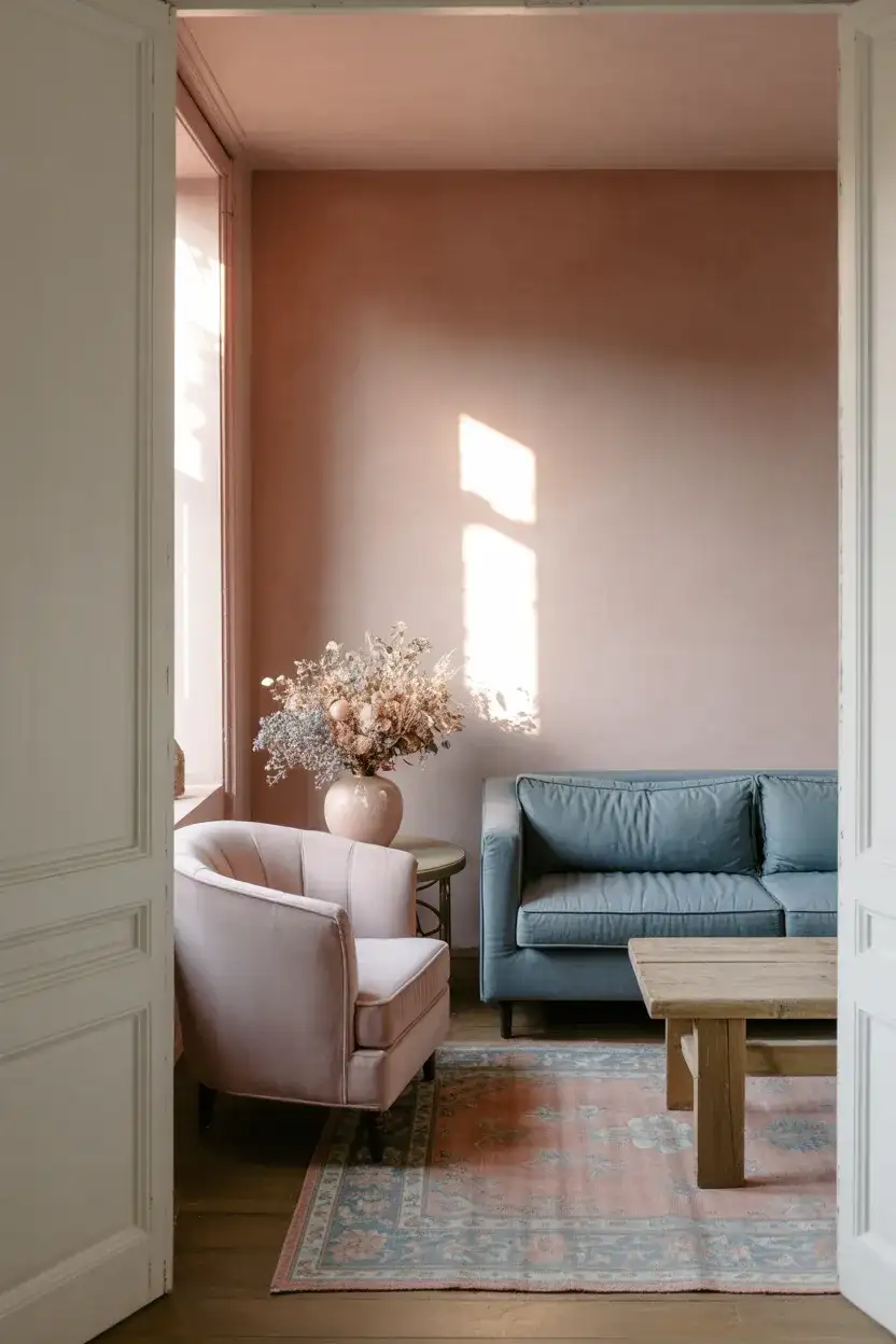
The combination of pink and blue is having a serious moment in interiors right now—not the primary red-and-blue of nautical design, but the softer, more complex pairing of dusty rose, faded blush, or warm mauve with muted or slate blue. Together, they create a palette that feels genuinely romantic and painterly, like something out of a Vuillard interior or a faded French boudoir. In a living room, this works best when both colors are pulled toward the muted, chalky end of their respective spectrums so that neither one dominates aggressively.
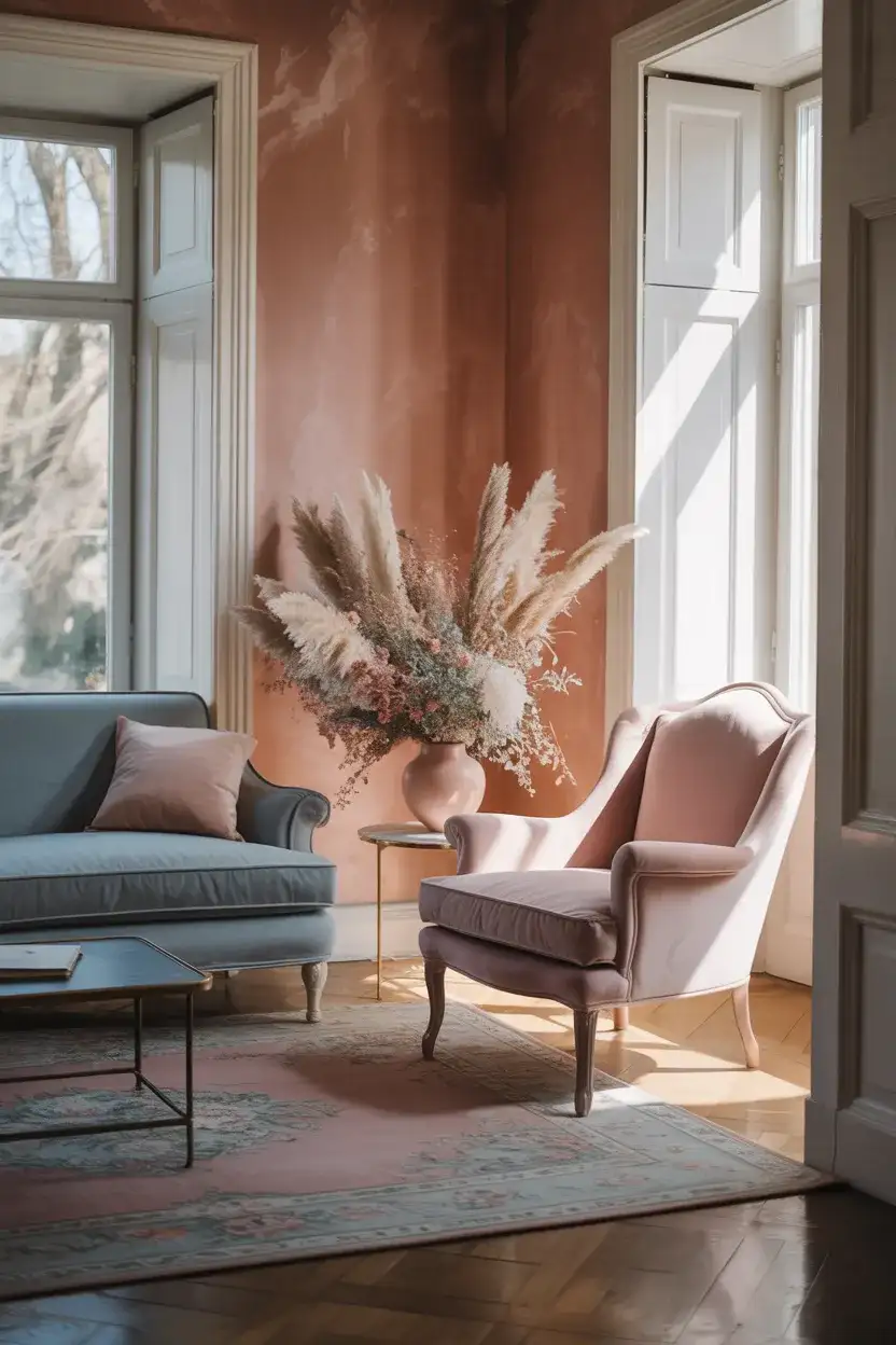
This is a combination that genuinely benefits from starting with what you love and building the other color in gradually. If you’re more of a pink person who wants to try blue, add one blue textile element at a time. If you’re a committed blue person, a single dusty rose pillow or small blush ceramic can be enough to introduce the warmth of pink without upending your whole palette. The goal is a conversation between the two colors, not a competition.
17. Gray and Blue Classic Americana Living Room
There is something quietly patriotic and deeply American about a gray and blue living room done in a classic mode—think colonial blue with warm gray, navy stripes on a linen sofa, or a slate-blue built-in bookcase flanked by warm gray paneled walls. This aesthetic nods to New England and Federal-period architecture without being costumey or overly stiff. Updated with contemporary furniture proportions and relaxed textiles, it manages to feel both classic and current—the design equivalent of a well-maintained historic home that someone actually lives in.
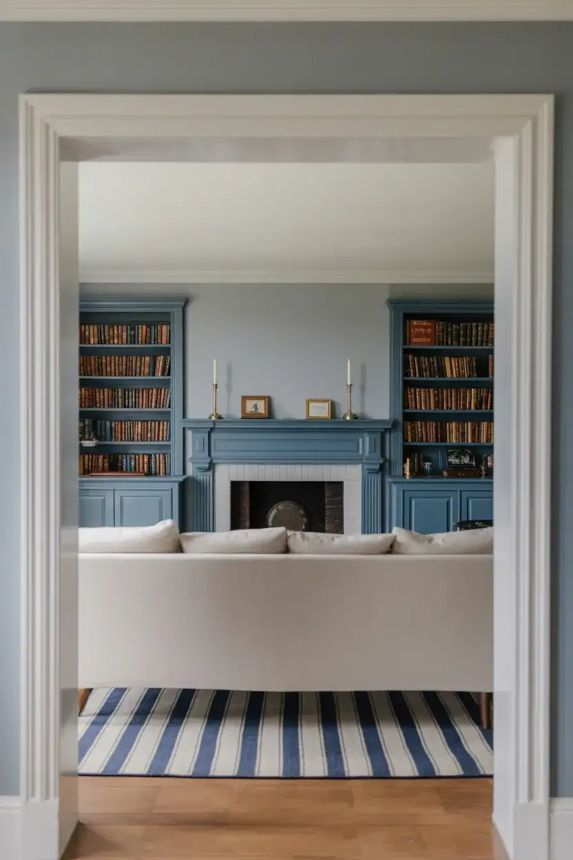
This approach is particularly well-suited to homes in the Northeast—older Colonials, Federals, and Greek Revivals where the architecture already has that kind of bone structure. But it doesn’t have to be confined to period homes; the combination of warm gray and colonial blue translates into a ranch house, a Craftsman, or even a new build when the furniture and trim details carry the classic references. The style has real staying power because it’s rooted in American history rather than a passing trend.
18. Deep Blue Velvet Maximalist Decor
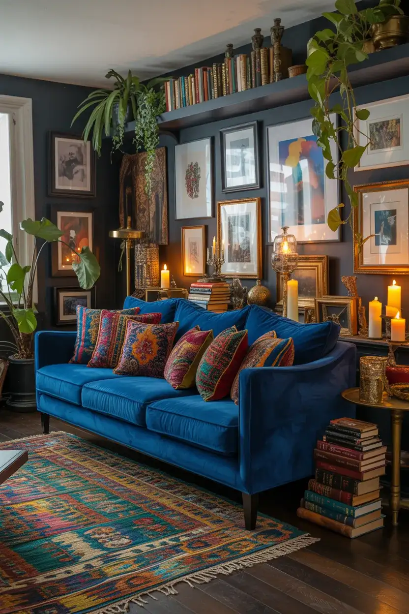
For the maximalist at heart, a deep blue velvet living room is an absolute dream. This is not a look for the minimally inclined—it’s rich, layered, gloriously excessive, and utterly committed. Think of a deep sapphire or indigo velvet sofa surrounded by eclectic decor: patterned kilim rugs, mismatched vintage cushions, gallery walls packed with art, plants spilling from every surface, and an abundance of candles and books. The blue velvet acts as a unifying anchor for all of this visual activity, providing a rich, consistent backdrop that lets everything else pop.
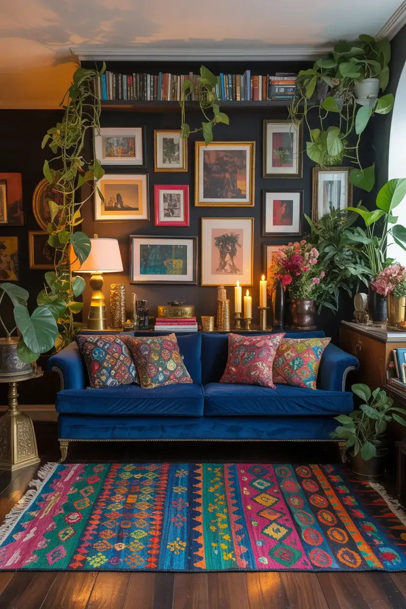
The maximalist blue velvet look can veer into fussiness if you’re not careful—the key is to ensure that the collection feels genuinely personal rather than staged. Every object in the room should have a reason for being there, whether it’s aesthetic or sentimental. The common mistake is buying things specifically to fill space; the better approach is to display things you already love and let the blue velvet create the visual coherence that ties them together. Trust the anchor color to do that work.
19. Cozy Blue Living Room With Fireplace
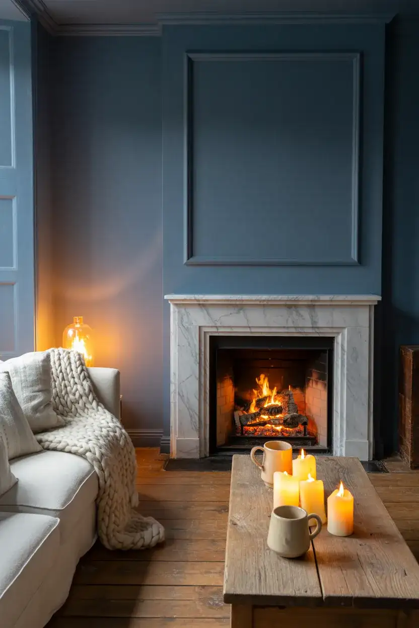
A cozy blue living room with a fireplace as its centerpiece is one of the most universally appealing living room visions there is—and it’s currently one of the most saved images on Pinterest for a reason. There’s something almost primally comforting about the combination of warm firelight and cool blue walls; the contrast makes the warmth feel even warmer. Whether the blue is a deep navy, a soft slate, or a muted duck egg, the fireplace creates a natural focal point that the rest of the ideas in the room can organize around.
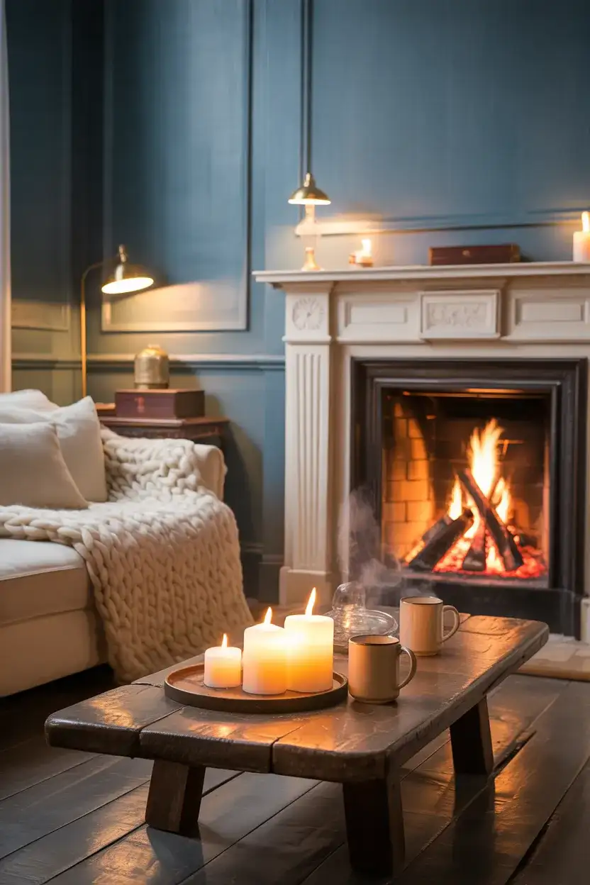
For American homes in colder climates—the upper Midwest, New England, and the Mountain West—this combination is particularly meaningful because it’s genuinely functional as well as beautiful. A fireplace in a blue room isn’t just an aesthetic choice; it’s a response to real winters, real cold, and the very human need for a warm gathering place. That contextual authenticity is part of why these rooms photograph so powerfully on Pinterest—they’re aspirational but also entirely believable.
20. Blue and Beige French Country Style
The French country approach to blue living rooms takes all of the formality out of the palette and replaces it with something sun-bleached, casual, and deeply welcoming. Think beige and warm honey tones alongside a washed-out cornflower or Provençal blue—the colors of old farmhouse shutters, lavender fields, and scrubbed flagstone floors. In a living room context, this translates to a linen sofa in warm natural tones, blue and white ceramic accessories, a well-worn wooden table, and cotton slipcovers that look like they’ve been laundered a hundred times.
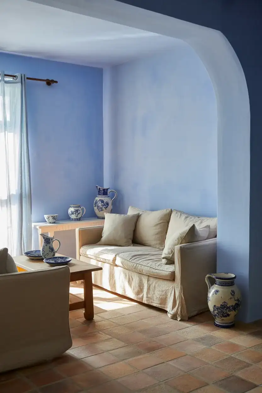
This style resonates particularly strongly with homeowners in rural or semi-rural American settings—farmhouses, converted barns, lake houses, and country retreats where the architecture has a relaxed, slightly imperfect quality that the French country palette suits naturally. The key to getting it right is accepting imperfection: don’t iron the slipcovers too precisely, don’t match the ceramics too carefully, and don’t over-style the shelves. The lived-in quality is the point, and the beauty is in the casualness.
21. Moody Midnight Blue Home Library Lounge
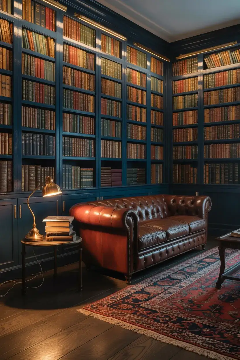
If your living room doubles as a reading room, a home office corner, or a place for late-night conversations over good drinks, a moody midnight blue home library lounge concept might be exactly what you need. This involves treating the living room more like a private club than a family gathering space—dark, saturated blue-black walls, built-in bookshelves painted the same deep tone, warm leather seating, and lighting that is entirely lamp and candle-based. It’s deliberately nocturnal and unapologetically atmospheric, and it’s one of the most searched living room archetypes right now.
An expert tip worth knowing: when painting bookshelves the same color as the walls (a technique called color drenching), the bookshelves themselves become part of the architecture rather than furniture. The books and objects on the shelves then appear to float against the blue, which is an extraordinary visual effect. This approach is budget-conscious too—you’re using paint rather than buying new shelving—and it’s one of the highest-impact, lowest-cost transformations available in interior design today.
22. Blue Accent Decor in a Neutral Living Room
Not everyone is ready to commit to blue walls or a blue sofa—and that’s completely fine, because a neutral living room with carefully chosen blue decor accents is one of the most quietly effective ways to work with the color in 2026. A white or warm greige room with a single oversized blue ceramic lamp, a pair of blue linen cushions, a blue abstract painting, and a blue-glazed planter can read as a very intentional blue living room without a single wall or large piece of furniture changing. The blue becomes a theme that threads through the space at the level of accessories and art.
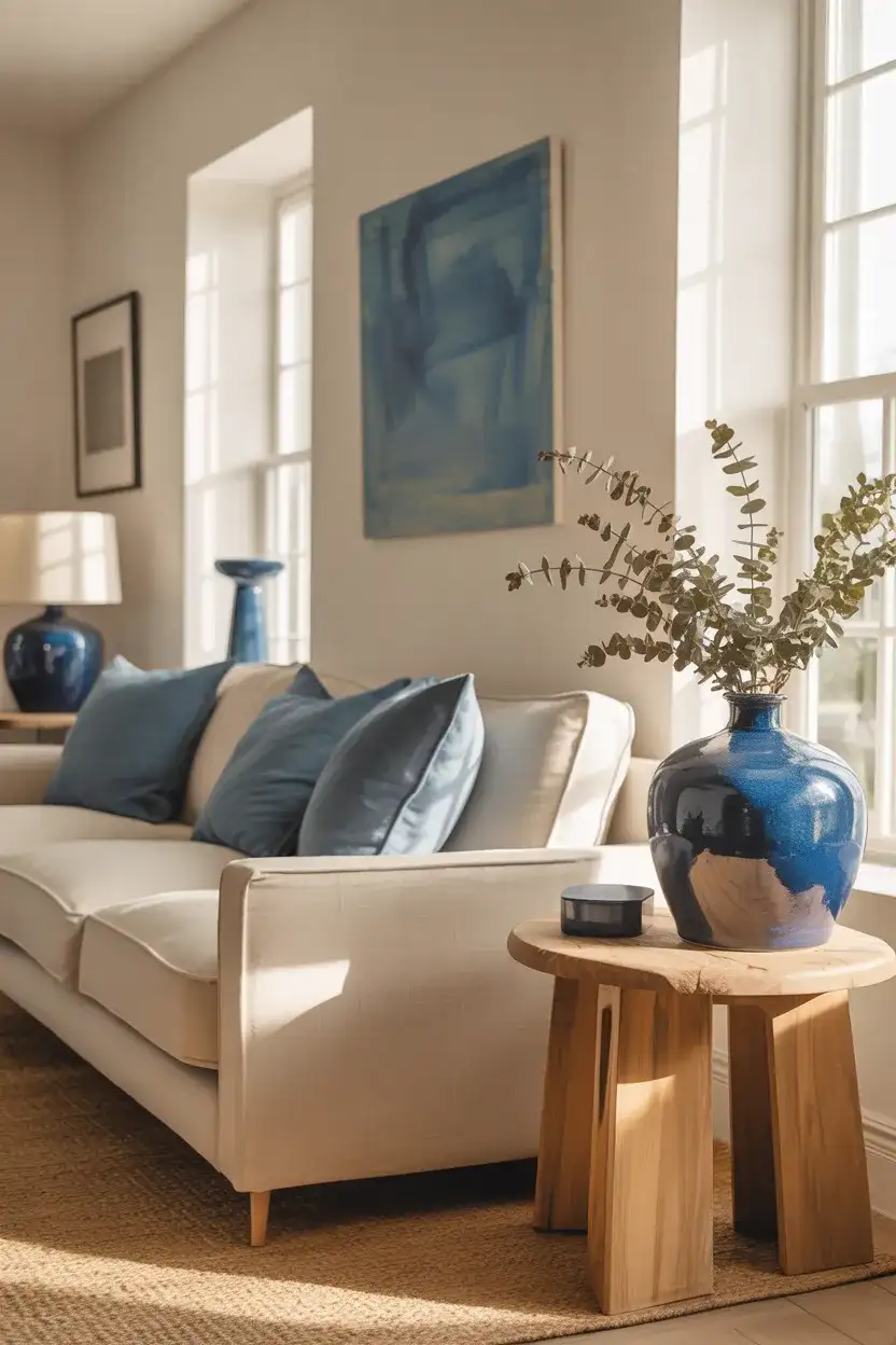
This approach is also the smartest way to try out a blue theme before a bigger commitment. If you buy three blue accessories and find yourself constantly removing them or covering them with throws because they feel off, you’ve learned something valuable and cheaply. If you find yourself adding more blue every month because you can’t get enough, you’ve found your color direction. Real homeowner behavior around color tends to be iterative and exploratory—and there’s no smarter way to design than that.
Conclusion
Blue living rooms in 2026 offer something genuinely rare in the design world: a single color family with enough range and depth to work for every personality, every home style, and every budget. Whether you’re drawn to the drama of navy and midnight, the serenity of sky and duck egg, or the quiet sophistication of dusty blue with neutrals, there’s a version of this palette that’s exactly right for your space. We’d love to know which of these ideas resonated most with you—drop a comment below and tell us which blue you’re dreaming of bringing home.