Blue and white living rooms are having a major moment in 2026, and it’s easy to see why American homeowners keep coming back to this timeless combination. Whether you’re scrolling through Pinterest late at night or flipping through design magazines, the pairing feels fresh yet familiar—calm yet full of personality. From coastal-inspired retreats to modern farmhouse sanctuaries, this color duo adapts beautifully to nearly every style. In this article, you’ll discover inspiring ways to bring blue and white into your living room, each with practical tips, style insights, and ideas that work for real homes across the country.
1. Farmhouse Blues with Shiplap Charm
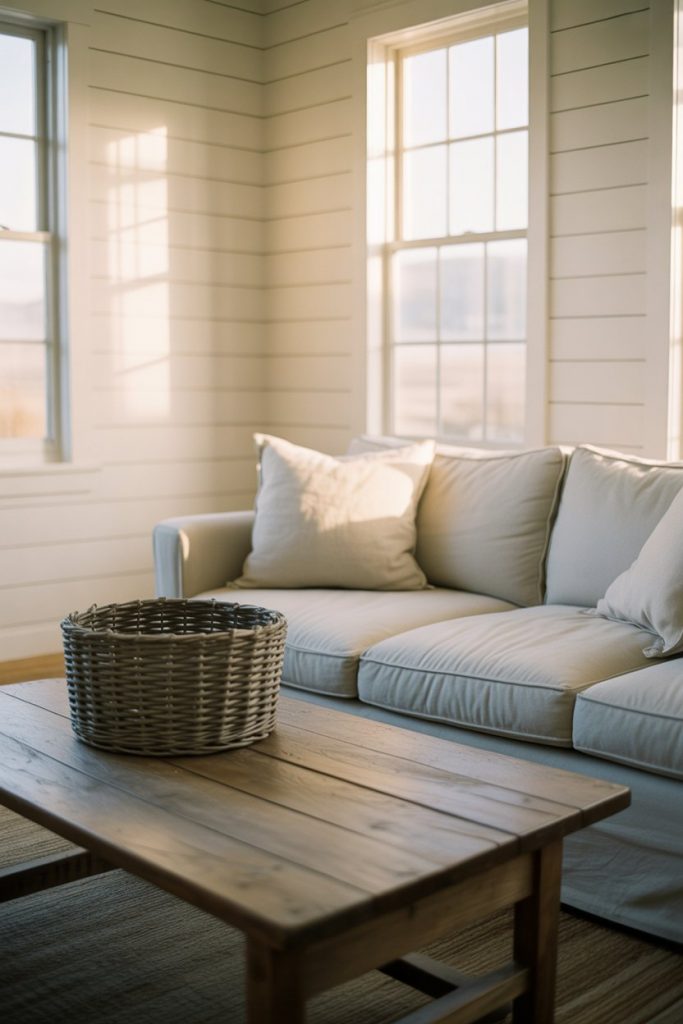
There’s something undeniably cozy about a farmhouse living room where soft blue tones meet crisp white shiplap walls. This look thrives on texture—think linen slipcovers, weathered wood coffee tables, and vintage-inspired accents that feel collected over time. The beauty of this style is how it balances rusticity with elegance, making your space feel lived-in but never cluttered. Pair pale sky blues with warm whites to keep the room feeling airy and inviting, especially in homes with abundant natural light. 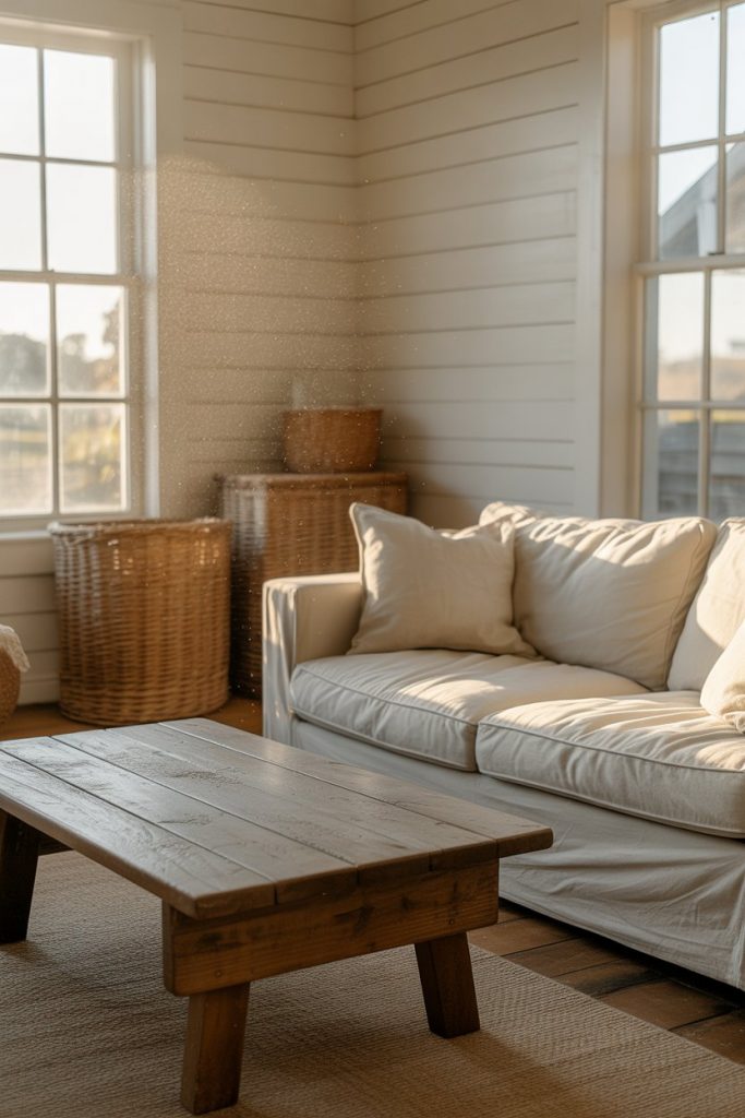
Budget-conscious decorators will appreciate that shiplap can be DIY’d with basic carpentry skills and pre-primed boards from hardware stores, often costing under $3 per square foot. Layer in flea market finds—a distressed blue cabinet, vintage quilts, or ironstone pitchers—to add character without breaking the bank. The farmhouse aesthetic welcomes imperfection, so don’t stress over matching every piece perfectly. Instead, let the mix of blues and whites create a relaxed, authentic vibe that feels uniquely yours.
2. Traditional Elegance in Navy and Ivory
For those who gravitate toward traditional interiors, a navy and ivory palette delivers timeless sophistication without feeling stuffy. Deep navy accent walls or richly upholstered sofas anchor the room, while crisp white trim, crown molding, and ceiling details add architectural interest. This combination works beautifully in formal living rooms or homes with classic proportions, where symmetry and balance are key design principles. 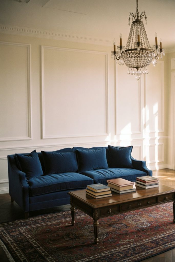
A common mistake here is going too dark—navy can overwhelm smaller rooms if not balanced properly. Instead, use it strategically on one focal wall or in upholstery, then layer in plenty of white through furniture, lampshades, and window treatments. Brass or gold hardware adds warmth and prevents the space from feeling too cool. In the Northeast and Midwest, where traditional architecture is common, this look feels especially at home in Colonial- or Victorian-era houses.
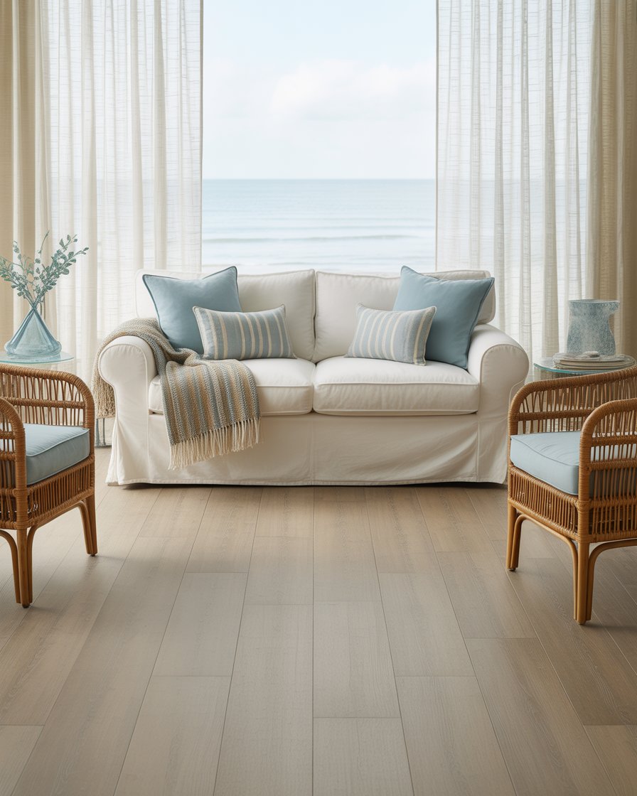
3. Coastal Breezes and Beachy Textures
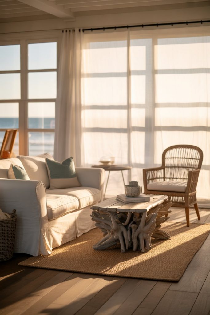
Nothing says relaxed living quite like a coastal blue and white scheme, where the colors of sea and sand come together in perfect harmony. This style thrives on natural materials—jute rugs, rattan furniture, driftwood accents, and linen fabrics that breathe. The palette leans lighter here, with soft aquas, powder blues, and crisp whites that mimic ocean foam and sun-bleached shells. It’s a look that instantly transports you to a seaside retreat, no matter where you actually live. 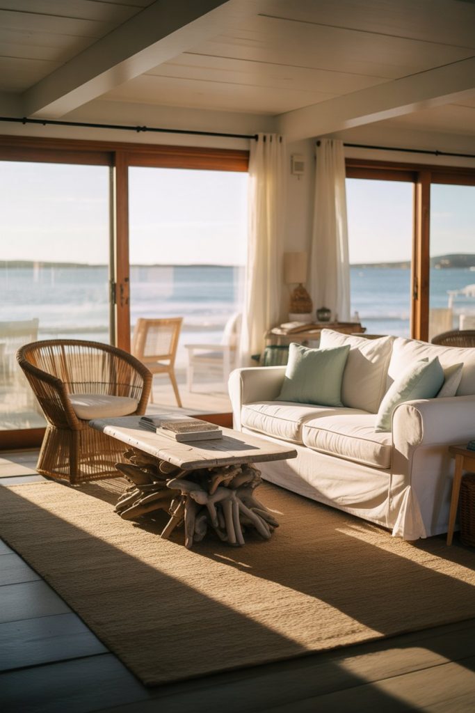
Coastal style works best in homes with good natural light and open floor plans, particularly in Southern California, Florida, and the Carolinas. But even in landlocked states, you can achieve this airy feel by maximizing window light and avoiding heavy drapes. A practical insight: skip the nautical clichés like anchors and seashells, which can veer into theme park territory. Instead, let the color palette and natural textures do the storytelling. Real homeowners often add one statement piece—a piece of coral, a vintage oar, or a large mirror—to anchor the coastal vibe without overdoing it.
4. Modern Minimalism in Crisp Contrast
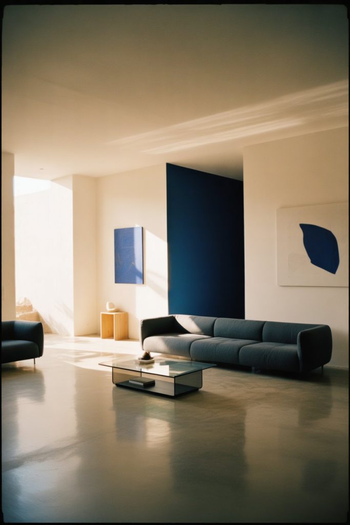
For a modern take on blue and white, think clean lines, bold geometry, and a restrained color palette that lets each element shine. Deep navy or cobalt accents pop against stark white walls, while sleek furniture in neutral tones keeps the focus on form and function. This style is all about intentionality—every piece has a purpose, and clutter is kept to an absolute minimum. It’s a refreshing approach for those who crave calm and order in their living spaces.
Where it works best: urban apartments, lofts, and new-build homes with open layouts and plenty of natural light. The key to pulling off modern minimalism is investing in a few high-quality pieces rather than filling the room with mediocre furniture. A well-designed sofa, a striking piece of art, or a sculptural floor lamp can define the entire space. Americans living in cities like Seattle, Austin, and Brooklyn have embraced this aesthetic as a way to maximize small square footage while maintaining a sense of breathing room.
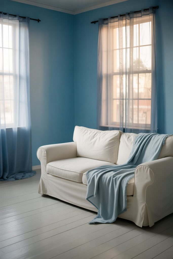
5. Light Blues for Airy Serenity
When you want a living room that feels like a breath of fresh air, turn to light blue hues paired with soft white accents. Powder blues, baby blues, and the palest sky tones create an ethereal backdrop that’s calming without being cold. This palette works especially well in smaller living rooms or spaces with limited natural light, as it opens up the room and makes it feel larger. Layer in white furniture, pale wood tones, and plenty of soft textiles to complete the serene look. 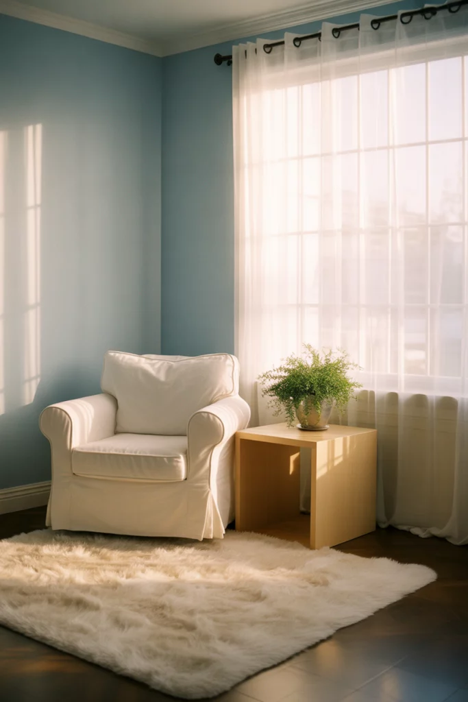
A micro anecdote from a homeowner in Portland: she painted her north-facing living room in the palest robin’s egg blue and was amazed at how much brighter it felt compared to the beige it replaced. Light blues reflect available light beautifully, making even dim rooms feel fresh. Pair with white trim and ceilings to enhance the airy effect, and avoid heavy furniture that can weigh down the space. This is a foolproof choice for anyone nervous about committing to color—it’s bold enough to make a statement but soft enough to live with long-term.
6. Grey and Blue Sophistication
Blending grey into your blue and white living room introduces a layer of sophistication and contemporary edge. Soft grey sofas or accent chairs paired with powder blue walls create a modern, grown-up palette that feels polished without being overly formal. This trio works beautifully in open-concept homes where the living room flows into the kitchen or dining area, as the neutral grey acts as a bridge between spaces. Add white trim and metallic accents to keep things crisp and cohesive. 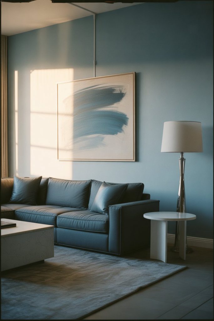
Expert-style commentary: designers often recommend this palette for clients who want something contemporary but not stark. The grey softens the crispness of blue and white, making the space feel more lived-in and approachable. It’s particularly popular in the Pacific Northwest and mid-Atlantic states, where natural light tends to be softer and cooler. To avoid a cold feel, incorporate warm wood tones in your coffee table or shelving, and layer in cozy textiles like wool throws and linen pillows.
7. Green Accents for Natural Harmony
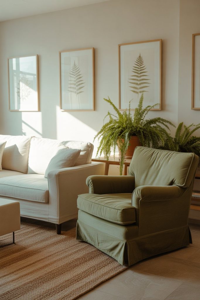
Introducing touches of green into a blue and white living room brings an organic, garden-inspired vibe that feels fresh and unexpected. Think botanical prints, potted plants, or even a sage green accent chair that complements your coastal blues. This combination mirrors nature—the sky, the sea, and the earth—creating a space that feels grounded and alive. It’s a subtle way to add warmth and depth without straying from the cool-toned palette. 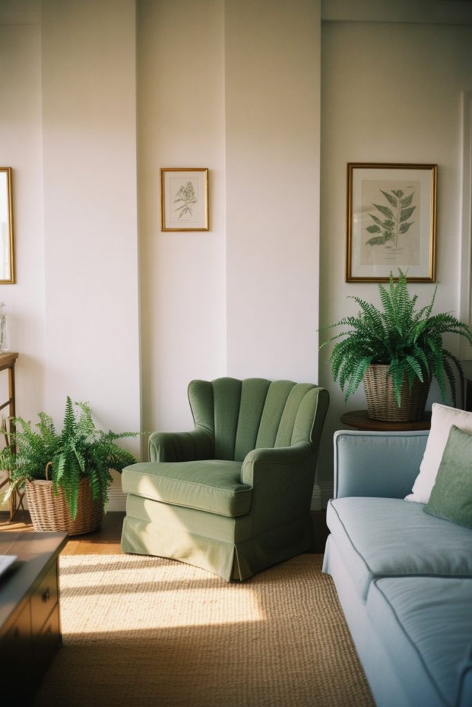
Real homeowner behavior: many people start with a strictly blue-and-white scheme, then gradually add plants and greenery as they realize the space needs a bit more life. The result is a living room that feels curated and personal rather than overly designed. Green also helps balance the coolness of blue, especially in rooms that don’t get much direct sunlight. Consider eucalyptus stems in a white vase, a fiddle-leaf fig in the corner, or even green-spined books stacked on your coffee table for an editorial touch.
8. Aesthetic Instagram-Worthy Spaces
If you’re drawn to that effortlessly chic, Instagram-ready aesthetic, a blue and white living room offers endless possibilities for creating a highly curated look. This style leans on careful styling—artfully arranged coffee table books, perfectly placed pillows, and a gallery wall that looks spontaneous but is actually meticulously planned. The color palette stays soft and serene, with muted blues, creamy whites, and just enough texture to photograph beautifully. It’s designed to look good from every angle. 
Where it works best: homes with great natural light and neutral backdrops that let your styling shine. The trick is to keep the foundational elements simple—white walls, a classic sofa, minimal clutter—then add personality through carefully chosen accessories. Younger homeowners in their twenties and thirties have embraced this look, often shopping vintage stores and online marketplaces to find unique pieces that don’t look mass-produced. Just be mindful not to prioritize looks over livability; a beautiful room should still feel comfortable and functional for everyday life.
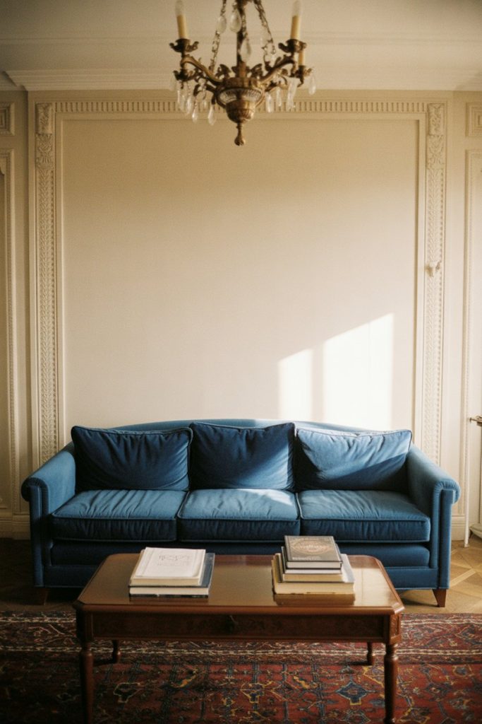
9. Royal Blue Drama
For those unafraid of bold color, royal blue paired with pure white creates a living room with serious wow factor. This is not a timid choice—royal blue commands attention, whether it’s on the walls, in a velvet sofa, or across richly patterned curtains. The intensity of the blue is balanced by generous amounts of white in trim, furniture, and accessories, preventing the space from feeling too dark or heavy. It’s a regal, confident look that works beautifully in homes with high ceilings and good proportions. 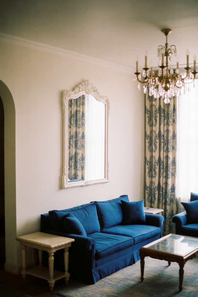
A common mistake is trying to tone down royal blue with too many neutrals, which dilutes its impact. Instead, embrace the drama by pairing it with crisp white and metallic accents in gold or brass. This palette feels especially at home in formal living rooms or historic homes where architectural details can match the grandeur of the color. In Southern states, where traditional design still holds sway, royal blue is a popular choice for creating spaces that feel both classic and current.
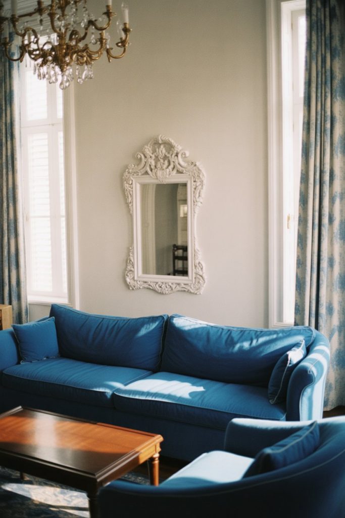
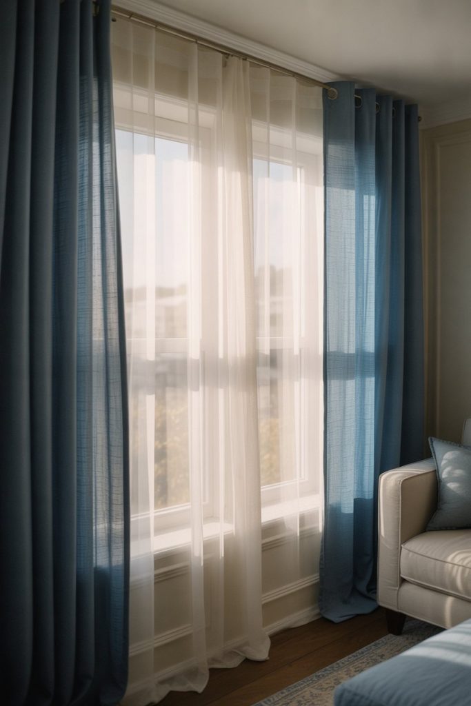
10. Curtains That Transform the Room
![]()
Never underestimate the power of curtains in a blue and white living room—they can completely transform the mood and scale of the space. Floor-to-ceiling white drapes make ceilings feel higher and rooms more elegant, while blue curtains in linen or cotton add softness and color without overwhelming the walls. Consider patterns like stripes, ikats, or subtle florals to introduce visual interest. The key is to hang them high and wide to maximize their impact. ![]()
Practical insight: Ready-made curtains rarely come in the right length, so budget for hemming or splurge on custom panels that puddle slightly on the floor for a luxurious look. Many American homeowners opt for blackout-lined curtains in bedrooms but prefer sheer or semi-sheer options in living rooms to maintain natural light. If you’re renting, tension rods and clip rings make it easy to install curtains without damaging walls. The right window treatments can tie together your entire blue and white scheme while adding softness and privacy.
11. Brown Wood Warmth
Adding brown wood tones to a blue and white living room is the secret to preventing the space from feeling too cold or sterile. Whether it’s a reclaimed wood coffee table, floating shelves, or a vintage sideboard, warm wood grounds the cool palette and adds a layer of organic texture. This combination works across styles—from farmhouse to modern—and it’s especially effective in homes where natural materials are prioritized. The wood doesn’t need to match perfectly; in fact, mixing tones adds depth and character. 
Real homeowner behavior: people often start with painted furniture to save money, then gradually invest in quality wood pieces as their budget allows. A solid wood console table or bookshelf can become a family heirloom, while particleboard pieces wear out quickly. In regions like the Midwest and Mountain West, where craftsman-style homes are common, mixing blue and white with natural wood feels authentic to the local architectural vernacular. Don’t shy away from darker woods like walnut or mahogany—they create stunning contrast against lighter blues.
12. Blue Walls with White Trim
Painting your living room walls in a medium to deep blue and finishing with crisp white trim is a classic move that never goes out of style. The contrast creates architectural definition, making even builder-grade rooms feel more custom and considered. This approach works in homes of all ages and styles, from traditional Colonials to modern bungalows. The key is choosing the right shade of blue—too dark and the room feels cave-like; too light and it may read as a nursery. 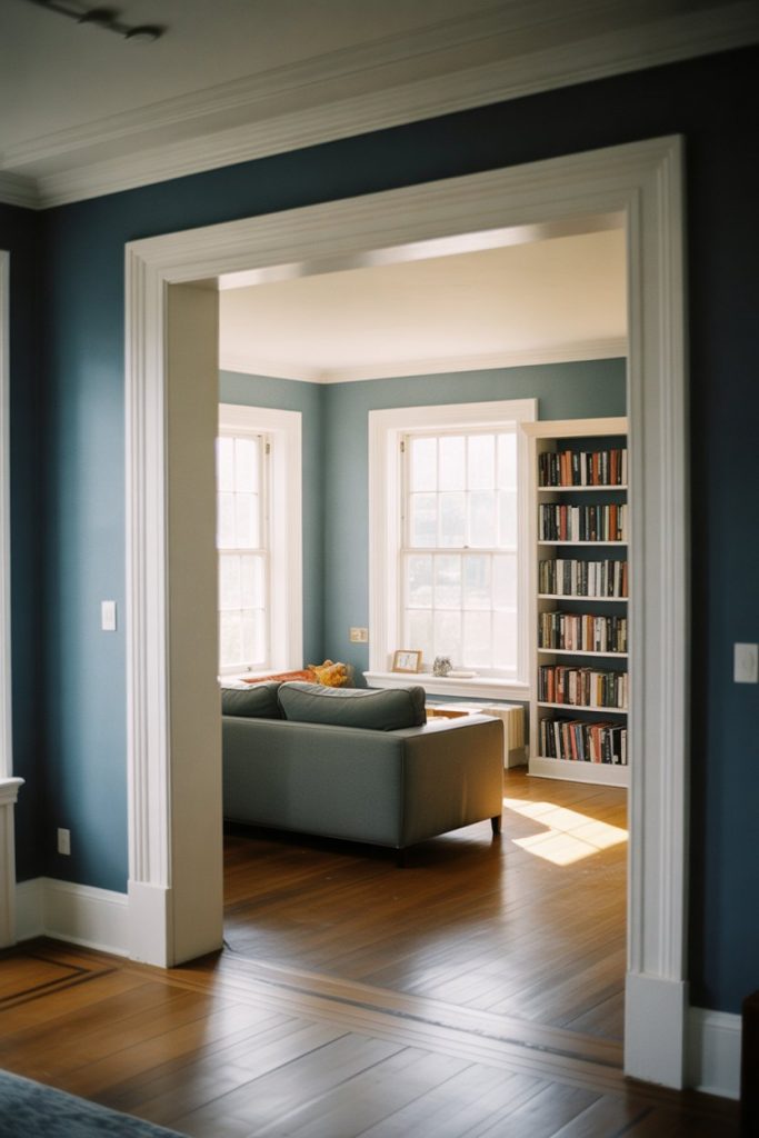
Budget angle: paint is one of the most affordable ways to dramatically change a room, with quality interior paint costing $30-$60 per gallon. Most living rooms can be transformed with two gallons of blue and one gallon of white trim paint. If you’re hesitant, test samples on multiple walls and observe them in different lighting throughout the day. Morning light reveals cooler tones, while afternoon sun brings out warmer undertones. Many homeowners find that painting the trim first and the walls second leads to cleaner lines and a more professional finish.
13. Curtains and Drapes Layering
Layering curtains and drapes in complementary shades of blue and white adds luxurious depth to your living room windows. Start with sheer white panels to filter light during the day, then add heavier blue drapes that can be drawn for privacy and warmth in the evening. This combination offers both function and style, allowing you to control light levels while creating a soft, layered look that feels sophisticated and intentional. 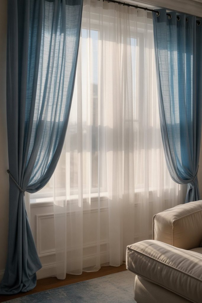
Where it works best: homes with large windows or sliding glass doors, particularly in climates with strong sun where light control matters. In the Southwest and Southern California, layered window treatments help manage heat gain while maintaining views. The investment can be significant—custom drapes often run $200-$500 per window—but the impact on your room’s comfort and appearance is immediate. For a budget-friendly version, try store-bought sheers with DIY-hemmed linen drapes, using decorative rings and a simple rod for easy installation.
14. French Country Shabby Chic Romance
The French country shabby chic aesthetic brings softness and vintage charm to blue and white living rooms through distressed finishes, floral patterns, and a gentle color palette. Think powder blues mixed with antique white, ruffled curtains, and furniture with a well-loved patina. This style celebrates imperfection—chipped paint, faded fabrics, and mismatched pieces all contribute to the romantic, collected-over-time feel. It’s feminine without being frilly and comfortable without being casual. 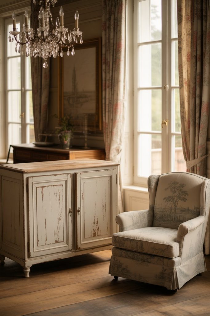
A micro anecdote: a homeowner in upstate New York found her grandmother’s old blue and white china and used it as inspiration for her entire living room palette, sourcing vintage furniture from estate sales and refinishing pieces herself. This personal approach is what makes shabby chic feel authentic rather than theme-park-ish. The style works beautifully in older homes with architectural character, though it can feel out of place in sleek modern builds. Focus on soft textures—linen, cotton, and vintage textiles—and don’t be afraid to mix patterns in complementary scales.
15. The Perfect Blue and White Rug
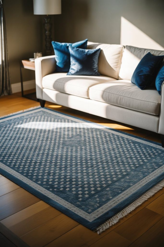
A well-chosen rug can anchor your entire blue and white living room, tying together furniture and defining the seating area. Whether you opt for a traditional Persian in navy and ivory, a coastal jute with blue stripes, or a modern geometric pattern, the rug sets the tone and adds essential softness underfoot. Size matters—your rug should be large enough that at least the front legs of your furniture rest on it, creating a cohesive conversation area. 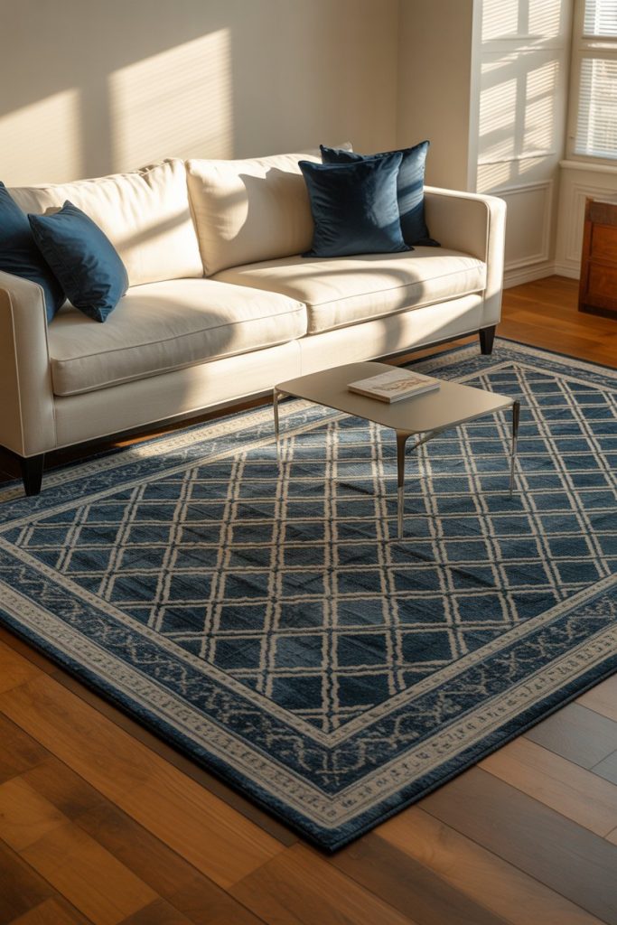
Practical insight: rug sizing is one of the most common mistakes in living room design. Too small, and the space feels disjointed; too large, and furniture appears to float. For most living rooms, an 8×10 or 9×12 rug works well, though larger open-concept spaces may need even bigger sizes. Americans shopping for rugs often find great deals online, but always check return policies—colors and patterns can look quite different in person. Layer a smaller patterned rug over a larger natural fiber one for added dimension, a trick popular in both farmhouse and coastal interiors.
16. French Elegance and Symmetry
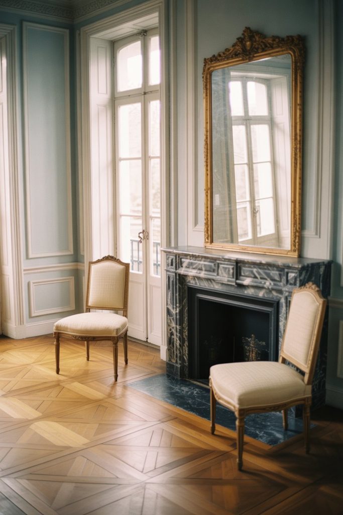
Taking cues from Parisian apartments and countryside châteaux, a French-inspired blue and white living room emphasizes symmetry, quality materials, and restrained elegance. Pair soft blue walls with ornate white molding, position matching bergère chairs flanking a fireplace, and hang an antique mirror above the mantel. The French approach favors fewer, better pieces over abundant decoration, and the result is a room that feels curated, timeless, and effortlessly chic. 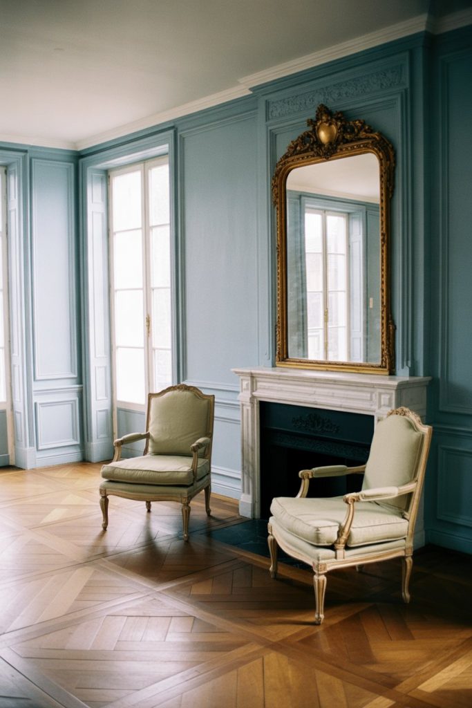
Expert-style commentary: French interiors prioritize quality over quantity, investing in pieces that will last generations. A single well-made linen sofa in perfect blue-grey is worth more than a room full of trendy fast furniture. This aesthetic particularly resonates in cities like New Orleans, Charleston, and parts of the Northeast, where French architectural influence remains strong. To achieve the look on a budget, focus on one or two statement pieces—perhaps an antique armoire or vintage chandelier—and keep the rest simple with classic silhouettes in blue and white.
17. Sky Blue Tranquility
The softest shade of sky blue paired with pure white creates a living room that feels like a peaceful sanctuary, perfect for unwinding after busy days. This delicate hue works especially well in bedrooms converted to sitting rooms or in homes where a calming atmosphere is the top priority. Unlike bolder blues, sky blue recedes visually, making rooms feel more spacious and serene. Layer in plenty of white through furniture, trim, and textiles to maintain the airy, cloud-like quality. 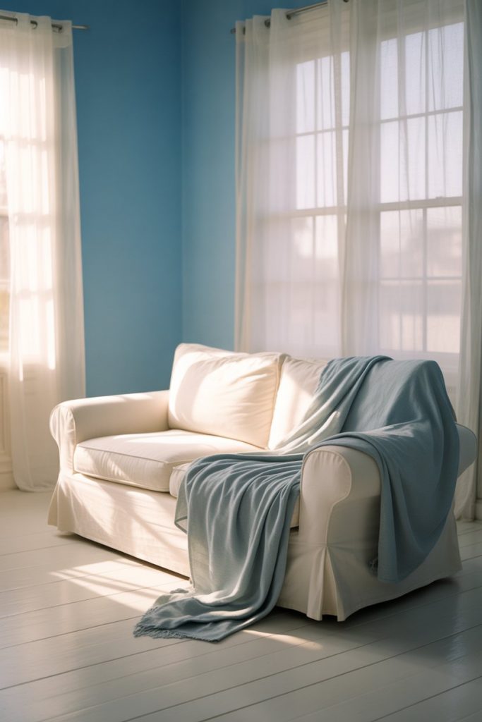
A common mistake is thinking sky blue will look washed out, but when paired with crisp white trim and adequate natural light, it’s actually remarkably refreshing. This shade works beautifully in cottage-style homes, beach houses, and any space where you want to feel transported to a calmer mental state. Americans living in high-stress urban environments often choose this palette for its psychological benefits—studies suggest light blue walls can lower blood pressure and reduce anxiety. Add texture through white linen, cotton, and soft wool to prevent the space from feeling flat or one-dimensional.
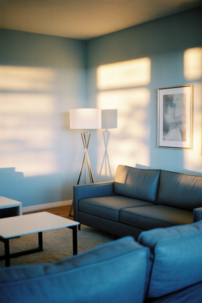
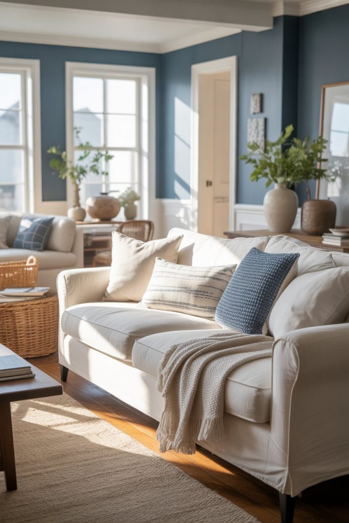
18. Navy Accent Walls
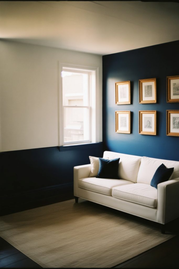
A single navy accent wall in an otherwise white living room creates instant drama and sophistication without overwhelming the space. This approach works particularly well behind a sofa, fireplace, or media center, where the deep blue provides a strong backdrop for lighter furniture and artwork. The contrast between the navy and surrounding white walls adds architectural interest even to basic rectangular rooms, and it’s a commitment-friendly way to experiment with bolder color. 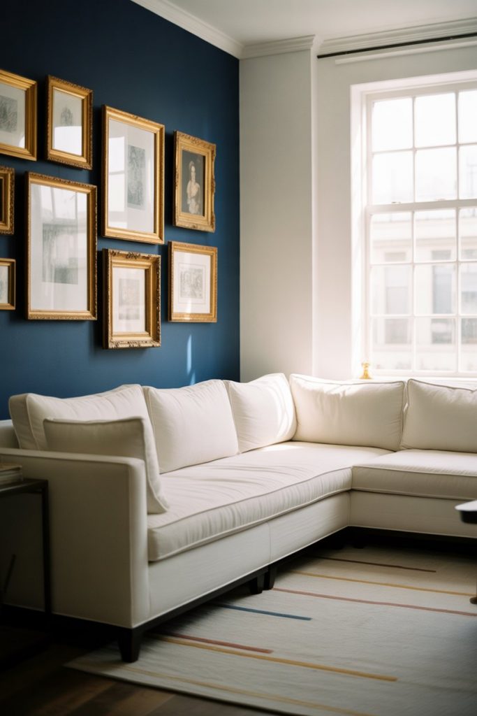
Where it works best: rooms with good natural light where the navy won’t make the space feel cave-like, and in homes with modern or transitional style where bold moves feel appropriate. The beauty of an accent wall is that it requires minimal paint—usually just one or two gallons—making it an affordable weekend project. If you’re nervous about going dark, remember that navy actually reads as a neutral in many lighting conditions, especially when balanced with white. This technique is hugely popular in rental homes where tenants want impact without painting entire rooms.
19. Mixing Blue Patterns
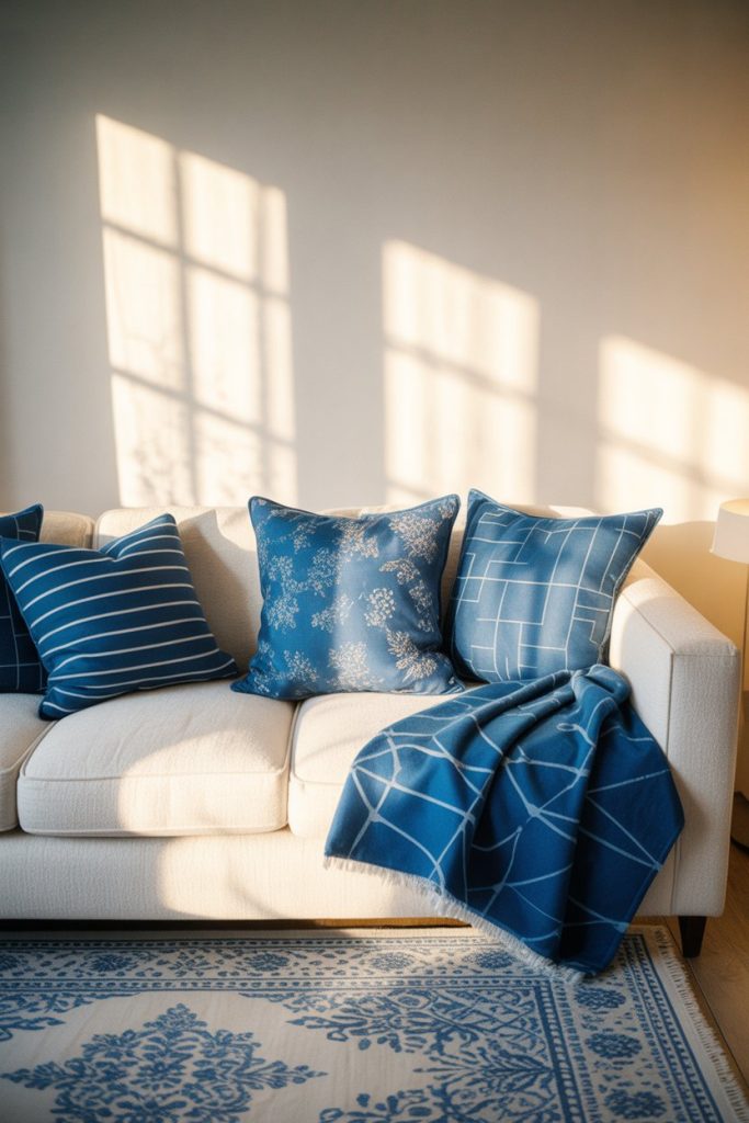
Don’t be afraid to layer multiple blue patterns in your white living room—the key is varying the scale and style so they complement rather than compete. Combine a large-scale floral rug with smaller striped pillows and a medium geometric throw, all in coordinating shades of blue. This approach adds visual interest and personality while maintaining the cohesive blue and white palette. The aesthetic feels collected and intentional rather than matchy-matchy. 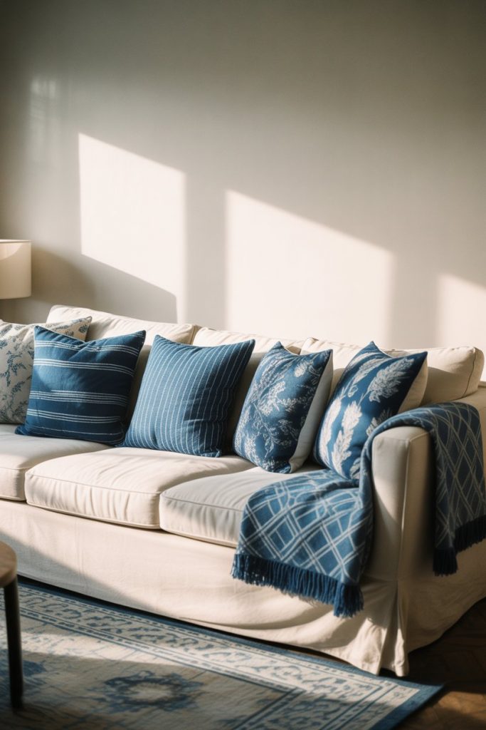
Real homeowner behavior: people often buy one patterned piece they love, then struggle to add more patterns without creating chaos. The trick is to choose patterns with a common color thread—in this case, varying shades of blue—and to keep backgrounds consistent, usually white or cream. This technique works across styles but feels particularly at home in traditional and coastal interiors where pattern layering is expected. Start with your largest piece (usually the rug), then add medium patterns (curtains or a large pillow), and finish with smaller accents (throw pillows, decorative objects).
20. Open Concept Blue and White
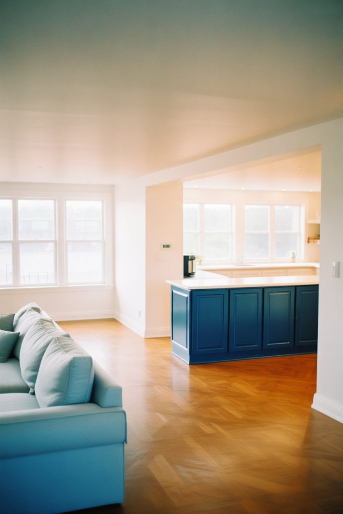
In modern open-concept homes, a blue and white living room palette can flow seamlessly into adjacent kitchen and dining areas, creating visual continuity while maintaining distinct zones. Use different shades or applications of blue to define each area—perhaps navy lower cabinets in the kitchen, light blue walls in the living room, and blue upholstered dining chairs. The consistent color story keeps the space feeling unified even across different functions. 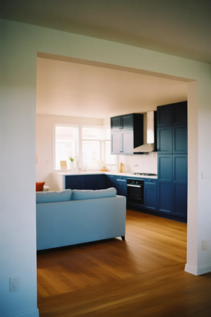
Practical insight: open layouts require careful color planning since everything is visible at once. Many designers recommend choosing three shades of blue—light, medium, and dark—and distributing them strategically across the open space. This prevents monotony while maintaining cohesion. Americans with newer construction homes (built after 2000) are most likely to have open-concept layouts, and this design challenge is particularly relevant in suburban developments where open living is the norm. Use area rugs and furniture arrangements to create intimate conversation areas within the larger space.
21. Blue and White Vintage Collections
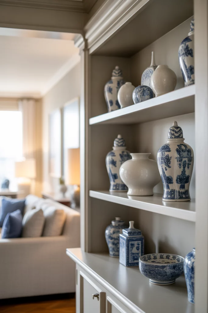
Displaying collections of blue and white ceramics, pottery, or glassware transforms your living room into a personal gallery that tells your story. Whether it’s traditional Chinese ginger jars, French enamelware, or vintage blue glass bottles, these collections add character and visual interest to shelves, mantels, and sideboards. The repetition of the blue and white theme creates cohesion even when the individual pieces are quite different in style or origin. 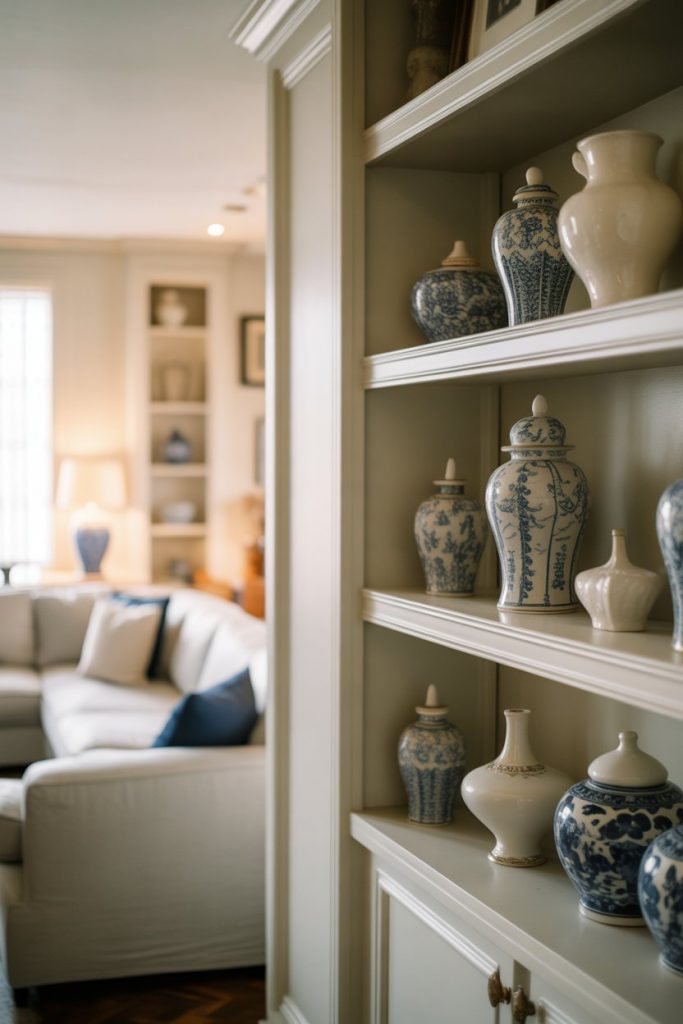
A micro anecdote: a collector in Connecticut started with one blue and white vase from a yard sale and now has over fifty pieces displayed throughout her living room. What began as a casual interest became a defining design element that gives her home incredible personality. Collections work best when grouped together rather than scattered, creating impact through repetition. They also offer an affordable way to add color and character—vintage blue and white pottery can often be found for under $20 per piece at thrift stores and estate sales, making this an accessible design strategy for budget-conscious decorators.
22. Year-Round Versatility
One of the greatest strengths of a blue and white living room is its year-round adaptability—this palette works beautifully across all seasons with just minor accessory changes. In summer, lean into the coastal vibe with lightweight linens and sky blue accents; in winter, add warmth through navy velvet pillows, thick wool throws, and deeper blue tones. The foundational color scheme remains constant, while seasonal touches keep the room feeling fresh and current throughout the year. 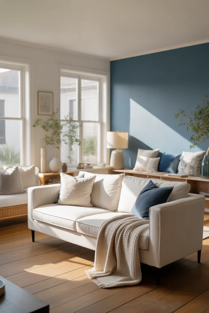
Expert-style commentary: investing in a blue and white foundation pays long-term dividends because you’re not locked into seasonal trends or constantly repainting. Smart homeowners buy quality foundational pieces in this timeless palette, then rotate affordable accessories to reflect the seasons—cotton throws and fresh flowers in spring, heavier textiles and candlelight in fall. This approach is both economical and sustainable, reducing the need to constantly replace furniture and decor. The blue and white combination has remained popular for centuries across cultures precisely because of this versatility and enduring appeal.
Conclusion
Whether you’re drawn to the relaxed charm of farmhouse blues, the dramatic sophistication of navy and white, or the breezy freshness of coastal tones, there’s a blue and white living room style that will work for your home and lifestyle. The beauty of this palette is its flexibility—it adapts to virtually any design aesthetic while remaining timelessly elegant. We’d love to hear which of these ideas resonated with you most, or how you’ve incorporated blue and white into your own living spaces. Share your thoughts and experiences in the comments below!