Black and white kitchens aren’t just a trend for 2026 — they’ve become a full-on design movement, and Pinterest is buzzing with millions of saves to prove it. Americans are drawn to this palette because it works in virtually every home, from century-old craftsman bungalows in the Pacific Northwest to sleek new builds in Austin and Nashville. Whether you’re planning a full gut renovation or just dreaming from your couch, this color combination delivers a look that feels both timeless and unmistakably current. In this article, you’ll find distinct takes on the black and white kitchen—each one a jumping-off point for your own space, complete with ideas on cabinets, backsplash, flooring, accents, and everything in between. Scroll through, save your favorites, and let the inspiration begin.
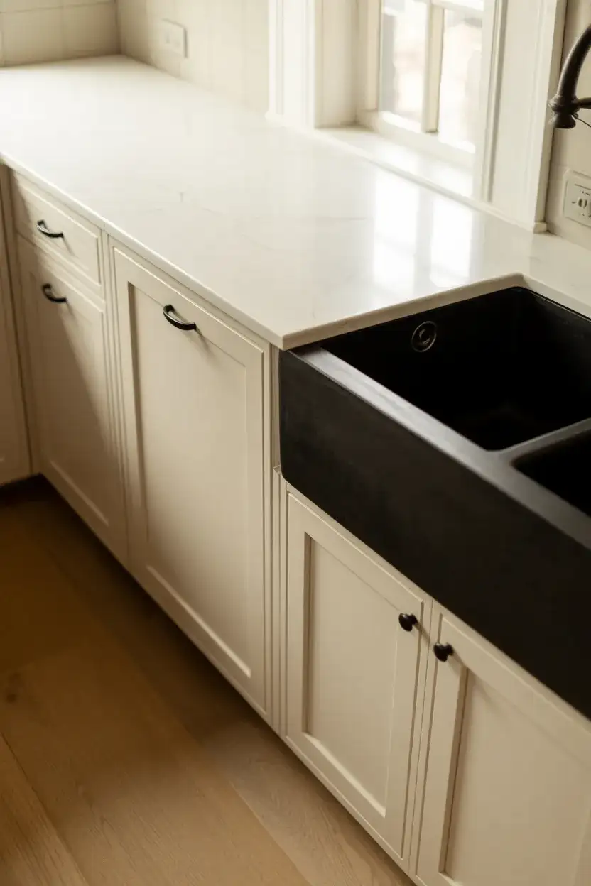
1. Glossy Black Cabinets with White Marble Countertops
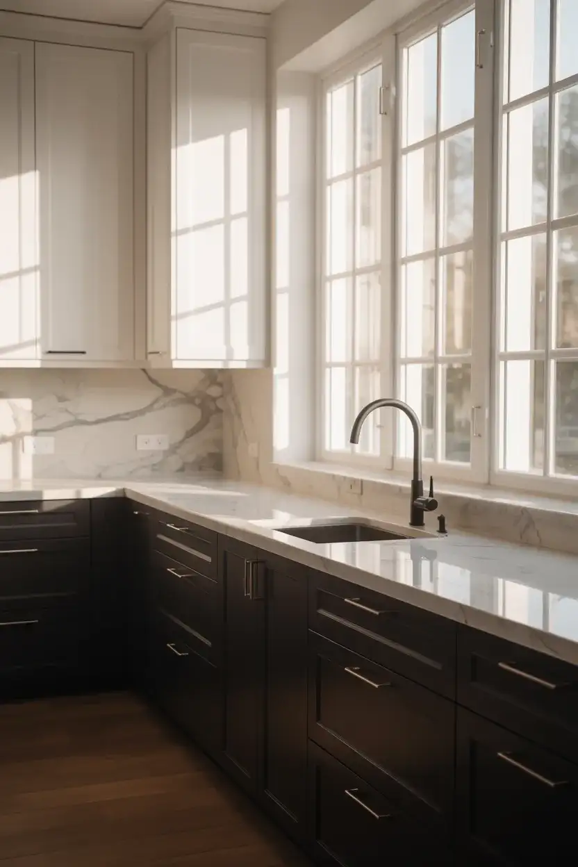
There’s something undeniably dramatic about pairing glossy black cabinets with crisp white marble—it’s the kind of kitchen that makes you pause at the doorway. This look thrives in open-plan layouts where the modern design has room to breathe, and natural light can bounce off the lacquered doors and veined stone surfaces. The contrast is sharp but not cold; the marble’s organic movement softens what could otherwise feel too severe. It’s bold, but it’s also incredibly livable—especially when you keep the hardware minimal and let the materials do the talking.
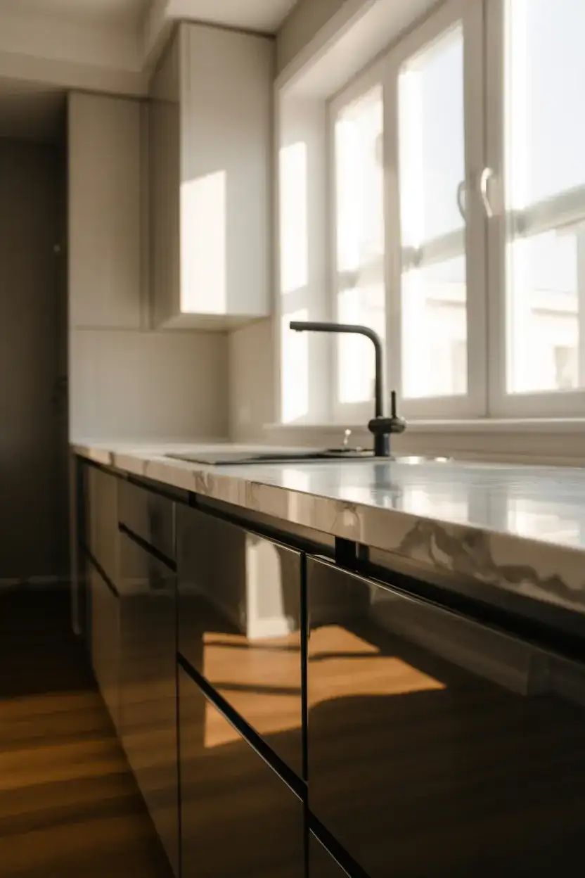
This pairing works best in kitchens with at least one large window or skylight—the reflective quality of the lacquer means you want light working with you, not against you. If your space is smaller, consider going glossy on the lowers only and keeping the uppers matte white to maintain that open, airy feel. Quartz is a smart, budget-friendly swap for marble if you want the look without the sealing maintenance. Either way, the result is a kitchen that feels genuinely luxurious without trying too hard.
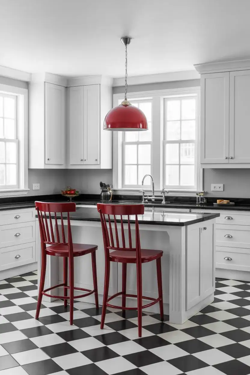
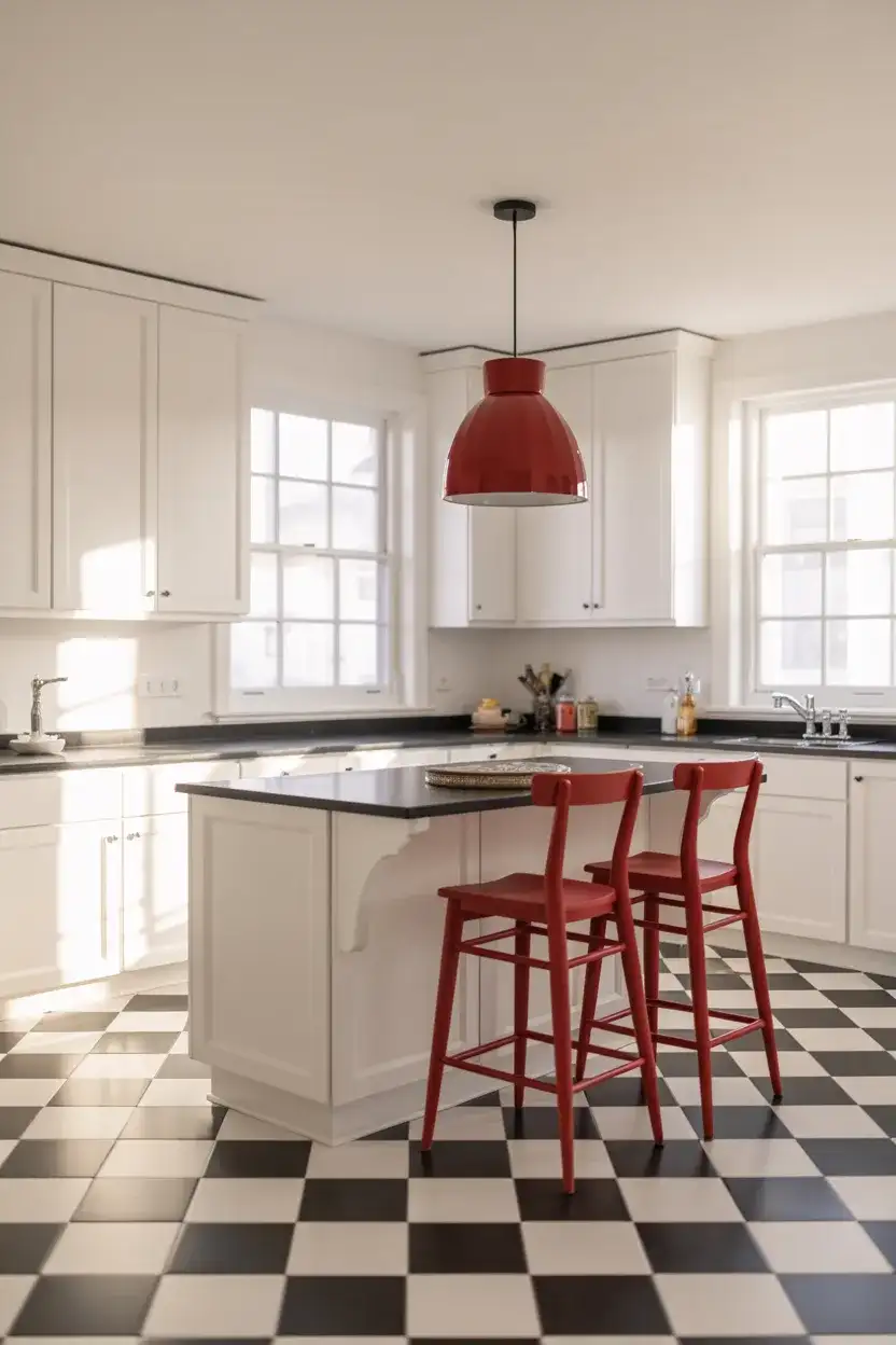
2. Checkered Black and White Floor Tiles
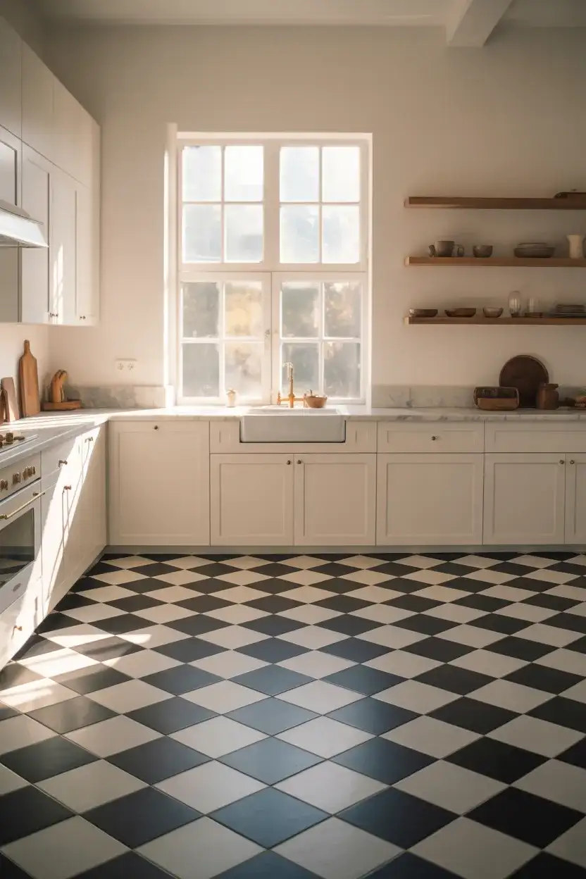
Few design choices are as instantly recognizable—and as endlessly stylish—as a checkered floor tile pattern in a kitchen. This classic floor tile layout has roots in European bistros and American diners alike, which is exactly why it translates so effortlessly into today’s homes. Whether you go with large-format 24-inch squares for a modern edge or keep it traditional with smaller 12-inch tiles, the effect is the same: graphic, confident, and a little bit playful. It anchors the entire room without demanding much else from the palette.
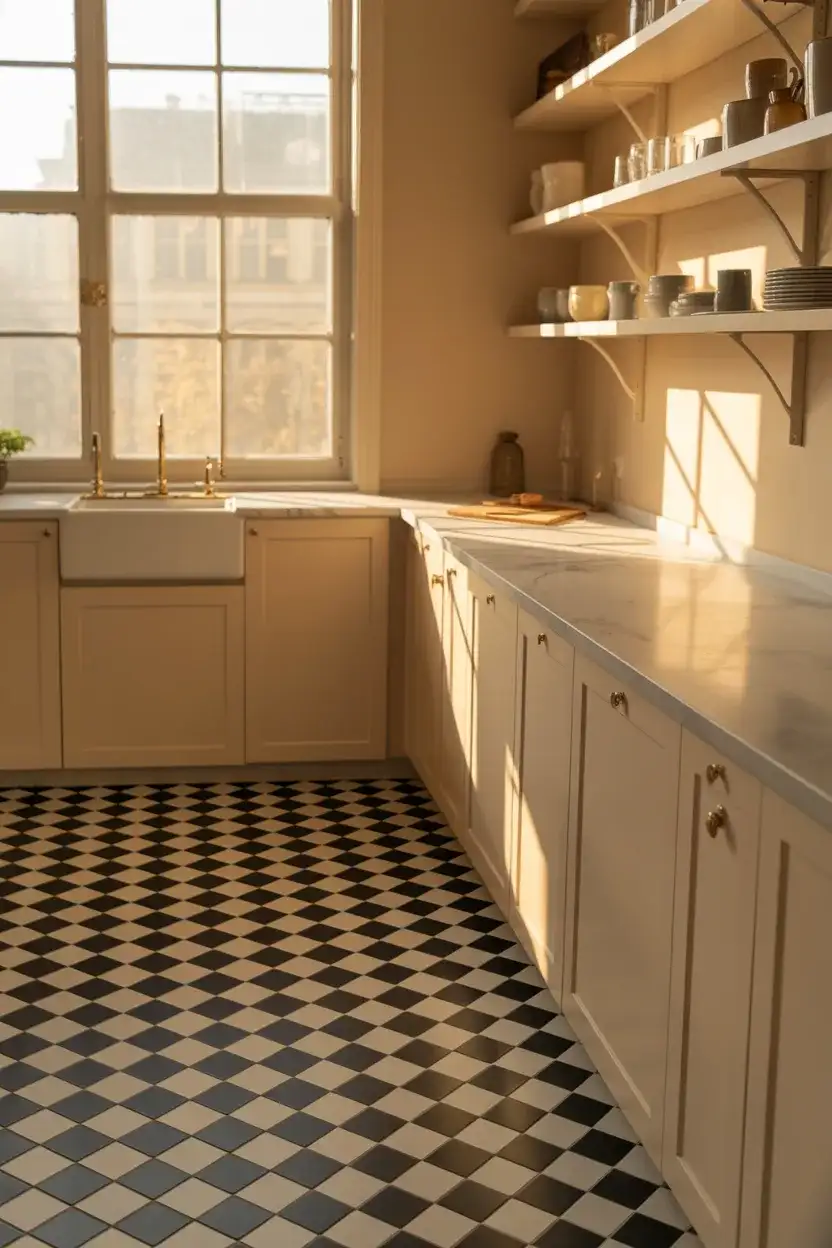
One thing homeowners often get wrong with checkered floors is the grout color—choosing bright white grout over black tiles makes the seams pop too harshly. A soft gray grout creates a much more cohesive look and is significantly easier to keep clean over time. This pattern works best in kitchens that aren’t too busy elsewhere; keep the cabinets and walls calm so the floor gets to be the star. If you’re renting and can’t commit, peel-and-stick vinyl versions of this pattern have gotten remarkably convincing in recent years.
3. White Shaker Cabinets with Black Hardware Accents
White shaker cabinets are the workhorse of American kitchen design—they’re clean, versatile, and they sell houses. But swap out those generic brushed nickel pulls for matte black hardware, and something interesting happens: the whole kitchen suddenly looks intentional. This is one of the most affordable upgrades you can make, and the decor ideas it unlocks are genuinely exciting. The black handles and knobs act like punctuation marks across the white faces, giving the eye something to follow and the room a quiet sense of definition.
Hardware swaps typically run between $3 and $15 per pull at hardware stores, making this one of the highest-return updates you can do before listing or simply before you get tired of your kitchen. Match the hardware finish to your faucet and light fixture for a polished, designer-curated feel. A common mistake is mixing too many hardware styles—stick to one profile (cup pull, bar pull, or knob) throughout the kitchen for consistency. Black hardware also pairs beautifully with both cool-toned and warm-toned whites, so you don’t need to repaint.
4. Bold Black Subway Tile Backsplash
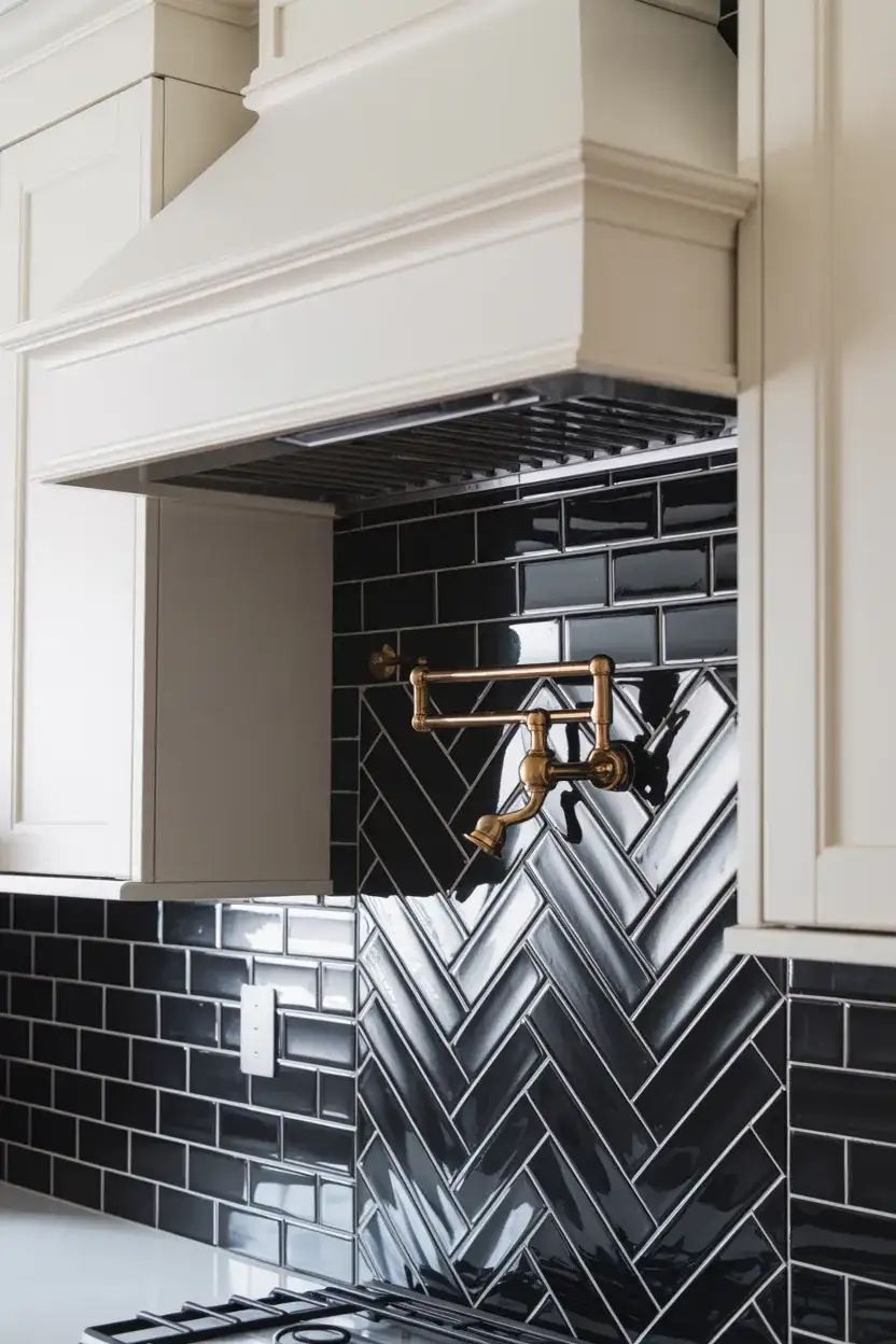
The backsplash is one of those design elements that often gets treated as an afterthought—a functional surface that simply exists behind the stove. But a full wall of black subway tile? That’s a statement. This backsplash ideas approach works particularly well in kitchens with white or light-toned cabinets, where the dark tile creates a dramatic focal point behind the range. The classic rectangular format keeps the look from feeling overwhelming, while the glossy surface bounces light and adds depth to a space that might otherwise feel flat.
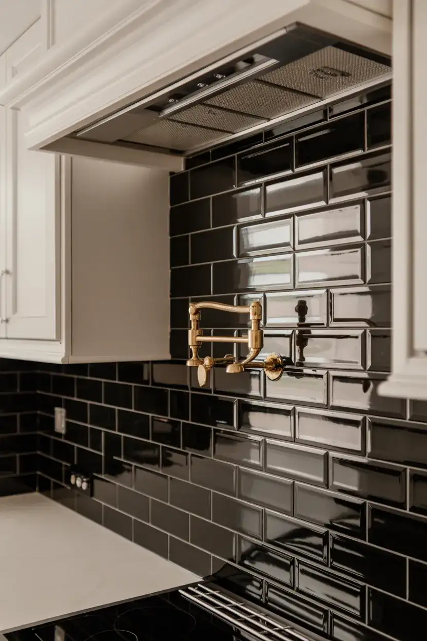
This look really lives and dies by the grout color. White grout on black tile creates a grid-like, graphic effect that reads as very retro. Dark gray grout is more seamless and contemporary—it lets the tile read as one cohesive dark surface rather than individual bricks. If you’re going this route, consider extending the tile all the way to the ceiling between your upper cabinets; the verticality makes the kitchen feel taller, and the tile investment looks more deliberate. Budget around $8–$20 per square foot for quality ceramic subway tile.
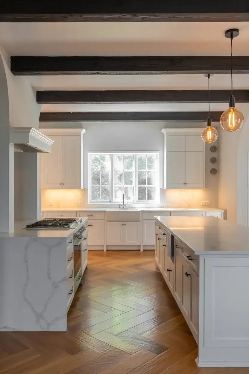
5. Black and White Kitchen Island as the Focal Point
One of the most versatile moves in kitchen design right now is giving the island a different treatment from the perimeter cabinets—specifically, painting it black while keeping everything else white. This creates an immediate visual anchor in the space and breaks up what could otherwise be a sea of one tone. It also gives the island a furniture-like quality, making it feel less like built-in cabinetry and more like a statement piece that belongs in the room. Pair it with white quartz or marble on top for maximum contrast.
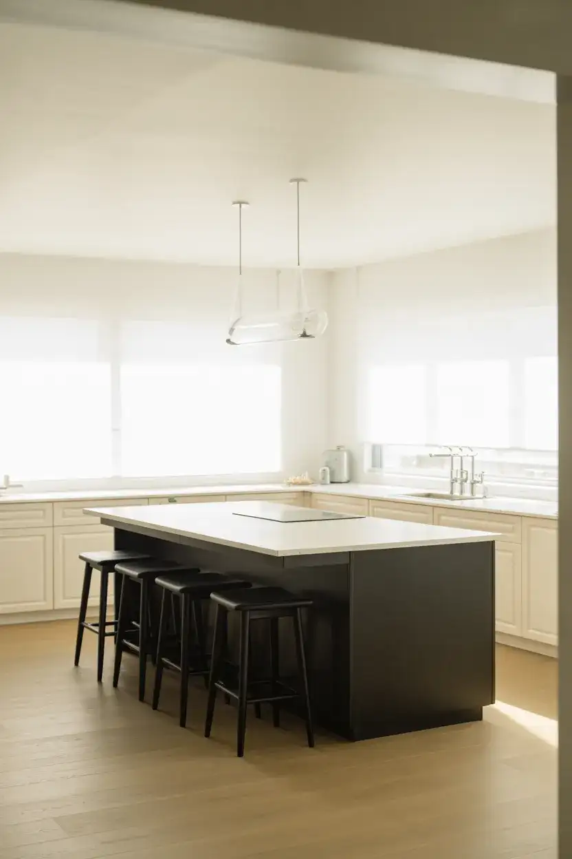
This approach is especially popular in open-concept homes—the island becomes a visual divider between the kitchen and living space while still feeling connected to both. Interior designers often recommend choosing the island color first, then building the rest of the palette around it. A satin or eggshell finish on the island will be far more forgiving than high gloss in terms of showing dings and fingerprints, which matters if you actually cook and entertain. Brass or unlacquered brass hardware on the black island adds a warm, collected feel that softens the high-contrast pairing.
6. Minimalist Black and White Kitchen with Wood Accents
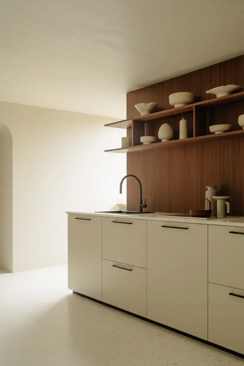
Pure black and white can feel stark if you’re not careful—and that’s exactly where wood accent elements come in. A warm walnut shelf, white oak floating shelves, or a butcher block section of countertops introduces organic texture that softens the graphic contrast without muddying the palette. This is the kitchen aesthetic that’s been all over Scandinavian design blogs for years, and it translates beautifully into American homes with good bones. The result is something that feels calm, curated, and genuinely livable rather than designed to impress at a glance and fade into the background after a week.
The key to making this look feel intentional rather than accidental is limiting wood to one or two spots—a single run of open shelving, the island top, or the flooring. If you add wood in too many places, it starts to compete with the black-and-white foundation rather than complement it. White oak is the go-to right now because its lighter tone reads almost neutral against whites, while its grain still brings that essential warmth. This palette is also extremely practical: white reflects light in smaller kitchens, while the black elements ground the space so it doesn’t feel like a hospital corridor.
7. Dramatic Black Ceiling with White Kitchen Below
Painting a kitchen ceiling black sounds terrifying until you see it done well—and then it’s all you want. This modern interior design technique creates an envelope effect that makes the space feel intimate, considered, and a little bit mysterious. When paired with all-white cabinets and light countertops below, the dark ceiling acts almost like a night sky: dramatic, enveloping, but not oppressive. It works particularly well in kitchens with higher ceilings (9 feet and above) where there’s enough volume to absorb the dark tone without the room feeling cramped.
A designer friend who renovated her 1920s Chicago bungalow put it perfectly: she said painting the ceiling black was the single most dramatic change she made that cost less than $200. The key is to finish—use flat or matte black for ceilings to absorb rather than reflect light; a satin or semi-gloss will create glare and show every imperfection. Leave the wall crown molding white if you have it, so the ceiling reads as a distinct floating plane rather than walls closing in. This works especially well in kitchens that open to a brighter dining or living area, where the contrast is part of the spatial experience.
8. Scalloped White Tile Backsplash with Black Grout
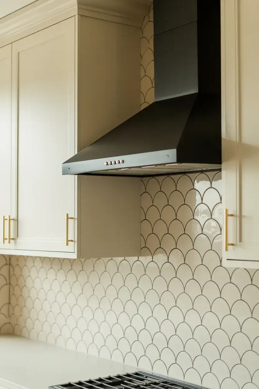
The tile backsplash has evolved far beyond the standard subway format, and scalloped or fan-shaped tiles with black grout represent one of the most compelling directions right now. This aesthetic reads as both vintage and thoroughly modern simultaneously—like something you’d find in a Portuguese café translated into a Brooklyn loft. The curves of the scallops break up the geometry of a kitchen that might otherwise feel very linear, while the dark grout lines create that satisfying grid effect that makes the pattern truly readable and graphic from across the room.
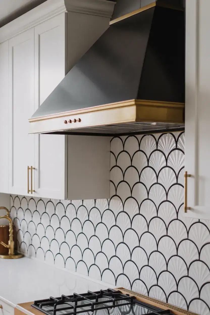
Where this works best is as an accent—running the scalloped tile behind the range or on one featured wall, rather than the full kitchen perimeter. This keeps costs down and prevents the pattern from becoming visually exhausting. Scalloped tiles do require a skilled tile setter because the curves need to align perfectly; uneven installation will ruin the effect. If you’re tiling yourself, do a dry layout first and work from the center out. Epoxy grout in black is worth the extra cost here—it resists staining far better than standard grout and stays crisp against the white tile for years.
9. Black and White Kitchen with a Green Color Pop
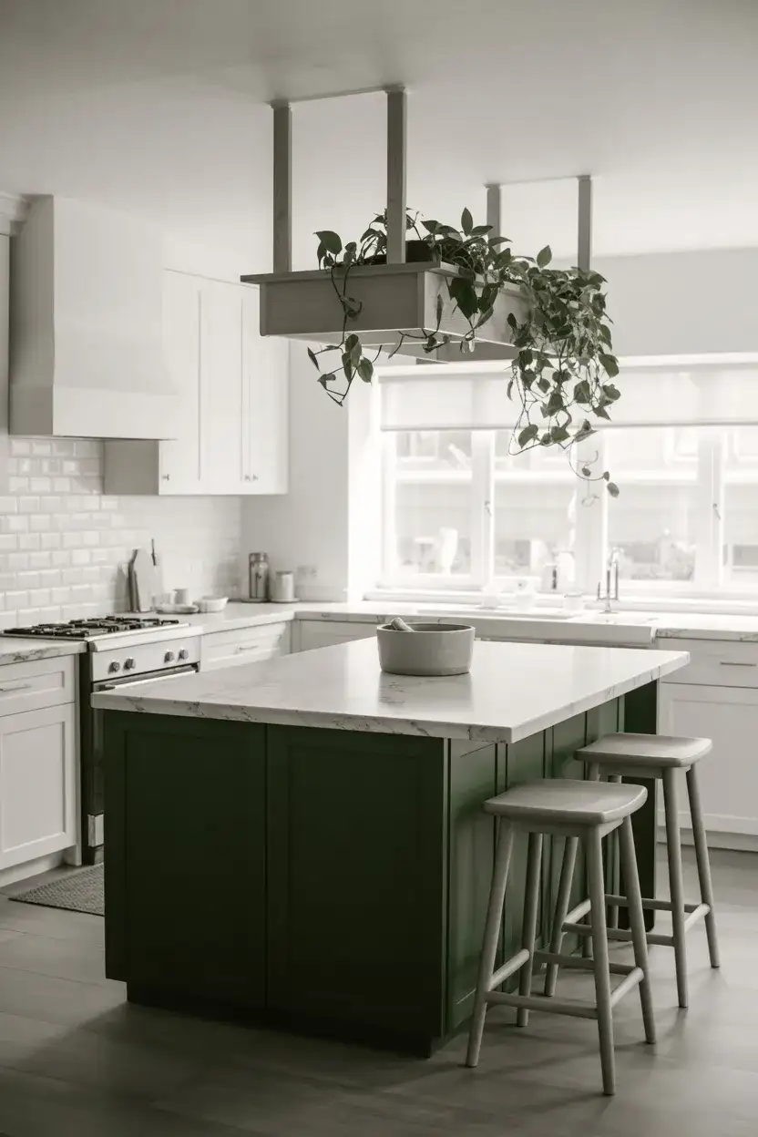
A strict black and white kitchen is beautiful, but sometimes it needs a breath of life—and green is the color that delivers it most naturally. Whether it’s a forest green island, a sage-painted lower cabinet, or simply a cluster of trailing pothos and monstera plants on open shelving, green grounds the palette in something organic and living. This color pop approach has been surging on Pinterest boards across the country because it threads the needle between graphic boldness and warmth. You get the visual clarity of the black-and-white foundation with a hit of nature that stops the space from feeling clinical.
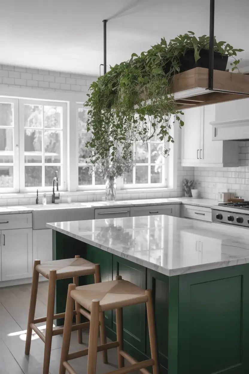
The green tones that read most elegantly in this context are the deeper, more complex ones—think hunter green, deep sage, or forest rather than lime or bright mint. These earthy, muted greens feel considered rather than trendy, and they age beautifully as design preferences shift. If committing to green cabinetry feels like too much, start with green pendants, bar stools, or even a painted ceiling in a muted sage. It’s far easier to swap out a light fixture than to repaint cabinets. Live plants also count—a kitchen window full of herbs in black ceramic pots is one of the easiest, most affordable ways to bring green into this palette.
10. Modern Black and White Kitchen with Grey Undertones
Pure black and pure white can feel like a hard-edged graphic statement—which is great in some contexts but occasionally too sharp for everyday living. Introducing grey into the mix softens the contrast while keeping the monochromatic spirit fully intact. Warm greige cabinets, cool concrete-look countertops, or a pale dove gray on the walls all function as bridges between the two extremes. This is the version of a black and white kitchen that feels most suited to the modern American family home—sophisticated enough to feel curated, relaxed enough to feel real.
One thing that trips people up when working with gray is undertone—and in a black and white kitchen, undertones matter enormously. A gray with a blue undertone next to warm white cabinets will look lavender rather than neutral. Always test paint chips on your actual walls next to your actual cabinet samples before committing. Benjamin Moore’s Revere Pewter has been a popular go-to for years; it reads warm in some lights and cool in others, which makes it oddly versatile. Pair with absolute white (not creamy) for the sharpest, cleanest iteration of this look.
11. Black Matte Flat-Front Cabinets, Modern Minimalist
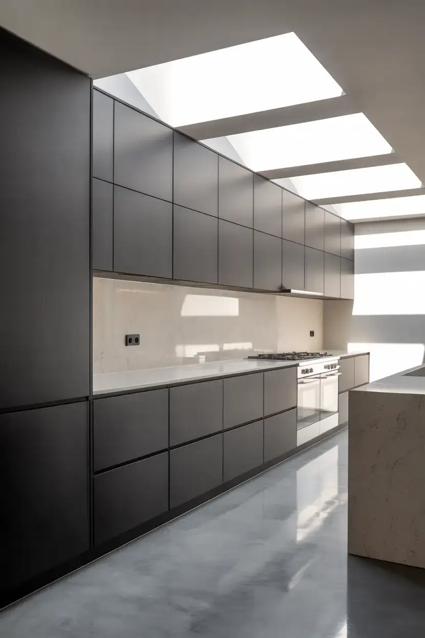
If the shaker cabinet is the classic American default, the handleless flat-front cabinet in matte black is its 2026 successor. This approach to cabinets strips the kitchen down to its most architectural form—no applied molding, no decorative hardware, just clean planes of deep, velvety black punctuated by integrated push-to-open mechanisms or thin recessed pulls. The result is something that reads more like furniture design than kitchen cabinetry. Pair with white walls and a poured concrete or white stone counter, and you have something that belongs in a design magazine—or in the feed of any serious inspo board.
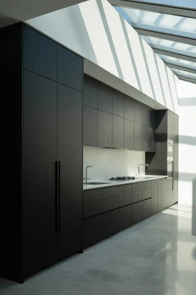
This look demands precision in installation—any gap or misalignment between flat-front doors is visible in a way that’s forgiving with shaker-style profiles. If you’re working with a contractor, ask specifically about European-style frameless cabinet construction, which is the most common system used with this aesthetic. Matte finishes also require specific cleaning care: avoid abrasive cleaners and always wipe in the direction of any grain or surface texture. The upside? Matte black hides fingerprints and smudges far more gracefully than high-gloss versions, making it infinitely more practical for households with kids or frequent cooking.
12. Black and White Kitchen with Red Accents
Black, white, and red is one of the most energetic color combinations in design history—it’s the palette of diners, race cars, and vintage kitchens that still look impossibly cool decades later. In a 2026 context, the key is restraint: keep the red for carefully chosen moments rather than painting half the kitchen crimson. A red KitchenAid stand mixer on the counter, a bold red pendant light over the island, or a few red-lacquered bar stools are all the decor this palette needs to come alive. Let the black and white do the structural work; let the red be the punctuation.
American kitchens in the Midwest and South have long embraced the retro diner aesthetic—red accents in a black and white kitchen tap directly into that nostalgic thread while feeling fresh and contemporary. The trick is choosing your red carefully: blue-red (like true crimson) reads more sophisticated and vintage; orange-red (like fire engine) is bolder and more playful. If you’re ever unsure, red appliances are the lowest-commitment way to test the color in your actual space before investing in stools, pendants, or painted elements. And since appliances tend to follow you when you move, it’s also a smart investment.
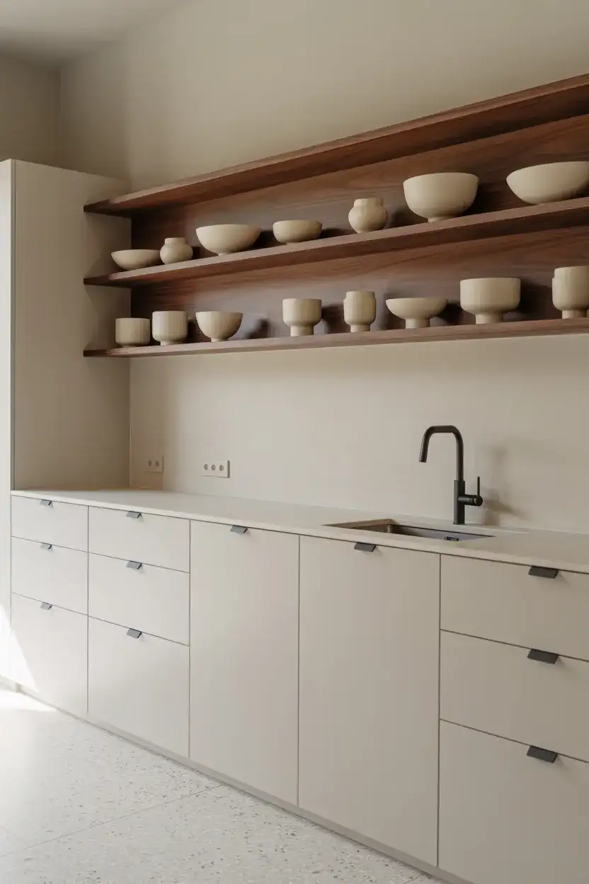
13. Open Shelving in a Black and White Kitchen
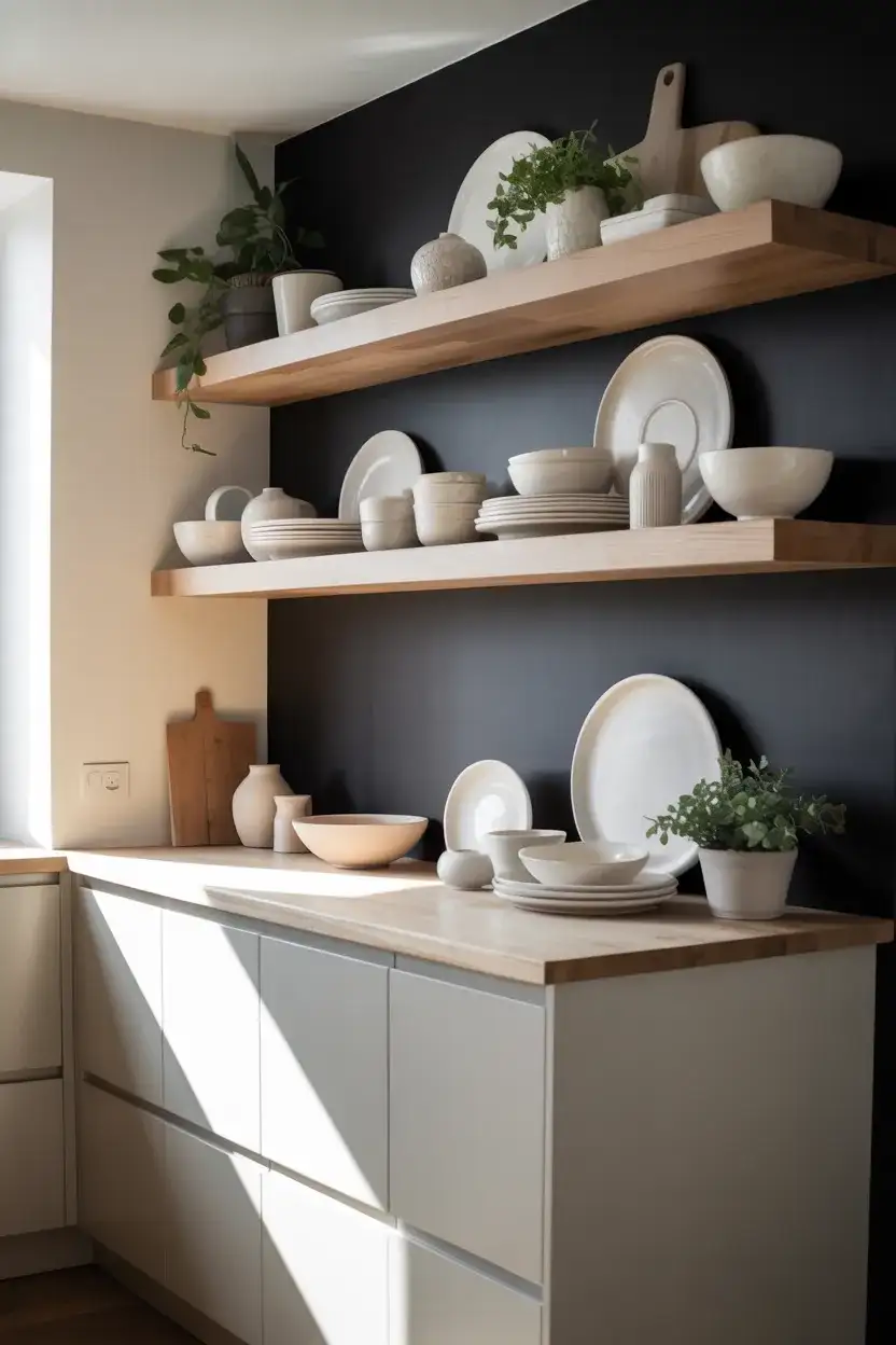
Replacing a few upper cabinets with open shelving is one of those design decisions that’s simultaneously practical and deeply aesthetic—and in a black and white kitchen, it creates a moment of visual relief. Float white oak or natural wood shelves against a black or white painted wall, and you’ve introduced texture, warmth, and personality into what might otherwise be a stark, monochromatic envelope. The modern interior design minimalist crowd has fully embraced this approach because it lets curated objects—ceramic mugs, glass jars, cookbooks—become part of the design rather than things to be hidden behind doors.
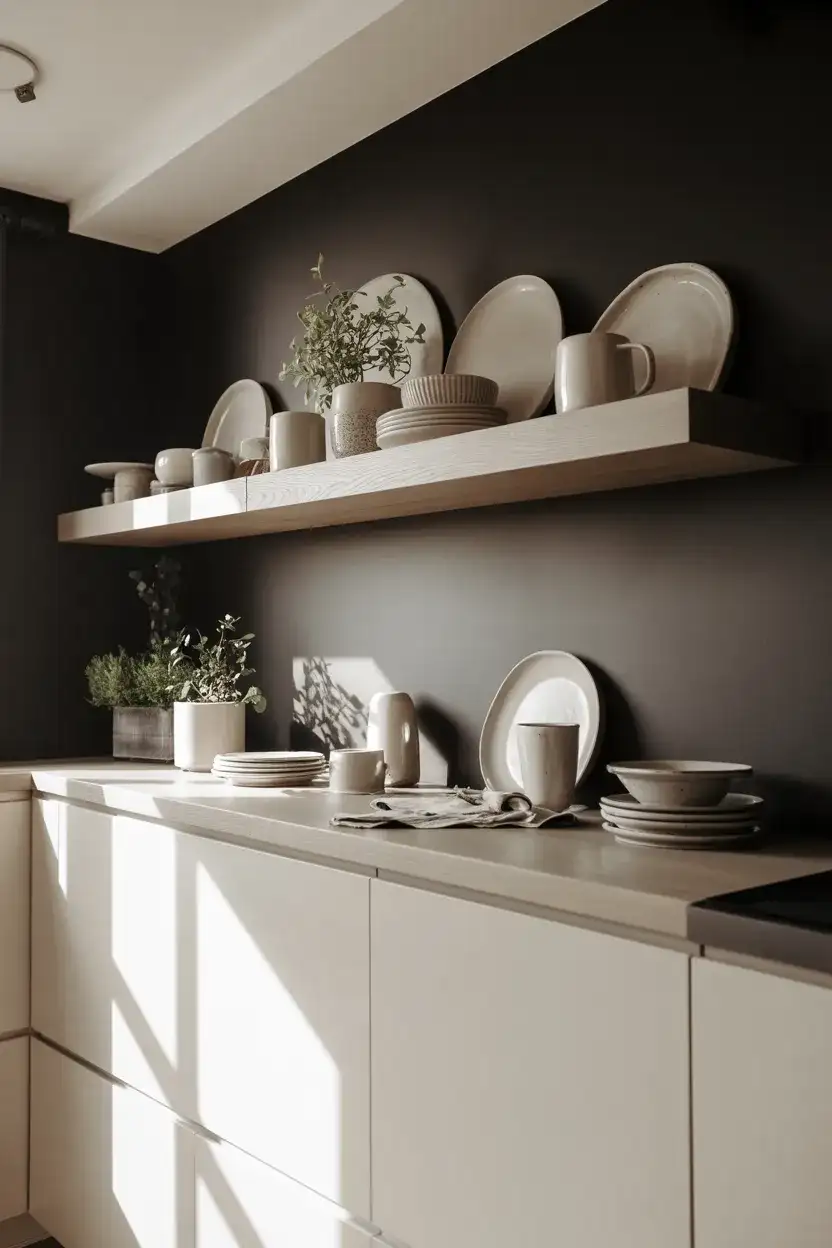
Here’s the honest truth about open shelving: it requires maintenance. Dishes collect dust, and the styling needs to be refreshed every now and then to keep it from looking like a chaotic pile. But for people who genuinely love their kitchen things—the handmade mug from a pottery market, the vintage casserole dish inherited from a grandmother—open shelving is a gift. Keep 70% of the shelf practical (things you actually use) and 30% purely decorative, and the arrangement will hold up over time without feeling like a constant chore to maintain.
14. Black and White Kitchen Table Dining Nook
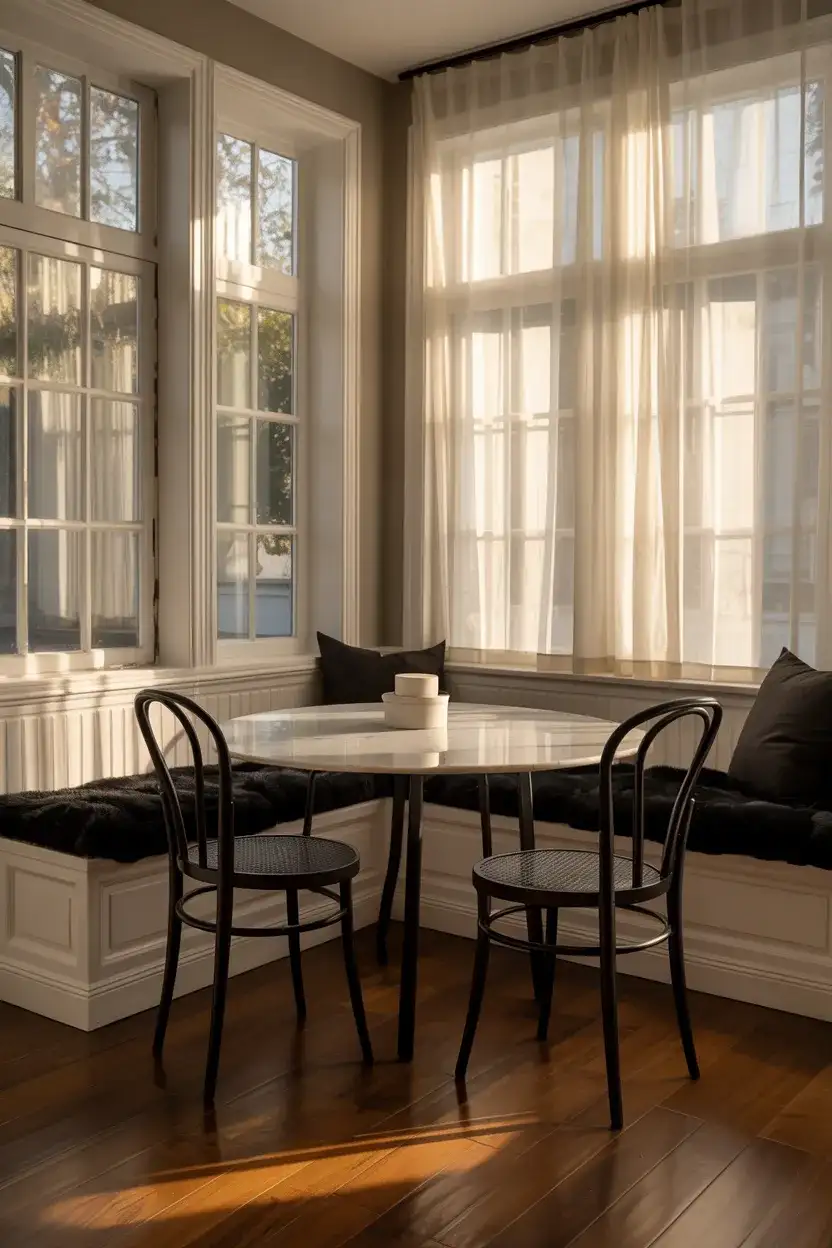
The kitchen table is having a design renaissance—and pairing a black and white dining nook directly adjacent to the kitchen creates a seamless, intentional living-cooking zone that feels distinctly American in its hospitality. Think of a round white marble bistro table with matte black legs, surrounded by black bentwood chairs or white bouclé upholstered seats. The nook becomes an extension of the kitchen’s palette while carving out its own intimate corner. This works especially well in older homes with separate eat-in kitchen spaces that might otherwise feel disconnected from the main kitchen design language.
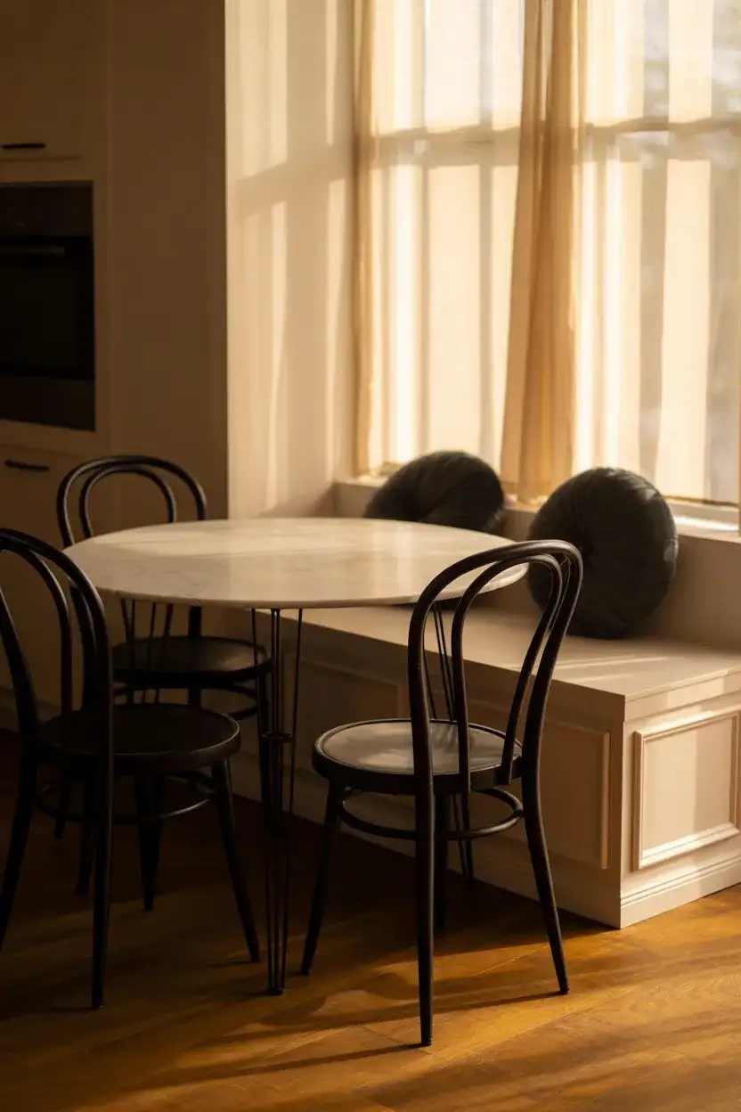
This is a layout that thrives in homes with kids and active families—the eat-in kitchen nook is arguably the most-used seating area in houses where the formal dining room gets reserved for holidays. Functionally, it keeps the cook connected to the conversation without anyone crowding around the work zone. Keep the table surface practical—marble looks stunning but requires sealing and is sensitive to acids. Quartz in a white or light gray marble look offers the same visual impact with significantly less fussiness, which matters when you’re wiping down spilled orange juice before school every morning.
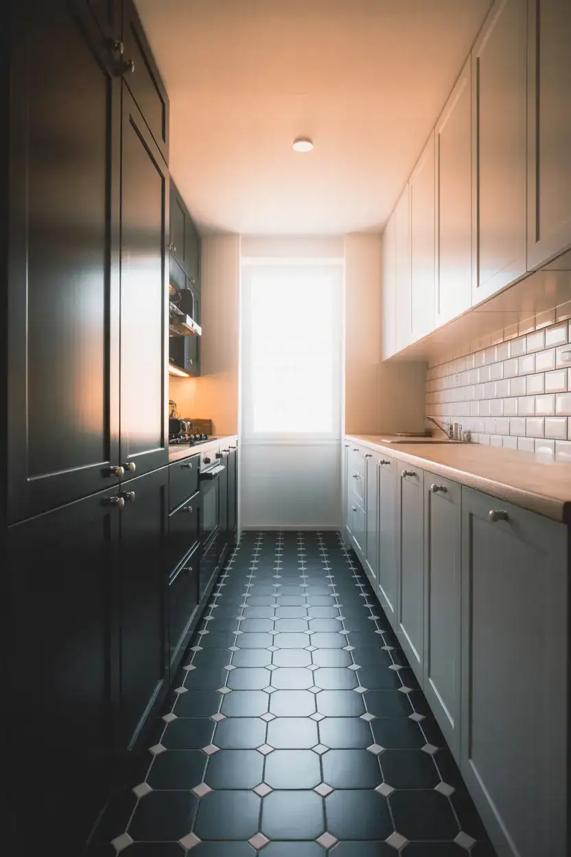
15. Hexagonal Black and White Floor Tile Pattern
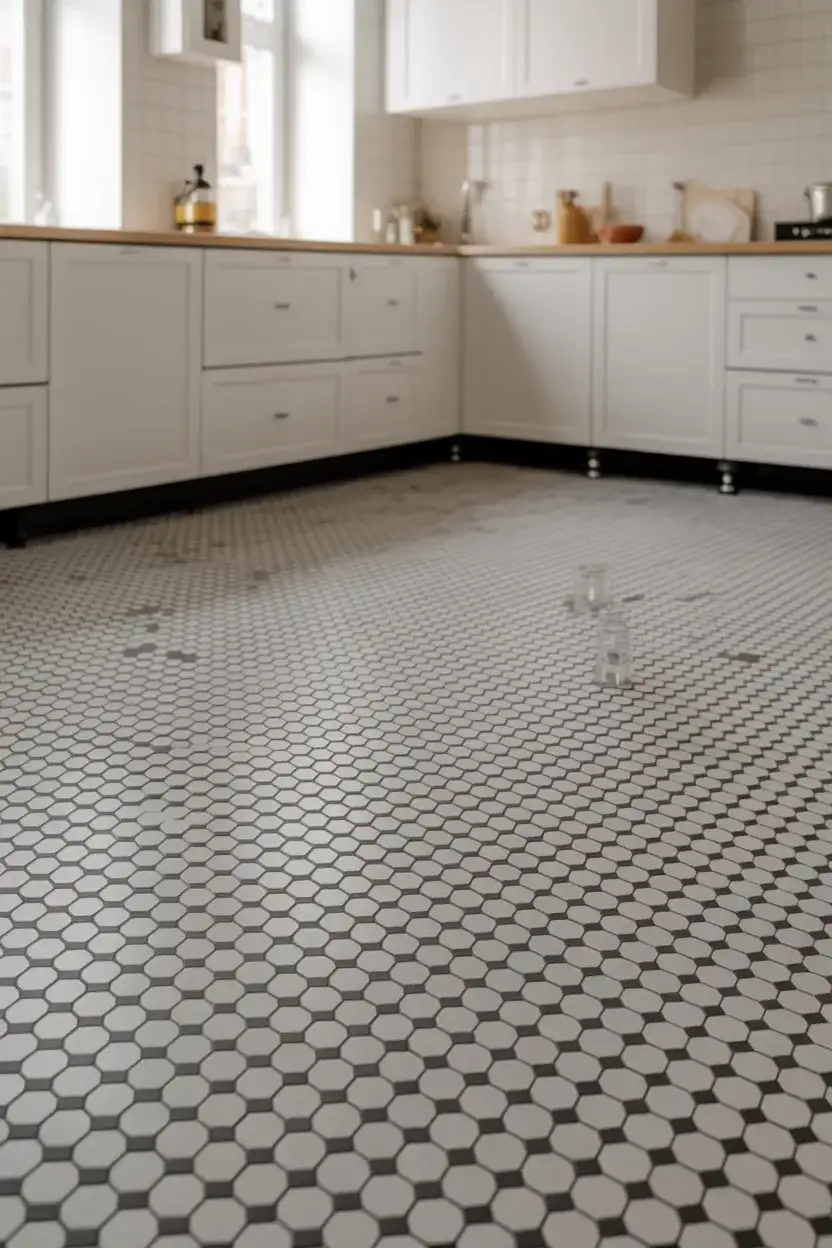
The hex tile is one of the most beloved patterns in American home design, and in black and white it becomes something genuinely architectural. Unlike the checkerboard, which reads as bold and graphic, the hexagonal floor pattern has a more intricate, handcrafted quality—it references Victorian bathroom floors, Parisian café terraces, and early 20th-century craftsman kitchens. It’s a pattern with real history, and introducing it to a modern kitchen gives the space a layered, lived-in character that brand-new construction often lacks. Use it in a classic black-on-white ratio for maximum impact without feeling too heavy underfoot.
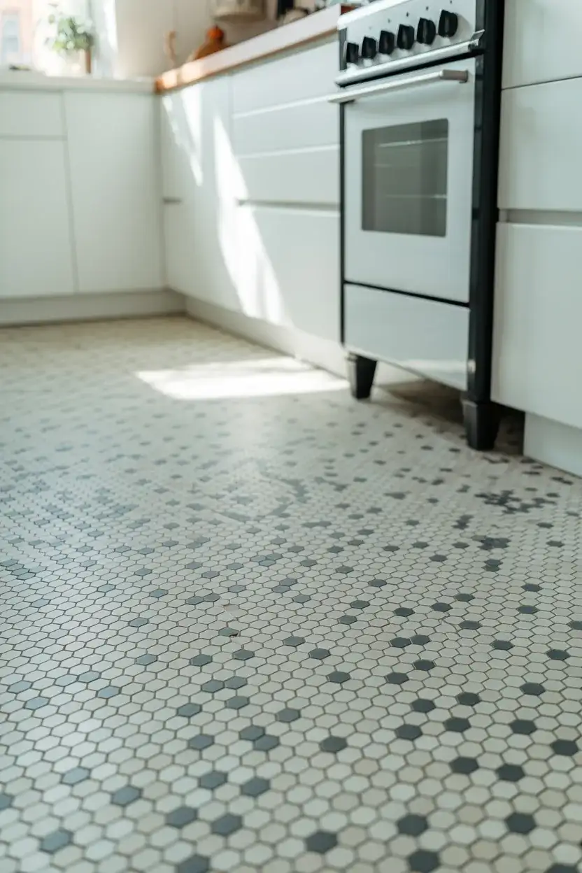
Hex tile comes in a huge range of sizes, from penny-round mosaics (under an inch) to large-format 6-inch hexes. The smaller the tile, the more grout lines you’re dealing with—which means more texture and visual complexity and more grout to maintain. For kitchens specifically, 2-inch to 4-inch hexes in porcelain hit the sweet spot: enough visual interest to make the pattern sing, manageable grout lines, and durable enough to handle dropped cast iron pans. Always seal the grout after installation and reseal annually in high-traffic kitchens to keep those white grout lines from going gray.
16. Black Windows and Frames as Kitchen Design Elements
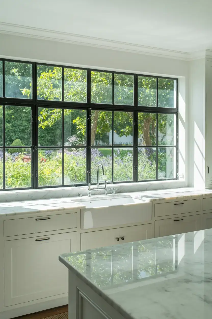
One of the quietest but most impactful design moves in a modern kitchen renovation is swapping standard white-frame windows for black steel or powder-coated aluminum frames. The black window becomes a feature—framing the view outside like a painting while tying into any other black elements in the kitchen. Against white cabinets and white walls, these frames add an architectural crispness that makes the entire space feel more considered. This is the modern detail that photographers and designers always call out when they walk into a well-executed kitchen, even if they can’t immediately articulate why the room feels so sharp.
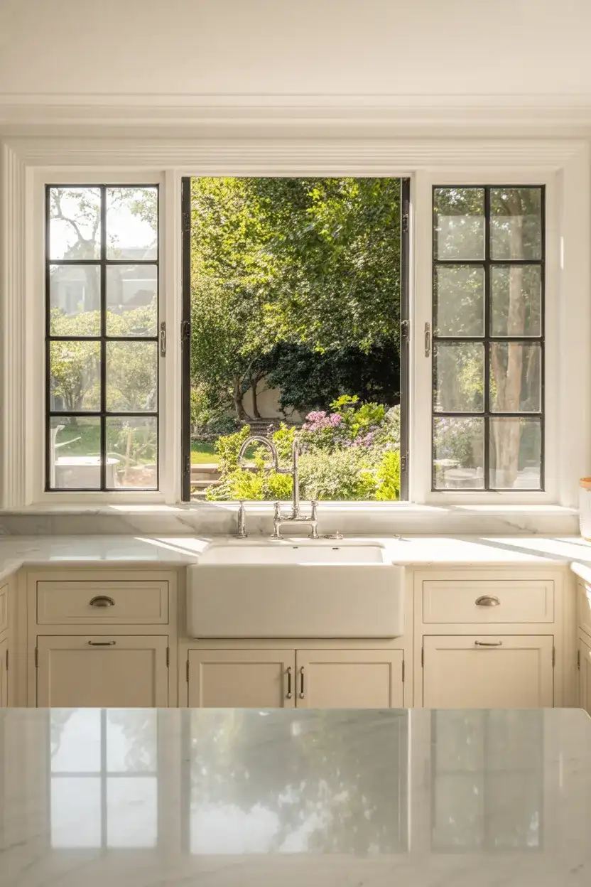
If a full window replacement isn’t in the budget, you can achieve a convincing version of this look with Rust-Oleum’s oil-rubbed bronze or matte black spray paint designed for metal—many homeowners have successfully transformed old aluminum frames this way. For new construction or major renovation, Marvin, Andersen, and Pella all offer dark-frame window options at various price points. The black frame effect is most powerful when you have at least two or three windows in the kitchen visible from the same vantage point, so the pattern becomes readable rather than a random single accent.
17. Black and White Kitchen with Terrazzo Floors
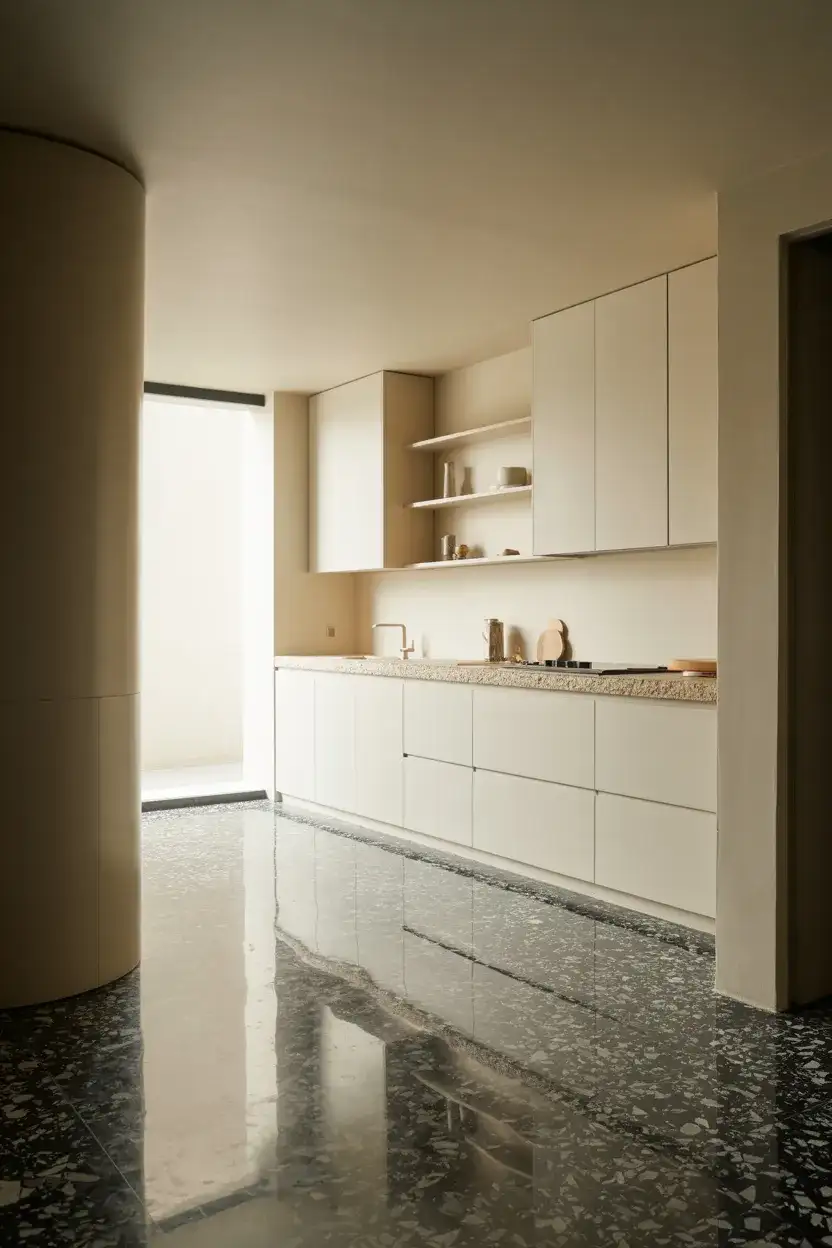
Terrazzo is having its most significant design moment since the 1970s, and it makes perfect sense in a black and white kitchen context. The material is essentially a composite of marble chips set in cement or resin—and in a black-and-white chip colorway, it creates a floor that’s both graphic and artisanal, with every square foot being slightly different from the last. This floor option reads beautifully against flat white or matte black cabinets because it brings organic variation to a palette that can sometimes feel a little too geometric and controlled. It’s a floor that rewards long-term living—it only gets more beautiful as it polishes over years of use.
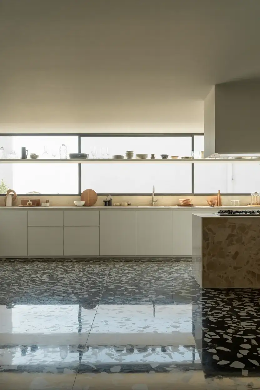
Poured terrazzo (the traditional form) is a significant investment—installation typically runs $15–$30 per square foot—but terrazzo tile has become widely available and brings the same visual impact at a fraction of the cost. If you’re shopping for terrazzo-look alternatives, large-format porcelain tiles with terrazzo printing have gotten remarkably convincing, particularly from brands like Daltile and Marazzi. The one thing that makes real terrazzo worth the splurge if you can manage it: it’s seamless. That continuous surface with no grout lines reads as genuinely luxurious and is far easier to clean in a kitchen environment.
18. Two-Tone Black Lower, White Upper Cabinet Scheme
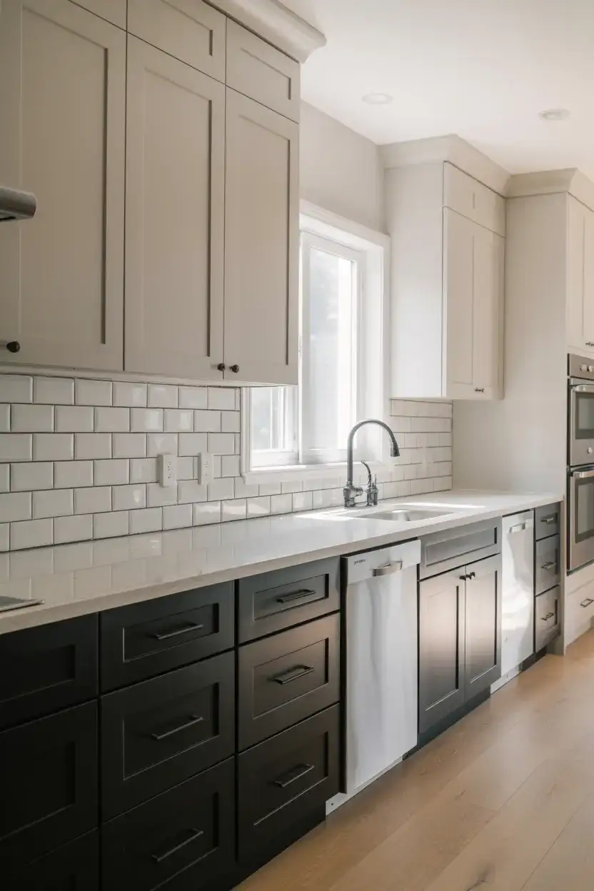
The two-tone cabinet approach—black lowers, white uppers—is arguably the most popular execution of the black and white kitchen theme in American homes right now, and for good reason. It gives you the drama and depth of dark cabinetry where it counts (grounding the room visually at the base) while keeping the upper half of the kitchen open, light, and airy. This arrangement is particularly friendly to kitchens with lower ceilings because the dark base doesn’t visually compress the room the way all-black cabinets would. It also creates a natural “horizon line” that makes the kitchen feel larger and more architecturally composed than a single-tone scheme.
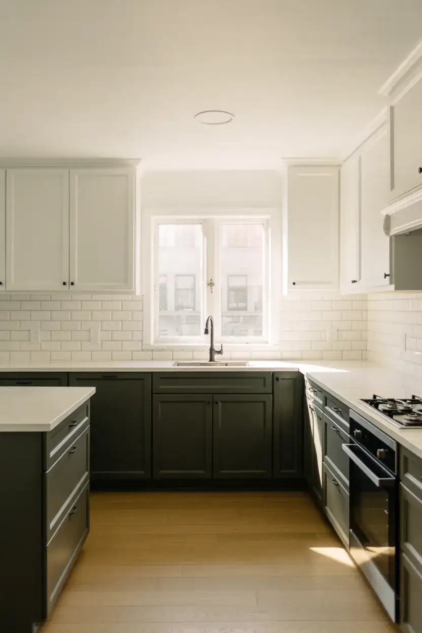
When planning this split, think carefully about where the visual transition happens. The standard break is at the countertop line, where the upper and lower cabinets naturally meet. But some designers extend the black up through the backsplash area with dark tile, which creates a banded effect and makes the transition feel more intentional. The opposite—keeping the backsplash white—keeps the lowers more grounded and separate. Neither is wrong; it comes down to whether you want the black to read as a bold architectural band or as a quieter, furniture-like element below the work surface.
19. Vintage Black and White Kitchen with Antique Accents
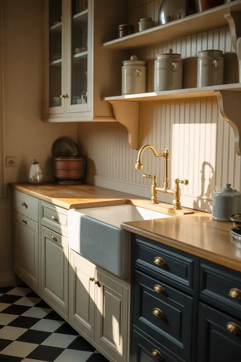
Not every black and white kitchen needs to be sleek and contemporary—the vintage interpretation of this palette has a warmth and character that modern versions sometimes lack. Think apron-front sinks, unlacquered brass faucets, open shelving holding transferware dishes, and painted beadboard walls. The decor leans nostalgic: a clock with Roman numerals, glass-front cabinets, and woven market baskets tucked beneath open shelves. This is the kitchen that feels like it’s always been there—like the house was built around it and every generation has added something personal to its walls and shelves over the decades.
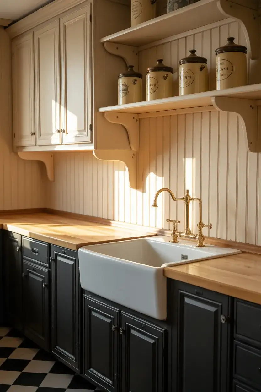
This style suits older homes with period character—craftsman bungalows, Colonials, Cape Cods, and Victorian-era row houses—where a hyper-modern kitchen would feel completely at odds with the bones of the building. The beauty of this approach is that it’s incredibly forgiving of imperfect walls, slightly uneven floors, and cabinets that don’t quite meet true level—which are all features of vintage homes, not bugs. Sourcing genuine antique hardware from Architectural Salvage stores or Etsy gives this kitchen a layered authenticity that reproduction hardware simply can’t replicate, and often at a similar or lower price point.
20. Black and White Kitchen with Concrete Countertops
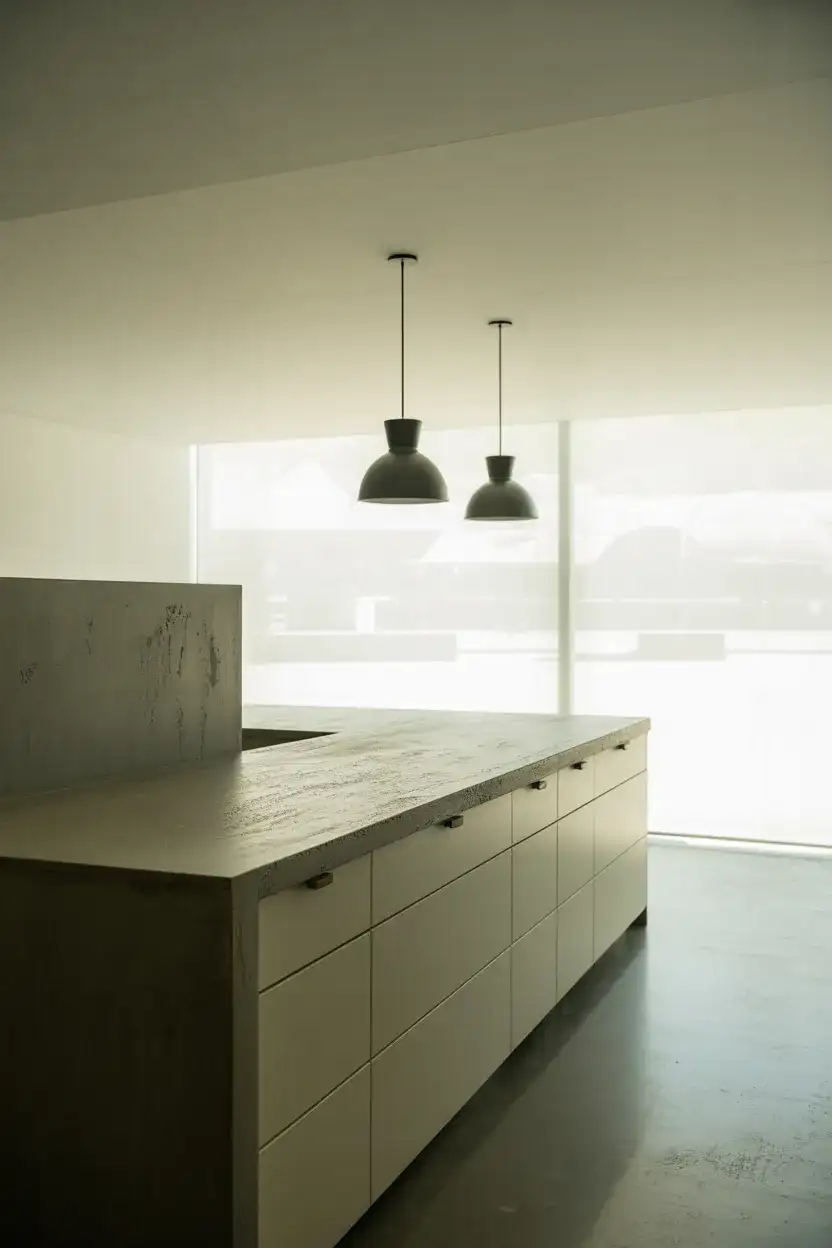
Concrete countertops occupy an interesting design space: they’re industrial and raw on one level, but in the right kitchen they read as genuinely artisanal and warm. In a black and white kitchen, poured concrete in a natural gray tone acts as a third neutral—neither fully black nor fully white—that creates depth and variation in the palette without introducing color. Against stark white flat-front cabinets, concrete counters have a distinctly loft-like, urban quality. Against black shaker lowers, they soften the contrast and bring in a craft-studio sensibility that feels simultaneously grounded and contemporary.
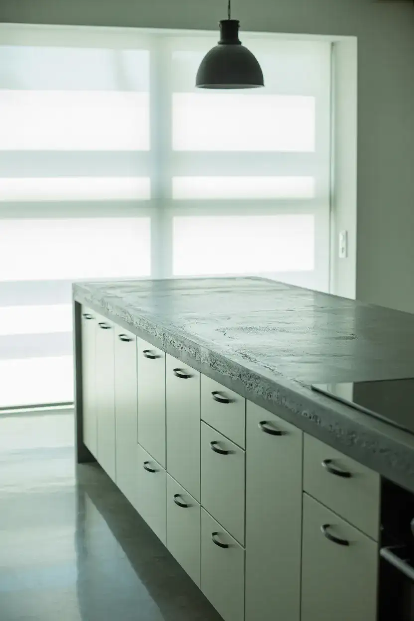
Real poured concrete countertops are a specialty fabrication—expect $75–$150 per square foot installed, including the sealing. They require resealing every one to three years and are prone to staining if you leave wine, lemon juice, or olive oil on the surface too long. For homeowners who love the look but want something more maintenance-friendly, concrete-look quartz is now so convincing that even architects sometimes have to look twice. Dekton and Silestone both produce excellent concrete-look slabs with none of the porosity concerns of genuine cast concrete.
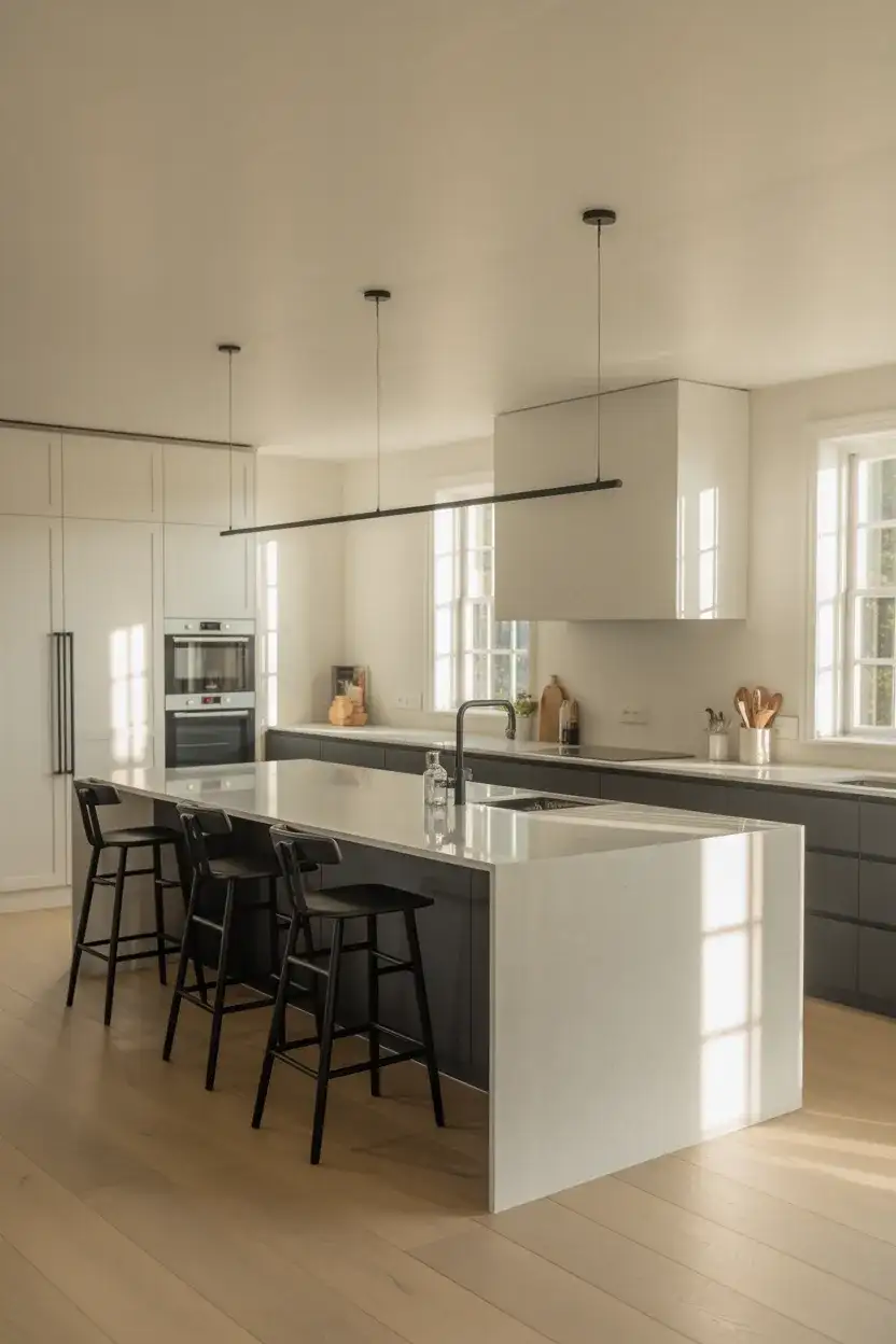
21. Black and White Kitchen with Statement Pendant Lights
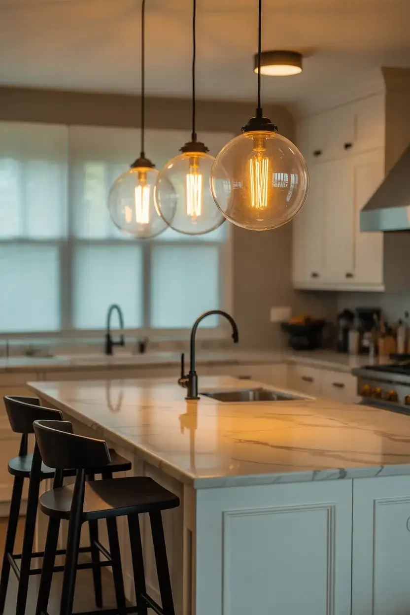
In a kitchen defined by its restraint—white walls, black cabinets, clean counters—the pendant light becomes the piece that gives the room a soul. A cluster of matte black cage pendants over a white island, or oversized black schoolhouse globes above a marble breakfast bar, brings the eye upward and creates a kind of punctuation that tells the viewer: this kitchen was thought about. This modern interior design approach to lighting treats fixtures not as utilities but as objects—chosen with the same care as a piece of furniture. The right pendant in a black and white kitchen is often the difference between a room that looks designed and one that just looks decorated.
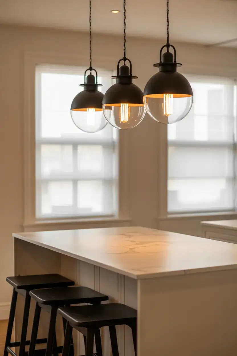
Pendant scale is something many homeowners underestimate—the instinct is often to go smaller and safer, but oversized pendants read dramatically better in finished photos and in person. A good rule: the diameter of your pendant should be roughly one-third the width of your island. For an 8-foot island, that means three 10-inch pendants or two 14-inch pendants. Hang them lower than you think—the bottom of the shade should sit 30 to 36 inches above the countertop surface. Anything higher starts to read as a ceiling fixture rather than a purposeful kitchen light, and you lose the intimacy that makes the pendant such an effective design element.
22. Full Black and White Galley Kitchen, Small Space
The galley kitchen is one of the most efficient cooking layouts ever devised—two runs of cabinets facing each other, with a narrow corridor between. And in a design sense, the black and white palette is one of its greatest allies because it brings such visual clarity to what is often a small, compressed space. Painting one wall in matte black and the opposite in crisp white creates a dynamic tension that makes the galley feel intentional rather than cramped. Add tile in a bold pattern on the floor—hex or checkered—and suddenly the narrowness becomes a feature: you see the full pattern laid out before you like a graphic runway.
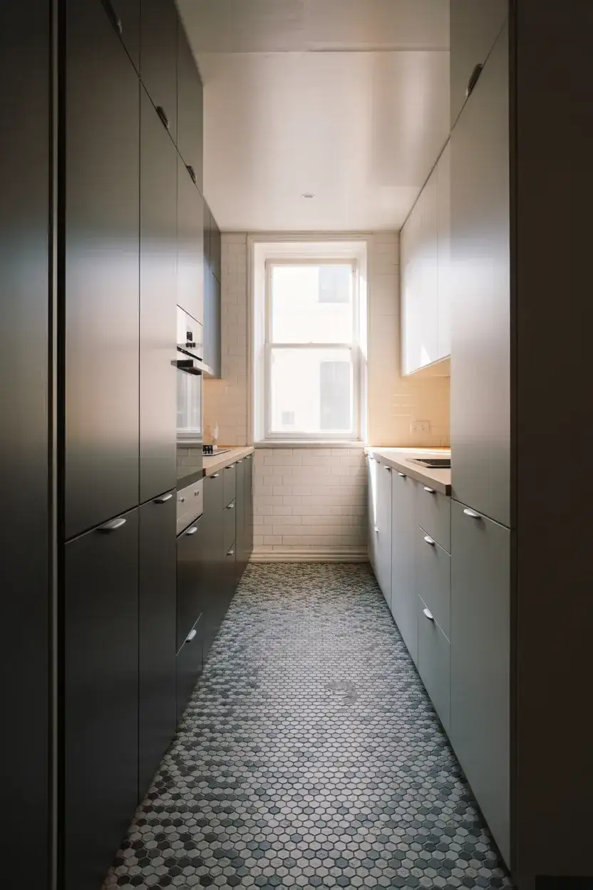
Small galley kitchens are common in urban apartments across New York, Chicago, D.C., and other dense American cities—and the black and white approach genuinely helps rather than hurts in tight quarters. Light reflects off the white surfaces to brighten the space, while the black elements provide visual anchoring that prevents the room from feeling washed out or sterile. One practical note: in a galley, cabinet pulls and handles get grabbed constantly because the space is so linear. Choose hardware you love touching—a smooth, comfortable pull makes a real difference in a kitchen you’re using daily in a very close, immediate way.
Conclusion
Whether you’re drawn to the drama of black matte cabinets, the romance of a checkered floor, or the simple elegance of white shakers with black hardware, there’s a version of the black and white kitchen that belongs in your home. These 22 ideas are a starting point, not a prescription—the best kitchens are always the ones that reflect the actual people living and cooking in them. Which direction speaks most to your space and style? Drop your thoughts in the comments below—we’d love to hear what you’re planning, what you’ve already tried, and what’s been sitting in your Pinterest board the longest.