Bedroom Paint Ideas 2026: 46 Stunning Colors and Schemes for Every Style
Bedroom paint in 2026 isn’t just about slapping color on walls—it’s about creating spaces that feel personal, calming, and completely yours. Americans scrolling Pinterest right now are searching for ways to refresh tired bedrooms without major renovations, and paint remains the fastest, most affordable transformation tool available. Whether you’re working with a cramped rental or a sprawling master suite, the right color can shift the entire mood of your sleep space. This year’s trends lean into earthy tones, unexpected darks, and playful accent strategies that make small changes feel significant. Here are bedroom paint ideas that capture what’s resonating in 2026.
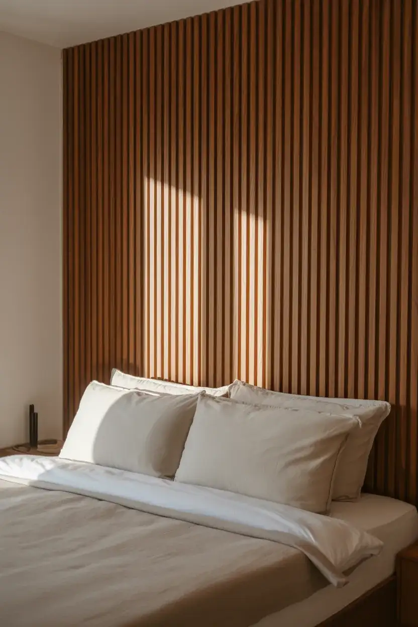
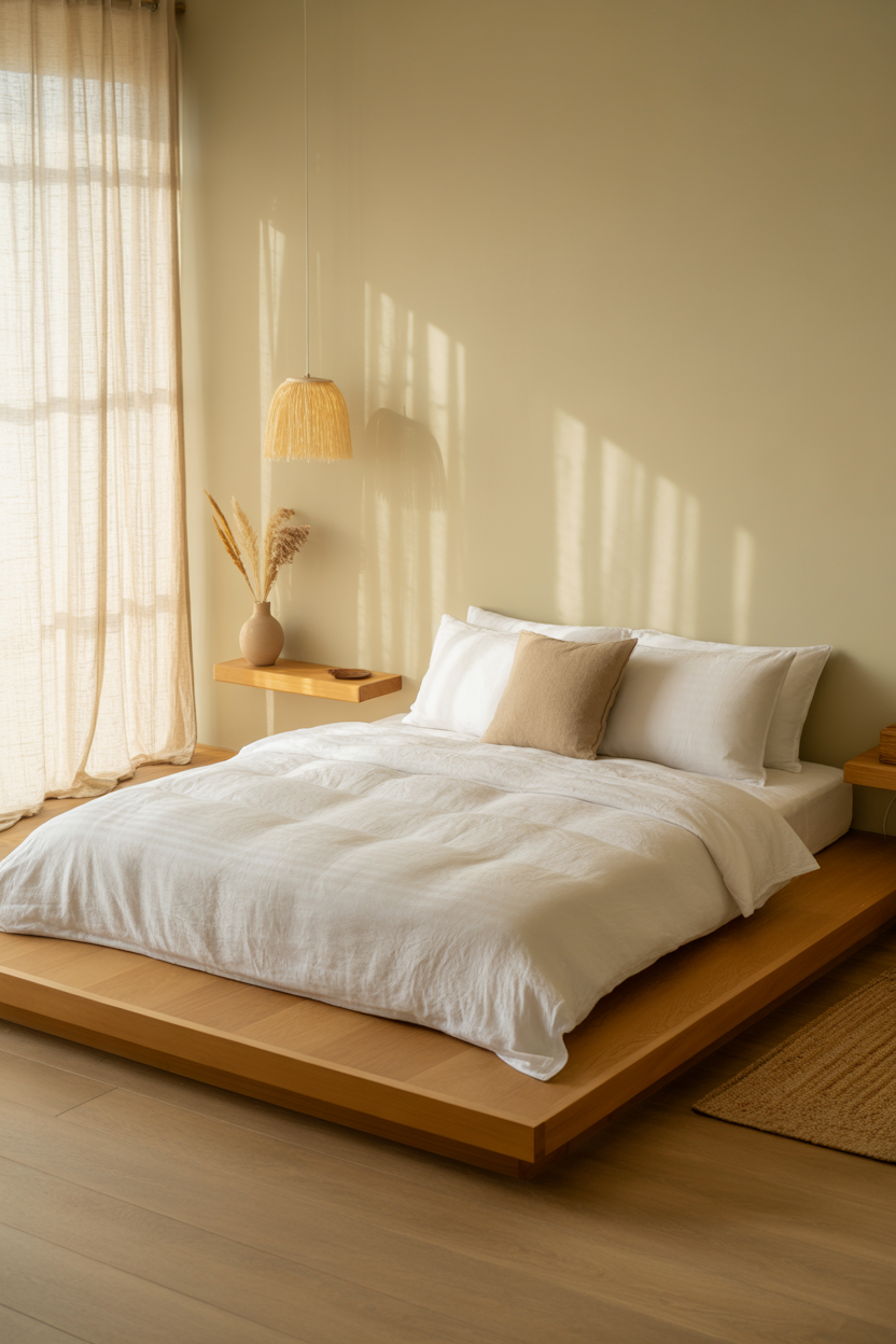
1. Canvas White with Warm Undertones
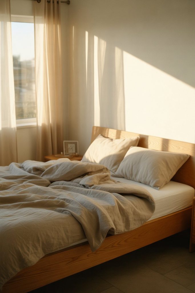
Think of canvas white as the smarter cousin of stark white—it has just enough warmth to prevent that sterile hospital feeling while still keeping small rooms bright and open. This shade works beautifully in bedrooms where natural light fluctuates throughout the day, adapting to morning sun and evening lamplight without looking yellow or cold. It’s especially popular in rental spaces where tenants want a clean slate that won’t clash with existing furniture or require landlord approval for bolder choices. 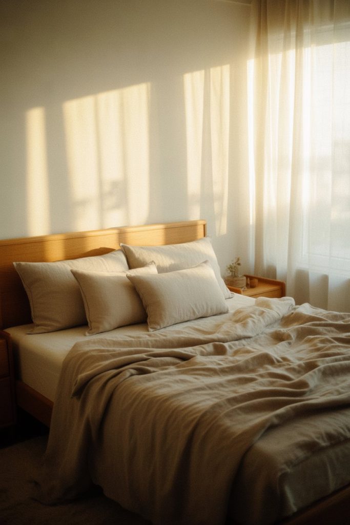
One common mistake is pairing canvas whites with cool-toned furniture—the clash creates visual confusion. Instead, lean into warm woods, brass fixtures, and natural textiles that amplify the paint’s inherent coziness. Test your chosen white in different lighting conditions before committing; what looks perfect at noon might read too beige by 7 p.m.
2. Terracotta Accent Wall in Master Bedrooms
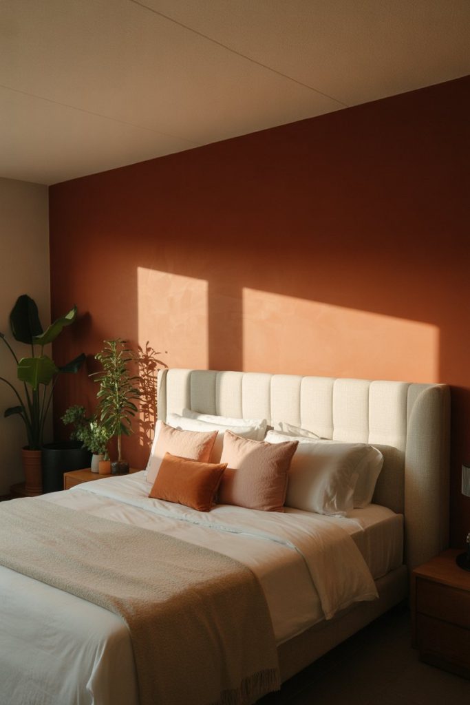
A single accent wall in terracotta brings instant warmth to master bedrooms without overwhelming the space, especially when paired with neutral bedding and light wood furniture. This earthy color has roots in Southwestern design but translates beautifully to modern bedrooms across the country, from Brooklyn lofts to suburban ranch homes. The trick is choosing the wall behind your bed—it frames the focal point and creates depth without requiring you to paint the entire room. 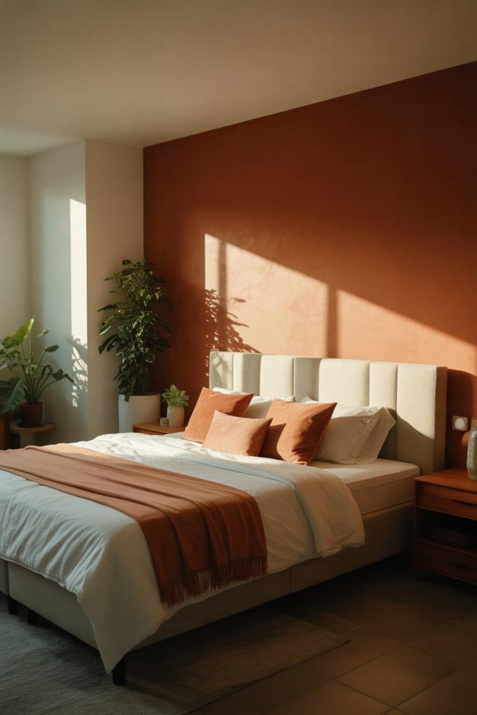
In practice, terracotta works best in rooms with good natural light—it can read muddy in north-facing bedrooms with limited windows. Pair it with crisp whites on the remaining walls and avoid heavy drapes that block light. This setup is particularly popular in states like Arizona and New Mexico, where the color feels culturally authentic, but it’s gained traction nationwide as homeowners seek grounding, earthy palettes.
3. Sage Green for Cozy Small Bedrooms
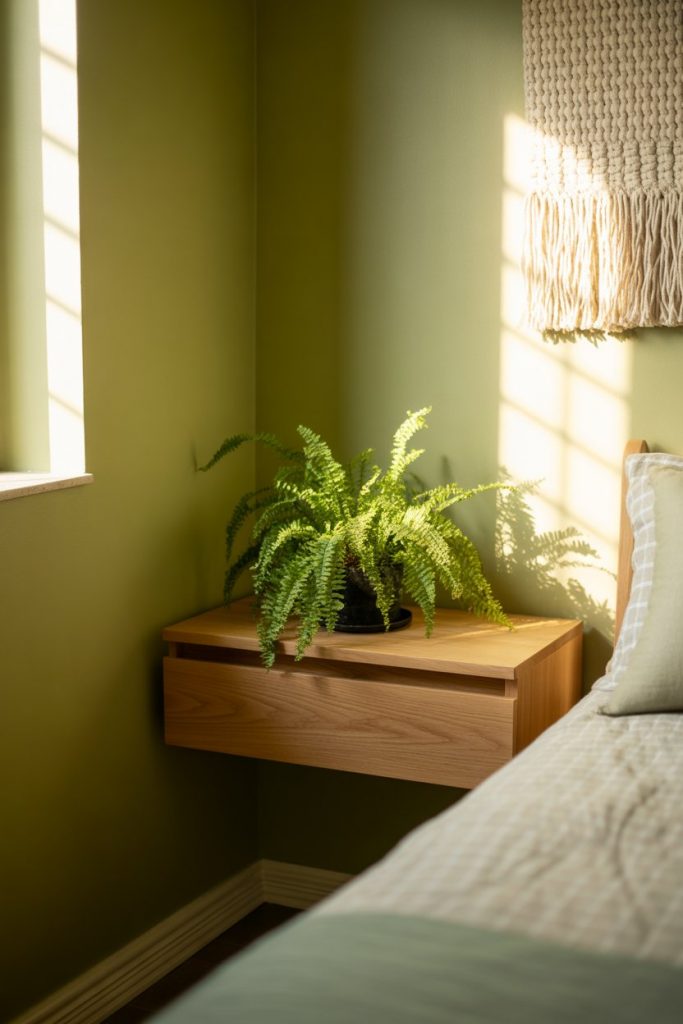
Sage green continues its reign as the go-to choice for small rooms that need to feel cozy rather than cramped. Unlike darker greens that can shrink a space, sage has enough gray to stay soft while still delivering color impact. It’s become shorthand for “I want my bedroom to feel like a calm retreat” on Pinterest boards, where it’s paired endlessly with white oak furniture and linen textures. 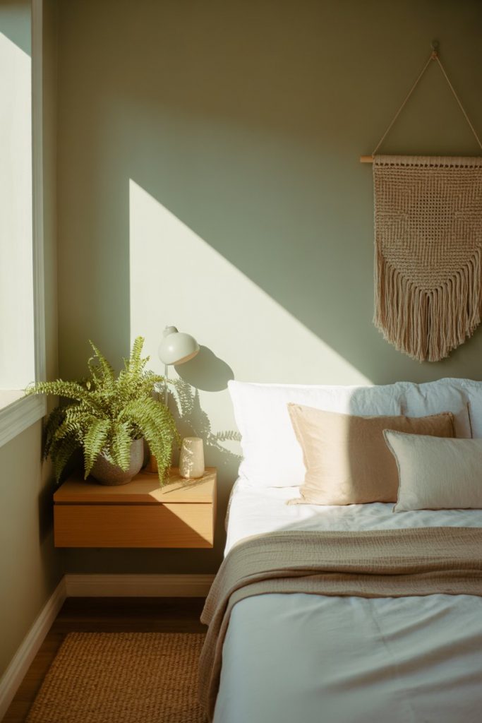
A designer once mentioned that sage green is essentially therapy in paint form—it lowers visual noise and pairs with almost any accent color you throw at it. The shade works particularly well in bedrooms where you’re trying to incorporate plants; the color echoes foliage without competing for attention. Budget-conscious homeowners appreciate that it hides minor wall imperfections better than stark white.
4. Charcoal Gray Guest Room Sophistication
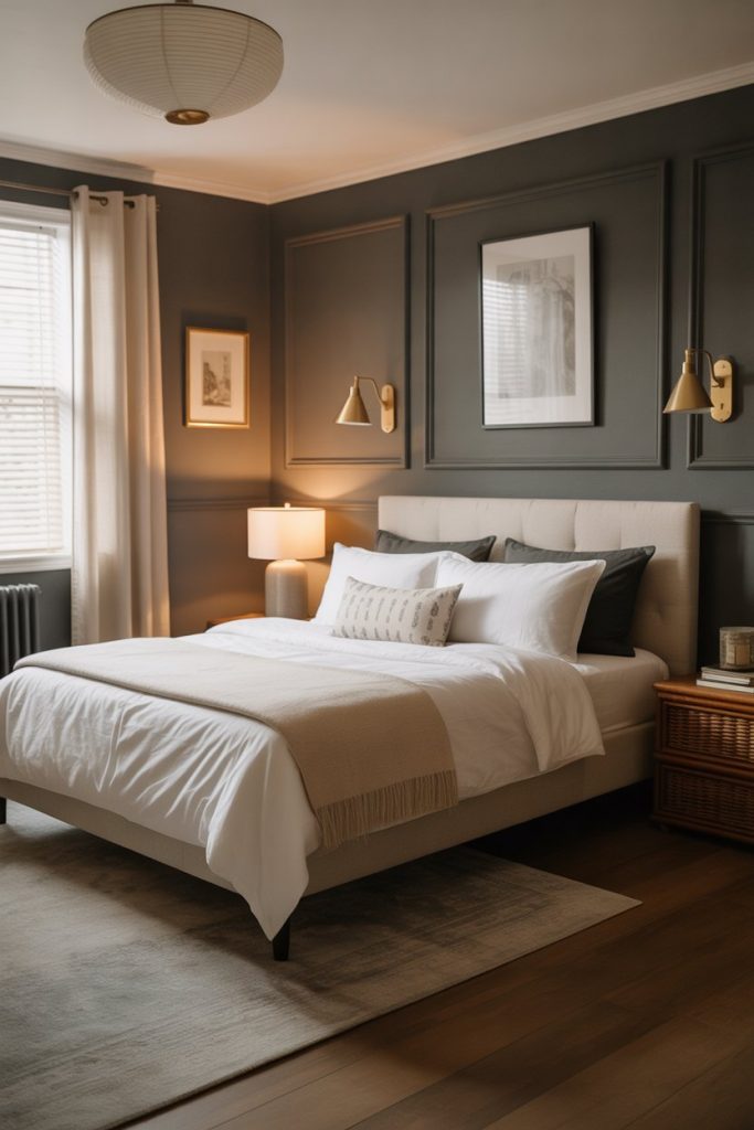
Painting a guest bedroom in charcoal gray might seem counterintuitive, but it creates a hotel-like sophistication that makes visitors feel pampered rather than confined. The dark tone works surprisingly well in spaces that aren’t used daily—it photographs beautifully and requires less frequent touch-ups than lighter shades. Pair it with bright white trim and brass lighting fixtures to prevent the space from reading as a cave. 
Where it works best: Guest rooms in homes with strong architectural details—crown molding, tall ceilings, or large windows that balance the darkness. In a typical suburban home, this treatment elevates a forgettable spare room into something that feels intentional. Avoid this in basement guest rooms unless you’re adding serious supplemental lighting.
5. Blush Pink and Cream Color Schemes
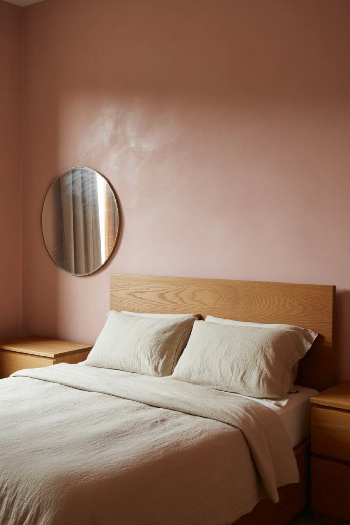
Blush pink has matured beyond the millennial pink phase into a sophisticated neutral that anchors entire color schemes when paired with cream and soft whites. It reads modern rather than juvenile, especially in matte finishes that avoid the sheen associated with nurseries. This combination thrives in bedrooms where you want warmth without the commitment of bold color—it’s subtle enough to live with long-term. 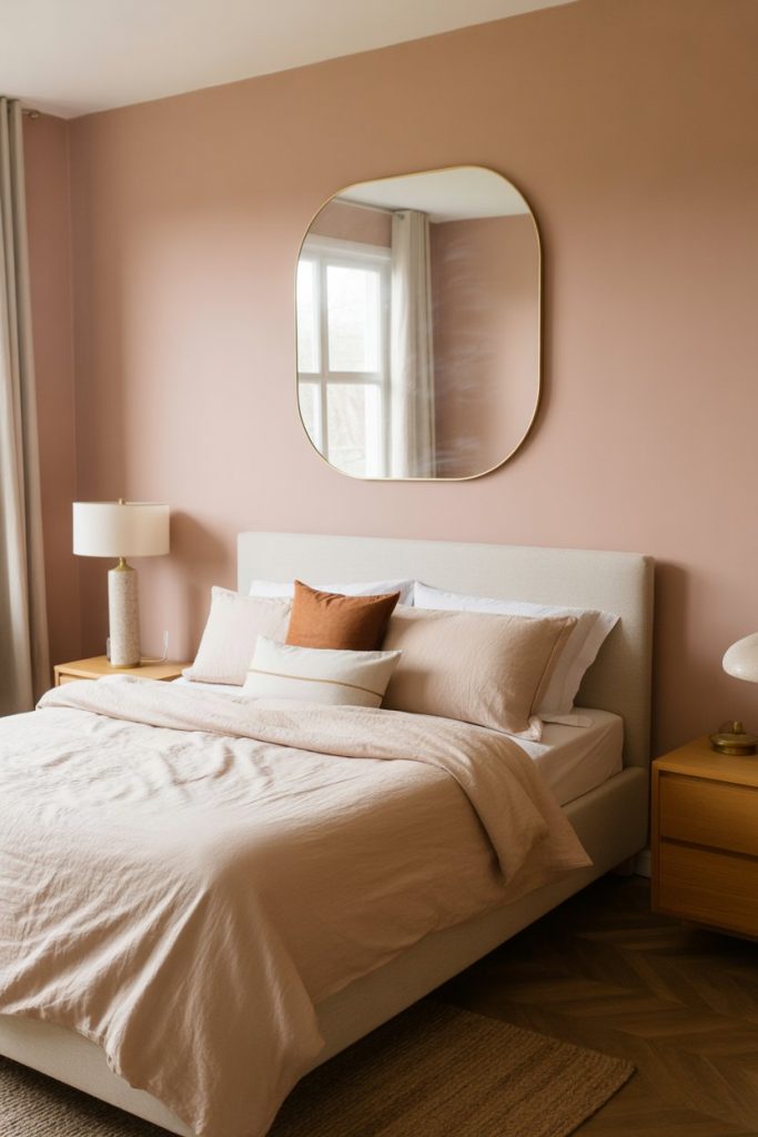
Real homeowner behavior reveals that people who choose blush tend to be swapping out trendy navy or gray bedrooms for something that feels less cold. The shade works across age ranges—twenty-somethings pair it with modern furniture, while older homeowners combine it with vintage pieces for a collected look. Keep metallic accents to a minimum; too much gold or rose gold can tip the palette saccharine.
6. Navy Blue Attic Bedroom Drama
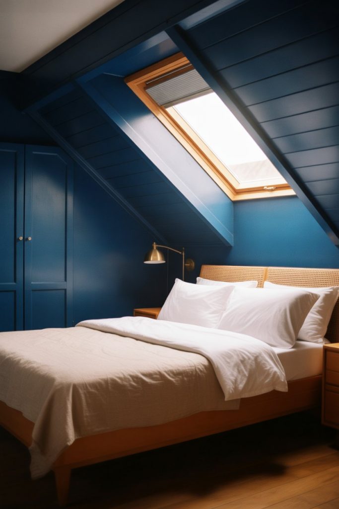
Transforming an attic bedroom with blue paint—specifically a deep navy—turns awkward angles and sloped ceilings into architectural assets rather than flaws. The dark color unifies choppy wall planes and creates an enveloping, cocoon-like quality perfect for sleep. This approach is especially popular in older homes with finished attics that need personality beyond exposed beams and Velux windows. 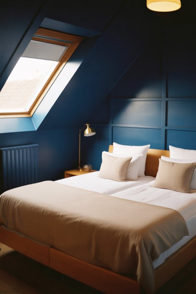
One practical insight: dark paint in attics requires excellent lighting strategy. Install multiple light sources at different heights—sconces, table lamps, and overhead fixtures—to prevent the space from feeling like a cave. The navy also hides dust and cobwebs better than white, which matters in attics where HVAC vents tend to accumulate particles.
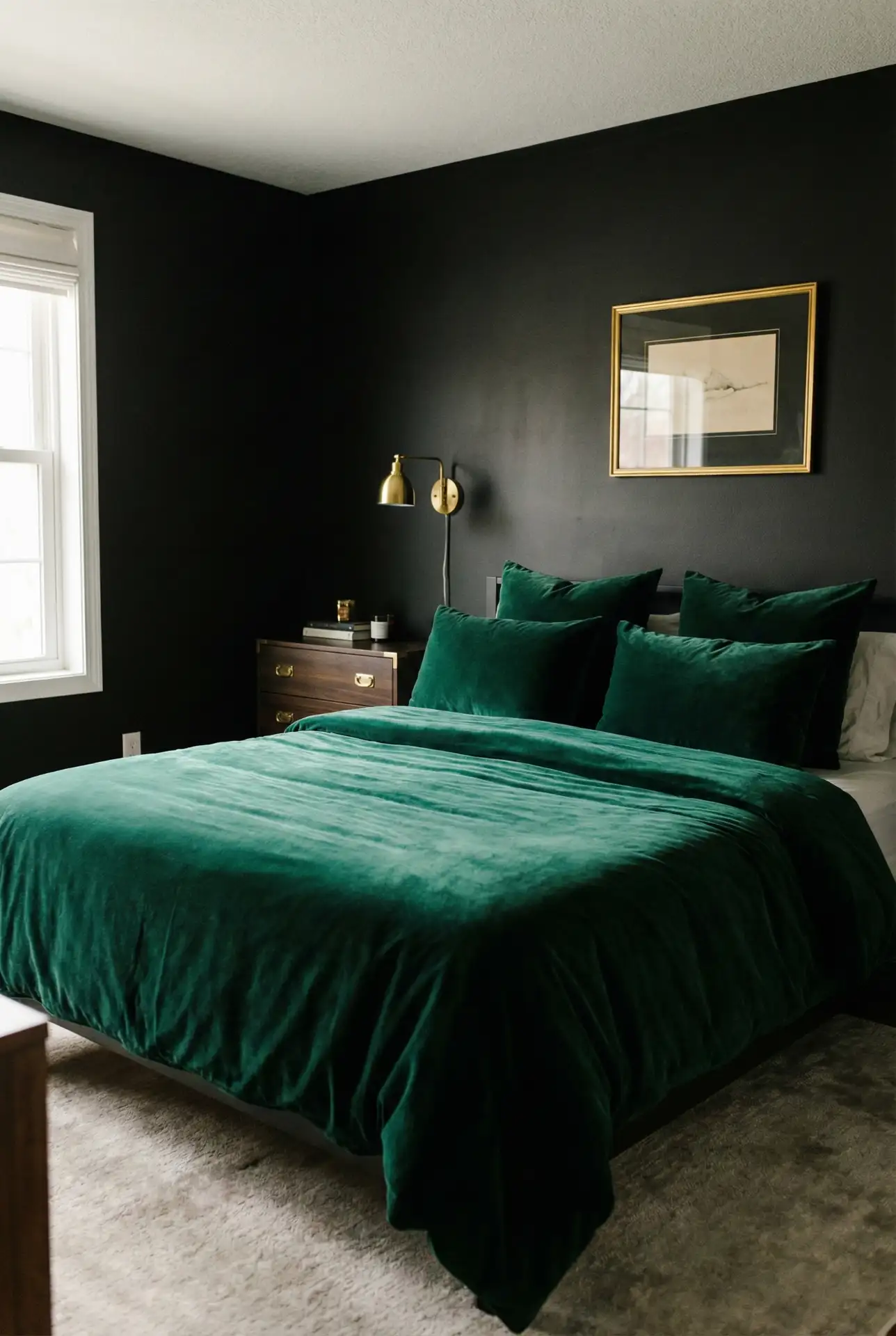
7. Indian-Inspired Jewel Tones
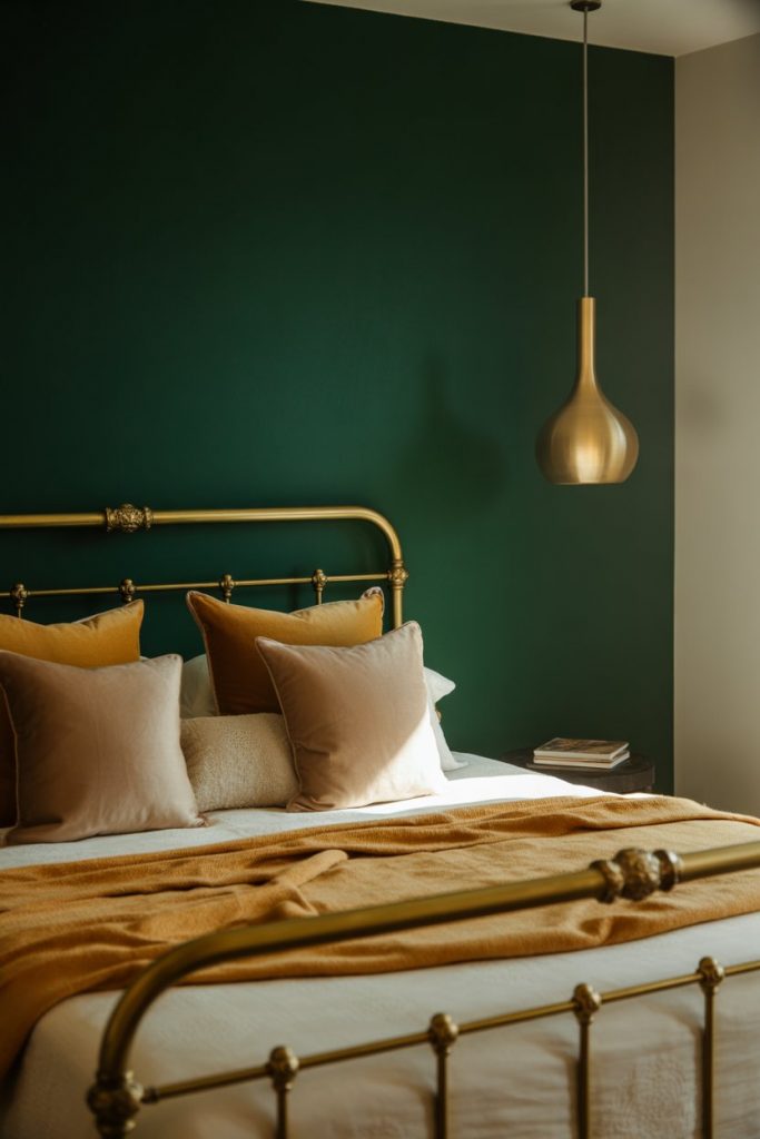
Drawing from Indian design traditions, jewel-toned bedrooms in emerald, sapphire, and ruby create richness that feels earned rather than trendy. These saturated colors work best as accent wall treatments or in smaller bedrooms where you want maximum impact, paired with gold accents and layered textiles. The aesthetic translates globally—you don’t need to commit to a full cultural theme to borrow the color confidence. 
A common mistake is treating jewel tones like they’re interchangeable with pastels—they demand different furniture weights and textures. Heavy linens, velvet pillows, and substantial wood pieces ground these bold colors, while minimalist Scandinavian furniture can look lost against them. Budget-wise, one gallon of quality jewel-tone paint goes further than you’d think; these shades hide imperfections beautifully.
8. Two-Tone Walls in Modern Master Suites
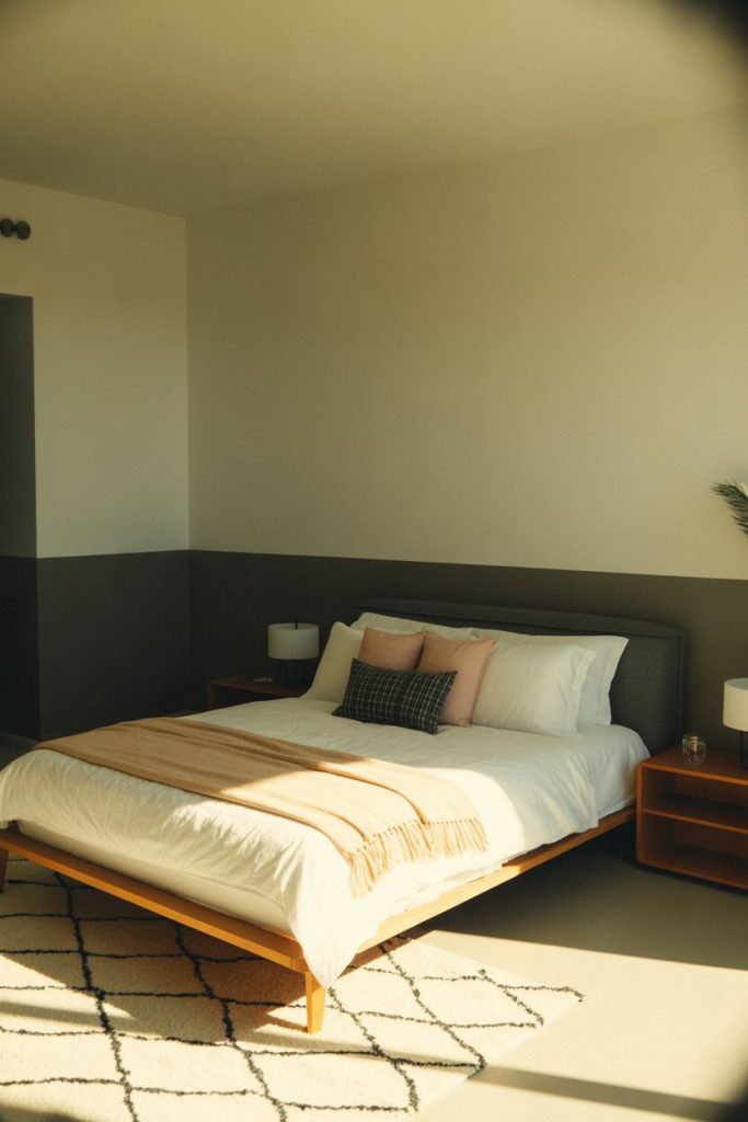
The two-tone wall treatment—painting the bottom half of walls in one color and the top in another—adds architectural interest to modern master bedrooms without the cost of wainscoting or paneling. Popular combinations include sage green below with cream above, or charcoal gray below with white above, split at chair-rail height. This technique works especially well in rooms with tall ceilings where a single color can feel overwhelming. 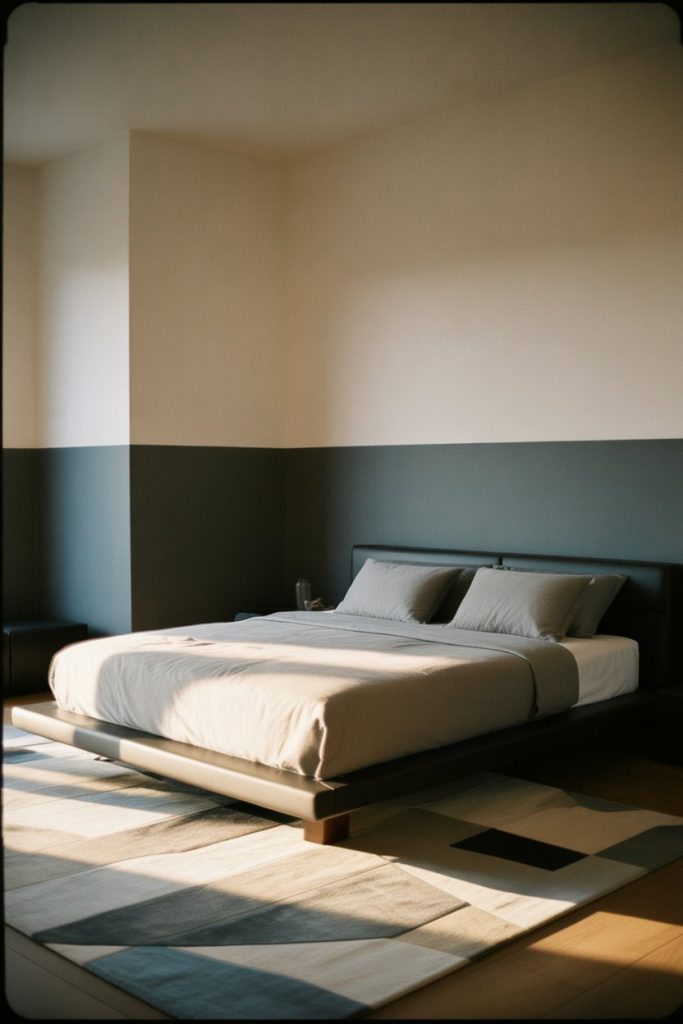
Where it works best: Bedrooms in newer construction where builders installed flat walls without trim details. The paint treatment creates visual breaks that make the space feel more considered. Avoid this in rooms with multiple windows and doors—too many breaks in the horizontal line will look choppy rather than intentional.
9. Dusty Lavender for Aesthetic Bedrooms
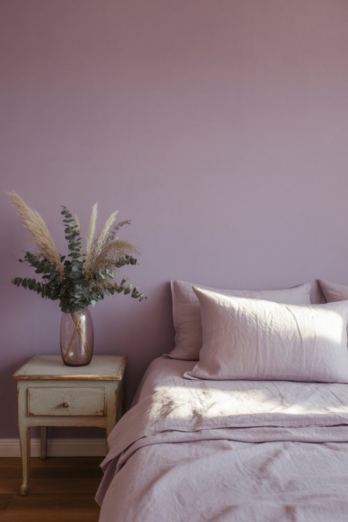
Dusty lavender has emerged as the 2026 answer to gray fatigue—it brings color without shouting, creating aesthetic bedrooms that photograph beautifully for social media while remaining livable. Unlike traditional purple, this muted version contains enough gray to feel sophisticated rather than juvenile. It’s become the signature shade for creative professionals who work from home and want their bedrooms to feel like intentional retreats. 
A friend who recently painted her bedroom this shade mentioned how it shifts throughout the day—looking almost gray in morning light, lavender at noon, and slightly pink at sunset. The color pairs unexpectedly well with warm woods and brass, creating a collected look that doesn’t read too matchy. For best results, use a matte or eggshell finish; satin can make the purple undertones too prominent.
10. Forest Green Boho Bedrooms
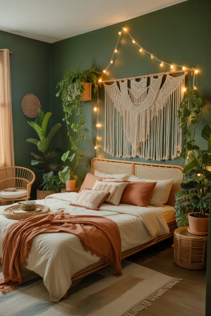
Deep forest green anchors boho bedrooms that layer patterns, textures, and plants without descending into visual chaos. The color provides a grounding backdrop for macramé wall hangings, woven baskets, and the inevitable collection of potted plants that define the style. Unlike neutral walls that recede, forest green participates in the design while still letting eclectic pieces shine. 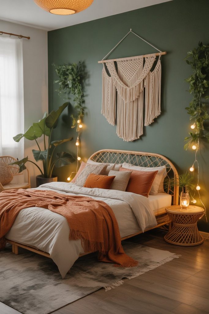
This treatment is particularly popular in the Pacific Northwest and Colorado, where the color echoes surrounding landscapes and feels culturally authentic. The shade works in both large master bedrooms and cramped studio apartments—in smaller spaces, it creates cozy rather than claustrophobic. Pair it with plenty of warm lighting to prevent the room from feeling too earthy or dark, especially in regions with limited winter sunlight.
11. Unique Ombré Wall Techniques
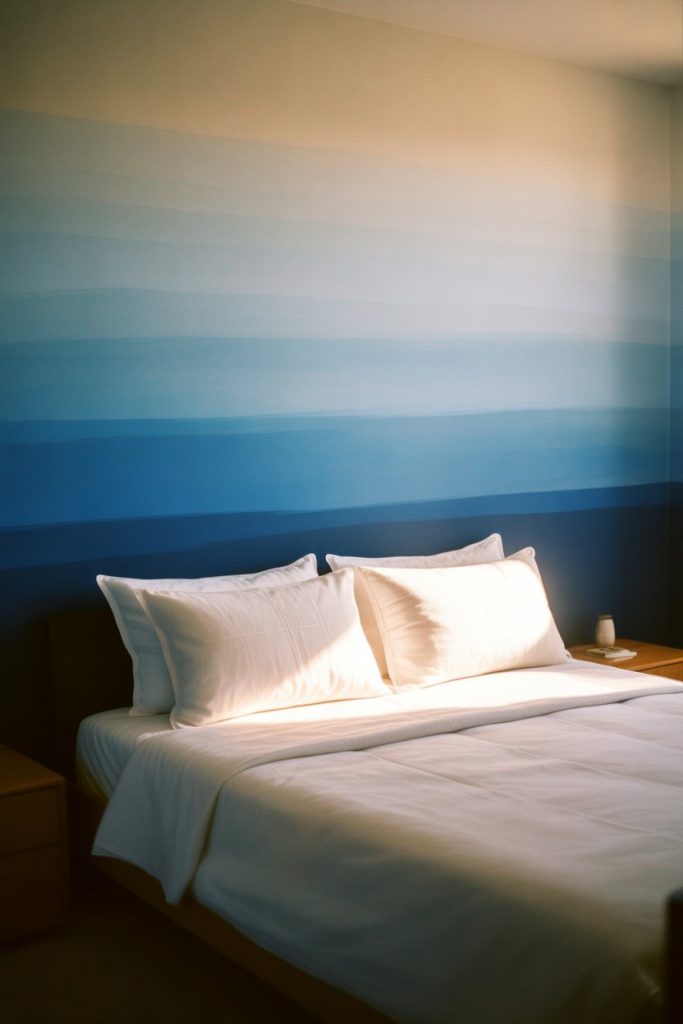
Ombré walls—where color gradually transitions from dark at the bottom to light at the top—create unique bedroom statements that feel custom despite being entirely DIY-able. This technique works with any color family but is most forgiving with blues and grays where slight blending variations look intentional. It’s a creative solution for renters or homeowners who want impact without committing to a single bold shade. 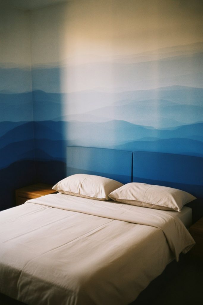
Expert commentary suggests using at least three shades of the same color family for smooth transitions—attempting ombré with just two colors often looks more like poor blending than intentional design. The technique requires patience and wet blending, so budget extra time compared to standard wall painting. It photographs exceptionally well, which explains its popularity on Pinterest among DIY enthusiasts.
12. Terracotta and Cream in Western-Style Bedrooms
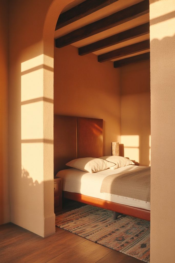
The combination of terracotta walls with cream trim captures Western design influences without resorting to literal cowboy themes, creating warm bedrooms that nod to Southwest heritage. This palette works across the country but feels most authentic in states like Texas, Arizona, and New Mexico where the colors echo both landscape and architectural tradition. Pair it with leather accents and woven textiles for a cohesive look that doesn’t feel costume-y. 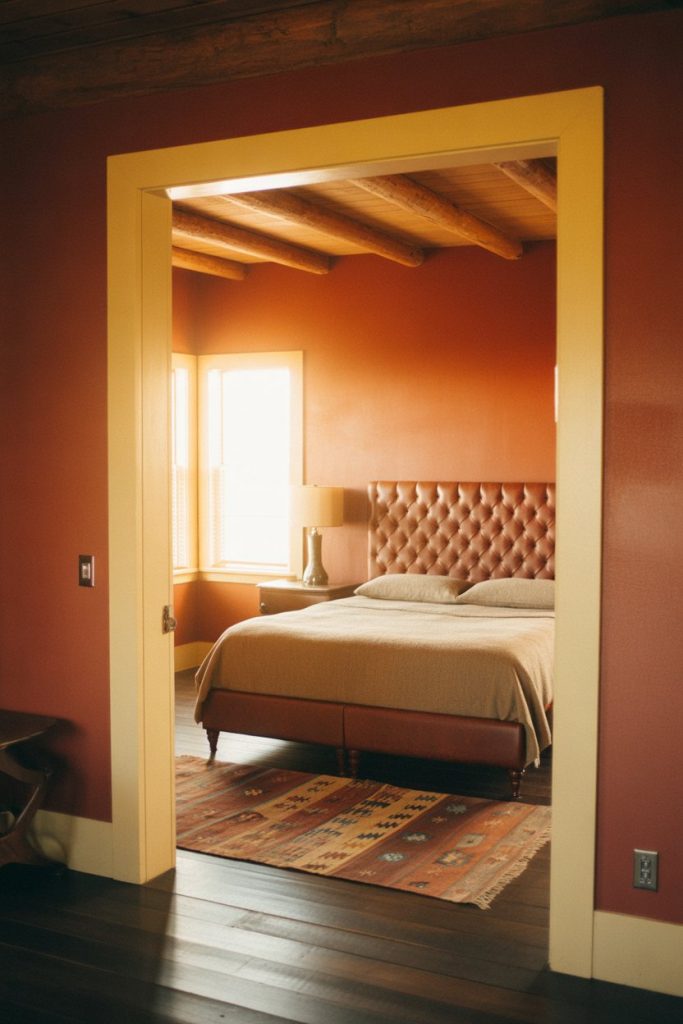
Where it works best: Homes with existing Southwestern architectural details—exposed beams, arched doorways, or tile floors. The paint choice amplifies these features rather than competing with them. In modern tract homes without these elements, the color can feel out of place unless you’re willing to layer in supportive décor like terracotta planters and natural fiber rugs.
13. Moody Charcoal with White Trim Contrast
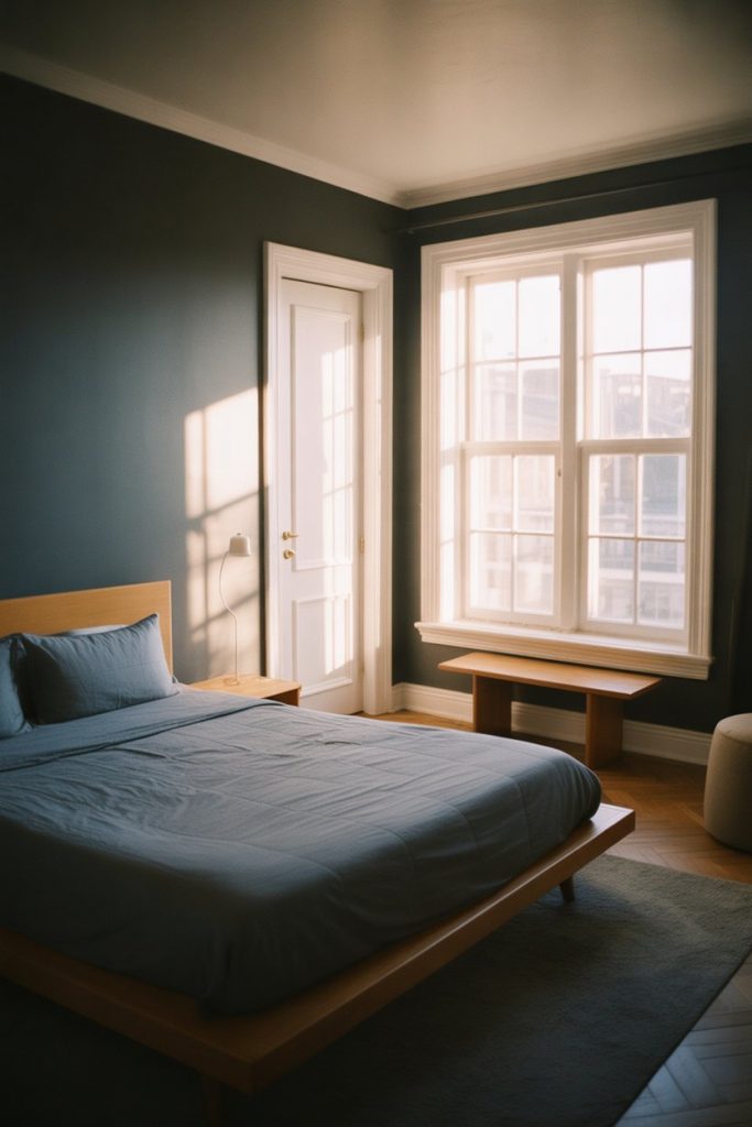
Charcoal walls with crisp white trim create cool, modern bedrooms that feel sophisticated rather than heavy when executed properly. The high contrast between wall and trim makes architectural details pop—baseboards, crown molding, and door frames become design features rather than afterthoughts. This approach works best in bedrooms with ample natural light or in urban settings where the moody palette complements city views. 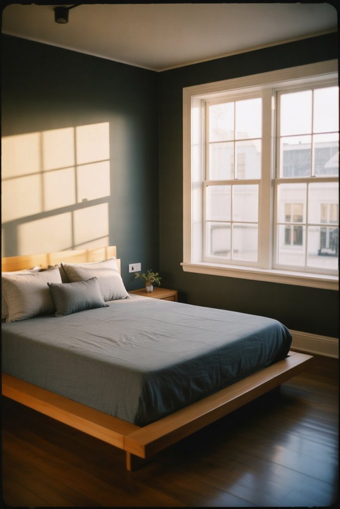
Real homeowners who’ve tried this often report needing more lamps than expected—dark walls absorb light, so standard overhead fixtures don’t cut it. Install dimmers and layer at least three light sources at different heights to maintain functionality. The palette also shows dust more obviously than mid-tone walls, requiring slightly more frequent cleaning to maintain the crisp look.
14. Fun Geometric Accent Walls
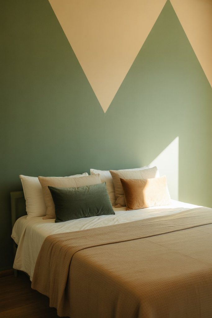
Geometric painted accent walls bring fun and visual interest to bedrooms without requiring wallpaper commitment or expense. Think painted triangles, hexagons, or color-blocked sections that create architectural interest on flat walls. This technique is especially popular in small rooms where a single statement wall adds personality without overwhelming limited square footage. 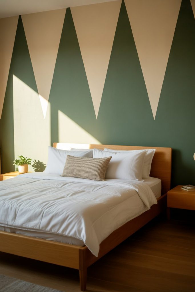
One practical insight: use painter’s tape designed for delicate surfaces and remove it while paint is still slightly tacky for the cleanest lines. Attempting to tape off complex geometric patterns on textured walls rarely ends well—test on a small section first or stick to simpler designs. This treatment photographs exceptionally well, which explains its Pinterest popularity among renters looking for temporary impact.
15. Indian Aesthetic with Spiced Color Palettes
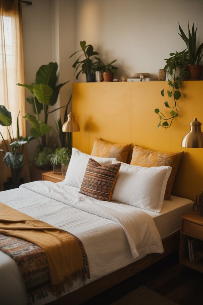
Bedrooms embracing Indian aesthetic principles use spiced color palettes—turmeric yellow, paprika orange, and cardamom green—that create warmth and cultural richness. These aren’t literal reproductions of traditional Indian interiors but rather color inspiration drawn from textiles, spices, and architectural traditions. The approach works particularly well in accent wall applications where bold color makes a statement without requiring full-room commitment. 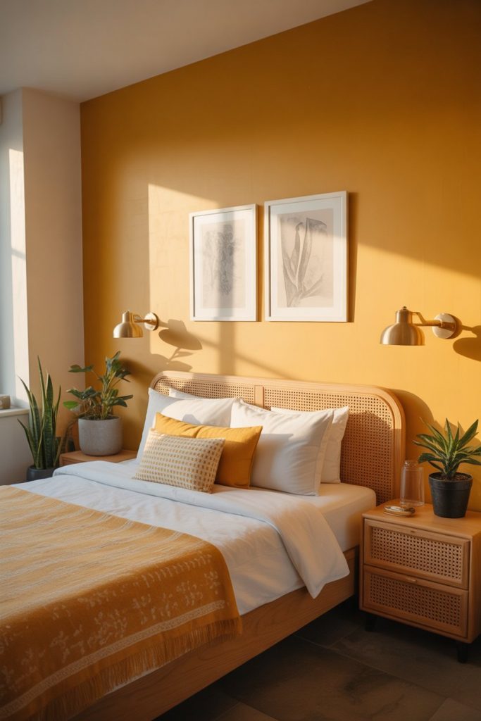
A common mistake is assuming these colors only work in maximalist spaces—they’re actually quite versatile when paired with neutral bedding and simple furniture. The key is letting the wall color be the statement while keeping other elements relatively quiet. Budget-conscious decorators appreciate that paint delivers instant impact without requiring investment in expensive furniture or textiles.
16. Soft Gray-Blue for Cozy Modern Bedrooms
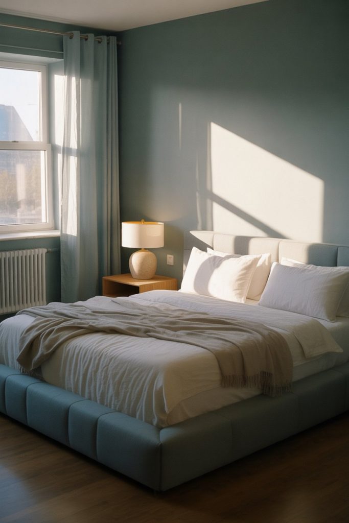
Soft gray-blue sits at the intersection of cool and cozy, creating modern bedrooms that feel calm without the sterility of pure gray. This shade adapts to changing light throughout the day—reading blue in bright morning sun and gray in evening lamplight. It’s become a default choice for homeowners who want color but struggle to commit to anything too bold or trend-specific. 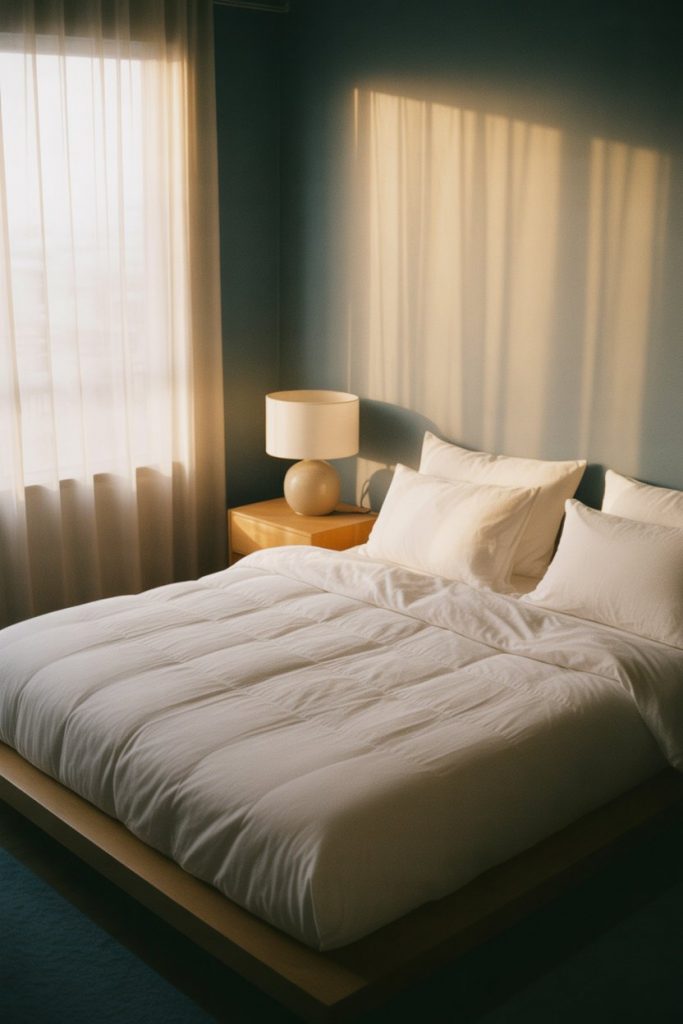
Where it works best: Bedrooms in coastal regions or areas with abundant natural light where the blue undertones enhance rather than clash with the environment. In landlocked, darker spaces, the color can read too cold unless you layer in warm wood tones and soft textiles. Pair it with brass or warm brass fixtures rather than chrome to maintain the cozy quality.
17. Olive Green Canvas for Layered Textiles
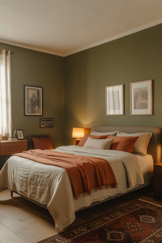
Olive green creates the perfect canvas for layered textiles and eclectic décor—it’s neutral enough to recede but colorful enough to feel intentional. Unlike sage, olive has brown undertones that make it feel earthier and more grounding, working particularly well in bedrooms where you’re mixing patterns and textures. It’s a favorite among creative types who want walls that support rather than compete with collected art and furnishings. 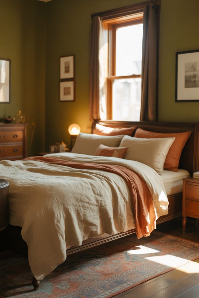
An interior designer once noted that olive green is essentially the chameleon of paint colors—it looks different depending on what you pair it with. Next to warm terracotta it reads cool and mossy; next to blue it appears warmer and more brown. This adaptability makes it forgiving for homeowners who like to change bedding and décor seasonally without repainting.
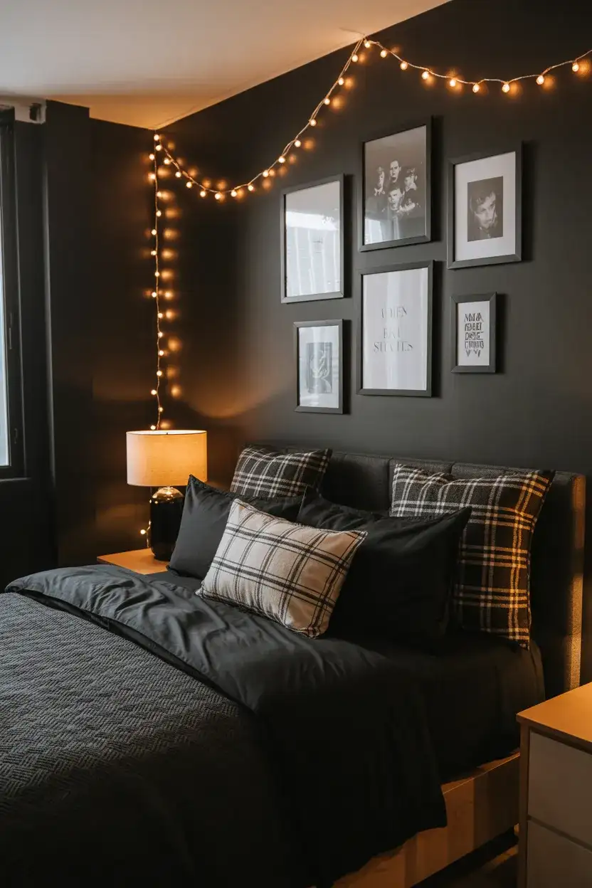
18. Dramatic Black Accent Walls
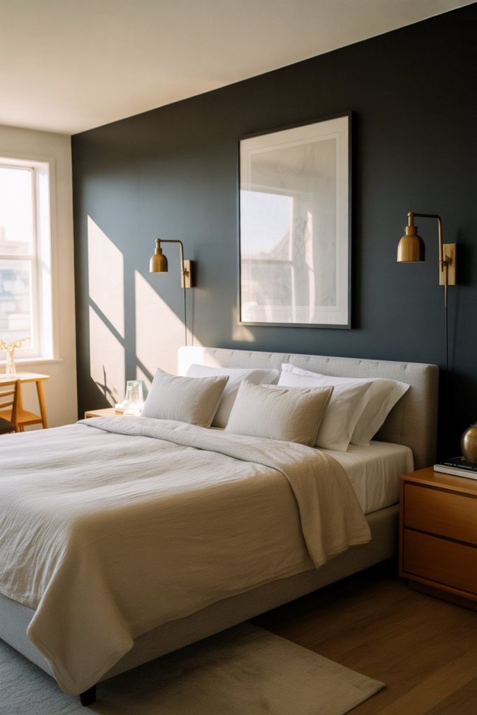
Black accent wall treatments in bedrooms create drama that feels intentional rather than oppressive when balanced with light furnishings and good lighting design. The dark backdrop makes white bedding appear crisper and allows artwork to pop in ways lighter walls can’t achieve. This choice signals design confidence—it’s not for the timid or those seeking resale-safe neutrals. 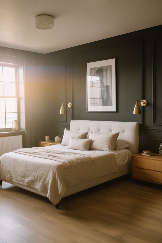
Real homeowner behavior shows that people who choose black walls tend to be swapping out safe beige or gray for something that feels more personal and less committee-approved. The treatment works best in rooms with large windows and good natural light—attempting this in a dark basement bedroom creates a cave rather than a retreat. Use matte black rather than glossy to avoid highlighting wall imperfections.
19. Warm Beige Color Schemes for Guest Rooms
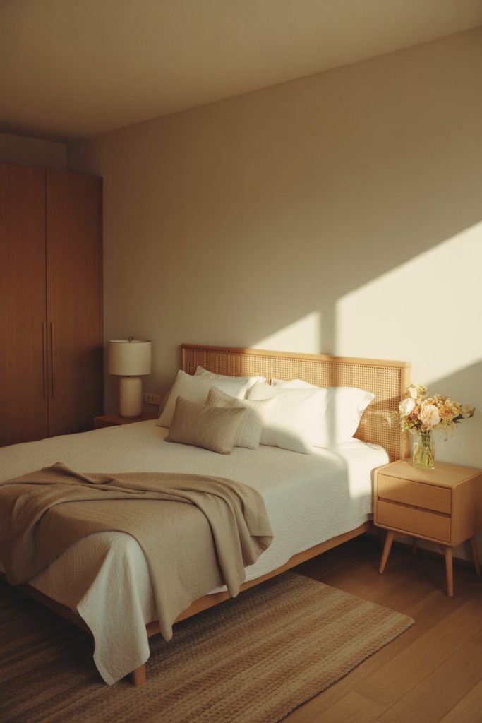
Warm beige color schemes in guest bedrooms create universally welcoming spaces that work for visitors with varying style preferences and sensory sensitivities. These aren’t the cold builder beiges of the early 2000s but warmer, more complex neutrals with undertones of cream, pink, or yellow. The palette feels like a luxury hotel—sophisticated and comfortable without making strong style statements that might polarize guests. 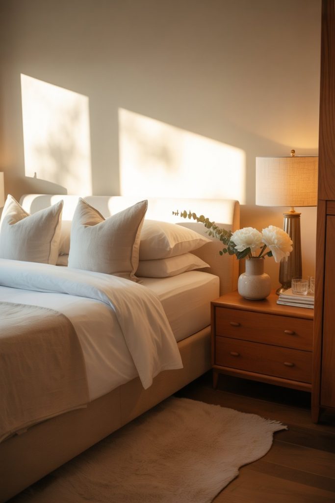
One practical insight: warm beige hides wear better than white or gray, which matters in guest rooms that see intermittent use and different levels of care. The color also photographs well for vacation rental listings if you’re considering that route. Pair it with white trim and natural wood tones to prevent the space from reading too monotone.
20. Coral and White for Energizing Bedrooms

Coral walls bring energy to bedrooms without the intensity of true orange, creating spaces that feel fun and optimistic rather than overly stimulating. The color works particularly well in small rooms where it adds personality without darkness, and pairs beautifully with white furniture and brass accents. It’s become a go-to for people who find traditional bedroom neutrals too boring but aren’t ready for fully saturated color. 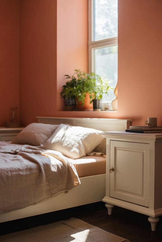
A common mistake is assuming coral only works in beach houses or tropical climates—it’s actually quite versatile when you choose the right undertone. Peachy corals with pink bases feel softer and work in most settings, while orange-based corals require more design commitment. The color shows personality without tanking resale value the way true red or bright orange might.
21. Muted Teal for Creative Professionals
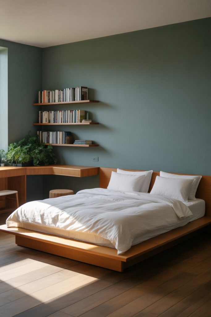
Muted teal creates unique bedrooms that balance color impact with the calm needed for sleep and focused work, making it popular among creative professionals who work from home. The blue-green hybrid feels both energizing and soothing—it’s cool enough to stay fresh but warm enough to feel inviting. This shade photographs exceptionally well, which explains its dominance in styled bedroom photos across Pinterest and Instagram. 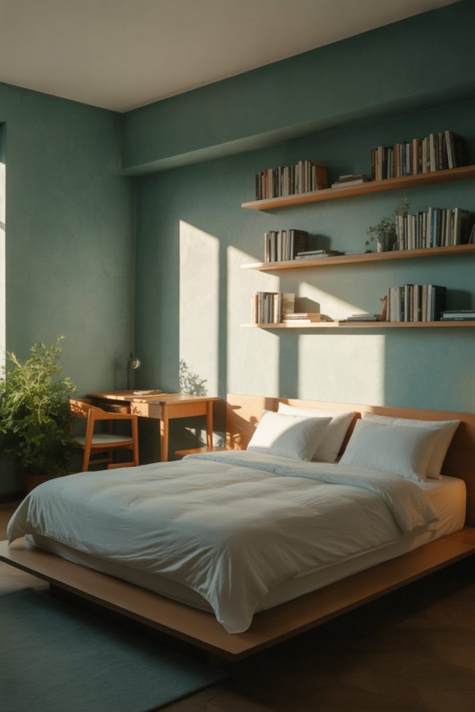
Where it works best: Bedrooms in modern apartments or homes with clean lines and minimal architectural detail. The paint provides personality that fussy Victorian homes already have through built-ins and molding. Pair it with warm wood tones and plenty of white to prevent the blue from reading too cold, especially in northern climates with limited winter sunlight.
22. Soft Pink Accent Walls in Modern Master Suites
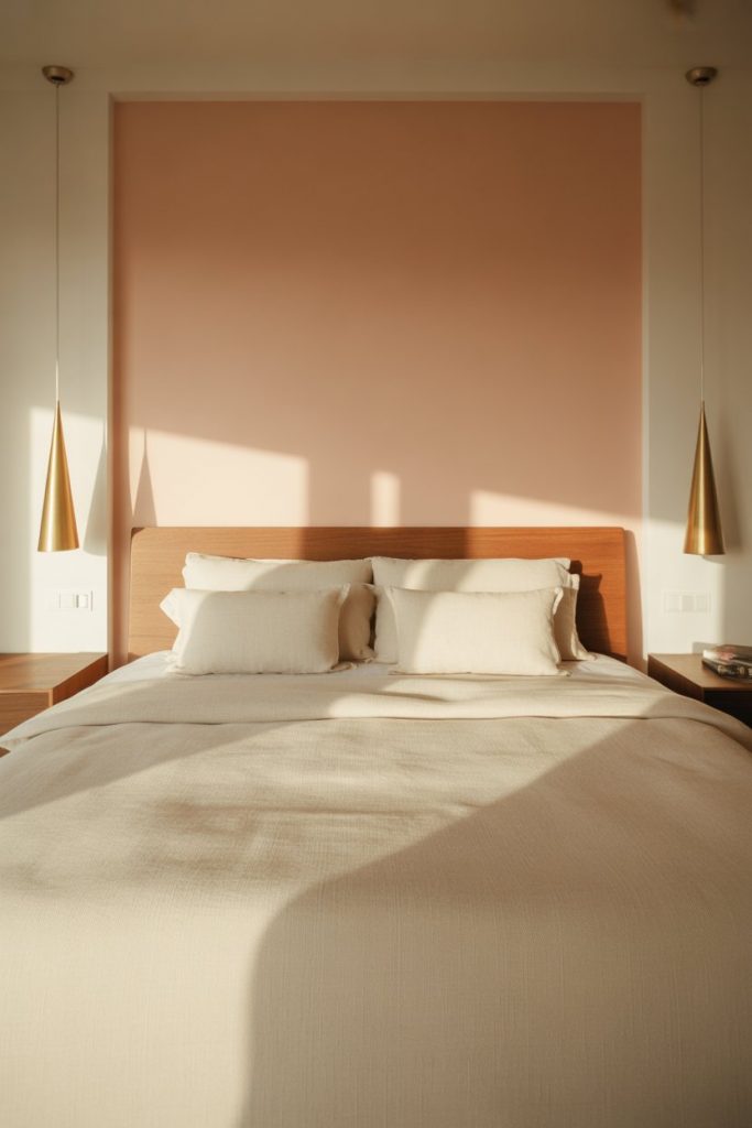
Soft pink accent wall treatments in modern master bedrooms deliver warmth and personality without the commitment of painting all four walls. This isn’t bubblegum pink but rather dusty, muted versions with gray or beige undertones that read sophisticated. The single painted wall creates a focal point that works particularly well behind the bed, framing it like built-in architecture. 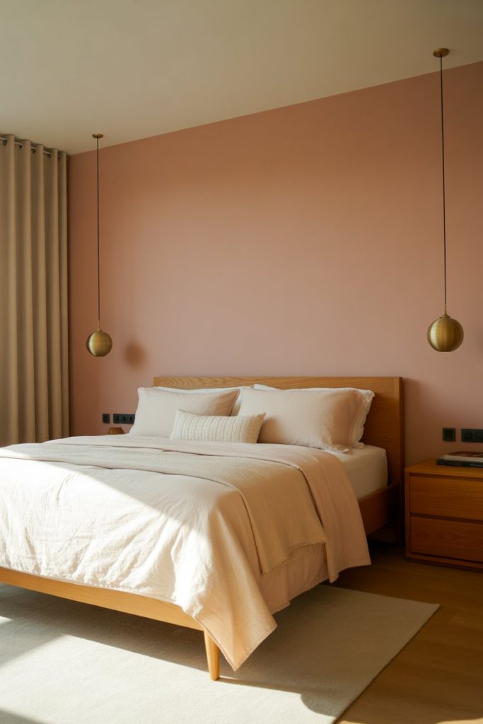
Real homeowners report that soft pink works across age ranges better than expected—it’s not exclusively feminine or juvenile when handled with restraint. The key is pairing it with substantial furniture in wood or upholstered finishes rather than delicate metallics that can tip the palette too precious. Keep remaining walls white or cream to maintain the modern, airy quality.
23. Deep Burgundy for Cozy Attic Retreats
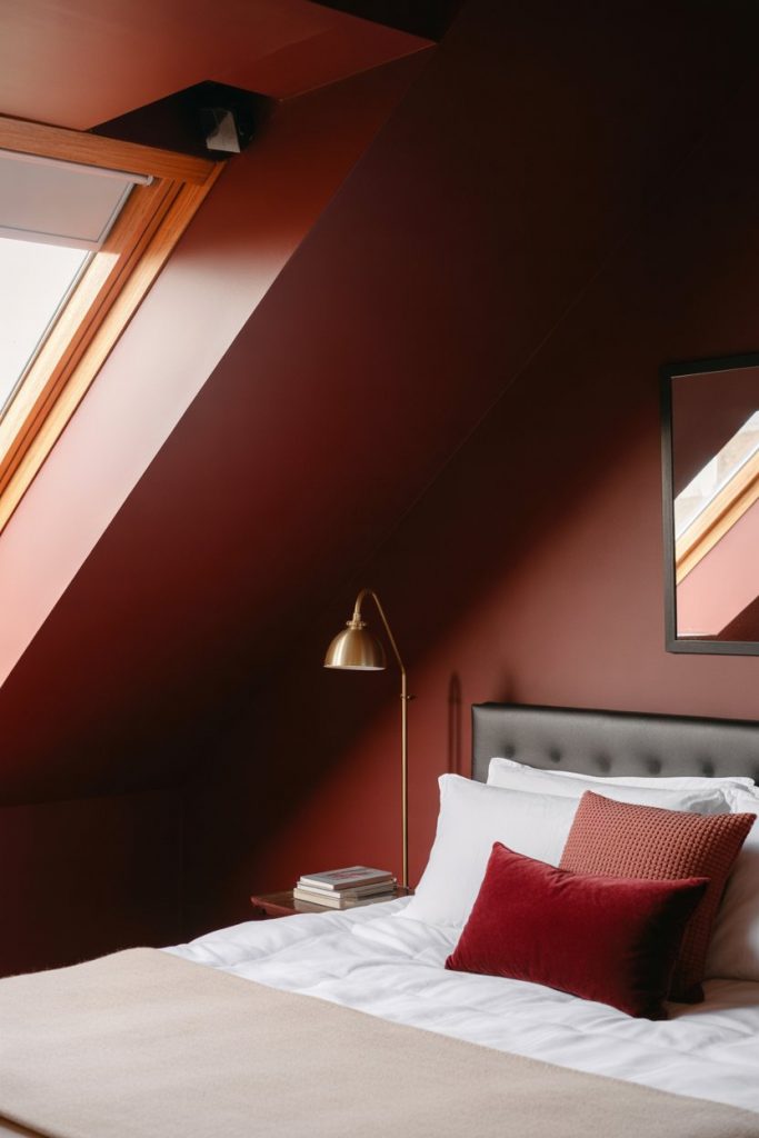
Deep burgundy transforms attic bedrooms into cozy retreats that embrace rather than fight awkward angles and limited ceiling height. The rich dark color unifies sloped walls and creates an enveloping quality perfect for reading nooks and sleep spaces. This choice signals design confidence—it’s the opposite of trying to “fix” attic quirks with white paint and forced brightness. 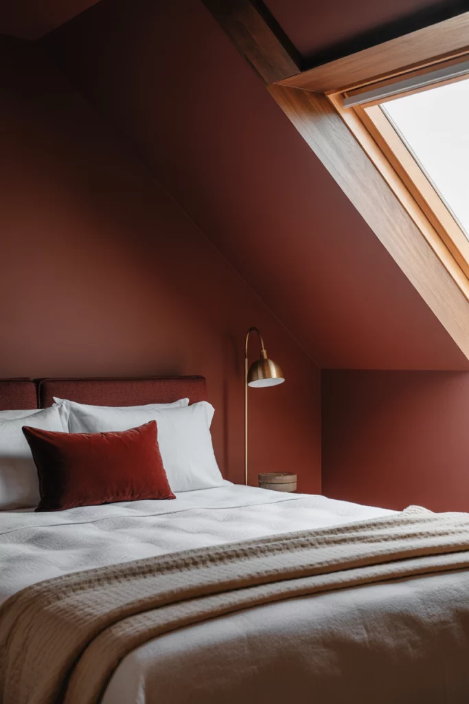
Expert commentary suggests that dark colors in attics work best when you commit fully—half measures with one dark wall and three white walls emphasize the awkwardness rather than embracing it. The burgundy pairs beautifully with brass fixtures and warm woods, creating a jewel-box quality that makes the space feel intentional. Layer multiple light sources to maintain functionality despite the dark walls.
Conclusion
These bedroom paint ideas reflect what’s actually resonating with American homeowners in 2026—a mix of earthy neutrals, moody darks, and thoughtful color that prioritizes personal expression over resale anxiety. Whether you’re working with a cramped rental or a spacious master suite, the right paint choice can completely shift how your bedroom feels. Drop a comment below with which idea you’re trying first, or share your own bedroom paint success stories.
