42 Living Room Color Schemes for 2025 to Transform Your Space with Blue, Green, Beige and More
Color has a way of transforming not only the look but also the emotional feel of a living room. Whether you’re drawn to deep jewel tones, calming neutrals, or playful contrasts, choosing the right scheme can make your space feel cozier, brighter, or more refined. In this article, we explore curated ideas to inspire your next living room makeover — all rooted in color palettes that reflect real trends and personal stories from the homes of everyday Americans and leading designers alike.
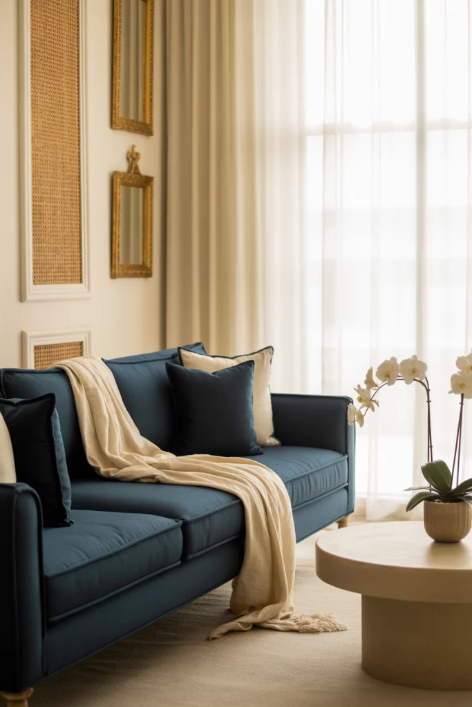
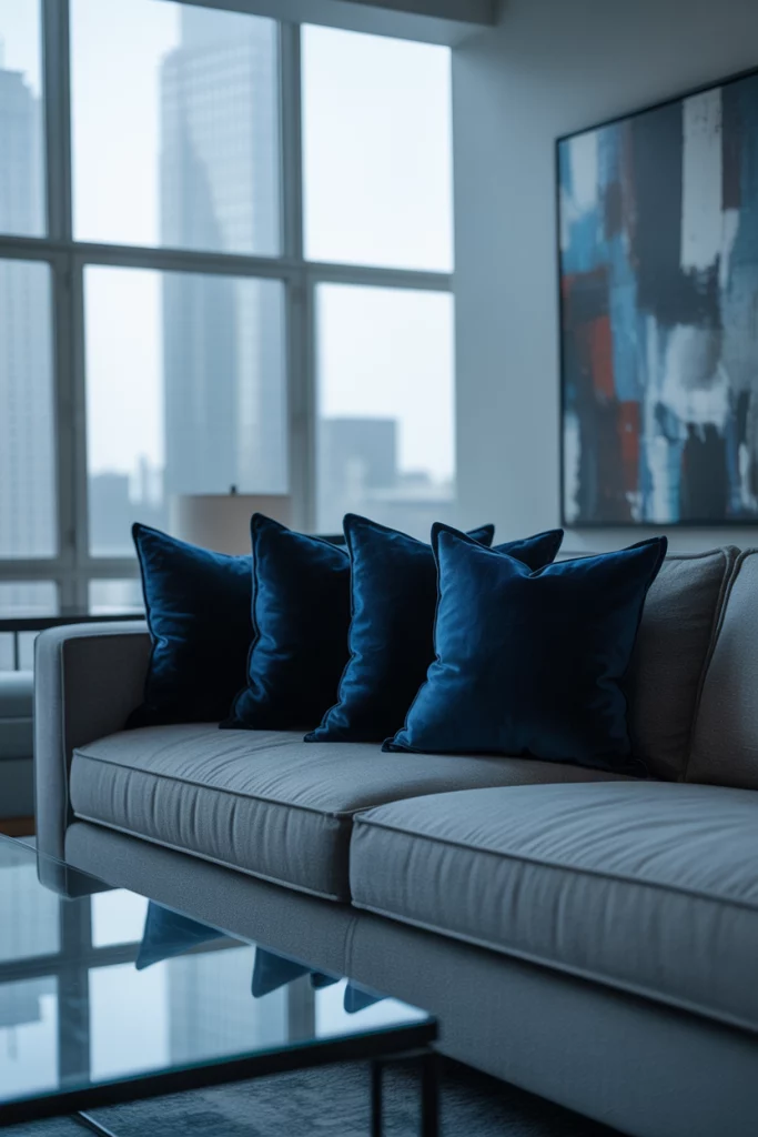
1. Navy Blue and Cream: A Classic Coastal Duo
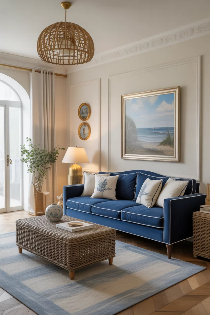
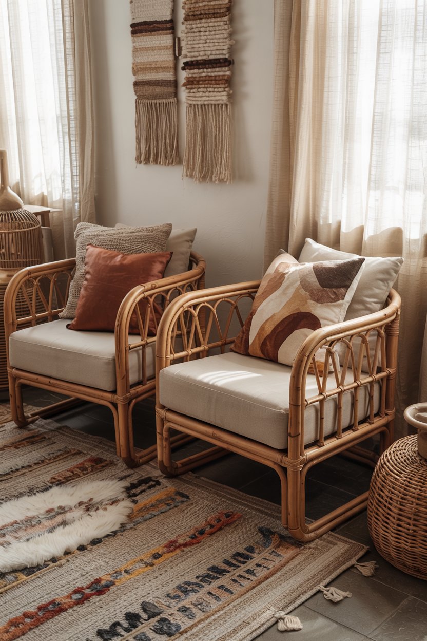
There’s something timeless about the pairing of navy blue and a cream sofa. It evokes the serenity of a breezy coastal escape, while still feeling grounded and sophisticated. I first noticed this combination in a friend’s small beachside cottage in Charleston — the contrast of her navy blue sofa against soft cream walls made the room feel both elegant and relaxing. This palette works beautifully with touches of wood, gold accents, and rattan textures.
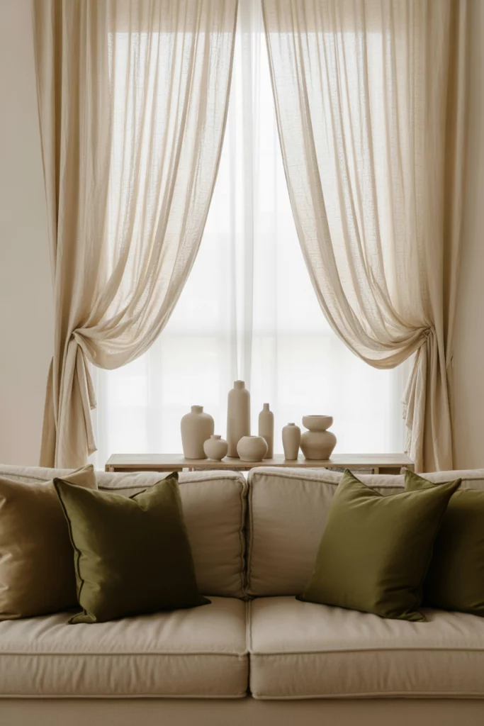
2. Sage Green and Beige: Soft and Organic
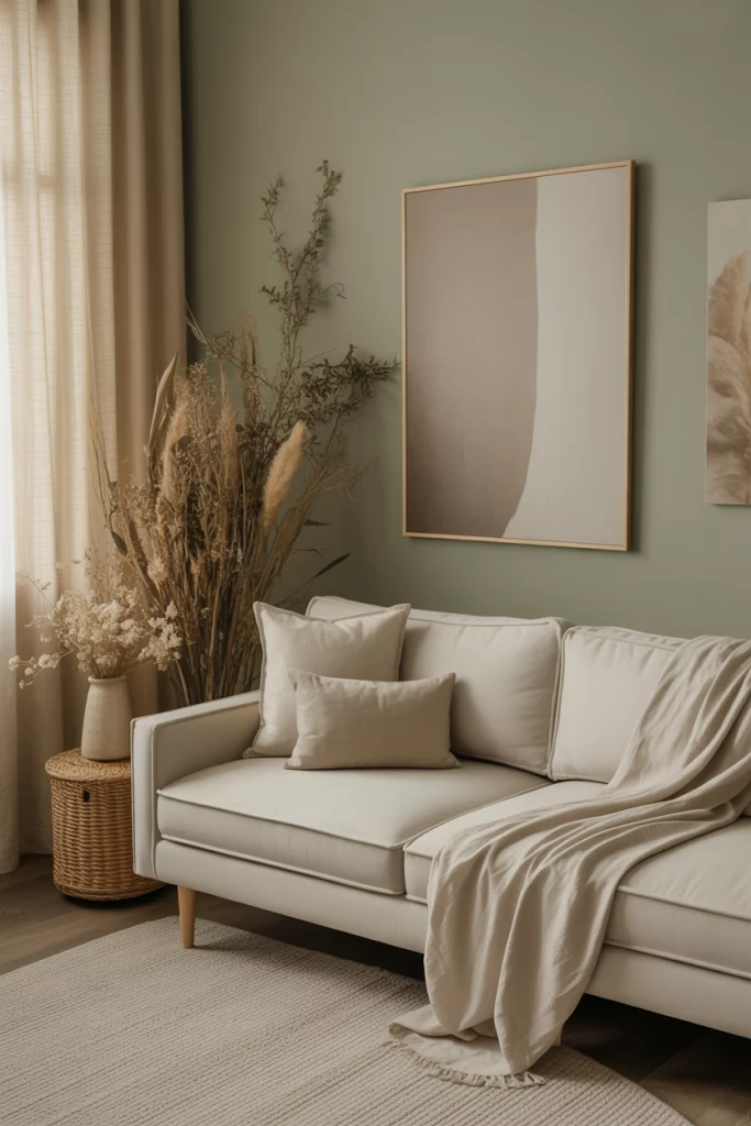
The gentle combo of sage green and a beige sofa is a match made in design heaven. These tones feel earthy and soothing — perfect for anyone craving a calm environment. I saw this palette in a recent Apartment Therapy feature on wellness-focused interiors, and it stuck with me. Paired with linen curtains, light woods, and dried florals, it brings a subtle nature-inspired elegance that feels both modern and grounded.
3. Blue and Yellow: Bright Yet Balanced
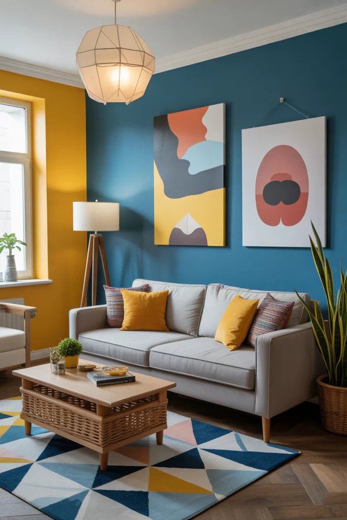
The pairing of blue and yellow is a cheerful yet surprisingly chic combination. A designer friend from Austin once used a light blue wall with mustard throw pillows and abstract art to turn a dull space into a sunny retreat. When done right, the contrast is playful without being juvenile. Think sunny yellow accents on blue upholstery or geometric rugs that tie both colors together.
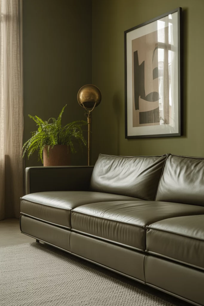
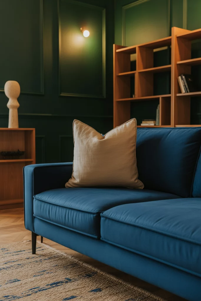
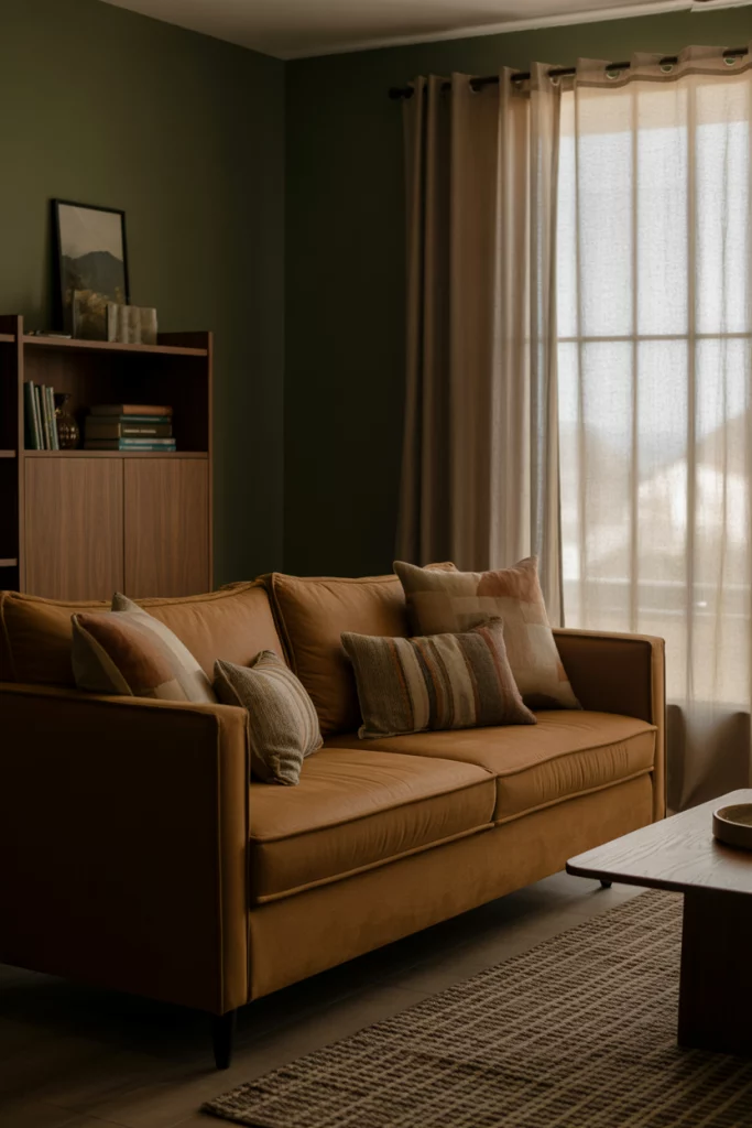
4. Grey and Olive Green: Moody and Modern
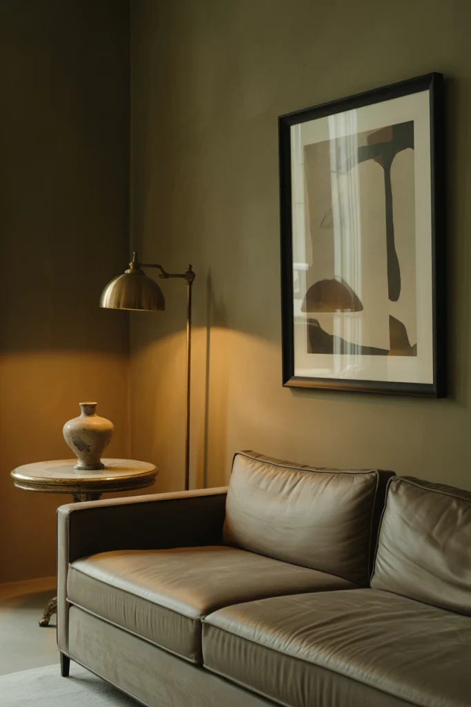
A grey sofa paired with olive green accents makes for a subtly moody yet warm living room. This duo works well for transitional spaces — I saw it featured on House Beautiful’s roundup of top paint colors. Olive brings depth, while grey grounds the look. Add black-framed artwork and vintage lighting to elevate the scheme into something truly stylish.
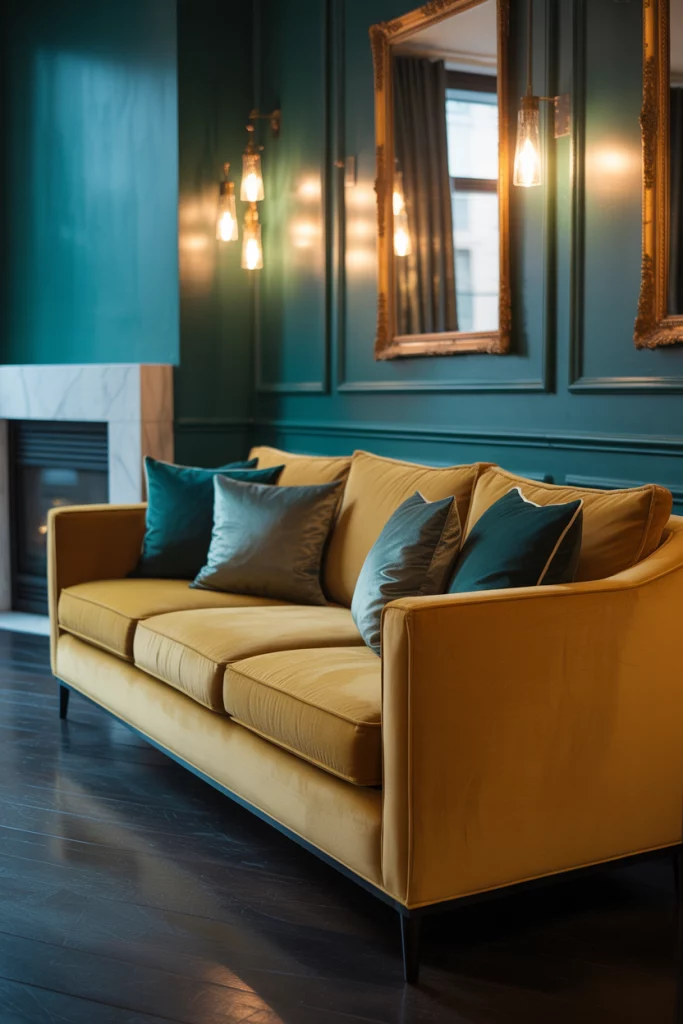
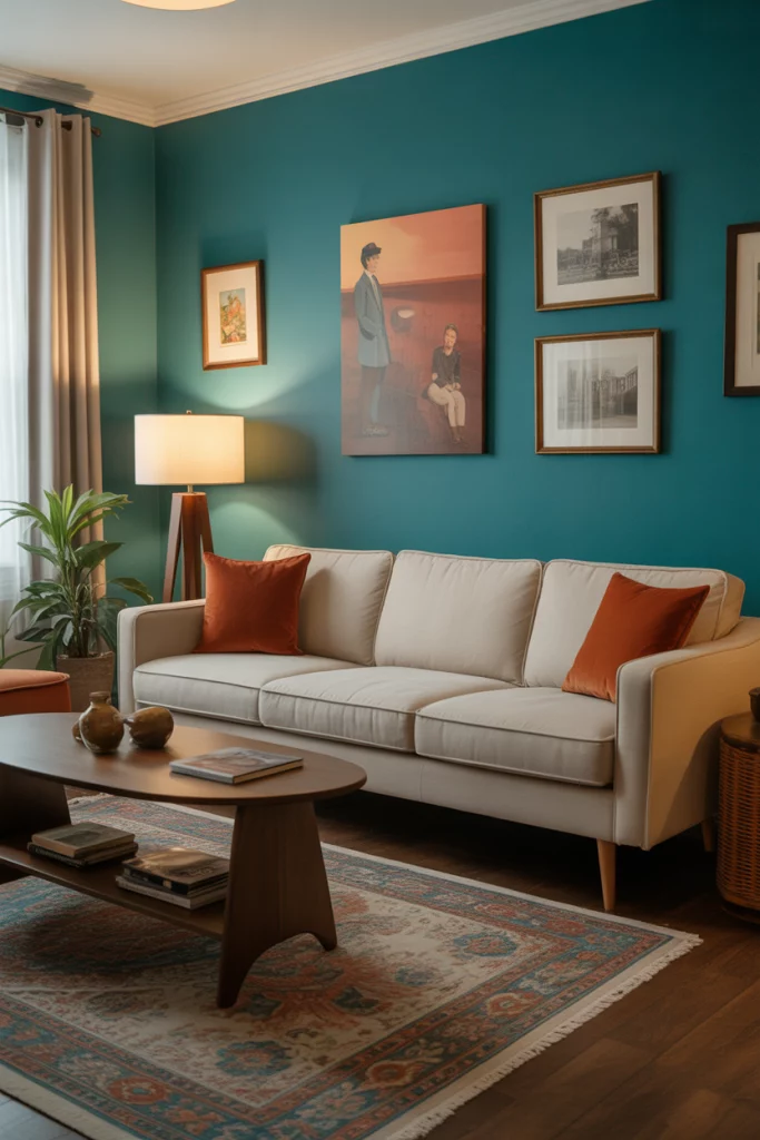
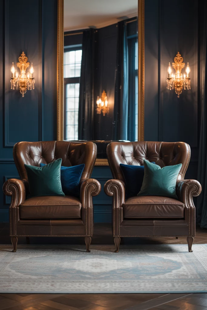
5. Teal and Gold: A Luxe Contrast
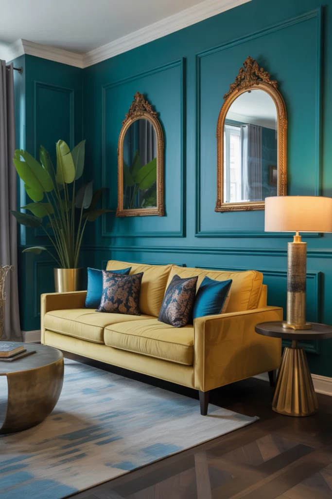
The deep richness of teal pops dramatically against metallic tones like gold. In my cousin’s downtown Chicago condo, she paired her gold sofa with teal-painted walls and brass-framed mirrors — the result felt regal but modern. This scheme is especially great for accent walls or rooms with high ceilings where bold colors won’t overwhelm.
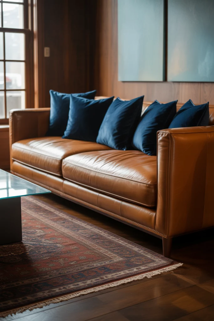
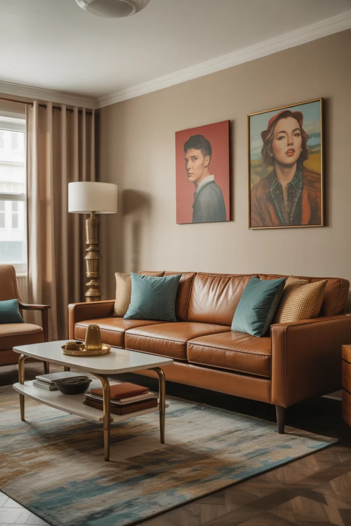
6. Blue and Brown: Timeless and Warm
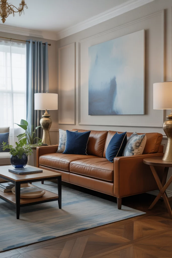
When I worked on a home staging project in Denver, I saw how effortlessly blue and brown could elevate a space. A brown sofa paired with navy blue pillows and soft blue artwork gave the room warmth without feeling dated. This combo bridges cool and warm tones, making it ideal for households with mixed style preferences.
7. Emerald Green and Cream: Vibrant Yet Refined
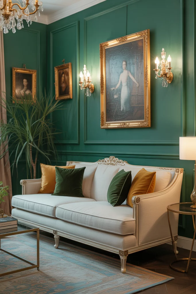
Emerald green has been a standout shade in the past few years, especially when set against a cream sofa. I remember seeing this combo in a Domino feature on bold interiors — the jewel tone offered a luxe feel while cream kept it grounded. Pair with brass fixtures, dark wood, and velvet textures for an upscale but livable room.
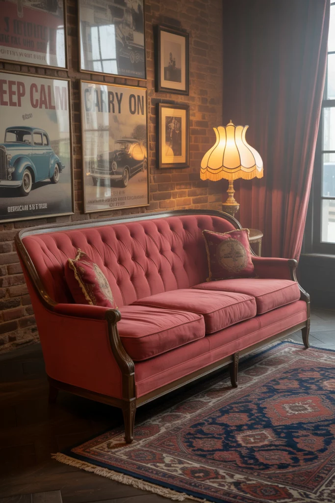
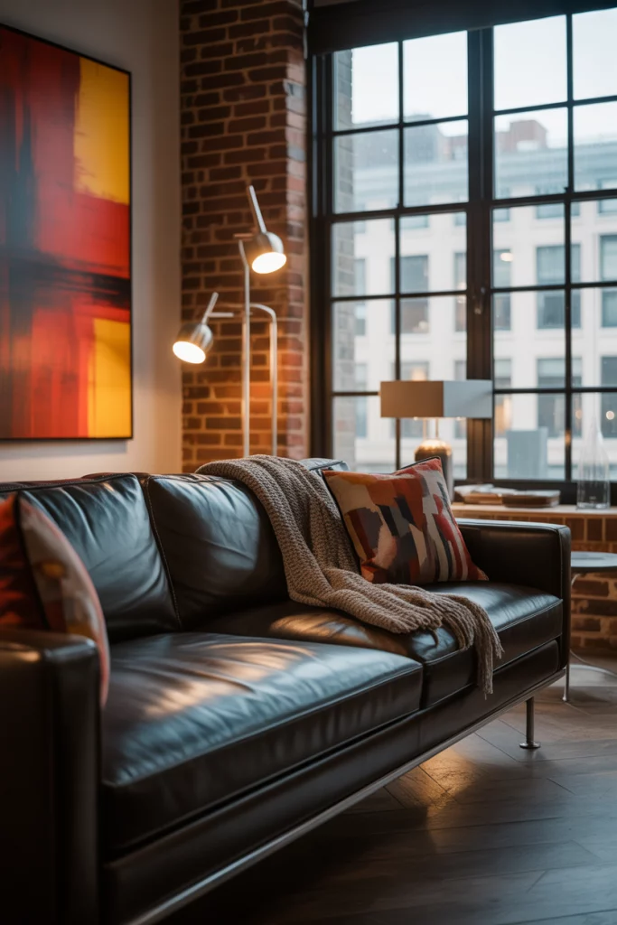
8. Red and Dark Grey: Cozy with Attitude
Mixing a red sofa with a dark grey sofa or wall color might sound bold, but it works wonders in modern rustic homes. I recently stayed at a mountain Airbnb in Colorado where this combo created the coziest reading nook. It felt edgy but warm — the red drew you in, while the grey added depth.
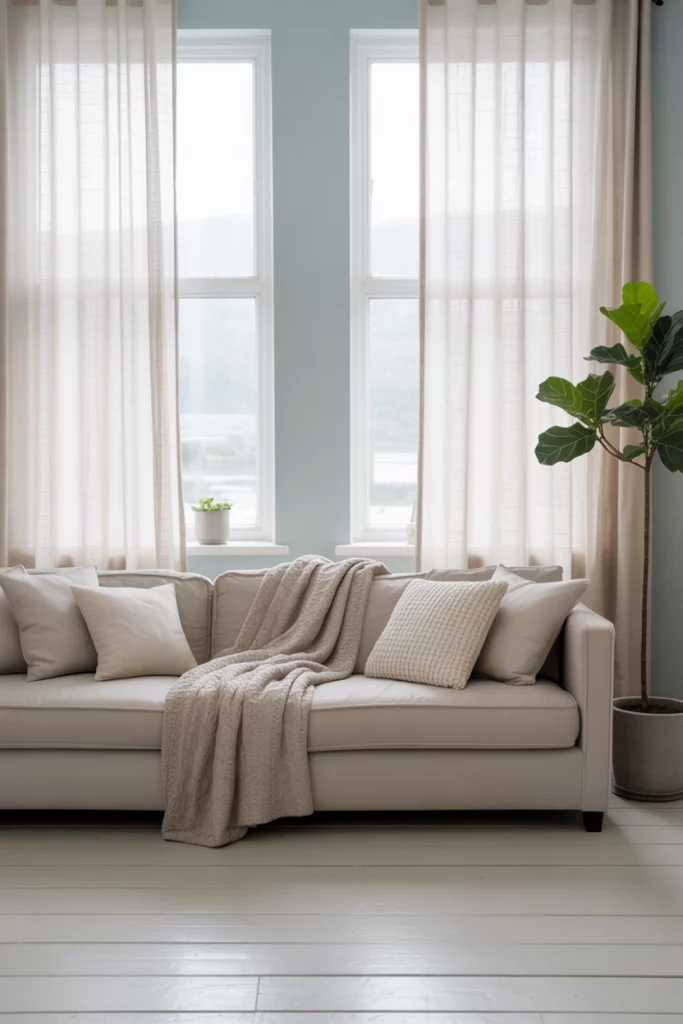
9. Light Blue and Neutral Beige: Airy and Serene
If you’re after a soft, ideas cozy space, consider light blue with neutral tones like beige sofa and cream walls. I saw this in a Scandinavian design blog where everything felt intentional yet easy. Add some white-washed wood furniture and simple lighting to finish the look.
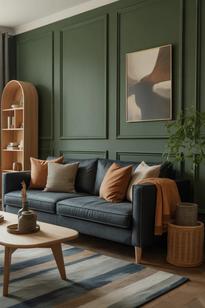
10. Dark Blue and Green: Sophisticated Earthiness
Combining dark blue and green can create a sophisticated, nature-inspired ambiance. One of the most striking rooms I toured during a Dwell Home Tour featured a navy couch with dark green paneled walls — it felt rich without being overdone. Earthy, layered, and dramatic, this color scheme works especially well in larger rooms with good lighting.
11. Beige and Olive Green: Understated Elegance
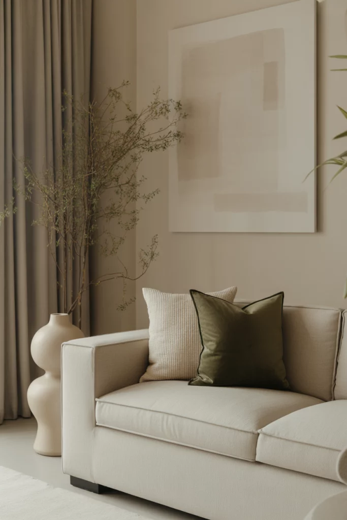
If you’re drawn to nature but prefer subtle design, a beige sofa with olive green accents might be your match. I saw this in a cozy Minneapolis loft with linen drapes and ceramic vases — the room felt grounded yet modern. Earthy doesn’t mean boring when textures shine.
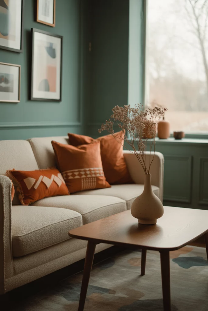
12. Teal and Rust: Unexpected Retro
I stumbled across this palette in a vintage decor Instagram account. Teal walls paired with rust cushions on a cream sofa brought serious mid-century vibes. It’s a great choice for those who love retro color schemes but want something warmer than typical jewel tones.
13. Grey and Blue: Cool and Collected
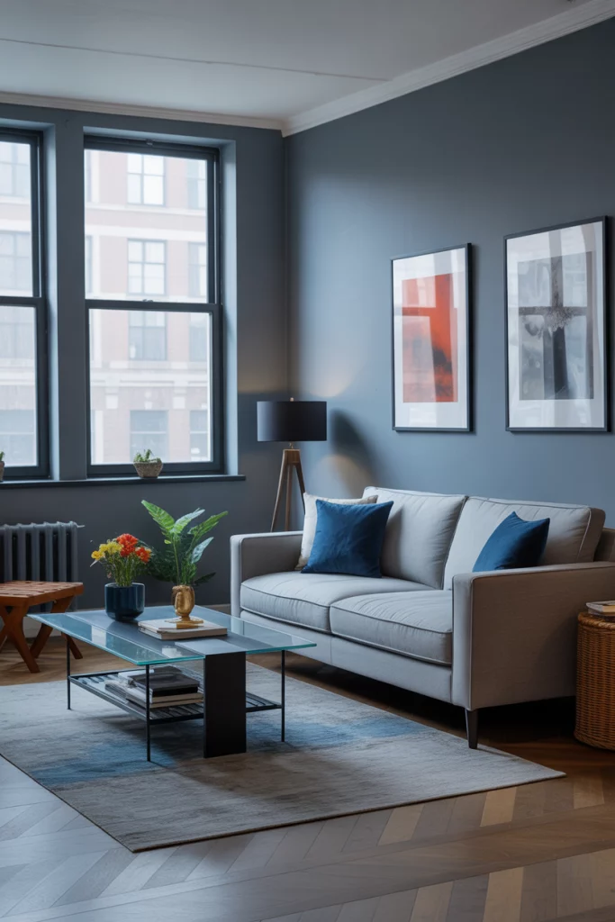
Grey sofa setups are incredibly versatile, and pairing one with blue accents—navy, sky, or cobalt—adds freshness. I remember seeing this look in a Brooklyn apartment with floor-to-ceiling windows, where the cool tones kept everything calm despite the bustling city outside.
14. Navy and Gold: Glam Meets Masculine
A bold navy blue wall and sleek gold accents walk the line between masculine and glam. I toured a bachelor pad in Atlanta where the mix of leather, velvet, and brass created a layered, luxe feel without veering too flashy.
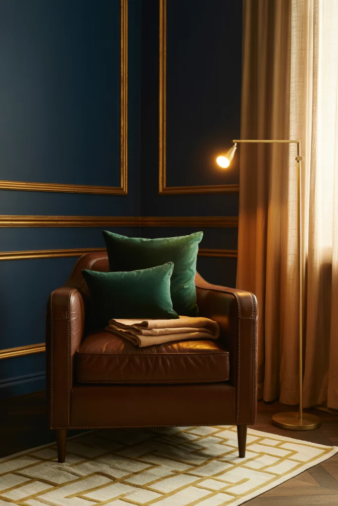
15. Dark Green and Wood Tones: Forest-Inspired
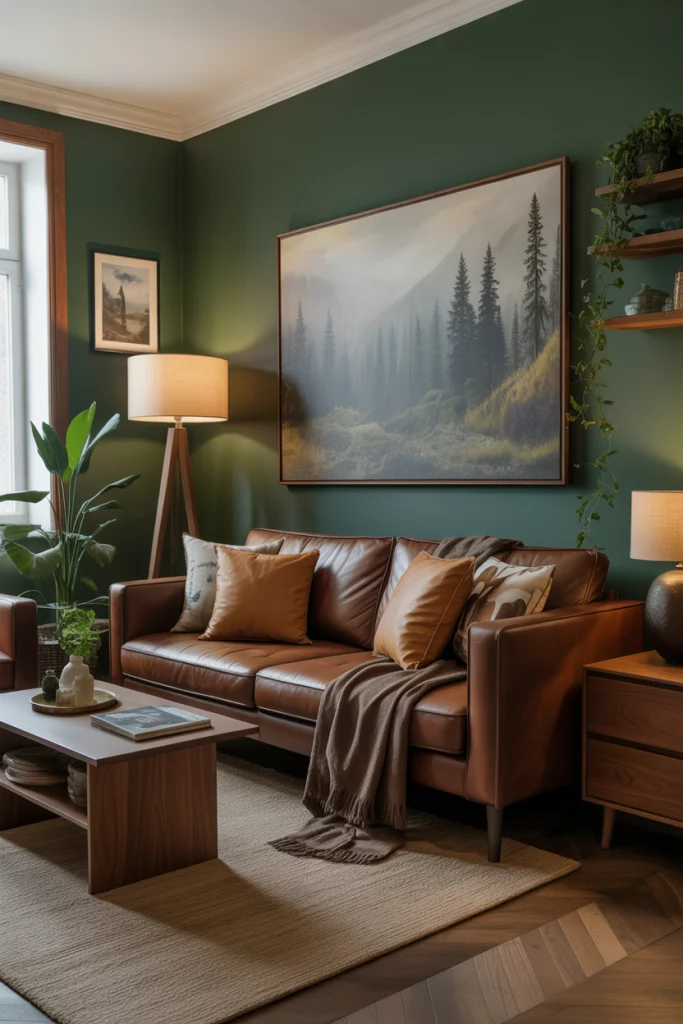
If you’ve got a room with lots of wood elements, dark green walls will make everything pop. I saw this combination in a Colorado cabin makeover — the forest hues complemented the walnut shelves and brown sofa perfectly.
16. Navy and Red: Bold Americana
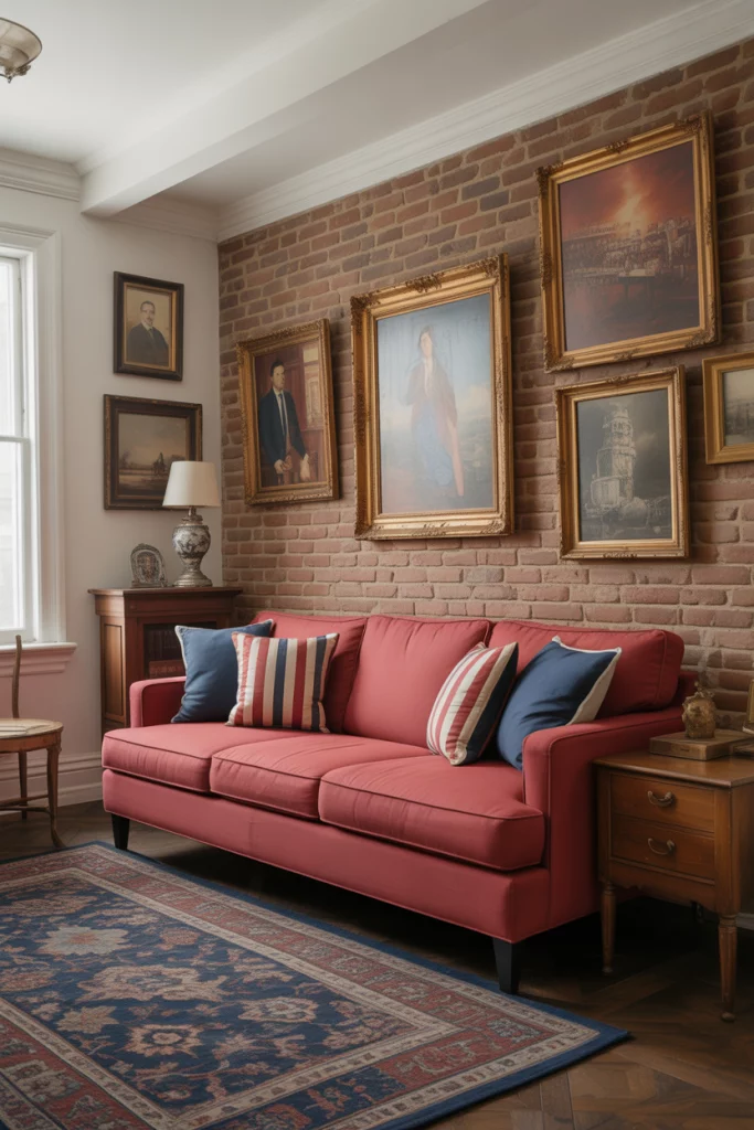
For a more traditional American look, pairing a red sofa with a navy blue rug or accents brings a classic patriotic feel — but with modern flair. I first saw this in a renovated 1920s home in Vermont with exposed brick and antique maps.
17. Cream and Light Blue: Breezy Farmhouse Feel
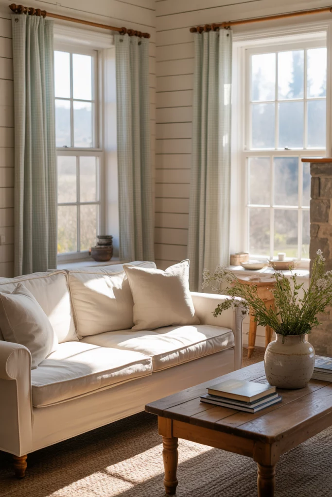
A cream sofa with light blue accents — maybe in gingham curtains or throw pillows — delivers that classic farmhouse charm. This combo was popularized by designers like Joanna Gaines and works great in spaces with white shiplap and natural light.
18. Grey and Red: Urban Energy
A dark grey sofa paired with pops of red injects energy into an otherwise neutral room. I once helped design a bachelor loft with this palette — red art prints and ceramics gave just enough punch without overwhelming the space.
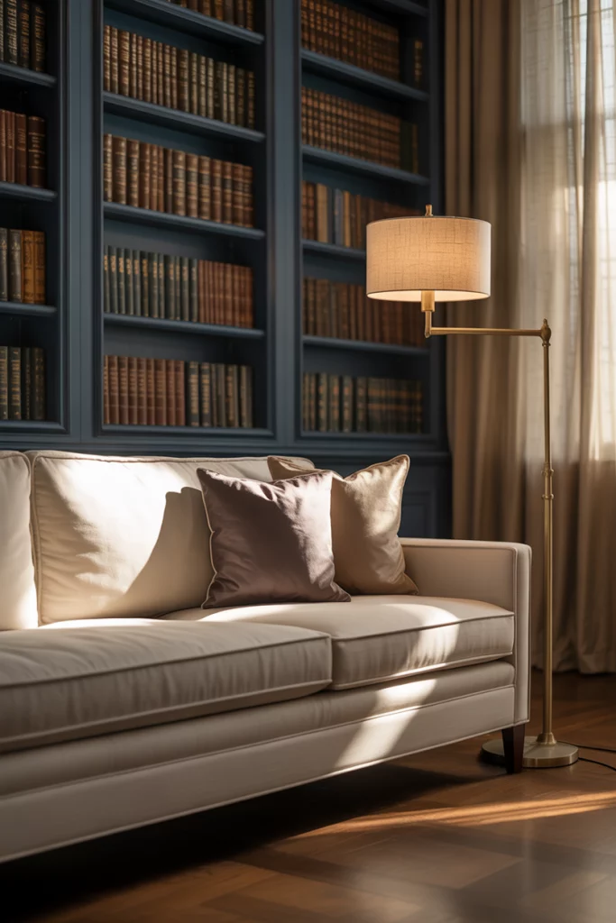
19. Beige and Navy: Crisp and Smart
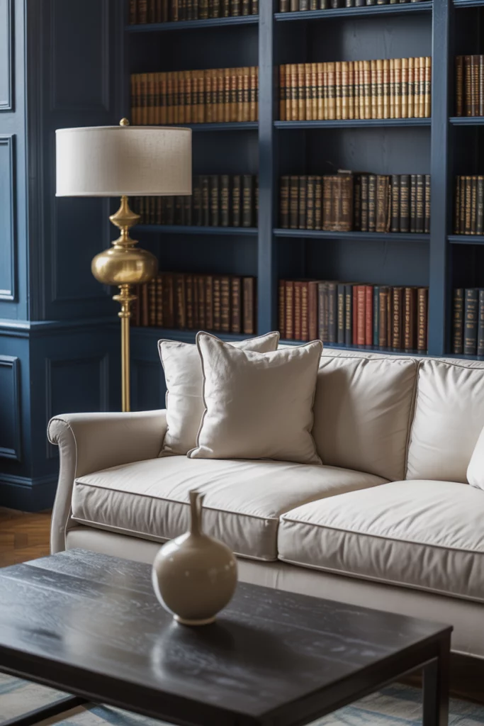
The combination of a beige sofa with navy blue elements offers a clean, collegiate feel — think of Ivy League libraries and tailored blazers. A friend’s Boston rowhouse nailed this look with navy bookshelves framing a beige sitting area.
20. Blue and Green: Layered Naturals
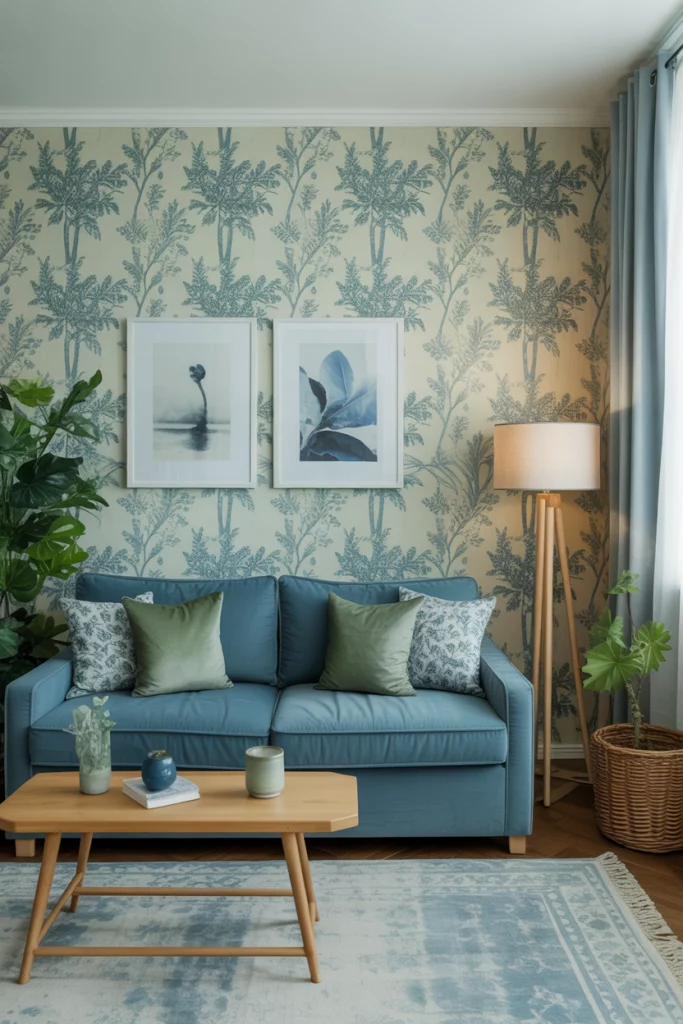
Blue and green together—especially shades like sage and cornflower—bring a layered, natural aesthetic. I once stayed in a bed-and-breakfast where the blue and green combo played across wallpaper, rugs, and upholstered seating. It felt fresh and intentional.
21. Cream and Emerald Accents: Clean with Drama
A cream sofa can anchor a room, but adding emerald green in artwork or decor adds a burst of luxe. I saw this palette in a recent Elle Decor piece where green velvet chairs flanked a minimalist cream seating area — simple, but striking.
22. Brown and Teal: Retro and Warm
Pairing a brown sofa with teal accessories gives a space vintage appeal — think 1970s with a refresh. I spotted this trend on a design blog by Emily Henderson, who layered in patterns and brass to make it feel fresh.
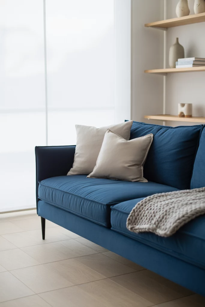
23. Navy and Light Wood: Scandinavian Cool
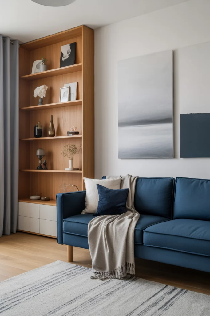
Navy blue looks amazing when balanced with pale oak or birch wood. A design workshop I attended in Portland featured this palette heavily — navy blue sofa, open shelving, and Scandinavian decor created a crisp, airy feel.
Conclusion
Color is one of the most powerful tools in your decorating toolkit — and when done right, it can change how a room feels as much as how it looks. These living room color schemes offer a variety of moods, from calm to dramatic, earthy to bold. Have a favorite? Let us know in the comments — or share your own tried-and-true palettes and how you’ve made them work in your space.