Purple is having a major moment in 2026, and it’s easy to see why. From deep plum tones that add drama to soft lavender hues that bring calm, purple bedrooms offer a spectrum of moods that resonate with American homeowners looking for something more personal than the usual neutrals. Pinterest searches for purple bedroom inspiration have surged as people seek spaces that feel both sophisticated and expressive. Whether you’re drawn to moody, romantic vibes or light, airy aesthetics, this guide will walk you through 22 fresh purple bedroom ideas that balance style, comfort, and real-world livability.
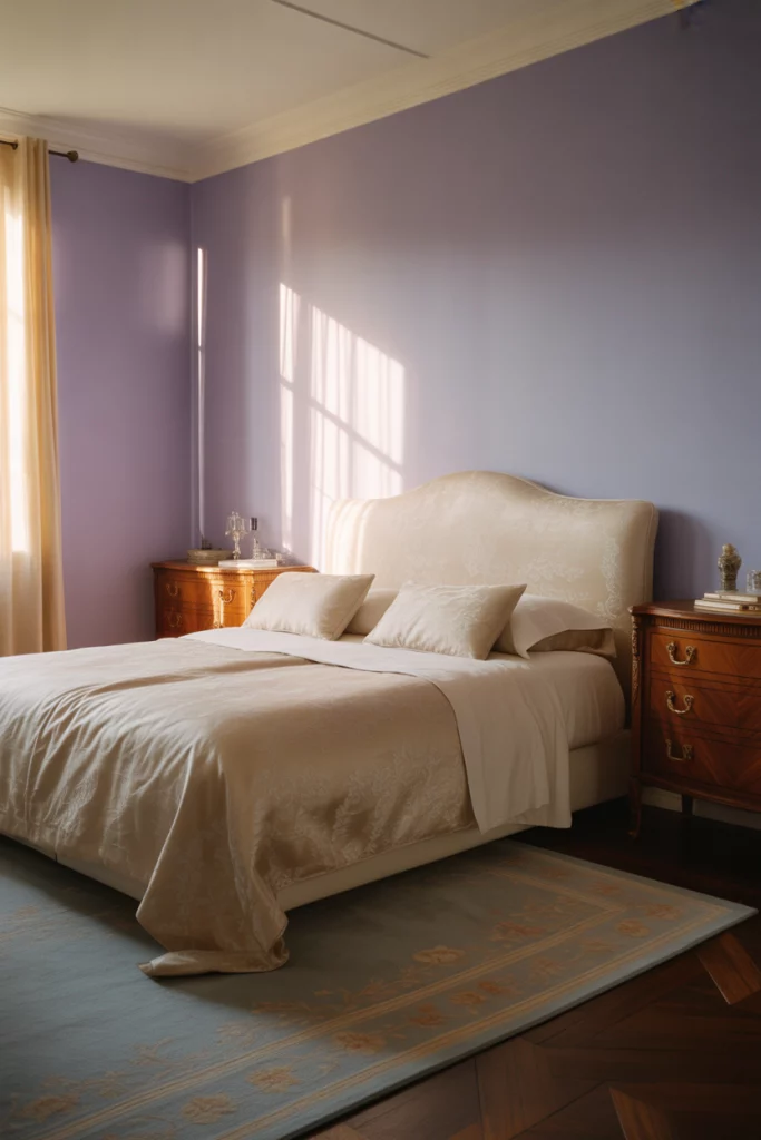
1. Lavender and White Minimalist Retreat
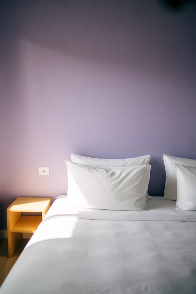
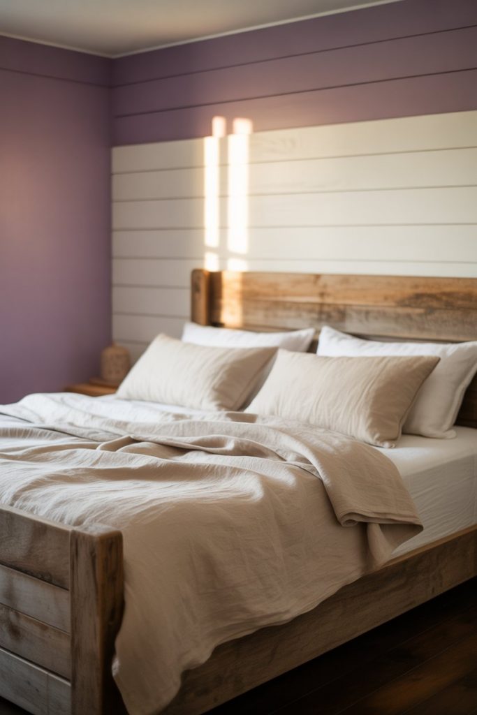
A light lavender wall paired with crisp white and linens creates a serene, minimalist bedroom that feels open and calming. This look works beautifully in smaller spaces where you want to maintain airiness while introducing color. The pastel purple tone softens the starkness of all-white rooms without overwhelming the senses, making it ideal for anyone who craves simplicity with a touch of personality. Consider adding natural wood accents to warm up the palette. 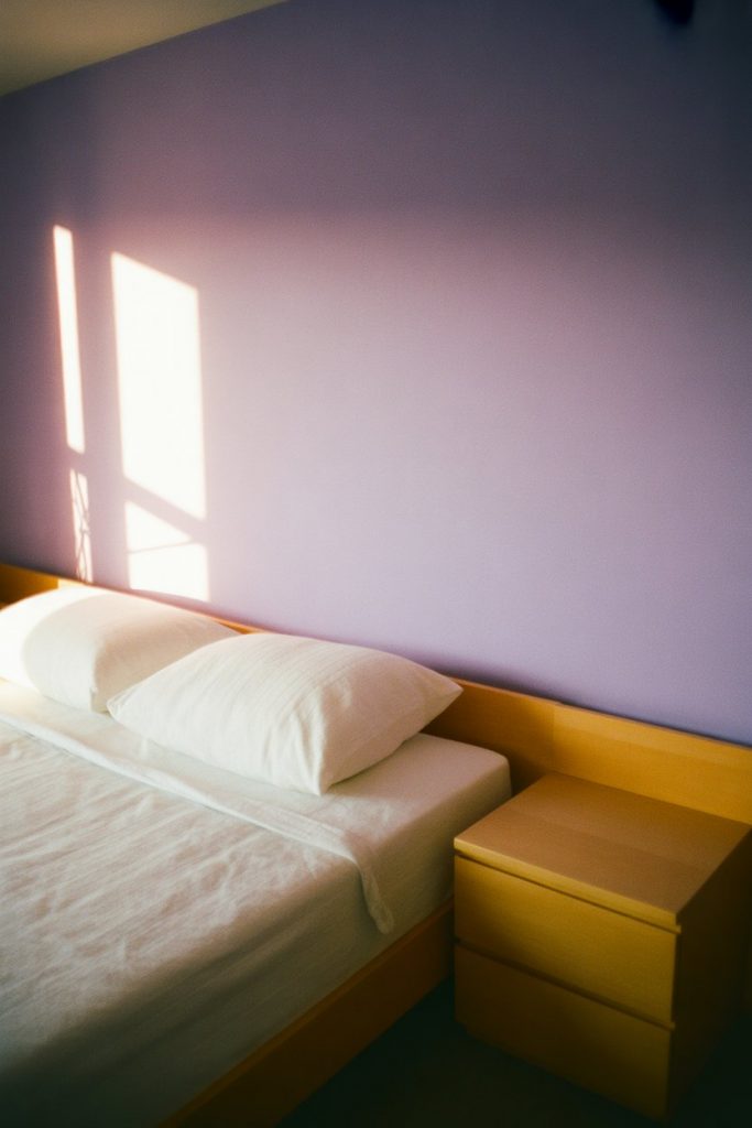
This approach works best in urban apartments or starter homes where space is at a premium. The light palette reflects natural light beautifully, making rooms feel larger than they actually are. Swap heavy curtains for sheer white panels to maximize the airy effect, and keep decor minimal—a single piece of artwork or a small plant is often enough to complete the look without cluttering the visual field.
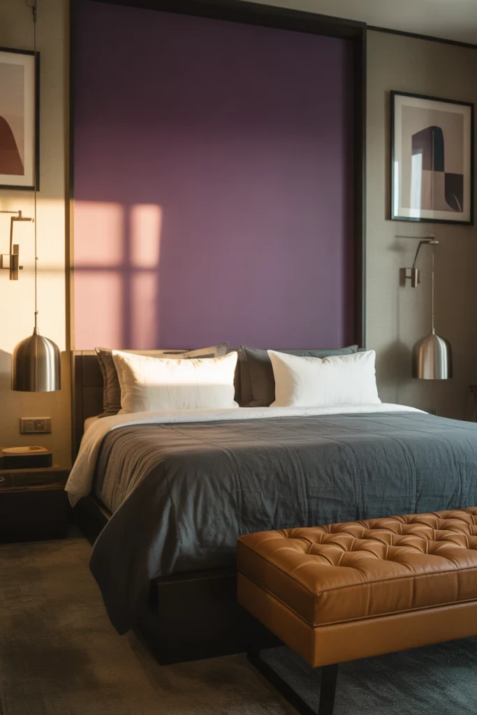
2. Deep Plum Accent Wall Drama
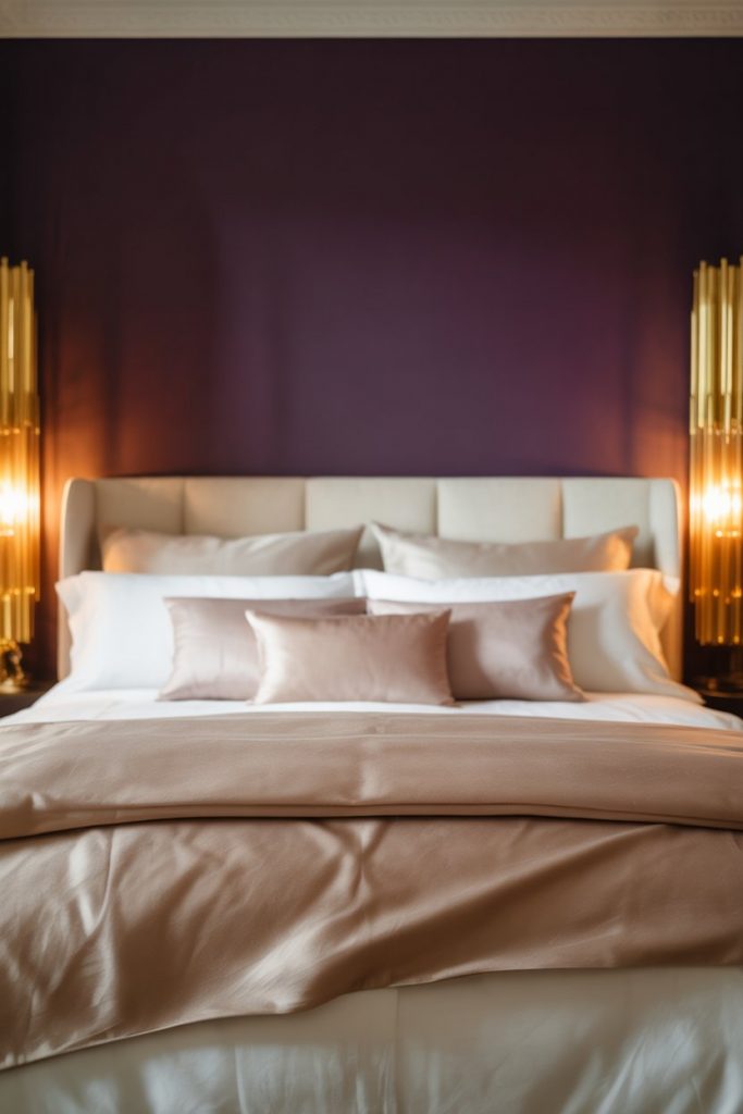
A single dark plum accent wall behind the bed anchors the room with bold sophistication. This technique works especially well in master bedrooms where you want to create a focal point without committing to an entirely moody space. The richness of plum adds depth and warmth, especially when paired with metallic gold or brass fixtures that catch the light. It’s a confident choice that signals maturity and taste. 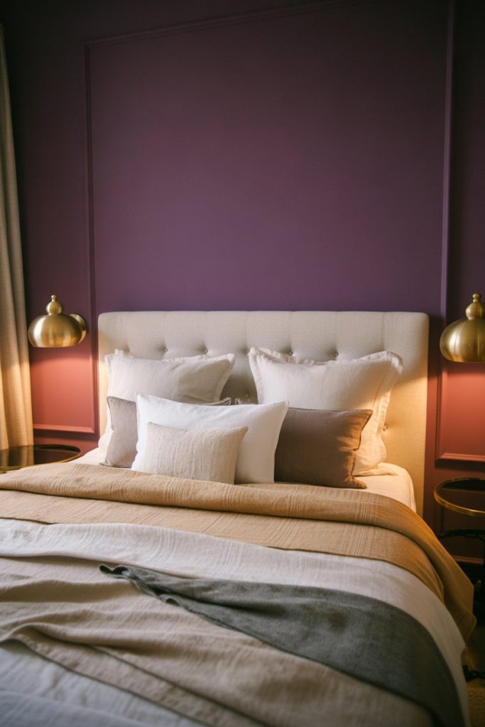
Many homeowners worry that dark walls will make a room feel smaller, but that’s usually a myth. In reality, a deep accent wall can create the illusion of depth, especially in rooms with ample natural light. The key is balancing the bold wall with lighter furniture and textiles. A common mistake is over-matching—avoid plum bedding or curtains, which can flatten the look. Instead, layer in creams, taupes, or soft grays to let that accent wall truly shine.
3. Purple and Gray Modern Elegance

Combining gray and purple tones creates a contemporary bedroom that feels polished and gender-neutral. This palette is especially popular among couples who want a shared space that doesn’t skew too feminine or masculine. Soft dove gray walls with purple throw pillows, a duvet, or an area rug strike a sophisticated balance. The coolness of gray tempers purple’s intensity, resulting in a calming yet stylish environment. 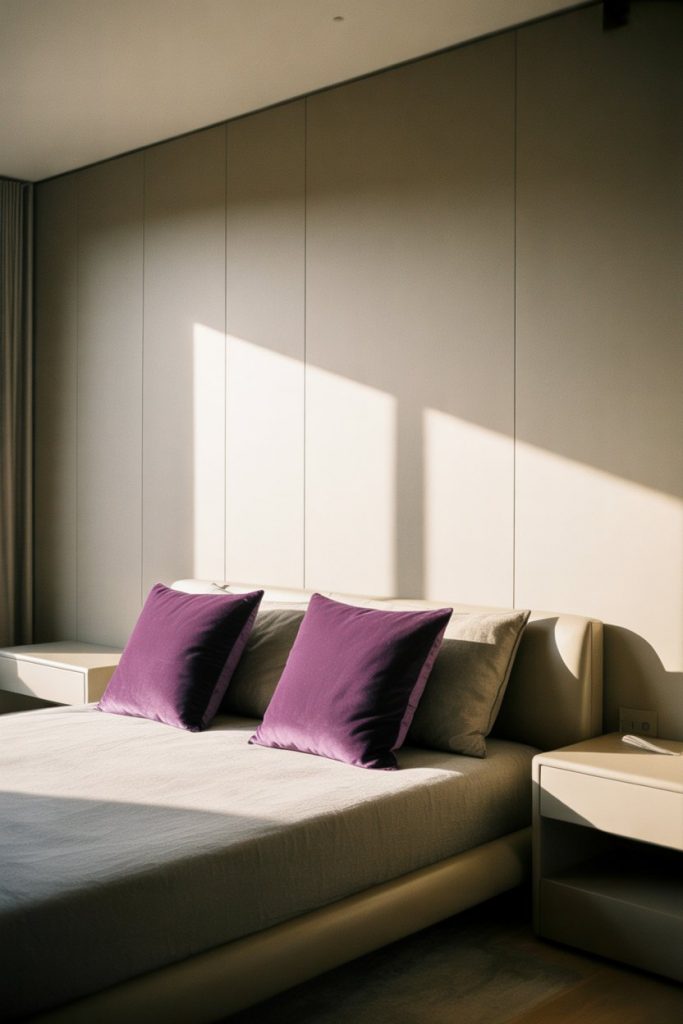
This color scheme is a favorite in suburban homes across the Midwest and Northeast, where seasonal light changes throughout the year. Gray provides a stable backdrop that works with both warm and cool light, while purple accents add just enough personality to keep things interesting. Budget tip: start with gray paint and purple textiles rather than investing in purple furniture, which can be harder to resell or repurpose if you decide to change directions later.
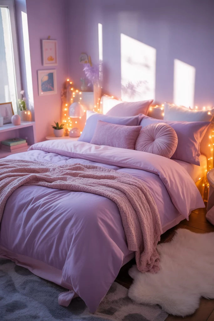
4. Lilac and Pink Dreamy Sanctuary
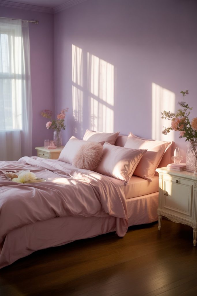
For a romantic and whimsical bedroom, blend lilac with blush pink and soft whites. This combination feels playful without being overly childish, making it perfect for young adults or anyone who wants to embrace a softer, more feminine aesthetic. The two-tone approach adds visual interest while maintaining a cohesive, dreamy quality. Layer in velvet or satin textures to enhance the luxurious feel. 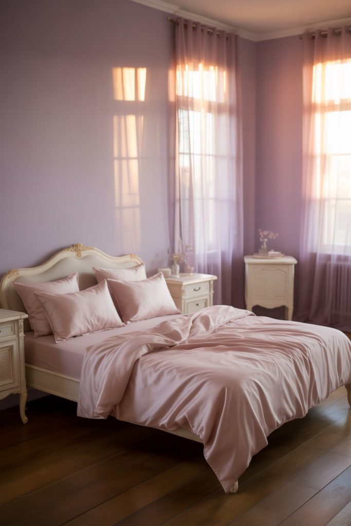
Where it works best: bedrooms with plenty of natural light and white or cream trim. The pale palette needs good illumination to avoid looking washed out or dull. If your room faces north or gets limited sun, consider adding warm-toned lamps or string lights to maintain that glowing, inviting feel. This is also a great option for rental apartments where you want impact without permanent changes—swap out bedding and add removable wallpaper in complementary tones.
5. Eggplant and Black Bold Statement
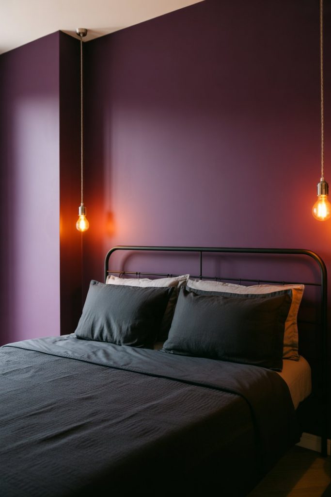
Pairing deep eggplant purple with black and charcoal creates a striking, moody bedroom that feels dramatic and intentional. This is not a timid choice—it’s for those who want their bedroom to make a statement. The darkness can actually be cozy rather than oppressive when balanced with the right lighting and a few reflective surfaces like mirrors or glass. Think boutique hotel vibes with a residential twist. 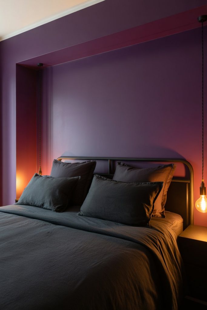
A designer I know once said that dark bedrooms actually help people sleep better because they signal rest more effectively than bright spaces. There’s real logic to that—our brains associate darkness with nighttime and recovery. If you’re going this bold, invest in quality blackout curtains and dimmable lighting so you can control the mood throughout the day. One common mistake: neglecting texture. In an all-dark room, varied textures (linen, velvet, leather) become essential for visual interest.
6. Lavender and Green Fresh Oasis
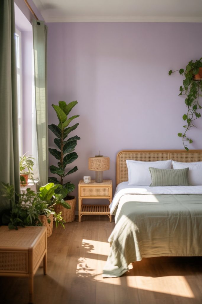
Bring nature indoors by combining soft lavender with sage green and natural wood tones. This pairing feels fresh and rejuvenating, reminiscent of spring gardens and openmeadows. The light purple provides a delicate backdrop while green accents—through plants, textiles, or artwork—ground the space in organic warmth. It’s a wonderful choice for anyone who finds peace in botanical elements. 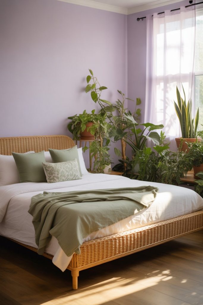
This palette thrives in West Coast homes, particularly in California and the Pacific Northwest, where indoor-outdoor living is a way of life. Real homeowners often report that waking up in a green-and-purple room feels like starting the day in a garden, which can genuinely improve morning mood. Keep the green subtle—too much can compete with the purple rather than complement it. Stick to muted, earthy greens rather than bright Kelly or lime tones.
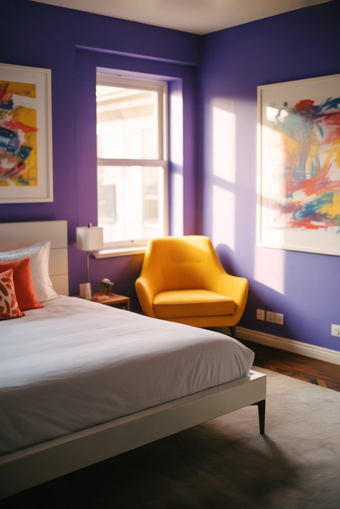
7. Purple and Teal Jewel Tone Luxury

Jewel tones are back in a big way, and pairing purple with teal and gold creates a bedroom that feels rich and globally inspired. Think Moroccan riads or Indian textiles—spaces where color is celebrated rather than minimized. This combination works beautifully with intricate patterns, layered textiles, and metallic accents. It’s bold, but when done right, it’s also deeply inviting. 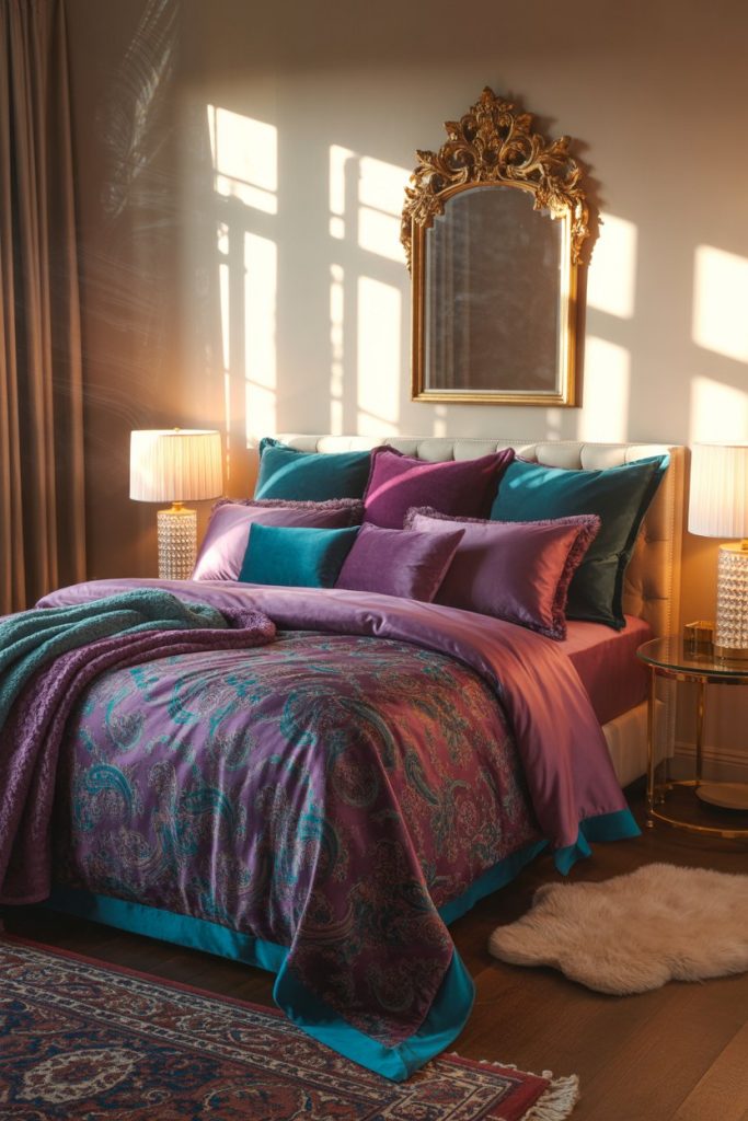
If you’re working with a mid-range budget—say, $1,500 to $3,000 for a bedroom refresh—this is where you’ll see the most impact for your investment. Jewel-tone bedding and accent pillows cost the same as neutral ones but deliver far more personality. Look for vintage or secondhand pieces like gilded mirrors or carved wood furniture, which add authenticity without the designer price tag. Just avoid the trap of over-accessorizing; even rich palettes need breathing room.
8. Dusty Purple and White Farmhouse Charm
A dusty purple—somewhere between mauve and lilac—paired with weathered white and wood brings farmhouse charm with a modern twist. This look is especially appealing in rural or suburban settings where rustic elements feel authentic rather than forced. Distressed furniture, linen bedding, and vintage-style lighting complete the vibe. It’s cozy without being cluttered, sophisticated without being stuffy. 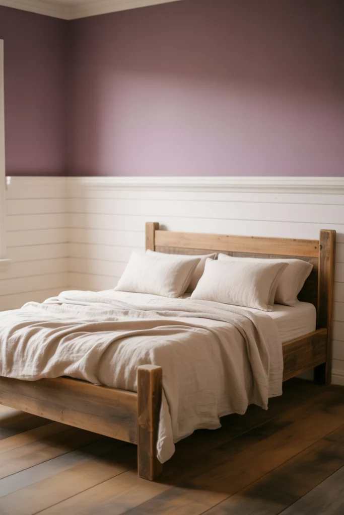
This style thrives in homes across the Midwest and South, where farmhouse aesthetics remain deeply popular. Real homeowners in these regions often mix in family heirlooms or flea market finds, which adds layers of personal history to the space. Expert tip: dusty purple is incredibly forgiving with different wood tones—it works with everything from dark walnut to light pine, making it easier to incorporate existing furniture without a full overhaul.
9. Bright Purple Teen Energy
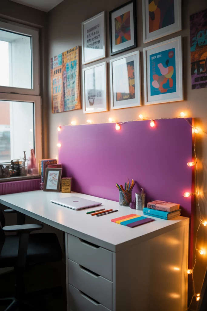
For a bedroom that reflects youthful energy, go bold with vibrant purple walls or bedding that teens will love. This isn’t about subtlety—it’s about creating a space that feels fun, expressive, and entirely their own. Pair bright purple with white furniture and pops of neon or metallic accents to keep it feeling current. Let your teen have input on the final touches; ownership of the space matters. 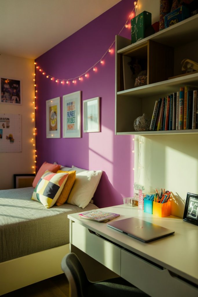
Where it works best: secondary bedrooms or basement spaces that can afford to be a bit more experimental. The beauty of decorating for teens is that their tastes will evolve, so choose paint and decor that can be easily updated rather than investing in custom built-ins or expensive furniture in trendy colors. Removable wallpaper in bold purple patterns is a smart alternative to paint—it makes a statement but can be swapped out as tastes change.
10. Soft Purple and Blue Coastal Calm
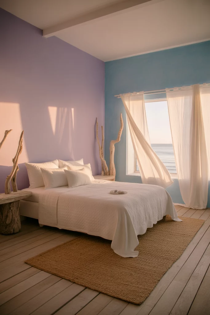
Combine soft lavender with pale blue and white for a bedroom that evokes coastal tranquility. This palette feels breezy and open, ideal for anyone who dreams of seaside living or just wants a space that promotes relaxation. The purple adds a gentle warmth that keeps the blue from feeling too cold, while white keeps everything bright and airy. Natural fiber rugs and driftwood accents complete the look. 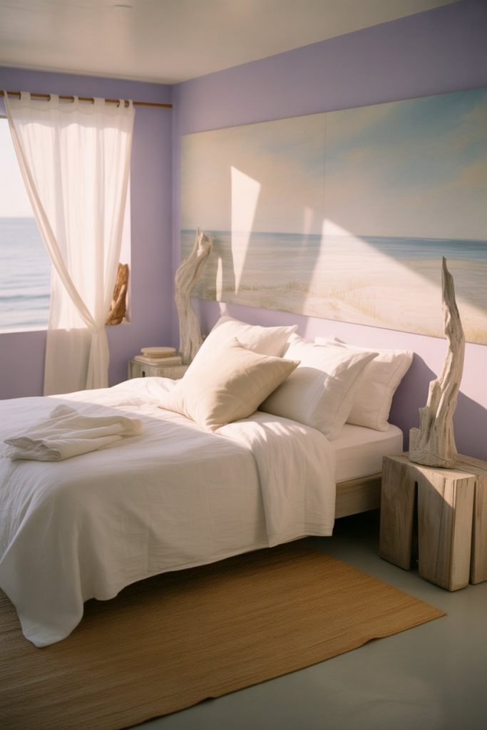
This style is especially popular in coastal states—Florida, California, the Carolinas—but it translates beautifully anywhere you want to bring vacation vibes home. A practical insight: if your bedroom tends to feel cold in winter, this palette might need seasonal adjustments. Swap in warmer throw blankets and deeper purple accents in colder months to maintain coziness. The palette is flexible enough to shift between fresh and warm depending on your accessories.
11. Purple and Grey Sophisticated Studio

For urban studio apartments or smaller bedrooms, a grey and purple palette creates a mature, sophisticated look without overwhelming limited square footage. Choose a gray and light purple scheme to maintain openness while adding personality. This combination feels intentional and grown-up, perfect for young professionals or anyone navigating city living. Streamlined furniture and smart storage keep the space functional. 
Budget angle: this palette is incredibly affordable to achieve because both gray and purple are readily available across all price points. A gallon of quality gray paint runs $30-50, while purple bedding from mid-range retailers like Target or West Elm costs $80-150 for a full set. Unlike trendy colors that require specialty products, these staples are everywhere, which also means you have more options for finding exactly the right shade without breaking the bank.
12. Mauve and Gold Vintage Glam

Channel Old Hollywood with a mauve purple paired with antique gold accents and velvet textures. This look is unabashedly romantic and glamorous, perfect for anyone who appreciates vintage aesthetics with a luxurious edge. Think tufted headboards, ornate mirrors, and crystal lighting fixtures. The muted purple keeps it from feeling too over-the-top while the gold adds just enough sparkle. 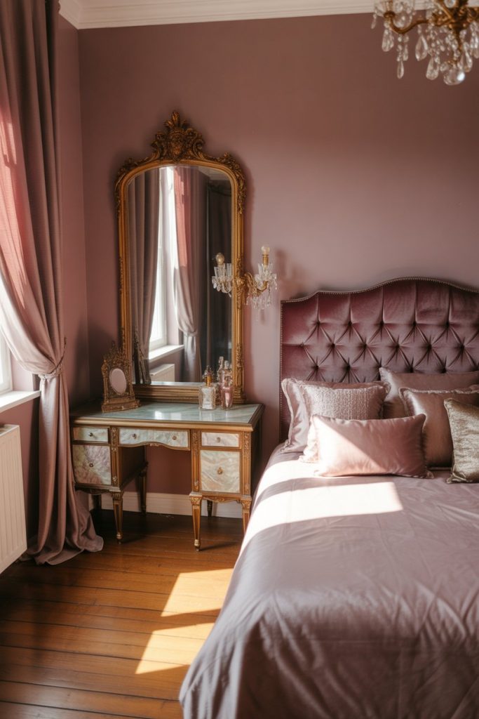
I once visited a Brooklyn brownstone where the owner had transformed a small bedroom into a jewel box using exactly this palette. The effect was intimate rather than cramped—the richness of the colors actually made the space feel more intentional and designed. Expert-style tip: when working with both deep color and metallic accents, lighting becomes crucial. Install a dimmer switch so you can adjust the mood, and mix ambient lighting with task lighting to avoid harsh shadows.
13. Purple and Yellow Bold Contrast
For those who love color and aren’t afraid to experiment, pairing purple with pops of yellow and white creates an energetic, unexpected bedroom. This combination is cheerful without being juvenile, bold without being chaotic. Use yellow sparingly—in throw pillows, artwork, or a single accent chair—to punctuate the purple without competing with it. The high contrast keeps the space feeling lively and modern. 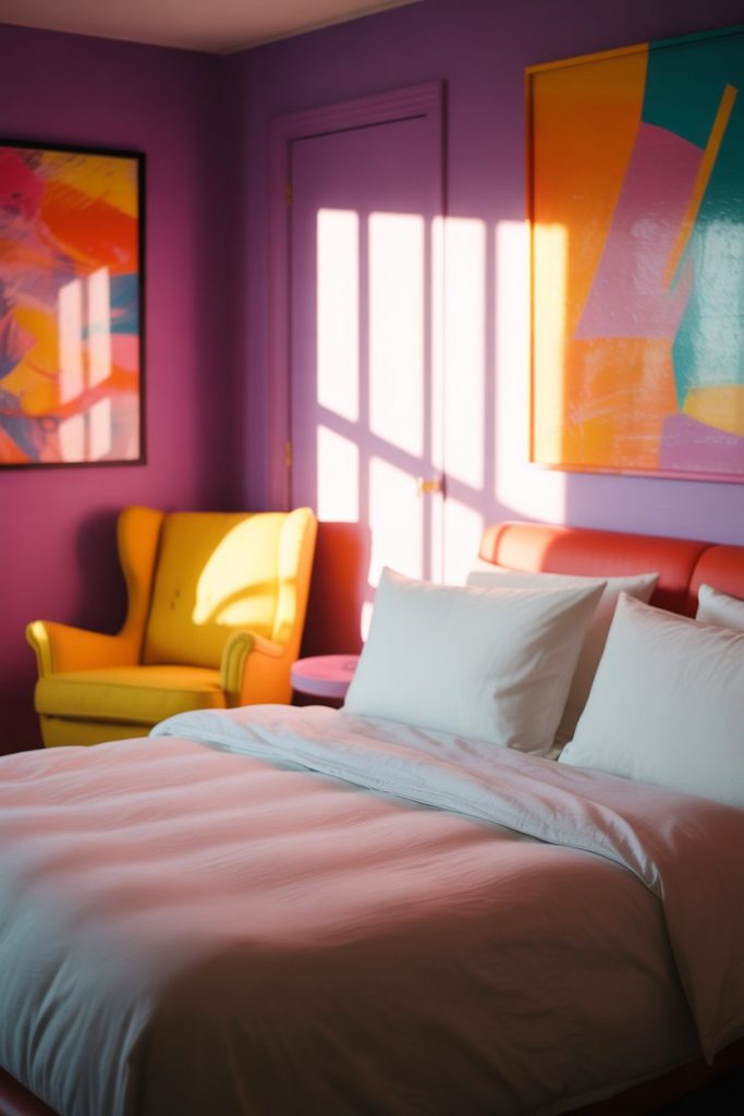
This palette works surprisingly well in rooms with lots of natural light, particularly those facing south or west. The brightness amplifies both colors in the best possible way. A common mistake here is choosing the wrong shade of yellow—opt for warm, golden yellows or soft buttery tones rather than neon or lemon, which can clash with cooler purples. Test paint samples in your actual light conditions before committing.
14. Lavender Kids’ Wonderland

Create a dreamy space for kids daughters with soft lavender walls and whimsical touches that spark imagination. This approach works across age ranges—from toddlers to tweens—because the color itself is gentle and versatile. Layer in fun patterns through bedding, rugs, and wall decals that can easily be updated as they grow. Keep furniture simple and neutral so the room can evolve without a complete overhaul. 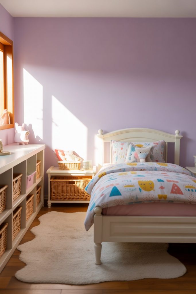
Real homeowner behavior shows that parents increasingly prefer neutral bases with colorful accents in kids’ rooms rather than theme-heavy designs that quickly feel dated. Lavender walls with interchangeable decor give you flexibility—swap out princess bedding for space themes or animal prints without repainting. This saves money and reduces waste as children’s interests inevitably shift, usually every 2-3 years.
15. Deep Purple and Orange Bohemian Spirit
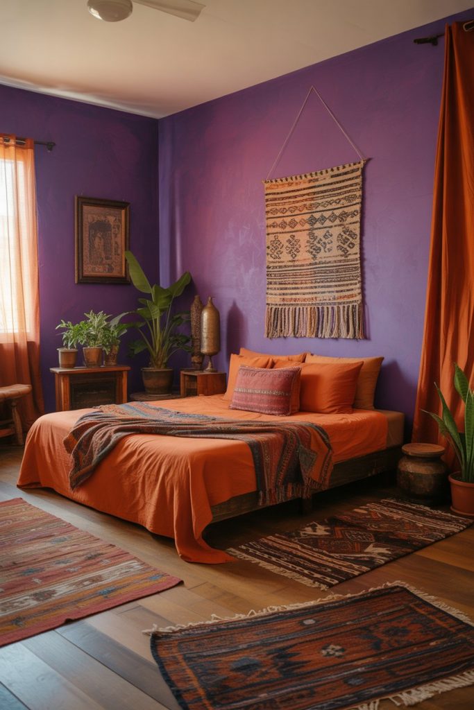
Embrace bohemian style with deep purple walls accented by burnt orange and terra-cotta tones. This warm, earthy combination feels grounded and creative, perfect for artistic souls who want a bedroom that reflects their free-spirited nature. Layer in woven textiles, macramé wall hangings, and potted plants to complete the boho aesthetic. The richness of purple provides depth while orange adds unexpected vibrancy. 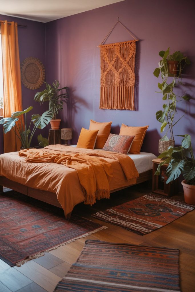
This look thrives in older homes with character—think Craftsman bungalows or converted lofts—where architectural details add to the eclectic feel. The purple-and-orange combo is particularly popular in creative hubs like Portland, Austin, and Asheville, where personal expression takes precedence over safe neutrals. Budget-friendly approach: hit up thrift stores and vintage markets for unique orange accessories and textiles rather than buying new, which adds authenticity and saves money.
16. Pastel Purple Dreamy Kids’ Room

For younger kids, a pastel purple creates a soothing, sleep-friendly environment that still feels cheerful during playtime. Soft lilac or lavender paired with white furniture and gentle patterns strikes the perfect balance between stimulating and calming. This palette grows with them better than primary colors, meaning fewer overhauls as they age. Add personal touches through artwork, stuffed animals, and bedding that reflect their personality. 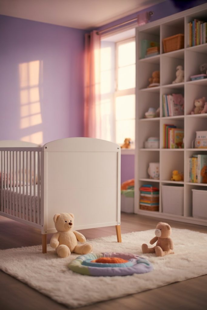
Where it works best: nurseries transitioning to toddler rooms, or elementary-age bedrooms that need to last several years. Pastel purple is forgiving—it hides minor wall scuffs better than white but remains bright enough to keep the space feeling open. Practical insight: use semi-gloss or satin finish paint in kids’ rooms rather than flat, as it’s far easier to wipe clean when sticky fingers inevitably meet walls.
17. Purple and Red Passionate Drama

For a truly bold bedroom, combine purple with deep red and burgundy accents. This passionate pairing feels dramatic and intimate, ideal for couples who want their bedroom to feel like a private retreat. The warmth of red balances purple’s cooler tones, creating a space that’s both energizing and cozy. Velvet, silk, and rich wood tones enhance the luxurious feel. 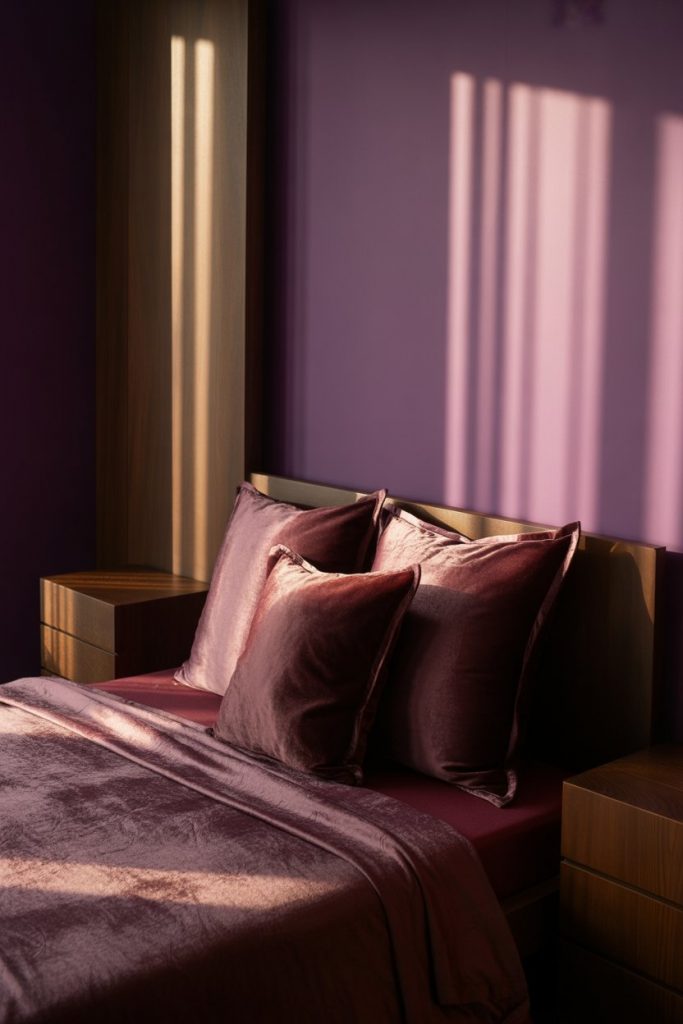
A friend who’s an interior designer mentioned that clients initially shy away from this combination, worried it’ll feel like a bordello, but when balanced correctly it’s actually quite sophisticated. The key is proportion—if you’re going bold with both colors, use one as the dominant shade and the other as an accent. Too much of either can overwhelm, but a deep purple wall with burgundy bedding and pillows creates just the right intensity without tipping into excess.
18. Lilac and White Airy Aesthetic

Achieve an aesthetic Instagram-worthy bedroom with the softest lilac walls and an abundance of white—white bedding, white curtains, white furniture. This ultra-light approach feels clean, modern, and effortlessly stylish. Add in some dried flowers, simple line art, and maybe a vintage mirror to complete the minimalist-meets-romantic vibe that’s all over social media right now. 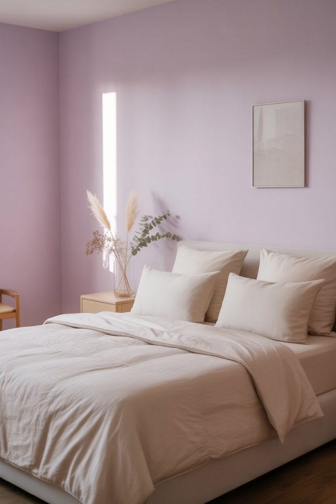
This look is especially popular among younger homeowners and renters in their twenties and thirties who curate their spaces with Instagram in mind. It photographs beautifully, which is part of the appeal. But beyond aesthetics, there’s real functionality here—the light palette makes small spaces feel larger and more open, which is crucial in apartments or starter homes. The simplicity also makes cleaning and organizing easier, since clutter becomes immediately visible against all that white.
19. Violet and Charcoal Modern Edge
Pair vibrant violet with charcoal gray or gunmetal accents for a bedroom with serious modern edge. This combination feels current and sophisticated, perfect for urban lofts or contemporary homes. The dark gray grounds the brightness of violet, preventing it from feeling too whimsical or juvenile. Metal fixtures, leather accents, and abstract artwork complete the contemporary aesthetic. 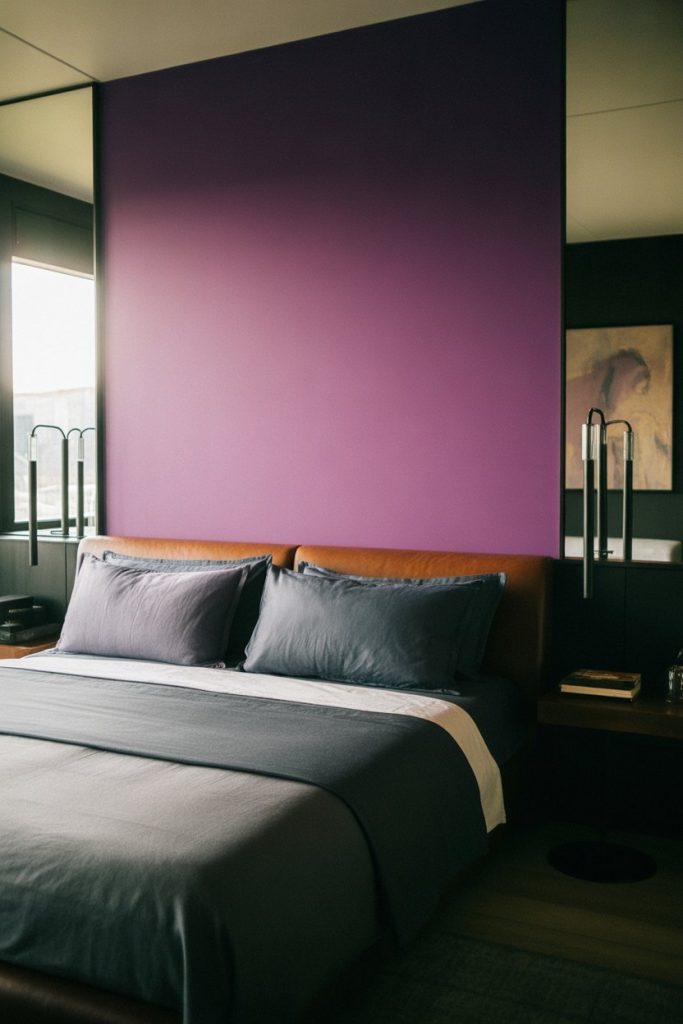
Common mistake: assuming that bright purple needs to be softened with pastels. In reality, pairing it with darker, more industrial tones creates a striking contrast that feels deliberate rather than accidental. This works particularly well in open-concept lofts where the bedroom area needs to hold its own against exposed brick, concrete, or other raw materials. If you’re in a rental, consider doing this with textiles and accessories rather than paint, so you can take the look with you when you move.
20. Soft Purple and Cream Timeless Elegance
Achieve timeless elegance by pairing soft purple walls with cream bedding and furniture. This classic combination feels refined without being stuffy, romantic without being overly feminine. The warmth of cream softens purple’s cool undertones, creating a balanced, inviting space. This is a safe but stylish choice for anyone who wants color without risk of it feeling dated in a few years. 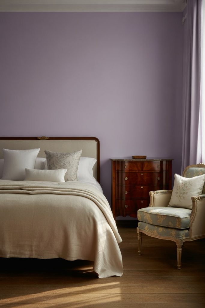
Expert-style commentary: this palette has staying power because it’s rooted in traditional design principles while remaining fresh enough for contemporary tastes. You’ll find versions of it in historic homes and brand-new builds alike. The cream adds a softness that pure white can’t achieve, making the space feel more lived-in and welcoming. It’s particularly lovely in bedrooms with period details like crown molding or wainscoting, where the colors enhance rather than compete with architectural features.
21. Purple and Pink Cute Charm
Create a cute and playful bedroom by mixing various shades of purple with soft pink and blush tones. This sweet combination feels youthful and charming without being overly childish, making it versatile for teens, young adults, or anyone who loves a feminine aesthetic. Layer different textures—velvet, linen, cotton—to add depth and interest. Small decorative touches like fairy lights or pom-pom trim complete the adorable vibe. 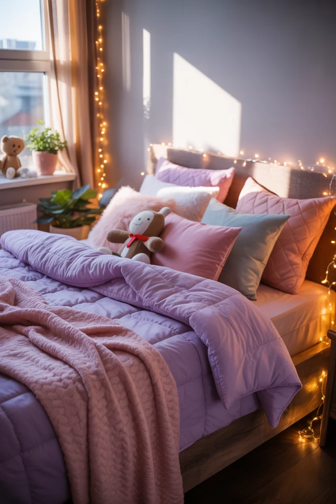
Real homeowner behavior in college towns and urban areas shows that this style remains popular among young women creating their first independent living spaces. The color combination feels optimistic and personal, which matters when you’re establishing your own space for the first time. Budget tip: outlets like HomeGoods and TJ Maxx carry tons of purple and pink décor at accessible prices, making it easy to pull together this look without designer-level spending.
22. Amethyst and Silver Luxe Glamour
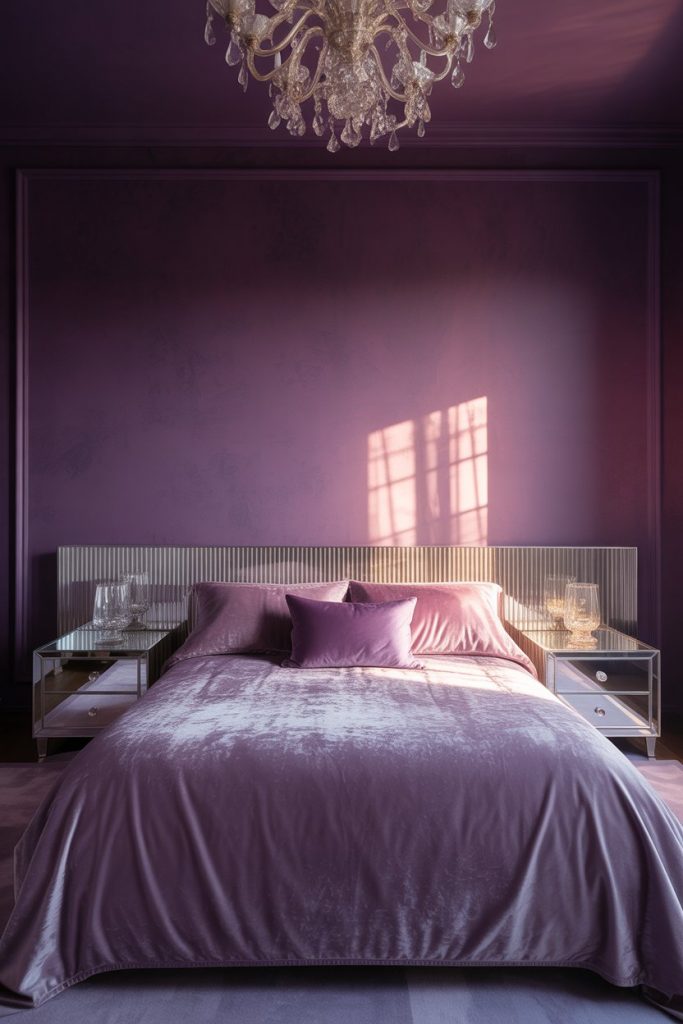
Finish strong with a luxurious amethyst purple paired with silver metallic accents for maximum glamour. This jewel-toned approach feels opulent and special, transforming your bedroom into a retreat worthy of a boutique hotel. Mirrored furniture, crystal lighting, and plush velvet textiles enhance the luxe factor. It’s bold, beautiful, and makes no apologies for celebrating color and shine. 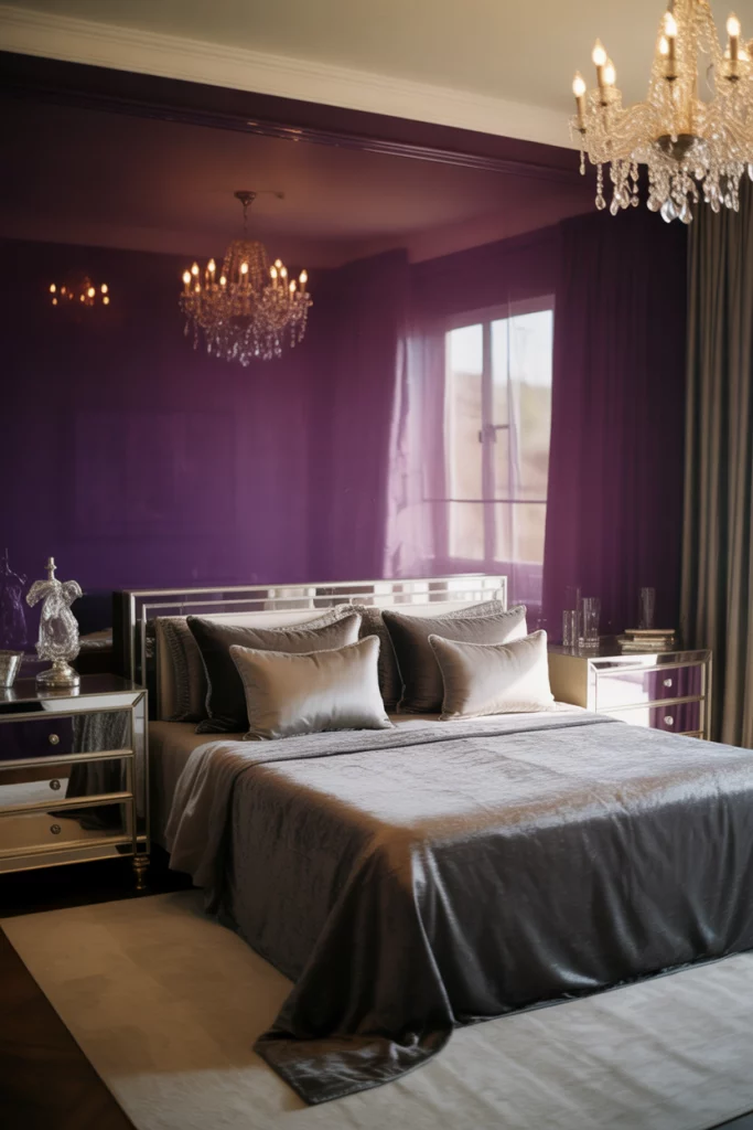
If you’re investing in a bedroom renovation with a budget of $5,000 or more, this is where you can really make an impact. Quality matters more than quantity here—one statement piece like a crystal chandelier or a custom velvet headboard will transform the entire space more effectively than a dozen smaller purchases. The amethyst-and-silver combination photographs beautifully and maintains its appeal across seasons, making it a smart choice for anyone who plans to stay in their home for several years and wants a bedroom that truly wows.
Conclusion
Whether you’re drawn to soft pastels or dramatic jewel tones, purple bedrooms offer endless possibilities for creating a space that feels uniquely yours. The beauty of purple is its range—from energizing to calming, playful to sophisticated. We’d love to hear which ideas resonated with you most, or if you’ve tried any purple palettes in your own bedroom. Share your thoughts, experiences, or questions in the comments below!