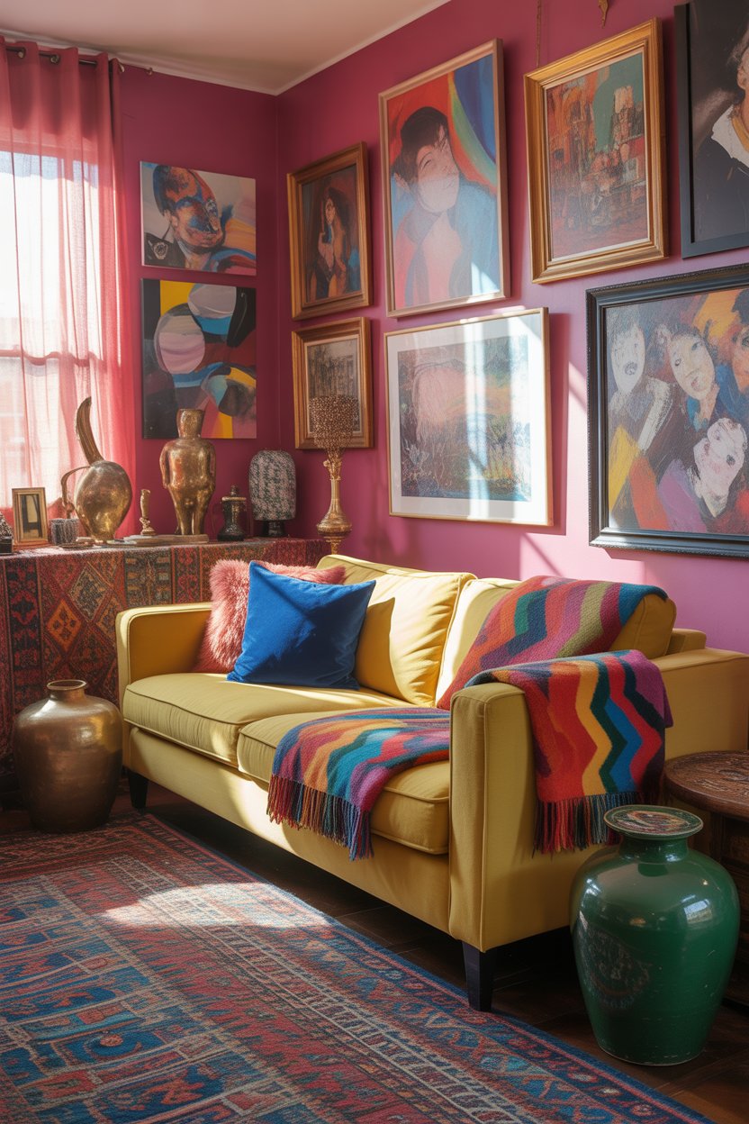
If your Pinterest feed has been flooded with moody earth tones, unexpected blues, and richly layered neutrals lately, you’re not imagining things. The living room color conversation has shifted dramatically heading into 2026, and American homeowners are paying attention. Gone are the days of playing it safe with builder-grade beige—this year is about intention, warmth, and personality. Whether you’re planning a full repaint or just swapping out accent pillows, the ideas below will walk you through the palettes, combinations, and design moves that are defining living rooms right now. Consider this your visual mood board, translated into real, actionable inspiration.
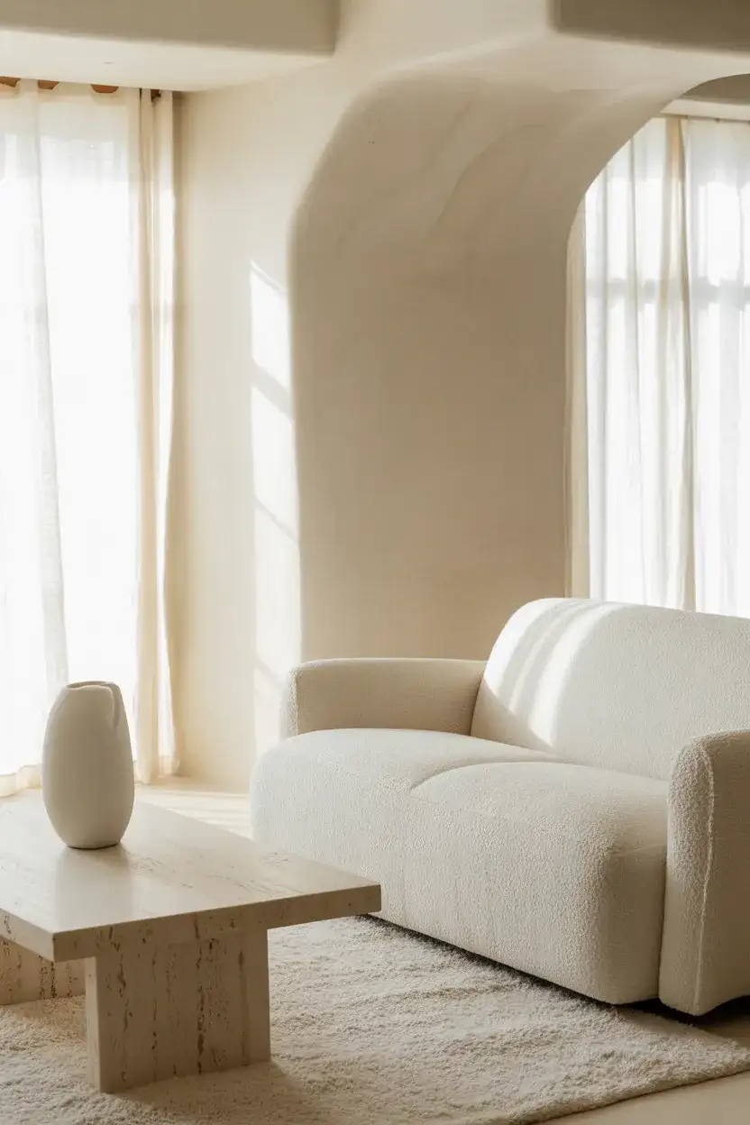
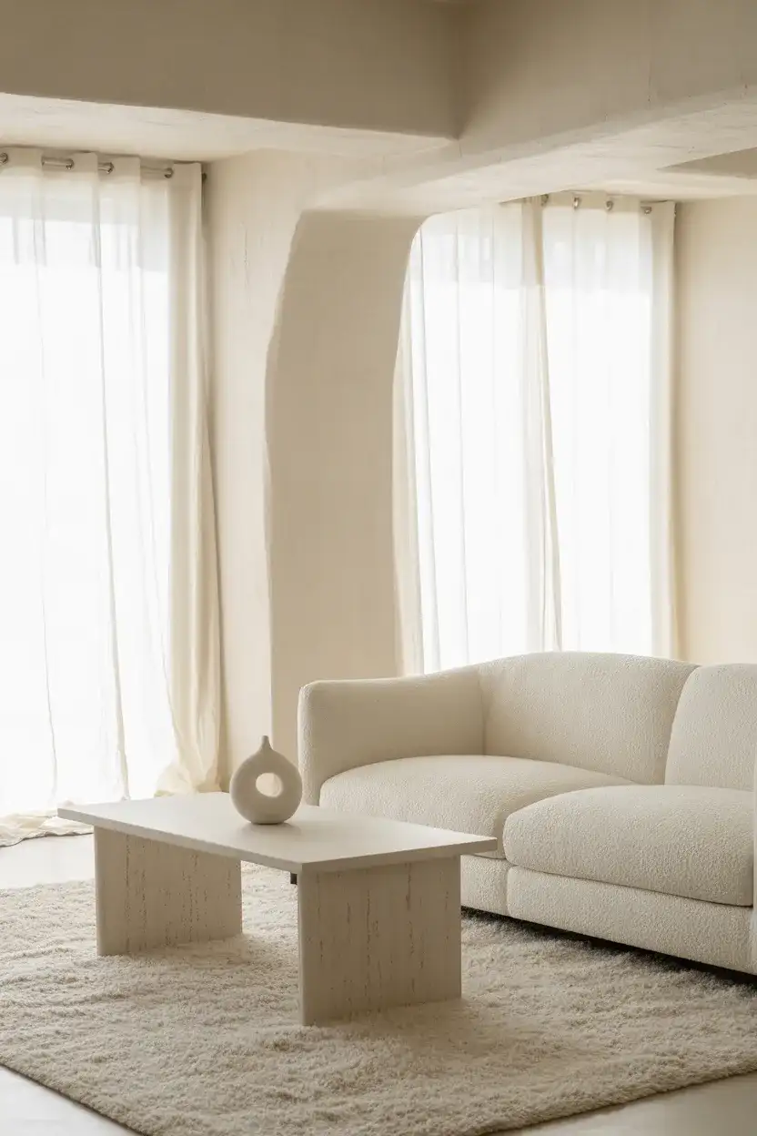
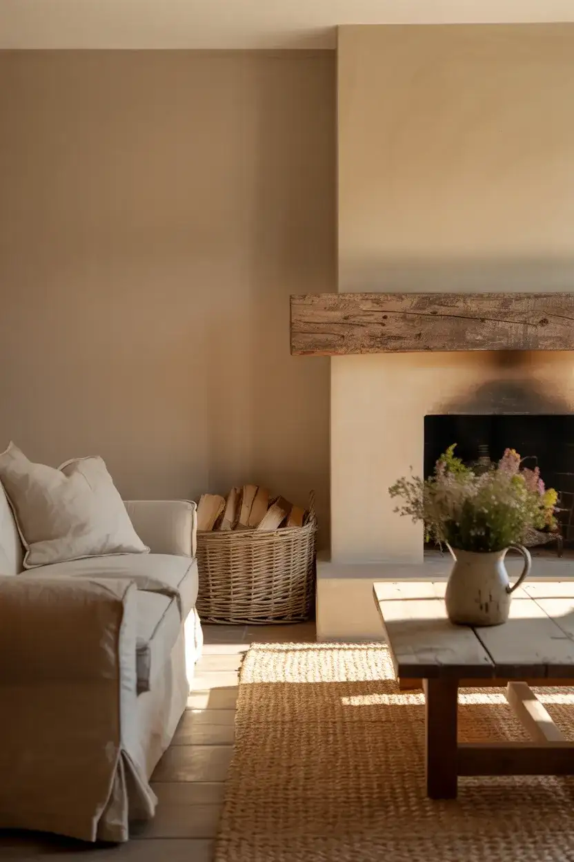
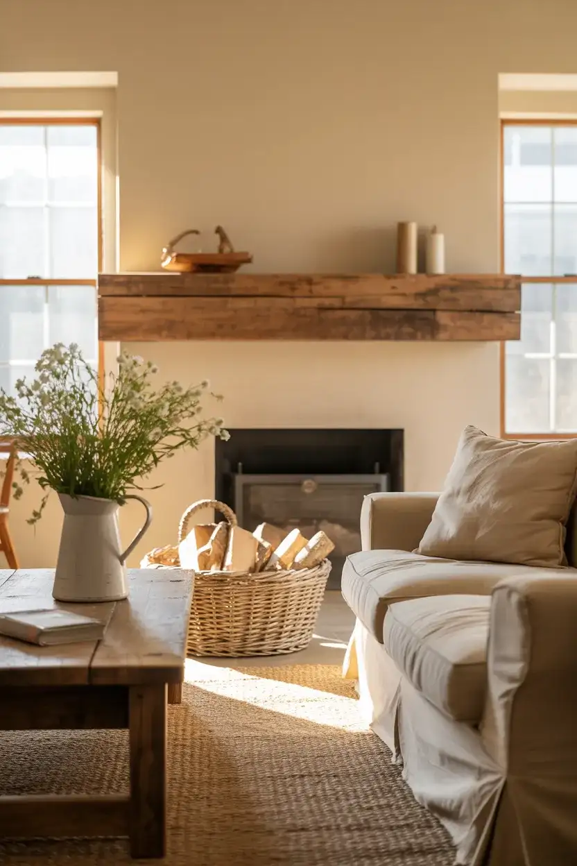
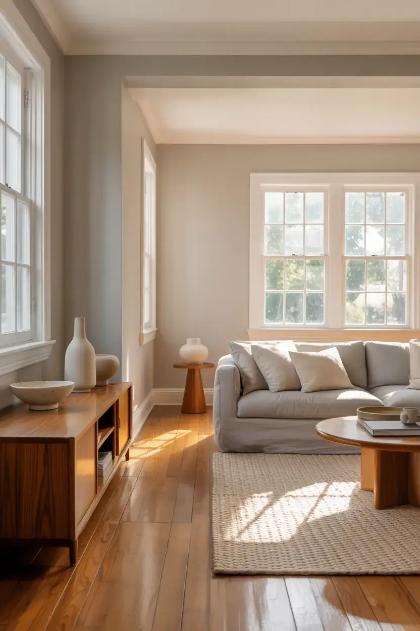
1. Warm Ivory Walls With Caramel Leather
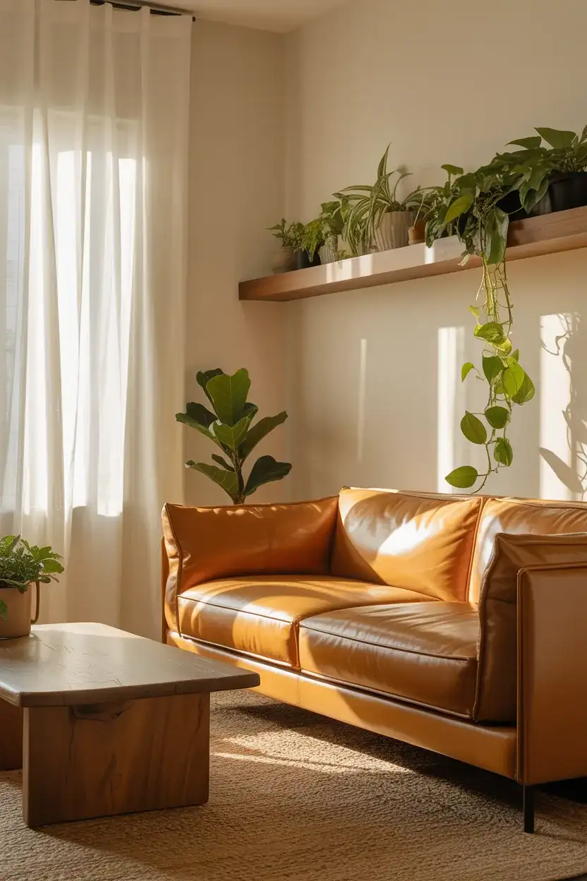
There’s a reason this combination keeps showing up on every design board—it simply works. A neutral ivory backdrop paired with caramel leather seating creates a living room that feels both collected and effortless. The warmth of the leather keeps the space from reading cold or sterile, while the light walls allow natural sunlight to bounce around the room all day. This scheme is especially popular in open-concept homes where the living area flows into the kitchen, giving the whole ground floor a cohesive, relaxed energy.
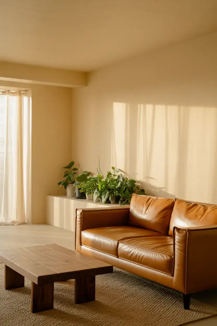
If you’re working with a tight budget, this palette is forgiving in the best way. You don’t need to invest in expensive statement furniture—a secondhand leather sofa from Facebook Marketplace and a gallon of affordable ivory paint can completely transform a space. The real trick is layering textures: think linen throw pillows, a chunky knit blanket, and maybe a woven basket for storage. These small additions cost almost nothing but give the room that pulled-together, editorial look people spend thousands trying to achieve.
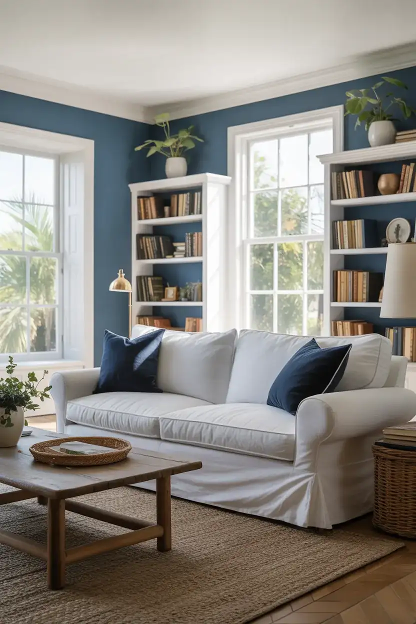
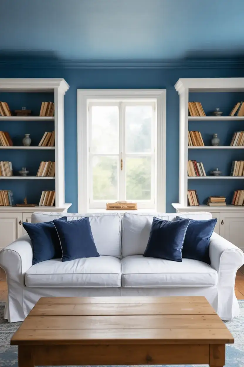
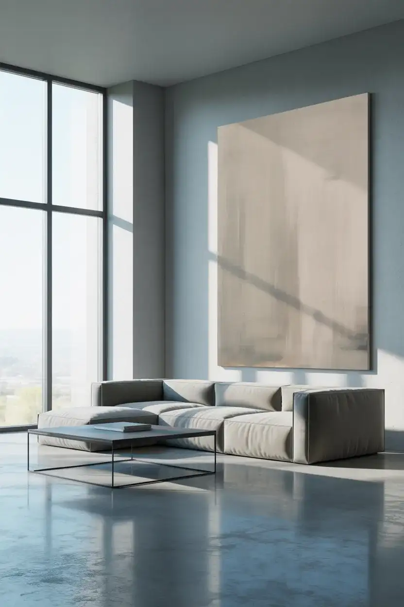
2. Dusty Blue Accent Wall
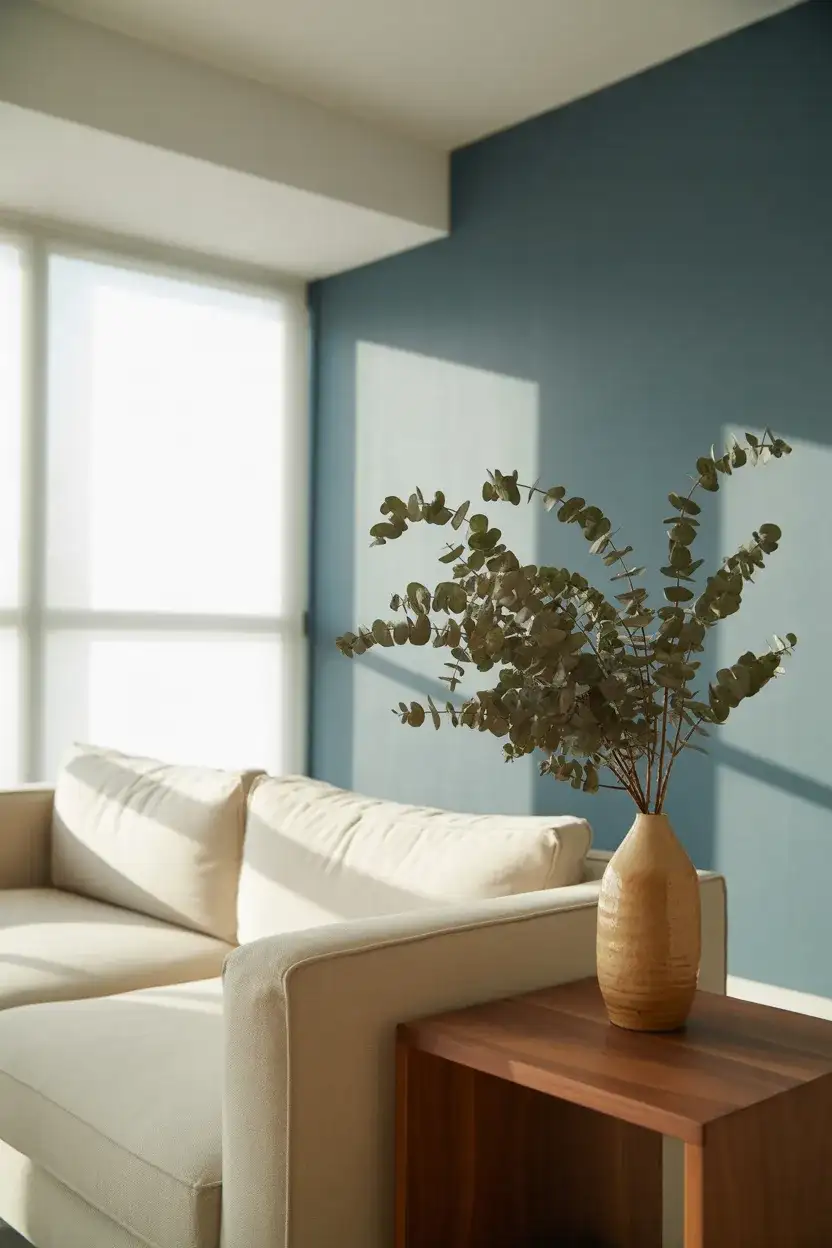
The blue living room isn’t going anywhere—but in 2026, the shade has matured. Forget the bright navy splash walls of a few years ago. This year’s favorite is a muted, dusty blue that reads almost like a storm cloud at dusk. Used as an accent wall behind the sofa or the media console, it adds serious depth without overwhelming the room. Pair it with bright white trim and warm wood furniture, and you’ve got a space that feels contemporary but not cold, modern but still inviting enough for a Sunday movie marathon.
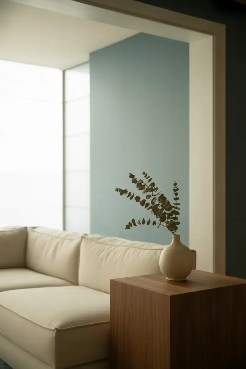
Where this works best is in north-facing rooms that tend to get cooler, indirect light throughout the day. A lot of people shy away from blue in these spaces, assuming it’ll make them feel colder. But dusty blue actually absorbs that silvery northern light beautifully and creates a cocoon-like atmosphere. It’s the same reason Scandinavian designers have relied on blue-gray tones for decades—they complement low light instead of fighting it. Southern-facing rooms work too, but the shade will read slightly warmer there.
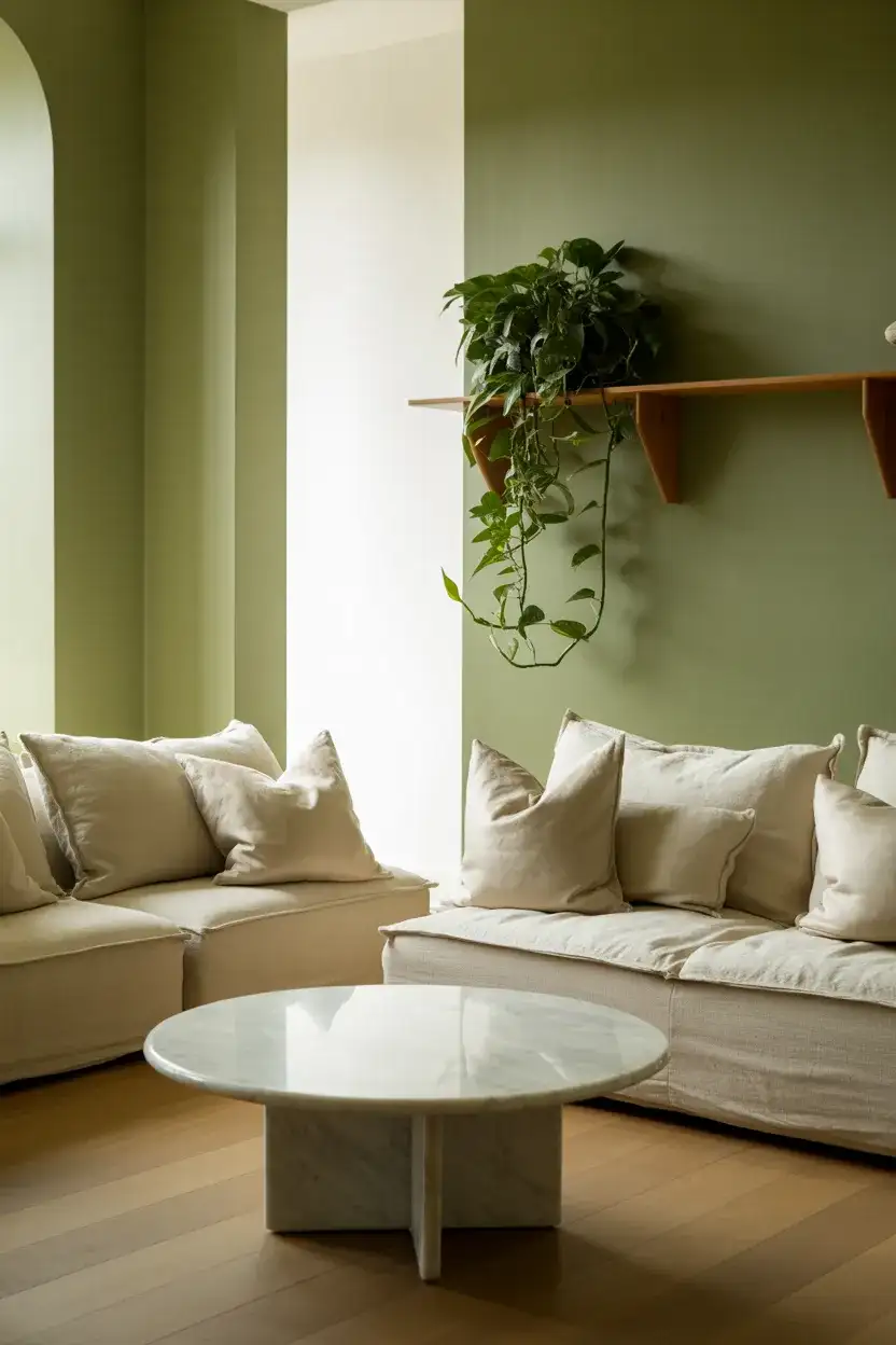
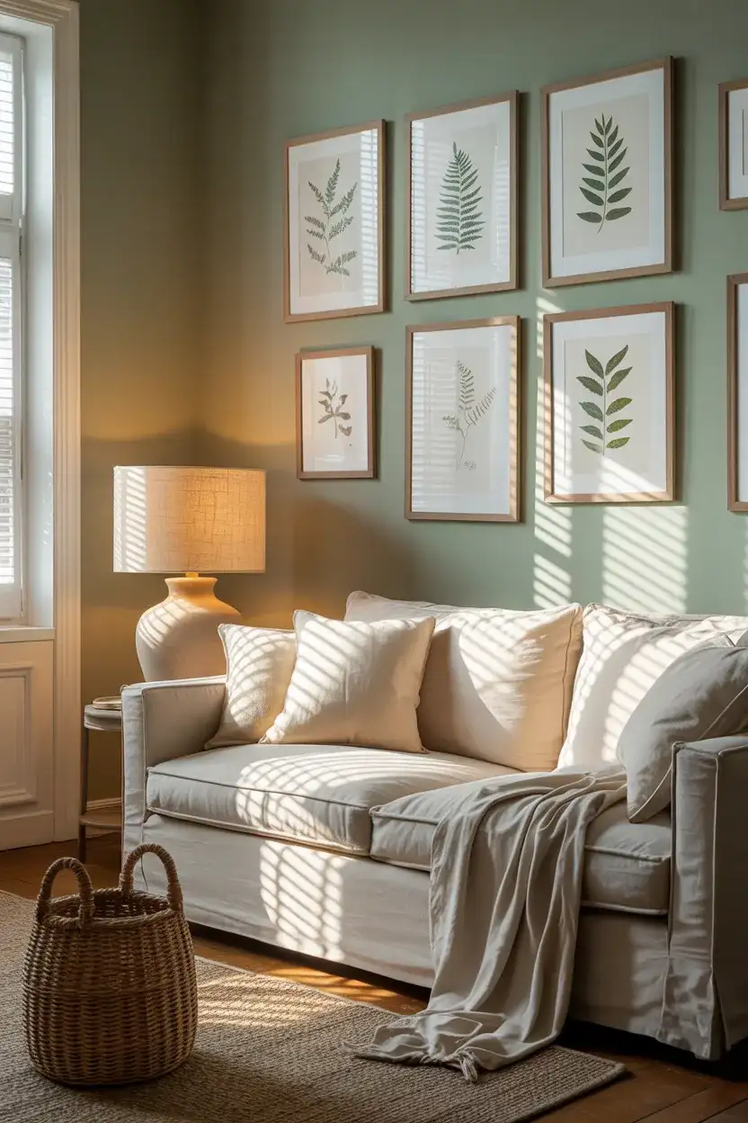
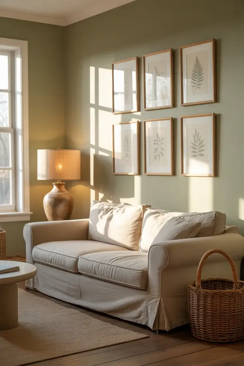
3. Sage Green and Cream Palette
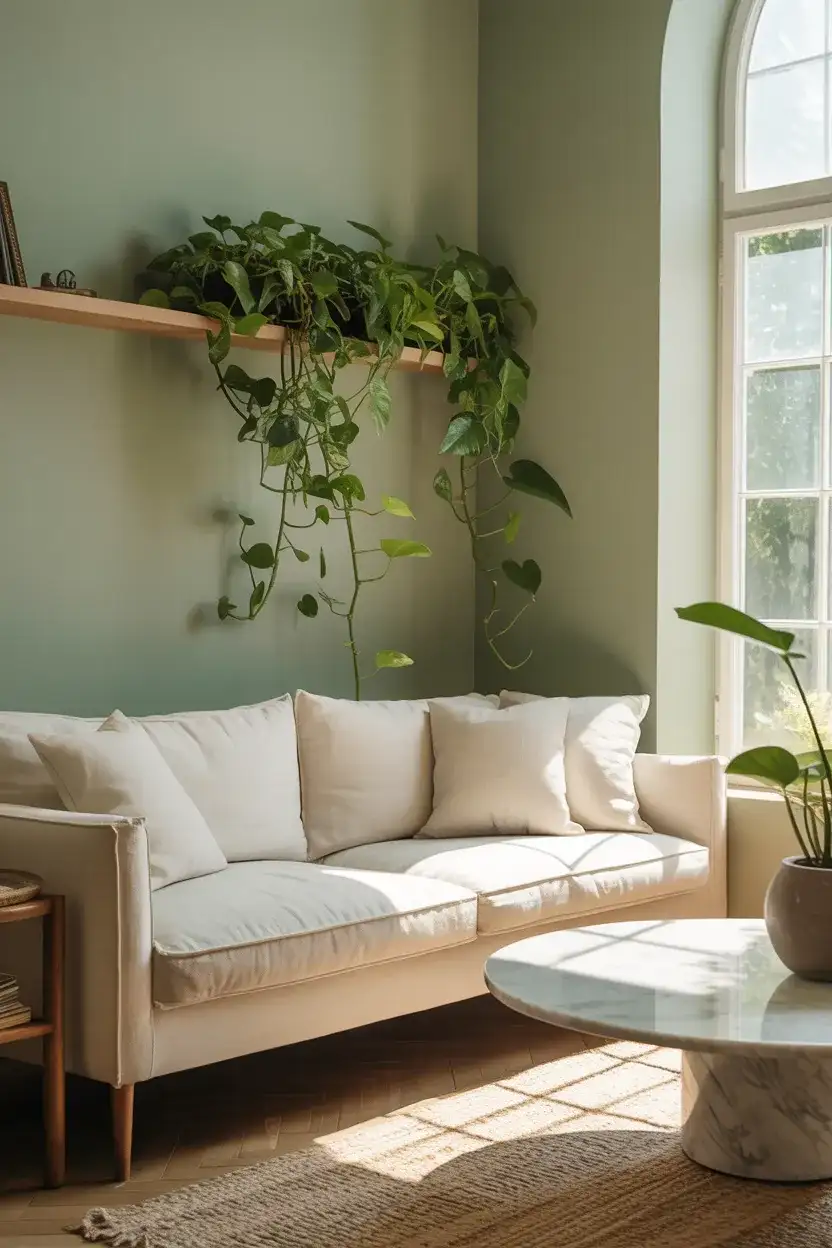
Sage green has steadily climbed the popularity charts, and by 2026 it’s firmly established as a go-to for anyone craving a nature-inspired palette. Combined with cream upholstery and natural linen textiles, this combination feels like stepping into a quiet morning garden. It’s an interior design favorite right now because it manages to feel organic without veering into rustic territory—the look is refined, almost spa-like. Works beautifully in both small apartments and larger family rooms where calm energy is the priority.
A friend of mine in Portland repainted her entire living room sage green on a whim last spring—she’d seen the color on a café wall downtown and couldn’t stop thinking about it. She paired it with secondhand cream chairs and a sisal rug, and the room went from feeling cluttered and chaotic to genuinely peaceful. Her husband, who’d been skeptical the whole time, admitted it was the first time the room actually felt finished. Sometimes one decisive color choice does more than months of accessorizing ever could.
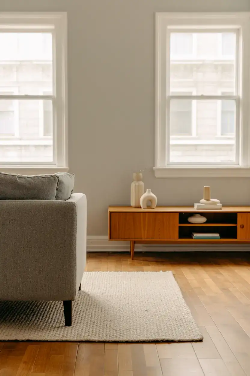
4. Charcoal and Warm White Contrast
High contrast is having a major moment. A combination of white wall and deep charcoal furnishings creates the kind of living room that photographs incredibly well—which is exactly why it dominates Pinterest right now. The schemes feel bold without requiring any unusual color knowledge. It’s essentially a two-tone approach: warm white on the walls and ceiling and charcoal on the sofa, rug, or built-in shelving. The result reads sophisticated in a modern apartment or a traditional rowhouse alike, making it one of the most versatile designs of the season.
The biggest mistake people make with this palette is going too cool on the white. A stark, blue-undertone white paired with charcoal can feel corporate and uninviting—think waiting room, not living room. The fix is simple: choose a warm white with a yellow or cream undertone. Benjamin Moore’s “White Dove” or Sherwin-Williams’ “Alabaster” are safe bets. And on the charcoal side, make sure the fabric has some texture—velvet, boucle, or a heavy linen weave—so the dark pieces feel plush rather than flat and lifeless.
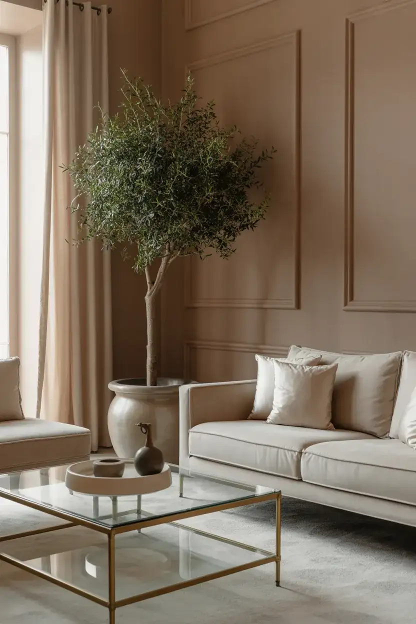
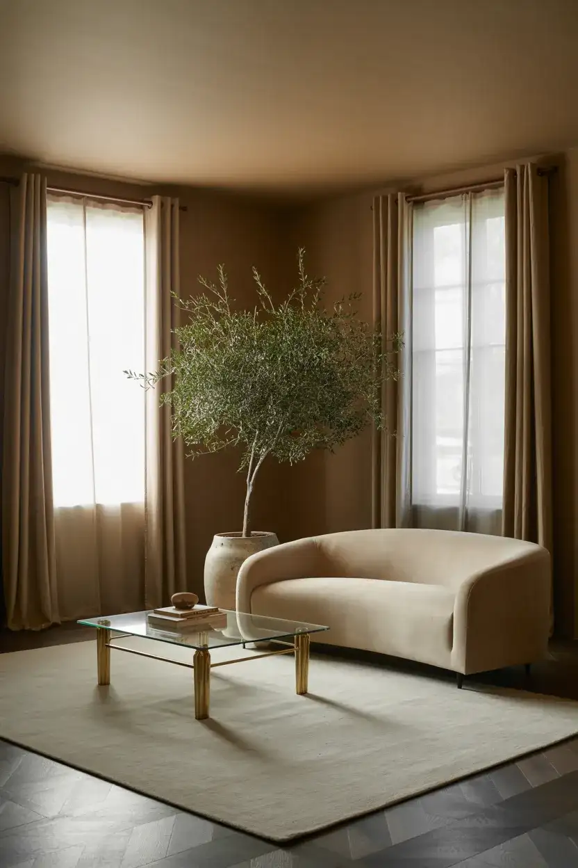
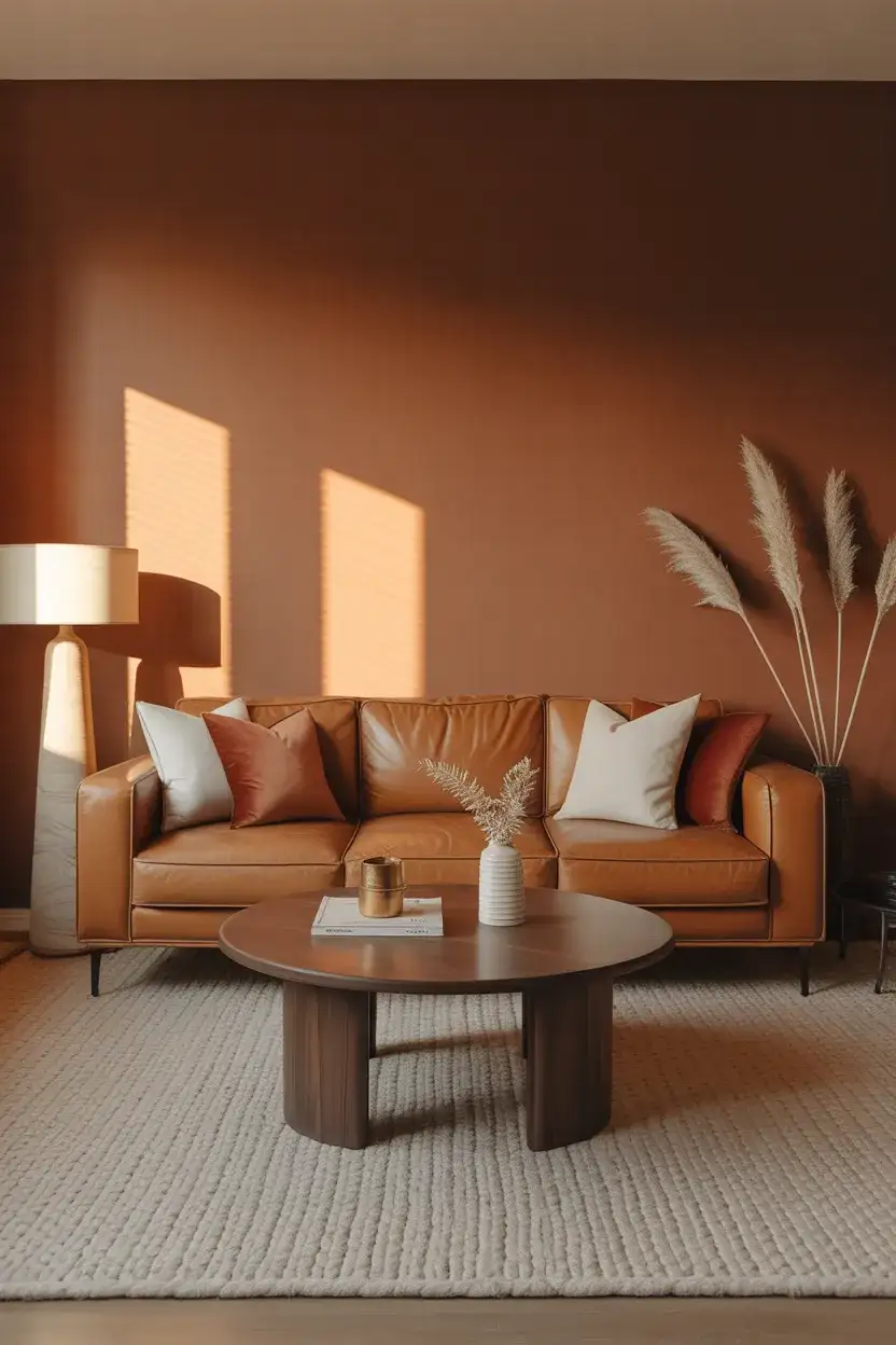
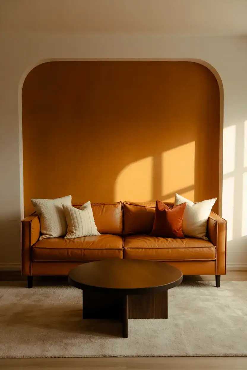
5. Terracotta and Olive Living Room
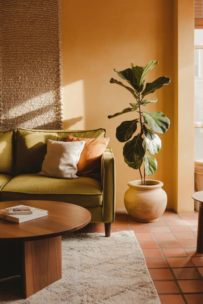
This palette feels like it was pulled straight from a Tuscan hillside, but it translates remarkably well to American living rooms. Terracotta—whether on the walls, in throw pillows, or through clay pottery accents—brings instant warmth. Pair it with olive green textiles, and you’ve got cozy scheme ideas that feel layered and worldly. It’s an especially good choice for anyone who finds pure neutrals boring but doesn’t want to commit to something as bold as jewel tones. The earthy quality keeps everything grounded and livable.
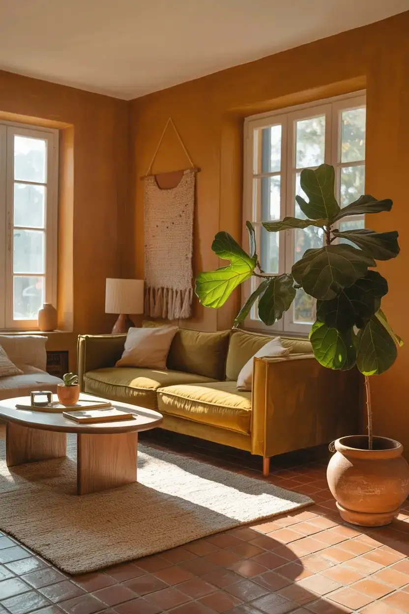
This combination resonates especially well in the Southwest and Southern California, where the natural landscape already features these tones. Homeowners in Tucson, Santa Fe, and the desert communities of Arizona have been gravitating toward this look because it echoes what’s right outside their windows. But it also works in unexpected places—a brownstone in Brooklyn or a ranch house in Texas Hill Country. The key is that terracotta and olive feel connected to the land, no matter which part of the country you call home.
6. Moody Plum With Gold Accents
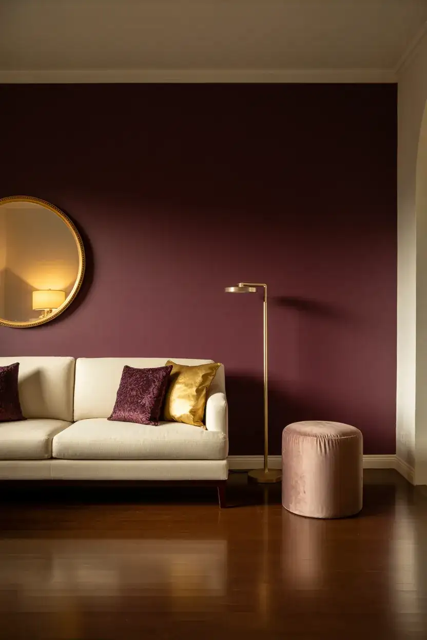
For those ready to make a dramatic statement, a deep plum wall color paired with gold accent pieces delivers the kind of richness that stops people mid-scroll. This isn’t a shy palette of ideas—it’s deliberately luxurious. But the trick to keeping it from feeling like a Victorian parlor is restraint: one plum wall, gold in small doses through light fixtures and frames, and the rest of the room in soft neutral tones. As a scheme idea alternative, consider plum cushions against a lighter wall if full commitment feels like too much.
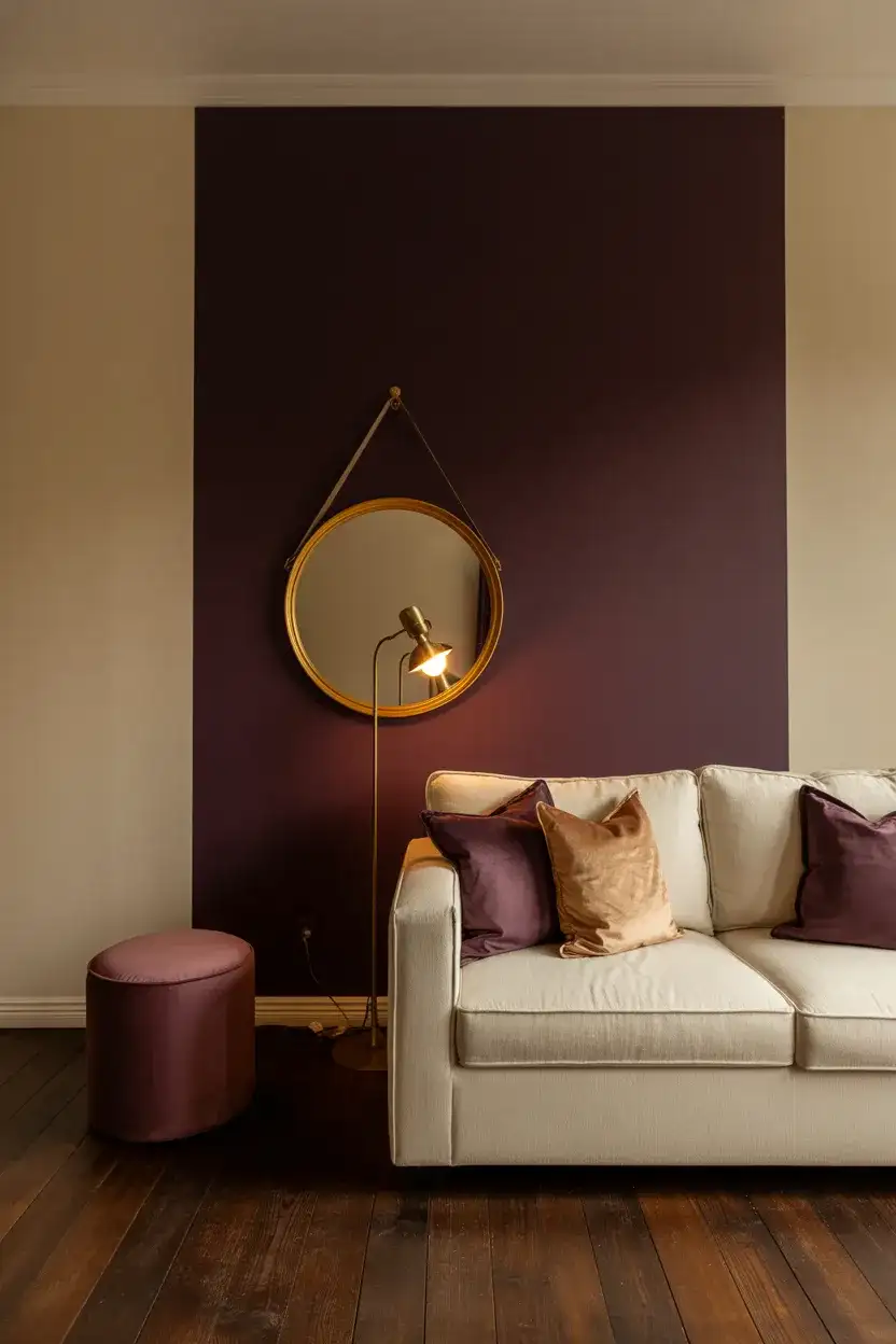
From a practical standpoint, plum reads differently throughout the day, and that’s actually its superpower. In morning light, it can look almost mauve—soft and approachable. By evening, especially under warm lamplight, it deepens into something nearly burgundy and incredibly enveloping. If you’re someone who spends most of your living room time in the evening after work, you’ll experience the richest version of this color right when you need it most. It’s a palette that rewards you for staying home.
7. All-White With Textural Layers
The all-white living room never truly goes away—it just evolves. In 2026, the move is away from the flat, Instagram-minimalist white box and toward a space that’s still white but loaded with combinations of ideas built through texture. Think plaster walls with visible trowel marks, a chunky bouclé sofa, linen curtains pooling on the floor, and a shaggy wool rug underfoot. The light palette remains the foundation, but every surface has something tactile going on that keeps the eye moving and the room feeling alive.
Interior designers have a name for what makes or breaks this look: “tonal variation.” Even within an all-white room, not every white should be the same. Your walls might be a slightly warm cream, the sofa a cooler bright white, and the curtains an off-white with a hint of gray. These subtle shifts create dimension. Without them, the room flattens out and feels sterile. The expert move is to hold fabric and paint swatches next to each other in natural light—differences invisible under store lighting become obvious at home.
8. Deep Forest Green Walls
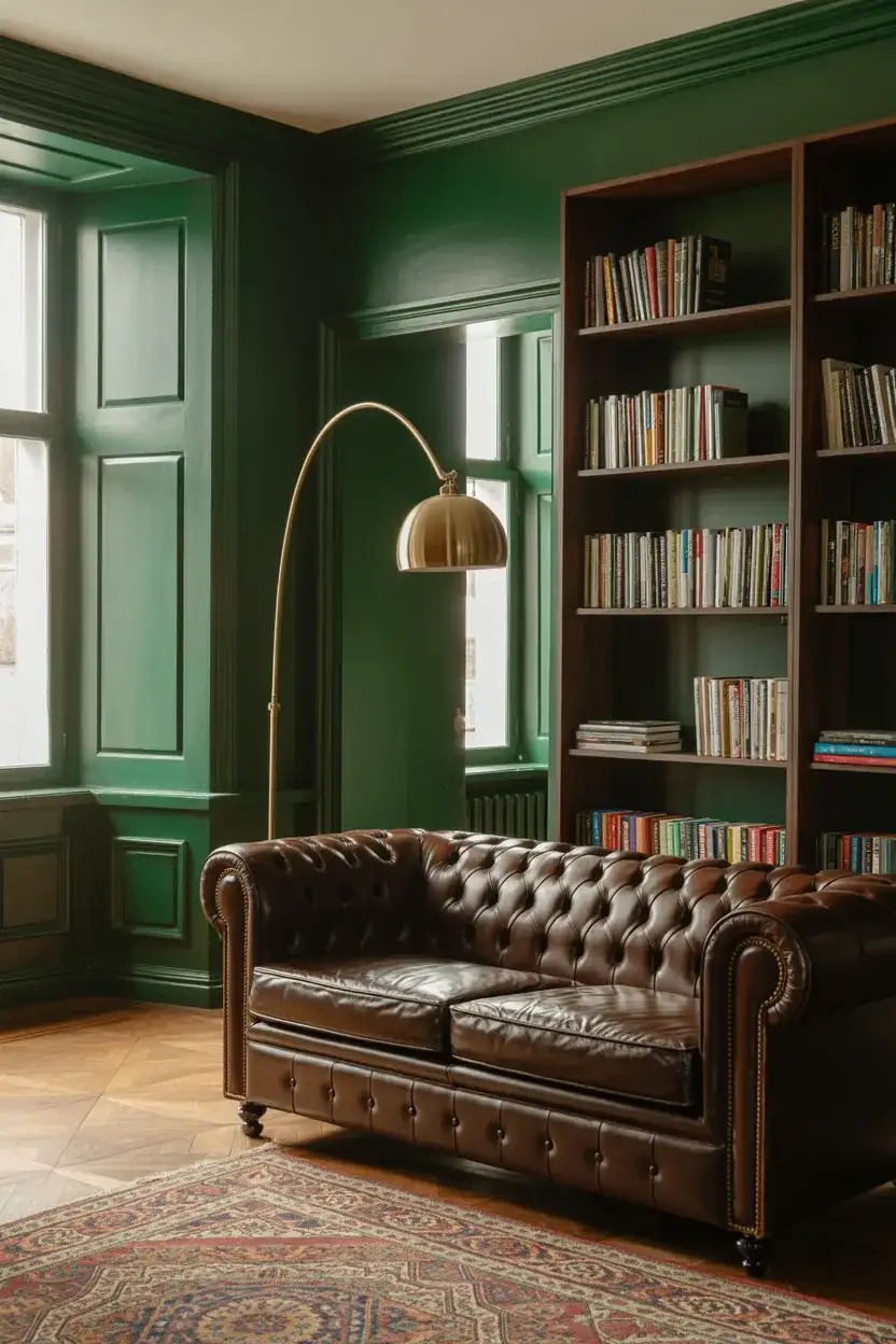
Dark, saturated green has crossed over from trendy accent color to full-room commitment, and the results are stunning. A living room wrapped in deep forest green feels like a private library or a gentleman’s club—in the best possible way. This cozy approach works particularly well with brown couch seating, brass lighting, and rich wood tones. It’s one of those ideas that sounds risky on paper but looks remarkably polished in person. The color absorbs light in a way that makes the space feel intimate and cocooned, even in larger rooms.
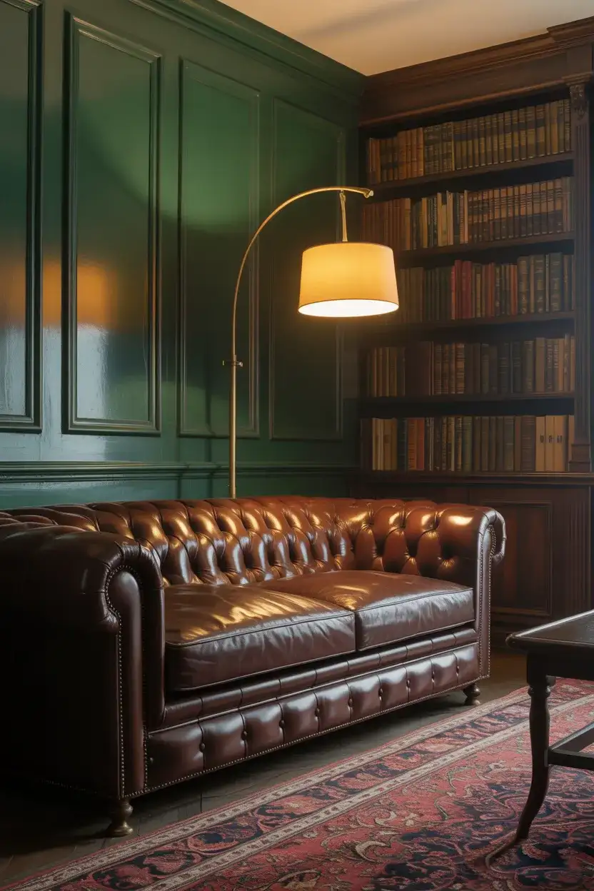
Real homeowners who take the plunge on dark green walls almost always report the same thing: the room feels smaller at first glance but more comfortable within minutes. There’s a psychological coziness to being enveloped in color that you simply can’t replicate with light walls and dark accessories. The people who love it tend to be the ones who actually use their living rooms—reading, hosting, watching movies—rather than treating them as pass-through spaces. If your living room is where life happens, dark green rewards that.
9. Sherwin-Williams Sanctuary Picks
If you’ve been following the annual color forecasts, Sherwin-Williams continues to push a palette rooted in sanctuary and retreat. Their curated collections for 2026 lean heavily into muted greens, warm clays, and grounded blues—colors designed to make a living room feel like a refuge from the overstimulating world outside. These aren’t loud choices. They’re intentionally subdued, the kind of colors that look better after a week on the wall than they do on the swatch card, because they respond so beautifully to changing light throughout the day.
Here’s something most homeowners don’t realize: paint companies like Sherwin-Williams invest millions in color psychology research before releasing their annual palettes. These aren’t random picks. Each shade is tested across different lighting conditions, room sizes, and regional preferences. When they recommend a specific green for living rooms, it’s been evaluated in rooms that mimic average American home dimensions. So while it might feel like just marketing, there’s genuine science behind why their 2026 picks feel so right on a wall.
10. Blush Pink and Soft Gray
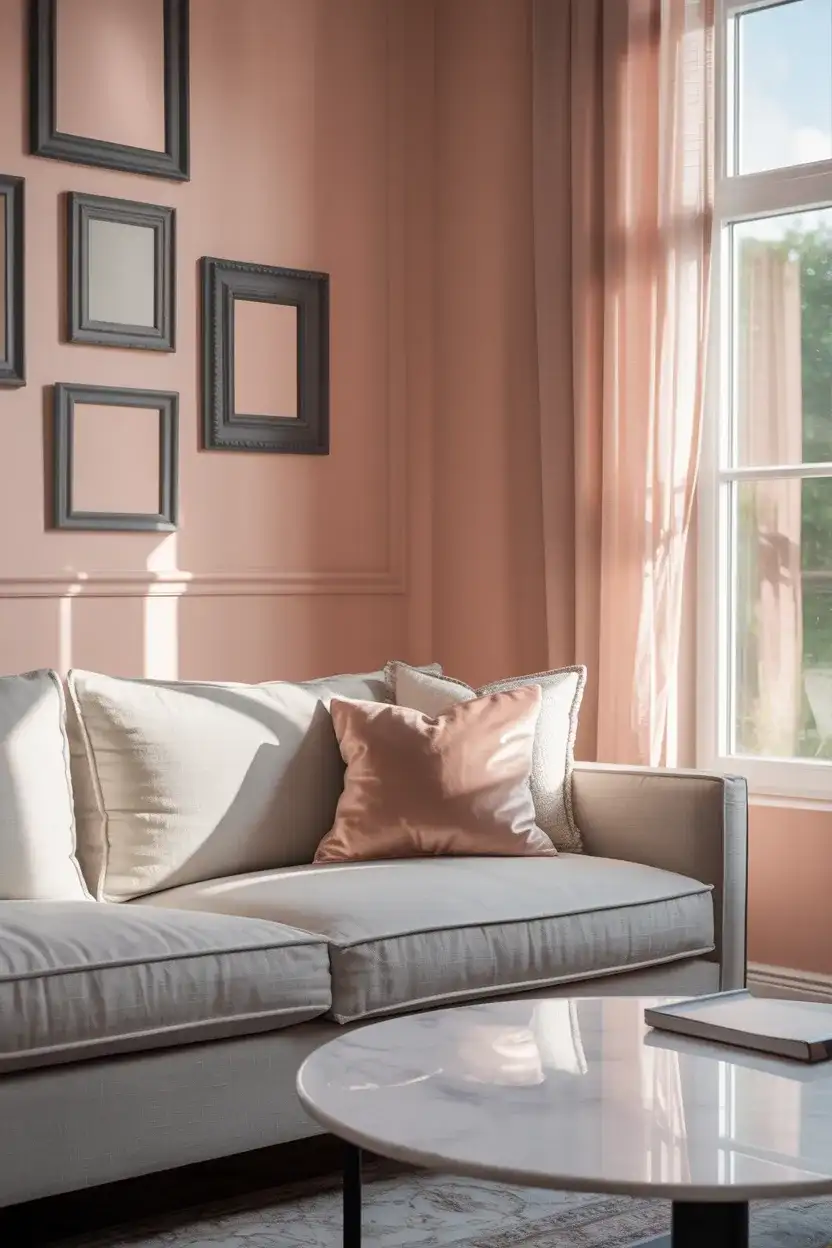
This scheme’s cozy pairing has quietly become one of the most pinned living room looks of the year. Blush pink—not bubblegum, not salmon, but a barely-there dusty rose—layered against soft grey couch upholstery creates a living room that’s romantic without being precious. It’s a good fit for anyone who wants warmth and softness but isn’t drawn to the typical beige-and-brown approach. Add in some matte black hardware or a dark-framed mirror, and the whole combination gains just enough edge to feel current rather than overly sweet.
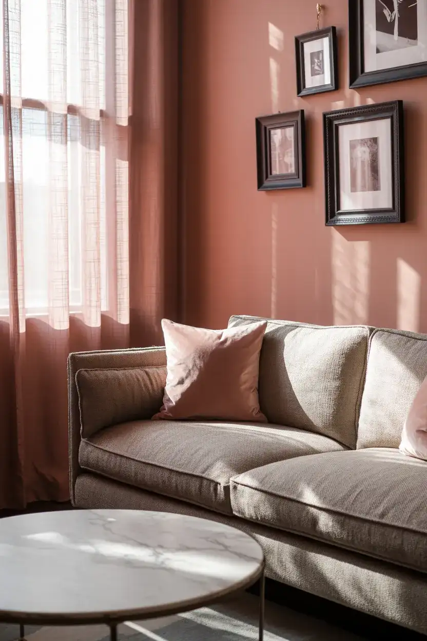
The most common mistake with blush and gray is going too matchy. When every pink element is the exact same shade and every gray piece lines up perfectly, the room starts to look like a staged furniture showroom instead of a home. The fix is intentional variation—a slightly warmer blush on the walls, a cooler rose in the pillows, and a gray sofa that leans charcoal while the rug leans dove. Let the tones drift a bit. That gentle imperfection is what makes a color palette feel lived-in and personal instead of catalog-perfect.
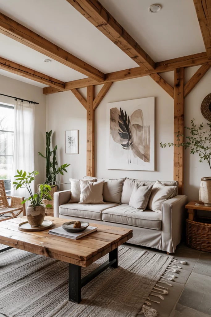
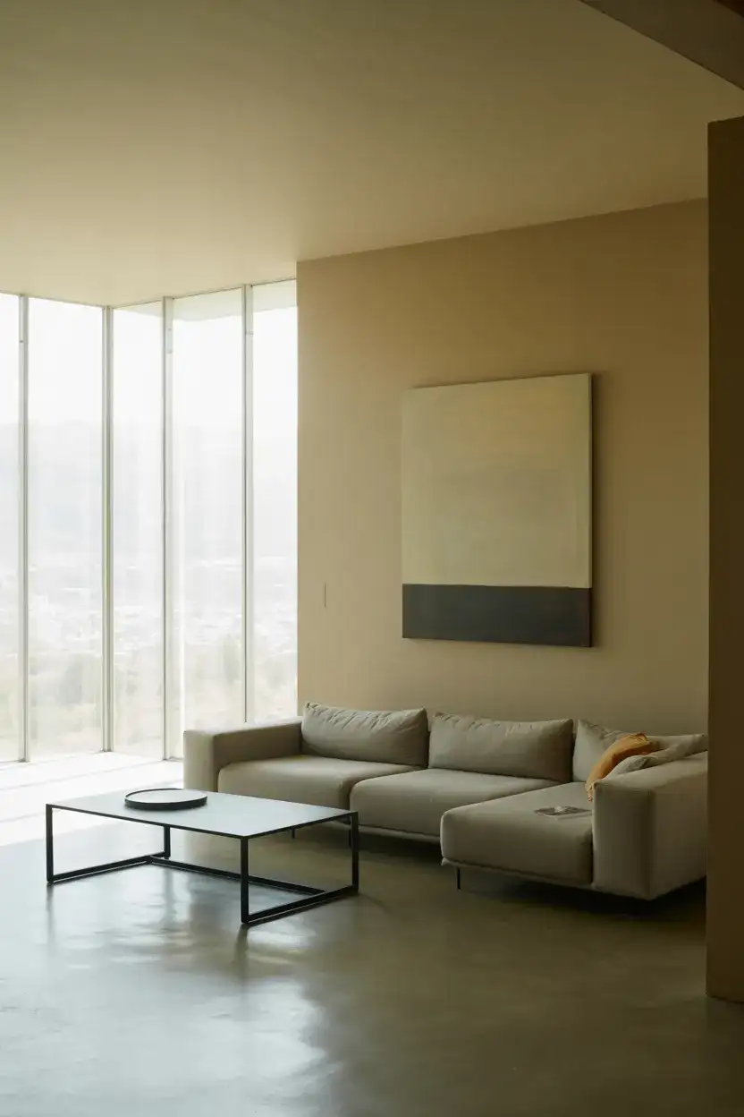
11. Warm Beige Farmhouse Revival
The farmhouse aesthetic isn’t dead—it’s just grown up. In 2026, the shiplap-and-white-everything era has given way to something softer and more intentional: warm beige walls, raw wood accents, and a neutral palette that feels collected rather than themed. This evolved farmhouse look trades the stark contrast of old black-and-white farmhouse style for tonal layering—think oatmeal, wheat, and sand, all living together in quiet harmony. It’s the kind of living room that feels timeless because it never tried to be trendy in the first place.
Across the Midwest and parts of the South, this warmer take on farmhouse style resonates deeply because it reflects the actual palette of rural life—golden fields, aged barn wood, and sun-bleached fences. Homeowners in Iowa, Kansas, and Tennessee have been leading this quiet shift, proving that a farmhouse doesn’t need to look like a Magnolia catalog to feel authentic. In these communities, the living room is the heart of the home, and a warm beige palette makes it feel welcoming for Tuesday night family TV just as much as Saturday dinner with friends.
12. Benjamin Moore’s Best Living Room Blues
Benjamin Moore has always had a knack for blue, and their latest recommendations for living rooms don’t disappoint. From the barely-there whisper of “Iceberg” to the moody depth of “Hale Navy,” their range covers every mood a homeowner could want. What makes their blue palette ideas particularly useful is the curated undertone work—each shade is designed to play well with warm wood, white trim, or even other blues, making it easier to build a layered scheme without hiring a color consultant.
If you’re trying to choose between Benjamin Moore blues and feeling overwhelmed by the sheer number of options, here’s an expert-level shortcut: buy sample pots of three blues you like, paint large swatches on your wall, and live with them for at least 48 hours. Watch how each one shifts from morning to evening. The blue that feels “right” at noon might look completely different under your living room lamps at 8 PM. Designers call this the daylight test, and it saves thousands of dollars in repainting costs every year.
13. Mushroom Taupe for Quiet Sophistication
Mushroom taupe is the neutral that designers keep calling “the new greige.” It sits somewhere between warm gray and soft brown, with a slightly purple undertone that keeps it interesting. As a wall color for living rooms, it pairs beautifully with both modern furniture and traditional pieces, making it one of the most adaptable ideas on this list. If you’ve been scrolling Pinterest looking for a good backdrop that isn’t beige and isn’t gray, mushroom taupe is almost certainly the color you’ve been searching for without knowing its name.
From a budget perspective, mushroom taupe is one of the smartest choices you can make. Unlike bold or trendy colors that may feel dated in two years, taupe has staying power—it’s been in rotation in various forms for decades. That means you won’t feel the urge to repaint soon, saving you both money and weekend labor. It also serves as a perfect canvas if you like to rotate your accessories seasonally: warm rust pillows in fall, fresh white linens in spring. The wall stays, and everything around it can evolve.
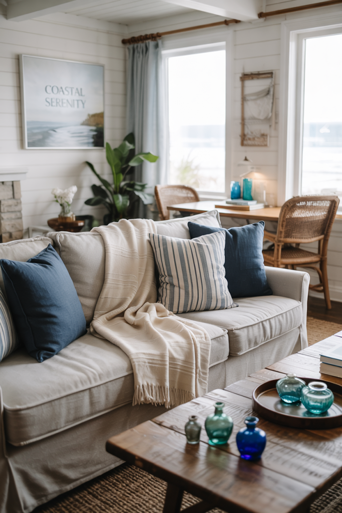
14. Coastal Navy and Sandy Linen
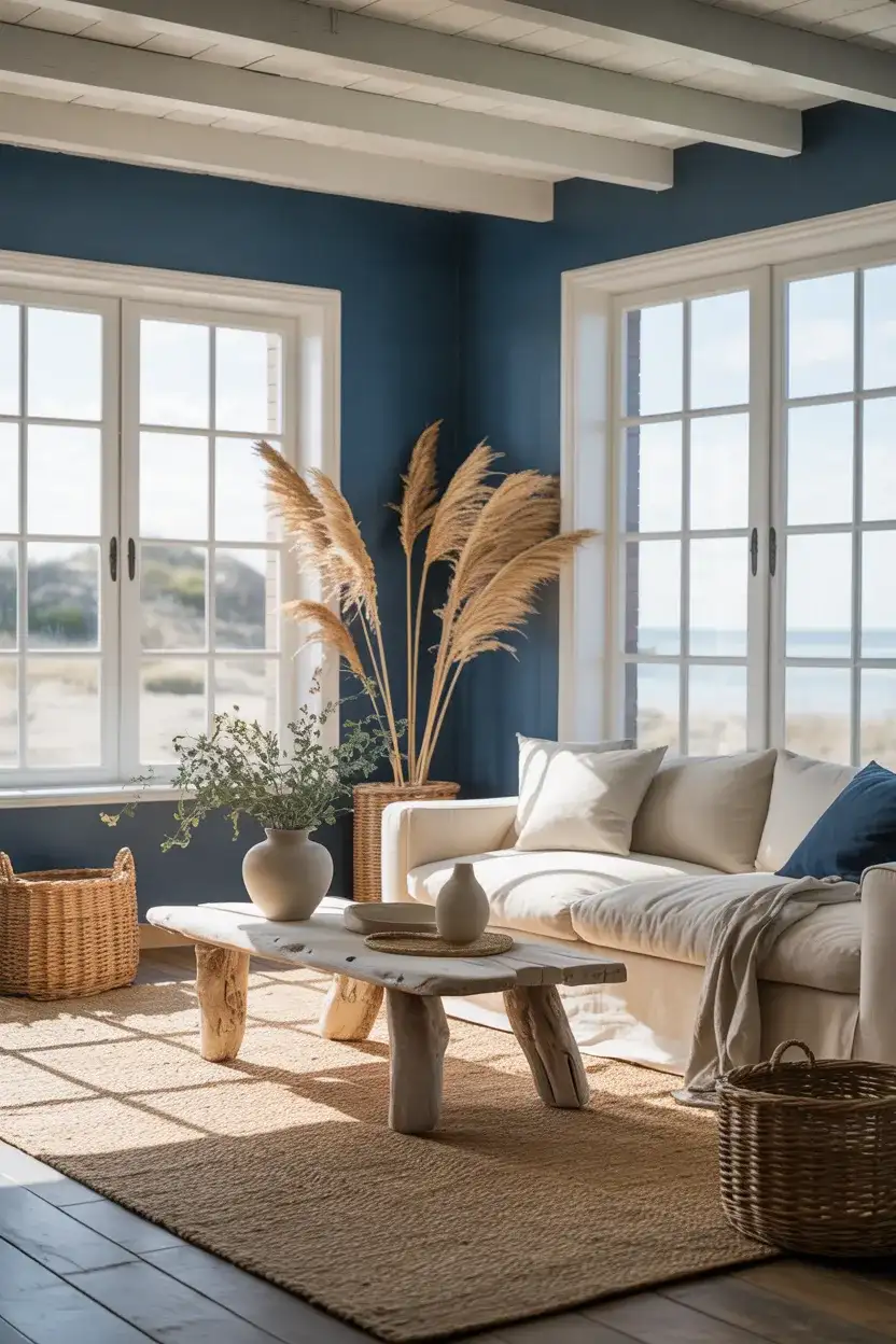
Coastal style is getting a much-needed makeover in 2026, shedding the kitschy starfish-and-rope look for something far more refined. The new coastal living room combination is built on navy blue—deep, confident, almost inky—balanced by sandy linen upholstery and bleached wood. It’s bright enough to feel airy but grounded enough to work year-round, not just during beach season. This approach trades obvious nautical references for a more abstract connection to the coast: the colors of deep water, warm sand, and driftwood.
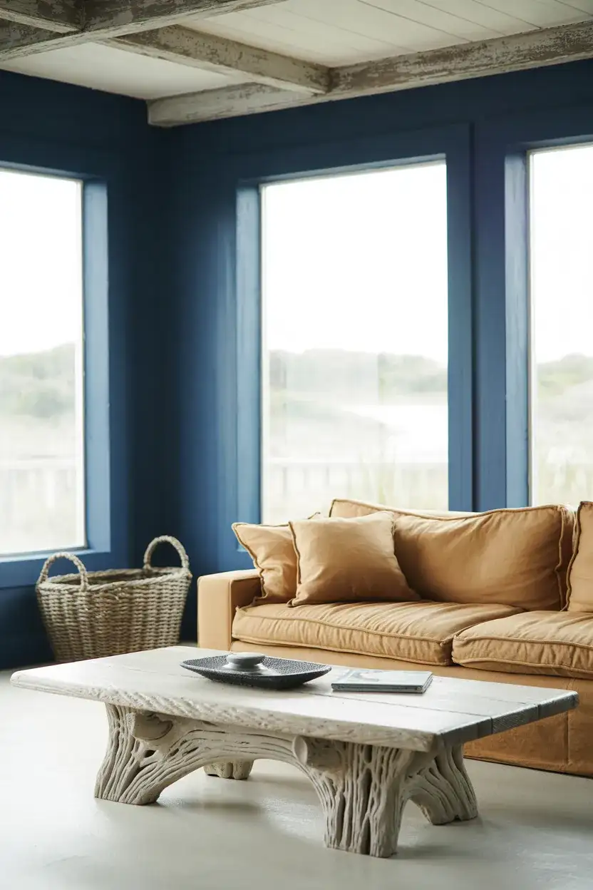
This palette resonates along the Eastern Seaboard and Gulf Coast for obvious reasons, but it’s been gaining traction inland too—in lake houses across Michigan, riverside homes in the Ozarks, and even suburban living rooms in Colorado that have no water view at all. The color story works because it evokes a feeling rather than a literal place. You don’t need to live near the ocean to benefit from the calming psychology of deep blue and warm sand. It’s aspiration baked into paint and fabric choices.
15. Warm Gray With Honey Oak Accents
For years, honey oak was the thing everyone wanted to paint over. Now it’s the thing designers are begging clients to keep. Paired with a warm grey couch and light grey walls, honey oak furniture and flooring become the room’s warm anchor instead of its eyesore. This scheme’s idea reversal is one of the most satisfying design shifts happening right now—it’s proof that color combinations are less about individual elements and more about how everything plays together in context.
Here’s a common mistake homeowners make with gray walls: choosing a gray with a cool blue undertone and then wondering why their warm oak looks orange next to it. Gray is not just gray—it shifts dramatically based on its undertone. If you have honey oak, you need a gray with a warm, slightly yellow or taupe undertone. Sherwin-Williams’ “Agreeable Gray” is practically famous for this purpose. Test it against your oak in daylight. If the wood looks golden and happy, you’ve found your match. If it looks sickly, keep sampling.
16. Cinnamon Spice Feature Wall
Warm spice tones are surging in popularity, and cinnamon—a rich, reddish-brown that sits between rust and mahogany—is leading the charge. As a feature wall color in a living room, it creates an instant focal point that feels both bold and deeply cozy. Pair it with a brown couch in a slightly lighter tone for a tonal look, or contrast it against cream and ivory for more drama. This is one of those designs that rewards commitment—a small swatch won’t do it justice, but a full wall absolutely will.
A designer I follow recently shared a story about a client in Nashville who was terrified of the cinnamon wall sample she’d brought over. The client agreed to paint just behind the TV console as a test—barely eight feet of wall. Within a day, she called back asking to extend it across the entire wall. Within a month, she’d added matching spice-toned pillows and a rust-colored throw. That’s the trajectory of bold color: initial hesitation, small test, total conversion. If you’re on the fence, start small and let the color convince you.
17. Cool Greige for Modern Minimalism
Greige—the perfect marriage of gray and beige—remains a workhorse wall color, but in 2026, the cool-leaning version is having its moment. While warm greige dominated for the past several years, the cooler take feels fresher and more modern, especially in interior design schemes that lean minimalist. It’s the ideal backdrop for living rooms with clean-lined furniture, simple art, and lots of negative space. Think of it as the color equivalent of a deep breath—calming, uncluttered, and quietly sophisticated.
Where cool greige works best is in newer construction homes with abundant natural light and open floor plans. These spaces, common in developments across the Sun Belt and Pacific Northwest, tend to have large windows and high ceilings that can make warm colors feel washed out. A cool greige holds its sophistication in all that light. It’s also an excellent choice for condos and townhomes where the living room shares sightlines with the kitchen—the neutrality ties everything together without competing with kitchen cabinetry or countertop colors.
18. Burnt Orange Throwback
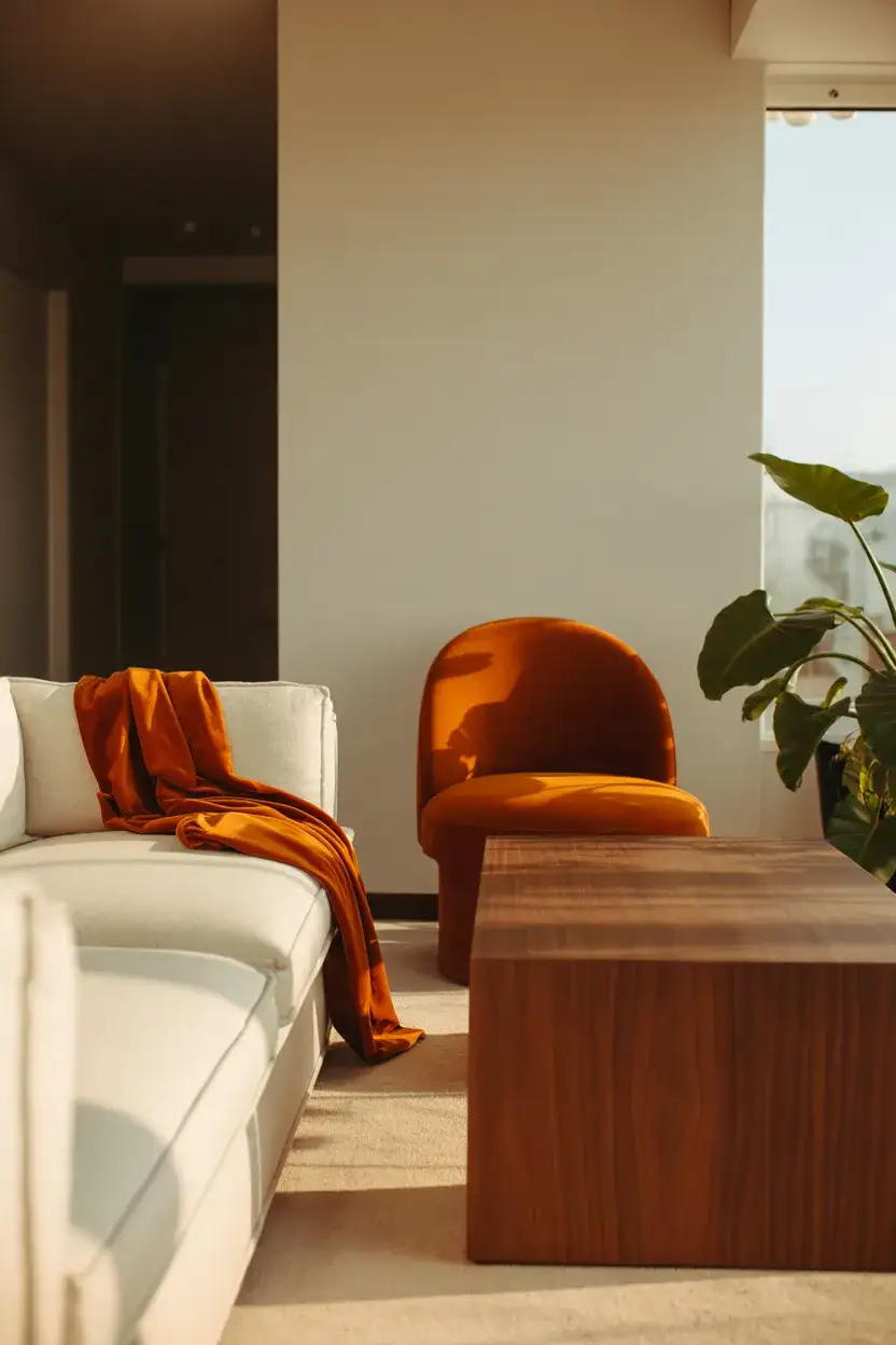
Call it a throwback, call it a revival—burnt orange is back in American living rooms, and it’s making no apologies. This bright and earthy hue channels the best of 1970s design without the avocado-green baggage. In 2026, it works as an accent color through velvet pillows, a statement chair, or even a single painted combination white wall feature with the remaining walls in warm white. The key to making it feel current rather than retro is pairing it with modern silhouettes—think minimalist frames, sleek sofas, and simple hardware.
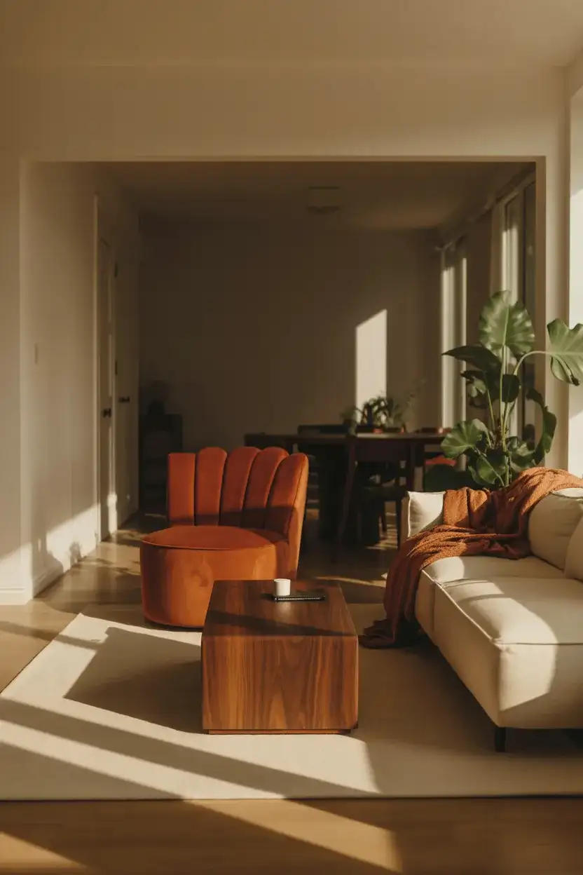
Burnt orange carries strong seasonal associations for most Americans—it’s the color of October leaves, pumpkin patches, and Thanksgiving centerpieces. Some homeowners worry that’ll make their living room feel permanently autumnal. But designers have found that when balanced with enough white, cream, or light wood, the orange reads as warm and energetic year-round rather than season-specific. The trick is proportion: keep it to about 20–30 percent of the room’s visual weight, and let neutrals do the heavy lifting on the other 70 percent.
19. Lavender Mist for a Soft Statement
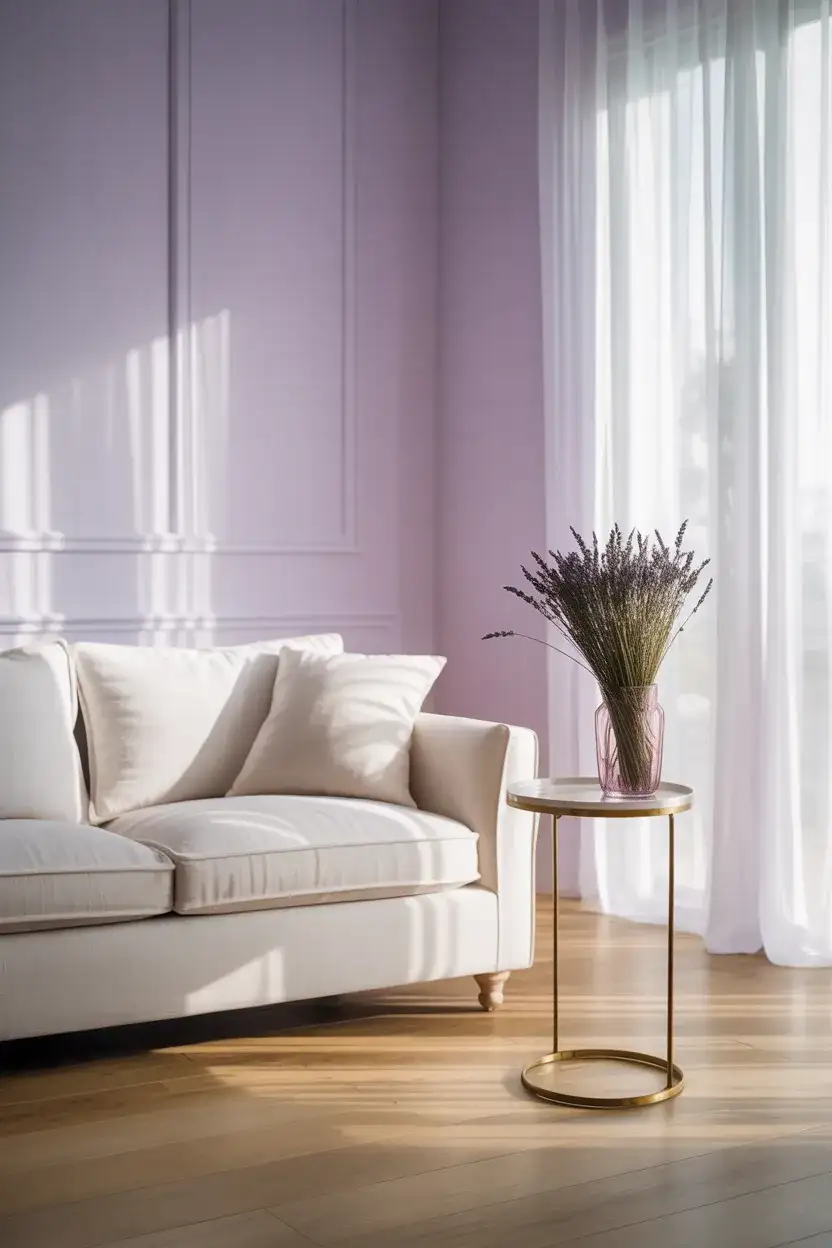
Lavender has made an unexpected leap from bedroom color to living room contender. The palette shift is subtle but significant: a very pale, misty lavender on the walls creates a light and ethereal quality that’s hard to achieve with any other hue. It pairs surprisingly well with warm wood tones and even metallics like brass and copper. As far as bright alternative scheme ideas go, lavender mist is for the homeowner who wants color without weight—something that reads almost like a tinted white until the light catches it just right.
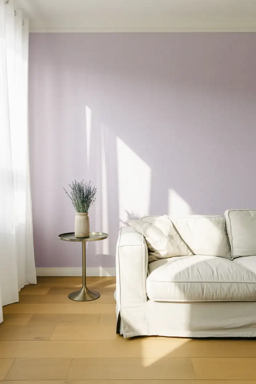
The real-world behavior around lavender walls is fascinating. Homeowners who choose it tend to be people who tested—and rejected—several grays and off-whites first. They wanted something that felt warmer and more personal than gray but couldn’t commit to a “real” color like blue or green. Lavender mist became their compromise, and almost unanimously, they report being happier with it than any neutral they’d considered. It’s proof that sometimes the most satisfying color choice is the one you didn’t plan for.
20. Tonal Brown Living Room
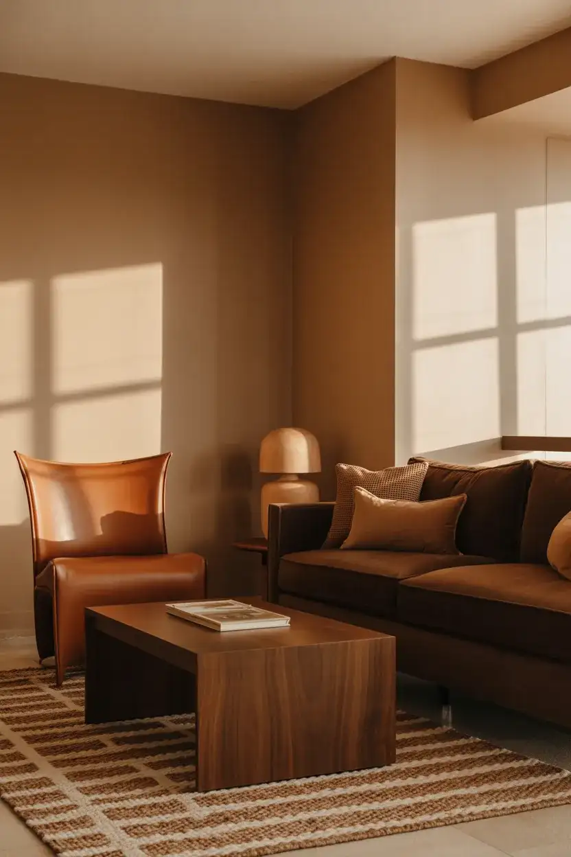
Brown is back—and not the heavy, dated chocolate brown of the early 2000s. The 2026 take is tonal, layering multiple shades from sand to espresso within a single room. A brown couch against a lighter mocha wall, with caramel pillows and walnut furniture, creates a cozy depth that feels luxurious and earthy. This interior design direction has been quietly building for the past two years, driven by a broader cultural swing back toward warmth and away from the cool, gray-dominant decade that preceded it.
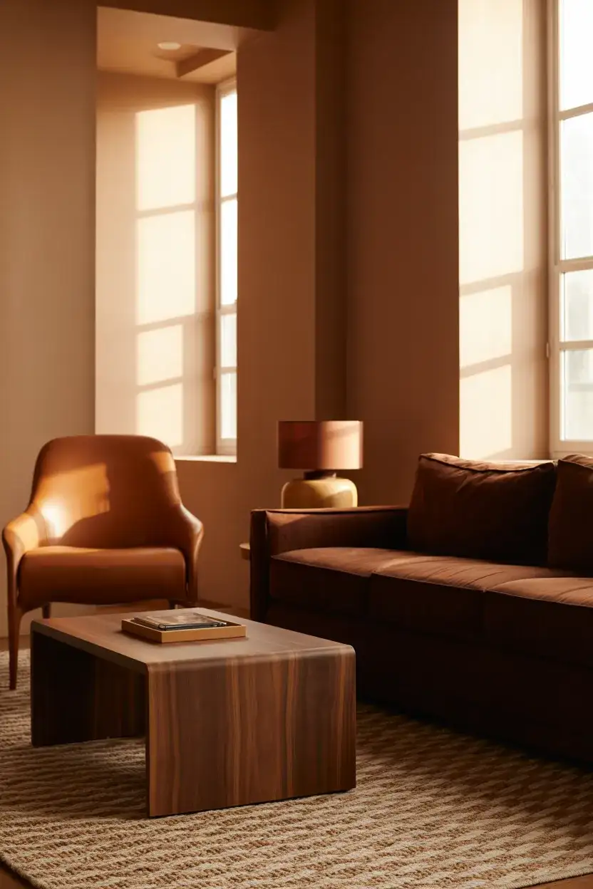
A little-known advantage of the tonal brown approach is how forgiving it is for families with kids and pets. Dark smudges, scuffs, and the general wear of daily life blend into a brown palette in ways they never would against white or light gray walls. One homeowner in suburban Atlanta told a design forum she chose tonal brown specifically because her golden retriever’s fur was everywhere and brown hid it perfectly. It’s not the most glamorous reason to pick a palette, but it’s an honest one—and plenty of people quietly make the same practical calculation.
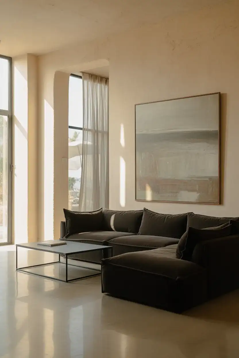
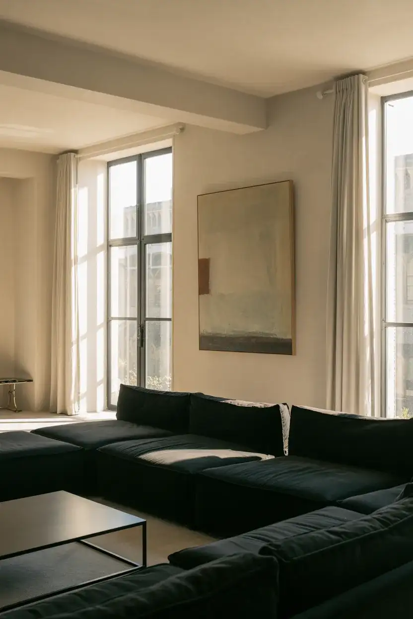
21. Black Accent Wall With Warm Touches
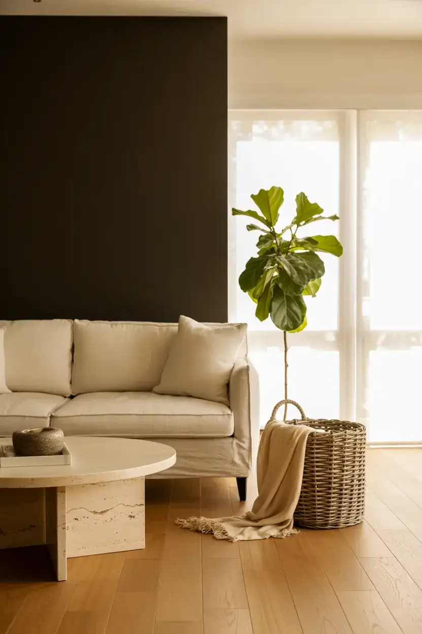
A black accent wall sounds intimidating, but it’s one of the most modern and photogenic designs trending right now. The approach works when the rest of the room stays warm—think light wood floors, cream or ivory seating, and plenty of organic textures to soften the contrast. It’s a bold move that reads as intentional and curated rather than dark or depressing. Interior stylists have been gravitating toward this for editorial shoots precisely because of how well it photographs, which explains why it keeps appearing on Pinterest and design blogs alike.
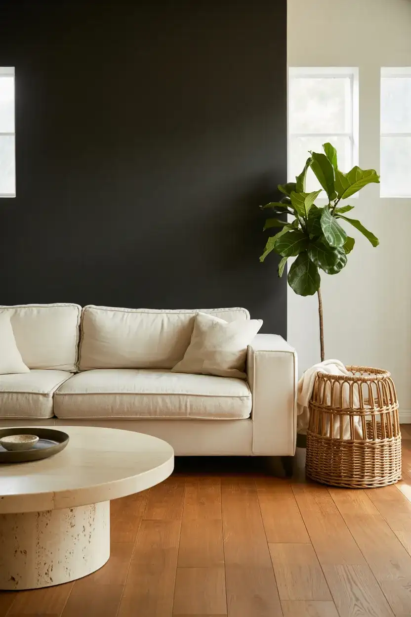
The one thing every designer will tell you about a black accent wall: finish matters more than color. A high-gloss black wall reflects light and can feel slick, almost nightclub-like—fine if that’s your aesthetic, but not what most people want in a living room. Matte or eggshell finishes absorb light and create a velvety depth that makes the wall feel like a backdrop rather than a barrier. If you’re considering this, invest in a quality matte paint. Cheap flat paints scuff easily and show every fingerprint, which defeats the purpose of that luxurious dark surface.
Conclusion
Choosing a living room color is one of the most personal decisions you’ll make for your home—it sets the mood for everything that happens inside those four walls. Whether you’re drawn to the quiet warmth of mushroom taupe or the bold confidence of a black accent wall, the best choice is always the one that makes you want to spend more time in the room. We’d love to hear which ideas caught your eye—drop a comment below and tell us what palette you’re leaning toward for your own living room this year.