Brown bedrooms are having a major moment in 2026, and it’s easy to see why. This warm, versatile color creates spaces that feel grounded, sophisticated, and deeply personal—qualities American homeowners are craving as they move away from stark minimalism. Whether you’re drawn to rich chocolate tones, soft beige foundations, or unexpected pops of color layered over brown, this palette offers endless possibilities. Pinterest boards are overflowing with brown bedroom inspiration because these spaces photograph beautifully and feel even better in person. In this guide, you’ll discover fresh ways to embrace brown in your bedroom, from moody maximalist retreats to light-filled modern sanctuaries.
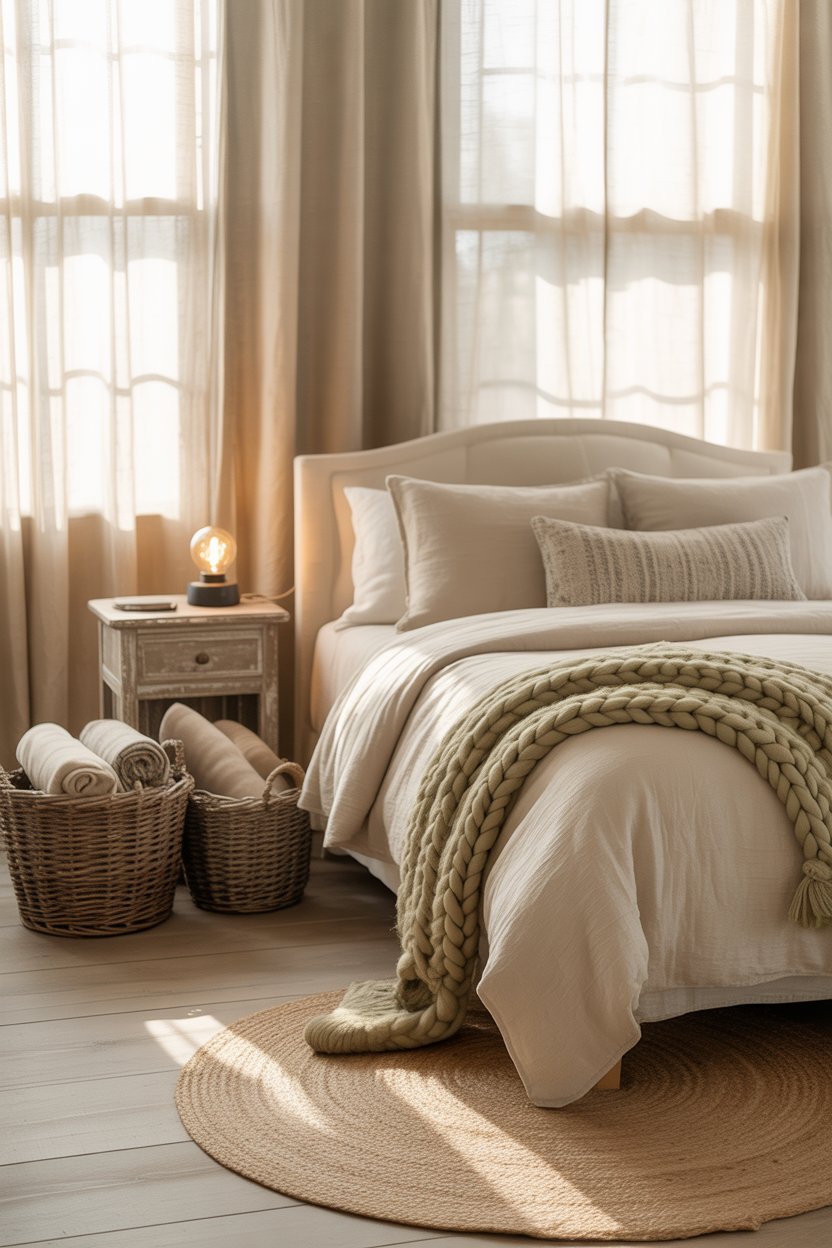
1. Layered Beige and Cream Foundation
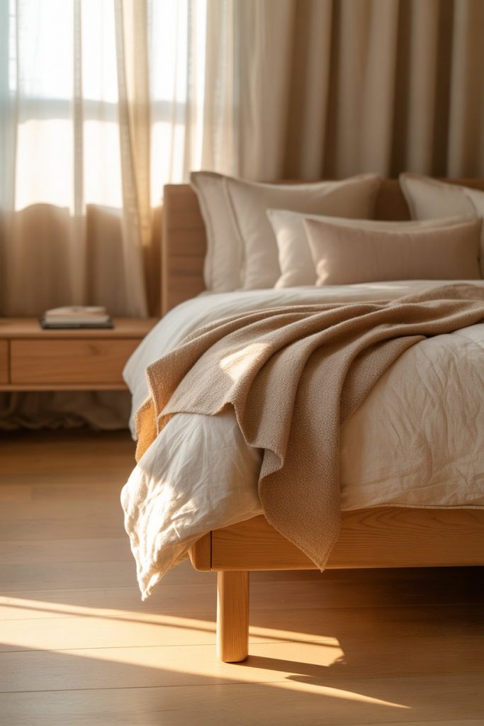
Starting with a beige and cream palette gives you a flexible canvas that works in any bedroom size or style. The key is layering multiple shades—think ivory walls, taupe bedding, and sandy wood furniture—to create depth without heaviness. This approach feels especially natural in American homes where neutral backdrops allow personal collections and art to shine. Add texture through linen curtains, wool throws, or a jute rug to keep the space from feeling flat or generic. 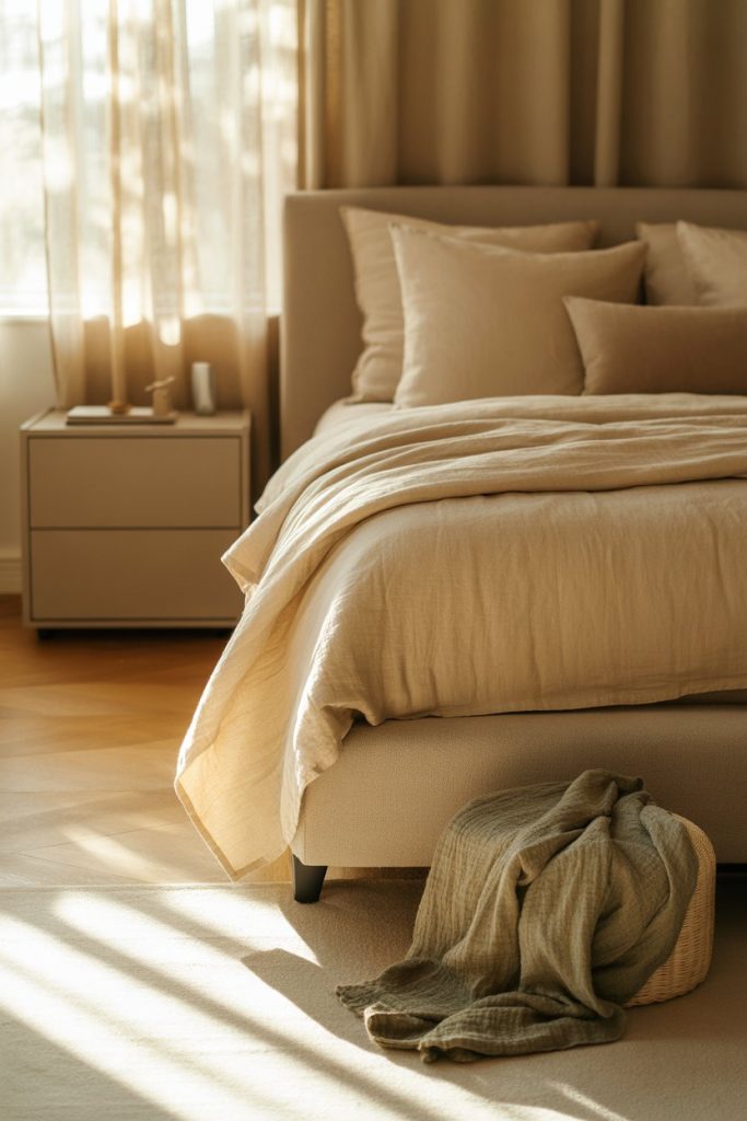
Where it works best: Master bedrooms in suburban homes where you want a calming retreat that doesn’t compete with views or architectural details. The layered beige approach also makes small bedrooms feel larger because the tonal consistency tricks the eye into perceiving more space. Pair with brass or matte black hardware for subtle contrast that doesn’t disrupt the peaceful mood.
2. Chocolate Brown Accent Wall Drama
A single chocolate brown accent wall transforms a bedroom from ordinary to magazine-worthy without requiring a full room commitment. This deep, rich tone works beautifully behind the bed, creating an instant focal point that grounds the entire space. Americans are embracing darker walls in 2026 because they photograph so well and create a sense of enclosure that feels protective rather than claustrophobic when balanced with lighter bedding and furniture. 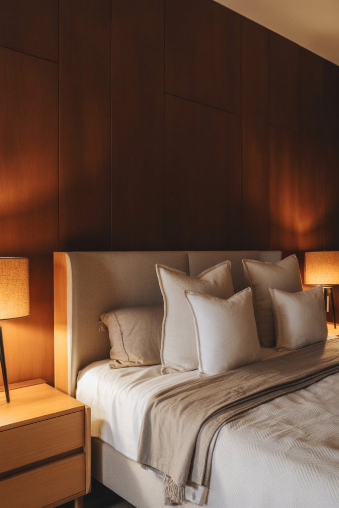
Budget angle: You can achieve this look for under $50 if you’re painting yourself—one gallon of quality paint covers roughly 400 square feet, and most accent walls need just a quart or two. Choose a matte or eggshell finish to minimize imperfections and give the wall a velvety, expensive appearance. The transformation takes about four hours including prep and two coats.
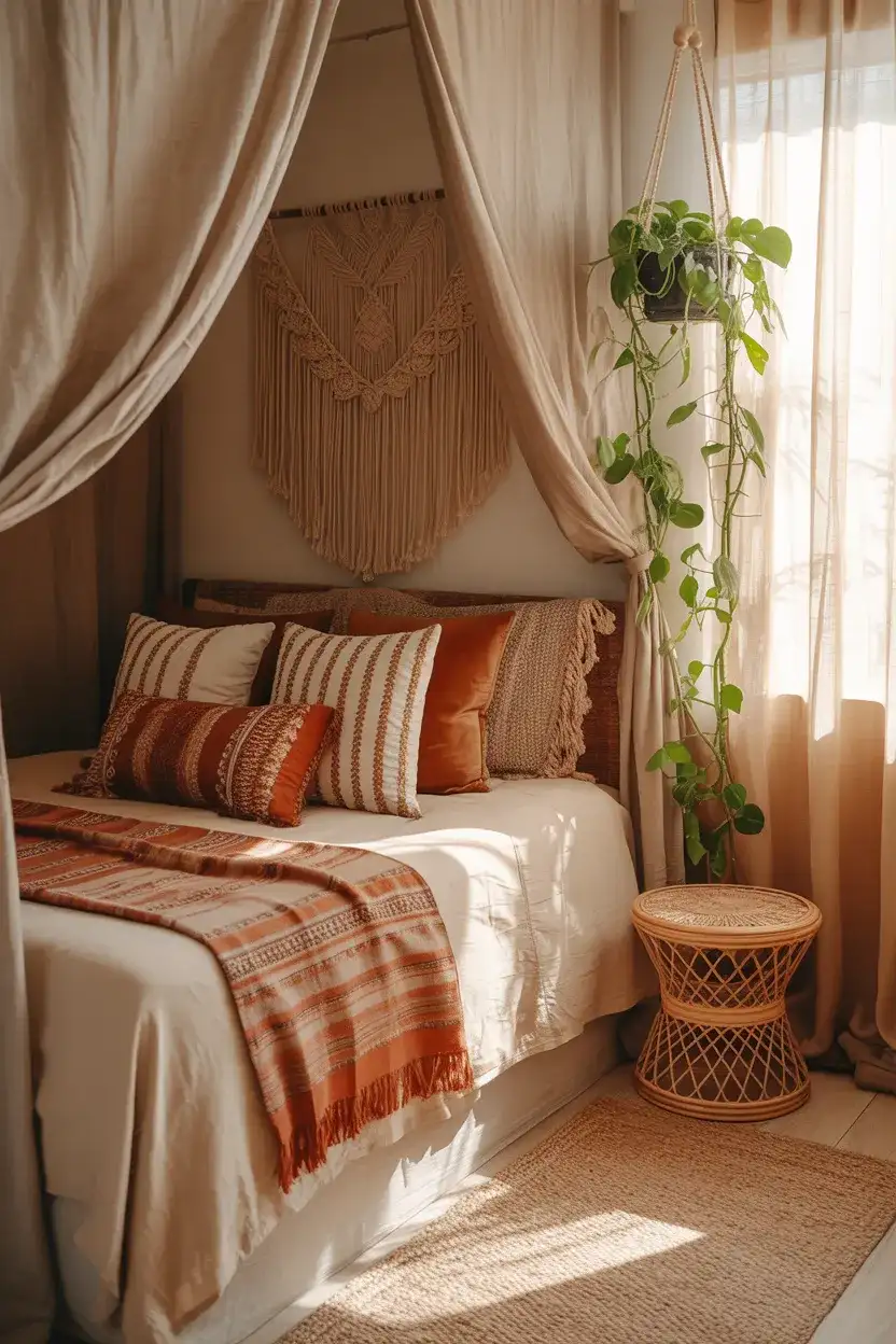
3. Cozy Textural Layers in Rust and Caramel
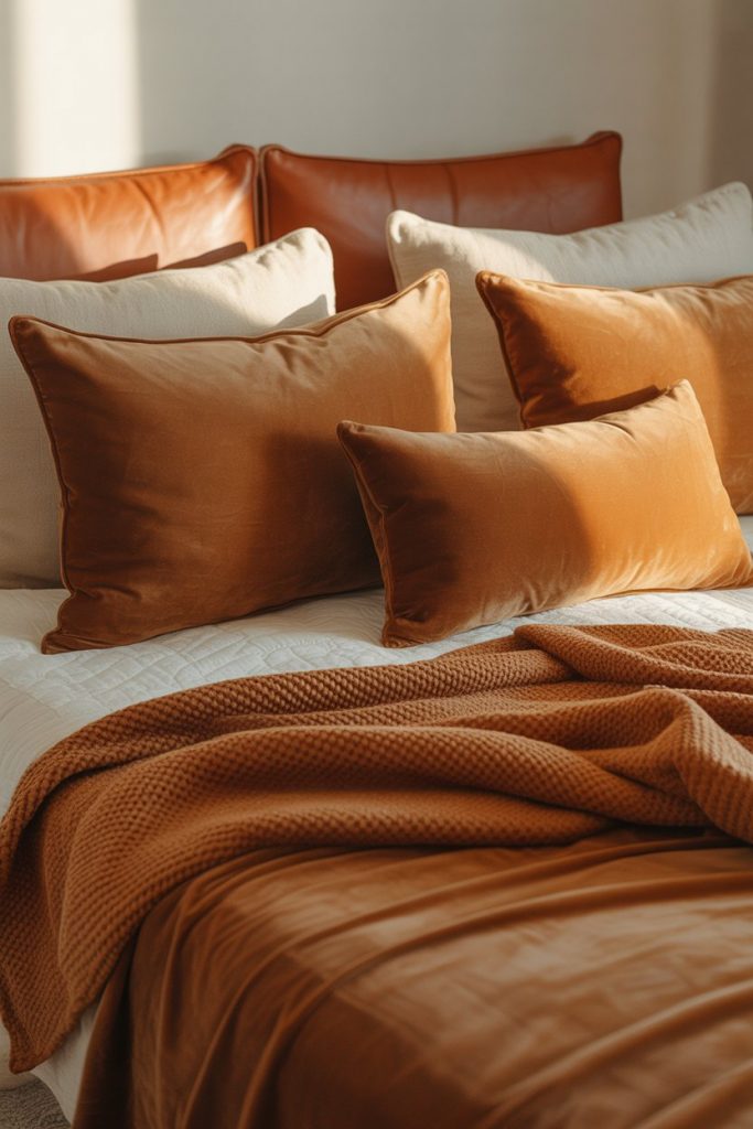
When you prioritize cozy comfort, layering different brown tones through textiles creates a bedroom that invites you to stay in bed all morning. Rust-colored velvet pillows, caramel wool blankets, and cognac leather accents build warmth through both color and material variety. This approach resonates with Americans seeking hygge-inspired spaces that feel indulgent without being overly styled or precious. 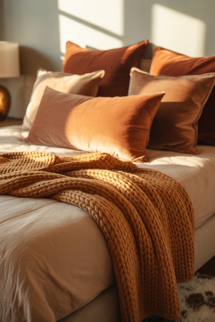
Real homeowner behavior: Most people who successfully pull off this look didn’t buy everything at once—they collected pieces over time, which actually creates a more authentic, lived-in feel than purchasing a matching set. Start with one statement textile like a chunky throw or velvet duvet cover, then add complementary textures as you find them. The gradual approach also spreads out costs and lets you test what actually works in your space.
4. Black and Tan Graphic Contrast
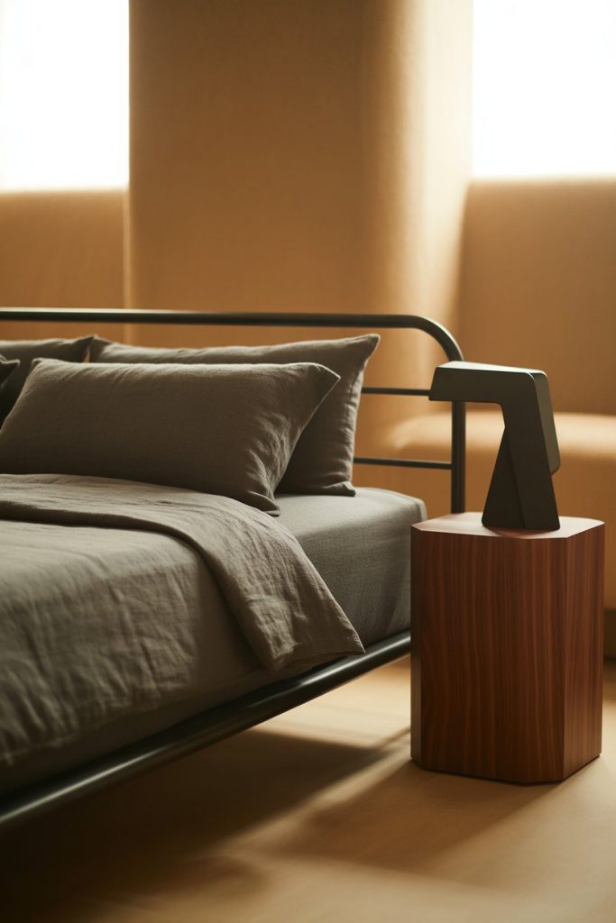
Pairing black and brown creates a graphic, modern look that feels grown-up and intentional—perfect for urban apartments or contemporary homes. The contrast works because brown provides warmth that pure black-and-white schemes lack, while black adds definition that prevents brown from feeling muddy. Think black metal bed frames against tan walls, or charcoal bedding with walnut furniture for a balanced, masculine-leaning aesthetic. 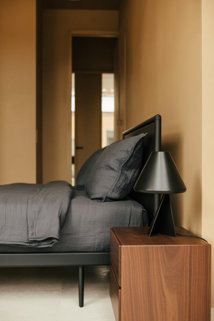
Expert-style commentary: Interior designers often use the 60-30-10 rule here—60% tan or brown on walls and major furniture, 30% black through the bed frame and larger accents, and 10% white or cream in bedding and details. This ratio prevents the space from feeling too dark while maintaining that bold, editorial quality. Avoid going heavier on black unless you have excellent natural light or want a true moody bedroom.
5. Gray and Brown Industrial Softness
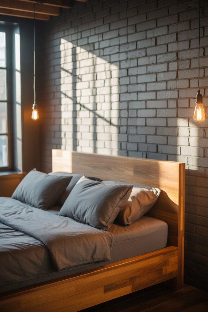
Combining gray and brown brings together industrial coolness with organic warmth, creating bedrooms that feel current but not cold. This palette works especially well in loft-style spaces or rooms with exposed brick, where gray concrete or stone elements meet warm wood furniture. The combination appeals to Americans renovating older homes who want to honor original architecture while adding contemporary comfort. 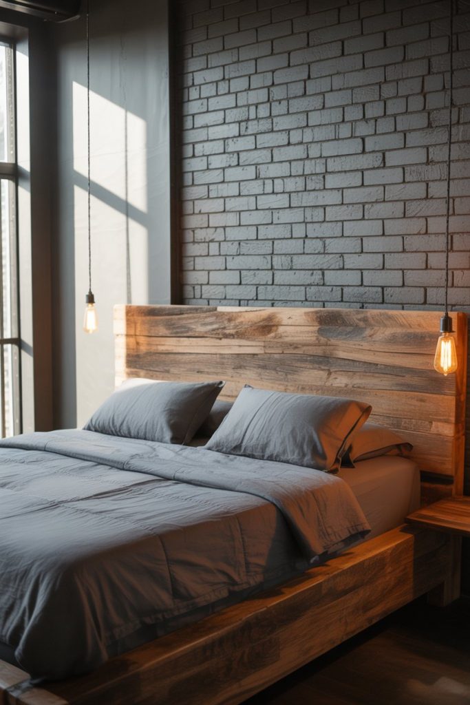
Practical insight: The trick is choosing the right undertones—cool grays pair best with reddish or warm browns, while warm grays work with cooler browns like taupe. Test paint samples next to your existing wood furniture in both morning and evening light before committing. A common mistake is choosing grays that are too blue, which makes brown furniture look yellow and creates visual tension rather than harmony.
6. Pink and Brown Unexpected Romance
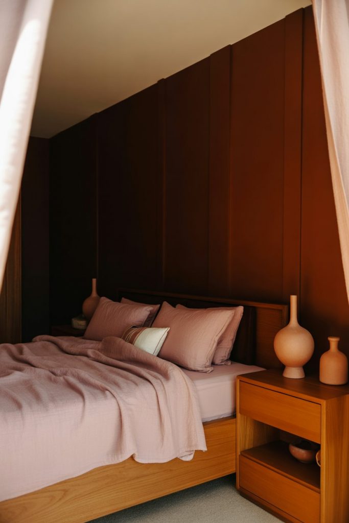
Dusty pink and brown together create a sophisticated, gender-neutral bedroom that breaks free from traditional color rules. This combination feels fresh in 2026 because it challenges the idea that brown is purely masculine—the addition of muted pink brings softness without skewing overly feminine. Think terracotta bedding against chocolate walls, or blush pillows on a tan upholstered headboard for a palette that feels both modern and timeless. 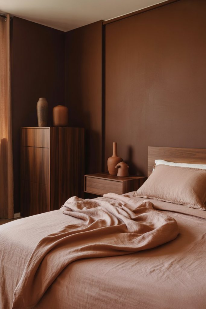
American lifestyle context: This palette has gained traction in Southwestern and Western states where desert-inspired interiors feel culturally authentic—the pink-brown combination naturally echoes canyon walls and sunset light. But it works equally well in coastal or urban settings when balanced with enough white or cream to keep it from feeling too themed. The key is using muted, earthy pinks rather than bright bubblegum shades.
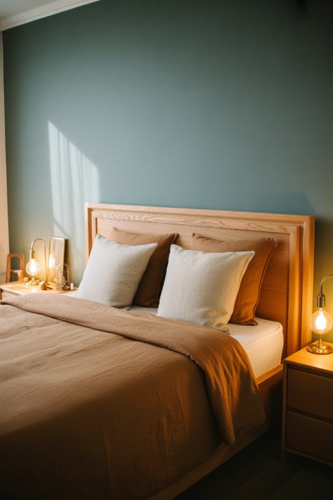
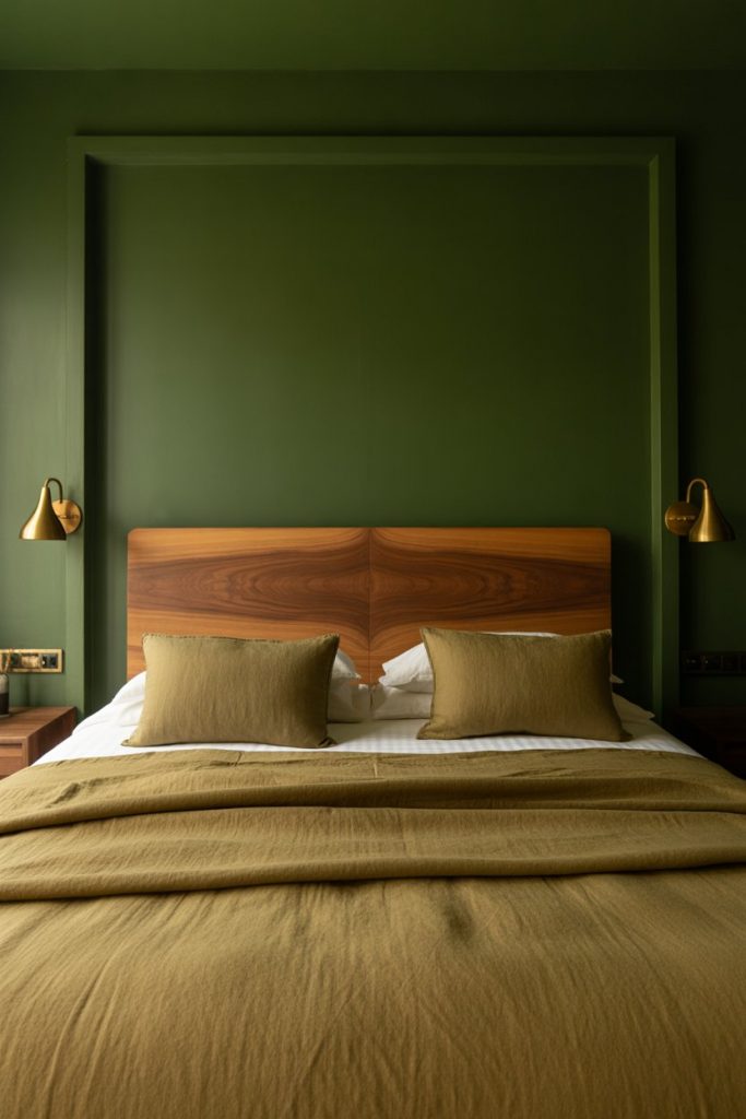
7. Green and Brown Organic Sanctuary
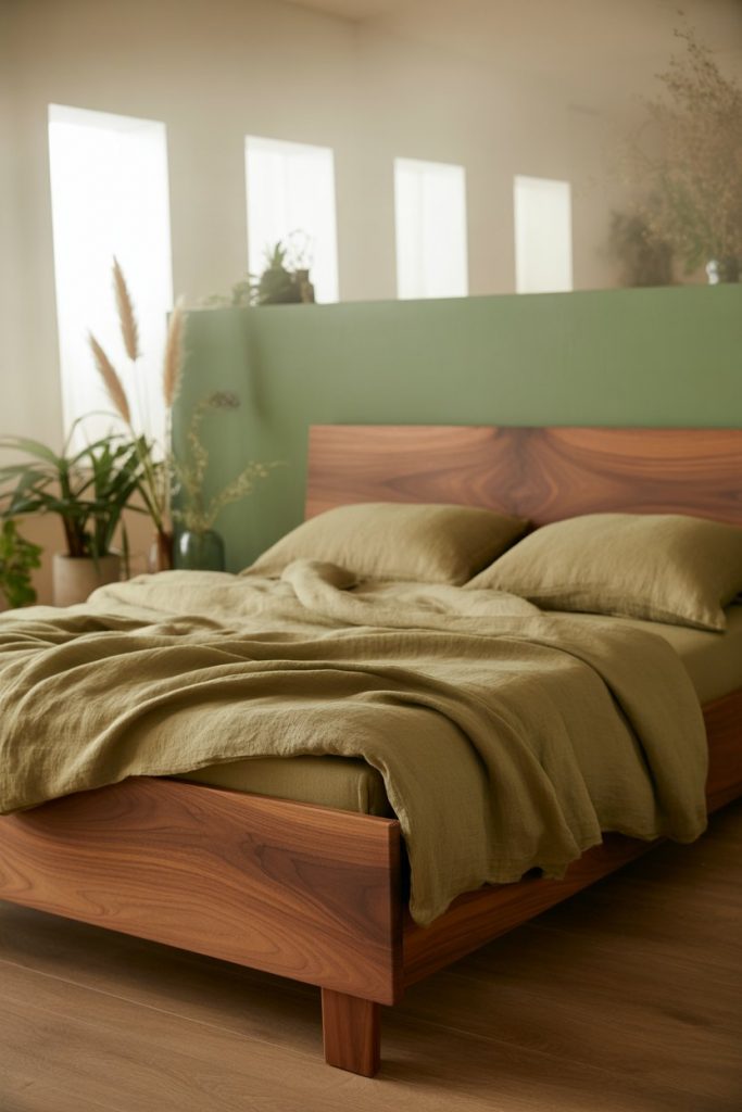
Bringing green and brown together in the bedroom creates an organic, nature-connected space that Americans are increasingly drawn to for its calming properties. Whether it’s sage green walls with walnut furniture or olive bedding against tan backgrounds, this combination taps into biophilic design principles without requiring actual plants. The palette works in both modern and traditional settings, making it one of the most versatile brown bedroom approaches. 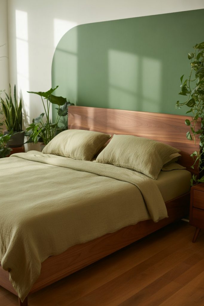
Where it works best: Bedrooms with garden views or good natural light benefit most from this palette because the green-brown connection to the outdoors becomes obvious. In windowless or dark bedrooms, lighten the greens considerably—think celery or mint—to avoid creating a cave-like feeling. Add warm brass or copper accents to bridge the temperature difference between cool greens and warm browns.
8. Blue and Brown Coastal Grounding
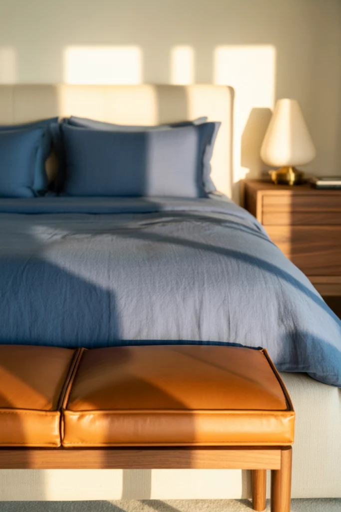
Navy or denim blue and brown brings coastal sophistication to bedrooms without resorting to obvious beach themes. This combination works because blue provides cool contrast while brown keeps the space grounded and livable. Think navy bedding with caramel leather accents, or soft blue walls with dark walnut furniture for a palette that reads as classic American style rather than trendy. 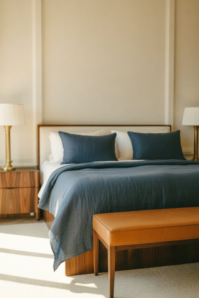
Micro anecdote: A designer in Charleston once told me she uses this exact palette in nearly every primary bedroom project because “it’s the one combination where couples never argue—everyone finds something to love.” The blue satisfies those wanting color, while the brown grounds it enough for minimalists. It’s a natural mediator palette that photographs well and lives even better.
9. Rustic Wood-on-Wood Richness
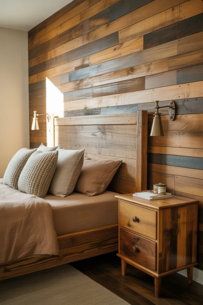
Embracing rustic wood in multiple finishes creates bedrooms with depth and character that feel collected over time. Don’t shy away from mixing wood tones—a reclaimed pine headboard with cherry nightstands and oak floors can work beautifully when unified by brown-toned bedding and textiles. This approach appeals to Americans renovating farmhouses or wanting that modern farmhouse aesthetic without the white shiplap clichés.
Common mistakes and how to avoid them: The biggest error is matching woods too closely, which creates a flat, furniture-showroom feel rather than the lived-in character you’re after. Instead, vary both tone (light to dark) and grain pattern (smooth to knotty). Keep at least three different wood species or finishes in the room, and break them up with textiles, metal accents, or painted elements so no single wood dominates.
10. Shades of Brown Monochromatic Depth
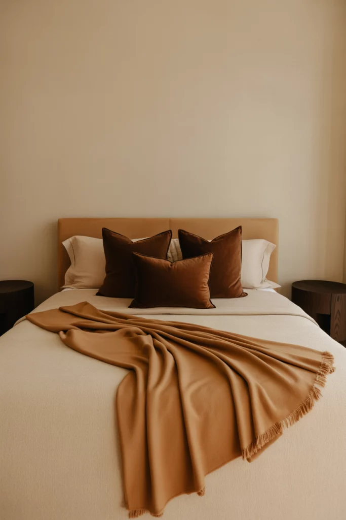
Working within shades of brown exclusively creates monochromatic bedrooms that feel sophisticated and intentional rather than boring. The secret is incorporating at least five distinct values—think cream, tan, caramel, chocolate, and espresso—distributed throughout walls, furniture, textiles, and accessories. This approach requires more thought than mixing colors but delivers a cohesive, high-end result that photographs exceptionally well. 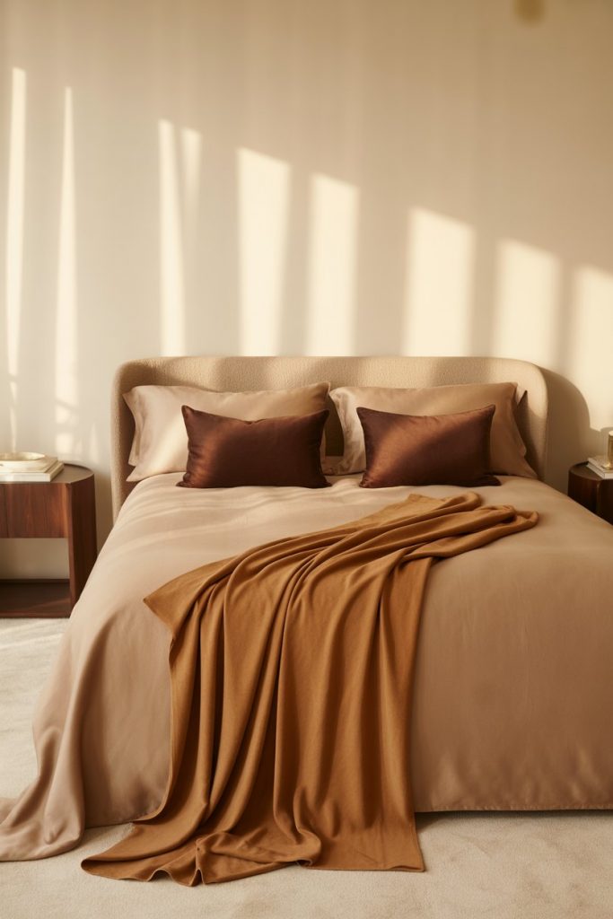
Practical insight: Light placement becomes critical in monochromatic brown schemes because shadows and highlights are what create visual interest. Install dimmer switches so you can adjust the mood throughout the day, and use multiple light sources at different heights—bedside lamps, floor lamps, and perhaps a pendant—to create depth. Without varied lighting, even the most carefully planned brown palette can fall flat.
11. Cozy Color Palettes with Warm Metallics
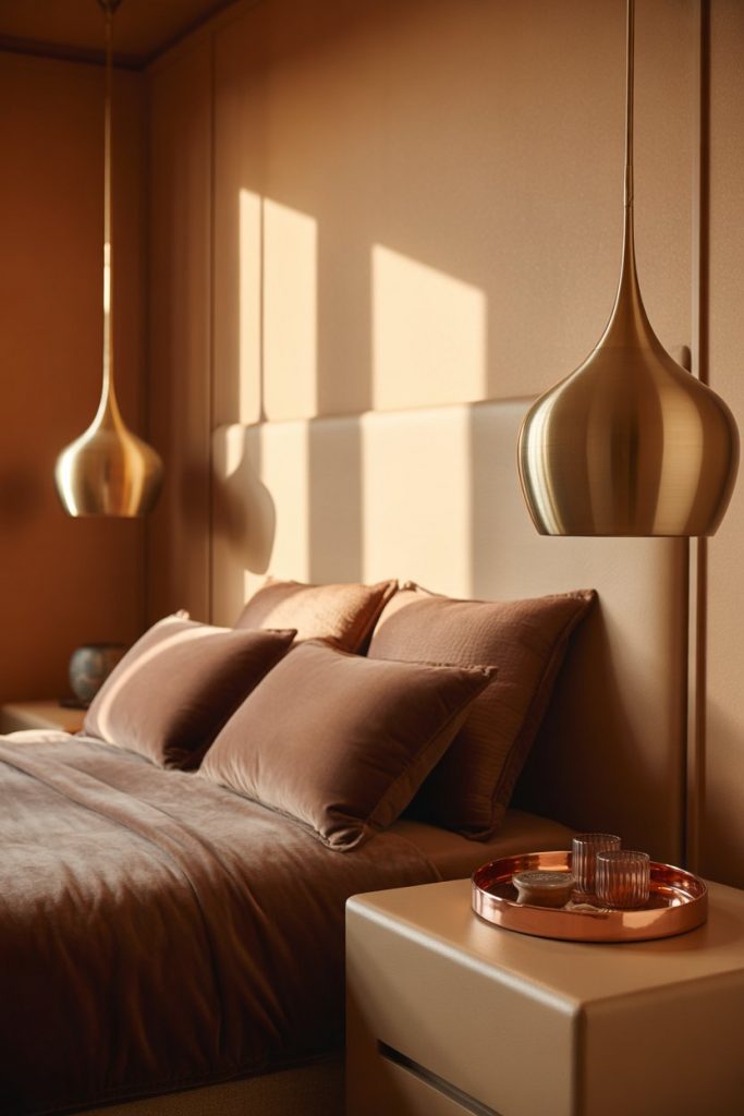
Building cozy color palettes around brown with added metallics elevates the warmth factor while introducing subtle glamour. Copper, brass, or rose gold accents catch light beautifully against brown backgrounds, adding visual interest without requiring bold color. This approach works particularly well in bedrooms where you want comfort but also a touch of refinement—think boutique hotel rather than rustic cabin. 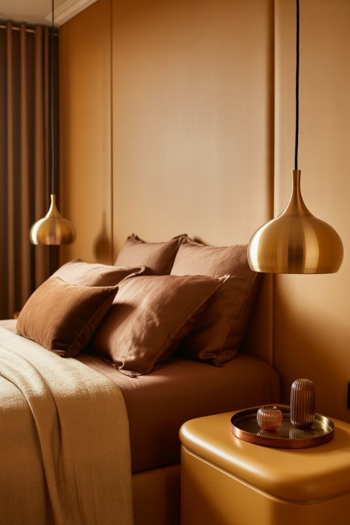
Budget angle: Metallics deliver maximum impact for minimum investment—swapping out basic hardware on nightstands and dressers for brass or copper pulls costs about $3-5 per piece but completely transforms the look. Add a metallic picture frame, lamp base, or decorative tray rather than replacing major furniture. The reflective quality of metals multiplies their presence, so a little goes a long way in brown spaces.
12. Orange and Brown Autumn Permanence
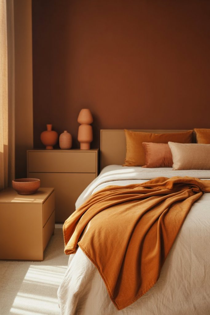
Burnt orange and brown brings the warmth of autumn into your bedroom year-round without feeling seasonal or kitschy. This combination works because both colors share similar warm undertones, creating harmony rather than contrast. Think terracotta accents against chocolate walls, or rust-colored textiles with tan backgrounds for a palette that feels both energizing and grounding—a balance hard to achieve with other color combinations. 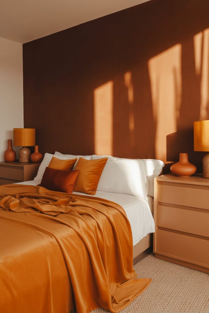
American lifestyle context: This palette has particular resonance in Northeastern and Midwestern homes where fall foliage is a cultural touchstone and homeowners want to capture that seasonal beauty permanently. It also works in Southwestern adobe-style homes where these earth tones feel architecturally appropriate. The key is balancing intensity—if the orange is bright, keep browns lighter; if browns are dark, soften the orange.
13. Vintage Brown Furniture Revival
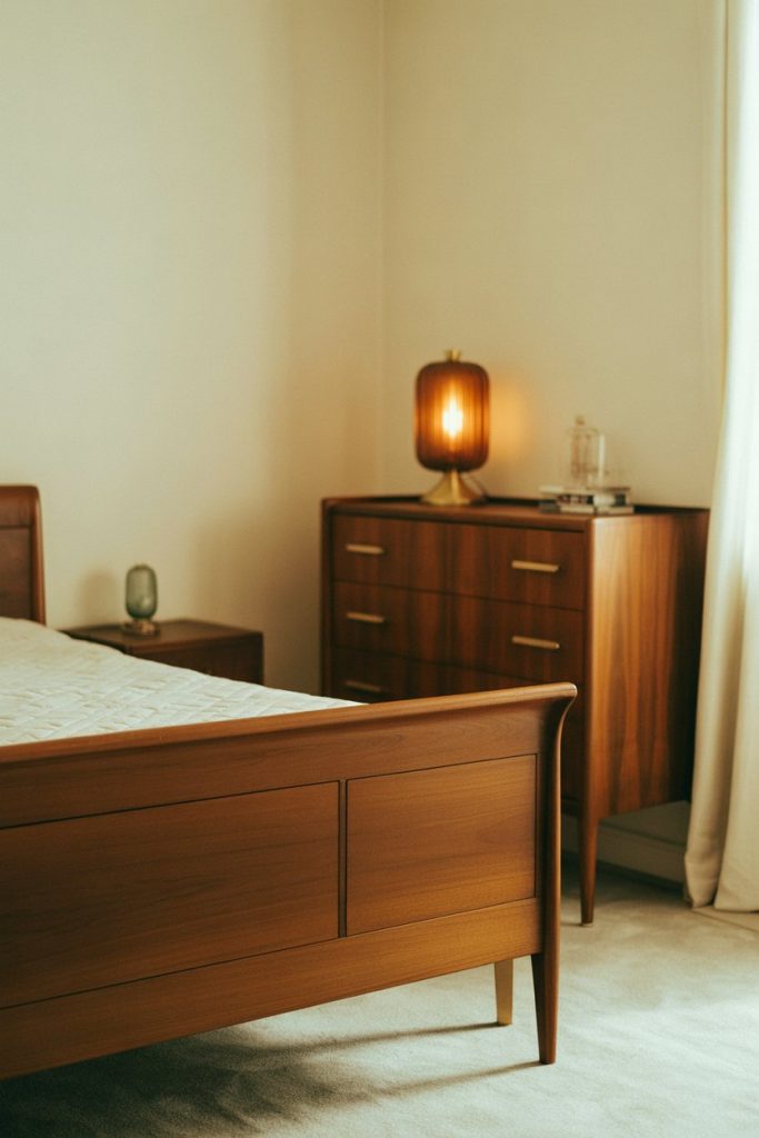
Centering a bedroom around vintage brown wood furniture creates instant character and sustainability that new pieces simply can’t match. Mid-century dressers, antique wardrobes, or 1970s platform beds in rich wood tones bring history and craftsmanship into modern spaces. This approach has gained traction as Americans seek alternatives to fast furniture and appreciate the quality and uniqueness of older pieces. 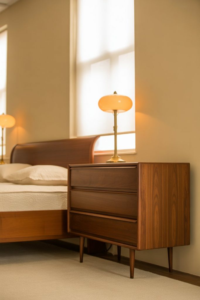
Real homeowner behavior: Most successful vintage brown bedrooms aren’t sourced from a single era or style—mixing a 1960s dresser with a 1930s bed frame and contemporary bedding creates visual interest and prevents the room from feeling like a museum. Focus on wood quality and condition rather than matching perfectly. Light sanding and fresh stain can unify disparate pieces while maintaining their individual character and patina.
14. Red and Brown Bold Warmth
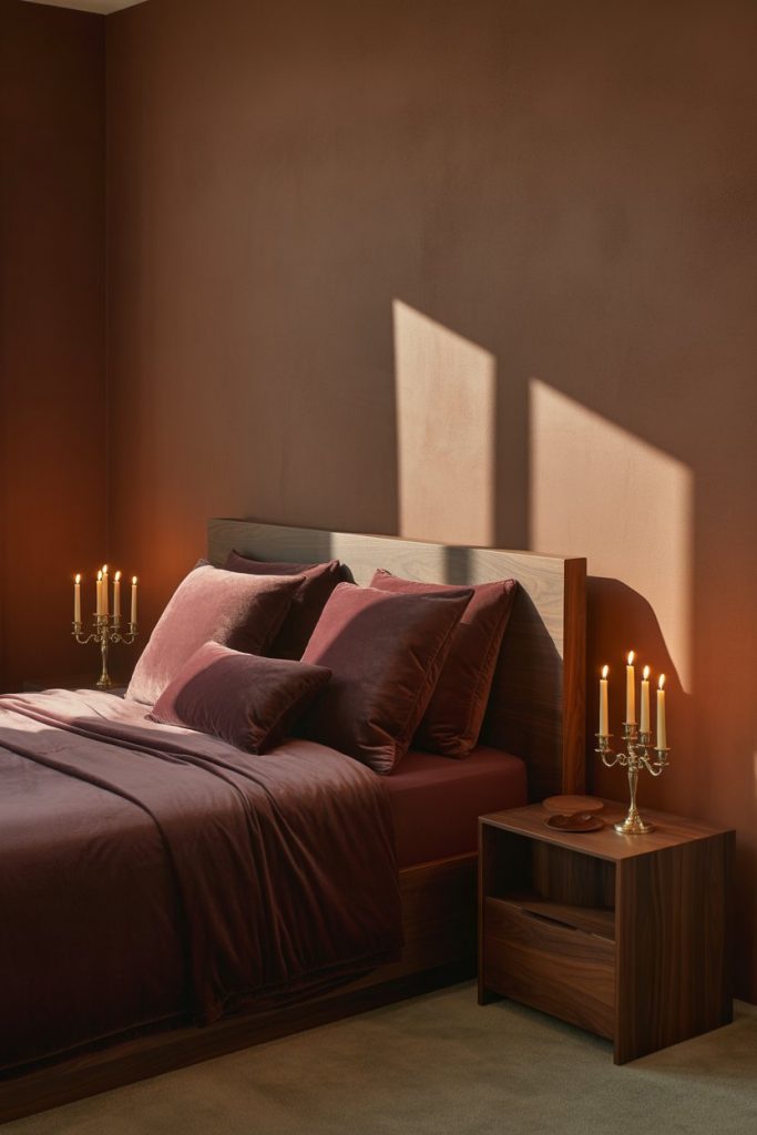
Deep red and brown together create bedrooms that feel bold, luxurious, and surprisingly versatile despite the intensity of the palette. Burgundy bedding against chocolate walls or rust-red accents with walnut furniture delivers warmth that borders on opulent. This combination appeals to Americans wanting drama in the bedroom without the coolness that comes with jewel tones like emerald or sapphire. 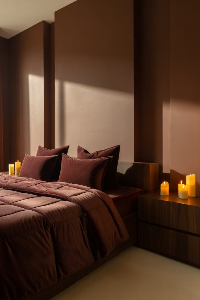
Expert-style commentary: The trick to pulling off red and brown is keeping one color in a supporting role—typically, brown should dominate at about 70% while red punctuates at 30%. Too much red creates visual overstimulation that’s antithetical to good bedroom design. Use red in moveable elements like pillows, throws, or artwork so you can dial it back if it becomes overwhelming, which many homeowners find happens after a few months.
15. Teal and Brown Unexpected Harmony
Pairing teal and brown might seem counterintuitive, but these colors create a sophisticated, jewelry-box effect that’s both calming and visually interesting. The cool teal provides contrast while the brown keeps things grounded—think teal accent walls with natural wood furniture, or brown bedding with teal decorative pillows. This combination has found an audience among Americans wanting something different from typical neutral schemes. 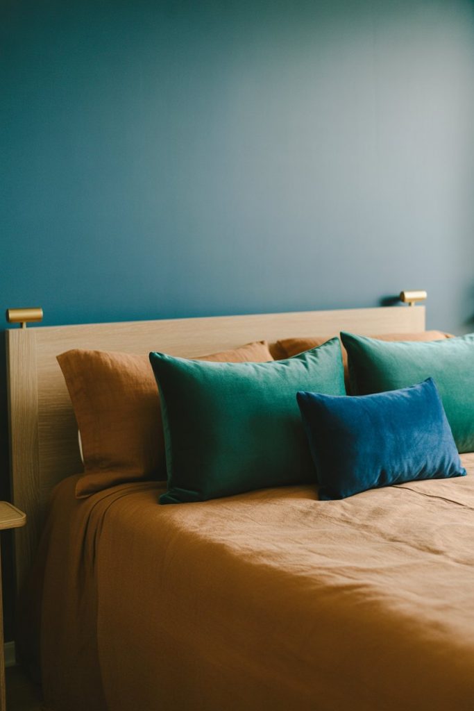
Where it works best: This palette thrives in bedrooms with good natural light because teal can read as dark or muddy in low-light conditions. Southern and Western-facing rooms handle the contrast beautifully. If your bedroom has limited light, use teal sparingly in textiles and accessories rather than on walls, and choose lighter brown tones like tan or camel to maintain brightness.
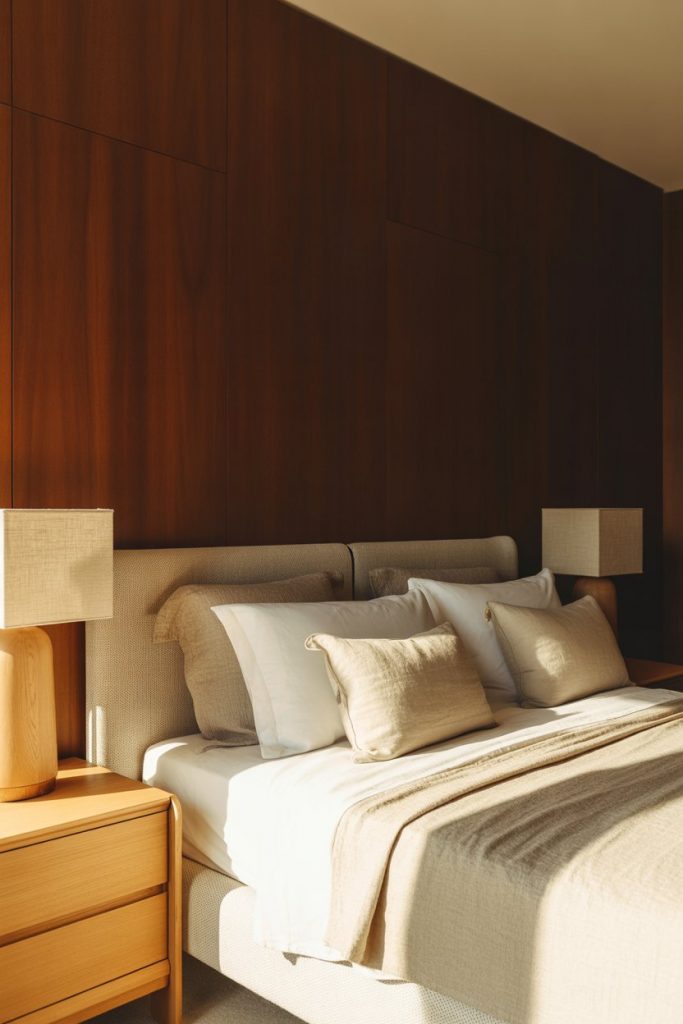
16. Moody Dark Brown Cocoon
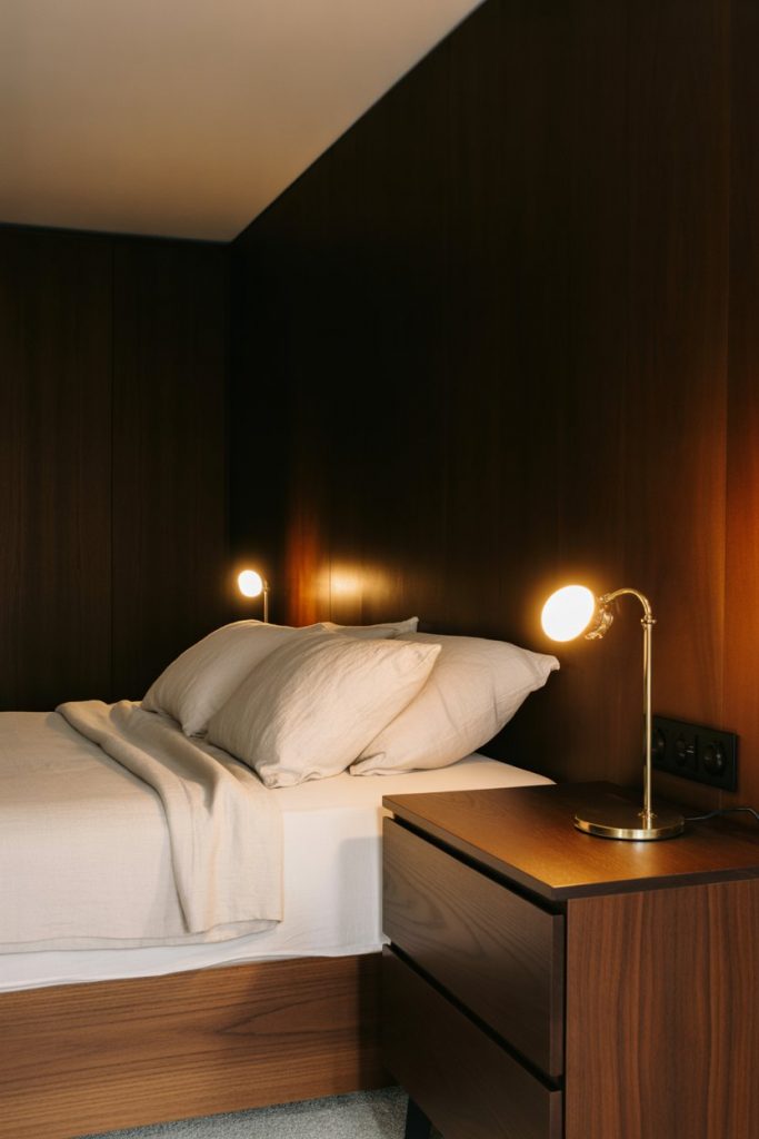
Creating a moody bedroom with deep brown walls embraces the enclosure rather than fighting it, resulting in spaces that feel protective and intimate. Espresso or dark walnut paint on all four walls, paired with layered lighting and lighter bedding, creates a sophisticated cocoon that’s perfect for rest. This approach challenges the conventional wisdom that bedrooms must be light and has gained popularity as Americans prioritize sleep quality over resale concerns. 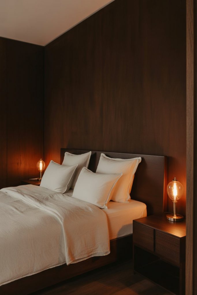
Common mistakes and how to avoid them: The primary error is insufficient lighting—dark bedrooms need at least three separate light sources on different circuits to avoid feeling oppressive. Include task lighting for reading, ambient lighting for overall mood, and accent lighting to highlight art or architecture. Also critical: use semi-gloss or satin paint rather than matte, which can make dark brown walls look chalky and absorb too much light.
17. Minimalist Brown Simplicity
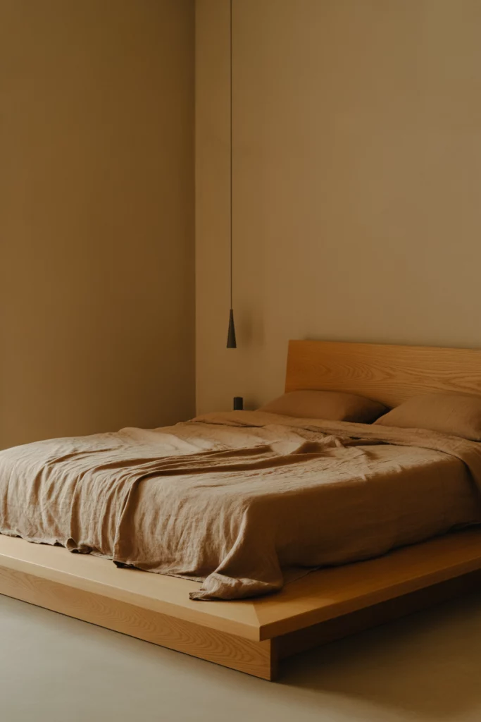
A minimalist approach to brown bedrooms strips away excess while maintaining warmth through careful material selection. Think light oak platform beds with no headboard, single-tone tan walls without artwork, and streamlined brown bedding without decorative pillows. This aesthetic resonates with Americans downsizing or embracing simpler lifestyles who still want comfort and visual warmth that pure white minimalism lacks. 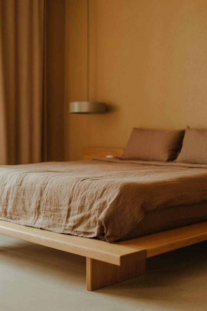
Practical insight: Minimalist brown bedrooms require higher-quality pieces since there’s nothing to hide behind—flaws in furniture or textiles become obvious when there’s so little in the room. Invest in solid wood furniture rather than veneer, and choose natural fiber bedding like linen or cotton rather than synthetics. The restraint in quantity demands excellence in quality, which actually makes this approach more expensive than it initially appears.
18. Purple and Brown Regal Depth
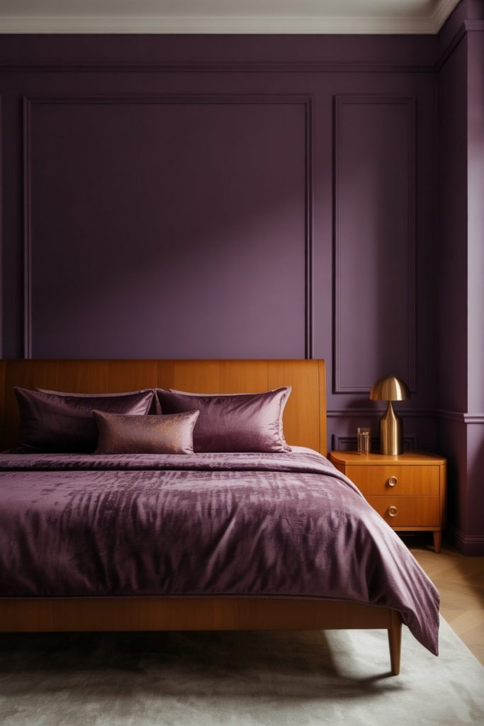
Deep purple and brown create bedrooms that feel regal and distinctive without being overly formal or traditional. Eggplant accent walls with caramel furniture, or plum bedding against chocolate backgrounds, deliver a richness that’s both modern and timeless. This combination appeals to Americans wanting sophisticated color in the bedroom while maintaining the grounding warmth that pure jewel tones lack. 
Micro anecdote: A homeowner in Portland tried this palette after seeing it in a boutique hotel and initially worried it would be too dark. Six months later, she reports it’s become everyone’s favorite room in the house—guests consistently comment on how well they sleep there. The purple-brown combination apparently creates a sense of nighttime even during the day, which helps with afternoon naps and shift workers’ sleep schedules.
19. Yellow and Brown Sunny Grounding
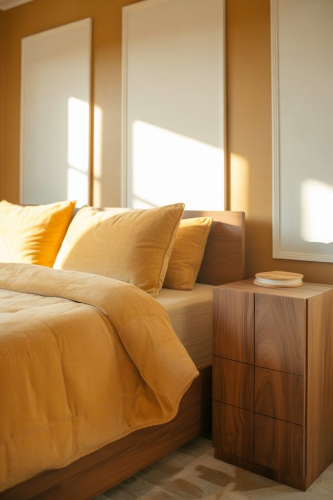
Soft yellow and brown brings sunshine into bedrooms while keeping them grounded and livable. Mustard accents against tan walls, or butter-yellow bedding with walnut furniture, creates warmth without the sweetness of pink or the intensity of orange. This palette works particularly well in Northern-facing bedrooms or climates with gray weather, where the yellow compensates for limited natural light. 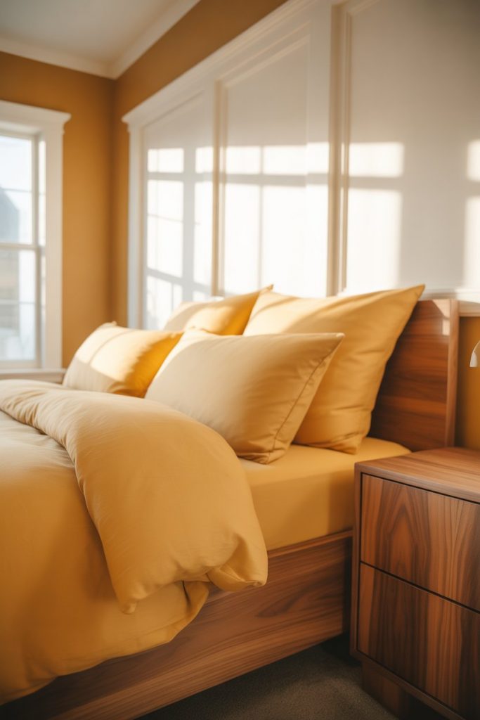
American lifestyle context: This palette has particular appeal in Pacific Northwest and New England homes where residents spend significant time indoors during rainy or snowy months. The yellow-brown combination provides psychological warmth that helps combat seasonal affective disorder without requiring bright, energizing colors that might interfere with sleep. Choose softer, golden yellows rather than bright lemon shades for better bedroom functionality.
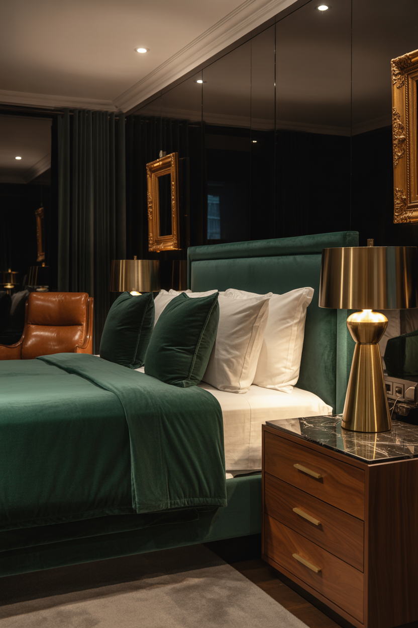
20. Forest Green and Walnut Natural Connection
Forest green paired with rich walnut creates bedrooms that feel connected to nature in a sophisticated, grown-up way. This combination works because both colors share depth and richness—there’s nothing pastel or light about either, which creates visual weight and substance. Think hunter green walls with dark walnut furniture, or olive bedding against medium walnut frames for a palette that feels both contemporary and traditional. 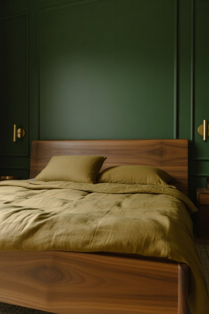
Budget angle: This look requires minimal investment beyond paint because the color combination makes even affordable walnut-veneer furniture look expensive. A gallon of quality green paint runs about $45-60, and basic walnut-finish furniture from budget retailers reads as high-end against the dark green backdrop. Add inexpensive brass hardware to bridge the two colors, and most people will assume you’ve invested far more than you actually have.
21. Gold and Brown Subtle Glamour

Incorporating gold and warm browns creates bedrooms with understated glamour that feels elegant rather than ostentatious. Brushed gold accents against chocolate walls, or champagne-gold bedding with tan backgrounds, adds just enough shine to elevate the space without creating Vegas-style excess. This approach appeals to Americans wanting luxury touches that photograph well for social media but still feel livable and comfortable day-to-day. 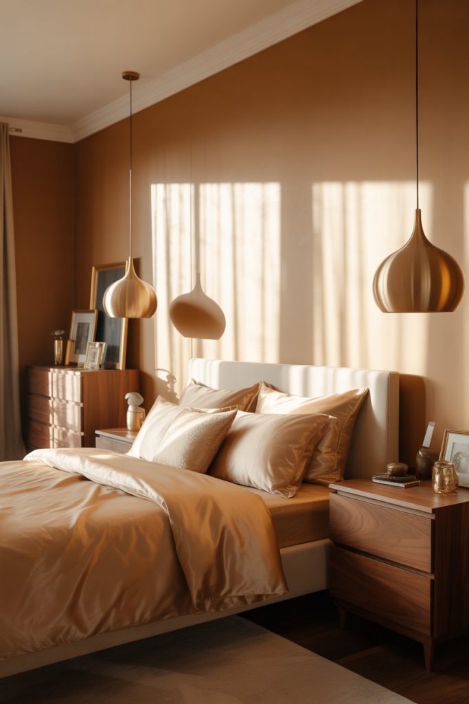
Real homeowner behavior: Most people who successfully incorporate gold into brown bedrooms use it in small doses—swapping out standard silver lamps for gold versions, adding a gold-framed mirror, or choosing gold-toned drawer pulls rather than painting entire walls or buying gold furniture. The restraint is what makes it feel expensive and intentional rather than garish. Think accent metal rather than dominant color, and the combination works beautifully without overwhelming the brown foundation.
Conclusion
Brown bedrooms in 2026 prove that neutral doesn’t mean boring—from moody chocolate cocoons to light-filled beige sanctuaries, this versatile palette adapts to virtually any style and preference. Whether you’re drawn to bold color combinations or subtle tonal variations, brown provides a warm, grounding foundation that makes bedrooms feel personal and complete. Try one of these ideas in your own space, and don’t hesitate to share your results or questions in the comments below—we’d love to see how you’re making brown work in your home.